Out of Scale, out of Context. The Use of Images in the Teaching of Graphic Design History †

Bio e Programmi, Supporto alla Didattica, ISIA Urbino, 61029 Urbino, Italy
†
Presented at the International and Interdisciplinary Conference IMMAGINI? Image and Imagination between Representation, Communication, Education and Psychology, Brixen, Italy, 27–28 November 2017.
Proceedings 2017, 1(9), 880; https://doi.org/10.3390/proceedings1090880
Published: 28 November 2017
(This article belongs to the Proceedings of Proceedings of the International and Interdisciplinary Conference IMMAGINI? Brixen, Italy, 27–28 November 2017.)
Abstract
:Images are a core element in the teaching of the history of graphic design, but the way they are used and often de-contextualized in publications and classroom presentations can alter the perception of graphic artefacts, which instead of being seen as examples from a specific historical context are transformed into undisputed icons from an ideal gallery of masterpieces. How is it possible to—at least partly—overcome these limits? An educational approach developed by the author since 2012 in her teaching at ISIA Urbino (Italy) proposes some viable solutions. Individual image analysis, comparisons and connections to other images, and the development of collective timelines are some of the tools used to help the students develop a critical attitude towards the contemporary and historical artefacts they observe.
Keywords:
graphic design; design pedagogy; education; history; critical history; decontextualization1. Introduction
Teaching the history of graphic design at undergraduate level involves showing examples of the different periods and movements included in the syllabus. The best way to achieve this would be to provide students with ample access to archives so that they have direct contact with the items discussed in the course; however, this is rarely possible given the constraints of time and location. As a result, in most educational contexts images—shown as reproductions, collected in books or displayed in the classroom—become the inevitable substitutes of the actual artefacts, mediating the connection to the original items. Furthermore, such images usually do not show the objects in their original context, which could instead be very useful to infer further information regarding their setting, size and use. This paper sets out to analyse the challenges posed by this situation and proposes one possible educational approach for overcoming some of its main shortcomings.
2. The Educational Context: Sources and Setting
One of the main tasks a lecturer has to face, after preparing a syllabus for a graphic design history course, is the choice of images to show during classes. Until a few years ago this selection would have been influenced mostly by the existing books on the subject, especially textbooks.
Since then the number of sources and of available images has increased exponentially, especially due to the diffusion of digital archives and other online resources. This increases the opportunities and widens the variety of materials, but at the same time requires further reflection regarding the choice and presentation of images in an educational context.
Images are both a primary tool and a problem. As a tool, they provide us with a way to exemplify the graphic production of a given historical period, movement or author. The choice of such examples can be based, for instance, on the fact that a specific object clearly shows some aesthetic, cultural and/or technical features which make it meaningful in the context in which it will be presented; other reasons could be the circulation, reception and importance of an item at the time it was produced, or its current availability in archives, publications, etc. Finally, the reason for selecting one specific example is very often its author: the idea that knowing the history of graphic design corresponds to being able to mention a list of important designers is still quite strong.
Whatever the reason for their choice, once the selected examples are extracted from a wide array of potentially similar artefacts, their status changes. They are no longer “one out of many”, but instead become icons, symbols, pieces from an established canon. And here lies the problematic side of the use of images: this shift can cause a loss of critical attitude, a disconnection of the chosen object from the many interconnected causes which make it look the way it does [1,2].
2.1. Images in Graphic Design History Books
Martha Scotford researched and hypothesised the existence of a canon in graphic design history, highlighting its downsides, in her essay published in 1991: “A canon creates heroes, superstars, and iconographies. In singling out individual designers and works, we might lose sight of the range of communication, expression, techniques, and formats that make up the wealth of graphic design history. (…) For students new to the study of graphic design, a canon creates the impression that they need to go no further; the best is known, the rest is not worth knowing. This is unfair, dangerous, and shortsighted” [3].
In 2008, fourteen years after this initial discussion of the canon, the British magazine Eye, under the editorship of John L. Walters, devoted an entire issue, no.68, to the theme “Beyond the canon” [4], extending the research into the digital environment and including an afterword by Scotford herself [5]; the issue also proposed some possibilities for the expansion of the canon, collecting a series of underrated historical items.
As Scotford notes, many are the reasons that can influence the way images are used in books, including layout and imposition requirements, availability, costs of reproductions, or copyright [3]. According to Hollis, works that are presented in books are the ones that have survived to our day by having been reproduced in magazines or annuals soon after they were made [2]. Poynor, examining the case of a widely reproduced poster by Allen Hori, affirms that “reproduction alone is not enough. (…) The crucial requirement is repetition” [6].
Authors seldom explain their criteria in the choice and use of images for their books, with some important exceptions. Richard Hollis, in an opening note to his Graphic design. A concise history, claims, “The illustrations are intended to function in the same way as projected images at a lecture, and are for reference only, or for the reader’s own further research” [7]; elsewhere, he adds, “The criterion for the choice of work should be the importance of what it can be made to reveal” [2]. Robin Kinross, in a postscript to the second edition of his Modern typography. An essay in critical history, writes that “the artefacts reproduced as 'examples’ in this book attempt to provide some visual illustration of its themes”, adding that his choice was influenced, among other reasons, by the accessibility of the works [8].
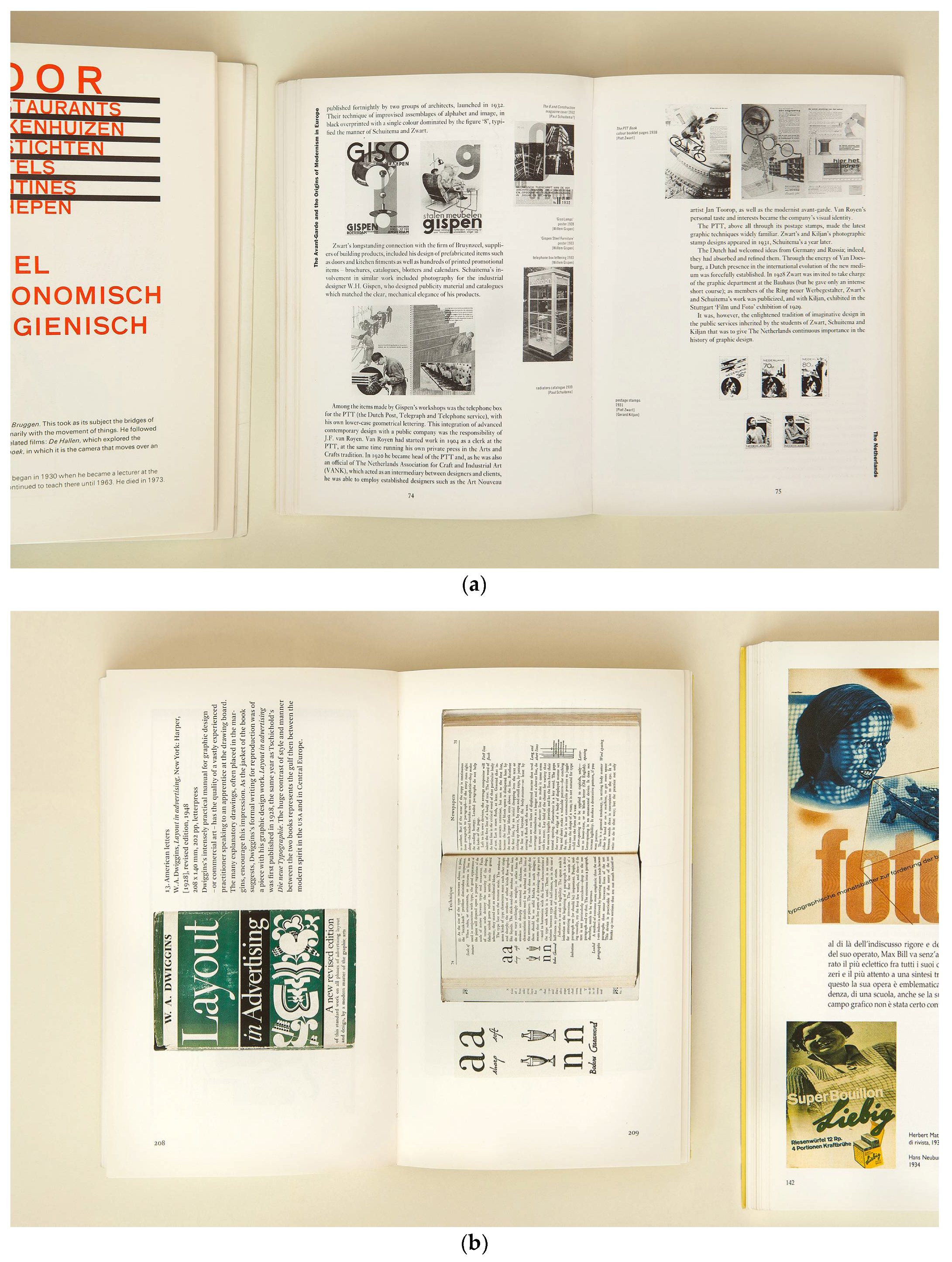
Both Hollis and Kinross have a background as designers or typographers, and both have made bold choices regarding the reproduction of images in their books. Hollis chose black and white thumbnails, refusing any attempt at being faithful to the original items (Figure 1a). Kinross only used three reductions in the layout of his book, and all the images of the same object appear at the same scale (Figure 1b). Both authors believe in the need of a verbal description and analysis of the works in order to “refer to points of interest” [8] and to highlight “the relationship of the message to the formal content and its organisation, and of these to the means of production” [8]. This brings us to another essential factor: the way images and verbal texts work together to deliver meaningful information. This point was considered by Drucker and McVarish in writing and designing their Graphic Design History. A Critical Guide (Figure 1c), where “images and captions form their own units and are not subsumed by the body text” [9].
In other leading publications in the field (Figure 2a–e), the selection and positioning of images is apparently based on design decisions which were not strictly related to the text, or were beyond the control of the authors. The results are layouts where dramatic changes in scale can be found, with some items presented as full page reproductions—which inevitably attracts attention to them regardless of whether they are historically important or not. On the other hand, the opposite can happen: pages where items, which are originally different in scale (such as posters and book covers, for instance), are levelled out by their having been adapted to the standard size of the image grid. This is of course not always the case, but the issue should be considered when using these books as reference or teaching material.
2.2. Images in the Classroom and in Student Research Projects
Over time the use of images has become a main feature in many educational environments and has been encouraged as a way to enhance the learning process by reinforcing it with visual aids. While discussions about the use of images in art education are quite common, they usually focus on fair use and copyright; however, there are other factors to be considered.
“Slides: remember that projected images give a distorted view of what the actual object is or was.” [9]. This remark by Richard Hollis points out an ever relevant issue, which becomes even more so when applied to graphic design, a discipline where scale and proportion are fundamental. Even when the lecturer tries to keep a sense of scale among the projected images, their size is usually very different from that of the original object. If enlarging the image allows details to be made more visible from a distance, even to a wide group of people, its downside is that it may produce a possible misperception of the objects and a lack of understanding of their reality as everyday artefacts intended for a specific use.
Furthermore, image projection often happens in a dimly lit space with a brightly lit screen illuminated in the distance: a setting which is unlikely to favour exchange and critical involvement.
A third shortcoming of the typical overhead projection setting is de-contextualization. The reproductions we have access to usually either have no background or simply a neutral one. If the object is a poster, it is rarely shown on a wall; if it is a book, it is not shown in the hands of a reader. This way any connection to the context of use and to the historical setting is lost. Overcoming these problems is difficult due to the lack of easily accessible documentation of these objects in use; however, keeping such concerns in mind can aid the search for possible countermeasures.
In addition to this, another unavoidable factor must be considered: the image searches carried out by students using tools such as Google Images or Pinterest (Figure 3). While these tools can provide quick access to a host of digital reproductions, the way they present the search results obviously creates a further de-contextualization, disconnecting the image from the situation in which it was originally published and from the information related to it. If not counterbalanced, this can reinforce the misperceptions I mentioned earlier.
3. An Educational Approach at ISIA Urbino, 2012–2017
“Should a graphic design history be populated with people or with things?” [16]. I had these issues in mind while developing the approach I am currently using in my course titled “Cultura della grafica e del design” (Graphics and Design Culture)—whose content is mainly historical—at ISIA Urbino, a visual communication design school based in central Italy offering undergraduate and graduate courses.
Another main goal I had was to incorporate an experiential approach in my teaching to help create meaningful connections between the information provided and the students’ personal backgrounds and interests. My intent is to provide them with an opportunity for finding their personal connections to the history of this discipline, inspired by what Stefan Themerson wrote in his visual essay Kurt Schwitters on a time chart [17].
The course I teach is addressed to 25 first-year students of the three-year Diploma in Graphic Design and Visual Communication, whose average age is around 20; it consists of 48 classroom hours, organized in blocks of 4 hours each. The time of each class is divided between a presentation of a given historical period or theme and a space of exchange and discussion with students. The overall time frame covered by the course corresponds to the 19th and 20th centuries, with occasional extensions into contemporary production.
3.1. First Introduction
During the first class, I present a few artefacts (e.g., a couple of books, some issues of a magazine, a poster) dating from between the 1960s and the 1970s, inviting students to take them into their hands and take their physicality into account. I point out elements such as size, materials, and traces of the printing technique. The intent is not to look at them as collector items, but to consider them as objects that were designed for a given purpose in a specific context, addressing a potential group of readers/viewers.
I subsequently give each student a printout of an image reproducing an artefact, without any further information. I invite them to spend some time interrogating the image: the purpose is to try to discover what the nature of the item is, and to guess the historical period in which it was produced (Figure 4). In this first phase, it becomes immediately apparent that the knowledge we all have as daily users of graphic artefacts can be effectively applied to the investigation and helpful in identifying recurring patterns: for instance, in most cases a magazine cover, whatever the language it uses, can be recognized by the presence of a date and an issue number. Many students do not have a background in art education, therefore I encourage them to rely more on this kind of intuitive approach in order to extract the maximum amount of information from the image. After this first analysis of the image, I invite everyone to present the results of their investigation and to explain which hints they have based their interpretation on: the idea is that there is no “wrong” interpretation as long as they are able to explain it. Only at the end of this step do they receive the essential information about the artefacts.
In the following step, all the printouts are laid out on a table and students are asked to observe and show connections between them. My initial selection is based on pairs of images which share a common element or theme (for instance, “corporate visual identities”, or “satirical magazines”, or “subjectivity in graphic design”) and I am interested in verifying if this is somehow visible. In most cases, the students find many of these connections or discover other ones based on meaningful observations.
3.2. Invitation to Further Research
These images are the starting point for the work that will be developed during the course. Each student is asked to analyse the image they have received and to begin researching it, following this structure:
- when and where: the context in which the artefact was designed;
- essential information on the designer, if applicable (where, when, field of activity, ideology and/or approach);
- essential information on the client, if applicable (where, when, field of activity, approach);
- theme, goal and use of the artefact;
- description of the design solution (and technical characteristics if relevant);
- critical evaluation: Why is this project interesting? What can we learn from it? How does the design solution relate to the given theme? How does it relate to the historical period in which it was produced?
I stress the fact that the information on the designer (and on the client) should be “essential”, that is, only the information needed to understand the artefact should be presented. With this in mind, the amount and quality of biographical information on the designer that is to be considered essential will vary—even strongly—according to each case. For instance, a knowledge of Willem Sandberg’s life during the Second World War is necessary to understand his post-war designs, while for other designers their educational experiences or ideological beliefs might be more relevant, and so on. The intent is not to exclude biography as a useful layer of information, but to avoid the “master/masterpiece” or “hero approach” [3,16,18].
In their analysis, students are invited to consider the visual components of the artefacts (verbal text, imagery, decorative elements, marks of production, when visible), the “content” of the communication (denotative and connotative levels), the historical setting (place, historical period and relevant facts, social phenomena, styles and prevailing aesthetics, production technologies, distribution, etc.), expanding on what is proposed by Drucker and McVarish [9].
The participants receive a set of suggestions and sources that can form the basis for their initial research, which will be expanded and deepened through further discussion over the weeks. They are invited to question the sources and compare them. As students are well aware that the traditional distinction between printed/reliable and digital/unreliable sources has long been surpassed, I try to help them focus their analysis based also on high quality referenced writing on the web and on rich digital archives providing detailed information (such as size, printing technique, etc.) regarding the items under consideration. The investigation can sometimes be widened with the help of interviews, when the authors or their collaborators are still alive.
3.3. Building Connections
Based on the images I provide, the students must also work in pairs to develop a common project—which can take the form of a timeline, a theme map or a booklet—where the two original artefacts are confronted with other historical or contemporary items that share the same theme. They are asked to collect at least 10 other images, to show how the common theme was dealt with in different periods, and to compare the different outcomes.
This approach has a two-fold intent. On one hand, by bringing the attention to the artefact rather than to its author, it aims at widening the historical narration beyond the usual gallery of established authors. On the other hand, the careful observation of the individual items and their comparison and connection with other items allows for the consideration of aspects which can be sometimes overlooked: for instance, the relevance of the artefact to its intended use, the relation between the formal arrangement, the production technique and the typical expressive forms of the time [2], the role of clients/commissioner, and the public to which it was addressed [18]. The latter is arguably the most difficult aspect to explore in this context—given that it requires specific information, which is not always easily available, on the single items, such as distribution, reception and so on—but still one worth considering.
The approach also offers an interesting opportunity to relate designers’ manifestos and statements with their works so as to see if and how ideas and principles transform into visual forms of expression.
To expand this image-based approach, this year I introduced a further development to my teaching. For the last class of the course, I asked every student to bring a small-scale printout of a personal selection of images: two examples from each theme presented during the course (20 images for each participant and a total amount of approximately 500 images). These images were laid out on a 7-m-long table, in chronological order (Figure 5a,b). This arrangement produced an impressive display which gave me valuable feedback on the impact that some images—more than others—had on the imagination of each participant. For instance, it became evident that the first half of the 19th century was not considered very impressive, probably for its lack of imagery. I was not surprised to see students’ great interest in the turn-of-the-century posters (such as those made by the Beggarstaffs Brothers) and in Plakatstil/Sachplakat. Interestingly, I had noticed the same enthusiasm during my classroom presentation when I first showed these examples; this enthusiasm can probably be explained due to the striking graphic “shorthand” that appeared for the first time in this period, which was perceived by many of the students as very close to contemporary design.
It was interesting to notice how even items that were not visually very distinctive could appear more than once in the timeline. Such was the case, for instance, with a poster designed by Massimo Vignelli for the Filosofia typeface created by Zuzana Licko (Emigre), which probably stuck in the students’ minds as a reminder of the strong contrast between the designer and the client, who each represented at the time two opposing points of view on typography.
After this first overview, I asked each one of them to pick two images from their selection and to explain the reasons for their choice. This allowed each participant to express their own personal connection to the chosen examples, motivated either by its visual impact, its specific history, its political value, the design philosophy it represents or by the student’s personal experience and interests. The act of picking up the printed images and handling them while speaking was also an act of appropriation and further connection.
3.4. Final Outcomes
The students work on their research parallel to the classes, integrating the information they receive along the way. During the weekly meetings, they are invited to present the evolution of their research, and receive further critique and suggestions. The required outcome, which must be delivered for evaluation prior to the exam, is a small three-part publication, in A5 (closed) format, which includes the individual works and the presentation of the common theme (Figure 6a–d). As writing skills in the group can vary extremely, I encourage students to use non-linear writing, visual comparisons and other ways of presenting concepts.
The evaluation of the final work is based on several factors:
- the completeness of the individual research according to the suggested structure;
- the scope and depth of the common research and its presentation;
- the ability to integrate relevant ideas and information taken from the course syllabus, beyond the specific theme.
An oral exam completes the final course grade.
4. Conclusions
This educational approach is far from complete or fixed and is constantly being revised (with each academic year); however, in my opinion, it can be seen as one possible answer to the problems highlighted at the beginning of this paper. Besides the more common presentation of images (in books, in display projections, in image searches) it provides other experiences, other methods of approaching images, which can hopefully help students in developing more autonomous ways to observe historical artefacts.
Over these years, I have seen how this focus on one object—paired with a clear stress on comparisons and connections—can facilitate the development of a critical approach, intended as the ability to evaluate a graphic design artefact not based on its presumed aesthetic value or on its author, but on a set of information, observations and considerations. In my opinion, this ability reaches well beyond the study of the history of the discipline: it belongs to the essential skills a designer needs to have.
Acknowledgments
I would like to thank ISIA Urbino, all the students I worked with over these years whose participation and feedback helped me in developing my teaching, and Carlo Vinti, my predecessor in this course, with whom I had the chance to exchange useful ideas. Thanks also to Vanja Macovaz and Guglielmo Turbian for their photos.
Conflicts of Interest
The author declares no conflict of interest.
References
- Kinross, R. Conversation with Richard Hollis on Graphic Design History, in Journal of Design History, 1992; Volume 5, No. 1; Reprinted in About Graphic Design. Hollis, R., Ed.; Occasional Papers: London, UK, 2012; pp. 47–64. ISBN 9780956962317. [Google Scholar]
- Hollis, R. Have you ever really looked at this poster? Eye 1994, 4, 4–5. [Google Scholar]
- Scotford, M. Is There a Canon of Graphic Design History? AIGA Journal of Graphic Design, 1991; Volume 9, No. 2; Reprinted in Graphic Design: History in the writing. De Bondt, S., de Smet, C., Eds.; Occasional Papers: London, UK, 2012; pp. 37–44. ISBN 978-0-9569623-0-0. [Google Scholar]
- Beyond the canon [Special issue]. Eye 2008, 17.
- Scotford, M. Afterword. Eye 2008, 17, 15. [Google Scholar]
- Poynor, R. Absolutely the ’Worst’. Eye 2008, 17, 73. [Google Scholar]
- Hollis, R. Graphic Design. A Concise History; Thames & Hudson: London, UK, 1994; ISBN 9780500203477. [Google Scholar]
- Kinross, R. Modern Typography. An Essay in Critical History, 2nd ed.; Hyphen Press: London, UK, 2004; ISBN 978-0907259183. [Google Scholar]
- Drucker, J.; McVarish, E. Graphic Design History. A Critical Guide; Pearson Prentice Hall: Upper Saddle River, NJ, USA, 2009; ISBN 978-0132410755. [Google Scholar]
- Spencer, H. Pioneers of Modern Typography, Revised edition; M.I.T. Press: Cambridge, MA, USA, 1983; ISBN 9780262693035. [Google Scholar]
- Baroni, D.; Vitta, M. Storia del Design Grafico; Longanesi: Milan, Italy, 2003; ISBN 978-8830420113. [Google Scholar]
- Meggs, P.B.; Purvis, A.W. Meggs’ History of Graphic Design, 4th ed.; Wiley: Hoboken, NJ, USA, 2006; ISBN 978-0470168738. [Google Scholar]
- Jubert, R. Typography and Graphic Design: From Antiquity to the Present; Flammarion: Paris, France, 2006; ISBN 978-2080305237. [Google Scholar]
- Eskilson, S.J. Graphic Design: A New History; Yale University Press: New Haven, CT, USA, 2007; ISBN 978-1856695114. [Google Scholar]
- Hollis, R. Six Lectures, in About Graphic Design; Occasional Papers: London, UK, 2012; pp. 118–121. ISBN 9780956962317. [Google Scholar]
- Crowley, D. Writing about Heroes. 2012. Available online: https://faktografia.com/2012/06/09/writing-about-heroes/ (accessed on 24 July 2017).
- Themerson, S. Kurt Schwitters on a time Chart, Typographica New Series; no.16; 1967; pp. 29–49. [Google Scholar]
- Wilkins, B. No more Heroes. Eye 1992, 2, 4–7. [Google Scholar]
Figure 1.
(a) Richard Hollis, Graphic Design. A concise history, 1994. The items, a selection of Dutch designs from the Twenties and Thirties, are shown in black and white in thumbnail size. The stamps (bottom right) are reproduced at a slightly smaller dimension, maybe in an attempt to suggest the difference in size. Captions are short and provide no comment [7]. Note: All the selected books have been photographed next to each other in the attempt to keep a sense of scale between them. The selected spreads are not meant to represent the books in their entirety, but to show some of the ways images are used in books. Photos by Vanja Macovaz; (b) Robin Kinross, Modern typography. An essay in critical history, second edition, 2004. In the “Examples” section, text and images are rotated 90 degrees to better accommodate the items, which are mostly book covers and spreads; a real-size detail of a page is provided [8]; (c) Johanna Drucker & Emily McVarish, Graphic Design History. A Critical Guide, 2009. This book frequently shows printed ephemera alongside works by well known authors: in this example, train tickets are presented on the same page as a poster by Edward Penfield; on the opposite page, a work by Alphonse Mucha is placed beside a poster for a department store whose author is unknown. Every image is commented upon with an extended caption that provides a critical reading [9].


Figure 2.
(a) Herbert Spencer, Pioneers of Modern Typography, revised edition, 1983. Spencer chose to reproduce the artefacts (taken mostly from avant-garde magazines and books) as black-and-white or black-and-red line art, and all reference to the page format is removed. The resulting reproductions are extremely distant from the original items and suggest the idea of abstract graphic elements instead of physical objects [10]; (b) Daniele Baroni & Maurizio Vitta, Storia del design grafico. 2003. This spread presents a selection of posters and covers by Herbert Matter. The size of the images does not correspond to the kind of object, and the images are quite similar in the use of colour, composition and typography [11]; (c) Philip B. Meggs & Alston W. Purvis, Meggs’ history of graphic design, 4th edition, 2006. In this example magazine covers and spreads designed by Alexey Brodovich and Alexander Lieberman are presented in the same size as two posters by Joseph Binder [12]; (d) Roxanne Jubert, Typography and Graphic Design: From Antiquity to the Present, 2006. A well known poster by Josef Müller Brockmann is accompanied by several sketches, reproduced at a smaller scale. Showing sketches and other behind-the-scenes documentation can be a way to highlight the design process [13]; (e) Stephen J. Eskilsson, Graphic Design: A New History, 2007. Given the dimensions of the book (21.5 × 29.2 cm), the poster by Lester Beall on the right-hand page is reproduced at an impressive size, which is reminiscent of the layout of an art catalogue [14].


Figure 3.
On the left, Pinterest search result, keywords: “Willem Sandberg”. On the right: Google Images search result, keywords: “Barbara Stauffacher Solomon” [15].
Figure 3.
On the left, Pinterest search result, keywords: “Willem Sandberg”. On the right: Google Images search result, keywords: “Barbara Stauffacher Solomon” [15].

Figure 4.
Notes taken by Chiara Fanelli, Giovanni Abbatepaolo and Giulia Silani, students in the academic year 2016–17 at ISIA Urbino, analysing works respectively by See Red Women’s Workshop, Jonathan Barnbrook and April Greiman.
Figure 4.
Notes taken by Chiara Fanelli, Giovanni Abbatepaolo and Giulia Silani, students in the academic year 2016–17 at ISIA Urbino, analysing works respectively by See Red Women’s Workshop, Jonathan Barnbrook and April Greiman.

Figure 5.
(a) Students working on the arrangement of the images; and (b) a composited image showing the whole timeline. Photos by Guglielmo Turbian taken at ISIA Urbino, June 2017.
Figure 5.
(a) Students working on the arrangement of the images; and (b) a composited image showing the whole timeline. Photos by Guglielmo Turbian taken at ISIA Urbino, June 2017.

Figure 6.
(a) Starting with two works by Bruno Munari, a futurist book (1933) and an unreadable book (1964), Debora D’Angelo and Marta Fioravanti have produced a set of cards each presenting and analysing a different kind of “book-object”, using a clear indexing system. A.y. 2015–16. All the students’ projects: photo by Vanja Macovaz; (b) Francesca Ballarini and Riccardo Righi used the two assigned posters that shared the theme of music (a Swiss one by Richard Paul Lohse, 1962, and a psychedelic one by Victor Moscoso, 1967) to compare the opposing views on design represented by the two works. A.y. 2014–15. P.; (c) Marco Capponi and Roberto Vito D’Amico started from the covers of two German satirical/political magazines, Simplicissimus (1929) and AIZ (1932), to develop a timeline and anthology of satirical magazine covers of the 20th century. A.y. 2015–16. Photo by Vanja Macovaz; (d) Rosanna Lama and Maria Chiara Moro were assigned two posters for photography exhibitions at the Gewerbemuseum Basel, one by Jan Tschichold (1938) and the other by Emil Ruder (1960). They produced a folder/poster that compares the development of the two designers’ works and ideas in relation to their time; the students deliberately chose to produce a handmade work as a reaction to the projects that were analysed. A.y. 2014–15. Photo by Vanja Macovaz.


Publisher’s Note: MDPI stays neutral with regard to jurisdictional claims in published maps and institutional affiliations. |
© 2017 by the author. Licensee MDPI, Basel, Switzerland. This article is an open access article distributed under the terms and conditions of the Creative Commons Attribution (CC BY) license (http://creativecommons.org/licenses/by/4.0/).
Share and Cite
MDPI and ACS Style
Sfligiotti, S. Out of Scale, out of Context. The Use of Images in the Teaching of Graphic Design History. Proceedings 2017, 1, 880. https://doi.org/10.3390/proceedings1090880
AMA Style
Sfligiotti S. Out of Scale, out of Context. The Use of Images in the Teaching of Graphic Design History. Proceedings. 2017; 1(9):880. https://doi.org/10.3390/proceedings1090880
Chicago/Turabian StyleSfligiotti, Silvia. 2017. "Out of Scale, out of Context. The Use of Images in the Teaching of Graphic Design History" Proceedings 1, no. 9: 880. https://doi.org/10.3390/proceedings1090880