Diagrams as Heuristic Tools. A Semiotic Investigation to Provide a Theoretical Model for the Design of Diagrams †

Politecnico di Milano, Dipartimento di Design, Milano 20158, Italy
†
Presented at the International and Interdisciplinary Conference IMMAGINI? Image and Immagination between Representation, Communication, Education and Psychology, Brixen, Italy, 27–28 November 2017.
Proceedings 2017, 1(9), 958; https://doi.org/10.3390/proceedings1090958
Published: 17 November 2017
(This article belongs to the Proceedings of Proceedings of the International and Interdisciplinary Conference IMMAGINI? Brixen, Italy, 27–28 November 2017.)
Abstract
:The article aims to demonstrate the importance of the diagrammatic image as an essential element of the inferential process: a necessary tool for us to interpret and to communicate the intelligible. Accordingly, it will be discussed how diagrams privilege and display pertinences of the object they stand for, consequently affecting our interpretation and what we can fathom. As a fundamental graphic-sign for reasoning and discovery, the diagram will be described in accordance with a theoretical model, to provide the visual designer with a useful instrument to monitor and probe their designs. In this view it will also emerge how the designer’s work resembles that of the scientist, both with the intention to innovate models to describe an object.
1. Introduction
The article’s objective is to demonstrate the importance of abstract images such as diagrams, hence their design, as a necessary tool for the inferential process. As a sign, in its own structure and essence the diagram constitutes the vision we have of what we can fathom. In this view in which the diagram becomes an expression and integral part for the mind to form its thinking, the necessity not just to define its own grammar but also to update it, emerges with clarity. Especially in order to recognize the importance of the diagram’s creation process, a semiotic reasoning that distinguishes their potential is needed. The diagram will hereby be extensively described as a model: a schematic image utilized to semiotically interpret the intelligible. Seen as such, Aristotle analogy model will be used to discuss its semiotic nature; furthermore, the aristotelian model will also be implemented with the notion of the k-interpretant: a new term to describe analogic proportions, rather similar to peircian’s interpretant, which is very effective to explain in a clearer way the analogy’s logic—and therefore diagrams themselves. By defining and reviewing the analogic model, it will thus be possible to theorize the design process of the diagram as well as to provide the discipline of communication design with a new useful tool.
The intention of this thesis has much wider consequences: to prove the significance of diagram’s design means in fact re-qualifying the role of the designer and the artist, expert visual translators. From this dissection the responsibility of the designer to fulfil its contribution to every field that uses the diagrammatic language will clearly emerge.
2. Defining Terminology
2.1. Different Definitions of the Term “Diagram”
In order to agree on what the term “diagram” means, it is worth considering how different disciplines associate to it different meanings; depending on the context in which it is used its meaning may vary. In the field of communication design it is important to analyze Jacques Bertin’s view on data-visualization, cartography and graphics’ classification. In his theory, the French cartographer succeeded in describing the term “diagram” by using the notions of component—“the variational concept involved” [1] (p. 5)—and invariant. For instance, if a data-set were made of a variable number of third sector workers in a given lapse of time, it would be made of two components—(I) quantitative data of workers; (II) specific time lapse—and of one invariant—the constant relation between a specific value of the first component and a specific value of the second one. The diagram is then classified as graphic sign of which the relationships on the spacial plain are established between “All the divisions of one component and all the divisions of another component” [1] (p. 50). Depending on the components features, Bertin strictly differentiates the “diagrams” from the “networks”—“all the divisions of the same component” [1] (p. 50)—and the “maps”—and the relationships between “all the divisions of the same component arranged according to a geographic order” [1] (p. 50). These three macro-categories plus a fourth one called “symbols”, make up the “graphics”: bi-dimensional graphic devices meant to visualize and communicate information. Truth is nonetheless, that bertinian classification of the graphics is exclusively subordinated to a statistic nature criterion in which the entity of the data (or the relationship within a spread-sheet set of data) is what establishes the type of sign. The choice of reducing to a single variant the classification of graphics allows Bertin to decide in an unambiguous and elegant manner the difference within the various categories, effectively succeeding in creating an efficient and definite language. The closed and independent diagrammatic-language is coherent with the structuralist tendencies of the time in which Semiologie Graphique was written. Despite his aim to formalize a precise and static system-language, both in the grammar and its syntax, he ignores aspects that regard the semiotic nature of the diagrams. Although Bertin often mentions the analogy that surfaces between the diagrams and what they represent, he would rather treat them exclusively according to his theory. He prescribes the correct use of the diagram in relation to the visual variables and of the entity of the data, moreover, classifying them as monosemic. Such analogic feature of the diagram is exhaustively described by Peirce when, studying the iconic-sign, he identifies it as one of its three subclasses: image; diagram; metaphor. The icon, according to Peirce is the sign that resembles in some respects the object for which it stands for, “but while the image represents its object through simple qualities and the metaphor represents it through similarities found in something else, the diagram represents it through a skeleton-like sketch of relations” [2] (p. 358). The diagram therefore becomes a tool of schematic representation, which brings to light the pure relations that exist within and outside the object: “The diagram represents a definite form of relation. This relation is usually one of which actually exists, as in a map, or is intended to exist, as in a plan. (…) The pure diagram is designed to represent and to render intelligible, the form of relation merely” [2] (Pag. 365). It may be reasonably objected how a diagram intended as an abstract representation of something—as Harry Beck’s map of London’s tube—evidently diverges from the diagram intended as a model of representation in the bertinian theory—bar-chart; tree-map; etc. It is indeed undeniable that the diagrams mentioned above vary greatly from one another, however, they are both built upon the same analogic sign foundation. For instance, in a histogram representing the rise and fall of temperature, the movement of the line is analogically dependent on the real shift of the phenomenon. What distinguishes the two types of diagrams only differs by the amount of codification. Accordingly, the diagram is defined as: a graphic representation of which traits are intended to correspond in some respects to those of some other structure, and it relates to the object analogically; an abstract-schematic representation depleted of all those mimetic-realistic aspects irrelevant in a given circumstance. It is easy to deduce how the term “diagram” hereby refers to a broader and much more flexible portion of content than Bertin supposed. As Anderson suggested “Diagrams are pictorial, yet abstract, representations of information, and maps, line graphs, bar charts, engineering blueprints, and architects’ sketches are all examples of diagrams” [3].
2.2. A Broader Inspection of Diagrams
Psychology as well seems to accept, more or less consciously, the semiotic definition of diagram as an iconic sign. Arnheim, in his book The Visual Thinking [4], already describes the necessity of using schematic and analogic images to ignite inferential process: they are built upon a preliminary abstraction and they are non-mimetic representations of the physical world. He adduces for example, in the case of his colleague Silberer, how he mentally represented a philosophical concept by using a schematic visualization, which would otherwise be inaccessible to the senses. This helpful tool is also described as a visualization that metaphorically allows the fundamental structure of the theme to be tangible, and as an image it can therefore be manipulated. This work model is created without any concern about whether it could exist in the physical realm or not. A simple representation, that is clear and extremely efficient. The use of the term “metaphor”, that he specifically chooses, indicates the analogical relationship between what he visualized and the philosophical concept itself. Even Arnheim’s representation could actually be defined as a diagram, with the exception of it not being a graphic sign but a mental image. It seems after all to reaffirm the definition suggested above, and it gives a deeper understanding of why diagrams, and their semiotics—now and more than ever—are relevant: (I) in abstraction, of the schematic image; (II) of its analogical and central role. It will also be evident how an experiment conducted in psychology will prove how these two characteristics of the diagram are indeed logically consequential. Karl Lashley leads a series of experiments on rats, which are put in front of a problem of perceptive nature and are rewarded when solving it [4]. Lashley is able to train a rat to distinguish horizontal lines—reward—from vertical ones—punishment. He discovers that the animal responds not only to the use of horizontal and vertical lines exclusively (stimuli that the rat is trained to respond to) but also to horizontality and verticality concepts when expressed by using dots respectively aligned (Figure 1). The surprising result shows the animal is able to extrapolate out of the occurrence an abstract and structural element which is crucial to solve the problematic situation. The rat is able to recognize the concepts of horizontality vs verticality. What is important to note in Lashley’s experiment is exactly the process of abstracting the orientation of the signs, a critical element of the stimuli’s structure that the rat uses to win its reward. From a logical—rather than psychological—viewpoint, a specific conclusion can be drawn. Between the different stimuli (horizontal/vertical lines vs horizontally/vertically oriented dots), the rat recognizes some resemblances in signs. A middle phase made possible by abstraction therefore exists. This process must be characterized by a more or less blurry image representing the essential traits that are pertinent to the first image: a diagram of what has been registered and what can be attained from it. The animal’s ability to solve the problem could not be otherwise explained. Abstraction was essential for the analogical comparison to happen and could exist between the vision of the aligned dots and the mental model learned during the training. It is logically understood for example that in order to formulate and comprehend a metaphor like a “boxer is (as fast as) lightning”, one must be able to distil and abstract some characteristics of the respective terms of comparison to then confront and comprehend the analogy between them. Nonetheless there is another interesting aspect that can be deduced from Lashley’s experiment, which he leaves unexplored: the signs that the rat was comparing were not only made up of the visual variable of orientation, but were defined also by a certain thickness, distance among dots and so on. Regardless, the animal was able to comprehend that the orientation of the signs was actually the pertinence needed to solve the problematic situation. This means that the abstraction conducted by the rat prioritized a specific aspect of the sign: if, on one hand it summarized the experience into a general model, on the other it selected a specific characteristic of the sign—its orientation: a pertinence of the sign. Sperber and Wilson would explain this phenomenon by stating how the mind is pertinently oriented: of every aspect defining a specific situation we privilege only those that are functional, pertinent indeed, to the resolution of the problem disregarding the rest [5].
If it came, for example, to abstracting the physical phenomenon of “time”, it would be probably seen as a straight line from left to right. This model—diagram—representing “time” prioritizes (pertinentizes) a specific aspect as pertinent: its sequential nature branches into past, present and future. Nevertheless science and philosophy have proven how “time” can be described in other ways. Other cultures interpret “time” as a binary phenomenon: “what is perceivable now” opposed to “what is not”—present vs past/future –; physicists would otherwise describe it as a bendable plain; this model would perhaps be useful to represent the bergsonian concept of “time”; pitagoric philosophy would make the cyclic feature of “time” relevant, instead. Not only every individual, but also every culture differs from one another in the way they perceive their reality [6]. The diagram interprets the object with respect to its pertinence: signs are what make the inferential process possible. Its two forms of structure, being “content” and “expression”, find themselves in a dyadic relationship, isomorphic and inseparable, in which the respective structures reflect one another, as if they were two mirrors facing each other [7,8]. In other words, the diagram is the content itself, it embodies the idea, making it intelligible: the sequential and linear development is only one meaning within the array the word “time” encompasses (Figure 2).
3. The Model of the Analogy
3.1. The k-Interpretant Implementation
It is now clear how the creative process of the diagram becomes crucial both in intercultural communication and as a heuristic instrument of discovery intended to interpret the environment. It is therefore worth gaining deeper understanding of the analogical correlation of the diagram and its semiotics. Going back to Lashley’s experiment it can be deduced how the rat had likely abstracted an external stimulus, reconstructing a schematic analogical image: a representation that allowed the rat to learn which behaviour would be suitable for that specific situation. The diagram thus embodies a solution which gave the rat perspective as to how the two signs would present analogical similarities.
Hofstadter believes that analogy is the foundation of every inferential movement, allowing further analysis [9]. He explicitly talks about “analogical thinking” declaring how we tend to stylize, for the purpose of comparison, a person’s movement, the sudden appearance of lightning and, generally, anything perceivable. Analogical thinking could be translated in an algorithm that optimizes the effort to tackle the daily obstacles. The reason why we can relate to an elevator control panel is because we already learnt how to use it: we know that pressing a button or the other will result into the ascending or descending of the machine. Analogue traits from different experiences are identified and compared among each other within the diagram, which prioritizes what is pertinent in a given situation. In this case it is pertinent to push the buttons instead of turning or pulling them; in the case of the rat, as well as of the elevator’s control panel, there is a correlation of two distinct experiences—past vs present—being confronted by a common interpretant, which is previously distilled and learned by using the diagram. The interpretant implicit in the schematic image allows the user to shine light onto the analogy between the two situations. Aristotle is the first one to describe the analogy in terms of a ratio among four elements—from which the name analoghía derives—and the model he uses to explain it is the mathematical proportion [10]. Although an analogy can be expressed comparing only two words, its logic actually shows how analogy exists not only between these two elements, but between the relationship that these have with its respective subordinates: Perelmann would then speak not of “relationships of similarity” but of “similarity of relationships” [11]. This point can be illustrated by returning to the example of the boxer and the lightning. Here the analogy is between two terms, more precisely between the behaviour of the boxer towards his opponent and how the lightning hits the ground. Formalizing the analogy will therefore mean: boxer:opponent = lightning:ground, similarly to 1:2 = 2:4.
Below, two initial thoughts about the limits of the model of proportion and how the verbal and mathematical examples differ:
- In the mathematical proportion, it is obvious which type of similarity relates the first group to the second: 1:2 = 2:4 is a function of double value. While the similarity is indicated by the sign “=”, its type is implicit and unique, not having other similarities between the two numerical pairs.
- In the verbal proportion the comparison between the two may be less evident. There actually is more than one possible interpretation of the assert: first of all, the most common one (lightning usually refers to its speed) suggests the correlation between the boxer and the speed of lightning. An alternative interpretation could refer to both entities emanating the same great amount of energy: the first one on the opponent, and the second one on the ground. Which pertinence should be applied when interpreting the analogy?
In both instances pertinence is implicit and will be described as the analogy’s interpretant, which in this article will be referred to as “k-interpretant” (a sign, similar to Peirce’s interpretant, with the function of translating, understand, interpret the proportion itself) [12]. The k-interpretant, which in the mathematical proportion was a single factor, instead, within the more complex dynamics of verbal language, articulates into several traits that can either be similar or in contrast with each other. Different kinds of k-interpretants can be generated by analysing the terms of the analogy; they could also be described—according to Hesse’s terminology—as positive, neutral or negative traits of the analogy [13]. In the case of the boxer and the lightning, the positive trait would be speed; while a negative one could be represented by the weight of the boxer compared to the lightning’s pure and light electrical current; finally, a neutral trait could be the strength they both are capable of. More specifically, k-interpretant matrixes could be built amongst the pair’s respective traits—which, if shared, would permit the analogy to take place and, if negative, would prevent it from existing. Truth is, even to doubt about the traits’ positivity or negativity can be in itself a scientific approach that leads to discovery. The unexplored comparison between the two pairs’ relationships depending on the chosen pertinence holds new interpretations—unlocking new hypothesis.
Another interesting outcome is to verify how the aristotelian proportion—even more obviously the reviewed one—becomes a visual tool itself, useful to discover new potential relationships between the terms. The mathematical proportion presents indeed a certain degree of iconicity, showing analogically all the elements—and their respective relationships—needed to rethink and to restructure the analogy. As Stjernfelt argues, iconic signs—therefore diagrams—allow a certain amount of manipulations: the diagram is a tool meant to include in its essence a series of manipulations useful to understand and redefine a phenomenon: the relationships among the elements of the diagrams are analogically standing for the actual relationships among the different structural parts of the phenomenon itself [2]. Just as Stjernfelt described, if the map of the London tube was considered, it would be clear how the relationships among the different lines—how they cross each other, or their position related to the Thames—are analogically linked to what they are representing. As an icon, Beck’s diagram-map will consequently allow different kinds of manipulations such as understanding the fastest way to go from A to B, but also to prefigure what would happen if a metro-line were to be added or erased.
3.2. Manipulations Allowed by the Model
As well as any other diagram, the model of analogy is prone to different manipulations. To avoid misunderstandings from here on, Perelman’s terminology will be used when referring to a proportion’s pairs: the first one being the theme, and the second one called phoros (Figure 3) [11]. Before going through all the different manipulations of the diagram, it is necessary to make one last remark: even if the proportion 1:2 = 2:4 presents perfect symmetry before and after the sign “=” (the doubling of the amounts being equally accessible respectively in the theme, as well as in the phoros), it can not be stated the same for the verbal proportion. The analogy’s purpose is to reflect the relationship between the two terms—usually the theme; it does so by comparing the former to the second one, which is more evident/available. Aristotle’s proportion, for example, reason:evidence = eyes of the bat:blaze of the day is effective because it explains through a sensible occurrence a concept which would otherwise be difficult to grasp. It interprets the analogy in respect to the k-interpretant of “blindness”: the intellect shuts its eyes when facing evidence. Analysing this example Zingale points out how, in the verbal analogy, some sort of asymmetry exists in which the phoros relationship explains a more hidden one found in the theme [14]. The inability to understand the dynamics and nature of a phenomenon is what encourages us to recognize within our knowledge an effective model to be applied to a new and unknown circumstance. The still blurry image of the theme is the premise from which the analogy is born, demonstrating once again, how this relationship is an auxiliary tool for knowledge. As a creative discipline, communication design stands out for involving the use of signs that efficiently communicate a concept otherwise amorphous [15]. The theme is what formalizes the “problematic situation”, the content that requires the design of an object—either graphic, or tangible—used to allow the theme to become intelligible.
After having considered the unbalance of the proportion, and in the light of this new approach, it is appropriate to proceed and analyze the diverse options (Figure 4) present in the analogy-model—also highlighting how k-interpretant implementation affects the design of a diagram:
3.2.1. Given a Theme, One of the Terms of the Phoros Will Be Substituted
By substituting a term of the phoros the relation between the pair will vary. It follows that the k-interpretant, and therefore the relationship between the pairs, will be redefined. This occurrence can be recognized when looking at Zingale’s explanation as to how these models have been useful to illustrate the “animal evolution” [14]. Throughout history, mankind has designed different diagrams to explain how this phenomenon is structured: starting from a linear, step-by-step model, it then appears as a map and later on turns into a tree, in which the analogy is seen as follows: genera:species = trunk:tree branches in function of a k-interpretant that predicts a constant and exponential growth. If instead the term branches of the tree was substituted by the term coral branch, the k and the relationship between phoros and theme would change as well: the coral not always splits into more branches, they sometimes converge to form a new single branch. Needless to say that the variation of the term in the phoros translates into a different k-interpretant—which now embraces the possibility of branches to decrease—. The new k affects the relationship between the phoros and the theme, resulting in the idea of evolution itself to be altered.
3.2.2. Given a Theme the Phoros Pair is Replaced
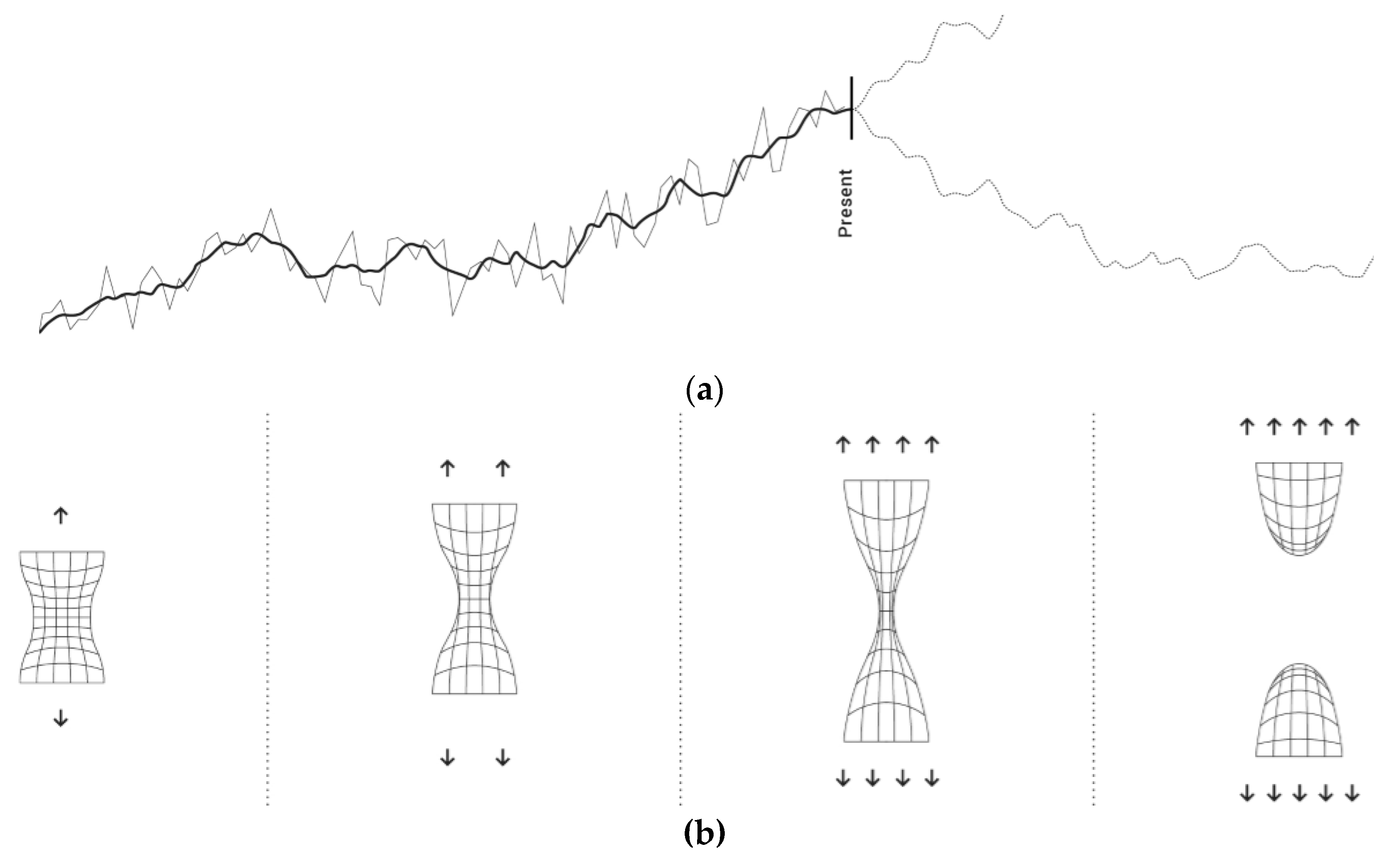
This substitution will therefore change both k-interpretants. To give a practical example of this substitution, and for communicative accuracy, some diagrams—which are usually used to illustrate global warming phenomenon—will be put into question: a large percentage of images representing this phenomenon make use of heat-maps and histograms to underline how the trend among temperatures is exponentially rising [12]. The analogical proportion between the histogram and the temperature peaks is the following: heat:cold = higher ordinate value:lower ordinate value, with both pairs sharing the k-interpretant of quantitative value variation respectively. This histogram (Figure 5), despite the easy to grasp representation, would allow temperatures to vary cyclically/regularly as the line—temperature variation—could always stabilize decreasing its height at any point (what is believed by scientists arguing against global warming). However, there is a considerable percentage of the scientific community which supports the phenomenon having a “point of no-return”, after which, temperatures will no longer decrease. If it came to represent this phenomenon taking this fact into consideration, the histogram model would become obsolete: the new k—now being the “point of no-return”—will become the interpretant to read the phenomenon—in this case global warming. It will hereby be necessary to find a model that includes this k-interpretant to be a potential option. The k-interpretant into question ignites the search for a coherent model that foresees this trait of irreversibility. The schematic image of an elastic surface that, put into stress, becomes slimmer and slimmer, until it breaks irreversibly, would appropriately lend itself to represent the “point of no-return”. The new analogy surfacing from the new phoros would look as follow: heat:cold = higher stress:lower stress, where the k-interpretant could represent either “breakability” or “irreversibility” for instance. In addition, the diagram implies another analogy: just as the quantitative data-component “temperature shift” refers to “amount of stress”, “the elasticity degree of the surface” indicates the “ecosystem’s tolerance”. As in the previous example, the phenomenon is redefined according to a new k-interpretant.
3.2.3. Given a Phoros, the Pair’s Common k-Interpretant is Substituted
In this case the terms of the phoros remain unvaried; what changes is the way in which the two elements relate to each other (and therefore the relationship between the theme and the phoros). In a polar dot-chart, for instance, used to represent the phenomenon of tax fraud, the distance from the centre represents the amount of fraud, and the polar degree indicates a specific month within the tax year [12]. The diagram would be based upon this analogy: more fraud:less fraud = more distance from the centre:less distance from the centre. Even though what would immediately catch the eye is the relationship between the quantitative data components, adopting a different k-interpretant would allow the detection of a different pattern that shows a specific population’s civic sense. The more a specific population spreads from the centre, the less civic sense a given community will have, opposing to more clustered images reflecting a higher sense of civics (Figure 6). By prioritizing a different k-interpretant (already existing within the analogy) the phoros—and therefore the diagram itself—will not change; though a new trait of the phenomenon will be brought to light. The designer can then take advantage of the new perspective to improve the visuals to showcase the new findings.
3.2.4. Given a Phoros, the Unknown Theme is Deduced
Hidden content has to be extrapolated from existing diagram or graphic image. This is the method used, for example, by psychologists when asking patients to interpret random abstract images. With no apparent design application, this example may as well be included for the sake of thoroughness. The phoros is what pushes the creative process forward, in the search of an appropriate theme that gives it meaning.
Obviously, what is of interest here is not the product of any specific example considered so far, but rather to attest how the model of analogy has been proven to be useful in conducting various manipulations—bringing the theme back into discussion. The undefined aspects of the theme are concepts that can be shaped more thoroughly by the phoros, thanks to a k-interpretant that helps decoding it.
5. Conclusions
As Arnheim argues, the history of mankind offers clear examples of how science made use of these models—diagrams—also to describe dynamics of systems which are not directly perceivable. From the rawest sensible stimulus, says Arnheim by quoting Democritus, simple forms will be abstracted, just as they will lend themselves as an instrument capable of capturing what is not directly accessible by the use of our senses. “Man, in perceiving the complex shapes of nature, creates for himself simple shapes, easy on the senses and comprehensible to the mind. One function of these shapes is that of producing physical equivalents of non-mimetic images harbored by the mind—"abstract" paintings, scientific diagrams, arithmetical concepts” [4] (p. 216). In this view of the diagram being the primary tool, premise of research and discovery, it is legitimate to define and update its semiotic: the use of the analogy model—integrated with the notion of k-interpretant and its relative considerations—has been hereby believed to be the most coherent and effective system to describe and monitor diagrams and their logical principles. Describing the diagrams in terms of an analogical relationship, authorizes visual artists as well as communication designers to consider themselves actual scientists. While it is true that the term "scientist" refers commonly to that figure gathering data to prove or confute a theory, Poincaré would also say that if it is through logic that we demonstrate, it is intuition that allows discoveries to be made. In other words, it is by reformulating analogies—redesigning and creating new diagrams—that new discoveries become achievable: a behaviour Peirce would define as abductive reasoning [16].
Although arts and sciences have often been thought to be separate disciplines, it has hereby been proven how, through the existence of a common denominator such as the analogy, they share a unique and heuristic tool. It may be reasonably argued how different practices employ different means to achieve their objective. However, they all deal with designing models and diagrams—either tangible or not—which interpret the intelligible in new, innovative ways. Moreover, reading the analogy through the pertinence theory and the peircian interpretant allows to point out how a diagram summarizes, within its structure, a specific and limited set of phenomenon’s pertinences: it becomes clear how a diagram will only be a partial representation of its theme, its content. The quest for an image which over embraces every plausible pertinence of a phenomenon is in fact vain, in turn, ontologically unattainable. Though contradictory, no specific pertinence chosen to describe “time” as a binary phenomenon rather than a cyclical, linear, or even as a deformable surface can be considered more or less accurate: to privilege a specific diagram would mean to select one of these specific pertinences, therefore to interpret and shape “time” in a particular, likely partial way. Here comes the responsibility of the communication designer, whose task is to design the most appropriate expression of a specific content, depending on each communicative context.
Emerging from the theory of pertinence, is also the fact that augmenting the variety and vocabulary of diagrams used to interpret a certain phenomenon means to enrich the library of models that science can use to describe any phenomenon. To gain different perspectives, can result into a more specific or exhaustive description. “Just as the mountains of the moon can be seen only when the sunlight falls from the side and casts shadows, so the scientist is constantly on the lookout for novel situations, not because there is virtue in the collection of instances as such, but because they may reveal fresh information” [4] (p. 45).
The role of the designer and the practice of visualization—more specifically designing diagrams—is hereby redefined. As a visual translator, the designer becomes a reference expert, in both choice and production of new diagrammatical models. The reviewed model of the analogy discussed in this thesis is an attempt to formalize and to theorize the logic of diagrams. From this dissection can be derived a new approach to designing diagrams, mainly giving priority to communication coherence and pragmatic accuracy over the flexibility of conventional charts. It does not, by any mean, claim to be understood as a process to define creativity itself, but rather as a reflection and explanation aiming to bring critical steps of diagram-design to the surface.
In the growing development and relative vulgarization of the visualization language for example—where so far the use of static and conventional charts has prevented the development of new models—the designer legitimizes his participation in the practice, along with statisticians and analysts, mainly in the design of visual solutions for the intent of communication. As designers make daily use of diagrammatic visual language, they are most aware and trained to utilize, rationally, bertinian visual variables, shaping into graphic signs an otherwise amorphous concept. Paraphrasing Garroni it can be stated that the designer focuses his efforts on designing new forms of expression, new visual translations [6,17]. In this new perspective, in which duties and responsibilities of the communication designer have been re-defined, a new auxiliary tool—the analogy model—has been provided to better monitor and create diagrams, a fundamental instrument for us to shape our thinking process.
Acknowledgments
I will mainly express my deepest gratitude to my mentor Salvatore Zingale, who as first thoroughly wrote about the importance of the analogy as a mean of discovery. I also wish to thank Paolo Ciuccarelli: a pioneer and innovator within the field of graphic design and, specifically, regarding the use and evolution of the diagrammatic language as a new and effective way to communicate.
Conflicts of Interest
The author declares no conflict of interest.
References
- Bertin, J. Semiology of Graphics: Diagrams, Networks, Maps, 1st ed.; ESRI Press: Redlands, CA, USA, 2011; ISBN 9780835735322. [Google Scholar]
- Stjernfelt, F. Diagrams as Centerpiece of a Peircean Epistemology. Trans. Charles S. Peirce Soc. 2000, 36, 357–384. [Google Scholar]
- Introduction to Diagrammatic Reasoning. Available online: http://web.archive.org/web/20021213193415/http://zeus.cs.hartford.edu/~anderson/intro.html (accessed on 3 September 2017).
- Arnheim, R. Visual Thinking, 1st ed.; University of California Press: Berkley, CA, USA, 1969; ISBN 0520018710. [Google Scholar]
- Sperber, D.; Wilson, D. Meaning and Relevance, 1st ed.; Cambridge University Press: Cambridge, UK, 2012; ISBN 9780521747486. [Google Scholar]
- Patuzzo, E.; Zingale, S. Il progetto delle forme. Progetto Grafico 2017, 32. in press. [Google Scholar]
- Caputo, C. Hjelmslev e la Semiotica, 1st ed.; Carocci: Roma, Italy, 2010; ISBN 9788843052813. [Google Scholar]
- Fabbri, P.; Marrone, G. Semiotica in Nuce Vol. 1, 1st ed.; Meltemi: Roma, Italy, 2000; ISBN 8883530276. [Google Scholar]
- Hofstadter, D.R. L’analogia: Cuore della cognizione. Ph.D. Thesis, Università di Bologna, Bologna, Italy, 27 May 2013. [Google Scholar]
- Eco, U. Semiotica e Filosofia del Linguaggio, 1st ed.; Einaudi: Torino, Italy, 1984; ISBN 8806056905. [Google Scholar]
- Perelman, C. Analogia e metafora. In Enciclopedia Einaudi, 1st ed.; Romano, R., Ed.; Einaudi: Torino, Italy, 1977; Volume 1, pp. 791–823. ISBN 9788806101657. [Google Scholar]
- Patuzzo, E. Design del Diagramma. Per una Semiotica dei Grafici. Master’s Thesis, Politecnico di Milano, Milano, Italy, 29 September 2016. [Google Scholar]
- Hesse, M.B. Models and analogies. In A Companion to the Philosophy of Science, 1st ed.; Newton-Smith, W.H., Ed.; Wiley-Blackwell: Hoboken, NJ, USA, 2000; pp. 209–307. ISBN 9780631170242. [Google Scholar]
- Zingale, S. Immagini e modelli per l’invenzione. In Psòmega Vent’anni Dopo, 1st ed.; Bonfantini, M.A., Ferraresi, M., Proni, G., Renzi, E., Stocchi, G., Zingale, S., Eds.; Moretti Honegger: Bergamo, Italy, 2006; pp. 55–86. ISBN 9788871863177. [Google Scholar]
- Zingale, S. Design as translation activity: A semiotic overview. In Proceedings of the DRS 2016, Design Research Society 50th Anniversary Conference, Brighton, UK, 27–30 June 2016; Volume 3, pp. 1061–1072. [Google Scholar] [CrossRef]
- Peirce, C.S. Collected Papers of Charles Sanders Peirce, Volumes 5–6, 4th ed.; Harvard University Press: Cambridge, MA, USA, 2017; ISBN 0674138023. [Google Scholar]
- Garroni, E. Creatività, 1st ed.; Quodlibet: Macerata, Italy, 2010; ISBN 9788874622979. [Google Scholar]
Figure 1.
Representation of the different visual stimuli the rat was asked to distinguish: (a) On the left, the two signs standing for verticality and horizontality, which the rat was trained to recognize; (b) On the right, the newer stimuli, shown to the rat after the training. It is also interesting to notice how the orientation is only one of the several pertinences the signs are made of.

Figure 2.
Several ways to represent “time” privileging different pertinences: (a) Cyclical and re-iterative features of time; (b) A linear and sequential model of time; (c) Deformable and non-sequential representation of time; (d) Binary distinction of “what is perceivable now” and “what is not”.
Figure 2.
Several ways to represent “time” privileging different pertinences: (a) Cyclical and re-iterative features of time; (b) A linear and sequential model of time; (c) Deformable and non-sequential representation of time; (d) Binary distinction of “what is perceivable now” and “what is not”.

Figure 3.
Model of the analogy: (a) Graphic visualization of the model’s structure. A phoros may be considered, when designing, the expression through which a content—or a theme—comes into being. The k-interpretant exists within both pairs’ relationships and, although just one will light up and interpret the analogy, it is shown how there would instead be a more complex set of them: either shared or not; (b) Example of a verbal analogy according to the reviewed model [12].

Figure 4.
Schemes of all the manipulations allowed by the model: (a) Replacing one term of the phoros. This will automatically change the k-interpretant; (b) Replacing the whole phoros pairs. As in the previous case, the k-interpretant will consequently mutate; (c) Replacing the k-interpretant of the phoros; (d) Replacing—or discovering—an unknown term of the theme which, however, is needed to ignite the analogy [12].

Figure 5.
Different examples showing how to visualize the global warming phenomenon: (a) The diagram on top—usually employed to represent the rising temperature—is the histogram. It permits to assume that, in the forthcoming future (after the present mark), the temperature may possibly stabilize; (b) The second model is built upon a different k-interpretant privileging the pertinence of the “no-return point”. The analogic relationship is now established between the quantitative data of temperature and the quantitative energy applied to stretch a breakable surface [12]. Moreover, the elasticity degree of the surface indicates the endurance of the ecosystem to the rising temperature (the entity of the stress): how much stress can the system cope with?

Figure 6.
Same visual model representing the tax fraud phenomenon: every dot stands for a person (or a group of people) who evaded tax. The further away from the centre of the circle, the more taxes have been evaded: (a) On the left, the polar dot chart organises the dots from the highest to the lowest value of fraud. According to Bertin, creating a line is actually the best visual solution to make an image memorisable. However, the analogic relationship between the visualization and the phenomenon is rather weak and cryptic; (b) On the right, the two polar dot charts are still based on the same functioning-principle although they do not align the dots as the previous example did. They instead place the dots differently—depending on the degree of tax fraud—conveying either the idea of a united collective (centre), or of a more individualistic society (dots spread apart) [12].

© 2017 by the author. Licensee MDPI, Basel, Switzerland. This article is an open access article distributed under the terms and conditions of the Creative Commons Attribution (CC BY) license (https://creativecommons.org/licenses/by/4.0/).
Share and Cite
MDPI and ACS Style
Patuzzo, E. Diagrams as Heuristic Tools. A Semiotic Investigation to Provide a Theoretical Model for the Design of Diagrams. Proceedings 2017, 1, 958. https://doi.org/10.3390/proceedings1090958
AMA Style
Patuzzo E. Diagrams as Heuristic Tools. A Semiotic Investigation to Provide a Theoretical Model for the Design of Diagrams. Proceedings. 2017; 1(9):958. https://doi.org/10.3390/proceedings1090958
Chicago/Turabian StylePatuzzo, Emilio. 2017. "Diagrams as Heuristic Tools. A Semiotic Investigation to Provide a Theoretical Model for the Design of Diagrams" Proceedings 1, no. 9: 958. https://doi.org/10.3390/proceedings1090958