1. Introduction
Machine learning models are widely used in a broad range of applications, e.g., biomedical research [
1,
2,
3], economics [
4], and physics [
5]. In the field of machine learning, the variety of statistical classifiers is rapidly growing. Hence, the demand for tools to assess their performance is also on the rise. Classical performance measures adopted by the machine learning community are accuracy, precision, sensitivity, and specificity [
6,
7]. The cited measures share a common feature, as they are all based on confusion matrices.
Receiver operating characteristic (ROC) curves [
8,
9] are the most acknowledged tool for visualizing the performance of classifiers. They are generated by plotting the true positive rate (i.e., sensitivity) on the
y-axis against the false positive rate (i.e., 1-specificity) on the
x-axis, at various threshold settings. The assessment capabilities of ROC curves are focused on the “intrinsic” behavior of a classifier, as everything behaves as if data were in fact balanced. In the event that one is interested in the actual behavior of a classifier, ROC curves become unreliable if there is an imbalance between positive and negative samples [
10,
11,
12], in either direction. The term
intrinsic (
actual) is used here to stress whether the behavior of a classifier does not depend (depends) on the imbalance of data. Note that, to estimate intrinsic properties, one should use measures that are not affected by the imbalance (e.g., specificity and sensitivity). Conversely, actual properties require the adoption of measures affected by the imbalance (e.g., accuracy and precision). This scenario typically holds in biomedical datasets, where the positive class contains samples related to individuals that suffer of a given disease or anomaly, whereas the negative class contains samples taken from a control group. In fact, generating samples for the control group can be difficult and cumbersome.
Coverage plots [
13] can be used instead of ROC curves to perform classifier assessments in presence of imbalance. However, by definition, neither ROC curves nor coverage plots allow for inspection of experimental results from an “accuracy-oriented” perspective. This apparent drawback may disappoint researchers, whose priority is often to check the accuracy of the classifier at hand under two different, but complementary, perspectives: i.e., in absence and in presence of imbalance.
Little work has been done on the behavior of a classifier in terms of accuracy [
14,
15,
16] by attempting to provide an alternative visualization to ROC curves. In the work by Armano [
17], a new kind of diagram is proposed, i.e.,
diagrams, whose primary intended use is the assessment of classifier performance in terms of accuracy, bias, and variance. In fact, their deployment occurs in a 2D space, whose coordinates represent the accuracy (stretched in
) and the bias (on the
y-axis and
x-axis, respectively). As an example, let us consider the results obtained by training a linear
SVM classifier on the category
Science, as opposed to the category
Business, both taken from the
Open Directory Project (ODP) (
http://opendirectoryproject.org/).
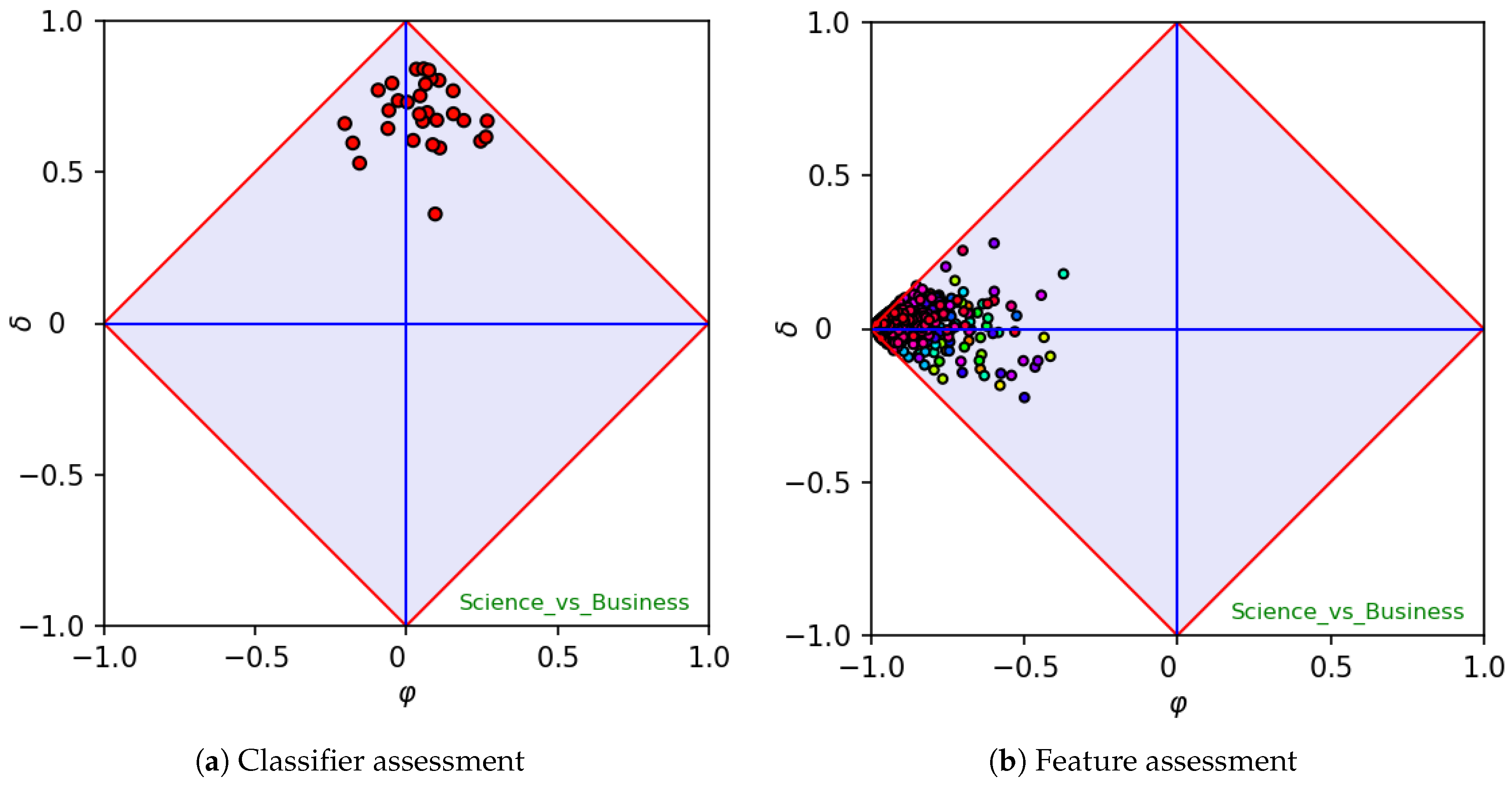
The left-hand side of
Figure 1 shows the results of a
k-fold cross validation. Each point in the diagram represents the outcome of the classifier on a different fold, measured in terms of
and
. Note that, whether bias and accuracy are embedded by the
x-axis and
y-axis, respectively, the variance can be visually inspected by looking at the scattering of all outcomes. Let us note that the corner at the top of a
diagram coincides with the behavior of an “oracle” (i.e., a classifier with this topmost performance is expected to never fail), whereas the bottom corner represents the behavior of an “anti-oracle” (i.e., a classifier which is expected to always fail). The left- and right-hand corners represent “dummy” classifiers, which would treat any unknown instance as negative and positive, respectively. As each feature can be seen as a “single-feature classifier”,
diagrams are able to outline the variable importance. Indeed, across many training samples, features could be typically sparse and/or numerous, leading to the so-called curse of dimensionality [
18]. To overcome this problem, feature ranking and/or selection is typically performed. Most of the corresponding algorithms require the evaluation of correlation coefficients between target class and independent features, for example, Pearson’s correlation coefficient [
19] or Cramer’s V [
20].
diagrams could be used along this perspective, as
shows to what extent the feature is characteristic or not, whereas
shows to what extent the feature is covariant or contravariant with respect to the positive category. As an example, let us consider the right-hand side of
Figure 1, which reports each feature as a point in a
diagram. Features that lie close to the right-hand corner of the diagram are mostly true (i.e., they are characteristic for the dataset at hand), whereas features that lie close to the left-hand corner of the diagram are mostly false. Conversely, features that lie close to the top/bottom corner are in strict agreement/disagreement with the positive category. The overall scattering in fact represents a “class signature”, from which a user can make hypotheses on the expected difficulty of training a classifier on the given data. As a rule of thumb, datasets whose signature is flattened along the
axis are expected to be difficult, whereas datasets in which at least one feature has been found to be in medium or high agreement or disagreement with the positive category are expected to be easy to classify. Note that a signature in which at least one feature is highly covariant or contravariant with the positive category allows for the conclusion that a classifier trained on the given dataset will be easy to classify. On the other hand, a “flat” signature is a strong indicator that a classifier trained on the given dataset
may reach poor results, although there is no strict implication for that. In particular, when at least one feature is located at the top or at the bottom region of the diagram (i.e., a feature exists whose absolute
value is medium to high), that feature is significantly discriminant and the corresponding
should be considered a lower boundary for the accuracy of a classifier on the given dataset. As
coincides with the unbiased accuracy remapped in
, the unbiased accuracy that corresponds to a generic
is in fact
. Hence, a dataset having a flattened signature along the
axis is expected to be difficult to classify, whereas datasets having a signature in which at least one feature is located in the upper or lower region of the diagram are expected to be easier to classify. Indeed, classification results typically confirm the conjectures made when looking at class signatures.
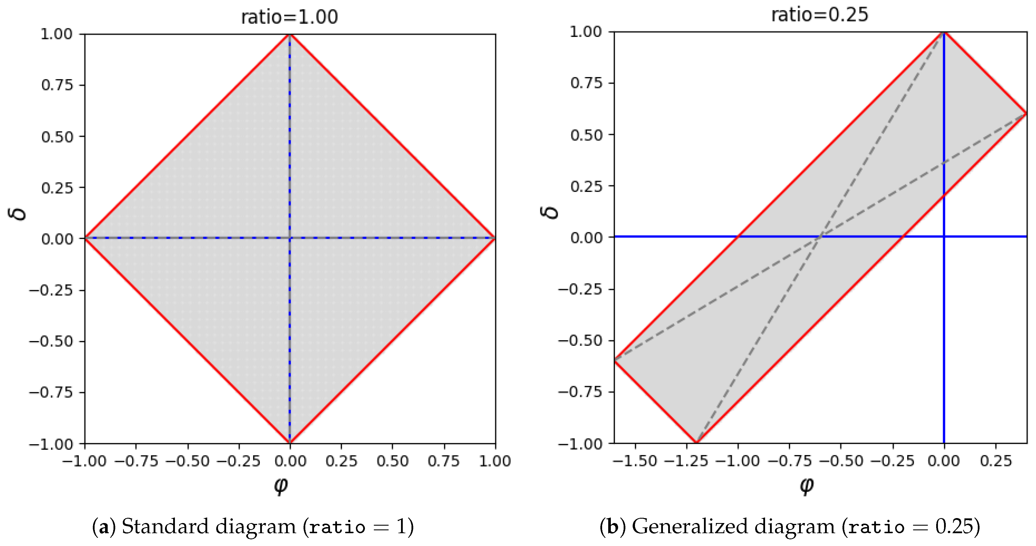
A generalization of
diagrams, able to account also for imbalance, has subsequently been proposed in the methodological publication authored by Armano and Giuliani [
21], which reports also a detailed study on all relevant isometrics. In particular, in their generalized version,
diagrams allow also for an investigation of the effect of class imbalance on performance measures (regardless of whether they are used for classifier or feature assessment).
Figure 2 reports a standard
diagram (on the left-hand side) and its generalization able to account for class imbalance (on the right-hand side). Of course, a standard
diagram, which is characterized by
, reports
and
as data that are in fact balanced, whereas for any other value of
ratio the diagram would be stretched accordingly. Let us note that isometrics of accuracy are in both cases straight lines parallel to the
axis. However, in the former case, accuracy and bias are in fact “unbiased”, meaning that the actual class ratio does not affect their evaluation. Rendering the formulas of accuracy and bias in terms of sensitivity, specificity, and class ratio, their “unbiased” counterparts can be obtained by simply setting
. We prefer to use the term “unbiased” rather than “imbalanced”, as these measures are calculated regardless of the imbalance of the dataset at hand, which may in fact be imbalanced or not. Other relevant isometrics are those related to specificity and sensitivity. Regardless of the adopted kind of diagrams, isometrics of specificity are straight lines parallel to the upper left edge of a diagram, whereas isometrics of sensitivity are straight lines parallel to the upper right edge (for more information on specificity and sensitivity isometrics, see reference [
21]).
In this article, the
software libraries are introduced, which were implemented to support the evaluation and the visualization of
measures as assessment tools of binary classifiers and variable importance. Implementations have been provided as
Python 3.x and
R packages. The former, made available as GitHub project, is given in both functional and object-oriented forms, whereas the latter, made available at the Comprehensive
R Archive Network (CRAN), includes also a web-application created with
R shiny. The remainder of this article is organized as follows: after a basic introduction to classifier and variable importance assessment with
measures and diagrams,
Section 2 outlines how to use
diagrams on example data.
Section 3 gives further details on the cited measures and on the required operational context. Materials and methods are described in
Section 4, whereas
Section 5 provides conclusions.
2. Results
This section describes some relevant use cases aimed at explaining the usefulness of diagrams. To better illustrate their characteristics, some experiments performed on real-world datasets (in a binary classification scenario) are reported hereinafter, with the twofold aim of investigating classifier and feature importance assessment.
Let us first consider a text categorization scenario, in which the absence or presence of a term in a document is presented by a binary feature. In this scenario, given a document corpus, when a term occurs in very few documents (i.e., the related feature is mostly false), it would be located in the left-hand corner of the diagram. Conversely, a term occurring in the majority of documents (i.e., the related feature is mostly true) would be placed in the right-hand corner of the diagram. In both cases, the term would not be helpful for the classification task. As for the discriminant capability, the feature corresponding to a term that occurs often in the documents belonging to the positive category and rarely in the negative category would be close to the upper corner of the diagram (where the value is highly positive). On the other hand, the feature corresponding to a term that occurs often in the negative category and rarely in the positive one would be close to the lower corner. In both cases, the term would be highly important for classifying the data at hand.
With the aim of illustrating the usefulness of
diagrams on real-world data, two datasets have been generated from
ODP. This project, which has been for two decades the largest publicly available Web directory, catalogs a huge number of web pages by means of a suitable taxonomy, each node containing web pages related to a specific topic. Categorizing web pages is an essential activity to improve user experience [
22], particularly when classes are topics [
23,
24] and when the page at hand must be labeled as relevant or not [
25]. In this scenario, both dataset has been generated from a pair of
ODP categories, whose samples have been preprocessed for extracting the corresponding textual content.
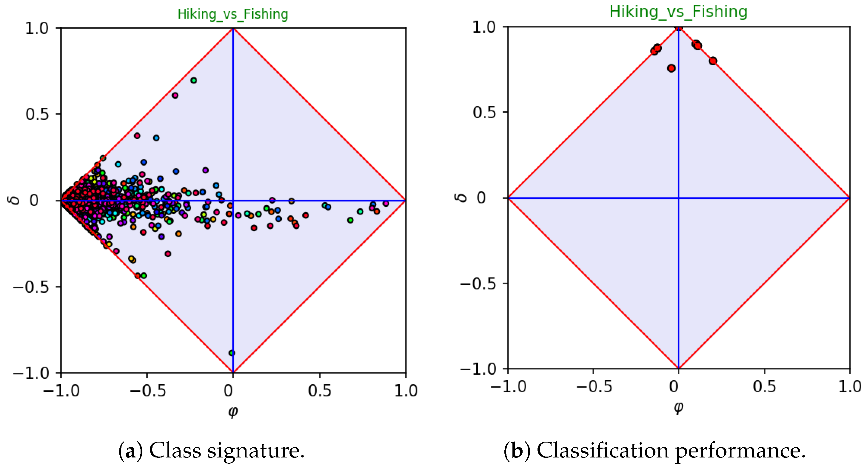
As a first example, let us consider a dataset, say
Hiking_vs_Fishing, obtained from the categories
Hiking (taken as a positive class) and
Fishing. These categories contain 225 and 295 web pages, respectively. The corresponding class signature is depicted in
Figure 3a, each point being associated to a single feature. Let us note that most features are located at the left-hand corner of the diagram, meaning that the terms they represent are rare and uncommon. This behavior is in accordance with Zip’s law [
26], which states that the majority of terms occur rarely in a given corpus. As for the features located at the right-hand side of the diagram, they are in fact
stopwords, as they typically occur very often in both categories. The first five high values of
in the
Hiking_vs_Fishing signature correspond in fact to the words “the,” “end”, “to”, “in”, and “for”.
Figure 3a clearly shows that the
Hiking_vs_Fishing dataset has several features with a significant value of
. In particular, one feature is located very close to the lower corner of the diagram, and, hence, it is significantly important for identifying the
Fishing category. Indeed, the feature is associated to the word “fish”. Conversely, meaningful features for identifying the
Hiking category would be the words “hike” and “trail”, which are located close to the upper corner of the diagram. Further important words are “mountain” and “walk” for the positive class—“angler” and “fly” for the negative class. Intuitively, as the signature highlights the presence of several important features, we were expecting an easy classification task. This expectation has been confirmed by performing a 30-fold cross validation, running a linear SVM classifier. The corresponding
diagram is reported in
Figure 3b, each point being the result of evaluating a single fold. The figure clearly points out that, as expected, the accuracy is high at each run.
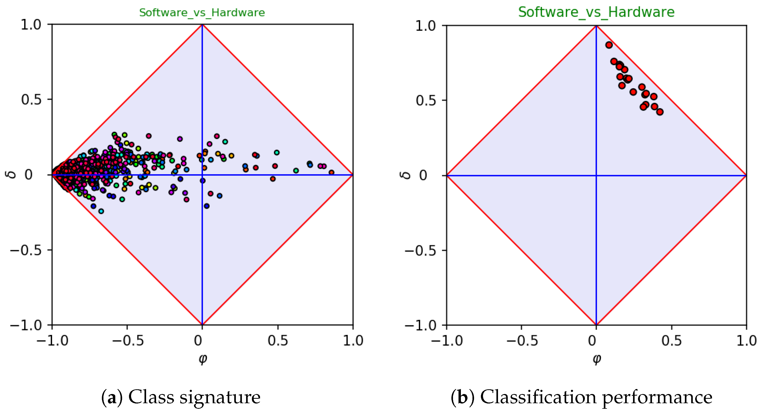
As a second example, let us consider a dataset, say
software-vs-hardware, taken from the categories
Software (positive class) and
Hardware, which contains 2206 and 564 samples, respectively.
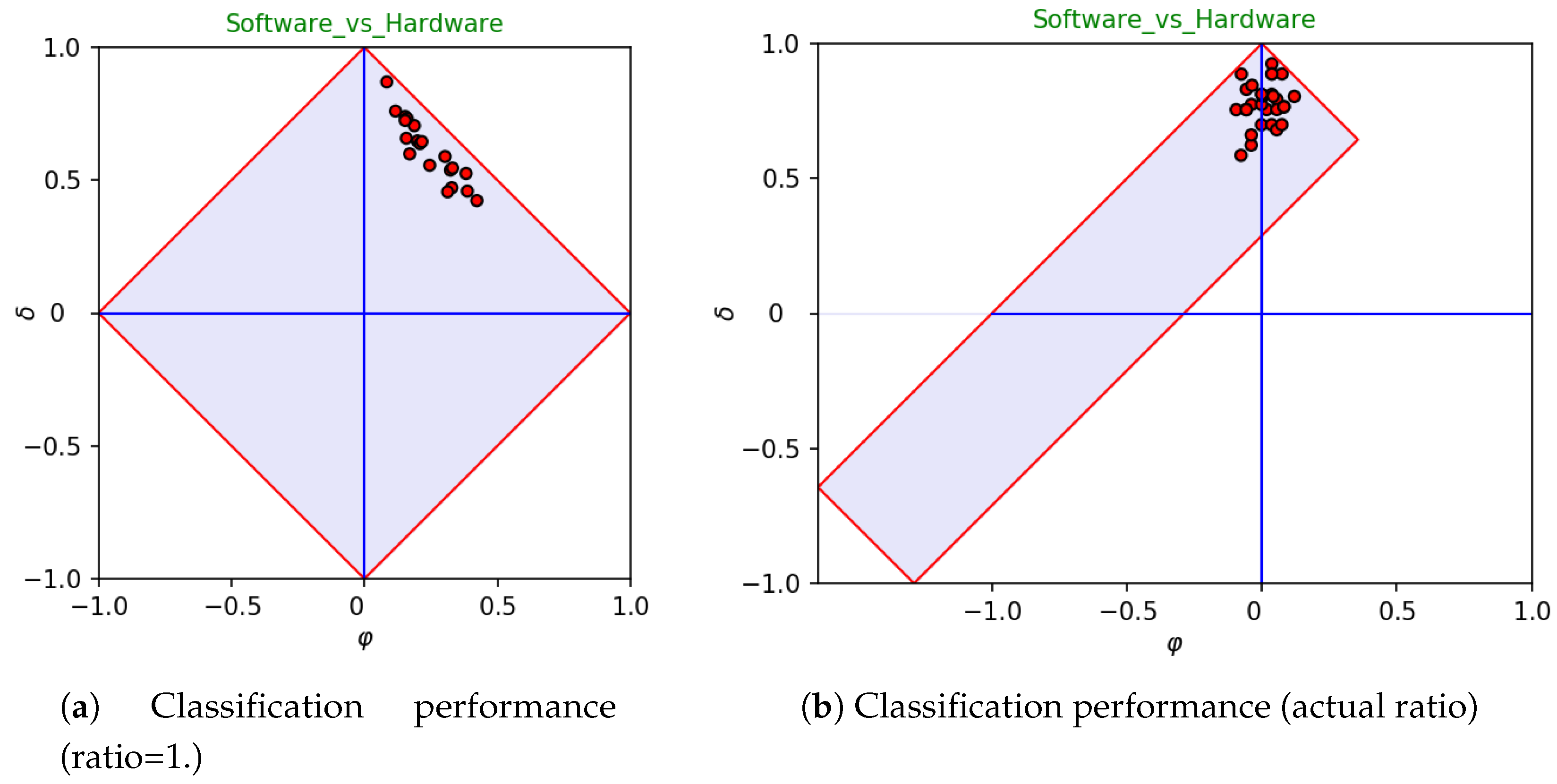
Figure 4 reports the signature and the classifier assessment of the dataset. In this case, the classifier assessment (right-hand side) has a clear bias towards the positive category. In fact, this is mainly due to the imbalance, as positive samples occur four times often more than negative ones (class ratio
). One may wonder whether the bias highlighted while plotting coordinates in a space in which
would still hold in a space in which the ratio coincides with the actual one.
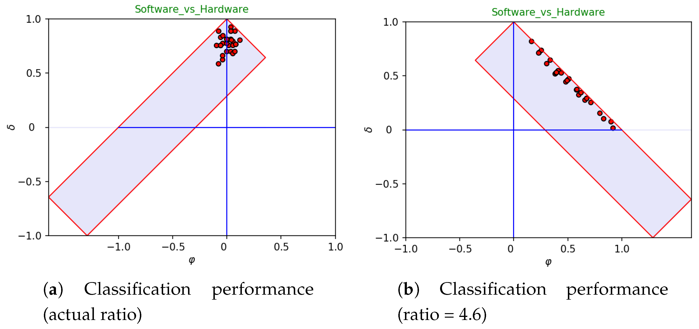
Figure 5 highlights that the bias is in fact imposed by the selected learning algorithm (i.e., linear
SVM), which is apparently affected by the imbalance of data. The left-hand side of the figure reports the outcomes
as if they would be observed in absence of imbalance, whereas the right-hand side clearly shows that the bias
vanishes (on average) if the actual ratio of data is used for plotting the performances obtained by the selected learning algorithm on each fold.
3. Discussion
Standard
measures and diagrams are strictly related to ROC curves, whereas their generalized version is strictly related to coverage plots. However, selecting either of them is not only a matter of personal taste. On the one hand, ROC curves or coverage plots should be adopted when the focus of interest is on specificity and sensitivity. In particular, one should use the former when interested in assessing the intrinsic properties of classifiers, whereas the latter should be adopted to check how specificity and sensitivity would be stretched depending on the actual (or guessed) imbalance between negative and positive samples. Standard and generalized
diagrams take place when the main focus is on bias and accuracy. Again, the former and the latter kinds of
diagrams should be adopted depending on whether the user is concerned on intrinsic or actual properties. Notably, the isometrics of accuracy in generalized
diagrams are straight lines parallel to the
x-axis, whereas the isometrics of bias are straight lines parallel to the
y-axis. This characteristic has been imposed by following a strict design choice, the underlying concept being that a user can make any sort of
“guess if” on the available data by changing the imbalance before visualizing data. In so doing, while assessing classifier performance, one is able to check at a glance the impact of imbalance on the overall accuracy of the system(s) under analysis. As an example, let us consider
Figure 6. The left-hand side reports all runs of a 30-fold cross validation in a generalized
diagram with ratio corresponding to the actual one. As already pointed out, in this case, the average bias reduces to zero. As expected, inverting the ratio (right-hand side) overturns the drift to concentrate on a small area of the diagram. In particular, all runs are now distributed along the straight line that delimits the right-hand side of the diagram (which has sensitivity equal to 1). This phenomenon is already evident in the standard
diagram (see
Figure 5a), and the ratio reversal makes it more evident. Moreover,
Figure 6b highlights that the sensitivity of all runs is approximately equal to 1, whereas their specificity varies along a wide interval (approximately from 1 down to 0.4). In fact, the high variation of specificity is “hidden” in the left-hand side, as the amount of negatives is small with respect to the amount of positives. Conversely, the differences in terms of specificity are made evident in the right-hand side, due to the ratio reversal.
As for feature assessment, the usefulness of
diagrams has been exemplified in
Section 2. In particular, it has been shown that the scattering of features (when considered as single-feature classifiers) on a
diagram can give useful and clear information about the difficulty of the corresponding classification task. Moreover, the importance of finding at least one feature in agreement or disagreement with the positive category has been commented and exemplified. Of course, as
represents the accuracy remapped in
, the best absolute value of
should be considered a lower bound for the performance of any classifier trained on the dataset under analysis.
Following the discussion above, it should be pointed out that ROC curves and diagrams are in a way complementary, and the adoption of one or the other depends on the focus of interest: the former should be preferred when the focus is on specificity and sensitivity, whereas the latter when the focus is on bias and accuracy. Changing the perspective from intrinsic to actual assessment, the same considerations hold for coverage plots vs. generalized diagrams.
The implementation of both standard and generalized diagrams is fully supported by the software libraries described in this article.
4. Materials and Methods
4.1. Short Summary on Diagrams
Let us start with a short introduction to
measures, which are the core functions for creating the corresponding diagrams (for deeper insights, please refer to References [
17,
21]). The standard definition of
and
is
where
and
denote sensitivity and specificity, respectively. As specificity and sensitivity are invariant with respect to the actual imbalance of the data at hand, this definition supports an analysis in which the user wants to measure the “intrinsic” characteristics of the classifier(s) or feature(s) under assessment. In the event that the user wants to account for the imbalance of data, the following generalized definition holds:
where
n and
p denote the percent of negative and positive samples that occur in the dataset at hand, respectively. The ratio between
n and
p gives exact information about the so-called “class ratio”. Needless to say, when the
ratio (i.e., when
), Equation (
2) reduces to (
1). Depending on a strict design choice, the
value corresponding to oracle and anti-oracle would be
and
–regardless of the imposed
ratio. On the other hand, the
value of dummy classifiers may change according to the
ratio. In particular, for low values of
ratio (which implies a majority of positive samples), the dummy classifier that always answer “yes” (right-hand side) becomes progressively closer to the oracle, and vice versa for the other dummy classifier. Conversely, for high values of
ratio (which implies a majority of negative samples), the dummy classifier that always answer “no” (left-hand side) becomes progressively closer to the oracle, and vice versa for the other dummy classifier. This should not be surprising, as it is well known that the accuracy obtained by a dummy classifier on a highly imbalanced dataset may be very good or very bad, according to the agreement or disagreement between the label of the majority of samples and the default answer of the classifier.
4.2. Implementation of Diagrams
As for the implementation of
diagrams,
Python (
https://www.python.org/) and
R (
https://www.r-project.org/) have been selected, due to the fact that they are the most popular programming languages in the community of data scientists, with substantially growing importance over the last years. Regardless of their original design (the former is a general-purpose programming language, subsequently enriched with support for array-based computation, whereas the latter is born as a statistical programming language), nowadays both languages provide great support—in terms of ad-hoc libraries—for data mining and data analysis. Having selected the cited target languages, care has been taken to keep the
same interface of the main functions for both
Python and
R.
Before getting into details with the available functions, let us spend a few words on the format of data. In principle, a dataset for supervised learning is made up of a set of samples, each sample being a pair —where x and y denote a list of feature values and the label of the target category, respectively. The simplest setting consists of binary problems, in which only two categorical values are given (e.g., and ). In practice, the standard representation of a dataset separates instances from labels, in such a way that the former are embedded as two-dimensional array (say data)—the latter as a one-dimensional array (say labels). For instance, assuming that the available samples are 500 and that each instance is described by a list of 20 feature values, data would be an array with 500 rows and 20 columns, whereas labels an array with 500 rows (and one column).
With these underlying assumptions in mind, three high-level functions have been devised:
phiDelta.convert,
phidelta.stats and
phiDelta.plot. The first should be called to convert standard performance measures (i.e., specificity and sensitivity) into
values; the second to evaluate statistics on the data at hand (features only); the third to plot
values into a
diagram. With
ratio denoting a value of class imbalance and
info denoting structured information about the data at hand, the interface of these functions follows hereinafter (optional parameters have been marked with an asterisk):
Note that both Python and R implementations adhere to the given interface and use the same function names. The agreement between names depends in fact on the interpretation given to the character “.” in the cited languages. In particular, in Python it denotes an ownership or inclusion relation (e.g., between an object and one of its slots or methods, or between a package and one of its components), whereas it can be freely used in R as part of a variable or function name. According to the underlying semantics, in the proposed syntax, the name phiDelta.plot in Python actually denotes the function plot as belonging to the package phiDelta, whereas in R it denotes a function name.
Let us briefly summarize the involved parameters from a pragmatic perspective, which acknowledges the array-based encoding as de-facto standard in the field of data analysis (more details are given on the optional ones to facilitate their usage):
specificity and sensitivity are two one-dimensional arrays, which are used as input parameters when a conversion is invoked. They must have equal size, as in fact—taken together—they embed pairs.
phi and delta are two one-dimensional arrays. They must have equal size, as in fact—taken together—they embed pairs.
data and labels denote the available input instances and labels, as two- and one-dimensional arrays, respectively. They must have the same number of rows.
info is an optional data structure (i.e., a dictionary in Python and a list in R) expected to contain information about the dataset at hand. In particular, the following information should appear therein: (i) the name of the dataset, (ii) a short description, (iii) a list of features, (iv) a list of class names, and (v) an assertion of which class name(s) should be considered positive. The default value for info is null. The value null has been used here to represent a null value, which in Python is denoted as None, whereas in R it is denoted as NULL. In the absence of explicit information, class names would be retrieved from labels, features names would be automatically generated (as ), and the positive class would be the first class name (taken in alphabetical order).
names is an optional one-dimensional array of strings, each string being intended to document the corresponding pair. Different semantics may hold for this parameter, depending on the underlying context. For classifier assessment, it is expected to embed classifier (or fold) names; for feature assessment, feature names. In both cases, the size of the array must be equal to the size of phi and delta. Being optional, the default value for names is null.
ratio denotes the class imbalance (i.e., the ratio between negative and positive samples). As output parameter of the function phiDelta.stats, it represents the actual ratio found on the dataset at hand. As an input parameter of the function phiDelta.plot, it controls the way a diagram is stretched (the default value is 1). When , the corresponding diagram would be a perfect rhombus. In so doing, data would be subsequently drawn as they were in fact balanced—regardless of the actual imbalance.
It is worth recalling that the possibility of “playing” with ratio as input parameter to phiDelta.plot allows the user to perform any sort of guess if on the corresponding performance measures. For instance, let us suppose that the actual ratio of the dataset at hand is 4 (meaning that and ). Notwithstanding the actual ratio, one may want to check a situation in which the ratio is assumed to be equal to (meaning that and ). This is a typical reversal of perspective, which might be very useful while trying to estimate the performance of a given classifier on different scenarios. In other words, under the assumption of statistical significance, imposing a ratio allows a user to come up with a useful estimation of a classifier performance in the event that the actual ratio would coincide with the one imposed as a parameter. As for the range of possible values, although in principle any positive value could be imposed, only those that fall in the interval are allowed. In fact, although there is no conceptual reason to constrain the interval in , in practice, “stretching” a diagram outside these values would not be useful.
4.3. Python Package
For Python users, the package is provided as a GitHub project under the following requirements:
Project title: Phi-Delta Diagram
Package name: phiDelta
Operating system (s): Platform independent
Programming language: Python (≥3.4.x)
License: GPL (≥2)
Any restrictions to use by non-academics: none
As pointed out, the package provides two different implementations: object-oriented and function-based. The interface of the latter has been made equal to the one provided in R and is derived by wrapping the former. Using either of them, however, is a matter of personal taste. Some details are given hereinafter on the object-oriented implementation, whereas the latter will be illustrated with less detail. This does not necessarily mean that the object-oriented implementation should be preferred. Considering that the function-based interface is the same for Python and R, the interested reader can obtain the missing details by reading that part of the article. Both implementations are embedded in the package phiDelta. Let us point out that the function-based implementation—which fulfills the common requirements posed for both Python and R implementations—is in fact a wrapper for the object-oriented implementation of diagrams. This choice has been made to guarantee the same behavior to both implementations while avoiding unnecessary redundancy.
4.3.1. Python Object-Oriented Implementation of Diagrams
The object-oriented implementation of diagrams has been obtained focusing on the goal of separating the underlying performance model (see listing 1, which reports the core functions) from the graphical representation of results (see listing 2, which reports the interface of class View). It is worth noting that View is derived from Geometry, the latter class being focused on calculating all relevant details that characterize the shape of a diagram according to the given ratio. Furthermore, a separate class entrusted with performing statistics (i.e., Statistics) has also been provided. In turn, it uses the class Feature, which is repeatedly involved for handling the processing of each feature.
A few comments on the functions provided by model follow:
phidelta_std transforms specificity and sensitivity into standard coordinates.
phidelta_std2gen transforms standard coordinates into generalized ones, according to the ratio given as parameter.
make_grid generates a grid of points, to be subsequently plotted in a diagram (N is an input parameter). This operation is provided for testing only. The visualization of a grid should be the first test to be made for checking the installation of the phiDelta package.
random_samples generates M random samples of values, which are subsequently plotted in a diagram (M is an input parameter). This operation is provided for testing only.
![Make 01 00007 i001]()
![Make 01 00007 i002]()
The following comments refer to the class View, which visualizes the diagrams:
plot should be invoked to plot data in the current diagram.
__lshift__, which overrides the operators “≪”, is used here to control the way a diagram is drawn. An example of how to use it is given hereinafter (see Listing 4).
__rshift__, which overrides the operators “≫”, is used here to control the way a diagram is drawn. An example of how to use it is given hereinafter (see Listing 4).
Let us now give some example code, to help programmers in the task of classifier and/or feature assessment. Listing 3 shows how to obtain the results reported in
Figure 1, whereas Listing 4 shows how to obtain the results reported in
Figure 1b.
As for Listing 3, data, labels, and info are first loaded from file (although some facilities are part of the library, in principle the user is responsible for properly implementing them). Then 30-fold cross validation is performed on the given data using a linear SVM (although the corresponding function is not part of the package, it is easy to implement it by importing svm.svc from sklearn). Finally, the resulting values are plotted using a View object (with ) created on the fly.
![Make 01 00007 i003]()
As for Listing 4, data, labels, and info are loaded from file. Then, statistics are calculated on the data at hand. Subsequently, the color map of the plot (i.e., cmap) is set to cool and the default option of filling the diagram with a default background is removed from the current options. The functions options and settings have been used to simplify parameter passing. In practice, the former returns a tuple containing its arguments, whereas the latter a dictionary containing keyword-value pairs. Finally, the resulting values are plotted by using a View object created on the fly.
![Make 01 00007 i004]()
4.3.2. Python Function-Based Implementation of Diagrams
The function-based implementation has been obtained (except for convert) by wrapping the object-oriented one. With this idea in mind, let us give information about the way it has been actually performed, with the goal of mimicking the corresponding implementation in R. Listing 5 illustrates the definition of the functions phiDelta.convert, phiDelta.stats, and phiDelta.plot.
![Make 01 00007 i005]()
4.4. R Package
The package is available for R users under the following requirements:
Project title: Phi-Delta Diagram
Package name: phiDelta
Operating system (s): Platform independent
Programming language: R (≥3.4.4)
License: GPL (≥2)
Any restrictions to use by non-academics: none
As mentioned above, the R package is designed similar to the function-based Python implementation of the diagrams. Listing 6 illustrates the main functions provided in the R package phiDelta.
The function
phiDelta.convert contains transformation formulas (see Equation (
1)) to convert given specificity and sensitivity to
values. It is conceived for the use of classifier assessment.
Function phiDelta.stats is designed for feature assessment, i.e., values are calculated based on the input parameters data and labels. It provides a logical value ratio_correction. By default the parameter is true and calculates and with respect to the ratio between positive and negative samples in the labels parameter.
In the case ratio_correction = FALSE, the ratio is set to one. The output of phiDelta.stats is a list with four objects. The first three objects are each vectors of values, values, and the corresponding names of the features. The last object is the class ratio calculated from the data. The outputs retrieved from phiDelta.convert and phiDelta.stats are compatible with the input parameters of the phiDelta.plot function, whereby names and ratio are not mandatory. In phiDelta.plot and are plotted in a diagram with default ratio = 1. Several graphical parameters can be passed, such as different isometric lines or points, which should be highlighted in the diagram.
Furthermore, the
package contains a small example dataset for feature assessment. It is called
climate_data and consists of meteorological data from a weather station in Frankfurt (Oder), Germany from February 2016, which has been implemented in the EFS package [
27]. The class variable is the boolean variable
RainBool, which is 0 for no rain and 1 for rain. On the basis of that
climate_data, Listing 7 shows an exemplary usage of the
R functions. The outcome plot of the example is shown in
Figure 7.
![Make 01 00007 i006]()
![Make 01 00007 i007]()
4.5. Web Application
Due to the relevance of our
software for researchers who are not very familiar with programming languages like
Python or
R, we also provide a web application at
http://phiDelta.heiderlab.de. It contains all functionalities mentioned above. If users want to evaluate the distributions of the feature points in the
diagram by a ranking of features, there are different options implemented.
The ranking is displayed in a table underneath the diagram plot and can be download as a CSV file.
Additionally to the R package, the web application provides the opportunity to graphically identify single feature points by moving the curses over the plots and zooming in the diagrams. By marking features in the feature ranking table, the corresponding feature points are highlighted in pink in the diagram.
5. Conclusions
In this article, two relevant software libraries for calculating measures and visualizing the corresponding diagrams have been introduced and described. Their implementation is provided in both Python and R, which are two very popular programming languages widely acknowledged by the data mining community. Great attention has been taken to guarantee the same interface for the end user, at least for the function-based interface. In addition, the Python library provides an object-oriented implementation of the cited measures and diagrams, whereas the R library is enriched with an online interface. The library to be used largely depends on personal taste or on constraints dictated by the underlying environment. Along the article, several source listings have been given to facilitate users in the task of devising and experimenting the proposed performance measures. It is worth noting that, on the Python side, more details have been given to illustrate the object-oriented implementation, as the function-based implementation is in fact obtained by wrapping the object-oriented one. For both languages, all relevant information has been given to help users to understand how the libraries are used. As for the R side, further details have been given to illustrate how the online interface can be accessed and used. diagrams are a mandatory alternative to ROC curves when the focus is on accuracy and/or bias rather than on specificity and sensitivity. Moreover, they are a powerful tool for studying the characteristics of any given dataset, which can be estimated as easy or difficult to classify, depending on the overall “signature” that its features depict in a diagram. To this end, some examples of signature generation have been described and commented. We deem that the proposed implementations of measures and diagrams, depending on their availability in two very popular programming languages, will be very helpful for a wide range of researchers.
As for future work, we are planning to improve the capability of performing feature analysis also for nominal features. In fact, although already experimented in both languages, they are not fully supported in the current release of the libraries. A technique that generates a set of binary features starting from a nominal feature is currently under development. Notably, this binarization process is a mandatory step for assessing the importance of nominal features (see also Reference [
21] for more information on this aspect).


