Article

Analysis of the Use of Color and Its Emotional Relationship in Visual Creations Based on Experiences during the Context of the COVID-19 Pandemic

by
César González-Martín
1,
Miguel Carrasco
2,* and
Germán Oviedo
2
1
Facultad de Ciencias de la Educación, University of Cordoba, San Alberto Magno, 14071 Cordoba, Spain
2
Facultad de Ingeniería y Ciencias, Universidad Adolfo Ibáñez, Av. Diagonal Las Torres 2700, Santiago 7941169, Chile
*
Author to whom correspondence should be addressed.
Sustainability 2022, 14(20), 12989; https://doi.org/10.3390/su142012989
Submission received: 14 September 2022 / Revised: 3 October 2022 / Accepted: 5 October 2022 / Published: 11 October 2022
(This article belongs to the Section Psychology of Sustainability and Sustainable Development)

Abstract

:
Color is a complex communicative element. At the level of artistic creation, this component influences both formal aspects and symbolic weight, directly affecting the construction of the message, and its associated emotion. During the COVID-19 pandemic, people generated countless images transmitting the subjective experiences of this event, and the social network Instagram was used to share this visual material. Using the repository of images created in the Instagram account CAM (The COVID Art Museum), we propose a methodology to understand the use of color and its emotional relationship in this context. The proposed methodology consists of creating a model that learns to recognize emotions via a convolutional neural network using the ArtEmis database. This model will subsequently be applied to recognize emotions in the CAM dataset, also extracting color attributes and their harmonies. Once both processes are completed, we combine the results, generating an expanded discussion on the usage of color and emotion. The results indicate that warm colors and analog compositions prevail in the sample. The relationship between emotions and composition shows a trend in positive emotions, reinforced by the results of the emotional relationship analysis of color attributes (hue, saturation, and lighting).

1. Introduction

The coronavirus (COVID-19) pandemic generated a collective experience worldwide with limitations on our freedoms through confinement, social distancing, and travel restrictions, among others, changing our daily lives. In this context, social medias such as Twitter, Facebook, Instagram, TikTok, etc., became essential spaces for the communication and dissemination of health policies [1], education [2] and for maintaining social contact [3], as well as channels for creating and spreading messages with different emotional loads [4,5], in different formats. Unlike other social networks, Instagram is one of the networks where stories and visual content-based social media predominate. Thus, its main advantage over other social networks is its used for interpersonal relations, documentation, coolness, self-promotion, or creativity [6,7].
During the pandemic, diverse artists used Instagram to share visual creations showing their personal visions about this event. This gave rise to the virtual museum called COVID Art Museum (CAM) on Instagram (@covidartmuseum), considered to be the first museum dedicated to art produced during the pandemic [8]. In this way, these digital creations became a source of information to understand and analyze the subjective experiences lived during the pandemic. They can also identify common patterns among users in representation strategies to communicate their experiences through visual language, as it has been a global event.
In light of an event with an evident negative emotional charge, as the experience of the pandemic has tended to be [5], a study is required to go deeper into subjective emotions to be able to empirically affirm the emotional effects produced by this event. Thus, our question is whether it is possible to know the emotions expressed via visual creations with the use of color in the compositions compiled on CAM, through a quantitative visual analysis methodology based on deep learning tools. Through the proposed methodology, it is possible to detect common patterns in users’ creations to understand if there are recurrent emotional discourses through color attributes.
The novelty of this article is to use the color extracted from digital creations shared by users in a social network, through an automated methodology to relate the emotional stage and the chromatic palettes and compositions used in these images. The key aspects of understanding color, its emotional relationship, its symbolism and the extraction of emotions through computational techniques are then introduced.

1.1. About Color

Visual creation involves making decisions about using representative elements, which affect the low-level formal aspects of the image [9] and its high-level significance, symbolic charge, and emotional level [10]. Color acts on both levels within these decisions and can express abstract concepts [11].
Thus, color is a semantic indicator that affects the composition of the image by manipulating hue (color), saturation (chroma) and luminosity (value), and its combinations with other colors. This generates contrasts, rhythms, balance, and harmonies, which in turn constructs the aesthetic experience, and ultimately transmits the intended message for communication, which will have an associated emotion [12,13].
There are models to describe the relationships between colors. Eiseman [14] points out the most conventional ones. With monotones, there is only one neutral color (off-whites, beige, grays, and taupe are considered neutral). In monochromatic works, a hue and its chromatic variables are used. Analogs or adjacent tones are close to each other in the chromatic circle and share a common color (usually a primary) in their composition, creating the most harmonies [15]. Complementary tones, which are directly opposite in the chromatic circle, create a simultaneous contrast that visually vibrates both tones (see more in [16]). Split-complementary consists of two adjacent colors combined with a complementary in the chromatic circle. Triads are three colors equidistant at an angle, and finally, tetrads are two pairs of complementary colors. Thus, through color combinations, we can accentuate the constituent colors’ characteristics and create more or less harmonious, balanced, and rhythmic compositions.

1.2. Significance, Symbology, and Emotion in Relation to Color

Research on color is very broad and extends to different areas of knowledge, such as marketing and advertising [17], design in different fields [18], consumer behavior [19], psychology [20], tourism [21], therapeutic treatments [22], and of course, art. The complexity of the study of color lies in its characteristics as an element that can function as a sign and as an object in itself, transmitting a meaning without being associated with an object [23]. When one color is associated with another, the syntax of color (sign + sign) occurs in a visual relationship that develops the aesthetic experience and a more complex conceptual message.
At the semantic level, color can function as an icon through a resemblance to an object—for example, orange is associated with fire. Color as an index is an indication, as is the example of the color of the fruit in its ripening, or the white on detergent packaging [24]. As a symbol, color is something we learn, a convention [11]. For instance, red on a traffic light means to stop driving, or certain colors on a flag represent a specific community.
Our relationship with colors is associated with events, objects, concepts, emotions, etc. [25], and it is assumed through the repetition of learnings based on experiences [26], with which individual knowledge is acquired. People therefore differ when it comes to associating an adjective with a color [27]. For example, the preference for one color over another may be determined by the association between color and object according to a color concept network [28] or the ecological valence theory proposed by Palmer and Schloss [29]. However, these reasons for preferences may be diverse [30]. For example, due to their biological conditions, dichromats prefer yellow colors over blues, and trichromats prefer the latter [31].
If personal peculiarities influence the perception and significance of color, and learning is personalized, color cannot be shared universally [30,32]. Thus, there is no evidence of universality on color preference from a gender perspective in research, detecting some differences between sexes [33,34]. Ou et al. [35] point out that “female observers tended to associate “like” with the color pairs that were “light”, “relaxed”, “feminine”, or “soft”, whereas this association did not occur for male observers” (p. 298). For their part, Valdez and Mehrabian [36] find that women are more sensitive to luminosity and saturation, although they recognize that the emotional reaction is similar.
Another characteristic that marks differences in color preferences and emotions is age [37,38]. Schloss and Palmer [28] explain that “(…) color preferences can and do vary systematically over time” (p. 95). On-time, Palmer and Schloss [29] point out that preferences over colors are kept or changed based on the experiences with the object, or the change “(…) such as boredom, new physical or social circumstances, or fashion trends, change the dynamics of aesthetic response, as indeed they inevitably do” (p. 8881).
If we consider cultures and geographical situations, Ou et al. [39] point out differences in emotions concerning color. However, in a subsequent study, no significant differences arose in the combination of colors in relation to emotions [35]. For their part, Xin et al. [40,41] show specific differences between regions about color attributes. Comparing industrialized and non-industrialized societies, Taylor et al. [42] find few coincidences in color preferences. Elliot and Maier [26] point out that particular meanings and effects produced by color are associated with cultures. On the contrary, Gao et al. [43] find uniformity between perception and emotion between cultures, thus eliminating experiential learning. Jonauskaite et al. [44] bring significant coincidences between members of the same cultural group to recognize emotions and find universalities between groups. As has been shown, the literature describes two antagonistic viewpoints about the universality of emotion related to color.
Different relationships have been demonstrated regarding the impact of color attributes to generate sensations and emotions. Valdez et al. [36] showed that saturation and value have an important effect on emotions. Along the same lines, Suk and Irtel [45], Manav et al. [27], and Schloss et al. [11] agree that the most influential factors for an emotional reaction are value and chroma, but all depend on the context of the observer [40,41]. Gong et al. [46] and Ou, et al. [39] point out differences in the attributes’ influence depending on the sensation you want to achieve. Thus, the chroma is more decisive for the sensation in the color temperature (cold-warm), while the lighting produces the heavy-light sensation. In some cases, such as the hard-soft feel, it is related to both attributes, chroma, and luminance [39]. Schloss et al. [11] show that judgment about happiness and sadness is determined by the chroma and luminosity of color, noting that dark blue is happier than dark yellow. By contrast, at the perceptual level and preference in color, the hue attribute seems to be more determinant than the value and chroma [46].

1.3. Color and Emotion: From Computing to Deep Learning

The extraction of emotion in digital images is more complex than other types of operations since it is subjective to the evaluator and can be influenced by different factors such as color, shapes, the appearance of lines, and the emotional bias of observers themselves [47]. This makes recognizing emotions a complex problem since they are not presented in their pure form in a digital image. The combination of different emotions in the same image is often present, making its evaluation subjective and difficult to determine empirically [48]. To attach the images with a particular emotion, it was necessary to use a categorical model from psychology, which is based on Categorical Emotional States (CES) and in the Dimensional Emotion Space (DES). The CES model considers a limited set of emotions such as fear, disgust, sadness, happiness, among others [49], emotions which can be separated into positive, negative and neutral categories.
Despite these limitations, a new approach to solving the problem of emotional analysis and extraction in different types of images has emerged thanks to the development driven by Convolutional Neural Networks (CNN) [50]. CNN facilitates extracting patterns automatically without requiring manual extraction work. CNN manages to extract and generate discriminative characteristics through a supervised learning process where the categories of the problem are previously known. In this way, CNN manages to separate highly non-linear and correlated characteristics on different sources of information. At present, the range of applications involving CNN is vast and diverse, achieving the extraction of patterns on various problems and domains [51,52,53].
The first advances in detecting emotions through CNN correspond to the work developed by Kim et al. [54] and Razavian et al. [55]. The authors used the network proposed by Krizhevsky [50] with some modifications in the increase of data or through incorporating other sources of information (labels or audio). Therefore, the research focused strongly on face recognition, an active research area in recent years.
An essential key to interpreting emotion lies in analyzing the objects present in the images. However, this is not the only information available. In this regard, Kim et al. [56] and Priya et al. [57] aim to integrate both information from objects and the background of images and low-level features. Although color is a low-level characteristic, it has an important relationship with the object and the meaning of the image. On the other hand, Rao et al. [58] propose the combination of multiple CNNs that consider the detection at a high level of the semantics of objects, such as colors, textures, and even aesthetics. Although CNN networks initially did not use these elements, their incorporation has improved the performance at a global level in the detection of emotion.
Although color begins to be relevant in the analysis, it is essential to understand that color can generate different emotions according to different cultural identities [44]. It is important to understand that color is not a static unit; it can be transferred and thereby affect the emotion generated in the observer [59]. One of the first works in this area was proposed by He et al. [60], which offered a tool to modify the color according to the target emotion. Other works have deepened this analysis either through the combination of different CNN [61] or by employing a relationship between color and texture, improving the relationship of color harmony [62].
In recent years, the analysis of color and how it affects the interpretation of emotion has begun to draw greater interest from the scientific world [59]. For example, Ram et al. [63] studied the relationship between color and emotions through an extensive questionnaire applied to more than 900 subjects. It is interesting to note that the results may vary more by observers’ age than by gender. However, not all color combinations generate a correlation with emotion. In this sense, Takada et al. [64] analyze the meaning of emotion when analyzing color and grayscale images. It is interesting to note that color images generate a more significant effect (positive or negative) on the observer.

1.4. Affective Computing

The oldest theoretical approaches to affective computing have existed for almost thirty years [65]. In recent years, it has been possible to advance in the understanding of images and how they induce different emotions in the observer [66] mainly due to the enormous advance in computational techniques. Zhao et al. [67] call this task “Analysis of the Content of Affective Images”. For input, they use the development of emotional models based on affective image datasets and quantitative methods to carry out this task.
From a computational perspective, it is necessary to have images as representative labels of some of the emotional models mentioned above [68]. There are multiple datasets in the literature, with different image typologies, emotion models and modes of use, in both continuous and discrete forms (see more details in Zhao et al. [66]). In general, datasets are composed of digital photographs. However, there are also datasets focused on the domain of artistic images. In this line, there are the datasets of ArtPhoto [10], MART [69], devArt [69], WikiArt [70] and ArtEmis [71], all in Categorical Spaces of Emotion. Both WikiArt and ArtEmis share that the WikiArt project is used as an image source.
As we discussed in this section, the literature on color and emotion is very broad and diverse. By way of summarizing the main findings, Table 1 separates the main commonalities and differences concerning color by category.

2. Materials and Methods

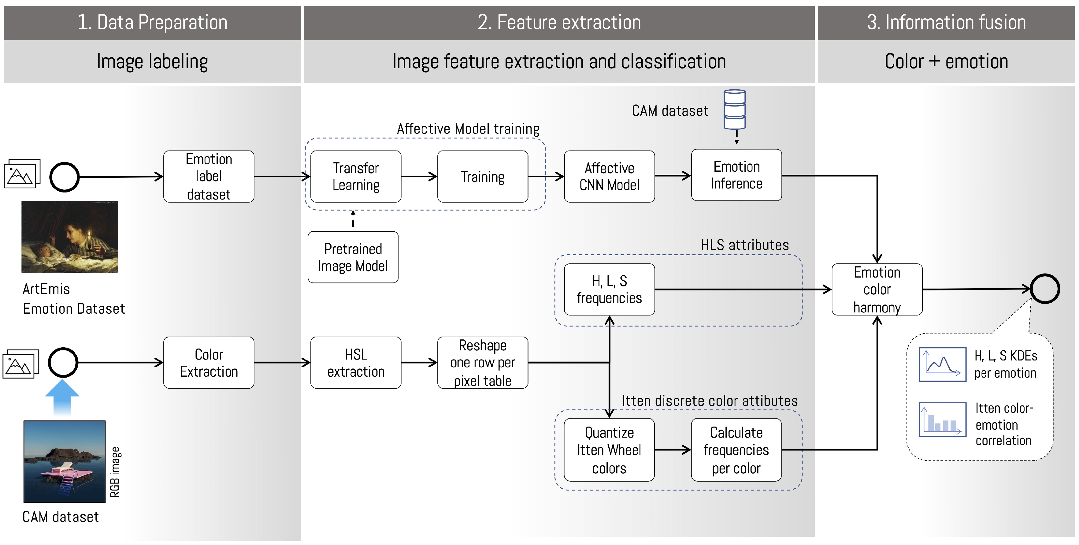
The proposed methodology focuses on understanding at a formal and emotional level the use of color in the visual representations of the subjective experiences lived during the pandemic, using the collection of images of the COVID Art Museum (CAM) on Instagram. For this, an analysis is proposed that includes three stages: (I) emotion extraction based on deep learning techniques, (II) extraction of color and its harmonies, and (III) fusion of emotion and color information. Below, we detail each step.
Step (I) Extraction of Emotions: As we have previously described, techniques based on deep learning have made enormous advances for extracting emotions in different types of images. This research uses, in particular, the ArtEmis dataset (Figure 1), which contains 454,684 emotion attributions and explanations from humans, on 80,031 unique artworks from WikiArt [71]. Emotions were binarized into positive (awe, amusement, contentment, excitement) and negative (anger, disgust, fear, and sadness). The authors recognize that awe can be considered negative as well. We also consider the category Something else in a separate form, which was used to express non-considered emotions or a lack of emotional reaction by the observer (Ibid).
The ArtEmis dataset consists of one or more files separated by CSV commas, which contain a web address of an image available on the WikiArt platform. Each of them is associated with nine numerical attributes (one per emotion), which encode the emotions of people who observed and reported the emotions they felt during the experiments. To automate this process, we have used the standard library for HTTP requests (via the Python 3.8 language) in order to download images previously classified by ArtEmis.
The training stage of the model consists of designing a CNN network that aids in understanding emotions of a previously labeled dataset; in this case, on the ArtEmis dataset. This allows the CNN network to extract underlying patterns in the data which describe emotions in digital images. Subsequently, the learning acquired on ArtEmis is applied to the CAM dataset (Figure 1) through inference of the model. The CAM dataset was extracted via a web scraping technique using Open Source Intelligence software [72]. This software allows the massive extraction of information through a command line. For this study, 1537 images were downloaded from the CAM in May 2021, corresponding to different types of digital art such as photographs, photomontages, digital paintings, or drawings.
The inference stage allows the extraction of emotions associated with a vector of probabilities for each of the images of the CAM. This process is relevant since the inference is made on an unknown set in the CNN network training process. Subsequently, the network generates a vector of emotions that will later be related to the color methodology. In particular, this study has used ResNet-34 architecture [60], which has been initialized with weights from the ImageNet dataset. However, in the exit layer, we have replaced the original architecture with a layer of nine values associated with emotions.
Step (II) Color Analysis: This stage uses color extraction to convert the RGB color model to the HSL (Hue-Saturation-Value) model. The HSL model is considered intuitively more straightforward than the RGB model to explain color mixing [73]. This type of transformation allows an aesthetic analysis of color. The colors used by an artist depend on light, so it is appropriate that it is a dimension of the color model to be used for artistic analysis [73]. Once this process is complete, each channel (HSL) is transformed into a list of independent values. Two threads are then performed in parallel:
a.
Estimation of frequencies through a histogram and subsequent estimation of a kernel density function (KDE). The density function makes it possible to estimate the probability of a given function. This is relevant for combining emotions within a particular distribution.
b.
Color quantization based on the Itten color palette. The colors of each image are quantized in relation to the Itten palette. The composition of each group and the harmony relationships present in the palette are then analyzed. In particular, we seek relationships of the analog, complementary, split-complementary, and triad types in the previously clustered groups, among other types. Thus, it is possible to inquire about the essence of colors in the image. This type of analysis aids in finding the harmonies detected according to the frequencies of relationship, which is related to the composition and aesthetics, whether more or less harmonious, balanced, or rhythmic. For this, an angular measurement between the colors expressed in the Itten palette is used to determine the relationship between the colors that make up the color wheel.
Step (III) Information fusion: After extracting the emotional set from each image, color harmonies, and density functions (KDE) for each color, we carried out an analysis via correlations to measure the Kendall Tau coefficient between these elements. This coefficient was chosen above others due to being a non-parametric ranking-based measurement [74], which thus did not depend on more restrictive linearity assumptions.
This process allows an in-depth analysis of the existing relations between colors (and their combinations) in relation to emotions, and to determine the existence of color patterns and their combinations with greater and lesser correlations for the analyzed dataset. In this way, the results obtained let us answer our initial research question. This process is described in Figure 2.

3. Results

This section presents the results obtained by the proposed methodology and the discovery of emotional discourses through the use of color attributes. As we will review below, the analysis of color and emotions presented in the methodology uses two independent paths processed in combination.

3.1. Color Analysis

In the first step, the quantitative information of the color is done through the decomposition into HSL channels (step II). Subsequently, these results are processed, searching for possible relationships of harmonies and contrasts. An angular measurement between the colors expressed in the Itten palette is used to achieve this, described in terms of absolute frequencies. This analysis shows a more significant presence of analog and complementary combinations compared to other harmonies (Figure 3). Colors used in the compositions share a color with each other, or an opposite or complementary color is present in the palette.
When analyzing the relationships of analog harmonies in detail, the combinations yellow-orange, orange, red-orange, orange, red-orange, red and yellow, yellow-orange, orange stand out, which correspond to 72% of the total of analog harmonies (Table 2). In contrast, analogous harmonies with blue, green, and violet colors account for less than 10% of the sample. These results are relevant since the frequency of appearance of the red-orange color shows a high frequency for analogous harmonies, and the blue-green combination shows a high frequency in complementary harmonies (Table 3). In the case of complementary combinations, the ratio blue-green, red-orange is shown with a higher frequency, which corresponds to 30% of all of these compositions (Table 3).

3.2. Correlation Analysis

Are colors and harmonies associated with a certain emotion? As we have previously detected, there is a high prevalence of analogous and complementary harmonies. For analogous and complementary harmony cases, these are present in 33% and 31% of the works of the CAM, respectively. In the case of monochromatic, split-complementary, and rectangular harmonies represent less than 12% each.
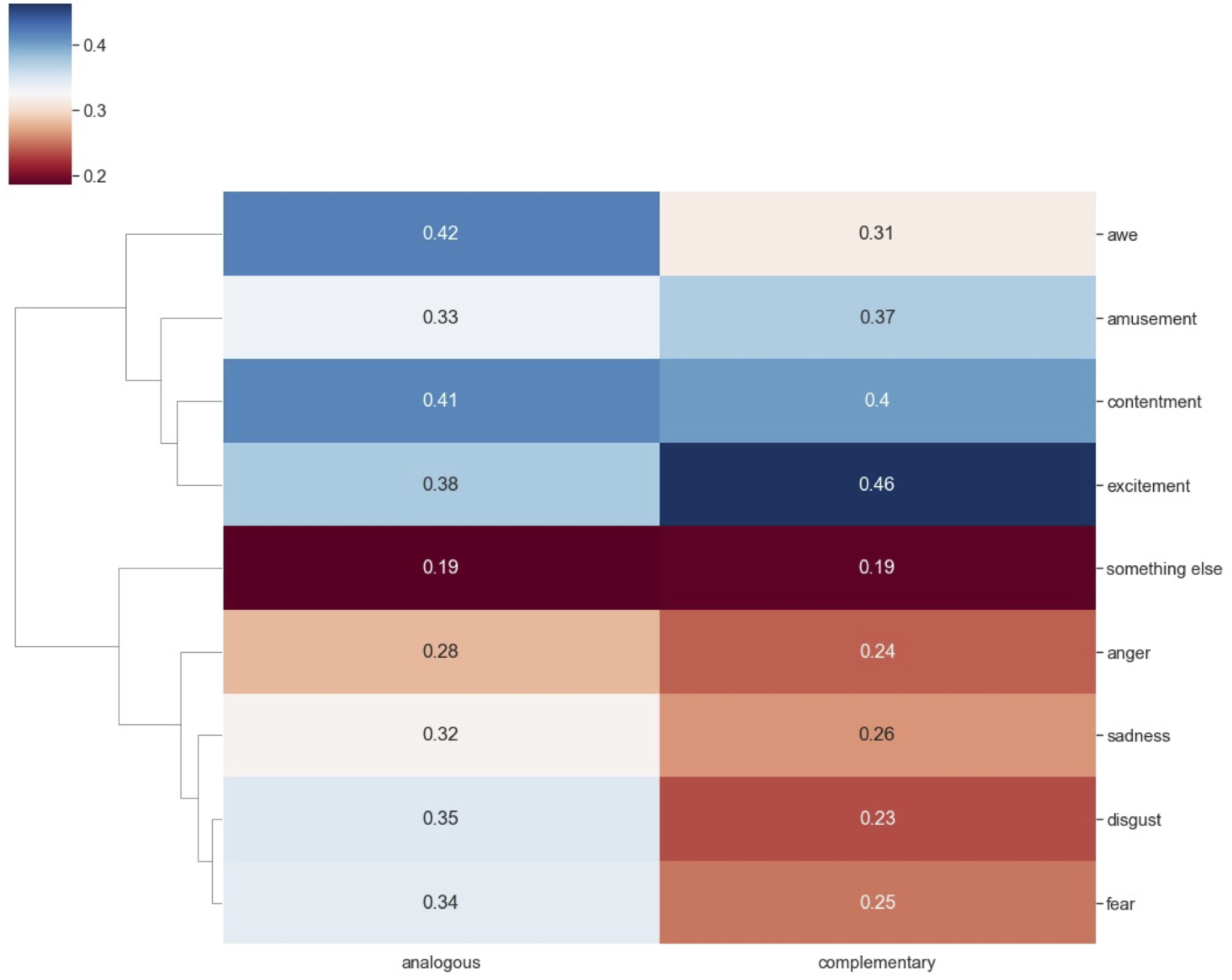
Experimental results indicate a slight relationship between emotion and analogous harmony over complementary color combinations. In some cases, this relationship is expressed with a more significant correlation, as in the case of awe ( τ = 0.42). However, in the case of complementary harmonies, excitement emotion ( τ = 0.46) presents a more significant correlation versus analog harmony (see Figure 4). In the case of fear and disgust emotions, it is observed that there is a greater presence of analogous versus complimentary harmonies. In the remaining emotions, the differences between the two are minor, the emotion being inconclusive over the analog or complementary harmony.
Some relevant correlations have been found at the level of color and emotion (Figure 5), such as the relationships between black and fear. Red, red-violet, violet, blue-violet, and excitement have a high correlation value compared to other combinations. There is a negative correlation in the case of the emotions fear, disgust, and sadness. This means that the lower the presence of the colors violet, red-violet, blue-violet, yellow-green, blue, and green, the greater the presence of these emotions. On the other hand, satisfaction and fear present a weak correlation with most colors, not being conclusive in any sense (greater or lesser). We can highlight that fun is positively associated with all colors, except black and gray. This correlation varies in some colors over others, where red, violet, and green colors stand out slightly. Finally, fear and sadness directly correlate with the colors black and gray, and inversely to white.
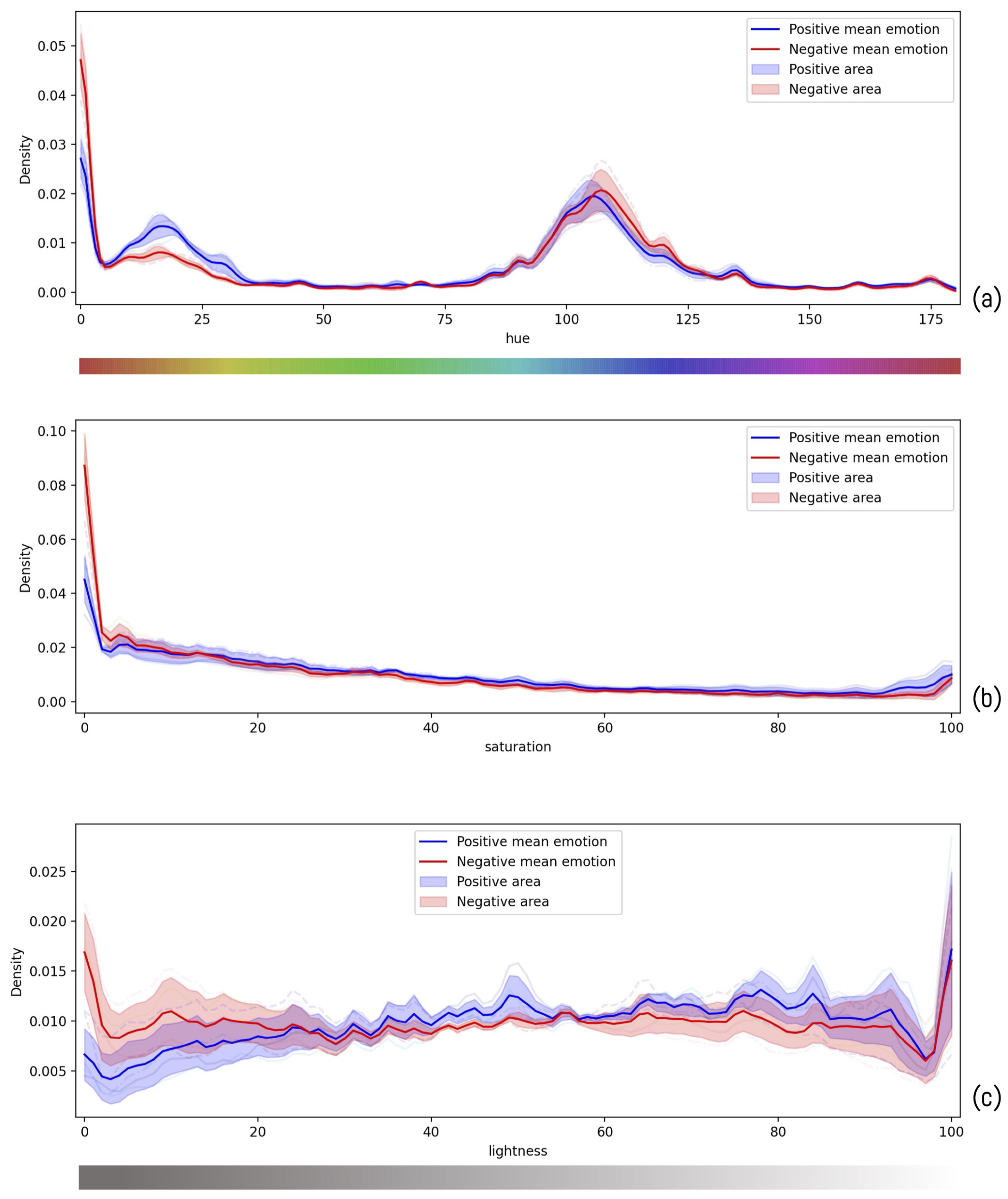
At the level of the HSL transformation, some differences in emotion are observed according to the hue, saturation, and lightness levels. Following the hue of the sample, the main difference between negative and positive emotions lies in the range of orange colors towards yellow. In the rest of the color palette, the behavior is similar (Figure 6a).
Regarding saturation, the main differences are in the lower value levels ( τ < 0.05) (Figure 6b). However, in the remaining saturation values, there are no significant differences between positive and negative emotions, to establish a correlation between saturation and emotion. On the other hand, the data show that the most significant divergences are found in lighting (Figure 6c). We can see a tendency towards more positive emotions appearing with more light, while negative emotions increase with less light.

4. Discussion

The COVID-19 pandemic has meant an alteration of our daily lives, which has impacted us emotionally at different levels. The large number of images that make up the COVID Art Museum (CAM) collection on Instagram becomes a place of visual stories that can be analyzed to understand the emotional impact during this period. The formal aspects and strategies used by the creators of the CAM images must be extracted and analyzed to understand this discourse. In this research, we have focused on color and its attributes, the element with the greatest capability to transmit emotions.
Given the large number of images, a methodology has been used that combines automatic processing tools, including deep learning tools for emotional classification and analytical tools of image processing and Machine Learning for color analysis.
According to the results obtained in the CAM collection, the harmony of colors most often used in the sample is analogous, with a majority use of composition yellow-orange, orange, red-orange, followed by complementary compositions with the use of blue-green, red-orange. As we can see in the results, yellow (as the primary color) is present in both and the following most used shades in the mixture, which causes the palette to tend towards warm color temperatures.
The correlation between predominant color compositions in the sample with the emotions used in this study shows that analogous harmony is related with the awe emotions, coinciding with the feeling categorization of Achlioptas et al. [71], and contentment, both positive. Complementary compositions, for their part, are the types that are the most concentrated in positive emotions, presenting the highest correlation score of the sample for the emotion excitement, followed by contentment. These results show that both harmonies mainly participate in positive feelings, although analogous composition is also related with negative emotions.
At the level of color–emotion relationships, a clear relationship is observed between black with the emotion of fear (negative emotion), while the colors violet, red-violet, and blue-violet are related to excitement (positive emotion). Furthermore, the presence of yellow-green in the something else category is the most notable negative correlation in the results. We should recall that this category was used to include emotions not falling under positive and negative and/or which did not produce any emotional reaction in the observer. With the data obtained in this analysis, we can speculate that this color does not have a lack of impact in emotional reaction. However, white, as a neutral color, has the highest correlation in this category.
The emotional relationship has also been analyzed depending on the attributes of the color (hue, chroma, and lighting), finding that the pairs of emotions present a similar behavior with the hue. However, red has a predominance of positive emotions which increase with higher amounts of yellow. In the blue tones, positive emotions reappear, but this is where we find a slightly higher presence of negative emotions.
Regarding saturation, although the result is very slight, it is shown that, at a higher level, positive emotions are presented. At the level of illumination, we can observe an increase in positive emotions with increased illumination, decreasing the presence of negative emotions in this sense. The importance of this parameter to determine emotions coincides with Cano-Martínez et al. [75], Ou et al. [39], and Schloss et al. [11].
In conclusion, in the sample obtained from the CAM, emotional discourses with positive tendencies prevail, which are shown by a predominance in the use of warm color palettes, compositions of colors and their relation with emotions, and the attributes of color, with hue and value being determining factors in our study. The greater use of compositions through analogues, with a predominance in positive emotions, can be explained by being the combination of colors closer to nature and producing more pleasure to the eyes and a more positive attitude [15]. This result demonstrates part of the conclusions of previous research [75], where some of the most used elements of representation in the CAM collection are those related to nature, as a resilience mechanism against the pandemic. These results mesh with other studies, which have shown trends in positive emotions in the context of the pandemic [76].
With the research carried out, we have been able to analyze the relationship between color and emotion in the visual creations shared on the Instagram social network, learning about the emotional state of their creators in the face of the pandemic produced by COVID-19. The proposed methodology is novel in that it uses computational techniques that can be applied in a broader context, and allows for the psychological evaluation of visual creations.
Thus, this research opens up new lines of future development by analyzing color and its relationship to emotions. As presented, there are still opposing opinions on whether the color–emotion relationship is universal. This research uses images created by Internet users, which can give it a global character, but the geographical origin, ages, or genders of the creators of the images in the sample are unknown. By obtaining this information, significant results could be contributed to the discussion on the color–emotion relationship and its universality.
It could be interesting to know the intention at an emotional level of the creators of the works of the CAM collection as well, which could enrich and consolidate the results. Expanding the investigation could be done through surveys or interviews, although the large number of images in the exhibition makes this proposal difficult.
Another future line of work would be to apply the same methodology developed in this study with another dataset using artworks based on other global pandemics including the Black Death, Spanish flu or HIV, to contrast the results obtained.
On the other hand, as color and its relationship with emotions can be associated with objects as reviewed in the literature, this research will continue to contrast with the results of a previous article [75] where the representation elements were extracted. With the results obtained in this research, significant progress can be made in the study of the communication of emotions in visual creation.

Author Contributions

Conceptualization, C.G.-M. and M.C.; methodology, M.C.; software, G.O.; validation, C.G.-M. and M.C.; formal analysis, C.G.-M., M.C. and G.O.; investigation, C.G.-M., M.C. and G.O.; data curation, G.O.; writing—original draft preparation, C.G.-M. and M.C.; writing—review and editing, C.G.-M. and M.C.; visualization, G.O.; All authors have read and agreed to the published version of the manuscript.

Funding

This study was funded by RRREMAKER. RRREMAKER MSC-RISE-H2020 project has received funding from the European Union’s Horizon 2020 Research and Innovation programme under the Marie Skłodowska-Curie, proposal number: 101008060.

Institutional Review Board Statement

Not applicable.

Informed Consent Statement

Not applicable.

Data Availability Statement

Conflicts of Interest

The authors declare no conflict of interest. The funders had no role in the design of the study; in the collection, analyses, or interpretation of data; in the writing of the manuscript; or in the decision to publish the results.

References

  1. Berg, S.H.; O’Hara, J.K.; Shortt, M.T.; Thune, H.; Bronnick, K.K.; Lungu, D.A.; Roislien, J.; Wiig, S. Health authorities’ health risk communication with the public during pandemics: A rapid scoping review. BMC Public Health 2021, 21, 1401. [Google Scholar] [CrossRef] [PubMed]
  2. Papademetriou, C.; Anastasiadou, S.; Konteos, G.; Papalexandris, S. COVID-19 Pandemic: The Impact of the Social Media Technology on Higher Education. Educ. Sci. 2022, 12, 261. [Google Scholar] [CrossRef]
  3. Bond, B.J. Social and parasocial relationships during COVID-19 social distancing. J. Soc. Pers. Relationships 2021, 38, 2308–2329. [Google Scholar] [CrossRef]
  4. Mohamad, S.M. Creative Production of ‘COVID-19 Social Distancing’ Narratives on Social Media. Tijdschr. Voor Econ. En Soc. Geogr. 2020, 111, 347–359. [Google Scholar] [CrossRef]
  5. Steinert, S. Corona and value change. The role of social media and emotional contagion. Ethics Inf. Technol. 2021, 23, 59–68. [Google Scholar] [CrossRef] [PubMed]
  6. Sheldon, P.; Rauschnabel, P.A.; Antony, M.G.; Car, S. A cross-cultural comparison of Croatian and American social network sites: Exploring cultural differences in motives for Instagram use. Comput. Hum. Behav. 2017, 75, 643–651. [Google Scholar] [CrossRef]
  7. Sheldon, P.; Bryant, K. Instagram: Motives for its use and relationship to narcissism and contextual age. Comput. Hum. Behav. 2016, 58, 89–97. [Google Scholar] [CrossRef]
  8. Muñoz, M.C. El arte como postraducción de la pandemia por la covid-19: El caso de The Covid Art Museum. Section: Nuevos retos y perspectivas de la investigación en Literatura, Lingüística y Traducción. Chapter 113. In Nuevos Retos y Perspectivas de la Investigación en Literatura, Lingüística y Traducción; Dykinson: Madrid, Spain, 2021; pp. 2189–2210. ISBN 978–984-1377-325-4. [Google Scholar]
  9. Wang, S.; Han, K.; Jin, J. Review of image low-level feature extraction methods for content-based image retrieval. Sens. Rev. 2019, 39, 783–809. [Google Scholar] [CrossRef]
  10. Machajdik, J.; Hanbury, A. Affective image classification using features inspired by psychology and art theory. In Proceedings of the International Conference on Multimedia-MM ’10; ACM Press: Firenze, Italy, 2010; p. 83. [Google Scholar] [CrossRef]
  11. Schloss, K.B.; Witzel, C.; Lai, L.Y. Blue hues don’t bring the blues: Questioning conventional notions of color–emotion associations. J. Opt. Soc. Am. A 2020, 37, 813. [Google Scholar] [CrossRef]
  12. Kauppinen-Räisänen, H.; Luomala, H.T. Exploring consumers’ product-specific colour meanings. Qual. Mark. Res. Int. J. 2010, 13, 287–308. [Google Scholar] [CrossRef]
  13. Wei-ning, W.; Ying-lin, Y.; Sheng-ming, J. Image Retrieval by Emotional Semantics: A Study of Emotional Space and Feature Extraction. In Proceedings of the 2006 IEEE International Conference on Systems, Man and Cybernetics, Taipei, Taiwan, 8–11 October 2006; pp. 3534–3539. [Google Scholar] [CrossRef]
  14. Eiseman, L. The Complete Color Harmony, Pantone Edition; Rockport Publishers: Beverly, MA, USA, 2017. [Google Scholar]
  15. White, A.R.; Martinez, L.M.; Martinez, L.F.; Rando, B. Color in web banner advertising: The influence of analogous and complementary colors on attitude and purchase intention. Electron. Commer. Res. Appl. 2021, 50, 101100. [Google Scholar] [CrossRef]
  16. Pridmore, R.W. Complementary colors: A literature review. Color Res. Appl. 2021, 46, 482–488. [Google Scholar] [CrossRef]
  17. Gorn, G.J.; Chattopadhyay, A.; Yi, T.; Dahl, D.W. Effects of Color as an Executional Cue in Advertising: They’re in the Shade. Manag. Sci. 1997, 43, 1387–1400. [Google Scholar] [CrossRef] [Green Version]
  18. Baptista, I.; Valentin, D.; Saldaña, E.; Behrens, J. Effects of packaging color on expected flavor, texture, and liking of chocolate in Brazil and France. Int. J. Gastron. Food Sci. 2021, 24, 100340. [Google Scholar] [CrossRef]
  19. Hsieh, Y.C.; Chiu, H.C.; Tang, Y.C.; Lee, M. Do Colors Change Realities in Online Shopping? J. Interact. Mark. 2018, 41, 14–27. [Google Scholar] [CrossRef]
  20. Reece, A.G.; Danforth, C.M. Instagram photos reveal predictive markers of depression. EPJ Data Sci. 2017, 6, 15. [Google Scholar] [CrossRef] [Green Version]
  21. Yu, J.; Egger, R. Color and engagement in touristic Instagram pictures: A machine learning approach. Ann. Tour. Res. 2021, 89, 103204. [Google Scholar] [CrossRef]
  22. O’Connor, Z. Color Psychology. In Encyclopedia of Color Science and Technology; Luo, R., Ed.; Springer: Berlin/Heidelberg, Germany, 2015; pp. 1–10. [Google Scholar] [CrossRef]
  23. Caivano, J.L. Color and semiotics: A two-way street. Color Res. Appl. 1998, 23, 390–401. [Google Scholar] [CrossRef]
  24. Kauppinen-Räisänen, H.; Jauffret, M.N. Using colour semiotics to explore colour meanings. Qual. Mark. Res. Int. J. 2018, 21, 101–117. [Google Scholar] [CrossRef]
  25. Retter, T.L.; Gao, Y.; Jiang, F.; Rossion, B.; Webster, M.A. Early, color-specific neural responses to object color knowledge. Neuroscience 2021, preprint. [Google Scholar] [CrossRef]
  26. Elliot, A.J.; Maier, M.A. Color and Psychological Functioning. Curr. Dir. Psychol. Sci. 2007, 16, 250–254. [Google Scholar] [CrossRef]
  27. Manav, B. Color-emotion associations and color preferences: A case study for residences. Color Res. Appl. 2007, 32, 144–150. [Google Scholar] [CrossRef]
  28. Schloss, K.B.; Palmer, S.E. An ecological framework for temporal and individual differences in color preferences. Vis. Res. 2017, 141, 95–108. [Google Scholar] [CrossRef]
  29. Palmer, S.E.; Schloss, K.B. An ecological valence theory of human color preference. Proc. Natl. Acad. Sci. USA 2010, 107, 8877–8882. [Google Scholar] [CrossRef] [PubMed] [Green Version]
  30. Taylor, C.; Franklin, A. The relationship between color–object associations and color preference: Further investigation of ecological valence theory. Psychon. Bull. Rev. 2012, 19, 190–197. [Google Scholar] [CrossRef] [Green Version]
  31. Schloss, K.B. Color Preferences Differ with Variations in Color Perception. Trends Cogn. Sci. 2015, 19, 554–555. [Google Scholar] [CrossRef]
  32. Schloss, K.B.; Hawthorne-Madell, D.; Palmer, S.E. Ecological influences on individual differences in color preference. Atten. Percept. Psychophys 2015, 77, 2803–2816. [Google Scholar] [CrossRef]
  33. Kim, J.H.; Kim, Y. Instagram user characteristics and the color of their photos: Colorfulness, color diversity, and color harmony. Inf. Process. Manag. 2019, 56, 1494–1505. [Google Scholar] [CrossRef]
  34. Wilms, L.; Oberfeld, D. Color and emotion: Effects of hue, saturation, and brightness. Psychol. Res. 2018, 82, 896–914. [Google Scholar] [CrossRef]
  35. Ou, L.C.; Luo, M.R.; Woodcock, A.; Wright, A. A study of colour emotion and colour preference. Part II: Colour emotions for two-colour combinations. Color Res. Appl. 2004, 29, 292–298. [Google Scholar] [CrossRef]
  36. Valdez, P.; Mehrabian, A. Effects of Color on Emotions; American Psychological Association: Washington, DC, USA, 1994; Volume 123, pp. 394–409. [Google Scholar] [CrossRef]
  37. Gilbert, A.N.; Fridlund, A.J.; Lucchina, L.A. The color of emotion: A metric for implicit color associations. Food Qual. Prefer. 2016, 52, 203–210. [Google Scholar] [CrossRef]
  38. Ou, L.C.; Luo, M.R.; Sun, P.L.; Hu, N.C.; Chen, H.S. Age effects on colour emotion, preference, and harmony. Color Res. Appl. 2012, 37, 92–105. [Google Scholar] [CrossRef]
  39. Ou, L.C.; Luo, M.R.; Woodcock, A.; Wright, A. A study of colour emotion and colour preference. Part I: Colour emotions for single colours. Color Res. Appl. 2004, 29, 232–240. [Google Scholar] [CrossRef]
  40. Xin, J.H.; Cheng, K.M.; Taylor, G.; Sato, T.; Hansuebsai, A. Cross-regional comparison of colour emotions Part I: Quantitative analysis. Color Res. Appl. 2004, 29, 451–457. [Google Scholar] [CrossRef]
  41. Xin, J.H.; Cheng, K.M.; Taylor, G.; Sato, T.; Hansuebsai, A. Cross-regional comparison of colour emotions Part II: Qualitative analysis. Color Res. Appl. 2004, 29, 458–466. [Google Scholar] [CrossRef]
  42. Taylor, C.; Clifford, A.; Franklin, A. Color preferences are not universal. J. Exp. Psychol. Gen. 2013, 142, 1015–1027. [Google Scholar] [CrossRef]
  43. Gao, X.P.; Xin, J.H. Investigation of human’s emotional responses on colors. Color Res. Appl. 2006, 31, 411–417. [Google Scholar] [CrossRef]
  44. Jonauskaite, D.; Wicker, J.; Mohr, C.; Dael, N.; Havelka, J.; Papadatou-Pastou, M.; Zhang, M.; Oberfeld, D. A machine learning approach to quantify the specificity of colour–emotion associations and their cultural differences. R. Soc. Open Sci. 2019, 6, 190741. [Google Scholar] [CrossRef] [Green Version]
  45. Suk, H.J.; Irtel, H. Emotional response to color across media. Color Res. Appl. 2010, 35, 64–77. [Google Scholar] [CrossRef]
  46. Gong, R.; Wang, Q.; Hai, Y.; Shao, X. Investigation on factors to influence color emotion and color preference responses. Optik 2017, 136, 71–78. [Google Scholar] [CrossRef]
  47. Hanjalic, A. Extracting moods from pictures and sounds: Towards truly personalized TV. IEEE Signal Process. Mag. 2006, 23, 90–100. [Google Scholar] [CrossRef]
  48. Yang, J.; She, D.; Sun, M. Joint Image Emotion Classification and Distribution Learning via Deep Convolutional Neural Network. In Proceedings of the Twenty-Sixth International Joint Conference on Artificial Intelligence; International Joint Conferences on Artificial Intelligence Organization: Melbourne, Australia, 2017; pp. 3266–3272. [Google Scholar] [CrossRef] [Green Version]
  49. Mikels, J.A.; Fredrickson, B.L.; Larkin, G.R.; Lindberg, C.M.; Maglio, S.J.; Reuter-Lorenz, P.A. Emotional category data on images from the international affective picture system. Behav. Res. Methods 2005, 37, 626–630. [Google Scholar] [CrossRef] [PubMed]
  50. Krizhevsky, A.; Sutskever, I.; Hinton, G.E. ImageNet classification with deep convolutional neural networks. Commun. ACM 2017, 60, 84–90. [Google Scholar] [CrossRef] [Green Version]
  51. Liu, H.; Sun, H.; Li, M.; Iida, M. Application of Color Featuring and Deep Learning in Maize Plant Detection. Remote Sens. 2020, 12, 2229. [Google Scholar] [CrossRef]
  52. Poterek, Q.; Herrault, P.A.; Skupinski, G.; Sheeren, D. Deep Learning for Automatic Colorization of Legacy Grayscale Aerial Photographs. IEEE J. Sel. Top. Appl. Earth Obs. Remote Sens. 2020, 13, 2899–2915. [Google Scholar] [CrossRef]
  53. Zhuang, F.; Qi, Z.; Duan, K.; Xi, D.; Zhu, Y.; Zhu, H.; Xiong, H.; He, Q. A Comprehensive Survey on Transfer Learning. arXiv 2020, arXiv:1911.02685. [Google Scholar] [CrossRef]
  54. Kim, Y.; Lee, H.; Provost, E.M. Deep learning for robust feature generation in audiovisual emotion recognition. In Proceedings of the 2013 IEEE International Conference on Acoustics, Speech and Signal Processing, Vancouver, BC, Canada, 26–31 May 2013; pp. 3687–3691. [Google Scholar] [CrossRef]
  55. Razavian, A.S.; Azizpour, H.; Sullivan, J.; Carlsson, S. CNN Features Off-the-Shelf: An Astounding Baseline for Recognition. In Proceedings of the 2014 IEEE Conference on Computer Vision and Pattern Recognition Workshops, Columbus, OH, USA, 23–28 June 2014; pp. 512–519. [Google Scholar] [CrossRef] [Green Version]
  56. Kim, H.R.; Kim, Y.S.; Kim, S.J.; Lee, I.K. Building Emotional Machines: Recognizing Image Emotions through Deep Neural Networks. arXiv 2017, arXiv:1705.07543. [Google Scholar] [CrossRef] [Green Version]
  57. Priya, D.T.; Udayan, J.D. Affective emotion classification using feature vector of image based on visual concepts. Int. J. Electr. Eng. Educ. 2020, 60. [Google Scholar] [CrossRef]
  58. Rao, T.; Xu, M.; Xu, D. Learning Multi-level Deep Representations for Image Emotion Classification. arXiv 2018, arXiv:1611.07145. [Google Scholar] [CrossRef] [Green Version]
  59. Elliot, A.J. Color and psychological functioning: A review of theoretical and empirical work. Front. Psychol. 2015, 6, 368. [Google Scholar] [CrossRef] [Green Version]
  60. He, L.; Qi, H.; Zaretzki, R. Image color transfer to evoke different emotions based on color combinations. Signal Image Video Process. 2015, 9, 1965–1973. [Google Scholar] [CrossRef] [Green Version]
  61. Liu, D.; Jiang, Y.; Pei, M.; Liu, S. Emotional image color transfer via deep learning. Pattern Recognit. Lett. 2018, 110, 16–22. [Google Scholar] [CrossRef]
  62. Liu, S.; Pei, M. Texture-Aware Emotional Color Transfer Between Images. IEEE Access 2018, 6, 31375–31386. [Google Scholar] [CrossRef]
  63. Ram, V.; Schaposnik, L.P.; Konstantinou, N.; Volkan, E.; Papadatou-Pastou, M.; Manav, B.; Jonauskaite, D.; Mohr, C. Extrapolating continuous color emotions through deep learning. Phys. Rev. Res. 2020, 2, 033350. [Google Scholar] [CrossRef]
  64. Takada, A.; Wang, X.; Yamasaki, T. Color-Grayscale-Pair Image Sentiment Dataset and Its Application to Sentiment-Driven Image Color Conversion. In Proceedings of the 2021 International Joint Workshop on Multimedia Artworks Analysis and Attractiveness Computing in Multimedia 2021; ACM: Taipei Taiwan, 2021; pp. 2–7. [Google Scholar] [CrossRef]
  65. Picard, R.W. Affective Computing; Technical Report No. 321; Media Laboratory Perceptual Computing Section; MIT 20 Ames St.: Cambridge, MA, USA, 1995. [Google Scholar]
  66. Zhao, S.; Wang, S.; Soleymani, M.; Joshi, D.; Ji, Q. Affective Computing for Large-Scale Heterogeneous Multimedia Data: A Survey. ACM Trans. Multimed. Comput. Commun. Appl. 2020, 15, 1–32. [Google Scholar] [CrossRef] [Green Version]
  67. Zhao, S.; Yao, X.; Yang, J.; Jia, G.; Ding, G.; Chua, T.S.; Schuller, B.W.; Keutzer, K. Affective Image Content Analysis: Two Decades Review and New Perspectives. arXiv 2021, arXiv:2106.16125. [Google Scholar] [CrossRef]
  68. Bradley, M.M.; Lang, P.J. Emotion and Motivation. In Handbook of Psychophysiology, 3rd ed.; Cacioppo, J.T., Tassinary, L.G., Berntson, G., Eds.; Cambridge University Press: Cambridge, UK, 2007; pp. 581–607. [Google Scholar] [CrossRef]
  69. Alameda-Pineda, X.; Ricci, E.; Yan, Y.; Sebe, N. Recognizing Emotions from Abstract Paintings Using Non-Linear Matrix Completion. In Proceedings of the 2016 IEEE Conference on Computer Vision and Pattern Recognition (CVPR), Las Vegas, NV, USA, 27–30 June 2016; pp. 5240–5248. [Google Scholar] [CrossRef]
  70. Saleh, B.; Elgammal, A. Large-scale Classification of Fine-Art Paintings: Learning The Right Metric on The Right Feature. arXiv 2015, arXiv:1505.00855. [Google Scholar]
  71. Achlioptas, P.; Ovsjanikov, M.; Haydarov, K.; Elhoseiny, M.; Guibas, L. ArtEmis: Affective Language for Visual Art. arXiv 2021, arXiv:2101.07396. [Google Scholar]
  72. Hassan, N.A.; Hijazi, R. Open Source Intelligence Methods and Tools: A Practical Guide to Online Intelligence, 1st ed.; Apress: Berkeley, CA, USA, 2018. [Google Scholar] [CrossRef]
  73. Rhyne, T.M. Applying Color Theory to Digital Media and Visualization; CRC Press; Taylor & Francis Group: Boca Raton, FL, USA, 2017. [Google Scholar]
  74. Shevlyakov, G.L.; Oja, H. Robust Correlation: Theory and Applications; Wiley Publisher: Hoboken, NJ, USA, 2016. [Google Scholar]
  75. Cano-Martínez, M.J.; Carrasco, M.; Sandoval, J.; González-Martín, C. Quantitative Analysis of Visual Representation of Sign Elements in COVID-19 Context. Empir. Stud. Arts. 2022, 1, 21. [Google Scholar] [CrossRef]
  76. Israelashvili, J. More Positive Emotions During the COVID-19 Pandemic Are Associated With Better Resilience, Especially for Those Experiencing More Negative Emotions. Front. Psychol. 2021, 12, 648112. [Google Scholar] [CrossRef]
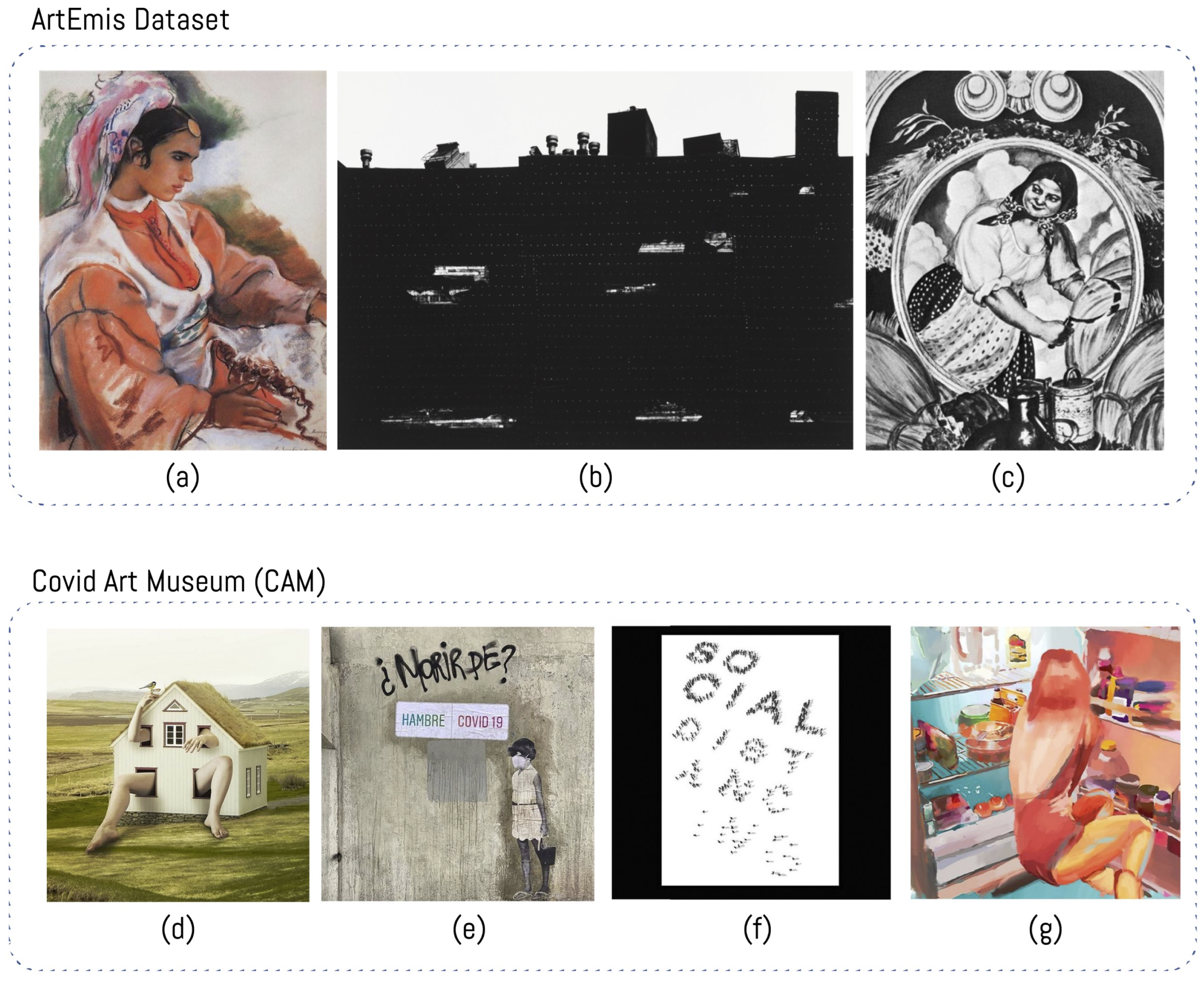
Figure 1. Sample images from ArtEmis Dataset and the Covid Art Museum Instagram account (a) Young Moroccan, Zinaida Serebriakova (1932); (b) New York I, Aaron Siskind (1951); (c) Harvester, Boris Kustodiev (1918), (d) @marciorodriguezphoto, (e) @Bix.rex.1 (f) Hojin Kang, @hojinkangdotcom (g) Pauz Peralta, Title: The Fridge, @notpauz.
Sustainability 14 12989 g001
Figure 2. Process diagram of the proposed method for emotion and color harmony analysis applied on the Covid Art Museum (CAM) dataset.
Sustainability 14 12989 g002
Figure 3. Frequency of color combinations present in the COVID Art Museum (CAM) dataset.
Sustainability 14 12989 g003
Figure 4. Kendall’s Tau correlation analysis between harmonies and emotion present in the COVID Museum Art (CAM) dataset.
Sustainability 14 12989 g004
Figure 5. Kendall’s Tau correlations between each color expressed in the Itten palette and inferred emotions on the COVID Museum Art (CAM) dataset.
Sustainability 14 12989 g005
Figure 6. Emotion ratio around color (hue), saturation and illumination (HSL). Positive emotions: {’amusement’, ’awe’, ’contentment’, ’excitement’}, Negative emotions: {’anger’, ’disgust’, ’fear’,’sadness’}. (a) density distribution related with hue palette, (b) density distribution related with saturation values, (c) density distribution related with lightness values.
Sustainability 14 12989 g006
Table 1. Main findings of the literature.
TopicCommon PointsDifferences
Semantic levelColor as an index is an indication, as is the example of the color of the fruit in its ripening, or the white on detergent packaging [24].Color is something we learn, a convention [11]. For instance, red on a traffic light means to stop driving, or certain colors on a flag represent a specific community.
Colors and emotionsColor is a low-level characteristic, it has an important relationship with the object [57].Emotions can be influenced by different factors such as color, shapes, the appearance of lines, and the emotional bias of observers themselves [47]. Not all color combinations generate a correlation with emotion [63].
Different cultural identitiesColor can generate different emotions according to different cultural identities [44].There are overlaps between groups [35,42,43,44].
Hue, Chroma and LuminosityJudgment about happiness and sadness is determined by the chroma and luminosity of color [46].Chroma is more decisive for the sensation in the color temperature (cold-warm), while the lighting produces the heavy-light sensation [11,39].
GenreOur relationship with colors is associated with events, objects, concepts, emotions, etc. [25].There is no evidence of universality on color preference from a gender perspective in research, detecting some differences between sexes [33,34].
Color and grayscaleColor images generate a more significant emotion effect (positive or negative) on the observer [64].It is possible to induce different emotions in the observer by changing its color [66].
Age/timeColor images generate a more significant emotion effect (positive or negative) on the observer [64].Color preferences may change over time, affected by fashions, new social and physical circumstances or moods [28,29,37,38].
Table 2. Frequency of analogous harmonies present in the COVID Art Museum (CAM) dataset.
Analogous Color HarmonyCountPercentage
(yellow-orange, orange, red-orange)28933.8%
(orange, red-orange, red)17920.9%
(yellow, yellow-orange, orange)14617.1%
(yellow-green, yellow, yellow-orange)627.3%
(red-orange, red, red-violet)516.0%
(blue-green, green, yellow-green)293.4%
(blue, blue-green, green)252.9%
(red-violet, violet, blue-violet)172.0%
(red, red-violet, violet)161.9%
(violet, blue-violet, blue)151.8%
(green, yellow-green, yellow)151.8%
(blue-violet, blue, blue-green)111.3%
Table 3. Frequency of complementary combinations present in the COVID Art Museum (CAM).
Complementary Color HarmonyCountPercentage
(blue-green, red-orange)36930%
(blue, orange)18715%
(red, green)302%
(yellow-green, red-violet)131%
(yellow-orange, blue-violet)91%
Publisher’s Note: MDPI stays neutral with regard to jurisdictional claims in published maps and institutional affiliations.