Abstract
This article aims to address the apparent contradiction between the urban demographic and migratory trends and the transition towards a more sustainable mobility that local and metropolitan governments seek. To that end, it uses the case of Barcelona, and its metropolitan area during the first decades of the 21st century, characterized by suburbanisation and gentrification. Employing demographic, mobility and transport, and air quality statistics, we intend to analyse: (a) the spatial demographic trends in the metropolitan area of Barcelona (AMB), particularly regarding the core and periphery population growth or decline; (b) trends in daily mobility and how the public and private transport mix has changed; and (c) pollution data changes confirming the success or failure of the private vehicle reduction policy. Findings confirm our initial hypothesis: the slow but steady transition towards sustainable forms of mobility in the core city and the dense contiguous municipalities is counterbalanced by what occurs in the peripheral suburbs. There, the use of private vehicles is still preeminent and growing. Nevertheless, the air quality has improved in the most central municipalities of the AMB (for which data are available), even if not all parameters have seen a similar pollution reduction.
1. Introduction
After the deep economic crisis caused by the 2008 Great Recession, the Spanish economy started to show signs of recovery in 2014. Indeed, it grew above the European average until the beginning of 2020—when the coronavirus crisis caused a major upheaval. Though this economic improvement during the so-called “post-crisis” period did not benefit the entire population, it had a relevant impact on the housing market, on activity and employment levels, and on population dynamics. In fact, it generated changes in residential mobility flows, with relevant socioeconomic, demographic, and residential implications. This sensitivity of demographic trends to economic cycles explains why this paper uses economic expansion, crisis and post-crisis periods to analyse residential mobility and urban growth processes, as they follow approximately the same timing. In effect, due to economic recovery, migration intensity and intra-metropolitan residential changes increased. However, in turn, these phenomena became more unstable, more complex, and fragmented. The direction of flows, the reasons for moving and the socioeconomic categories and ages of migrants also diversified.
These new mobility trends generated a spatial reconfiguration of large Spanish urban areas—particularly, Madrid and Barcelona—during the post-crisis period. More specifically suburbanisation, which had reduced—though not disappeared—during the economic crisis, increased once again. Indeed, this process, mainly caused by people migrating from the core city to the metropolitan periphery, implying that the population of these peripheral municipalities (suburbs) grows more than that of the core, recommenced during post-crisis years. Simultaneously, cores strengthen their capacity to attract or retain certain population age groups, as international immigration flows resumed while the settlement of young Spaniards increased. Consequently, large cities—acting as human capital magnets—grew again during the last economic recovery, and their historical centres rejuvenated and gentrified. Barcelona and its metropolitan area would be a prototypical example of all these trends, which are occurring, even on a larger scale, in all major global cities. Undoubtedly, all these changes that are spatially reconfiguring large metropolitan areas must have had impacts both on the daily mobility of the population and on its environmental consequences.
This article aims to address the apparent contradiction between these urban demographic and migratory trends that we have just described—which potentially imply an increase in mobility, as more suburbanisation means more commuting—and the transition towards a more sustainable mobility that local and metropolitan governments seek. Indeed, in a global context of climate change, large cities have generated a discourse and policies in favour of protecting the environment and reducing emissions that mostly involve reducing the number of private vehicles. However, is this possible within a context of increasing suburbanisation? By contrast, is the rejuvenation and gentrification of urban centres favouring the use of public transport and other forms of sustainable mobility? Finally, has the political goal of reducing pollution and improving air quality been achieved? The aim is to find answers to these questions by analysing Barcelona as a case study.
1.1. Aims and Research Questions
This paper intends to study the relationship between recent spatial demographic dynamics in the Metropolitan Area of Barcelona and daily mobility in the first two decades of the 21st century The Metropolitan Area of Barcelona—its Catalan and Spanish acronym being AMB– is a supra-municipal governance body for the city of Barcelona and 35 other contiguous municipalities. In fact, these 36 municipalities are only a small but central part of its functional urban area (FUA), composed, according to the functional definition established by Eurostat, of 135 municipalities. Unlike the AMB, the FUA does not have a governance body, but is a purely statistical spatial unit. Indeed, the paper uses this area as a case study to analyse the consequences of urban reconfiguration on both commuting and movements for reasons other than to work or study, in the period mentioned. We intend this to be a useful exercise to develop public policies attempting to reduce pollution in cities, by taking urban development characteristics and demographic and spatial trends into account.
This led to the following research questions:
- (a)
- What have been the demographic trends in the Metropolitan Area of Barcelona (AMB) during the past two decades, particularly regarding the core city and periphery population growth or decline?
- (b)
- What have been the trends in daily mobility in the AMB during the past two decades and how has the public and private transport mix changed?
- (c)
- Do pollution data for the last two decades provide any clue on the success or failure of the private vehicle reduction policy?
1.2. Hypothesis
Rejuvenation and growing population in central Barcelona, and a municipal policy against the of use private cars, should be reducing the use of these vehicles in the core city and the inner ring towns—those municipalities adjoining Barcelona, with which they form an urban continuum, which is well-connected by a dense public transport network. However, persisting metropolitan suburbanisation, together with increased urban sprawl and a deficient metropolitan public transport system in outer metropolitan rings, could be leading towards a greater use of private vehicles, in these areas. Therefore, the achievements of a “car-free city” in the AMB is possibly being neutralised, or at least mitigated. This could lead to the failure of policies intending to reduce pollution and improve air quality.
2. Theoretical and Conceptual Framework
2.1. European Policies for the Transition to Sustainable Urban Mobility and Their Implementation by Local Governments
The European Green Deal (EGD), driven by the European Commission, aims to achieve an ecologically ambitious and socially fair transformation towards a climate-neutral development model. To this end, it has set an intermediate climate target for the European Union (EU) of reducing greenhouse gas (GHG) emissions by 55% in the year 2030 and of becoming climate neutral (‘net-zero target’) in 2050. Therefore, the EU must reduce transport-related GHG emissions by 90% [1]. Undoubtedly, transport is one of the few sectors in which emissions are higher today than in 1990 and, in fact, regardless of the efforts to reduce them, they continue increasing. Aiming to make all means of transport more sustainable, while improving the health of the population (pollution is one of the major causes of premature deaths and disease in Europe and is responsible for around 400,000 annual premature deaths [2]), the European Commission launched its Sustainable and Smart Mobility Strategy in December 2020 [3]. It has become a key element to meet the EGD climate targets, while the EU transport system adapts to the impact of the COVID-19 pandemic. Jointly with an Action Plan of 82 initiatives, it established the agenda for Europe’s transition to a green, smart, and affordable transport system, intending to transform how the population and goods move within Europe, especially in urban areas [4].
Accounting for 40% of total road transport in the EU, cities play a key role in reaching this ambitious target [5]. There is a long history of European policies on sustainable urban mobility. One of the first precedents dates to 1988 and European Charter Pedestrians’ Rights, that recognised “the rights to live in a healthy environment and freely to enjoy the amenities offered by public areas under conditions that adequately safeguard his physical and psychological well-being and to live in urban or village centres tailored to the needs of human beings and not to the needs of the motor car and to have amenities within walking or cycling distance” [6]. This charter was based on traffic in European cities in the 1980s. It focused on the idea that cities were losing space for pedestrians in favour of cars, resulting in a reduction in the places where the citizens could meet and establish relations. In 1990, the European Commission approved the Green Paper on the Urban Environment [7]. It included a series of air, water, waste, and noise pollution measures intending to improve quality of life in cities. This led to the first two European conferences offering local authorities the opportunity to work together to improve the urban environment. The Car Free Cities Conference was held in Amsterdam on 24–25 March 1994, and the European Conference on Sustainable Cities took place in Aalborg from 24–27 May 1994. The latter concluded by the signature of the Charter of European Cities and Towns Towards Sustainability. It involved a commitment to participate in Local Agenda 21 initiatives and to develop long-term action plans towards sustainable urban mobility. Another milestone was the ratification of the Kyoto Protocol on Climate Change by the European Union in 1997, committing the EU to reduce fossil fuel emissions. In 2001, the European Commission presented a White Paper on Transport [8] proposing 60 measures to review EU transport policies. It intended to make transport more sustainable, avoiding economic losses due to traffic congestion, pollution, and accidents, by giving a comprehensive approach to urban and transport policies. In 2007, the European Union prepared a Green Paper: Towards a new culture for urban mobility [9], which led to an overall strategy summarised in the Action Plan on Urban Mobility [10] in 2009. To meet the challenges posed by mobility in cities, this Action Plan proposed a scheme based on 6 axis favouring sustainable urban mobility: implementing integrated policies, responding to citizens’ needs, promoting an environmentally friendly urban transport, increasing funding for transport, optimising urban mobility, and sharing successful experiences with other cities. This action plan proposed the development and implementation of the so-called Sustainable Urban Mobility Plans (SUMP) by local governments. Thus, since 2013 and within the EU mobility policy framework, supervised by the Directorate General for Mobility and Transport of the European Commission, many local governments have been implementing SUMPs. They mainly intend to improve mobility, connectivity and transport in cities and metropolitan areas while reducing the impact of private vehicles [11]. In fact, European cities are working on three main areas to reduce air pollution and congestion levels: (a) the promotion of the use of public transport, shared vehicles and micro-mobility; (b) the intervention on physical urban space (also known as ‘tactical urbanism’) by, for example, the reduction in traffic lanes for private cars, the expansion of cycling, bus and taxi lane networks, the increase in pavement width and of pedestrian areas; and (c) the implementation of traffic restrictions by introducing tolls or prohibiting the entry of polluting vehicles.
2.2. COVID-19 and Its Impact on Shared Mobility, Micro-Mobility and the Use of Public Transport
The implementation of these measures by local authorities has been accelerated by the COVID-19 pandemic, which has caused more teleworking, mobility reduction, and major changes in the use of urban transport. While the number of its users had constantly been increasing up to 2020, in the first wave lockdown they reduced by 90%. However, COVID-19 has also shown the key role of public transport in accessing work and essential services [12]. For instance, to face the fear of contagion, cleaning and disinfection measures were strengthened, capacity limitations were enforced, and the frequency of buses and metros was augmented, so that social distance could increase, and a safer public mobility achieved. In addition, one of the scarce positive aspects of lockdowns was a forced reduction in distances travelled. It encouraged (new) types of shared vehicles and micro-mobility, such as (electric) bicycles, motor, or electric scooters, etc., better adapted to short distance journeys [4,13]. Indeed, micro-mobility and shared mobility can be considered a way to counteract the increased use of cars during the pandemic—not only for short journeys but also in the case of long-distance ones, when they are well integrated with public transport networks [14].
However, these new forms of mobility have not multiplied without conflict. To avoid interferences, specific lanes segregating these vehicles from motor ones and pedestrians, have been created. As for public transport, the number of its users has not yet reached pre-pandemic levels. Moreover, due to increased teleworking in the pandemic, residential moves to suburban areas have somewhat risen, as housing prices are lower there, and households can also access abundant amenities [15]. Therefore, this population relocation could potentially involve more private vehicles being used, meaning greater environmental damage [13]. In other words, augmenting commuting distance from low-density neighbourhoods, where public transport is less efficient, could encourage car use [13]. Thus, within the EGD framework, reinforcing safe and efficient public transport systems is especially relevant for the transition towards a clean and sustainable mobility. Furthermore, enjoying a good public transport system is essential for local economic recovery, as it connects businesses and people to new economic and social opportunities. Hence, public transport must face the triple challenge of decarbonisation, digitalisation, and growth, in the coming years. It is the way to return to the previous number of travellers and to become inclusive and affordable, accessible to all, independently from the economic level of their users [12]. In fact, the new Urban Mobility Package, adopted in September 2021, is a good occasion for the EU to enhance the engagement of cities with its Green Deal agenda [16].
Simultaneously, the Sustainable Urban Mobility Plan guidelines [17] have been improving by the European Commission, and, currently, about a thousand European cities have designed and applied their own SUMP. However, many more cities should be implementing this kind of policy, backed by public investments from the European Structural and Investment Funds (ESIF), and the Recovery and Resilience Facility (RRF). These are two key instruments incorporated to the Next Generation European Union Recovery Fund, to back member states hit by the pandemic. Other local governments can also obtain public and private investments for their transition to sustainable mobility and transport infrastructures through the InvestEU programme [4]. As for the existing Sustainable Urban Mobility Plans, which have a five to ten-year time horizon, they should include a long-term planning perspective. In effect, these should have 20-to-30-year transition pathways, with intermediate milestones, designing implementation schemes [18].
2.3. Tactical Urban Interventions against Private Cars at the Local Level: The Case of Barcelona
The most determined local governments have been attempting to implement new urbanism models since before the pandemic and have accelerated them in response to COVID-19. Thus, the “15-min city” model, in which citizens live near all their daily needs to prevent them from traveling unnecessarily, giving priority to pedestrians while promoting ‘active mobility’ (walking or cycling), has become particularly attractive for several cities [4]. In this sense, there have been interventions on physical urban space, such as low traffic neighbourhoods (LTNs), that developed quickly during the pandemic lockdowns. Implementing LTNs intended to reduce private vehicle traffic—especially that of non-residents—by restricting circulation in several ways, such as the introduction of barriers in some streets, the renversement of the direction in which traffic moves in others, and the establishment of a 10 km/h speed limit or of pedestrian streets and squares. In fact, it is a way of inviting inhabitants to change to alternative forms of micro-mobility. Additionally, by way of these interventions, several other objectives, such as the improvement of air quality, road safety, livability, and the promotion of local businesses, are also being targeted [19]. Similarly, in the previous decade, some London boroughs also implemented this program successfully, by combining several elements: (a) a strong political will, (b) the enormous benefits that communities saw were obtained from these changes, and (c) a research body demonstrating that the population was walking and cycling more, becoming more active, and relied less on their cars. In fact, LTNs do not only reduce traffic and car ownership but strengthen road safety. Subsequently, in the summer of 2020, LTNs were extended to many of the 33 London boroughs, to protect gains that communities had obtained during the pandemic lockdown, when traffic dropped to unprecedented levels [19].
One of the best-known examples of these LTNs are the “superblocks” (superilles) in Barcelona, which are to be implemented in the Eixample. This district was created in the 19th century following the expansion plan (with streets that intersect orthogonally) designed by the engineer Ildefons Cerdà. This network of blocks (illes) is to be transformed by reclaiming part of the space occupied by private vehicles for citizens [20]. The COVID-19 lockdown and subsequent road traffic reduction have allowed the Barcelona City Council to start implementing a first, light version, of the superblocks. This initial step consists in delimiting a series of green hubs and squares—where these green hubs cross one another—in which pedestrians have priority. To that end, the Barcelona City Council had previously carried out a detailed study on the city: citizen flows and mobility, facilities available in neighbourhoods, green spaces, buildings, and social fabric. This comprehensive approach allowed for the creation of a street hierarchy, enabling some of them to be pedestrianised. As a first step, traffic lanes have been reduced and pavements widened in some streets of the Eixample district. At the same time, in other main roads—such as Gran Via de les Corts Catalanes or Diagonal Avenue—the number of bus lanes has been increased, while reducing those for private vehicles. In other words, the aim of the superblocks and other similar measures is to generate a healthier, greener, fairer, and safer public space that encourages social interactions and promotes the local economy [21].
2.4. Implementing Traffic Restrictions and Low Emission Zones in Barcelona (Barcelona’s ZBE)
As for traffic-restriction implementation, the most used measure is the creation of low emission zones (LEZs), to stop polluting vehicles from entering core cities. Also known as ‘quantity-based’ measures, this is a step which nearly 300 European cities have already taken. Within this context, and in line with other European metropolises, Barcelona’s LEZ came into force on 1 January 2020. Known as ZBE-Rondes for its acronym in Spanish and Catalan, this LEZ affects most of the municipality of Barcelona—the space lying within the “rondes”, or ring road—and part of the neighbouring municipalities and covers more than 95 km2 [22]. Some pioneering cities have gone a step further by applying congestion tolls or ‘price-based’ measures to all vehicles entering a city: Singapore (since 1975), London (since 2003), Stockholm (since 2007), Milan (since 2008), Gothenburg (since 2013) and Palermo (since 2016). In fact, London adds another charge, depending on the emission level of the vehicle [2]. In general, while both quantity-based and price-based policies are effective in fighting against pollution [23,24,25], only tolls mitigate congestion [25,26]. Actually, in London, tolls are associated with a reduction in car accidents [27]. In contrast, LEZs only reduce traffic in central urban areas, where there are vehicle restrictions, while increasing it in the surrounding ones. Therefore, the effect for the city as a whole is null [28].
If congestion tolls are much more effective in reducing traffic congestion, why are only a small number being used in European cities, while a growing number of them are introducing LEZs? Quantity-based measures are more easily accepted by citizens than price-based ones, for several reasons. First, there seems to be a public consensus that quantity measures reduce pollution more efficiently. Second, LEZs only affect some commuters—the most polluting ones—while tolls have an impact on all of them. Third, LEZs are more cost-effective, as tolls are generally established together with high investments ameliorating public transport. Finally, LEZs encourage the replacement of older, more polluting cars by newer, cleaner ones, a measure even supported by car manufacturers [29].
The fact that the mobility of socially deprived groups is that most affected by the implementation of both quantity-based measures (they have older and more polluting vehicles) and price-based measures (for obvious reasons), demonstrates that the transition to sustainable urban mobility must go beyond CO2 emission reduction. Indeed, mobility transition plans must adopt a broad perspective, taking issues such as connectivity, accessibility, affordability, and traffic safety, into account [4]. In addition, by widening the mobility divide between social groups, the COVID-19 pandemic has proved that it is not possible to separate mobility, environment and equality when reflecting on cities [13].
3. Materials and Methods
As mentioned, this paper mainly intends to study the differences between the core city, Barcelona, and its peripheral metropolitan municipalities, in population growth, daily mobility and the use of different means of transport. Therefore, diverse sources offering spatially disaggregate data were sought for the analysis. In the case of demographic data, the definition of a functional urban area (FUA) based on commuting, made by Eurostat—therefore allowing international comparisons—and delimited, in the case of Spain, by the National Institute of Statistics (INE), was used. The concept of “functional urban area” comes from the Eurostat’s Urban Audit program and is based on a functional criterion. Each functional urban area consists of a central city and the municipalities in its immediate surroundings, defined as its area of influence from a labour perspective. Thus, a municipality belongs to a city’s FUA if 15% or more of its working population commutes to that city to work. Based on this criteria, boundaries of the Barcelona FUA have expanded over time, as the labour influence of Barcelona has extended. We used the 2015 definition of the FUA, a date more or less in the middle of the post-crisis period (2013–2019). According to this delimitation, the Barcelona FUA consisted of 135 municipalities, occupying an area of 2628 km2, where around 5 million inhabitants lived. For analytical purposes, this wide periphery was divided into 10-km municipality rings, measured by radial distance from the centre of Barcelona to that of each of the municipalities in its FUA (Figure 1).
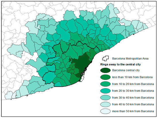
Figure 1.
Delimitation of the Barcelona Functional Urban Area (FUA), distinguishing its 10-km peripheral rings and the Barcelona Metropolitan Area (AMB). Source: done by the authors.
The so-called Padrón continuo (continuous local register) publishes official population data for all municipalities in Spain as of 1 January of each year. Therefore, updated population data for the entire Barcelona FUA can be obtained. However, to analyse transport and mobility data, we did not find any source covering the whole area, throughout the entire period under analysis. Hence, the paper used those in the Working Day Mobility Survey (Enquesta de mobilitat en dia feiner, EMEF) published by the AMB on a smaller area of 635.8 km2 and including only 36 municipalities (see its borders in black, in Figure 1). This survey launched by the Metropolitan Transport Authority (ATM) is published annually. Beginning in 2003, it became an official survey in 2014, and allows to distinguish an inner and an outer ring. The first comprises 18 municipalities located on the coast and, more specifically, on the coastal plain between the coastal mountains and the sea. It includes the city of Barcelona (1.6 million inhabitants in 100.3 km2, resulting in 16,039 inhab./km2) and the closest municipalities to it, forming a high population density urban continuum (ranging from 20,549 inhab./km2 in L’Hospitalet de Llobregat to 1069 inhab./km2 in Tiana). The second one, the outer ring, also made up of 18 municipalities, is situated further inland, in the plain between pre-coastal and coastal mountains (Figure 2). These municipalities are less dense, with Begues presenting the lowest population density: 134 inhab./km2. Thus, three areas can be distinguished from a mobility point of view: the city of Barcelona; the rest of the inner (or first) ring and the outer (second) ring (see population data in Table 1). These two rings do not exactly overlap with the first two 10-km rings delimited in the FUA, but their characteristics regarding population density and growth are similar. Table 1 shows that, between 2013 and 2019, the population of outer ring municipalities grew more than that of inner ring ones.

Figure 2.
Delimitation of the AMB, distinguishing the inner ring (including Barcelona) and the outer ring. Source: done by the authors.

Table 1.
Population of the AMB, distinguishing the city of Barcelona, the rest of the inner ring and the outer ring. AMB, 2013 and 2019.
Though small, these differences in demographic growth indicate that the percentage of the metropolitan population living in Barcelona is becoming progressively smaller, reaching less than 50% of the total. By contrast, the percentage of those residing in peripheries has been increasing with time, especially in the outermost municipalities. This may have consequences for our results, as the means of transport used in the city of Barcelona and in peripheral areas are different. In Barcelona, people mainly move on foot and by bicycle, whereas, in peripheries, and especially in outer ring municipalities, private vehicles predominate, and public transport is scarcely used (Figure 3).

Figure 3.
Modal distribution of transport in the AMB, distinguishing the city of Barcelona, the rest of the inner ring and the outer ring. AMB, 2019. Source: done by the authors from data published in [31], p. 25.
Given the importance that population change and geographical distribution may have on daily mobility growth or reduction, on the type of movement (commuting or other causes) made and on the use of different transport means, we will first analysed the demographic aspects, then data on mobility and, finally, its consequences on pollution level and air quality indices in the metropolitan area of Barcelona.
4. Results
4.1. The Population in the Urban Area of Barcelona: Differences between Core and Peripheral Rings
Table 1 shows that population has grown more in the AMB’s outer ring than in the inner one, and more in that inner ring than in the city of Barcelona. However, as already explained, the AMB only comprises the most central part of the Barcelona functional urban area (FUA) (see Figure 1 again). As we intended to analyse the influence of metropolitan population growth and its spatial distribution on daily mobility, it was necessary to adopt this second and broader definition of metropolitan limits, since FUA is precisely delimited by daily movements due to work or study—i.e., commuting. Table 2 shows the population of the Barcelona FUA—around 5 million inhabitants—of the core and of the 10-km rings, on 1 January of each year. In the first two decades of the 21st century, the population of the metropolitan area of Barcelona continued to grow. However, it has not grown in all of its areas [32]. The population of the city of Barcelona and the contiguous municipalities (located at less than 10 km away from the capital city) fluctuated during the economic expansion, crisis and post-crisis periods. It grew between 2000 and 2009, and between 2015 and 2020, and decreased between 2009 and 2015. Annual growth between 2000 and 2020 has been very low, both in the core (0.53%) and in the first metropolitan ring (0.24%). In contrast, the suburban municipalities located 10 km or more from Barcelona grew throughout the entire period analysed. In absolute figures, municipalities located between 10 and 20 km from Barcelona are the ones that have grown the most. However, in relative terms, the highest growth corresponds to the municipalities situated further away (30 km or more).
Table 2.
Population in selected years (and cumulative annual growth rate between 2000 and 2020) of the city of Barcelona, of the peripheral municipalities grouped in increasingly distant 10 km rings 10 km from Barcelona and of the entire functional urban area (FUA), 2000–2020.
Figure 4 shows that, during the economic expansion period (prior to 2009), suburban municipalities located 10 to 20 km from Barcelona were the ones that increased their population the most in absolute numbers. These were followed by those located 20 to 30 km from Barcelona and, thirdly, came the city of Barcelona itself. At the other end of the spectrum were inner ring municipalities—less than 10 km from Barcelona—that gained the least population.
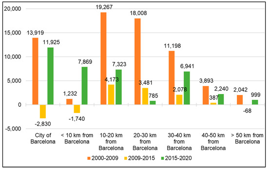
Figure 4.
Annual population change (in absolute numbers). in the city of Barcelona and in the peripheral municipalities grouped in increasingly distant 10 km rings 10 km from Barcelona, 2000–2020. Source: done by the authors from Padrón continuo (local register), INE. Note: periods limited by population on 1 January of the selected years.
During the economic recession phase (from 1 January 2009, to 1 January 2015), Barcelona lost the most population, followed by the closest towns and those located more than 50 km away from the central city. The rest of the rings continued to gain population, especially those located between 10 and 20 km, followed by those situated between 20 and 30 km away from Barcelona. The more remote municipalities gained less population, showing that suburbanisation lost momentum during the economic crisis, probably because the estate bubble burst and the construction industry collapsed. Finally, the new economic recovery phase, beginning on 1 January 2015, has shown different characteristics from the expansion one. Barcelona and the inner ring have been gaining the most population in absolute numbers, followed by the municipalities situated between 10 and 20 km from the central city (Figure 4). However, this is not the case in relative terms (Figure 5). This graph shows that suburbanisation has slightly recovered in recent years, but not as intensely as before 2009, and that it particularly benefits those municipalities located more than 30 km away from Barcelona.

Figure 5.
Annual population growth rate (in %) in the city of Barcelona and in the peripheral municipalities grouped in increasingly distant 10km rings 10 km from Barcelona, 2000–2020. Source: done by the authors from Padrón continuo (local register), INE. Note: periods limited by population on 1 January of the selected years. Comparative data for Spain: 2000–2009: 1.61%; 2009–2015: –0.04%; 2015–2020: 0.35%.
The demographic changes described in the previous paragraphs explain that, in the first two decades of the 21st century, the proportion of the metropolitan population residing in the core has progressively decreased. It has gone from representing 35.4% of the population in 2000 to 32.7% in 2020 (Figure 6). The same happens with the contiguous inner ring, as residents within 10 km of Barcelona go from 19.7% to 17.2% in the same years. However, the percentages have stabilized—and even increased slightly—in recent years. The opposite occurs in outermost rings, gaining demographic importance since the beginning of the century. For instance, the 20 to 30 km ring goes from representing 15.5% in 2000 to 16.5% in 2020, and the 30 to 40 km ring from 4.1% to 6.3%, respectively.
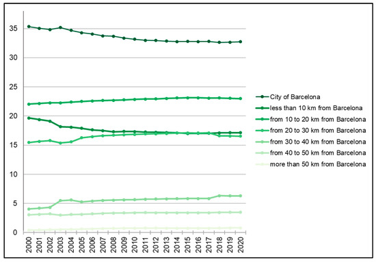
Figure 6.
Percentage of the population of the AMB living in the city of Barcelona and in the peripheral municipalities grouped in increasingly distant 10 km rings from Barcelona, 2000–2020. Source: done by the authors from Padrón continuo (local register), INE. Note: periods limited by population on 1 January of the selected years.
In these two decades, not only has the population living in the metropolitan periphery grown more than that of the core city, suburbanisation has also produced a change in age structure. While suburban towns are mainly composed of families—with working-age parents and children—the population of Barcelona is older. However, there are also differences within the city. In the more central neighbourhoods, where many national and foreign immigrants have settled, there is a process of rejuvenation—and, in some neighbourhoods, also gentrification. However, in the working-class ones, built in the 1960s and 1970s, the population is ageing [33,34]. This ageing process will also reach the peripheral municipalities in the future. In the meantime, the existing differences in age structure are relevant in terms of the means of transport used. Indeed, as it will be observed in the following section, there are not only differences according to the geographical place of residence, but also to the age of the population that uses them.
4.2. Daily Mobility in Barcelona: Towards Metropolitan Transport Sustainability?
The public authorities of the city of Barcelona and its metropolitan area have been implementing policies to achieve the transition to a more sustainable mobility, for several years. The most recent are the low emission zone (ZEB-Rondes) enforced in 2020 in Barcelona and some contiguous municipalities, and interventions on physical urban space. These latter ones intend to reduce the circulation of private vehicles by, among others, limiting the number of traffic lanes in several streets and vehicle speed. Both measures were rapidly enforced during the COVID-19 lockdown. However, other measures, aiming to increase the use of public transport and of micro-mobility, had been previously implemented: the expansion of the metro (subway) system, the creation of a new orthogonal bus network, and the addition of new kilometres of bicycle lanes. But what were the results of these policies until 2019? Has private vehicle traffic decreased?
Starting with the total number of daily trips, these have increased since the beginning of the 21st century. Despite that they slowed down with the economic crisis (when many people lost their employment), they grew again with the economic recovery and fell again in 2020 due to COVID-19 (Figure 7).
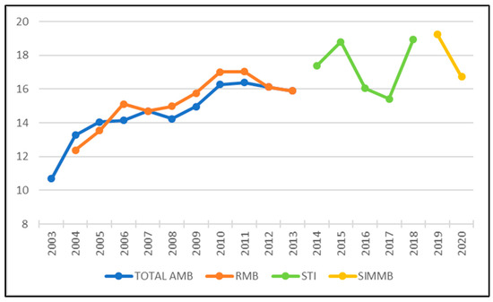
Figure 7.
Number of daily movements (in millions) in Barcelona and its metropolitan region, 2003–2020. Source: done by the authors from AMB, until 2013 [35]. Rest of data: IERMB. Enquesta de mobilitat en dia feiner. La mobilitat a l’Àrea Metropolitana de Barcelona. Informes anuales (2013–2020). Note: Total AMB, until 2010: residents in the inner ring of the Integrated Fare System. Since 2011, residents in the Metropolitan Area of Barcelona (36 municipalities). RMB: the old Metropolitan Region of Barcelona (164 municipalities). STI: Integrated Fare System (253 municipalities). SIMMB: Barcelona’s Metropolitan Mobility Integrated System (311municipalities).
These changes have also been observed in the number of trips per person, reaching an average of 3.97 in 2019 (Figure 8). Outer ring inhabitants are those that are currently making more daily movements (4.03 movements per person) and those who live in the inner ring, the ones that do it the least—3.91 times. However, differences among the three areas are small.
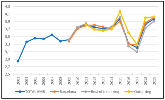
Figure 8.
Average number of daily movements per person in the AMB, distinguishing the city of Barcelona, the rest of the inner ring and the outer ring. AMB, 2003–2019. Source: done by the authors from diverse sources. Until 2008: [35]. From 2009: [31]. Note: Until 2010: residents in the inner ring of the Integrated Fare System. Since 2011, residents in the Metropolitan Area of Barcelona (36 municipalities).
This increase in mobility during the post-crisis has been observed in all means of transport. Starting by public transport, both the annual number of passengers travelling by bus and by metro has grown, since 2012 or 2013, after a few years of falling because of the economic crisis (Figure 9). The thresholds of 400 million and 200 million annual metro and bus passengers, respectively, were surpassed in 2018.

Figure 9.
Annual number of metro and bus passengers (in millions) in the Metropolitan Area of Barcelona. AMB, 2010–2019. Source: done by the authors from [36].
Active mobility users—those who move on foot, by bicycle or on a scooter—have also increased, especially in the case of short distance moves. For instance, daily bicycle journeys have grown from 163,492 in 2013 to 211,993 in 2019 (Table 3). These forms of micro-mobility have benefited from the constant growth of the bicycle lane network (reaching 236 km in 2020, Figure 10) and of other types of pedal or cyclable paths, such as pacified streets and green paths (992 km and 174 km, respectively, in the AMB in 2019). Similarly, the network of secure bicycle parking areas (Bicibox) has also spread throughout the AMB. The growing number of its registered users indirectly shows that the amount of people using bicycles as their main means of transport in the urban area has increased (Figure 11).
Table 3.
Number of trips on a workday by mean of transport used, in the Metropolitan Area of Barcelona. AMB, 2013 and 2019.

Figure 10.
Kilometres of cycling lanes in the municipality of Barcelona, 2011–2020. Source: done by the authors from Department of Statistics and Data Dissemination, and Department of Mobility Strategy, Barcelona City Council.
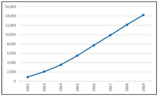
Figure 11.
Number of registered users of the Bicibox service. AMB, 2012–2019. Source: done by the authors from [36].
Another key element of metropolitan policies to achieve the transition towards sustainable mobility is promoting electric vehicles to progressively replace combustion engine ones. To that end, a growing network of electric charging stations—similar to petrol ones, but where electric vehicles can recharge their electric batteries—has been established, reaching a total of 10, in the whole AMB.
The number of its users has been growing gradually in just five years, reaching 581 in 2019. Consequently, the number of recharges and kWh distributed has also grown to 37,835 and 383,889, respectively, in 2019 (Figure 12). These electric recharges would cover 2.7 million km and avoid emitting 356.47 tons of CO2 and 1508.14 kg of NO2 to the atmosphere [36].
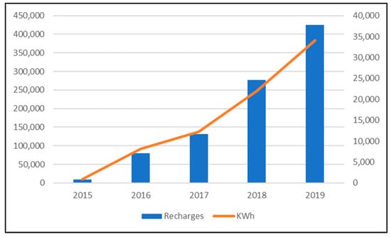
Figure 12.
Number of recharges at electric charging stations (right axe) and KW/h distributed (left axe, 2015–2019. Source: done by the authors from [36].
However, electric vehicles are still a tiny part of those vehicles moving in Barcelona and its metropolitan area. Furthermore, despite public policies promoting the use of an increasingly sustainable mobility, daily trips by private vehicle have grown more than those made by sustainable means of transport, during the post-crisis. This can be observed in Table 3, showing that the total number of daily movements has grown in virtually all means of transport in the AMB between 2013 (one of the deepest crisis moments) and 2019. However, as the table continues to point out, the rate of growth of the number of daily trips by private vehicle more than doubles the growth in the use of public transport or active mobility, in 2019. In fact, these journeys by private vehicle represent more than a quarter of the total moves (Table 3). While central city dwellers use active mobility more frequently than inner ring ones, private vehicles are predominant against any other means of transport in the outer ring (Table 4).
Table 4.
Number of trips on a workday in the city of Barcelona, the rest of the inner ring and the outer ring. AMB, 2013 and 2019.
Why has the use of private vehicles increased despite the deployment of policies to reduce them in Barcelona and its metropolitan area? Possible causes are developed in the following paragraphs.
One of the plausible reasons is population ageing. EMAF 2019 mobility survey data indicates that young people between the age of 16 and 29 are those that use public transport the most. Indeed, in 2019, they made 39.3% of all their trips on this kind of vehicle, compared to 21.2% of the adults between the age of 30 and 64, and to 19.3% of those over 64 [36]. Therefore, the older the population of a municipality, the less public transport is used. However, active mobility increases to percentages ranging from 42.2% of all trips in young people, to 47.2% in adults and 65.7% in the elderly people. By contrast, adults between the age of 30 and 64 are the biggest private vehicle users (31.6% of all daily moves compared to 18.5% of young people and 15% of elderly people, in 2019).
This growing use of private vehicles by adults could be related to their greater participation in the labour market. Therefore, a second factor, daily mobility by cause, and its possible changes, must be analysed. Two out of every three trips are for reasons other than to work or study, and only a third is to commute. This latter percentage decreased during the economic crisis—when the number of unemployed increased considerably—but has recovered since 2013; the percentage is higher in 2019 (Figure 13 and Figure 14).
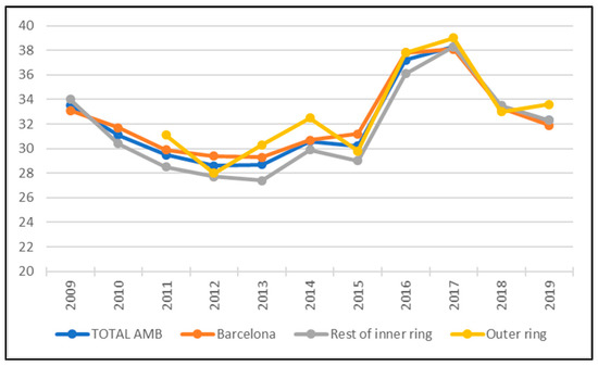
Figure 13.
Percentage of commuting trips in the Metropolitan Area of Barcelona, distinguishing the city of Barcelona, the rest of the inner ring and the outer ring. AMB, 2009–2019. Source: done by the authors from [31]. Note: Until 2010: residents in the inner ring of the Integrated Fare System. Since 2011, residents in the Metropolitan Area of Barcelona (36 municipalities).
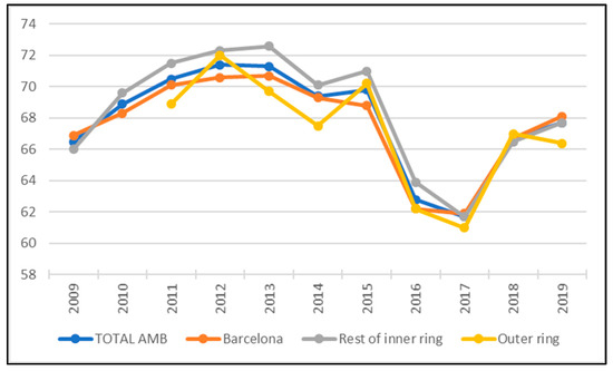
Figure 14.
Percentage of daily trips for reasons other than commuting in the Metropolitan Area of Barcelona, distinguishing the city of Barcelona, the rest of the inner ring and the outer ring. AMB, 2009–2019. Source: done by the authors from [31]. Note: Until 2010: residents in the inner ring of the Integrated Fare System. Since 2011, residents in the Metropolitan Area of Barcelona (36 municipalities).
Though differences are not huge, the highest percentage of commuting trips is observed in outer rings, and the lowest in the city of Barcelona (Figure 13). The opposite occurs in daily trips for reasons other than commuting (Figure 14). Once more, we can assume that these differences between the core city and peripheries may partly respond to age structure, since people living in Barcelona are relatively older, while suburban municipality residents, especially those in the outer ring, are mainly of working age or young people who study [33].
What would this have to do with the number of private vehicles used, the vast majority (still) being powered by a combustion engine? Table 5 shows that daily movements for reasons other than commuting are mainly active ones—on foot or by bicycle—while commuters mainly use public transport or their private vehicle. The increasing proportion of commuting trips among daily movements between 2013 and 2019, combined with growing suburbanisation, would explain, to a large extent, that percentages of those using active mobility or public transport to move in the AMB, have decreased. In fact, those who move in private vehicles have increased by almost a point and a half.
Table 5.
Reason for moving by mean of transport (%) in the Metropolitan Area of Barcelona. AMB, 2013 and 2019.
Does this mean that policies promoting public transport have failed? Not necessarily, though the use of private vehicles for reasons other than commuting has risen slightly, this has not been so in the case of commuting. In fact, active mobility is the form of mobility that has grown the most between 2013 and 2019, while the use of public transport has decreased and that of private vehicles has remained stable. In other words, it is the greater proportion of commuting in relation to overall mobility and the greater number of trips for work or study reasons that explains the increased use of private vehicles in recent years, not the fact that they are increasingly used for commuting.
Undoubtedly, the relation between age structure and reasons for daily mobility must affect the way the different means of transport are used in each area into which the AMB is divided. To this end, we analysed the diverse forms of moving within the AMB, distinguishing the three areas into which it is divided, and how they have changed over time (Figure 15).
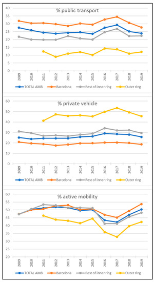
Figure 15.
Percentage of use of each mean of transport in the Metropolitan Area of Barcelona, distinguishing the city of Barcelona, the rest of the inner ring and the outer AMB, 2009–2019. Source: done by the authors from [31]. Note: Until 2010: residents in the inner ring of the Integrated Fare System. Since 2011, residents in the Metropolitan Area of Barcelona (36 municipalities).
The results showed that it is in outer ring suburban towns where active mobility and public transport are used the least and that the highest proportion of daily trips are made by private vehicle. Furthermore, it is also in these municipalities where private vehicles are most used, even in daily mobility for reasons other than commuting [31]. This would explain why this type of daily mobility, made by private vehicles, has increased (Table 5). By contrast, public transport and mobility on foot and by bicycle are the most used in Barcelona. In this sense, the rest of the inner ring municipalities are in an intermediate position.
An indicator summarising data discussed in the previous paragraph is the public transport/private transport ratio. A result bigger than 1 means that public transport is used more, and a result smaller than 1 indicates that private vehicles predominate. Figure 16 shows that it is in the city of Barcelona that public transport is predominantly used, while, in peripheral municipalities—especially outer ring ones—private vehicles are used more. In the whole AMB, this indicator is around 1, showing a certain equilibrium in the use of both transport modes, though the indicator tends to decrease, therefore, pointing to an increasingly predominant use of private transport. Given that the three lines corresponding to the three geographical areas under analysis in Figure 16 show great stability, the downward trend of the ratio for the whole AMB could be explained—as it has already been stated—by a progressively greater demographic importance of the peripheries with respect to the core of the urban area, the city of Barcelona.
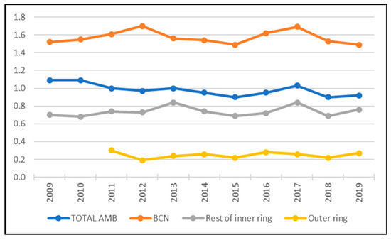
Figure 16.
Ratio public transport/private transport in the Metropolitan Area of Barcelona, distinguishing the city of Barcelona, the rest of the inner ring and the outer ring. AMB, 2009–2019. Source: done by the authors from [31]. Note: Until 2010: residents in the inner ring of the Integrated Fare System. Since 2011, residents in the Metropolitan Area of Barcelona (36 municipalities).
Another factor that may explain this tendency towards a greater use of private vehicles is a change in the spatial patterns of traffic, showing a gradual increase in longer daily trips. This can be analysed using several indicators. For instance, that of municipal self-containment, giving the percentage of daily trips originating in and with destination to the municipality of residence (Figure 17). Obviously, the highest municipal self-containment values (close to 90%) are observed in Barcelona, the largest, most populated, and densest municipality, that has the largest job market and more services. At the other end of the spectrum are periphery municipalities (with values below 60%), in many of which it is necessary to leave to work, consume, visit a doctor, etc. More significantly, municipal self-containment has reduced in all three geographical areas since 2013, because of economic and labour market recovery. Indeed, this is clearly shown by the line in the graph indicating self-containment for the whole AMB. In other words, increasingly more people leave their municipality to work, study or other reasons, implying that the distance travelled has grown.

Figure 17.
Municipal self-containment (percentage of daily trips originating in and with the destination to the municipality of residence, with respect to the total daily trips made) in the AMB, distinguishing the city of Barcelona, the rest of the inner ring and the outer ring. AMB, 2009–2019. Source: done by the authors from [31]. Note: Until 2010: residents in the inner ring of the Integrated Fare System. Since 2011, residents in the Metropolitan Area of Barcelona (36 municipalities).
Another interesting indicator is destination-origin ratio, found by dividing the number of daily trips with destination in of each area by those originating in each of them (Figure 18). The result for the city of Barcelona is more than 2. This indicates that, at least, twice as many daily trips have this destination as those originating in it. The opposite occurs in contiguous municipalities to Barcelona, the rest of the inner ring, where the number of trips in which the destination is the inner ring is almost half of those originating in it. These are mainly residential municipalities, where many of the people living in them commute to Barcelona. By contrast, in outer ring towns, the indicator shows a more balanced result. Indeed, many of their inhabitants move out of their municipality of residence to work or for other reasons, but many people also arrive to them daily, for instance, to work. In fact, numerous industrial and logistic parks are situated in this outer suburban area. The line in the graph shows that values for the whole AMB are more than 1 (there are more moves that have this destination than those originating in it) and this trend grows. This could suggest that the AMB is increasingly open to the world, implying longer daily trips.
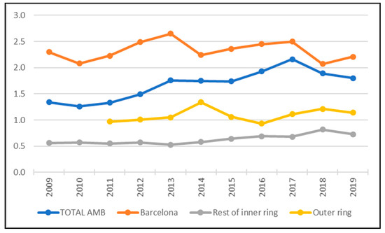
Figure 18.
Origin-destination ratio (the number of daily trips with the destination in of each area divided by those originating in each area of them) in the AMB, distinguishing the city of Barcelona, the rest of the inner ring and the outer ring. AMB, 2009–2019. Source: done by the authors from [31]. Note: Until 2010: residents in the inner ring of the Integrated Fare System. Since 2011, residents in the Metropolitan Area of Barcelona (36 municipalities).
The last indicator, average duration of daily trips by public transport (Figure 19), shows an increase in distances travelled. Obviously, the lowest values of this indicator correspond to the core city (less than 35 min) and the highest ones to outer ring municipalities (more than 45 min). In addition, it should be also noted that figures tended to rise. In other words, a longer time travelling can be synonymous with a longer distance covered and could also imply a potential advantage for using private transport in metropolitan areas. In fact, the average duration of journeys in private transport in the AMB (23 min) is much lower than that in public transport, lasting, on average, more than half an hour, or 34.8 min, to be exact. In fact, private vehicle journeys are only longer than daily trips on foot, bicycle, or scooter (15.8 min). As each mean of transport is used differently in the core city, in the rest of the inner ring and the outer ring, the average duration of daily trips is very similar in the three areas under examination—22.4, 22.0 and 21.8, respectively, for an average duration of 22.2 min in the whole AMB. In other words, despite that population has grown more in the periphery with respect to the centre, and despite the increased travel distances that this entails, there would not have been an increase in the average duration of trips due to the greater use of private transport in the outer ring.
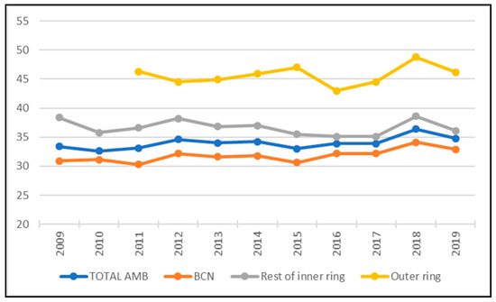
Figure 19.
Average duration of trips (in minutes) by public transport in the Metropolitan Area of Barcelona, distinguishing the city of Barcelona, the rest of the inner ring and the outer ring AMB, 2009–2019. Source: done by the authors from [31]. Note: Until 2010: residents in the inner ring of the Integrated Fare System. Since 2011, residents in the Metropolitan Area of Barcelona (36 municipalities).
In short, the public policies implemented have, at the same time, increased the use of active mobility and public transport, between 2013 and 2019. However, that of private transport has augmented even more, probably due to a combination of several factors: population ageing, an increasing percentage of the population living in peripheries—mostly working (adults) or studying (young people)—an increment of commuting with respect to other reasons for daily movements, and of the distance travelled. In the following section we will observe its impact on air quality.
4.3. Air Quality in the AMB: Towards (Insufficient) Pollution Reduction
Air pollution is an important cause of mortality and morbidity; it is the environmental factor that most damages health. Pollution increases the risk of contracting respiratory, cardiovascular, immunological, neurological, or oncological diseases and increases the risk of dying from any other cause at any age. According to the Barcelona Public Health Agency (ASPB), excess air pollution causes about 1000 deaths in the city per year, a figure representing 7% of all deaths [37].
One of the air pollution components are substances in the air, which are the ones that can cause the greatest health damage. They are mainly caused by anthropogenic action, namely, by industrial and transport emissions.
The pollutants found in the air are: suspended particles (PM10 or PM2.5); sulphur compounds (S02 sulphur dioxide; H2S hydrogen sulphide); nitrogen compounds (NO nitric oxide, NO2 nitrogen dioxide, NOx nitrogen oxide, NH3 ammonia), carbon compounds (CO carbon monoxide, CO2 Carbon dioxide, CH4 Methane, THC total hydrocarbons), halogens and chlorine compounds (Cl2 chlorine, HCl hydrochloric acid, HF hydrofluoric acid, CFCs chlorofluorocarbons) and photochemical oxidants (O3 ozone, peroxides, aldehydes). The pollutants affecting this metropolitan area the most are: nitrogen dioxide NO2—an irritating gas generated by road traffic, especially diesel-powered vehicles—and suspended particles (PM10 or PM2.5), emitted by combustion vehicles [38].
Among the many different indicators measuring pollution, the ICQA index—elaborated with data on the main air pollutants (SO2, NO2, O3, CO and PM10) —was chosen to analyse air pollution, in this study. Data come from the Directorate of Environmental Quality belonging to the Department of Territory and Sustainability of the Generalitat de Catalunya. Its values vary between −100 (worst air quality) and 100 (best air quality). Shown in Table 6 are the mean values of the ICQA index for those AMB municipalities where there are measurement stations connected to the Atmospheric Pollution Prevention Surveillance Network of Catalonia.
Table 6.
ICQA for some of the municipalities of the Metropolitan Area of Barcelona, 2004–2019.
In most municipalities, the values of the index exceeded 50% during the entire period under analysis, reaching the highest values—best air quality—between 2010 and 2014, the economic crisis years. In general terms, air quality is better than 15 years before. As for geographical location, the highest rates were observed in the inner ring municipalities such as Sant Coloma de Gramanet, Sant Andreu de la Barca, L’Hospitalet de Llobregat and also Sant Cugat del Vallès—the latter, part of the AMB, but situated in the outer ring. However, in the city of Barcelona, air quality was lower. The main components of atmospheric pollution in all these municipalities are nitrogen dioxide (NO2) and PM10 particles. In the city of Barcelona, air quality is measured in two types of stations, urban traffic stations and urban background stations. The first measures pollution from street traffic emissions. As for urban background ones, they measure contamination from different origins. They are situated away—300 m—from main roads with more than 10,000 vehicles per day, or from any other nearby emission source.
According to data from the Barcelona Public Health Agency and the Department of Climate Action, Food and Rural Agenda of the Generalitat de Catalunya [37], pollution levels in the city of Barcelona have been decreasing since 2004. Indeed, data reflect the positive results of the implementation of measures to reduce pollution both in the city of Barcelona and in the AMB. However, NO2 emissions by urban traffic (Figure 20) are above the limits for the protection of human health. In fact, they are above the limits set by both the European Environment Agency—40 µg/m³ (in force since 2005)—and the WHO, which is much more demanding, i.e., 20 µg/m³. Only urban background stations show NO2 levels below 40 µg/m³ (Figure 21). The case of PM10 particles is different, as they have decreased, reaching half the limit considered harmful to health (Figure 22 and Figure 23).
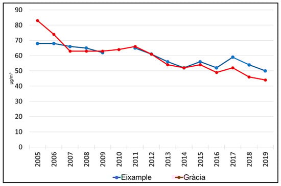
Figure 20.
Nitrogen dioxide emissions in µg/m³ (Traffic), Barcelona, 2004–2019. Source: done by the authors from Barcelona Public Health Agency and the Department of Climate Action, Food and Rural Agenda of the Generalitat de Catalunya.
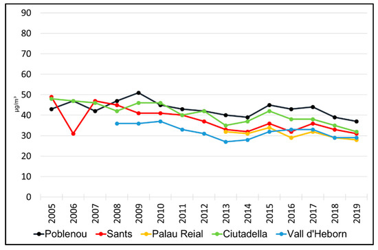
Figure 21.
Nitrogen dioxide emissions in µg/m³ (Urban background), Barcelona, 2004–2019. Source: done by the authors from Barcelona Public Health Agency and the Department of Climate Action, Food and Rural Agenda of the Generalitat de Catalunya.
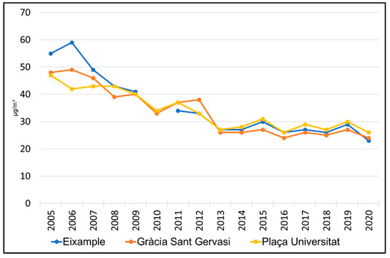
Figure 22.
PM10 emissions in µg/m³ (Traffic), Barcelona, 2004–2019. Source: done by the authors from Barcelona Public Health Agency and the Department of Climate Action, Food and Rural Agenda of the Generalitat de Catalunya.
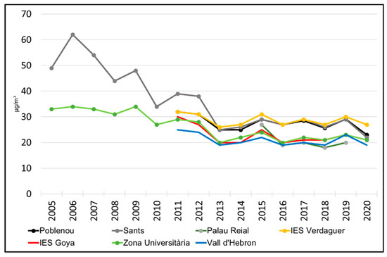
Figure 23.
PM10 emissions in µg/m³ (urban background), Barcelona, 2004–2019. Source: done by the authors from Barcelona Public Health Agency and the Department of Climate Action, Food and Rural Agenda of the Generalitat de Catalunya.
Therefore, the reduction in pollution and the improvement of air quality in the city of Barcelona and the municipalities of the AMB was confirmed; indexes were more positive than fifteen years ago. Vehicle fleet composition changes (in terms of environmental standards) due to car renewal may be partly responsible for this improvement: according to the Barcelona City Council, in 2019, only 25.4% of the vehicles registered in Barcelona did not have the environmental sticker identifying the most environmentally friendly vehicles. This reduction in pollution was faster in the crisis years and slowed in the economic recovery ones. Moreover, reductions were lower in traffic stations and with regard to pollutant NO2, emitted mainly by diesel vehicles. Finally, the latest available data show that the restrictions caused by lockdowns and the sharp reduction in mobility during the pandemic led to an unprecedented improvement in air quality. Nevertheless, once activity has resumed, it will gradually recover pre-pandemic levels.
5. Conclusions
This research, which analysed the relationship between recent spatial demographic dynamics in the Barcelona metropolitan area and its consequences on daily mobility, has provided us answers to the three research questions.
The first asked what the demographic trends have been in the Barcelona metropolitan area in the last two decades. The data analysed shows that, despite demographic changes during the expansion, crisis and post-crisis phases, previous suburbanisation trends, already observed in the last decades of the 20th century, have continued. This means that population has increased in peripheral rings, particularly in those furthest from the city of Barcelona. In fact, it has increased more than in the central city and in the contiguous municipalities—those bordering the city of Barcelona and/or located at less than 10 km from it. It is true that, in these last two more central areas, the population has also increased in the expansion and post-crisis phases, but both areas lost population during the crisis period. This was because international migration flows changed their direction [39]. Negative net migration meant a population loss that was not compensated by weakening suburbanisation during the years of crisis. However, Barcelona and the closest municipalities regained population, due to the arrival, once again, of international immigrants, in the last few years before the outbreak of the COVID-19 crisis. Moreover, these are the municipalities that have gained the most population, in absolute figures. However, municipalities located more than 30 km away from Barcelona, the ones that have benefited from the reactivation of suburbanisation flows the most, have grown at a higher rate [40]. Therefore, Barcelona and the inner ring have gained less population than outer suburban municipalities in the first two decades of the 21st century, and, consequently, have lost demographic importance.
The second question concerned daily mobility trends in the AMB in the past two decades and how the use of the different means of transportation changed in relation to the spatial demographic trends mentioned above. It can initially be responded that active mobility and the use of public transport have increased, but that of private vehicles has grown even more. This is due to several factors. The first is population ageing, implying less use of public transport. The second is the increased importance of commuting—involving a greater use of private vehicles—in comparison to moves for other reasons. The third is the growing percentage of people living in the periphery and who, for age structure reasons, mostly work (adults) or study (young people). This latter fact, which implies increasing commuting distance, also leads to greater use of the car, to reduce the time that traveling by public transport would imply. Therefore, the answer must make the difference between the core and the periphery municipalities. In the most central urban areas, where there are abundant and well-connected public services, that is to say, the city of Barcelona and the inner ring towns, the use of public transport increased during the last years of economic recovery. This occurred after the number of users declined in the crisis years, when unemployment rose sharply. Together with public transport, active mobility (on foot, by bike or scooter, among other forms of micro-mobility) has also risen in the more central area. Therefore, policies to reduce private vehicle use have been successful in Barcelona and the inner ring municipalities. By contrast, this has not been the case in the outer ring municipalities, as the use of private vehicles has not fallen. Here, commuters must travel increasingly longer distances—then, walking and using other forms of micro-mobility are not possible—and public transport stops being competitive, as it implies travelling for more time. To prevent this, many of those living in suburban areas take the option of using their private vehicles more often.
Therefore, the results of the first two questions are ambivalent and confirm our initial hypothesis. The slow but steady transition towards sustainable forms of mobility in the core city and the dense contiguous municipalities is counterbalanced by what occurs in the peripheral suburbs. There, the use of private vehicles is still preeminent, and this is not good news, considering that the proportion of the metropolitan population living in these parts of the AMB is increasing.
Finally, the third question asked whether pollution data in the last two decades could indicate the success or failure of the private vehicle reduction policy. The results show that there has been a relative success in the most central municipalities of the AMB (for which data are available), where air quality has improved over the last fifteen years. Not all parameters have seen a similar reduction in pollution. PM10 pollution levels, with levels under those recommended, has been reduced more than those of NO2, which are still excessively high due to traffic. Though air quality does not depend only on the means of transport used, undoubtedly the implementation of measures to reduce pollution caused by private vehicles has had a positive impact. As mentioned in the theoretical framework, among these there would be the promotion of public transport, tactical urban planning measures, the push to create the “superilles” (superblocks) and other low traffic neighbourhoods, or the creation of an extensive low emission zone, such as the ZBE Rondes. However, these policies of the Barcelona City Council, which are part of the Sustainable Urban Mobility Plans implemented by local authorities to achieve the environmental objectives set out in the European Green Deal, are only a first step, which is still incomplete.
6. Discussion
To accomplish the transition to a sustainable urban mobility, the Barcelona City Council, within its 2030 Agenda to achieve Sustainable Development Goals—particularly Goal 11: Sustainable cities and communities [41] —has developed the new Urban Mobility Plan for 2019–2024 [42], with a holistic approach. It includes three main milestones: to increase mobility on foot; to create safe and comfortable spaces for pedestrians; and to augment sustainable and more efficient means of mobility—bicycle, shared-use of vehicles, and public transport—while reducing private vehicles (cars and motorcycles) on streets. It not only intends to reduce environmental pollution—both atmospheric and acoustic—and its health-related problems, but also car accidents and the amount of public space occupied. Other goals are to reduce transport energy consumption, reducing its contribution to climate change, and to increase renewable and ‘clean’ energy used. That is, Barcelona needs a safer, healthier, smarter and more sustainable mobility, but also a more equitable one. Indeed, the latter aim may only be reached by ensuring a public transport system for everyone and allowing a fair mobility according to age, physical condition, gender, income, and neighbourhood.
This municipal urban mobility plan, currently being implemented, will be replaced by the 2024 New Urban Mobility Plan. It was initially approved on 14 December 2021, by the Commission for Ecology, Urbanism, Infrastructures and Mobility of the Barcelona City Council, and is currently in the phase of publicly being exhibited [43]. This new plan specified a total of 60 lines of action and more than 300 measures to achieve a more sustainable, safe, and healthy mobility. It also sets the goal that by 2024, 81.52% of the movements in the city of Barcelona will be made on foot, by public transport or by bicycle.
However, the results of this research show that interventions to reduce the use of private vehicles in large cities can be affected and mitigated by socio-demographic and residential dynamics observed at the metropolitan level. Therefore, policies must go beyond the city itself—in this case, Barcelona—and be extended to the whole metropolitan area, this is, the “natural” sphere in which environmental and transport planning policies develop by definition. Indeed, this is especially so when suburbanisation, frequently combined with urban sprawl—unlimited growth of a low-density urbanised area—would seem to favour the use of private vehicles instead of public transport. Hence, the governance of mobility within the metropolis of Barcelona affects a larger area than the city itself and has been assumed by the AMB. This supra-municipal body has designed the 2019–2024 Metropolitan Urban Mobility Plan for its 36 municipalities [44]. It is a plan developing a strategy for moving people and goods by sustainable means of transport at a supra-municipal level, establishing lines of action in those areas in which the AMB has the legal capacity to act. In other words, it establishes an interdependent mobility scheme, setting criteria and guidelines for the development of sustainable urban mobility plans in its 36 metropolitan municipalities. Therefore, it intends to ensure that local plans on mobility are compatible with a medium and long-term strategy at a metropolitan level to achieve the transition to sustainable mobility.
The AMB has also the legal responsibility to protect the environment, so it has implemented several initiatives to reverse present air pollution problems: the Metropolitan Sustainability Plan (2014–2020), which integrates sustainability criteria into metropolitan policies; the Council of Metropolitan Municipalities to Fight against Atmospheric Pollution, created in 2015, to coordinate joint measures among the 36 metropolitan municipalities and is a space for technical cooperation to confront air pollution; and the Air Quality Table of the Barcelona Conurbation, in which social agents, institutions and public and private organizations involved in the reduction in air pollution, participate.
Among the specific measures emanating from the Action Plan for the Improvement of Air Quality, Horizon 2020, several actions, in the field of mobility, have been implemented. For instance, in order to reduce the population exposed to polluting gases by vehicle traffic, the implementation of LEZs has been extended to other areas. In addition to the Barcelona LEZ, the Sant Cugat Centre LEZ, in the suburban town of Sant Cugat del Vallès, was put in place on 1 May 2021. Other measures to induce people to change from private vehicles to public transport have also been introduced. The Metropolitan Green Card can be highlighted among them, as it consists of a three-year free public transport ticket for citizens who scrap their old vehicle. Finally, clean mobility has also been encouraged in several ways. Some examples are: the renewal of the AMB bus fleet, eliminating diesel-powered vehicles; the expansion of the network of charging points for electric vehicles; the encouragement of cycling as a means of mobility by working towards the creation of a metropolitan network of cycle paths and the improvement of cycling services (Bicibox, etc.); the promotion of a high-performance public transport; or the extension of park and rides parking areas at the metropolitan level [44].
We cannot end this article without mentioning that measures implemented so far to regain public space for citizens have strengthened the transition to a low-carbon mobility in many European cities but have also widened the so-called ‘mobility divide’. Indeed, most medium, and high-income commuters who own newer and less polluting cars, continue commuting despite the existence of a LEZ in their city. However, low-income ones have more difficulties to continue doing so, unless they renew their car. Consequently, household income should also be an element under consideration when LEZs are implemented [45]. In Barcelona, this mobility divide stands out in the ZBE-Rondes low emission zone. Indeed, it has generated a negative social impact on the most deprived social groups living in the periphery and who now find it more difficult to commute into the city of Barcelona. Similarly, the pandemic has also widened the mobility divide, as public transport, one of the contagion routes of the virus [46,47], is still used in particular by low-income workers. They often have low-skilled jobs, that do not adapt to teleworking extremely well. Additionally, lockdowns forced people to meet their needs in their neighbourhoods, highlighting differences in the quality of life between high and low amenity areas [13].
Moreover, deprived neighbourhoods have scarcely been favoured by tactical urban interventions. Neverthless, when these are carried out (for instance, when LTNs or new cycling lanes are implemented), they may contribute to expel low-income residents [45]. This is a process called environmental, ecological or green gentrification [48,49,50], in which cleaning up pollution or providing green amenities, increases local property values and attracts higher-income dwellers to a previously polluted or deprived area. As housing prices rise, vulnerable neighbours are forced to find another place in which to live [51,52]. This green gentrification has been observed in Barcelona as a consequence of the implementation of the “superilles” or superblocks and other tactical urban planning measures to reduce private vehicle traffic. Though it has improved the quality of life in several neighbourhoods, it has also expelled neighbours who cannot afford to pay housing price increases.
An additional non-desirable effect is that small traditional retail shops are being obliged to move away by franchises and multinational stores—this has been observed in Barcelona but also in Madrid [53]. As a result, the advantages of these environmental interventions, like health benefits for locals, can be overturned, creating social injustices for some, while others enjoy environmental privileges [54,55]. In other words, the introduction of new environmental amenities and new ‘tactical’ interventions may not always help to build a just and sustainable neighbourhood for everyone [45]. Hence, to mitigate the negative socioeconomic consequences of the urban mobility transition and avoid other social divisions while fighting gentrification, it is essential for urban planners and public authorities to transform social equality into a core criterion in mobility policies [11]. In sum, the mobility transition must lead to a more sustainable but also a socially fairer mobility.
Finally, this research focused on the demographic aspects of suburbanisation [56] and its environmental consequences. However, the results are also part of a broader discussion on which urban form can more effectively lead to lower carbon footprint or, in other words, the global warming impact of urban sprawl and suburbanisation, with very relevant policy implications. This being a significant topic, there is a wide international literature on the subject [57,58,59,60]. We hope to have contributed to the debate with this research—the main message is that the design and implementation of public policies aiming at the environmental improvement of urban mobility should take into account recent trends in spatial demographic dynamics. Otherwise, the transition to sustainable urban mobility will be a longer and more difficult process.
Author Contributions
Conceptualization, F.G.-A.; methodology, F.G.-A. and C.L.-V.; software, F.G.-A., C.L.-V. and J.T.-Q.; validation, F.G.-A. and C.L.-V.; formal analysis, F.G.-A., C.L.-V. and J.T.-Q.; investigation, F.G.-A. and C.L.-V.; resources, F.G.-A. and C.L.-V.; data curation, F.G.-A., C.L.-V. and J.T.-Q.; writing—original draft preparation, F.G.-A. and C.L.-V.; writing—review and editing, F.G.-A.; visualization, F.G.-A., C.L.-V. and J.T.-Q.; supervision, F.G.-A.; project administration, C.L.-V.; funding acquisition, F.G.-A. and C.L.-V. All authors have read and agreed to the published version of the manuscript.
Funding
Research for the present paper was conducted within the following I+D+i project: Nuevas movilidades y reconfiguración sociorresidencial en la poscrisis: consecuencias socioeconómicas y demográficas en las áreas urbanas españolas (New mobilities and socio-residential reconfiguration in the post-crisis: socio-economic and demographic consequences in Spanish urban areas, ref. RTI2018-095667-B-I00), directed by Dr Cristina López Villanueva and Dr Fernando Gil Alonso. It was funded by the Spanish Ministry of Science and Innovation, the Spanish Research Agency, and the European Regional Development Fund (MCIN/AEI /10.13039/501100011033/ FEDER «Una manera de hacer Europa»). The authors are members of the Territori, Població i Ciutadania (Territory, Population, and Citizenship) consolidated research group, recognized by the Catalan government (ref. GRC_2017SGR1298) and coordinated by Dr Fernando Gil Alonso.
Institutional Review Board Statement
Not applicable.
Informed Consent Statement
Not applicable.
Data Availability Statement
Publicly available datasets were analyzed in this study. This data can be found here: https://www.ine.es/.
Acknowledgments
The authors are grateful for the comments received from the Urban Science editorial team and the three reviewers, all of them contributing to improvements in the text.
Conflicts of Interest
The authors declare no conflict of interest.
References
- EC—European Commission. The European Green Deal; Communication COM 640 Final; European Commission: Brussels, Belgium, 2019; Available online: https://ec.europa.eu/info/strategy/priorities-2019-2024/european-green-deal_en (accessed on 7 September 2021).
- Bernardo, V. The effectiveness of low-emission zones and urban tolls in mitigating pollution and congestion: Evidence from the literature. In Urban Mobility after COVID-19. Long-Term Strategies for the Sustainable Mobility Transition in European Cities; Abdullah, H., Serrano Roble, E., Eds.; CIDOB, Ajuntament de Barcelona: Barcelona, Spain, 2021; pp. 39–44. [Google Scholar]
- EC—European Commission. Sustainable and Smart Mobility Strategy—Putting European Transport on Track for the Future; 9.12.2020.COM 2020a 789 Final; European Comission: Brussels, Belgium, 2020; Available online: https://ec.europa.eu/transport/sites/default/files/legislation/com20200789.pdf(2020a) (accessed on 2 September 2021).
- Sluiter, C. The new EU Sustainable and Smart Mobility Strategy: A local and regional perspective. In Urban Mobility after COVID-19. Long-Term Strategies for the Sustainable Mobility Transition in European Cities; Abdullah, H., Serrano Roble, E., Eds.; CIDOB, Ajuntament de Barcelona: Barcelona, Spain, 2021; pp. 25–29. [Google Scholar]
- EC—European Commission. Mobility and Transport. Website of the European Union. 2020. Available online: https://ec.europa.eu/transport/themes/urban/urban_mobility_en (accessed on 16 July 2021).
- EC—European Commission. Official Journal of the European Communities C 289; European Commission: Brussels, Belgium, 1988. [Google Scholar]
- EC—European Commission. Green Paper: Urban Environment; Publications Office European Commission: Brussels, Belgium, 1991. [Google Scholar]
- EC—European Commission. White Paper on Transport (COM/2001/0370); European Commission: Brussels, Belgium, 2001. [Google Scholar]
- EC—European Commission. Green Paper: Towards a New Culture for Urban Mobility (COM/2007/ 551); European Commission: Brussels, Belgium, 2007. [Google Scholar]
- EC—European Commission. Action Plan on Urban Mobility (SEC/2009/1211); European Commission: Brussels, Belgium, 2009. [Google Scholar]
- Abdullah, H.; Serrano Roble, E. (Eds.) Urban Mobility after COVID-19. Long-Term Strategies for the Sustainable Mobility Transition in European Cities; CIDOB, Ajuntament de Barcelona: Barcelona, Spain, 2021. [Google Scholar]
- Degen, A. Building back European public transport after COVID-19. In Urban Mobility after COVID-19. Long-Term Strategies for the Sustainable Mobility Transition in European Cities; Abdullah, H., Serrano Roble, E., Eds.; CIDOB, Ajuntament de Barcelona: Barcelona, Spain, 2021; pp. 57–60. [Google Scholar]
- Gragera, A. How can shared mobility contribute to the post-pandemic urban mobility transition? In Urban Mobility after COVID-19. Long-Term Strategies for the Sustainable Mobility Transition in European Cities; Abdullah, H., Serrano Roble, E., Eds.; CIDOB, Ajuntament de Barcelona: Barcelona, Spain, 2021; pp. 63–66. [Google Scholar]
- EIT. Urban Mobility Strategies during COVID-19; EIT: Budapest, Hungary, 2021; Chapter 5, pp. 93–122. Available online: https://www.eiturbanmobility.eu/wp-content/uploads/2021/03/Urban-mobility-strategies-during-COVID-19_long-1.pdf (accessed on 20 September 2021).
- Su, Y.; Liu, S. The Impact of the COVID-19 Pandemic on the Demand for Density: Evidence from the US Housing Market. 2020. Available online: https://mpra.ub.uni-muenchen.de/102082/ (accessed on 25 June 2021).
- Eltis. European Commission Releases New Urban Mobility Framework. 2021. Available online: https://www.eltis.org/in-brief/news/european-commission-releases-new-urban-mobility-framework (accessed on 26 December 2021).
- Eltis. Guidelines for Developing and Implementing a Sustainable Urban Mobility Plan (2nd edition). 2021. Available online: https://www.eltis.org/mobility-plans/sump-guidelines (accessed on 7 September 2021).
- Smeds, E.; Jones, P. Developing Transition Pathways towards Sustainable Mobility in European Cities: Conceptual Framework and Practical Guidance. 2020, Deliverable D1.2, H2020 CIVITAS SUMP-PLUS Project. Available online: https://sump-plus.eu/fileadmin/user_upload/Resources/Reports_and_publications/SUMP-PLUS_-_developing_transition_pathways_-_D1.2_final_version_compressed.pdf (accessed on 7 September 2021).
- Leach, J. Challenging the car’s dominance to bring life back to residential streets and support high streets and town centres. In Urban Mobility after COVID-19. Long-Term Strategies for the Sustainable Mobility Transition in European Cities; Abdullah, H., Serrano Roble, E., Eds.; CIDOB, Ajuntament de Barcelona: Barcelona, Spain, 2021; pp. 45–48. [Google Scholar]
- Rueda, S. La Supermanzana, Nueva Célula Urbana Para La Construcción de Un Nuevo Modelo Funcional y Urbanístico de Barcelona. 2016. Available online: http://www.bcnecologia.net/sites/default/files/proyectos/la_supermanzana_nueva_celula_poblenou_salvador_rueda.pdf (accessed on 16 July 2021).
- Ajuntament de Barcelona. Barcelona Superblock: New Stage. 2021. Available online: https://ajuntament.barcelona.cat/superilles/en/ (accessed on 30 August 2021).
- AMB. ZBE Rondes de Barcelona. Àrea Metropolitana de Barcelona: Barcelona, Spain. Available online: https://www.zbe.barcelona/en/index.html (accessed on 30 August 2021).
- Bernardo, V.; Fageda, X.; Flores-Fillol, R. Mitigating congestion in urban areas: Urban tolls versus low emission zones. Papeles Energía 2020, 10, 67–92. [Google Scholar]
- Simeonova, E.; Currie, J.; Nilsson, P.; Walker, R. Congestion pricing, air pollution and children’s health. In National Bureau Economic Research; Working Paper, 24410; Citeseer: Princeton, NJ, USA, 2019. [Google Scholar]
- Gibson, M.; Carnovale, M. The effects of road pricing on driver behavior and air pollution. J. Urban Econ. 2015, 89, 62–73. [Google Scholar] [CrossRef] [Green Version]
- Bernardo, V.; Fageda, X.; Flores-Fillol, R. Políticas para reducir contaminación y congestión en áreas urbanas: ¿peajes urbanos o zonas de bajas emisiones? EsadeEcPol Brief 2021, 8, 1–21. [Google Scholar]
- Green, C.P.; Heywood, J.S.; Navarro, M. Traffic accidents and the London congestion charge. J. Pub. Econ. 2016, 133, 11–22. [Google Scholar] [CrossRef] [Green Version]
- Tassinari, F. Low Emission Zones and Traffic Congestion: Evidence from Madrid Central; Mimeo: New York, NY, USA, 2021. [Google Scholar]
- Fageda, X.; Flores-Fillol, R.; Theilen, B. Price Versus Quantity Measures to Deal with Pollution and Congestion in Urban Areas: A Political Economy Approach”, SSRN Working Paper. 2020. Available online: https://papers.ssrn.com/sol3/papers.cfm?abstract_id=3688332 (accessed on 19 September 2021).
- IERMB. Enquesta de Mobilitat en Dia Feiner 2013. La Mobilitat a l’Àrea Metropolitana de Barcelona; Institut d’Estudis Regionals i Metropolitans de Barcelona: Bellaterra, Spain, 2014. [Google Scholar]
- IERMB. Enquesta de Mobilitat en Dia Feiner 2019. La Mobilitat a L’àmbit de l’Àrea Metropolitana de Barcelona; Institut d’Estudis Regionals i Metropolitans de Barcelona: Bellaterra, Spain, 2020. [Google Scholar]
- Gil-Alonso, F.; López-Villanueva, C.; Bayona-i-Carrasco, J.; Pujadas-Rúbies, I. Towards an Even More Spatially Diversified City? New Metropolitan Population Trends in the Post-Economic Crisis Period. Urban Sci. 2021, 5, 41. Available online: https://www.mdpi.com/2413-8851/5/2/41 (accessed on 26 December 2021). [CrossRef]
- Gil-Alonso, F.; Thiers-Quintana, J.; Bayona-i-Carrasco, J.; Pujadas-Rúbies, I. La population des villes est-elle ségréguée en fonction de l’âge ? Quartiers vieillissants et quartiers rajeunis dans les grandes métropoles espagnoles. Espace Popul. Sociétés 2021. Available online: http://journals.openedition.org/eps/11055 (accessed on 22 November 2021). [CrossRef]
- López Villanueva, C.; Pujadas-Rúbies, I.; Rubiales, M. Hogares unipersonales y curso de vida: Diversificación por edades y concentración espacial en las regiones urbanas de Madrid y Barcelona. Estud. Geográficos 2019, 80, e012. [Google Scholar] [CrossRef] [Green Version]
- AMB. Mobilitat a l’AMB. Dades Bàsiques 2013; Dades de l’Enquesta de mobilitat en dia feiner (EMEF 2013); Àrea Metropolitana de Barcelona: Barcelona, Spain, 2014. [Google Scholar]
- AMB. Dades Bàsiques de Mobilitat 2019 (Desplaçaments-Parades-Vehicles-Viatgers-Nitbus-Bus Turístic-Emissions-Qualitat-Eficàcia-Servei-Rapidesa-Sostenibilitat); Àrea Metropolitana de Barcelona: Barcelona, Spain, 2020. [Google Scholar]
- ASPB. Avaluació de la Qualitat de L’aire a la Ciutat de Barcelona; Agència de Salut Pública de Barcelona: Barcelona, Spain, 2020. [Google Scholar]
- AMB. Programa Metropolità de Mesures Contra la Contaminació Atmosfèrica; Àrea Metropolitana de Barcelona: Barcelona, Spain, 2020. [Google Scholar]
- Gil-Alonso, F.; Thiers-Quintana, J. Population and economic cycles in the main Spanish urban areas: The migratory component, Comparat. Popul. Stud. 2019, 44, 317–350. [Google Scholar] [CrossRef]
- García-Coll, A.; López-Villanueva, C. The Impact of Economic Crisis in Areas of Sprawl in Spanish Cities. Urban Sci. 2018, 2, 113. [Google Scholar] [CrossRef] [Green Version]
- Ajuntament de Barcelona. Agenda 2030. Goal 11: Sustainable Cities and Communities. 2017. Available online: https://ajuntament.barcelona.cat/agenda2030/en/objectives/make-cities-inclusive-safe-resilient-and-sustainable (accessed on 30 August 2021).
- Ajuntament de Barcelona. New Urban Mobility Plan for 2019–2024. 2018. Available online: https://www.barcelona.cat/mobilitat/en/news-and-documents/new-urban-mobility-plan-2019-2024 (accessed on 30 August 2021).
- Ajuntament de Barcelona. Aprovació Inicial del Pla de Mobilitat Urbana 2024. 2021. Available online: https://www.barcelona.cat/mobilitat/ca/actualitat-i-recursos/aprovacio-inicial-del-pla-de-mobilitat-urbana-2024 (accessed on 26 December 2021).
- AMB. Pla Metropolità de Mobilitat Urbana 2019–2024. Síntesi del Pla. Barcelona: Àrea Metropolitana de Barcelona; Direcció General de Mobilitat, Transport i Sostenibilitat; AMB: Barcelona, España, 2020. [Google Scholar]
- Triguero-Mas, M. Transitioning to sustainable urban mobility in a just and quitable manner: How to prevent environmental gentrification and enhance social equity. In Urban Mobility after COVID-19. Long-Term Strategies for the Sustainable Mobility Transition in European Cities; Abdullah, H., Serrano Roble, E., Eds.; CIDOB, Ajuntament de Barcelona: Barcelona, Spain, 2021; pp. 49–53. [Google Scholar]
- Clipman, S.J.; Wesolowski, A.P.; Gibson, D.G.; Agarwal, S.; Lambrou, A.S.; Kirk, G.D.; Labrique, A.B.; Mehta, S.H.; Solomon Sunil, S. Rapid Real-time Tracking of Nonpharmaceutical Interventions and Their Association with Severe Acute Respiratory Syndrome Coronavirus 2 (SARS-CoV-2) Positivity: The Coronavirus Disease 2019 (COVID-19) Pandemic Pulse Study. Clin. Infect. Dis. 2021, 73, e1822–e1829. [Google Scholar] [CrossRef]
- Tai, D.B.G.; Shah, A.; Doubeni, C.A.; Sia, I.G.; Wieland, M.L. The disproportionate impact of COVID-19 on racial and ethnic minorities in the United States. Racial. Ethn. Health Dispar. 2021, 72, 703–706. [Google Scholar] [CrossRef] [PubMed]
- Sieg, H.; Smith, V.K.; Banzhaf, H.S.; Walsh, R. Estimating the general equilibrium benefits of large changes in spatially delineated public goods. Int. Econ. Rev. 2004, 45, 1047–1077. [Google Scholar] [CrossRef]
- Banzhaf, H.S.; McCormick, E. Moving Beyond Cleanup: Identifying the Crucibles of Environmental Gentrification. NCEE Working Paper Series. Available online: https://www.epa.gov/sites/default/files/2014-12/documents/moving_beyond_cleanup_identifying_the_crucibles_of_environmental_gentrification.pdf (accessed on 19 September 2021).
- Dooling, S. Ecological gentrification: A research agenda exploring justice in the city. Int. J. Urban Reg. Res. 2009, 33, 621–639. [Google Scholar] [CrossRef]
- Checker, M. Environmental gentrification: Sustainability and the just city. In The Routledge Handbook of Anthropology and the City; Low, S., Ed.; Routledge: New York, NY, USA, 2018; pp. 199–213. [Google Scholar]
- Cole, H.V.S.; Mehdipanah, R.; Gullón, P.; Triguero-Mas, M. Breaking Down and Building Up: Gentrification, Its drivers, and Urban Health Inequality. Curr. Environ. Health Rep. 2021, 8, 156–166. [Google Scholar] [CrossRef] [PubMed]
- Salvador-González, L.R. Impacts of pedestrian prioritization on retailing and street level services. Comercial axes in the city of Madrid: Commercial gentrification and extinction of urban complexity. Territ. Form. 2019, 15, 149–170. [Google Scholar] [CrossRef]
- Anguelovski, I.; Connolly, J.J.; Masip, L.; Pearsall, H. Assessing green gentrification in historically disenfranchised neighborhoods: A longitudinal and spatial analysis of Barcelona. Urban Geogr. 2018, 39, 458–491. [Google Scholar] [CrossRef]
- García-Lamarca, M.; Connolly, J.; Anguelovski, I. Green gentrification and displacement in Barcelona. In Housing Displacement; Routledge: New York, NY, USA, 2020; pp. 156–170. [Google Scholar]
- Cividino, S.; Egidi, G.; Salvati, L. Unraveling the (Uneven) Linkage? A Reflection on Population Aging and Suburbanization in a Mediterranean Perspective. Sustainability 2020, 12, 4546. [Google Scholar] [CrossRef]
- Chen, G.; Hadjikakou, M.; Wiedmann, T.; Shi, L. Global warming impact of suburbanization: The case of Sydney. J. Clean. Prod. 2018, 172, 287–301. [Google Scholar] [CrossRef]
- Kovács, Z.; Harangozó, G.; Szigeti, C.; Koppány, K.; Kondor, A.C.; Szabó, B. Measuring the impacts of suburbanization with ecological footprint calculations. Cities 2020, 101, 102715. [Google Scholar] [CrossRef]
- Carantino, B.; Lafourcade, M. The Carbon’Carprint’of Suburbanization: New Evidence from French Cities; CEPR Discussion Paper No. DP13086; Paris School of Economics: Paris, France, 2018. [Google Scholar]
- Ramos, É.M.S.; Bergstad, C.J.; Chicco, A.; Diana, M. Mobility styles and car sharing use in Europe: Attitudes, behaviours, motives and sustainability. Eur. Trans. Res. Rev. 2020, 12, 13. [Google Scholar] [CrossRef] [Green Version]

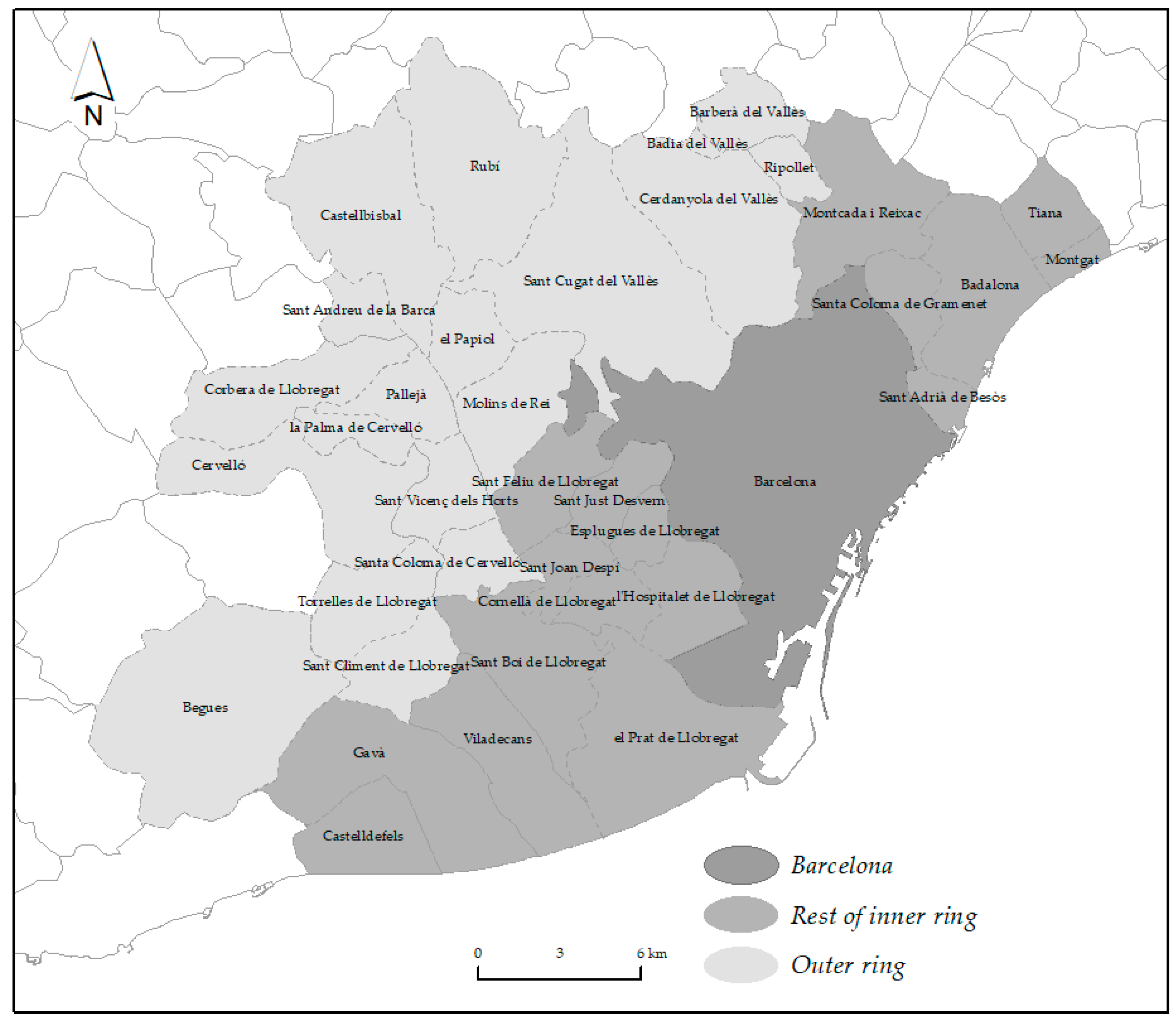
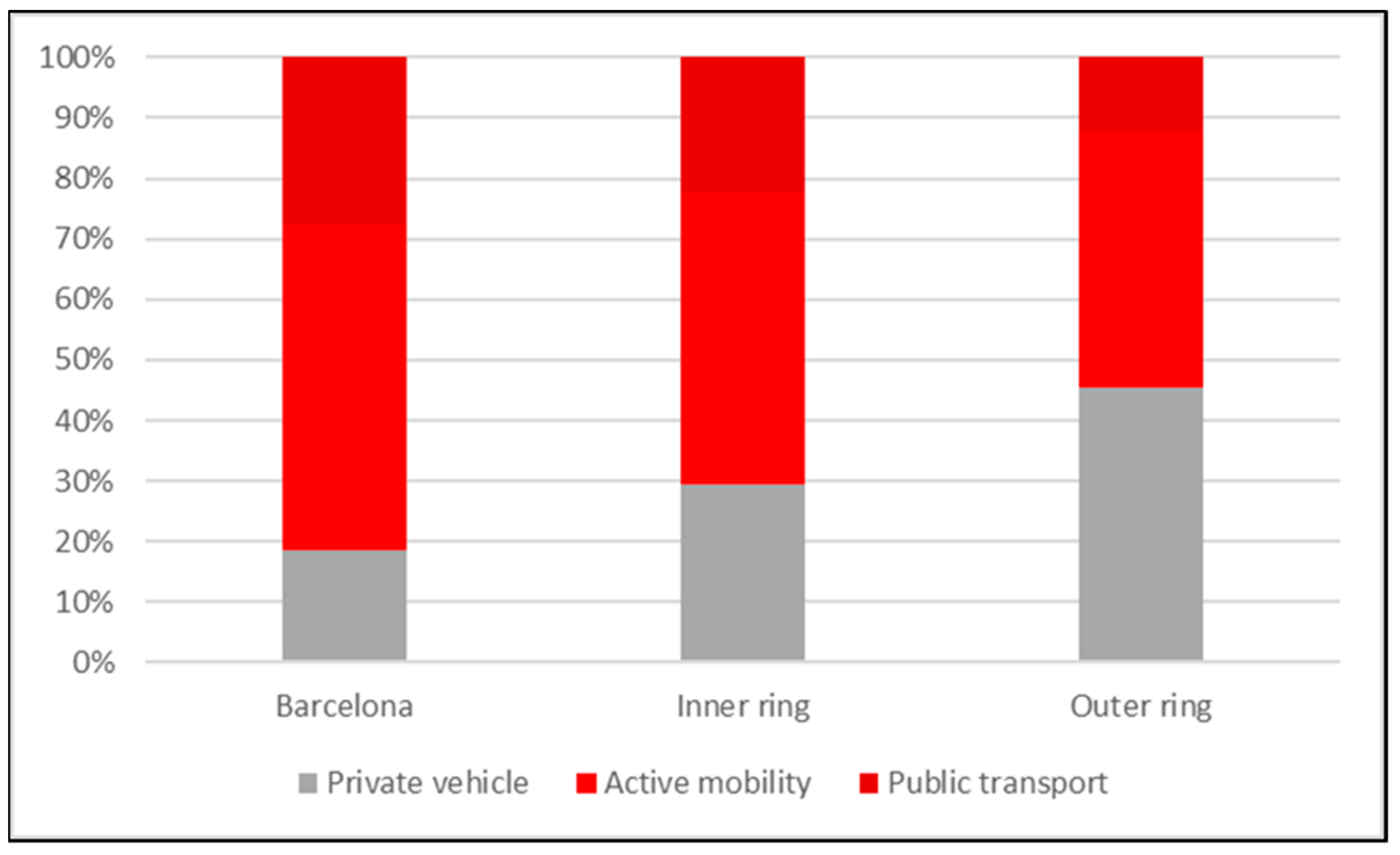

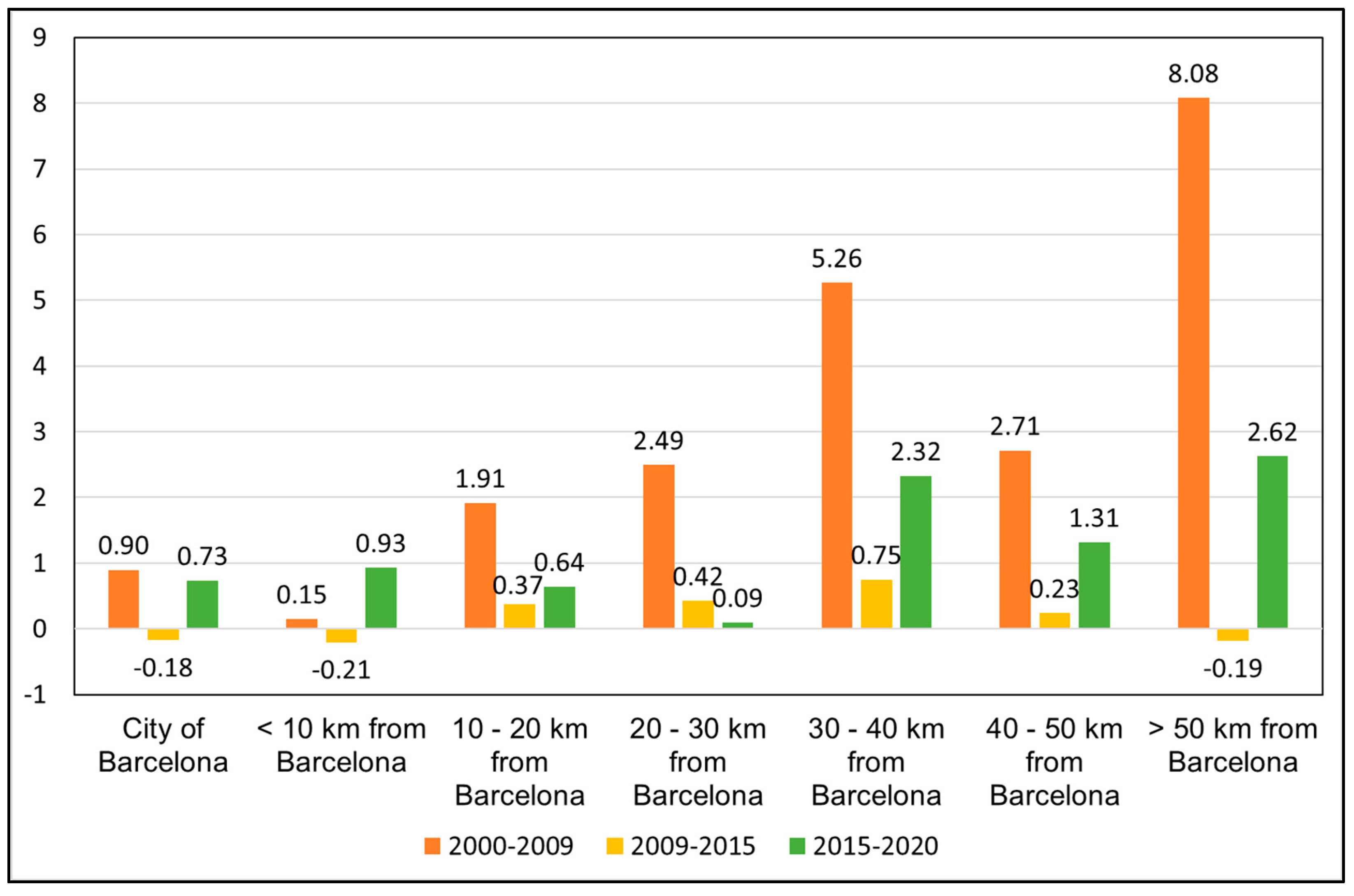

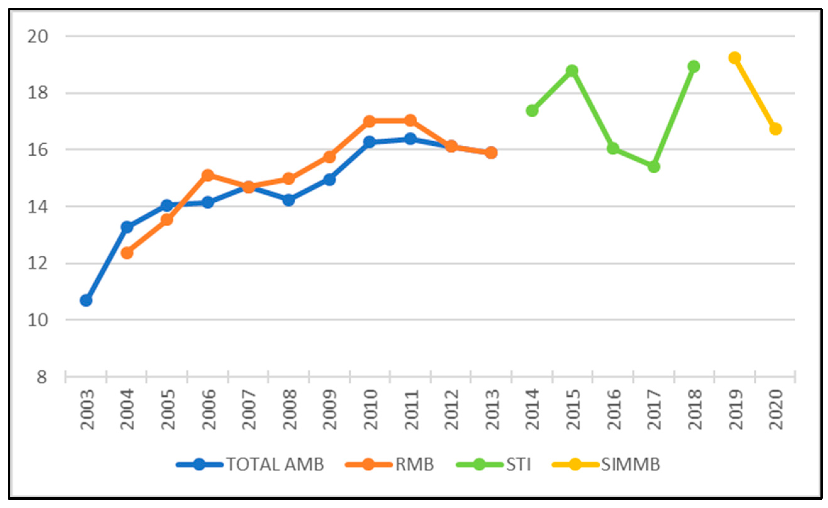
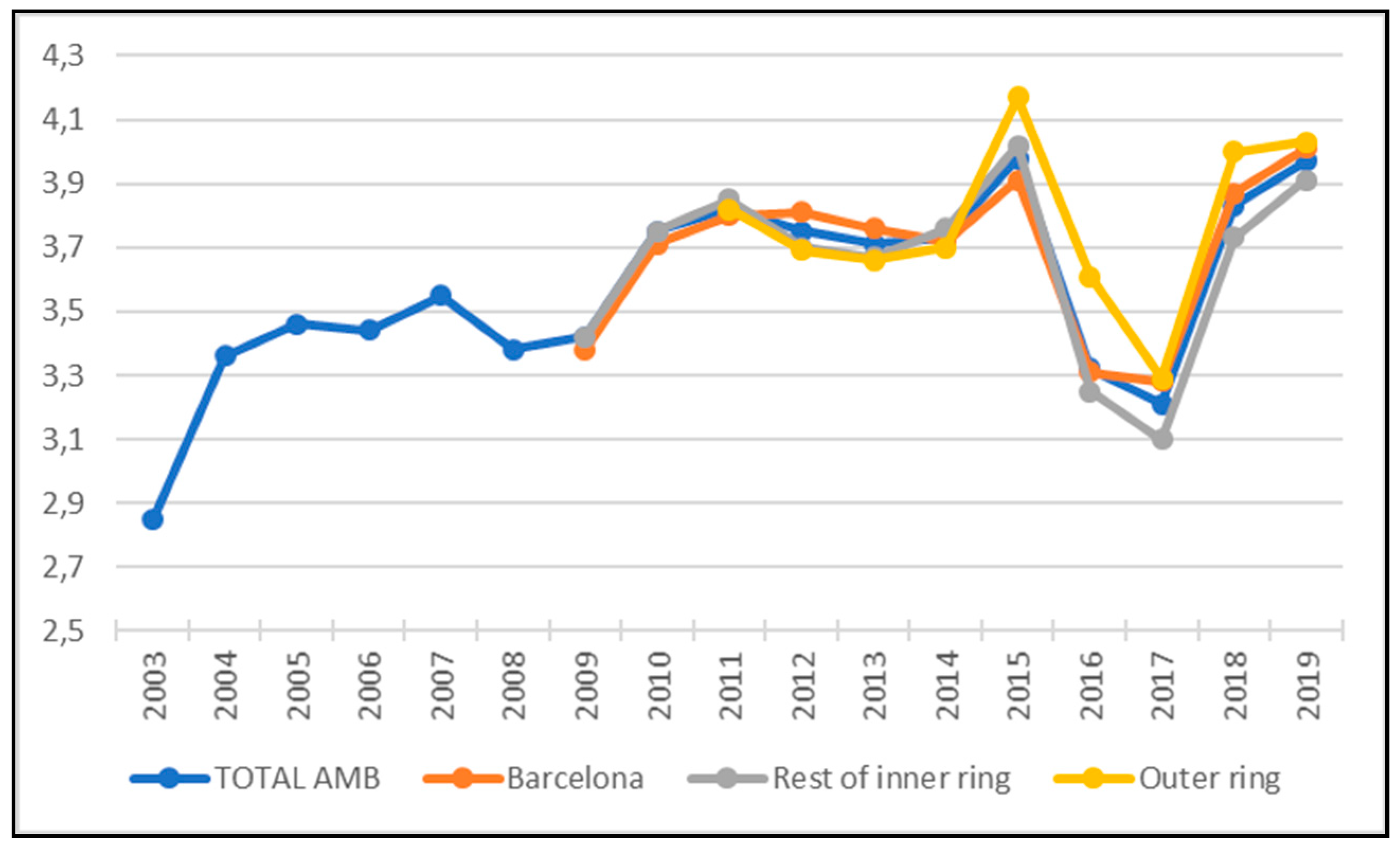
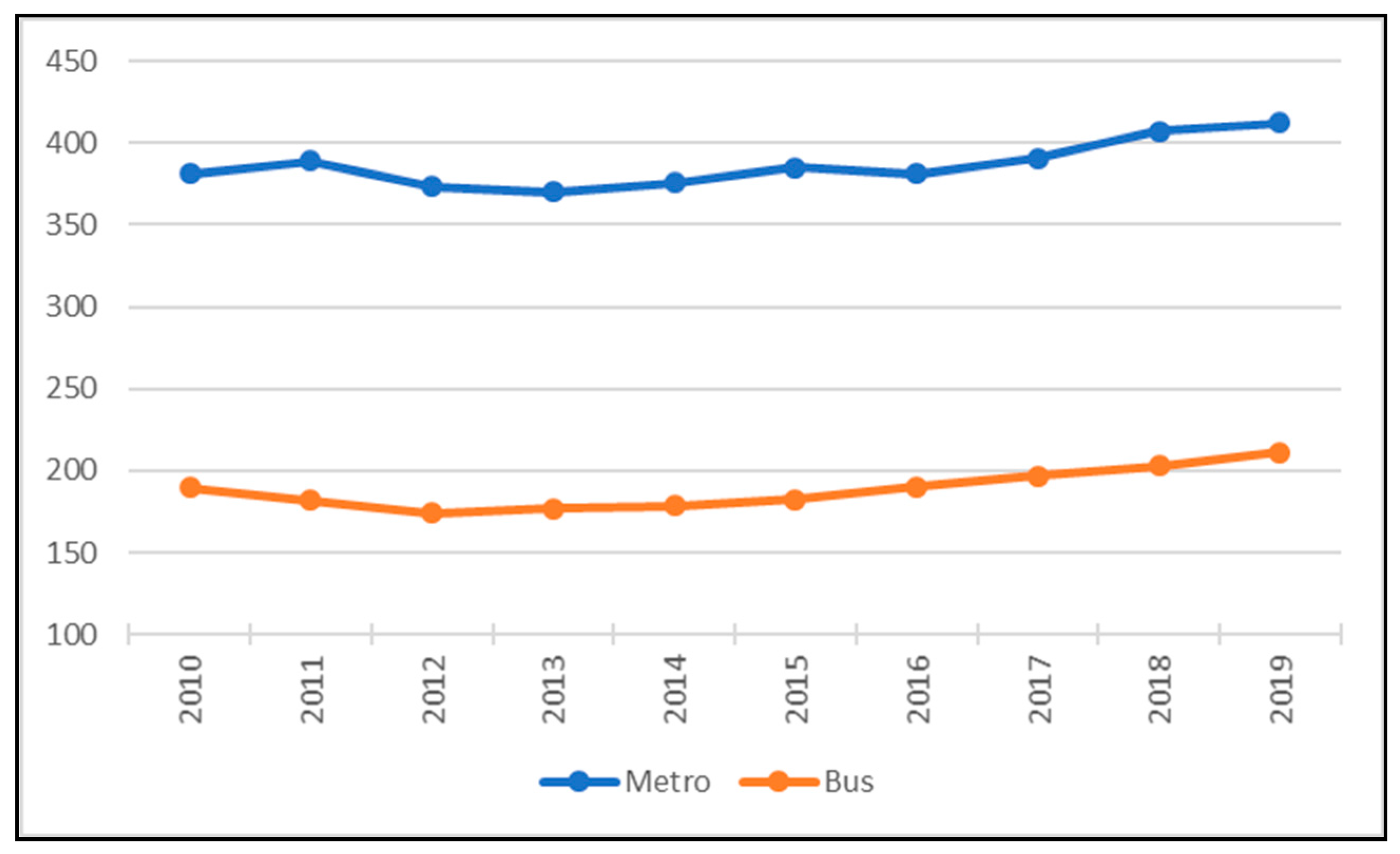
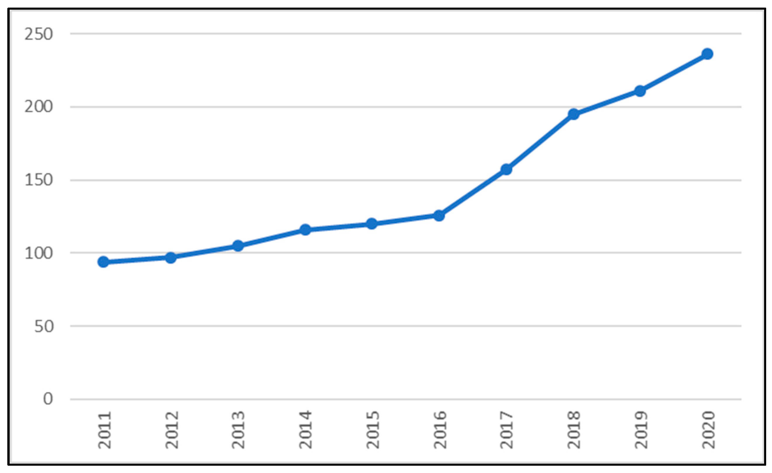


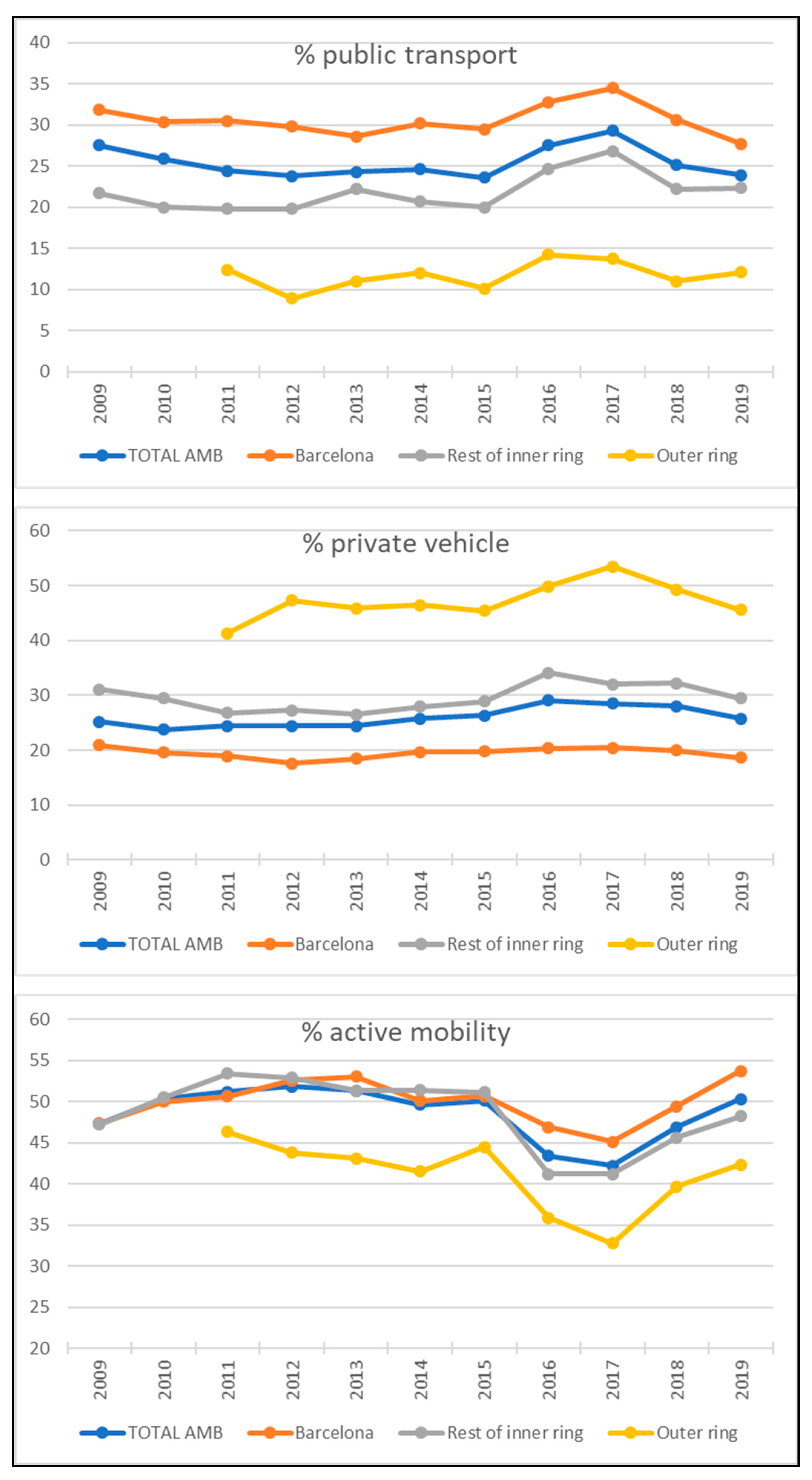
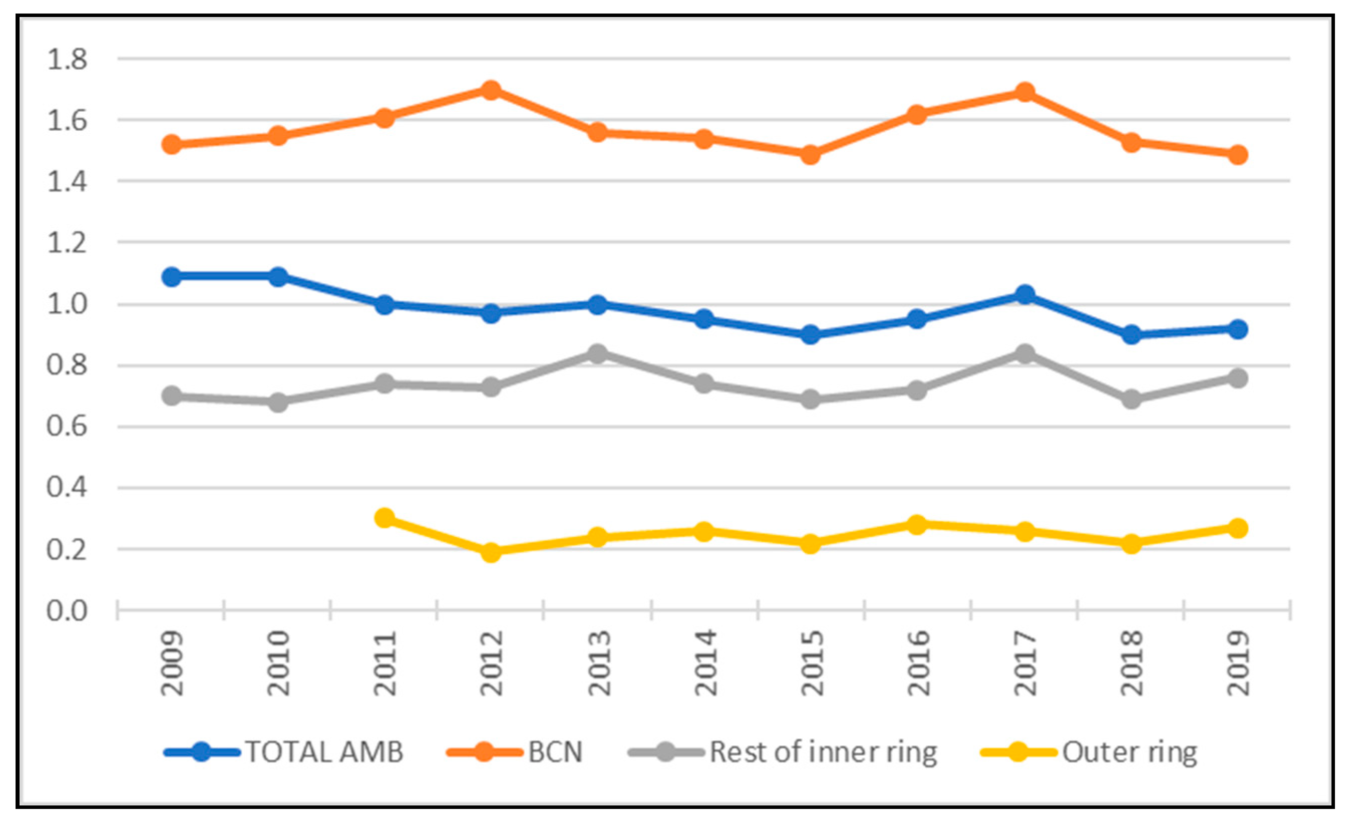
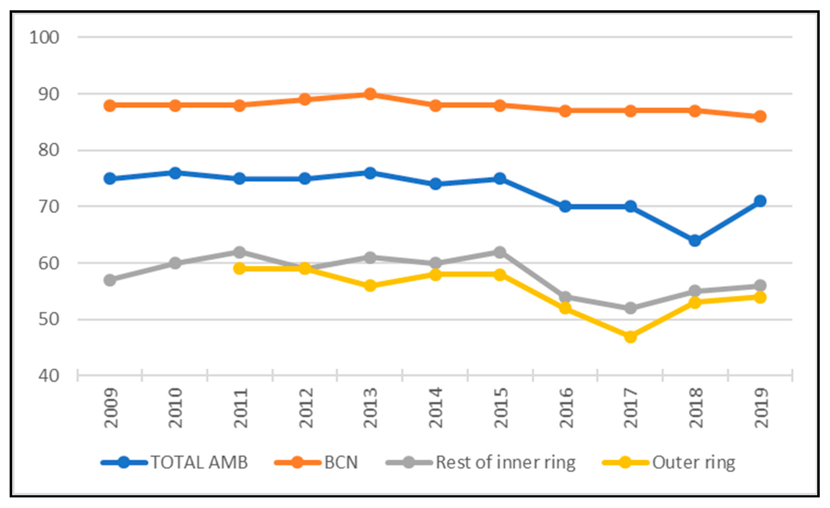
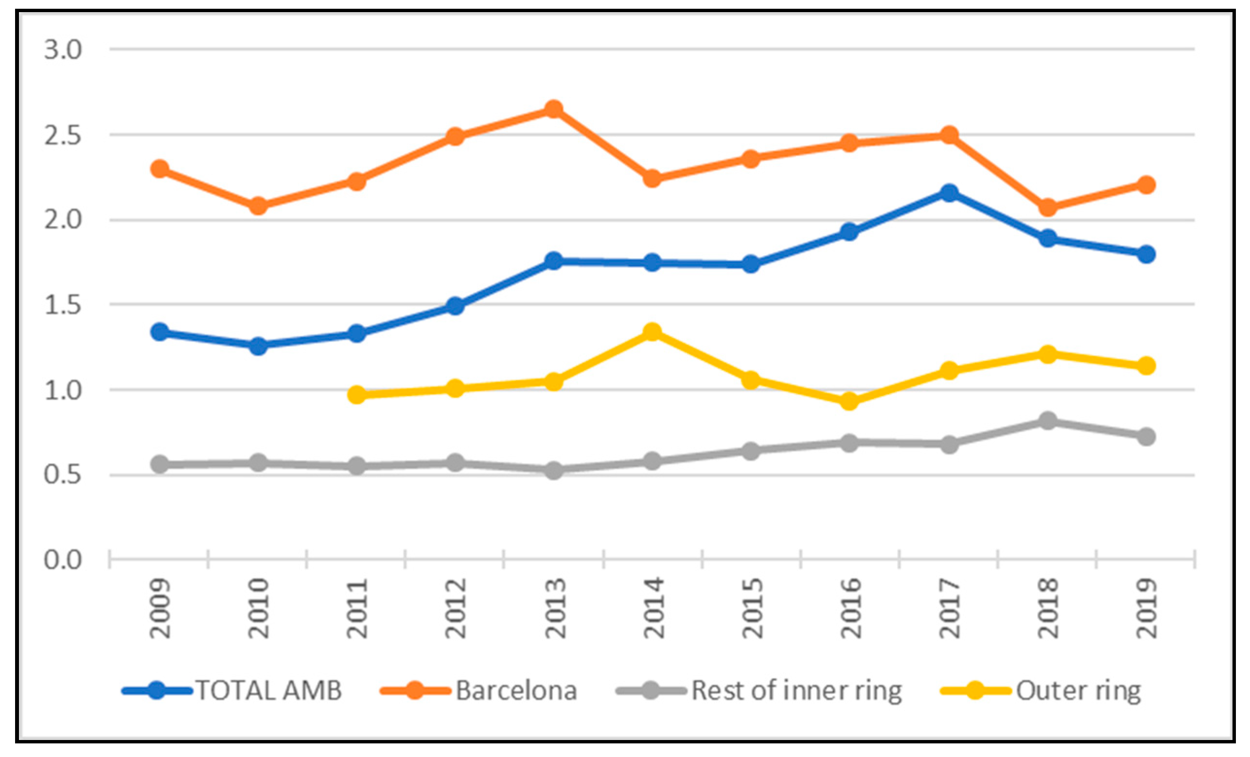
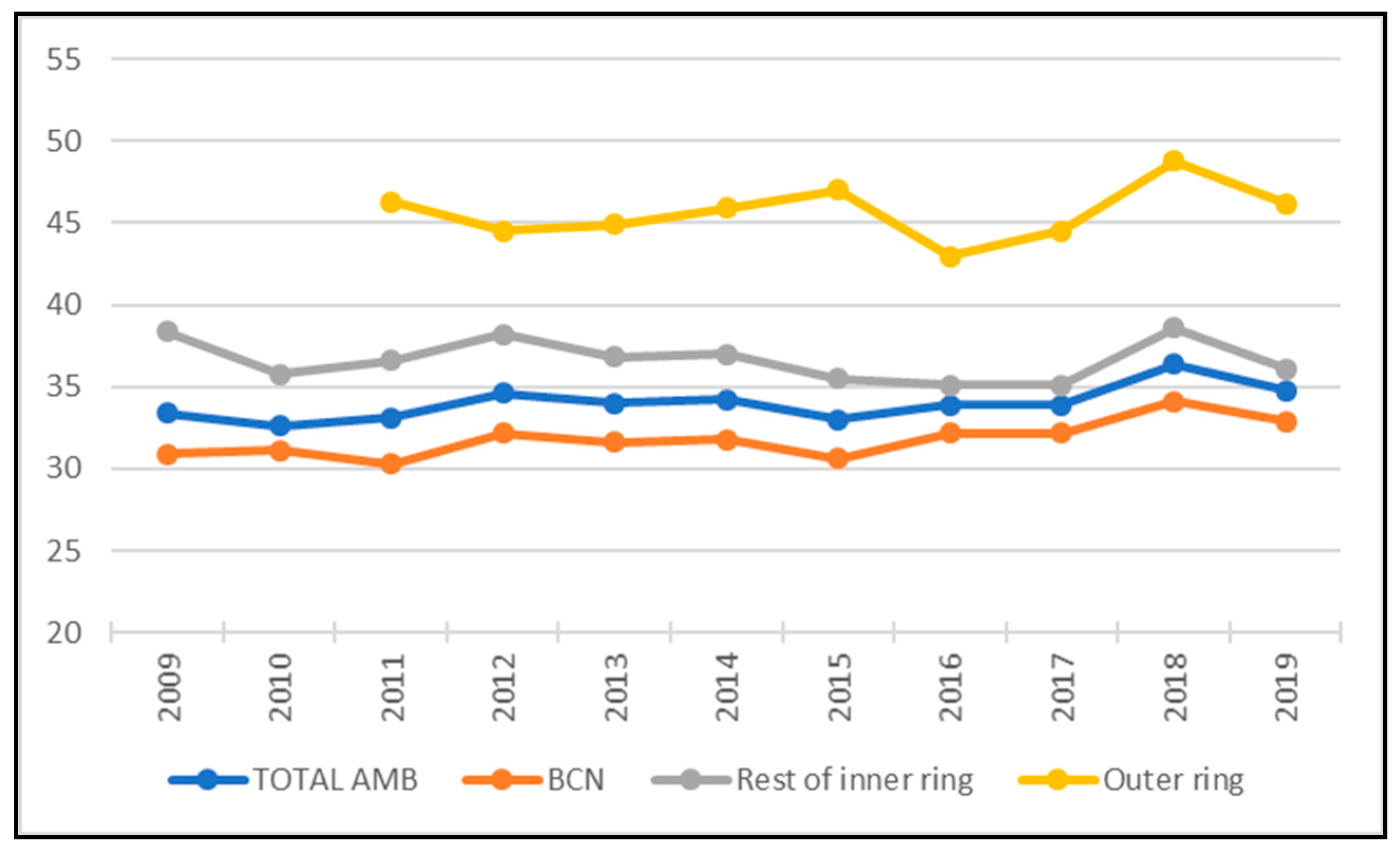
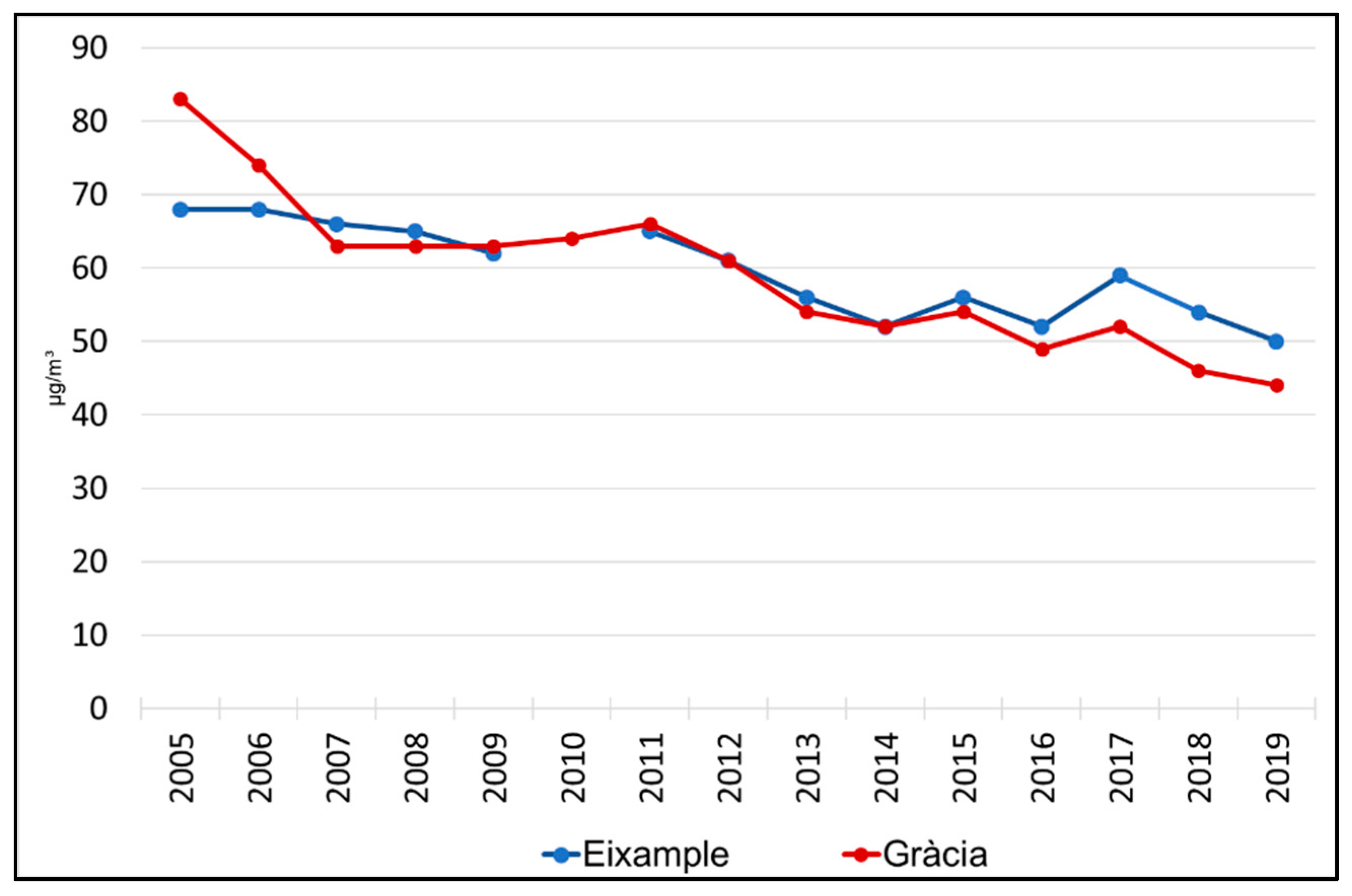
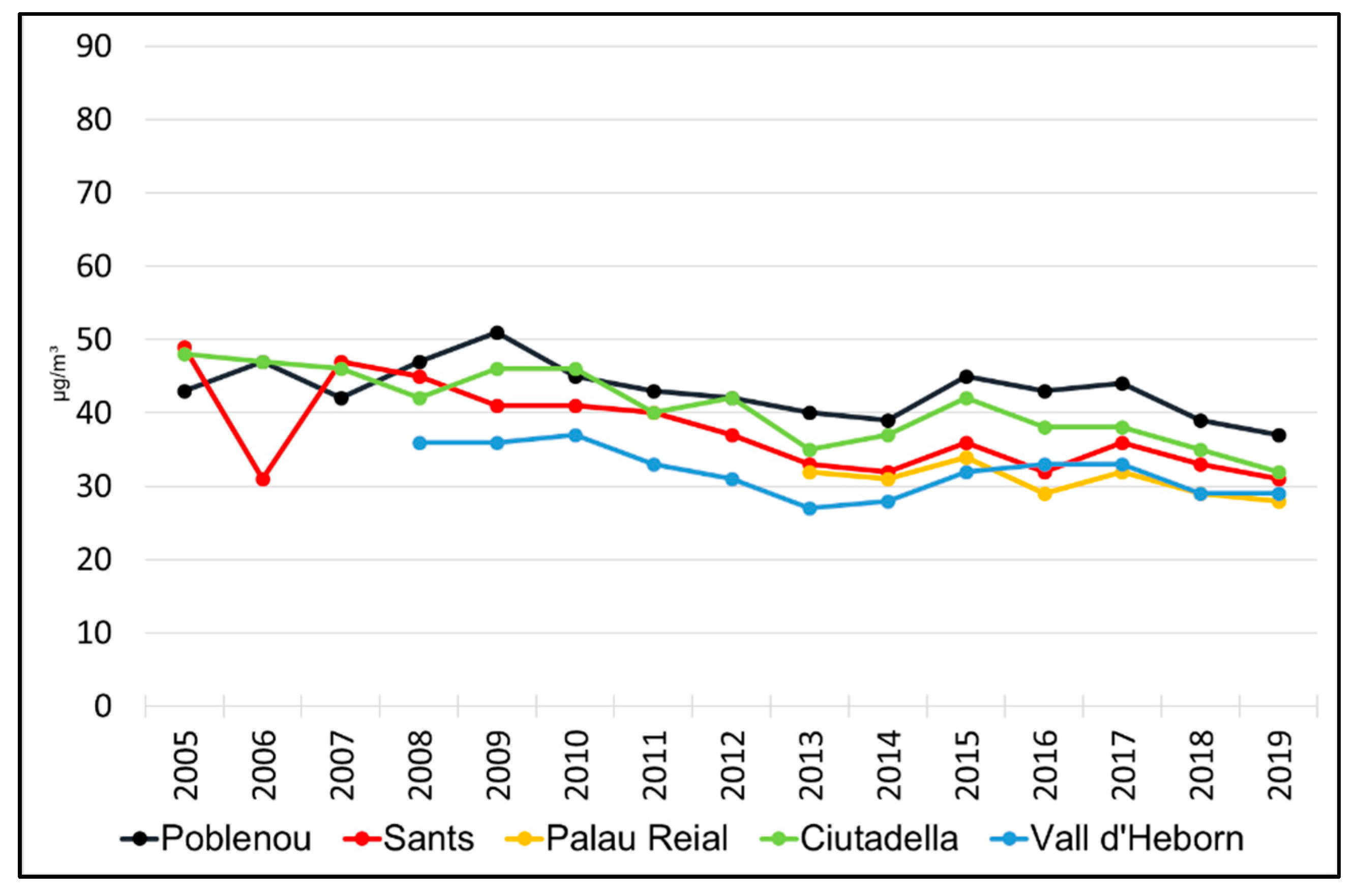
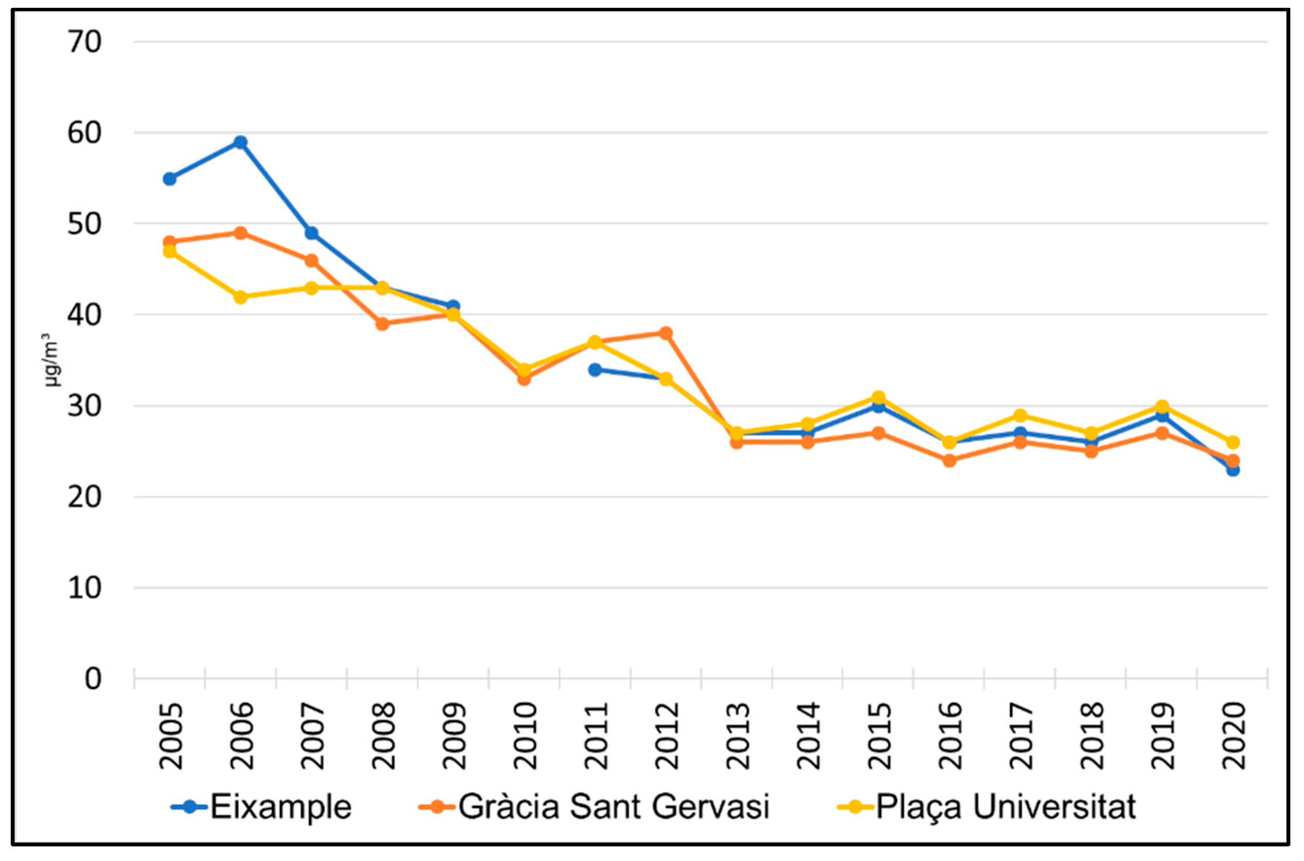

Publisher’s Note: MDPI stays neutral with regard to jurisdictional claims in published maps and institutional affiliations. |
© 2022 by the authors. Licensee MDPI, Basel, Switzerland. This article is an open access article distributed under the terms and conditions of the Creative Commons Attribution (CC BY) license (https://creativecommons.org/licenses/by/4.0/).