1. Introduction
Industry 4.0 is changing production systems, companies and value chains [
1]. In addition, digital technologies enable new ways of delivering goods, services and customer solutions, generating new sources of revenue and new forms of competition and collaboration [
2,
3]. There are many studies exploring the technical issues of Industry 4.0.
However, approaches that focus on the practical implications of digitalisation for business are comparatively scarce. These issues are central to strategy and sustainability [
4,
5]. Therefore, case studies investigating the use of digital technologies in enterprises and their outcomes are of interest. Since the performance of routine operations can be improved by smart decisions, and smart decisions need the support of routine operations to collect relevant data, there is a growing research effort to merge Industry 4.0 and data analytics [
6].
This paper deals with data analysis (as an application of Industry 4.0 technologies) in the early stages of product design. It is research in Design Engineering applied to the food industry. The use of machine learning techniques makes it possible to link the perceived quality of products to the factors on which they depend. Therefore, products can be designed for numerous applications, such as presenting the desired emotion, creating user profiles and recommending products that optimise user satisfaction. Furthermore, the research focuses on crossmodal correspondence theory that, according to [
7], consists of multisensory cues, such as visual and tactile information, that enable people to deduce information about the condition of the world: for example, information (colour, shape, roughness and hardness) regarding the inferred stimulus quality (weight, for example) is provided in this instance by sensory inputs from many modalities. Comparatively speaking, these are implicit inferential processes (such as conclusions about identities or physical features). Moreover, crossmodal correspondences are defined by [
8] as the likelihood that a feature attribute, dimension or stimulus in a single sensory modality—whether real or simply imagined—is matched with a feature attribute, dimension or stimulus in another modality.
The material and colours of packaging are very important for consumer preferences [
9,
10]. Nougat is a typical Spanish sweet that can be purchased in souvenir shops and also at international airports in Spain. Moreover, during the colonial era, Spaniards introduced nougat recipes to Mexico in the regions of Oaxaca and Puebla [
11,
12].
It is worth noting that food and consumption is a complex behaviour since it involves a decision-making process and is affected by various factors, including cultural, social, psychological and sensory acceptance aspects [
13,
14]. Food choice also creates aggregate consumer demand in the food system for suppliers who produce, process and distribute food [
15]. In this aspect, the packaging is crucial, and by taking into account that the interaction between shape and colour of packaging influences the way a product is expected [
16], these two characteristics must be analysed. On the other hand, as noted, the inclusion of Industry 4.0 in production processes and, therefore, in all stages of product design and development, allows for greater visibility, connectivity and data analysis in the life cycle, which facilitates informed decision making and improves product capability. Moreover, if these aspects are present in the early stages of design, it strengthens the outcome because, in that case, the user is present from the beginning and the final product will be better suited to his or her needs [
17]. The research question for this work focuses on the design of products to improve perceived quality from the point of view of optimising sustainability. In the state of the art, there is a growing concern for sustainability, which has become a major global issue [
18,
19]. An example of the importance of environmental sustainability at this time is that sustainability is the backbone of the agenda of the Sustainable Development Goals. Several of the SDGs are directly related to the concepts of environmental sustainability [
20,
21], although sustainability must go beyond the merely environmental.
Many of the interpretations of what sustainable development should in fact be coincide in that in order to achieve such sustainable development, the policies and actions to attain economic growth must respect the environment and must also be socially equitable to procure economic growth: this is the Triple-E model or “triple bottom line”—an approach to sustainability that takes into account its environmental, social and economic dimensions [
22,
23].
In order to contextualise the proposal made in this work, it is necessary to summarise the three axes of the proposal: (1) tools and methods in the early stages of design to identify which product properties require improvement to increase user satisfaction; (2) use of techniques for data management and the relationship between perceived quality and factors; and (3) integrated perspective of sustainability, which includes social (perceived quality), economic and environmental dimensions.
The combined influence of packaging shape and colour on consumer expectations of dairy desserts by using word association techniques and joint analysis results was studied in [
24]. Hence, the authors suggest that different packaging colours give rise to different expectations of taste.
According to [
25],
“Colour is perhaps the single most important element (or feature) as far as the design of multisensory product packaging is concerned. On the one hand, it plays a dominant role in terms of capturing the attention of the shopper in the aisle, or increasingly, online” (p. 234). This statement is supported by [
26] in that colour motivates between 62% and 90% of all consumer purchasing decisions and is crucial for attracting customers and setting expectations (e.g., [
27,
28,
29]). For example, it was shown that congruence of the product flavour and the packaging colour facilitated the visual search for a specific flavour of potato chips [
30].
Our senses (sight, hearing, taste, smell and touch) capture external stimuli and process them based on the experiences and knowledge of a consumer to provoke a response called feeling that is translated into subjective images or impressions.
There are other various techniques focused on the extraction of the emotions caused by products, such as the use of neuroscientific techniques such as the use of helmets for the detection of brain signals, facial emotional recognition, etc. [
31,
32].
The ecological valence theory claims that colour preferences are an outcome of educational and cultural values and vary significantly across object contexts, particularly in terms of lightness and chroma [
33]. Furthermore, colours evoke a variety of affective experiences [
34].
Regarding shape, according to [
35], angular shapes are instinctively associated with conflict because they indicate a confrontation between the environment and the stimulus. In keeping with this, angular designs convey toughness, strength, and energy, whereas rounded shapes convey friendliness and harmony [
36,
37]. Furthermore, there is a propensity to choose rounded items over sharp, angular-shaped objects [
37,
38]. Due to the amygdala’s fear response to angularly shaped items, people have a propensity to prefer rounder, semantically neutral objects [
38,
39].
Rectangular products and packages are viewed as “better” when compared to other shapes, which results in increased demand for them in the market [
40]. However, shape allows differentiating some products: for example, milk chocolate is related to rounder shapes, whereas dark chocolate is paired with angular shapes [
41].
According to [
24], the package’s shape for a milk-based dessert sets expectations for its textural properties, and hence, square packaging was associated with thick sweets, whilst rounded ones were associated with runny desserts. Another interesting study on shapes shows that angular packages of cookies are said to be healthier and taster better than spherically packaged cookies [
42].
The pleasure of buying, owning and using products evokes emotions [
43]: as consumers choose foods that they like to eat, they thereby are creating positive experiences [
44]. Emotion, motivation and decision are connected by means of learning and can be used to predict future outcomes of specific scenarios [
13]. A study carried out by [
45] shows that visual appearances are relevant for describing emotional responses to (eating) food. In addition, other studies [
44,
46] categorise the strongest positive and negative emotions related to packaging and the purchasing stages.
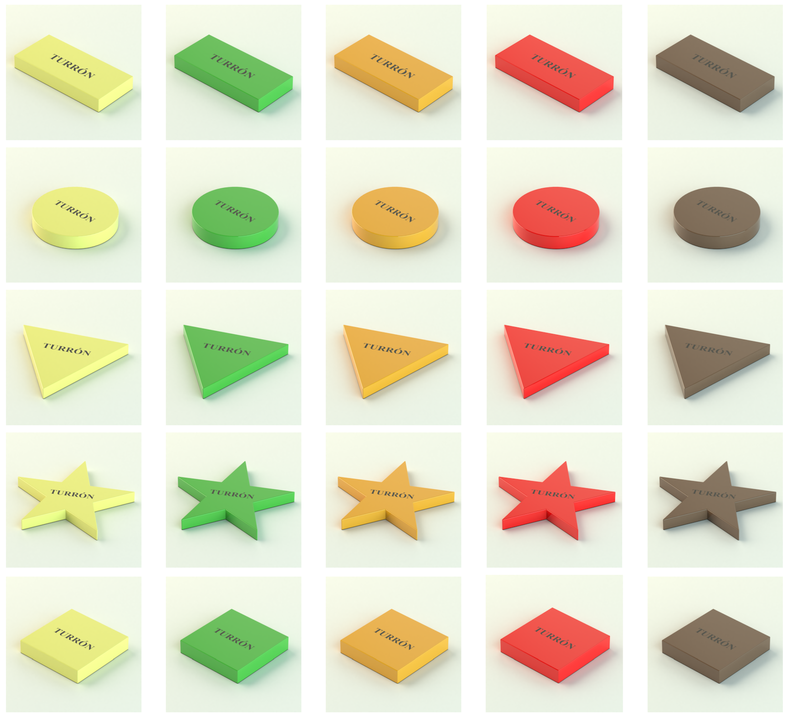
The variation of the shape and the colour of nougat packaging is studied in this paper in order to improve the expected quality by the consumer. This study is carried out through repeated measures analysis of variance (ANOVA).
The rest of the paper is structured as follows.
Section 2 describes the materials and methods followed for the experimentation.
Section 3 reveals the results obtained. Finally,
Section 4 the discussion, conclusions, limitations and future work are presented.
3. Experimental Results
A total of 122 participants took part in this study online: 99 participants from Spain and 23 participants from Mexico.
Table 1 and
Table 5 show the answers of the participants.
The main results provided by the analysis of variance (ANOVA) for each emotion can be seen in
Table 6,
Table 7 and
Table 8. In these tables, the main effects of the shape, colour and the interaction between the shape and colour of nougat packaging can be observed.
Next, the emotions are analysed one by one.
3.1. Admiration-Contempt (E1)
In terms of the main effect of packaging shape (see
Figure 3), the participants expected there to be less Admiration for the circular nougat packaging than for the rectangle and square packaging (both
).
In terms of the interaction between colour and shape, the participants expected there to be more Admiration for the yellow nougat packaging if it were rectangular rather than a circle or a triangle (both ). Furthermore, the participants expected there to be more Admiration for the yellow nougat packaging if it were a star rather than a circle or a triangle (both ). Regarding the colour red, the participants expected there to be less Admiration for the red nougat packaging if it were a circle rather than a triangle, star or rectangle (all .
In terms of the interaction between shape and colour, the participants expected there to be more Admiration for the triangular nougat packaging in red compared to yellow or orange (both ). Moreover, the participants expected there to be more Admiration for the square nougat packaging in orange compared to green ).
3.2. Pleasant Surprise–Unpleasant Surprise (E2)
In terms of the main effect of the packaging shape of the nougat packaging (see
Figure 4), the participants expected there to be less of a Pleasant Surprise for the circular nougat packaging than for the star or triangle (all
).
In terms of the interaction between colour and shape, the participants expected there to be less of a Pleasant surprise for the red nougat packaging if it were a circle as compared to a triangle or square (both ).
In terms of the interaction between shape and colour, the participants expected there to be less of a Pleasant surprise for the circular nougat packaging if it were red rather than green or orange (both ).
3.3. Attraction–Aversion (E3)
In terms of the main effect of the shape of nougat packaging (see
Figure 5), the participants expected there to be less Attraction towards the circular nougat packaging than towards a triangle or star (both
).
Regarding the interaction between colour and shape, the participants expected there to be less Attraction towards the red nougat packaging if it were a circle rather than a triangle, rectangle, star or square (all ). Furthermore, the participants expected there to be less Attraction towards the green nougat packaging if it were a square rather than a triangle or star (both )
In terms of the interaction between shape and colour, the participants expected there to be more Attraction towards the circular nougat packaging in orange rather than red (). In addition, the participants expected there to be less Attraction towards the square nougat packaging in green rather than orange or yellow (both
3.4. Fascination–Boredom (E4)
In terms of the main effect of packaging shape (see
Figure 6), the participants expected there to be less Fascination for the circular nougat package than for the triangle or star (both
). Furthermore, the participants expected there to be more Fascination for the triangle than for the circle or square (both
).
In terms of the main effect of colour, the participants expected there to be more Fascination for the yellow nougat packaging than for the red . In addition, the participants expected there to be more Fascination for the orange nougat packaging than for the red or green (both ).
Regarding the interaction between colour and shape for red packaging, the participants expected there to be less Fascination for the red nougat packaging if it were a rectangle or circle rather than a triangle, star or square (all ). As for the colour brown, the participants expected there to be more Fascination for the brown nougat packaging if it were a triangle rather than a rectangle or square ). Finally, for the colour green, the participants expected there to be less Fascination for the green nougat packaging if it were a square rather than a triangle, star or circle (all ).
In terms of interactions between shape and colour, the participants expected there to be more Fascination for the rectangle packaging in orange rather than for the green, yellow or red (all ). Furthermore, the participants expected there to be less Fascination for the circular nougat packaging in red rather than orange, green, yellow or brown (all ). Moreover, the participants expected there to be less Fascination for the square nougat packaging in green rather than yellow, red, orange or brown (both ).
3.5. Joy–Sadness (E5)
In terms of the main effect of packaging shape (see
Figure 7), the participants expected there to be more joy for the triangle or star than for the rectangle, square or circle (both
). In terms of the main effect of the nougat packaging colour, the participants expected there to be less Joy from red nougat packaging than from orange, yellow or brown (all
).
In terms of the interaction between colour and shape, the participants expected there to be less Joy from the red nougat packaging if it were a circle rather than a square, star, triangle or rectangle (all ). As for the colour brown, the participants expected there to be less Joy from the brown nougat packaging if it were a square rather than a star (). Finally, the participants expected there to be less Joy from the green nougat packaging if it were a square rather than a triangle, circle, star or rectangle (all ). Moreover, the participants expected there to be more Joy from the green nougat packaging if it were a triangle rather than a square, rectangle or star (all ).
In terms of the interaction between shape and colour, the participants expected there to be more Joy from the rectangular nougat packaging in orange rather than green (). Regarding the circular shape, the participants expected there to be less Joy from the circular nougat packaging in red rather than orange, yellow, green or brown (all ). As for the triangular shape, the participants expected there to be more Joy from the triangular nougat packaging in green rather than red or orange ). Regarding the square shape, the participants expected there to be more Joy from the square nougat packaging in yellow rather than green (). Moreover, the participants expected there to be less Joy from the square nougat packaging in green rather than orange, yellow, red or brown (all ).
3.6. Satisfaction-Dissatisfaction (E6)
In terms of the main effect of the shape of nougat packaging (see
Figure 8), the participants expected there to be less Satisfaction from circular nougat packaging rather than square (both
).
Regarding the interaction between colour and shape, the participants expected there to be less Satisfaction from the red nougat packaging if it were circular rather than a square or triangle ). Regarding the colour green, the participants expected there to be more Satisfaction from the green nougat packaging if it were a triangle rather than a star or square (both ).
In terms of the interaction between shape and colour, participants expected there to be more Satisfaction from the circular nougat packaging in orange rather than red ). Regarding the square shape, the participants expected there to be less Satisfaction from the square nougat packaging in green rather than orange or red (both ).
Figure 8.
Mean ratings of Satisfaction–Dissatisfaction as a function of colour and shape of the nougat packaging. The error bars represent 95% confidence interval.
Figure 8.
Mean ratings of Satisfaction–Dissatisfaction as a function of colour and shape of the nougat packaging. The error bars represent 95% confidence interval.
4. Discussion, Conclusions, Limitations and Future Work
4.1. Discussion
The general results of the experiment correspond to the colour-context theory of [
55], which means the colour is assigned a specific meaning depending on the circumstances: in this case, with nougat packaging (such as an association between nougat and the colours yellow or brown). It can be concluded from the experiment that the participants associate a colour with nougat packaging.
Furthermore, according to [
56], the congruence between colour and flavour constitutes an important factor to consider while searching for flavour information. Participants were able to find packaging flavour labels faster when the colour of the container was consistent with the flavour label (e.g., red/tomato or green/cucumber) compared to when the colour was incongruent (e.g., yellow/tomato).
In our results, green was associated with less Attraction, Satisfaction and Fascination for certain shapes because it is unusual in the marketplace to see nougat in green packaging. The colour brown was associated with more Admiration but less Joy and Attraction, such as in [
24], where the adjectives Interesting, Premium and Unpleasant were all employed to describe black containers for yoghurt; however, contradictory terms do exist.
In packaging, the product colour is highly relevant, and the shape of the packaging takes second place. However, our results show that the form is indeed relevant, since it may add additional information and value; this is the case in the packaging of nougat, where the most preferred shapes are angular. The main shapes are triangles, stars, and squares for the whole emotion, except the star, which evokes more Fascination than others. Hence, concerning the shape, the preference of the participants for angular packaging can be explained by [
57,
58,
59], wherein people preferred an angular shape for chocolate products, which have similar packaging to that of nougat, rather than the round shape that works for nougat packaging. According to [
37] and these research results, product shapes and colours cannot be viewed as secondary features of the product line. The use of colour and shape in design can significantly alter consumer preferences, perceptions of quality and feelings [
37].
The emotions of Satisfaction, Joy, and Fascination are influenced by colour and shape, and hence, designers should take these factors to design nougat packaging that can provoke the emotion that the designer wants from a consumer. Moreover, it can be observed that colours and shapes play a major role when nougat packaging is designed.
Certain shapes are predominant in nougat packaging, such as rectangles, squares and triangles. On the other hand, the main colours that can positively influence emotions are yellow, orange and brown. Therefore, we suggest that the nougat industry make packaging with a combination of the three shapes (triangle, star and square) and colours (orange, yellow and brown) mentioned above to provoke greater feelings of Admiration, Satisfaction, Pleasant Surprise, Attraction, Fascination and Joy.
The use of the adjective Satisfaction implies the inclusion of the social axis of sustainability throughout the study, which helps to strengthen this triple vision by connecting it with the purely economic aspects (attraction/sale of the product) and the environmental ones (use of less raw materials by creating products more focused on the user and his needs, and therefore, fewer product options that are less required).
On the other hand, nougat packaging with a triangular shape can be combined with green and brown colours. And finally, nougat packaging with circular shapes can be combined with green and orange colours. Therefore, our results showed that the colour and shape of the package are two important factors that influence purchase intent. In addition, a new nougat product could get a novelty shape (circular or triangular) package and a colour that does not correspond to the product colour, such as green.
The expectations a product generates are critical in the purchase stage since they influence the purchase intent. A product that generates increasingly positive emotion can generate a purchase intent, although these expectations must be consistent with the product sold in order to prevent any inconsistencies. The nougat industry also has to meet the expectations of the product since when these expectations are met, customers experience greater satisfaction, thereby generating a renewed intention to purchase the product.
This paper presents a detailed study of consumer preferences for the colour and shape of nougat packaging. To the authors’ knowledge, there is no similar work on this product. There are studies on chocolate [
60,
61] and other agri-food products. Therefore, something new that our work provides is that it is focused on nougat. Moreover, the rectangular shape is the most common shape for nougat packaging. This study shows that nougat packaging can be innovated through the use of different shapes, e.g., rectangular and circular. In addition, new nougat packaging with new shapes would be more attractive to potential consumers.
4.2. Managerial and Theoretical Implications and Conclusions
The importance of packaging design in agro-industrial products has been previously analysed. In this work, the participants tasted the same product wrapped in different types of packaging. Differences in perception were found. Therefore, the hypothesis of the influence of the perception of the packaging was successfully tested [
62]. Previous works propose the use of emotional design in the field of eco-design, but its use is not widespread. More studies should be conducted regarding the impact of packaging on the environment and the need to minimise this impact through design [
63,
64,
65].
According to [
66], colour is applied to convey information, the ideas that the colour arouses, and how that colour influences mental simulations. In addition, this can be applied, in principle, to the impact of colour on food in general and on flavour. Moreover, according to [
67], unquestionably, food colouring has a significant impact on customer acceptability and enjoyment of a range of food and beverages. Despite this, in a study by [
68] about the colour of beer and shape of its container, orange, blue and brown beers do not always have a strong association with a certain beer category. As a result, the type of glass (such as its shape, roundness, angularity and width) may offer more details to help create hedonic and sensory-discriminative expectations (bitter, sour, sweet, liking and alcohol).
In conclusion, research has focused on nougat packaging, as we have seen above. Thus, the study adds that the colour and shape features of the nougat packaging have been examined jointly rather than separately. This is carried out by analysing the emotions consumers attribute to a product and examining the colour and shape of nougat packaging.
One of the contributions of this study is that when the consumer knows the product, the consumer prefers the colour most related to the colour of the product: i.e., crossmodal correspondence and semantic congruence in expectations. In addition, the shape of the nougat packaging can influence the emotions of participants and play a crucial role in creating a different product. The designer of the packaging of nougat can design packages with features that improve the emotions of the consumers.
We suggest that colour, as a fundamental cue associated with nougat packaging—but more broadly to sweet products, with sometimes strong corresponding associations—works as a criterion for the shape of the impact that nougat packaging (and perhaps other extrinsic cues) can have on nougat package expectations. Hence, understanding how these two cues (but also others) interact is a better way to inform decisions that may have implications in environments in which nougat is purchased and consumed by consumers. Our research contributes to the understanding of how variables can influence nougat packaging expectations, highlighting that their impact depends on several variables like the colour, shape and emotion that is evaluated in nougat packages.
4.3. Limitations and Future Work
The present research does not come without limitations. For example, the colours and nougat packaging selected were only a subset of the possible alternatives found in the market, and as such, future research may be expanded by studying additional colour variations (not only hue). Furthermore, no evaluation of the experience of the participants has yet been carried out. It would be interesting to evaluate how these variables influence the experience given specific expectations and to use different analysis techniques for the data in future research. Moreover, there is a limitation that needs to be highlighted and is therefore transferred to future work regarding the slight variations in the individual responses, and these results can be taken into account as a new perspective of the study after a subsequent survey. Finally, we will work with a larger sample in the future.


