Abstract
This paper investigates the spatial attributes of the color properties and brightness characteristics of sustainable architectural strategies including daylight, electrical lighting, and surface color in architecture, which could potentially impact users’ spatial experiences. Images of 48 spaces varying in surface color configurations, type of light source, and position of the lighting strategy were evaluated. The analyses included assessments of color palettes, descriptors based on saturation and brightness properties, and brightness distribution maps. The results indicate that lighting design and types of light source influence the saturation and brightness properties of the perceived hues evaluated in the same environment, leading to variations in color descriptors or adjectives. Furthermore, this study demonstrates that variations in brightness between bright and dark zones, the creation of focal points, and perceived spatial fragmentation depend on the reflectance of the colors applied in the surfaces, the position of the lighting, and the type of light source. This study does not aim to establish best practices for enhancing users’ emotions through architecture. Instead, it explores how variations in color and light influence perceptual descriptions that have been previously associated with emotional responses. This research recognizes the impact of sustainable strategies including surface colors under daylight and electrical lighting on users’ spatial experiences.
1. Introduction
This paper explores the attributes formed by sustainable architectural strategies of surface color applications under daylight and electrical lighting that could impact users’ spatial experiences, whether they are positive, neutral, or negative. In this research, we refer to the spatial attributes for the characteristics of light and color that cause a space to be described differently. Color in the built environment under proper daylight and electric lighting design can alter spatial attributes, including bright–dark zones, and modify color properties, which in turn positively impact spatial experience. Light, whether daylight or artificial, and color painting are costless solutions and essential sustainable practices to ameliorate indoor conditions in new buildings and building retrofit [1,2,3]. It has been clearly demonstrated that daylight is the cleanest and healthiest form of lighting, reducing energy consumption and improving people’s well-being [4]. Daylighting can reduce the need for artificial lighting by 20% to 60%. For instance, a study from Tsangrassoulisa, Kontadakisa, and Doulo [5] on daylight harvesting in office buildings reported potential lighting energy savings approaching 60% Another analysis from Afifa Nur, Yoon, and Sato [6] found that daylight dimming systems provided energy savings ranging from 24% to 51%, depending on factors like room orientation and window design. This is an important fact considering that lighting constitutes 13% of energy consumption in public buildings [7]. Technologies such as LED lighting can compensate for the lack of daylight during dark hours, reducing energy consumption and cost maintenance compared to other lighting solutions. LED lighting is highly energy-efficient, using up to 90% less energy than incandescent lighting, which translates to significant cost savings [8]. Moreover, LEDs have longer lifespans, reducing maintenance costs [9]. Additionally, innovations in sustainable color coatings and finishes have advanced by using bio-based materials, lowering volatile organic compounds (VOCs) [10,11] that could harm human health [12]. While these benefits in terms of energy consumption depend on multiple factors considering building design, control systems, and occupants’ behavior, they constitute a major strategy to improve building performance while ameliorating occupants’ environmental satisfaction.
The impact of light and color on humans has also been analyzed, presenting important benefits to human physiology and psychological well-being. Daylight exposure has been associated with improved mood, enhanced morale, reduced fatigue, and decreased eyestrain [13]. Light for circadian entrainment influences hormone secretion, modifies sleep/wake cycles, regulates body temperature, and can improve people’s mood [14,15]. Color application strategies have been demonstrated to significantly improve occupants’ mood and productivity [16], enhance arousal and performance [17,18], improve differences in the reported spatial experience with respect to culture [19], enhance subjective impressions [20,21], improve safety and wayfinding [22,23,24,25], reduce violence [26,27], and bring about an enhanced sense of control and comfort [28,29]. These studies have widely, but independently, shown consistent results, despite the fact that light and color mutually interact, thus changing the chromatic properties and brightness patterns of the space. Jafarian et al. [30] tested changes in the color coordinates when wooden surfaces were combined in a built environment accompanied by different types of light, whether clear or overcast sky. The results demonstrate that their position, such as in the floor or ceilings, could impact the color properties and brightness distribution of the space. Figure 1 presents an example of the interaction and the impacts on the built environment between varying surface color configurations under an overcast sky, and similar surface color configurations under clear or overcast sky. Comparable spatial configurations with different floor colors can modify the perception of an overall space. The ceiling surface is perceived as warmer with a yellow floor compared to the space with a green floor. The analysis of the brightness percentages in the environment also reveals discrepancies. The yellow space offers higher brightness levels than the green space due to the reflectance values of the color applied on the floor. Color choice and its interaction with different types of lighting strategies cause variations in brightness and darkness zones. These variations influence the focus points within the space, as perceived in the atmosphere under a clear sky, that could potentially impact personal states such as alertness and calmness [31,32]. These scenarios, coupled with variations in the time of day and season, can significantly alter color attributes within architecture, thereby influencing the impressions and spatial experiences of users.
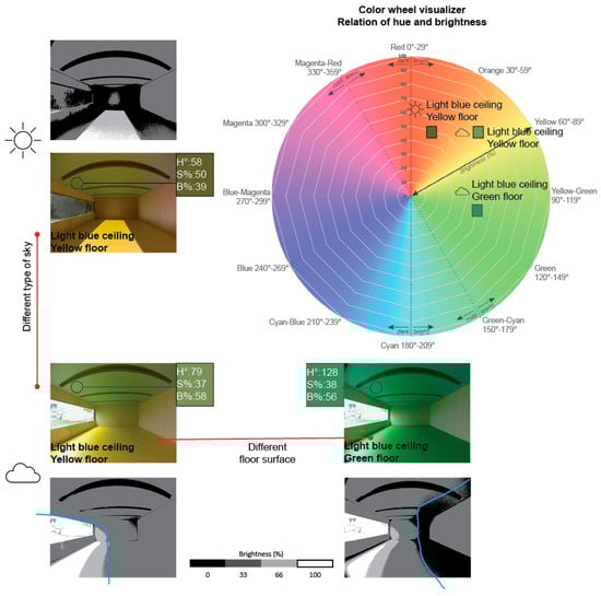
Figure 1.
Comparison of surface color applications and type of sky. Colors are altered according to floor color surface. Percentages and brightness distributions in grayscale maps [33] are altered according to each surface color configuration and type of light source.
Current studies assessing the qualities of light and color have been developed with users’ participation, attempting to interpret visual effects through questionnaires and with small samples. In the present time, however, telecommuting is widespread among professional teams [34,35,36], hindering direct community contact and participation in the design process. This underscores the importance of employing assessment techniques that anticipate potential impacts from the earliest stages of design to propose effective architectural solutions. This research, therefore, presents the attributes of light and color in architectural spaces and their potential impact on individuals by offering different evaluation methods to analyze architecture.
1.1. Evaluation Methods to Predict Light and Color Outcomes in Architecture
Color and light are measurable parameters in the built environment that significantly affect occupants. Techniques for scrutinizing spatial attributes’ impacts on subjective impressions mainly involve the participation of users who evaluate an environment using open-ended questions and responses on semantic or rating scales [37]. User participation provides several benefits during the design process [38,39]. Research from Carthy, Cormican, and Sampaio [40] examined the perceived importance of understanding users’ emotional needs during the design process. The preliminary results demonstrate that an emphatic approach has a significant impact on new product development performance. However, one of the major drawbacks of this method is the frequent involvement of the community in the development of architectural projects at advanced design stages, as it can lead to spaces that fail to optimize the desired effects in line with the architectural program; thus, there is an urgent need to examine the potential outcomes concerning the qualities of light and color applications in the early stages of design.
Subjective assessments of the impacts of light and color on individuals primarily rely on the evaluation of affective impressions and their correlation with environmental descriptors derived from chromatic and brightness contrast vocabulary. Affective impressions generally encompass the emotions provoked by a spatial configuration [41,42]. These emotions are entirely perceptual and differ among individuals. Yet, specific concepts and adjectives describing properties that influence users’ emotions have been developed, offering applicability in the early stages of architecture design. Two scopes have been developed to describe spatial attributes: chromatic contrast and brightness contrast. Chromatic contrast refers to the divergences of main color properties in terms of hue, saturation, and brightness in a scene, image, or any visual stimulus [43] and depends on the location and proportions of color in relation to other hues in the visual field [44]. Albers [45] suggests that proximity between colors can impact the affective impressions of hues in terms of saturation and brightness, applicable when architectural planes such as walls, floors, and ceilings converge in space. Itten [46] established seven distinct types of chromatic contrast: hue, bright–dark, warm–cold, complementary, quality, quantity, and simultaneous. Although these theories correspond to approximations of chromatic contrast analyses in art, they can be applied to spatial characterization through subjective interpretations without processing the value of color properties such as saturation and brightness. Further research by Valdez and Mehrabian [47] established that color brightness could express information related to dominance in the space, translating into strength and power, while saturation expresses arousal information, translating into energy and activity levels, proposing the notion that color properties could enhance distinct emotions in humans. Divers [48] discussed the implementation of this theory in architectural design practice, developing the user-friendly Value (brightness)–Chroma (saturation) paradigm, which points to the existence of a wide range of color choices to enhance similar feelings in terms of saturation and brightness instead of hue. For instance, a space may have high levels of saturation and brightness, which can provide the impression of a vivid atmosphere and energetic or activating sensations, while a space with high brightness but lower levels of saturation can be described as a pale or clear space and interpreted as a calm and relaxed atmosphere [47,48]. The proposal of this paradigm is supported by multiple studies [49,50,51,52,53,54], which have also demonstrated the influence of the saturation and brightness of architectural colors on the emotional state of individuals. The approaches to describing an environment and the emotions ultimately generated depend not only on the comparison of the color itself but also on the innate properties of the color such as saturation and brightness.
Brightness contrast, also known as achromatic or intensity contrast, correlates brightness values with subjective impressions in architectural spaces. Demers [31] established vocabulary according to luminous patterns of light using images from multiple spatial typologies. This vocabulary was developed according to the perceived effects of light source variables in a space in relation to physical aspects by analyzing brightness contrast patterns using grayscale images. Some of Demers’ definitions deal with terminology such as direct–diffuse, uniformity–non-uniformity, dispersion–concentration, and distraction–attention. Rockcastle, Amundadottir, and Andersen [55] assessed potential individuals’ experiences using immersive visualization and questionnaires. Demers’ vocabulary was implemented during these experiments and was also enriched with other concepts such as simple–complex, calm–exciting, and subdued–stimulating, among others. The results showed that higher brightness contrasts with light or dark spots could enhance exciting effects, while uniform spaces with low brightness favored calming outcomes.
1.2. Research Questions and Objectives
Considering previous studies, it is possible to infer that light and color influence the qualities of a space and impact humans’ emotions and spatial experiences. Two research questions were addressed:
- What are the spatial attributes of an environment with distinct surface color applications and light source type and position?
- How can the spatial attributes of light and color in architecture be represented and evaluated?
The objective of this research is to illustrate how the interplay of sustainable elements including light and color architectural strategies can modify the characteristics of a space rather than solely providing architectural solutions for improving the lighting conditions in a built environment.
The experimental variables examined in this study were previously investigated in the work of Espinoza-Sanhueza et al. [56], which assessed the photobiological potential of electric lighting and surface color in indoor environments, particularly in terms of illuminance levels for vision and circadian stimulation. Contrarily, this study introduces an innovative approach by evaluating the potential descriptors emerging from the interaction between light and color, employing chromatic and brightness contrast analyses to deepen the understanding of their combined effects.
The results allow for the inference that the characteristics of an architectural setting determined by color properties such as saturation and brightness levels are influenced by the type and position of the light source in a space relative to the observer. This study also explores the advantages and limitations of daylighting and electric lighting strategies in terms of their potential to influence brightness zones and focal points. This study aims to highlight sustainable strategies, including the type of light sources, lighting design, and their impact on a colored space with respect to chromatic and brightness contrast, as well as the significance of methods for representing color descriptors and brightness patterns as a common language for predicting likely spatial experiences in architecture.
2. Materials and Methods
This section presents the methods and processes employed to describe the spatial attributes of color and light to evaluate spaces. This study was conducted using images of architectural spaces retrieved from a reduced-scale model and processed through chromatic and brightness contrast analysis.
2.1. Experimental Setup and Architectural Variables
The experimental setup used to conduct this research was employed in a previous study from Espinoza-Sanhueza et al. [56] that aimed to understand the photobiological impact, related to intensity levels for vision and circadian stimulation, of electrical lighting set at 2700 K, 4000 K, and 5500 K and color in surfaces by means of images. This study concluded that distinct lighting strategies, spectral composition, and color application in surfaces could generate diverse luminous scenarios for visual tasks. Nevertheless, all scenarios stimulate the circadian system similarly. These findings open the possibility of applying different lighting and color solutions following the requirements to promote humans’ circadian phase shift. In this present study, the light sources are divided into daylighting and electrical lighting. The conducted analyses consider qualitative aspects of light and color, such as chromatic and brightness contrast, instead of photometrical calculations. This study retrieved images of scenes at 5500 K used in the research from Espinoza-Sanhueza et al. [56] and complemented them with new images from scenes under daylight available in the Espinoza-Sanhueza et al. dataset [57] (https://data.mendeley.com/datasets/hc7f9hnhxy/1 accessed on 22 July 2024).
Experimental setup: The images were captured from a reduced-scale model equipped with a 185° horizontal field-of-view (FOV) Fish Eye Camera [58,59], attached to a Raspberry Pi 4 microcomputer (manufactured by Sony UK Technology Centre in Pencoed, Wales, United Kingdom) [60] that allowed remote control and avoid handling and movement by the researchers as displayed in Figure 2. The Fish Eye Camera’s FOV offers two key advantages. First, it provides a significantly wider view compared to a standard 50 mm lens (horizontal FOV ~40° to ~47°), allowing for a more comprehensive capture of light and color interaction throughout the entire space. Second, it approximated the natural field of view of the human eye, enabling the capture of a greater portion of the environment.

Figure 2.
The experimental setup used in the research based on previous studies; it was previously employed in the research by Espinoza-Sanhueza et al. [56]. The number circles correspond to (1) exo-structure, (2) plywood shell, (3) interior panels, (4) ceiling with different lighting strategy, (5) the support of the electrical system, and (a′) camera installation from the point of view of the observer.
The camera was placed on the back of the physical model, simulating the point of view of an observer who is entering a room. Reduced-scale models make it possible to accurately simulate several ambiance characteristics using a method that is compatible with architectural practice [61,62]. Studies by Demers [34,63] have shown that image-based lighting analyses can predict potential subjective experiences related to brightness and contrast in the early stages of design. This approach, combined with the implementation of reduced scale models, provides an accurate and straightforward method to recreate the characteristics of an architectural space and to obtain specific chromatic and lighting information about a space. This study used a plywood prototype fabricated at the School of Architecture of Laval University, serving as a support shell for the experimental study area. The shell corresponded to a top-opened box of 50.6 cm × 36.2 cm × 20 cm constructed with 6 mm plywood. It is assembled with a steel corner exo-structure and fastened with 5/8″ wood screws. The panels, which configure the experimental space, were inserted into the shell and created the study area representing a generic room of 50 cm × 35 cm × 15 cm. Spaces generated parametrically within physical models combine variables in terms of surface color, lighting strategy, or light source position and type, such as daylight or electrical systems.
The images of the spaces obtained from the models were acquired using high dynamic range imagery (HDRi) techniques to simulate the light and color properties as perceived by the human eye [56]. The ambiance description was performed through the exploration of chromatic and brightness contrast using tone-mapped images explained in the Section 2.2. Data acquisition, processing, and analyses.
Architectural variables: Light and color architectural variables are elements that should be studied jointly since the light stimulus from a light source and its position in a space can be modified by the spectral color properties of a surface. The visual appearance of a colored surface can, moreover, be affected by the properties of a light source. This research identified three types of variables that mutually interact and affect the light and color attributes of the space: the surface color; the type of light source; the meaning daylight or electrical (artificial) lighting; and the position of the light source.
Architectural variables—Surface color: Surface color (SC) configuration refers to the different color applications that have been integrated into indoor surfaces such as walls, ceilings, or floors. This research considers the eight different SC configurations used in previous studies by Espinoza-Sanhueza et al. [55], based on three main principles: achromatic space used as a reference, photobiological effects [64,65], and color theory [66], as illustrated in Figure 3. The first environment corresponds to an achromatic space that is used as a reference. A white space was chosen, with a wooden floor, similar to the spaces studied and used as a reference in the research of Parsaee et al. [67] and Espinoza-Sanhueza et al. [56,68]. The second environment, called “Green Floor”, corresponds to a white space similar to the reference and is based on the maximum photopic sensitivity of the human eye to facilitate vision, which occurs at 555 nm in the visible spectrum, corresponding to green [69]. The third and fourth environments correspond to two monochromatic spaces: “yellow” and “violet”. These were chosen based on their reflectance differences (0.77% for yellow and 0.47% for violet) and their complementarity. It has been established that spaces with higher reflectance, such as yellow surfaces, can produce higher alertness levels due to the high light intensity for vision and circadian stimulation that this color can reflect [64,65,67,68,70]. On the other hand, spaces with lower reflectance generate reduced light levels suitable for decreasing alertness stimulation [65]. The fifth and sixth environments correspond to two spaces that use a combination of complementary colors: Blue-Orange and Orange-Blue. According to the theory of color complementarity from Chevreul [66], hues that are opposite each other in the color wheel create a mutual enhancement of their characteristics. This color combination was chosen to be applied on the floor due to this element being the main factor responsible for the reflectance of light and color in the whole environment. The front wall was chosen to be applied to create visible comparisons through the images. The triad spaces were chosen in relation to the RYB subtractive system [46,66] creating triad spaces with the primary colors (blue–red–yellow) and spaces with the secondary colors (violet–orange–green). The darker colors were applied to the floor following DeKay and Brown’s [71] and DiLaura et al. [69] reflectance recommendations. Since this study aimed to polarize the results, we have created scenarios that enhance color qualities, specifically saturation (>50%), except for the violet colors, of which the saturation was compared to the colors used in the studies from Potočnik and Kosir [64].
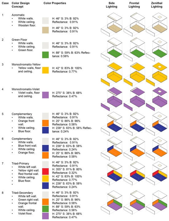
Figure 3.
A graphical display of the surface color configuration concepts tested under three different lighting strategies. The selection of floor color in the complementary cases (5) and (6) and triads (7) and (8) are based on the reflectance percentages established by Brown and DeKay [71].
Architectural variables—Type of light source: Light sources were classified as either daylight (clear sky) or electrical lighting due to the reported effects of natural light in terms of the affective processes and new discoveries in electrical lighting related to well-being and their applications in the built environment [72]. Daylight constitutes a dynamic variable, since its intensity and color temperature properties heavily depend on sky conditions, time of the day, and season [14]. The test with daylight was performed on 10 May and 22 May 2022. The sky conditions varied between clear and mostly cloudy sky during the period of data acquisition for both days, which affected the illuminance levels of each space under study. The correlated color temperature (CCT) and illuminance (Ev) were measured using a CL200-A Chromameter [73]. The CCT of the daylight conditions oscillated between ~5212 K and ~5482 K. A summary of the CCT properties, exterior vertical illuminance (Ev), date, and hour information is displayed in Table A1 in the Appendix A of this document.
Electrical lighting is considered to be a controlled parameter since current technologies allow immediate switches in its intensity and color temperature properties [74]. Electric lighting cannot fully reproduce the spectral properties of daylight but can contribute to the human need for dynamism and spectral changes in light in the built environment. To compare the light and color environments among the models, the experiment was conducted using three LED light strips from Philips Hue [75] characterized by tunable CCT properties, intensity, and a CRI of >80. The LED stripes are constructed of RGB WW LED chips placed at a distance of 5 cm each. The light strips were installed in a light box mounted onto the experimental space, as illustrated in Figure 4, and a summary of the specifications is displayed in Table 1. Each LED system was set at 5500 K, similar to the color temperature conditions of a clear sunny sky [76]. The position of the light source was also considered in this research since daylight dynamism and the on/off control of the electrical sources could modify the appearance of the space and form new shapes when interacting with surface color applications [16,77,78,79]. The position of the light source only considered Side, Frontal, and Zenithal lighting strategies from the point of view of the observer to demarcate and compare the effects of light penetrating a space. The tests under electrical lighting were performed in a controlled environment, as displayed in Figure 2, during the month of November 2022.
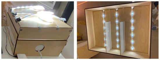
Figure 4.
The installation of the LED light strips for scenarios under electrical lighting.

Table 1.
Lighting systems and properties related to CCT, CRI, and Illuminance levels.
2.2. Data Acquisition, Processing, and Analyses
The data acquisition was performed using a low-cost, 185° field-of-view Fisheye Camera Module [58] attached to a Raspberry Pi 4, introduced in the physical model. The Raspberry Pi comprised a Python script developed by Parsaee [80] to start the image capture. The Pi was remotely managed using a Virtual Network Computer (VNC) server to avoid movement during the image and data acquisition. The script gathered from 9 to 11 low dynamic range images (LDRi) from a very dark exposure value (−4 EV) to a very bright exposure value (+4 EV) in .JPG format. The creation of HDR images (in .HDR format) was conducted using a Python script and OpenCV package [81]. High dynamic range imaging is a technique used to capture a larger range of luminance than what can be captured by standard cameras, similar to what the human eye does. Since HDR files may contain luminance values higher than what typical screens can display, various tone-mapping operators were developed to compress the original signal to a lower dynamic range. Tone mapping reduces the strong contrast from scene values to display ranges while preserving image details, which are essential for comprehending the information content of the space. Specifically, this experiment was conducted using the Reinhard [82] tone-mapping operator on images due to its similarities with what is perceived in real spaces, as encountered in research from Yoshida et al. [83], who indicated that participants perceived higher naturalness in the displayed colors of the images. Research from Tai and Inanici [84] also found higher details in bright regions. Figure 5 illustrates visual differences in color saturation and brightness between tone-mapping operators.
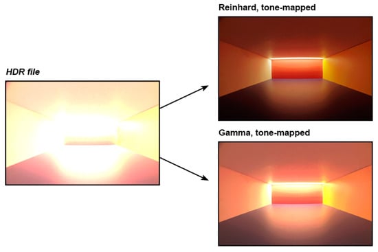
Figure 5.
The aspect of an HDR image and the tone-mapping operators used to illustrate color, saturation, and brightness on images.
The steps of image treatment for chromatic and brightness contrast employed in this experiment are illustrated in Figure 6. Chromatic contrast analyses were conducted by importing .JPG tone-mapped images into Adobe InDesign [85]. Color samples were retrieved according to the luminaire position and its interaction in the room, as illustrated in Figure 7. For the Side Lighting scenes, the colors were retrieved following a linear transition from the light source and the depth of the room. For the Frontal and Zenithal Lighting scenes, the color samples were obtained from the five surfaces (floor, right wall, frontal wall, right wall, and ceiling). In the case of the Frontal Lighting scenes, the colors were selected from central points close to the luminaire position. For the Zenithal Lighting scenes, the colors were mainly obtained from the lower extremities of the wall, front wall, main floor, and luminaire. In some scenes, especially those under daylight, the color samples were obtained from the areas where the light beam directly interacted with walls and floor surfaces.

Figure 6.
Image treatment and workflow analyses.
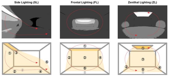
Figure 7.
A graphical collection of color samples according to the lighting strategy. The numbers correspond to the color samples in a color palette with 5 tones.
This research worked with the seven chromatic contrast concepts developed by Itten [46] since they are part of the content taught in the bachelor’s program in architecture. Likewise, its ideation presents intuitive notions used in architectural practice, such as the perception of color temperature, quantity, and quality, compared to those exemplified by Mahnke [86], which require extensive analyses of the color wheel and complementarity and harmony combinations. Saturation (%) and brightness (%) properties were retrieved using the HSB (hue, saturation, and brightness) color system [87]. The main benefit of employing the HSB system for this analysis is the intuitive and user-friendly procedure to describe color [69]. Saturation and brightness were obtained from the color and inserted into an Excel Sheet configured to illustrate the main color descriptors [88]. The relationship between saturation and brightness is linked to how a color can be described in a space, thus providing hints of the potential affective responses of users. The terminology to describe the perceived tonalities in this research was retrieved from the Lighting and Physical Ambiance course [89] based on the expressions proposed by Béguin [90], Le Grand [91], Adeline [92], Pracontal [93], and Bergeon et al. [94] and applied in studies by Bülow-Hübe [95], Russell and Pratt [43], Poirier et al. [22], Arsenault et al. [96], Pineault and Dubois [97], and Clarke and Costal [98], among others. Although the proposed descriptors provide information about the quality of light and color and do not predict the subjective impressions or users’ emotions, they hint at possible outcomes that occupants could perceive, such as exciting and positive experiences with saturated and bright tones, or calming outcomes with shades that present medium/low saturation and brightness. A 2D graphic is presented to visualize the main color descriptors illustrated in Figure 8.

Figure 8.
Two-dimensional graphic color descriptors related to human emotions (in red) based on saturation and brightness properties. Color descriptors were retrieved from the research of Valdez and Mehrabian [47], Divers, [48] Dael et al., [50] Al-Ayash et al., [51] Wilms and Oberfeld, [52] Gao and Xin [53] and Gao et al., [54] Béguin, [90] Le Grand [91], Adeline [92], Pracontal [93], and Bergeon et al. [94] and applied in studies by Bülow-Hübe [95], Russell and Pratt [43], Poirier et al. [22], Arsenault et al. [96], and Pineault and Dubois [97].
Unlike chromatic contrast, brightness contrast refers to luminous differences in a scene measured in brightness levels only. Brightness contrast permits the relating of potential subjective outcomes with architectural attributes using a systematic language based on luminous patterns [99]. The brightness analyses allowed us to predict luminous points or dark zones according to the architectural configuration, turning into focal attention elements that could play a key role in the experience of the space [31]. The tone-mapped images used for the chromatic contrast analyses were imported into Adobe Photoshop [100]. A grayscale filter was applied to standardize the brightness information in the image, which was then post-processed using a posterization technique that condenses similar brightness zones to better visualize bright and dark areas [33]. This research utilized five brightness levels following the research method of Demers [33] and Biron and Demers [101]: 0% (dark), 25%, 50%, 75%, and 100% (white). The histogram of a specific space provides the pixel number of a brightness level. The pixel count of brightness levels was inserted in an Excel sheet configured to display tree maps, which provide a graphical overview of the brightness distribution of each image. A summary of the steps of image treatment for brightness contrast employed in this experiment is illustrated in Figure 6.
3. Results and Discussions
The results highlighted different outcomes in color attributes depending on the surface color configuration and lighting design. The combination of variables yielded 24 scenes with daylight and 24 scenes with the electrical lighting system. An overview of the 48 scenes is illustrated in Figure 9, in which the eight cases presented are organized by the type of light source, either daylight or electrical light set at 5500 K. Each scene also presents its color palette, in which it is possible to observe the differences in tonalities between the colors initially used. The analyses generated interesting results in all 48 environments; however, only 15 of them are discussed to show the biggest differences and polarized results in terms of chromatic and brightness contrast. For a summary of all the results, see Appendix A in this paper.

Figure 9.
An overview of the 48 scenarios under daylight and electrical lighting.
The three following sections present the following topics. The first section is Section 3.1. Color properties and descriptors altered by light source and luminaire position. The effects related to lighting schemes are described in Section 3.2. Brightness patterns of color reflectance, light source type, and luminaire position. An explanation of the main outcomes is provided in Section 3.3. Interpretation of color properties and brightness patterns indoors.
3.1. Color Properties and Descriptors Altered by Light Source and Luminaire Position
Analyses indicated that surface color configurations such as (1) Achromatic, (2) Green Floor, (3) Monochromatic-Yellow, and (4) Monochromatic-Violet scenes under daylight and electrical lighting in the top four rows of Figure 9 showed no major changes in the variety of hues in their color palette. A bright–dark chromatic contrast, as well as the presence of a monochromatic palette, is evident for all four cases. The most recognizable difference is the modification of saturation and brightness properties depending on the type of light source, daylight or electrical lighting, and the position of the lighting strategy from the point of view of the observer.
Multicolored spaces, such as the Complementary 1 and 2, and the Primary and Secondary Triad color combinations illustrated in rows (5) to (8) in Figure 9 presented three main outcomes that merit discussion: chromatic contrast according to the light source, and differences in both saturation and brightness properties according to the luminaire position. The type of light source affects the predominant ambient colors of a space, as evidenced in Figure 10. The example is illustrated in (6) Complementary 2 surface color configuration with a Frontal Lighting strategy position under daylight from a clear sky and an electrical system set at 5500 K.
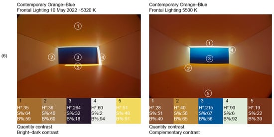
Figure 10.
Differences in chromatic contrast between daylight and electrical lighting in the (6) Complementary 2 scene. Contemporary Orange-Blue FL 5500 K retrieved from the research of Espinoza-Sanhueza et al. [56].
The two lighting conditions create distinct blue properties that shape the overall ambiance, leading to different ways of describing their respective color palettes. Under daylight, the colors in the space remain separate and unblended, resulting in a deep blue that is nearly perceived as black, thereby establishing a bright–dark contrast in the color palette. In contrast, under electrical lighting, the light is more evenly distributed, enhancing the visibility of the blue and orange tones with varying degrees of brightness and saturation for the orange tones. This interaction between light and color contributes to a complementary contrast in the palette, potentially fostering harmonious color combinations [46]. It could be possible that both scenes would probably have similar colors if the daylight scene was under diffuse sky conditions, producing a similar effect to the electrical system.
The luminaire position produced a variation in the observed color palettes as exemplified in Figure 11. Side and Zenithal Lighting scenes presented an apparent warm–cold contrast, illustrating the presence of red (H: 0–29°), cyan-blue (H: 210–239°), orange (H: 30–59°) and gray (several hue coordinates with low saturation) for the (7) Primary Triad and the presence of green (H: 120–149°), blue with low saturation similar to violet tones (H: 240–269°), yellow (H: 60–89°), black in the zone of magenta-red (H: 333°), and red (0–29°) in the (8) Secondary Triad. Conversely, a Frontal luminaire in the (7) Primary Triad scene directly impacted on a colored surface that reflected its own spectral composition throughout the space, generating a warm color palette. A similar situation is generated in the (8) Secondary Triad, where the violet tones of the floor became dark red due to the interaction with light and reflectance properties of the orange frontal wall. This effect eclipsed the presence of the floor colors from the observer’s point of view.

Figure 11.
Effects of the luminaire position in the color palettes generated for the (7) Primary Triad and (8) Secondary Triad scenes. Spaces retrieved from Espinoza-Sanhueza et al. [56].
Differences were evidenced in the descriptions when evaluating the saturation and brightness levels of the scenes as displayed in Figure 12 and Figure 13. The figure presents the descriptors based on each sample retrieved from the tested images. In the case of the (7) Primary Triad (Figure 12) under a Side and Zenithal Lighting strategy, the saturation and brightness levels allow for the characterization of a space with pale, dull, and medium colors; yet a dichotomy is perceived in the same case under a Frontal Lighting strategy.

Figure 12.
A graphical display of the color palette (top) and HSB color descriptors of the Triad-Primary scenes under SL, FL, and ZL electrical lighting at 5500 K. The analysis is based on saturation and brightness properties retrieved from Bülow-Hübe [95], Küller [102], Russell and Pratt [43], Poirier, Demers and Potvin, Arsenault, Hébert and Dubois [96] Pineault and Dubois [97] and Chen et al. [49] and supported by the PAD theory [47] and Value (brightness)–Chroma (saturation) paradigm [47].
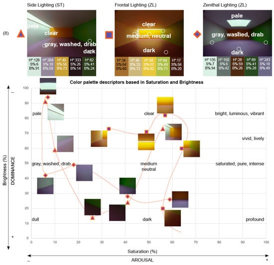
Figure 13.
A graphical display of color palette (top) and HSB color descriptors of the Triad-Secondary scenes under SL, FL, and ZL electrical lighting at 5500 K. The analysis is based on saturation and brightness properties retrieved from Bülow-Hübe [95], Küller [102], Russell and Pratt [43], Poirier, Demers and Potvin [22], Arsenault, Hébert and Dubois [96], Pineault and Dubois [97], and Chen et al. [49] and supported by the PAD theory [47] and Value (brightness)—Chroma (saturation) paradigm [48].
Frontal Lighting, which generated tones that vary, from clear, medium, saturated, intense, pure, to dark tones. A special situation is evidenced in the (8) Secondary Triad (Figure 13), where the color palettes present notorious dark tones in the three scenes, but the rest of the colors expose a difference in the saturation and brightness levels that make it possible to conduct different descriptions of the scene. While the saturation and brightness in the Side and Zenithal Lighting make it possible to distinguish the color of this space as gray, washed, drab, or dark, the tones perceived in the Frontal Lighting scene can be described as clear and medium zones of saturation and brightness properties.
The results presented in this section suggest that the effects of color in architecture are conditioned not only by its application to surfaces but also by its interaction with the light stimulus. This exploration led to the conclusion that combinations of color and light could provide several practical color palettes. The palettes could potentially influence the characteristics of the built environment. These outcomes can be reflected in the beneficial experiences of users, which is one of the aims of sustainable and responsive architecture.
3.2. Brightness Patterns of Color Reflectance, Light Source Type, and Luminaire Position
The analysis of image brightness distribution using posterized grayscale images showed that combinations of light and color in architecture can create three visual effects, as illustrated in Figure 14: (a) distinction of image brightness zones and different accentuation of light spots, (b) differences in the spatial concentration of light, and (c) the fragmentation and focus points of light. The first outcome expresses the influence of the reflectance properties in the brightness distribution map of a scene when comparing a luminous scene such as the (3) Monochromatic-Yellow space and a dark space such as the (4) Monochromatic-Violet space, illustrated in Figure 14a (top row). A bright zone at the back of the room due to the Frontal Lighting strategy was observed in both spaces, performing as a spatial focal point of attention. The main observable difference corresponds to the level of the brightness zones when comparing the brightness distribution maps of both cases. The (3) Monochromatic-Yellow space presented brighter zones in comparison to the (4) Monochromatic-Violet space, in which the dominant areas were black (0%). Likewise, the bright focal point perceived at the back of the room was more noticeable in the Monochromatic-Violet space, because of the differences in brightness values compared to the rest of the scene.

Figure 14.
Luminous effects and brightness distribution maps according to lighting position and type of light source. Effect classification inspired by Demers [34,63].
The second outcome portrays the differences in the spatial concentration of light caused by the luminaire position, despite the color application on the surfaces. The example illustrated in Figure 14b (middle row) presents the (2) Green Floor environment tested with a Side and a Zenithal Lighting strategy. The Side Lighting strategy generated a linear transition from very bright zones close to the light source to dark areas deep in the room. Contrarily, the Zenithal Lighting scene revealed a likely uniform space, with a major concentration of bright zones in the center of the room caused by the light source and three minor attention points displayed on the left and right walls and on the floor. These results make it possible to compare the potential use of the architectural area as a function of light concentration patterns and points of visual interest in architecture.
The last finding reveals the influence of the light source on the fragmentation of bright and dark areas and the generation of attention points of light in a space. The example with daylight in the left image of Figure 14c (bottom row) illustrates a beam of light penetrating the space, generating a fragmented room with a distinct type of lighting zone in a single spatial configuration. On the other hand, greater uniformity was evidenced in the scene with an electrical light source located at the bottom right of Figure 14. In this case, the brightness distribution map presents higher brightness zones and a slight fragmentation between a bright area close to the light source and a more evident focal point due to the blue surface of the room background.
These results are not generalizable for all situations such as those presented in the Results and Discussion section because they depend, for instance, on the dynamism of natural light, reflectance properties, area size, textures of the colors applied on the surfaces, and human perception. However, they present an overview of potential visual effects and invite designers to reflect on the combination of light sources, their positioning strategy from the observer’s point of view, and the reflectance properties of the surfaces that are implemented in the built environment.
3.3. Interpretation of Color Properties and Brightness Patterns Indoors
Chromatic and brightness contrast analysis offer valuable insights that architects and designers could use to interpret light and color applications in architecture. These interpretations can help communicate ideas more effectively and simply between designers, researchers, and professionals. Figure 15 compares chromatic and brightness outcomes obtained from Complementary (5) Blue-Orange and (6) Orange-Blue scenes under electrical Frontal Lighting strategies. The results obtained from the color palette of each scene and the posterized grayscale images following the procedure described in the Section 2.2. Data acquisition, processing, and analyses served to conduct an example of the general conclusion that could be retrieved from an environment. It was possible to infer that (5) the Complementary Blue-Orange scene provides a monochromatic and warm-dominant color palette, providing foremost pale, medium gray, washed, and dark tones and brightness attributes, characterized by light projection in the back to the rest of the space. Conversely, the (6) Complementary Orange-Blue is represented by saturated, pure, and intense tones in the space, with high dark uniformity, as well as the formation of two focal points of light that could enhance concentration and attention to specific areas in the space. The descriptions provided in Figure 15 correspond to examples of the different narratives that can be created from an understanding of the light and color characteristics of each scene. Although the conclusions derived from chromatic and brightness contrast may differ between architects and designers during the design process, they approximate individuals’ potential experiences based on previous studies that have substantiated the relationship between light and color properties and individuals’ behavior. The presented table offers an interpretation of the quantitative aspects of light and color based on chromatic and brightness contrast analyses that could help to predict users’ potential experiences in architecture.
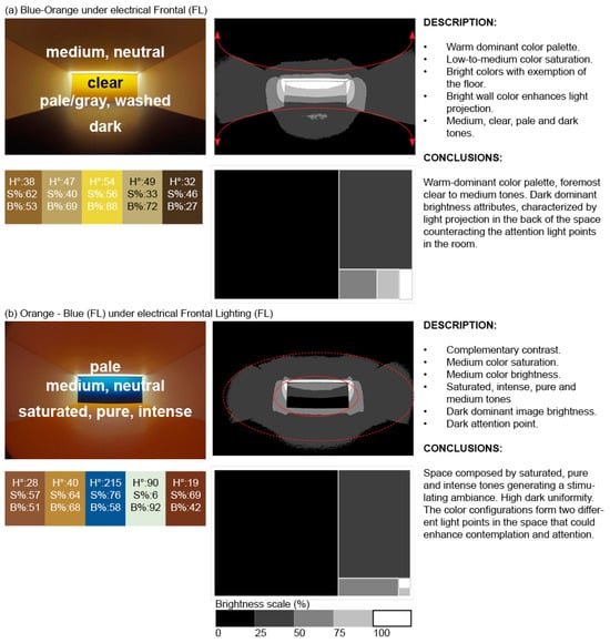
Figure 15.
An interpretation of the light and color attributes in an architectural space using the presented methodology.
4. Conclusions
This research presented the impact of sustainable strategies including daylight and electrical lighting on luminous and color attributes in architecture. Through analyses of chromatic and brightness contrasts, this study provided insights into potential spatial experiences for users.
The advantages of the presented method, particularly in experimental setup and data acquisition, lie in its ability to recreate various spatial conditions and capture images using cost-effective visualization techniques. The use of remote image capture minimized movement, ensuring high-precision data acquisition through the HDRi technique. Furthermore, the proposed analyses streamlined the assessment of indoor lighting and color, including chromatic and brightness contrast. This methodology could serve as a valuable tool for students, architects, and designers to comprehend the interaction between light and color in architecture, enhancing the implementation of these elements in the professional practice.
This study involved the creation of 48 distinct environments within scale models that were subsequently analyzed through images. Key conclusions drawn from chromatic contrast and color descriptor analyses include the following:
- The choice of light sources significantly influences the resulting color palettes, defining the characteristics of a space.
- The position of light sources, relative to the observer’s viewpoint, can impact the dominant colors within an environment, particularly affecting saturation and brightness properties.
- The combined influence of light source type and luminaire position can impact color properties and be reflected by distinct descriptors, shaping the characterization of an architectural space.
Regarding brightness contrasts, this research revealed the following insights:
- The reflectance properties of the surface-applied colors play a pivotal role in emphasizing spatial focal points.
- The positioning of a light source could affect the spatial concentration of light in a space.
- Whether through direct daylight or electrical lighting, the type of light source has the potential to alter the perception of light fragmentation within a space.
This study did not aim to develop a list of best practices to improve users’ emotions through architecture but to explore how the relationship between color and light can cause different descriptions that have been previously associated with users’ emotions. In this regard, colors and light can be used according to specific targeted experiences in the built environment.
The results obtained from the analysis of chromatic contrasts and brightness have been meticulously interpreted to draw conclusions regarding lighting conditions and color. These insights enable us to envision specific experiences through proposed architectural solutions that are designed for the integration of color and light.
The value of this research relies on the environmental diversity achieved using color on interior surfaces and the implementation of natural and electric lighting strategies. Daylight, electrical lighting, and color coatings are costless sustainable strategies to improve visual information in new projects and building retrofits. The findings of this study support the use of light to generate different spatial experiences in settings with distinct color in their surfaces so as to support decision-making in the development of architecture.
5. Limitations and Future Work
Chromatic and brightness contrasts, as well as color descriptors and their relationship with users’ potential emotions used in this research, are based on previous studies. It is important to mention that people’s emotions and their affective responses regarding light and color are highly dependent on other factors that this research did not investigate. This research based its analyses on the existing literature, specifically the chromatic contrast definitions proposed by Itten [46] and the saturation and brightness descriptors and their relation to existing emotions as exemplified in the studies by Béguin [90], Le Grand [91], Adeline [92], Pracontal [93], and Bergeon et al. [94] and applied in studies by Bülow-Hübe [95], Russell and Pratt [43], Poirier et al. [22], Arsenault et al. [96], Pineault and Dubois [97], and Clarke and Costal [98], as mentioned in the Methods section. The brightness pattern analyses were also based on the numerical procedures proposed by Demers [34] and associated with the experiences reported by Rockcastle, Andersen, and Amundadottir [55]. The factors that were not included in this investigation include geographical and cultural differences, as well as personal history and background regarding color and light exposure. Further aspects such as seasonal and hourly variations in daylight and their interplay with surface properties could also affect emotions and impressions that an individual can develop according to a space. Further limitations were found in this investigation concerning the color combinations and textures used to create the scenes studied for this experiment. The color schemes applied to walls were chosen according to the color harmony theories from Goethe [103], who stated that RYB color model complementaries and triads could potentially enhance people’s environmental satisfaction. Saturation properties were considered to polarize and exaggerate the results to promote discussion. Nevertheless, color schemes in relation to nature could differ according to context, latitude, and culture. This study did not explore materials with diverse textures or noble materials, despite extensive research demonstrating their impact on psychological well-being. Future work could investigate how distinct color schemes, tailored to specific communities and local materials, contribute to creating contextually representative architecture.
A second aspect not considered in this research corresponds to the perception of colors affected by a main color reflected in a room. For instance, a wall with a red color that reflects its hue in a room can modify the hue of a blue color, making it appear “dark violet”. These types of changes have been analyzed through chromatic contrasts such as warm–cold or bright–dark, for example. However, human perception connected to how much a color could change or how colors are affected by the reflectance of other elements has not been approximated. It is necessary to consider this type of variable in future experiments.
This study underscores the effectiveness of images as a tool for evaluating the potential effects of color and light on individuals. However, the authors acknowledge that more reliable and valid results could be obtained by studying participants in real environments or through immersive visualization techniques, such as virtual reality (VR) and artificial intelligence-generated spaces. In recent years, VR technology has advanced significantly, enabling the creation of highly realistic virtual environments that serve as reliable tools for lighting evaluations in research.
Author Contributions
C.E.-S.: writing of the original draft, methodology, investigation, conceptualization. M.H.: supervision and revision. J.-F.L.: supervision and revision. C.D.: conceptualization, project-direction, supervision, revision, funding acquisition. All authors have read and agreed to the published version of the manuscript.
Funding
This research was supported by the Sentinel North strategy program of Université Laval, made possible, in part, thanks to funding from the Canada First Research Excellence Fund. More specifically, this research was funded by the project entitled “Optimizing biophilia in extreme climates through architecture” and “Biophilic design in the Arctic: immersive community co-creation to reconcile well-being and energy performance in Ikaluktutiak architecture”.
Institutional Review Board Statement
Not applicable.
Informed Consent Statement
Not applicable.
Data Availability Statement
The data presented in this research are available upon request to the corresponding author.
Acknowledgments
The authors would like to thank Mélanie Watchman and Alexandre Carrier for reviewing this paper for grammatical consistency.
Conflicts of Interest
The authors declare no conflicts of interest.
Appendix A
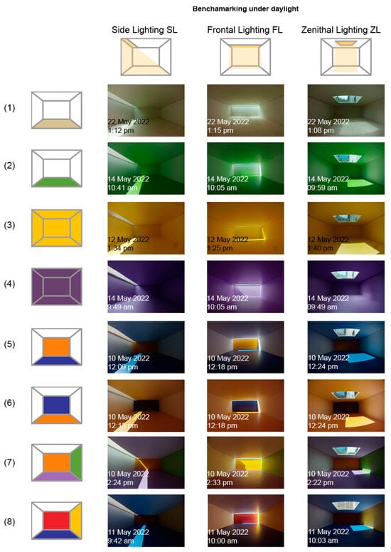
Figure A1.
The benchmarking of the environments under daylight.
Figure A1.
The benchmarking of the environments under daylight.
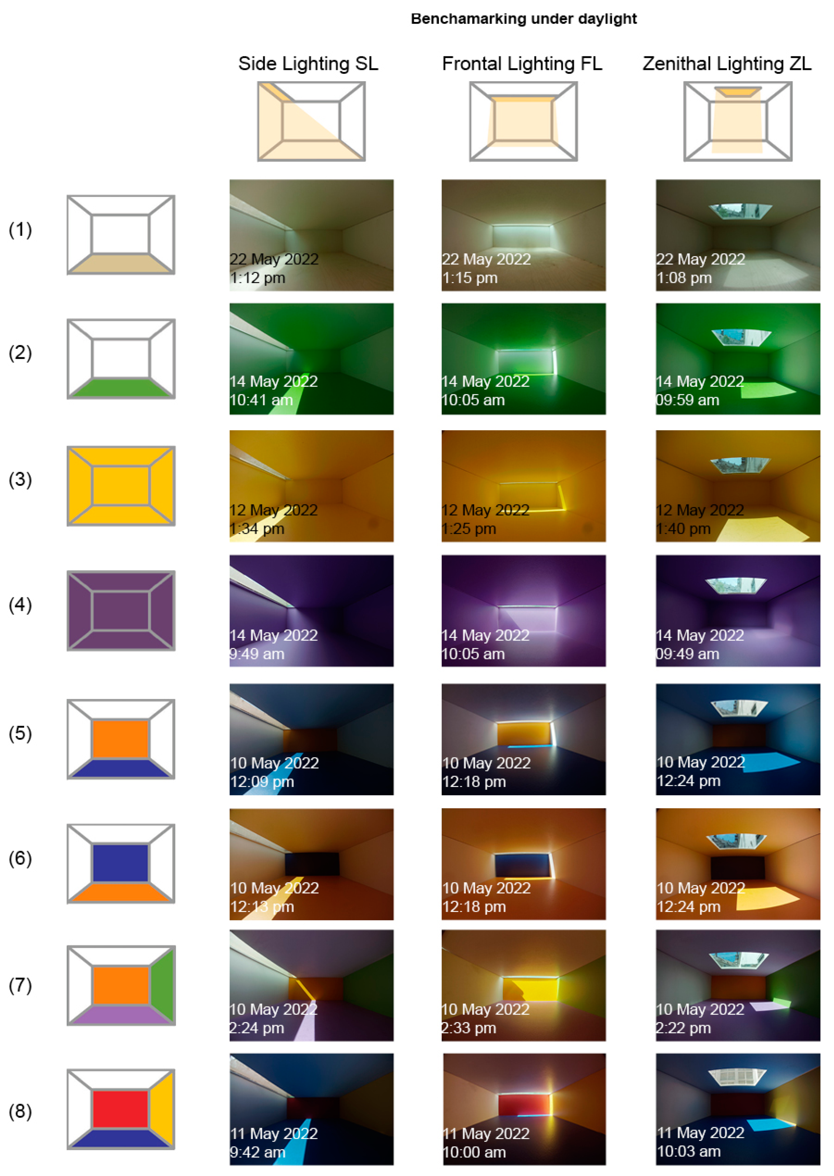
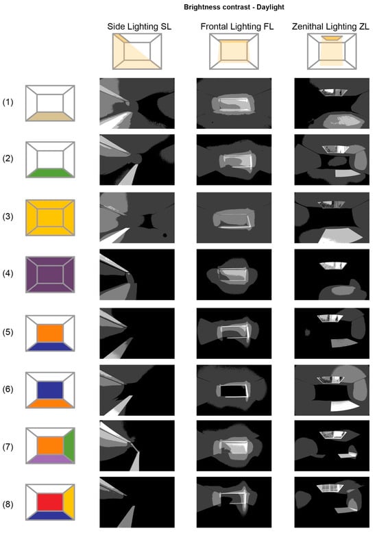
Figure A2.
Brightness distribution map of environments under daylight.
Figure A2.
Brightness distribution map of environments under daylight.
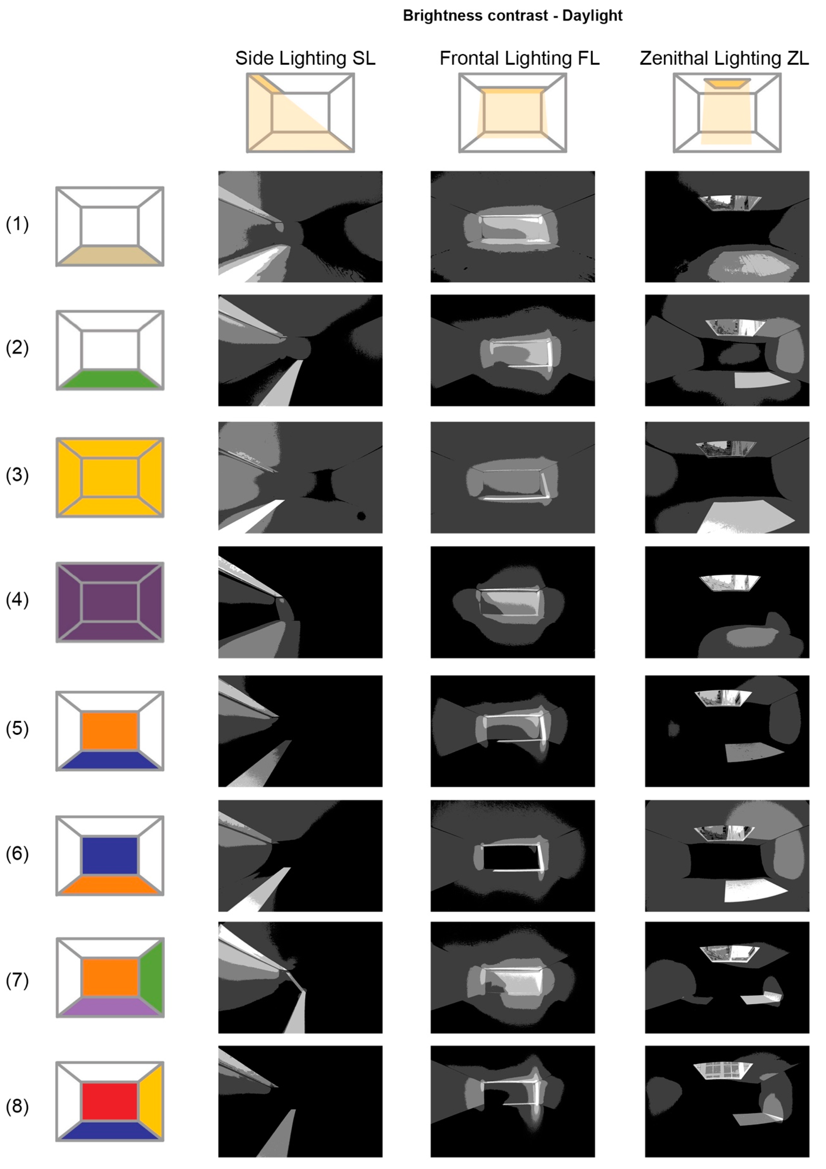
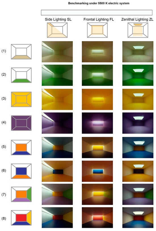
Figure A3.
The benchmarking of the environments with electrical lighting at 5500 K. The images were used in previous studies by Espinoza-Sanhueza et al. [56].
Figure A3.
The benchmarking of the environments with electrical lighting at 5500 K. The images were used in previous studies by Espinoza-Sanhueza et al. [56].
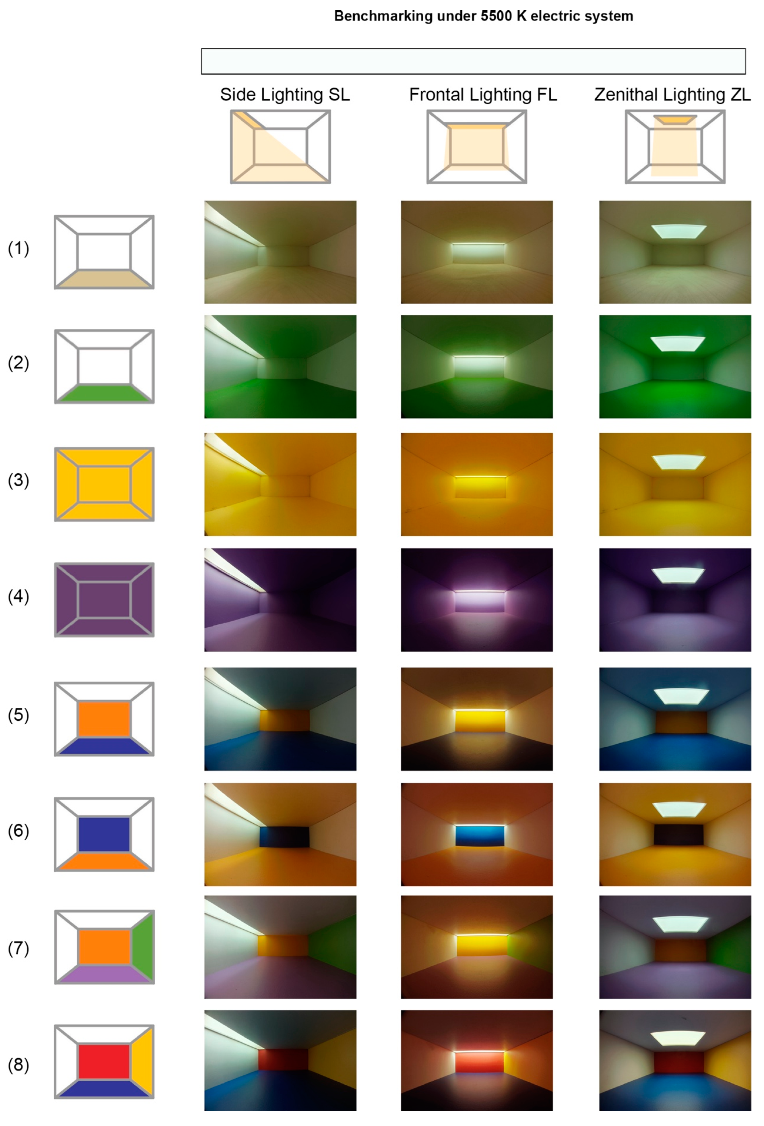
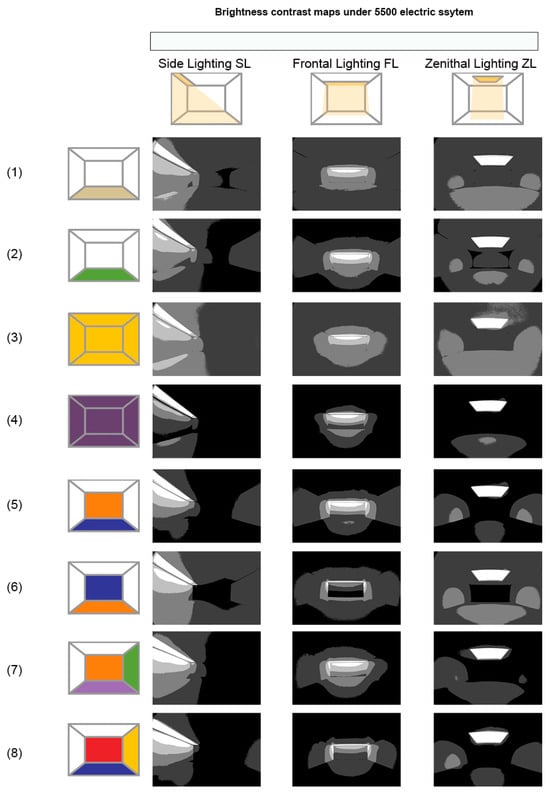
Figure A4.
Brightness distribution maps with electrical lighting at 5500 K. Posterized images retrieved from the research of Espinoza-Sanhueza et al. [56].
Figure A4.
Brightness distribution maps with electrical lighting at 5500 K. Posterized images retrieved from the research of Espinoza-Sanhueza et al. [56].
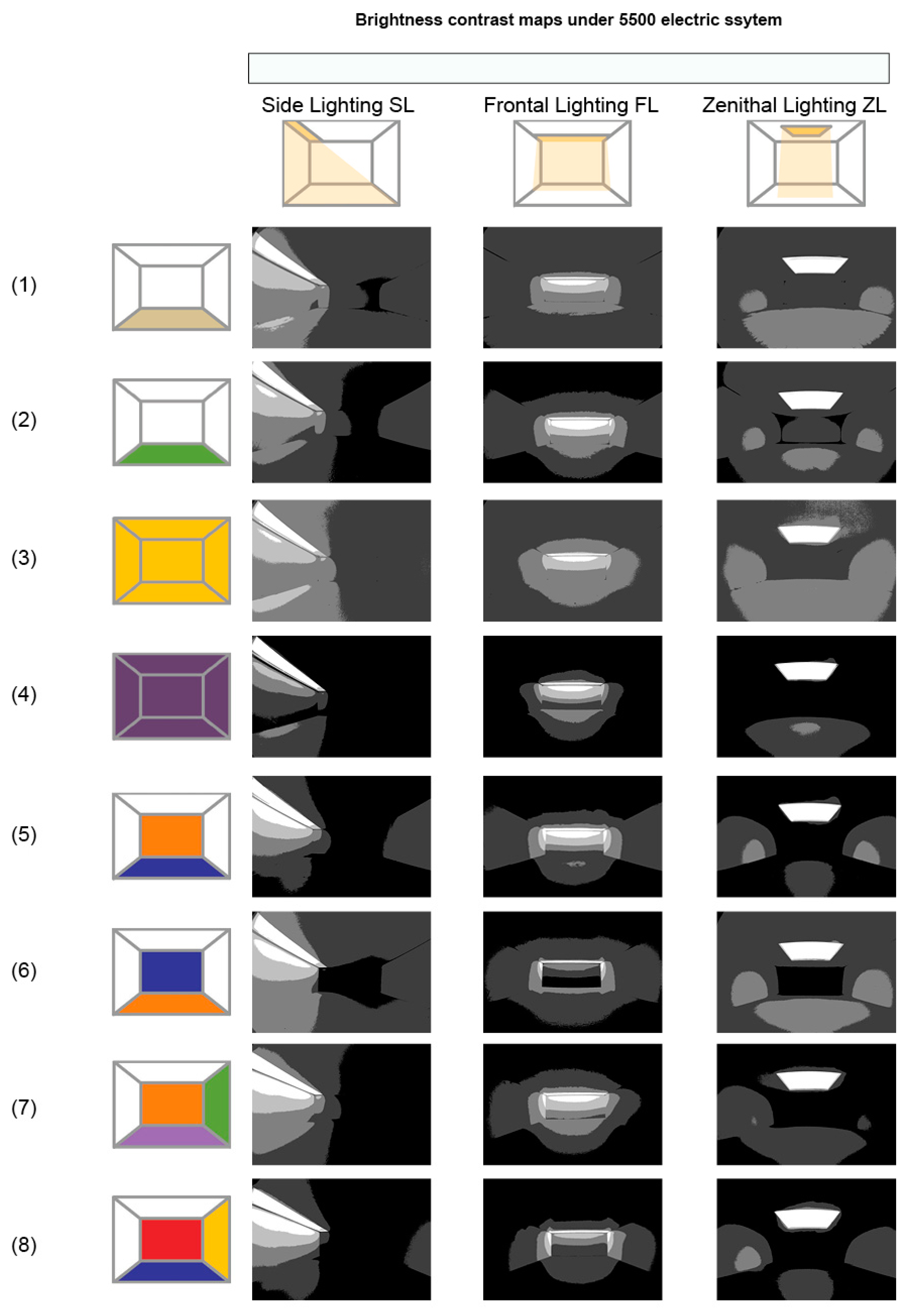
Table A1.
Daylight conditions during the data acquisition from the scenes under a real sky. The data were acquired during the month of May 2022.
Table A1.
Daylight conditions during the data acquisition from the scenes under a real sky. The data were acquired during the month of May 2022.
| SC Configuration | Lighting Strategy | Date | Hour | CCT Source | Exterior Illuminance (Ev) |
|---|---|---|---|---|---|
| (1) Achromatic | ST | 22-May | 01:12 PM | 5311 | 43,956 |
| FT | 22-May | 01:15 PM | 5299 | 44,699 | |
| ZL | 22-May | 01:08 PM | 5315 | 43,612 | |
| (2) Green Floor | ST | 14-May | 10:41 AM | 5533 | 42,250 |
| FT | 14-May | 10:05 AM | 5482 | 40,153 | |
| ZL | 14-May | 09:59 AM | 5404 | 32,795 | |
| (3) Monochromatic-Yellow | ST | 12-May | 01:34 PM | 5253 | 61,610 |
| FT | 12-May | 01:25 PM | 5315 | 60,440 | |
| ZL | 12-May | 01:40 PM | 5311 | 65,660 | |
| (4) Monochromatic-Violet | ST | 14-May | 09:49 AM | 5304 | 41,860 |
| FT | 14-May | 10:05 AM | 5482 | 39,170 | |
| ZL | 14-May | 09:49 AM | 5304 | 30,370 | |
| (5) Complementary 1 | ST | 10-May | 12:09 PM | 5314 | 68,956 |
| FT | 10-May | 12:18 PM | 5344 | 67,934 | |
| ZL | 10-May | 12:24 PM | 5332 | 69,124 | |
| (6) Complementary 2 | ST | 10-May | 12:13 PM | 5398 | 68,672 |
| FT | 10-May | 12:18 PM | 5401 | 67,934 | |
| ZL | 10-May | 12:24 PM | 5399 | 69,124 | |
| (7) Triad-Primary | ST | 10-May | 02:24 PM | 5235 | 70,439 |
| FT | 10-May | 02:33 PM | 5212 | 69,284 | |
| ZL | 10-May | 02:22 PM | 5240 | 69,511 | |
| (8) Triad Secondary | ST | 11-May | 09:42 PM | 5231 | 40,943 |
| FT | 11-May | 10:00 AM | 5270 | 39,152 | |
| ZL | 11-May | 10:03 AM | 5283 | 32,488 |
References
- Meerwein, G.; Rodeck, B.; Mahnke, F.H. Color—Communication in Architectural Space, 4; Birkhäuser: Basel, Switzerland, 2007. [Google Scholar]
- National Resources Canada. Retrofitting. 2018. Available online: https://natural-resources.canada.ca/energy-efficiency/buildings/existing-buildings/retrofitting/20707 (accessed on 26 June 2024).
- Jaglarz, A. Perception of Color in Architecture and Urban Space. Buildings 2023, 13, 2000. [Google Scholar] [CrossRef]
- Thampanichwat, C.; Bunyarittikit, S.; Moorapun, C.; Phaibulputhipong, P. A Content Analysis of Architectural Atmosphere Influencing Mindfulness through the Lens of Instagram. Sustainability 2023, 15, 10063. [Google Scholar] [CrossRef]
- Altomonte, S. Daylight for Energy Savings and Psycho-Physiological Well-Being in Sustainable Built Environments. J. Sustain. Dev. 2009, 1, 3–16. [Google Scholar] [CrossRef]
- Tsangrassoulis, A.; Kontadakis, A.; Doulos, L. Assessing Lighting Energy Saving Potential from Daylight Harvesting in Office Buildings Based on Code Compliance & Simulation Techniques: A Comparison. Procedia Environ. Sci. 2017, 38, 420–427. [Google Scholar] [CrossRef]
- Nur, Y.A.; Yoon, G.; Sato, T. Energy savings evaluation of enhanced classroom daylighting utilization. Energy Build. 2024, 312, 114179. [Google Scholar] [CrossRef]
- National Resources Canada. Make Your Building More Energy Efficient. 2022. Available online: https://natural-resources.canada.ca/stories/spotlight-energy-efficiency/make-your-building-more-energy-efficient (accessed on 7 January 2025).
- Lighting Choices to Save You Money, Energy.Gov. Available online: https://www.energy.gov/energysaver/lighting-choices-save-you-money (accessed on 7 January 2025).
- Why Choose ENERGY STAR Certified LED Lighting?|ENERGY STAR. Available online: https://www.energystar.gov/products/lighting_fans/light_fixtures/why_choose_energy_star_qualified_led_lighting (accessed on 6 January 2025).
- Xia, S.; Zhao, Q.; Ji, J.; Wu, R.; Chen, L.; Yin, Y.; Liu, Q. Impact of Water-Based Coating Substitution on VOCs Emission Characteristics for the Surface-Coating Industries and Policy Effectiveness: A Case Study in Jiangsu Province, China. Atmosphere 2023, 14, 662. [Google Scholar] [CrossRef]
- de Kort, J.M.A.; Gauvin, F.; Loomans, M.G.L.C.; Brouwers, H.J.H. Emission rates of bio-based building materials, a method description for qualifying and quantifying VOC emissions. Sci. Total Environ. 2023, 905, 167158. [Google Scholar] [CrossRef]
- Ghobakhloo, S.; Khoshakhlagh, A.H.; Morais, S.; Tehrani, A.M. Exposure to Volatile Organic Compounds in Paint Production Plants: Levels and Potential Human Health Risks. Toxics 2023, 11, 111. [Google Scholar] [CrossRef] [PubMed]
- Knoop, M.; Stefani, O.; Bueno, B.; Matusiak, B.; Hobday, R.; Wirz-Justice, A.; Martiny, K.; Kantermann, T.; Aarts, M.; Zemmouri, N.; et al. Daylight: What makes the difference? Light. Res. Technol. 2020, 52, 423–442. [Google Scholar] [CrossRef]
- Blume, C.; Garbazza, C.; Spitschan, M. Effects of light on human circadian rhythms, sleep and mood. Somnologie 2019, 23, 147–156. [Google Scholar] [CrossRef] [PubMed]
- Boyce, P.R. Human Factors in Lighting, 3rd ed.; CRC Press: Boca Raton, FL, USA, 2014. [Google Scholar]
- Kwallek, N.; Lewis, C.M.; Robbins, A.N.N.S. Effects of Office Interior Color on Workers’ Mood and Productivity. Percept. Mot. Ski. 1988, 66, 123–128. [Google Scholar] [CrossRef]
- Küller, R.; Mikellides, B.; Janssens, J. Color, arousal, and performance—A comparison of three experiments. Color Res. Appl. 2009, 34, 141–152. [Google Scholar] [CrossRef]
- Veitch, J.; Newsham, G.; Boyce, P.; Jones, C. Lighting appraisal, well-being and performance in open-plan offices: A linked mechanisms approach. Light. Res. Technol. 2008, 40, 133–151. [Google Scholar] [CrossRef]
- Küller, R.; Ballal, S.; Laike, T.; Mikellides, B.; Tonello, G. The impact of light and colour on psychological mood: A cross-cultural study of indoor work environments. Ergonomics 2006, 49, 1496–1507. [Google Scholar] [CrossRef] [PubMed]
- Hegde, A.L.; Rogers, J.M. Effects of Light, Illuminance and Color on Subjective Impression Rankings. Des. Princ. Pract. Int. J.-Annu. Rev. 2013, 6, 33–44. [Google Scholar] [CrossRef]
- Poirier, G.; Demers, C.M.H.; Potvin, A. Wood Perception in Daylit Interior Spaces: An Experimental Study Using Scale Models and Questionnaires. BioResources 2019, 14, 1941–1968. [Google Scholar] [CrossRef]
- Hidayetoglu, M.L.; Yildirim, K.; Akalin, A. The effects of color and light on indoor wayfinding and the evaluation of the perceived environment. J. Environ. Psychol. 2012, 32, 50–58. [Google Scholar] [CrossRef]
- Min, Y.H.; Ha, M. Contribution of colour-zoning differentiation to multidimensional spatial knowledge acquisition in symmetrical hospital wards. Indoor Built Environ. 2020, 30, 1420326X2090949. [Google Scholar] [CrossRef]
- Jansen-Osmann, P.; Wiedenbauer, G. Wayfinding Performance in and the Spatial Knowledge of a Color-coded Building for Adults and Children. Spat. Cogn. Comput. 2004, 4, 337–358. [Google Scholar] [CrossRef]
- Gerhardsson, K.M.; Laike, T.; Johansson, M. Leaving lights on—A conscious choice or wasted light? Use of indoor lighting in Swedish homes. Indoor Built Environ. 2020, 30, 745–762. [Google Scholar] [CrossRef]
- Schauss, A.G. Tranquilizing Effect of Color Reduces Aggressive Behavior and Potential Violence. Orthomol. Psychiatry 1979, 8, 218–221. [Google Scholar]
- Pellegrini, R.J.; Schauss, A.G.; Miller, M.E. Room Color and Aggression in A Criminal Detention Holding Cell: A Test of the “Tranquilizing Pink” Hypothesis. J. Orthomol. Psychiatry 1981, 10, 174–181. [Google Scholar]
- Stephen, K.; Kaplan, R. Cognition and Environment: Functioning in an Uncertain World; Praeger: New York, NY, USA, 1982. [Google Scholar]
- Kuijsters, A.; Redi, J.; de Ruyter, B.; Seuntiëns, P.; Heynderickx, I. Affective ambiences created with lighting for older people. Light. Res. Technol. 2015, 47, 859–875. [Google Scholar] [CrossRef]
- Jafarian, H.; Demers, C.; Blanchet, P.; Landry, V. Lighting Ambiances and Materialities of Wood in Architecture “A Comparative Evaluation of the Quality of Spaces in Relation to Interior Finishes”, Université Laval. 2016. Available online: https://corpus.ulaval.ca/jspui/handle/20.500.11794/27262 (accessed on 1 April 2019).
- Demers, C.M.H. The Sanctuary of Art: Images in the Assessment and Design of Light in Architecture. Ph.D. Thesis, University of Cambridge, Cambridge, UK, 1997. [Google Scholar]
- Rockcastle, S. Perceptual Dynamics of Daylight in Architecture. Ph.D. Thesis, École Polytechnique Fédérale de Lausanne, Lausanne, Switzerland, 2017. [Google Scholar]
- Demers, C.M.H. Assessing Light in Architecture: A Numerical Procedure for a Qualitative and Quantitative Analysis; CIE (Commission Internationale de l’Éclairage): Venice, Italy, 2006; p. 8. [Google Scholar]
- Teleworking in the COVID-19 Pandemic: Trends and Prospects, OECD. Available online: https://www.oecd.org/en/publications/2021/09/teleworking-in-the-covid-19-pandemic-trends-and-prospects_5b0f89ee.html (accessed on 21 November 2023).
- Lecours, A.; Gilbert, M.-H.; Boucher, N.; Vincent, C. The Influence of Teleworking in a Pandemic Context on the Work Experience of Individuals with Physical Disabilities: A Quebec Qualitative Study. J. Occup. Rehabil. 2023, 33, 375–388. [Google Scholar] [CrossRef] [PubMed]
- Kiko, M.; Coulombel, N.; Poulhès, A.; Seregina, T.; Tremblin, G. Evaluation of Direct and Indirect Effects of Teleworking on Mobility: The Case of Paris. Transp. Res. Rec. 2023, 2678, 865–878. [Google Scholar] [CrossRef]
- Groat, L.N.; Wang, D. Architectural Research Methods, 2nd ed.; John Wiley & Sons, Inc.: Hoboken, NJ, USA, 2013; Available online: https://nexosarquisucr.wordpress.com/wp-content/uploads/2016/03/architecturalresearchmethods-groat_wang.pdf (accessed on 10 February 2025).
- Cruickshank, L.; Coupe, G.; Hennessy, D. Co-Design: Fundamental Issues and Guidelines for Designers: Beyond the Castle Case Study. Swed. Des. Res. J. 2016, 9, 46. [Google Scholar] [CrossRef]
- Evans, M.; Terrey, N. Co-design with citizens and stakeholders. In Evidence-Based Policy Making in the Social Sciences: Methods That Matter; Bristol University Press: Bristol, UK, 2016; pp. 243–262. [Google Scholar] [CrossRef]
- Carthy, S.; Cormican, K.; Sampaio, S. Knowing me knowing you: Understanding user involvement in the design process. Procedia Comput. Sci. 2021, 181, 135–140. [Google Scholar] [CrossRef]
- Russell, J.A.; Mehrabian, A. Evidence for a Three-Factor Theory of Emotions. J. Res. Personal. 1977, 11, 273–294. [Google Scholar] [CrossRef]
- Russell, J.A.; Pratt, G. A Description of the Affective Quality Attributed to Environments. J. Personal. Soc. Psychol. 1980, 38, 311–322. [Google Scholar] [CrossRef]
- Witzel, C.; Gegenfurtner, K. Chromatic Contrast Sensitivity. In Encyclopedia of Color Science and Technology; Luo, R., Ed.; Springer: Berlin/Heidelberg, Germany, 2015; pp. 1–7. [Google Scholar] [CrossRef]
- Albers, J. Interaction of Color. Leonardo 1973, 6, 272. [Google Scholar] [CrossRef]
- Itten, J. Art de la Couleur: Approche Subjective et Description Objective de l’art; Edition Ab: Paris, France, 1961. [Google Scholar]
- Valdez, P.; Mehrabian, A. Effects of Color on Emotions. J. Exp. Psychol. Gen. 1994, 123, 394–409. [Google Scholar] [CrossRef] [PubMed]
- Divers, E. Theory to practice: Pleasure-Arousal-Dominance (PAD) theory for architectural color design. Color Res. Appl. 2023, 48, 445–452. [Google Scholar] [CrossRef]
- Chen, Y.; Yang, J.; Yu, L.; Westland, S.; Wang, H. The multiple characteristics of specific associations from words to colors. Color Res. Appl. 2023, 48, 139–150. [Google Scholar] [CrossRef]
- Dael, N.; Perseguers, M.-N.; Marchand, C.; Antonietti, J.-P.; Mohr, C. Put on that colour, it fits your emotion: Colour appropriateness as a function of expressed emotion. Q. J. Exp. Psychol. 2016, 69, 1619–1630. [Google Scholar] [CrossRef] [PubMed]
- AL-Ayash, A.; Kane, R.T.; Smith, D.; Green-Armytage, P. The influence of color on student emotion, heart rate, and performance in learning environments. Color Res. Appl. 2016, 41, 196–205. [Google Scholar] [CrossRef]
- Wilms, L.; Oberfeld, D. Color and emotion: Effects of hue, saturation, and brightness. Psychol. Res. 2018, 82, 896–914. [Google Scholar] [CrossRef]
- Gao, X.P.; Xin, J.H. Investigation of human’s emotional responses on colors. Color Res. Appl. 2006, 31, 411–417. [Google Scholar] [CrossRef]
- Gao, X.-P.; Xin, J.H.; Sato, T.; Hansuebsai, A.; Scalzo, M.; Kajiwara, K.; Guan, S.-S.; Valldeperas, J.; Lis, M.J.; Billger, M. Analysis of cross-cultural color emotion. Color Res. Appl. 2007, 32, 223–229. [Google Scholar] [CrossRef]
- Rockcastle, S.; Amundadottir, M.L.; Andersen, M. Contrast measures for predicting perceptual effects of daylight in architectural renderings. Light. Res. Technol. 2017, 49, 882–903. [Google Scholar] [CrossRef]
- Espinoza-Sanhueza, C.; Hébert, M.; Lalonde, J.-F.; Demers, C.M.H. Biophilic analogous patterns for light-responsive architecture during polar night: Examining the photobiological effects of electrical lighting on surface colour configuration. Build. Environ. 2024, 249, 111125. [Google Scholar] [CrossRef]
- Espinoza-Sanhueza, C.; Hébert, M.; Lalonde, J.-F.; Demers, C.M. Dataset of images for visual and non-visual analysis of colour applications in architecture. Data Brief 2024, 55, 110755. [Google Scholar] [CrossRef]
- Waveshare. “RPi Camera (I), Fisheye Lens”. Available online: https://www.waveshare.com/rpi-camera-i.htm (accessed on 29 February 2024).
- Raspberry Pi Foundation, Camera—About Camera Modules, Raspberry Pi Documentation. Available online: https://www.raspberrypi.com/documentation/accessories/camera.html (accessed on 20 March 2024).
- The Raspberry Pi Foundation, Teach, Learn, and Make with Raspberry Pi, Raspberry Pi. Available online: https://www.raspberrypi.org/ (accessed on 10 February 2021).
- Lau, J. Use of scale models for appraising lighting quality. Light. Res. Technol. 1972, 4, 254–262. [Google Scholar] [CrossRef]
- Bodart, M.; Deneyer, A.; De Herde, A.; Wouters, P. A Guide for Building Daylight Scale Models. Archit. Sci. Rev. 2007, 50, 31–36. [Google Scholar] [CrossRef]
- Demers, C.M. Light: The Power of Images—A Design for Architectural Creation. In Proceedings of the 30th Annual Conference of the EDRA, Orlando, FL, USA, 2–6 June 1999. [Google Scholar]
- Potočnik, J.; Košir, M. Influence of commercial glazing and wall colours on the resulting non-visual daylight conditions of an office. Build. Environ. 2020, 171, 106627. [Google Scholar] [CrossRef]
- Jakubiec, J.A. Data-Driven Selection of Typical Opaque Material Reflectances for Lighting Simulation. Leukos 2022, 19, 176–189. [Google Scholar] [CrossRef]
- Chevreul, M. The Laws of Contrast of Colour; Routledge, Warne and Routledge: London, UK; New York, NY, USA, 1861. [Google Scholar]
- Parsaee, M.; Demers, C.M.H.; Lalonde, J.-F.; Potvin, A.; Inanici, M.; Hébert, M. Human-centric lighting performance of shading panels in architecture: A benchmarking study with lab scale physical models under real skies. Sol. Energy 2020, 204, 354–368. [Google Scholar] [CrossRef]
- Espinoza-Sanhueza, C.; Hébert, M.; Lalonde, J.-F.; Demers, C.M. Exploring light and colour patterns for remote biophilic northern architecture. Indoor Built Environ. 2023, 33, 359–376. [Google Scholar] [CrossRef]
- DiLaura, D.L.; Houser, K.W.; Mistrick, R.G.; Steffy, G.R. The IESNA Lighting Handbook, 10th ed.; Illuminating Engineering: New York, NY, USA, 2011. [Google Scholar]
- Hoang, K.; Peters, T. Optimisation of Housing Design Options for Human-Centric Lighting. Impacts of architectural parameters on daylight. In Proceedings of the PLEA 2022 Santiago Will Cities Survive? Santiago, Chile, 22–25 November 2022; p. 1118. Available online: https://plea2022.org/wp-content/uploads/2023/03/PROCEEDINGS-ONSITE-FINAL-MARZO.pdf (accessed on 10 February 2025).
- DeKay, M.; Brown, G. Sun, Wind and Light; John Wiley: Hoboken, NJ, USA, 2014. [Google Scholar]
- Gagné, V.; Turgeon, R.; Jomphe, V.; Demers, C.M.H.; Hébert, M. Evaluation of the effects of blue-enriched white light on cognitive performance, arousal, and overall appreciation of lighting. Front. Public Health 2024, 12, 1390614. [Google Scholar] [CrossRef] [PubMed]
- Konica Minolta, CL-200A Chroma Meter, Konica Minolta Sensing. 2021. Available online: https://sensing.konicaminolta.us/us/products/cl-200a-chroma-meter/ (accessed on 19 March 2021).
- Chinchero, H.; Alonso, J.; Ortiz, H. LED lighting systems for smart buildings: A review. IET Smart Cities 2020, 2, 126–134. [Google Scholar] [CrossRef]
- Philips, Smart Lighting, Philips Hue. 2018. Available online: https://www.philips-hue.com/en-us (accessed on 18 March 2021).
- Wyszecki, G.; Stiles, W.S. Color Science: Concepts and Methods, Quantitative Data and Formulae, 1st ed.; John Wiley & Sons, Inc.: New York, NY, USA, 1967. [Google Scholar]
- Zheng, X. Insights to Current Lighting Technologies and Low Environmental Impact Artificial Lighting. In Renewable Energy and Sustainable Technologies for Building and Environmental Applications: Options for a Greener Future; Ahmad, M.I., Ismail, M., Riffat, S., Eds.; Springer International Publishing: Cham, Switzerland, 2016; pp. 87–105. [Google Scholar] [CrossRef]
- Veitch, J.A. Imagining the future of office lighting: Smart, sustainable, solid-state. Light Off. Newsl. Indian Soc. Og Light. Eng. 2013, 4, 10–22. [Google Scholar]
- Anter, K.F.; Klarén, U.; Anter, E. Colour & Light: Spatial Experience, 2nd ed.; Routledge, Taylor & Francis Group: London, UK, 2017. [Google Scholar]
- Parsaee, M. RaspiCamera. 2022. Available online: https://github.com/parsaeemojtaba/RaspiCamera (accessed on 10 February 2025).
- Python Software Foundation, Opencv-Python: Wrapper Package for OpenCV Python Bindings. Available online: https://github.com/skvark/opencv-python (accessed on 24 August 2022).
- Reinhard, E.; Ward, G.; Pattanaik, S.; Debevec, P.; Heidrich, W.; Myszkowski, K. High Dynamic Range Imaging: Acquisition, Display and Image-Based Lighting, 2nd ed.; Morgan Kaufmann: Burlington, NJ, USA, 2010. [Google Scholar]
- Yoshida, A.; Blanz, V.; Myszkowski, K.; Seidel, H.-P. Perceptual Evaluation of Tone Mapping Operators with Real-World Scenes. In Human Vision and Electronic Imaging X, Proceedings of the Electronic Imaging 2005, San Jose, CA, USA, 16–20 January 2005; Rogowitz, B.E., Pappas, T.N., Daly, S.J., Eds.; SPIE: Bellingham, WA USA, 2005; p. 192. Available online: https://www.spiedigitallibrary.org/conference-proceedings-of-spie/5666.toc (accessed on 10 February 2025). [CrossRef]
- Tai, N.-C.; Inanici, M. Space perception and luminance contrast: Investigation and design applications through perceptually based computer simulations. In Proceedings of the 2010 Spring Simulation Multiconference, Orlando, FL, USA, 11–15 April 2010. [Google Scholar] [CrossRef]
- Adobe, Adobe InDesign. 2023. Available online: https://www.adobe.com/ca/products/indesign/free-trial-download.html (accessed on 10 February 2025).
- Mahnke, F.H. Color, Environmental and Human Response: An Interdisciplinary Understanding of Color and Its Use as a Benefitial Element in the Design of the Architectural Environment; John Wiley & Sons, Inc.: New York, NY, USA, 1996. [Google Scholar]
- Joblove, G.H.; Greenberg, D. Color spaces for computer graphics. SIGGRAPH Comput. Graph. 1978, 12, 20–25. [Google Scholar] [CrossRef]
- Microsoft, Microsoft Excel Spreadsheet Software|Microsoft 365. Available online: https://www.microsoft.com/en-us/microsoft-365/excel (accessed on 30 September 2022).
- Demers, C.M. La Couleur Digitale. Couleur et Expression de la Lumière (Partie II); School of Architecture, Université Laval: Quebec City, Canada, 2022. [Google Scholar]
- Béguin, A. Dictionnaire Technique de la Peinture, A; Béguin: Bruxelles, Belgium, 1978. [Google Scholar]
- Le Grand, Y. Optique Physiologique: Lumière et Couleurs, Éditions de la “Revue d’optique”; Masson: Paris, France, 1972. [Google Scholar]
- Adeline, J. Lexique des Termes d’art, Guérin, Montréal. 1997. Available online: http://catalogue.bnf.fr/ark:/12148/cb389959597 (accessed on 21 October 2023).
- de Pracontal, P. Lumière, Matière et Pigment: Principes et Techniques des Procédés Picturaux; Gourcuff Gradenigo: Montreuil, France, 2008. [Google Scholar]
- Bergeon, S.; Curie, P.; Rey, A. Peinture & Dessin Vocabulaire Typologique et Technique, Éditions du Patrimoine; Centre des Monuments Nationaux: Paris, France, 2009; Available online: http://catalogue.bnf.fr/ark:/12148/cb42080040n (accessed on 21 October 2023).
- Bülow-Hübe, H. Subjective reactions to daylight in rooms: Effect of using low-emittance coating on windows. Light. Res. Technol. 1995, 27, 37–44. [Google Scholar] [CrossRef]
- Arsenault, H.; Hébert, M.; Dubois, M.C. Effects of glazing colour type on perception of daylight quality, arousal, and switch-on patterns of electric light in office rooms. Build. Environ. 2012, 56, 223–231. [Google Scholar] [CrossRef]
- Pineault, N.; Dubois, M.-C. Effect of Window Glazing Type on Daylight Quality: Scale Model Study of a Living Room under Natural. Leukos 2013, 5, 83–99. [Google Scholar] [CrossRef]
- Clarke, T.; Costall, A. The emotional connotations of color: A qualitative investigation. Color Res. Appl. 2008, 33, 406–410. [Google Scholar] [CrossRef]
- Jafarian, H.; Demers, C.M.H.; Blanchet, P.; Laundry, V. Effects of interior wood finishes on the lighting ambiance and materiality of architectural spaces. Indoor Built Environ. 2018, 27, 786–804. [Google Scholar] [CrossRef]
- Adobe, Adobe Photoshop. 2020. Available online: https://www.adobe.com/ca/products/photoshop.html (accessed on 10 February 2025).
- Biron, K.; Demers, C.M. Dynamique forme-lumière: Un processus de création et d’analyse de l’espace architectural par modèles maquettes/images. In Proceedings of the Design Research Society International Conference, Montreal, QC, Canada, 7–9 July 2010; Design Research Society: Montreal, QC, Canada, 2010. [Google Scholar] [CrossRef]
- Küller, R. Environmental Assessment from a Neuropsychological Perspective. In Environment, Cognition, and Action: An Integrated Approach; Oxford University Press: New York, NY, USA, 1991; p. 37. [Google Scholar]
- von Goethe, J.W. Theory of Colours; MIT Press: Cambridge, MA, USA, 1810. [Google Scholar]
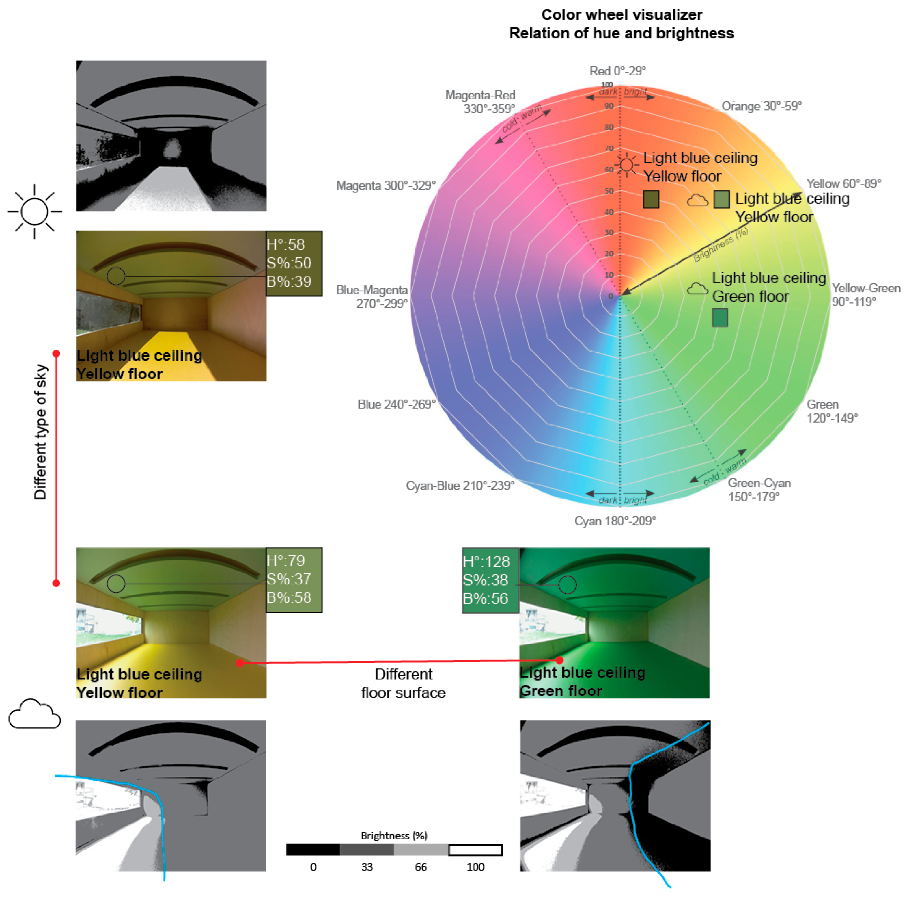
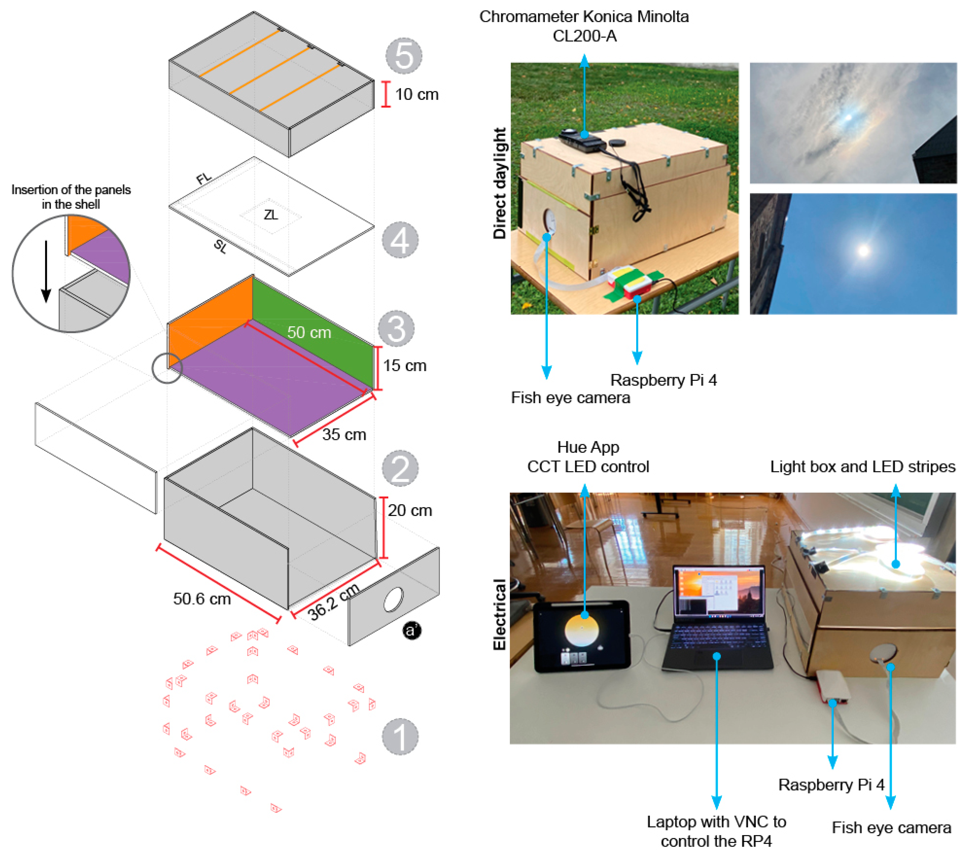
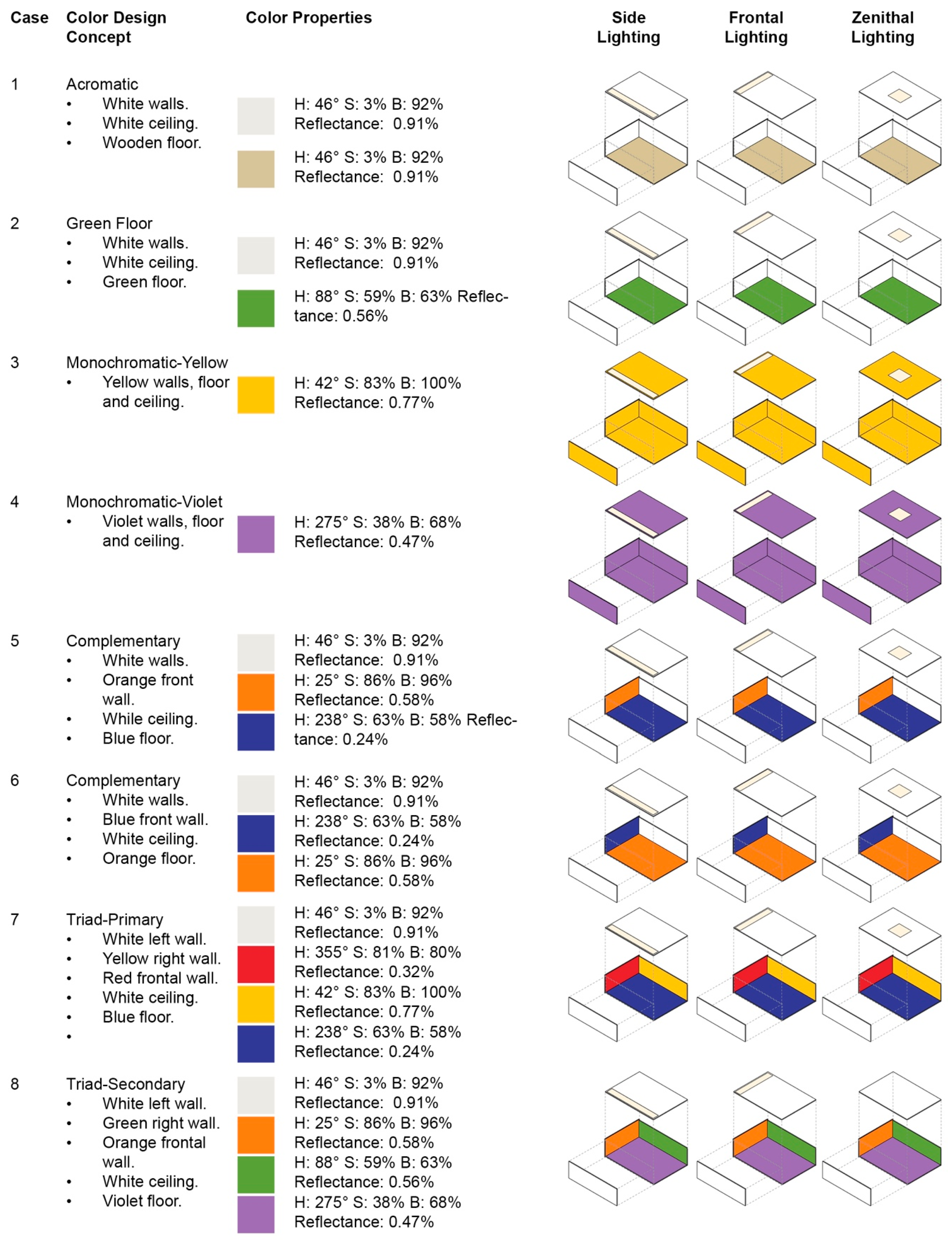
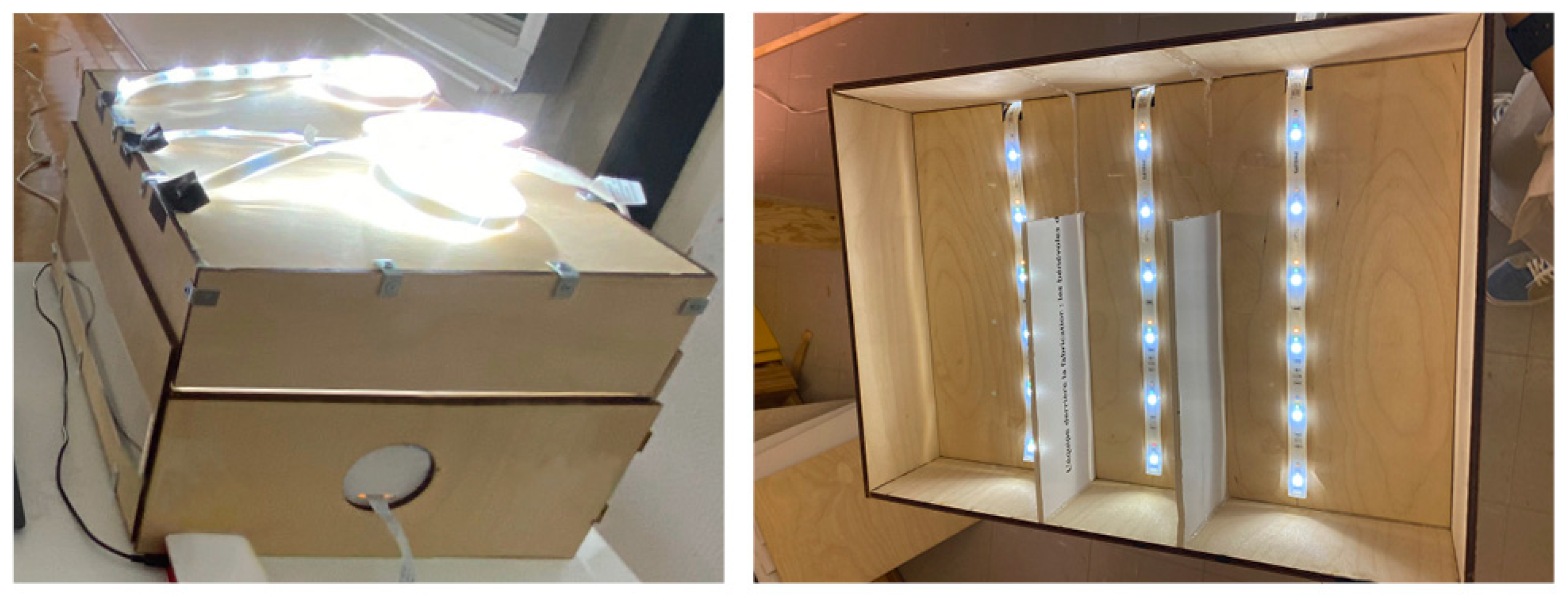
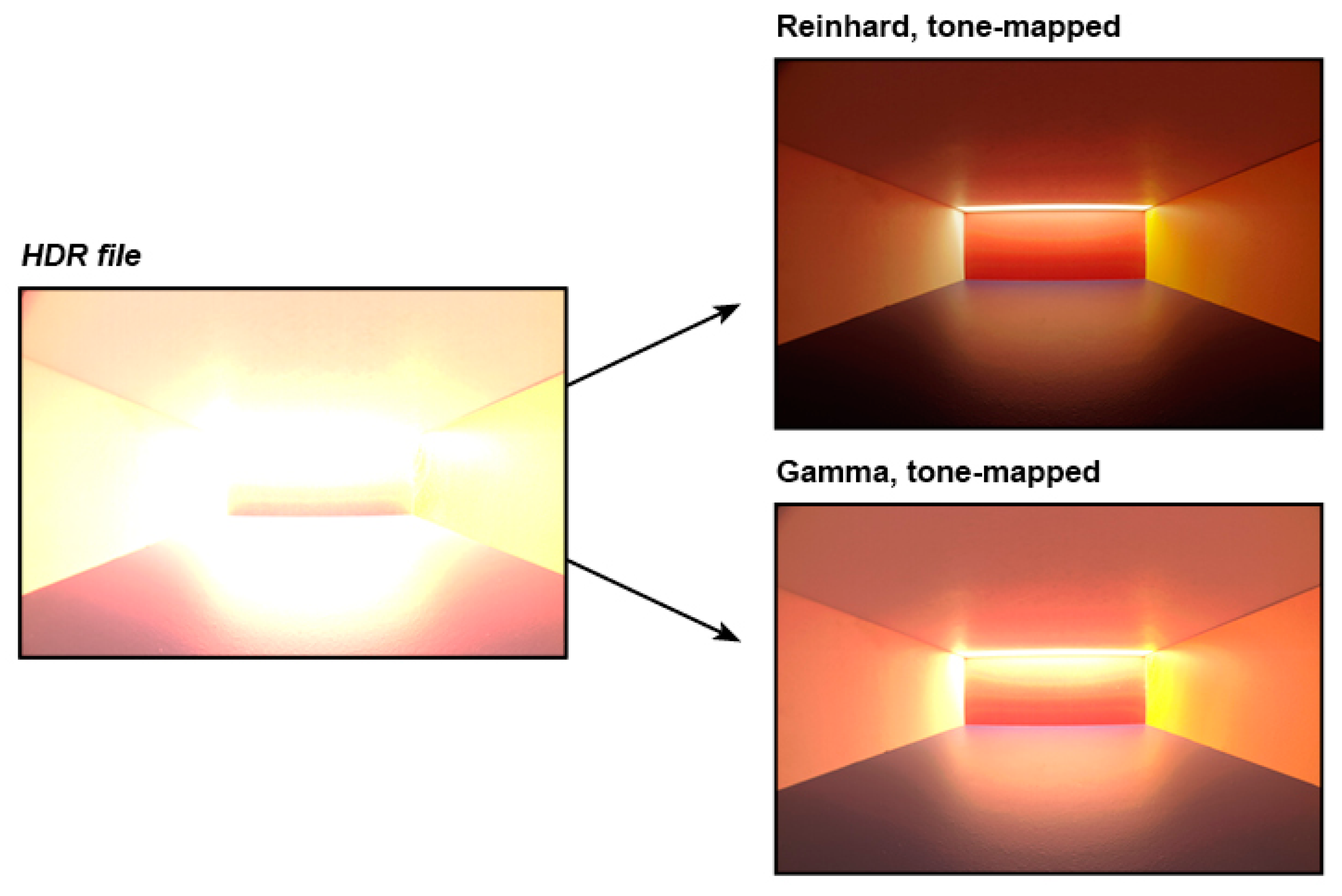
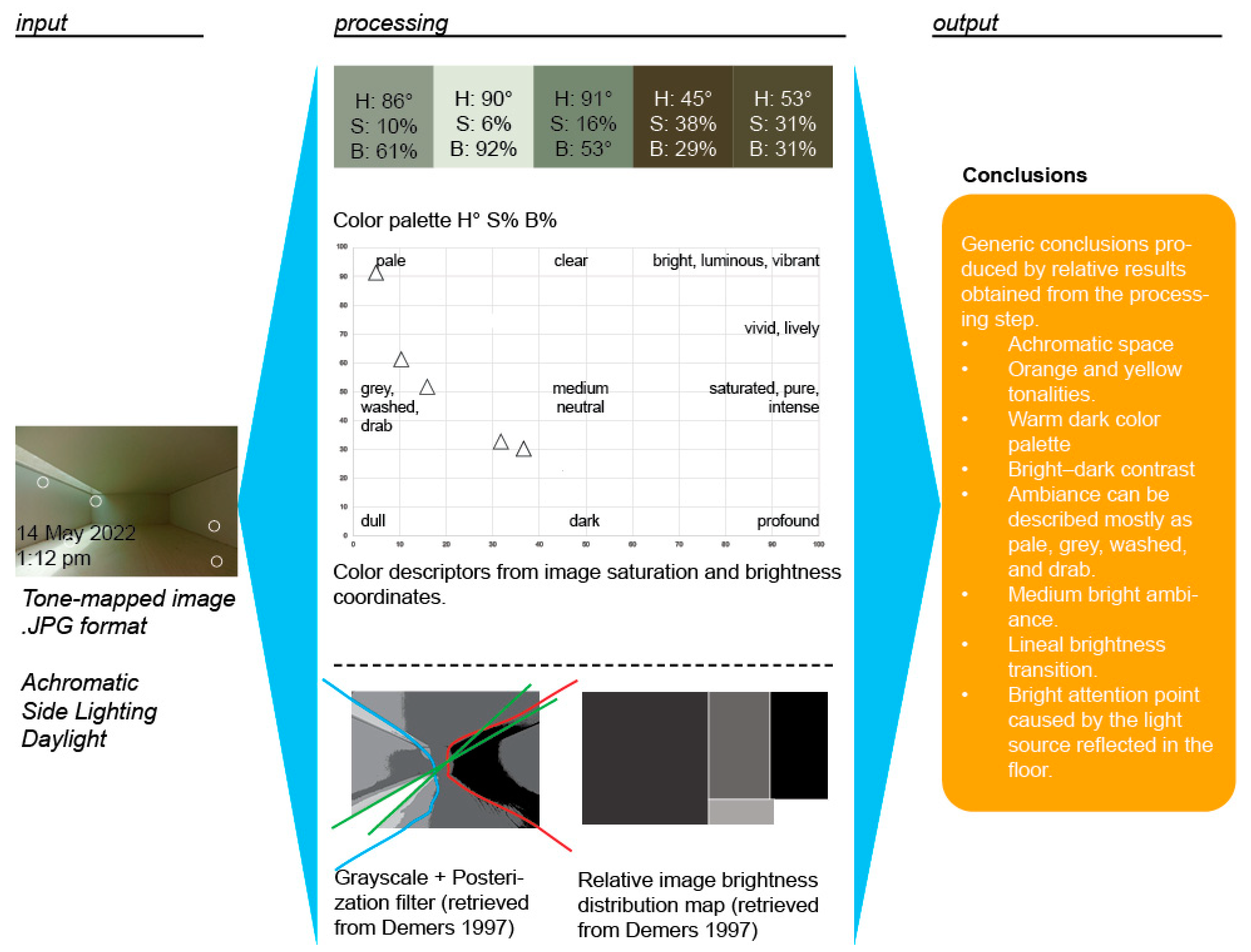
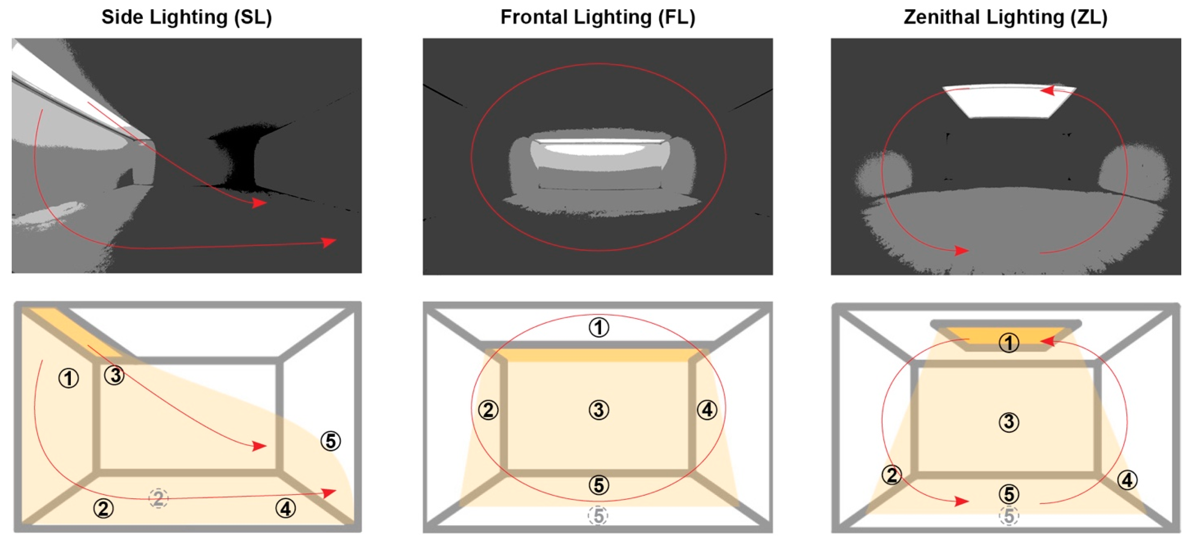
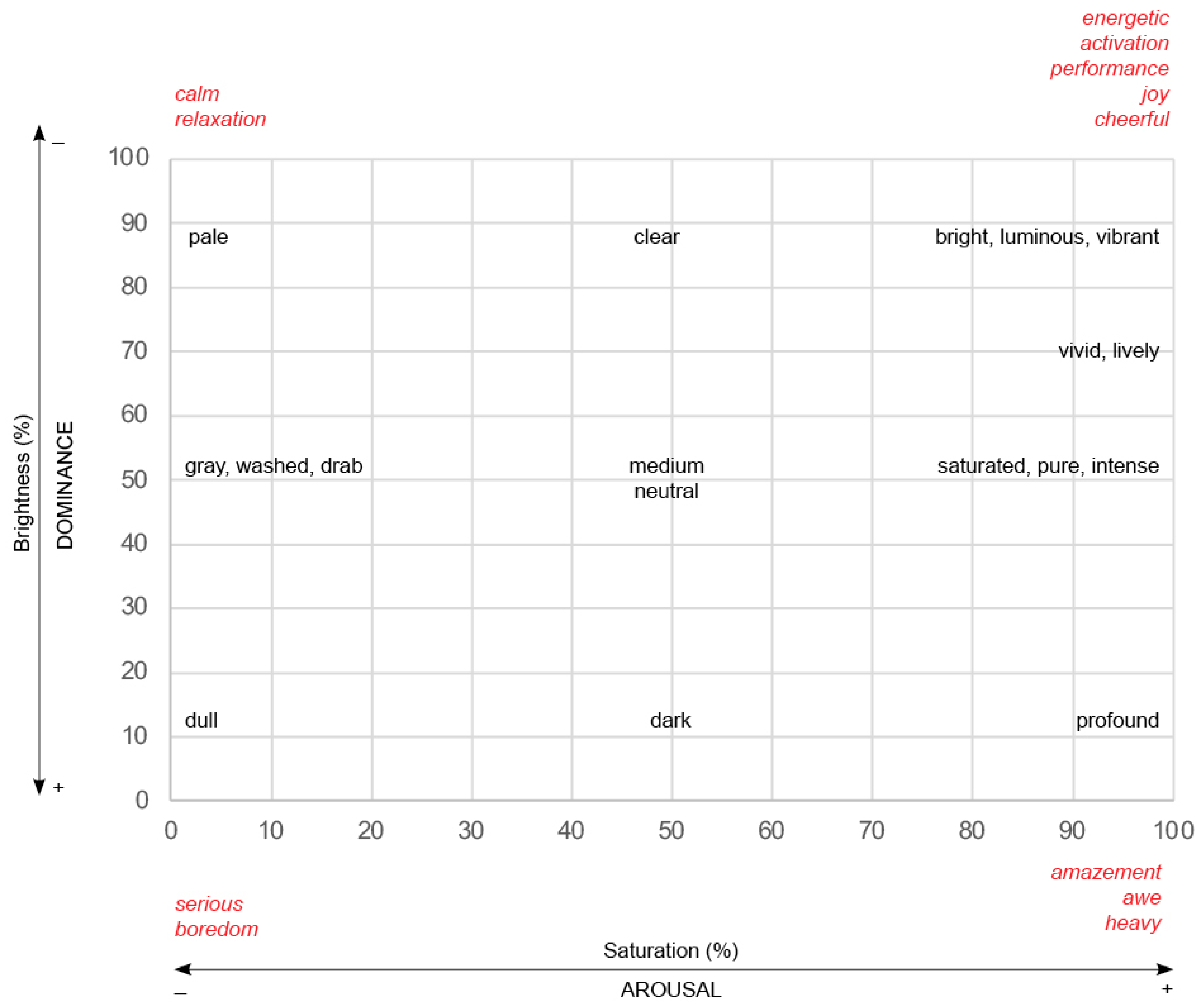
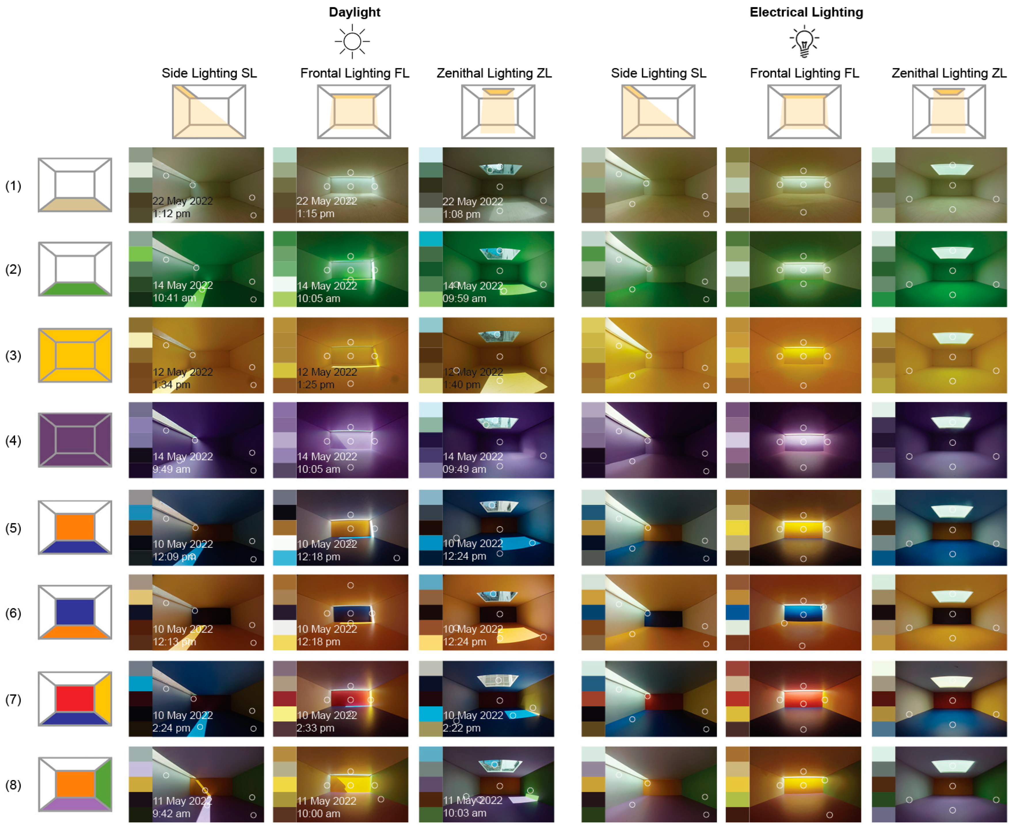
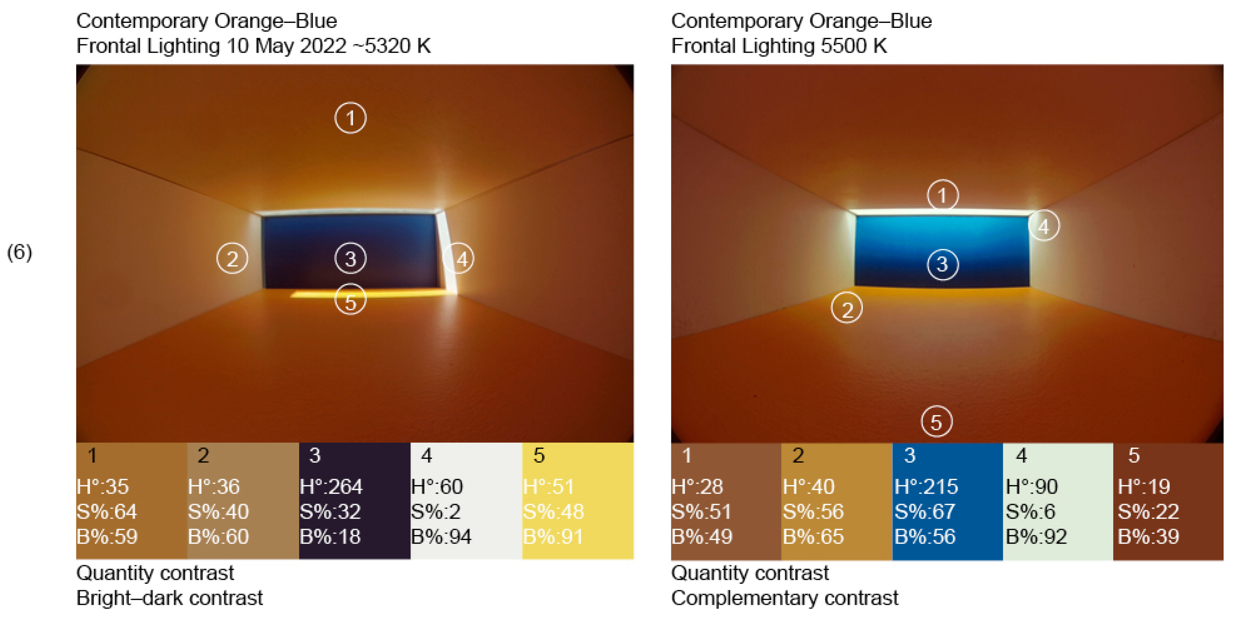
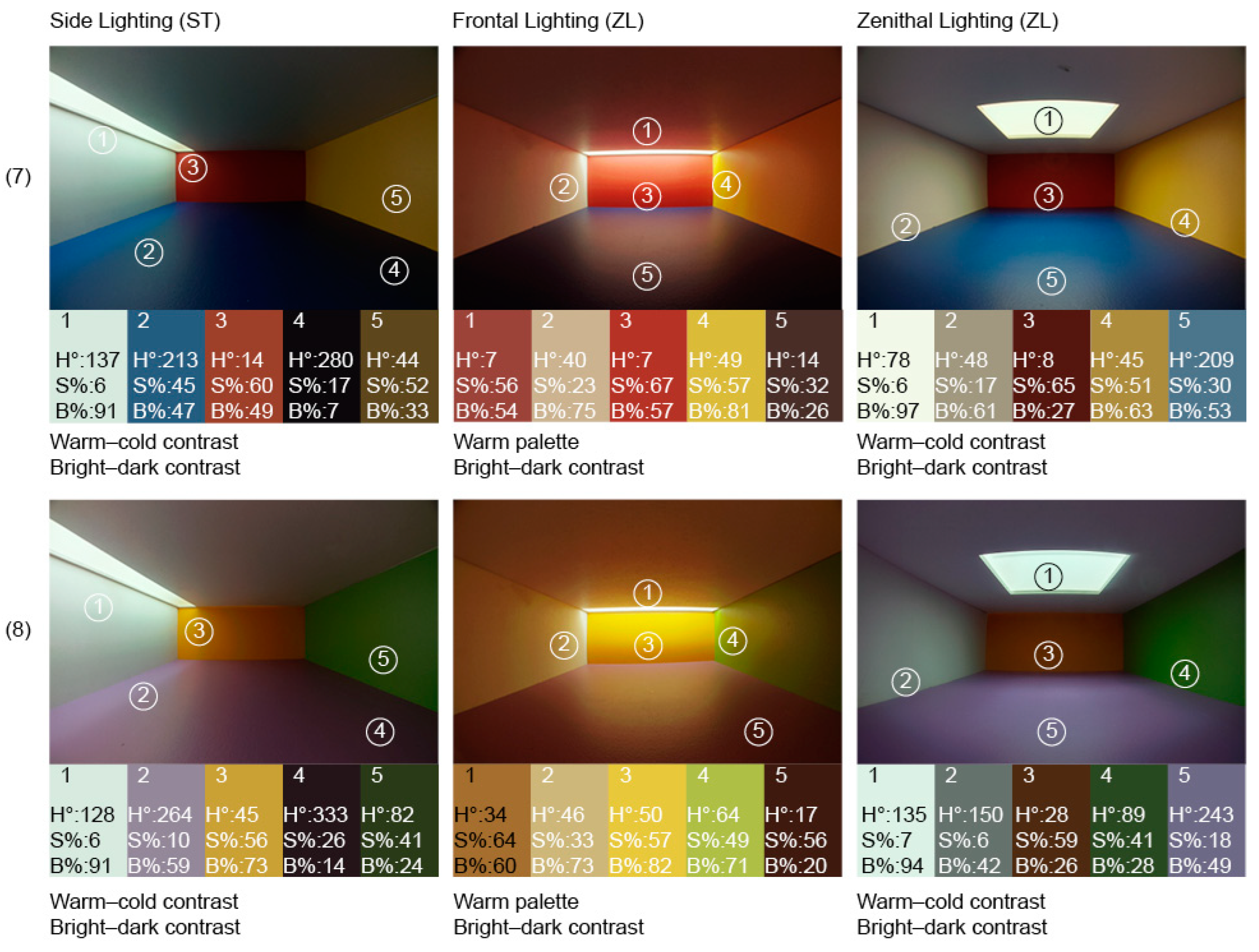
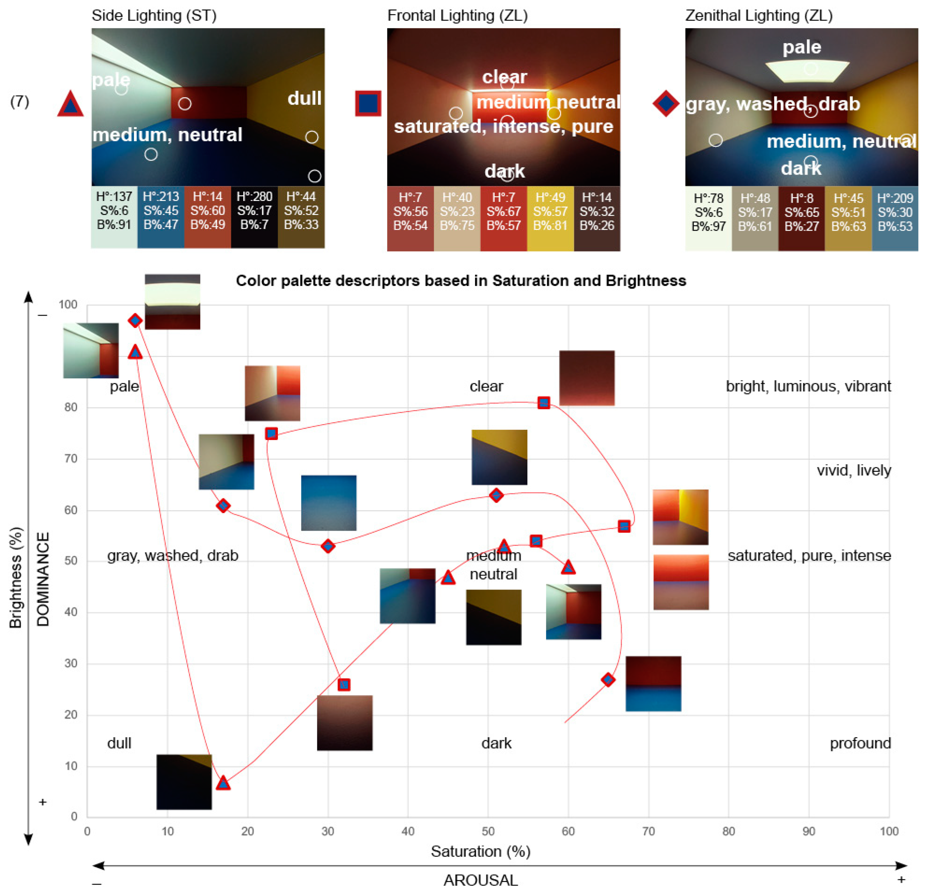

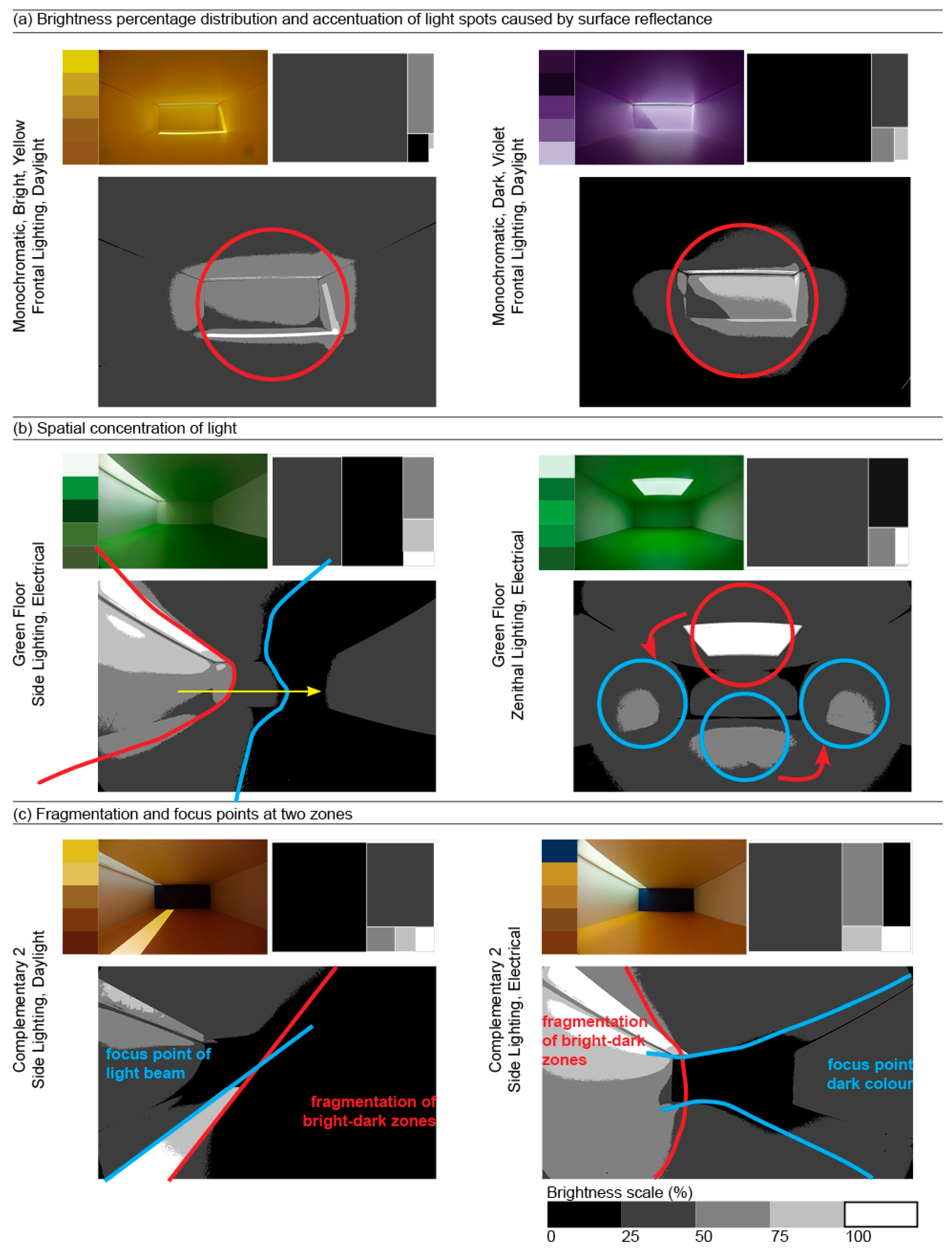
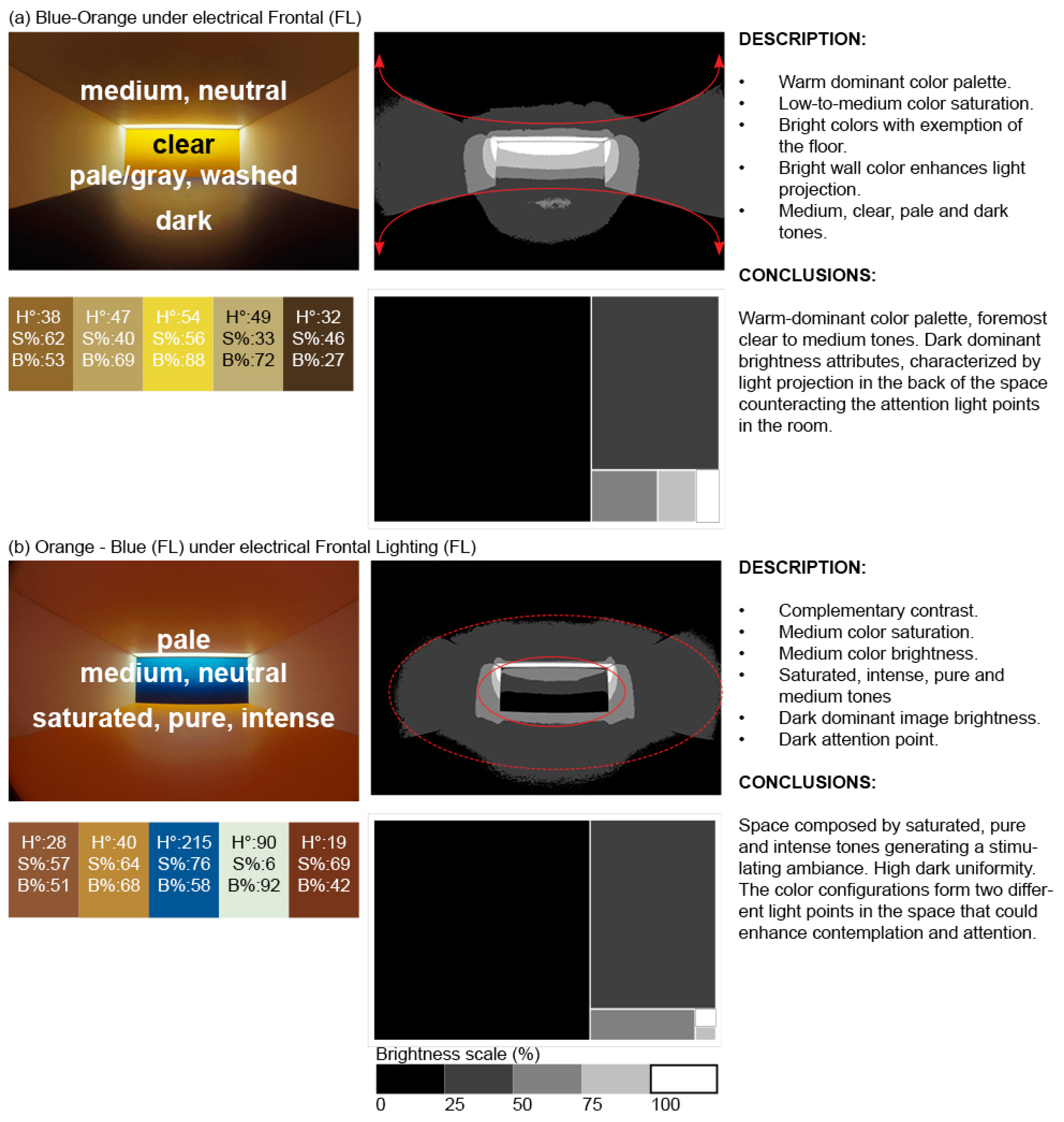
Disclaimer/Publisher’s Note: The statements, opinions and data contained in all publications are solely those of the individual author(s) and contributor(s) and not of MDPI and/or the editor(s). MDPI and/or the editor(s) disclaim responsibility for any injury to people or property resulting from any ideas, methods, instructions or products referred to in the content. |
© 2025 by the authors. Licensee MDPI, Basel, Switzerland. This article is an open access article distributed under the terms and conditions of the Creative Commons Attribution (CC BY) license (https://creativecommons.org/licenses/by/4.0/).