1. Introduction
The surface of the Earth may move. Its movement can be induced either by natural processes such as tectonics, volcanism, slope deformations and temperature changes or by human activities such as mining, CO2 injection to geological structures, storage of natural gas in underground gas storage (UGS) facilities, etc.
Some areas may exhibit periodicity of their surface movement. It is especially true in areas where natural gas is stored in the UGS. Natural gas is regularly injected into these UGS facilities during the warm season and is withdrawn during the cold season. This natural gas injection/withdrawal induces periodic terrain movements above the UGS and in its immediate vicinity.
Terrain movement can be monitored in various ways. Methods based on radar interferometry (InSAR) have brought great progress to this area [
1]. They allow long-term monitoring of large areas with high spatial and temporal resolution. The resulting space–time series describes the movement of the terrain through a large number of individual points distributed randomly in space across the monitored area. The result of the analysis of this series can be spatial and temporal trends of the terrain surface movement or recurring patterns of periodic surface behaviour. In both cases, changes in these trends or patterns may also be interesting.
Changes in these trends or patterns detected during the UGS monitoring can be used, for example, in assessing the state of the underground geological structure in which the UGS is built, or they can detect unexpected behaviour of a part of the UGS and help in its interpretation. Such behaviour could indicate, for example, degradation of the storage structure or damage to the underground technical infrastructure of the UGS.
InSAR generates a large amount of output data to be analysed and interpreted. Visual analytics tools [
2] are often used to perform data analytics on large volumes of data. They rely on appropriate visualisation of time series and exploit the human brain’s ability to detect patterns in images [
3].
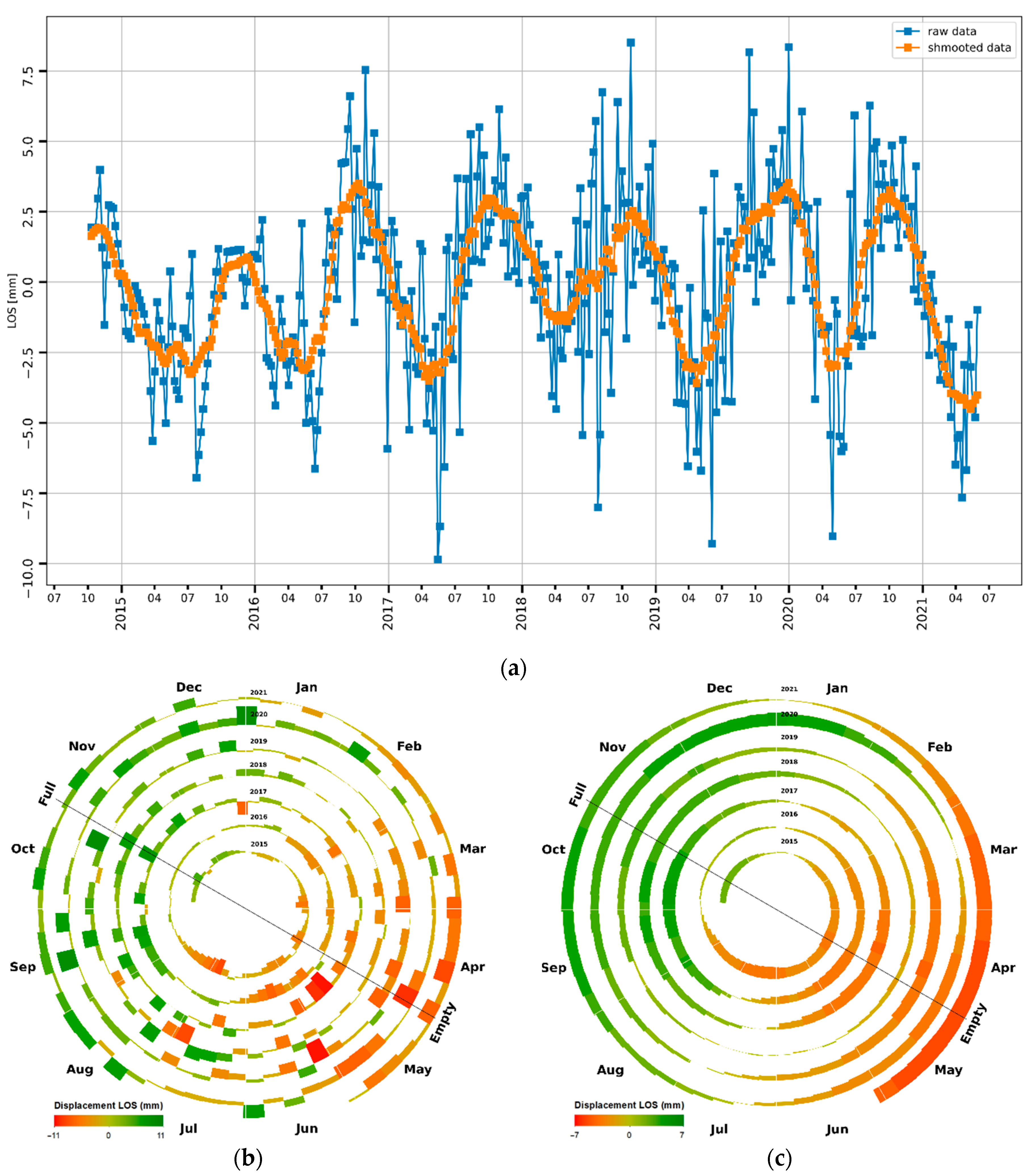
Commonly, visualisation of time series is done using simple line graphs (
Figure 1a), showing the evolution of one or more points in time. This type of visualisation has been addressed by several authors [
4,
5,
6,
7]. They aimed to provide the best possible visualisation of the evolution over time, most often for single points and usually for shorter time series. The disadvantage of their approaches is that line graphs, although capable of capturing both periodicity and similarity of time evolution between different points, do not allow comparing individual periods of a single time series with each other. Moreover, when used to visualise long time series, line graphs can hide some patterns of periodic behaviour or change.
Other visualisation methods, based on seasonal plots [
7,
8,
9], calendar view [
10,
11] or spiral graphs [
10] (
Figure 1b), attempt to address this problem. The latter visualization technique is based on spiral (in 2D view; [
12,
13,
14]) or helix (in 3D view; [
15]). Alternatively, it is also possible to visualise a spiral graph in 3D space [
16]. Such a view allows plotting the values of the attribute of interest perpendicular to the spiral plane (see
Figure 2).
A common disadvantage of all these visualisation techniques is that they do not explain the temporal patterns in space. If we also want to capture this spatial aspect, we must apply the methods of cartographic visualization to visualize the temporal development of individual points and thus get an idea of the distribution of temporal evolution in space.
The cartographic visualisation of space–time series has not yet become widespread. Thakur and Hanson [
17] have explored the visualisation of space–time series over a map using space–time cube metaphors. However, they did not deal with the visualisation of periodic space–time series; they worked exclusively with linear time. Hewagamage et al. [
15] studied the possibility of using helices for representing periodic data over a map. The fundamental drawback of this visualisation is that in an isometric view of the map, the helices themselves always overlap the more distant part of themselves, making their complete visual analysis difficult. For the same reason, spatial pattern recognition is also tricky.
Combining a spiral graph in 3D with a map (
Figure A1; [
16]) works slightly better. However, it can be seen that there is also a partial overlap of the displayed values. In addition, the time shifts between periods of each time series are difficult to evaluate, and the significant variation in values caused by noise also hinders clarity. All these factors can make visual analysis and interpretation of the visualised results difficult.
Presented research aimed to design a method of cartographic visualisation of periodic space–time series that would facilitate their visual analysis and interpretation not only in the temporal but also in the spatial domain.
2. Materials and Methods
When visualising long space–time series generated by InSAR, it is necessary to solve several problems: The number of spatially distributed points described by the time series and their corresponding graphs, which tend to overlap, the similarity of nearby points and the possibility of clustering them and representing each cluster with only one graph, visualising the cycles so that they are comparable, the choice of a suitable diagram, its colour scale and other parameters, applying cartographic methods to it, etc.
2.1. Underground Gas Storage
The UGS is an underground structure used to store natural gas at times of reduced consumption and withdraw it when gas consumption is higher. This regime allows the UGS to smooth out fluctuations in the load on the distribution pipeline network.
In principle, there are several types of UGS built in [
18]:
depleted oil and gas reservoirs,
aquifers,
salt caverns,
abandoned underground mines,
caverns artificially created in hard rock.
Different types of UGS operate in different modes. The first two types of UGS are characterised by large storage capacity and slow injection and withdrawal rates, allowing only compensation of seasonal changes in gas consumption. The other three types typically have significantly lower capacity but are capable of much higher injection/withdrawal rates; they are therefore primarily used to compensate for short-term peaks in consumption. In principle, due to the geological conditions, only the first three types can be expected to exhibit terrain surface movement caused by injection/withdrawal cycles, and InSAR can theoretically monitor this behaviour. However, in terms of the temporal resolution of radar data, only the first two types of UGS are suitable for monitoring by InSAR.
In 2016, the first two types of UGS dominated the world, with a total of 575 facilities in operation and covering 91% of global working gas volumes. The third type was represented by 97 UGS and covered 8% of global working gas volumes. The last two types of UGS accounted for the remaining one per cent of global working gas volumes [
19]. At the end of 2020, there were 661 UGS in operation worldwide, with a total working gas capacity of 423 billion cubic meters [
20]. From this brief overview of the numbers of different UGS types occurring in the world, it is clear that the use of InSAR for the UGS monitoring is perspective.
The activity of any UGS can induce vertical movements of the Earth’s surface above the UGS area [
21], which reflect cyclic injection and withdrawal of gas to/from the reservoir. The whole cycle usually starts at the turn of April and May, initiating gas injection into the UGS, and the injection usually is over at the turn of October and November, when withdrawal starts.
Figure 3 displays the theoretical course of the injection and withdrawal cycle at UGS [
22].
For testing methods for space–time series visualisation, we selected UGS Tvrdonice, located in southern Moravia near the borders of Slovakia and Austria and not far from the village of Tvrdonice. The UGS is built in a depleted oil and gas reservoir, and it has a surface area of 13 km
2 (
Figure A2).
2.2. Radar Data
The freely available radar images taken by the ESA Sentinel-1 mission were used to investigate ground movements over the UGS. The sensing was performed at a wavelength in the C-band, which is not sensitive to light and weather conditions. The imaging is carried out by a pair of Sentinel-1A and Sentinel-1B satellites (
https://sentinel.esa.int/web/sentinel/missions/sentinel-1/overview (accessed on 2 April 2022)). Images are available from October 2014 (Sentinel-1A) and July 2016 (Sentinel-1B) to the present (Unfortunately, Sentinel-1B is no longer providing data as of January 2022.), for example, from (
https://search.asf.alaska.edu/#/ (accessed on 2 April 2022)). The sensing period for one satellite is twelve days. The satellites are placed in the same orbit but on opposite sides of the globe. They provide images of the same area on the same track every six days. Multiple tracks usually cover each area in Europe. Data can be acquired on the ascending track or the descending one.
We use data from ascending track 73 for the presented study. The data are processed for the period from October 2014 to May 2021. The data were taken at 12- or 6-day intervals, depending on the availability of satellites. There are also gaps in the data due to either unavailability or reduced quality of radar data. A summary of the images used in this study is available in
Table 1.
2.3. Radar Interferometry
Radar interferometry is a remote sensing method based on interferometric processing of successive radar images gathered by satellites equipped with synthetic aperture radar (InSAR sensor; [
1]). Due to the very short wavelength of the radio waves used (band C in the case of Sentinel-1), the method is susceptible to changes in the distance between the satellite and the backscattering terrain surface. The change in this distance can be caused, among other things, by the movement of the terrain surface [
23,
24]. This method is quite sensitive; it detects changes in the distance between the satellite and the terrain surface in the order of millimetres a year. Radar satellite data allows one to study periodic terrain movements during the year or compare individual cycles of these periodic movements. The detected movement is evaluated in the line-of-sight (LOS) direction, thus referring to the change in distance between the satellite and the terrain surface.
Several radar data processing methods have been developed. Frequently used methods include Permanent scatterers interferometry (PS-InSAR; [
25,
26]), which is based on the automatic detection of points that permanently backscatter the radar signal (permanent scatterers) and for which it is possible to evaluate the time series of their movement. It is claimed to achieve ~1 mm a year accuracy. The method works well for the urban area, bare rock or similar well-reflecting surfaces.
The result of PS InSAR processing is space–time series describing the movement of the individual permanent scatterers distributed on the surface over the monitored area. This method is mainly used for areal monitoring the surface of the Earth, to detect natural or anthropogenic changes (or their combination), such as monitoring movement of the surface above underground gas or oil reservoirs as in [
27,
28,
29]. More about PS InSAR processing, as used in this research, can be found in [
30,
31,
32].
2.4. Time Series
The output of PS InSAR is a space–time series, i.e., a set of time series related to individual permanent scatterers spread over the study area. A time series is a series of observations arranged chronologically in time. Each observation is represented by the value of the measured property [
33,
34]. Time series helps study the system’s dynamics because it shows how the observed attribute changes over time.
An essential characteristic of a time series is the parameters of the time axis related to it. The taxonomy for time axes was introduced by Frank [
35]. He classified time series according to the following characteristics [
34,
35]:
a timeline as a sequence of discrete-time points or time intervals—separated time points have no duration, unlike time intervals, which can also be directly related to each other (examples can be days, weeks, months, etc),
a timeline expressing linear time or cyclic time—a linear timeline is defined as a sequence of events going from the past through the present into the future; however, many phenomena, whether natural or technical, are cyclic; an example is the storage of natural gas in the UGS and the associated movement of the ground surface above the UGS,
a timeline expressing ordinal (relative) time or absolute time—ordinal time in principle represents a relative time axis, on which it is only possible to express position using statements like before, after; in the latter case, on the other hand, we can evaluate exact time differences between two points on the time axis and thus evaluate, for example, the rate of change of the attribute being monitored,
a timeline as ordered time, branching-time or time capturing multiple perspectives—ordered time means that the events in time follow each other in an orderly fashion; in the case of branching-time, one event may be followed by one of the possible alternative events; in the third case, we have several values of the observed phenomenon associated with a single point in time.
From this perspective, it can be concluded that the space–time series related to the UGS and generated by InSAR is defined over a time axis expressing discrete, absolute, cyclic and ordered time.
2.4.1. Time Series Analysis
Time series analysis is one of the most widespread problems in science and practice. It is gaining importance, primarily due to the development of technologies that have increased the volumes of collected time series data by many orders of magnitude [
3]. It includes methods that allow understanding a time series and possibly making predictions about its further evolution [
33].
The time series can generally be decomposed into four components describing its different aspects. These components are [
33]:
long-term trend,
seasonal component,
periodic component,
random component.
From the perspective of the UGS study, no significant long-term trend is expected. After many injection and withdrawal cycles, the area is already relatively stable. The seasonal component may be caused by seasonal temperature changes on the ground surface. Since it coincides with the periodic component, it is difficult to distinguish it in the case of the UGS time series. However, since it has a significantly lower amplitude and thus disappears against the background of the periodic component, it can be neglected in the case of UGS [
22]. The periodic component carries valuable information about the behaviour of the terrain above the UGS related to periodic natural gas injection/withdrawal and therefore represents the main component of the interferometric time series studied. The random component then introduces noise into the time series; it may be caused by diurnal temperature changes, changes in surface reflectivity, short-term changes in reservoir operating regime (e.g., short-term injection during the withdrawal period), etc. It is commonly removed by filtering. We used a simple moving average for this purpose.
2.4.2. Visualisation of Time Series
In addition to the classical mathematical analysis of time series, a different approach is also used—the so-called visual analytics [
2], relying in this case, among other things, on appropriate visualisation of time series.
In order to map periodic space–time series to suitable visual structures, to compare and analyse them, visual representations must allow [
14]:
visualisation of individual measured points (permanent scatterers), or their clusters, in time,
visualisation of individual measurements as an ordered sequence of values,
visualisation over an absolute time axis, but at the same time
visualisation taking into account the periodicity of the phenomenon under study—visualisation in such a way that multiple periods can be effectively compared with each other,
visualisation of long time series,
the ability to detect patterns in the data over time and to enable the evaluation of offsets between periods,
allow comparing multiple time series distributed in space to observe spatial patterns.
Terms 1–6 can be well satisfied by the spiral plots (
Figure 1b,c). The term seven can be satisfied by cartographic visualisation. Spiral plots capture both serial and linear properties of an individual time series. The serial property is represented along the spiral, while the periodic property is represented along the spokes. One period fills just one lap of the spiral. The advantage of this visualisation is that we can easily see what happened before and after the studied moment (counter clockwise or clockwise along the spiral) and what happened at the same time in the previous or next cycle (inward or outward along spokes) [
12,
13,
14,
36,
37]. Compared to doughnut graphs, they also have the advantage that a cycle, in general, can start at any time; we will always see it continuously.
In-plane spirals are suitable for visualising periodic time series (
Figure 1b,c). In this case, the Archimedean spiral [
36] is most often used as a basis, as it has a constant pitch and thus allows visualising more extended time series with many consecutive periods. The only modification we introduced is that, for readability reasons, we use a curve whose origin is shifted so that even the lap of the first period is of sufficient length to allow the first period data to be displayed in a readable way [
37]. For the rest of the paper, when we refer to a spiral, we will mean an Archimedean spiral modified in this way.
The coordinates for plotting data along the Archimedean spiral are denoted by
θ and
r;
r depends on
θ according to Equation (1):
where
a is the coefficient of proportionality defining the pitch of the spiral.
We calculate
θ from the Equation (2):
where
o is the offset of the beginning of the spiral,
n is the number of visualised years,
N is the number of measurements (in our case, the number of six-day periods), and
k is the serial number of the measurement. The right-hand side of the equation was multiplied by −1 to plot the spiral clockwise. The spiral is generated using the matplotlib library (
https://matplotlib.org/ (accessed on 2 April 2022)) as a polar plot.
The spiral can be visualised in a vertical view—then the studied attribute must be plot in the plane of the spiral laps (
Figure 1b,c) or an oblique view — and then the attribute can be plot perpendicular to the plane of the spiral (
Figure 2).
2.4.3. Time Series Transformation—Correlation Coefficient
When a space–time series is generated using the PS InSAR method, it can be expected to be composed of several thousand individual time series. Comparing them on a one-to-one basis could lead to significant demands on computing power. On the other hand, these individual time series have a unique property: when tied to the UGS activity, they are periodic, exhibiting a significant annual period synchronous with the theoretical annual injection/withdrawal period of the UGS (
Figure 3). Therefore, it offers the possibility to replace the time series with a single parameter, the correlation coefficient
r, describing the tightness of the relationship between the individual time series and the theoretical curve (
Figure 3). This step can significantly simplify the comparison of individual time series with each other. To calculate
r, we used Pearson’s correlation coefficient [
38].
2.5. Periodogram
UGS operations are characterised by periodic injection/withdrawal of natural gas. Therefore, a significant periodic component should be present in the time series of measurements over the UGS. Spectral analysis is used to find the period contained in the time series. It is usually assumed that the time series is sampled regularly. In such a case, for example, Fourier analysis could be used. However, in our case, this condition is not met, partly due to gaps in the data and partly due to the later commissioning of the Sentinel-1B satellite. Therefore, we used the Lomb-Scargle periodogram (LSP; [
39,
40]), which is quite powerful for finding and testing the significance of periodic component in weak periodic signals with noise and unevenly sampled data [
41]. The significance of some peaks was determined in the LSP calculation. Only those peaks that are above the 5% significance level are statistically significant (
Figure 4). In the case of the UGS, we were mainly interested in the presence of an annual period.
2.6. Clustering
To visualise a space–time series in a map, we need to reduce the number of points for which we will visualise the corresponding time series. In the space–time series generated by PS InSAR, there may be several thousands of points to which to the same number of time series correspond that should be visualised, so, it is necessary to reduce their number. The final number of visualised time series should be such that the time series capture the spatial variability of the attribute of interest in sufficient detail without overlapping individual time series visualisations. One way to achieve this goal is to use clustering.
The goal of clustering is to find clusters of points such that points in clusters are much closer to each other than to points in other clusters [
11]. Since we are working with a space–time series, it would be logical to use one of the algorithms for spatiotemporal clustering. A survey of them has been done, for example, by Belhadi et al. [
42]. However, the space–time series related to the UGS has some specificities: the
x and
y coordinates of the backscatterers are practically invariant over time; only the movement of the terrain in the LOS direction matters. The correlation coefficient
r replaces the LOS time series (see
Section 2.4.3). In this situation, it is necessary to perform combined clustering in the spatial domain and the attribute domain
r.
For clustering in two-dimensional space, we used the classical Euclidean metric to calculate the distance matrix:
where (
xi,
yi) and (
xj,
yj) are the coordinates of the
i-th and
j-th backscatterers of the space–time series, respectively.
The second distance matrix was computed for the attribute component; in our case, for the correlation coefficient
r computed for each time series. We used the Manhattan metric for this purpose to calculate the distance matrix:
where
ri and
rj are correlation coefficients of time series related to the
i-th and
j-th point of the space–time series, respectively.
Since magnitude of the distances in the two distance matrices were significantly different, we normalised them to the range 0 to 1 and summed them according to Equation (5):
where
α and
β are the weights of the given matrices. It must apply that
α +
β = 1.
We chose the DBSCAN (Density-Based Spatial Clustering of Applications with Noise) algorithm for the practical implementation of clustering, which can find even noise-burdened clusters [
43]. This algorithm does not require specifying the number of resulting clusters, which is its great advantage. It also admits that not all points will be included in the clusters.
The algorithm expects only two parameters on input: min_pts and eps. The min_pts parameter specifies the minimum number of points in the cluster, eliminating small clusters from further processing.
The
eps parameter determines the size of the point’s neighbourhood. Two points are considered adjacent if their distance is less than or equal to
eps. Its value can be derived using the
k-dist function proposed in [
43]. The procedure is based on a graph showing the distance of a given point to the
k-th point (
Figure 5). For each point, we construct an ordering of distances to other points and select its distance to the
k-th point; for our example, we use
k = 10. We sort the obtained distances by the magnitude and plot them on the graph. Then we find the point in the first valley on the curve [
43,
44,
45]. The corresponding 10-distance at this point represents the value of
eps for
k = 10 (
Figure 5). The value of
k is usually set equal to the value of
min_pts.
2.7. Information Visualisation Pipeline
To visualise any data in general, Card et al. ([
46] in [
47]) defined the information visualisation pipeline. The processing starts with the raw data. They can be obtained in various forms, from unstructured plane text to highly-structured data. The first step is to transform them into data tables whose structure will support the visualisation. Such structured data can then be mapped to visual structures. This step involves mapping attributes to graphical properties such as colours, shapes, relative positions. The result can be, for example, bar charts. Visual structures can be further transformed into views of visual structures, which can exist in space–time and can therefore be dynamic. They usually contain additional data, such as an underlying map, and are intended for the end-user.
3. Results
The proposed procedure for visualising data describing ground movement above the UGS is based on the information visualisation pipeline [
46]. We tested it on data from the UGS Tvrdonice monitoring. Since the PS InSAR processing covers a considerably larger area than our area of interest, the scope of the data used was limited to the UGS and the surrounding area up to 4 km outside the boundary of the UGS Tvrdonice (
Figure A2).
3.1. Raw Data
Raw data obtained by PS InSAR for the defined area of the UGS and its vicinity were available in the form of a table, saved as a CSV file. The individual rows of the table contain data for a single permanent scatterer: its position in geographic coordinates (lat, long) and the sequence of values of the detected movement in millimetres for the times at which the individual radar images were acquired (i.e., time series). This time series is followed by a series of values of other quantities evaluated by PS InSAR, such as coherence, standard deviation, inclination angle, etc. These values are irrelevant for visualisation purposes.
3.2. Data Transformation and Resulting Data Tables
The first step in transforming the raw data into data tables supporting visualisation was to select permanent scatterers whose time series contain a significant annual periodic component. We performed this step using the Lomb–Scargle periodogram. We selected permanent scatterers whose time series contain a period of movement in an interval of 330–390 days with significance above the 5% level for further processing (
Figure 4).
The possible deviation from the expected 365-day period may be caused, in some years, by the fact that the spring transition between withdrawal and injection may occur earlier—if there was a significantly higher gas withdrawal from the UGS in the winter—or later—if the winter was mild but with a more extended gas withdrawal period. Similarly, the autumn transition from injection to withdrawal may be shifted.
Figure 6 shows the UGS fullness curve for the Czech virtual UGS [
48]. It shows that virtual UGS minimum fullness ranges from 26 March 2017 to 1 May 2021, and maximum fullness ranges from 6 October 2020 to 9 December 2011. Therefore, the period sought may not be exactly 365 days.
In the second step, we selected only those permanent scatterers whose time series were close to the theoretical injection/withdrawal cycle (
Figure 3). We first smoothed each time series with a simple moving average with a 180-day window to minimise the influence of the random component and then calculated the correlation coefficient between the smoothed time series and the theoretical curve. Interestingly, there were points that showed a significant positive correlation, but also points that showed a significant negative correlation. Therefore, for further processing, we selected points where the correlation coefficient was in the interval 1.0–0.3 or −0.3 to −1.0. The first group of points showed movements similar to the theoretical curve (they are syn-phase with it), while the points from the second group showed movements in the opposite direction (they are anti-phase with it).
The next step was the clustering of permanent scatterers. First, we calculated the distance matrix according to Equations (3)–(5).
Figure 7a shows the result of clustering in the spatial domain only, and
Figure 7b shows the result of clustering in the attribute domain only.
Figure 7c shows the clustering result according to both domains, using weights α = 0.7 for spatial domain and β = 0.3 for attribute domain. The higher weight was assigned to the spatial domain because it shows significantly higher variability (compare
Figure 7a,b).
We applied the DBSCAN algorithm implemented in the Python library scikit-learn [
49] to this final distance matrix. It expected two parameters on input:
min_pts and
eps. In our study, the
min_pts parameter was set to ten. To calculate the value of the
eps parameter, we used the algorithm for
k-dist implemented in the Python library kneed (
https://github.com/arvkevi/kneed (accessed on 2 April 2022)). These values were then used as input to DBSCAN. It resulted in the creation of ten clusters—see
Figure 7c.
As a final step, we calculated the average time series for each of the ten clusters formed as the arithmetic mean of the time series of all points included in the respective cluster, removing outliers, i.e., values that are further than three standard deviations from the average time series. If a gap appeared in the data, it was filled by values determined by linear interpolation from adjacent values.
3.3. Visual Mappings and Visual Structures
During data transformation, we found that there are points in the region whose movement is in-phase with the theoretical injection/withdrawal cycle, but also points that are anti-phase with this cycle. Therefore, in the visual analysis, we were interested in how these points are distributed in space and how their behaviour can be interpreted.
For visualisation purposes, we normalised the time series to an interval ranging from −1.0 (which corresponded to the lowest surface height of all ten time series at the lowest fullness of UGS) to +1.0 (which corresponded to the highest surface height of all ten time series at the maximum fullness of UGS). We, therefore, found the highest absolute value of the surface movement (equal to 11 mm) from the time series for all clusters and divided the values of each time series by this value during visualisation. This approach ensured that we used the same colour scale for all time series while maintaining the ratios between the height changes in each time series.
We then plotted spiral plots for each cluster. Each bar plotted on the spiral represents one measurement every six days. The result for one cluster is shown in
Figure 1b. We can see in it a large fluctuation of values, caused by a significant random component. That’s why we filtered the time series with a simple moving average with a window size of 90 days. The resulting spiral plot thus better capture the annual injection/withdrawal cycles of the UGS (
Figure 1c). The smoothed plots also show the difference between the amount of gas injected or withdrawn and the shift in the start and end of the injection/withdrawal cycles between years in a more efficient way. For comparison, the line graph in
Figure 1a shows the periodic nature of the LOS movement, but it also demonstrates how difficult it is to compare these periods to each other. Even smoothing of line graph data does not eliminate this drawback—see a curve produced by smoothing the original data with a simple moving average with a window size of 90 days in
Figure 1a.
3.4. View Transformations and Views
In the previous step, we generated spiral plots representing the time series of each cluster. From the plot, it is possible to see how the UGS sub-region represented by a given cluster responded to gas injection/withdrawal or how the individual cycles within a particular time series shifted relative to each other. However, we do not get an idea of the spatial pattern of behaviour of the UGS and its vicinity described by the individual time series spread over space, i.e., whether there are relatively homogeneous regions exhibiting similar behaviour. For this purpose, it is necessary to place the individual spiral plots into a map over the corresponding clusters. To this end, the individual spiral graphs were inserted as special symbols into ArcMap and used to create diagram map compositions.
First, we designed two map compositions. The first one depicts the time series as a diagram map (
Figure A3), where the individual spiral graphs are placed above or near the centroid of the corresponding clusters (to avoid overlapping graphs). The advantage of such a visualisation is a better capture of the situation in space, and the interpreter can easily follow the temporal evolution of the ground surface movements concerning the injection/withdrawal cycle of the UGS and track their changes in space. The disadvantage is the limited visibility and impaired readability of the background map, caused mainly by the necessary size of the spiral graphs. The second option is a map composition showing spiral graphs around the perimeter of the map field (
Figure A4). It has the advantage of preserving the readability of the background map, including good visualisation of individual clusters, while the disadvantage is significantly worse identification of potential spatial pattern.
It is clear from the first composition that the clusters beyond the east-south-east boundary of the UGS concentrate points that are anti-phase to the theoretical behaviour of the ground surface, i.e., the injection/withdrawal cycle.
The other clusters concentrate points that are syn-phase with the injection/withdrawal cycle. As described in [
22], this different behaviour of the east-south-east area is due to the geology: approximately along the south-eastern boundary of these clusters, the Tvrdonice Fault passes through the rock block in which the Tvrdonice UGS is built. When natural gas is injected into the UGS, the terrain above it uplifts, but the borderland of the rock block adjacent to the Tvrdonice fault subsides. This subsidence is caused by the borderland sliding down the Tvrdonice Fault. Among other things, this means that the Tvrdonice Fault is not healed, and movements may occur along it. This information may, in certain circumstances, be critical to the UGS operator. The visualisation proposed in
Figure A3 allows this development to be well documented and explained to the UGS operator.
Another visualisation option is to replace the spiral graph with a doughnut graph that visualises the average annual cycle of terrain movement at the cluster location (
Figure A5). Given the relatively regular alternation of natural gas injection/withdrawal phases, such visualisation may be sufficient in certain circumstances. Specifically, in our case, where we were interested in the response of the terrain to natural gas injection/withdrawal in relation to the geology, such a visualisation is adequate.
Graph interpretability can also be improved by filtering noise from the data.
Figure A6 shows a similar composition to
Figure A1, but in this case, the data are smoothed with a simple moving average with a 90-day window. The readability of the map composition has been dramatically improved, the spatial trend in the area has been highlighted, and the comparability of individual injection/withdrawal cycles within each time series has been improved.
4. Discussion
PS InSAR radar interferometry generates many points with associated time series that cannot be visualised individually without overlapping. Therefore, it is necessary to reduce the number of visualised time series. Here, it is possible to use clustering, which can be performed in spatial domain, in attribute domain or in a combination of both. When clustering in the spatial domain, the goal is to find clusters of nearby points. The closeness of points is evaluated in Euclidean space based on the classical Euclidean metric. It results in clusters of points that may be different in the time dimension, although spatially close. For example, if we compare cluster four in
Figure 7a with the corresponding points in
Figure 7b, cluster four groups points that behave differently in the time dimension.
When clustering by similarity over time, in our case, we evaluated the proximity of points based on the similarity of the correlation coefficient
r. The result was two large clusters, one comprising all points with a positive correlation coefficient, the other comprising points with a negative correlation coefficient—see
Figure 7b. This figure shows that the two clusters partially mingle.
Therefore, we used combined clustering, where both spatial distance and clustering by similarity in time are used to group points. The resulting clusters are shown in
Figure 7c. We see that the original cluster four from
Figure 7a has been broken into two separate clusters, five and eight, which exhibit different behaviour.
For each of the resulting clusters, an average time series representing the behaviour of the entire cluster was created, and this time series was then visualised with a spiral graph representing the behaviour of the ground surface in the area represented by the cluster.
The primary curve over which the spiral graph is constructed is the Archimedean spiral. This curve theoretically starts precisely in the origin of the coordinate system, so the first lap is very short and does not allow the data for the first observed UGS operating cycle to be plotted in a readable way. Therefore, it is advisable to introduce a significant offset at the beginning to shift the first observed UGS operating cycle to a higher lap. It is up to the visualizer to decide which offset to choose. In our case, we set the offset to two. The new lap always starts on 1 January. However, data acquisition can start at any time during the year. Therefore, we still need to set a minor offset that shifts the data display on the first used lap to match the data capture start. In our case, this shifted the start to October.
Another parameter that is set for the spiral is the pitch (parameter a in Equation (1)). This parameter determines the gap between adjacent laps in the graph, usable for visualising the displayed attribute values. Since we display values from minus one to one, the values are plotted on both sides of the spiral curve. This approach would mean that the bars should not be higher than half the pitch of the spiral to avoid overlapping. However, due to the nature of the investigated phenomenon, there should be no overlap. It is unlikely that in adjacent cycles in the same part of the year, there would be maximal fullness one year and minimal fullness the next one, or vice versa. The height of the column can therefore be set higher; in our case, we used 100% of the pitch.
The height of the bars is a good representation of the magnitude of the movement of the terrain surface. However, the nature of spiral implies that while in the left part of the spiral, the column pointing to the left corresponds to the uplift of the terrain, in the right part of the spiral, the same oriented column (i.e., to the left again) represents the subsidence of the terrain. This situation can complicate the perception and visual interpretation of the spiral graph. Therefore, it is advisable to colour the columns with a colour scale, clearly representing the uplift and subsidence of the terrain. For the actual interpretation of the spiral graph, especially in a spatial context, it is then advisable to focus first on the distribution of colours, which represents well the spatial and temporal context, and only when looking in detail to work with the height of the columns.
Another option is to replace the spiral graph with a doughnut graph that visualises the average annual cycle of terrain movement at the cluster location (
Figure A5). In this case, we are already working with colour only. This visualisation gives general overview of the UGS area response to natural gas injection/withdrawal and helps interpret it.
The last option that we considered is to display a planar spiral graph in 2D and 3D (
Figure 1 and
Figure 2). Comparing these figures, it is clear that the representation of the planar spiral graph in 3D also suffers from a similar drawback as the helix. Thus, it is less suitable for displaying spatial time series from this perspective. The same effect one can see in
Figure A1. A better result can only be achieved using smoothed data (
Figure A6).
In order to get an overall view of the behaviour of the study area from the individual spiral plots, they need to be visualised in space. We studied two possibilities. The first option was to place the spiral graphs on the map by creating duagram maps, with the spiral plots placed over the centroids of the corresponding clusters (
Figure A3), and the second option was to place the spiral graphs around the map window and use guidelines to show which areas they refer to (
Figure A4). Comparing the two outputs, it is clear that the first approach is preferable, but it too has some drawbacks: when visualising more extended time series, the size of the spiral graphs can become so large that they start to overlap. The solution is to shift them appropriately relative to the centroids of the clusters, but this may ultimately distort the perception of the spatial context.
Visualising space–time series using spiral graphs has its limitations, of course. We have already mentioned some of them: ambiguous interpretation of the bars on the left and right side of the graph, the large size of graphs when displaying extremely long time series, overlapping of spiral graphs in a proportional point symbol map, covering a large part of the underlying map. Other problems are related to the readability of the graph labels, and the choice of appropriate clustering can also be problematic.
It is interesting that although the possibility of obtaining periodic space–time series is growing with the development of technologies that allow monitoring the movement of people, devices, and natural phenomena, this issue is not currently given due attention. Only a few publications dealing with some aspects of spatial time series visualisation can be found. The approach of Thakur and Hanson [
17], dealing with the visualisation of a large number of time series distributed in space over a map, has been mentioned earlier. Their approach was based on the space–time cube metaphor. However, they did not pay any attention to the problem of periodic series; they represented the time series over a linear time axis. Guo [
50] presented a Visualisation System for Space–time and Multivariate Patterns, which included many methods to investigate complex patterns across multivariate, spatial and temporal dimensions via clustering, sorting and visualisation. The system included, among others, self-organising maps, geographic small multiple displays and a 2-dimensional cartographic colour design method. These methods are intended to visualise spatial interactions in geographic space and time. None of them is suitable for periodic spatial time series related to a network of individual points. Similar is the case with the work of Andrienko and Andrienko [
51]. The approach of Hewagamage et al. [
15]), based on the representation of periodic space–time series by 3D spirals (helices) placed in a map, seems to be more appropriate. However, even this has its limitations—in the isometric view of the map, the helices themselves always overlap their more distant part. A complete visual analysis of the scene is therefore tricky. For the same reason, pattern recognition in space is also tricky.
Based on this overview, we consider our proposed approach very suitable.
5. Conclusions
As part of our research on monitoring ground surface movement over the UGS using PS InSAR, we addressed the issue of visualising periodic space–time series to analyse temporal and spatial patterns. Visualising space–time series, in general, is not a simple task, and one needs to combine both the requirements for visualising individual time series and capturing temporal patterns within them and the requirements for visualising them in space and capturing spatial patterns across time series. In terms of visualising individual time series, we concluded that 2D spiral graphs (
Figure 1) based on the Archimedean spiral are most appropriate. We have tried other variants, such as 2D spiral graphs in 3D (
Figure 2 and
Figure A6), but we consider their readability and clarity weaker.
We paid great attention to capturing spatial patterns. Here, we first had to solve how to visualise a large number of individual time series in a small area so that they do not overlap. Finally, we chose to cluster them, allowing similar time series for spatially close points to be replaced by a single, average time series, and only visualise it. We performed the clustering based on the spatial proximity of the permanent scatterers (with a weight of 70%) and on the correlation coefficient of the time series with the theoretical curve (
Figure 3), with a weight of 30%. For each cluster, we calculated the average time series. We also computed the variant smoothed by a simple moving average with a window length of 90 days. We then visualised the average time series over the map. We found the map composition in
Figure A3 most appropriate. In some situations it can be improved using smoothed data (
Figure A7). The map composition in
Figure A6 based on smoothed data is also applicable. If it is not necessary to compare neighbouring periods, but rather a general assessment of spatial trends in general time context, it is appropriate to use the map composition based on doughnut graphs (
Figure A5).
The research results showed that it is possible to visualise space–time series in space and time efficiently. This visualisation allowed us to put the acquired data in context with the geological situation and the UGS regime of operation and interpret them. The results show that the proposed visualisation method can provide the UGS operator with the necessary information for effectively and efficiently managing the storage structure and the entire UGS. In the future, it will be interesting to extend this method to include a third spatial dimension, and possibly time, to move it towards dynamic 3D visualisation of spatial time series.


