Article

Matchup Strategies for Satellite Sea Surface Salinity Validation

by
Elizabeth E. Westbrook
1,
Frederick M. Bingham
1,*,
Severine Fournier
2 and
Akiko Hayashi
2
1
Center for Marine Science, University of North Carolina Wilmington, Wilmington, NC 28412, USA
2
Jet Propulsion Laboratory, California Institute of Technology, Pasadena, CA 91109, USA
*
Author to whom correspondence should be addressed.
Remote Sens. 2023, 15(5), 1242; https://doi.org/10.3390/rs15051242
Submission received: 10 February 2023 / Revised: 17 February 2023 / Accepted: 21 February 2023 / Published: 23 February 2023

Abstract

:
Satellite validation is the process of comparing satellite measurements with in-situ measurements to ensure their accuracy. Satellite and in-situ sea surface salinity (SSS) measurements are different due to instrumental errors (IE), retrieval errors (RE), and representation differences (RD). In real-world data, IE, RE, and RD are inseparable, but validations seek to quantify only instrumental and retrieval error. Our goal is to determine which of four methods comparing in-situ and satellite measurements minimizes RD most effectively, which includes differences due to mismatches in the location and timing of the measurement, as well as representation error caused by the averaging of satellite measurements over a footprint. IE and RE were obviated by using simulated Argo float, and L2 NASA/SAC-D Aquarius, NASA·SMAP, and ESA·SMOS data generated from the high-resolution ECCO (Estimating the Climate and Circulation of the Oceans) model SSS data. The methods tested include the all-salinity difference averaging method (ASD), the N closest method (NCLO), which is an averaging method that is optimized for different satellites and regions of the ocean, and two single salinity difference methods—closest in space (SSDS) and closest in time (SSDT). The root mean square differences (RMSD) between the simulated in-situ and satellite measurements in seven regions of the ocean are used as a measure of the effectiveness of each method. The optimization of NCLO is examined to determine how the optimum matchup strategy changes depending on satellite track and region. We find that the NCLO method marginally produces the lowest RMSD in all regions but invoking a regionally optimized method is far more computationally expensive than the other methods. We find that averaging methods smooth IE, thus perhaps misleadingly lowering the detected instrumental error in the L2 product by as much as 0.15 PSU. It is apparent from our results that the dynamics of a particular region have more of an effect on matchup success than the method used. We recommend the SSDT validation strategy because it is more computationally efficient than NCLO, considers the proximity of in-situ and satellite measurements in both time and space, does not smooth instrumental errors with averaging, and generally produces RMSD values only slightly higher than the optimized NCLO method.

1. Introduction

Validation of satellite data has been defined as “the process of assessing, by independent means, the quality of the data products derived from the system outputs” [1]. Satellite data undergoes validation for calibration purposes as well as to assess the instrumental and retrieval errors of the satellite products [2]. In the case of satellite sea surface salinity (SSS) observations, validation is normally completed by comparison with independent in situ observations such as Argo floats or moorings. There are many examples of such studies where these comparisons are completed at level 2 (L2) [3,4,5,6,7,8] or L3 (many of the above plus refs. [9,10,11,12,13,14,15,16,17,18,19,20,21]). Carrying out validation for satellite SSS requires choosing which independent observations to compare satellites to and determining how to perform that comparison. This is the matchup problem described by [22].
With SSS satellite data, the density of satellite observations at L2 is much higher than that of in situ observations. Ref. [23] give numbers of NASA/SAC-D Aquarius or NASA SMAP (Soil Moisture Active Passive) satellite observations per Argo float as a function of space or time window with numbers in the 100′s or 1000′s for reasonably sized windows. Following one year of study, there were ~27 million L2 Aquarius satellite observations vs. ~100,000 Argo floats, for an overall average of 270 satellite observations per float. The number is much higher for SMAP and ESA SMOS (Soil Moisture and Ocean Salinity). However, the issue is not just how large a time or space window to use but how to treat the satellite observations within that window. Should they be simply averaged together? Should they use a weighted average as ref [22] tried? Use the closest satellite observation in distance or time to the float observation? And how does one determine the optimal method of doing the matchups? Is it the one with the lowest RMS difference? Perhaps computational efficiency is important, as is minimizing differences in certain regions or ocean regimes.
Ref. [23] discusses some of these issues and gives recommendations as to time and space windows. They ultimately settle on an “all salinity difference” (ASD) matchup method, which takes all valid satellite observations within a set time and space window of a float observation (+-3.5 days and 50 km) and averages them together to form a comparison value. Ref. [23] uses the same ASD method but varies the space-time window to find optimal values and, as just stated, additionally attempts a weighted average instead of a simple one. In this paper, we will compare the results of some different matchup methods for limited regions of the ocean. This is completed using a high-resolution ocean model. The purpose behind using the model is that the computation removes any difference between in situ and satellite due to retrieval uncertainty, instrumental error, or vertical representation differences, so that the remaining source of differences in salinity values is due to representation errors resulting from satellite footprint averaging and horizontal representation differences, e.g., sub-footprint variability, or time aliasing [24]. We use these limited regions so we can study them in the appropriate level of detail given limited computational resources and to better understand how each matchup method is affected by differing ocean dynamics and SSS variability.

2. Data and Methods

2.1. The Global Model

The model we use is the Estimating the Climate and Circulation of the Oceans (ECCO) LLC4320 version. The model is described in detail by refs. [25,26]. It was originally run to support the SWOT (Surface Water and Ocean Topography) satellite mission as a testbed for pre-launch studies [26]. We give a brief description about the model here and refer readers to these sources for more information. This model output has been used in several applications for studying upper ocean variability [27], matchups [23], and satellite sub-footprint variability [24]. The model is run on a “latitude-longitude polar cap” (LLC) grid that is 1/48° in resolution from 70°S to 57°N. The vertical resolution of the model is one meter from the surface to 30 m depth. It is forced by 6-hourly winds and surface heat and freshwater fluxes from the ECMWF (European Centre for Medium-Range Weather Forecasting) operational atmospheric analysis. We use one year of available model output (1 November 2011–31 October 2012) and evaluate only the SSS field, which is taken at the topmost level of the model, which is the upper meter of the ocean.

2.2. Simulated SSS Data

2.2.1. Simulated Satellite Data

As part of a project to study representation differences in satellite SSS data, we sampled the model as if the Aquarius, SMOS, and SMAP satellites were flying over it. This involved generating simulated L2 measurements by averaging the hourly model salinity output over a satellite footprint [23]. This averaging is completed using a gaussian weighted average of the salinity measurements surrounding the point of observation. The gaussian weighting is dependent on footprint size, as described by ref. [24]. The result is a year-long simulated L2 dataset for each satellite.
One complication of our method is that the available model data covers the 2011–2012 period given above, but the SMAP satellite has not yet been launched. It launched in 2015. To get around this, we took the track of the SMAP satellite during the period 1 November 2016–31 October 2017, subtracted 5 years, and “flew” the satellite over the model. Thus, the simulated SMAP dataset is created by pretending the satellite was operational during the 2011–2012 period and using the dates and locations of the satellite samples in the later period. It should be noted here that the LLC4320 model is free running and assimilates only atmospheric and no ocean data. Our goal in this study is to study how satellites sample the ocean, not any particular ocean state.
The simulated data used in most parts of this study is free of instrumental noise and retrieval error, unlike real-world satellite data. These errors exist in real-world satellite data [22], and part of the goal of performing a validation is to quantify them. Therefore, we are interested in understanding how different validation strategies mask or reveal instrumental errors. To explore this, we created a second simulated Aquarius data set with added gaussian noise (mean = 0, standard deviation = 0.2) and compared the results of each matchup strategy to those generated using the Aquarius data set without noise.

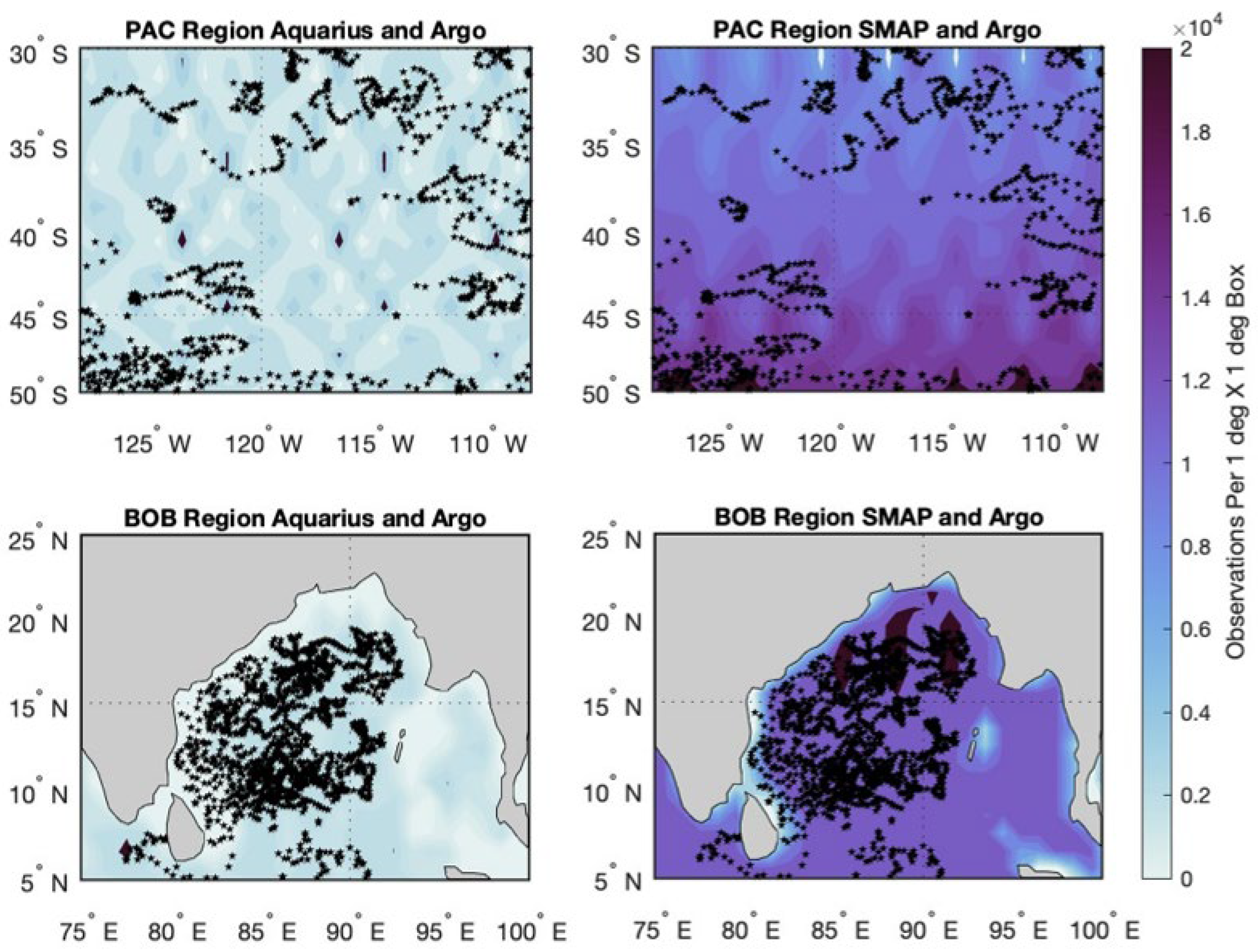
2.2.2. Simulated Argo Float Data

In addition to the simulated satellite data, we generated a simulated Argo float dataset with the model sampled at the time and location of each real float surfacing over the 2011–2012 time period. The resulting dataset contained about 100,000 points [24]. It should be noted that while Argo floats normally stop making measurements at five meters depth on their ascent [28], the simulated Argo data assumes that it is measuring surface salinity. Near-surface vertical stratification is not considered by this study but could also be an important part of overall representation differences. However, it is not clear that the ECCO LLC4320 model correctly portrays the details of the near-surface stratification.

2.3. Matchup Criteria

The four matchup strategies explored in this study were Single Salinity Difference Closest in Time (SSDT), Single Salinity Difference Closest in Space (SSDS), All Salinity Difference (ASD), and N Closest in Time and Space (NCLO). Each method was tested in seven different regions, the latitude and longitude ranges of which are given in Table 1 and Figure 1. These (~20° × 20°) regions were chosen with the goal of sampling a variety of ocean regimes as well as areas of the ECCO model with high horizontal salinity stratification (such as the BOB and ETP regions).
In each region, every Argo measurement within the simulated data set was matched with an L2 satellite measurement or the average of several satellite measurements according to the method being tested. Within each region, the differences in SSS between each Argo and satellite measurement (or average satellite measurement) were found, as were their root mean square, bias, and standard deviation. The effectiveness of each method was measured primarily by the root mean square of the differences (RMSD) between the in-situ and satellite SSS observations.
Figure 2 gives an example of the satellite observations picked for comparison with a random Argo measurement by each method, and the methods themselves are described in Section 2.3.1, Section 2.3.2, Section 2.3.3 and Section 2.3.4.
Each method below only considers the satellite observations made within 50 km and ±3.5 days of the Argo measurement. This window is recommended in ref. [22].

2.3.1. Single Salinity Difference Closest in Time Method (SSDT)

For each Argo measurement, all the satellite observations within ±3.5 days and 50 km were found. Of those, the satellite track that was closest in time to the Argo measurement was found. The single observation along this track that was closest in space to the Argo measurement was selected for comparison. This yields a single closest-in-time matchup.

2.3.2. Single Salinity Difference Closest in Space Method (SSDS)

For each Argo measurement, all the satellite observations within ±3.5 days and 50 km were found. Of those, the single observation made that was closest in space to the Argo measurement was selected. In the rare case that the two closest satellite measurements are exactly equidistant, the closer in time of the two is taken. This yields a single closest-in-space matchup.

2.3.3. All Salinity Difference Method (ASD)

For each Argo measurement, all the satellite observations within ±3.5 days and 50 km were found. All these observations were averaged together to make one combined satellite measurement for comparison. This is the same method that is recommended by [22] and used by [23]—though they used variably-sized space and time windows.

2.3.4. N-Closest Optimized Averaging Method (NCLO)

Depending on the dynamics of the region being studied, closeness in time may be more important than closeness in space, or vice versa. For the N-closest method, we developed a criterion for making tradeoffs in time and space in different regions. For each Argo measurement, all the satellite observations within ±3.5 days and 50 km were found. From these observations, the SSS values of a certain number of them (N) were averaged together to create an average value for comparison. These satellite observations were selected based on the following method, which assigns a “score” to each observation and then chooses the N points with the lowest score for averaging.
First, the distances in time and space between each eligible satellite observation (within 50 km and ±3.5 days of the Argo float) and the Argo measurement were calculated and independently normalized from 0 to 1, according to:
N o r m a l i z e d   X i = X i min ( X ) max ( X ) min ( X )
where Xi is either Ti, the distance in time, or Di, the distance in space of the satellite observation being scored (i) from the Argo measurement, and min(X)/max(X) is the minimum/maximum difference in time or space among the satellite observations being scored. The purpose of this is to represent the distance in time and space between the Argo measurement and each satellite observation as a number between 0 and 1.
To place importance on closeness in time over space or vice versa, the normalized time and space differences of each satellite observation were multiplied by a ‘time_weight’ and ‘space_weight’ coefficient, respectively. The weighted and normalized values for time and space were added together to create an overall score for each satellite observation, according to Equation (3) below.
t i m e   w e i g h t + s p a c e   w e i g h t = 1 .
s c o r e ( i ) = T i ( t i m e   w e i g h t ) + D i ( s p a c e   w e i g h t )
Since time_weight and space_weight are dependent on each other in Equation (2), they can be thought of as a percent importance placed on closeness in time or space. For example, if space_weight is given a value of 0.6, there is a 60% importance placed on closest in space and a 40% importance placed on closest in time when picking satellite observations to be averaged and compared with the Argo measurement. The lower the score, the closer the observation is in time and space according to the importance placed on time and space by the weight coefficients. When the value of time_weight is greater than 0.5, observations with lower scores will be those that are close in time to the Argo measurement, and less so those that are close in space. When the value of space_weight is greater than 0.5, the opposite is true, as more than 50% importance has been placed on closeness in space. The N observations with the lowest score were averaged together to make one average satellite measurement for comparison. Figure 3 gives an example of how different satellite observations are averaged depending on what values of N and space_weight are used.
To tailor the NCLO method to each of the regions studied, these parameters were optimized by region. The optimal values of time_weight, space_weight, and N were found by first calculating the RMS of differences produced by every fifth N value from 1 to 100 and every 0.1 space_weight value from 0 to 1. The space_weight and N values that gave the lowest RMSD was found and then further optimized by calculating the RMS of differences produced by every N value from Noptimal − 1 to Noptimal + 1 and every 0.01 space_weight value from space_weightoptimal − 0.1 to space_weightoptimal + 0.1.

3. Results

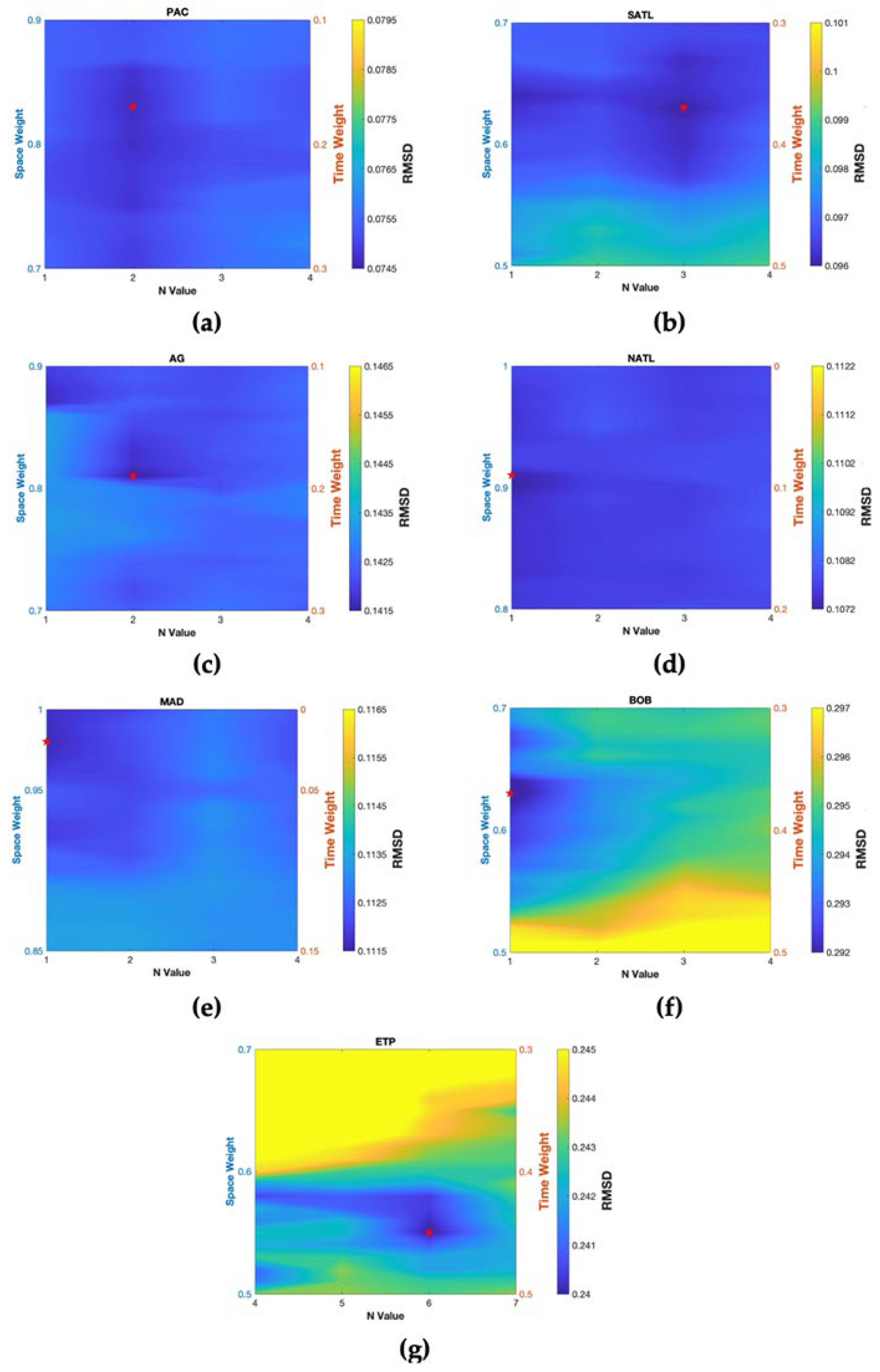
3.1. Optimization of NCLO Parameters

The purpose of optimizing the N and space_weight parameters used in the N closest method for each region is to show how the most effective set of key parameters varies based on where in the ocean the validation is being performed. Figure 4 shows contour plots of RMSD calculated using different N and space_weight values for each region using the Aquarius data set. When using this method to validate Aquarius observations, the optimum N values tend to be low (between one and four in all regions except ETP), and the plots show that closeness in space is more important than closeness in time (i.e., space_weights are higher than time_weights), especially in the midlatitude regions. In the equatorial regions (BOB and ETP), the optimum space_weights were lower than those of the other satellites. The optimization of N and space_weight also had more of an effect on the RMSD in these equatorial regions, which is shown by the higher variety of colors in the contour plots.
The optimum parameters determined by these calculations for all three satellites are shown in Figure 5. The optimum parameters are influenced by the satellite used and the region being studied in a way that is not completely clear. Optimizations completed using the SMAP satellite tend to have lower space_weight values, while optimizations completed using the Aquarius satellite tend to have higher space_weight values and lower N values. It is possible that satellite measurement spatial density is responsible for this difference. If observations are less dense, a higher space_weight is required to get a good spatial match because there are fewer satellite observations around that are close in both space and time. The effect of region on the N-closest parameters is less clear. Low space_weight values given for the ETP region by all three satellites may show the effects of short-term temporal variability in the tropics, but the optimum space_weight is not consistently low for the other equatorial region (BOB).

3.2. Relative Effectiveness of Each Matchup Strategy

Statistics describing the differences produced by each of the four methods are shown in Figure 6. These charts show that the region and satellite being tested have much more influence over the RMSD and bias than the method used to do the matchup. The NCLO method always produced the lowest RMS difference in each region. This was expected because the SSDS, SSDT, and ASD are all encompassed within it. For example, N = 1 and space_weight = 1 would yield the exact same RMSD as the SSDS method because it would only choose one point that is the closest in space to each Argo point for comparison. In most cases, the NCLO method produced an RMSD that was only marginally smaller than the RMSD produced by the SSDT method, which was the second most successful. The bias values produced were small, but all positive or all negative for every method in each region except NATL for SMOS and SMAP. A positive/negative bias means that the satellite SSS values were generally larger/smaller than the Argo SSS values.
Figure 7 shows histograms of the differences produced by each method for each region. No one method produced differences that were noticeably lower than the other methods based on these histograms, including the NCLO method.

3.3. Impact of Simulated Instrumental Errors

Figure 8 shows the relationship between the RMSDs determined using the simulated Aquarius data with and without noise added. In all regions, the SSDS and SSDT methods produced higher RMSD values when noise was present, while the ASD and NCLO methods were relatively unaffected by the addition of noise. This is because the instrumental errors are smoothed out by averaging in the ASD and NCLO methods but not in the SSDS and SSDT methods.
The effect of averaging on instrumental errors is also apparent from the NCLO optimization for the noisy data set, which is examined in Figure 9. The optimum N values found for the data set with noise are much higher because more averaging is needed to smooth out the random noise [22]. The effect of noise on space_weight is less clear.

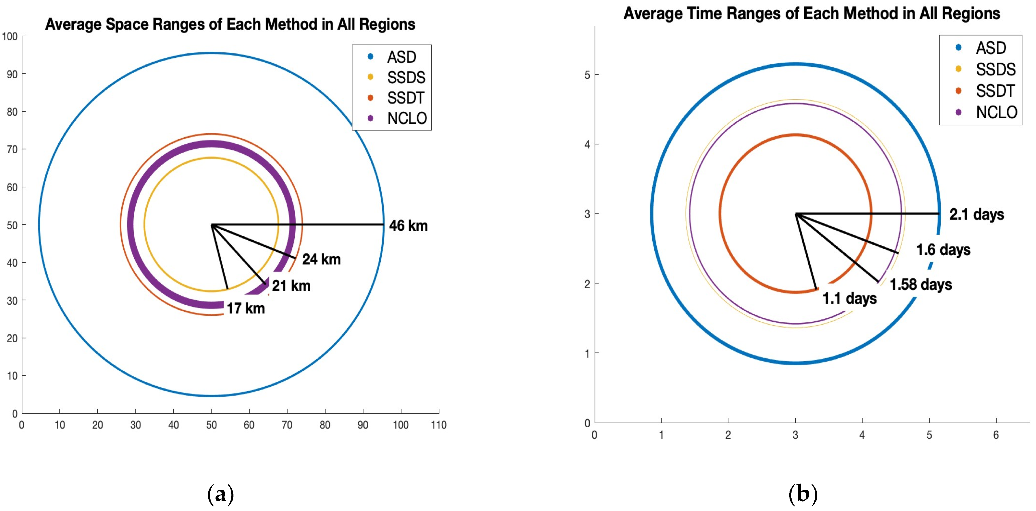
3.4. The Effect of Matchup Method on the Spatial and Temporal Distance of the Satellite Observations Picked for Comparison

To show the effect of each matchup strategy on the actual distance in space and time of the satellite observations that are compared with the in-situ Argo measurements, Figure 10 gives the average space and time windows encompassed by each method throughout all regions when the Aquarius satellite is used. The average space windows encompassed by the SSDS (17 km) are about 29% lower than the windows encompassed by the SSDT (24 km). The average time windows encompassed by SSDT (1.1 days) are about 33% lower than the average space windows encompassed by SSDS (1.6 days). The average space and time window covered by the ASD method is much larger than that of the other three methods (46 km and 2.1 days). This shows that the 50 km and ±3.5-day window that was used in refs. [22,23] is ideal for minimizing instrumental errors and representation differences but may be too large for minimizing only representation differences.
The regional average space windows covered by the NCLO method (mean of 21 km) have about three times the standard deviation of the regional average space windows of the other methods. This variability is likely caused by the optimization of parameters for each region. The time windows covered by the NCLO method are much less variable from region to region. This is because all the observations have unique locations but can be very close together in time (see Figure 2), so a change in NCLO parameters will not always change the range of time differences considered but rather increase or decrease the number of points from a satellite track that is closer in space but more distant in time. The effect of the NCLO optimization on the time and space windows covered is explored further in Figure 11, which shows how changing the space_weight parameter influences the actual space and time range covered by the NCLO method in the PAC region with the Aquarius satellite.
Based on this figure, it appears that as space_weight is decreased, the space range covered in the averaging increases slowly at first and then more rapidly. Meanwhile, the time range covered increases quickly at first and then more slowly. This is also likely because satellite observations have unique locations but are nearly simultaneous, as described in the previous paragraph. A small increase in space_weight is often enough to shift most of the averaged points to the closer satellite track that may be further in time, but once the focus is shifted, space range only increases slightly by choosing more points along that track as the space_weight is increased further.

4. Discussion

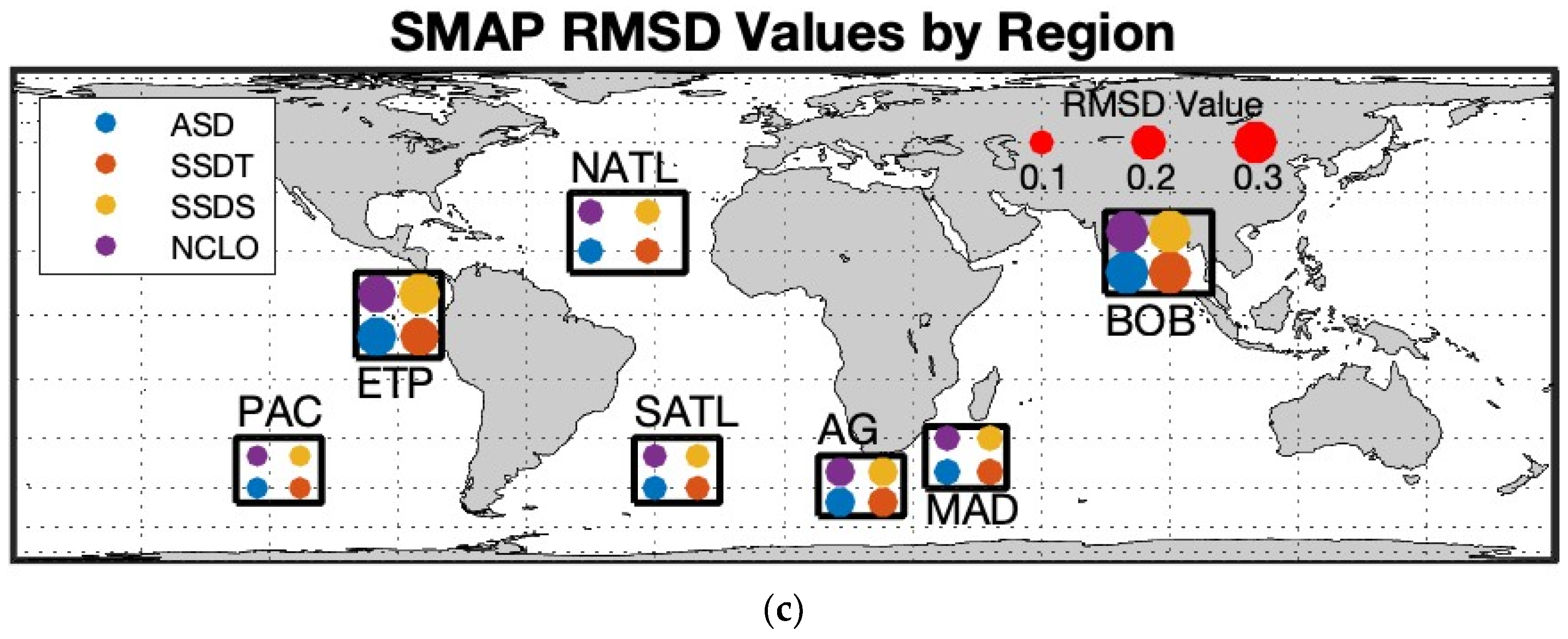
4.1. The Effect of Region and Satellite Track on Ideal Matchup Strategy

Since the use of the LLC4320 model eliminates instrumental errors and ignores vertical stratification, the matchup differences being studied here are due to space and time aliasing. Since Argo and satellite observations are rarely if ever taken at the same time and place, the representation differences we are studying encompass both errors caused by the footprint averaging of satellites and differences caused by horizontal stratification and short-term temporal variability of salinity. One limitation of using RMSD as a statistical metric for the effectiveness of a matchup is that there is no distinction between differences caused by these two potential sources. To study the effect of footprint averaging alone, another data set with in-situ and satellite measurements taken at the exact same time and place would be necessary. The impact of these factors is highly variable based on regional ocean dynamics and the locations of satellite observations relative to Argo floats. Therefore, we chose to repeat this experiment in several different regions. The RMS differences given by Figure 6a and the errors given by Figure 7 show that the size of the representation difference is more dependent on the region and satellite being studied than the method used to do the matchups. Regions near the equator (BOB and ETP) have higher representation differences produced by all matchup strategies because salinity is more spatially and temporally dynamic in these areas. For example, in the Bay of Bengal, there is a lot of short-term temporal variability due to monsoons causing a heavy outflow of freshwater from the Ganga-Brahmaputra and Irrawaddy rivers [29]. This means that two observations that are close in space but several days apart in time may occur before and after a large influx of fresh water and therefore have very different salinities. The same is true for observations that are close in time but a few kilometers apart in space. One observation could be inside the freshwater plume from a river, while another could be outside the plume and much saltier. To further illustrate the effect of high short-term variability and small-scale horizontal variability of each region on the RMSD produced by each method, Figure 12 includes a global map of the ECCO model’s average 7-day SSS standard deviation (12a), average 100 km sub-footprint variability (Figure 12b), and a representation of the RMSD produced by each method on a map (Figure 12c). These maps show some regions with large amounts of variability, e.g., ETP and BOB, and others with much less, e.g., PAC.
The NCLO optimization showed that closeness in space was often more important than closeness in time for the SMOS and Aquarius satellites because optimum space_weight was in most cases higher than time_weight, especially for regions in mid-latitude areas of the ocean that do not experience strong or frequent salinity forcing (PAC, NATL). However, this was not the case for the SMAP, which produced optimum space_weight values lower than 0.5 in all regions. This may be because SMAP has the most coverage of the three satellites; therefore, a high space_weight is not necessary to find a close spatial match for any given Argo point. Figure 13 shows the heavy contrast between the observation densities of the SMAP and Aquarius satellites. The Aquarius satellite only has about a tenth of the observations that SMAP does and therefore has more patches of ocean being observed less frequently. The lack of coverage by Aquarius may explain why the optimized NCLO parameters for the Aquarius satellite tend to have higher space_weights than both SMOS and SMAP.
While it is possible that lower optimum space_weights in the tropical regions (BOB and ETP) are the result of high short-term temporal variability caused by heavy and frequent precipitation events (e.g., [30]), it is difficult to say whether the optimum parameters were primarily influenced by the characteristics of the region or the track of the satellite used. Both equatorial regions examined include near-coastal areas, where satellite coverage is not as complete as it is in the open ocean. Overall, the sparsity of the Aquarius observations leads to higher representation differences no matter which method or region is used, which is reflected in the higher RMSD values shown in Figure 6a.

4.2. Feasibility of Each Method

It is true that the very most effective method of minimizing representation differences between satellite and in situ measurements would consider the dynamics of the ocean region and the track of the satellite being studied. However, implementing the N-closest method—or any validation method that optimizes based on area of the ocean—on real world data would be complicated, ever-changing, and inefficient. This would require producing a grid of optimized parameters, i.e., determining the optimal N and space_weight for the whole globe. Based on the amount of time that it takes to run the N-Closest matchup for a 20° × 20° region using one year of SMAP data on the computer used to conduct this study, it would take about 3.8 days to generate such a grid with that resolution for the whole globe. It takes approximately three and a half hours to run an ASD, SSDS, or SSDT matchup over the entire globe. Therefore, running the ASD, SSDS, or SSDT method globally takes about 3.7% of the time it takes to run NCLO globally. Strong seasonal variability in ocean dynamics would also require that this grid be calculated for several different times of the year to remain accurate, making the method even more computationally inefficient. Finally, ocean dynamics related to salinity are rapidly changing from year to year due to global climate change and events such as the El Niño Southern Oscillation, so any such optimized grid would not be expected to stay accurate for very long and would need to be frequently redone or fit to a climate model in some way.
The RMSD values produced using ASD, SSDS, and SSDT are slightly higher, but it only takes about 3 h to run any of these methods globally. These methods are much simpler and will not change over time or require adjustments throughout the year as an optimized method would. The representation differences found using these methods can be more easily estimated using simulated data for each satellite, and this predictability makes it easier to know what portion of total differences can be attributed to representation differences when validations are completed on real data. Perhaps the answer is not to optimize the method of matching up by region but rather to collect information about the expected representation differences present in each region so it can be subtracted from real matchups.

4.3. The Effect of Averaging on Instrumental Noise

In all regions, the optimum N value was found to be six or lower. This indicated that there is not much benefit in averaging many observations together when minimizing only representation differences between in situ and satellite observations. The results of each matchup method when used on the Aquarius data set with added gaussian noise (Figure 8) show that methods that use averaging appear more effective than the other methods when instrumental errors are present because they smooth out these random errors. Another effect of adding noise to simulate instrumental errors was an increase in the optimal N values found by the NCLO optimization (Figure 9).
If this experiment were to be repeated using real satellite and Argo data, and it was found that optimum N values increased or the ASD method produced lower RMSD values, it could be because averaging decreases the effect of random noise, and not representation differences. This is, after all, the reason why L1B satellite observations are averaged over a footprint to make an L2 product [22]. It was previously suggested that it is better to average L2 observations when doing matchups because these observations are oversampled and some averaging is needed to minimize radiometric noise [22]. However, the purpose of validation is to detect instrumental errors in satellite products, and L2 satellite observations are a published product that will be used in future research, so it is important to understand the instrumental and retrieval errors of these products as-is. We find that the single salinity difference methods are more indicative of the errors present in the L2 products. Averaging via the ASD method, as refs. [22,23] have completed, or using any number of nearest neighbors, such as in the N-closest method, would be more appropriate for developing a matchup strategy for an averaged version of the L2 product, such as an L3 product. L3 product validation is a potential future direction of this research.

4.4. Success of ASD, SSDS, SSDT and Recommendations

In this study, where simulated satellite data were used and instrumental errors were not present, the SSDT method outperformed the ASD method and the SSDS method in every region for the SMOS and SMAP satellites, as shown in Figure 6a. It is important to remember that the SSDT method does not pick a random observation that has the smallest time difference from the Argo measurement, but rather identifies the group of observations that have that minimum time difference and then picks the closest in space out of those. Therefore, SSDT is a single salinity method that considers closeness in both time and space. The simplicity of this method makes it easily applicable to the entire ocean at any time and more computationally efficient than an optimizing method such as NCLO. Therefore, we recommend SSDT as a method of validation of L2 satellite observations with in-situ Argo floats.

5. Conclusions

The metric used to measure the success of each matchup method, RMSD, was more dependent on the region and satellite being tested than the method used to do the matchup. This shows that while a matchup strategy that takes regional dynamics and satellite track into consideration will most effectively minimize RMSD, it is more important to consider the computational efficiency of the method. While the optimized N-Closest method did produce the lowest RMSDs in every region with every satellite, the decrease in RMSD was relatively small compared with the computational cost of conducting the optimization for each region. Implementing such a method across the globe would not be feasible because the parameters N and space_weight would need to be generated on a grid for the entire ocean, and then those values would change as ocean dynamics changed during different seasons as well as permanently over time due to global climate change and natural variability.
While representational differences are not absolutely minimized by a simpler method such as SSDS, SSDT, or ASD, it is better to employ a simple method that works predictably well across the entire ocean. The advantage of having representation differences that are predictable rather than minimized is that a predictable representation difference can be estimated and subtracted in the future from instrumental errors found by real observation matchups. Future directions of this research could include using a simple matchup method on several years of simulated data sets to quantify representation differences in different areas of the ocean at different times of the year and check for consistency across several years. Another future research direction may be determining the vertical representation differences between Argo and satellite measurements caused by Argo sampling at ~5 m depth. However, further investigation of the representation of near-surface stratification by the ECCO model would need to be completed to ensure accuracy, especially near the coasts. We are also interested in determining a matchup method that is better suited for validating L3 data with an averaging method.
Due to its consistent success across all the regions tested and all the satellites used, we recommend using the SSDT method for validating L2 satellite data using Argo data. This method is time-centric but gives some consideration to the closeness of the satellite observation in both time and space. It is about as computationally efficient as the ASD and SSDS methods but produces slightly lower RMSD values overall with simulated data.

Supplementary Materials

The following supporting information can be downloaded at: https://www.mdpi.com/article/10.3390/rs15051242/s1, Figure S1: Contour Plots for the SMOS NCLO optimization; Figure S2: Contour Plots for the SMAP NCLO optimization; Table S1: Final Parameters and RMSD data from the N closest optimization; Figure S3: Standard Deviation of Errors Calculated for Each Method; Figure S4: Space and Time Windows Covered by Each Methos (SMAP); Figure S5: Space and Time Windows Covered by Each Method (SMOS).

Author Contributions

Conceptualization, E.E.W. and F.M.B.; methodology, E.E.W.; formal analysis, E.E.W.; investigation, E.E.W. and F.M.B. resources, F.M.B. and S.F.; data curation, F.M.B., S.F. and A.H.; writing—original draft preparation, E.E.W. and F.M.B.; writing—review and editing, F.M.B. and S.F.; visualization, E.E.W.; supervision, S.F. and F.M.B.; project administration, S.F. and F.M.B.; funding acquisition, F.M.B. and S.F. All authors have read and agreed to the published version of the manuscript.

Funding

This research was funded by NASA, grant numbers 19-OSST19-0007 and 80NSSC18K1322.

Data Availability Statement

Data can be accessed using the following DOIs: Simulated SMAP: https://doi.org/10.15139/S3/XQDRAF. Simulated SMOS: https://doi.org/10.15139/S3/4RVFZH (accessed on 2 February 2023). Simulated Aquarius: https://doi.org/10.15139/S3/GFAMIP (accessed on 2 February 2023). Simulated Argo: https://doi.org/10.15139/S3/5SLCEV (accessed on 2 February 2023).

Acknowledgments

We would like to thank our reviewers for their comments and suggestions.

Conflicts of Interest

The authors declare no conflict of interest.

References

  1. Loew, A.; Bell, W.; Brocca, L.; Bulgin, C.E.; Burdanowitz, J.; Calbet, X.; Donner, R.V.; Ghent, D.; Gruber, A.; Kaminski, T.; et al. Validation practices for satellite-based Earth observation data across communities. Rev. Geophys. 2017, 55, 779–817. [Google Scholar] [CrossRef] [Green Version]
  2. Dinnat, E.P.; Le Vine, D.M.; Boutin, J.; Meissner, T.; Lagerloef, G. Remote Sensing of Sea Surface Salinity: Comparison of Satellite and In Situ Observations and Impact of Retrieval Parameters. Remote Sens. 2019, 11, 750. [Google Scholar] [CrossRef] [Green Version]
  3. Kao, H.-Y.; Lagerloef, G.S.E.; Lee, T.; Melnichenko, O.; Meissner, T.; Hacker, P. Aquarius Salinity Validation Analysis, Data Version 5.0; Aquarius/SAC-D: Seattle, WA, USA, 2018; Volume 45. [Google Scholar] [CrossRef] [Green Version]
  4. Abe, H.; Ebuchi, N. Evaluation of sea surface salinity observed by Aquarius. J. Geophys. Res. Oceans 2014, 119, 8109–8121. [Google Scholar] [CrossRef]
  5. Tang, W.; Yueh, S.H.; Fore, A.G.; Hayashi, A. Validation of Aquarius sea surface salinity with in situ measurements from Argo floats and moored bouys. J. Geophys. Res. Oceans 2014, 119, 6171–6189. [Google Scholar] [CrossRef]
  6. Meissner, T.; Wentz, F.; Le Vine, D.M. The salinity retrieval algorithms for the NASA Aquarius version 5 and SMAP version 3 releases. Remote Sens. 2018, 10, 1121. [Google Scholar] [CrossRef] [Green Version]
  7. Dinnat, E.P.; Boutin, J.; Yin, X.; Le Vine, D.M. Inter-comparison of SMOS and aquarius Sea Surface Salinity: Effects of the dielectric constant and vicarious calibration. In Proceedings of the 2014 13th IEEE Specialist Meeting on Microwave Radiometry and Remote Sensing of the Environment (MicroRad), Pasadena, CA, USA, 24–27 March 2014. [Google Scholar] [CrossRef] [Green Version]
  8. Hernandez, O.; Boutin, J.; Kolodziejczyk, N.; Reverdin, G.; Martin, N.; Gaillard, F.; Reul, N.; Vergely, J.L. SMOS salinity in the subtropical North Atlantic salinity maximum: 1. Comparison with Aquarius and in situ salinity. J. Geophys. Res. Oceans 2014, 119, 8878–8896. [Google Scholar] [CrossRef] [Green Version]
  9. Bao, S.; Wang, H.; Zhang, R.; Yan, H.; Chen, J. Comparison of Satellite-Derived Sea Surface Salinity Products from SMOS, Aquarius, and SMAP. J. Geophys. Res. Oceans 2019, 124, 1932–1944. [Google Scholar] [CrossRef]
  10. Qin, S.; Wang, H.; Zhu, J.; Wan, L.; Zhang, Y.; Wang, H. Validation and correction of sea surface salinity retrieval from SMAP. Acta Oceanol. Sin. 2020, 39, 148–158. [Google Scholar] [CrossRef]
  11. Olmedo, E.; Martínez, J.; Turiel, A.; Ballabrera-Poy, J.; Portabella, M. Debiased non-Bayesian retrieval: A novel approach to SMOS Sea Surface Salinity. Remote Sens. Environ. 2017, 193, 103–126. [Google Scholar] [CrossRef]
  12. Olmedo, E.; Gabarró, C.; González-Gambau, V.; Martínez, J.; Turiel, A.; Ballabrera, P.J.; Portabella, M.; Fournier, S.; Lee, T. Seven Years of SMOS Sea Surface Salinity at High Latitudes: Variability in Arctic and Sub-Arctic Regions. Remote Sens. 2018, 10, 1772. [Google Scholar] [CrossRef] [Green Version]
  13. Olmedo, E.; Taupier-Letage, I.; Turiel, A.; Alvera-Azcárate, A. Improving SMOS Sea Surface Salinity in the Western Mediterranean Sea Through Multi-Variate and Multi-Fractal Analysis. Remote Sens. 2018, 10, 485. [Google Scholar] [CrossRef] [Green Version]
  14. Olmedo, E.; González-Haro, C.; Hoareau, N.; Umbert, M.; González-Gambau, V.; Martínez, J.; Gabarró, C.; Turiel, A. Nine years of SMOS sea surface salinity global maps at the Barcelona Expert Center. Earth Syst. Sci. Data 2021, 13, 857–888. [Google Scholar] [CrossRef]
  15. Tang, W.; Fore, A.; Yueh, S.; Lee, T.; Hayashi, A.; Sanchez-Franks, A.; Martinez, J.; King, B.; Baranowski, D. Validating SMAP SSS with in situ measurements. Remote Sens. Environ. 2017, 200, 326–340. [Google Scholar] [CrossRef] [Green Version]
  16. Fournier, S.; Lee, T.; Tang, W.; Steele, M.; Olmedo, E. Evaluation and Intercomparison of SMOS, Aquarius, and SMAP Sea Surface Salinity Products in the Arctic Ocean. Remote Sens. 2019, 11, 3043. [Google Scholar] [CrossRef] [Green Version]
  17. Vazquez-Cuervo, J.; Fournier, S.; Dzwonkowski, B.; Reager, J. Intercomparison of In-Situ and Remote Sensing Salinity Products in the Gulf of Mexico, a River-Influenced System. Remote Sens. 2018, 10, 1590. [Google Scholar] [CrossRef] [Green Version]
  18. Vazquez-Cuervo, J.; Gomez-Valdes, J.; Bouali, M.; Miranda, L.E.; Van der Stocken, T.; Tang, W.; Gentemann, C. Using Saildrones to Validate Satellite-Derived Sea Surface Salinity and Sea Surface Temperature along the California/Baja Coast. Remote Sens. 2019, 11, 1964. [Google Scholar] [CrossRef] [Green Version]
  19. Vazquez-Cuervo, J.; Gomez-Valdes, J.; Bouali, M. Comparison of Satellite-Derived Sea Surface Salinity Gradients Using the Saildrone California/Baja and North Atlantic Gulf Stream Deployments. Remote Sens. 2020, 12, 1839. [Google Scholar] [CrossRef]
  20. Vazquez-Cuervo, J.; Gentemann, C.; Tang, W.; Carroll, D.; Zhang, H.; Menemenlis, D.; Gomez-Valdes, J.; Bouali, M.; Steele, M. Using Saildrones to Validate Arctic Sea-Surface Salinity from the SMAP Satellite and from Ocean Models. Remote Sens. 2021, 13, 831. [Google Scholar] [CrossRef]
  21. Hall, K.; Daley, A.; Whitehall, S.; Sandiford, S.; Gentemann, C.L. Validating Salinity from SMAP and HYCOM Data with Saildrone Data during EUREC A-OA/ATOMIC. Remote Sens. 2022, 14, 3375. [Google Scholar] [CrossRef]
  22. Schanze, J.J.; Le Vine, D.M.; Dinnat, E.P.; Kao, H.-Y. Comparing Satellite Salinity Retrievals with In Situ Measurements: A Recommendation for Aquarius and SMAP (Version 1); Earth & Space Research: Seattle, WA, USA, 2020; Volume 20. [Google Scholar] [CrossRef]
  23. Bingham, F.M.; Fournier, S.; Brodnitz, S.; Ulfsax, K.; Zhang, H. Matchup Characteristics of Sea Surface Salinity Using a High-Resolution Ocean Model. Remote Sens. 2021, 13, 2995. [Google Scholar] [CrossRef]
  24. Bingham, F.M.; Brodnitz, S.; Fournier, S.; Ulfsax, K.; Hayashi, A.; Zhang, H. Sea Surface Salinity Sub Footprint Variability from a Global High Resolution Model. Remote Sens. 2021, 13, 4410. [Google Scholar] [CrossRef]
  25. Su, Z.; Wang, J.; Klein, P.; Thompson, A.F.; Menemenlis, D. Ocean submesoscales as a key component of the global heat budget. Nat. Commun. 2018, 9, 775. [Google Scholar] [CrossRef] [PubMed] [Green Version]
  26. Wang, J.; Menemenlis, D. Pre-SWOT Ocean Simulation LLC4320 Version 1 User Guide; Jet Propulsion Laboratory, California Institute of Technology: Pasadena, CA, USA, 2021. [Google Scholar]
  27. Rocha, C.B.; Gille, S.T.; Chereskin, T.K.; Menemenlis, D. Seasonality of submesoscale dynamics in the Kuroshio Extension. Geophys. Res. Lett. 2016, 43, 11304–11311. [Google Scholar] [CrossRef]
  28. Drucker, R.; Riser, S. Validation of Aquarius Sea Surface Salinity with Argo: Analysis of Error Due to Depth of Measurement and Vertical Salinity Stratification. J. Geophys. Res. Oceans 2014, 119, 4626–4637. [Google Scholar] [CrossRef]
  29. Akhil, V.P.; Vialard, J.; Lengaigne, M.; Keerthi, M.G.; Boutin, J.; Vergely, J.L.; Papa, F. Bay of Bengal Sea surface salinity variability using a decade of improved SMOS re-processing. Remote Sens. Environ. 2020, 248, 11196. [Google Scholar] [CrossRef]
  30. Clayson, C.A.; Edson, J.B.; Paget, A.; Graham, R.; Greenwood, B. Effects of rainfall on the atmosphere and the ocean during SPURS-2. Oceanography 2019, 32, 86–97. [Google Scholar] [CrossRef] [Green Version]
Figure 1. Outlines of the regions being tested.
Remotesensing 15 01242 g001
Figure 2. Aquarius satellite observations picked by each method for comparison with a typical Argo measurement (★) in the PAC region (See Figure 1 and Table 1). The square (◾) symbol shows the average location of the points used in the ASD method. The triangle (▲) symbol shows the average location of the points used in the NCLO method, which has been optimized for this region. The diamond (♦) symbol shows the closest observation in space to the Argo measurement, which is used for the SSDS method. The circle (●) symbol shows the observation that is the closest in space to the Argo measurement out of the group of observations that are closest in time, which is used for the SSDT method. The symbol color shows how many days before or after the Argo measurement the Aquarius observations or average of several Aquarius observations occurred, with color scale at right.
Remotesensing 15 01242 g002
Figure 3. Aquarius measurements selected for averaging by the N closest method (■) for a random Argo float in the PAC region when different values of N and space_weight are used. The coordinate of the average satellite observation (★) is also shown along with the location of the Argo float (▲). The difference between the averaged SSS of these chosen observations and the SSS measured by the Argo float is found for all of the Argo floats in the given region and the RMS of these differences is used as a measure of the effectiveness of any given set of N and space_weight parameters.
Remotesensing 15 01242 g003
Figure 4. Contour plots of the RMSD generated by the Aquarius data set in each region using a range of N and space_weight values, shown on the X and Y axis. The N and space_weight combination that yielded the lowest RMS Difference is considered to be optimal for the region and is marked by a red star (★). Only the four N values and 20 space_weight values that encompass the area with the lowest RMS Differences are shown for each region. The color scale is different for each plot, as RMSD was primarily influenced by location, but each color scale only includes a range of RMSD values 0.005 units long, so the variety of colors present reveals the level of importance of the optimization in each region. For the sake of brevity, contour plots for only Aquarius data are shown here. Similar plots for SMOS and SMAP data can be found in the Supplementary Information (Figures S1 and S2). (a) PAC, (b) SATL, (c) AG, (d) NATL, (e) MAD, (f) BOB, and (g) ETP regions.
Remotesensing 15 01242 g004
Figure 5. A summary of the optimum N and space_weight values determined for each region when optimized for the Aquarius, SMOS, and SMAP satellites. As noted in the legend, the different satellites are denoted by the star, circle and triangle symbols, and the different regions are denoted by different colors. This data can be found tabulated in the Supplementary Information (Table S1).
Remotesensing 15 01242 g005
Figure 6. Statistics describing the differences produced by each of the four matchup methods tested in every region using Aquarius, SMAP, and SMOS simulated data. Different colored bars are for different methods and groupings of bars are for different regions as indicated in the legend of each panel. (a) RMSD. (b) Bias. (difference = Argo SSS − Satellite SSS). A similar figure showing the standard deviation of errors can be found in the Supplementary Information (Figure S3).
Remotesensing 15 01242 g006
Figure 7. Histograms of the differences produced using each of the four matchup methods on the simulated Aquarius satellite data. In the NATL and MAD regions, the errors produced for the SSDS and NCLO methods are the same because the optimum space_weight in these regions is high (between 0.9 and 1) and the optimum N value is 1. This is an example of a single salinity difference method being optimum for the region.
Remotesensing 15 01242 g007
Figure 8. RMSD values produced using each method with the simulated Aquarius dataset and the simulated Aquarius data set with Gaussian noise (Standard Deviation = 0.2, Mean = 0) added.
Remotesensing 15 01242 g008
Figure 9. Optimum N and space_weight values found for the simulated Aquarius data set with and without added Gaussian Noise (standard deviation = 0.2, mean = 0).
Remotesensing 15 01242 g009
Figure 10. The mean (over all regions) space (a) and time (b) windows encompassed by each of the four matchup methods using the Aquarius satellite. As indicated by the legend, ASD windows are shown in blue, SSDS in yellow, SSDT in orange, and NCLO in purple. The size of the circles indicates the size of the average window covered. The thickness of the lines is proportional to the standard deviation between the mean space (by a factor of 2) and time (by a factor of 16) ranges calculated for the seven individual regions. Similar figures showing the time and space windows when these methods are applied to SMAP and SMOS are given in the Supplementary Information (Figures S4 and S5).
Remotesensing 15 01242 g010
Figure 11. The mean space (a) and time (b) windows encompassed by the NCLO method in the PAC region using the Aquarius satellite and four different values of space_weight (0.90, 0.60, 0.40, 0.20) and an N value of 11. The size of the circle is dependent on the average distance between each Argo float in the PAC region and the furthest Aquarius observation in time or space that was included in its NCLO averaging. The thickness of the circle lines is indicative of the standard deviation.
Remotesensing 15 01242 g011
Figure 12. (a) gives the average variability of SSS over a 7-day interval on a 1/48° grid. This gives an idea of the short-term variability of the ECCO model. (b) gives the daily average 100 km sub-footprint variability (calculated using the method in [24] on a 2° × 2° evaluation grid. This gives an idea of the small-scale spatial variability of the ECCO model. (c) A representation of the data from Figure 6a on a map showing the boundaries of the regions studied. The regions that have high variability shown in Figure 12a,b have high RMSD values produced by all methods.
Remotesensing 15 01242 g012aRemotesensing 15 01242 g012b
Figure 13. Colors with scale at right: Coverage of the Aquarius (left column) and SMAP satellites (right column). Black symbols: Argo float observations for the entire year of simulated data in the PAC (top row) and BOB (bottom row) region.
Remotesensing 15 01242 g013
Table 1. Latitude and longitude ranges of the seven regions tested.
Region NameRegion LatitudesRegion Longitudes
Pacific (PAC)30°S–50°S128°W–108°W
South Atlantic (SATL)30°S–50°S15°W–35°W
Agulhas (AG)35°S–55°S8°E–28°E
North Atlantic (NATL)10°N–30°N23°W–50°W
MAD (Madagascar)45°S–27°S33°E–52°E
Bay of Bengal (BOB)5°N–25°N75°E–100°E
Eastern Tropical Pacific (ETP)10°S–10°N100°W–80°W
Disclaimer/Publisher’s Note: The statements, opinions and data contained in all publications are solely those of the individual author(s) and contributor(s) and not of MDPI and/or the editor(s). MDPI and/or the editor(s) disclaim responsibility for any injury to people or property resulting from any ideas, methods, instructions or products referred to in the content.

