Article

Exploring the Spatial Variability of Air Pollution Using Mobile BC Measurements in a Citizen Science Project: A Case Study in Mechelen

1
Flemish Institute for Technological Research (VITO), Boeretang 200, 2400 Mol, Belgium
2
Belgian Interregional Environment Agency, Gaucheretstraat 92-94, 1030 Brussels, Belgium
3
School of Public Health, Université Libre de Bruxelles, Route de Lennik 808-CP591, 1070 Brussels, Belgium
*
Author to whom correspondence should be addressed.
Atmosphere 2024, 15(7), 757; https://doi.org/10.3390/atmos15070757
Submission received: 16 April 2024 / Revised: 29 May 2024 / Accepted: 11 June 2024 / Published: 25 June 2024

Abstract

:
Mobile monitoring is used as an additional tool to collect air quality data at a high spatial resolution and to complement data from fixed air quality stations. Citizens are interested in contributing to air quality monitoring, and while the availability of low-cost air quality sensors can create opportunities to measure the air quality at a high spatial resolution, the data are often of lower quality, and sensors that measure combustion-related aerosols (like black carbon) are not commonly available. Mobile monitoring using a mid-range instrument can fill this gap. We present the results of a mobile BC (black carbon) monitoring campaign performed by citizens in Mechelen as part of a local citizen observatory (CO), Meet Mee Mechelen, initiated as part of the European H2020 project, Ground Truth 2.0. The goal of the study was two-fold: (1) to propose and evaluate a mobile monitoring method (data collection and data processing) to construct pollution maps of BC concentrations and (2) to demonstrate how to organize community-based air quality monitoring to measure both the spatial and temporal variations in air pollution levels. Measurements were taken during peak hours in four campaigns characterized by different meteorological conditions: October–November 2017, February–March 2018, June–July 2018 and September 2018. The results show large spatial and temporal variabilities. Spatial variability is influenced by traffic volume, stop-and-go traffic and also the building environment and the distance of biking paths from road traffic. The four different campaigns show similar spatial patterns, but due to background and meteorological influences, the absolute concentrations differ between seasons. A rescaling method using data from fixed stations in the air quality monitoring network (AQMN) was presented to construct maps representative of longer periods. This paper shows that mobile measurements can be used by CO to assess the spatial variability of air quality in a city. The data can be used to evaluate mobility plans, carry out hot spot detection, evaluate the exposure of cyclists as a function of cycling infrastructure and perform model validation. However, it is important to use high-quality instruments and apply the correct measurement methodology (number of repetitions, season) to obtain meaningful data.

1. Introduction

Citizens are becoming more and more aware of air quality and the impact of air quality on health. The increasing availability of low-cost air quality sensors is giving citizens the opportunity to start measuring their own environment. However, the quality of the sensors used and the setup of the monitoring campaign need special attention.
Citizen science projects face challenges in relation to data credibility (e.g., data fragmentation, data inaccuracy, lack of experimental design) and the utility of citizen science data [1]. If large datasets are produced and are not scientifically sound, these may become a headache for those who are responsible for managing air quality [2]. In addition, the results of citizen science projects need to be explained in a comprehensible way to keep stakeholders engaged. Therefore, citizens, researchers and policymakers need to work together to make a citizen observatory successful. Low-cost portable devices are available and have been increasingly used to monitor air quality. While these sensors can have potential when used in fixed networks to assess the spatial variability for some pollutants when appropriate calibration models are used, some issues remain if they are used for mobile applications. In this study, we used a validated monitoring approach (www.airqmap.com) that resulted in scientifically sound data with respect to the monitoring device and the method with which the measurements were made [3].
Traditionally, air quality is measured at fixed air quality monitoring stations (AQMSs) with a low spatial resolution. The main advantages of fixed reference stations are their measurement accuracy and long-term time series. However, they do not necessarily represent citizens’ exposure to air pollution. To obtain a better estimate of the spatial variability of air pollution, more locations need to be sampled within a city or region. Two different measurement approaches can be used: a dense network using low-cost monitoring instruments (sensors or passive samplers) or, mobile measurements using high-grade or medium-grade monitors [4,5,6,7] or low-cost sensors [8,9,10,11]. While a dense network of stationary locations has a trade-off between the cost of instruments and the quality of the data, mobile measurement approaches can use higher-quality instruments at higher costs because one instrument can cover a large area. Therefore, mobile measurements are complementary to fixed stations with high-end instruments in terms of spatial coverage and are preferred to dense networks when low-cost sensors are not available for the pollutant or are of questionable quality.
Mobile measurements are often a snapshot of the situation, e.g., in a specific season or at a specific time of the day. Given the spatio-temporal variability of air quality, the resulting data from mobile measurements need to be sampled and analyzed in a different way compared to fixed measurements [12]. In this study, we performed measurements on different days and in different seasons to reduce the statistical noise related to the differences in meteorological conditions, resulting in a representative map of the spatial variability of pollution.
This study focuses on black carbon (BC), a compound of fine particles that are emitted from combustion sources [13]. BC is a good indicator of combustion-related air pollution, and exposure to BC is recognized by the World Health Organization to be associated with cardiovascular and cardiopulmonary mortality [14]. A recent study has provided important evidence of the associations between long-term exposures to low concentrations of, for example, BC and various health endpoints [15]. In addition, studies of short-term health effects suggest that BC is a better indicator of harmful particulate substances from combustion sources (especially traffic) than undifferentiated particulate matter (PM) mass. Data on the speciation of PM, and more specifically, BC, are scarce because BC concentrations are not regulated by the EU Air Quality Directive, and instrumentation is relatively complicated and expensive. Recent research has developed empirical models based on, for example, machine learning ([16,17] and references therein) or land use regression [18], where BC is estimated based on other pollutants or interpolated at other locations to cover a broader area. While these modeled data can address the need for better exposure estimates, they still require validation that is based on measured data with a high spatial resolution. In Flanders, BC was measured at 25 stations in the AQMN at the time of the study, and no station was situated in the city of Mechelen.
In previous research, we showed the potential of mobile measurements to assess the personal exposure of cyclists [19] or other transport modes [4,20] and to assess the spatial variability of urban air quality of different pollutants (e.g., UFP, BC and heavy metals in [5]; UFP and PM10 in [21]; UFP and BC in [6]; BC in [7]). We examined the number of repetitions needed and the impact of background concentrations [3,22]. Other papers also showed the potential of mobile measurements [23,24,25,26] for personal exposure in studying the spatial variation of air pollution. In a number of recent studies, mobile BC measurements have been made to assess the exposure of bicycles and other commuters [5,27,28,29,30,31,32,33] in relation to the traffic situation [34] and the effect of bicycle infrastructure on the exposure levels of bicycle commuters [35,36]. A similar exercise was conducted for PM2.5 by distributing 500 low-cost sensors to voluntary participants in Utrecht, the Netherlands [11].
In this paper, we performed a study on the spatial variability of BC during peak hours in different seasons in the city of Mechelen. The goal of the study was two-fold: (1) to evaluate the mobile monitoring method (data collection and data processing) to construct pollution maps of BC concentrations and to propose a scientific sound method, and (2) to demonstrate how to organize community-based air quality monitoring to measure both the spatial and temporal variations in air pollution levels.
The measurements were performed by citizens of Mechelen who took part in a local citizen observatory (CO), “Meet Mee Mechelen”; the measurement requirements, setup and execution were performed by the citizens in close consultation with the research partner VITO and the city council. Using this unique dataset, we compared campaigns that were performed under different meteorological conditions. A rescaling methodology based on fixed monitoring stations of the Flemish Environment Agency was applied and evaluated. Spatial patterns were analyzed and interpreted in terms of the current mobility plans, in particular with respect to cyclist exposure. The results of a mobile monitoring campaign were compared to state-of-the-art modeling results. Based on simultaneous mobile measurements, the currently used approach of measuring BC using medium-cost instruments was compared to measurements taken using a low-cost sensor for PM that is often used in citizen science projects.

2. Material and Methods

2.1. A Citizen Observatory for Air Quality

As part of the Ground Truth 2.0 project (http://gt20.eu/, accessed on 16 June 2024), citizen observatories (COs) have been initiated in six European and African countries involving citizens, policymakers and scientists, following a co-design process developed as part of the project. The main findings on best practices for the setup of a CO are discussed in two other publications [37,38]. In Mechelen, Belgium, a group of enthusiastic volunteers, local policymakers and scientists initiated Meet Mee Mechelen (translated as “Join our measurements Mechelen”), a CO with a focus on improving the local air quality to enhance health, quality of life and social cohesion.
The participants of the CO defined the following aim of the measurement campaign to measure local air pollution levels in Mechelen (1) to identify the impact of road traffic and obtain a set of benchmark measurements (prior to proposing or implementing specific actions) and (2) to identify the spatial and temporal changes in air quality levels. Researchers helped to translate the citizens’ needs into a scientifically sound measurement setup. They also trained the coordinators of the effective measurement campaign and instructed participants on how to operate and wear the instruments, as well as how to perform the measurement campaign with a special focus on driving speed and direction, number of repetitions, and synchronization of the measurements on the different routes.

2.1.1. Instrumentation

Citizens of Mechelen carried out the measurements using airQmap (www.airqmap.be, accessed on 16 June 2024), a user-friendly monitoring tool developed by VITO to map BC at street level; airQmap is a mobile platform that measures BC via repeated measurements by bicycle and is based on a scientifically justified method [3]. It comprises a measurement unit consisting of a microAeth® (AE51, AethLabs, San Francisco, CA, USA), a GPS and an automated data processing infrastructure to construct the aggregated BC maps. The microAeth® measures the attenuation of light (880 nm LED) through a Teflon-coated borosilicate glass fiber filter on which light-absorbing particles are sampled continuously. The difference in attenuation (per time base) is converted to a BC concentration using a specific absorption coefficient sigma = 12.5 m2 g−1 (at 880 nm) and the actual sample flow rate. The sample flow rate is set at 150 mL min−1, and the measurements are made at a temporal resolution of 1 s. To reduce the signal noise at the one-second time resolution (especially at low concentrations), the ONA (optimized noise-reduction averaging) algorithm was used with an attenuation threshold of 0.05 [39]. Prior to each monitoring campaign, the flow of the instruments is calibrated, and the different instruments used are intercompared by co-location (for at least one day) to check that the inter-instrument variability is less than 10%. A periodic comparison with the AE33 (Magee) is performed.
To assess the potential of using low-cost sensors and different metrics, the AirBeam was aligned with the aethalometer and used simultaneously on some trips. Useful for citizen science, the AirBeam is a PM sensor developed by HabitatMap, a US non-profit environmental health justice organization whose goal is to raise awareness of the impact the environment has on human health. HabitatMap builds tools to support grassroots environmental organizing, including AirCasting. AirCasting is an open-source, end-to-end solution for collecting, displaying and sharing health and environmental data using your smartphone. The platform consists of wearable sensors that detect changes in your environment and physiology, including a palm-sized air quality monitor called the AirBeam, the AirCasting Android app, the AirCasting website and wearable LED accessories. The AirBeam and AirCasting infrastructures are used worldwide. Citizen scientists from around the world take measurements and contribute to the air quality crowd map. The AirBeam sensor was assessed by the AQ-SPEC (the Air Quality Performance Evaluation Center), and while it showed an overestimation of the PM values, it also showed a good correlation with more expensive FEM instruments. In a recent study [40], AirBeam showed acceptable quantitative data for different sources and the authors concluded that AirBeam was of sufficient accuracy and reliability to be able to detect sources and assess increased exposure to PM2.5 in homes. Another study showed the fit-for-purpose of the AirBeam for mobile monitoring applications in urban environments, based on extensive lab- and field benchmarking [41].

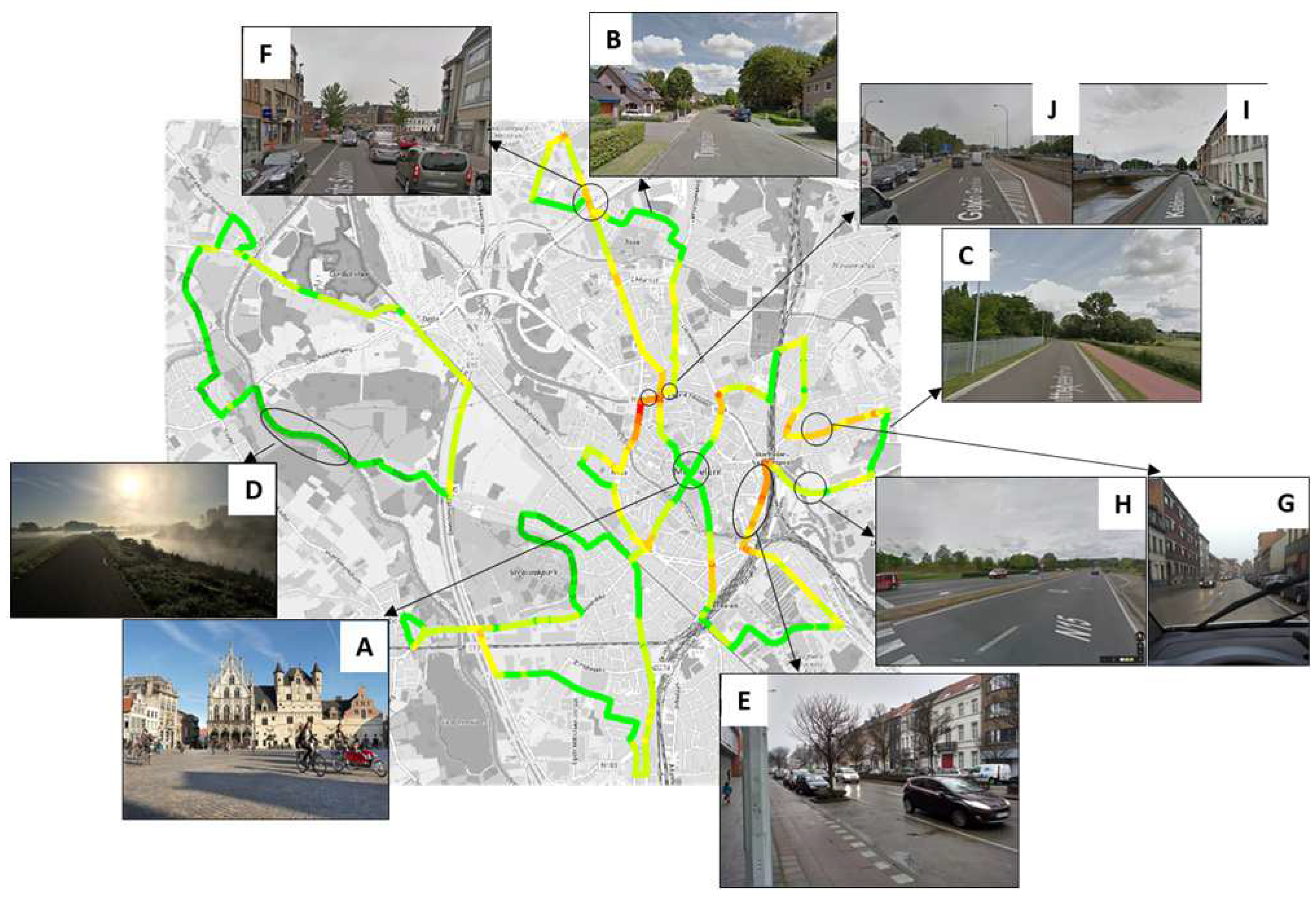
2.1.2. Description of the Measurement Campaign

Measurements were performed in different seasons, resulting in four measurement campaigns: Campaign 1 (October/November 2017), Campaign 2 (February/March 2018), Campaign 3 (June/July 2018) and Campaign 4 (September 2018). The meteorological conditions (air temperature, precipitation, windspeed and wind direction) during the four campaigns were compared to normal values from a 30-year reference period based on data from the Royal Meteorological Institute of Belgium (RMI). Air temperatures were (very) high for the time of the year during Campaigns 1 and 3 (about 2–3 °C higher) and low during Campaign 2 (about 2 °C lower). Precipitation was exceptionally low during large parts of Campaigns 1, 2 and 3. The wind conditions were normal for the times of the year, except for the dominance of a northerly wind in Campaign 3 when southerly winds are usually dominant. We do not expect that the differences in meteorological conditions that were observed during the individual campaigns compared to long-term averages for these times of the year will affect the representativity of the results because the measurements were performed over different seasons.
In each of the campaigns, 4 routes representing 4 different areas of the city were measured. The total combined distance of the four routes was roughly 40 km. The different routes are shown in Figure 1. In this way, each of the routes was measured within one hour and the measurements could be performed in a restricted time frame within traffic rush hours. The resulting concentration maps are considered a representative hourly average concentration over the peak hour measured. The route selection was made by local citizens and policymakers based on the guidance of air quality experts. This guidance included having a good mix of background locations and busy streets and variations in traffic intensities and street configurations.
During the first campaign, the South route was not measured simultaneously with the other three routes; the South route was measured from 23 October 2017 to 5 November 2017, prior to the other routes (North, East and West routes), which were measured from 6 November 2017 to 19 November 2017. During Campaign 3 (25 June–8 July 2018), only the North and East routes were measured because not enough volunteers were available.
Measurements were performed during the morning and evening rush hours. Repeated measurements are needed, as shown in previous publications [3,21]. Data experiments with a large dataset of 256 repeated runs showed that when 13 repetitions are performed, the BC concentrations can be assessed with a deviation of less than 50% at 90% of the 20 m road segments [3]. While the referenced study did not focus on rush hours, it does give some idea of the number of repetitions needed. In this study, we used approximately 25 repetitions (runs) for each route and campaign. Details on the number of measurements (in the morning and the evening) for the four routes over the different monitoring campaigns are given in Table 1. The aim of this study was to assess the air quality during peak traffic hours, so participants were instructed to carry out the mobile measurements between 8:00–9:00 and 17:30–18:30 local time. In practice, most measurements taken during the morning were started between 7:45 and 8:15, with some outliers. However, the time window for the evening measurements was slightly broader, between 16:45 and 17:45, as it was decided that it suited the volunteers better to start a bit later after a few days into the first campaign. Figure 2 shows the frequency distribution of the starting times for the measurements performed over the four routes and the four campaigns. Overall, the monitoring efforts were adequately aligned between the different teams of volunteers and over the four campaigns.
On four bicycle trips (runs), simultaneous measurements were taken with the aethalometer and the AirBeam for comparison (5 and 6 March 2018, morning and evening rush hours on both days, West route). The sensors were installed at identical positions.

2.1.3. Collected Dataset

Black carbon concentration measurements were collected by bicycle along four routes in four different campaigns over two weeks. A raw dataset of 1,110,771 geo-tagged measurements was collected. In the process of data validation and aggregation, the number of data points was drastically reduced to approximately 2300 data points per campaign. In the aggregation, geo-tagged measurements are attributed to fixed points that are 20 m apart from each other, and a trimmed mean of the collection of measurements per fixed point is calculated. The resulting dataset is overlaid onto a street map. For more details on the data processing (validation and aggregation), we refer to a previous paper [3]. For GPS data, we used the projection on predefined street segments of the route based on the shortest distance to correct for inaccurate GPS data. For the BC concentrations, we applied the ONA correction (see also Section 2.2) and used the trimmed mean per spatially aggregated point. We did apply a filter-loading correction but prevented high filter loading by frequently replacing the filter tickets (every six runs).
We did not apply any data validation on the PM2.5 data of the AirBeam that was collected on four of the routes.

2.1.4. Data Processing

The dataset of the four campaigns was used to assess two rescaling approaches: (i) to construct a ‘yearly average’ map representative of the peak rush hours by using a weighted average to aggregate the results, and (ii) to evaluate a rescaling strategy in order to better visualize the results of the individual campaigns.
Weighted averaging was performed to aggregate the results of the four different campaigns into one map of an estimated yearly average BC concentration during peak traffic hours. The virtual urban traffic station (see Section 2.2) was used as a reference since data from the mobile measurements were collected at street level, although some locations along the routes are more typical of an urban background. The weighting factors are proportional to the BC concentration during the campaigns in relation to the year-round BC concentration and are calculated as follows (pseudo-code):
  • Input:
    • BC data from the four mobile campaigns X = {X1, X2, X3, X4};
    • BC data for a virtual traffic station from the reference dataset of the Flemish Environment Agency, Y, for the period October 2017 until October 2018 (including the period from start X1 until end X4).
  • Output: Map of the estimated yearly average BC concentration during peak traffic hours from the mobile campaigns.
  • Method:
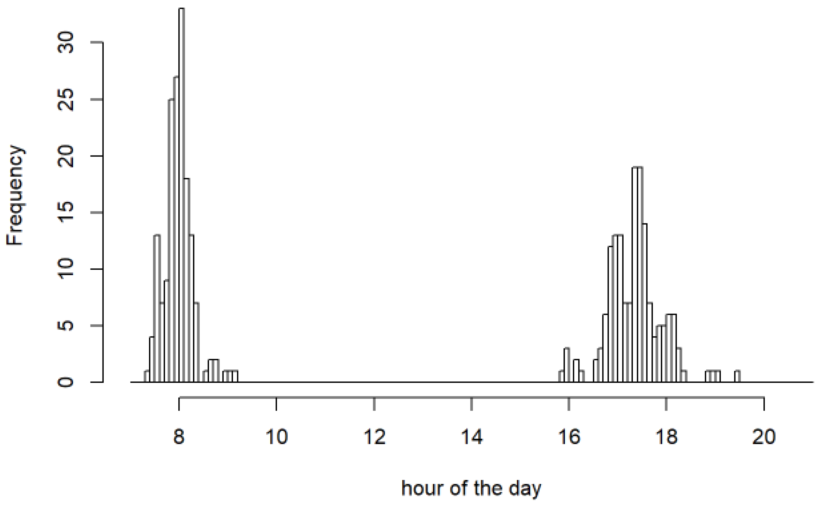
    • Subset Y (Ys) for the morning and evening rush hour measurements, in line with the hours of the day of the mobile monitoring (X, see Figure 2);
    • Calculate the weekly averages from Ys ( y ^ w , i for i = 1,…,52);
    • Calculate the averages from Xi ( x ^ i for i = 1, …, 4);
    • Calculate a frequency histogram of y ^ w , i in 0.5 µg m−3 bins;
    • Obtain the frequency of occurrence of the bins that coincide with x ^ i ( f i for i = 1, …, 4, F = f i );
    • Obtain a weighting ( w i for i = 1, …, 4) per campaign as f i / F ;
    • Apply these weighting factors to estimate the yearly average BC concentration ( w i X i ).
Subsequently, we tried a rescaling strategy to assess whether the measurements performed under different background concentrations or meteorological conditions would yield similar patterns when the concentrations at fixed monitoring stations are taken into account (see Section 2.2). For the period of each of the four mobile campaigns, the average BC concentration at the urban traffic AQMS was calculated ( y ^ U T , i for i = 1, …, 4). The yearly average BC concentration was calculated for the AQMS ( y ^ U T , y e a r ). The ratio of the yearly average to the campaign averages ( y ^ U T , y e a r / y ^ U T , i ) was used to rescale (multiply) the legend categories (lower and upper bounds) of the BC map of each of the four campaigns. Applying this method will not result in an additional bias of the resulting BC concentrations. Any relative bias between the AE51 and BC monitor of the AQMN is canceled out in the ratio ( y ^ U T , y e a r / y ^ U T , i ) and as a result, the rescaled values will have the same relative bias as the original data. Only when there is a large offset of the AE51 compared to the BC monitor of the AQMN can the rescaling introduce an additional bias and result in an over- or underestimation of the rescaled values. Previous studies showed that the AE51 corresponds well with the BC monitors of the AQMS, with acceptable slopes (0.83–1.13), an MAE below 0.3 μg/m3 after slope correction [3] and a relative bias of 1–4% [42]. No indications for a clear offset between the AE51 and the monitors of the AQMN were observed.

2.2. Air Quality Monitoring Stations and Data

The black carbon concentrations on the ‘virtual’ rural (R), ‘virtual’ urban background (UB) and ‘virtual’ urban traffic (UT) stations of the official monitoring network in Belgium (Figure 3) for the four different sampling seasons are summarized in Table 2. The term ‘virtual’ refers to the average concentrations of a selection of typical stations of this type; the stations included for calculating the average virtual station are N029 (Houtem) and N016 (Dessel) for the rural station, R803 (Park Spoor Noord), R801 (Borgerhout-achtergrond), R701 (Gent-Baudelo) and R817 (Antwerpen-Groenenborgerlaan) for the urban background and R802 (Borgerhout-straatkant), R805 (Antwerpen-Belgiëlei) and R702 (Gent) for the urban traffic station, respectively. The ‘virtual’ stations give an indication of the concentrations at a typical location without relying on just one station and these ‘virtual’ stations are also used in the Flemish Environment Agency’s annual reports [43]. The R817 station is categorized as a suburban station but is included here to calculate the ‘virtual’ urban background value.

2.3. Model

An integrated model chain, ATMO-Street, has been set up to assess the air quality at the local scale (street scale), including both regional variability as well as the local variation in sources of pollution. High-spatial-resolution air quality information is available for the Flemish region in Belgium from the ATMO-Street model chain at an hourly resolution. ATMO-Street starts with the regional background concentrations obtained by intelligent interpolation of the hourly observations from the monitoring network using land-cover data as a spatial driver. These background concentrations are combined, taking into account double counting, with the output of a dispersion model running on a dense, irregular receptor grid for the emissions from point sources and line sources, including traffic emissions, with a resolution of up to 15 m close to the emission sources. This output is coupled to a street canyon module to capture the street canyon increments. The model results at the receptor locations are interpolated to raster maps. This integrated model chain has been validated against many validation datasets (e.g., [44,45], validation reports from http://www.irceline.be/nl/documentatie/modellen/validatie, accessed on 16 June 2024). The citizen science data presented in this publication offer an additional validation target.

3. Results

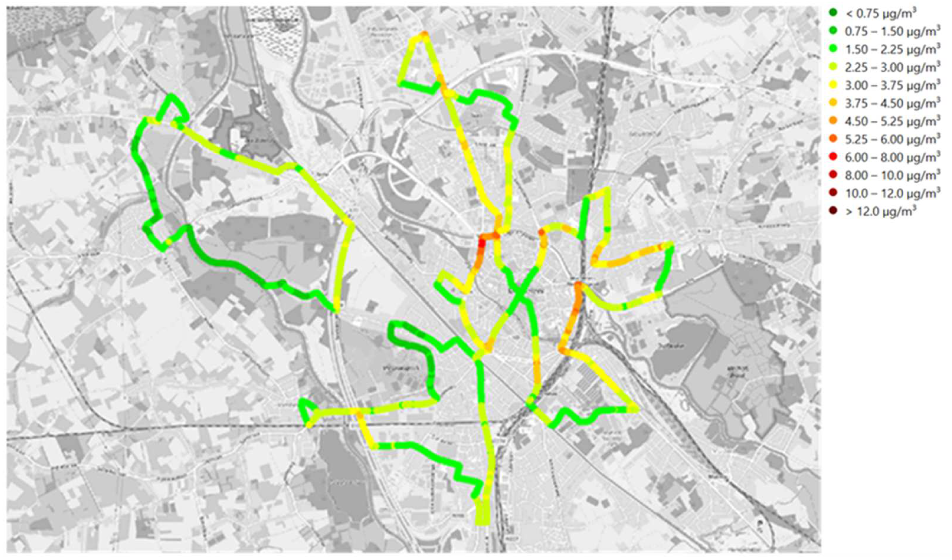
3.1. Black Carbon Concentration Maps

The maps of the four individual campaigns are shown in Figure 4. Each individual map represents the average BC concentration during the morning and evening rush hours over a two-week period. Concentrations are shown for every 20 m road segment. Note that in the third monitoring campaign (June/July), only two subroutes were included, as fewer volunteers could join during the summer holiday period. Table 3 summarizes the statistics of the four campaigns.
In the first monitoring campaign, one of the subroutes (South route) was not measured at the same time as the other three. Nevertheless, a comparison of the results of the measurement campaigns in the four different seasons showed that BC concentrations have strong spatial and temporal variabilities. The highest concentrations were measured in October–November 2017, and the lowest concentrations in June–July 2018. The difference in concentrations between the different measurement campaigns can be explained by the different background concentrations, different dispersion conditions and different emissions (additional sources in winter and less traffic in the summer months). Given the seasonal differences, the spatial patterns are similar between the different campaigns. However, when background concentrations and meteorological conditions result in low concentrations (Campaign 3), the spatial variability is less apparent with the same fixed color scale. Table 2 shows that the average BC concentration at the ‘virtual’ traffic station for Campaign 3 is lower than the average BC concentration at the ‘virtual’ urban background station for Campaigns 1, 2 and 4. Low concentrations during Campaign 3 are also due to a lower traffic volume in the holiday season. Therefore, the conditions during Campaign 3 are less suitable for assessing hot spots due to traffic.

3.2. Black Carbon Concentrations at AQMS

At the AQMSs, the highest concentrations were measured during the first measurement campaign (October–November 2017), and the lowest concentrations were measured in the third campaign (June–July 2018), which was during the summer holiday season (Table 2). The ‘virtual’ rural station showed similar concentrations (0.06 µg m−3 higher) during the second campaign (end of the winter season) compared to the first campaign. During the second and fourth campaigns, the concentrations at the ‘virtual’ urban background and the ‘virtual’ urban traffic stations were very similar, while at the ‘virtual’ rural station, the concentrations during Campaign 2 were higher. Concentrations at the UB and UT stations were around 25% lower during Campaign 2 and Campaign 4 compared to Campaign 1 or were reduced by 0.58 µg m−3 and 0.59 µg m−3 at UB, and 0.91 µg m−3 and 0.83 µg m−3 at UT, respectively. At the R station, concentrations were 5% and 35% higher for Campaign 2 and Campaign 4, respectively, when compared to Campaign 1, or they increased by 0.06 µg m−3 and reduced by 0.43 µg m−3, respectively. We observed that the higher concentration at the ‘virtual’ rural station during Campaign 2 was due to slightly higher concentrations at one of the two stations (N029) that were used to calculate the rural value; the higher value can be explained by an easterly (NE) wind direction during Campaign 2 compared to a westerly (SW–NW and SW, respectively) one during Campaign 1 and Campaign 4. In the third campaign, concentrations were more than 50% lower (56%, 63% and 58% at R, UB and UT, respectively) or reduced by 0.69 µg m−3 at R, 1.51 µg m−3 at UB and 1.93 µg m−3 at UT. Table 2 also shows the yearly average concentration for 2017 for a comparison. However, we can expect the yearly average during peak hours to be even higher. The averages of the four campaigns measured during peak hours are, respectively, 8%, 16% and 25% higher than the yearly average.

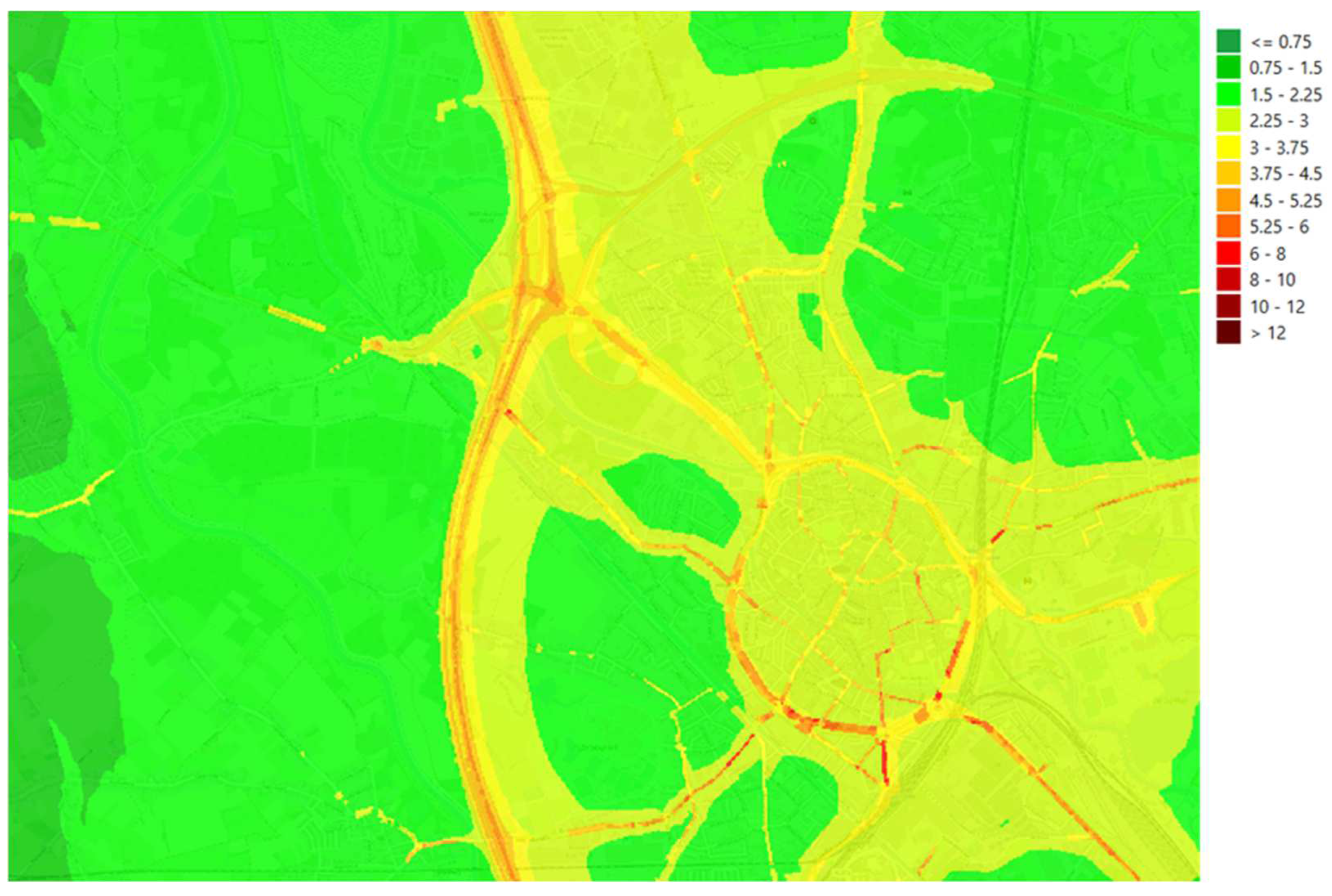
3.3. Aggregated and Rescaled Maps

The maps (Figure 4) show that the timing of monitoring can have a large impact on the result and that the monitoring effort can be optimized. On the one hand, the resulting map from Campaign 3 (June/July), for example, shows almost no spatial variability and is not as useful in identifying hot spots in the city. On the other hand, periods of low concentration and low spatial variability do occur and need to be accounted for when the monitoring campaign is aiming to acquire an estimate of the average concentrations over longer periods, e.g., a yearly average. The variability of the concentrations over time can also be seen from the results of the fixed monitoring stations. Table 2 shows large differences in the concentrations at the fixed monitoring stations over the four campaigns, and the trends observed at the UB and UT stations correspond to the trends of the average concentrations of the mobile measurements (Table 3): lower concentrations during Campaign 3, the highest concentrations during Campaign 1 and intermediate concentrations during Campaigns 2 and 4. The data from the fixed monitoring stations were used in the rescaling strategy presented here.
Two data processing methods have been applied (see Section 2.1.4) to create a yearly average map and a method to enhance the contrast for a more informative visualization of the individual campaign maps. The map of yearly average concentrations (Figure 5) aggregates the maps of the four campaigns into one single map, taking the differences in background concentrations during the campaigns into account.
For the rescaling of the individual maps, ratios of the yearly average to campaign averages for urban traffic were applied (Table 4), as explained in Section 2.1.4. The results of the rescaled maps for the different seasons (see Figure 6) show a better correlation between the different campaigns. Also, the rescaled maps provide better visualization of the spatial variability with concentrations of the entire color scale, and improvements can be observed for periods 1 and 3, especially.

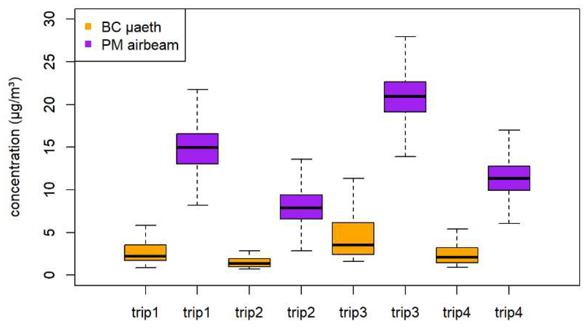
3.4. Comparison with Different Metric and Measurement Technology: BC by AE51 versus PM2.5 by AirBeam

The boxplots of the four bicycle trips (runs) where simultaneous measurements were taken with the aethalometer and the AirBeam are presented in Figure 7. The boxplots clearly show lower BC concentrations than PM concentrations, with BC included in the PM. The concentration trends between the different trips are similar for both pollutants, i.e., the median (and average) concentrations are ranked identically over the four trips for both (trip 3 > trip 1 > trip 4 > trip 2). A higher concentration range during the morning rush hour trips was observed for both pollutants. However, the BC measurements have a more skewed distribution than the PM measurements, with higher upper extremes compared to the majority of the data, whereas the PM concentrations show a more symmetrical distribution. This is explained by the higher contribution of local traffic to the BC measurements in contrast to the PM measurements, where traffic is also a contribution, but the background variations are more pronounced. This is also observed in the autocorrelation analysis, where the BC measurements show a much more rapid drop in the autocorrelation than the PM measurements. Again, this is explained by the more localized variations in BC. Overall, the correlation between the BC and PM measurements is about 0.3 (with a lower value of 0.15 for one of the trips), showing no clear linear trend between both.
To compare the spatio-temporal data collected by the two methods, the BC and PM measurements (of the four campaigns) were plotted using the same color scale based on percentiles (with five categories as follows: P0–20, P20–40, P40–60, P60–80 and P80–100). These maps show street sections where colors coincide but other sections where the colors indicate low BC and high PM values or vice versa (maps not shown in this paper).

3.5. Comparison with Model Results

The ATMO-Street model is applied to model the BC concentrations in Flanders in high resolution, including street canyon increments, at an hourly resolution. The model chain uses a variety of input data, including the BC observations at monitor stations, meteorological data and BC emissions from line sources such as traffic. The model validation was performed for the first campaign in 2017. The model results for the North, East and West routes are presented in Figure 8. The South route is also modeled but not shown in this figure. For details on the four routes, please refer to Figure 1. The modeled results showed similar patterns for the measured data (Figure 4).
The model clearly has a fair correlation with the measurements at background locations, where cyclists are not directly exposed to the exhaust from local traffic. The model appears to underestimate the peak concentrations observed at locations near dense areas. This is also shown by the scatter plots of all data and selected urban background data (Figure 9).
The scatter plots compare the average concentration levels from the two-week campaigns during the morning and evening rush hours for 20 m road segments with modeled BC concentrations for the same location and averaged for exactly the same hours. Data for the South route are plotted in blue, and the three other trajectories are in orange, as these were measured during a different two-week period. It must be mentioned that all mobile measurements are considered as an hourly average during peak hours over the measured days and are compared with the corresponding modeled hourly averages over the measurement days, whereas the measurements were only the result of a few seconds of sampling at each spot of every run.
The scatter plot shows that the ATMO-Street model concentrations are significantly lower than the measured values, except for the lower values, with a normalized mean bias of −24%, a relative root-mean-square error of 46% and a coefficient of determination of 0.34. Significant differences and scatter between the model and measurement results can be observed, as can be expected given the different time resolutions. A subset of background locations was selected and is presented in Figure 9. This is a subset of measurements in eight city parks, traffic-free zones and dead-end streets. The scatter plot shows a clear correlation between the model and the observations for this set of locations, with a normalized mean bias of 2% and a relative root-mean-square error of 16%.

4. Discussion

4.1. Comparison of Different Campaigns

Strong seasonal differences in the BC concentrations can be observed from a comparison of the maps over the four campaigns and from the summary statistics (Table 3). The seasonal variation, with the highest concentrations in Campaign 1 (end of the autumn season), the lowest concentrations during the summer season (Campaign 3), and intermediate concentrations in winter and at the end of the summer, are reflected in the maps and correspond to the measurements at the fixed monitoring sites of the air quality network. The seasonal differences in BC concentrations with higher concentrations on some days in winter and autumn are typical in the research area. As a consequence, maps were generated based on mobile monitoring to represent the situation when the data collection occurred. These maps cannot be generalized and interpreted using another time base, for example, interpreted as if it were a map of the yearly averaged concentration.
A similar conclusion can be drawn for the experienced variability within one day. As BC concentrations fluctuate during the day in accordance with the source, dilution and dispersal dynamics, the maps represent the situation at the hours of the day when the measurements were made. In this particular study, the maps represent average BC concentrations during morning and evening peak traffic hours. Maps of the nighttime concentrations, for example, would look completely different (lower concentrations, much less spatial variation).
For mobile monitoring of air pollution, it is advisable to restrict the monitoring to a predefined period of the year and predefined hours of the day. As such, the collected data are much less sparse and become easier to understand. As the greatest advantage of mobile monitoring in urban areas is being able to highlight streets and zones of high concentrations (hot spots) and low concentrations (background area), the most suitable hours of the day to perform the monitoring are the hours when contributions from local sources are the largest. For BC, this coincides with the rush hours when traffic volumes are highest. The amount of time spent on transport is one of the main determinants of personal exposure, and the traffic micro-environment can contribute largely to overall exposure. [20] Mobile monitoring during rush hours can, therefore, provide valuable information on the spatial variability of BC in relation to exposure.
Similarly, when selecting the best season to perform monitoring, the season with the highest local contribution is the most suitable. Holiday periods with significantly lower traffic volumes appear less useful in this sense. Following these suggestions, the outcome of the monitoring (e.g., BC concentration maps) is biased toward episodes of higher concentration and cannot be interpreted as maps of yearly averaged concentration, for example.

4.2. Rescaling

In this study, four monitoring campaigns were conducted, spread over different seasons. As discussed before, the aggregated map of Campaign 3 (June/July) shows almost no spatial variability, whereas the aggregated map of Campaign 1 shows so many hot spots that the spatial differences (especially in the North and East routes) are difficult to see. Could the results of these campaigns be aggregated to obtain a map of yearly average BC concentrations? Or is it possible to use rescaling so that campaigns performed over different seasons are comparable? Two approaches were evaluated: one in which the legend of the map from one season was rescaled based on the ‘virtual’ traffic station of the air quality monitoring network, and another where the ‘annual’ average of the map was constructed based on data from the fixed monitoring network.
The results from the rescaled maps for the different seasons show better correspondence between different campaigns. The rescaled maps also provide a better visualization of the spatial variability with concentrations of the entire color scale, and improvements can be observed for periods 1 and 3, especially. The rescaled map for Campaign 3 shows a better spatial variability along the ring road with hot spots in the NE, somewhat lower concentrations in the SE and lower concentrations in the W. Also, differences between two access roads, H and G (see also Figure 5), can be better distinguished, and the impact of stop-and-go traffic at location F is clearer. In addition, the impact of the car-free city center is more visible in the rescaled maps. The rescaled results of the first campaign also show a better spatial resolution, meaning that different parts of the ring road can be distinguished.
While the spatial patterns of different campaigns are very similar, the absolute values are still slightly different. This could partly be due to varying emissions, e.g., the period of Campaign 3 is typically characterized by less traffic due to the end of secondary school and the start of the holiday season. In the colder season, we can expect additional emissions from household heating.
An aggregated map based on measurements in different seasons results in a more representative picture. To assess the air quality in a city, it is recommended that measurements be taken in different seasons. However, this is not always possible due to constraints, such as the budget or availability of volunteers. In addition, meteorological conditions can result in extremely high or low concentrations and are not always known in the planning stages of the monitoring campaign. In addition, to assess hot spots in a city, one campaign may be sufficient as long as the situation when the measurements are taken is representative. For example, holiday seasons with reduced traffic should be avoided if the aim is to assess the impact of traffic, and when comparing different maps, these should always be interpreted on the basis of the ambient concentrations at fixed stations in relation to a reference, e.g., the yearly average.

4.3. Interpretation of Results with Respect to Mobility Planning

The map (Figure 10) shows a large difference in BC concentrations at street level. The results show the clear impact of traffic on the air quality. Relatively low concentrations are measured in the pedestrian zone in the city center (A), in residential areas (B) or on quiet roads (C) with only limited local traffic. Dedicated biking paths (separated from road traffic), in particular, show low concentrations (D), as observed in earlier studies [5]. In contrast, high concentrations are measured near the ring road (E) and locations with more stop-and-go traffic (F). However, the building environment and the distance of the biking path from the traffic also have a significant impact on the measured concentration and exposure. Small streets with high buildings (‘street canyons’) can show higher concentrations (G) compared to more open environments near busy traffic roads (H). In addition, the distance of the biking path from the traffic is also a significant factor. If the biking lane is separated from the traffic (e.g., by a river, such as in I), the cyclist’s exposure to BC is much lower than compared to a biking lane next to a busy road (J). When no biking lane is available, exposure is higher compared to a biking lane separated from road traffic. Below, the BC concentrations are interpreted with respect to the type of road categories in relation to the traffic circulation plan of the city.
The traffic circulation in the city has changed over recent years. Access to the city is gained via a number of entrance roads that end on the circular ring road. Nowadays, the city center is a low-traffic area as cars are not allowed in these streets between 11 am and 6 pm. There are also traffic-free streets in this area (e.g., the main pedestrian shopping street). Public transport buses are allowed to enter certain low-traffic and traffic-free streets. There are four circulation routes for traffic entering the city center. The entrances to and exits from the circulation routes are located on the circular ring route. Areas other than the low-traffic center are accessible from the circulation routes or directly from the ring road. This is a predominantly residential area. The majority of streets are one-way. There are also background areas near the city, e.g., a park in the southeast part of the city. Finally, the bicycle infrastructure includes bicycle streets, i.e., streets with a speed limit of 30 km h−1 where cars are not allowed to overtake cyclists. One of the three bicycle streets also functions as part of a traffic circulation loop.
Based on the traffic circulation plan, a number of categories were defined, including an access road, ring road, circulation street, low-traffic street, pedestrian street, bicycle street, residential area and background area. The streets and roads where the BC measurements took place were classified according to these categories. However, some streets could not be attributed to one of the categories and/or were not withheld for this analysis, for example, streets in neighboring villages. The average BC concentration was calculated for each of the categories based on all the data from the validated measurements of the four campaigns (Figure 11, showing the average values and SD); the aggregated dataset was used as described above.
The BC concentration is highest on the ring road (4.3 µg m−3), where two-by-two-lane traffic intensity is high and (mainly residential) buildings border the ring road, which likely causes the street canyon effect to some extent. The access roads to the ring road have markedly lower concentrations (3.3 µg m−3) on average (although the error bars do overlap). Here, the bicycle lane is often further away from the road, and some roads are much more open than the ring road with higher dispersion rates of BC pollution. The bicycle streets have remarkably high BC concentrations. Two reasons could probably explain this. Firstly, the fact that one of the bicycle streets is also used as an entrance street to the city center in a circulation loop; hence traffic intensity is quite high here. Secondly, there is a mix of bicycles and cars on this street, and cyclists often end up right behind a car near the exhaust. Of course, this issue would require additional research, but these data do suggest that bicycle streets may lead to increased exposure to traffic pollution when they are laid out in streets with high traffic intensity. The data do not allow an estimate to be made of what the traffic intensity threshold would be, and this is probably also very street-specific due to other influencing factors. Yet, it would appear to be beneficial to separate the entrance streets to the city center for bicycles and traffic.
The BC concentration in the residential area, where most streets are one-way, is 2.3 µg m−3 on average and is significantly lower than on the circulation streets. However, the BC concentration on low-traffic and traffic-free streets in the city is lower (1.8 µg m−3). City areas with decreased traffic intensities clearly benefit from these measures in terms of decreased air pollution and decreased exposure of residents and pedestrians. The background areas, such as a green park in this case, have the lowest BC concentration (1.5 µg m−3) and may represent ideal locations for leisure activities.

4.4. Comparison with Model Results

The results of the mobile measurements can be used for model validation. While model validation was not the main aim of this paper, we have shown that a mobile campaign, as presented here, can be useful for model validation, and we carried out an initial exercise using the results of Campaign 1. Validating the spatial resolution of model results is difficult due to the lack of measurements at a high spatial resolution. Often, diffusive samplers are used to validate model results (e.g., [43]). Mobile measurements of good data quality can be used to fill this gap. The results of Campaign 1 were used to evaluate the model results for the same time period. The ATMO-Street model was applied to model the BC concentrations in Flanders in high resolution, including street canyon increments, at an hourly resolution. As the model results for 2018 were not yet available, validation could only be performed for the first campaign in 2017 at the time of writing. The comparison shows that the model results are clearly correlated with the measurements at background locations without the direct impact of local traffic. The model appears to underestimate the peak concentrations observed at locations near dense traffic.
Several aspects of the modeling approach explain the differences observed in the measurements. The majority of the measurements are taken when cyclists are cycling along traffic lanes very close to the traffic or in between traffic. The bi-Gaussian modeling of local emissions applies an irregular receptor grid. This is a line-source-following grid, with the highest resolution close to emission sources and fewer receptor points at greater distances from the emission sources. Receptor points are located at least 15 m from the sources. Only at a distance from the source can the concentrations be well represented by a Gaussian profile. Furthermore, Gaussian models are not well-suited to explain concentration levels in the turbulent environment between road traffic. The concentration levels at the receptor points are converted to concentration maps using a TIN interpolation but will thus underestimate the concentrations on and next to the roads. Street canyon locations are modeled separately and yield concentration levels on the building façade. The measurements in canyons are much closer to the traffic in many locations. Additionally, the quality of the model output also depends on the quality of the model input. The traffic emissions are calculated based on traffic volumes and the traffic fleet. Some streets still have significant traffic volumes and are not captured. Furthermore, the traffic model yielding the traffic volumes is not fully up to date with the current traffic conditions. The city center of Mechelen has been changed to a zone with limited traffic by closing it to through-traffic and making several streets one-way. These recent changes are not captured in the traffic data. Some outliers are found at locations that are not treated as street canyons but where significant street canyon contributions can be expected. As these limitations affect the validation for locations with significant traffic volumes, an analysis for the set of locations at a significant distance from road traffic has been made.
However, mobile measurements also have drawbacks, and extreme conditions during the mobile measurements could also be the reason for a difference between the measurements and results. Therefore, it is better to compare model results and measurements of a high spatial resolution on a more aggregated level on different days. Despite the repeated measurements and the use of a trimmed mean, on some occasions, a remaining outlier can result in higher values, especially at road crossings when the number of data points used for the averages is limited. This was the case for one of the three outliers (BC measurements > 10 µg m−3 in Figure 11), whereas the two other outliers were representative values of very high average concentrations (the BC concentrations were >10 µg m−3 in 6–7 of the measurement runs).
The comparison with model results presented here should only be seen as a first attempt to examine the added value of mobile measurements in model validation. Further work on model validation with mobile measurements is planned when the data from other campaigns are available and will be a topic for future publication.

4.5. Mobile Measurements Using airQmap in Citizen Science Projects

The results show that mobile measurements can be used in citizen science projects. The participants of the CO can define the aim of the measurement campaign and the area that needs to be investigated. Next, researchers can assist in fine-tuning the research question even further into a scientifically validated measurement approach. After a short training session, citizens can perform the measurements. By using a scientifically validated measurement approach and instruments that provide high-quality data, results can be used by policymakers; in this study, the results were used to evaluate the current mobility plans. The resulting high-resolution maps can also be used for hot spot detection, personal exposure assessments, evaluations of other policy measures and validation of pollutant dispersion models. The resulting high-resolution maps can also justify the need for additional permanent stations within the AQMN.
Mobile monitoring, with the help of citizens, can complement fixed regulatory stations and can also complement low-cost fixed sensor networks. Low-cost sensor networks require maintenance and calibration efforts that may result in higher overall costs or lower data quality if this is not done properly. Because mobile monitoring only requires one (or a few) instrument(s) to measure a large study area, medium-grade instruments can be used, which can measure emerging pollutants and generate data of higher quality than low-cost sensors. Data quality is also relevant in CS projects because it is very important that participants know the value of the dataset in order to keep them engaged.
In this paper, we also compared the current tool, airQmap, which measures BC, with another low-cost tool, AirBeam, which measures PM. The main conclusion from this assessment is that BC and PM maps do not result in exact agreement.
In citizen science projects, the AirBeam cannot be used as a low-cost alternative for the micro-aethalometer, as they are simply two different tools. In a citizen science context, the benefit of the methodology for BC measurements is that BC measurements will provide a better visualization of the contribution that traffic makes to air pollution. The downside is the price of the sensor as well as the lack of interfacing and automated data visualization and sharing. The AirBeam is a tool that is embedded in a data management system, which makes it more useful for citizens. However, one should bear in mind that the PM maps that are generated only partly reflect the local traffic contribution and that background variations will have a greater impact.

5. Conclusions

This study used a mobile measurement approach to assess local differences in air quality in the city of Mechelen. Using a user-friendly measurement platform, airQmap, engaged people from the CO Meet Mee Mechelen were able to set the agenda, perform the measurements and discuss the results.
The results show that repeated measurements are needed and would preferably be performed in different seasons to obtain a representative result. If it is not possible to perform measurements in different seasons, it is recommended that the data be compared with fixed stations and rescaling applied in order to obtain a good indication of the hot spots and green zones.
The results of this CO are used to assess the current mobility plans in relation to the exposure of cyclists. The analysis shows that BC concentrations at the street level are highly impacted by traffic intensity and stop-and-go traffic, as well as proximity to traffic and the building environment (open versus street canyon).
The dataset from the first measurement campaign was used to validate a dispersion model and demonstrated that, in general, the model showed a good spatial representation. However, in some cases, the model underestimated the concentrations because of street canyons, slight misclassifications in location or missing traffic data. In addition, we should mention that the models can assess pollutant concentrations at street level but are not built to assess the concentrations between traffic flows due to possible higher turbulence, which cannot assessed by the model. In some cases, deviations between the measurements and the model are due to an overestimation of the concentration by the measurements due to the high impact of extremely high concentrations during one of the campaigns, despite using the trimmed mean.
Measurements were performed with a monitoring platform, airQmap, which is based on mid-grade instruments that are not low-cost. During a selection of the measurements, a low-cost PM sensor was compared with the current approach, and this comparison demonstrated that the BC measurements showed a larger variability in concentrations, which can be explained by the higher contribution of local traffic to the BC measurements in contrast to the PM measurements. The results of this study show that cyclists’ (and pedestrians’) exposure can be reduced by keeping traffic out of the city center, providing green cycling highways where there is no motorized traffic, trying to reduce the traffic in street canyons, increasing the distance between the street and the biking lanes and avoiding a mix of vehicles and cyclists in busy streets.
This paper shows that mobile measurements can be used by COs to assess the spatial variability of air quality in a city. The data can be used to assess mobility plans, evaluate the exposure of cyclists with respect to cycling infrastructure and validate models. However, it is important to use high-quality instruments and apply the correct measurement methodology (number of repetitions, season) in order to obtain meaningful data.

Author Contributions

Conceptualization, M.V.P., J.P. and S.V.; methodology, M.V.P., J.P. and S.V.; software, J.P. and W.L.; validation, S.V., J.P. and W.L.; formal analysis, J.P. and S.V.; investigation, J.V.L. and S.V.; resources, C.V. and B.V.; writing—original draft preparation, M.V.P., J.P. and S.V.; writing—review and editing, M.V.P., J.P., S.V. and J.H.; visualization, J.P., S.V. and W.L.; supervision, M.V.P.; funding acquisition, J.P. and S.V. All authors have read and agreed to the published version of the manuscript.

Funding

This research was partly funded by the European Union’s Horizon 2020 project Ground Truth 2.0, grant agreement No. 689744, and partly funded by the FLAMENCO project, a research project financially supported by Agentschap Innoveren & Ondernemen (VLAIO), contract number IWT-SBO 150044. This study is also supported by the European Union’s Horizon 2020 Green Deal project RI-URBANS project (Research Infrastructures Services Reinforcing Air Quality Monitoring Capacities in European Urban & Industrial Areas), grant agreement No. 101036245, and the methodology is further validated in the RI-URBANS project.

Institutional Review Board Statement

Not applicable.

Informed Consent Statement

Not applicable.

Data Availability Statement

The data that support the findings of this study are available from the corresponding author, M.V.P., upon reasonable request.

Acknowledgments

We are grateful to the volunteers of the CO Meet Mee Mechelen for their assistance in the collection of the mobile data and their interesting discussions. We would also like to thank all co-workers in the project for their assistance in the measurement campaign and the city of Mechelen for facilitating the project from the policy side.

Conflicts of Interest

The authors declare no conflicts of interest.

References

  1. Conrad, C.C.; Hilchey, K.G. A review of citizen science and community-based environmental monitoring: Issues and opportunities. Environ. Monit. Assess. 2011, 176, 273–291. [Google Scholar] [CrossRef] [PubMed]
  2. Lewis, A.; Edwards, P. Validate air pollution sensors. Nat. N. Comment 2016, 535, 29–31. [Google Scholar] [CrossRef] [PubMed]
  3. Van den Bossche, J.; Peters, J.; Verwaeren, J.; Botteldooren, D.; Theunis, J.; De Baets, B. Mobile monitoring for mapping spatial variation in urban air quality: Development and validation of a methodology based on an extensive dataset. Atmos. Environ. 2015, 105, 148–161. [Google Scholar] [CrossRef]
  4. Dons, E.; Laeremans, M.; Orjuela, J.P.; Avila-Palencia, I.; Carrasco-Turigas, G.; Cole-Hunter, T.; Anaya-Boig, E.; Standaert, A.; De Boever, P.; Nawrot, T.; et al. Wearable Sensors for Personal Monitoring and Estimation of Inhaled Traffic-Related Air Pollution: Evaluation of Methods. Environ. Sci. Technol. 2017, 51, 1859–1867. [Google Scholar] [CrossRef] [PubMed]
  5. Hofman, J.; Samson, R.; Joosen, S.; Blust, R.; Lenaerts, S. Cyclist exposure to black carbon, ultrafine particles and heavy metals: An experimental study along two commuting routes near Antwerp, Belgium. Environ. Res. 2018, 164, 530–538. [Google Scholar] [CrossRef] [PubMed]
  6. Peters, J.; Van den Bossche, J.; Reggente, M.; Van Poppel, M.; De Baets, B.; Theunis, J. Cyclist exposure to UFP and BC on urban routes in Antwerp, Belgium. Atmos. Environ. 2014, 92, 31–43. [Google Scholar] [CrossRef]
  7. Van Poppel, M.; Peters, J.; Levei, E.A.; Mărmureanu, L.; Moldovan, A.; Hoaghia, M.-A.; Varaticeanu, C.; Van Laer, J. Mobile measurements of black carbon: Comparison of normal traffic with reduced traffic conditions during COVID-19 lock-down. Atmos. Environ. 2023, 297, 119594. [Google Scholar] [CrossRef] [PubMed]
  8. Apte, J.S.; Messier, K.P.; Gani, S.; Brauer, M.; Kirchstetter, T.W.; Lunden, M.M.; Marshall, J.D.; Portier, C.J.; Vermeulen, R.C.H.; Hamburg, S.P. High-Resolution Air Pollution Mapping with Google Street View Cars: Exploiting Big Data. Environ. Sci. Technol. 2017, 51, 6999–7008. [Google Scholar] [CrossRef] [PubMed]
  9. Hofman, J.; Panzica La Manna, V.; Ibarrola-Ulzurrun, E.; Peters, J.; Escribano, M.; Van Poppel, M. Opportunistic Mobile Air Quality Mapping using Sensors on Postal Service Vehicles: From Point Clouds to Actionable Insights. Front. Environ. Sci. 2023, 2, 1232867. [Google Scholar] [CrossRef]
  10. Messier, K.P.; Chambliss, S.E.; Gani, S.; Alvarez, R.; Brauer, M.; Choi, J.J.; Hamburg, S.P.; Kerckhoffs, J.; LaFranchi, B.; Lunden, M.M.; et al. Mapping Air Pollution with Google Street View Cars: Efficient Approaches with Mobile Monitoring and Land Use Regression. Environ. Sci. Technol. 2018, 52, 12563–12572. [Google Scholar] [CrossRef]
  11. Wesseling, J.; Hendricx, W.; de Ruiter, H.; van Ratingen, S.; Drukker, D.; Huitema, M.; Schouwenaar, C.; Janssen, G.; van Aken, S.; Smeenk, J.W.; et al. Assessment of PM2.5 Exposure during Cycle Trips in The Netherlands Using Low-Cost Sensors. Int. J. Environ. Res. Public Health 2021, 18, 6007. [Google Scholar] [CrossRef]
  12. Blanco, M.N.; Bi, J.; Austin, E.; Larson, T.V.; Marshall, J.D.; Sheppard, L. Impact of mobile monitoring network design on air pollution exposure assessment models. Environ. Sci Technol. 2023, 57, 440–450. [Google Scholar] [CrossRef]
  13. Report to Congress on Black Carbon. Available online: https://19january2017snapshot.epa.gov/www3/airquality/blackcarbon/2012report/fullreport.pdf (accessed on 16 April 2024).
  14. Janssen, N.A.; Gerlofs-Nijland, M.E.; Lanki, T.; Salonen, R.O.; Cassee, F.; Hoek, G.; Fischer, P.; Brunekreef, B.; Krzyzanowski, M. Health Effects of Black Carbon; Technical Report; World Health Organization: Geneva, Switzerland, 2012. [Google Scholar]
  15. Brunekreef, B.; Strak, M.; Chen, J.; Andersen, Z.J.; Atkinson, R.; Bauwelinck, M. Mortality and Morbidity Effects of Long-Term Exposure to Low-Level PM2.5, BC, NO2, and O3, an Analysis of European Cohorts in the ELAPSE Project. Res. Rep. Health Eff. Inst. 2021, 2021, 208. [Google Scholar]
  16. Rovira, J.; Paredes-Ahumada, J.A.; Barceló-Ordinas, J.M.; García-Vidal, J.; Reche, C.; Sola, Y.; Viana, M. Non-linear models for black carbon exposure modelling using air pollution datasets. Environ. Res. 2022, 212, 113269. [Google Scholar] [CrossRef]
  17. Fung, P.L.; Savadkoohi, M.; Zaidan, M.A.; Niemi, J.V.; Timonen, H.; Pandolfi, M.; Alastuey, A.; Querol, X.; Hussein, T.; Petäjä, T. Constructing transferable and interpretable machine learning models for black carbon concentrations. Environ. Int. 2024, 184, 108449. [Google Scholar] [CrossRef] [PubMed]
  18. Kerckhoffs, J.; Hoek, G.; Vlaanderen, J.; van Nunen, E.; Messier, K.; Brunekreef, B.; Gulliver, J.; Vermeulen, R. Robustness of intra urban land-use regression models for ultrafine particles and black carbon based on mobile monitoring. Environ. Res. 2017, 159, 500–508. [Google Scholar] [CrossRef] [PubMed]
  19. Berghmans, P.; Bleux, N.; Int Panis, L.; Mishra, V.K.; Torfs, R.; Van Poppel, M. Exposure assessment of a cyclist to PM10 and ultrafine particles. Sci. Total Environ. 2009, 407, 1286–1298. [Google Scholar] [CrossRef]
  20. Dons, E.; Int Panis, L.; Van Poppel, M.; Theunis, J.; Wets, G. Personal exposure to Black Carbon in transport microenvironments. Atmos. Environ. 2012, 55, 392–398. [Google Scholar] [CrossRef]
  21. Peters, J.; Theunis, J.; Van Poppel, M.; Berghmans, P. Monitoring PM10 and ultrafine particles in urban environments using mobile measurements. Aerosol Air Qual. Res. 2013, 13, 509–522. [Google Scholar] [CrossRef]
  22. Van Poppel, M.; Peters, J.; Bleux, N. Methodology for setup and data processing of mobile air quality measurements to assess the spatial variability of concentrations in urban environments. Environ. Pollut. 2013, 183, 224–233. [Google Scholar] [CrossRef]
  23. Blanco, M.N.; Bi, J.; Austin, E.; Larson, T.V.; Marshall, J.D.; Sheppard, L. Characterization of Annual Average Traffic-Related Air Pollution Concentrations in the Greater Seattle Area from a Year-Long Mobile Monitoring Campaign. Environ. Sci. Technol. 2022, 56, 11460–11472. [Google Scholar] [CrossRef] [PubMed]
  24. Dekoninck, L.; Botteldooren, D.; Int Panis, L.; Hankey, S.; Jain, G.S.K.; Marshall, J. Applicability of a noise-based model to estimate in-traffic exposure to black carbon and particle number concentrations in different cultures. Environ. Int. 2015, 74, 89–98. [Google Scholar] [CrossRef] [PubMed]
  25. Kerkhoffs, J.; Hoek, G.; Gehring, U.; Vermeulen, R. Modelling nationwide spatial variation of ultrafine particles based on mobile monitoring. Environ. Int. 2021, 154, 106569. [Google Scholar] [CrossRef] [PubMed]
  26. Languille, B.; Gros, V.; Nicolas, B.; Honoré, C.; Kaufmann, A.; Zeitouni, K. Personal Exposure to Black Carbon, Particulate Matter and Nitrogen Dioxide in the Paris Region Measured by Portable Sensors Worn by Volunteers. Toxics 2022, 10, 33. [Google Scholar] [CrossRef]
  27. Apparicio, P.; Carrier, M.; Gelb, J.; Seguin, A.M.; Kingham, S. Cyclists’ exposure to air pollution and road traffic noise in central city neighbourhoods of Montreal. J. Transp. Geogr. 2016, 57, 63–69. [Google Scholar] [CrossRef]
  28. Jereb, B.; Batkovic, T.; Herman, L.; Sipek, G.; Kovse, S.; Gregoric, A.; Mocnik, G. Exposure to Black Carbon during Bicycle Commuting-Alternative Route Selection. Atmosphere 2018, 9, 21. [Google Scholar] [CrossRef]
  29. Hankey, S.; Marshall, J.D. On-bicycle exposure to particulate air pollution: Particle number, black carbon, PM2.5, and particle size. Atmos. Environ. 2015, 122, 65–73. [Google Scholar] [CrossRef]
  30. Kaminska, J.A.; Turek, T.; Van Poppel, M.; Peters, J.; Hofman, J.; Kazak, J.K. Whether cycling around the city is in fact healthy in the light of air quality–Results of black carbon. J. Environ. Manag. 2023, 337, 117694. [Google Scholar] [CrossRef] [PubMed]
  31. Okonen, E.O.; Yli-Tuomi, T.; Turunen, A.W.; Taimisto, P.; Pennanen, A.; Vouitsis, I.; Samaras, Z.; Voogt, M.; Keuken, M.; Lanki, T. Particulates and noise exposure during bicycle, bus and car commuting: A study in three European cities. Environ. Res. 2017, 154, 181–189. [Google Scholar] [CrossRef]
  32. Targino, A.C.; Rodrigues, M.V.C.; Krecl, P.; Cipoli, Y.A.; Ribeiro, J.P.M. Commuter exposure to black carbon particles on diesel buses, on bicycles and on foot: A case study in a Brazilian city. Environ. Sci. Pollut. Res. 2016, 25, 1132–1146. [Google Scholar] [CrossRef]
  33. Targino, A.C.; Krecl, P.; Danziger, J.E.; Segura, J.F.; Gibson, M.D. Spatial variability of on-bicycle black carbon concentrations in the megacity of Sao Paulo: A pilot study. Environ. Pollut. 2018, 242, 539–543. [Google Scholar] [CrossRef]
  34. Targino, A.C.; Gibson, M.D.; Krecl, P.; Rodrigues, M.V.C.; dos Santos, M.M.; Correa, M.D. Hotspots of black carbon and PM2.5 in an urban area and relationships to traffic characteristics. Environ. Pollut. 2016, 218, 475–486. [Google Scholar] [CrossRef]
  35. Betancourt, R.M.; Galvis, B.; Balachandran, S.; Ramos-Bonilla, J.P.; Sarmiento, O.L.; Gallo-Murcia, S.M.; Contreras, Y. Exposure to fine particulate, black carbon, and particle number concentration in transportation microenvironments. Atmos. Environ. 2017, 157, 135–145. [Google Scholar] [CrossRef]
  36. Lonati, G.; Ozgen, S.; Ripamonti, G.; Signorini, S. Variability of Black Carbon and Ultrafine Particle Concentration on Urban Bike Routes in a Mid-Sized City in the Po Valley (Northern Italy). Atmosphere 2017, 8, 40. [Google Scholar] [CrossRef]
  37. Wehn, U.; Almomani, A. Incentives and barriers for participation in community-based environmental monitoring and information systems: A critical analysis and integration of the literature. Environ. Sci. Policy 2019, 101, 341–357. [Google Scholar] [CrossRef]
  38. Gharesifard, M.; Wehn, U.; van der Zaag, P. Context matters: A baseline analysis of contextual realities for two community-based monitoring initiatives of water and environment in Europe and Africa. J. Hydrol. 2019, 579, 124144. [Google Scholar] [CrossRef]
  39. Hagler, G.S.; Yelverton, T.L.; Vedantham, R.; Hansen, A.D.; Turner, J.R. Postprocessing method to reduce noise while preserving high time resolution in Aethalometer real-time black carbon data. Aerosol Air Qual. Res. 2011, 11, 539–546. [Google Scholar] [CrossRef]
  40. Singer, B.C.; Delp, W.W. Response to consumer and research grade indoor air quality monitors to residential sources of fine particles. Indoor Air 2018, 28, 624–639. [Google Scholar] [CrossRef]
  41. Hofman, J.; Lazarov, B.; Stroobants, C.; Elst, E.; Smets, I.; Van Poppel, M. Portable Sensors for Dynamic Exposure Assessments in Urban Environments. State Sci. 2024, preprint. [Google Scholar] [CrossRef]
  42. Van den Bossche, J.; De Baets, B.; Botteldooren, D.; Theunis, J. A spatio-temporal land use regression model to assess street-level exposure to black carbon. Environ. Model. Softw. 2020, 133, 104837. [Google Scholar] [CrossRef]
  43. Jaarrapport Lucht. Emissies 2000–2016 en Luchtkwaliteit 2017. Available online: https://www.vmm.be/bestanden/VMM-2017-LKT_TW.pdf (accessed on 16 April 2024).
  44. Lefebvre, W.; Van Poppel, M.; Maiheu, B.; Janssen, S.; Dons, E. Evaluation of the RIO-IFDM-street canyon model chain. Atmos. Environ. 2013, 77, 325–337. [Google Scholar] [CrossRef]
  45. Hooyberghs, H.; Lefebvre, W.; Vranckx, S.; Maiheu, B.; Trimpeneers, E.; Vanpoucke, C.; Janssen, S.; Meysman, F.; Fierens, F.; De Craemer, S. Validation and optimization of the ATMO-Street air quality model chain by means of a large-scale citizen-science dataset. Atmos. Environ. Int. J. 2022, 272, 118946. [Google Scholar] [CrossRef]
Figure 1. Street map of Mechelen with the four different routes.
Atmosphere 15 00757 g001
Figure 2. Frequency distribution of the starting time of all measurements (4 campaigns and 4 subroutes).
Atmosphere 15 00757 g002
Figure 3. Daily average BC concentrations at the ‘virtual’ rural background (blue), urban background (green) and urban traffic (red) monitoring stations in Belgium for the years 2017 and 2018. The four campaigns of mobile BC monitoring are indicated in gray.
Atmosphere 15 00757 g003
Figure 4. BC concentration maps from four monitoring campaigns: Campaign 1 (October–November 2017, top left), Campaign 2 (February–March 2018, top right), Campaign 3 (June–July 2018, bottom left), Campaign 4 (September 2018, bottom right). The dimensions of the maps are approximately 11 km × 10 km.
Atmosphere 15 00757 g004
Figure 5. Map of the estimated yearly average BC concentration during peak hours calculated as a weighted average over the different campaigns.
Atmosphere 15 00757 g005
Figure 6. BC concentration maps from four rescaled monitoring campaigns (same scale as Figure 4): Campaign 1 (October–November 2017, top left), Campaign 2 (February–March 2018, top right), Campaign 3 (June–July 2018, bottom left) and Campaign 4 (September 2018, bottom right).
Atmosphere 15 00757 g006
Figure 7. Boxplots for the four BC and PM runs measured on the West route during Campaign 2. The black line in the boxes represents the median, the vertical size of the box is the interquartile range (IQR). Whiskers extend to minimum and maximum values not exceeding 1.5 times the IQR from the median.
Atmosphere 15 00757 g007
Figure 8. Modeled results for Campaign 1 (North, East and West routes).
Atmosphere 15 00757 g008
Figure 9. Scatter plots of the BC ATMO-Street model concentrations against the BC measurements for all locations (left) and urban background locations only (right) in Mechelen, Belgium, in October–November 2017. The southern trajectory is plotted in blue, as it had been measured two weeks earlier. The blue line represent the 1:1 line. Units: µg m−3.
Atmosphere 15 00757 g009
Figure 10. BC concentration map from monitoring Campaign 4 with some pictures of typical situations relating to traffic and the environment (same scale as Figure 5).
Atmosphere 15 00757 g010
Figure 11. Average BC concentrations from bicycle measurements in different categories of roads and streets.
Atmosphere 15 00757 g011
Table 1. Overview of the number of runs (morning or evening) for the different campaigns and the different routes.
Campaign 1
Morning/Evening
Campaign 2
Morning/Evening
Campaign 3
Morning/Evening
Campaign 4
Morning/Evening
North11/1111/1212/1412/11
East11/1313/1012/1112/12
South13/14 (a)10/9-11/10
West11/1311/11-12/12
All12/1313/1214/1412/12
(a) Measurements at this route were not performed simultaneously with the other routes during this campaign and are not included in the ‘Total’ number of runs in the campaign.
Table 2. Average BC concentrations at the ‘virtual’ rural background, urban background and urban traffic monitoring stations in Belgium during the four different campaigns.
Concentration (µg m−3)Rural
(R)
Urban Background
(UB)
Urban Traffic
(UT)
Campaign 1 (a)1.242.413.31
(1.17)(1.86)(2.69)
Campaign 21.301.832.41
Campaign 30.550.901.38
Campaign 40.801.822.48
Annual average 20170.91.51.9
(a) Numbers between brackets are average concentrations during the measurements at the South route, which was performed just before the other three subroutes.
Table 3. Summary statistics of the BC concentrations (µg m³) from mobile measurements in four campaigns.
Min.First Qu.MedianMeanThird Qu.Max.
Campaign 11.02.43.33.74.712.4
Campaign 21.32.02.32.52.910.5
Campaign 30.50.91.21.41.76.2
Campaign 40.51.82.52.53.18.3
Table 4. Ratio of the yearly average BC concentration to ‘campaign average’ BC concentrations during measurement hours at ‘virtual’ rural background (R), urban background (UB) and urban traffic (UT) monitoring stations in Flanders during the four different campaigns.
Ratio (Yearly av./Campaign av.)RUBUT
Campaign 10.730.620.57
Campaign 20.690.820.79
Campaign 31.641.661.38
Campaign 41.120.820.77
Disclaimer/Publisher’s Note: The statements, opinions and data contained in all publications are solely those of the individual author(s) and contributor(s) and not of MDPI and/or the editor(s). MDPI and/or the editor(s) disclaim responsibility for any injury to people or property resulting from any ideas, methods, instructions or products referred to in the content.

