Abstract
Effective scheduling in construction is crucial for ensuring timely project completion and maintaining budget control. Scheduling programs play an important role in this process by providing digital tools to develop, monitor, and adjust project timelines effectively. In the industry’s current method of practice, tabular scheduling programs are utilized that require users to enter task information and their relationships in a tabular format. Recently, a new scheduling program approach called visual scheduling has emerged that requires users to draw the network diagram to create the schedule. This paper presents an experimental study that evaluated the efficiency of schedule creation using a visual scheduling program compared to two tabular scheduling programs. The results show that the time spent creating a schedule using the visual scheduling program was significantly shorter than using tabular scheduling programs. Participants found visual scheduling easier to define tasks, define correlations, spot mistakes in the schedule, make changes to the schedule, and understand the overall schedule. The majority of the participants reported visual scheduling as a tool that allowed them to create schedules faster. They also found it to be a more intuitive scheduling tool and a method that can reduce the possibility of making mistakes during scheduling.
1. Introduction
Successful project execution relies heavily on strong project management, with scheduling serving as a key element. Scheduling is essential to ensure projects are executed as planned making it a foundational aspect of project management and analysis [1]. By offering a detailed timeline for project deliverables, scheduling helps in structuring tasks to keep them organized and manageable [2]. Without effective scheduling, project timelines can become unpredictable, resulting in hurried tasks and comprised quality [3]. In the world of project management, computer applications play an increasing role in project deliveries. To support the complexities of organizing, planning, and managing resources, Project Management Software (PMS) packages are indispensable. These tools not only handle scheduling and budgeting but also facilitate resource assignment resulting in cost-optimal scheduling [4] and surpassing manual methods in performance [5]. The adoption of PMS has become progressively prevalent across various industries due to its significant advantages. An increasing number of companies acknowledge the advantages of systematic project management, such as reduced costs, enhanced efficiency, improved satisfaction among customers and stakeholders, and a higher competitive advantage in the industry [6].
Construction projects are known for their substantial complexity and high levels of risk, often leading to extended timelines and multiple phases. The inherent unpredictability of these projects often causes errors, risks, and modifications due to the involvement of various stakeholders and the nature of construction work plans. Consequently, the use of PMS is crucial in the construction industry to manage these challenges effectively [7]. The most commonly reported factors influencing the use of PMS are the size and complexity of projects, which compel project management professionals to adopt these tools more extensively [8]. Consequently, some small and medium-scale construction companies confront various issues such as inefficient planning, project delays, and inefficiency of resources due to reluctance to adopt digital tools [9]. As huge users of PMS, construction industry professionals are interested in improving the tools and techniques available for better project planning and control [10]. However, not all users are concerned with the most sophisticated package with advanced tools and features. They mostly look for programs that allow them to produce simple time charts, simple resource and cost analyses, and basic reports [11]. Studies have demonstrated success in implementing PMS in construction projects for scheduling in residential [12,13] and commercial projects such as hotels, schools, and high-rise buildings [14,15,16]. These packages have shown success in resource allocation and leveling in schedules [17]. Selecting the appropriate PMS to use is crucial as it significantly impacts project efficiency and control [18], which has motivated researchers to evaluate them based on various project management criteria [19]. A survey conducted with eighty construction professionals in 2020 revealed relatively low user satisfaction with available PMS packages as they do not integrate all the construction aspects, making it difficult for construction companies to select the most appropriate software. Some participants indicated using more than one package to address their project needs [20].
In the realm of project management, visual explanations and tools can demonstrate their profound impact on enhancing understanding and efficiency. Translating verbal information from the text into a visual explanation can promote deeper processing of the material and more complete and comprehensive mental models [21]. Visual representations ensure all components of a system are included and work together properly, promoting overall coherence and effectiveness in achieving project goals [22]. Visual approaches not only aid in mastering complex systems but also facilitate better project scheduling and management practices, as the clarity and depth of understanding are significantly enhanced through visual means.
In contrast to purely symbolic words, visual communications can convey some content and structure directly [23]. A sketch can enable designers to visualize new configurations and generate ideas that may not have been anticipated during the initial creation [24]. This capability is crucial in project management, where diagrams and sketches facilitate inferences by leveraging physical features, such as proximity, angle, and connectivity, and capture complex relations between components [25]. Problem-solving can proceed through a smooth transit of the diagrams [26]. Therefore, as the construction industry increasingly adopts PMS, the integration of visual tools and methodologies becomes essential, not only for improving project efficiency and control but also for enhancing learning outcomes and problem-solving capabilities in project scheduling.
One of the methods for visualizing schedules is the Gantt chart, which originated with Gantt’s work during the First World War [27]. It was introduced as a production planning tool but not adopted for widespread use in construction management until the 1980s [28]. Gantt charts are simple bar charts displayed on a time scale, where each bar represents a task with its start and end times indicated by the bar’s edges [29]. It is the most common visual method for scheduling because it is easy to prepare, read, and understand [30]. Consequently, early PMS packages allowed users to present their results in the form of Gantt charts [31,32], which are still used in current packages. Despite their readability and simplicity, they have various disadvantages for large projects, including the lack of precedence relationships between the tasks [33]. Thus, they are not ideal as primary tools for project monitoring and management [28].
The Critical Path Method (CPM) was developed by Du Pont and UNTVAC in 1957. Since then, it has become a very popular tool for scheduling complex and large projects, which is the basis for the analysis of most PMS packages [34]. This method is based on a network diagram, which is the most popular visual platform for presenting project schedules [28,35]. Network diagrams feature nodes, arrows, and labels to represent task durations and logical constraints. The activity-on-node (AON) method is the most common form of network diagram representation, where nodes denote tasks and arrows illustrate the logical relationships between them [28]. Analyzing this diagram identifies the critical path, which is the longest path from the start to end milestones and indicates the minimum time required to complete the project [34]. Although the Gantt chart lacks the ability to represent logical dependencies compared to the network diagram, it is one of the most powerful tools used in the industry. Based on a series of interviews conducted with project managers in 2024, the Gantt chart was reported to have a crucial role in project management by offering a clear visualization of the project schedule, enabling team members to easily understand timelines, making it indispensable for effective project management [36]. According to a survey of seven hundred fifty project managers in 2008, the Gantt chart was the fourth most frequently used tool out of seventy different project management tools and techniques, while the network diagram was ranked forty-second [37].
The majority of the current commercially available PMS packages, such as Microsoft Project [38], Oracle Primavera P6 [39], and Procore [40], use the tabular scheduling method. Users enter data such as task and constraint information in a tabular format, and the program generates a Gantt chart next to the table by default settings. With advances in technology, most recently, PMS packages have been developed based on the visual scheduling method, which allows users to draw the network diagram to create the schedule. In the current method of practice in the industry, before entering any data into the programs, contractors draw network diagrams to brainstorm project schedules by using sticky notes on the board that show the tasks and their duration and draw lines between them to show the relationships [41,42]. This brings up the question of whether the visual scheduling method in PMS packages could be more efficient for creating schedules as it mirrors the way professionals perform scheduling in practice. This study aimed to examine the efficiency of the visual scheduling methods for schedule creation without the consideration of cost or resource constraints.
2. Materials and Methods
To evaluate the efficiency of the visual scheduling compared to the tabular scheduling method, an experiment was conducted with one visual and two tabular scheduling programs. The two tabular scheduling programs in this study were among the most frequently used programs in the construction industry and were set as the comparison baseline. A start-up company provided the visual scheduling program. In this paper, all three program names are kept anonymous; the visual scheduling program is called “Vis”, and the two tabular scheduling programs are called “Tab1” and “Tab2”. The experiment required participants to create schedules for three comparable project scenarios with all three programs assigned randomly. The time participants took to complete each scenario was measured for quantitative analysis. The user feedback on their experience with each program and their comparison was collected with questionnaires. The following sections provide detailed information about the participants, experimental setup, scenarios, questionnaires, and experimental procedure.
2.1. Participants
The study involved 55 graduate students enrolled in the CMGT 650 construction project management, planning, and scheduling course in the construction management master’s program at California State University, East Bay. The average age was 25 years, with 30.9% female and 69.1% male. The majority of the participants, 92.7%, had a bachelor’s degree in architecture, engineering, or construction (AEC). They had an average of two years of AEC industry experience. Among the participants, 21.8% had prior experience using Tab1, 16.3% with Tab2, and 12.7% had used visual scheduling programs similar to Vis. Throughout the semester, participants were trained on using Tab1, Tab2, and Vis in lab sessions for 9 weeks and completed assignments with these programs. They were also required to submit a team project using all three programs. This ensured that participants were well-prepared to work with these scheduling programs by the time of the experiment, which was the end of the semester.
2.2. Experiment Setup
The experiment took place in a computer laboratory with Tab1 and Tab2 installed. Participants were provided access to Vis through individual user accounts. Computers had access to the internet and allowed participants to log into Vis, a cloud-based program. Programs Tab1 and Tab2 have relatively similar tabular interfaces. The task names are entered into one column, and the information correlated to the tasks can be seen on the row in front of each task name cell. The duration and correlation of each task with others are entered in a tabular interface. With the default settings, these programs generate a Gantt chart next to the table. To view the network diagram, users need to change the settings to see it in another interface. On the other hand, the visual scheduling program Vis requires users to draw the network diagram on an empty digital page by utilizing drawing tools to create the schedule. Users define tasks by drawing a shape and typing the task name within the shape. They define the correlation between the tasks by drawing an arrow between the task shapes and entering the correlation information. To view the Gantt chart, users need to change the settings to see it in another interface that includes a table of task information similar to tabular scheduling programs. Participants were asked to use all the programs in an auto-schedule setting, meaning the programs automatically created the schedule as the information was entered.
2.3. Scenarios
Three scheduling scenarios, Sc1, Sc2, and Sc3, were designed to mirror one another in complexity. Each scenario consisted of the same number of activities, each activity with the same duration and with similar network relationships, lags, and relationship types. However, the scenarios differed in the sequencing of activities, resulting in different end dates. All scenarios had start and end milestones, along with 10 activities named with letters. This way, the time spent on typing the activity names was the same for all scenarios. Each activity had the same duration of 5 days, milestones had a duration of zero, and the lag duration was the same for all scenarios. As a result, the impact of entering a wrong activity or lag duration on the end date was minimized, meaning participants mainly had to check their relationship definitions in the programs to find possible scheduling mistakes. There were four different types of activity relationships: finish to start (FS), fish to start with a lag (FS + L), start to start with lag (SS + L), and finish to finish (FF). All scenarios had 15 relationships, where 9 of them were FS, 2 of them were SS + L, 3 of them were FS + L, and one of them was FF. All scenarios had a start date of 1 February 2024. To assist in validating the accuracy of the schedule, the end date was given to the participants. Participants were given the description of the scenarios on paper with no network diagram. They had the option to draw the network diagram next to the description; however, it was not mandatory. The descriptions of the scenarios are as follows.
2.3.1. Scenario 1
After the Notice to Proceed (start milestone), activities A and B can start (FS). Activity C will start one day after activity B starts (SS + 1). Activity D starts after activity C is finished (FS). Activity E will start two days after activity B is finished (FS + 2). Activity F will start two days after activity D is finished (FS + 2). Activities G and I will start once activity A is finished (FS). Additionally, activities G and I must finish at the same time (FF). Activity H starts one day after activity I starts (SS + 1). Activity J will start two days after activity H is finished (FS + 2) and after activity G is finished (FS). The Project Closeout (end milestone) (project closeout) will be completed once activities F, E, and J are finished (FS). After the completion of this schedule with the assignment program, the end date of February 26, 2024 (26 February 2024) will be reached. Figure 1 shows the network diagram created based on the description of the first scenario, Sc1.
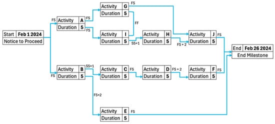
Figure 1.
The network diagram of the first scenario, Sc1.
2.3.2. Scenario 2
After the Notice to Proceed (start milestone), activity A can start (FS). Activities B and C will start once activity A is finished (FS). Additionally, activities B and C must finish at the same time (FF). Activity D will start two days after activity C finishes (FS + 2). Activity E will start one day after activity D starts (SS + 1). Activity F will start two days after activity E finishes (FS + 2). Activity G will start after activity B is done (FS). Activity H will start two days after activity G is over (FS + 2). Activity I will start one day after activity G starts (SS + 1). Activity J will start after activity I and H are finished (FS). The Project Closeout (end milestone) will be completed once activities J, D, and F are finished (FS). After the completion of the schedule with the assigned program, the end date of 8 March 2024 (03/08/2024) will be reached. Figure 2 shows the network diagram created based on the description of the second scenario, Sc2.
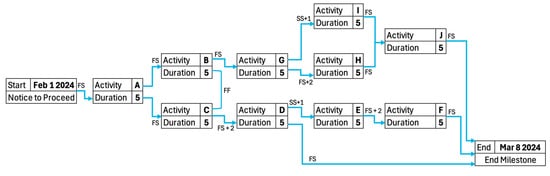
Figure 2.
The network diagram of the second scenario, Sc2.
2.3.3. Scenario 3
After the Notice to Proceed (start milestone), activity A can start (FS). Activity B will start one day after activity A has started (SS + 1). Activities C and E will start after activity B finishes (FS). Additionally, activities C and E must finish at the same time (FF). Activity D will start two days after activity C is finished (FS + 2). Activity F starts after Activity E finishes (FS). Activity G will start after activity A is finished (FS) and 2 days after activity F is finished (FS + 2). Activity H will start one day after activity A has started (SS + 1). Activity I will start two days after activity H is finished (FS + 2). Activity J starts after activities D and I are finished (FS). The Project Closeout (end milestone) will be completed once activities G and J are finished (FS). After the completion of the schedule with the assigned program, the end date of 4 March 2024 (03/04/2024) will be reached. Figure 3 shows the network diagram created based on the description of the third scenario, Sc3.
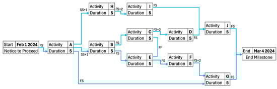
Figure 3.
The network diagram of the third scenario, Sc3.
2.4. Questionnaires
A Personal Information questionnaire was designed to ask participants to specify their age, gender, bachelor’s degree, and previous experience with scheduling. The statistical information provided in Section 2.1. Participants are based on the data collected from this questionnaire. To gather participant feedback on their experience using visual and tabular scheduling programs, a total of five questionnaires were designed. Three questionnaires were tailored for each individual scheduling program, referred to as Individual Platform Reflection questionnaires, while two questionnaires were designed to compare the visual with each tabular scheduling program, referred to as Platform Comparison questionnaires.
To define the key functionalities of the program for the purpose of evaluation in these questionnaires, the scheduling process, as well as the overall understanding of the schedule from the perspective of project management, were considered. The steps to create a schedule are (1) define tasks, (2) order tasks based on activity sequencing, (3) establish task relationship, (4) determine task duration, (5) assign resources and budget, (6) process the schedule based on the scheduling method, such as CPM [43]. Since before entering data into the scheduling program, the task order and duration are determined by construction professionals [41,42], steps 2 and 4 were eliminated from consideration. Additionally, this study did not consider resource and budget constraints, eliminating the consideration of step 5. Participants were asked to use the programs in an auto-schedule setting, and the program processed the schedule. Consequently, two key functions of (a) define tasks and (b) define correlations were selected based on the scheduling process. To perform quality control, users check their schedule for mistakes and make changes to the schedule upon spotting them. As a result, two functions of (c) make changes to schedule, and (d) spot mistakes were selected. Finally, the last selected criterion was (e) understanding the overall schedule. These five key functions were the evaluation factors in all the questionnaires.
2.4.1. Individual Platform Reflection Questionnaires
These questionnaires were given to participants upon completion of scheduling with the program assigned to them. The questionnaires were named Platform Reflection Vis, Platform Reflection Tab1, and Platform Reflection Tab2. Each questionnaire consisted of two sections, multiple choice and written. The first section aimed to gauge users’ ease of use across five key functionalities of a scheduling program. Participants were asked to specify to what extent the assigned program was challenging during the scheduling to (1) define tasks, (2) define correlations, (3) spot mistakes in their schedule, (4) make changes to the schedule, and (5) understand the overall schedule. The options provided in these multiple-choice questions were (a) very easy, (b) easy, (c) medium, (d) challenging, and (e) very challenging. The written section allowed participants to specify features that influenced their scheduling process, including those that expedited schedule creation, caused challenges, and supported overall understanding of the schedule.
2.4.2. Platform Comparison Questionnaires
There were two sets of Platform Comparison questionnaires called “Platform Comparison Vis vs. Tab1” and “Platform Comparison Vis vs. Tab2”. They were given to participants at the end of the experiment, following the completion of scheduling tasks with all three programs and subsequent feedback submission through the respective Individual Platform Reflection questionnaires. Each of these questionnaires comprised two sections, multiple choice and written, that were designed to gather insights into participants’ preferences and experience with the scheduling platforms. The first question in the multiple-choice section aimed to identify the platform that provided the most assistance across five key functionalities of a scheduling program. Participants were asked to specify the program that helped them the most during the scheduling to (1) define tasks, (2) define correlations, (3) spot mistakes in their schedule, (4) make changes to their schedule, and (5) understand the overall schedule. Subsequently, the second question sought to ascertain participants’ platform preferences in terms of (6) speed: creating schedule faster and (7) intuitiveness for schedule creation. The third question sought to determine which platform participants deemed more trustworthy in the event of conflicting outcomes between the two programs for the same schedule. For this purpose, participants were asked if they created the same schedule with both of the programs and ended up with two different end dates, which program would they trust more to not make a mistake during scheduling. These three questions gave participants the option to select either of the two programs they compared or state that both programs were the same based on the functions questioned. The first question in the written section asked participants to specify the reason behind their platform selection for trustworthiness based on their response to the last question of the multiple-choice section. The following two questions asked them to specify the features of each platform that they preferred over the other by writing them down in their own words.
2.5. Procedure
Before the start of the experiment, a sample scenario similar to the experiment scenarios was provided to the participants along with the instructions to allow them practice and familiarize themselves with the assignment. Each participant was then randomly assigned to one of the three programs in a way that one-third of the participants started with Vis, one-third with Tab1, and the rest with Tab2. Upon assignment of the scheduling program, participants were asked to log in to the respective program and the university’s web-based learning management system, Canvas [44]. The experiment was designed as a quiz on Canvas that collected the submissions of the students and measured the duration it took them to finish each scenario. All participants started with the first scenario, Sc1. Once logged in and ready, the research team worked with each participant individually to ensure the accuracy of the time measured. Each participant was given an access code to enter into Canvas to start the quiz and was immediately provided with the scenario on paper to start the scheduling task. Upon completion, participants submitted the schedule in PDF format on Canvas, which recorded the exact scheduling time for the respective program. After the completion of Sc1, participants were randomly assigned to another program to complete Sc2, and then Sc3 with the remaining program. Upon each Canvas submission, participants were given the Individual Platform Reflection questionnaire. Upon completion of all three scenarios and questionnaire submissions, participants were given the two Platform Comparison questionnaires. Figure 4 shows the experiment procedure visually.
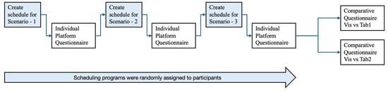
Figure 4.
Experiment procedure.
3. Results
The results of the data analysis are presented in three sections of (1) individual platform reflection, (2) platform comparison, and (3) time spent to create a schedule.
3.1. Individual Platform Reflection
This section presents the analysis of the data collected from the three Individual Platform Reflection questionnaires for Tab1, Tab2, and Vis. The feedback of the participants for the level of difficulty they faced during scheduling based on the five key functions is depicted in Table 1 for Tab1, in Table 2 for Tab2, and in Table 3 for Vis. On average, 89.1% of the participants found Vis to be very easy or easy, while this number was 69.3% for Tab1 and 63.6% for Tab2. The average percentage of participants who found the level of difficulty medium for five functions was 10.0% for Vis, compared to 25.2% for Tab1 and 25.7% for Tab2. On average, 1.5% of the participants found Vis1 to be challenging or very challenging, whereas 5.5% did so for Tab1 and 10.7% for Tab2.

Table 1.
Participant responses for five key functionalities of Tab1.
Table 2.
Participant responses for five key functionalities of Tab2.
Table 3.
Participant responses for five key functionalities of Vis.
To quantify the results and ease the comparison between the platforms, a numerical value was assigned to each level of difficulty: Very Easy = 5, Easy = 4, Medium = 3, Challenging = 2, and Very Challenging = 1. Since there were three programs to compare, to validate the results statistically, a one-way ANOVA was conducted on the data to determine if the differences in the responses towards the scheduling programs were statistically significant [45]. The significance level was set at 5% to test if p < 0.05 [46]. This test was performed based on the responses to each of the five function questions in the Individual Platform Reflection questionnaire. The results indicated that for all five functions, the difference in average response for at least one scheduling program was statistically significant. The results of this test are presented in Table 4 and Table 5.
Table 4.
p-Values of one-way ANOVA and paired t-test.
Table 5.
Test results of one-way ANOVA and paired t-test.
To compare the average response on platforms between each pair, a two-tailed paired t-test was conducted since the feedback for each of the three platforms was from the same sample pool [47]. The significance level was set at 5% to test if p < 0.05. The paired t-test was performed for responses to each of the five function questions in the Individual Platform Reflection questionnaire. The average response of Vis, µ Vis, Tab1, µ Tab1, and Tab2, µ Tab2 were compared against each other: Vis vs. Tab1, Vis vs. Tab2, and Tab2 vs. Tab1. The results are presented in Table 4 and Table 5. The one-way ANOVA and paired t-test results showed that for each of the five functions, the average response for Vis was significantly greater than those for Tab1 and Tab2. This indicates that more participants reported Vis to be easier to use than Tab1 and Tab2. Additionally, there was no statistically significant difference between the average feedback received for Tab1 and Tab2 across all five functions.
It was also investigated whether previous experience influenced participant responses regarding the level of difficulty for the five key functions. The participant responses are detailed in Table 6, Table 7 and Table 8 for Tab1, Tab2, and Vis, considering their previous experience. The responses are graphically represented in Figure 5, Figure 6 and Figure 7 for Tab1, Tab2, and Vis.
Table 6.
Participant responses for five key functionalities with and without prior experience of Tab1.
Table 7.
Participant responses for five key functionalities with and without prior experience of Tab2.
Table 8.
Participant responses for five key functionalities with and without prior experience of Vis.
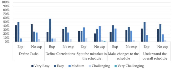
Figure 5.
Participants’ feedback with and without prior experience of Tab1.
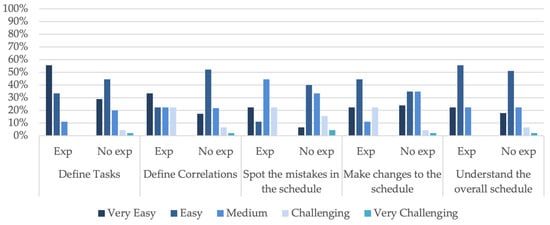
Figure 6.
Participants’ feedback with and without prior experience of Tab2.
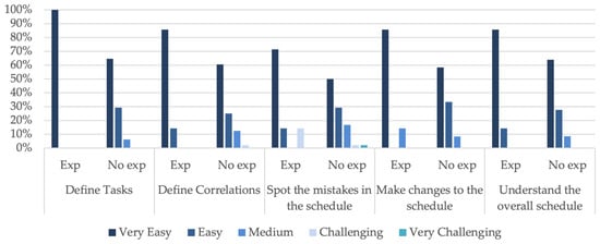
Figure 7.
Participants’ feedback with and without prior experience of Vis.
To statistically validate the difference in responses of participants with and without prior experience, a two-sample t-test was conducted [48]. The significance level, α, was set at 5% to test if p < α. The mean response of the participants with experience, µ Exp, was compared against the mean response of the participants without experience, µ No Exp, for each of the key five functions. The results of the t-tests and the two-tailed p-value are detailed in Table 9 for Tab1, in Table 10 for Tab2, and in Table 11 for Vis.
Table 9.
The t-test results for participant responses with and without prior experience of Tab1.
Table 10.
The t-test results for participant responses with and without prior experience of Tab2.
Table 11.
The t-test results for participant responses with and without prior experience of Vis.
Based on the results, it can be concluded that for Tab1 and Tab2, there is no statistically significant difference between the responses of participants with and without experience. Participants with prior experience with visual scheduling programs have rated Vis higher than participants without experience for functions of defining tasks, defining correlation, and making changes in the schedule. There is no statistically significant difference between the responses of participants with and without experience for functions such as spotting the mistakes in the schedule and understanding the overall schedule.
3.1.1. Platform Features That Supported Scheduling
This section presents the results of the written section of participant feedback on the features that helped them create the schedule faster and understand the overall schedule. The results represented in this section do not include responses of none or N/A or those that were left with no response. Non-relevant responses were also excluded from the analysis. It should be noted that some participants specified multiple features that were all considered in the analysis.
Platform Features That Contributed to Faster Scheduling
In this subsection, we present the results based on the participant feedback on the feature that helped them create the schedule faster. The responses of the participants for the three programs were grouped under seven categories: (1) user interface, (2) task creation, (3) correlation assignment, (4) task information, (5) auto-schedule, (6) network diagram, and (7) Gantt chart. The user interface was an umbrella term used by participants referring to different features in the interface to create the schedule, visualize it, etc., while some participants specifically specified schedule creation features that supported them in task creation or relationship assignment, as well as schedule visualization features such as Gantt chart and network diagram as separate features. The task information category referred to the participants’ efforts to look up activity information for purposes such as checking its accuracy. Auto-schedule was the required setting for all three programs in this study that was mentioned in some of the comments. The results are detailed in Table 12, showing the percentage of participants reporting features that helped them to schedule faster.
Table 12.
Percentages of participants reporting features that helped to schedule faster.
The overall user interface was reported by a considerable number of the participants for Vis, which was higher than that of tabular scheduling programs, which represented different features for schedule creation and visualization. Participants liked the simple visual interface of Vis and the tabular interface of Tab1 and Tab2, which was similar to the Microsoft Excel [49] program. Looking into schedule creation features, ease of task creation was the second highly reported reason by Vis users that helped them perform scheduling faster by creating shapes, while they reported ease of assigning relationships compared to other features of tabular scheduling as the main reason for helping them schedule faster in Tab1 and Tab2 in a tabular format. Looking up task information and viewing the Gantt chart were reported only for tabular scheduling programs as the tabular interface allowed users to check for information in the table, and the Gantt chart was presented next to the table. Checking the network diagram was reported by a few, even for Vis. Some examples of participant feedback are provided in Table 13.
Table 13.
Feedback examples for features that helped to schedule faster.
Platform Features That Contributed to Understanding the Overall Schedule
This subsection presents the results based on the participant feedback on the features that contributed to understanding the overall schedule. The written responses of the participants were grouped into four categories: (1) user interface, (2) task information, (3) Gantt chart, and (4) network diagram. The results are detailed in Table 14, showing the percentage of participants reporting features that helped them understand the overall schedule.
Table 14.
Percentages of participants reporting features that helped understand the overall schedule.
While interpreting the results, it should be noted that the user interface in tabular scheduling programs showed a table and Gantt chart, while it was only a network diagram in Vis. The results showed that the Gantt chart was the most reported tool that helped participants understand the overall schedule in tabular scheduling programs. Considering the combination of user interface and network diagram categories for Vis, it can be interpreted that the network diagram was the most helpful tool reported in the visual scheduling program. Nearly one-fourth of the participants using Vis stated the Gantt chart in another interface supported understanding the schedule. On the other hand, very few had checked the network diagram in another interface while using the tabular scheduling programs. This shows the importance of the Gantt chart in supporting users in understanding the overall schedule. Users also found checking the task information to be helpful. Some examples of participant feedback are provided in Table 15.
Table 15.
Feedback examples for features that helped in understanding the overall schedule.
3.1.2. Platform Features That Caused Challenges during Scheduling
This section presents the results based on the participant feedback on the features that caused challenges during scheduling. The written responses of the participants were grouped into four categories: (1) user interface, (2) task creation, (3) correlation assignment, and (4) spotting mistakes. The results are detailed in Table 16, showing the percentage of participants reporting features that caused challenges during scheduling.
Table 16.
Percentages of participants reporting challenging features in programs.
The distribution of the challenges reported was different for each program. For Tab1, the user interface and correlation assignment were the top two challenges users faced. For Tab2, besides the user interface and correlation assignment, challenges with spotting mistakes was also mentioned by users. The two main challenges participants faced in scheduling with Vis were task creation and correlation assignment. The reasoning behind that was explained as activity shapes overlapping or hiding behind each other during task creation, as well as drawing links between the task shapes when they were not close to each other. Some examples of participant feedback are provided in Table 17.
Table 17.
Feedback examples for features that caused challenges during scheduling.
3.2. Platform Comparison
This section presents the results of the analysis based on the data collected from the Platform Comparison questionnaires, comparing Vis versus Tab1 and Vis versus Tab2.
3.2.1. Comparison of Vis vs. Tab1
In this section, the results of the analysis of the Platform Comparison questionnaires that determined the most preferred platform between Vis and Tab1 for various scheduling functions and factors are presented. First, the results of the multiple-choice questions are discussed, and then the responses to the written sections are presented. The results do not include the written responses of none or N/A or those that were left with no response. Non-relevant responses were also excluded from the analysis. It should be noted that some participants specified multiple features that were all considered in the analysis.
Platform Preference (Vis vs. Tab1) for Five Key Functions
The preferences of participants between the platforms to perform five key functions are detailed in Table 18 in percentages and visually presented in Figure 8 with bar charts. The results show that more than half of the participants, ranging from 50.8% to 60.0%, with an average of 56.4%, preferred Vis over Tab1 for all five key functions. The number of participants preferring Tab1 over Vis was relatively low, ranging from 9.1% to 18.2%, with an average of 13.1%. A moderate number of the participants, ranging from 21.8% to 36.4%, with an average of 30.5%, found both programs similar in performing the five key functions.
Table 18.
Platform preference (Vis vs. Tab1) for five key functionalities.
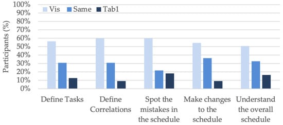
Figure 8.
Platform preference (Vis vs. Tab1) for five key functionalities.
Platform Preference (Vis vs. Tab1) for Speed and Intuitiveness
The second query in the questionnaire identified the favored platform regarding speed and intuitiveness. The inclinations of participants towards each platform are outlined in Table 19 and visually presented in Figure 9 with bar charts.
Table 19.
Platform preference (Vis vs. Tab1) for speed and intuitiveness.
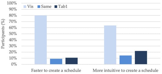
Figure 9.
Platform preference (Vis vs. Tab1) for speed and ease of schedule creation.
In terms of speed, Vis emerged as the favorite program, with 44 participants, 80.0%, indicating a preference for this platform. In total, seven participants, 12.7%, had prior experience of working with visual scheduling programs similar to Vis, from which five participants, 9.1%, opted for Vis and two participants, 3.6%, opted Tab1. This suggests that most participants found Vis to be faster in creating schedules compared to Tab1. Conversely, only 10.9% of participants favored Tab1 for its speed in schedule creation, while from the total pool of 55 participants, 12 participants, 21.8%, had prior experience of working with Tab1. From these 12 participants, only 2 participants, 3.6%, preferred Tab1 over Vis, and the remaining 10 participants, 18.2%, opted for Vis.
In terms of intuitiveness, 35 participants, 63.6%, indicated a preference for Vis. In total, seven participants, 12.7%, had prior experience of working with visual scheduling programs similar to Vis, from which four participants, 7.3%, opted for Vis and one participant, 1.8%, opted for Tab1, while the remaining two participants, 3.6%, found both platforms equal. In contrast, 12 participants, 21.8%, favored Tab1 for its intuitiveness in schedule creation, while from the total pool of 55 participants, 12 participants, 21.8%, had prior experience of working with Tab1. From these 12 participants, only 2 participants, 3.6%, preferred Tab1 over Vis, and the remaining 10 participants,18.3%, opted for Vis.
Platform Preference (Vis vs. Tab1) for Trustworthiness
The participant responses regarding platform trustworthiness in the event of conflicting outcomes using both programs reveal that the majority, 69.1%, reported the use of the visual scheduling method can reduce the possibility of making mistakes. In total, 12.7% of the participants had prior experience working with a scheduling program like Vis, from which 9.1% of the participants opted for Vis. Conversely, only 21.8% of participants favored Tab1 over Vis. From the total pool of participants, 21.8% of the participants had prior experience of working with Tab1, from which only 1.8% of the participants preferred Tab1 over Vis. The remaining participants, 9.1%, reported both programs performing equally. The results are visually presented in Figure 10 as a pie chart.
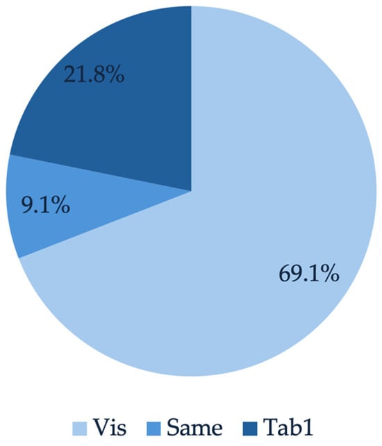
Figure 10.
Platform preference (Vis vs. Tab1) for trustworthiness.
The participant responses to the reasoning behind their choice of platform for trustworthiness were categorized under (1) user interface and (2) spotting mistakes, as detailed in Table 20. The percentages reported in Table 20 are among those who chose Vis or Tab1.
Table 20.
Participant feedback on the reason to choose the platform (Vis vs. Tab1) for trustworthiness.
The most reported reason for trustworthiness was the user interface, where participants indicated a user-friendly interface could reduce the possibility of making mistakes and consequently result in a schedule that is more trustable. In this analysis, the responses related to visual or tabular methods were grouped under the user interface category as well. The second reason was the ease of spotting mistakes that allowed users to check their schedule for accuracy. Some examples of participant comments are shown in Table 21.
Table 21.
Feedback examples for the platform trustworthiness.
Preferred Features—Vis vs. Tab1
This section summarizes the participant feedback on features they preferred in each program over the other. The responses were grouped under four categories, (1) user interface, (2) task creation, (3) correlation assignment, and (4) spotting mistakes, for Vis, as detailed in Table 22 with feedback examples presented in Table 23, and grouped under five categories, (1) user interface, (2) correlation assignment, (3) task information, (4) Gantt chart, and (5) spotting mistakes, for Tab1, as detailed in Table 24 with feedback examples presented in Table 25.
Table 22.
Preferred Vis features over Tab1 specified by participants.
Table 23.
Feedback examples on preferred features of Vis over Tab1.
Table 24.
Preferred Tab1 features over Vis specified by participants.
Table 25.
Feedback examples on preferred features of Tab1 over Vis.
Drawing lines between the tasks for assigning task relationships was the favorite Vis feature reported by the participants over Tab1. The next was the overall visual user interface. Subsequently, they reported the ease of defining tasks with the use of shapes as the third feature. Some also mentioned the ease of spotting their mistakes in the program made them prefer Vis over Tab1. Some examples of participant feedback are shown in Table 23.
For Tab1, the overall user interface where they could define tasks and correlations in a tabular format was favored the most by the users. Viewing the Gantt chart in the interface and looking up for information in the table were the second most reported features. Subsequently, they reported ease of assigning relationships between the tasks. A few also mentioned the ease of spotting their mistakes in the program made them prefer Tab1 over Vis. Some examples of participant feedback are shown in Table 25.
3.2.2. Comparison of Vis vs. Tab2
In this section, the results of the analysis of the Platform Comparison questionnaires that determined the most preferred platform between Vis and Tab2 for various scheduling functions and factors are presented. First, the results of the multiple-choice questions are discussed, and then the responses to the written sections are presented. The results do not include the written responses of none or N/A or those that were left with no response. Non-relevant responses were also excluded from the analysis. It should be noted that some participants specified multiple features that were all considered in the analysis.
Platform Preference (Vis vs. Tab2) for Five Key Functions
The preferences of participants between the platforms to perform the five key functions are detailed in Table 26 in percentages and visually presented in Figure 11 with bar charts. The results show that the majority of participants, ranging from 61.8% to 74.5%, with an average of 68.4%, preferred Vis over Tab1 for all five key functions. The number of participants preferring Tab1 over Vis was relatively low, ranging from 7.3% to 18.2%, with an average of 12.0%. A moderate number of the participants, ranging from 14.5% to 23.6%, with an average of 19.6%, found both programs similar in performing the five key functions.
Table 26.
Platform preference (Vis vs. Tab2) for five key functions.
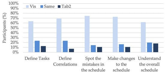
Figure 11.
Platform preference (Vis vs. Tab2) for five key functionalities.
Platform Preference (Vis vs. Tab2) for the Speed and Intuitiveness
The second query in the comparative survey, comparing Vis and Tab2, identified the favored platform regarding the speed and ease of schedule creation. The inclinations of participants towards each platform are outlined in Table 27 and visually presented in Figure 12.
Table 27.
Platform preference (Vis vs. Tab2) for the speed and intuitiveness.
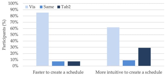
Figure 12.
Platform preference (Vis vs. Tab2) for the speed and ease of schedule creation.
In terms of speed, Vis emerged as the favorite program, with 47 participants, 85.5%, indicating a preference for this platform. In total, seven participants, 12.7%, had prior experience of working with visual scheduling programs like Vis, from which five participants, 9.1%, opted for Vis and two participants, 3.64%, opted for Tab2. This suggests that most participants found Vis to be faster in creating schedules compared to Tab2. Conversely, only 7.3% of participants favored Tab2 for its speed in schedule creation, while from the total pool of 55 participants, 9 participants, 16.3%, had prior experience of working with Tab2. From these 9 participants, only 2 participants, 3.64%, preferred Tab2 over Vis, and the remaining 7 participants, 12.7%, opted for Vis.
In terms of intuitiveness, Vis emerged as the favorite program, with 34 participants, 61.8%, indicating a preference for this platform. In total, seven participants, 12.7%, had prior experience of working with Visual scheduling programs like Vis, from which four participants, 7.3%, opted for Vis and two participants, 3.64%, opted for Tab2, while the remaining one participant, 1.8%, found both platforms equal. In contrast, 29.1% of participants favored Tab2 for its intuitiveness in schedule creation, while from the total pool of 55 participants, 9 participants, 16.4%, had prior experience of working with Tab2. From these nine participants, only two participants, 3.64%, preferred Tab2 over Vis, five participants, 9.1%, opted for Vis and the remaining two, 3.6%, found both platforms equal.
Platform Preference (Vis vs. Tab2) for Trustworthiness
The participant responses regarding platform trustworthiness in the event of conflicting outcomes using both programs reveal that the majority, 65.5%, reported the use of the visual scheduling method can reduce the possibility of making mistakes. In total, 12.7% of the participants had prior experience working with a scheduling program like Vis, from which 9.1% of the participants opted for Vis. Conversely, only 21.8% of participants favored Tab2 over Vis, while from the total pool of participants, 16.4% of the participants had prior experience of working with Tab2, from which only 5.5% of the participants preferred Tab2 over Vis. The remaining participants, 12.7%, reported both programs performing equally. The results are visually presented in Figure 13 as a pie chart.
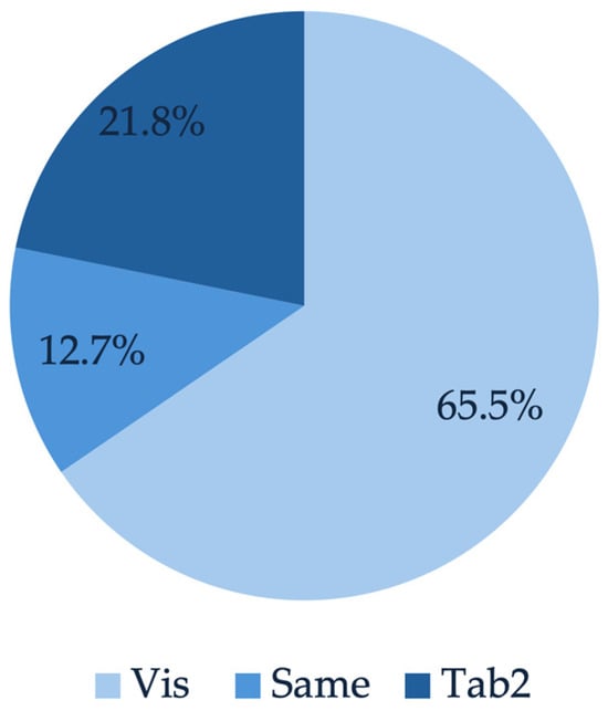
Figure 13.
Platform preference (Vis Vs Tab2) for trustworthiness.
The participant responses to the reasoning behind their choice of platform for trustworthiness were grouped under two categories, (1) user interface and (2) spotting errors, as detailed in Table 28. The percentages reported in Table 28 are of those who chose Vis or Tab2.
Table 28.
Participant feedback on the reason to choose the platform (Vis vs. Tab2) for trustworthiness.
The most reported reason for trustworthiness was the user interface, where participants indicated a user-friendly interface could reduce the possibility of making mistakes and consequently result in a schedule that is more trustable. The second reason was the ease of spotting mistakes, which allowed users to check their schedules for accuracy. Some examples of participant comments are shown in Table 29.
Table 29.
Feedback examples on the platform trustworthiness.
Preferred Features—Vis vs. Tab2
This section summarizes the participant feedback on features they preferred in each program over the other. The responses were grouped under four categories, (1) user interface, (2) task creation, (3) correlation assignment, and (4) spotting mistakes, for Vis, as detailed in Table 30 with feedback examples presented in Table 31, and grouped under five categories, (1) user interface, (2) task creation, (3) correlation assignment, (4) Gantt chart, and (5) spotting the mistakes, for Tab2, as detailed in Table 32 with feedback examples in Table 33.
Table 30.
Preferred Vis features over Tab2 specified by participants.
Table 31.
Participant feedback examples of preferred features for Vis over Tab2.
Table 32.
Preferred Tab2 over Vis features specified by participants.
Table 33.
Participant feedback examples on preferred features for Tab2 over Vis.
Drawing lines between the tasks for assigning task relationships was the favorite Vis feature reported by the participants over Tab2. The next was the overall visual user interface. Subsequently, they reported the ease of defining tasks with the use of shapes as the third feature. Some also mentioned the ease of spotting their mistakes in the program made them prefer Vis over Tab1. Some examples of participant feedback are shown in Table 31.
For Tab2, the overall user interface where they could define tasks and correlations in a tabular format was favored the most by the users. Ease of assigning relationships between the tasks was also among the top favorites. Subsequently, viewing the Gantt chart in the interface and ease of task creation were reported by some. One person mentioned the ease of spotting the mistakes in the program. Some examples of participant feedback are shown in Table 33.
3.3. Time Spent to Create a Schedule
The time spent by participants to create the schedule of each scenario with three programs was analyzed quantitively. The statistical data of this time is summarized in Table 34, which includes the mean, median, range, and standard deviation.
Table 34.
Statistical data on time spent on each platform to create a schedule.
The average time spent by participants to create a schedule with Vis was 30.9 min. This value was 41.0 min for Tab1 and 50.9 min for Tab2. Statistical analysis was conducted on the duration spent on scheduling with each program, utilizing data from all participants across three scenarios and three programs. A one-way ANOVA with a significance level, α, of 5% was conducted to test if p < α. It resulted in a p-value of 0.0000008, indicating there was a significant difference among the means. This suggested that at least one program’s mean value was statistically different from the others. Subsequent paired t-tests were conducted to compare the means between the platforms. The comparison between Tab1 and Tab2 yielded a two-tailed p-value of 0.006982, indicating the mean scheduling time for Tab2 was significantly greater than for Tab1 (μTab2 > μTab1). Similarly, the comparison between Tab1 and Vis resulted in a two-tailed p-value of 0.00322, showing that the mean scheduling time for Tab1 was significantly greater than for Vis (μTab1 > μVis). In summary, the statistical tests confirmed that the visual scheduling method resulted in the least time required for creating schedules, with the mean duration ranking in the order of μTab2 > μTab1 > μVis. The results of these tests are detailed in Table 35.
Table 35.
Result of statistical analysis on the duration spent on creating a schedule.
The impact of prior experience on the time spent to create a schedule with each program was analyzed. For Vis, experienced users had a mean time of 32.1 min, with 7 participants having prior experience, while users with no experience had a mean time of 30.7 min, with 48 participants with no experience. For Tab1, experienced users had a mean time of 35.1 min, with 12 participants having prior experience, compared to 42.7 min for users with no experience, where 43 participants had no experience. Similarly, for Tab2, experienced users had a mean time of 48.8 min, with 9 participants having prior experience, whereas users with no experience had a mean time of 51.4 min, with 46 participants having no experience. The mean time with all three programs is visually presented in Figure 14 with considerations of prior experience.
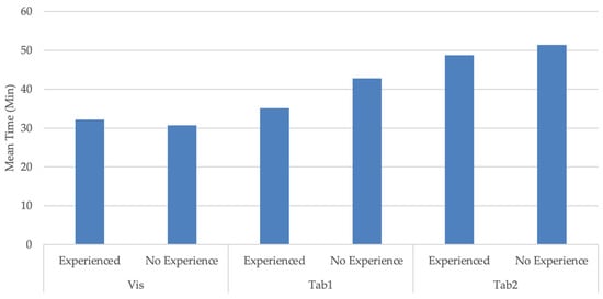
Figure 14.
Average time spent on creating a schedule with and without prior program experience.
To examine whether prior experience impacted the time spent to create a schedule with each program, a two-sample t-test with unequal variance was conducted. This test compared the mean time spent by participants with prior program experience, µ Exp, to the mean time spent by participants without prior experience, µ No Exp. The t-test was conducted at a significance level, α, of 5% to test if p< α. The results are detailed in Table 36. The results showed that the p-value for all three programs was over 0.05. This means no statistically significant difference between the mean time spent to create a schedule was observed between participants with and without experience. Consequently, it can be concluded that prior experience did not have an impact on the time spent on schedule creation in this study.
Table 36.
Results of the analysis on the impact of experience on the time spent to create a schedule.
4. Discussion
This research study evaluated the efficiency of visual scheduling compared to the current industry practice of tabular scheduling for schedule creation. An experiment was conducted with a visual and two tabular scheduling programs that required participants to create three comparable schedules with all three programs. The time spent to create the schedules was measured, and participant feedback was collected with questionnaires where they reflected on their experience with each program and compared the platforms. The study results showed that the time spent in schedule creation with visual scheduling was significantly shorter than using tabular scheduling programs. This was confirmed by the majority of the participants, who reported visual scheduling as a tool that allowed them to create a schedule faster compared to two tabular scheduling programs. Based on the participant feedback on their experience with each platform, it was statistically proven that they found visual scheduling easier to define tasks, define correlations, spot mistakes in the schedule, make changes to the schedule, and understand the overall schedule, which were the five key scheduling functions evaluated in this study. More than half of the participants preferred visual scheduling over tabular scheduling programs to perform the five key scheduling functions. A considerable number of participants found the visual scheduling platform has the potential for making fewer mistakes. Consequently, they stated they would trust their schedule created with visual scheduling to be more trustable in the event of conflicting outcomes compared to tabular scheduling. They also found it a more intuitive method to create schedules.
The analysis of qualitative data based on the written section of the questionnaires revealed that those participants favoring visual scheduling preferred its visual approach by drawing network diagrams, which gave them a better understanding of the overall schedule. They found it user-friendly to create tasks and define correlations that reduced the possibility of making mistakes. They also found it easier to spot their mistakes by checking the network diagram. On the other hand, participants who preferred tabular scheduling reported that it was easier for them to find the tasks and check their information and correlations in a table, while in the visual scheduling interface, they needed to search for the tasks in the network diagram. They also found the tabular interface easy to understand due to their familiarity with the Microsoft Excel interface. The results revealed the importance of the Gantt chart in supporting the users to understand the overall schedule. Tabular scheduling users also found it useful to spot the mistakes using the Gantt chart that showed them the progress of the schedule creation in real time. While a considerable number of participants preferred the visual scheduling method, they also reported finding it challenging to create a schedule by drawing network diagrams because shapes representing the tasks could overlap or hide behind each other, requiring them to drag the tasks around. Drawing lines between the tasks to define the task relationships could also be challenging when the tasks were not close to each other.
4.1. Limitations
The participants were graduate students with a few years of industry experience and exposure to scheduling practices. This required the research team to simplify the schedule scenarios in this study. Another significant limitation was the time constraint. The study required the research team to train students on the scheduling programs in one academic semester, which allowed them to focus only on three scheduling programs. Consequently, the team evaluated only one of the visual scheduling programs compared to two of the frequently used tabular programs in the industry. Since the study was designed as an in-class activity, experiment duration was limited. This required the research team to design schedule scenarios that had relatively few activities and task relationships to allow participants to finish the tasks on time. Furthermore, the scenarios were designed in a way that they could be compared in a controlled experiment and were not real-world schedules.
4.2. Future Studies
Future research studies need to be conducted with industry professionals to explore the efficiency of visual scheduling programs in day-to-day scheduling practices compared to currently used tabular scheduling programs. A design of a similar experiment is suggested with more complex scenarios that reflect real-world schedules to be conducted with industry schedulers. Furthermore, studies that include the cost and resource constraints are suggested to be conducted to test the efficiency of the visual scheduling method.
Supplementary Materials
The following supporting information can be downloaded at: https://www.mdpi.com/article/10.3390/buildings14103084/s1.
Author Contributions
Conceptualization, B.A.; methodology, B.A.; validation, T.T.; formal analysis, T.T.; investigation, B.A. and T.T.; resources, B.A.; data curation, T.T.; writing—original draft preparation, T.T.; writing—review and editing, B.A.; visualization, T.T.; supervision, B.A.; project administration, B.A.; funding acquisition, B.A. All authors have read and agreed to the published version of the manuscript.
Funding
This study was partially funded by the start-up company that owned the visual scheduling program. The company paid for the data analysis efforts by the first author.
Institutional Review Board Statement
The California State University East Bay’s Institutional Review Board issued the IRB approval #CSUEB-IRB-2023-274 for conducting this research study.
Data Availability Statement
The data are provided in the Supplementary Materials. Participant responses to the Personal Information and the written parts of the questionnaires are confidential in nature and may only be provided after anonymizing by the corresponding author upon reasonable request.
Conflicts of Interest
This research study was conducted in collaboration with a start-up company that provided the visual scheduling program to the research team and participants for free. The company was not involved in the design or data collection of this study. The first author was hired as an intern by the company after the data collection phase and was paid for his efforts in the data analysis phase as a part of his internship with the company. At the time of manuscript submission, the first author was no longer an employee of the company. The name of the company and the product are not provided in this manuscript.
References
- Radujković, M.; Sjekavica, M. Project Management Success Factors. Procedia Eng. 2017, 196, 607–615. [Google Scholar] [CrossRef]
- Herausgeber Project Management Institute. A Guide to the Project Management Body of Knowledge (PMBOK Guide), 6th ed.; Project Management Institute: Newtown Square, PA, USA, 2017; ISBN 9781628256659. [Google Scholar]
- Atef, A.; El-henawy, I.; Abdel-Baset, M. Project Scheduling: Survey and Research Potentials. Int. J. Comput. Appl. Technol. Res. 2015, 4, 235–239. [Google Scholar] [CrossRef]
- Valenko, T.; Klanšek, U. An Integration of Spreadsheet and Project Management Software for Cost Optimal Time Scheduling in Construction. Organization. Technol. Manag. Constr. Int. J. 2017, 9, 1627–1637. [Google Scholar] [CrossRef]
- Miranda, S.; Sugarindra, M. Utilizing Project Management Software in Project Scheduling: A Case Study. IOP Conf. Ser. Mater. Sci. Eng. 2019, 528, 012037. [Google Scholar] [CrossRef]
- Project Management Institute. The Value of Project Management. 2010. Available online: https://www.pmi.org/business-solutions/white-papers/value-project-management (accessed on 4 August 2024).
- Hamada, M.A. Investigate the Efficiency of Project Management Software in Construction Projects. Eurasia Proc. Sci. Technol. Eng. Math. 2023, 22, 247–257. [Google Scholar] [CrossRef]
- Liberatore, M.J.; Pollack-Johnson, B. Factors Influencing the Usage and Selection of Project Management Software. IEEE Trans. Eng. Manag. 2003, 50, 164–174. [Google Scholar] [CrossRef]
- Wagh, R.; Lende, P. Planning, Scheduling and Allocation of Resources for Huge Structures Using Oracles Primavera P6 Software. Int. J. Res. Appl. Sci. Eng. Technol. 2022, 10, 3847–3856. [Google Scholar] [CrossRef]
- Liberatore, M.J.; Pollack-Johnson, B.; Smith, C.A. Project Management in Construction: Software Use and Research Directions. J. Constr. Eng. Manag. 2001, 127, 101–107. [Google Scholar] [CrossRef]
- Gharaibeh, H. Evaluating Project Management Software Packages Using a Scoring Model—A Comparison between MS Project and Primavera. J. Softw. Eng. Appl. 2014, 07, 541–554. [Google Scholar] [CrossRef]
- Desai, N.V.; Yadav, N.B.; Malaviya, N.N. Increasing the Potential Application of Microsoft Project and Primavera P6 for Project Management: A Comparative Analysis of the Residential Project. Mater. Today Proc. 2022, 77. [Google Scholar] [CrossRef]
- Joshi, R.; Patil, V.Z. Resource Scheduling of Construction Project: Case Study. Int. J. Sci. Res. 2015, 4, 563–568. [Google Scholar]
- Reddy, B.S.K.; Nagaraju, S.K.; Salman, M. A Study on Optimization of Resources for Multiple Projects by Using Primavera. J. Eng. Sci. Technol. 2015, 10, 235–248. [Google Scholar]
- Subramani, T.; Sarkunam, A.; Jayalakshmi, J. Planning and Scheduling of High Rise Building Using Primavera. J. Eng. Res. Appl. 2014, 4, 134–144. [Google Scholar]
- Santos, F.; Garcia, S.; Acosta, C. Comparison of the Different Project Management Software Used for a Commercial Project in the Philippines: A Case Study. In Proceedings of the 2nd International Conference in Information and Computing Research (iCORE), Cebu, Philippines, 10–11 December 2022; pp. 177–183. [Google Scholar]
- Albayati, N.H.F.; Aminbakhsh, S. Resource Allocation Capabilities of Commercial Project Management Software Packages for Resource Leveling and Resource Constrained Project Scheduling Problems: A Comparative Study. J. Constr. Eng. Manag. Innov. 2023, 6, 104–123. [Google Scholar] [CrossRef]
- Kutlu, B.; Bozanta, A.; Ates, E. Project Management Software Selection Using Analytic Hierarchy Process Method. Int. J. Appl. Sci. Technol. 2014, 4, 113–119. [Google Scholar]
- Cicibas, H.; Unal, O.; Demir, K. A Comparison of Project Management Software Tools (PMST). In Proceedings of the 2010 International Conference on Software Engineering Research & Practice, SERP 2010, Las Vegas, NV, USA, 12–15 July 2010; pp. 560–565. [Google Scholar]
- Wisniewski, J. Improving Project Management Efficiency in Commercial Construction Management. Ph.D. Dissertation, Worcester Polytechnic Institute, Worcester, MA, USA, 2020. [Google Scholar]
- Craik, F.I.M.; Lockhart, R.S. Levels of Processing: A Framework for Memory Research. J. Verbal Learn. Verbal Behav. 1972, 11, 671–684. [Google Scholar] [CrossRef]
- Bobek, E.; Tversky, B. Creating Visual Explanations Improves Learning. Cogn. Res. Princ. Implic. 2016, 1, 1–14. [Google Scholar] [CrossRef]
- Tversky, B. Visualizing Thought. Top. Cogn. Sci. 2010, 3, 499–535. [Google Scholar] [CrossRef]
- Nickerson, J.; Tversky, B. The Spatial Nature of Thought: Understanding Information Systems Design through Diagrams. In Proceedings of the International Conference on Information Systems, Paris, France, 14–17 December 2008. [Google Scholar]
- Corter, J.E.; Nickerson, J.V.; Tversky, B.; Zahner, D.; Rho, Y.J. Using diagrams to design information systems. In Proceedings of the Thirtieth Annual Conference of the Cognitive Science Society, Washington, DC, USA, 23–26 July 2008; Love, B.C., McRae, K., Sloutsky, V.M., Eds.; Cognitive Science Society: Austin, TX, USA, 2008; pp. 2259–2264. [Google Scholar]
- Larkin, J.H.; Simon, H.A. Why a Diagram Is (Sometimes) Worth Ten Thousand Words. Cogn. Sci. 1987, 11, 65–100. [Google Scholar] [CrossRef]
- Field, M.; Keller, L. Project Management; Thomson Business Press/Open University: London, UK, 1998. [Google Scholar]
- James, W. Gantt charts: A centenary appreciation. Eur. J. Oper. Res. 2003, 149, 430–437. [Google Scholar]
- Adeli, H.; Karim, A. Construction Scheduling, Cost Optimization and Management; CRC Press: Boca Raton, FL, USA, 2001. [Google Scholar]
- Wei, C.; Liu, P.; Tsai, Y. Resource-constrained project management using enhanced theory of constraint. Int. J. Proj. Manag. 2002, 20, 561–567. [Google Scholar] [CrossRef]
- Levine, H. Project Management Using Microcomputers; McGraw-Hill Book Company, Inc.: New York, NY, USA, 1986. [Google Scholar]
- PM Network. 1995 Project Management Software Survey. PM Netw. 1995, IX, 35–48. [Google Scholar]
- Maylor, H. Beyond the Gantt chart. Eur. Manag. J. 2001, 19, 92–100. [Google Scholar] [CrossRef]
- Hendrickson, C.; Au, T. Project Management for Construction: Fundamental Concepts for Owners, Engineers, Architects, and Builders; Prentice-Hall: Englewood Cliffs, NJ, USA, 1989. [Google Scholar]
- Naylor, H.F.W. Construction Project Management: Planning and Scheduling; Delmar Publishers: Albany, NY, USA, 1995. [Google Scholar]
- Wadhwa, K. The Role of Gantt Chart in Project Management. Master’s Thesis, Vaasan Ammattikorkeakoulu University of Applied Sciences, Vaasa, Finland, 2024. [Google Scholar]
- Besner, C.; Hobbs, B. Project Management Practice Generic or Contextual: A Reality Check. Proj. Manag. J. 2008, 39, 16–33. [Google Scholar] [CrossRef]
- Available online: https://www.microsoft.com/en-us/microsoft-365/project/project-management-software (accessed on 4 August 2024).
- Available online: https://www.oracle.com/construction-engineering/primavera-p6/ (accessed on 4 August 2024).
- Available online: https://www.procore.com/ (accessed on 4 August 2024).
- Pratama, L.; Dossick, C. A Critical Review of Visual Aid Implementation in Lean Construction Scheduling Process. In Construction Research Congress 2020; American Society of Civil Engineers: Reston, VA, USA, 2020; pp. 455–463. [Google Scholar]
- Viklund Tallgren, M.; Roupé, M.; Johansson, M.; Bosch-Sijtsema, P. BIM-tool development enhancing collaborative scheduling for pre-construction. J. Inf. Technol. Constr. (ITcon) 2020, 25, 374–397. [Google Scholar]
- Hinze, J. Construction Planning and Scheduling; Pearson Prentice Hall: Upper Saddle River, NJ, USA, 2008; Volume 3. [Google Scholar]
- Available online: https://www.instructure.com/canvas (accessed on 4 August 2024).
- Montgomery, D.C.; Runger, G.C. Chapter 8.6 Resolution III Designs. In Applied Statistics and Probability for Engineers; Wiley: Hoboken, NJ, USA, 2018; pp. 354–361. ISBN 9781119746355. [Google Scholar]
- Sedgwick, P. Confidence Intervals and Statistical Significance: Rules of Thumb. BMJ 2012, 345, e4960. [Google Scholar] [CrossRef][Green Version]
- Montgomery, D.C.; Runger, G.C. Chapter 6.5 A Single Replicate of 2k Design. In Applied Statistics and Probability for Engineers; Wiley: Hoboken, NJ, USA, 2018; pp. 264–268. ISBN 9781119746355. [Google Scholar]
- Montgomery, D.C.; Runger, G.C. Chapter 6.4 The General 2k Design. In Applied Statistics and Probability for Engineers; Wiley: Hoboken, NJ, USA, 2018; pp. 253–257. ISBN 9781119746355. [Google Scholar]
- Available online: https://www.microsoft.com/microsoft-365/excel (accessed on 4 August 2024).


Disclaimer/Publisher’s Note: The statements, opinions and data contained in all publications are solely those of the individual author(s) and contributor(s) and not of MDPI and/or the editor(s). MDPI and/or the editor(s) disclaim responsibility for any injury to people or property resulting from any ideas, methods, instructions or products referred to in the content. |
© 2024 by the authors. Licensee MDPI, Basel, Switzerland. This article is an open access article distributed under the terms and conditions of the Creative Commons Attribution (CC BY) license (https://creativecommons.org/licenses/by/4.0/).