Abstract
Building façade color plays a key role in shaping urban image, enhancing urban vitality, and optimizing citizens’ living experience. Moreover, colors can influence people’s perception of space, but the multiple interrelationships between color elements and users’ color evaluation and visual perception have not yet been thoroughly studied. In order to explore the relationships between color elements and visual perception and subjective comfort, this study discusses the matching relationship between color and the comfort of a residential building façade from three levels of color hue, lightness, and saturation by combining eye movement technology and a subjective evaluation. Taking Anshan San Village in Shanghai as the research object, the relationship model between color elements, visual perception, and subjective comfort is established through correlation analysis, linear regression, and multifactor regression analysis, and the correlation between single elements and multiple elements is explored from multi-dimensional perspectives. It aims to assess the operability of eye movement data as a measure of the visual comfort with the residential building façade color through multiple indicators and to explore and establish a new correlation assessment framework between the three attributes of façade color and users’ visual comfort. The results show that (1) highly saturated façade colors significantly increase cognitive load and decrease color evaluation. (2) Brightness has a non-linear relationship with visual perception and subjective evaluation, either too high or too low a brightness value will cause visual fatigue and thus reduce the color evaluation, and when the brightness is maintained at 40–80%, there will be a better color experience. (3) Warm tones such as red, orange, and yellow can strengthen the color perception to enhance the color evaluation of the façade; among cold tones, cyan and purple can also strengthen the visual perception of the color of the façade to enhance the color evaluation. After validation, the proposed new color comfort assessment method is feasible and comprehensive, and we hope it can provide a reference for the planning of old residential buildings and communities in the future.
1. Introduction
1.1. The Importance of Urban Color
As a component of the urban public space environment, urban color plays an important role in urban development. Color is a very resonant medium, and its use in architecture and the built environment fundamentally affects people’s perception of space and architectural form, directly and clearly reflecting the psychological state of the observer [1]. Building elevations make up the largest visible percentage of a building and can significantly affect the overall color appearance of a building [2]. The color of the urban façade is a fundamental part of the urban landscape [3], providing a unique visual experience and spatial environment perception for urban residents, and influencing their emotions and behaviors [4].
Currently, many scholars are conducting research on the relationship between color and urban image. Manav attempts a research approach on the classification of levels of color perception and linguistic representation, and initially describes an urban color scheme based on color–emotion associations [5]. The symbolic value of urban color and the identity of buildings are emphasized. Through semi-structured interviews, Xu and Zheng highlight that urban color can be applied to urban regeneration, cultural heritage preservation, and expression of urban identity, which promotes the sustainable development of urban space [6]. Odetti clearly expresses that the rational allocation of color is an important element in the construction of urban culture [7]. Through the issue of color, it is possible to express the needs, desires, and emotions of the inhabitants, thus implying a better urban culture.
A livable urban environment includes not only comfortable building design and easy access to transportation but also a pleasant visual environment, with more than 83% of the information people receive on a daily basis coming through their eyes [8]. Of all the factors that influence visual information, color accounts for the largest percentage, followed by shape and form [8]. Thus, urban color plays a key role in shaping the city’s image and influencing people’s overall impression of the city, and understanding the nuances of color patterns can help reveal a city’s uniqueness and identity [9].
1.2. National Approaches and Territorial Studies
Although color research in China started relatively late, it has developed rapidly [10]. Guo and Cai systematically illustrate the color practices of architecture and environment in Chinese cities over the past ten years and study the sources and flows of color practices in China’s architecture and environment in order to find the development path of color in China’s urban architecture and environment [11]. Chinese cities have proposed color regulation, planning, design, and management guidelines with regional characteristics [12,13,14,15,16,17]. In today’s context of globalization, traditional geographical constraints are being broken down and the differences between urban scenes are shrinking. Therefore, how to reflect regional characteristics while building modern cities has become an important issue in urban color planning [16].
In the ‘14th Five-Year Plan for Housing Development in Shanghai’, the city will continue to deepen the improvement of existing housing conditions. Against this policy backdrop, many scholars have proposed general opinions on the urban color of Shanghai from different perspectives and using various technical methods. The concept of urban renewal will be used to advance the transformation of old areas in an orderly manner and continue to promote the effective enhancement of housing functions and living environments [1]. Urban color modeling is a major urban design element when planning urban spaces [4]. Systematic color planning can provide a theoretical basis for architectural renovation in old areas. In an earlier study, Gou and Wang take the urban planning perspective as a starting point and systematically introduce the color characteristics of architectural attributes within different cities in the Chinese region [18]. J. Wang et al. collected subjects’ evaluations of architectural color in the Shanghai area from the perspective of visual perception and compiled different residents’ perceptions of Shanghai’s urban color image [19]. J. Wang et al. summarized the color characteristics of residential buildings in Shanghai based on a subjective evaluation and color attribute grading of residential buildings by subject evaluation factors [10]. Chen et al. used house prices as a reference perspective and econometrics as a research tool to reveal the close connection between changes in consumer preferences and various combinations of facade colors and materials [20].
Z. Wang et al. explored the color satisfaction of different cities and building types in China from a humanistic perspective, which compensated for the earlier single-designer- and planner-oriented architectural color evaluation system, enhanced the users’ participation in decision-making in the process of architectural color formulation, and provided a more diversified perspective for future research [21]. However, many previous studies have simply divided buildings according to their functional attributes without considering (1) the obvious differences in architectural styles between the northern and southern regions of China, and it is still worthwhile to test whether the color evaluation system for buildings in Shanghai can be promoted in a wide range. (2) China’s buildings were built over a wide range of years, and there are still some differentiated needs within a single building function, resulting in a lack of representativeness in the selection of previous experimental subjects. Currently, Chinese cities have gradually transitioned from macro-level planning to focusing on the micro-level aspects of the urban built environment. The emphasis on the color environment and building type of a single building also indicates that urban building users have increasing requirements for the color of the building and the environment [11]
To sum up at this stage, although Shanghai has completed the renewal of some old residential buildings, the color selection of residential building facades is confusing, the color combination is disordered, and the expected effect of facade renewal has not been achieved. China’s architectural color research lacks systematic planning, the color management system is not yet sound, and the architectural color renewal is still in the initial stage. People’s physiological and psychological functions react differently to different space colors, and so how to enhance the visual comfort of users through reasonable color selection and combination of building façades has become an important issue for architects [3].
1.3. Limitations of Past Research
The residential building facade color is an important part of urban culture and style, and color, as an important means of architectural design, has a close relationship with the mood of urban residents [10]. At the early stage of the concept of urban color, the British architect William Benson’s Principles of Color Science, the Argentinian architect Julio Villalobos’ Color Atlas, and the Swedish scholar Sven Hesselgren’s Language of Architecture all systematically elaborated on the significance of urban color at the theoretical level, initially constructing the city color system. Due to the limitations of time and technology, the early color research simply stayed in the macro-theoretical exposition of urban color, which not only lacked data support but also lacked micro-scale research, resulting in certain limitations of the previous research.
At this stage, more and more technical means are used to study the visual perception of architectural color to better improve the earlier theoretical system research. Zhong et al. proposed a deep learning-based method to map the color of urban facades using street view images. The dominant color of the city façade is used as an indicator to describe the color of the city façade [4]. Xu et al. used deep learning to acquire and recognize still images of urban buildings [22]. The obtained images were batch processed using the AWB white balance algorithm to finally obtain the main colors of the buildings. Kong et al. targeted building color planning based on the use of land color control layer maps and road color layer maps in ArcGIS through hierarchical analysis [23]. Ou, LuoOu, and Luo, through subjective color scoring, derived the relationship between architectural color combination harmony and comfort, and a color harmony model was constructed as a result [24]. Z. Wang et al. classified the color and function of Shanghai’s historic buildings by screening their samples [21]. Using the dual approach of a questionnaire survey and visual comparison method, the influential relationship between the three elements of color and subjective comfort was found.
Previous research has provided systematic guidance on urban color planning based on multiple dimensions and various technologies. Zhong et al. through big data and a convolutional neural network, systematically collated Shanghai’s architectural color, providing intuitive data support for the overall urban color transformation of Shanghai and making up for the sample range problem and color bias caused by vision in the past through manual visual collection [4]. Ou and Luo, and Z. Wang et al. intuitively reflect the relationship between architectural color and subjective visual perception through subjects’ subjective evaluations [21,24]. However, in previous studies, the machine semester could only extract the colors of urban buildings, but lacked a subjective evaluation of building colors. The evaluation process is affected by individual culture, regional background, and color preference, which cannot reflect the visual perception of urban residents in a comprehensive and accurate way. Many methods have been widely applied to address the aesthetic value of residential building façade color in research. However, human perception remains difficult to measure quantitatively, and more comprehensive and innovative approaches and methods need to be used [25].
1.4. Advantages of Research on Eye-Tracking Technology
With the development of technology, eye-tracking technology provides new perspectives for the study of visual comfort. Eye-tracking technology can capture the involuntary conscious behavior of participants and reflect the cognitive process of individuals on things [26]. Modern eye-tracking instruments can accurately record two types of eye movements: gaze and swipe [27]. Gaze occurs when the eye focuses on a visual target for a short period of time (i.e., approximately 300 ms). An eye hop is a rapid eye movement between two gaze points, and the amplitude of the eye hop varies from small movements to large and variable movements [28]. According to the eye-centered hypothesis, visual attention directly responds to mental attention, and visual gaze patterns intuitively demonstrate an individual’s cognitive strategies.
In recent years within the field of construction, De Lucio et al. and Tatler drew on eye movement techniques to derive eye movement patterns, in which eye movements in visual behavior tend to focus on visual centers, large volumes, and areas with strongly contrasting elements, rather than on geometric features of buildings [28,29]. Hasse and Weber have used eye-movement technology to study the balance and aesthetic perception of architectural façades, concluding that the balance of architectural façade compositions has an impact on the user’s evaluation, vitality, and interest, but does not affect the judgment of beauty [30]. Z. Li et al. proposed a strategy to improve spatial visualization by asking subjects to express their spatial feelings through adjectives using eye-movement techniques and semantic discretization [31]. Szekely et al. combined eye-tracking techniques, as well as semi-structured interviews, observations, audible reflection protocols, SUS questionnaires, and product response cards, to propose a viable methodology for the use of urban architecture in digital cultural heritage preservation [32]. De Lucio, Tatler, Hasse and Weber et al.’s study quantifies and analyzes subjective visual perception through eye movement indexes, which provides a new measurement standard for evaluation results. At the same time, eye movement indicators directly capture involuntary conscious activities of the human body, enriching and refining the earlier scale-based color evaluation model. The studies by Z. Li and Szekely et al. enriched the evaluation dimensions of visual perception by adding subjects’ subjective feelings to the eye movement technique.
However, previous building-related eye-movement studies have relied solely on eye-movement indicators, which cannot comprehensively and three-dimensionally demonstrate the relationship between building visual elements and visual satisfaction comfort, and more subjective experiments are needed to support this. At the same time, most of the building-related eye movement experiments are centered on the visual elements of the building façade or the interior space. It is not clear at this stage how participants observed building façade colors.
1.5. Research Questions and Objectives
In this paper, eye-tracking technology is used to obtain physiological measurements and investigate the human body’s instinctive response to different architectural colors, and the SD method is used to quantify the perception of color for subjective comfort. The combination of eye-tracking technology and subjective questionnaires expands the current research tools for color perception of residential building facades. Using the color renewal of old residential blocks in Yangpu District, Shanghai, as a research object, we conducted an experimental analysis of color elements. The objectives are as follows:
- (1)
- To propose a quantitative evaluation method for analyzing the color comfort of building facades using eye movement technology;
- (2)
- To combine color elements, subjective evaluations, and eye-movement indicators to establish a new multifactorial assessment framework for evaluating the color comfort of façades;
- (3)
- To quantitatively analyze the relationship between the three elements of building façade color and visual comfort.
2. Methods
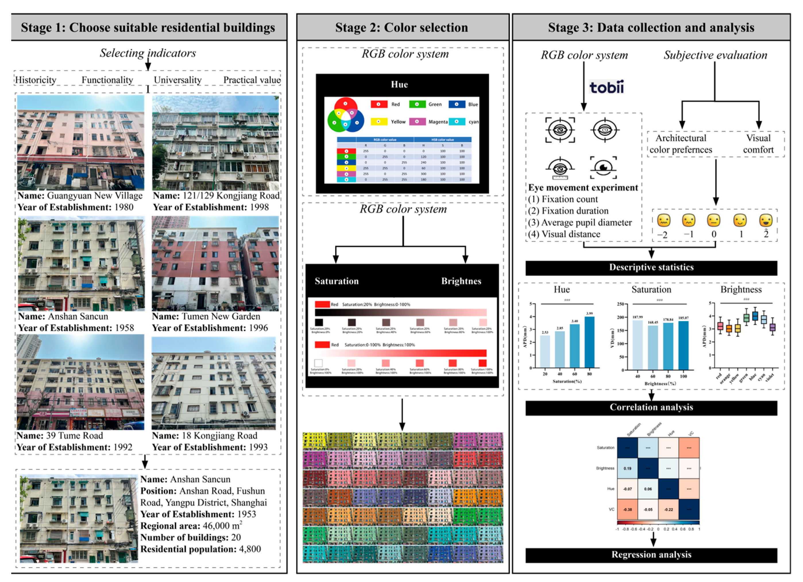
2.1. Research Flow
This experiment hopes to explore the relationship between architectural color elements and users’ visual comfort through eye movement experiment indicators and color scoring. The experiment was conducted at the University of Shanghai for Science and Technology (USST). In the early stage of the experiment, we visited a number of old residential areas in Shanghai, and after multi-dimensional comparisons, we finally selected a representative old residential area in Shanghai as the experimental object. In the selection of experimental colors, considering the visual fatigue of the subjects and color differences, 56 typical colors were selected from the original 175 colors for the experiment after the expert panel’s review. The experiment included eye movement data [3] from the experiment and a subjective evaluation questionnaire. During the eye movement experiment, the screen automatically displayed 56 pictures in sequence, each picture was displayed for 5 s, and a blank screen appeared for 3 s after the end of the playback to eliminate the original color stimuli. After each picture was displayed, the subjects scored their architectural color preference and subjective comfort level by oral presentation (Figure 1).
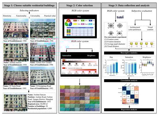
Figure 1.
Research framework.
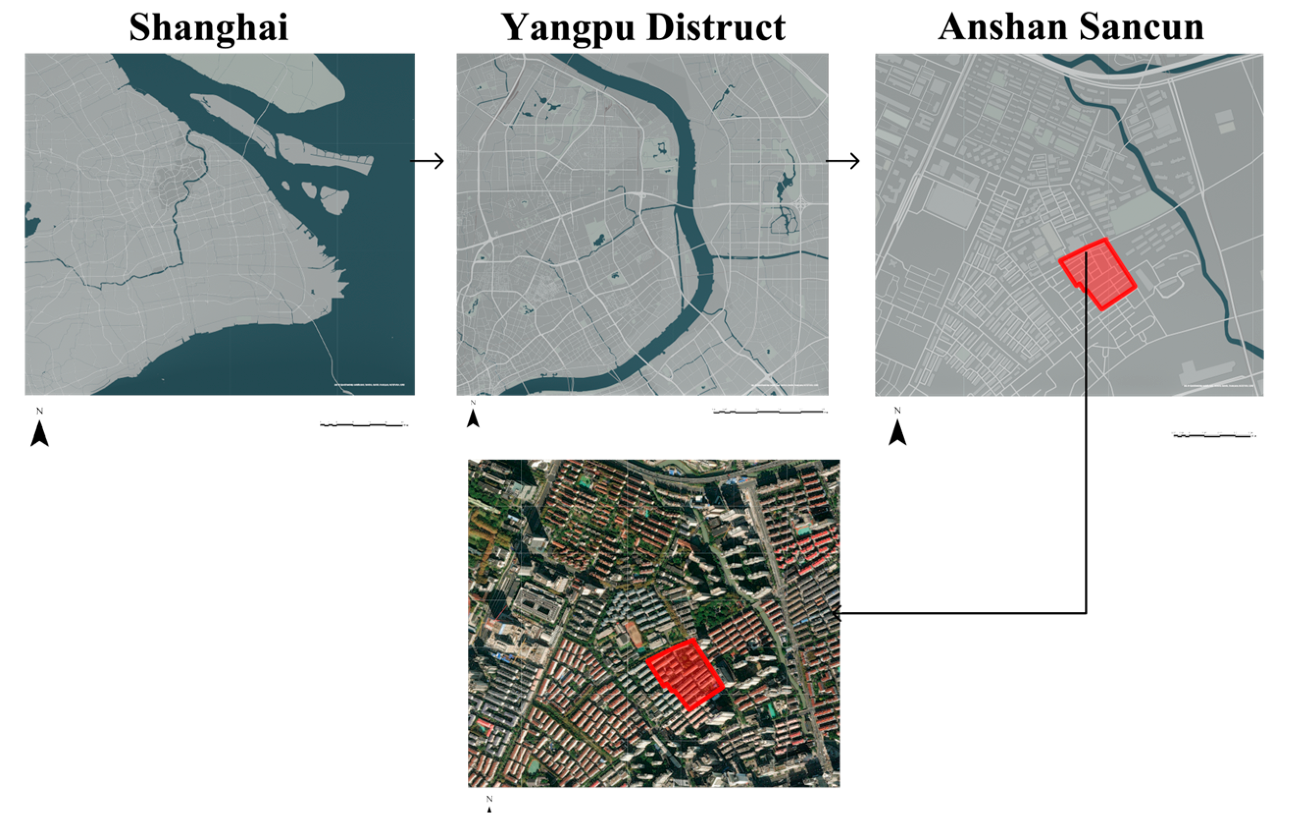
2.2. Study Area
In the process of selecting experimental subjects, several old residential neighborhoods in Yangpu District, Shanghai, were visited. These neighborhoods were built between 1958 and 2000, and most buildings utilized the Khrushchyovka style from the Soviet era, which greatly met the housing needs at that time. Due to the limitations of the era, the initial design did not consider the psychological impact of color on residents. During the selection process, a thorough comparison was made of various elements, such as the façade layout, façade design elements, and window forms of residential buildings from different periods. Additionally, the historical significance, functionality, universality, and practicality of the residential buildings were fully considered. Ultimately, Anshan Third Village was selected as the experimental subject. Three Anshan villages are currently functionally incomplete, the pipeline equipment is aging, public space is lacking, and cultural attributes are weak in line with the “Shanghai Residential Repair Project Management Trial Measures” defined by the old neighborhoods, which are urgently in need of systematic renewal and renovation.
Due to the long history of the construction of Anshan Sanchun and its many expansions, the colors of many residential buildings are confused at this stage. Additionally, due to the maintenance problems, the current building façade paint appears to fade, peel and display other phenomena, which requires a new color planning guidance for façade color design. Therefore, Anshan San Village in Yangpu District, Shanghai, was selected as the experimental subject (Figure 2).
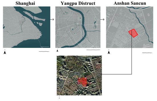
Figure 2.
Study area.
2.3. Color Selection
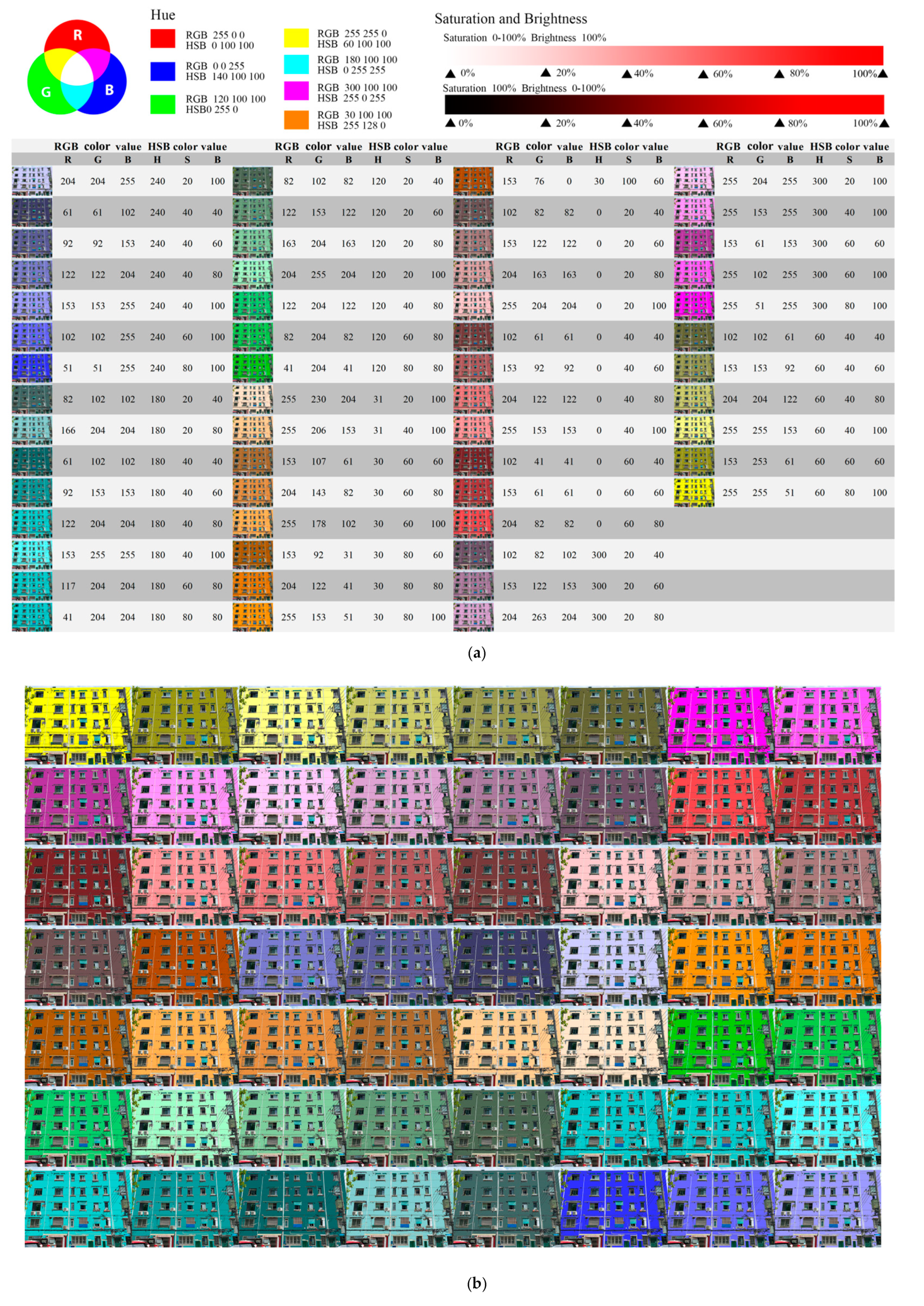
In previous studies, color attributes of visualizations have been significantly correlated with the cognitive efficiency of space users [33]; the experimental color is a combination of RGB and HSB color modes, RGB is a more common color mode through the superposition of the three color components R (red), G (green) B (blue) to achieve a color change. The experiment selects the three main colors of the RGB color mode, red, green, and yellow, and the three superimposed colors on the three intertones, magenta, yellow, and cyan (Figure 3b). The HSB color model (H: hue [0–360], S: saturation [0–100], B: brightness [0–100]) uses the three basic attributes of color—hue, saturation, and brightness—for quantitative expression. Therefore, in the saturation and brightness experiment process, the HSB color model is used to select the color saturation and brightness (i.e., 20%, 40%, 60%, 80%, and 100%) at intervals of 20% for the experiment (Figure 3a).
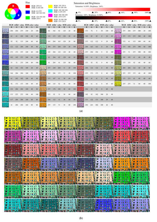
Figure 3.
Color value correspondence diagram: (a) color selection and color value correspondence chart. (b) Color list chart.
Orange, a widely used color in the Shanghai urban color scheme, was added to the original 6 shades by the decision of the expert group. In addition, after members of the expert group screened all samples to ensure that each color was represented, they finally selected 56 colors assigned to the same building façade as the experimental samples, and so this test was for the 7 (hue: red, orange, yellow, green, blue, cyan, and purple) × 4 (saturation: 20%, 40%, 60%, and 80%) × 4 (brightness: 20%, 40%, 60%, and 80%) three-factor within-group experiment (Figure 3).
2.4. Experimental Equipment
The experimental equipment used to collect eye movement data was the Tobii-x2-60 compact eye-tracker from a Swiss company, a desktop eye-tracking binocular eye-tracking device with eye movement technology based on infrared corneal reflectance. Experiments were conducted using dual monitors. One device was used to present the experimental material and one device was used to record the experimental data using the tobii studio 2 software. The resolution of both screens was 1024 × 768, and the final eye movement data were filtered and exported in tobii studio (Figure 4).
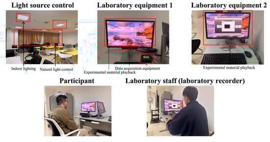
Figure 4.
Experimental equipment.
2.5. Subject
In past research, many scholars have demonstrated that the aesthetic preferences of college students are consistent with the public [34]. In this experiment, 64 college students were selected as subjects. At the same time, in order to achieve sample diversity and ensure that the subjects include a wider range of color preferences and aesthetics, we selected students from different disciplines, such as architectural design, landscape design, visual communication, industrial design, energy and power, management and other disciplines, from Shanghai Institute of Technology for the experiment. The final number of valid data is 50. All participants participated voluntarily, and all subjects had naked eye vision of 1.0 or higher, without strabismus, amblyopia, color weakness, color blindness, or other diseases.
2.6. Data Processing and Analysis
Eye movements include both gaze and eye hopping. Gaze occurs when the eye focuses on a visual target for a short period of time (i.e., approximately 300 milliseconds). An eye hop is a rapid eye movement between two gaze points, and the amplitude of the eye hop varies from small movements to large and variable movements [28]. Lv et al. used research to demonstrate the relationship between number of gaze points, average gaze duration, average sweep length, and cognitive load [35]. Yamamoto and Philbeck found that eye hopping movements reveal the speed and accuracy of spatial memory retrieval [36].
In this experiment, the eye movement indexes were processed by Tobii Studio, and four eye movement indexes, namely, visual distance (VD), pupil diameter (APD), fixation duration (TFD), fixation count (FC), and visual preference (VD), were used to study the subjects’ visual preference (Table 1).

Table 1.
Meaning of eye movement indicators.
Architectural color preferences and visual comfort indicators were tabulated through experimenter records (Table 2). Data preprocessing, management, and data analysis were based on R v4.1.1 software. ANOVA was used to test the differences between the experimental groups; the correlation analysis between two variables was expressed by Pearson’s correlation coefficient. For the regression analysis, each eye movement and subjective evaluation index was taken as the dependent variable, and façade color saturation and brightness were taken as the independent variables. Based on the trend of the dependent variable changing with the independent variable, a primary term linear regression model was established for the two variables that showed linear changes in a straight line, and a quadratic term curvilinear regression model was established for the two variables that showed curvilinear changes in a curvilinear line. Based on the trend of the dependent variables changing with the independent variables, the primary linear regression model was established for the two variables changing linearly in a straight line, and the quadratic curvilinear regression model for the two variables changing linearly in a curve. Firstly, the one-way regression models of brightness and saturation were established separately, and when the regression model and the fitting coefficient R2 were significant, the multifactorial regression model was further established. A two-sided test was used in this study, and p ≤ 0.05 was taken as a statistically significant difference.
Table 2.
Questionnaire for the subjective evaluation of color comfort on building facades.
3. Results
3.1. Data Processing and Preliminary Explorations
The purpose of this study is to assess the operability of eye movement data [3] as a measure of visual comfort with the residential building façade color by combining eye movement physiological index measurements and subjective visual perception methods. The data for each visual index obtained in the experiment were examined to explore the relationship between the three attributes of façade color and users’ visual comfort. A total of 2744 data sets, including eye movement indexes and subjective evaluation data, were collected from 50 subjects in the experiment.
The preliminary exploration of the data revealed that the ANOVA p-values for the APD, VD, FC and TFD of the subjects in different color element groups obtained from the experiment on the color saturation, lightness, and hue of the building façade were less than 0.05, which implies that when the color saturation, lightness, and hue were changed, the eye movement indexes of the subjects were significantly changed. Moreover, the three elements of building façade color obtained in the experiment were statistically significant in the study of eye movement data (Table 3).
Table 3.
Analysis of variance between eye movement evaluation indexes and three attributes of color.
In order to get the mathematical model of the three elements of building façade color and users’ visual comfort, we gradually established single-factor and multifactor linear regression analysis models to get the fitting equations. The change trend between the three attributes of color and eye movement index was obtained, and the influence of different colors on visual comfort was clarified.
3.2. Influences of Eye Movement, Subjective Evaluation Indicators, and Color Elements
3.2.1. Influence of Pupil Size in Relation to Color Elements
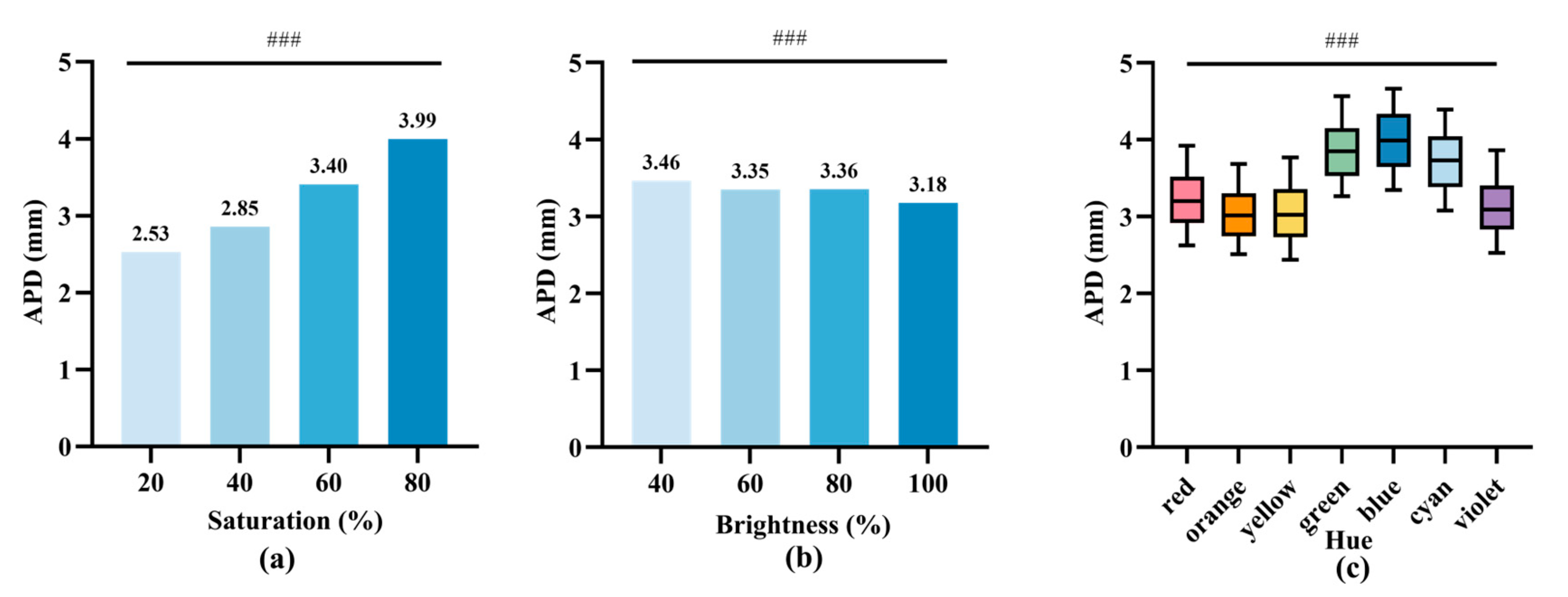
The results of the experiment based on the three elements of color and APD showed that color saturation, lightness, and hue had significant effects on subjects’ APDs (Figure 5). In the case of the same color tone and brightness of the façade, the relationship between APD and color saturation was explored, and the average value of APD was the lowest at 2.53 mm when the saturation was 20%, fluctuated from 2.85 to 3.40 mm when the saturation was from 40% to 60%, and the average value of APD was the highest at 3.99 mm when the saturation was 80%, which shows that the two have a positive correlation (Figure 5a).

Figure 5.
Average pupil diameter (APD) for the three attributes of elevation color. (a) Histogram of the mean saturation and APD; (b) histogram of the mean luminance and APD; and (c) box line plot of the hue and APD (the middle line represents the median, the upper and lower boundaries of the box line represent the 25th and 75th percentiles, and the upper and lower ends of the line segments represent the 5th and 95th percentiles, respectively). 0.05; ###: p < 0.001.
When the color tone and saturation of the façade remain unchanged, the highest average value of APD is 3.46 mm for a brightness of 40%, APD fluctuates from 3.35 to 3.36 mm for a brightness of 60% to 80%, the average value of APD is as low as 3.18 mm when the brightness is 100%. The two have a negative correlation, i.e., APD is gradually reduced with an increase in the brightness of the color (Figure 5b).
With the same saturation and luminance, there were differences in subjects’ APDs between shades, with the highest mean APDs for green, blue, and cyan buildings. The range of fluctuation of subjects’ APDs was smaller for orange-colored buildings. Compared to other color spaces, orange made subjects’ emotions relatively stable (Figure 5c).
The APD results showed that façade color saturation, luminance, and hue had significant effects on subjects’ APDs. APDs increased significantly and eye fatigue increased when both the spatial color saturation was too high and brightness was too low.
3.2.2. Relationship between the Eye Jump Distance and the Influence of Color Elements
The experimental results based on the three elements of color and VD showed that color saturation, lightness, and hue had significant effects on subjects’ VD (Figure 6). In the case of the same color tone and brightness of the façade, VD increased gradually with an increase in color saturation; the lowest mean value of VD was 172.34 mm when the saturation was 40%, and the highest mean value of VD was 190.51 mm when the saturation was 80%, which shows that the two are positively correlated with each other (Figure 6a).
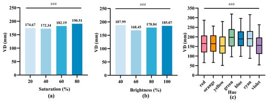
Figure 6.
Visual distance (VD) for three attributes of elevation color. (a) Histogram of the mean saturation and VD; (b) histogram of the mean luminance and VD; and (c) box line plot of the hue and VD (the middle line indicates the median, the upper and lower boundaries of the box line indicate the 25th and 75th percentiles, respectively, and the upper and lower ends of the line segment indicate the 5th and 95th percentiles, respectively). ###: p < 0.001.
When the color tone and saturation of the façade remain unchanged, the mean value of VD was higher when the luminance was 40% and 100%, which were 187.99 mm and 185.07 mm, respectively, and the mean value of VD fluctuated at 168.45~178.84 mm when the luminance was within 60~80%; thus the luminance shows a non-linear correlation tendency with the VD and shows a negative correlation before the critical value (60%) and a positive correlation after the critical value (60%) (Figure 6b).
With the same saturation and brightness, there were differences in subjects’ VD between different hues, with the highest mean VD values and a greater range of fluctuation in the green, blue, and cyan environments. In the orange environment, the subjects’ VD had a smaller range of fluctuation. Compared to other color spaces, orange made subjects’ emotions relatively stable. In the green, red, yellow, and purple spaces, the VD of different subjects varied more, which indicates that the visual comfort of different subjects varied more in these colors (Figure 6c).
The VD results showed that façade color saturation, luminance, and hue had significant effects on subjects’ VD. When the façade color saturation was too high and brightness was too low or too high, VD increased significantly, subjects subconsciously performed sweeping movements to alleviate eye discomfort, and people may feel anxious, affecting the cognitive efficiency of residential users.
3.2.3. Relationship between the Number of Attention Points and the Influence of Color Elements
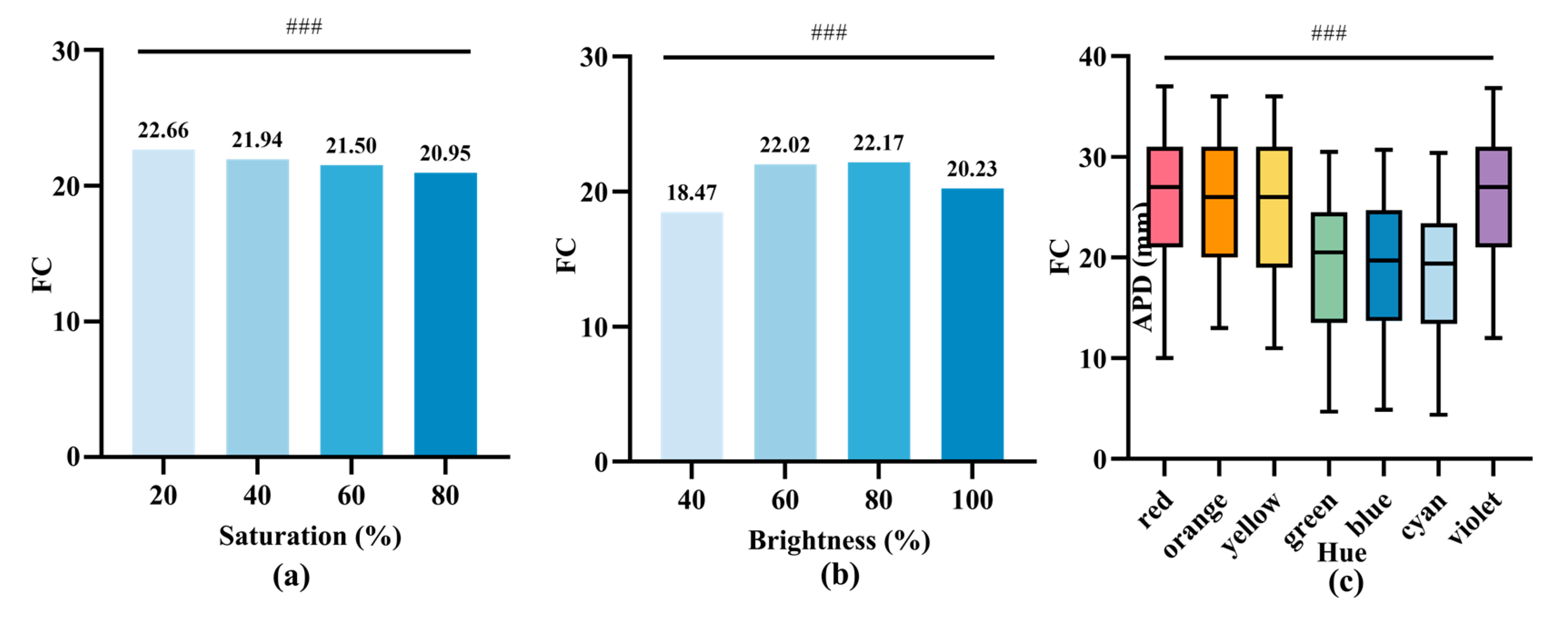
The experimental results based on the three elements of color and FC showed that color saturation, lightness, and hue had significant effects on subjects’ FC (Figure 7). In the case of the same façade hue and brightness, FC decreased gradually with an increase in color saturation; the highest mean FC value was 22.66 at 20% saturation, and the lowest mean FC value was 20.95 at 80% saturation, which were negatively correlated (Figure 7a).

Figure 7.
Focus count (FC) for the three attributes of elevation color. (a) Mean saturation and FC histogram; (b) mean luminance and FC histogram; and (c) and hue and FC box line plot (the middle line represents the median, the upper and lower boundaries of the box line represent the 25th and 75th percentiles, respectively, and the upper and lower ends of the line segment represent the 5th and 95th percentiles, respectively). ###: p < 0.001.
When the elevation hue and saturation were kept constant, the mean FC values were lower at 40% and 100% brightness, 18.47 and 20.23, respectively, and the mean FC values were higher at 60% to 80% brightness, fluctuating from 22.02 to 22.17, which showed a nonlinear relationship, with a positive correlation before the critical point (80%) and a negative correlation after the critical point (80%) (Figure 7b).
With the same saturation and brightness, there were differences in subjects’ FC between shades, with lower mean FC values in green, blue, and cyan spaces (Figure 7c).
The FC results showed that façade color saturation, brightness, and hue had significant effects on subjects’ FC. When the color saturation was low, the brightness was moderate, and when the hues were red, orange, yellow, and purple, the FC increased significantly and the subjects would be more interested in the façade colors.
3.2.4. Relationship between the Total Gaze Time and the Influence of Color Elements
The experimental results based on the three elements of color and TFD showed that color saturation, brightness and hue had significant effects on subjects’ TFD (Figure 8). In the case of the same façade hue and brightness, TFD gradually decreased with an increase in color saturation; the highest mean value of TFD was 5.69 s at 20% saturation, and the lowest mean value of TFD was 3.64 s at 80% saturation, which were negatively correlated with each other (Figure 8a).
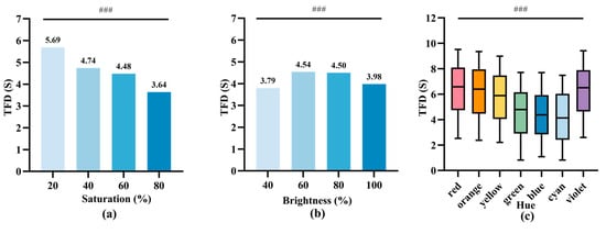
Figure 8.
Total focus duration (TFD) for the three attributes of elevation color. (a) histogram of mean saturation and TFD; (b) histogram of mean luminance and TFD; and (c) box line plot of the hue and TFD (the center line indicates the median, the upper and lower boundaries of the box line indicate the 25th and 75th percentiles, respectively, and the upper and lower ends of the line segments indicate the 5th and 95th percentiles, respectively). ###: p < 0.001.
When the elevation hue and saturation were kept constant, the mean TFD values were lower at 40% and 100% brightness, 3.79 s and 3.98 s, respectively, and the mean TFD values fluctuated from 4.54 s to 4.50 s at 60% to 80% brightness, which showed a nonlinear relationship, with positive correlation before the critical point (60%) and negative correlation after it (Figure 8b).
With the same saturation and lightness, there were differences in subjects’ TFD between shades, with subjects having lower mean TFD values in green, blue, and cyan spaces (Figure 8c).
The TFD results showed that façade color saturation, luminance, and hue had significant effects on subjects’ TFD. When the spatial color saturation was low, the brightness was moderate, and the hue was red, orange, yellow, or purple, the TFD increased significantly and subjects would be more interested in the façade color.
3.2.5. Visual Comfort in Relation to the Influence of Color Elements
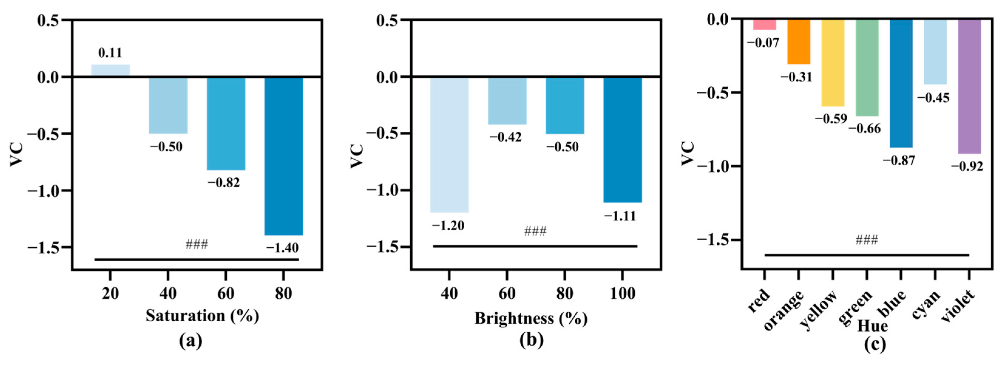
The experimental results based on the three elements of color and VC showed that color saturation, lightness and hue had significant effects on subjects’ VC (Figure 9). In the case of the same façade hue and brightness, VC gradually decreased with an increase in color saturation; the highest mean value of VC was 0.11 at 20% saturation, and the lowest mean value of VC was −1.40 at 80% saturation, which showed a negative correlation (Figure 9a).
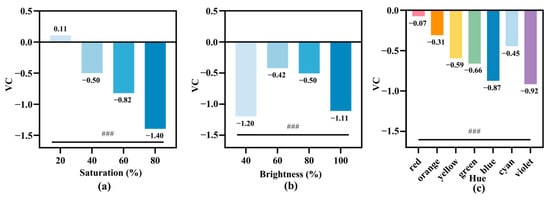
Figure 9.
Visual comfort (VC) and the three attributes of façade color. (a) Histogram of mean saturation and VC; (b) histogram of mean luminance and VC; and (c) box line plot of the hue and VC (the middle line represents the median, the upper and lower boundaries of the box line represent the 25th and 75th percentiles, respectively, and the upper and lower ends of the line segments represent the 5th and 95th percentiles, respectively). ###: p < 0.001.
When the color tone and saturation of the façade were kept constant, the mean VC values were lower at 40% and 100% brightness, −1.20 and −1.11, respectively, and the mean VC values fluctuated from −0.50 to −0.42 when the brightness ranged from 60% to 80%. Both of them were not in a linear relationship and showed a positive correlation before the critical value (60%) and a negative correlation after the critical value (60%) (Figure 9b).
With the same saturation and brightness, there were differences in subjects’ VC between different hues, with higher VC in the red, orange, and cyan spaces, with mean values of −0.07, −0.31, and −0.45, respectively, and lower VC in the yellow, green, blue, and violet spaces, with mean values of −0.59, −0.66, −0.87, and −0.92, respectively (Figure 9c).
The VC results showed that façade color saturation, brightness and hue had significant effects on subjects’ VC. When the color saturation of the façade was low, the brightness was moderate, and the hue was red, orange, or cyan, the VC increased significantly and the subjects were more visually comfortable with the façade.
3.2.6. The Relationship between Architectural Color Preferences and the Influence of Color Elements
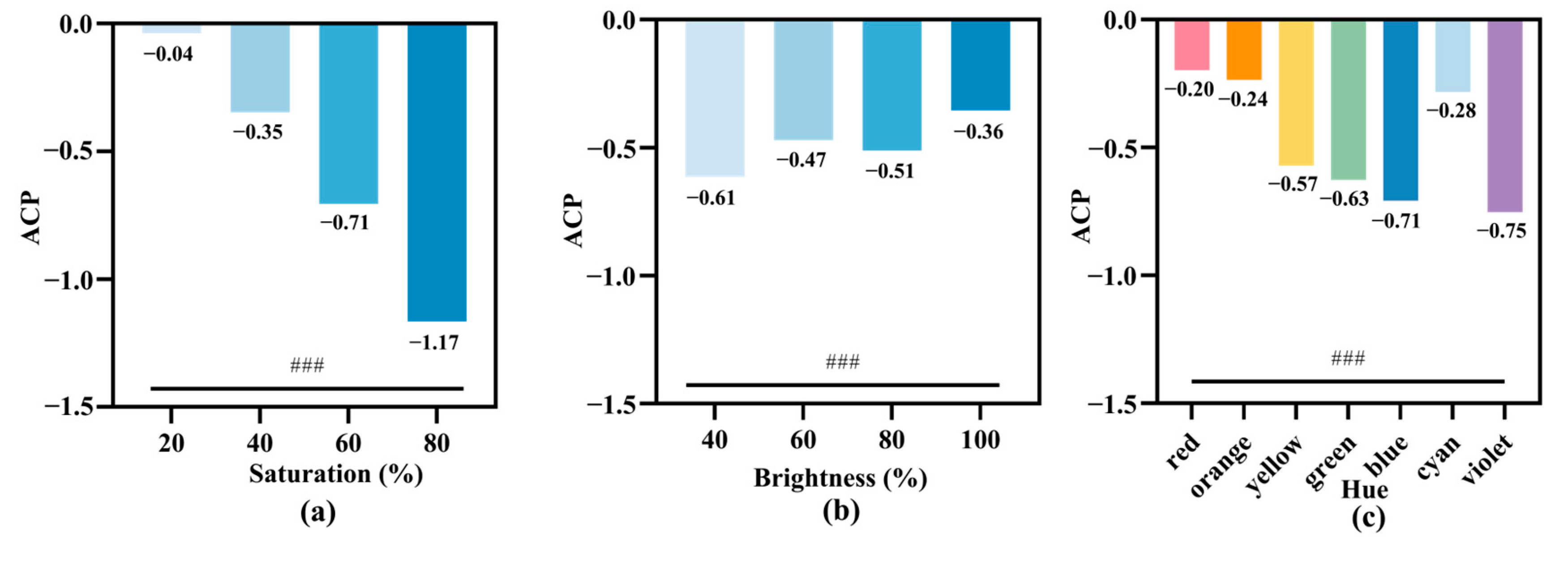
The experimental results based on the three elements of color and ACP showed that color saturation, lightness, and hue had significant effects on subjects’ ACP. In the case of the same color tone and brightness of the façade, ACP decreased gradually with an increase in color saturation; the highest mean value of ACP was −0.04 at 20% saturation, and the lowest mean value of ACP was −1.17 at 80% saturation, both of which were negatively correlated (Figure 10a).
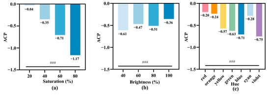
Figure 10.
Architectural color preference (ACP) for the three attributes of elevation color. (a) Histogram of mean saturation and ACP; (b) histogram of the mean ACP values for brightness; (c) boxplot of the ACP for color (the middle line represents the median, the upper and lower boundaries of the boxplot represent the 25th and 75th percentiles, respectively, and the upper and lower ends of the line segment represent the 5th and 95th percentiles, respectively). ###: p < 0.001.
When the elevation hue and saturation were kept constant, the ACP decreased with an increase in brightness, with a lower mean ACP value of −0.61 at 40% brightness, and a fluctuating mean ACP value of −0.51 to −0.47 when the brightness was in the range of 60% to 80% (Figure 10b).
With the same saturation and lightness, there were differences in subjects’ ACP between hues, with subjects in the red, orange, and cyan spaces having higher ACP with mean values of −0.20, −0.24 and −0.28, respectively, while subjects in the yellow, green, blue, and violet spaces had lower ACP with mean values of −0.57, −0.63, −0.71 and −0.75, respectively (Figure 10c).
The ACP results showed that façade color saturation, brightness, and hue had significant effects on subjects’ ACP. When the façade color saturation was lower, brightness was higher, and hues were red, orange, or cyan, ACP increased significantly and subjects would prefer the façade color more.
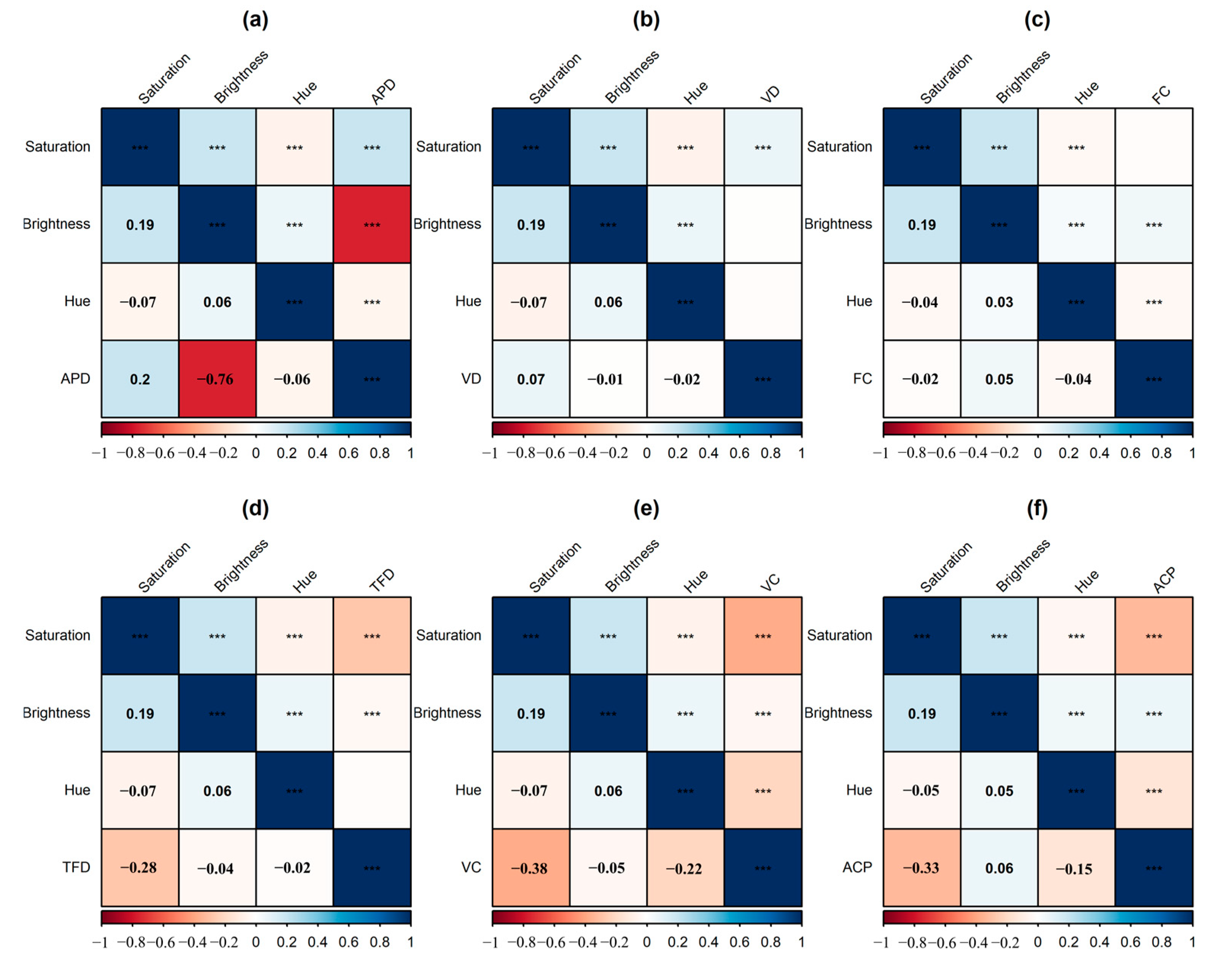
3.3. Correlation Analysis of Eye Movement and Subjective Evaluation Indicators with Color Elements
In order to get the assessment model of residential building façade color, this study analyzes the correlations between eye movement, subjective evaluation indexes, and the three elements of color. From the above study, it can be seen that there is not a linear correlation between hue, eye movement, and subjective evaluation indexes, and so we mainly analyze the correlations between color saturation and brightness pairs and eye movement and subjective evaluation indexes.
In this study, APD was found to be positively correlated with saturation (p < 0.05), with a correlation coefficient of 0.2 (Figure 11a). APD was negatively correlated with brightness (p < 0.05), with a correlation coefficient of −0.76 (Figure 11a). VD was positively correlated with saturation (p < 0.05), with a correlation coefficient of 0.07 (Figure 11b). APD was negatively correlated with brightness (p < 0.05), with a correlation coefficient of −0.01 (Figure 11b). The results are shown in Figure 11c. FC was negatively correlated with saturation (p < 0.05), with a correlation coefficient of −0.02 (Figure 11c). FC was positively correlated with brightness (p < 0.05), with a correlation coefficient of 0.05 (Figure 11c). TFD was negatively correlated with saturation and brightness (p < 0.05), with correlation coefficients of −0.28 and −0.04 (Figure 11d), respectively. VC was negatively correlated with saturation and luminance (p < 0.05), with correlation coefficients of −0.38 and −0.05, respectively (Figure 11e). ACP was negatively correlated with saturation (p < 0.05), with a correlation coefficient of −0.33. ACP was positively correlated with luminance (p < 0.05), with a correlation coefficient of 0.06 (Figure 11f).
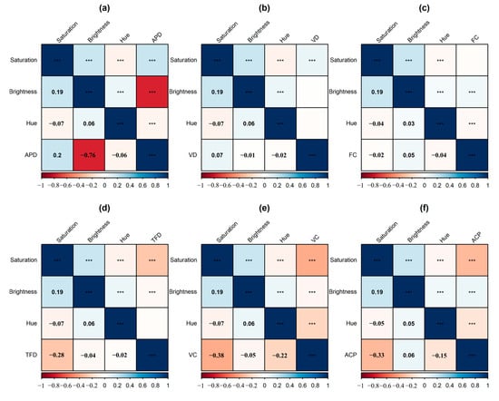
Figure 11.
Correlation analysis of the three elements of color with eye movement indicators and subjective comfort. (a) Correlation of APD with the three elements of color. (b) Correlation of VD with the three elements of color. (c) Correlation of FC with the three elements of color. (d) Correlation of TFD with the three elements of color. (e) Correlation of VC with the three elements of color. (f) Correlation of ACP with the three elements of color. ***: p < 0.001.
3.4. Regression Analysis of Eye Movement and Subjective Evaluation Indicators with Color Saturation and Lightness
As known from the previous section, there is a linear correlation between color saturation and brightness and between eye movement and subjective evaluation indexes, and so this study establishes a regression model of color saturation and brightness with eye movement and subjective evaluation indexes. Each eye movement and subjective evaluation index is the dependent variable, and metro space saturation and luminance are the independent variables. Based on the trend of the dependent variable changing with the independent variable in Figure 5, Figure 6, Figure 7, Figure 8, Figure 9 and Figure 10, the primary term linear regression model was established for the two variables that changed linearly in a straight line, and the quadratic term curvilinear regression model was established for the two variables that changed linearly in a curve. Firstly, the single-factor regression models of brightness and saturation were established, respectively, and when the regression model and the fitting coefficient R2 were significant, the multifactor regression model was further established (Table 4).
Table 4.
Mathematical equation model between eye movement evaluation indexes and color attributes.
In this study, the linear mathematical prediction models of APD, VD, FC, TFD, VC, and ACP with color saturation were established separately, and their regression model R2 values were 0.87, 0.83, 0.65, 0.76, 0.73, and 0.79, respectively, and the model R2 and regression coefficients were tested for differences and found to be statistically significant (p < 0.05) (Table 4). In this case, color saturation had a positive effect on APD, with APD rising by 0.73 units for every one unit increase in saturation. Color saturation had a positive effect on VD, with VD elevated by 22.96 units whenever saturation increases by one unit. Color saturation has a negative effect on FC, with FC decreasing by 3.00 units for every one- unit increase in saturation. Color saturation had a negative effect on TFD, decreasing FC by 3.00 units for every one- unit increase in saturation. Color saturation had a negative effect on VC, decreasing FC by 2.20 units for every one unit increase in saturation. Color saturation had a negative effect on ACP, decreasing ACP by 1.84 units for every one unit increase in saturation.
We also established linear mathematical prediction models for APD and ACP with color brightness, and their regression models R2 were 0.91 and 0.80, respectively, and the model R2 value and regression coefficients were statistically significant (p < 0.05) (Table 4). Among them, color brightness affected APD negatively, where the higher the brightness, the lower the APD, and every time the brightness increased by one unit, the APD decreased by −2.59 units. The effect of color luminance on ACP was positive, where the higher the luminance, the higher the ACP, and whenever luminance increased by one unit, ACP was elevated by 0.33 units.
A quadratic linear mathematical prediction model of VD, FC, TFD and VC with color brightness was established, and its regression model R2 values were 0.84, 0.81, 0.93 and 0.77, respectively, and the model R2 and regression coefficients were tested for differences and found to be statistically significant (p < 0.05) (Table 4). The effect of color luminance on VD was first decreasing and then increasing with increasing luminance. With increasing luminance, VD first gradually decreased until the luminance reached 74%, when VD reached the lowest value, and then as the luminance continued to increase, VD gradually increased. The effect of color brightness on TFD with the increase in brightness first increased and then decreased. First, with the increase in brightness, TFD gradually increased until the brightness of 69%, where TFD reached the highest value, and as the brightness continued to increase, TFD gradually decreased. The effect of an increase in color brightness on the VC first increased and then decreased. First, with the increase in brightness, VC gradually increased until the brightness of 49%, when the VC reached the highest value, and as the brightness continued to increase, VC gradually decreased.
Based on the fitting of the single-factor regression model, finally, the color brightness and saturation were introduced into the regression model at the same time, and a multifactor regression model was established. The mathematical prediction models of APD, VD, FC, TFD, VC, and ACP with the color saturation and brightness had regression model R2 values of 0.92, 0.86, 0.75, 0.85, 0.79, and 0.81, respectively, and the model R2 values and the regression coefficients were statistically significant (p < 0.05) (Table 4). Among them, when the color brightness was unchanged, for every one unit increase in saturation, the APD increased by 1.29 units; when the saturation was unchanged, for every one unit increase in brightness, the APD decreased by 2.82 units. When the color brightness was unchanged and saturation increased every one unit, VD increased by 27.59 units; when the saturation was unchanged, VD first decreased and then increased with the increase in brightness. First, with the increase in brightness VD gradually decreased until the brightness of 76%, where VD reached its lowest value, and as the brightness continued to increase, the VD gradually increased. When the color brightness was unchanged and the saturation increased by one unit, FC decreased by 1.67 units; when the saturation was unchanged, FC first increased and then decreased with the increase in brightness. First, with the increase in brightness, FC gradually increased until the brightness of 75%, where FC reached its highest value, and as the brightness continued to increase, the FC gradually decreased. When the color brightness was unchanged and saturation increased by one unit, TFD decreased by 3.23 units; when the saturation was unchanged, TFD increased with brightness initially, but then decreased as brightness continued to increase. First of all, with the increase in brightness, TFD gradually increased until a brightness of 73%, where TFD reached its highest value, and as the brightness continued to increase, TFD gradually decreased. When the color brightness was unchanged and the saturation increased by one unit, VC decreased by 2.48 units; when the saturation was unchanged, VC increased with brightness initially, but then decreased as brightness continued to increase. First, with the increase in brightness, VC gradually increased until a brightness of 73%, where the VC reached its highest value, and as the brightness continued to increase, the VC gradually decreased. When the brightness of the color was unchanged and saturation increased by one unit, ACP increased by 0.69 units; when saturation was unchanged and brightness increased by one unit, ACP decreased by 1.98 units.
4. Discussion
4.1. General Laws and Conclusions
Through the results, we found that (1) for saturation, the façade color saturation is positively correlated with APD and VD. As the façade color saturation increases, both APD and VD also increase. The increase in APD is significantly higher than that in VD, indicating that the façade color saturation can significantly affect the cognitive load of the subjects, reducing their preference for the building façade color. Façade color saturation is negatively correlated with FC, TFD, VC, and ACP. As the elevation color saturation increases, FC, TFD, VC, and ACP decrease, with the most significant effect observed on VC. It shows that as color saturation increases, VC will be significantly reduced. (2) For brightness, the façade color brightness is positively correlated with FC and ACP. As the elevation brightness increases, FC and ACP will slowly increase. The façade color brightness is negatively correlated with APD, VD, TFD, and VC. As the elevation brightness increases, APD, VD, TFD, and VC decrease. Among them, the effect of façade brightness on APD is the most significant; as brightness increases, APD will decrease significantly. A high brightness of the façade color can significantly reduce visual fatigue, decrease the cognitive load of users, and enhance the color perception of the building façade. For hue, the façade hue is negatively correlated with APD, VC, FC, TFD, and ACP. Changes in hue significantly affect VC and ACP. Combined with Figure 9 and Figure 10, red, orange, and cyan colors have the highest color rating values, with red having the highest VC and ACP. Orange follows as the next highest, indicating that people prefer warm-colored buildings.
In this paper, we explore the characteristics of visual behavior and the variability of subjective evaluations in different architectural color contexts through a combination of eye-movement techniques and subjective questionnaires, and our results are as follows:
- (1)
- A highly saturated building facade color will significantly reduce the user’s perception of the color of the building to increase the user’s visual fatigue, reducing the user’s evaluation of the building color.
- (2)
- Brightness has a non-linear effect on visual perception, and too much or too little brightness has a bad visual effect on building color. When the brightness is maintained at 60–80%, the user’s perception of the color of the building will be significantly enhanced, increasing the degree of preference for the color of the façade.
- (3)
- Warm colors (red, orange, and yellow) were less irritating to subjects’ eyes and had higher subjective ratings. Among the cooler colors (blue, green, and cyan), subjects had higher eye irritation and lower subjective ratings, but among the cooler colors, subjects rated cyan significantly higher than the other cooler colors. In contrast to cyan, purple was rated significantly lower than the other warm colors, even though it was less irritating to the subjects’ eyes.
4.2. Strengths and Limitations of This Study
This study introduces physiological measurement methods into color research. By conducting single-factor and multifactor regression analyses, it establishes a mathematical model between façade color elements, eye-tracking indicators, and subjective evaluations. This approach deeply explores the relationship between building colors and the subjective perceptions of the subjects.
This study cross-verifies eye-tracking physiological indicators with the subjective evaluations of the subjects, addressing the limitation of previous research that relied solely on eye-tracking indicators to measure subjects’ color preferences. This enriches the existing theoretical framework of urban color. At the same time, the use of eye-tracking technology allows for a more accurate acquisition of user demand data, improving research efficiency and precision. By relying on the objective and in-depth participation of user groups, urban color research can better meet the real needs of the users, providing more diverse perspectives for the study of urban colors [37]. Color research based on urban big data often systematically explains urban color choices from a macro perspective. However, big data and machine learning struggle to accurately capture users’ subjective perceptions of color. This study, through eye-tracking experiments and subjective questionnaires, proposes multidimensional evaluation indicators for urban color planning from a human-centered perspective, ensuring that urban color planning better meets the real needs of the user group.
Traditional color research methods primarily rely on surveys, which are greatly influenced by subjective factors. Elements such as interests, emotions, and personality affect the objectivity of the survey results, making it necessary to improve their accuracy. In this study, the use of eye-tracking signals offers objectivity that is not influenced by the subjective intentions of the user group, reflecting their true psychological and emotional states. This ensures the objectivity of the subjects’ experiential feedback. Finally, high-quality building colors can significantly influence the urban vitality of an area, enhance the residential experience, and further increase the economic value of the location. However, due to the limited length of the article and its focus, this study does not delve into the impact of urban color on economic value. The influencing factors and receptors in real-world environments are diverse and complex. Future research on corresponding subjects will explore its impacts on aspects such as the economy, population, and physical and mental health in greater depth.
5. Conclusions
This study collected physiological indicators and subjective evaluations from participants. Using single-factor and multifactor regression analyses, it explored the relationships between building façade color elements, visual perception, and subjective evaluation indicators. The findings provide user perspective reference suggestions for the color renewal of façades in some of Shanghai’s older residential buildings. This study introduces eye-tracking technology into building color experiments. Eye-tracking perception technology can help participants express their needs truthfully and objectively, enhancing the authenticity of the feedback and accurately capturing the psychological information of the user group [38]. Using eye-tracking technology to collect participants’ subconscious visual responses to different building colors, this research method enriches the traditional building color research framework, which previously relied solely on questionnaires. It emphasizes the feasibility of urban color planning at a pedestrian scale. It strengthens the cognitive depth of multiple stakeholders in color planning, improves urban color quality, and complements urban color research based on deep learning and urban imagery. This provides new theoretical support for the current development of architectural and urban color planning.
Author Contributions
Conceptualization, Z.W. and M.S.; methodology, M.S. and Y.H.; software, M.S. and Y.H.; validation, M.S. and Y.H.; formal analysis, M.S. and Y.H.; investigation, M.S.; resources, Z.W. and M.S.; data curation, M.S.; writing—original draft preparation, M.S. and Y.H.; writing—review and editing, M.S. and Y.H.; visualization, M.S. and Y.H.; supervision, Y.H.; project administration, Y.H.; funding acquisition, Z.W. All authors have read and agreed to the published version of the manuscript.
Funding
This research was funded by the Fundamental Research Funds for the Central Universities grant number 22120220302 and Shanghai Science and Technology Innovation Project by 22692111700.
Data Availability Statement
All relevant data are within the paper files.
Conflicts of Interest
The authors declare that they have no known competing financial interests or personal relationships that could have appeared to influence the work reported in this paper.
References
- Jaglarz, A. Perception of Color in Architecture and Urban Space. Buildings 2023, 13, 2000. [Google Scholar] [CrossRef]
- Zhai, Y.; Gong, R.; Huo, J.; Fan, B. Building Façade Color Distribution, Color Harmony and Diversity in Relation to Street Functions: Using Street View Images and Deep Learning. ISPRS Int. J. Geo-Inf. 2023, 12, 224. [Google Scholar] [CrossRef]
- Zhang, L.; Li, X.; Li, C.; Zhang, T. Research on Visual Comfort of Color Environment Based on the Eye-Tracking Method in Subway Space. J. Build. Eng. 2022, 59, 105138. [Google Scholar] [CrossRef]
- Zhong, T.; Ye, C.; Wang, Z.; Tang, G.; Zhang, W.; Ye, Y. City-Scale Mapping of Urban Façade Color Using Street-View Imagery. Remote Sens. 2021, 13, 1591. [Google Scholar] [CrossRef]
- Manav, B. Color-emotion Associations, Designing Color Schemes for Urban Environment-architectural Settings. Color Res. Appl. 2017, 42, 631–640. [Google Scholar] [CrossRef]
- Xu, Z.; Zheng, X. Roadmap of Moving Urban Colour toward Cultural Sustainability in China. Color Res. Appl. 2021, 46, 222–239. [Google Scholar] [CrossRef]
- Odetti, J.V. The Study of Color as a Component of Urban Cultural Construction: A Theoretical Reflection and Methodological Proposal. Color Res. Appl. 2023, 48, 453–467. [Google Scholar] [CrossRef]
- Liu, S.; Zhu, S.Y. Research on Influencing Factors of Urban Color—Taking Changsha as an Example. AMM 2014, 675–677, 1279–1282. [Google Scholar] [CrossRef]
- Li, R.; Wu, M. Revealing Urban Color Patterns via Drone Aerial Photography—A Case Study in Urban Hangzhou, China. Buildings 2024, 14, 546. [Google Scholar] [CrossRef]
- Wang, J.; Zhang, L.; Gou, A. Study of the Color Characteristics of Residential Buildings in Shanghai. Color Res. Appl. 2021, 46, 240–257. [Google Scholar] [CrossRef]
- Guo, H.Y.; Cai, Y.N. China’s Urban Architecture and Environmental Color Practicein in Ten Years. AMM 2012, 174–177, 2512–2515. [Google Scholar] [CrossRef]
- Guo, H.Y.; Cai, Y.N. Urban Color Composition Characteristic in Guangzhou City. AMM 2012, 174–177, 2508–2511. [Google Scholar] [CrossRef]
- Li, Y. Research on the Urban Architecture Color and Chromatography—A Proposal of Digital Environmental Color Taking Dandong City’s Building Color as an Example. AMR 2013, 671–674, 2245–2249. [Google Scholar] [CrossRef]
- Liu, S.; Li, G.Y. Color a City—The Study of Yichang’s Urban Color. AMM 2014, 675–677, 1271–1274. [Google Scholar] [CrossRef]
- Miao, M.; Feng, L.; Wu, Y.; Zhu, R.; Xu, D. Color Authenticity for the Sustainable Development of Historical Areas: A Case Study of Shiquan. Sustainability 2024, 16, 2417. [Google Scholar] [CrossRef]
- Ren, J. Research on Urban Color Environment Planning Based on Regional Characteristics—Take Urban Color Environment of Zhengzhou for Example. AMR 2011, 255–260, 1546–1550. [Google Scholar] [CrossRef]
- Zhang, S.; Liu, Y.; Nie, H. Geographical Feature Based Research on Urban Color Environment—Taking Wuhan as an Example. IERI Procedia 2014, 9, 190–195. [Google Scholar] [CrossRef]
- Gou, A.; Wang, J. Research on the Location Characters of Urban Color Plan in China. Color Res. Appl. 2008, 33, 68–76. [Google Scholar] [CrossRef]
- Wang, J.; Zhang, L.; Gou, A. Study on the Preference of City Color Image Selection Based on the Logistic Model: A Case Study of Shanghai. Color Res. Appl. 2020, 45, 542–557. [Google Scholar] [CrossRef]
- Chen, K.; Lin, H.; Chen, Y.-J.; Xu, Y.; Ding, S.; Guo, Y.; You, S. Do Consumers Have Colour Aesthetic Preferences for the Facade Materials of Condominium Buildings? Buildings 2024, 14, 557. [Google Scholar] [CrossRef]
- Wang, Z.; Sun, H.; Li, J. Research on Architectural Color and Visual Comfort in Historic Landscape Areas. Buildings 2023, 13, 1004. [Google Scholar] [CrossRef]
- Xu, Z.; Zhang, F.; Wang, H.; Gao, Y.; Xu, M.; Ran, J.; Wang, M.; Xia, J. Deep Learning Based Urban-Building Color Obtaining Method, Involves Picking up, Summarizing and Counting Color of Extracted Building, and Performing Color Clustering to Obtain Main Color of Building in Different Areas. Patent CN110197511-A, 2019. Available online: https://webofscience.clarivate.cn/wos/alldb/full-record/DIIDW:201978988F (accessed on 10 May 2024).
- Kong, L.; Liu, J.; Qiao, C.; Wang, W.; Xu, N.; Ren, Y.; Xu, X. Dividing Urban Color Grade, Involves Constructing Evaluation System of City Space Color by Analytic Hierarchy Process of Factors Influencing City Color, and Generating Element Data Set of Sub-Standard Layer. Patent CN113610295-A, 2021. Available online: https://webofscience.clarivate.cn/wos/alldb/full-record/DIIDW:2021C90961 (accessed on 10 May 2024).
- Ou, L.; Luo, M.R. A Colour Harmony Model for Two-colour Combinations. Color Res. Appl. 2006, 31, 191–204. [Google Scholar] [CrossRef]
- Zhao, J.; Yan, Y.; Deng, H.; Liu, G.; Dai, L.; Tang, L.; Shi, L.; Shao, G. Remarks about Landsenses Ecology and Ecosystem Services. Int. J. Sustain. Dev. World Ecol. 2020, 27, 196–201. [Google Scholar] [CrossRef]
- Duchowski, A.T. A Breadth-First Survey of Eye-Tracking Applications. Behav. Res. Methods Instrum. Comput. 2002, 34, 455–470. [Google Scholar] [CrossRef] [PubMed]
- Rayner, K. Eye Movements in Reading and Information Processing: 20 Years of Research. Eye Mov. Read. 1998, 124, 372–422. [Google Scholar] [CrossRef] [PubMed]
- Tatler, B.W. The Central Fixation Bias in Scene Viewing: Selecting an Optimal Viewing Position Independently of Motor Biases and Image Feature Distributions. J. Vis. 2007, 7, 4. [Google Scholar] [CrossRef] [PubMed]
- De Lucio, J.V.; Mohamadian, M.; Ruiz, J.P.; Banayas, J.; Bernaldez, F.G. Visual Landscape Exploration as Revealed by Eye Movement Tracking. Landsc. Urban Plan. 1996, 34, 135–142. [Google Scholar] [CrossRef]
- Hasse, C.; Weber, R. Eye Movements on Facades: The Subjective Perception of Balance in Architecture and Its Link to Aesthetic Judgment. Empir. Stud. Arts 2012, 30, 7–22. [Google Scholar] [CrossRef]
- Li, Z.; Sun, X.; Zhao, S.; Zuo, H. Integrating Eye-Movement Analysis and the Semantic Differential Method to Analyze the Visual Effect of a Traditional Commercial Block in Hefei, China. Front. Archit. Res. 2021, 10, 317–331. [Google Scholar] [CrossRef]
- Szekely, D.; Vert, S.; Rotaru, O.; Andone, D. Usability Evaluation with Eye Tracking: The Case of a Mobile Augmented Reality Application with Historical Images for Urban Cultural Heritage. Heritage 2023, 6, 3256–3270. [Google Scholar] [CrossRef]
- Williams, P.C. The Effect of Surface Colour on Apparent Surface Distance. Light. Res. Technol. 1972, 4, 27–30. [Google Scholar] [CrossRef]
- Li, N.; Zhang, S.; Xia, L.; Wu, Y. Investigating the Visual Behavior Characteristics of Architectural Heritage Using Eye-Tracking. Buildings 2022, 12, 1058. [Google Scholar] [CrossRef]
- Lv, J.; Xu, X.; Ding, N. Research on the Quantitative Method of Cognitive Loading in a Virtual Reality System. Information 2019, 10, 170. [Google Scholar] [CrossRef]
- Yamamoto, N.; Philbeck, J.W. Peripheral Vision Benefits Spatial Learning by Guiding Eye Movements. Mem. Cogn. 2013, 41, 109–121. [Google Scholar] [CrossRef] [PubMed]
- Kiefer, P.; Giannopoulos, I.; Raubal, M.; Duchowski, A. Eye Tracking for Spatial Research: Cognition, Computation, Challenges. Spat. Cogn. Comput. 2017, 17, 1–19. [Google Scholar] [CrossRef]
- Babiker, A.; Faye, I.; Prehn, K.; Malik, A. Machine Learning to Differentiate Between Positive and Negative Emotions Using Pupil Diameter. Front. Psychol. 2015, 6, 1921. [Google Scholar] [CrossRef]


Disclaimer/Publisher’s Note: The statements, opinions and data contained in all publications are solely those of the individual author(s) and contributor(s) and not of MDPI and/or the editor(s). MDPI and/or the editor(s) disclaim responsibility for any injury to people or property resulting from any ideas, methods, instructions or products referred to in the content. |
© 2024 by the authors. Licensee MDPI, Basel, Switzerland. This article is an open access article distributed under the terms and conditions of the Creative Commons Attribution (CC BY) license (https://creativecommons.org/licenses/by/4.0/).