Article

Recto and Verso: The Pictorial Fronts and the Marbled Reverses of Two Flemish Panel Paintings

Kunsthistorisches Institut der Universität zu Köln, Albertus-Magnus-Platz, 50923 Köln, Germany
Arts 2022, 11(1), 10; https://doi.org/10.3390/arts11010010
Submission received: 15 October 2021 / Revised: 23 December 2021 / Accepted: 29 December 2021 / Published: 3 January 2022
(This article belongs to the Special Issue Flemish Art: Past and Present)

Abstract

:
From the first third of the 15th century onwards, panel paintings with marbled reverses increasingly appeared in Flemish art. The fronts of these panels primarily depicted religious narrative scenes or portraits. The backs were decorated with an abstract pattern, referred to as marbling. These painted marble facsimiles often differed in terms of design from other examples of stone imitations such as those used on the frame decorations of other panels. Unlike these frames, which suggest a greater illusionistic intention, the marbled reverses appear to function as abstract ornamentation. However, this article proposes that the painted backs are thematically linked to the pictorial narratives of the fronts. The marbled backs of Rogier van der Weyden’s Crucifixion and the Portrait of Margareta van Eyck will be considered in the context of a profane and a theological iconography. Both panels feature a reverse that can be identified as both an imitation of red porphyry and a representation of liquid paint. Metaphysical, material–semantic, and theological references will be revealed in the pictorial examples.

1. Introduction: Stone Imitation or Painted Imagery?

Flemish pictorial works in the early modern period are known for their illusionistic qualities. Due to the execution of the sophisticated painting technique, the figures were depicted in a convincing closeness to reality. This naturalistic practice served to offer an approach to the content of the picture for the viewer. In contrast to these finely painted narratives, there are some panel backs of the 15th and early 16th century which depict sprinkled, blotched or fluid colour patterns instead of figurative representations. Examples of this phenomenon were most likely introduced on reverses in the first third of the 15th century in the Netherlands (Cf. Verougstraete 2015, p. 91). However, a systematic study of marbled reverses of panels has yet to be carried out. The aim of this study is not to reconstruct a corpus of these types of surviving paintings,1 but to propose a possible reception of the materiality of stone and colour and their relevance for the mediation of the images on the front.
Painted versos of panel paintings are primarily found in diptychs or triptychs, which were closed in their workday view. This allowed a distinction between the inner and outer image that may have implied the representation of different levels of reality. These mostly figuratively-designed reverses were visible to the public outside of holy days. There are also panels,2 which do not show figurative representations but imitate the materiality of specific types of stone such as porphyry, serpentine marble, carrara marble, black mirror stone, and many others (Cf. Verougstraete 2015, p. 88; Dunlop 2014, pp. 68–96; Preimesberger 1991 pp. 459–89). These stone imitations were also added to the framework of some 15th-century panel paintings. They were undoubtedly used to emphasize the preciousness and value of the painting (Cf. Preimesberger 1991, p. 466); moreover, they evoked a portability that made the painting a manageable object (Cf. Panofsky 1966, p. 181; Preimesberger 1991, p. 466). This may be attributed to the fact that in the Middle Ages marble was used for portable hardstone altars, which suggested a certain mobility linking the material with this function over time (Cf. Dunlop 2014, pp. 69–71). The stone replicated in the frames described here is of high verism due to the sophisticated depiction of the grain of the imitated stone. The frames often show broken corners or small imperfections of the kind that would occur in a real stone frame. In contrast, the painted backs of these panel paintings do not have these veristic indicators; they evoked a different kind of materiality that cannot clearly be identified.
These suggestions of stone are usually characterized by a grain that resembles the properties of a liquid consistency, which was captured as if frozen or literally petrified in movement.3 This is reminiscent of the properties of viscous paint, which can be applied to or flow over the support of a painting until it solidifies within the drying process. Some of the painted veining appears like speckles that have fallen like drops of liquid paint on the image support and left a kind of crater due to the impact, the edge of which has frayed and look similar to an amoeba. This description of the appearance of the marbling is intended to make clear that the application of paint becomes apparent through the visible references of splashing, dripping and flowing of paint when the picture is examined more closely.
Nevertheless, these panel backs have been described as marble imitations that were used to materially enhance the medium of the picture in terms of material quality, durability and value.4 Less frequently, one finds references to more profound levels of meaning, such as the use of the non-figurative picture surfaces as a space for spiritual reflection. Sometimes they were intended as a reference to representations depicted on the front of the panel, as a stimulus for religious devotion, visual reference to memorial practices, or to convey theoretical implications of the images within.5 The detailed observations of the materiality are intended to be the starting point for this study, including illusions of liquid and solid matter as well as their simulated properties as flowing, viscous or also mottling materials. Within previous research, it seems not to have been considered that these representations offer a reason to reflect on the artistic process. Consequently, it is assumed in this paper that not only stone is imitated in these reverses: the properties, qualities and processing of colour are addressed in these representations as well. An understanding of these reverses in the context of a profane and a theological iconography will be discussed below, using two works of art as examples. The reverses of the Portrait of Margareta van Eyck and the Crucifixion of Rogier van der Weyden can be identified as both an imitation of red porphyry and a representation of liquid colour.6 As these two examples do not show sub-iconographic contents within the picture narrative,7 the panel backs have a physicality of their own which can be linked to the function of the image carrier.
This paper suggests that that due to the fluid appearance of the structures on the backsides, a reference to the materiality of colour is evoked. Furthermore, the colour fields discussed here are not polychromatic, but consist of red colour splashes on a dark background, which can be linked to a specific materiality of blood and flesh. This evocation of a materiality of colour versus blood acts as a visual stimulant, intended to lead the viewer from the sensually perceivable to the spiritual and metaphysical content hidden within it (Cf. Wusterwitz 2003, p. 116f). The fact that the panels show blotches or a visible brushstroke emphasizes the application of paint and its material properties. The basic substance of paint became the object of representation. At the same time, the original forms of these substances, mostly extracted from minerals and often prepared by chemical processes, remained present in the pigment for the artist, as he was directly involved in the transformation of the substance into a pigment through the production process, even activating it (in the hermetic sense). An example of the close connection between alchemical and artistic knowledge can be seen in medieval collections of recipes, which often contain instructions for mixing colours for painting side by side with alchemical recipes, suggesting that these processual aspects of the alchemical practice were often reflected in the painting process.8
In addition, entire colour spectra can be read in some of these paintings which thematise colour refractions and thus the perception of colours. Therefore, the representation of colour could be seen as an instrument to reflect on deception and reality as opposing concepts in the work. Just as colour is strongly dependent on individual perception, artistic production is ultimately a perceptual act that must be translated into a representational act by means of colour. These questions finally bring us back to a third perspective on these paintings, a theological reception which is to be redirected from a material to a spiritual visualization by means of contemplative devotion.
The study of the two examples is elaborated by linking art–technological and art–historical observations, suggesting that technical practices in the 15th century were theoretically reflected in a discourse on craft, artistic theory, and theology.9 Accordingly, the results of existing technological investigation are included in the analysis and embedded within a natural–philosophical understanding of art and materiality. In particular, the idea of Didi-Hubermann and Rath is interesting in this context, as they discuss the metaphysical principles of Aristotle in the depictions on marbled stone floors of Italian Annunciation scenes (Cf. Didi-Hubermann 1995; Rath 2020, pp. 334–59; 2019, p. 322), stating that the artist’s idea gave form to the material of the work of art, which will play a role in the methodological approach of this case study.
The formless backs, from today’s perspective, contrast strongly with the mostly hyper-realistic images on the fronts of the panels, which are highly connected to a ‘Flemish way of painting’. Therefore, it is suggested that these two contrasting techniques often refer to each other in a concrete way, using pictorial themes such as metaphysical concepts and transcendent phenomena to reflect on transformative processes through their link back to the materiality of colour.

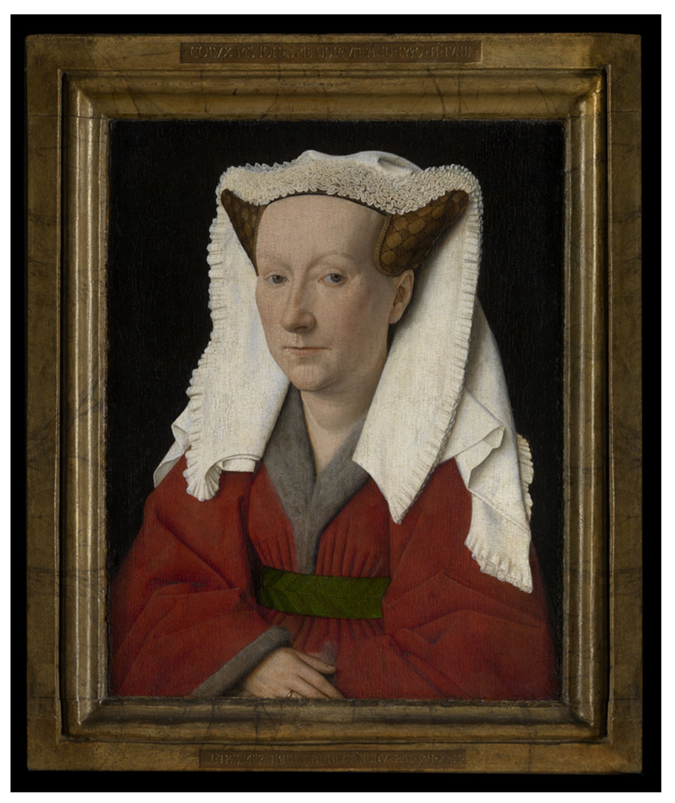
2. Margareta van Eyck and the Concept of prima materia

As a first case study for this argument, the Portrait of Margareta van Eyck will be discussed [Figure 1]. In the following, a comparison of the technical structure of the sprinkled back of the panel with that of Margareta’s skin will provide the starting point for embedding the pictorial program into a metaphysical idea which can be understood both for the person of Margareta herself and for the forming process of her portrait by Jan van Eyck.
The painting was dated from 1430 by her husband Jan van Eyck, at least according to the inscription, inscribed in illusionistic letters on a frame: Co[n]iu[n]x M[eu]s Joh[ann]es me c[om]plevit an[n]o 1439 17 iunii/etas mea trigina triu[m] an[n]oru[m] (“My husband Johannes completed me in 1435 on 15 June/I was 33 years old”). This is followed by van Eyck’s motto “Als ich can” (Cf. Campbell et al. 2008, p. 180). Margareta is looking to catch the direct gaze of the beholder who, upon closer inspection, can see the reflection of a window in her eye. She wears a linen veil over an elaborately pinned-up hairstyle, in which her hair is tied together to form two horns. The red outer robe is lined with the fur of a squirrel.
In previous studies, the portrait has been praised for the quality of Margareta’s skin. Marjolijn Bol and Ann-Sophie Lehmann described the properties of the skin as translucent, which makes it difficult to paint (Cf. Bol and Lehmann 2012, p. 216). They argued that the quality of translucency only occurs in very few materials within nature, such as milk or marble (Cf. Bol and Lehmann 2012, p. 216). The coincidence that the back of the portrait was designed as a so-called marble imitation gives reason to reflect on the painting style of Margareta’s skin in comparison to the colour splashes of the marbled pattern [Figure 2].10 From an artistic point of view, the effect created here is quite comparable in terms of the permeability of light. According to Bol and Lehmann, the effect of a transparent and simultaneously opaque surface could best be created by the use of an oil-based binder, as the layer of paint bound in oil forms a kind of flexible skin when it dries (Cf. Bol and Lehmann 2012, p. 216). In Margareta’s case, this is indeed accurate. The skin was created from many layers of thinly applied paint, bound in oil, that allowed reflection of the whitish underlying base (Cf. Bol and Lehmann 2012, p. 217).
In a recently published study by Jill Dunkerton, Rachel Morrison, and Ashok Roy, the veined structure on the back of the panel was also found to consist of multiple layers of paint.11 These painting layers were, however, bound in a protein-based medium, while the front was bound in an oil-based medium (Cf. Dunkerton et al. 2017, p. 277).
Between the layers of paint of the marble imitation as well as between the layers of paint of Margareta’s face, a transparent, pigmentless layer was discovered. It was probably used for the purpose of an intensified effect of depth, generating the translucent materiality to be imitated here (Cf. Dunkerton et al. 2017, p. 227). On the reverse of the panel, a dark purple colour was applied over a layer of black paint. On top of this lies a translucent film, which appears slightly milky and contains traces of chalk (Cf. Dunkerton et al. 2017, p. 227). Some of the red dots were applied below this layer and some above it, which enhanced a special illusion of depth.12 The red colour blobs consist of a relatively thick layer of vermilion with slight white speckles of lead white (Cf. Dunkerton et al. 2017, p. 227). The condition of the reverse painting is extraordinary, and seems to have never been retouched, so that the original effect of the transparency can be seen particularly well in this example.13
For this effect of transparency, actual marble has been discussed as an extraordinary material in the past. For example, Bissera V. Pentcheva was able to reconstruct the early Christian tradition of perception of marble surfaces in the sixth-century interior of the church of Hagia Sophia.14 She suggests that the effect of marbled surfaces evokes an image of liquification through shimmering due to the influence of light and shadow.15 These imaginative transformations of the material are triggered by its light-absorbing and light-reflecting properties. On a theological level, they were presumably taken as a spiritual presence in the material (Cf. Pentcheva 2011, pp. 97–101). Marble thus made representable what was not representable, a transformation of substance and form. The reason for van Eyck’s exceptionally careful layering technique on the reverse may be related to such a perceptual tradition with respect to marble. In particular, the transparent intermediate layers he placed under and over the colour splashes were probably intended to provide a greater surface for the influence of light and shadow and their associated effects.
It is interesting that the amoeba-like splashes that van Eyck placed here under and over the transparent layers of the painting were made of vermilion. Vermilion was a pigment that, at the time, could be mined or produced both naturally and chemically. When it was produced chemically, it was made from mercury and sulfur. The basic materials, mercury and sulfur, which are thus inherent in the splattered pattern of the reverse side of the panel, can be included in a broader metaphysical idea as they were understood in their origins as form and matter. The meaning of the union of mercury and sulfur was already rooted in Arabic alchemy. Sulfur and mercury represented the four elements from which all matter could be created. According to this theory, sulfur consisted of fire and air and mercury of water and earth. This understanding was predominant especially in the 15th century, and became known in the Occident through numerous writings (Cf. Haage 1996, pp. 28–30).
The theory has its roots with Aristotle, who claimed that a processual change of material came from the concept of hyle and morph. He postulated that the nature of physical existence functioned through the composition of complementary principles which could be identified in their abbreviation as form (morph) and substance (hyle).16 In the end, matter was something that does not yet exist, being only the possibility of becoming something by taking a form (Cf. Schmitz 1999, p. 638). According to Aristotle, everything that existed was composed of form and of matter which was undergoing perpetual change. The form was thereby to be understood as active and the matter as passive (Cf. Schmitz 1999, p. 638). According to this theory, there were three principles of change of form: the (prima) materia, that is, the original substrate (Aristotle 1933, Metaphysics IX. 7, 1049a, p. 451; Cf.: Schmitz 1999, p. 638) or potential to exist; the deprivation, as in that not yet formed or imperfectly formed; and the form as the goal of the change (Aristotle 1933, Metaphysics XII. 5. 1071a; Cf.: Schmitz 1999, p. 638). Thus, a process was described that defined and explained the coming into being and passing away of all being in the world by placing it in a context of dependence on material and form. In the 15th-century reception of this theory, the reference for this was the divine creative power which created an infinite variation of life from the four elements. These elements, according to the belief of the time, were present in the materials sulfur and mercury, whose final product forms vermilion.
What the divine creation performed on a large scale, the artist imitated with his skills and scientia on a small scale (Cf. Haage 1996, pp. 28–30). In this context, Petrus Bonus made the following statement in his alchemical treatise: “In all metals quicksilver [mercury] is understood for the substance, and sulphur for the active principle which supplies form to the matter” (Petrus Bonus 1894, p. 107; Cf.: Bucklow 2009, p. 86). Albertus Magnus described the substances as parents, and therefore as the origin of all elements: “for Sulphur is, so to speak, the Father and Quicksilver the Mother; or, to put it more accurately, we may say that in the constitution of metals Sulphur is like the substance of the male semen and Quicksilver like the menstrual fluid that is coagulated into the substance of the embryo (Magnus 1967, Book of minerals, Book IV, chp. I, p. 204; Cf.: Bucklow 2009, p. 90).”
The significance of the two substances must have been known to van Eyck, so that the multitude of recipes of vermilion still handed down today is hardly surprising, as Spike Bucklow states in his study ‘The Alchemy of Paint’ (Cf. Bucklow 2009, p. 87). In the design of the sprinkled reverse of the panel, the creation of the image was addressed as the creation of form, in order to emphasize the artist’s abilities as a ‘former’. The theory of hylemorphism thus implied an eternal cycle of the becoming and passing of the visible and perceptible world. Passed matter became primordial matter, which again required a form in order to be (Cf. Schmitz 1999, p. 638).
An inscription in art theory would be immanent through the material presence of the depicted processes in the image: form, material, and content would thus be brought together. This also corresponds to the hermetic understanding of a materialization of the principle of form (Cf. Böhme 1996, p. 121), the idea that a change in the form simultaneously causes a change in the substance. Thus, the matter of the painting itself only received form through the application of the pigments on the image support. The principle of shaping an original material (in the sense of materia prima) can be addressed on an art-theoretical level, as it simultaneously depicted the process through which it passed during the painting process. Aristotle used the image of a statue, which consisted only of a block of stone in which the idea of an artist had taken shape, to illustrate the doctrine of form and substance (Cf. Bucklow 2009, p. 78f). Accordingly, he transferred his theory to the realm of the creative artist who possessed the special ability to bring substance into form. The artistic activity was thus explained on a metalevel as a hylemorphistic process, which every substance processes on a natural level. Nature and artistic activity were merged here into one principle. This complex theoretical approach may perhaps seem to be a somewhat ambitious claim for the use of vermilion in the reverse of the portrait of Margareta. Nevertheless, the careful technical treatment of the paint splashes and drops between the transparent layers and their similarity to the technical realization of the color surface of Margareta’s skin seem to evoke a link between the two sides of the panel.
The previous indications also tie in with a theory by Karin Gludvatz, who recognized an art-theoretical approach of van Eyck in the signature described above (Cf. Gludovatz 2004, p. 27). She distinguished between van Eyck’s usual choice of words “me fecit” and the variant “me complevit” used in the portrait of Margareta. According to Gludovatz, the former referred to an intellectual design, while complevit could describe a painterly production.17 The completion of painting implied by this word could be interpreted in two ways, by drawing attention both to the forming of artistic activity and to the completion of Margareta through the person of Jan van Eyck within the marriage (Cf. Gludovatz 2004, p. 27), as Gudovatz stated:
“He (Van Eyck) will have been aware of the ambiguity of confirming with it not only the completion of the painting, but also that of the woman. The sculpturability of the painting material by the artist is thus paralleled by the sculpturability of the female “materia” by the husband, “as he can”, as his word of choice adds and assures Margareta’s completed representation. The polarization of the sexes into an active male and a passive female part is not restricted to the biological component, but finds its correspondence in the artistic ‘act of procreation’”.18
This artistic act of procreation, as Gludovatz called it, could in turn be recognized on the reverse side of the panel, in the carefully applied splashes of paint where the image reverts to colour. Just as the material, which symbolizes Margareta as a wife, was depicted in its formlessness as substance. Through the intervention of the artist and the husband, finally the front completed the image of Margareta van Eyck. This could also be the solution for the question of a “missing” portrait of Jan van Eyck which as a marriage portrait should usually be contrasted as a counterpart to Margareta. Through its particular technical design, the use of the pigment vermilion, and the inscription, the painting offers points of contact for creative implications that are addressed on both an artistic and a metaphysical level.

3. Rogier van der Weyden’s Crucifixion and the Concept of Disembodiment

The Crucifixion panel by Rogier van der Weyden is the second example discussed in this paper [Figure 3].19 In the following, the sprinkled reverse of the painting is associated with the drastic representation of the blood of Christ’s dying body. The reference to the bodily fluids of blood and sweat offer a theoretical reflection on the undefined form and substance of the divine body which can be received on both a pictorial and a theological level.
The panel shows on its front a crucifixion scene with unusual iconography. Christ on the cross is the center of the scene. He is mourned by six angels covered in the colours of a rainbow. In front of the cross, the usual personages can be found: besides John and three mourning figures of Mary, the mother of God stands out. In an act of despair, she wraps her arms around the trunk of the cross in order to mourn the death of her son. Her saying, which is visualized by a golden lettering, “O Son, let me come near to embrace the foot of the cross with my hands”20 further emphasizes the drama of the scene. The gesture of the mother of God appears to be unusually exalted and would be more associated with the pictorial convention of Mary Magdalene (Cf. Kemperdick and Sander 2009, p. 291). Here however, it is the mother who comes close to her son to express his and thus also her pain. The body of Christ is also emphasized in its expressiveness, as the representation of sweat and blood coming out of his skin are of the highest quality in order to show the affective power of his agony.
The reverse of the panel shows a marble imitation which was worked out by red colour clouds on a dark background [Figure 4]. A similar design was once on the backs of Rogier’s Kolumba altar (Munich, Alte Pinakothek), which is now painted over (Cf. Kemperdick and Sander 2009, p. 292). The individual clouds of red paint that were designed on the reverse of the crucifixion panel appear like liquid paint in a dye basin that slowly rises to the surface. Thus far, no pigment analysis of the reverse side has been carried out. However, it can be suggested that an opaque red pigment, presumably vermilion, and a red lake on a black layer of paint were used.21 The perception of these surfaces as fluid consistencies results from the softly designed colour transitions and a fine blending of the individual tones. These clouds of colour formed a bridge for understanding the image on the front.
The topic of the crucifixion focused primarily on the body of Christ. The death of the body and the exposure of flesh and blood initiated thereby emphasizes the climax of the incarnation of the divine Son and therefore a climax of the manhood and carnality of his body. The moment of the death of the human shell could therefore be understood as a turning point in which the human returns to the purely divine nature.
Christiane Kruse has already highlighted the significant role that the concept of the incarnation of Christ played in 15th-century pictorial theory (Cf. Kruse 2000, pp. 305–25). She made it clear that the material–semantic link between colour and flesh could have been connected to the choice of words incarnazione and incarnare first used by Cennino Cennini in his art-technological manuscript della pittura (1400), which he used to describe the colouring, or rather the painting process, of human skin (Cf. Kruse 2003, pp. 175–224). Prior to Cennini, this term had been used only in theological contexts to refer to the incarnation of Christ (Cf. Kruse 2003, pp. 176–79). Cennini, however, related for the first time the idea of the transformation of liquid paint into lifelike figures within the painting process to the concept of the incarnation of Christ (Cf. Kruse 2003, p. 181). In describing the painting process, Cennini emphasized the colour red as the colour of blood, which cannot be absent from living bodies. In the case of dead bodies, however, Cennini warns against the use of red, "because dead persons have no colour” (Cennini 1922, chp. 148, p. 128).
Through the loss of blood, the dissolution of the human body was staged as a transformation into its divine form. Artistically, this was realized in the picture by Rogier emphasizing the outflow of the bodily fluids of the Christian body in an illusionistic painting technique. The side wound from which the blood flows could have been understood as a transformative process. In this process, each of the fluids that leave the body had an individual semantic link to the idea of salvation. The skin became the permeable medium, the container from which blood and sweat emerged. Both fluids referred to the true image of God. The sweat was a reference to the Vera Icon, the veil of sweat of St. Veronica on which Christ left an image of himself and thus made himself representable. The blood symbolized the seat of the soul as pneuma22 and as the eucharistic species of Christ. Both substances thus connected the idea of the inner and the outer form in which they circumscribed the image of God and his spirit. The substances leaving the body at the moment of death represented a process of transformation, which was implemented on a pictorial level by the abstract colour clouds on the back of the panel. Here, the described bodily fluids were taken up again in their material form and their consistency.23
Visually, the sprinkled reverse could certainly be compared to the appearance of the so-called Holy Blood columns, which Julia Kölle examined in an essay for their meaning within Flemish painting (Cf. Kölle 2019, pp. 247–77). She described the painted structures as fluid, swelling and stagnant, and associated them with the blood of Christ which was shed during the Passion.24 She interpreted the material structures within the columns as symbolizing the two natures of Christ in the painted stone, the first one being the earthly nature, represented by the blood, and the second one being the heavenly nature, represented by the transparency in the picture (Cf. Kölle 2019, p. 271). Thus, sweat and blood here could be understood as modes of representation for God’s presence; especially the blood, foregrounded by the sacrificial theme of the passion, will have triggered a strong associative reception with the reverse side. The swelling cloud-like structures on the back are reminiscent of a viscous liquid. Thus, in addition to the colour, the substance emulated here formed a reference for the depiction of blood.25 What once held together the form and substance of the Christian body within the painted image, the inventio of the artist, now dissolved back into a formlessness, into pure materia, into colour.
The idea of physical transformation was also present in the traditional reception of marble. Thus, Veronika Tvrzníková was able to show for the marble baptisteries of early Christianity (using the example of Ravenna) that the idea of death and rebirth within the baptismal ritual was semantically supported by the materiality of marble (Cf. Tvrzníková 2016, pp. 45–47). In late antiquity, the formation of marble was imagined, based on Aristotle, as water solidified by metamorphosis (Cf. Barry 2007, p. 631). Thus, the material was a particularly good choice for surfacing baptisteries, which carry within them the transformative (consecrated) water of baptism that once made up the stone itself. The physical transformation of the baptized was thus paralleled with the transformation of the marble (Cf. Tvrzníková 2016, pp. 45–47). Just as liquid water could transform into solid stone, the human body, originally created from clay, was also solidified and spiritually reborn (Cf. Ivanovici 2016, pp. 100–5). The abstract painting of the marble reverse carries a reference to this transformative process. This was done both through its resemblance to marble and through its pictorial impermanence, and can be projected on the example of the body of Christ transformed in death.
On a theological level, the fleshly components of Christ depicted on the front are transformed within the argument of the image and returned to the worldly environment as the blood dripped down onto the mother of God. David Ganz described a similar phenomenon in Rogier’s Descent From the Cross (Madrid, Museo del Prado) (Cf. Ganz 2008, p. 33). He defined Mary’s tears as parallel to the blood of Christ, as both bodies in the painting were designed parallel to each other. Blood and tears, according to Ganz, were related to each other in the context of archetype and image in terms of the concept of simitudo dei (Cf. Ganz 2008, p. 33). A reflection on the pictorial theory was therefore immanent.
In our example, Mary’s corporeality seems to be blended with the corporeal emanations of her Son, which must be brought into context with her function as causa materialis.26 Thomas Aquinas explained the phenomenon as follows in his Summa Theologica:
“As stated above, in Christ’s conception His being born of a woman was in accordance with the laws of nature, but that He was born of a virgin was above the laws of nature. Now, such is the law of nature that in the generation of an animal the female supplies the matter, while the male is the active principle of generation […]. But a woman who conceives of a man is not a virgin. And consequently it belongs to the supernatural mode of Christ’s generation, that the active principle of generation was the supernatural power of God: but it belongs to the natural mode of His generation, that the matter from which His body was conceived is similar to the matter which other women supply for the conception of their offspring. Now, this matter […] is the woman’s blood, not any of her blood, but brought to a more perfect stage of secretion by the mother’s generative power, so as to be apt for conception. And therefore of such matter was Christ’s body conceived.”
“[…] hence He is said to have taken flesh from the Virgin, not that the matter from which His body was formed was actual flesh, but blood, which is flesh potentially.”
Mary formed the substantial cause of the incarnation of God in the function of the causa materialis, as explained by Thomas Aquinas. This means that Christ ultimately materialized from the mariological body. She represented the shell from which the materia of the incarnated God has arisen. By blending Mary’s tears with the drops of Christ’s sweat and blood on her face, the corporeal substances of materia causa were reunited at the moment of the death of the human body. This, in turn, could be associated with the painted reverse side, in which the color again decayed into substance, similar to the blood of Christ.
Another reference to the reception of image-making as well as to the visualization of a somatic appearance is found in the background of the crucifixion. The stormy sky was an overpainting of the 16th century. Originally, the background was designed in gold which adjoined a rainbow in the upper third of the picture. Within this rainbow the floating angels were located, still coloured through the transitions of yellow, green, blue and red (Cf. Kemperdick and Sander 2009, p. 291). This visualization of the rainbow offered a further basis for reflection on the physicality of the painted figures. The splitting of light into colour could have been understood as a metaphysical concept, and thus allowed another point of connection to the reverse side of the panel.
The colour distribution shows the spectral colours of sunlight; accordingly, those colours that were observed when light was refracted. The splitting of light into individual colours by refraction depending on their different wavelengths was not yet scientifically known in the 15th century. Aristotle, however, in his work Meteorologica, associated the colours with reflections in raindrops (Aristotle 1952, Meteorologica III. 4, 373b, p. 255; Cf. Wilson 2013).
“When, therefore, it is about to rain and the air in the clouds is already condensing into raindrops but the rain is not yet falling, if there is, opposite the cloud, the sun or any other object so bright that the cloud mirrors it and reflection takes place from the cloud to the bright object opposite, an image of colour but not of shape must be produced. Each of the reflecting particles is invisibly small, and the continuous magnitude formed by them all is what we see; what appears to us is therefore necessarily a continuous magnitude of a single colour, since each of the reflecting particles gives off a colour the same as that of the continuous whole. Since, therefore, these conditions are theoretically possible, we may suppose that when the sun and the cloud stand in this relation and we are situated between them, the process of reflection will give rise to an image. And it is under these conditions and no others that the rainbow in fact appears.”
This concept can be related to the basic ideas of Aristotle’s theory of form and substance. Here, he argued that the divine was not matter, only form. If we understand the sprinkled reverse as a visualization of the link between substance and form, the use of the reflection of real light on the gold background27 of the Christ depiction could represent a reference to a form without substance. Thus, the different textures of Christ’s fleshly and fleshless form were defined both visually and conceptually.

4. Conclusions

The reverse of the two panels were designed in such a way that they could have been simultaneously read without semantic reception while offering a basis for complex metaphysical and theoretical considerations. As only two works are considered in this case study, no claim is intended for a general transfer of the idea presented here to the general group of marbled reverses. The intention is merely to present a possible reception of this widespread technique of the 15th century, which should stimulate a closer examination of the significance of panel reverses in the future.
Nevertheless, the offer of reception, suggested in this paper, can be differentiated on different levels for the profane Portrait of Margareta van Eyck and for the image of the Crucifixion by Rogier van der Weyden. The original idea, which was common to both panels, is certainly that of bringing the reception back to the perception of a painted image. Through pigment binder and brush, this image presented an idea of the visual and substantial world.
Last but not least, these backs were extensions of the frame constructions that we still see preserved in the depiction of Margareta. The imitation of actual stone, such as porphyry or marble, is here intended to be understood as a boundary that separates the pictorial space from the viewer’s space (Cf. Panofsky 1966, p. 181). The visual boundary between painted stone and the painted colour grounds of the reverses offers the greatest contrast. The illusionistic effect of the frame is juxtaposed with the natural quality of colour on the reverse. In this way, the reverse sides can be understood as a carrier, material foundation, or breeding ground for the illusions on the front. This can be supported by the terminology of Cennini when he used the term campo, ground, for the structure of stacked paint layers.28 The layering of the various color fields (paint layers) ultimately forms the artistic illusion, as exemplified in the depiction of Margareta. If one breaks down the painted image again into the individual components of paint layers, binder, and finally pigment, all that remains is substance. The shaping of the picture can thus be related to the depicted bodies through the internal vision. A similar reflection on the substance of a ground surface is indicated in the two paintings discussed. Created from colour and shaped by the forming hand of the artist, these coloured grounds can be understood similarly to the concept of the female body as substantial source of life, which can be seen in both of the panels. Of course, the described painting techniques were not exceptional for the artists of the 15th century, and fit the usual practice. However, the special aspect to be suggested here for the marbled backs is that these color areas draw attention to the practice of painting and reflect it in a theoretical context.
In the case of Margareta van Eyck’s depiction, metaphysical references can be seen in the application of various layers of paint and the use of vermilion, which may be associated with artistic activity through the inscription on the painting. In the Crucifixion by Rogier van der Weyden, the cloud-like structure on the reverse suggests a reflection on the physical transformation of the divine. The mixture of bodily fluids such as sweat, blood, and tears refer both to the origin of Christ’s fleshly body in Mary and to the process of becoming an image. Both pictorial works originate from different artistic backgrounds and contexts of use, and can therefore only be considered as individual case studies. Nevertheless, they provide information about a common reception based on a material and imaginative practice. The original semantics of the marble material can be traced back to antiquity. Through its material properties, it seems to refer to a transformative process that in the Christian tradition relates to the death and resurrection of Christ. Transferred to the meaning of the portrait of Margareta, the idea of resurrection can also be found here, as the inscription of the portrait refers to the ideal age of 33 years, at which Christ was resurrected. Hereby the reference to the second life after death, which was only made possible by the sacrificial death of Christ, is also inherent in this picture (Cf. Wusterwitz 2003, pp. 131, 140).

Funding

This research received no external funding.

Conflicts of Interest

The author declares no conflict of interest.

Notes

1
This is also a difficult undertaking as the backs of panel paintings have been neglected within research, making it difficult to find corresponding image material. In addition, many of the preserved overpaintings are in poor condition today as they were damaged, removed, or painted over in the past. (Cf. Verougstraete 2015, p. 86).
2
These are not necessarily triptychs or diptychs, and may single panels or portraits.
3
The idea of petrification is further worked out in the research of Rath 2020 and Kölle 2019 in relation to painted stone floors and painted columns of the Holy Blood.
4
5
Beate Fricke was already able to fruitfully connect theories on the incarnation of Christ as well as on the similitude of God for the painted reverse side of Dürer’s Man of Sorrows in Karlsruhe, which she legitimizes with sources from John of Damascus (Cf. Fricke 2010a, pp. 183–206). Susan Müller Wusterwitz understands the reverses primarily as stimulants for religious devotion (Cf. Wusterwitz 2003, pp. 131–42). James Mundy argues for a memorative meaning, representing mainly on the reverse of portraits a triumph over death (Cf. Mundy 1988, pp. 37–43). In addition, there are theories that have dealt with similar appearances of stone imitations, primarily abstract-looking painted stone floors within pictorial works as an iconographic element. Georges Didi-Hubermann, for example, takes up the idea of the metaphysical concept of hylemorphism for the stone floors of the Annunciation scenes of Fra Angelico by searching for the form-giving power of God within the form-giving power of colour for sprinkled floor and wall surfaces in his Italian paintings (Cf. the study of Fra Angelico’s work in detail: Didi-Hubermann 1995). Markus Rath suggests, furthermore, an inherent visualization of the creative process of the artist for these very colour surfaces by defining colour as a substantial possibility and the artist as a form-giving instance (Cf. Rath 2020, pp. 334–59; Rath 2019, p. 322). The investigations listed here form a basis for the consideration of the sprinkled backs.
6
Both artists have been credited with other panels that have marbled reverses. Among Jan van Eyck’s works, a marbled reverse is preserved on the panels of Saint Barbara (Koninklijk Museum voor Schone Kunsten, Antwerp) and on the portrait of the so-called Timotheus (National Gallery, London). For Rogier van der Weyden, a marbled back can be traced on the Portrait of a Young Woman (Gemäldegalerie, Berlin) and on the Kolumba Altar (Alte Pinakothek, Munich), although the latter is now painted over (Cf. Wusterwitz 2003, pp. 131–42; Billinge et al. 2000, p. 44; Kemperdick and Sander 2009, p. 292).
7
As is the case in the studies of Didi-Hubermann and Markus Rath. (Cf. Didi-Hubermann 1995; Rath 2020, pp. 334–59).
8
A prominent example is the mappae clavicula from the late 12th century (Cf. Smith and Hawthorne 1974); furthermore, see on this topic: (Bucklow 2009). For the 17th century, Karin Leonhard has dealt with this subject (Cf. Leonhard 2013).
9
We find references to this understanding of painting in art theoretical writings, such as the Schedula diversarum artium of Theophilus Presbyter (12th century) and in the tract Libro dell’arte o trattato della pittura by Cennino Cennini, written around 1400, in which art theoretical ideas are combined with art technical instructions (Cf. Oltrogge 2014, pp. 105–7; Reudenbach 1994, pp. 1–16; Kruse 2000, pp. 305–25). Even if these texts cannot be concretely linked to the case studies presented here, they nevertheless refer to a discourse that will have been present in a theoretically-reflected artistic environment of the 15th century, which can be assumed for Jan van Eyck and Rogier van der Weyden. Furthermore, various works of van Eyck have been related to ancient texts, which suggests a scientific and philosophical interest in close connection with painting techniques and materiality (Cf. Preimesberger 1991, pp. 459–89; Lindnerova 2016, pp. 225–43; Lehmann 2007, pp. 21–40).
10
The profiled frame identifies the panel side of the marbling as the object of observation, and can therefore be taken seriously as a painting in its own regard. (Cf. Wusterwitz 2003, p. 129).
11
The structure of the layers of paint resembles the marbling found on the reverse side of Jan van Eyck’s depiction of St. Barbara, which was revealed by technological research carried out by Rachel Billinge, Hélène Verougstraete and Roger Van Schoute. (Cf. Billinge et al. 2000, p. 44).
12
Hélène Verougstraete and Roger van Schoute describe these decoration-types as jasper, or jaspered. They suggest that the term was used in the 15th century to describe spattered patterns that are similar to the grain of porphyry. See: (Verougstraete and Van Schoute 2000, p.110f).
13
(Verougstraete and Van Schoute 2000, p.111). The good state of preservation is probably due to the fact that in the 17th century the painting was kept in a box by the painters’ guild in Bruges, and exhibited only once a year in honor of Jan van Eyck. See: (Campbell et al. 2008, p. 180).
14
Pentcheva discusses in her research how multisensory experiences cause a change in the perception of the marble material. She proves the described reception of the materials through early Christian sources which connect the perception of the material with meditative inner images. (Cf. Pentcheva 2011, pp. 97–101). For the perception of actual marble as water, see Fabio Barry: (Barry 2007, pp. 627–56).
15
For the reverse effect of petrification in connection with representations of marble, see (Rath 2020, pp. 340–46).
16
The principle has been explained in research, especially for the formless floor and wall tiles of Italian Annunciation scenes of the Quattrocento (Cf. Didi-Hubermann 1995; Rath 2019, pp. 303–22). In general, about the principle of hylemorphism in relation to art technology, see: (Bucklow 2009, p. 78).
17
(Cf. Gludovatz 2004. p. 27). Elisabeth Dahnes argues that his choice of words indicates that a painting was completed by the artist’s own hand, which at the same time means that some paintings were not completed by van Eyck’s hand but by a workshop assistant. (Cf. Dhanes 1980, p. 179).
18
English translation by the author. Original quote: “Er (Van Eyck) wird sich der Doppeldeutigkeit bewusst gewesen sein, damit nicht nur die Vollendung des Gemäldes, sondern auch die der Frau zu bestätigen. Die Formbarkeit des Malmaterials durch den Künstler wird so die Formbarkeit der weiblichen “materia” durch den Ehemann parallelisiert, so gut er es vermochte, wie sein Wahlwort hinzugefügt und Margaretas vollendete Darstellung versichert. Die Polarisierung der Geschlechter in einen aktiven männlichen und einen passiven weiblichen Part ist hier nicht auf die biologische Komponente beschränkt, sondern findet seine Entsprechung im künstlerischen ‘Zeugungsakt’.” See: (Gludovatz 2004. p. 31).
19
A dendrochronological examination suggests a use of the wooden carrier from 1429. (Cf.: Kemperdick and Sander 2009, p. 294).
20
The phrase originates from a meditation book (Cf. Kemperdick and Sander 2009, p. 291).
21
I would like to thank Dr. Stephan Kemperdick for this information.
22
On the late medieval conception of pneuma, see: (Putscher 1973).
23
Wusterwitz describes the tradition in which the red drops of color are contemplated as drops of blood and can evoke individual episodes of Christ’s passion as well as the redeeming power of the blood (Cf. Wusterwitz 2003, p. 116).
24
She demonstrates this on a column of the Holy Blood which is depicted on the representation of Ecce Homo by Quentin Massys (Quentin Massys, Ecce Homo, 1520, oil on wood, 95 × 74 cm, Venice, Palazzo Ducale). Both the column (in the form of a capital) and the body of Christ are crowned here by a crown of thorns to increase the parallelism of the two motifs. (Cf.: Kölle 2019, p. 271).
25
26
George Didi Hubermann takes this term from the Summa Theologica of Thomas Aquinas: Thomas Aquinas, Summa Theologiae 1947, III, 31, 5; III, 32, 3-4. Aquinas here again refers to Aristotelian metaphysics, which is based on the theory of hylemorphism (Cf. Didi-Hubermann 1995, p. 43). On the connection of the concept of causa materialis with the cloak of Mary: (cf. Gertsmann 2019, pp. 397–429).
27
In the representational convention of the late Middle Ages, the gold ground would be understood as pure light in which neither body nor space exist. According to Beate Fricke, it describes a transitory moment. See: (Fricke 2010a, p. 192f)
28
(Cennini 1922, cap. 147, p. 126). Compare Burioni for a positioning of the pictorial ground as an art-theoretical concept: (Burioni 2012, pp. 94–148, pp. 97, 102).

References

  1. Aquinas, Thomas. 1947. Summa Theologiae. Translated by Fathers of the English Dominican Province. Available online: https://aquinas101.thomisticinstitute.org/st-index (accessed on 14 October 2021).
  2. Aristotle, Metaphysics. 1933. Volume I: Books 1–9. Translated by Hugh Treden-nick. Cambridge: Loeb Classical Library, p. 271. [Google Scholar]
  3. Aristotle, Meteorologica. 1952. Books 1–4. Translated by Henry Desmond Pritchard Lee. Cambridge: Loeb Classical Library, p. 397. [Google Scholar]
  4. Barry, Fabio. 2007. Walking on Water: Cosmic Floors in Antiquity and the Middle Ages. The Art Bulletin 4: 627–56. [Google Scholar] [CrossRef]
  5. Billinge, Rachel, Hélène Verougstraete, and Roger van Schoute. 2000. The Saint Barbara. In Investigating Jan van Eyck. Edited by Susan Foister, Sue Jones and Delphine Cool. Turnhout: Brepols, pp. 41–48. [Google Scholar]
  6. Böhme, Gernot und Hartmut. 1996. Feuer, Wasser, Erde, Luft. Eine Kulturgeschichte der Elemente. Munich: Beck. [Google Scholar]
  7. Bol, Marjolijn, and Ann-Sophie Lehmann. 2012. Painting Skin and Water Towards a Material Iconography of Translucent Motifs in Early Netherlandish Painting. In Rogier van der Weyden in Context, Papers presented at the Seventeenth Symposium for the Study of Underdrawing and Technology in Painting held in Leuven, 22–24 October 2009. Edited by Lorne Campbell, Jan van der Stock, Catherine Reynolds and Lieve Watteeuw. Leuven: Peeters, pp. 215–25. [Google Scholar]
  8. Bonus, Petrus. 1894. The New Pearl of Great Price. A Treatise Concerning the Treasure and Most Precious Stone of the Philosopher. Translated and Edited by Arthur Edward Waite. London: J. Elliott and Co. [Google Scholar]
  9. Bucklow, Spike. 2009. The Alchemy of Paint. Art Science and Secrets from the Middle Ages. London and New York: Boyars. [Google Scholar]
  10. Burioni, Matteo. 2012. Grund und campo. Die Metaphorik des Bildgrundes in der frühen Neuzeit oder: Paolo Uccellos Schlacht von San Romano. In Der Grund: Das Feld des Sichtbaren. Edited by Gottfried Boehm. Munich and Paderborn: Fink, pp. 94–148. [Google Scholar]
  11. Campbell, Lorne, Rice Louise, and Attwood Philip. 2008. Renaissance Faces. Van Eyck to Tizian, Exh. Cat. London: National Gallery. [Google Scholar]
  12. Cennini, Cennino. 1922. The Book of the Art of Cennino Cennini: A Contemporary Practical Treatise on Quattrocento Painting. Translated by Christiana J. Herringham. London: George Allen & Unwin. [Google Scholar]
  13. Dhanes, Elisabeth. 1980. Hubert und Jan van Eyck. Königstein and Taunus: Langewiesche. [Google Scholar]
  14. Didi-Hubermann, Georges. 1995. Fra Angelico. Unähnlichkeit und Figuration. Munich: Fink. [Google Scholar]
  15. Didi-Hubermann, Georges. 2005. Blut der Bilder. In Transfusionen. Blutbilder und Biopolitik in der Neuzeit. Edited by Anja Lauper. Zürich and Berlin: Diaphanes, pp. 21–49. [Google Scholar]
  16. Dunkerton, Jil, Rachel Morrison, Ashok Roy, Media Pigments, and Varnish Layers. 2017. On the Portrait of Margaret van Eyck. In Van Eyck Studies, Papers presented at the Eighteenth Symposium for the Study of Underdrawing and Technology in Painting, Brussels, 19–21 September 2012. Edited by Christina Currie, Bart Fransen, Valentine Hendriks, Cyriel Stroo and Dominique Vanwijnsberghe. Paris, Leuven and Bristol: Peeters, pp. 270–79. [Google Scholar]
  17. Dunlop, Anne. 2014. On the origins of European painting materials, real and imagined. In The Matter of Art. Materials, Practices, Cultural Logics, c. 1250–1750. Edited by Christy Anderson, Anne Dunlop and Pamela H. Smith. Manchester: Manchester University Press, pp. 68–96. [Google Scholar]
  18. Fricke, Beate. 2010a. Artifex ingreditur in artificium suum. Dürers Schmerzensmann in Karlsruhe und die Geschichte eines Arguments von Johannes von Damaskus. In Intellektualisierung und Mystifizierung Mittelalterlicher Kunst. Edited by Martin Büchsel and Rebecca Müller. Berlin: Mann, pp. 183–206. [Google Scholar]
  19. Fricke, Beate. 2010b. Zur Genealogie von Blutspuren. Blut als Metapher der Transformation auf dem Feldbacher Altar (ca. 1450). In L’Homme, L’Homme 21, Blut, Milch und Dann Heft 2. Weimar: Cologne, pp. 11–32. [Google Scholar]
  20. Ganz, David. 2008. Spuren der Bildwerdung. Zur Medialität gemalter Tränen im Spätmittelalter. In Tränen. Edited by Beate Söntgen. Munich: Fink, pp. 27–40. [Google Scholar]
  21. Gertsmann, Elina. 2019. Der blutige Umhang des textilen Leibs der Jungfrau. In Religiöses Wissen im vormodernen Europa. Schöpfung—Mutterschaft—Passion. Edited by Renate Dürr, Annette Gerok-Reiter, Andreas Holzem and Steffen Patzold. Paderborn: Ferdinand Schöningh, pp. 397–429. [Google Scholar]
  22. Gludovatz, Karin. 2004. Vom Ehemann vollendet: Die Bildwerdung der Margareta van Eyck. In (En)gendered: Frühneuzeitlicher Kunstdiskurs und weibliche Portraitkultur nördlich der Alpen. Edited by Simone Roggendorf and Sigrid Ruby. Marburg: Jonas Verlag, pp. 18–37. [Google Scholar]
  23. Haage, Bernhard Dietrich. 1996. Alchemie im Mittelalter. Ideen und Bilder—Von Zosimos bis Paracelsus. Zürich: Artemis & Winkler. [Google Scholar]
  24. Ivanovici, Vladimir. 2016. Manipulating Theophany: Light and Ritual in North Adriatic Architeture (ca. 400–ca. 800). Berlin: De Gruyter. [Google Scholar]
  25. Kemperdick, Stephan, and Jochen Sander. 2009. Der Meister von Flémalle und Rogier van der Weyden, Exh. Cat. Frankfurt am Main (Städel Museum): Ostfildern. [Google Scholar]
  26. Kölle, Julia. 2019. Versteinertes Blut. Heilig-Blut-Säulen in der flämischen Malerei um 1500. In Steinformen. Materialität, Qualität, Imitation. Edited by Isabella Augart, Maurice Saß and Iris Wenderholm. Berlin and Boston: De Gruyter, pp. 247–77. [Google Scholar]
  27. Kruse, Christiane. 2000. Fleisch werden, Fleisch malen. Malerei als ›incarnazione‹. Mediale Verfahren des Bildwerdens im Libro dell’Arte von Cennino Cennini. Zeitschrift für Kunstgeschichte 63: 305–25. [Google Scholar] [CrossRef]
  28. Kruse, Christiane. 2003. Wozu Menschen Malen: Historische Begründungen eines Bildmediums. Munich: Fink. [Google Scholar]
  29. Lehmann, Ann-Sophie. 2007. Jan van Eyck und die Entdeckung der Leibfarbe. In Weder Haut Noch Fleisch. Das Inkarnat in der Kunstgeschichte. Edited by Daniela Bohde and Mechtild Fend. Berlin: Mann, pp. 21–40. [Google Scholar]
  30. Leonhard, Karin. 2013. Bildfelder. Stillleben und Naturstücke des 17. Jahrhunderts. Berlin: Akad.-Verl. [Google Scholar]
  31. Lindnerova, Klara. 2016. Die Rezeption der Naturalis Historia des Älteren Plinius bei Jan van Eyck. Die antike Quelle als Inspiration für die altniederländische Malerei an der Wende vom Mittelalter zur Neuzeit. In Kontinuitäten, Umbrüche, Zäsuren: Die Konstruktion von Epochen im Mittelalter und früher Neuzeit in interdisziplinärer Sichtung. Edited by Thomas Kühtreiber and Gabriele Schichta. Heidelberg: Universitätsverlag Winter, pp. 225–43. [Google Scholar]
  32. Magnus, Albertus. 1967. Book of Minerals. Translated by Dorothy Wyckoff. Oxford: Clarendon Press. [Google Scholar]
  33. Mundy, James. 1988. Porphyry and the “Posthumous” Fifteenth Century Portrait. Pantheon Internationale Jahreszeitschrift für Kunst XLVI: 37–43. [Google Scholar]
  34. Oltrogge, Doris. 2014. Ars picturae. Die Malerei in kunttechnologischen Quellen des frühen und hohen Mittelalters. In Zwischen Kunsthandwerk und Kunst: Die „Schedula diversarum artium". Edited by Andreas Speer. Berlin and Boston: De Gruyter, pp. 105–7. [Google Scholar]
  35. Panofsky, Erwin. 1966. Early Netherlandish Painting. Its Origins and Character. Cambridge: Harvard University Press. [Google Scholar]
  36. Pentcheva, Bissera V. 2011. Hagia Sophia and Multisensory Aesthetics. Gesta 50: 93–111. [Google Scholar] [CrossRef]
  37. Preimesberger, Rudolf Zu. 1991. Jan van Eycks Diptychon der Sammlung Thyssen Bornemisza. Zeitschrift für Kunstgeschichte 54: 459–89. [Google Scholar] [CrossRef]
  38. Putscher, Marielene. 1973. Pneuma. Spiritus. Geist. Vorstellungen vom Lebensantrieb in ihren geschichtlichen Wandlungen. Wiesbaden: Steiner. [Google Scholar]
  39. Rath, Markus. 2019. Annunziation und Petrifikation in der Malerei des Quattrocento. In Steinformen. Materialität, Qualität, Imitation. Edited by Isabella Augart, Maurice Saß and Iris Wenderholm. Berlin and Boston: De Gruyter, pp. 303–22. [Google Scholar]
  40. Rath, Markus. 2020. Substanzaktivität. Farbe als prima materia im Andachtsbild der Frühen Neuzeit. Zeitschrift für Kunstgeschichte 83: 334–59. [Google Scholar] [CrossRef]
  41. Reudenbach, Bruno. 1994. Ornatus materialis Domus. Die theologische Legitimation handwerklicher Künste bei Theophilus. In Studien zur Geschichte der europäischen Skulptur im 12./13. Jahrhundert. Heinrich: Frankfurt a. M., pp. 1–16. [Google Scholar]
  42. Schlie, Heike. 2012. Blut und Farbe: Sakramentale Dimensionen der Frühneuzeitlichen Bild und Kunsttheorie. In Sakramentale Repräsentation. Substanz, Zeichen und Präsenz in der Frühen Neuzeit. Edited by Stefanie Ertz, Heike Schlie and Daniel Weidner. Munich: Fink, pp. 51–79. [Google Scholar]
  43. Schmitz, Rolf P. 1999. “Form/Materie”. In Lexikon des Mittelalters IV. Edited by Robert-Henri Bautier. Stuttgart and Weimar: Metzler, pp. 635–46. [Google Scholar]
  44. Smith, Cyril Stanley, and John G. Hawthorne. 1974. Mappae Clavicula. A Little Key to the World of Medieval Techniques. Translations of the American Philosophical Society held in Philadelphia for Promoting Useful Knowledge. Philadelphia: American Philosophical Society, vol. 64, Part 4. [Google Scholar]
  45. Tammen, Silke. 2011. Blut ist ein ganz besonderer Grund. In Bild und Text im Mittelalter. Edited by Karin Krause and Barbara Schellewald. Cologne, Weimar and Vienna: Böhlau, pp. 229–51. [Google Scholar]
  46. Tammen, Silke. 2012. Rot sehen—Blut berühren. Blutige Seiten und Passionsmemoria in einem spätmittelalterlichen Andachtsbüchlein (Brit. Libr., Ms. Egerton 1821). In Die Farben Imaginierter Welten: Zur Kulturgeschichte ihrer Codierung in Literatur und Kunst vom Mittelalter bis zur Gegenwart. Edited by Monika Schausten Akad. Berlin: Akad.-Verl., pp. 302–22. [Google Scholar]
  47. Tvrzníková, Veronika. 2016. Ritual, Body and Perception: A New Perspective on the Orthodox Baptistery of Ravenna. Available online: https://theses.cz/id/tw2cfl/ (accessed on 14 October 2021).
  48. Verougstraete, Hélène Roger, and Frames Van Schoute. 2000. Supports of some Eyckian Paintings. In Investigating Jan van Eyck. Edited by Susan Foister, Sue Jones and Delphine Cool. Turnhout: Brepols, pp. 107–17. [Google Scholar]
  49. Verougstraete, Hélène. 2015. Frames and Supports in 15th- and 16th Century Southern Netherlandish Painting. Brussels: Royal Institute for Cultural Heritage. [Google Scholar]
  50. Wilson, Malcolm. 2013. Structure and Method in Aristotle’s Meteorologica: A More Disorderly Nature. Cambridge: Cambridge Univ. Press. [Google Scholar]
  51. Wusterwitz, Susan Müller. 2003. Bildnis und Tugendübung. Zur Funktion früher niederländischer Portraittafeln in der individuellen Frömmigkeitspraxis des 15. Jahrhunderts. Hamburg: Mikrofiche. [Google Scholar]
Figure 1. Jan van Eyck, Portrait of Margareta van Eyck, oil on panel, 32.6 × 25.8 cm, Bruges, Groeningemuseum, (inv. No. 000GRO0162.1): Collection Musea Brugge—www.artinflanders.be—Hugo Maertens (Accessed on: 15 October 2021).
Arts 11 00010 g001
Figure 2. Jan van Eyck, Reverse of the Portrait of Margareta van Eyck, protein-based medium on panel, 32.6 × 25.8 cm, Bruges, Groeningemuseum, (inv. No. 000GRO0162.1): Musea Brugge—www.artinflanders.be—Hugo Maertens (Accessed on: 15 October 2021).
Arts 11 00010 g002
Figure 3. Rogier van der Weyden, Crucifixion, oil on panel, 79.30 × 49.90 cm, Berlin, Gemäldegalerie (inv. No. 538A): bpk/Gemäldegalerie, SMB/Volker-H. Schneider (Accessed on: 15 October 2021).
Arts 11 00010 g003
Figure 4. Rogier van der Weyden, Reverse of the Crucifixion, oil on panel, 79.30 × 49.90 cm, Berlin, Gemäldegalerie (inv. No. 538A): bpk/Gemäldegalerie, SMB/Volker-H. Schneider (Accessed on: 15 October 2021).
Arts 11 00010 g004
Publisher’s Note: MDPI stays neutral with regard to jurisdictional claims in published maps and institutional affiliations.

