Abstract
A cultural landscape is the result of a continuous interaction between the surrounding natural landscape and culture. Meanings, symbols, and codes of culture are an integral part of it. This paper is a review of publications on current research over the past 20 years. The aim is to analyze the existing research practices, which are based on factual evidence and existing theoretical foundations, using an interdisciplinary approach, in order to come closer to a sufficiently holistic understanding of the coloristic semantics of the cultural landscape. Such a review and analysis of disparate studies allows for the first time the correlation of different types of cultural landscapes (urban, rural, gardens, and parks) and different types of signifier functions performed in them by color—signals, indices, iconic models, conventional signs or symbols, zero, or empty signs. The author analyzes the difference in the semantics of chromatic and achromatic colors and explores the landscape chromodynamics, namely, by creating the first-ever classification of the types and meanings of color foci of various durations—from days to decades. Color loci signs are continuously communicating in the cultural landscape, which is a field of constant “cultural explosion”, where traditional cultural meanings are transmitted and new meanings are generated. The author comes to the conclusion that color symbolism is part of the “landscape-as-text” containing certain information—“messages” of culture to itself. In these messages, color has sacral, temporal, and historical semantics, thus creating an extended semantic frame for the reproduction of cultural codes.
1. Introduction
A cultural landscape is the result of a continuous interaction between culture and the surrounding natural landscape. The semantics of the cultural landscape is determined by the whole spectrum of meanings included in the mentality of culture. The symbolic meanings of a color are composed of psychological characteristics of its perception, and cultural traditions. “A color is a social phenomenon. It is society that ‘makes’ color, defines it, gives its meaning, constructs its codes and values, establishes its uses, and determines whether it is acceptable or not” (Pastoureau 2018, p. 10).
The colorism of a cultural landscape represents a sign system, and, as Yulia Griber wrote:
“…colour is understood as a way of visual communication, a special kind of language, consisting of particular signs. Each colour sign has several levels of meaning varying in depth. Depending on the context and conditions of its use, the same tone or hue can act in different roles. It can function as an index, the form of which follows and is provoked by its content; as a copy, in which the form repeats the content; or as a symbol, with its form linked to the content quite arbitrarily and conditionally”.(Griber 2018, p. 23)
Color has a semantic function, according to which it can serve as signals, indexes, symbols, or iconic models, as categorized by the founder of semiotics Charles Peirce. Color, like other signs, can have functions of consolidation, storing, and transmitting information, including through generations.
“Meaning in the colour field can be identified as an adjacency to this or that image structure, to which the general mood of a particular colour space or its elements refer, to which the associations linked to it refer. Within the colour field, however, there are signs of different levels of semioticity, from the simplest to the most complex ones”.(Griber 2017, p. 14)
Accordingly, there are several lines of research that conceptually lead to comprehending the semiotics of color in the cultural landscape.
Firstly, there is semiotics itself as a science of signs, primarily the works of Charles Peirce (1992–1998) and Yuri Lotman (Tamm 2019).
Secondly, these are numerous studies on color semiotics in culture. Among them are, for example, a large-scale project by Michel Pastoureau (2008, 2013, 2017, 2018); one of the classic books on color and culture by John Gage (1999); and the most modern publication, the six-volume A Cultural History of Color (Biggam and Wolf 2021) about the history, theory, and practices of usage and comprehension since ancient times to the present day. A representative review of studies on semiotics of color was made by Mony Almalech (2017) from Bulgaria, and the most comprehensive work on semiotics of color in culture is the book The Semantics of Colour by the famous British researcher Carole Biggam (2012). The most detailed analysis of color as a sign in the context of semiotic studies was carried out by Russian scholar Leonid Tchertov (2019).
Thirdly, there are studies of visual perception—such as Rudolf Arnheim’s book (Arnheim 1971)—including the perception of color, from the physical to the conceptual, or the recent research on the psychology of color by Andrew Elliot (2015, 2018). Among these are also studies on the aesthetic value of natural landscapes, parks, and gardens, including by colorimetric methods—something in which Chinese scholars have excelled (Mu et al. 2022; Cheng and Tan 2018; Shen et al. 2022). Karen Schloss and colleagues have carried out research on the environmental friendliness of our color preferences (Schloss et al. 2018), including their dependence on the seasons (Schloss et al. 2017).
Fourthly, there is exploring the functionality of color as the reason for its use in architecture and urban studies, that is, studying how color affects the visual perception of an object—its geometry, size, visual weight and texture, and the composition of its volumes—and thus increasing the space efficiency (Serra et al. 2012, 2021, 2022; Braham 2002; Serra 2013). This includes research into the history of national color schemes in the urbanscape (Brino 2010; Arrarte-Grau and Ludmir 1987; Wigley 1995).
Fifthly, there are studies of the structure and semiotics of the cultural landscape proper, which have been carried out in humanistic geography since the 1960s. Kevin Lynch’s The Image of the City (Lynch 1960) is usually cited as the benchmark book. It provides a detailed analysis of the structure of a landscape, distinguished not only objectively (on the functional principle), but also by virtue of the laws of perception. Yi-Fu Tuan’s (1990) work, a classic of cultural geography, also addresses meanings of color in a landscape and world structure.
The problem of studying cultural landscapes gained a new breath at the end of the 20th century, when UNESCO created its classification and distinguished three basic types: clearly defined or designed landscapes, organically evolved landscapes (among which there are the subcategories of relict or fossil landscapes and continuing landscapes), and, finally, associative landscapes.1 The semantic color is a part of all types of landscapes, only in different categories—from natural semiotics in organically evolved landscapes, to color symbolism in designed and associative landscapes.
The semiotics of the cultural landscape and the conception of the cultural landscape as a text as such are presented in their fullest in my book (Lavrenova 2019).
Finally, studies on the existence of color in the urbanscape are best presented in the books of Russian scholars Andrey Efimov (1990) and Yulia Griber (2017, 2018).
2. Materials and Methods
This interdisciplinary study incorporates a review of the academic publications over the past 20 years and draws on the discourses of the humanities, and geographical, anthropological, and social sciences. The review helps us to have an overview of the broad field of research and opens up new possibilities for conceptualizing the coloristics of cultural landscapes, which bring us closer to a critical understanding of the essence of color as a sign system in space. The article uses the semiotic method of research, implying the interpretation of the cultural landscape as a sign system. The methods applied are comparative-historical, comparative-geographical, and interpretive analysis.
Color semiotics is approached from the viewpoint of Peirce’s typology of signs, as well as from the viewpoint of modern frameworks, including those developed by the Russian expert in semiotics Leonid Tchertov (2019). Colors are envisaged in terms of their sign functions and the relationship with the signified; among other things, polysemanticism of colors in architecture, as well as their correlation with construction materials, and correlation between color and meaning, are considered.
The present study is a comprehensive analysis of color semiotics in different types of cultural landscapes. Through comparative methodology, the semantics of color has been correlated and analyzed from the point of view of semiotics. A sufficiently large corpus of previous theoretical and applied research, from classical to modern, has been considered in order to discover, by means of deductive reasoning, the patterns of color semantics of a landscape and semiosis processes associated with color.
Spatial elements and parameters of cultural landscape structure have been studied in the context of coloristic semantics, along with semiological and psycho-emotional discourses of plant color use and perception in landscape architecture.
3. Color Semiotics in a Landscape
We perceive landscapes through the interpretation of color combinations that are kinds of “natural signs”. It is in this process that the principle of continuous information transmission and smooth flow of color shades is realized—the so-called principle of palette, as opposed to the alphabetic principle, when syntactic constructions are created by a combination of clearly distinguishable units (Tchertov 2019, pp. 91–100, 311).
Color nuances can be perceived differently depending on cognitive tasks; a distinction is made between color sense, perceived color, and apperceptual color.
“At the level of colour sense, depending on individual sensitivity, hundreds and thousands of colour shades that are not correlated with certain objects can be recorded. At the level of perceived colour this variety is reduced; there is a generalization of colour nuances and their correlation with the colouration of certain objects. At this perceptual level, a number of shades that are discernible at the level of sense can be taken for a single colour. At the apperceptual level, the imagined colour can reproduce both sensory and perceptual impressions, but less distinctly and diversely. At this level, the variety of colour is generalized again and colours are grouped according to categories usually associated with some verbal designation—’red,’ ‘blue,’ etc. <…> Recognition of a visible colour is essential for it to be used as a sign bearing a certain meaning. However, for a colour to acquire the functions of a sign, it does not only need to be recognized, but also to be referred to something else. <…> …there must also be some shifting of its interpretation, leading from the presented colour to the object being represented”.(Tchertov 2019, p. 306)
We experience the world as a three-dimensional space. Although color itself is presented two-dimensionally, without intention to be spatially experienced (Klarén et al. 2013), it is through color nuances that the volume and depth is perceived and interpreted. For instance, lighter colors and a shift toward blueness are decoded as signals of a larger distance to objects (Figure 1).

Figure 1.
Kamchatka, Russia. Photo by Olga Lavrenova.
Apparently, this is why colors are divided not only into warm and cold, but also into advancing and receding. Here is what Yi-Fu Tuan writes about this binary opposition in the context of landscape perception:
“Red, orange, and yellow are described as advancing colors because they seem nearer to the observer than other hues. Red, or red–orange in particular, ‘reaches out.’ It stimulates the nervous system and suggests warmth. Red color also has the effect of making an object seem heavier than it is. Green, blue, and blue–green are known as receding colors; they suggest coolness”.(Tuan 1990, p. 24)
The brightness and purity of a warm-colored object indicates its proximity to the observer. This is consistent with the natural sign system typical of physical reality: moving away, a red or yellow object loses its brightness and purity and takes on cooler hues.
It is in the natural landscape that color has indexical functions, when it “signifies some properties of objects” (Tchertov 2019, p. 308). For example, in biosemiotics, in particular, and indicative geobotany, plant color signals certain properties of soil and bedrock. Also, a richer green color of foliage indicates the proximity of water sources. Colorimetry is applied for primary analysis of mineralogical composition and classification of soils (Sánchez-Marañón et al. 2011).
In the urbanscape, an example of using the material colors as an index is decoration of buildings with various types of expensive wall stone and facing stone of natural shades (tufa, granite, travertine, marble, etc.). Such a color scheme is often a hallmark of prosperous and wealthy quarters (Griber 2018, p. 23).
In anthropogenic, man-made landscapes, in everyday and cultural practices and in relation to color, or rather, to localized “color patches”, the alphabetic principle is used predominantly. These “color letters” make up “words” and “phrases”—semantic chains that interconnect in a text of the cultural landscape.
“A meaningful color can also be involved in the formation of the iconic model of a depicted object” (Tchertov 2019, p. 309). In the cultivated landscape, color as an iconic sign is most often applied to specific structures or features of urban architecture. For example, an Orthodox church in the Russian mentality implies white walls and a golden dome (although there are many churches painted in different chromatic colors). Therefore, if a certain abstract church is depicted on a postcard, or poster, or in a cartoon, it will most likely be in this color pattern. Or, for instance, there can be a base color in a city, which becomes the index of that city. A typical example is the yellow pavements of Sofia, the capital of Bulgaria (Figure 2). In Bulgaria itself, the phrase “on the yellow cobblestones” means affiliation with the capital. Interestingly, the index sign can outlive reality itself. In the Russian mentality, stemming from folklore, Moscow is still referred to as white-stone, although the white-stone Kremlin, built in the 14th century of dolomite and limestone, was many centuries ago replaced by a red-brick one.
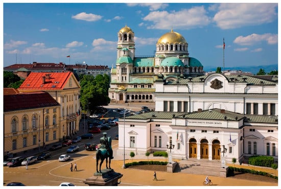
Figure 2.
Yellow pavements in Sofia, Bulgaria. Public domain image.
Likewise, iconic signs in the cultural landscape are when a diverse palette of color combinations is reduced to a sign associated with a particular type of geographical features. For example, “blue mountains”, “yellow desert”, “blue sea” are stable word combinations and visual images in the centuries-old cultural tradition. We know that in reality the mountains, desert, and sea may have completely different shades, but from the entire palette we chose these very colors—which, by the way, are associated with the perception of objects located at a great distance. Only poets and artists dare to find innovative color images for mountains, rivers, and other geographical features and give them new meanings, like the Russian poet Maximilian Voloshin (1877–1932), who called the mountains “colors of roses and honey”.
In the cultural landscape, there are color codes that specialize in signaling functions—such as traffic lights or sky rockets codes (Tchertov 2019, p. 308). And these signals are quite universal across cultures. Red and green regulate the traffic flow in cities; this color set has a conventional nature, although there is a psycho-physical justification for this “convention”, too. According to Rayleigh scattering, shorter wavelengths scatter more than longer wavelengths. Our eye sees scattered waves—from red (long wavelength) to violet or blue (short wavelength). Accordingly, red color, especially in bad weather, is perceived faster and clearer, and this is why we see red from afar light much better than, say, blue or violet.2
4. Colors as Symbols
Symbols are conventional signs defined by the basic sign system accepted in the culture.
In and of itself, “color symbolism is an ambiguous phenomenon formed, on the one hand, by the symbolism of objects—carriers of color, and on the other hand, by a set of possible ranges that include this or that color” (Kolosova 2009, p. 24). It is important that color symbolism is defined by “combinatorics, a combination of colors, that is, revealed not by itself, but in comparison” (ibid.). By that, a “message” appears and merges with the semiotic system (text) of the cultural landscape.
Color as a symbol in man-made structures has been used since archaic times. “In ancient times, the astronomical and topo-navigational points and directions which were most important for human life and activities were marked out by large stones of different colors” (Marsadolov 2019, p. 75). The color of stones depended on the orientation to the east or west, i.e., had different meanings.
Red is the color of love, throne, war, and revolution, and blood spilled in the struggle. In architectural ensembles, one of the meanings may be used intentionally, according to the architect’s plan, or implicitly, post factum. For instance, Peter the Great’s palace in Kadriorg, Tallinn, was originally painted basic red (Figure 3), and the paths in the garden were paved with crushed red brick—according to the Petrine era symbolism, “Mars red” was dedicated to the god of war.
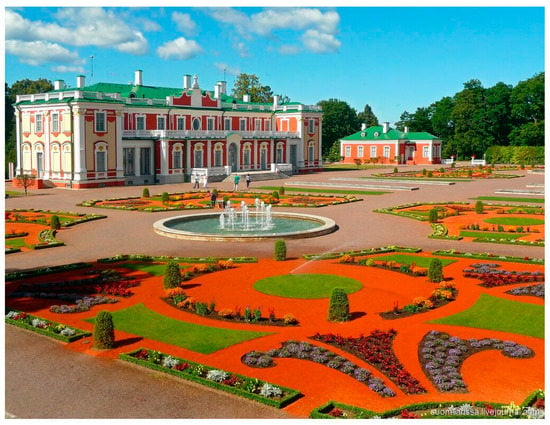
Figure 3.
Kadriorg Palace in Tallin. Public domain image.
Red was universally regarded as a symbol of the sun. For this reason, red was seen as a color akin to gold. Ochre has long been used in burials—not as a symbol of sorrow, but as a symbol of the soul’s path to the light. Aristotle placed the color red right beside light in his color scale. Festive flags are very often red, but after the October Revolution of 1917 red flags received a very specific semantic connotation associated with the workers’ struggle for their rights, and later with communist ideology. In socialist countries, the red color of flags was repeated in monumental panels in the urban landscape and complemented by the laying of red carnations at memorials (for example, in the USSR and Iran, commemorating those who died for the Revolution).
There are also historical and cultural inversions, such as the Amsterdam Red Light District, where red color and light symbolize the accessibility of women of pleasure.
There is also a natural system of signs associated with red in the landscape. According to Yi-Fu Tuan, “red sky means calamity and warfare” (Tuan 1990, p. 25). This can be explained, on the one hand, by fires and explosions that color the sky, and, on the other hand, by the color foreshadowing bad weather or storms. In some languages, there is a proverb, “Red sky at night, sailor’s delight; red sky in morning, sailor’s warning”, showing that in most cases the red morning sun is a natural sign of a change in the weather for the worse.
Gold, the color of divine light and royal power, is mainly associated with ritual structures, such as the golden domes of Orthodox churches and Buddhist temples, and with the decor of royal and imperial palaces.
Yellow as a substitute for gold can also serve as an exponent of sunlight. “On the one hand, as light color, yellow can be equated with white (= light, life) and endowed with positive symbolism; as the color of fire, it is equivalent to red” (Kolosova 2009, p. 24).
“All peoples distinguish between ‘black’ and ‘white’ or ‘darkness’ and ‘light.’ Everywhere these colors carry powerful symbolic reverberations; only red among chromatic colors matches them in importance. Black and white have both positive and negative meanings, thus:Black: (positive) wisdom, potential, germinal, maternal, earth-mother.(negative) evil, curse, defilement, death.White: (positive) light, purity, spirituality, timelessness, divine.(negative) mourning, death”.(Tuan 1990, p. 25)
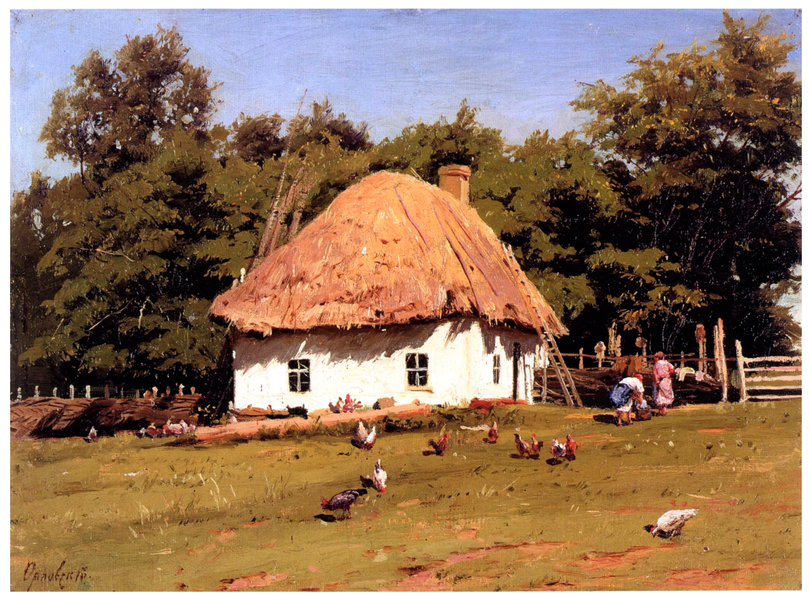
White in the landscape is an achromatic neutral color, a symbol of purity. White temple buildings in Orthodoxy and Buddhism become visual and semantic focal points of the landscape. Lime as a finishing material is very popular in the southern latitudes because of its antiseptic and optical–physical properties: white walls absorb less heat. White Ukrainian mazankas (small village houses built of wood, clay, and reeds) in the steppe or white walls of Mediterranean settlements have no definite semantic connotations, but have become reference landscapes that symbolize their culture (Figure 4).
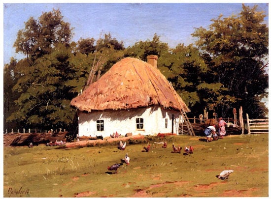
Figure 4.
Volodymyr Orlovsky. Hut. 1880s. Public domain image.
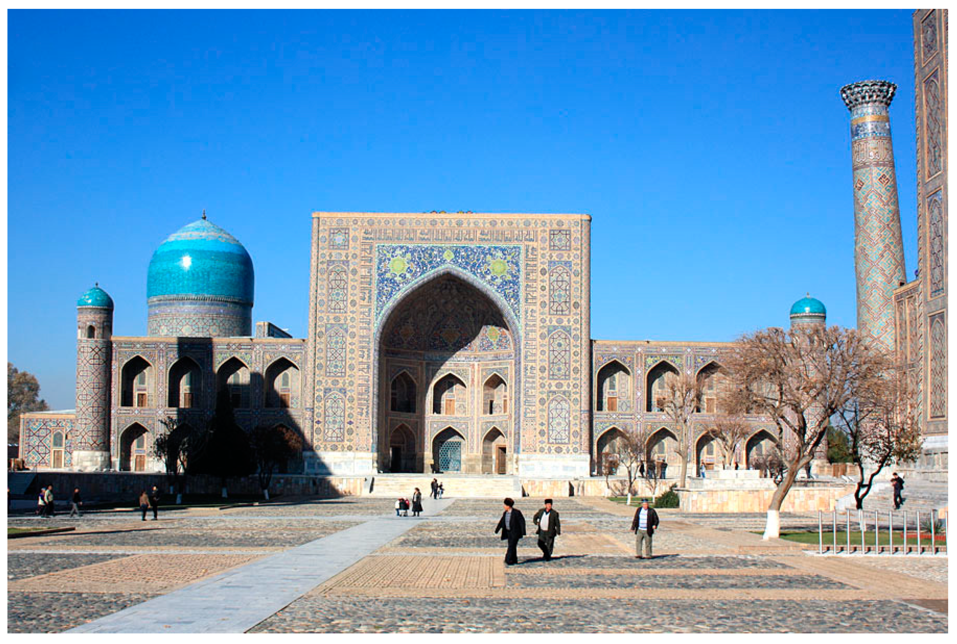
The blue color of mosque domes symbolizes reflections on God, grace, and heaven. Given the basic color of semi-desert and desert landscapes, the colors blue and light blue, used in Islamic architecture, are complementary to yellow and ochre; they form a visual and semantic pair (Figure 5).

Figure 5.
Tilla-Kori Madrasah in Samarkand, Uzbekistan. Public domain image.
Open, bright colors are usually associated with constructive cultural intentions—decor, and expensive construction materials of specific colors (marble, pink tuff, etc.).
“Politically engaged” colors in a landscape deserve a separate mention. “The colour code which distinguishes between political movements and expresses corresponding political ideas can serve as an example of colour symbols becoming signs-significators” (Tchertov 2019, p. 308). Political signs (sometimes reduced to a basic color and symbol) are invariably present in the urbanscape, and in some countries even outside it. For instance, in Peru, amidst the upland desert, one can find paintings in the colors of the most popular parties on wild stone along the country roads. Graffiti and street art are used to create politically colored complete messages.
Among other aspects, colors in a landscape are subject to the principle of polysemanticity: in different contexts and time periods, the same color can have different semantics. “The same tone and even hue in different cultures and at different historical periods can have an almost infinite number of meanings; between some of them, it is difficult to find anything in common, while between others, it is difficult to distinguish” (Griber 2018, p. 99).
The opposite phenomenon is polychrome, when the same surface is decorated with several colors, the combination of which forms certain meanings. In addition to its polysemy, polychrome can have a physical aspect—the optical mixing of colors, which creates a whole new meaning.
“The ancients in their decoration knew no subdued, half-tones of color. The blending and mixing took place not on the palette but on the wall, through the juxtaposition of variegated and graceful decorations that at a certain distance appear to the eye as intermixed, but that always retain a tender playfulness that has such a charming effect”.(Semper 2008, pp. 236–37)
Within such a space, color creates the illusion of trembling glow and triggers the feeling of physical objects as a visualization of immaterial, spiritual worlds.
5. Achromatic Colors in a Landscape and Their Semantics
In any landscape, everything is saturated with color, either chromatic or achromatic. However, we perceive through the prism of cultural dominants; that is why achromatic colors are often seen as zero signifiers or empty signifiers. A zero signifier is signified without a specific signifier, “a meaning without a form, the absence of a positive signifier that would have to exist by virtue of analogy with other syntagmas, in which the sign of the same meaning does have an explicit form” (Griber 2018, p. 24).
An empty signifier is a signifier without a signified. Such signs do not refer to specific phenomena or objects of the non-textual world, that is, they claim to be self-sufficient. Any color, not only achromatic, in the perception of a landscape can sometimes be an empty sign—it is there, but it has no meaning. When asked, “What do you see?” a person starts itemizing objects—fields, mountains, houses—while the color remains as if invisible, since it is not important for perception. Therefore, “color in audiovisual communication can act not only as a symbol, but also as a zero signifier. At the same time, unlike alphabetic graphic notation, color has form and functional meaning, but is often overlooked in decoding” (Davydik 2021).
“…For our consciousness, only chromatic tones are actual colours. And it is this approach that is better suited for the analysis of colour representation in urban space. Considered from this position, architecture breaks down into black-and-white and coloured buildings. As in any language, achromatic signs (in this case, colour in urban space will be zero) can only exist against the background of chromatic (non-zero) signs, composing a system together with them”.(Griber 2018, p. 25)
Despite all its shabbiness, achromatic urban space can have a definite meaning, indexical in its nature—a kind of “sign of misfortune”. Gray (covered with dust, with washed-off or worn-off paint) ruins and abandoned buildings indicate “the loss of control over the colour space of the city, the unplanned and uncontrollable character of changes in it” (Griber 2018, p. 26). “Smog with its particulates fills the air of large cities and settles everywhere, fading the colours of all the building materials. The smog particles perform a visual filter function…” (Zennaro 2017, pp. 92–93). Dust and smog change the appearance of even celebrated architectural masterpieces. For instance, the almost black sandstone Cologne Cathedral was once light and airy, but now its true color can only be seen in small parts, where restoration is underway.
The dullness in architecture (like the gray khrushchevkas—concrete-paneled or brick five-storied apartment buildings in the USSR) “points to a low colouristic culture, limited material resources, and a lack of required colour-carrying materials” (Griber 2018, p. 26). In the slums of the Global South (Dharavi, Kibera, and others), gray and brown colors also prevail (because houses are literally made of unprocessed stone, clay, or old profiled sheets), which is also indicative of ill-being, and the inability and unwillingness to design environmental coloristics (Figure 6).
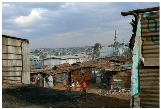
Figure 6.
Kibera, Kenya. Photo by Olga Lavrenova.
In the ontological sense, the “sign of misfortune” can also be perceived as emptiness. The ugliness of form plus dusty achromatism is the absence of meaning and voidness without the potential for development, and emptiness as a nest of the underside of life. In the void, another, “seamy” life emerges and exists. It implies vandalism, but also encourages the new, albeit protesting and chaotic, chromaticness—the manifestation of graffiti art, stencil art, and street art.
The beauty–ugliness dichotomy lies at the heart of all life, and serves as a marker of its moral virtues. Russian philosopher Nikolay Lossky wrote:
“At the heart of all processes ultimately lies an instinctive or even sometimes conscious desire for the absolute fullness of life. It follows that in all stages of nature, there is beauty or ugliness because beauty is the sensual embodiment of the positive, and ugliness is the sensual embodiment of the negative traits of soulfulness or spirituality”.(Lossky 1998, p. 220–21)
He argued that nature is beautiful in all states, and ugliness is therefore the fate of some of the humanized landscapes, a direct consequence of the spiritual and emotional imperfection of society.
In the post-apocalyptic films of the late 20th and early 21st century, “dirty” colors—gray and brown—are usually associated with industrial structures, which in the modern paradigm begin to symbolize infernal and destructive forces (Figure 7).

Figure 7.
Still from Alita: Battle Angel. 2019. Public domain image.
Empirical studies of color preferences show that “people like colors strongly associated with objects they like (e.g., blues with clear skies and clean water) and dislike colors strongly associated with objects they dislike (e.g., browns with feces and rotten food)” (Palmer and Schloss 2010, p. 8877). It is possible therefore to talk about the reversibility of symbolism. Colors become symbols of objects and phenomena. But at the same time, objects become expressors of colors.
Indeed, brown and gray can have noble hues and be applied, among other things, in the design of high-end residential neighborhoods. Gray and silver colors are quite typical of high-rise high-tech ensembles. “The use of glass and stainless steel was promoted to highlight the contemporary nature of the place, but also softened the appearance of those tall buildings through the reflective properties of those materials. Large plates of glass work like mirrors duplicating external environments, changing colour with weather. Tinted glass panels and ascetic steel ornaments are applied to add finer grain and texture to the otherwise monolithic facades. Daylight almost paints steel detailing in contrast to the building’s skin” (Zimnicka et al. 2022).
6. Colors of Nature in the Context of the Cultural Landscape
Rural landscapes and townscapes usually fit into the natural color scheme, being either in harmony with or in opposition to it. In rural landscapes the color is the result of very different factors, connected to the production needs and habits that are stratified with the colors of the soil. In the modern world, the town design coloristic palette can echo the earth colors (Waygood 2017). There are even special scientific studies carried out for this purpose.
Here, brown can have the semantic characteristics of naturalness and environmental friendliness. “In the Natural environment there are the trunks and the branches of the trees, the ploughed lands, a season, the autumn, where the green leale, passing the red, orange, yellow versions, become brown before falling to the ground” (Ronchi 2010, p. 10). At the same time, physicists tell us:
“…the brown color does not belong to the electromagnetic spectrum, and that the brown light does not exist. We perceive the brown exclusively as an ‘object color,’ for instance, when our eye is stimulated by the light diffusedly reflected by a brown painted surface, lit by a source operating on a broad spectral band. <…> Brown is a dark orange (or also a dark yellow), that is, it implies relatively low luminances”.(ibid., p. 11)
Luxury chalets do not mask the color of their wooden walls, but emphasize them by applying various treatment solutions, including fire retardants.
Residential houses made of unpainted wood are most often either gray or brown—colors blending well with the natural landscape. In the North and in the highlands, environmental factors turn the original light brown color of wood (especially aspen) into silver, and the buildings look as if covered with silver (noble gray) (Figure 8).
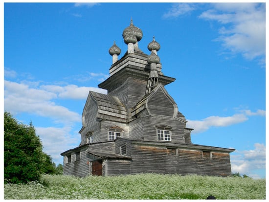
Figure 8.
Church of the Vladimir Icon of the Mother of God, village Podporozhye, Arkhangelsk Oblast, Russia. Public domain image.
Color focal points in the natural landscape are influenced by the specifics of visual perception: they should be noticeable in the basic tone of the landscape. This is why, in architecture and other man-made elements, colors complementary to the landscape are quite common. Red is well-loved in the overall green tone of forest landscapes. The blue color of the mountains incites the frequent use of yellow and ochre. And in creating the town color scheme, these colors can be applied not only in architecture, but also in the decor, flags, etc.
In a natural landscape, certain color characteristics attract the most attention. According to eye-tracking studies, “magenta–green variation is an important factor in mountain landscapes, yellow–blue colour field is an important factor in aquatic landscapes, complexity is an important factor in open landscapes, and hue variation is an important factor in forest landscapes” (Huang and Lin 2019, p. 12).
The color symbolism of gardens is related to the same titular colors, as well as to the “dominant semantics” of the era (Likhachev 1991, p. 16) and the symbolism of the plants themselves, such as roses or lilies, with their certain semantic connotations stemming from Christian symbolism. Interestingly, the apparent plant diversity is also most often subordinated to one aspect determined by the time of flowering of this or that species. Geobotanists speak, for example, of yellow, red, purple, and other aspects determining the blooming of wild plants.
What is interesting is the causal inversion of plant semantics associated with their color. The appearance of a plant, which serves as the cause for the creation of the myth, begins to be considered as the result of it. For one:
“…in the South Slavic tradition, the plant, the appearance of which, according to the legend, is associated with the menstrual blood of the Virgin Mary, received the name bogorodichina trava (“herb of the Mother of God”) and is applied in the sphere related to female bodily functions (the use of Hypericum for female genital diseases, menstrual irregularities, difficult delivery and infertility)”.(Kolosova 2009, p. 270)
“The same attribute can be interpreted in different ways: for instance, the combination of two colors in a flower can inspire the names like brother–sister or day and night” (ibid.).
In parks, the colors of flowers in flowerbeds are distinguished from each other, creating a certain pattern or an ornament. Depending on the idea, it could be the colors of a national flag, the colors of the revolution, the colors of religious orders, etc. (Figure 9).
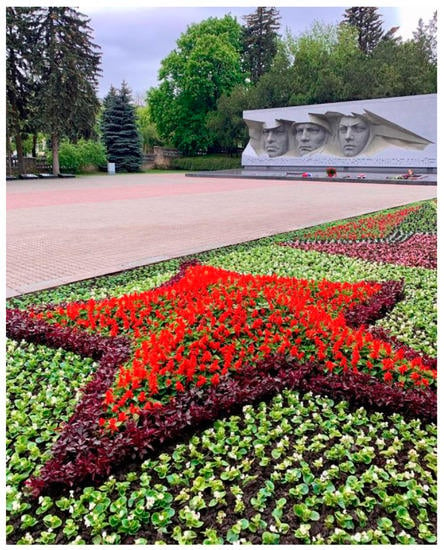
Figure 9.
A red star-shaped flower bed in Victory Park, Stavropol, Russia. Public domain image.
From the point of view of a landscape architect, color is the most powerful tool of influence.
“Nothing in a garden makes such a strong impression as color: it can stop the person’s eye at a specific point, give them a certain trajectory for overlooking the composition, cause strong emotions, experiences and associations. Color is best used to create an emotional background in the garden, to manipulate people’s moods and feelings. The ‘language of color’ is almost universal, it is comparable to human speech, and therefore has its functions: communicative, nominative, expressive, and motivating”.(Yastrebova 2013, pp. 104–5)
In landscape architecture, seasonality is much more significant than in the usual urbanscape. It is the leaf color, changing with the season, that matters. In temperate climates, a landscape architect should consider how the garden or park would look not only in the warm season, but also in winter—predominantly in black and white. In winter, the sun gives “sharp and long shadows, creating a theatrical, dramatic effect, which allows to play on forms. During this season, the sun plays with the structure of tree crowns, the texture of small architectural forms, as well as their opposition to the ground and the shadows themselves rather than with color. But this does not mean that winter implies the absence of color in the garden. Instead, the color and texture of the bark of trees (e.g., Padus maackii, Betula nigra), fruits and berries, conifers and shrubs, as well as paving and hardscape come into play” (Yastrebova 2013, p. 106).
Likewise, for parks and urban coloring, the color of the foliage is important. Studies show that, compared with other colors, different leaf colors (green–white and green–yellow) evoke feelings of “comfort”, “relaxation”, “natural”, “beautiful”, and “cheerful” (Kexiu et al. 2021, p. 6).
In addition, most cities have regular green spaces, which modify the appearance of the city depending on the period of flowering and shedding of leaves (Musso 2013). Another significant aspect is the color of the bark, when the trees lose their leaves: for instance, plane trees with their light bark create the effect of a “light”, “airy” city.
With natural landscapes, people assign meanings to them aesthetically: aesthetic quality defines visual value. At the same time, color contrast, saturation, and color variety play a significant role. Diverse and balanced color patches or a dominant color patch contrasted by many small patches with interspersed color components are regarded by viewers and researchers as having a superior visual aesthetic quality (Mu et al. 2022).
7. Chromodynamics in a Landscape
Significant color foci vary in their degree of temporal anchoring in a landscape, forming a “moving color–space field” (Efimov 1990, p. 225).
Periodic color foci have different temporal periods of manifestation and/or dominance in the cultural landscape, determined by both physical and geographical aspects (latitude and seasonality), as well as cultural, political, and ideological reasons (holidays, elections, etc.).
The most common periodic chromatic element in the cultural landscape is flowers, either growing or brought to memorial sites. Some trees become national or local symbols in the period of blooming. The blooming sakura (Japanese cherry tree) and mume (plum tree or Japanese apricot) symbolize the exquisite beauty of Japanese culture. The blossoming chestnut tree is the symbol of Kyiv, Ukraine’s capital.
Daily periodicity. It implies the light of the rising, midday or setting sun, and the scattered light of the cloudy sky. Stones with their smooth surface facing the sunlight (south or southeast) were used in ancient cultures to make sanctuaries and draw petroglyphs. For this reason, centuries later, cult sculptures were set facing east or southeast—from the ancient Greek gods to the statues of Lenin (Adams and Lavrenova 2023).
“At dawn and dusk, the sun is at the lowest points of its trajectory. Light beams fall at such an angle that the air takes on a soft, warm hue, and we see the sky in red–yellow–pink” (Yastrebova 2013, p. 106). This creates a pink–orange haze effect, in which warm colors look most advantageous. Long, deep shadows become a “haven” for the shades of purple. When the sun is at the zenith, the landscape is perceived in contrasts (the brightest midday pictures are the harsh white shadowless walls of Mediterranean village houses).
Shadow in the landscape is important within the framework of “natural semiotics”: the images reflected on the retina have no volume, but, thanks to shadows, objects are perceived as three-dimensional. Darkness is also the absence of light. “The darkness of night is itself only a big shadow, a kind of regular shade provided by the earth” (Cler 2011, p. 186).
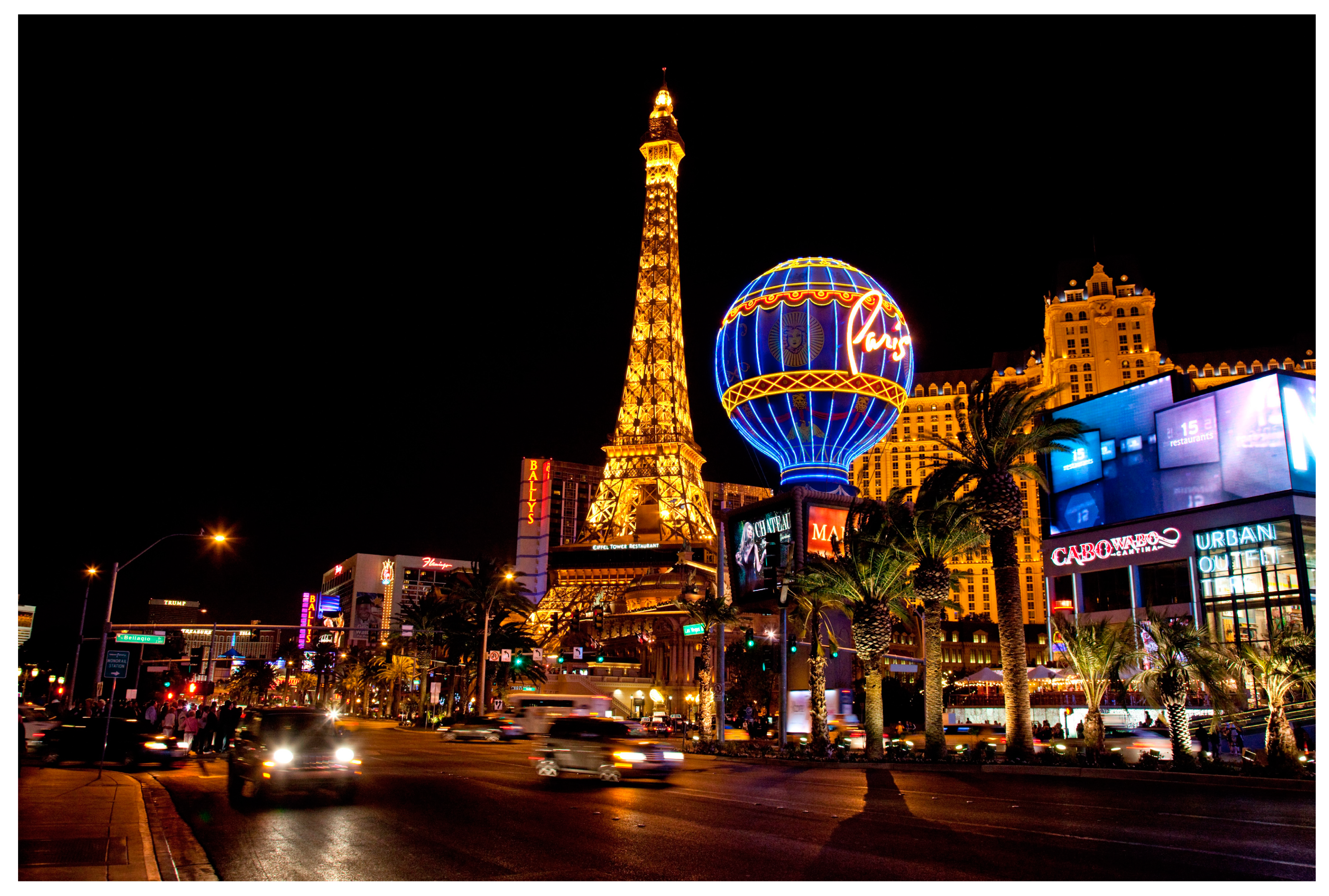
Night is an ideal time for crepuscular and nocturnal animals, who can see and navigate in the dark. That is why, in villages and small settlements surrounded by wildlife, there are certain rules for nighttime, when wild animals—boars, raccoons, and foxes—can roam the streets in search of food. In Siberia, wolves or bears sometimes enter the human settlements at night, attacking dogs or late passers-by. In cities, on the other hand, “nocturnal spaces can be newly cultivated through artificial light. As cyclic movement in regular rhythms or through other durations, coloured light can be used to complete or manipulate the appearances of coloured materials” (Cler 2011, p. 182). There are two ways to utilize artificial light: floodlighting and neon decoration. Floodlight is mostly used for the city’s most prominent buildings and monuments. Neon lights are cheaper and more toylike, and they are popular among small firms to attract customers and create a recognizable image. Advertising screens, constantly changing color and content, become not only nighttime, but also daytime, focal points of color and light, while not being meaningful nodes in the cityscape (Figure 10).
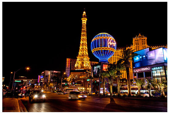
Figure 10.
Las Vegas, neon city. Public domain image.
Seasonal periodicity. In high latitudes, night becomes a seasonal reality rather than a daily one, accustoming people to live in the dark and be content with artificial light. In order to live under polar night conditions, people need a specific philosophy and adaptability that researchers write about (Chartier et al. 2022).
In temperate and subarctic climates, there are two main color seasons: “—chromatic (spring, summer, and autumn), when greenery serves as a background for the color picture; —achromatic (winter), when the main color palette is determined by black, white, and gray scale” (Mihalcheva 2018, p. 195). For the peoples of the North, white is not unambiguous. There is also a “natural language” of snow tones—one can distinguish fresh snow from frozen snow and crust from firn by its hue, and change the route accordingly.
In the subtropics and tropics, the wet season and the dry season change the color of the landscape from deep green to sun-bleached yellow and ochre. Areas with deep green indicate the proximity of water.
Periodicity of events and holidays. Banners and flags have their own culture-driven periodicity. These color patches are the most symbolic, as they are associated with ideology and religion, with religious or political holidays (Figure 11).
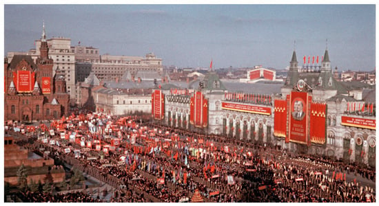
Figure 11.
1955 Parade on Red Square, Moscow, USSR. Public domain image.
Corporate colors, which are relevant in some cultures, can also be attributed to this category. For instance, in some U.S. cities, especially university and college towns, it is customary to wear the colors of the university, or the football team, etc. Signboards and bus stops are also painted the corresponding colors. On certain days, such as football games and the beginning of classes at the university, so many people put on symbolic colors that the entire city changes its colors to corporate.
This can also include the polychrome and colorfulness of commercial brands, which in certain urban locations (shopping streets) is perceived as the identity of the place. “In a large scale, the colours of corporate identity in the street are in contrast to each other creating a colourful scene. Colourfulness thus presents an identity as a whole in visual perception” (Xu 2017, p. 137).
Static color spots are architecture that changes its color every few decades, or not at all. But here, too, urban colorism is marked by “long waves” of chromaticity–achromaticity cycles, of rave of color and chromatic temperance.
“They have a different amplitude, but a remarkably stable trajectory—which Werner Spillmann (1981) was one of the first to notice. In his 1981 article, Architecture between Gray and Superbright, he drew attention to the fact that throughout the twentieth century, the ‘colourful’ decade was always followed by a ‘colourless’ one. In later years the wave-like dynamics of urban colourism was also noticed by Erich and Fabian Küthe, Francesca Valan, Andrea Urlandová; even though they suggested different images (‘pendulum’ (Küthe and Küthe 2002, p. 204), ‘cycle’ (Valan 2012), ‘spiral’ (Urlandová 2016)) as a source of metaphorical expansion, nevertheless, they saw the same mechanism by its nature and properties in the development of urban colourism”.(Griber 2018, pp. 81–82)
Historically substantiated restoration of the coloristics of European cities in compliance with the documents of the 18–19th centuries has some challenges, one of which is the definition of colors in those documents. “Many of the most frequent colours, cited in the documents (“Molera” or “Molassa” sandstone, “Peach flower”, “Nanking”, Malanaggio dark green”, “Light blue greyish” etc.) have already become absolutely obsolete, but their reconstruction should absolutely happen on the base of precise formulas” (Brino 2010, p. 33). Therefore, such restoration work requires the creation of a special color dictionary.
Solutions to the coloristics of the historic part of a city may be rather innovative; in such cases, they cause rejection at first, but over time people get used to them. Most often, they do not carry any specific meaning, and the environment itself is not rethought (Jefferies and Mottram 2012).
“… Lime green and lilac chromatic colours were not so popular in urban restoration work in Lund, Sweden. <…> deep blue and pale-lilac colours, both unusual colours in Sweden, have been used in Gothenburg, [where] people disliked them when evaluating them in a simulation study. However, when people were asked to evaluate them in the real environment, while their evaluation of the lilac remained unchanged, their evaluation of the blue building became significantly more positive. Occupants of the building liked it even more”.(Mikellides 2017, p. 198)
The new stage in the evolvement of urbanscape color design is associated with the renunciation of clear boundaries and rules; the color space becomes “infinitely diverse, embodying the philosophical principle of freedom and the democratic principle of equality of everything and everyone” (Griber 2017, p. 20).
8. Conclusions: Cultural Landscape as a Text—Coloristic Aspect
The fact that color in culture is a certain language has already been sufficiently discussed in various studies—which is demonstrated by this review and the analytical conclusions drawn from it. This language has some peculiarities. For example:
- One and the same color can have opposite meanings (this is the intra-color antonymy);
- Many colors can mean the same feeling or idea (inter-color synonymy);
- Both effects are due to the small number of tokens in the color language—visual and verbal (Almalech 2017).
Conscious use of color in the cultural landscape according to the cultural code and the psychology of visual perception results in the creation of a message or text in its broad cultural understanding. A cultural landscape, thanks to the multiple meanings associated with its elements, can conceptually be interpreted as a text.
It is also possible to treat color semantics and syntactics as a kind of mandala—information encrypted in color, geometric, and compositional codes.
“There is deep symbolism in colour figures used in the layouts, seemingly random and incidental (for example, round is opposed to angular, and streamlined borders predominate in all the colour designs found). Widespread are spatial mythologemes of an island (an image of physical and mental isolation), temple, house, pyramid, river (water). The compositional core of colour images is the archetype of a movement-path (road) between colour images”.(Griber 2017, p. 14)
It is also possible to apply the concepts of “color constellations” and “superfigures” (Minah 2003, pp. 28, 30)—clusters of objects similar in color, having pronounced cultural meanings, and representing semiotic units in the cultural landscape text. Reading such a text involves usage of emotional and cultural codes.
Coloristic semantics is rooted in the history of culture, and color sometimes partakes of the so-called bifocal sign, which “arise from the interaction of the new and the previous texts. <…> A bifocal sign determines not only the new object, but its complex perception as a unit that already has a certain history in culture” (Shuneyko and Chibisova 2018, p. 178).
Accordingly, colors in cultural landscapes, from natural to man-mad, have their meanings—not always clearly expressed, but influencing the emotional perception, the underlying reading of meanings, and allowing navigation in this “color-semantic” space.
Funding
This research was funded by Russian Science Foundation, project No. 22-18-00407, https://rscf.ru/en/project/22-18-00407/ (accessed on 24 May 2023).
Institutional Review Board Statement
Not applicable.
Informed Consent Statement
Not applicable.
Data Availability Statement
The data presented in this study are available on request from the corresponding author.
Conflicts of Interest
The authors declare no conflict of interest.
Notes
| 1 | https://whc.unesco.org/en/culturallandscape/ (accessed on 24 March 2023). |
| 2 | https://www.marieclaire.ru/psychology/interesnyie-faktyi-o-tsvete/ (accessed on 24 March 2023). |
References
- Adams, Paul C., and Olga A. Lavrenova. 2023. Monuments to Lenin in the post-Soviet cultural landscape. Social Semiotics 32: 708–27. [Google Scholar] [CrossRef]
- Almalech, Mony. 2017. Semiotics of Colour. In New Semiotics: Between Tradition and Innovation, Paper Presented at the World Congress of the IASS/AIS, New Bulgarian University, Sofia, Bulgaria, 16–20 September 2014. Edited by Kristian Bankov. Sofia: IASS Publications & NBU Publishing House. [Google Scholar] [CrossRef]
- Arnheim, Rudolf. 1971. Art and Visual Perception. Berkeley: University of California Press. [Google Scholar]
- Arrarte-Grau, Malvina, and B. Ludmir. 1987. Lima Actual: El Color de la Vivienda. Lima: Universidad Ricardo Palma. [Google Scholar]
- Biggam, Carole P. 2012. The Semantics of Colour: A Historical Approach. Cambridge: Cambridge University Press. [Google Scholar] [CrossRef]
- Biggam, Carole P., and Kirsten Wolf, eds. 2021. A Cultural History of Color. 6 vols. London: Bloomsbury Publishing. [Google Scholar]
- Braham, William W. 2002. Modern Color/Modern Architecture: Amédée Ozenfant and the Genealogy of Color in Modern Architecture. Burlington: Ashgate Pub. Co. [Google Scholar]
- Brino, Giovanni. 2010. Introduction to a Dictionary of Colours of Italian Cities. Colore: Quaderni di Cultura e Progetto del Colore—Notebooks of Culture and Colour Design 68: 32–46. [Google Scholar]
- Chartier, Daniel, Katrín Anna Lund, and Gunnar Thór Jóhannesson, eds. 2022. Darkness: The Dynamics of Darkness in the North. Montréal and Reykjavik: Imaginaire. [Google Scholar]
- Cheng, Yuning, and Ming Tan. 2018. The Quantitative Research of Landscape Color: A Study of Ming Dynasty City Wall in Nanjing. Color Research and Application 43: 436–48. [Google Scholar] [CrossRef]
- Cler, Michel. 2011. Colour Appearance in Urban Chromatic Studies. In New Directions in Colour Studies. Edited by Carole P. Biggam, Carole A. Hough, Christian J. Kay and David R. Simmons. Amsterdam: John Benjamins Publishing, pp. 181–90. [Google Scholar] [CrossRef]
- Davydik, Alexander S. 2021. Nulevoy i pustoy znaki: Semioticheskie elementy televizionnykh programm [Zero and Blank Signs: Semiotic Elements of Television Programs]. Journal of the Belarusian State University: Journalism 2: 46–50. [Google Scholar]
- Efimov, Andrey V. 1990. Koloristika goroda [Coloristics of the City]. Moscow: Stroyizdat. [Google Scholar]
- Elliot, Andrew J. 2015. Color and Psychological Functioning: A Review of Theoretical and Empirical Work. Frontiers in Psychology 6: 368. [Google Scholar] [CrossRef] [PubMed]
- Elliot, Andrew J. 2018. A Historically Based Review of Empirical Work on Color and Psychological Functioning: Content, Methods, and Recommendations for Future Research. Review of General Psychology 23: 177–200. [Google Scholar] [CrossRef]
- Gage, John. 1999. Color and Culture: Practice and Meaning from Antiquity to Abstraction. Berkeley: University of California Press. [Google Scholar]
- Griber, Yulia A. 2017. Tsvetovoe Pole Goroda v Istorii Evropeyskoy Kul’tury [Color Field of the City in the Context of Culture]. Moscow: Soglasie. [Google Scholar]
- Griber, Yulia A. 2018. Teoriya Tsvetovogo Proektirovaniya Gorodskogo Prostranstva [Theory of Colour Design in Urban Spaces]. Moscow: Soglasie. [Google Scholar]
- Huang, Angela S.-H., and Yann-Jou Lin. 2019. The Effect of Landscape Colour, Complexity and Preference on Viewing Behaviour. Landscape Research 45: 1–14. [Google Scholar] [CrossRef]
- Jefferies, Tom, and Judith Mottram. 2012. Colour in the Designed Environment. In Color and Design. Edited by Marilyn DeLong and Barbara Martinson. London: Berg. Available online: http://www.bergpublishers.com/?tabid=15892 (accessed on 24 March 2023).
- Kexiu, Liu, Mohamed Elsadek, Binyi Liu, and Eijiro Fujii. 2021. Foliage colors improve relaxation and emotional status of university students from different countries. Heliyon 7: e06131. [Google Scholar] [CrossRef]
- Klarén, Ulf T., Harald Arnkil, and Karin Fridell Anter. 2013. Colour and Light in Design—Levels of experiencing colour and light. In DRS Cumulus Oslo 2013, Proceedings of the 2nd International Conference for Design Education Researchers, Oslo, Norway, May 14–17. Edited by Janne B. Reitan, Peter Lloyd, Erik Bohemia, Liv M. Nielsen, Ingvild Digranes and Eva Lutnæs. Oslo: ABM-media, pp. 743–52. Available online: https://dl.designresearchsociety.org/conference-volumes/42 (accessed on 24 March 2023).
- Kolosova, Valeria B. 2009. Leksika i Simvolika Slavyanskoy Narodnoy Botaniki [The Lexicon and the Symbolism of Slavic Folk Botany]. Moscow: Indrik. [Google Scholar]
- Küthe, Erich, and Fabian Küthe. 2002. Marketing mit Farben: Gelb wie der Frosch. Wiesbaden: Gabler Verlag. [Google Scholar]
- Lavrenova, Olga A. 2019. Spaces and Meanings: Semantics of the Cultural Landscape. New York: Springer. [Google Scholar] [CrossRef]
- Likhachev, Dmitry S. 1991. Poeziya sadov: K semantike sadovo-parkovykh stiley [Poetry of Gardens: On the Semantics of Landscape Styles]. St. Petersburg: Nauka. [Google Scholar]
- Lossky, Nikolay O. 1998. Mir kak Osushchestvlenie Krasoty [The World as the Realization of Beauty]. Moscow: Progress-Traditsiya, Traditsiya. [Google Scholar]
- Lynch, Kevin. 1960. The Image of the City. Cambridge: MIT Press. [Google Scholar]
- Marsadolov, Leonid S. 2019. Ob izuchenii tsveta kamney na arkheologicheskikh pamyatnikakh Sayano-Altaya [On the Study of the Color of Stones at the Archaeological Sites of the Sayano-Altai]. In Polevye Issledovaniya v Verkhnem Priob’e, Priirtysh’e i na Altae: Arkheologiya, Etnografiya, Ustnaya Istoriya i Muzeevedenie, 2018 [Field Research in the Upper Ob, Irtysh and Altai: Archaeology, Ethnography, Oral History and Museology, 2018], Paper presented at the 16th International Scientific Conference, Barnaul, Russia, May 22–23. Edited by Mikhail A. Demin, Tatiana K. Shcheglova and Natalia S. Gribanova. Barnaul: AltGPU, pp. 69–77. [Google Scholar]
- Mihalcheva, Svetlana G. 2018. Koloristicheskie vzaimosvyazi arkhitekturnoy i prirodnoy sredy zhilogo kompleksa [The Color Relationships of the Architectural and Natural Environment of the Residential Complex]. Obrazovanie i nauka v sovremennom mire: Innovatsii 5: 194–200. [Google Scholar]
- Mikellides, Byron. 2017. Colour psychology: The Emotional Effects of Colour Perception. In Colour Design, 2nd ed. Edited by Janet Best. Sawston: Woodhead Publishing, pp. 193–214. [Google Scholar] [CrossRef]
- Minah, Galen. 2003. Blackness, Whiteness, Chromaticness: Formulas for High Visibility in the Modern City. In AIC 2003 Bangkok: Color Communication and Management, Paper Presented at the AIC 2003 Conference, Bangkok, Thailand, August 4–6. Edited by Aran Hansuebsai. Bangkok: The Color Group of Thailand, pp. 26–30. Available online: https://aic-color.org/resources/Documents/aic2003.pdf (accessed on 24 March 2023).
- Mu, Yanxia, Wenyue Lin, Xiuli Diao, Zhe Zhang, Jin Wang, Zijing Lu, Wencheng Guo, Yu Wang, Chunxiang Hu, and Changyou Zhao. 2022. Implementation of the Visual Aesthetic Quality of Slope Forest Autumn Color Change into the Configuration of Tree Species. Scientific Reports 12: 1034. [Google Scholar] [CrossRef]
- Musso, Maria L. 2013. Trees of Buenos Aires Changing the Colour of the City. In AIC Colour 2013, Paper presented at the 12th Congress of the International Colour Association, Newcastle upon Tyne, UK, July 8–12. Edited by Lindsay MacDonald, Stephen Westland and Sophie Wuerger. Newcastle: The Colour Group, AIS, pp. 239–42. Available online: https://aic-color.org/resources/Documents/aic2013proc1.pdf (accessed on 24 March 2023).
- Palmer, Stephen E., and Karen B. Schloss. 2010. An ecological valence theory of human color preference. Proceedings of the National Academy of Sciences of the United States of America 107: 8877–82. [Google Scholar] [CrossRef]
- Pastoureau, Michel. 2008. Black: The History of a Color. Princeton: Princeton University Press. [Google Scholar]
- Pastoureau, Michel. 2013. Green: The History of a Color. Princeton: Princeton University Press. [Google Scholar]
- Pastoureau, Michel. 2017. Red: The History of a Color. Princeton: Princeton University Press. [Google Scholar]
- Pastoureau, Michel. 2018. Blue: The History of a Color. Princeton: Princeton University Press. [Google Scholar]
- Peirce, Charles. 1992–1998. The Essential Peirce. Edited by Nathan Houser, Christian Kloesel and Peirce Edition Project. 2 vols. Bloomington, Indiana: Indiana Christian University Press. [Google Scholar]
- Ronchi, Lucia. 2010. About the Ubiquitous but Academically Neglected Color Named Brown. Colore: Quaderni di Cultura e Progetto del Colore—Notebooks of Culture and Colour Design 68: 9–20. [Google Scholar]
- Sánchez-Marañón, Manuel, Pedro A. García, Rafael Huertas, Javier Hernández-Andrés, and Manuel Melgosa. 2011. Influence of Natural Daylight on Soil Color Description: Assessment Using a Color-Appearance Model. Soil Science Society of America Journal 75: 984–93. [Google Scholar] [CrossRef]
- Schloss, Karen B., Laurent Lessard, Charlotte S. Walmsley, and Kathleen Foley. 2018. Color Inference in Visual Communication: The Meaning of Colors in Recycling. Cognitive Research: Principles and Implications 3: 5. [Google Scholar] [CrossRef]
- Schloss, Karen B., Rolf Nelson, Laura Parker, Isobel A. Heck, and Stephen E. Palmer. 2017. Seasonal Variations in Color Preference. Cognitive Science 41: 1589–612. [Google Scholar] [CrossRef] [PubMed]
- Semper, Gottfried. 2008. Kleine Schriften. Edited by Henrik Karge. Hildesheim: Zürich [u.a.]: Olms-Weidmann. [Google Scholar]
- Serra, Juan. 2013. The Versatility of Color in Contemporary Architecture. Color Research and Application 38: 344–55. [Google Scholar] [CrossRef]
- Serra, Juan, Ángela García, Ana Torres, and Jorge Llopis. 2012. Color Composition Features in Modern Architecture. Color Research and Application 37: 126–33. [Google Scholar] [CrossRef]
- Serra, Juan, Banu Manav, and Yacine Gouaich. 2021. Assessing Architectural Color Preference after Le Corbusier’s 1931 Salubra Keyboards: A Cross Cultural Analysis. Frontiers of Architectural Research 10: 502–15. [Google Scholar] [CrossRef]
- Serra, Juan, Yacine Gouaich, and Banu Manav. 2022. Preference for Accent and Background Colors in Interior Architecture in Terms of Similarity/Contrast of Natural Color System Attributes. Color Research and Application 47: 135–51. [Google Scholar] [CrossRef]
- Shen, Shiguang, Yao Yao, and Li Canliu. 2022. Quantitative Study on Landscape Colors of Plant Communities in Urban Parks Based on Natural Color System and M-S Theory in Nanjing, China. Color Research and Application 47: 152–63. [Google Scholar] [CrossRef]
- Shuneyko, Alexander A., and Olga V. Chibisova. 2018. Semioticheskaya klassifikatsiya znakov: Novyy aktsent [The Semiotic Typology of Signs: A New Accent]. Vestnik Chelyabinskogo Gosudarstvennogo Universiteta 4: 174–81. [Google Scholar]
- Spillmann, Werner. 1981. Architektur zwischen Grau und Superbunt. Architektur und Farbe 4: 43–52. [Google Scholar]
- Tamm, Marek, ed. 2019. Juri Lotman—Culture, Memory and History. Brian James Baer, trans. Berlin: Springer Nature. [Google Scholar] [CrossRef]
- Tchertov, Leonid F. 2019. Signs, Codes, Spaces, and Arts. Newcastle upon Tyne: Cambridge Scholars Publishing. [Google Scholar]
- Tuan, Yi-Fu. 1990. Topophilia: A Study of Environmental Perception, Attitudes, and Values. New York: Columbia University Press. [Google Scholar]
- Urlandová, Andrea. 2016. Sila Farby [Power of Color]. Bratislava: Vydavateľstvo Eurostav, spol. s r. o. [Google Scholar]
- Valan, Francesca. 2012. The Evolution of Color in Design from the 1950s to Today. Journal of the International Colour Association 8: 55–60. [Google Scholar]
- Waygood, Jem. 2017. Colour in the urban environment: Responding to a sense of place and creating a sense of place, two examples from the UK. Social Transformations 27–28: 171–85. [Google Scholar]
- Wigley, Mark. 1995. White Walls, Designer Dresses: The Fashioning of Modern Architecture. London: MIT Press. [Google Scholar]
- Xu, Johnny J. 2017. Colour Identity of Place: A Case Study of Narborough Road, Leicester, UK. Social Transformations 27–28: 129–52. [Google Scholar]
- Yastrebova, Oksana G. 2013. Osobennosti vospriyatiya tsveta v landshafte [Peculiarities of Color Perception in the Landscape]. Vestnik landshaftnoy arkhitektury 2: 104–7. [Google Scholar]
- Zennaro, P. 2017. The ‘ugly’ in today’s built environment. Social Transformations 27–28: 83–95. Available online: http://color-lab.org/files/283/ecd_book_compressed.pdf (accessed on 24 March 2023).
- Zimnicka, Agnieszka, Ewa Balanicka, and Aleksandra Kroll. 2022. Evolution in Approach to Colour in Tall Buildings’ Architecture on the Isle of Dogs, London, UK. Arts 11: 9. [Google Scholar] [CrossRef]
Disclaimer/Publisher’s Note: The statements, opinions and data contained in all publications are solely those of the individual author(s) and contributor(s) and not of MDPI and/or the editor(s). MDPI and/or the editor(s) disclaim responsibility for any injury to people or property resulting from any ideas, methods, instructions or products referred to in the content. |
© 2023 by the author. Licensee MDPI, Basel, Switzerland. This article is an open access article distributed under the terms and conditions of the Creative Commons Attribution (CC BY) license (https://creativecommons.org/licenses/by/4.0/).


