
Multi-Purpose Ontology-Based Visualization of Spatio-Temporal Data: A Case Study on Silk Heritage


Abstract
:1. Introduction
2. Related Work
2.1. Visualization of Spatio-Temporal Data
- Step 1. Data collection and transformation. First, we need to collect data from their sources. Data is sometimes unstructured. Therefore, it is necessary to transform it in order to structure it appropriately.
- Step 2. Filtering. Then, it is usually necessary to filter the data, in order to remove noise and focus only on what is meaningful for our visualization purposes. This step, which reduces significantly the amount of information that we need to handle, can only be done if data are previously sufficiently structured.
- Step 3. Mapping. In this step, we need to map the filtered data into geometric elements (points, lines, circles, squares, bars etc.) that can be graphically represented.Step 4. Rendering. A rendering module is necessary, in order to arrange all these geometric primitives and create a visual representation.
- Step 5. User Interaction. The last module is a user interface, by which users can modify the visualization method/parameters and/or explore different datasets.
2.2. Ontology Visualization and Ontology-Based Visualization
3. STMaps Visualization Tool
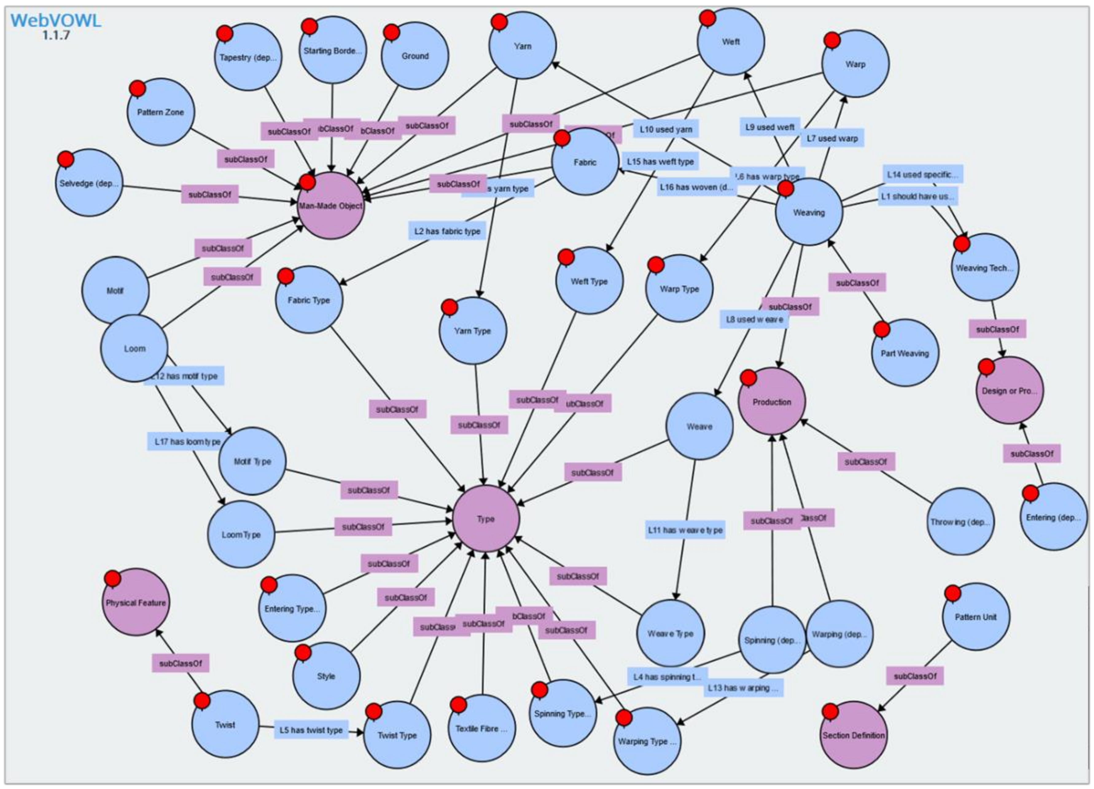
3.1. SILKNOW’s Data and Ontology
- -
- Production place;
- -
- Production time;
- -
- Type of object;
- -
- Material (silk, wool, cotton, gold, chenille etc.);
- -
- Weaving technique (brocatelle, damask, brocade, lampas, espolín etc.);
- -
- Depiction;
- -
- Museum that provided the record.
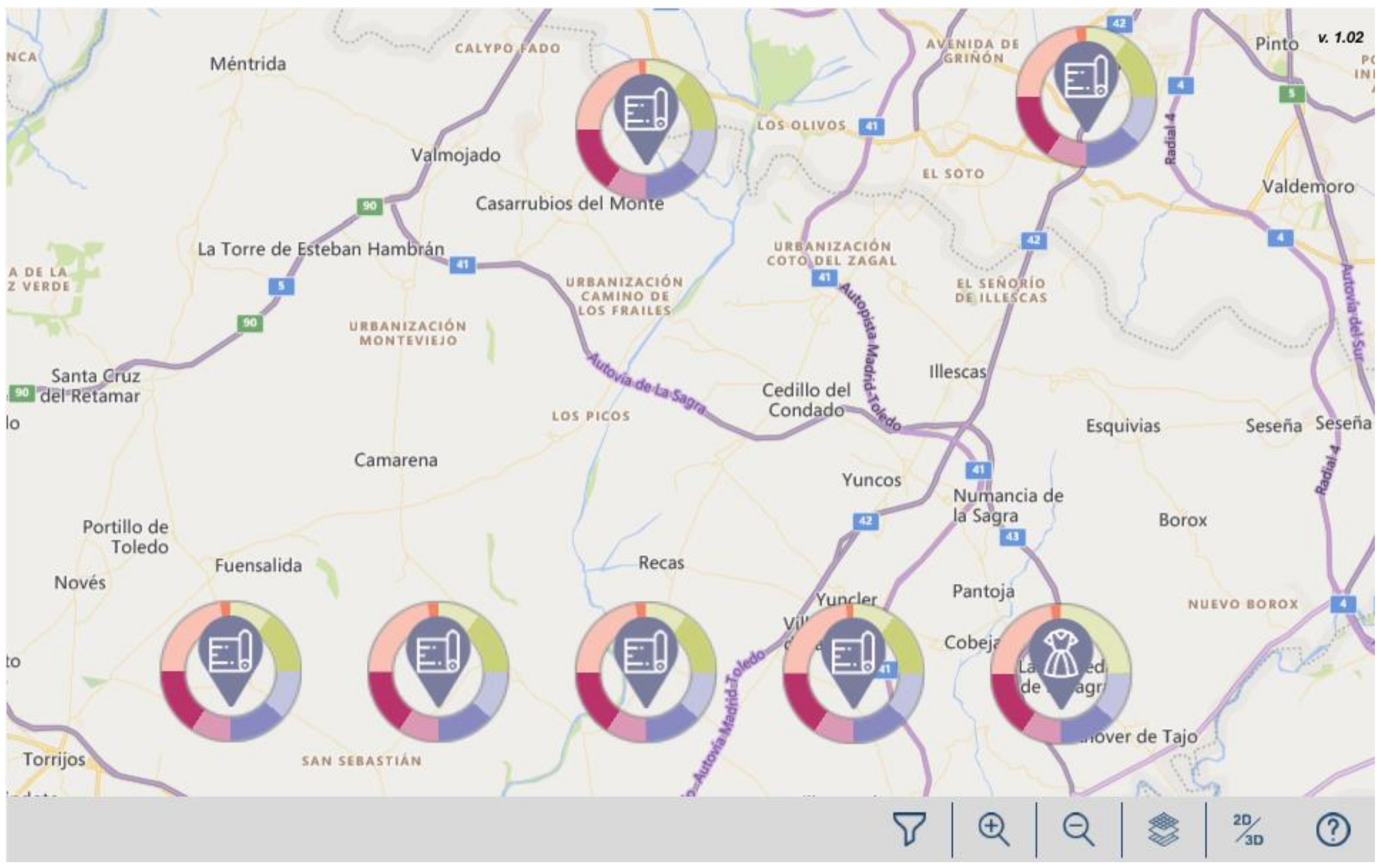
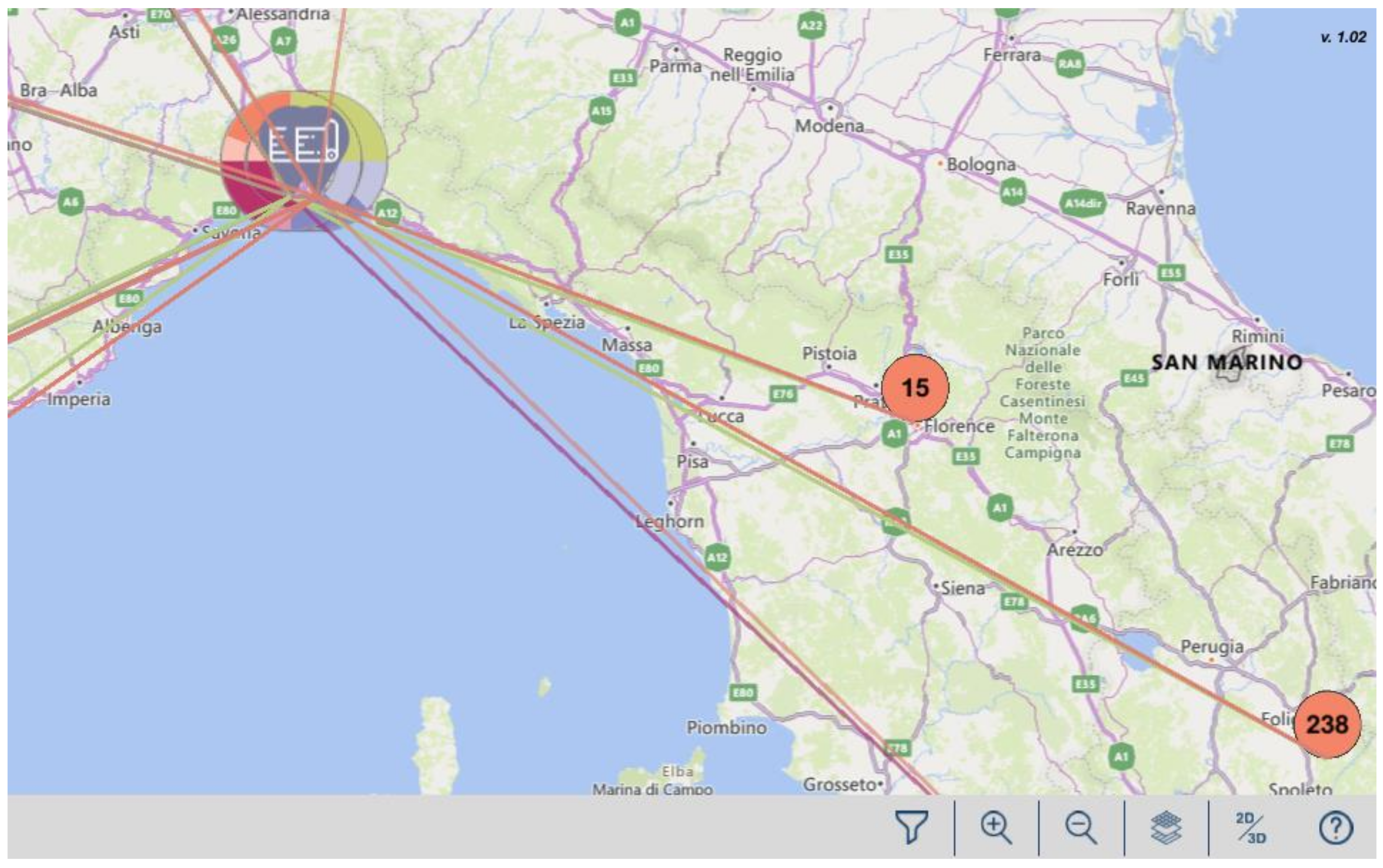
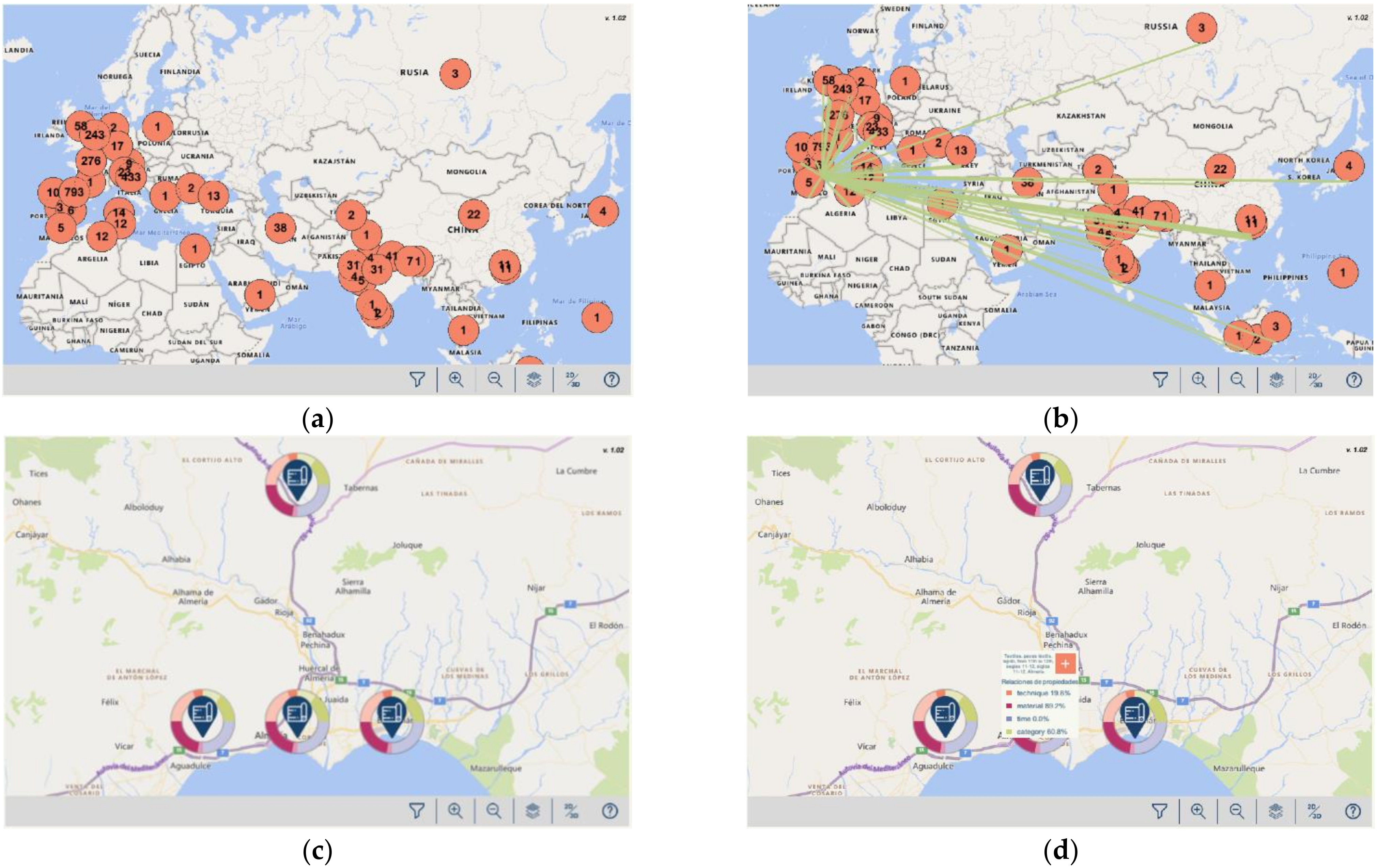
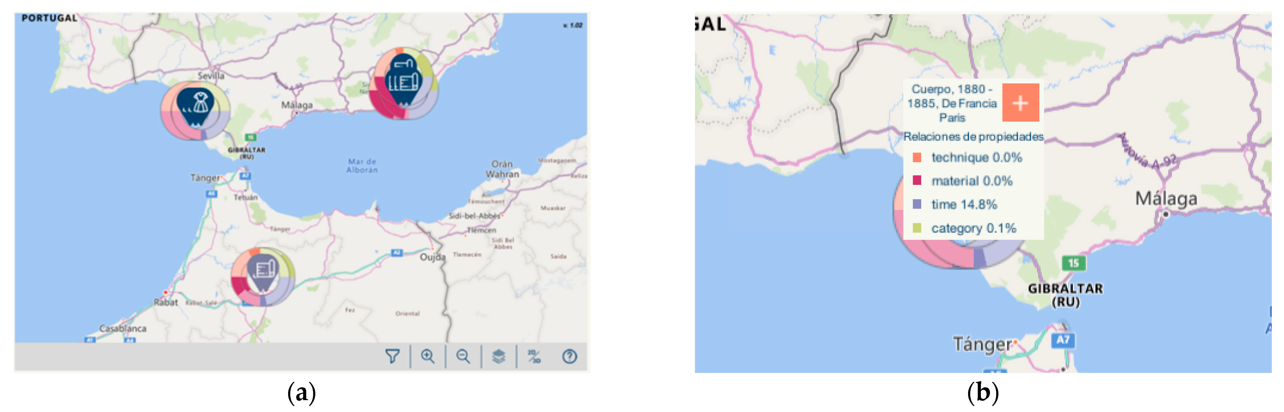
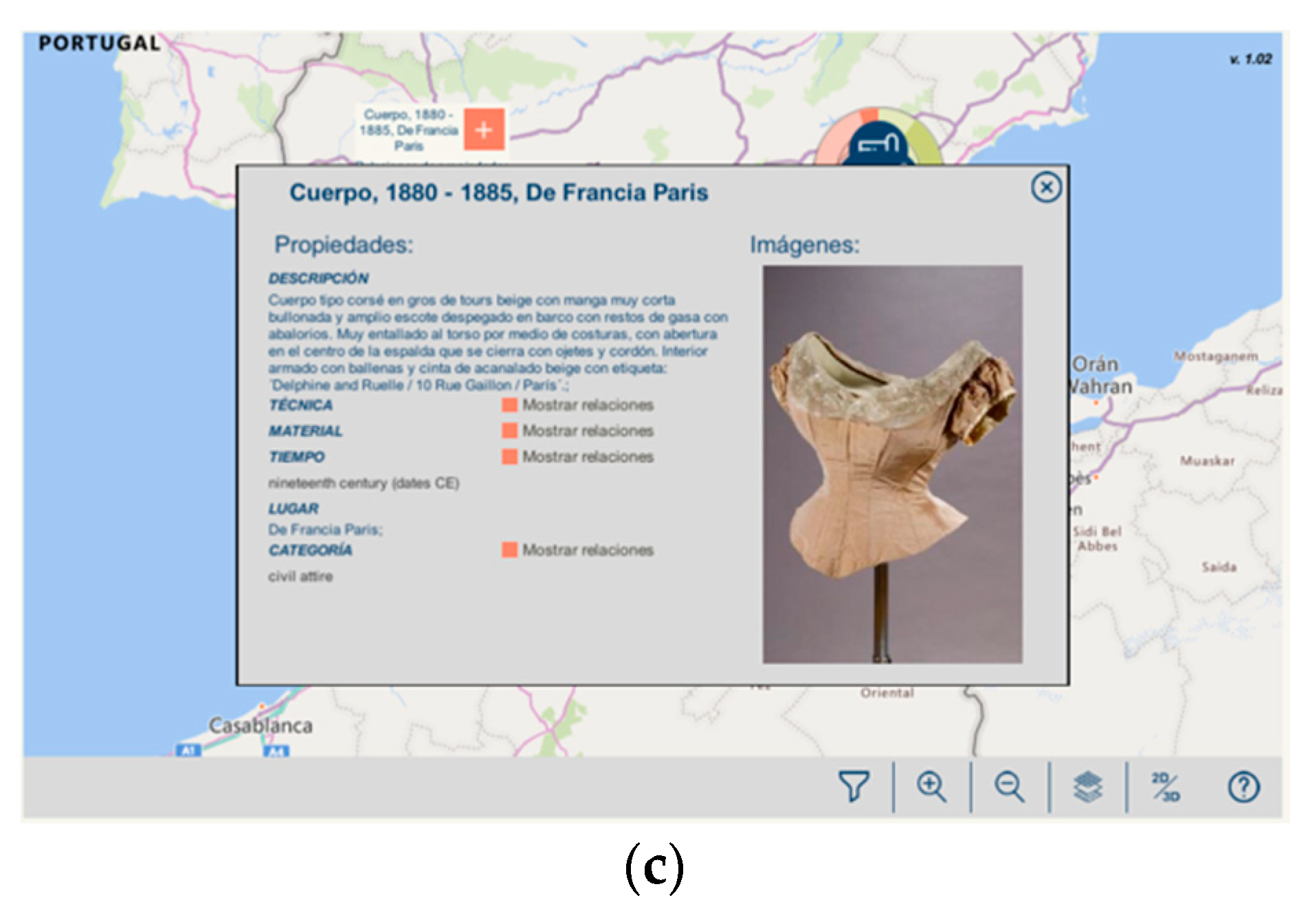
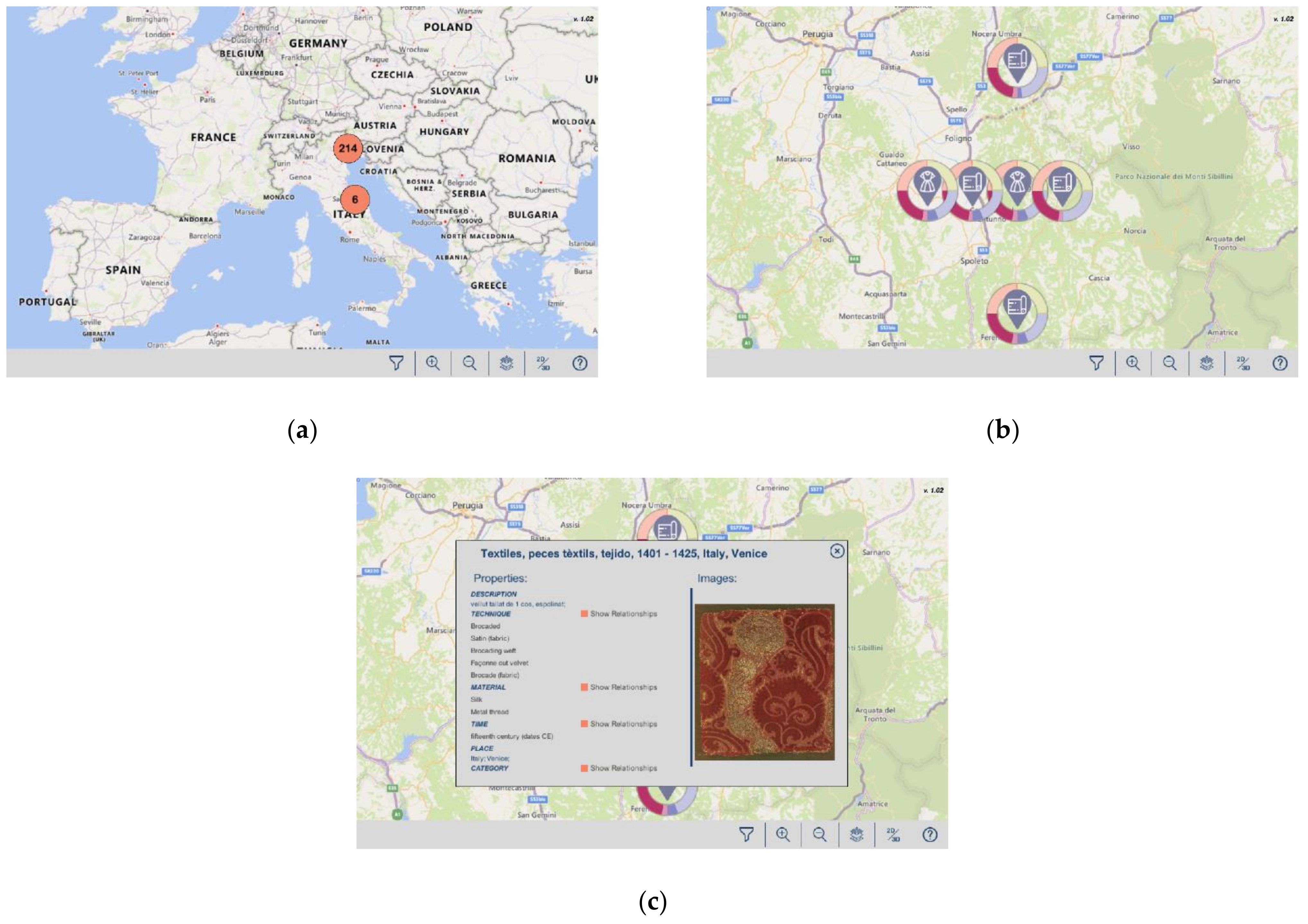
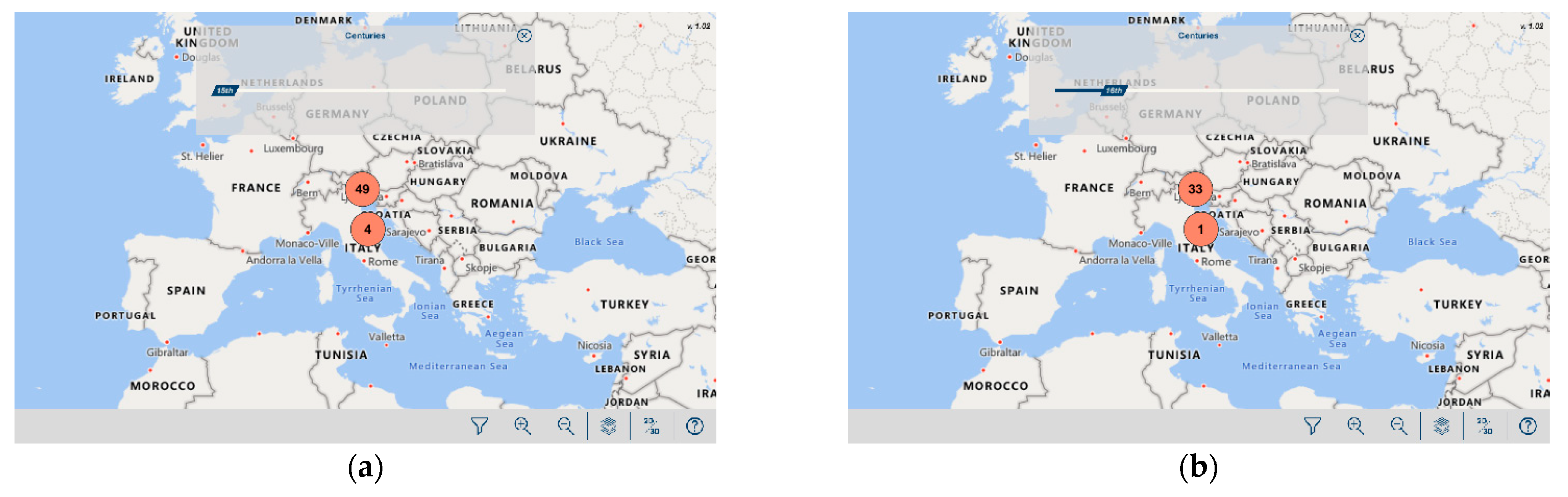
3.2. Multipurpose Ontology-Based Spatio-Temporal Visualization
- {
- “DataOntology”: “http://data.silknow.org”,
- “VisualizationOntology”:”http://purl.org/viso/”,
- “StyleSheet”:”style.json”
- “DataFile”: “datafile.json”
- }
- -
- The URI of the object (in the DO).
- -
- The class the object belongs to (it refers to a particular class defined in the stylesheet file).
- -
- The spatio-temporal properties of the object (as defined in the stylesheet file).
- -
- A link to an image, if available.
- “SceneList”: {
- “Scene”: {
- “name”:”<name>”,
- “based”: “<URI_DynamicMap>”|”<URI_TimeMap>”,
- “mapData”: {
- “dataSource”:”<data_source_key”>”,
- “zoomLevels”:”<zoom_levels_on_map>”,
- “views”:”2D|3D|All”,
- “clusters”: {
- “fromLevel”:”<level_from_the_clusters_will_be_shown>”,
- “toLevel”:”<”level_to_the_clusters_will_be_shown”>,
- “fromDataLevel”:“<level_from_the_point_markers_will_be_shown>”,
- “numQuads”:”<num_of_quads_for_clustering_on_the_top_level>”
- },
- “timeIntervals”:”2|3|4|5”
- }
- }
- }
- “ClassesList”: {
- “Class”: {
- “URI”:”<URI>”,
- “SceneConfiguration”: {
- “sceneName”:”<name_of_the_scene>”,
- “pointRepresentation”:”<URL_File>|Sphere|Cube|Cylinder”,
- “pointColor”:”<color>”,
- “clusterRepresentation”:”<URL_File>|Sphere|Cube|Cylinder”,
- “spatialDataProperties”: {
- “long”:”<longitude_name_on_DataFile>”,
- “lat”:”<latitude_name_on_DataFile”
- }
- “timeDataProperties”: {
- “from”:”<from_name_on_DataFile>”,
- “to”:”<to_name_on_DataFile>”
- }
- “nameProperty”:”<name_on_DataFile>”,
- “relatedToProperty”:”<relation_name_on_DataFile>”,
- “relation”:{
- “based”:”<URI_Direct_Linking>”,“<URI_Relation_Ring>”,
- “color”:”<color>”
- }
- }
- }
- }
3.3. Representation of CH Spatio-Temporal Data. The SILKNOW Case
- -
- Production place;
- -
- Production time;
- -
- Type of object;
- -
- Material;
- -
- Weaving technique.
- -
- Furniture;
- -
- Textiles/fabrics;
- -
- Religious objects;
- -
- Dresses;
- -
- Drawings;
- -
- Household objects.
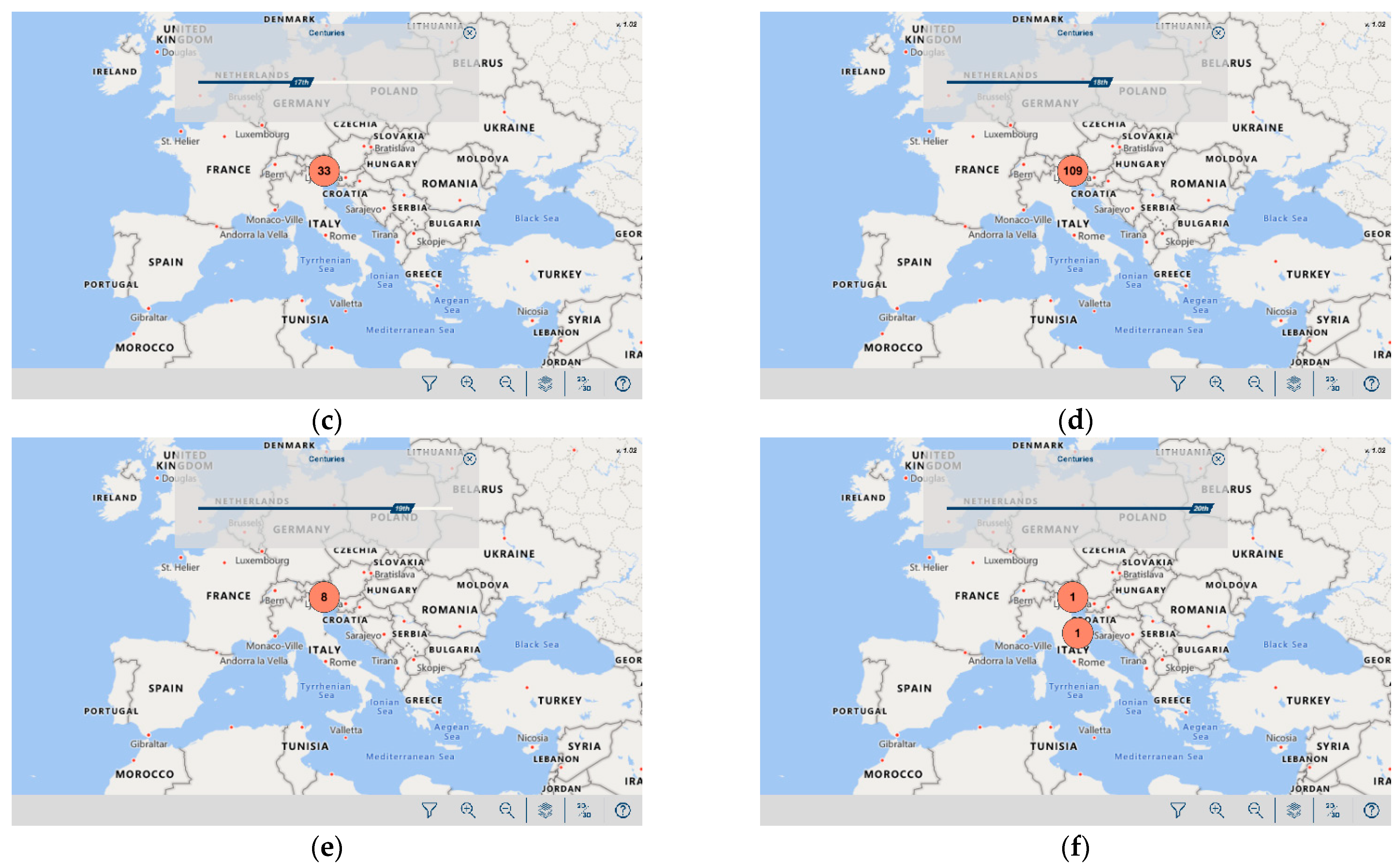
4. Results and Discussion
5. Conclusions and Future Work
Author Contributions
Funding
Institutional Review Board Statement
Informed Consent Statement
Data Availability Statement
Conflicts of Interest
References
- Silknow Project SILKNOW, Weaving Our Past into the Future. Available online: https://silknow.eu/ (accessed on 23 December 2020).
- Tilden, F. Interpreting Our Heritage: Principles and Practices for Visitor Services in Parks, Museums, and Historic Places; University of North Carolina Press: Chapel Hill, NH, USA, 1957. [Google Scholar]
- Portalés, C.; Casas, S.; Vera, L.; Sevilla, J. Current Trends on the Acquisition, Virtual Representation, and Interaction of Cultural Heritage: Exploring Virtual and Augmented Reality and Serious Games. In Recent Advances in 3D Imaging, Modeling, and Reconstruction; IGI Global: Hershey, PA, USA, 2020; pp. 143–167. [Google Scholar]
- Rodríguez-Gonzálvez, P.; Muñoz-Nieto, A.L.; del Pozo, S.; Sanchez-Aparicio, L.J.; Gonzalez-Aguilera, D.; Micoli, L.; Barsanti, S.G.; Guidi, G.; Mills, J.; Fieber, K. 4D Reconstruction and Visualization of Cultural Heritage: Analyzing Our Legacy through Time. Int. Arch. Photogramm. Remote Sens. Spatial Infor. Sci. 2017, 42, 609. [Google Scholar] [CrossRef] [Green Version]
- Windhager, F.; Federico, P.; Schreder, G.; Glinka, K.; Dörk, M.; Miksch, S.; Mayr, E. Visualization of Cultural Heritage Collection Data: State of the Art and Future Challenges. IEEE Trans. Vis. Comput. Graph. 2018, 25, 2311–2330. [Google Scholar] [CrossRef]
- Sezgin, S.; Hassan, R.; Zühlke, S.; Kuepfer, L.; Hengstler, J.G.; Spiteller, M.; Ghallab, A. Spatio-Temporal Visualization of the Distribution of Acetaminophen as Well as Its Metabolites and Adducts in Mouse Livers by MALDI MSI. Arch. Toxicol. 2018, 92, 2963–2977. [Google Scholar] [CrossRef]
- Neches, R.; Fikes, R.E.; Finin, T.; Gruber, T.; Patil, R.; Senator, T.; Swartout, W.R. Enabling Technology for Knowledge Sharing. AI Mag. 1991, 12, 36. [Google Scholar]
- Portalés, C.; Sebastián, J.; Alba, E.; Sevilla, J.; Gaitán, M.; Ruiz, P.; Fernández, M. Interactive Tools for the Preservation, Dissemination and Study of Silk Heritage—An Introduction to the Silknow Project. Mult. Technol. Interact. 2018, 2, 28. [Google Scholar] [CrossRef] [Green Version]
- Kehrer, J.; Hauser, H. Visualization and Visual Analysis of Multifaceted Scientific Data: A Survey. IEEE Trans. Vis. Comput. Graph. 2012, 19, 495–513. [Google Scholar] [CrossRef]
- Liu, S.; Cui, W.; Wu, Y.; Liu, M. A Survey on Information Visualization: Recent Advances and Challenges. Vis. Comput. 2014, 30, 1373–1393. [Google Scholar] [CrossRef]
- Bach, B.; Dragicevic, P.; Archambault, D.; Hurter, C.; Carpendale, S. A Review of Temporal Data Visualizations Based on Space-Time Cube Operations. In Proceedings of the EurographicsConference on Visualization, Swansea, UK, 9–13 June 2014. [Google Scholar]
- Peuquet, D.J. It’s about Time: A Conceptual Framework for the Representation of Temporal Dynamics in Geographic Information Systems. Ann. Assoc. Am. Geogr. 1994, 84, 441–461. [Google Scholar] [CrossRef]
- Andrienko, N.; Andrienko, G.; Gatalsky, P. Exploratory Spatio-Temporal Visualization: An Analytical Review. J. Vis. Lang. Comput. 2003, 14, 503–541. [Google Scholar] [CrossRef]
- Ponjavic, M.; Karabegovic, A.; Ferhatbegovic, E.; Tahirovic, E.; Uzunovic, S.; Travar, M.; Pilav, A.; Mulic, M.; Karakas, S.; Avdic, N. Spatio-Temporal Data Visualization for Monitoring of Control Measures in the Prevention of the Spread of COVID-19 in Bosnia and Herzegovina. Med. Glas. (Zenica) 2020, 17, 265–274. [Google Scholar]
- Zhang, X.; Zhang, M.; Jiang, L.; Yue, P. An Interactive 4D Spatio-Temporal Visualization System for Hydrometeorological Data in Natural Disasters. Int. J. Dig. Earth 2019, 1–21. [Google Scholar] [CrossRef]
- Jänicke, S.; Heine, C.; Scheuermann, G. GeoTemCo: Comparative visualization of geospatial-temporal data with clutter removal based on dynamic delaunay triangulations. In Computer Vision, Imaging and Computer Graphics. Theory and Application; Springer: Berlin, Germany, 2013; pp. 160–175. [Google Scholar]
- Zhang, S.; Zhang, W.; Wang, Y.; Zhao, X.; Song, P.; Tian, G.; Mayer, A.L. Comparing Human Activity Density and Green Space Supply Using the Baidu Heat Map in Zhengzhou, China. Sustainability 2020, 12, 7075. [Google Scholar] [CrossRef]
- Ku, W.-Y.; Liaw, Y.-P.; Huang, J.-Y.; Nfor, O.N.; Hsu, S.-Y.; Ko, P.-C.; Lee, W.-C.; Chen, C.-J. An Online Atlas for Exploring Spatio-Temporal Patterns of Cancer Mortality (1972–2011) and Incidence (1995–2008) in Taiwan. Medicine 2016, 95, e3496. [Google Scholar] [CrossRef]
- Hengl, T.; Roudier, P.; Beaudette, D.; Pebesma, E. PlotKML: Scientific Visualization of Spatio-Temporal Data. J. Stat. Softw. 2015, 63, 1–25. [Google Scholar] [CrossRef] [Green Version]
- Di Bartolomeo, S.; Pandey, A.; Leventidis, A.; Saffo, D.; Syeda, U.H.; Carstensdottir, E.; Seif El-Nasr, M.; Borkin, M.A.; Dunne, C. Evaluating the Effect of Timeline Shape on Visualization Task Performance. In Proceedings of the 2020 CHI Conference on Human Factors in Computing Systems, Honolulu, HI, USA, 25–30 April 2020; pp. 1–12. [Google Scholar]
- Kraak, M.-J. Timelines, Temporal Resolution, Temporal Zoom and Time Geography. In Proceedings of the 22nd International Cartographic Conference, A Coruña, Spain, 9–16 July 2005. [Google Scholar]
- Lee, C.; Devillers, R.; Hoeber, O. Navigating Spatio-Temporal Data with Temporal Zoom and Pan in a Multi-Touch Environment. Int. J. Geogr. Infor. Sci. 2014, 28, 1128–1148. [Google Scholar] [CrossRef]
- Rodríguez-Gonzálvez, P.; Guerra Campo, Á.; Muñoz-Nieto, Á.L.; Sánchez-Aparicio, L.J.; González-Aguilera, D. Diachronic Reconstruction and Visualization of Lost Cultural Heritage Sites. IISPRS Int. J. Geo. Infor. 2019, 8, 61. [Google Scholar] [CrossRef] [Green Version]
- Chronas. Available online: https://chronas.org (accessed on 7 February 2021).
- Helsinki Ennen. Available online: https://helsinkiennen.fi (accessed on 7 February 2021).
- Jewish Cultures Mapped. Available online: http://www.jewish-cultures-mapped.org (accessed on 7 February 2021).
- Wang, C.; Ma, X.; Chen, J. Ontology-Driven Data Integration and Visualization for Exploring Regional Geologic Time and Paleontological Information. Comput. Geosci. 2018, 115, 12–19. [Google Scholar] [CrossRef]
- Yang, H.; Li, T.; Chen, X. Visualization of Time Series Data Based on Spiral Graph. J. Comput. Appl. 2017, 37, 2443–2448. [Google Scholar]
- Weber, M.; Alexa, M.; Müller, W. Visualizing Time-Series on Spirals. In Proceedings of the Infovis, San Diego, CA, USA, 22–23 October 2001; Volume 1, pp. 7–14. [Google Scholar]
- Hewagamage, K.P.; Hirakawa, M.; Ichikawa, T. Interactive Visualization of Spatiotemporal Patterns Using Spirals on a Geographical Map. In Proceedings of the 1999 IEEE Symposium on Visual Languages, Tokyo, Japan, 13–16 September 1999; pp. 296–303. [Google Scholar]
- Guo, H.; Wang, Z.; Yu, B.; Zhao, H.; Yuan, X. Tripvista: Triple Perspective Visual Trajectory Analytics and Its Application on Microscopic Traffic Data at a Road Intersection. In Proceedings of the 2011 IEEE Pacific Visualization Symposium, Hong Kong, China, 1–4 March 2011; pp. 163–170. [Google Scholar]
- Havre, S.; Hetzler, B.; Nowell, L. ThemeRiver: Visualizing Theme Changes over Time. In Proceedings of the IEEE Symposium on Information Visualization 2000. INFOVIS 2000, Tokyo, Japan, 13–16 September 1999; pp. 115–123. [Google Scholar]
- Bogucka, E.P.; Jahnke, M. Feasibility of the Space–Time Cube in Temporal Cultural Landscape Visualization. IISPRS Int. J. Geo. Infor. 2018, 7, 209. [Google Scholar] [CrossRef] [Green Version]
- Fang, Y.; Xu, H.; Jiang, J. A Survey of Time Series Data Visualization Research. IOP Conf. Ser. Mater. Sci. Eng. 2020, 782, 022013. [Google Scholar] [CrossRef] [Green Version]
- Wagner Filho, J.A.; Stuerzlinger, W.; Nedel, L. Evaluating an Immersive Space-Time Cube Geovisualization for Intuitive Trajectory Data Exploration. IEEE Trans. Vis. Comput. Graph. 2019, 26, 514–524. [Google Scholar] [CrossRef] [Green Version]
- Guo, D.; Du, Y. A Visualization Platform for Spatio-Temporal Data: A Data Intensive Computation Framework. In Proceedings of the 2015 23rd International Conference on Geoinformatics, Wuhan, China, 19–21 June 2015; pp. 1–6. [Google Scholar]
- Pebesma, E.J.; de Jong, K.; Briggs, D. Interactive Visualization of Uncertain Spatial and Spatio-temporal Data under Different Scenarios: An Air Quality Example. Int. J. Geogr. Infor. Sci. 2007, 21, 515–527. [Google Scholar] [CrossRef]
- Shrestha, A.; Zhu, Y.; Miller, B. Visualizing Uncertainty in Spatio-Temporal Data. In Proceedings of the ACM SIGKDD Workshop on Interactive Data Exploration and Analytics (IDEA), New York City, NY, USA, 24 August 2014; pp. 117–126. [Google Scholar]
- Gerharz, L.; Pebesma, E.; Hecking, H. Visualizing Uncertainty in Spatio-Temporal Data. Spat. Accuracy 2010, 2010, 169–172. [Google Scholar]
- Windhager, F.; Filipov, V.A.; Salisu, S.; Mayr, E. Visualizing Uncertainty in Cultural Heritage Collections. In Proceedings of the EuroVis Workshop on Reproducibility, Verification, and Validation in Visualization (EuroRV3), Brno, Czech, 2–8 June 2018. [Google Scholar]
- Windhager, F.; Salisu, S.; Mayr, E. Exhibiting Uncertainty: Visualizing Data Quality Indicators for Cultural Collections. Informatics 2019, 6, 29. [Google Scholar] [CrossRef] [Green Version]
- Dudáš, M.; Lohmann, S.; Svátek, V.; Pavlov, D. Ontology Visualization Methods and Tools: A Survey of the State of the Art. Knowl. Eng. Rev. 2018, 33, 1–39. [Google Scholar] [CrossRef]
- Dudáš, M.; Zamazal, O.; Svátek, V. Roadmapping and Navigating in the Ontology Visualization Landscape. In Proceedings of the International Conference on Knowledge Engineering and Knowledge Management, Linköping, Sweden, 24–28 November 2014; pp. 137–152. [Google Scholar]
- Anikin, A.; Litovkin, D.; Kultsova, M.; Sarkisova, E.; Petrova, T. Ontology Visualization: Approaches and Software Tools for Visual Representation of Large Ontologies in Learning. In Proceedings of the Conference on Creativity in Intelligent Technologies and Data Science, Volgograd, Russia, 16–19 September 2019; pp. 133–149. [Google Scholar]
- Mikhailov, S.; Petrov, M.; Lantow, B. Ontology Visualization: A Systematic Literature Analysis. In Proceedings of the BIR Workshops, Prague, Czech, 14–16 September 2016. [Google Scholar]
- Katifori, A.; Halatsis, C.; Lepouras, G.; Vassilakis, C.; Giannopoulou, E. Ontology Visualization Methods—a Survey. ACM Comput. Surv. (CSUR) 2007, 39, 10-es. [Google Scholar] [CrossRef] [Green Version]
- Sintek, M. OntoViz. 2007. Available online: http://protegewiki.stanford.edu/wiki/OntoViz (accessed on 28 December 2020).
- Liepinš, R.; Grasmanis, M.; Bojars, U. OWLGrEd Ontology Visualizer. In Proceedings of the 2014 International Conference on Developers. CEUR-WS. org, Riva del Garda-Trentino, Italy, 14–23 October 2014; Volume 1268, pp. 37–42. [Google Scholar]
- Horridge, M. OWLViz. 2010. Available online: http://protegewiki.stanford.edu/wiki/OWLViz (accessed on 28 December 2020).
- Falconer, S.M.; Bull, R.I.; Grammel, L.; Storey, M.-A. Creating Visualizations through Ontology Mapping. In Proceedings of the 2009 International Conference on Complex, Intelligent and Software Intensive Systems, Fukuoka, Japan, 16–19 March 2009; pp. 688–693. [Google Scholar]
- Nazemi, K.; Burkhardt, D.; Ginters, E.; Kohlhammer, J. Semantics Visualization–Definition, Approaches and Challenges. Procedia Computer Sci. 2015, 75, 75–83. [Google Scholar] [CrossRef]
- Miksch, S.; Leitte, H.; Chen, M. Knowledge-Assisted Visualization and Guidance. In Foundations of Data Visualization; Springer: Berlin, Germany, 2020; pp. 61–85. [Google Scholar]
- Voigt, M.; Franke, M.; Meissner, K. Using Expert and Empirical Knowledge for Context-Aware Recommendation of Visualization Components. Int. J. Adv. Life Sci 2013, 5, 27–41. [Google Scholar]
- Mutlu, B.; Veas, E.; Trattner, C. Vizrec: Recommending Personalized Visualizations. ACM Trans. Interact. Intell. Syst. (TiiS) 2016, 6, 1–39. [Google Scholar] [CrossRef]
- Polowinski, J.; Voigt, M. VISO: A shared, formal knowledge base as a foundation for semi-automatic infovis systems. In CHI’13 Extended Abstracts on Human Factors in Computing Systems; Association for Computing Machinery: New York, NY, USA, 2013; pp. 1791–1796. [Google Scholar]
- Polowinski, J. Towards RVL: A Declarative Language for Visualizing RDFS/OWL Data. In Proceedings of the 3rd International Conference on Web Intelligence, Mining and Semantics, Madrid, Spain, 12–14 June 2013; pp. 1–11. [Google Scholar]
- Sobral, T.; Galvão, T.; Borges, J. An Ontology-Based Approach to Knowledge-Assisted Integration and Visualization of Urban Mobility Data. Exp. Syst. Appl. 2020, 150, 113260. [Google Scholar] [CrossRef]
- Kauppinen, T.; Deichstetter, C.; Hyvönen, E. Temp-o-Map: Ontology-Based Search and Visualization of Spatio-Temporal Maps. In Proceedings of the Demo track at the European Semantic Web Conference ESWC, Innsbruck, Austria, 3–7 June 2007; pp. 4–5. [Google Scholar]
- Potnis, A.; Durbha, S.S. Exploring Visualization of Geospatial Ontologies Using Cesium. In Proceedings of the VOILA@ ISWC, Kobe, Japan, 17 October 2016; pp. 143–150. [Google Scholar]
- Kauppinen, T.; Henriksson, R.; Väätäinen, J.; Deichstetter, C.; Hyvönen, E. Ontology-Based Modeling and Visualization of Cultural Spatio-Temporal Knowledge. In Proceedings of the 12th Finnish Artificial Intelligence Conference STeP 2006, Espoo, Finland, 26–27 October 2006; p. 37. [Google Scholar]
- Haubt, R.A.; Taçon, P.S. A Collaborative, Ontological and Information Visualization Model Approach in a Centralized Rock Art Heritage Platform. J. Archaeol. Sci. Rep. 2016, 10, 837–846. [Google Scholar] [CrossRef]
- Yaco, S.; Ramaprasad, A. Informatics for Cultural Heritage Instruction: An Ontological Framework. J. Doc. 2019. [Google Scholar] [CrossRef]
- Damiano, R.; Lieto, A.; Lombardo, V. Ontology-Based Visualisation of Cultural Heritage. In Proceedings of the 2014 Eighth International Conference on Complex, Intelligent and Software Intensive Systems, Birmingham, UK, 2–4 July 2014; pp. 558–563. [Google Scholar]
- International Committee for Documentation of the International Council of Museums CIDOC Conceptual Reference Model (CRM). Available online: http://cidoc-crm.org/ (accessed on 23 December 2020).
- Andaroodi, E.; Andres, F. Ontology-Based Semantic Representation of Silk Road’s Caravanserais: Conceptualization of Multifaceted Links. In Proceedings of the Joint International Semantic Technology Conference, Awaji, Japan, 26–28 November 2018; pp. 89–103. [Google Scholar]
- Andaroodi, E.; Andres, F.; Ono, K.; Lebigre, P. Developing a Visual Lexical Model for Semantic Management of Architectural Visual Data, Design of Spatial Ontology for Caravanserais of Silk Roads. J. Digit. Infor. Manag. (JDIM) 2004, 2, 151–160. [Google Scholar]
- Dorozynski, M.; Clermont, D.; Rottensteiner, F. Multi-Task Deep Learning with Incomplete Training Samples for the Image-Based Prediction of Variables Describing Silk Fabrics. ISPRS Ann. Photogramm. Remote Sens. Spatial Infor. Sci. IV-2/W6 2019, 47–54. [Google Scholar] [CrossRef] [Green Version]
- Gaitán, M.; Portalés, C.; Sevilla, J.; Alba, E. Applying Axial Symmetries to Historical Silk Fabrics: SILKNOW’s Virtual Loom. Symmetry 2020, 12, 742. [Google Scholar] [CrossRef]
- Portalés, C.; Sevilla, J.; Pérez, M.; León, A. A Proposal to Model Ancient Silk Weaving Techniques and Extracting Information from Digital Imagery-Ongoing Results of the SILKNOW Project. In Proceedings of the International Conference on Computational Science, Faro, Portugal, 12–14 June 2019; pp. 733–740. [Google Scholar]
- Silknow Project SILKNOW’s ADASilk Search Engine. Available online: https://https://ada.silknow.org/en (accessed on 2 February 2021).
- University of Erlangen-Nuremberg, Department of Computer Science & Artificial Intelligence Erlangen CRM/OWL, CIDOC-CRM Implementation. Available online: http://erlangen-crm.org (accessed on 23 December 2020).
- International Committee for Documentation of the International Council of Museums E22 Man-Made Object in Version 6.1. Available online: http://www.cidoc-crm.org/Entity/e22-man-made-object/version-6.1 (accessed on 23 December 2020).
- International Committee for Documentation of the International Council of Museums E12 Production in Version 6.1. Available online: http://www.cidoc-crm.org/Entity/e12-production/version-6.1 (accessed on 23 December 2020).
- Silknow Project Ontology Management Environment—SILKNOW Ongoing. Available online: http://ontome.dataforhistory.org/namespace/36#graph (accessed on 23 December 2020).
- geonames.org GeoNames. Available online: http://www.geonames.org/ (accessed on 23 December 2020).
- Hungaricana. Available online: https://gallery.hungaricana.hu/en/map/?layers=google-roadmap%2Cvector-data&bbox=-1691399%2C4333062%2C5353037%2C7635141 (accessed on 7 February 2021).
- Cronobook. Available online: https://cronobook.com (accessed on 7 February 2021).
- Collections Du Musée Albert-Kahn. Available online: http://collections.albert-kahn.hauts-de-seine.fr (accessed on 7 February 2021).
- UNESCO Interactive Map. Available online: https://whc.unesco.org/en/interactive-map (accessed on 7 February 2021).
- PERICLES. Available online: https://mapyourheritage.eu (accessed on 7 February 2021).
- Cultural Routes. Available online: https://www.coe.int/en/web/cultural-routes/cultural-routes-database-main-page (accessed on 7 February 2021).
- CYARK. Available online: https://www.cyark.org/projects (accessed on 7 February 2021).
- Historic Country Borders. Available online: https://historicborders.vercel.app (accessed on 7 February 2021).
- Map of the Ancient World. Available online: https://www.ancient.eu/map (accessed on 7 February 2021).
- Cultural Atlas of Australia. Available online: http://australian-cultural-atlas.info/CAA/search.php (accessed on 7 February 2021).
- Sanborn Maps from USA. Available online: https://selenaqian.github.io/sanborn-maps-navigator (accessed on 7 February 2021).
- A Map of Myth, Legend and Folklore. Available online: https://mythsmap.english-heritage.org.uk (accessed on 7 February 2021).
- Geoquiz History. Available online: https://baffioso.github.io/geoquiz-history (accessed on 7 February 2021).
- Industrial Heritage for Tourism. Available online: https://industrialheritage.travel/map (accessed on 7 February 2021).
- EAMENA. Available online: https://database.eamena.org/map (accessed on 7 February 2021).
- The Museum of the World. Available online: https://britishmuseum.withgoogle.com (accessed on 7 February 2021).
- OldSF. Available online: http://www.oldsf.org (accessed on 7 February 2021).
- Willmes, C.; Brocks, S.; Hoffmeister, D.; Hütt, C.; Kürner, D.; Volland, K.; Bareth, G. Facilitating Integrated Spatio-Temporal Visualization and Analysis of Heterogeneous Archaeological and Palaeoenvironmental Research Data. ISPRS Ann. Photogramm. Remote Sens. Spatial Infor. Sci. 2012, I-2, 223–228. [Google Scholar] [CrossRef] [Green Version]
- Silknow Project SILKNOW’s Virtual Loom & ADASilk Evaluation. Available online: https://silknow.eu/index.php/evaluation/test_en/ (accessed on 23 December 2020).


| New Class | Class Extended | Properties Used |
|---|---|---|
| Graphic Representation 3D | Graphic Representation | |
| Graphic Object 3D | Graphic Object | File, Primitive, Color |
| Interactive Graphic Representation 3D | Interactive Graphic Representation | Tilt_allowed |
| Map 3D | Map | |
| Dynamic Map 3D | Map 3D, Interactive Graphic Representation 3D | Clustering_allowed, Data_allowed |
| Cluster | Graphic Object | Clustering (Spatial, Shape), Domain, Ring |
| Cluster 3D | Cluster, Graphic Object 3D | |
| Time Map | Dynamic Map | Levels |
| Time Map 3D | Time Map, Dynamic Map 3D | |
| Point | Data Structure | X, Y |
| Spatial Data | Point | |
| Time Data | Point | |
| Relation Ring | N-Ary Graphic O2O Relation | Color, Legend |
| Number of Objects with “Production Place” Information | % | Number of Objects with “Production Time” Information | % | |
|---|---|---|---|---|
| Total | 36,081 | 100 | 29,465 | 100 |
| One value | 33,834 | 93.7 | 26,852 | 91.1 |
| More than one value | 2247 | 6.3 | 2613 | 8.9 |
| Work | Spatial Features Representing Data | Temporal Representation of Data | Other Relevant Features |
|---|---|---|---|
| UNESCO Interactive Map [79] | Icons; message boxes (text, images); 2D/3D | Filter data by date | Filters (categories, themes etc.) |
| PERICLES [80] | Clustering; interactive icons; message boxes (text) | - | Filters (object, song, story etc.); users can add their own data |
| Cultural Routes [81] | Clustering; interactive icons; message boxes (text, images) | - | Link to detailed inspection of objects |
| CYARK [82] | Clustering; interactive icons; message boxes (text, images) | Timeline (from, to) | Link to detailed inspection of objects |
| Historic Country Borders [83] | Choropleth map; text | Timeline | - |
| Chronas [24] | Interactive choropleth map; icons; message boxes | Map timeline; another timeline linked to description of objects (Wikipedia) | Line-based representation of relations (between objects and visual data); link to Wikipedia; link to related items |
| Map of the Ancient World [84] | Choropleth map; text | Time selection (from certain historical moments) | - |
| Cultural Atlas of Australia [85] | Interactive icons; message boxes (text, images) | Timeline (from, to) | Filters (narrative, location, state) |
| Sanborn Maps from USA [86] | Interactive multi-resolution choropleth map; interactive icons | As textual data related to objects | Link to detailed inspection of objects (Library of Congress) |
| Jewish Cultures Mapped [26] | Interactive icons; message boxes (images) | Timeline with interactive icons representing events, connected to the map | Link to detailed inspection of objects; filters (projects, people, tags etc.); related objects through events |
| A Map of Myth, Legend and Folklore [87] | Interactive drawings; animated drawings | - | Link to detailed inspection of stories; some stories are submitted by users |
| Geoquiz History [88] | Interactive icons; message boxes (text) | - | Link to Wikipedia |
| Industrial Heritage for Tourism [89] | Interactive icons; message boxes (text) | - | Virtual tours (360° images); videos |
| EAMENA [90] | Interactive icons; clustering; message boxes (text) | - | Link to heritage place |
| The Museum of the World [91] | Interactive icons; areas represent continents; simple message boxes (text, images); detailed message boxes (stories, images, videos etc.) | 3D representation of time, highly interactive | Line-based representations of relations; filtering (art and design, living and dying etc.) |
| Hungaricana [76] | Interactive icons (only clustered); message boxes with images | Date of objects is depicted when inspecting them | Link to detailed inspection of objects |
| Collections du Musée Albert-Kahn [78] | Clustering; interactive icons; message boxes with images | - | Filters (themes etc.) |
| OldSF [92] | Interactive icons (only clustered) | Timeline (from, to) | Inspection of objects (images and text) |
| Helsinki Ennen [25] | Interactive icons; message boxes (text and images) | Timeline (selection of specific time spans) | - |
| Cronobook [77] | Clustering; pictorial icons; message boxes (image, text) | Date of objects is depicted when inspecting them | - |
| Willmes et. al 2012 [93] | Choropleth map; icons | Timeline | Based on semantic web |
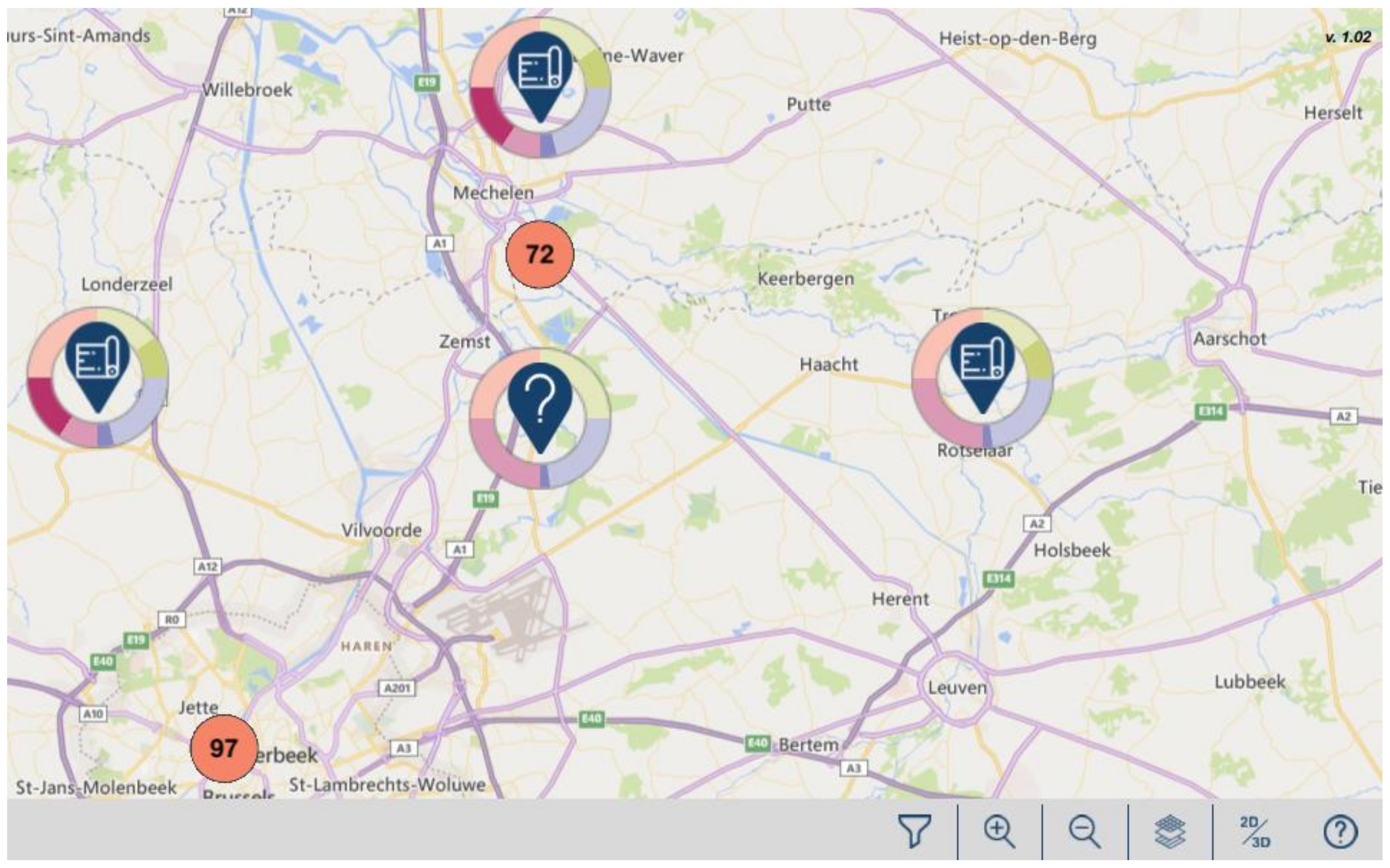
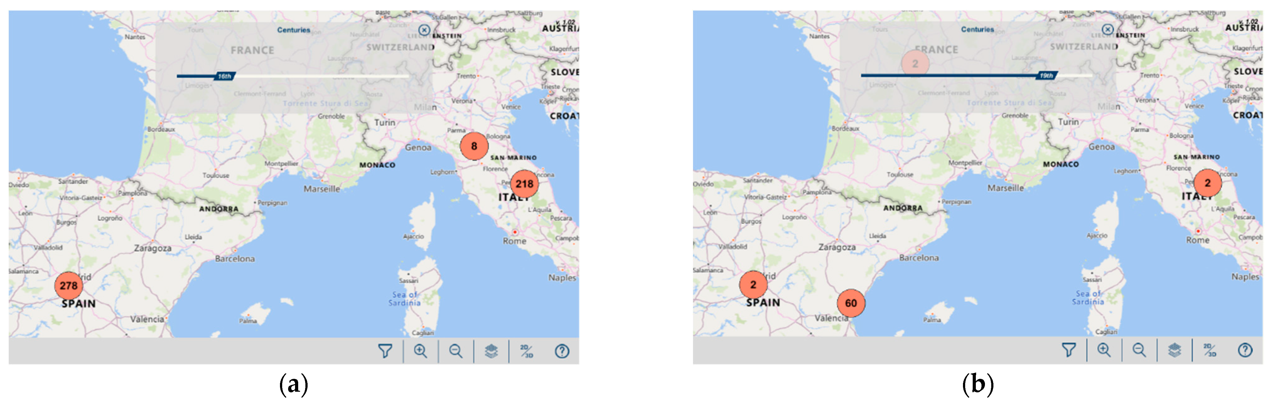
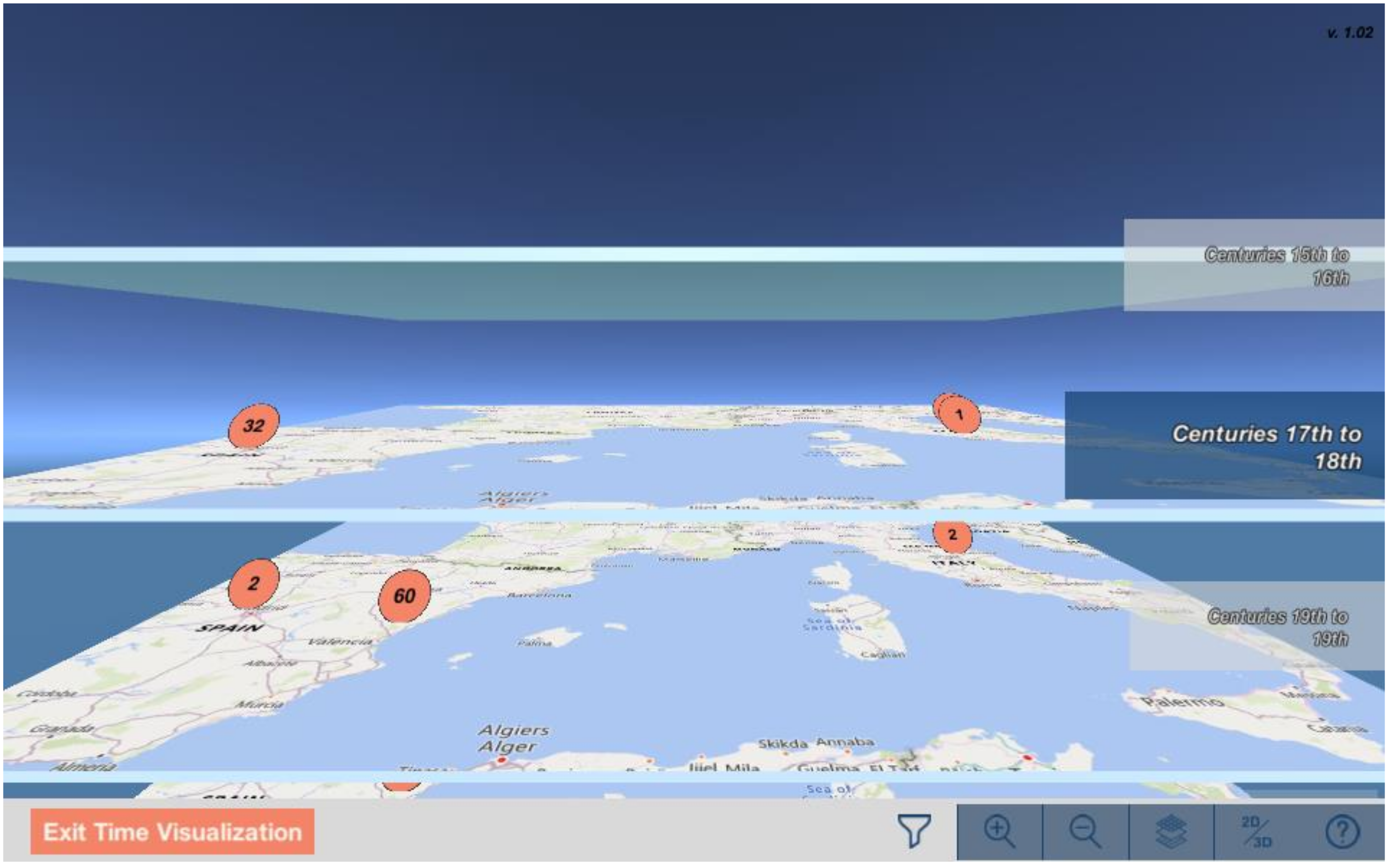
| STMaps | Clustering; interactive icons; message boxes (text, images, properties); 2D/3D | Timeline and time-layer representation (granularity: centuries) | Uncertainty (icons for records with multiple locations); based on knowledge graph; line-based and ring-based representations of relations; filtering |
Publisher’s Note: MDPI stays neutral with regard to jurisdictional claims in published maps and institutional affiliations. |
© 2021 by the authors. Licensee MDPI, Basel, Switzerland. This article is an open access article distributed under the terms and conditions of the Creative Commons Attribution (CC BY) license (http://creativecommons.org/licenses/by/4.0/).
Share and Cite
Sevilla, J.; Casanova-Salas, P.; Casas-Yrurzum, S.; Portalés, C. Multi-Purpose Ontology-Based Visualization of Spatio-Temporal Data: A Case Study on Silk Heritage. Appl. Sci. 2021, 11, 1636. https://doi.org/10.3390/app11041636
Sevilla J, Casanova-Salas P, Casas-Yrurzum S, Portalés C. Multi-Purpose Ontology-Based Visualization of Spatio-Temporal Data: A Case Study on Silk Heritage. Applied Sciences. 2021; 11(4):1636. https://doi.org/10.3390/app11041636
Chicago/Turabian StyleSevilla, Javier, Pablo Casanova-Salas, Sergio Casas-Yrurzum, and Cristina Portalés. 2021. "Multi-Purpose Ontology-Based Visualization of Spatio-Temporal Data: A Case Study on Silk Heritage" Applied Sciences 11, no. 4: 1636. https://doi.org/10.3390/app11041636
APA StyleSevilla, J., Casanova-Salas, P., Casas-Yrurzum, S., & Portalés, C. (2021). Multi-Purpose Ontology-Based Visualization of Spatio-Temporal Data: A Case Study on Silk Heritage. Applied Sciences, 11(4), 1636. https://doi.org/10.3390/app11041636