Figure 1.
(A) shows the decision-making process of the trained model. (B) shows the results of different interpretation methods for the same model and the same prediction result (From left to right: Grad-cam, Mask, Rise). Different interpretation algorithms give different reasons for prediction, which explanation should users trust and which one is more convincing?
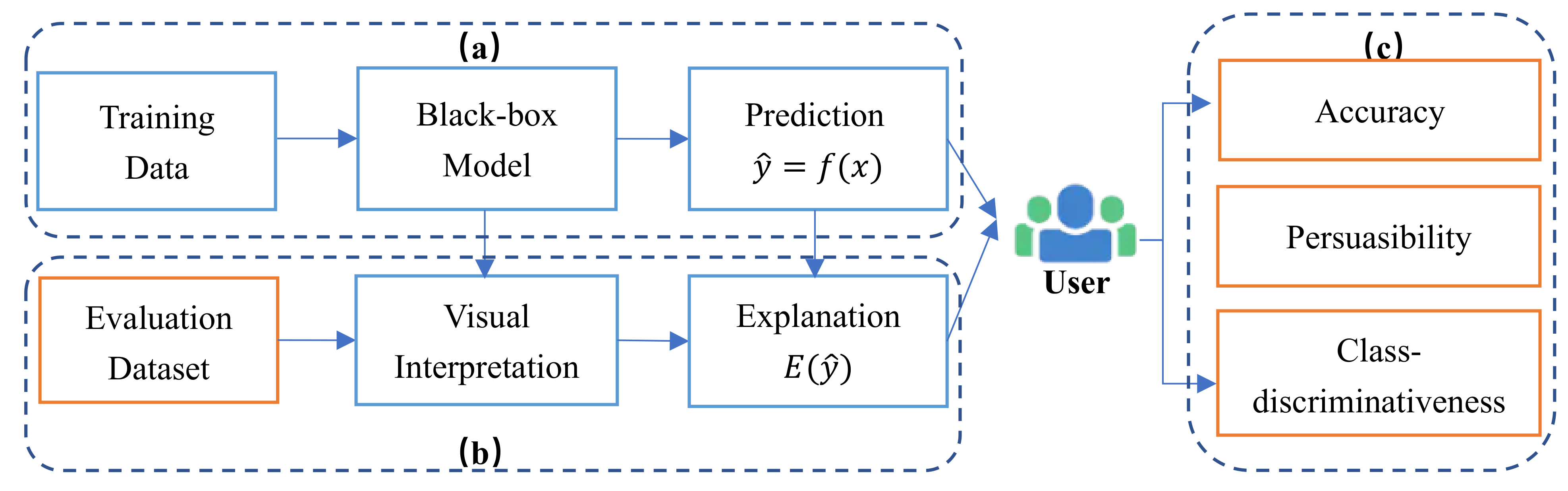
Figure 2.
Overview of our evaluation framework, which contains three parts model decision process (a), generating interpretation process (b) and user-oriented evaluation process (c) (Note that the blue box represents the existing research results, the orange box is our innovative work).
Figure 2.
Overview of our evaluation framework, which contains three parts model decision process (a), generating interpretation process (b) and user-oriented evaluation process (c) (Note that the blue box represents the existing research results, the orange box is our innovative work).
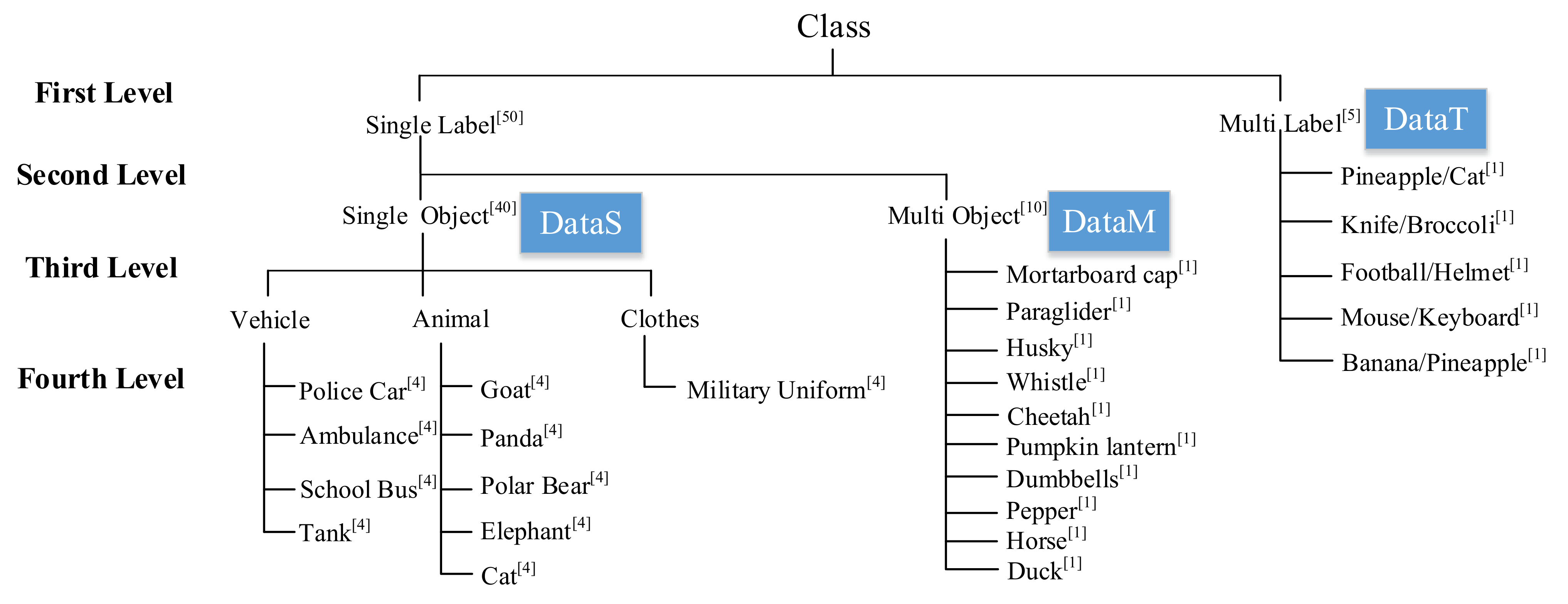
Figure 3.
Schematic diagram of the hierarchical structure of the evaluation dataset. The superscript number indicates the number of each type of image.
Figure 3.
Schematic diagram of the hierarchical structure of the evaluation dataset. The superscript number indicates the number of each type of image.
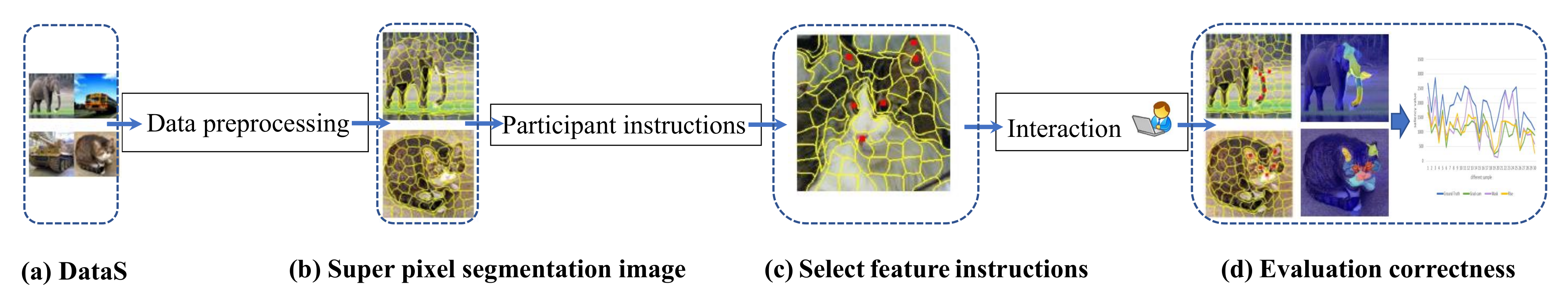
Figure 4.
Accuracy Evaluation (AE) pipeline of interpretation methods. There are four steps in total: dataset (DataS), pixel segmentation, pixel feature selection and evaluation process.
Figure 4.
Accuracy Evaluation (AE) pipeline of interpretation methods. There are four steps in total: dataset (DataS), pixel segmentation, pixel feature selection and evaluation process.
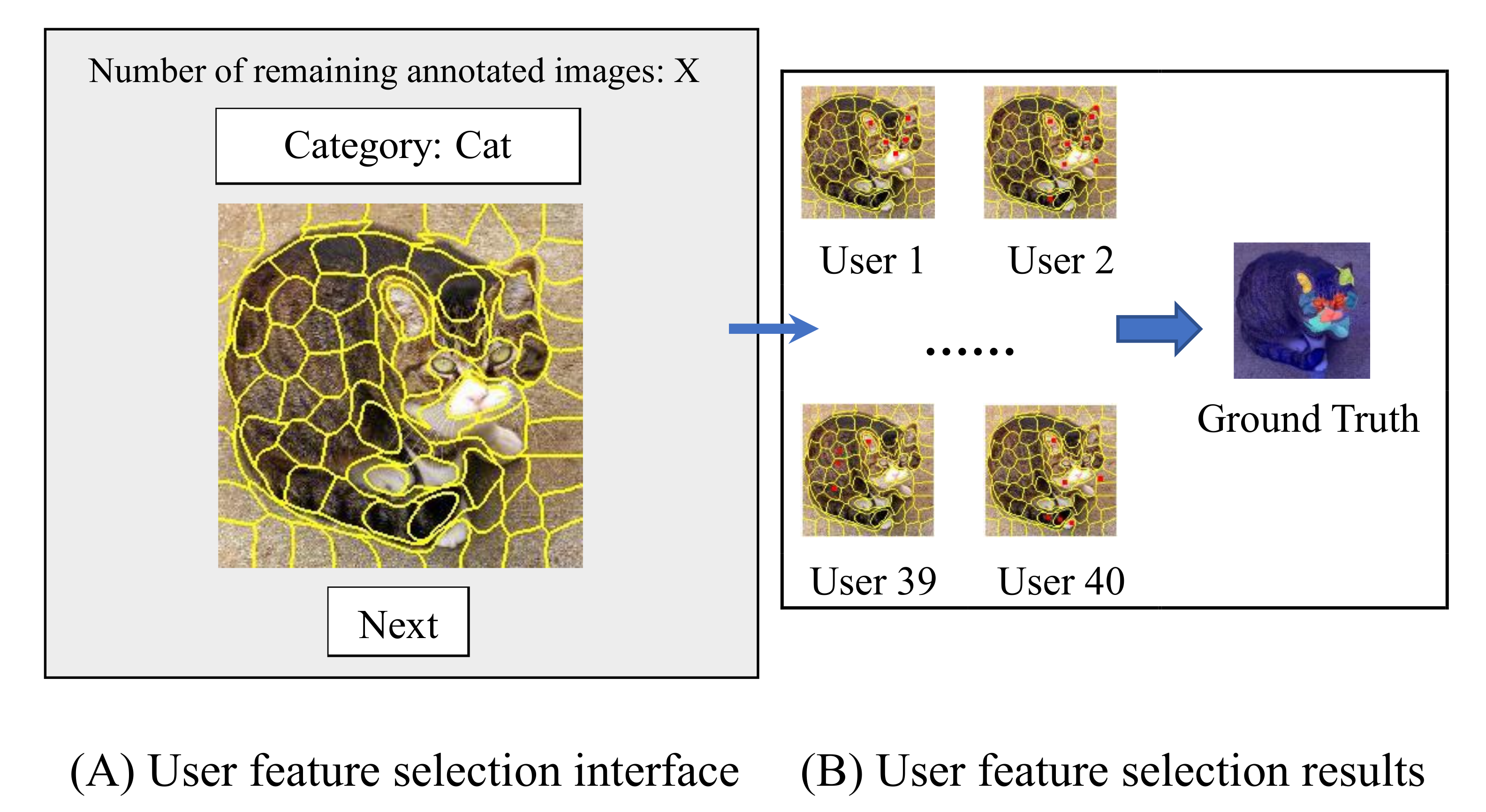
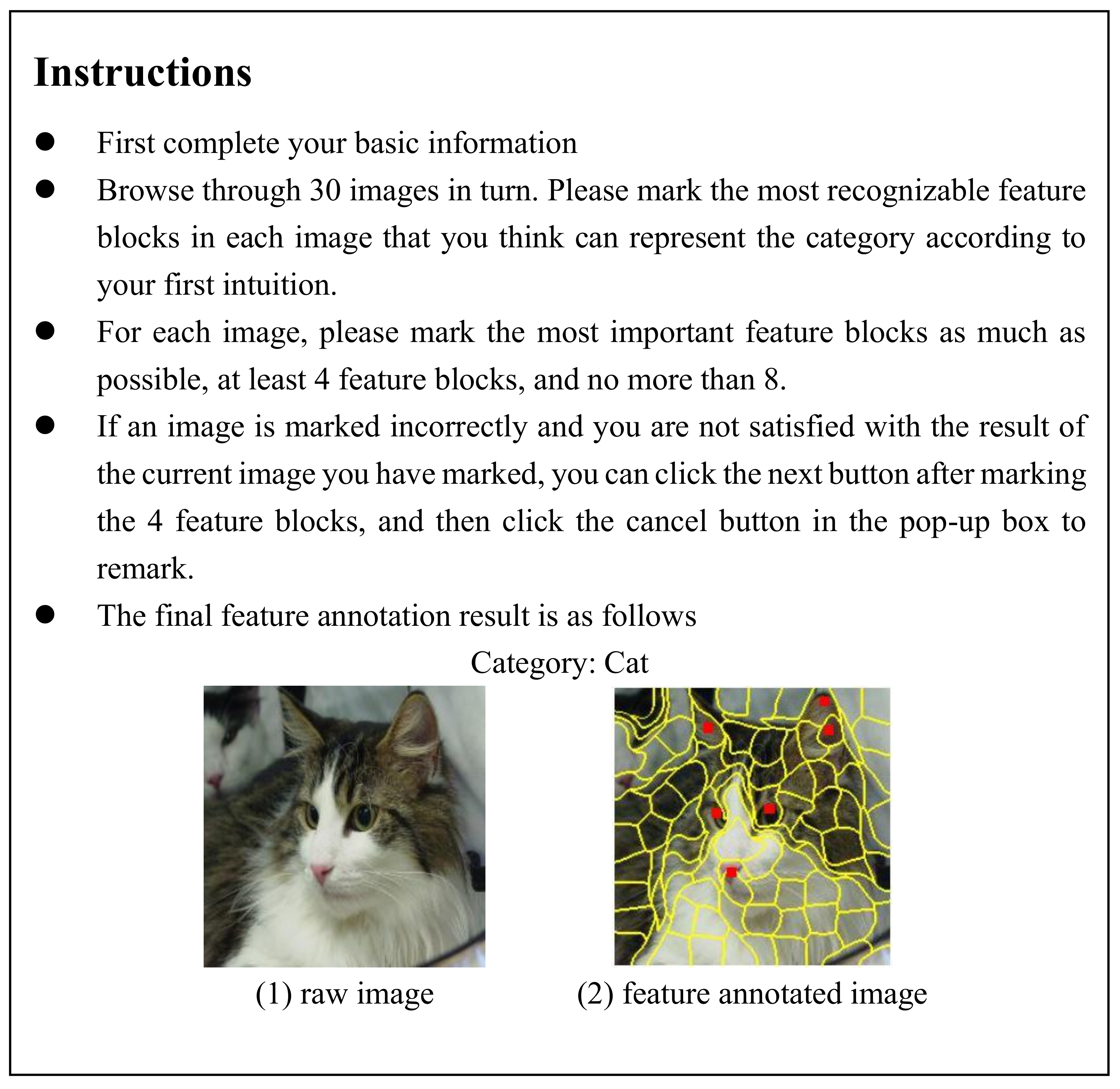
Figure 5.
Overview of feature annotation interface. (A) is our main interface, which displays the segmented image and category information to be labeled, and also informs the user of the number of remaining labeled images. (B) means that we obtain the final ground truth by counting the feature blocks marked by different users.
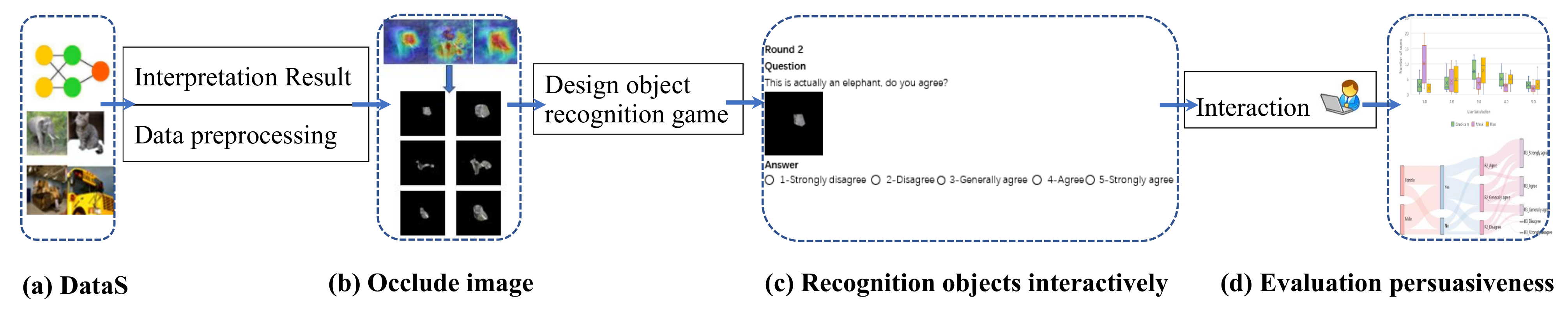
Figure 6.
PE pipeline of interpretation methods. There are four steps in total: dataset (DataS), image occlusion, object recognition process and evaluation process.
Figure 6.
PE pipeline of interpretation methods. There are four steps in total: dataset (DataS), image occlusion, object recognition process and evaluation process.
Figure 7.
Three visual interpretation algorithms retain 3 % and 8% feature occlusion maps.
Figure 7.
Three visual interpretation algorithms retain 3 % and 8% feature occlusion maps.
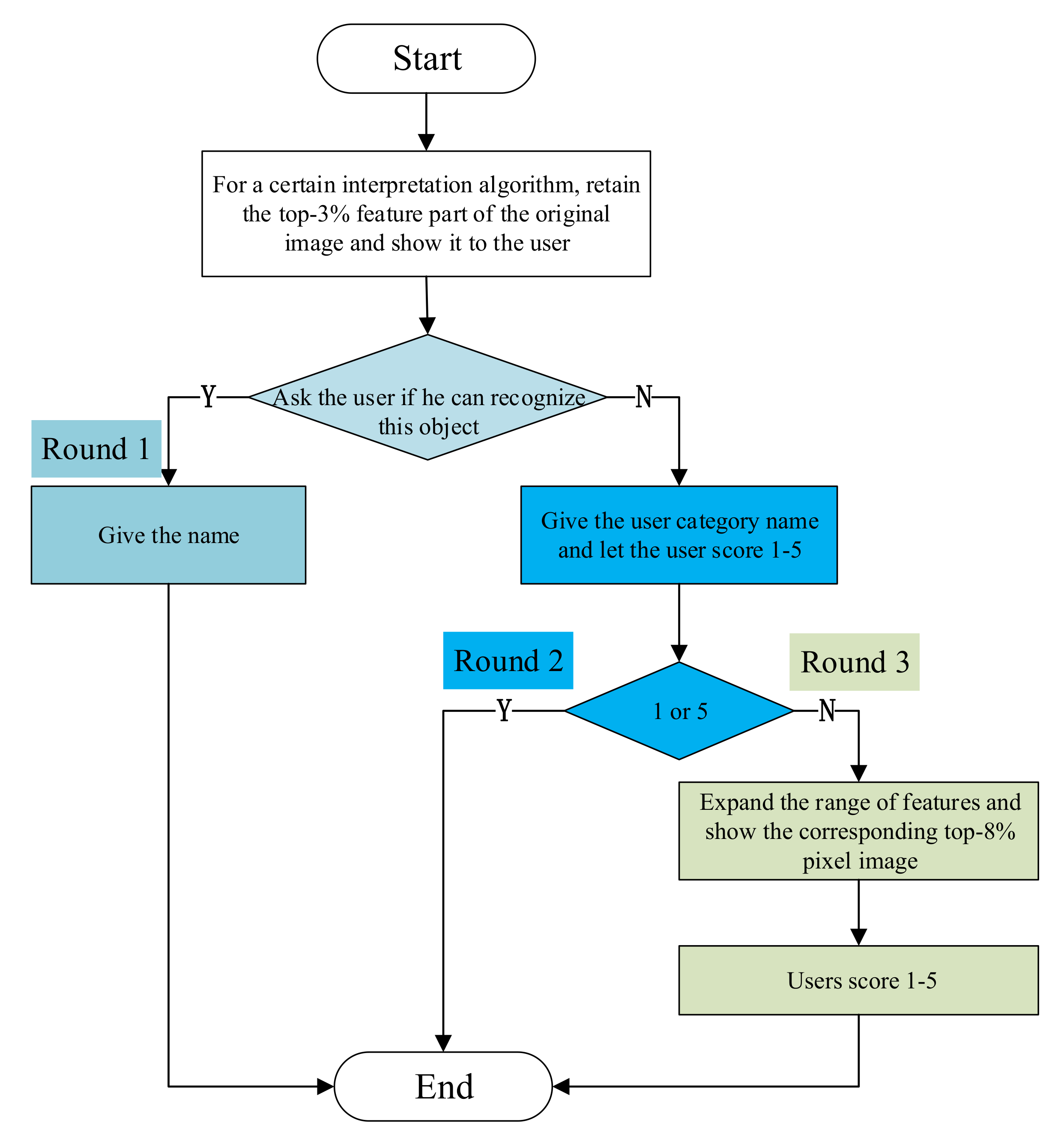
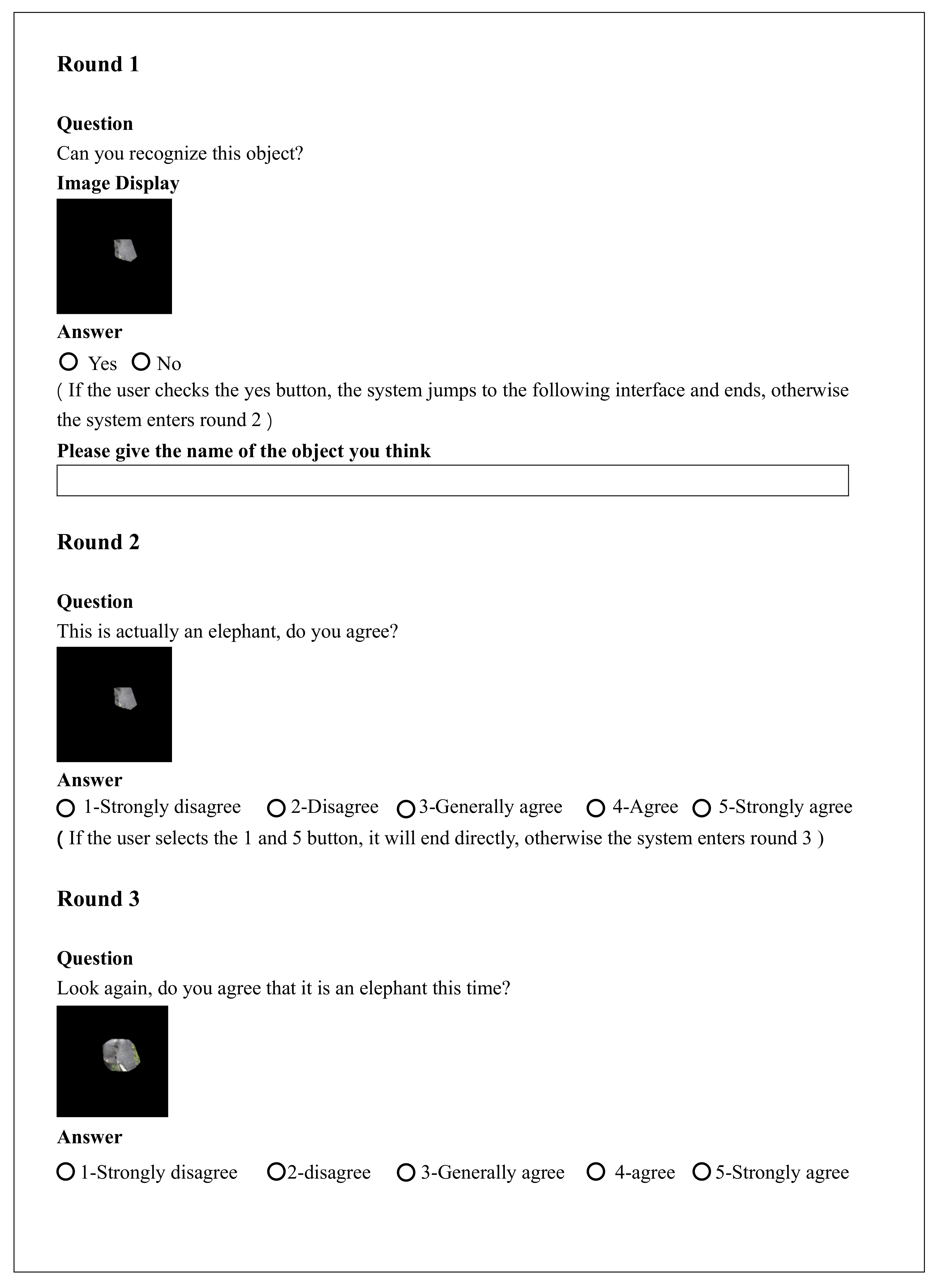
Figure 8.
Flow chart of user persuasion method with three rounds (round1, round2 and round3), different colors indicate different round processes.
Figure 8.
Flow chart of user persuasion method with three rounds (round1, round2 and round3), different colors indicate different round processes.
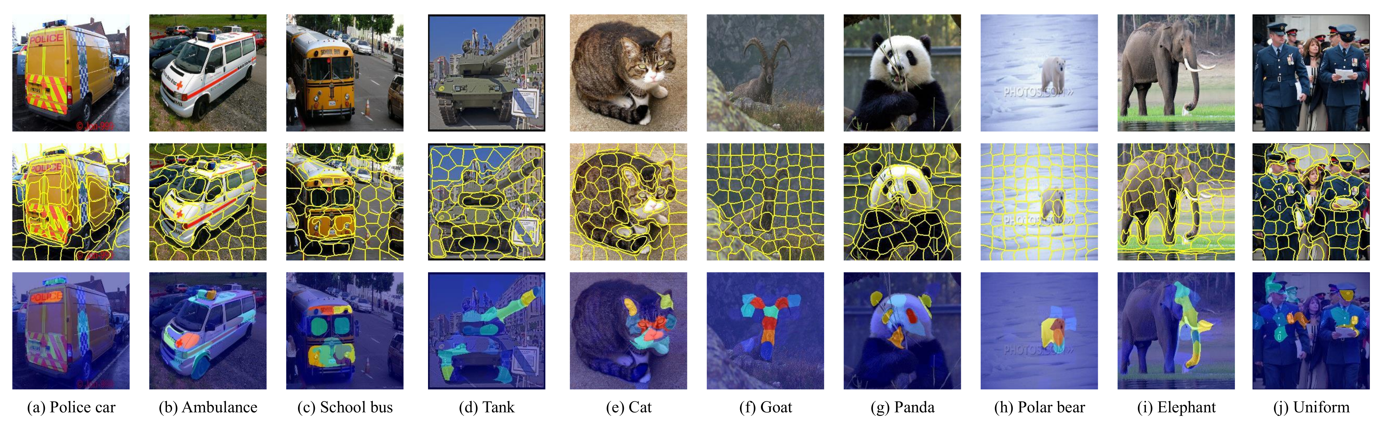
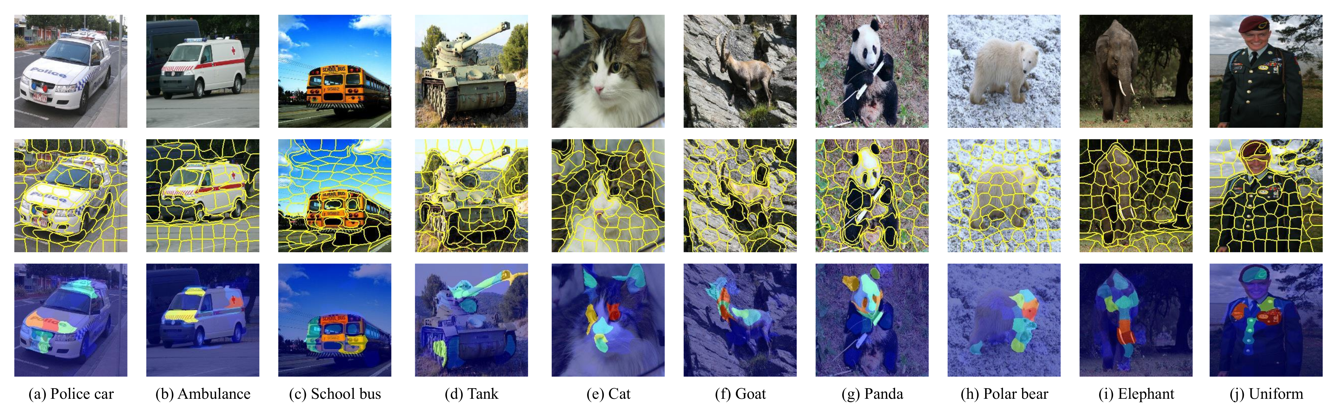
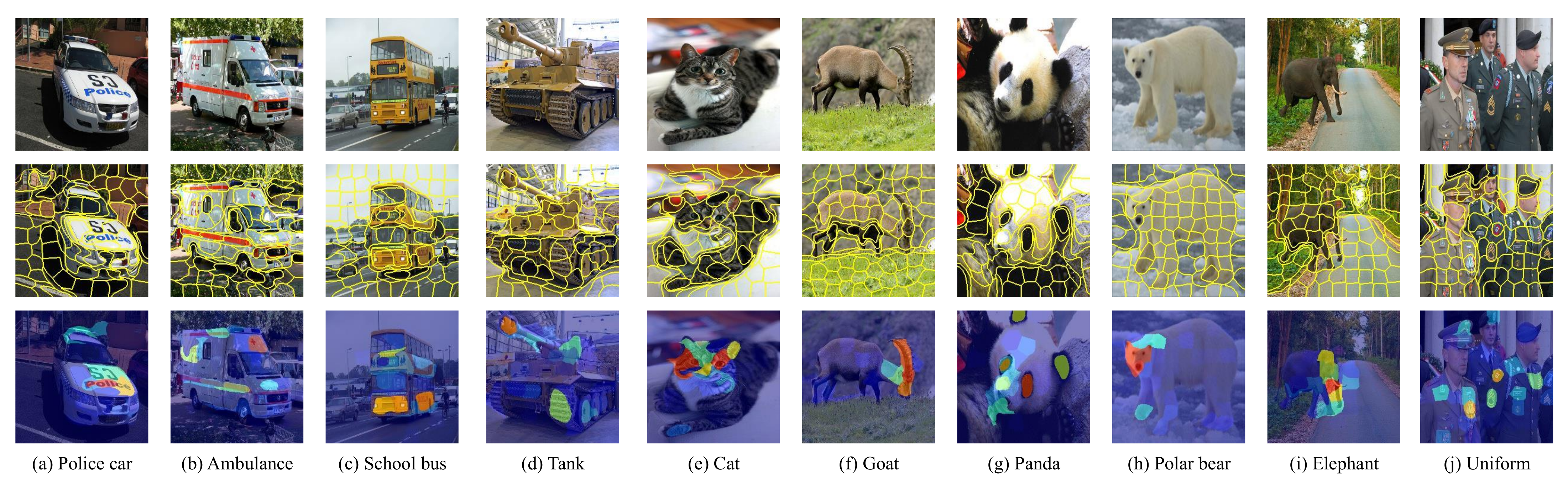
Figure 9.
Examples of ground truth result of the relevant feature block marked by the user of each category. (TOP) The 10 input image samples in 10 categories from the evaluation data set DataS. (Middle) Segmented image with 100 feature blocks obtained according to the SLIC segmentation algorithm. (Bottom) Resulting multi-participants human attention mask. Each image is annotated by 40 unique participants.
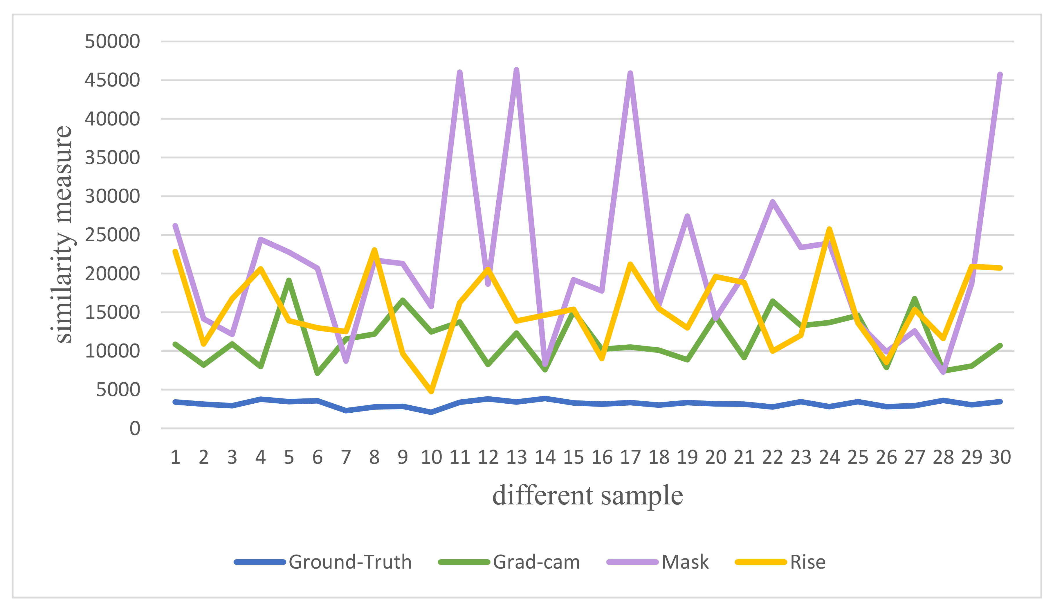
Figure 10.
The similarity measure result of the feature importance of different interpretation methods relative to the ground truth value on the DataS data (Police car, Ambulance, School Bus, Tank, Cat, Goat, Panda, Polar Bear, Elephant and Uniform).
Figure 10.
The similarity measure result of the feature importance of different interpretation methods relative to the ground truth value on the DataS data (Police car, Ambulance, School Bus, Tank, Cat, Goat, Panda, Polar Bear, Elephant and Uniform).
Figure 11.
For different interpretation algorithms under top-3% occlusion, the statistical results of object names that users can identify. Each interpretation method is tested with 10 images from DataS and 35 users.
Figure 11.
For different interpretation algorithms under top-3% occlusion, the statistical results of object names that users can identify. Each interpretation method is tested with 10 images from DataS and 35 users.
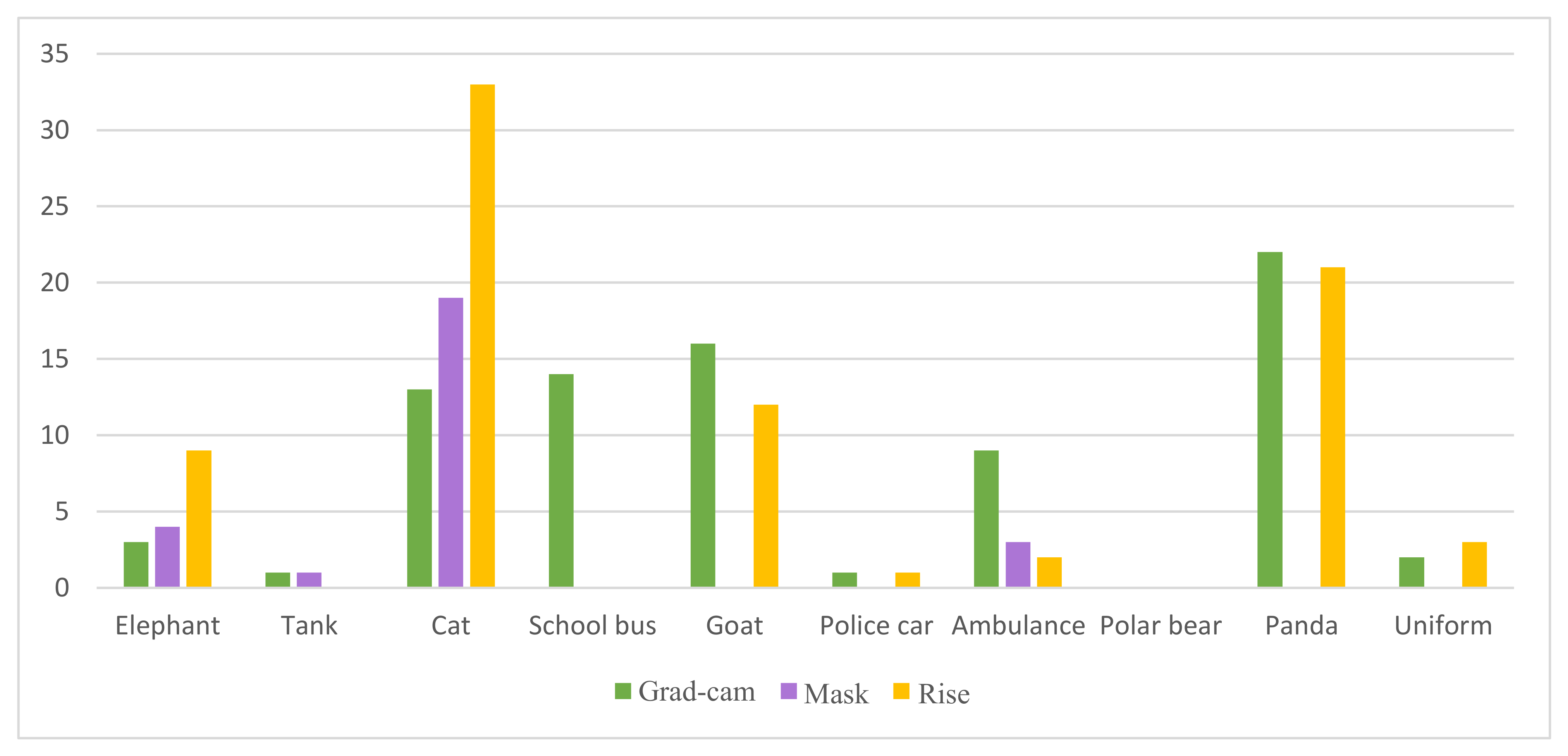
Figure 12.
The statistical result of the correct object name given by the user. Each interpretation method is tested with 10 images from DataS and 35 users.
Figure 12.
The statistical result of the correct object name given by the user. Each interpretation method is tested with 10 images from DataS and 35 users.
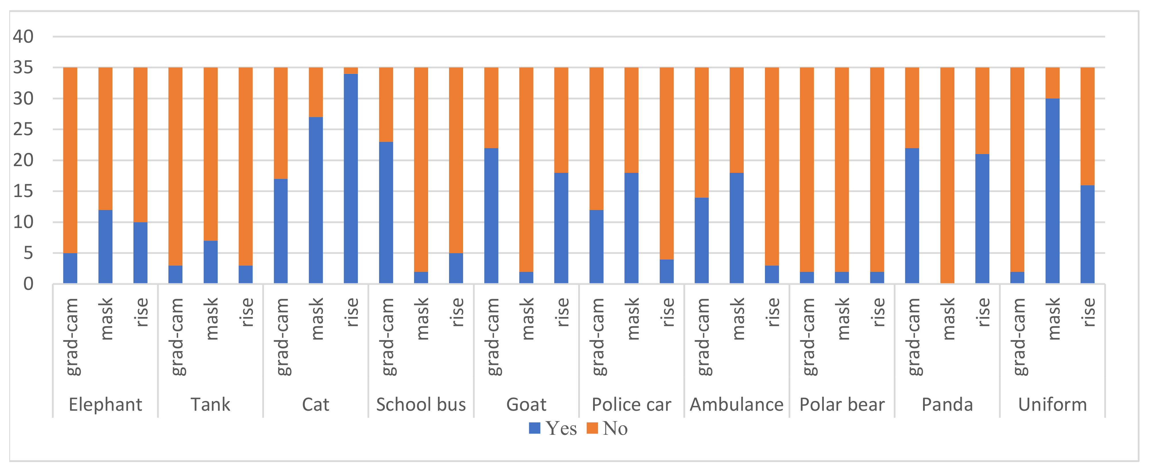
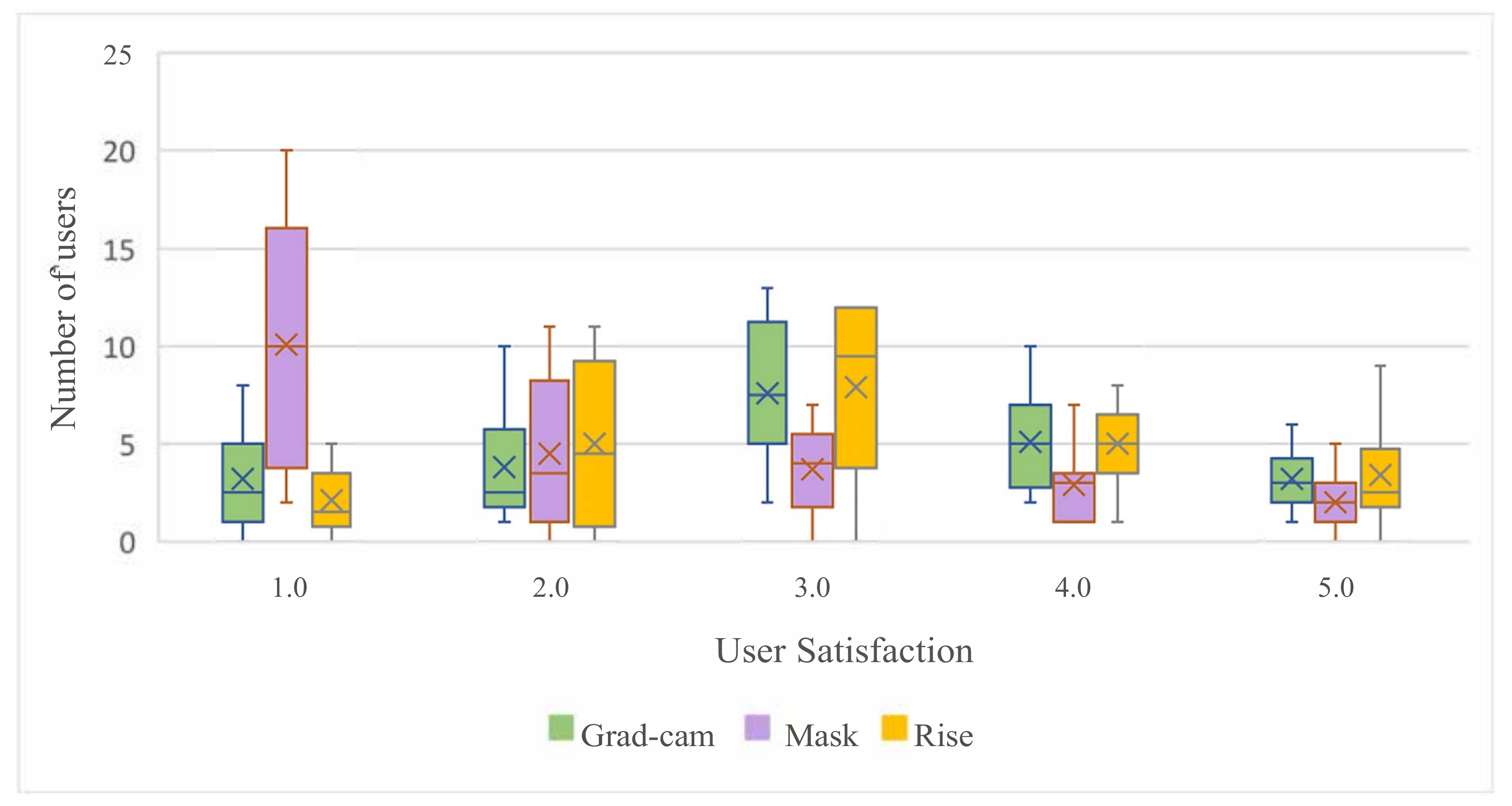
Figure 13.
The user satisfaction distribution of different interpretation algorithms under the top-3% occlusion. Each interpretation method is tested with 10 images from DataS and 35 users. Satisfaction score is 1–5 (1 means most dissatisfied, 5 means most satisfied).
Figure 13.
The user satisfaction distribution of different interpretation algorithms under the top-3% occlusion. Each interpretation method is tested with 10 images from DataS and 35 users. Satisfaction score is 1–5 (1 means most dissatisfied, 5 means most satisfied).
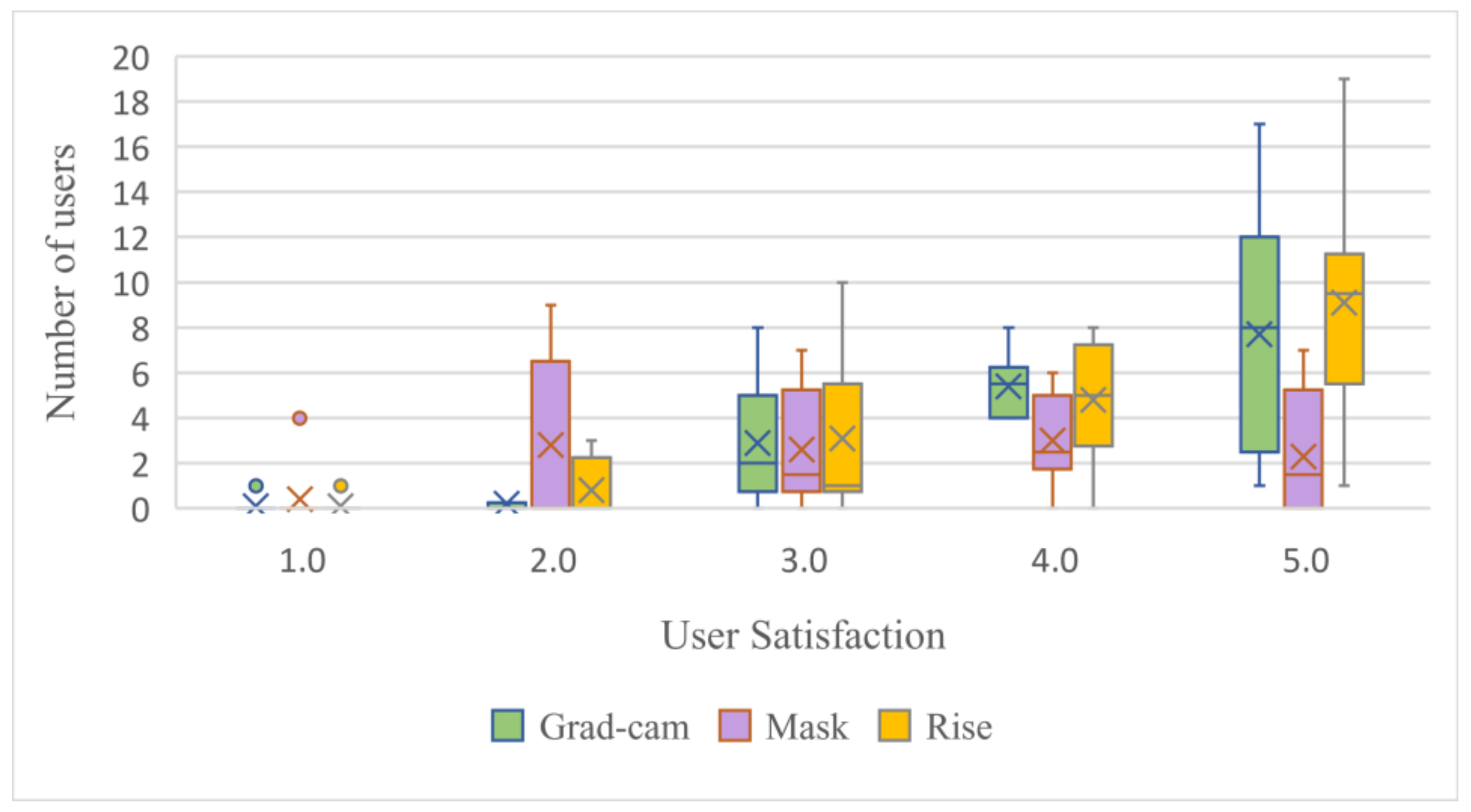
Figure 14.
The user satisfaction distribution of different interpretation algorithms under the top-8% occlusion. Each interpretation method is tested with 10 images from DataS and 35 users. Satisfaction score is 1–5 (1 means most dissatisfied, 5 means most satisfied).
Figure 14.
The user satisfaction distribution of different interpretation algorithms under the top-8% occlusion. Each interpretation method is tested with 10 images from DataS and 35 users. Satisfaction score is 1–5 (1 means most dissatisfied, 5 means most satisfied).
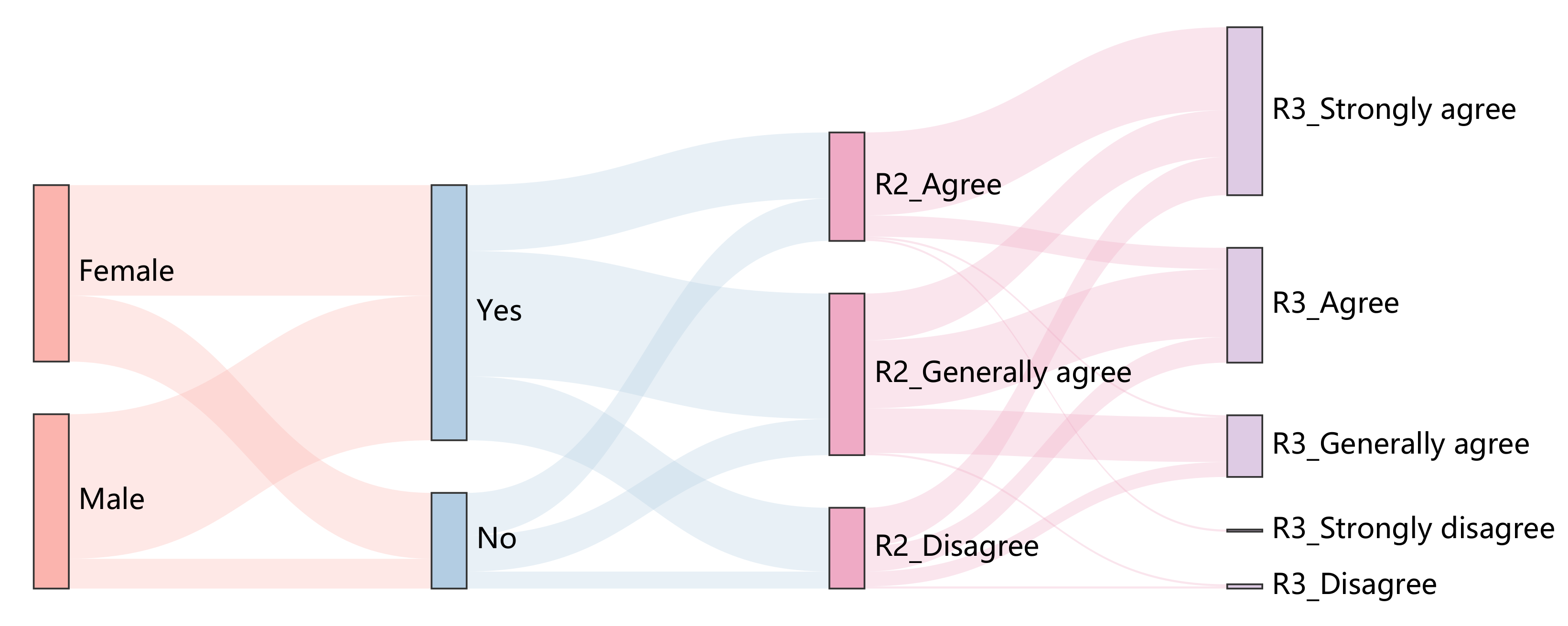
Figure 15.
Sankey Diagram results for Gradient-weighted Class Activation Mapping (Grad-cam). The third column shows the distribution of top-3% of user satisfaction, and the fourth column shows the distribution of top-8% of user satisfaction. Grad-cam method is tested with 10 images from DataS and 35 users.
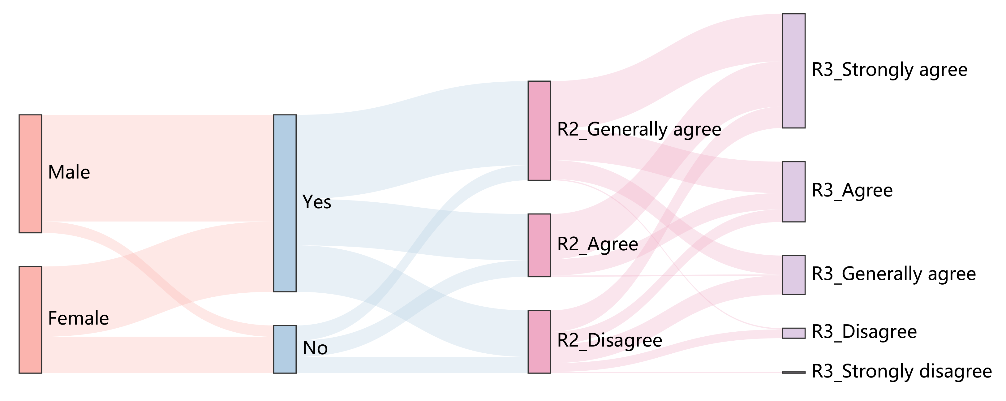
Figure 16.
Sankey Diagram results for Mask. The third column shows the distribution of top-3% of user satisfaction, and the fourth column shows the distribution of top-8% of user satisfaction. Mask method is tested with 10 images from DataS and 35 users.
Figure 16.
Sankey Diagram results for Mask. The third column shows the distribution of top-3% of user satisfaction, and the fourth column shows the distribution of top-8% of user satisfaction. Mask method is tested with 10 images from DataS and 35 users.
Figure 17.
Sankey Diagram results for Rise. The third column shows the distribution of top-3% of user satisfaction, and the fourth column shows the distribution of top-8% of user satisfaction. Rise method is tested with 10 images from DataS and 35 users.
Figure 17.
Sankey Diagram results for Rise. The third column shows the distribution of top-3% of user satisfaction, and the fourth column shows the distribution of top-8% of user satisfaction. Rise method is tested with 10 images from DataS and 35 users.
Figure 18.
Failure cases of Mask method in panda category, goat category, school bus category and uniform category. (Note that these examples are from DataS.)
Figure 18.
Failure cases of Mask method in panda category, goat category, school bus category and uniform category. (Note that these examples are from DataS.)
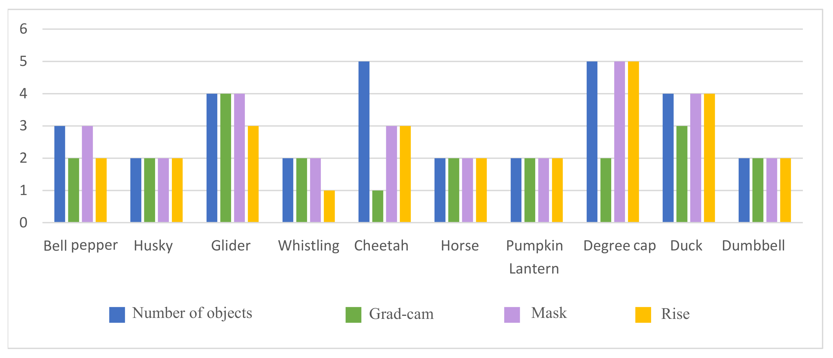
Figure 19.
The statistical result of the number of objects hit by different interpretation algorithms. Each interpretation method is tested with 10 images from DataM and 35 users.
Figure 19.
The statistical result of the number of objects hit by different interpretation algorithms. Each interpretation method is tested with 10 images from DataM and 35 users.
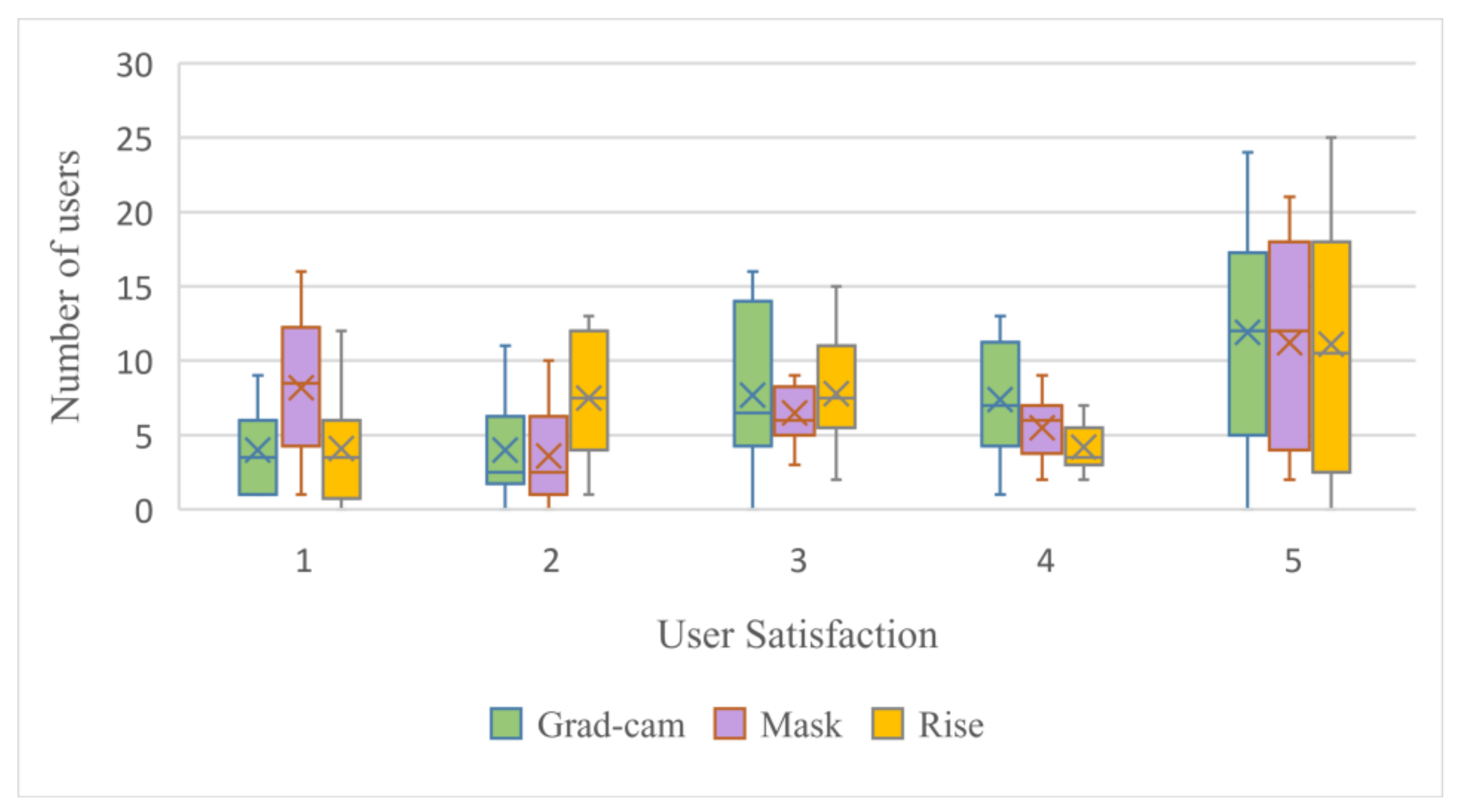
Figure 20.
The user satisfaction distribution of different interpretation algorithms. Each interpretation method is tested with 10 images from DataM and 35 users. Satisfaction score is 1–5 (1 means most dissatisfied, 5 means most satisfied).
Figure 20.
The user satisfaction distribution of different interpretation algorithms. Each interpretation method is tested with 10 images from DataM and 35 users. Satisfaction score is 1–5 (1 means most dissatisfied, 5 means most satisfied).
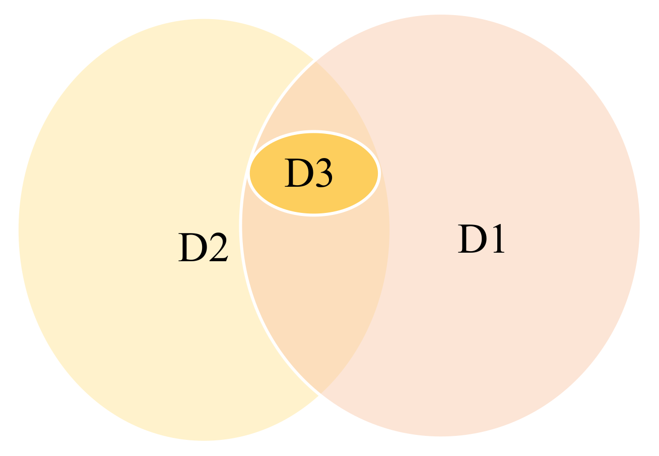
Figure 21.
The Venn diagram of D1 (accuracy), D2 (persuasibility) and D3 (class-discriminativeness).
Figure 21.
The Venn diagram of D1 (accuracy), D2 (persuasibility) and D3 (class-discriminativeness).
Table 1.
Accuracy results of different interpretation algorithms (the smallest value is the best).
Table 1.
Accuracy results of different interpretation algorithms (the smallest value is the best).
| Interpretation Methods | Grad-Cam | Mask | Rise |
|---|
| MAE | 0.23 | 0.43 | 0.31 |
Table 2.
Confusion matrix of different interpretation algorithms (P means Positive, N means Negative).
Table 2.
Confusion matrix of different interpretation algorithms (P means Positive, N means Negative).
| Grad-Cam | Mask | Rise |
|---|
| | P | N | | P | N | | P | N |
| P | 1.54 | 1.6 | P | 1.76 | 1.4 | P | 1.5 | 1.69 |
| N | 4 | 92.7 | N | 10.19 | 86.65 | N | 5.6 | 91.21 |
Table 3.
F1-score results of different interpretation algorithms. (The larger value is the best).
Table 3.
F1-score results of different interpretation algorithms. (The larger value is the best).
| | Grad-Cam | Mask | Rise |
|---|
| F1-score | 0.35 | 0.23 | 0.29 |
Table 4.
Comparisons of class discrimination of three different explanation methods. The first column is the five test examples of the DataT. The second column is the prediction result of the pre-trained VGG-16 model. The last three columns are the class discrimination results of the explanation methods. (mark indicates that the class-discriminativeness characteristic is satisfied).
Table 5.
Cases in class-discriminativeness of different interpretation algorithms (P means the model prediction result).
Table 6.
Point game statistics of three explanation methods on DataS.
Table 6.
Point game statistics of three explanation methods on DataS.
| Interpretation Methods | Grad-Cam | Mask | Rise |
|---|
| Number of missed objects | 0 | 8 | 0 |
| Point Game Value | 100% | 80% | 100% |
Table 7.
Point game statistics of three explanation methods on DataM.
Table 7.
Point game statistics of three explanation methods on DataM.
| Interpretation Methods | Grad-cam | Mask | Rise |
|---|
| Number of missed objects | 0 | 0 | 0 |
| Point Game Value | 100% | 100% | 100% |
Table 8.
Comparison of the considered visual explanation method. Different marks are provided: “H” (High), “M” (Medium), “L” (Low) or NA (Not Applied).
Table 8.
Comparison of the considered visual explanation method. Different marks are provided: “H” (High), “M” (Medium), “L” (Low) or NA (Not Applied).
| Explanation Methods | Correctness | Persuasibility | Class Discriminativeness |
|---|
| Grad-cam | H | H | H |
| Mask | L | L | NA |
| Rise | M | M | H |


