Article

Towards a Technological Ecosystem to Provide Information Dashboards as a Service: A Dynamic Proposal for Supplying Dashboards Adapted to Specific Scenarios

by
Andrea Vázquez-Ingelmo
1,*,
Francisco José García-Peñalvo
1 and
Roberto Therón
2
1
GRIAL Research Group, Computer Science Department, University of Salamanca, 37008 Salamanca, Spain
2
VisUSAL, Computer Science Department, University of Salamanca, 37008 Salamanca, Spain
*
Author to whom correspondence should be addressed.
Appl. Sci. 2021, 11(7), 3249; https://doi.org/10.3390/app11073249
Submission received: 4 March 2021 / Revised: 2 April 2021 / Accepted: 3 April 2021 / Published: 5 April 2021
(This article belongs to the Special Issue Innovations in the Field of Cloud Computing and Education)

Abstract

:
Data are crucial to improve decision-making and obtain greater benefits in any type of activity. However, the large amount of information generated by new technologies has made data analysis and knowledge generation a complex task. Numerous tools have emerged to facilitate this generation of knowledge, such as dashboards. Although dashboards are useful tools, their effectiveness can be affected by poor design or by not taking into account the context in which they are placed. Therefore, it is necessary to design and create custom dashboards according to the audience and data domain. This paper presents an application of the software product line paradigm and the integration of this approach into a web service to allow users to request source code for customized information dashboards. The main goal is to introduce the idea of creating a holistic ecosystem of different services to craft and integrate information visualizations in a variety of contexts. One of the contexts that can be especially favored by this approach is the educational context, where learning analytics, data analysis of student performance, and didactic tools are becoming very relevant. Three different use cases of this approach are presented to illustrate the benefits of the developed generative service.

1. Introduction

Information dashboards are very powerful tools. They not only support the understanding of complex datasets but also are applicable to a variety of contexts and data domains. In addition, information dashboards provide support to learn from data and can also be considered educational tools [1].
However, adapting these tools to different contexts is a compelling task because it requires the study of the data domain and the audience that will be using the dashboard to discover knowledge. It is this complexity that makes the development of dashboards a time-consuming process. That is why reducing the development time of these tools is a crucial factor in tackling the continuous and exponential generation of data.
Having a dashboard ready to use in any context is beneficial for exploiting data and learning from them, with the goal of supporting better-informed decision-making processes. For these reasons, this article presents an ecosystem proposal to manage the generation of information dashboards that can be tailored attending to fine-grained features.
Although the end goal is the straightforward generation of information dashboards, this objective can be broken down into different low-level tasks, such as cleaning data, selecting the right data encodings or dashboard configurations, generating source code, etc. That is why a technological ecosystem approach can be applicable to this situation. Technological ecosystems provide a context in which different services are connected through information flows, although they can be seen as independent components or tools [2,3]. The “ecosystem” metaphor transfers properties from the biological to the technology field, so the relationships among the organisms can be seen as information flows between the technological ecosystem’s components. On the other hand, the physical environment can be seen as the mechanisms or methods to support these flows [2].
For these reasons, applying an ecosystem approach to this matter benefits users by providing access to a whole generative pipeline for information dashboards, with components that interact and collaborate among them to offer powerful features, but also to independent services for more specific tasks. In fact, this ecosystem would support knowledge management, because all the tacit knowledge associated with dashboard design processes, design decisions, data transformations, etc., would be managed by the different components.
Besides, the proposed ecosystem’s features rely on a dashboard meta-model that accounts for other factors that determine the dashboard design process: the users’ characteristics, the data domain, the potential data context, etc.
Several data domains could benefit from these kinds of services—specifically, data domains in which the variety of data sources and the heterogeneity of data is determinant. The educational context is one of these domains.
Educational dashboards [4] are instruments that allow their users to identify patterns, relationships, relevant data, etc., among a set of learning variables [5].
However, in a context such as education, many roles can be involved: from the students themselves to teachers, heads of studies, or principals; and these roles will have different objectives when exploring their data, depending on their needs.
This diversity of roles was analyzed in a literature review conducted by [6] regarding educational dashboards. While the majority of users are usually teachers, students, administrators and researchers are also among the primary users of these tools. Educational dashboards are also diverse in terms of their objectives; self-monitoring, monitoring of other students, and administrative monitoring [6].
The abovementioned literature review also shows the main types of charts or visualizations used to display learning information according to the user’s role. Thus, the most commonly used graphics in general by all roles are bar charts, line charts, and tables.
This type of research allows us to observe that dashboards are very diverse in the educational context, both in their functionalities and in their design, since these characteristics are what define the purpose of the instrument (and its efficiency). Due to these factors, methods have been sought, and proposals made to design educational and learning analytics dashboards so that they can be adapted according to their purposes and audience, because there is no one-size-fits-all approach [7]. In the educational context, dashboards not only seek to inform tutors about student performance but can also become tools to motivate students. They can even serve as tools for students to self-regulate and compare their own results. However, not all students may respond in the same way to the information shown on a dashboard about their performance [7].
Thus, it is not only the variety of user roles in the educational context but the variety of objectives and profiles among users with the same role, which makes the development of dashboards that present learning analysis an elaborate activity. In addition, the amount of data generated and its complex structure can make the process of knowledge discovery even more difficult for less technical profiles.
As can be seen, dashboards in the educational context have increased in popularity due to the benefits that their use can bring. However, to take advantage of them, it is necessary to take into account the users and the context in which they will be used.
However, not only dashboards that show learning variables can be found in the educational context. As these kinds of tools provide an important means to understand data and extract information and knowledge from them, they are also employed as didactic tools for motivation and learning [1], adding more complexity to the domain.
For all these reasons, the present work describes a proposal to create a technological ecosystem for dynamically tailoring dashboards no matter the data context or the data domain. Specifically, this paper is focused on illustrating how dashboards can be generated through a web service, providing different use cases within the context of developing dashboards for educational purposes [1]. To sum up, we pose the following research question:
RQ1. 
Is a technological ecosystem approach applicable to provide dashboards in different contexts and data domains?
The rest of this paper is organized as follows. Section 2 contains background regarding the automatic generation of dashboards and visualizations. Section 3 describes the methodology followed throughout this work. Section 4 presents the dashboard generator service architecture, and Section 5 illustrates the application and integration of these services to generate dashboards with different purposes. Finally, Section 6 and Section 7 discuss the results and outline the conclusions obtained through this work.

2. Background

The automatic generation and design of dashboards is a popular research topic, given its potential benefits for exploiting datasets. This generative process can be pursued through different methodologies and paradigms.
There are a variety of methods to tackle a generative approach when developing these tools [8]. One of the most common methods for customizing dashboards is using configuration wizards that support the users’ decisions when developing dashboards without requiring programming skills. For example, [9,10,11,12] use graphical user interfaces that assist the selection of widgets to be included in the dashboard. Configuration wizards could be complemented with visual mapping methods to assist the users in the selection of visualization types taking into account the data types or structure [13,14,15,16].
On the other hand, another common method to generate dashboards is to configure them by using structured configuration files [17,18,19]. These files allow users to select the dashboard components and visualizations through higher levels of abstraction, maintaining a structured representation of the generated tool.
Some works also take advantage of software engineering methodologies such as the Software Product Line (SPL) paradigm [20,21] or Model-Driven Development (MDD) [22,23,24]. These methodologies are focused on the abstraction of features within a domain to reduce development times and increase flexibility and adaptability when generating final products.
Other methods also include agents [25,26], inclusive user modeling [27], semantic reasoners [28], and knowledge graphs and ontologies [29].
Pursuing generative approaches when developing information dashboards has several advantages, such as the decrease of development time. However, another benefit is that these approaches are mainly based on configuration files or models, providing structured data regarding the dashboards’ features.
Materializing the dashboards’ features (which are often expressed in unstructured requirement documentation) in a structured manner provides a high-level layer to specify dashboards and the possibility to create services that use these structured definitions programmatically.

3. Materials and Methods

3.1. Metamodeling

Metamodeling is the backbone methodology from the model-driven development (MDD) paradigm [30,31]. This paradigm enables the abstraction of the systems’ development process’s requirements, providing support for moving both data and operations specifications away from lower-level details.
By abstracting these details, it can be possible to obtain a generic “skeleton” of information systems, containing the main structures and relationships among its high-level components. Meta-models are very useful resources to understand the systems’ domain because they ease the identification process of relevant features within the context, separating these features from technical details or specific technologies.
This methodology increases the reusability of components (thus, decreasing the development time) and the reusability of knowledge because the structures and relationships identified within the systems’ domain can evolve to obtain better solutions when instantiating the meta-model.
The MDD approach can be implemented through the model-driven architecture (MDA), a guideline proposed by the Object Management Group (OMG). This guideline provides an architecture for software development driven by models describing and defining the target system [32]. The OMG proposal also determines a set of standards to develop the approach, such as meta-object facility (MOF), unified modeling language (UML), XML (Extensible Markup Language), metadata interchange (XMI), and query/view/transformation (QVT).
In this case, the proposed dashboard meta-model is part of this meta-model architecture proposal [33]. Although the first version of the dashboard meta-model [34,35] was an instance of MOF, it was finally transformed into an instance of Ecore [36] using Graphical Modelling for Ecore included in Eclipse Modeling Framework (EMF) (Figure 1).
The transformations between the M2 and M1 levels are currently performed through manual processes: it is necessary to select and define the dashboard configuration manually; however, we are working on automating this process through artificial intelligence (AI) approaches. In [37], we explore this AI-based automation theoretically, and we plan to connect this approach with the M1-to-M0 transformations.
The M2 meta-model provides the basis to instantiate dashboards in different contexts and domains, and these models will be ultimately implemented as specific dashboards. This transition between this M1 model and the M0 model can be done automatically through the dashboard generator service, which complies with the M2 meta-model’s structure and features.
As seen in the dashboard meta-model, these tools are composed of different sections or aspects, such as the layout, operations, visual marks and even the audience characterization. To adapt this model to an ecosystem proposal, we have divided the sections of the meta-model into the main tasks that can be found during a dashboard design process (user characterization, data transformations, data encoding and visualization design). Separating these phases into services could support the definition of a dashboard design pipeline.

3.2. Code Templates

Although the meta-model can be used as a conceptual resource for driving the development of dashboards, it can also have practical implications in this process. In the end, the meta-model is a structured set of elements and relationships that can be represented in different formats. One of these formats is XMI (XML-based Metadata Interchange), which can be quickly processed and converted into other formats, such as JSON objects.
By using a Python generator and an SPL [38,39,40] development, it has been possible to build a set of core software assets that can be combined into fully functional dashboards following the meta-model instance specification.
An example code template, configuration file, and rendered HTML code can be found at https://github.com/AndVazquez/generation-workflow-example (accessed on 4 April 2021) for further details.

3.3. Code as a Service

The possibility of automatically generating information dashboards by providing an external configuration enables providing this functionality as a service. The Python generator can be easily integrated into a web app (through the Django framework [41] and the Django REST Framework (DRF) module) to accept external requests containing the configuration of a visualization.
Specifically, this web service takes a JSON object as an input (containing the configuration of the visualization), and the user receives the HTML and JavaScript source code of the requested visualization.

4. Architecture Proposal

In this section, the architecture proposal for exploiting the previously explained framework will be detailed. As introduced before, one of the goals of applying this architecture is to obtain an ecosystem for generating and providing information visualizations as a service.
The ecosystem is planned to be a holistic set of well-defined components that provide unitary services, but that can also be combined to obtain a complete pipeline. Every service has well-defined interfaces that enable the connection of information flows among them. These services provide support for the generation of information dashboards that compile with the previously presented meta-model.
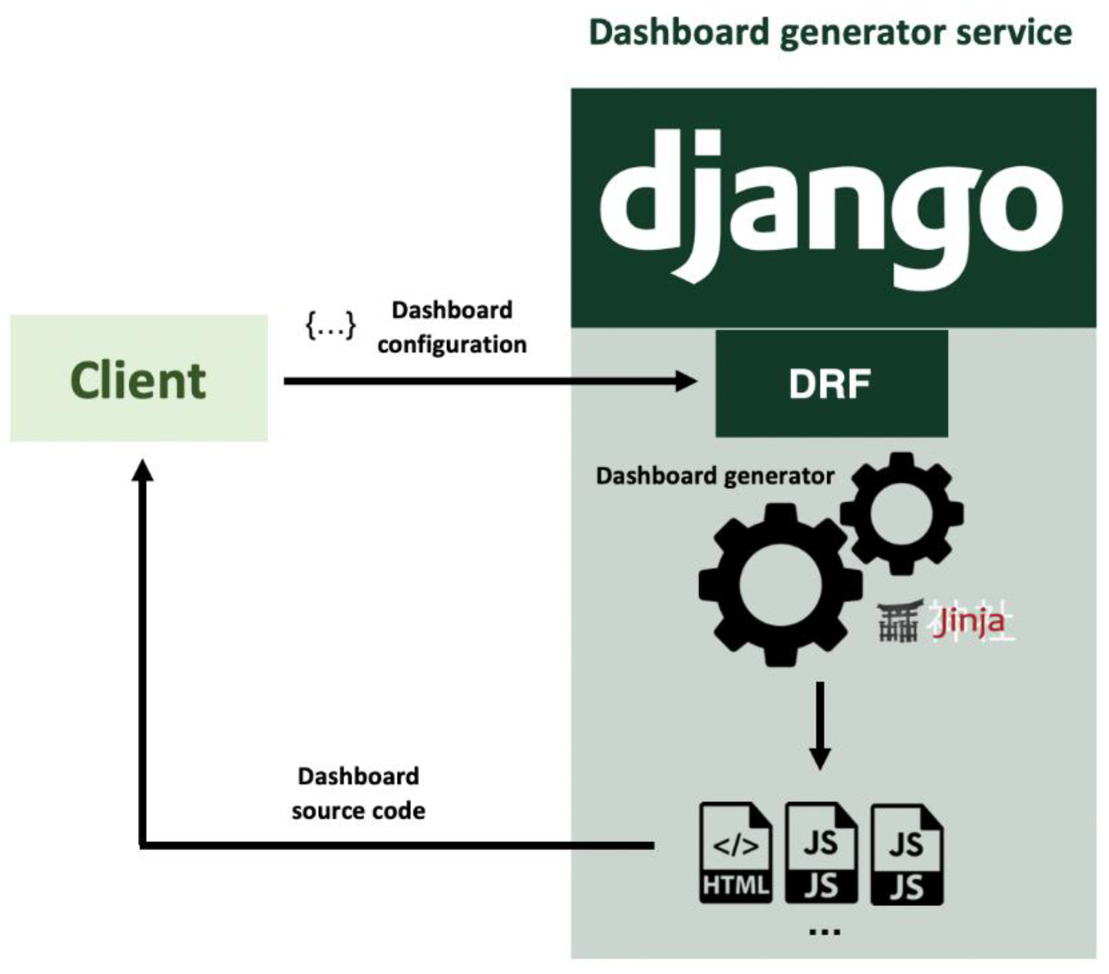
One of these services is the dashboard generator (Figure 2), based on plain JavaScript through the D3.js framework to allow better integration with external services avoiding other dependencies. The dashboard generator service accepts HTML requests containing information about the visualization component to craft. Specifically, this service is developed as an API in which the input is a JSON object with the configuration of an entire dashboard or a single visualization:
  • Information about the dataset or datasets to be displayed. Data sources could be external APIs or files.
  • The disposition or layout of the elements.
  • The features of the visualization:
    Number and type (X position, Y position, size, color, etc.) of visual channels;
    Visual mark type (bar, circle, topographic, arc, etc.);
    Dataset’s variables to be represented;
    Interaction events and effects [42].
The service processes this JSON object; then, the source code is generated using the previous section’s code templates. These returned source code files are returned to the client, which could embed them in its own applications or use them standalone.
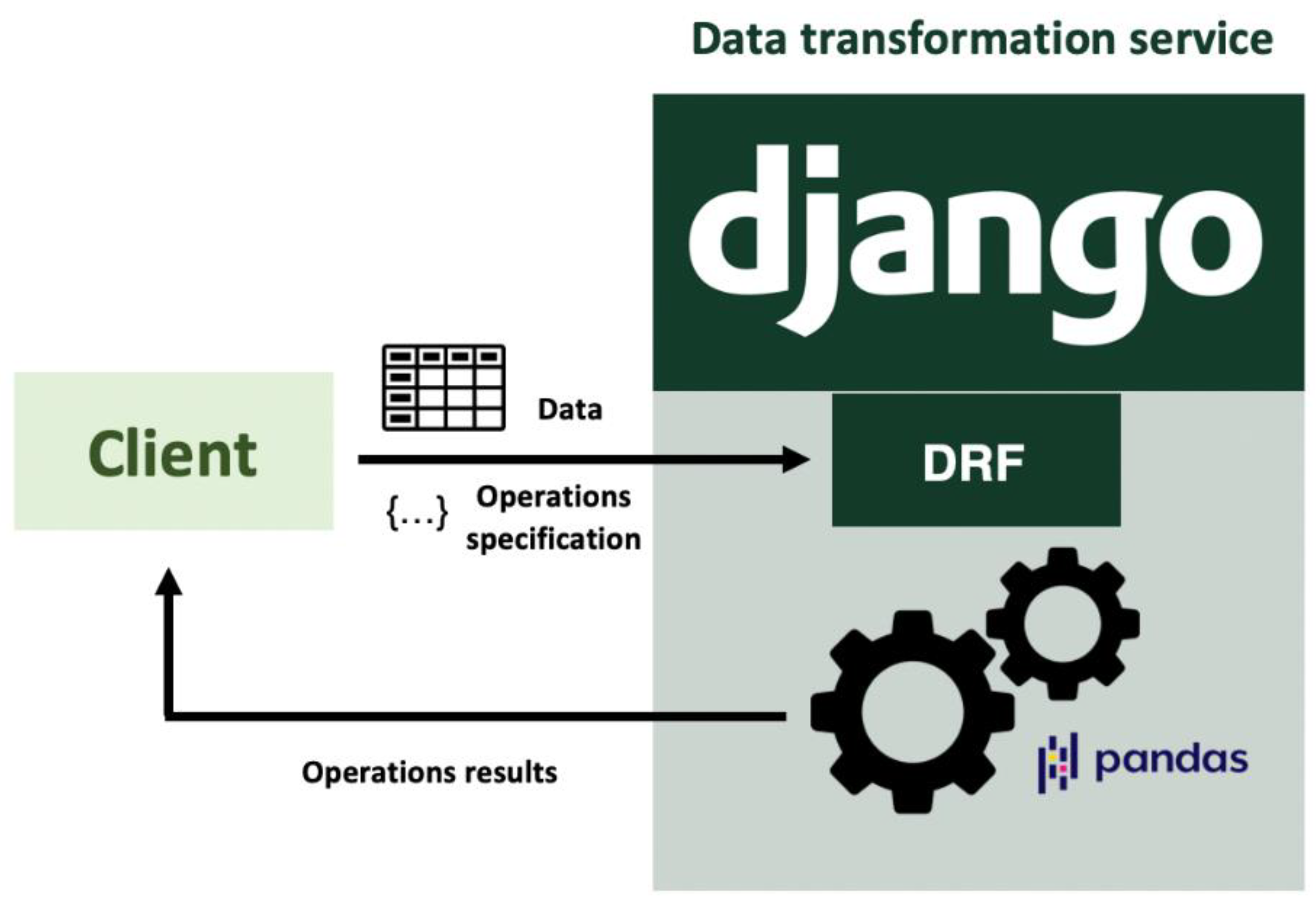
On the other hand, the ecosystem might support other information visualization-related tasks, such as data transformations. Formatting data is essential to support some encodings or layouts [43], so a service that carries out this task and unburdens the front-end with these computations can be connected to the dashboard generator component to offer a complete pipeline.
As the dashboard generator, this service is also developed as an API (Figure 3). In this case, the input data will provide information regarding the computations to perform. Target data must be sent along with the following configuration parameters to enable the service to perform the requested operations:
  • The set of variables from the dataset that will take part in the computations;
  • The operation or operations to be performed (summary statistics, regressions, ratios, etc.);
  • Filters (optional);
  • Groupings (optional);
  • Output data layout: tabular (default), nested, linked, etc.

5. Use Cases

This section aims to illustrate the generative process of the dashboard generator service. Through three use cases, we want to show not only the flexibility in terms of the data domain but also the flexibility in terms of necessities: the services can be used when data are stored in files locally (CSV, XLSX) or even make petitions to external endpoints (proprietary endpoints or even the ecosystem’s computational service). Also, the generated source code could be stored as files or dynamically embedded or loaded in other applications.

5.1. Requesting Source Code to Obtain a Standalone Dashboard

The services’ independence allows the integration of the dashboard generator with other technologies of the educative domain. In this example, part of the Open University (OU) dataset has been used to show a dashboard request [44].
Two visualizations will be requested, one to display the scores obtained in different assessments by the students and the other to display the range of scores by assessment. To obtain the source code, we need to build an HTTP POST request containing the dashboard layout and each visualization’s configuration to generate both the HTML and the JavaScript code (Figure 4).
Once the HTTP request has been sent, the service gets the payload data (i.e., the dashboard configuration) and performs the application engineering process to yield the personalized source code. To do so, the input JSON object is processed by the dashboard generator process, which is in charge of filling the code templates with the specific information handed by the client.
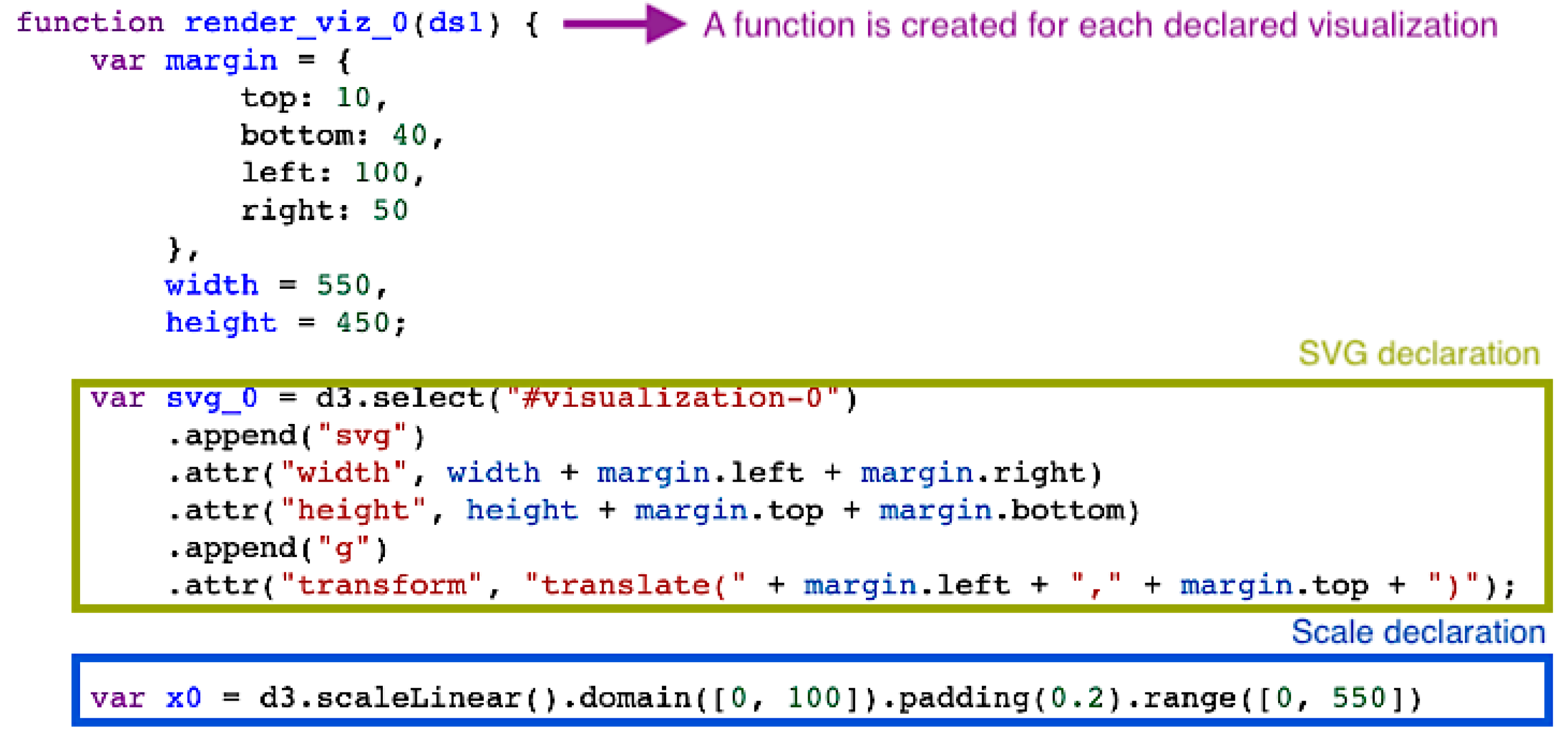
This process’ outcomes will be the source code of the dashboard, which is included in text format inside the API call response to the client. The source code could be used standalone and embedded within other applications by injecting the HTML and dynamically loading the JavaScript code. Figure 5 shows an excerpt of one of the generated JavaScript files.
Every generated JavaScript file follows the same structure:
  • Creation of the SVG container;
  • Declaration of the scales;
  • Creation of the visual marks;
  • Addition of each visual mark’s channels.
The obtained source code can be deployed as a standalone web page: Figure 6 displays the rendered dashboard with the configured features at the beginning of the example.

5.2. Integration with Other Components

In the previous use case, a dashboard was generated based on a configuration file and a dataset. This generation was straightforward because data were already in the right format for the chosen visualizations (in this case, simple visualizations such as bar charts), and no additional computations were needed.
However, data are not always in the right format for every visualization [43], and most times, it is necessary to transform the datasets before visualizing them. That is why a complementary data transformation service is included within the ecosystem. As will be discussed, adding this component benefits users in terms of delegating data transformations to an independent component and captures the implicit knowledge that is contained in the execution of data preprocessing tasks.
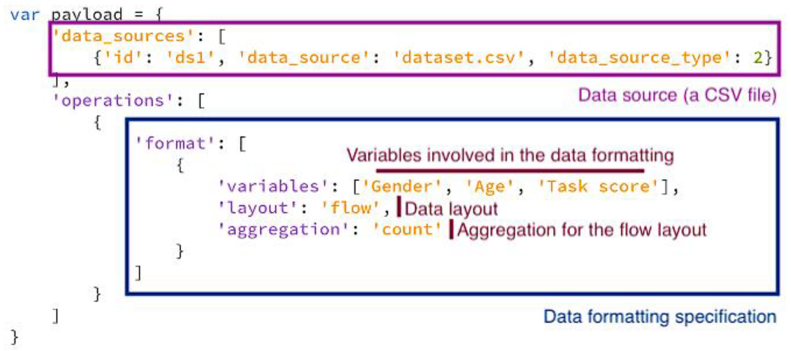
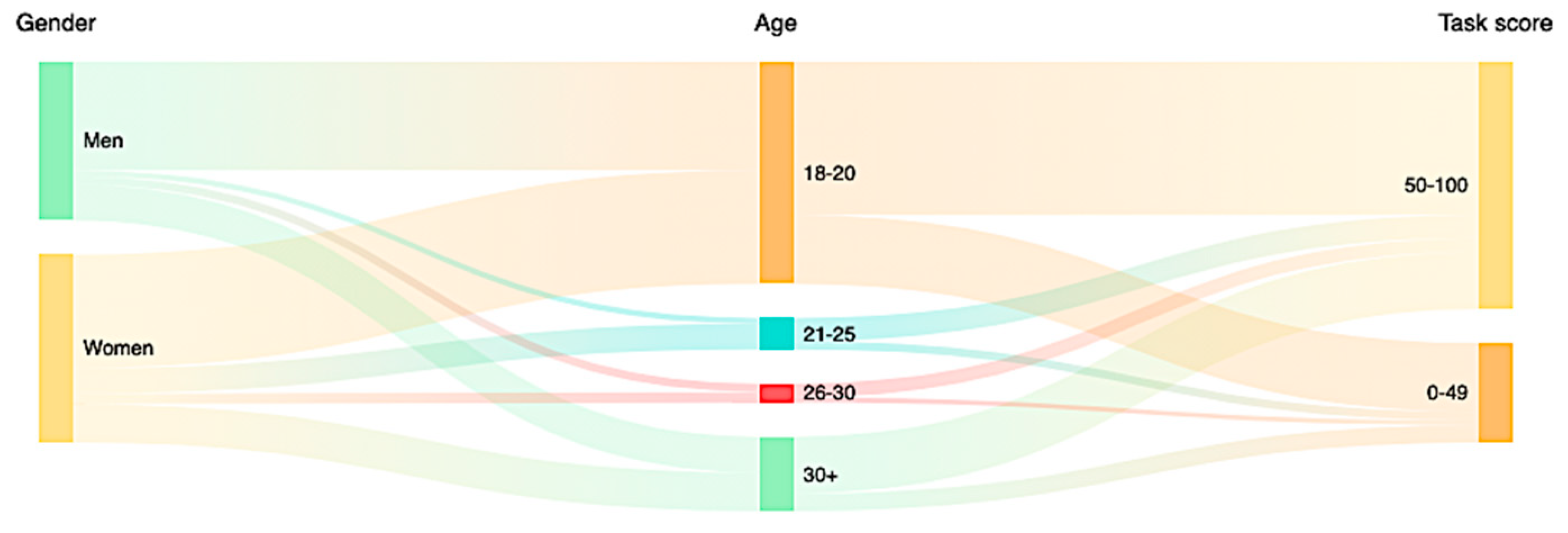
The data transformation component provides a solution for performing data computations and also to format data to different formats. As explained in Section 4, this component is also based on API calls. This example performs calculations on sociodemographic data to offer a Sankey diagram (which can be classified as a “flow layout” [43] or “parallel sets layout” [45]) in which its links represent the count of each category within each variable (Figure 7).
As with the dashboard generator service, the HTTP POST is processed by the data transformation service. In this case, the operation specification contains the information needed for the service to perform the data transformations requested by the client. Once the data are processed, they are returned within an HTTP response.
The API call results can be subsequently used with the dashboard generator service to create a visualization: in this case, a Sankey diagram (Figure 8).

5.3. Dynamic Implementation of a Dashboard with Educative Purposes

The last use case is focused on the possibility of integrating source code dynamically within an existing web application. A user interface has been designed to explore and visualize a dataset within the medical domain in the following example.
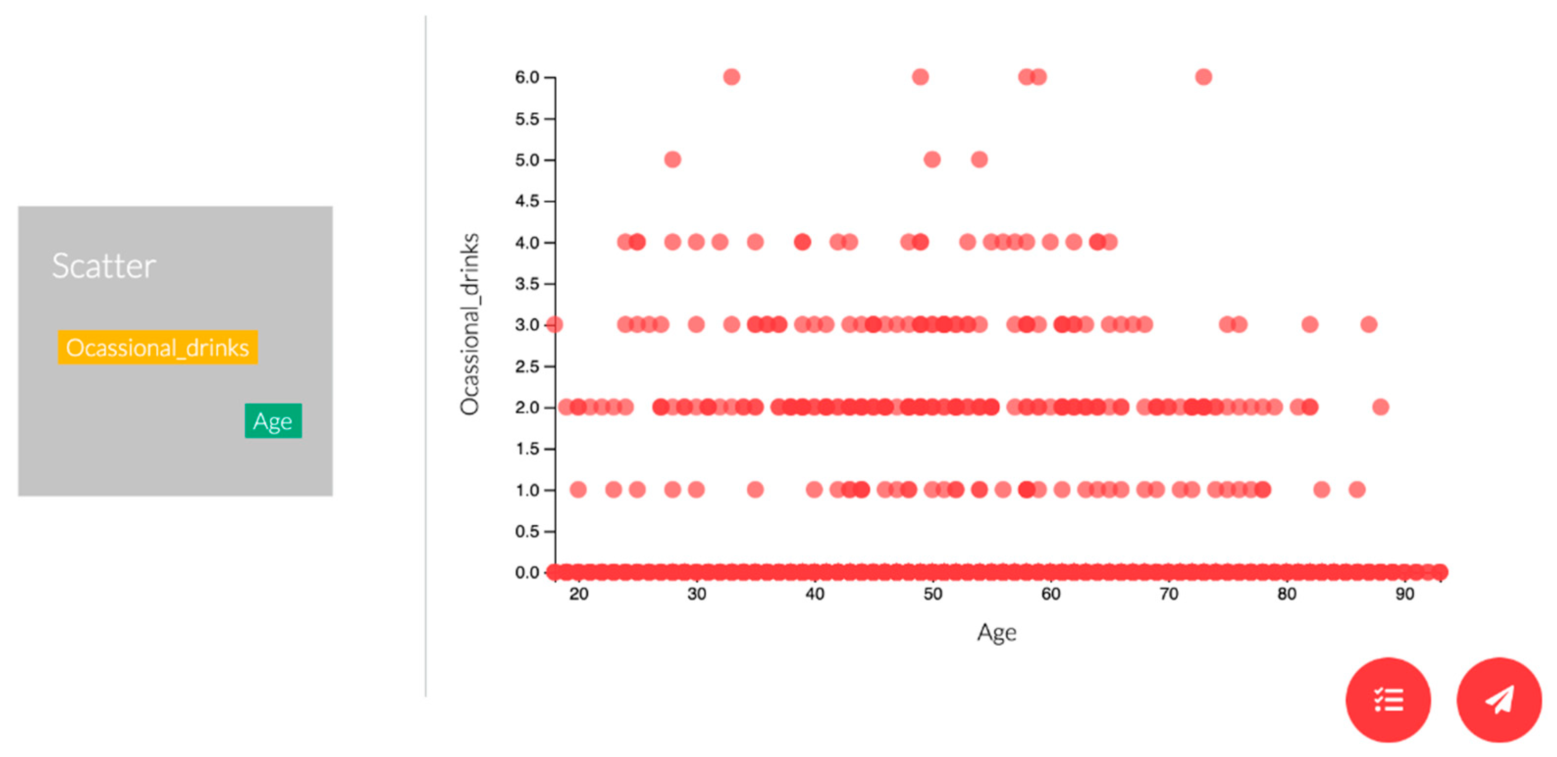
The user interface allows users to explore the variables within the dataset and to craft personalized visualizations based on their variables’ selection. Users can drag and drop the variables, select a visualization, and then, once confirmed, the front end computes the dashboard configuration and sends it to the dashboard generator service, which follows the same workflow as explained in the first example.
The final source code returned from the service can be dynamically loaded through JavaScript’s DOM manipulation functions. In this sense, the existing web application is benefited by not carrying out all the data visualization logic, only focussing on offering a usable didactic tool for the medical domain (Figure 9).

6. Discussion

This paper set the foundations for developing a technological ecosystem for designing and building information visualizations through holistic web services. Two of these ecosystem services are presented in this work: a service to generate information dashboards (transforming M1 models into M0 models) and a service to perform data transformations.
Adding a high-level layer to the design process of dashboards reduces their development time and their complexity in terms of programming. Another benefit is the possibility of structuring dashboard features in documents, which allow version control and further processing to identify interesting or useful features in different contexts.
A web service has been developed to serve this functionality through HTTP requests. This approach aims at the integration of different services programmatically. Returning the whole source code in plain JavaScript and HTML allows the users to retrieve a fully functional set of visualizations and rely on a template if they want to modify the generated code to match further requirements.
The generator service relies on a meta-modeling and software product line approach. The meta-model has been a useful resource for designing and developing the service; however, the domain engineering process has enabled a better dashboard domain understanding by identifying the primitive components generic to information dashboards and visualizations.
Relying on fine-grained features allows more variability points, meaning more elements can be customized when requesting a visualization source code. Fine-grained features also enable the analysis of the visualizations’ primitives at a low level, thus providing a characterization of potentially useful visualizations. Suppose a data visualization works well in a specific context or use case. In that case, their features could be examined to identify which of them are beneficial and subsequently adapt them to other datasets or domains.
Another benefit that could yield a generative dashboard ecosystem is transparency and traceability, and knowledge management. By relying on services with well-defined interfaces, it is possible to follow the users’ design decisions by analyzing their requests to the different services.
Sometimes it is difficult to materialize the implicit knowledge within design processes, as several times developers rely on heuristics, guidelines, or even default configurations. The generative dashboard ecosystem captures this implicit knowledge and structures it through the API calls’ schema (which relies on the dashboard meta-model). This sets the foundations for reusing previously generated knowledge; if specific dashboard configurations worked well in a particular environment, they could be reused for similar contexts.
As mentioned before, the educational context can be a clear beneficiary of applying the software product lines to the dashboard domain. The amount of learning data generated due to the popularization of new technologies in education [46] makes it necessary to have new methods and instruments that allow obtaining benefits from such information. Nevertheless, as seen in the third use case, this service can be used for other educational purposes, such as creating didactic tools that let users exploring data without the necessity of having programming skills.
Although dashboards are handy tools for these analysis processes, it is necessary to consider the audience that will use them, especially in educational environments where user roles and profiles can be very heterogeneous in terms of objectives, characteristics, and preferences [6].
Being able to generate dashboards quickly, and dedicating more time to the design and conceptualization of the dashboard than its implementation, allows having products better designed and adapted to concrete situations in less time [47,48].
However, it is necessary to deeply evaluate this proposal. We plan to carry out meta-model validations through the automatic generation of already developed dashboards, to test the usability of the generated products against “manually” developed ones.

7. Limitations

Relying on web services implies the transference of data between systems, which could be critical if data are sensitive. This proposal addresses this problem by not storing the data after performing the operations or transformations. However, it is necessary to define a policy and even anonymization mechanisms if these services are exploited in production. In fact, not storing data could result in performance issues for large datasets and repetitive operations, so this challenge needs to be tackled both in terms of security and efficiency.

8. Conclusions

This work provides the foundation for designing an ecosystem for developing information dashboards based on different services with different well-defined functionalities. Specifically, this paper presents a web service to request the source code of customized dashboards and another web service to perform data operations. The dashboard generator service is implemented as an API that takes as an input the requested dashboard or visualization configuration and returns a set of HTML and JavaScript files containing the source code. On the other hand, the data transformation service takes as an input the transformation parameters and the dataset and returns the modified dataset.
Future steps will involve the addition of more services to the ecosystem to complement the dashboard generator and obtain services that could be connected to provide a whole dashboard developing pipeline: for example, a recommendation service of potentially features, a detector of potentially misleading information visualizations, data cleaning services, etc. In this proposal, we tested the approach’s viability and flexibility; however, we also plan to test its acceptance, performance, and usability with users.

Author Contributions

Conceptualization, A.V.-I., F.J.G.-P. and R.T.; methodology, A.V.-I., F.J.G.-P. and R.T.; software, A.V.-I.; validation, A.V.-I., F.J.G.-P. and R.T; formal analysis, A.V.-I., F.J.G.-P. and R.T.; investigation, A.V.-I., F.J.G.-P. and R.T.; resources, A.V.-I., F.J.G.-P. and R.T.; writing—original draft preparation, A.V.-I.; writing—review and editing, F.J.G.-P. and R.T.; visualization, A.V.-I.; supervision, F.J.G.-P. and R.T.; project administration, F.J.G.-P. and R.T.; funding acquisition, F.J.G.-P. and R.T. All authors have read and agreed to the published version of the manuscript.

Funding

This research was partially funded by the Spanish Government Ministry of Economy and Competitiveness throughout the DEFINES project grant number [TIN2016-80172-R] and by the Spanish Government Ministry of Economy and Competitiveness and EU CHIST-ERA agreement throughout the PROVIDEDH project grant number [PCIN-2017-064]. This research was supported by the Spanish Ministry of Education, Culture and Sport under a FPU fellowship (FPU17/03276).

Institutional Review Board Statement

Not applicable.

Informed Consent Statement

Not applicable.

Data Availability Statement

No new data were created or analyzed in this study. Data sharing is not applicable to this article.

Acknowledgments

The authors would like to thank the InterAction and eLearning Research Group (GRIAL) for its support to conduct the present research https://grial.usal.es (accessed on 4 April 2021).

Conflicts of Interest

The authors declare no conflict of interest.

References

  1. Sarikaya, A.; Correll, M.; Bartram, L.; Tory, M.; Fisher, D. What Do We Talk About When We Talk About Dashboards? IEEE Trans. Vis. Comput. Graph. 2018, 25, 682–692. [Google Scholar] [CrossRef] [PubMed]
  2. García-Holgado, A.; García-Peñalvo, F.J. The evolution of the technological ecosystems: An architectural proposal to enhancing learning processes. In Proceedings of the First International Conference on Technological Ecosystems for Enhancing Multiculturality (TEEM’13), Salamanca, Spain, 14–15 November 2013; ACM International Conference Proceeding Series (ICPS); García-Peñalvo, F.J., Ed.; ACM: New York, NY, USA, 2013; pp. 565–571. [Google Scholar]
  3. García-Holgado, A.; García-Peñalvo, F.J. A metamodel proposal for developing learning ecosystems. In Learning and Collaboration Technologies. Novel Learning Ecosystems. 4th International Conference, LCT 2017. Held as Part of HCI International 2017, Vancouver, BC, Canada, 9–14 July 2017. Proceedings, Part I; Lecture Notes in Computer Science, No. 10295; Zaphiris, P., Ioannou, A., Eds.; Springer International Publishing: Cham, Switzerland, 2017; pp. 100–109. [Google Scholar]
  4. Yoo, Y.; Lee, H.; Jo, I.-H.; Park, Y. Educational dashboards for smart learning: Review of case studies. In Emerging Issues in Smart Learning; Springer: Berlin/Heidelberg, Germany, 2015; pp. 145–155. [Google Scholar]
  5. Álvarez-Arana, A.; Villamañe-Gironés, M.; Larrañaga-Olagaray, M. Improving Assessment Using Visual Learning Analytics. Educ. Knowl. Soc. 2020, 21. [Google Scholar] [CrossRef]
  6. Schwendimann, B.A.; Rodriguez-Triana, M.J.; Schwendimann, B.A.; Vozniuk, A.; Prieto, L.P.; Boroujeni, M.S.; Holzer, A.; Gillet, D.; Dillenbourg, P. Perceiving learning at a glance: A systematic literature review of learning dashboard research. IEEE Trans. Learn. Technol. 2017, 10, 30–41. [Google Scholar] [CrossRef]
  7. Teasley, S.D. Student facing dashboards: One size fits all? Technol. Knowl. Learn. 2017, 22, 377–384. [Google Scholar] [CrossRef]
  8. Vázquez-Ingelmo, A.; García-Peñalvo, F.J.; Therón, R. Information Dashboards and Tailoring Capabilities A Systematic Literature Review. IEEE Access 2019, 7, 109673–109688. [Google Scholar] [CrossRef]
  9. Filonik, D.; Medland, R.; Foth, M.; Rittenbruch, M. A Customisable Dashboard Display for Environmental Performance Visualisations. In Persuasive Technology. PERSUASIVE 2013; Springer: Berlin/Heidelberg, Germany, 2013; pp. 51–62. [Google Scholar]
  10. Mayer, B.; Weinreich, R. A dashboard for microservice monitoring and management. In Proceedings of the 2017 IEEE International Conference on Software Architecture Workshops (ICSAW), Gothenburg, Sweden, 5–7 April 2017; pp. 66–69. [Google Scholar]
  11. Michel, C.; Lavoué, E.; George, S.; Ji, M. Supporting awareness and self-regulation in project-based learning through personalized dashboards. Int. J. Technol. Enhanc. Learn. 2017, 9, 204–226. [Google Scholar] [CrossRef]
  12. Miotto, G.L.; Magnoni, L.; Sloper, J.E. The TDAQ Analytics Dashboard: A real-time web application for the ATLAS TDAQ control infrastructure. J. Phys. Conf. Ser. 2011, 331, 022019. [Google Scholar] [CrossRef] [Green Version]
  13. Nascimento, B.S.; Vivacqua, A.S.; Borges, M.R. A flexible architecture for selection and visualization of information in emergency situations. In Proceedings of the 2016 IEEE International Conference on Systems, Man, and Cybernetics (SMC), Budapest, Hungary, 9–12 October 2016; pp. 003317–003322. [Google Scholar]
  14. Elias, M.; Bezerianos, A. Exploration views: Understanding dashboard creation and customization for visualization novices. In IFIP Conference on Human-Computer Interaction; Springer: Berlin/Heidelberg, Germany, 2011; pp. 274–291. [Google Scholar]
  15. Yalçın, M.A.; Elmqvist, N.; Bederson, B.B. Keshif: Rapid and expressive tabular data exploration for novices. IEEE Trans. Vis. Comput. Graph. 2018, 24, 2339–2352. [Google Scholar] [CrossRef] [PubMed]
  16. Petasis, G.; Triantafillou, A.; Karstens, E. YourDataStories: Transparency and Corruption Fighting Through Data Interlinking and Visual Exploration. In International Conference on Internet Science; Springer: Berlin/Heidelberg, Germany, 2017; pp. 95–108. [Google Scholar]
  17. Kumar, K.; Bose, J.; Soni, S.K. A Generic Visualization Framework based on a Data Driven Approach for the Analytics data. In Proceedings of the 2017 14th IEEE India Council International Conference (INDICON), Roorkee, India, 15–17 December 2017; pp. 1–6. [Google Scholar]
  18. Cardoso, A.; Teixeira, C.J.V.; Pinto, J.S. Architecture for Highly Configurable Dashboards for Operations Monitoring and Support. Stud. Inform. Control 2018, 27, 319–330. [Google Scholar] [CrossRef]
  19. Pastushenko, O.; Hynek, J.; Hruška, T. Generation of test samples for construction of dashboard design guidelines: Impact of color on layout balance. In World Conference on Information Systems and Technologies; Springer: Berlin/Heidelberg, Germany, 2018; pp. 980–990. [Google Scholar]
  20. Vázquez-Ingelmo, A.; García-Peñalvo, F.J.; Therón, R. Domain engineering for generating dashboards to analyze employment and employability in the academic context. Presented at the 6th International Conference on Technological Ecosystems for Enhancing Multiculturality, Salamanca, Spain, 24–26 October 2018. [Google Scholar]
  21. Logre, I.; Mosser, S.; Collet, P.; Riveill, M. Sensor data visualisation: A composition-based approach to support domain variability. In European Conference on Modelling Foundations and Applications; Springer: Berlin/Heidelberg, Germany, 2014; pp. 101–116. [Google Scholar]
  22. Kintz, M. A semantic dashboard description language for a process-oriented dashboard design methodology. In Proceedings of the 2nd International Workshop on Model-based Interactive Ubiquitous Systems (MODIQUITOUS 2012), Copenhagen, Denmark, 25–28 June 2012; Volume 947, pp. 31–36. [Google Scholar]
  23. Kintz, M.; Kochanowski, M.; Koetter, F. Creating User-specific Business Process Monitoring Dashboards with a Model-driven Approach. In Proceedings of the MODELSWARD, Porto, Portugal, 19–21 February 2017; pp. 353–361. [Google Scholar]
  24. Palpanas, T.; Chowdhary, P.; Mihaila, G.; Pinel, F. Integrated model-driven dashboard development. Inf. Syst. Front. 2007, 9, 195–208. [Google Scholar] [CrossRef] [Green Version]
  25. Radovanović, S.; Majstorović, B.; Kukolj, S.; Bjelica, M.Z. Device Cloud platform with customizable Remote User Interfaces. In Proceedings of the 2014 IEEE Fourth International Conference on Consumer Electronics Berlin (ICCE-Berlin), Berlin, Germany, 7–10 September 2014; pp. 202–204. [Google Scholar]
  26. Belo, O.; Rodrigues, P.; Barros, R.; Correia, H. Restructuring Dynamically Analytical Dashboards Based on Usage Profiles. In International Symposium on Methodologies for Intelligent Systems; Springer: Berlin/Heidelberg, Germany, 2014; pp. 445–455. [Google Scholar]
  27. Arjun, S. Personalizing data visualization and interaction. In Proceedings of the Adjunct Publication of the 26th Conference on User Modeling, Adaptation and Personalization, Nanyang Technological University, Singapore, 8–11 July 2018; ACM: New York, NY, USA, 2018; pp. 199–202. [Google Scholar]
  28. van Hoecke, S.; Huys, C.; Janssens, O.; Verborgh, R.; van de Walle, R. Dynamic Monitoring Dashboards Through Composition of Web and Visualization Services. In International Internet of Things Summit; Springer: Berlin/Heidelberg, Germany, 2015; pp. 465–474. [Google Scholar]
  29. Santos, H.; Dantas, V.; Furtado, V.; Pinheiro, P.; McGuinness, D.L. From data to city indicators: A knowledge graph for supporting automatic generation of dashboards. In European Semantic Web Conference; Springer: Berlin/Heidelberg, Germany, 2017; pp. 94–108. [Google Scholar]
  30. Pleuss, A.; Wollny, S.; Botterweck, G. Model-driven development and evolution of customized user interfaces. In Proceedings of the 5th ACM SIGCHI Symposium on Engineering Interactive Computing Systems, London, UK, 24–27 June 2013; pp. 13–22. [Google Scholar]
  31. Kleppe, A.G.; Warmer, J.; Bast, W. MDA Explained. The Model Driven Architecture: Practice and Promise; Addison-Wesley Longman Publishing Co., Inc.: Boston, MA, USA, 2003. [Google Scholar]
  32. Mellor, S.J.; Scott, K.; Uhl, A.; Weise, D. Model-Driven Architecture. In Proceedings of the Advances in Object-Oriented Information Systems: OOIS 2002 Workshops, Montpellier, France, 2 September 2002; Bruel, J.-M., Bellahsene, Z., Eds.; Springer: Berlin/Heidelberg, Germany, 2002; pp. 290–297. [Google Scholar]
  33. Álvarez, J.M.; Evans, A.; Sammut, P. Mapping between Levels in the Metamodel Architecture. In Proceedings of the UML 2001—The Unified Modeling Language. Modeling Languages, Concepts, and Tools. UML 2001; Lecture Notes in Computer Science; Gogolla, M., Kobryn, C., Eds.; Springer: Berlin/Heidelberg, Germany, 2001; Volume 2185, pp. 34–46. [Google Scholar]
  34. Vázquez-Ingelmo, A.; García-Peñalvo, F.J.; Therón, R.; González, M.Á.C. Extending a dashboard meta-model to account for users’ characteristics and goals for enhancing personalization. Presented at the Learning Analytics Summer Institute (LASI), Vigo, Spain, 27–28 June 2019. [Google Scholar]
  35. Vázquez-Ingelmo, A.; García-Peñalvo, F.J.; Therón, R. Capturing high-level requirements of information dashboards’ components through meta-modeling. Presented at the 7th International Conference on Technological Ecosystems for Enhancing Multiculturality (TEEM 2019), León, Spain, 16–28 October 2019. [Google Scholar]
  36. García-Holgado, A.; García-Peñalvo, F.J. Validation of the learning ecosystem metamodel using transformation rules. Future Gener. Comput. Syst. 2019, 91, 300–310. [Google Scholar] [CrossRef] [Green Version]
  37. Vázquez-Ingelmo, A.; García-Peñalvo, F.J.; Therón, R.; Filvà, D.A.; Escudero, D.F. Connecting domain-specific features to source code: Towards the automatization of dashboard generation. Clust. Comput. 2020, 23, 1803–1816. [Google Scholar] [CrossRef]
  38. Clements, P.; Northrop, L. Software Product Lines; Addison-Wesley: Boston, MA, USA, 2002. [Google Scholar]
  39. Gomaa, H. Designing Software Product Lines with UML: From Use Cases to Pattern-Based Software Architectures; Addison Wesley Longman Publishing Co., Inc.: Boston, MA, USA, 2004. [Google Scholar]
  40. Vázquez-Ingelmo, A.; García-Peñalvo, F.J.; Therón, R. Taking advantage of the software product line paradigm to generate customized user interfaces for decision-making processes: A case study on university employability. PeerJ Comput. Sci. 2019, 5, e203. [Google Scholar] [CrossRef] [Green Version]
  41. Django Software Foundation. Django Web Framework. Available online: https://www.djangoproject.com/ (accessed on 15 March 2015).
  42. Vázquez-Ingelmo, A.; García-Peñalvo, F.; Therón, R.; García-Holgado, A. Specifying information dashboards’ interactive features through meta-model instantiation. In Proceedings of the LASI-SPAIN 2020. Learning Analytics Summer Institute Spain 2020: Learning Analytics. Time for Adoption? Valladolid, Spain, 15–16 June 2020; CEUR-WS.org: Aachen, Germany, 2020. [Google Scholar]
  43. Meeks, E. D3. js in Action: Data Visualization with JavaScript; Manning Publications: Shelter Island, NY, USA, 2018. [Google Scholar]
  44. Kuzilek, J.; Hlosta, M.; Zdrahal, Z. Open university learning analytics dataset. Sci. Data 2017, 4, 170171. [Google Scholar] [CrossRef] [PubMed] [Green Version]
  45. Wilke, C.O. Fundamentals of Data Visualization: A Primer on Making Informative and Compelling Figures; O’Reilly Media: Newton, MA, USA, 2019. [Google Scholar]
  46. Ferguson, R. Learning analytics: Drivers, developments and challenges. Int. J. Technol. Enhanc. Learn. 2012, 4, 304–317. [Google Scholar] [CrossRef]
  47. Liñán, L.C.; Pérez, Á.A.J. Educational Data Mining and Learning Analytics: Differences, similarities, and time evolution. Int. J. Educ. Technol. High. Educ. 2015, 12, 98–112. [Google Scholar]
  48. Picciano, A.G. The evolution of big data and learning analytics in American higher education. J. Asynchronous Learn. Netw. 2012, 16, 9–20. [Google Scholar] [CrossRef] [Green Version]
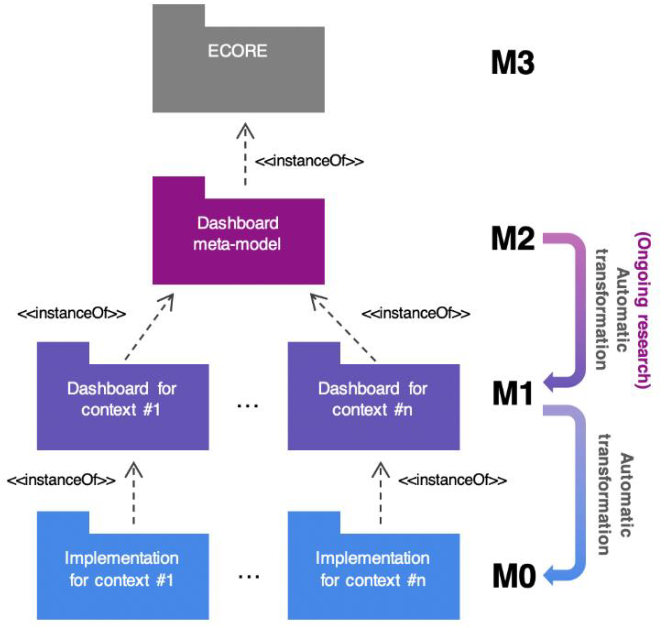
Figure 1. Location of the dashboard meta-model following the Object Management Group (OMG) architecture. The dashboard generator is in charge of transforming the meta-models’ instances (M1 models) in specific dashboard implementations.
Applsci 11 03249 g001
Figure 2. Schematic view of the dashboard generator service architecture.
Applsci 11 03249 g002
Figure 3. Schematic view of the data transformation service architecture.
Applsci 11 03249 g003
Figure 4. HTTP POST request’s payload, which contains the dashboard configuration.
Applsci 11 03249 g004
Figure 5. Excerpt of a generated JavaScript source file.
Applsci 11 03249 g005
Figure 6. Rendered dashboard.
Applsci 11 03249 g006
Figure 7. Formatting operation specification.
Applsci 11 03249 g007
Figure 8. Rendered Sankey visualization that formats data as flows.
Applsci 11 03249 g008
Figure 9. Fragment of the user interface integrated with the ecosystem’s services. The right section of the figure shows the drag and drop space in which users are allowed to configure their visualizations graphically. The left section shows the generated visualization, which is dynamically embedded.
Applsci 11 03249 g009
Publisher’s Note: MDPI stays neutral with regard to jurisdictional claims in published maps and institutional affiliations.