1. Introduction
Color is an inherent aspect of everyday life. It one of the key factors of visual communication, both between people and between users and computer systems through graphical user interfaces. Research has shown that more than 80% of visual information is related to color (as an information carrier). Color identifies products or companies, the quality of goods, and important aspects of user interfaces, among other factors [
1]. It is often used deliberately when catching the attention of users is a priority.
In recent years, our environment has become more invasive and stimulating than ever. People need to choose carefully what to look for in their over-stimulated daily lives. From year to year, more and more content is presented to us, causing our concentration to wane. One of the key ways to attract visual attention is through the use of color. Understanding color sensation is not easy, as it can be attributed to various theories, including biological factors, a universal scale of preference existing in people, or unchanging stimulus qualities. Responses to color may be influenced by social and cultural factors [
2]. Color may cause many visual sensations, such as signaling, intensification, arousal, appeal, or enhancement. A single color in isolation may incite certain sensory responses but, in actuality, colors are rarely viewed in isolation. Color compositions involve more than one color stimulus being perceived simultaneously. This occurrence may evoke visual sensations that differ from those caused by a single color stimulus [
1,
3].
In contact with digital products (specifically, user interfaces) the focus of users is most often directed to visual messages, consisting of elements which the user interacts with and makes a decision (e.g., by clicking a button, picking a menu item, suspending an action, thinking about the decision).
According to the literature, in the visual message context, attention can be categorized into sustained attention and divided attention (
Figure 1).
Sustained attention is used when user needs to focus on one specific task for a long period of time, such as when filling in a form, making a bank transfer, or finalising an online purchase. The main emphasis of such a message must be on visual message readability and user-friendly selection of colors, in order to retain attention and focus.
Divided attention has been defined as our brain’s ability to attend to two or more different stimuli at the same time, as well as to respond to the multiple demands of our surroundings. Examples are singing along to a song while driving, having a conversation while walking, or listening to music while grocery shopping. Some research has suggested that “in moments where we think we’re multitasking, we’re likely just switching quickly from task to task” [
4,
5,
6]. Transitioning from one activity to another depends on a stimulus that causes focus diversion, such as colors or sounds [
7]. In our research, we focus exactly on such an understanding of the term ’divided attention’, where one activity is in the main focus while others exist, but are less relevant, at a given time. The visual message then fulfills the role of warning the user of danger or unwanted actions, such as error messages or critical alerts. The main emphasis of such a message must be on diverting the user away from their current activity and quickly attracting their attention. When designing graphical user interfaces (GUIs), depending on the role they should play, a designer uses one of the above mentioned types of attention models. The diversity and wide application of GUIs has caused, in some situations, the user’s attention to be quickly drawn (e.g., error messages, critical alerts, warnings) while, in other cases, it should be held longer (e.g., reading important information, filling in a bank form, user registration).
Therefore, a question arises: how can we effectively attract the attention of a user, depending on the needs and the task being performed? Companies that run advertising campaigns compete for user attention differently than designers of user interfaces, by drawing their attention to call to action buttons (e.g., add to cart, pay, sign up to newsletter) or critical alerts (e.g., tire pressure loss, slippery surface, wrong password).
A second question is how to interrupt the user’s cognition process such that they notice an important message that shows up in their peripheral perception. The cognition process is understood as a situation where the user is engaged in the task and directs the whole of their focus to this task. Meanwhile, cognitive process interruption is the process when another task (than the one which is the subject of their focus) redirects a user’s attention. In such a case, the following questions can be asked: How can the users attention be attracted if they are engaged in another task? Will the color of the visual message interrupt the cognition process and redirect the user’s sight to the required target? Will the message be readable? Which colors will attract the user;s attention, and which will hold their sight and allow them to freely read the message? These problems are visually depicted in
Figure 2.
This paper attempts to answer the above research questions, based on an analysis of user behavior in response to simple color messages (composed of two colors: one for the background and one for a pictogram) in a perceptual experiment. In our research, we focus on the simple color messages, understood as graphical user interface components, such as buttons, menus, forms, logos, and pictograms. We did not include user reactions to backgrounds that contain multiple colors, such as website layouts. The main goal of this paper was to determine which colors hold the attention of users for a longer time during their activity, and which colors break the focus of users and attract their attention to an important message. To achieve this goal, a perceptual experiment was conducted (
Section 3) and the obtained results were analyzed (
Section 4). In
Section 5 we discussed the results and finally
Section 6 concludes the paper.
The main contributions of our work are:
The measurement of natural reactions of users related to their first impression, indicating the color composition that first (from displayed pair of images) draws their attention. The users were not familiar with our intention, which enabled us to register bottom-up attention, which is significant in divided attention models.
The measurement of user preferences related to user-friendly, readable color compositions. As the user understood our intention, these preferences correspond to a top-down attention model, which is significant in sustained attention models.
Taking into account the different types of visual attention, we selected those colors that attract the user’s divided attention and sustained attention, respectively. The first group of colors can be used in systems such as automotive systems, where the key factors are short attention span and rapidly drawing attention. The second group is useful for systems such as user interfaces, advertisements, and so on. The predominant color in this group turned out to be white, which provides long attention span, holding attention with high readability together with user friendliness.
2. Related Work
In graphic interfaces (e.g., websites, applications, systems), the attention of users is drawn to its components, such as buttons or icons. These are the components that lead to the acievement of business goals through facilitating the user performing certain actions (e.g., add to the basket, buy, subscribe to newsletter, share). User actions influence the conversion rate, which is the basic measure of the effectiveness of online marketing activities [
8]. According to the methodologies of Nielsen (
www.nngroup.com, accessed on 15 October 2021), one of the techniques for highlighting components in graphical interfaces is color. It has a calming function and can positively impact on the user (e.g., when filling out a form). It can also have a distinguishing function and draw the user’s attention to important information (e.g., when an incorrect password has been used). The relationships between colors and their influence on the user, in terms of psychology and society, have been determined [
9]. We can talk about warm and cold colors, more and less contrasting colors, neutral colors, and so on (
www.colormatters.com, accessed on 15 October 2021). Much depends on what action the designer wants to achieve: To attract or maintain attention.
Correct color assesment by a human is influenced by many factors. Above all, they are differences in light source that can give different color impressions, depending on spectral range. Apart from that, the characteristics of the observed object are important, as well as environmental conditions connected to the observation direction or light position [
10]. A known phenomenon is spatial effects; for example, a line or object arrangement can cause an optical illusion that has a significant influence on color perception [
9]. Long exposure to intensive colors causes retinal fatigue, which gives an impression of colors being continuously displayed, and a rest or sight neutralization is necessary. Human sight is also characterized by a low ability to remember colors, which means that images have to be watched simultanously to be able to assess the difference between them. Age and the eye ageing process should also be taken into account. Research has shown that, with age, color perception disorders build up [
11] and contrast sensitiveness emerges [
12].
Color perception changes, depending on differences in the size and background of the observed object [
9]. Colors on large surfaces appear brighter and more vivid than those observed on small surfaces. This phenomenon can cause mistakes in color perception. Colors placed in front of a bright background seem to be darker than when they are put in front of a dark background. This is called the contrast effect, and is undesirable for precise color assessment. The above research indicates that color perception is not a trivial issue. When designing perceptual experiments with colors, it is important to simplify them as much as possible, which not only makes it easier for the user to perform it, but also increases the credibility of the collected data.
When analyzing the literature, one can find reports in which the preferences and visual attention related to colors have been studied [
1,
13,
14]. In [
14], Kawasaki et al. have focused on the relationship between subjective preference and visual attention-related brain activities. They used colors as information for preference decision making, in order to decrease the number of visual features. Although they noticed that simple stimuli have advantages over natural scenes or attractive faces, both of which have many features, the other systematic components of color (e.g., brightness, RGB dimensions, and fixation colors) can influence the associated preference judgments. In the paper [
1], Camgöz et al. have discussed the problem of indicating different color properties, such as hue, saturation, and brightness, on user preferences and attention. Analyses of data on attention showed that brightness and saturation levels are more important than the hue component in attracting attention: they found that the most attention was attracted when using colors with maximum saturation and brightness. We took advantage of this fact in our study. The drawback of the approach was its form, where the participants were shown a color palette with 49 squares of seven colors with different saturation and brightness levels. Introducing such a large number of colors into the space made it difficult to evaluate, which was tied to noise in participant’s results. In addition, the colors were analyzed independently of each other, without a final summary or ranking.
Approaches to capture visual attention have been reported in various studies [
15,
16], where an EEG signal was used for estimating visual attention; however, eye tracking systems are most often used for this task [
17,
18,
19]. In [
20], the authors indicated an eye tracking study as a reasonable method to investigate how visual attention behaves under particular complex stimuli and tasks. According to the study [
21], overt attention is usually associated with eye movements, mostly related to gaze fixation and saccades. The first of the eye movements—saccadic—are rapid, ballistic movements that brings new objects of interest into the fovea. Saccades are said to be ballistic as, once one starts, it will not stop until the target location is reached. The second type of eye movements are fixations, which position the target object into the fovea. This allows the eyes to maximize their focus on the object. Saccades are related to so-called spatial attention, a mechanism that chooses the destination of each subsequent saccade. In other words, it can be used to select process information from different locations [
22,
23,
24]. Allocating attention to a position in space results in faster and more accurate processing of luminance and form information in a region of space surrounding that location [
23,
25,
26]. In addition to enhancing perceptual processing, attention may also be important in guiding “action systems,” such as reaching [
27]. As shifts in attention can occur much faster than changes in eye position [
28], spatial attention can be used during one fixation to choose the location for the following fixation. Despite the fact that the first attention takes place before fixation, attention is the mechanism that suggests where the sight should be allocated. In context of divided attention, the place where the observer allocates (or, rather, redirects) their sight is what we focus.
The studies presented above have mainly analyzed the role of colors in relation to psychological meaning, accessibility, and preferences of colors; however, there is a lack of comparisons of different colors, in relation to their background, in the context of graphical components of user interfaces. Indicating those colors that attract the attention of users more than others could enhance the process of usability in GUI design. The research goal of this paper is, thus, finding such colors that have a greater visual power than other colors and catch the attention of users more strongly, regardless of the background. This means that they should be visible, despite the surrounding environment. The visualization of the considered problem is depicted in
Figure 2.
To achieve this goal, a perceptual experiment was developed, where user preferences, related to user-friendly, readable color compositions, were measured. At the same time, we measured the unconscious reactions of users related to their first impression, indicating the color composition that (from a displayed pair of images) draws the user’s attention first.
3. Materials and Methods
To analyze the effect of color images on user attention, a perceptual experiment was conducted. We define the experimental procedure in detail below.
Screening Observers. For the experiment, 41 participants were employed. The observers may have reported implausible impression scores as they misunderstood the experiment instructions, or did not engage in the task and gave random answers. Therefore, a screening procedure should be employed. We conducted screening using the approach described in the [
29] standard (Annex 2.3.1), which provides a numerical screening procedure. This procedure involves counting the number of trials in which an observer’s result lies outside the
standard deviation range, and rejecting those observers for whom: (a) More than 5% of the trials are outside that range; and (b) the trials outside that range are evenly distributed, such that the absolute difference between the counts of trials exceeding the lower and the upper bounds of that range is not more than 30%. We performed this procedure on our data and found that four participants needed to be removed.
All analyzed data were fully anonymized. Before the experiment, the participants provided informed written consent to have their data from the perceptual experiment used in research (according the Bioethics Committee Agreement no. KB-0012/24/2020).
Choice of colors for the experiment. Color theory encompasses a multitude of definitions, concepts, and design applications. There are three basic categories of color theory that are logical and useful: The color wheel, color harmony, color contrast, the context of how colors are used, and so on [
30,
31,
32].
When choosing colors for the experiment, we observed the following rules:
Using a low number of colors (max. 10 colors). Too many variants could affect the user’s perception and the course of the experiment.
In accordance with the above, variations in brightness and color saturation were excluded. These parameters were implicitly set to 100% (except for white, gray, and black colors), based on the research results reported in [
1], where it was shown that users reacted most to colors with the highest saturation level (at least, in the context of GUIs).
Neutral color inclusion: White, black, gray. They serve a calming and reassuring role in web design. Neutral colors do not compete with primary and secondary colors; instead, the complement them. Gray is usually used as a background for color analysis and comparison.
Saturated colors are most often chosen as eye-catching elements on a website.
Warm and cold color inclusion. The wavelengths of these colors evoke warm feelings in people or leave a cold effect, respectively.
By analyzing trends and design patterns for websites published on
awwwards.com (accessed on 15 October 2021) or
colormatters.com (accessed on 15 October 2021) , one can observe the “Vibrant Colors Modulated by Neutral” trend. According to this, the use of basic, saturated colors as the main elements of websites has become more and more common; for example, in advertisements, slogans, menu, and buttons. According to the above mentioned trend, these are combined with neutral colors to soften them and increase their visibility.
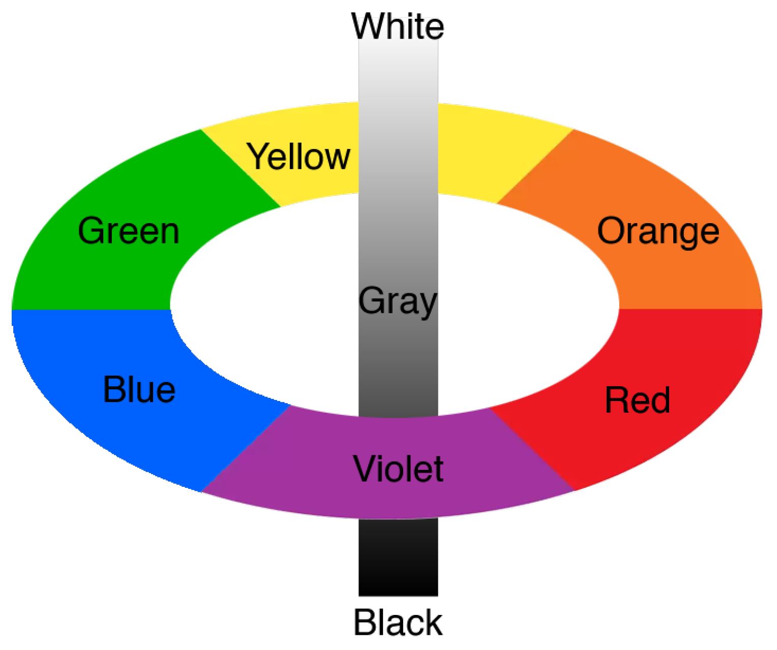
We have based our choice on the traditional color wheel, also known as Newton’s Disc, which has been the basis for a lot of later research and many systems and theories. In one variant, the color wheel can be divided into three parts, consisting of the primary colors red, yellow, and blue. Mixing these colors creates the secondary colors orange, green, and violet. Therefore, we based our experiment on nine colors: Red, yellow, blue, orange, green, violet, black, gray, and white (see
Figure 3). The selected colors are defined in standard color space for RGB display devices, with the following values: Red (255,0,0), yellow (255,255,0), blue (0,0,255), orange (255,125,0), green (0,255,0), violet (125,0,255), black (0,0,0), gray (145,145,145), and white (255,255,255).
Experimental method. Our approach was based on perceptual experiments. First, in Stage 1 (see
Figure 4), our intention was to identify color compositions that matched in the most noticeable way. We used forced-choice metrics in this experiment.
Therefore, we attempted to indicate color combinations that attract attention in a more friendly way. Choose the color composition that you think attract the people attention to the poster concerning the thing you lost. The question was verified through consultation with a psychologist. It is easier for the people to answer a question that is natural and does not require additional knowledge. Next, from the separate color ranking, determined for every background color, we computed one ranking for user preferences and one for user’s first impression (Stage 2). In Stage 3, we used the k-means clustering algorithm to identify the colors that dominated the visual space, independent of the background. Below, we explain the forced-choice procedure we used in Stage 1.
When ordering in the
forced-choice pairwise comparison procedure, the observers were shown a pair of images (with the same primary color—background, and different secondary colors—pictogram), and were asked to indicate the more eye-catching image. Observers were always forced to choose one image, even if they saw no difference between them (hence the name “forced-choice”). There was no time constraint within which the observer had to make their decision. This method is popular, but is highly tedious if a large number of images need to be compared. However, as reported in [
33], such a approach results in the smallest measurement variance and, thus, produces the most accurate results, in comparison with other metrics commonly used in perceptual experiments, such as single stimulus, double stimulus, or similarity judgement [
33].
Experimental procedure. The observers were asked to read written instructions before every experiment. Following the [
29] recommendations, the experiment started with a training session, in which observers familiarized themselves with the task, interface, and displayed images. To ensure that observers fully attended the experiment, three random trials were shown at the beginning of the main session, without recording the results. According to [
29], this is a standard procedure used in perceptual experiments. The trials displayed at the beginning were displayed again at the end of the experiment.
Two consecutive trials showing a different pair of pictograms with the same background were avoided, if possible. The experiment was performed with the use of an eye tracker; therefore, each experiment was preceded by eye tracker calibration, after which the user could start the experimental procedure. Although the task presented to users in the manual was to choose a color composition that attracted their attention in a more friendly way, we also recorded the unconscious reactions of the user (eye tracking signal). The reaction to the displayed color compositions was independent of the cognitive task execution. Based on the eye tracker signal, we were able to identify the color compositions that drew their attention at first impression. Therefore, throughout the experiment, the positions of the user’s pupils were identified and information about the associated fixations was collected. For the experiment, we used a Gazepoint GP3 HD 150 Hz eye tracker. To determine the fixations from the raw gaze signal, the GP3 built-in filtration procedure was used.
Characteristics of the stimulus and experiment conditions. In order to find the most eye-catching and user-friendly color pairs, 72 images were prepared as follows: for each of the analyzed colors (black, gray, green, blue, violet, red, orange, yellow, and white), one color was fixed as primary (and set as a background), while the second color for each generated pictogram was chosen from the set of remaining colors and called the secondary color (set as a pictogram).
Example images with a gray primary color are depicted in
Figure 5. The images had an oblong shape in 1:2 proportions, which allowed for better fitting them to the display resolution. They took up 40% of the full screen surface. The object shapes were picked such that they did not distract the user. Hence, we chose a regular square shape and the widely known e-mail icon. However, colors, not shapes, were our primary focus. The choice of colors for the experiment is presented in the
Figure 6.
The experiment was conducted in 41 naive observers who were confirmed to have standard or corrected-to-standard vision. The age of the observers ranged from 25 to 60. For additional reliability, each observer repeated each experiment three times, but no two repetitions took place on the same day, in order to reduce the learning effect. According to [
33], collecting 30–60 repetitions per condition is sufficient; where condition denotes two matched colors, represented by pictogram and background, in our context.
The images were shown on a 50% gray background, which has been recommended by International Color Consortium (
www.color.org, accessed on 15 October 2021) as a background for comparing colors. The same background was used for the intervals between displayed pairs of images. The mouse cursor was reset to a neutral position after each trial. The experiment was conducted on an EIZO ColorEdge CG220 22.2 inch display, calibrated using X-Rite i1 Publish Pro 2. For optimal eye tracking, the distance from the participant’s eyes to the eye tracker was set at 60 cm, as recommended by Tobii [
34]. In the room, constant and uniform lighting conditions were ensured through the use of lamps with color temperature 5000 K (D50 standard). According to the International Color Consortium, the color observation angle was 2
. Additionally, surrounding light in the room was regularly controlled using a Sekonic L-478DR light meter. For comparison, only images with the same primary color were displayed (see
Figure 5). This enabled reliable comparisons by users, as introducing more than three colors (one primary and two secondary) would make the experiment difficult to conduct, or may even lead to inconsistent results.
Eye tracking metrics. The primary requirement of eye movement analysis, in the context of gaze-contingent system design, is the identification of fixations. Fixations naturally correspond to the desire to maintain one’s gaze on an object of interest [
35]. Henderson and Hollingworth (1998) [
36] have reviewed past results, and indicated that the positions of fixations within a scene are non-random, with fixations clustering on informative scene regions. Fixations were considered the most suitable feature recorded by the eye tracker for our analysis. The main issue in the analysis of divided attention is to identify the areas where the user’s eyes essentially stop scanning about the scene, holding the central foveal vision on the places that attract the user’s attention most.
In this research, our focus was to obtain an indication of the color composition that first attracts the attention of users. As the very first impression can be recognized by the first fixation, we used this in further analysis. The metrics were measured just after the pair of images was displayed and assigned to the color composition that first attracted the user’s attention. To properly conduct eye tracking analysis, we defined two areas of interest that cover the displayed stimuli—AOI1 (the stimulus on the left) and AOI2 (the stimulus on the right)—with which the metric “first fixation” was computed.
In order to avoid situations where the fixation of eyesight was a remnant from the previously displayed slide, and to make the color choice independent of the previous slide, an empty screen with 50% gray was displayed between consecutive slides. This ensured that all the measurements from the image were independent of the previous impression. The schema of the experiment is depicted in
Figure 6. On average, 75% of the trials per user met the criterion of the first fixation appearing after displaying the image, which corresponded to the natural situation of attracting the user’s sight to the displayed stimulus. Such situations appeared despite the mouse cursor displaying at the center of the screen to reset the user’s sight to a neutral position after each trial. The fixations that started in AOIs before the pictograms were displaying could be the result of after-images, which might interact with the next trial. Therefore, these data were ignored from the analysis, in order to not distort the correct data.
It is worth emphasizing that the task given to users was to evaluate which color composition attracted their attention in a more friendly and readable way (See: Experimental method). The unconscious attraction of the eye to the stimulus, as the very first reaction, was often independent of the final result of the user’s conscious choice, which was indicative of the actual strength of the stimulus that was attracting the user’s attention.
An example situation of an eyesight path, where the first fixation indicates the color composition and where the user made their preference, is presented in
Figure 7. As depicted in
Figure 7B, the color composition that caught the user’s eye first was not necessarily the one which they made a conscious choice of declaring to be color composition which is visible and friendly at the same time. In the example picture, the user’s eyesight was drawn to the white pictogram color but, ultimately, their preference was related to the black pictogram color. In
Figure 7D, the situation where the user could not make a decision and analyzed the displayed images for a long time is shown, where they finally made the same choice as their eyesight was originally drawn to (e.g., the violet pictogram color).
3.1. Confidence Intervals and Significance
Most studies are expected to report, in addition to the mean scores, the 95% confidence interval for the mean (i.e., the range of samplings from the population that would lead to a confidence interval that includes the population mean). Despite the fact that a
p-value
is typically used as the significance level, according to Fisher [
37], there is no authoritative reference for using
as the significance level.
According to [
38,
39], research results should be considered in connection to their domain. Statistical significance does not mean practical significance. Only by considering the context can one determine whether a difference is practically significant (i.e., whether it requires action). Such an individual approach to research results often occurs in marketing, user experience, and service design [
40]. This means that the error value during medical data analysis has a completely different influence on system behaviour, in comparison to that in the assessment of tendencies in visual messages. In the latter case, all tendencies and suggestions increasing the readability and accessibility of the multimedia message are important. Therefore, values of
are perfectly acceptable in this case and, so, we considered
to denote statistical significance in our analysis.
3.2. Effect Size
To visualize the effect size, we used the graph proposed in [
33]. This method is very useful, as it not only indicates whether the sustained or divided attention for different pictogram colors (independent of background colors) are statistically significant, but also whether they are significant from a practical point of view. The results are depicted in
Section 4.2. The percentage numbers shown on the relation lines are the key feature of the graphs. They represent the estimate of the probability that the setup on the right is more visible than the setup on the left. When two setups are visible in the same manner, this probability is 50%; if one setting is always indicated as visible, the probability is 100%. If the mean visibility for both setups are
and
, and they have a common variance
and equal sample sizes, such probability is depicted by Equation (
1).
The p value is computed from the normal cumulative distribution function, assuming that the variance of the visibility difference is .
The considered probability is very useful, as it estimates in which percentage of cases an average observer will prefer one setting over another. For example in
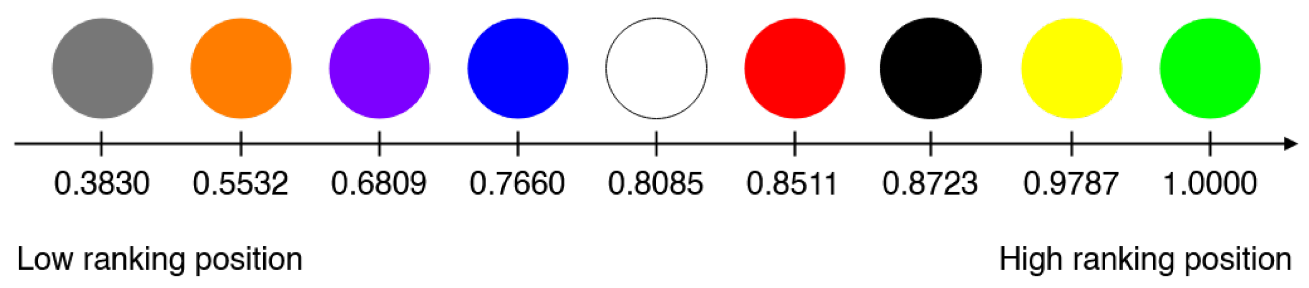
Section 4.2 (Sustained attention), the white color group was statistically different and better than the yellow/black groups, but users preferred it only about 63% of the time. On the other hand, between yellow/black and blue/green/red groups, we found no significant difference, but the yellow/black group was 73% times more preferred.
5. Discussion
The main task carried out in the paper was an attempt to determine colors that elicit the user reactions expected by the designer. This research pertained to two types of attention, which occur the most often when a user is in contact with visual messages and user interfaces: Sustained attention and divided attention. The conducted research allowed us to identify the dominant colors, which drew and held the attention of users.
Let us look closer at the research results on sustained attention. White was rated as the friendliest and most readable, in reference to the background. It can be assumed that, regardless of the surroundings in which it is present, its aesthetic and readability are sufficient, and it does not cause sight fatigue in users. Moreover, this color is visible to every person (with minor differences in brightness). The white color has the highest brightness coefficient and, therefore, it will cause an illusion of being bigger on top of other colors. In the psychological context, white is equated to purity and information message simplicity. When looking at the other end of the ranking, the most background-dependent colors were gray, orange, and violet. The perception of these colors changed, depending on the background, and they were generally perceived as unaesthetic and unfriendly for the user. Visual messages colored gray, orange, or violet were also perceived as unreadable.
An example of a practical application of our research results on sustained attention is presented in
Figure 14. In the example of typical website visualization, two colors are juxtaposed, where white is the background-independent color and gray is background-dependent color. The remaining examined colors (e.g., Group 3 in
Figure 10) require an individual approach and examination of each project in the context of its surroundings. We recommend the application of white for icons, graphical elements, and text wherever it has no influence on the project surroundings, when the background is colorful (i.e., photography), or when the graphic design contains more than 3–4 uniform colors. This research can be used by designers in website projects, user interfaces (e.g., for applications or systems), advertisements, informational messages, call-to-action buttons, and announcements.
Now, let us look closer at the research results on divided attention. Green and yellow colors triggered the fastest user responses and were noticed rapidly. They stand out by being very quickly noticed as atypical and distinguished elements, regardless to their background color and surroundings. Their brightness may be the factor that causes this phenomenon, producing an impression of being dazzled and agitated. The effect is very intense and occurs for each examined background. Green and yellow colors were found to be in the same group, thus making them equivalent in this aspect. When looking at the other end of the ranking, the most background-dependent color was gray. User reactions to gray was unstable and highly dependent on the background color. In most cases, it was unnoticeable to the user, even when the background was intensive.
An example of a practical application of the research results on divided attention is presented in
Figure 15, with the example of a typical car dashboard, background-independent colors (green and yellow), and the background-dependent color (gray) are juxtaposed. A visualization is shown for icons and numbers (A: green icons, gray numbers, B: yellow numbers, gray icons). Green and yellow colors highly attract and focus the user’s attention, regardless of their background, while gray is poorly visible and noticeable only after user’s gaze is enforced. We recommend the application of green and/or yellow colors wherever a user’s attention needs to be drawn quickly (e.g., error messages, warnings, and critical alerts). It should be emphasized that green and yellow are supposed to be noticeable, but not friendly and readable. They should not be used for conveying longer messages, such as informational text; however, can be used by the designer in graphical user interface design for warning elements, such as medical and car interfaces, warning systems, and danger messages (e.g., in bank systems or public transport).
Our results were consistent with the research described in [
1], especially regarding the part related to user preferences. In the case of attracting the attention of users, in [
1], the experiment was also based on user preferences, where the user’s task was to indicate the color that most attracted their attention. The methodology of their research, in comparison to our approach, was completely different. When examining the conscious behavior of the user, we cannot be sure of their unconscious reactions. Therefore, the foundations of the study described in [
1] are disputable, in the context of identification of the color which, regardless of our consciousness, is supposed to attract attention. Another approach that raises doubts is the task of choosing a preferred color composition based on an entire table of different color combinations presented simultaneously. According to [
33], the pairwise comparison methodology used in this article is a very effective tool for collecting reliable data. In addition, importantly, the forced choice method (a type of pairwise comparison approach) is a much easier task for the user than being presented with all the data at once, which affects their fatigue and, thus, the reliability of the results obtained.


