Article

H&E Multi-Laboratory Staining Variance Exploration with Machine Learning

1
Faculty of Information Technology, University of Jyväskylä, 40014 Jyväskylän, Finland
2
Faculty of Medicine and Health Technology, Tampere University, 33014 Tampere, Finland
3
Cancer Research Unit, Institute of Biomedicine, University of Turku, 20014 Turku, Finland
4
FICAN West Cancer Centre, Turku University Hospital, 20521 Turku, Finland
5
Department of Education and Research, Hospital Nova of Central Finland, 40620 Jyväskylä, Finland
6
Department of Biological and Environmental Science, University of Jyväskylä, 40014 Jyväskylän, Finland
7
Department of Pathology, Hospital Nova of Central Finland, 40620 Jyväskylä, Finland
*
Author to whom correspondence should be addressed.
Appl. Sci. 2022, 12(15), 7511; https://doi.org/10.3390/app12157511
Submission received: 27 June 2022 / Revised: 21 July 2022 / Accepted: 21 July 2022 / Published: 26 July 2022
(This article belongs to the Special Issue Applications of Artificial Intelligence in Medical Imaging)

Abstract

:
In diagnostic histopathology, hematoxylin and eosin (H&E) staining is a critical process that highlights salient histological features. Staining results vary between laboratories regardless of the histopathological task, although the method does not change. This variance can impair the accuracy of algorithms and histopathologists’ time-to-insight. Investigating this variance can help calibrate stain normalization tasks to reverse this negative potential. With machine learning, this study evaluated the staining variance between different laboratories on three tissue types. We received H&E-stained slides from 66 different laboratories. Each slide contained kidney, skin, and colon tissue samples stained by the method routinely used in each laboratory. The samples were digitized and summarized as red, green, and blue channel histograms. Dimensions were reduced using principal component analysis. The data projected by principal components were inserted into the k-means clustering algorithm and the k-nearest neighbors classifier with the laboratories as the target. The k-means silhouette index indicated that K = 2 clusters had the best separability in all tissue types. The supervised classification result showed laboratory effects and tissue-type bias. Both supervised and unsupervised approaches suggested that tissue type also affected inter-laboratory variance. We suggest tissue type to also be considered upon choosing the staining and color-normalization approach.

1. Introduction

Contemporary digital workflows have overtaken histopathology’s traditional diagnostic and analysis protocols [
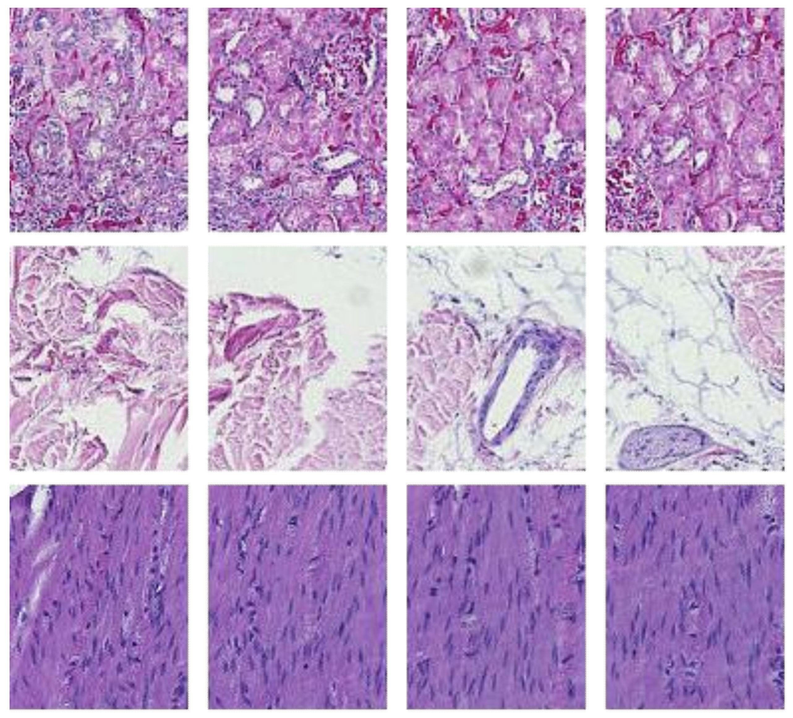
1]. It is standard for pathologists to use digitalized images within virtual microscope software. Such software visualizes images obtained from a scanning microscope. Typically, an image consists of an entire glass slide of tissue stained to highlight relevant biological features. A microscope illuminates a given slide and allows the digitization of the sample. Any given staining approach has affiliated interactions with specific biological components in the slide [2]. If a histological slide is not stained, it remains transparent and will be masked by the illuminance source of the microscope penetrating through the tissue. In a standard, red, green, and blue (RGB) channel format, the stain will absorb a distinct amount of light in each channel [2]. The resulting images will thus vary due to laboratory changes in stain manufacturer, general storing conditions, microscope/slide scanner configuration, and dye-application methods [1,2,3,4].
In diagnostic applications, hematoxylin and eosin (H&E) is the default staining method for revealing salient histologic features [5]. Hematoxylin stains histologic cell nuclei to a purple-blue hue, while eosin stains cytoplasm and extracellular matrixes to a pink-red hue. Like other staining methods, the results of an H&E stain may vary between different laboratories or even within the same laboratory [2]. Such variance negatively impacts the time-to-insight for histopathologists and can even affect the accuracy of computer-aided diagnostic software (CAD) [4,6,7,8]. It is therefore imperative to effectively normalize the staining variance between histological slides.
Various methods have been developed for stain normalization [2,9,10,11,12,13,14]. Often, methods require a target image to imitate by artificially altering an input image [15,16]. Essentially, the staining variance of one laboratory is used to alter out-of-laboratory stain samples. Studies such as [17] highlight the efficacy of structure-preserving normalization [18] with a target. In work [19], it was noted that the Food and Drugs Administration recommended adopting target-based normalization. Overall, the variance between laboratories can be essential in organizing available targets for more effective normalization. As noted in [19], there is no ‘gold standard’ when it comes to color-management issues.
Regarding classification effects, prior investigations show that color normalization within samples of the same laboratory did not positively affect classification accuracy [20]. In addition, the same study showed inconsistent positive effects across all its datasets. Another study [21] showed that color pre-processing reduced accuracy in cancer classification, especially when coupled with color related features. In that regard, another work showed similar effects for kidney tissue classification [22]. In [8], the authors showed that color transformations were more effective than color normalization in four different applications. In contrast positive accuracy effects of color normalization were previously shown for diagnostic tasks such as colorectal cancer classification [6]. All these results strongly highlighted a potential task-related positive or negative impact of color normalization approaches.
We saw that stain normalization approaches have been investigated in various ways. To date, the underlying structure of inter-laboratory stain variance as a normalization target remains unclear. How can it be systematically exploited for task specific positive normalization effects? When considering this variance, we first consider the following questions. How many laboratories have distinct staining results? Are staining effects consistent between tissue types? Beginning to answer these questions can help digital pathologists and the research community fine-tune their assumptions about target and normalization choices, ultimately in an effort to improve time-to-insight and classification accuracy in CAD applications.
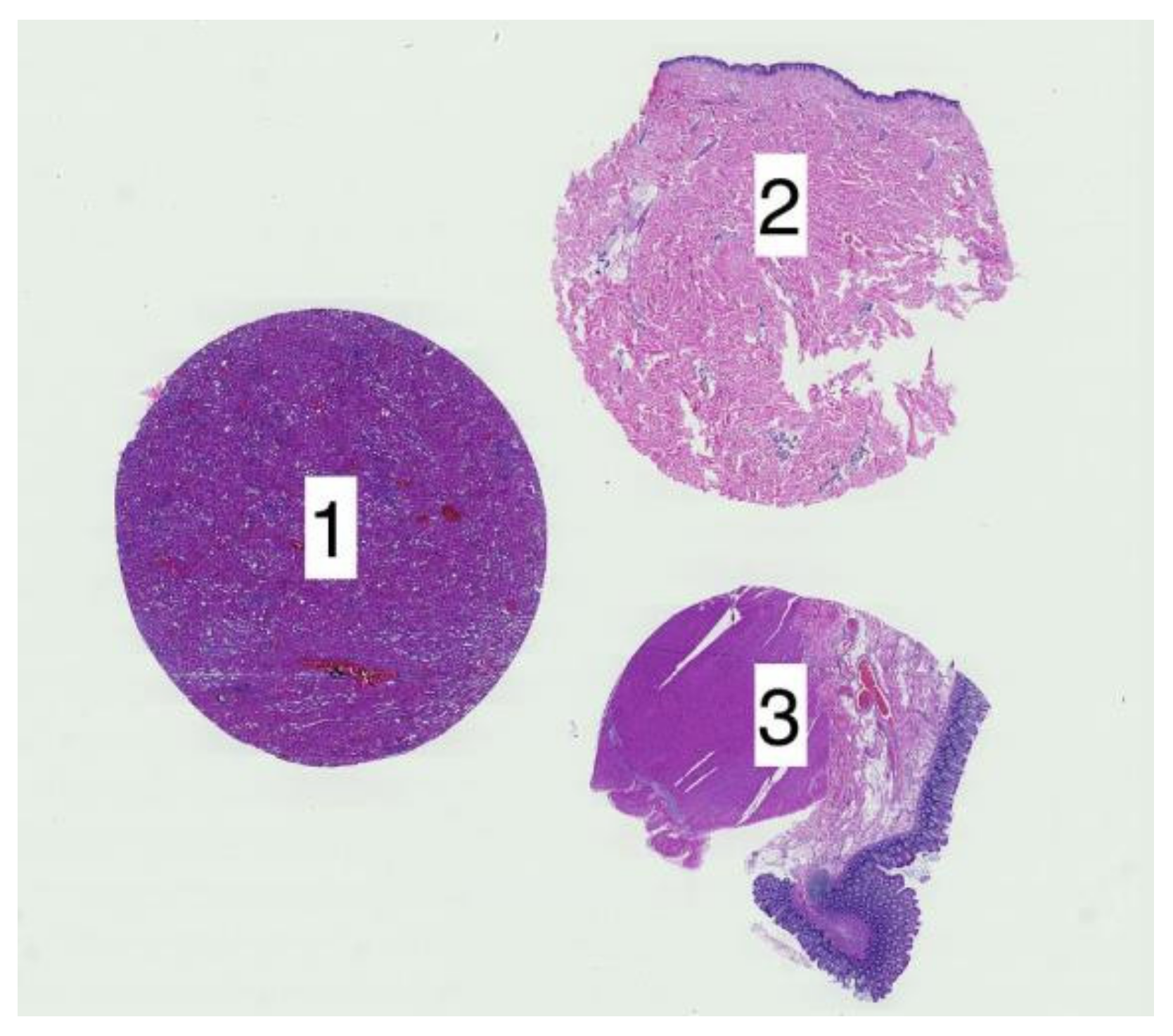
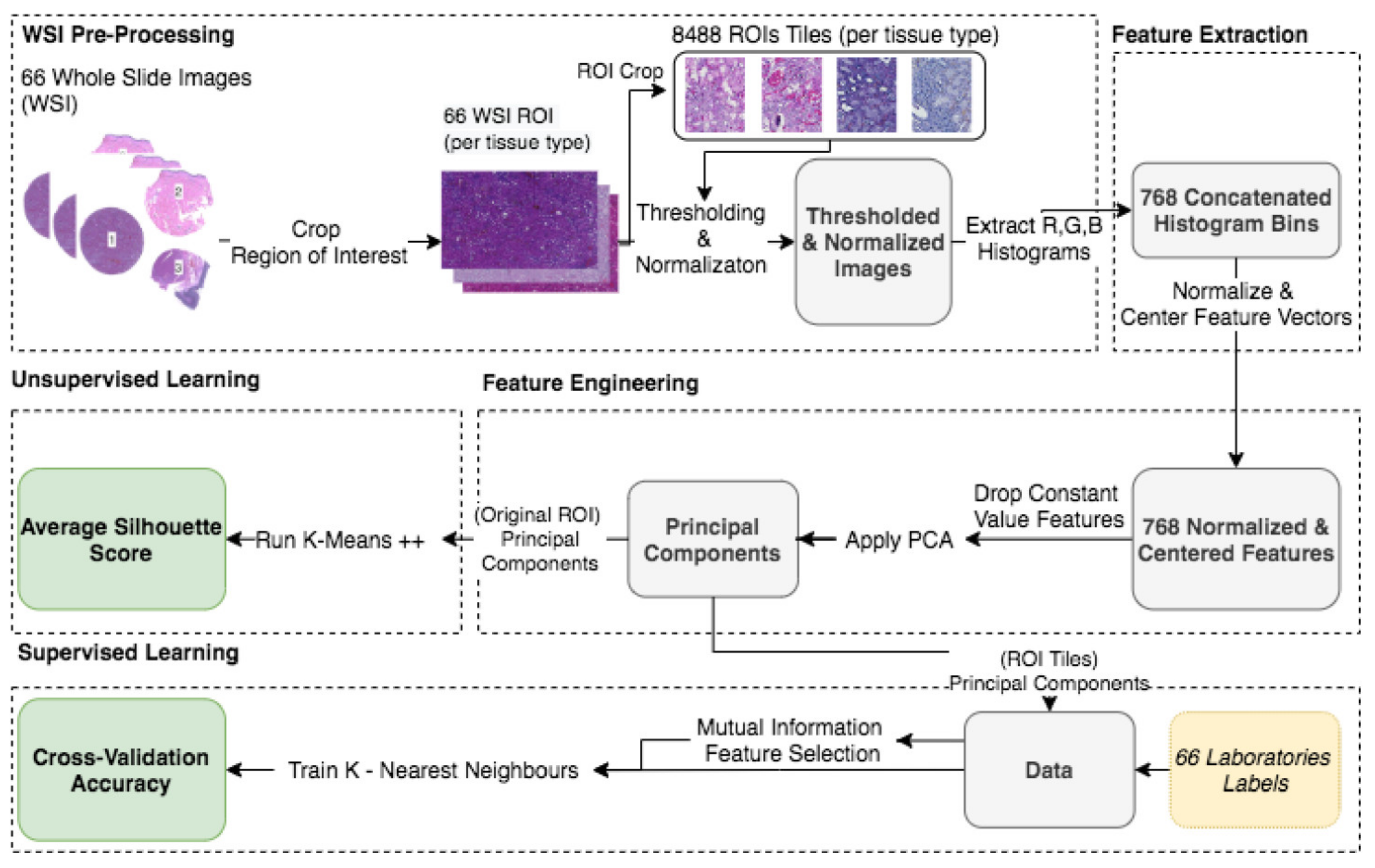
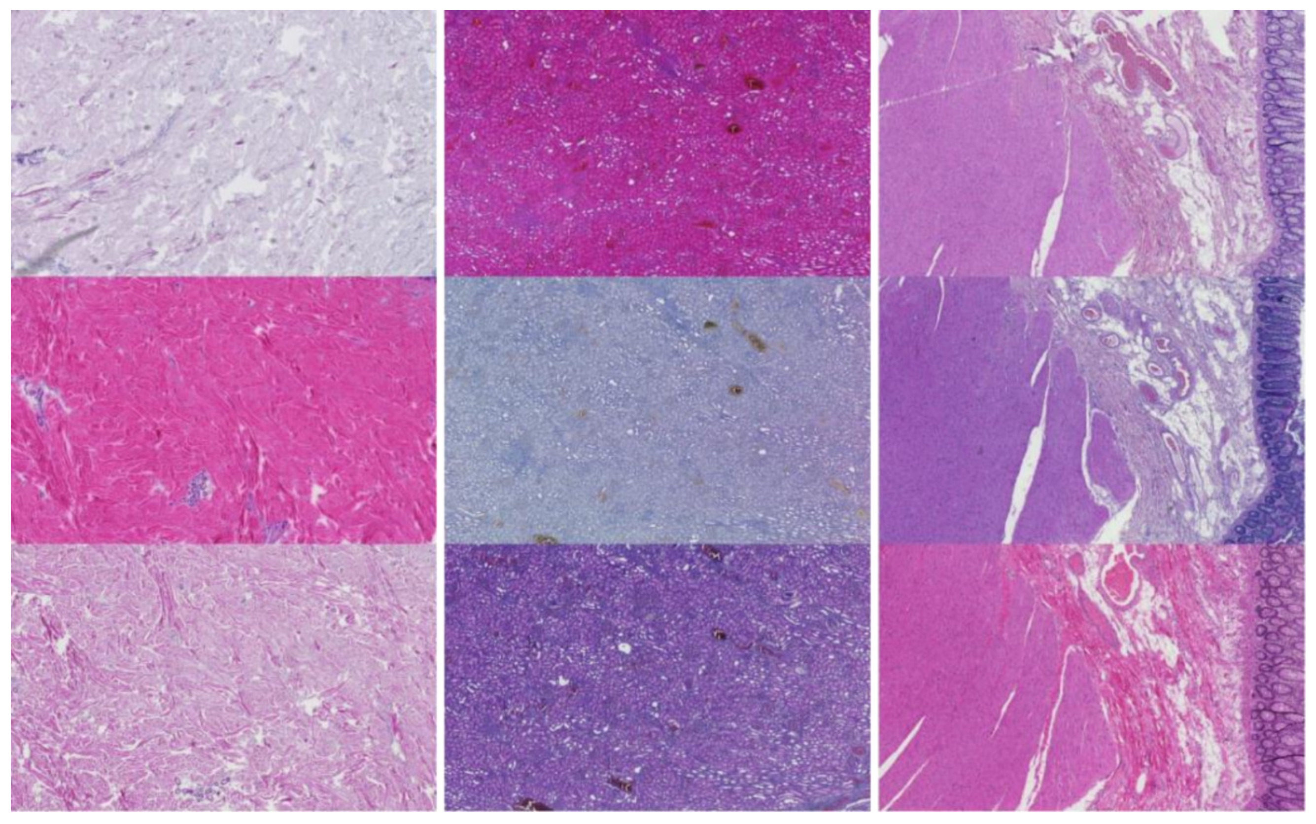
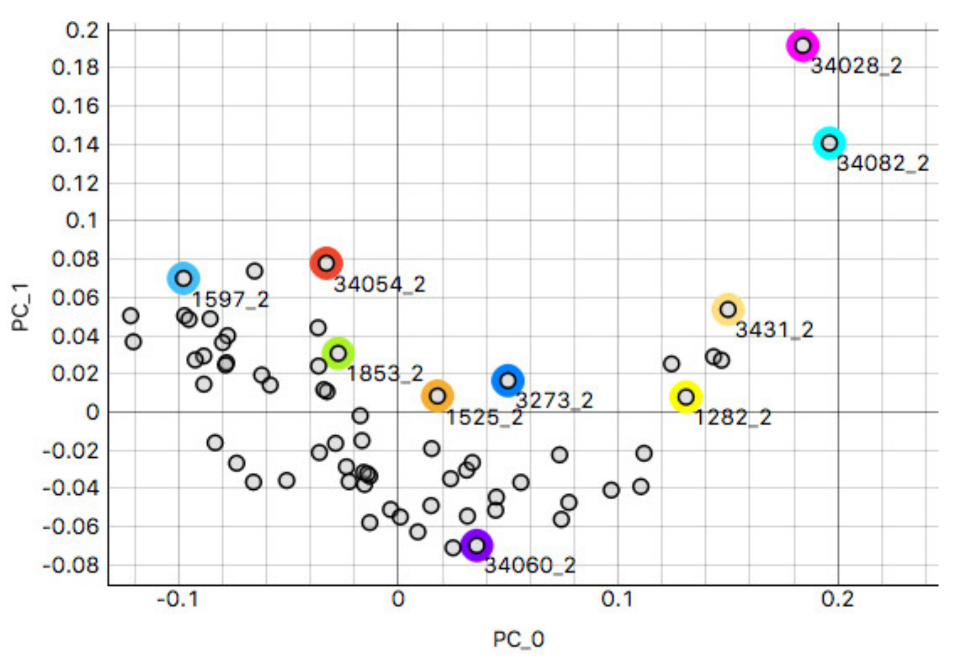
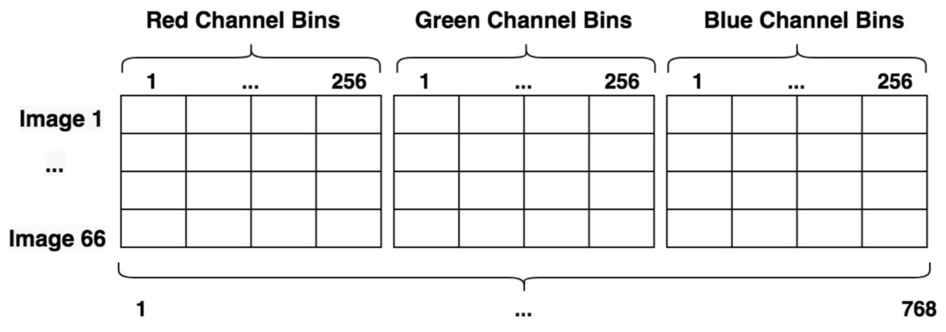
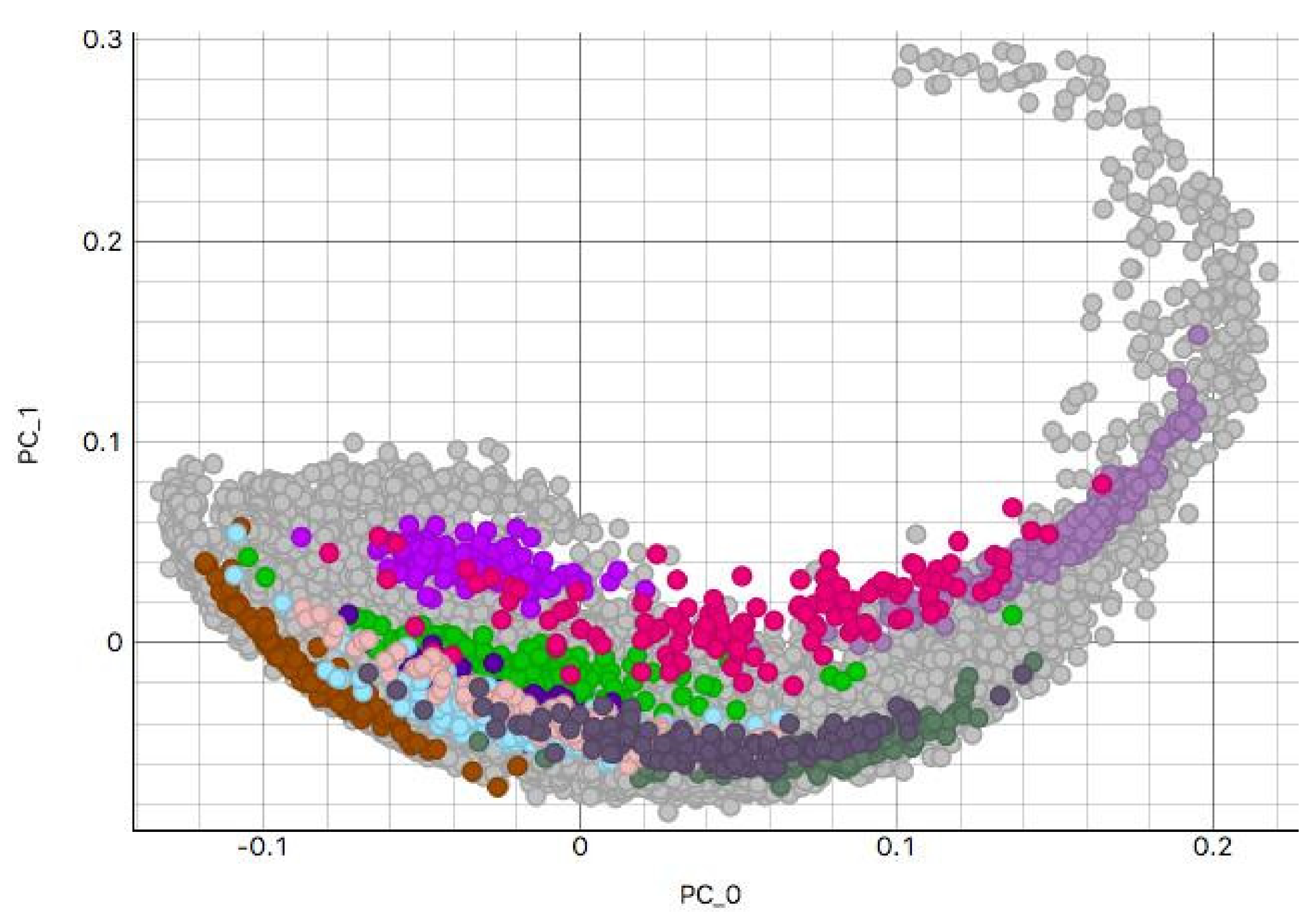
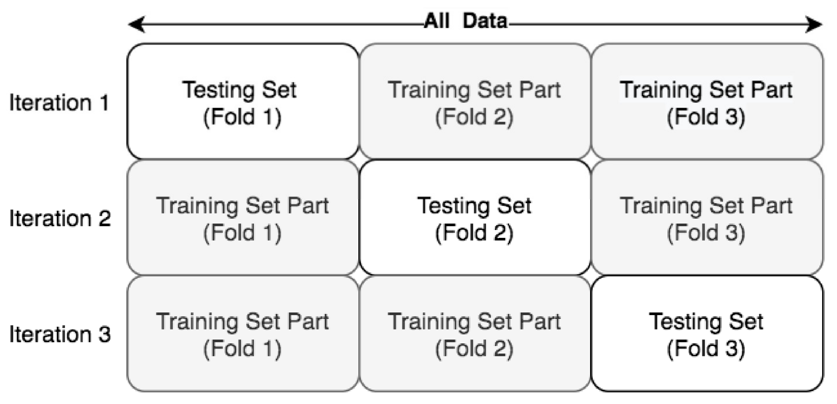
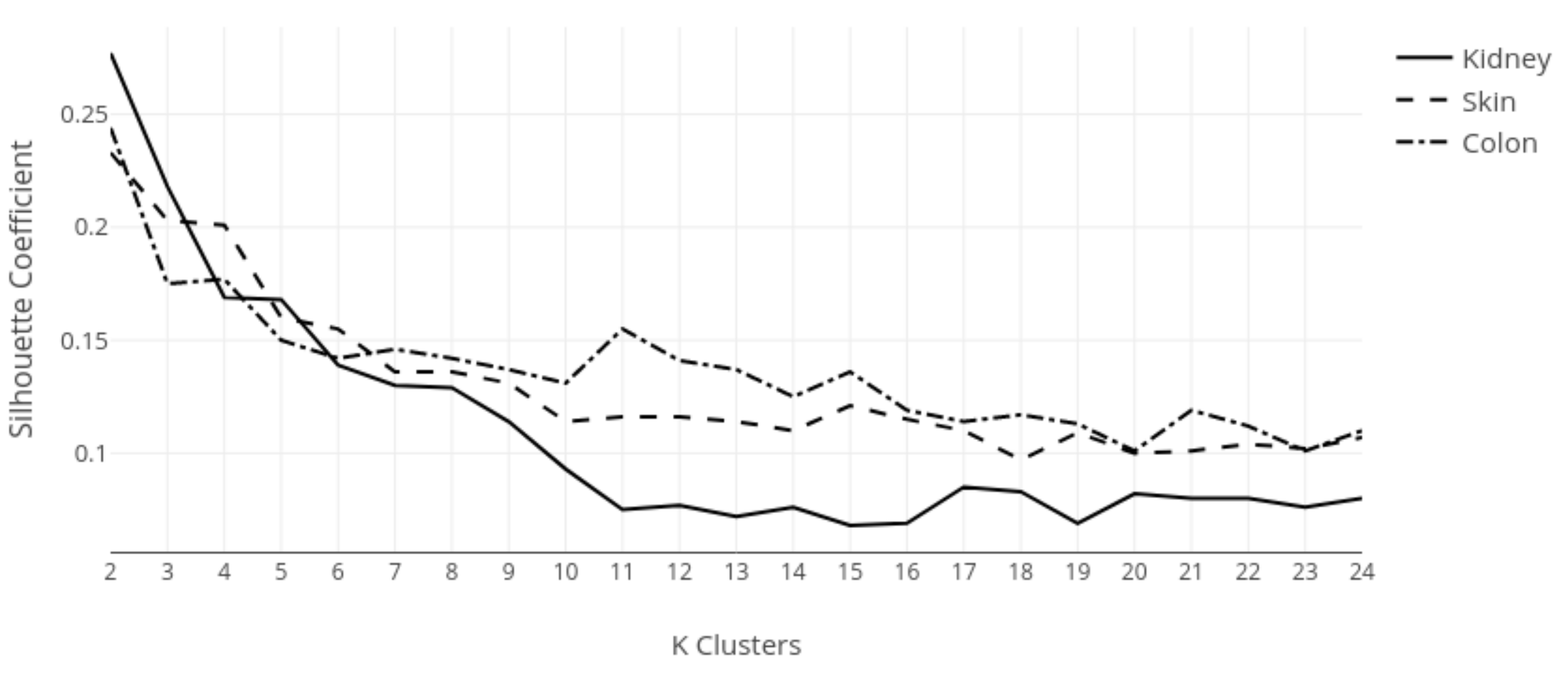
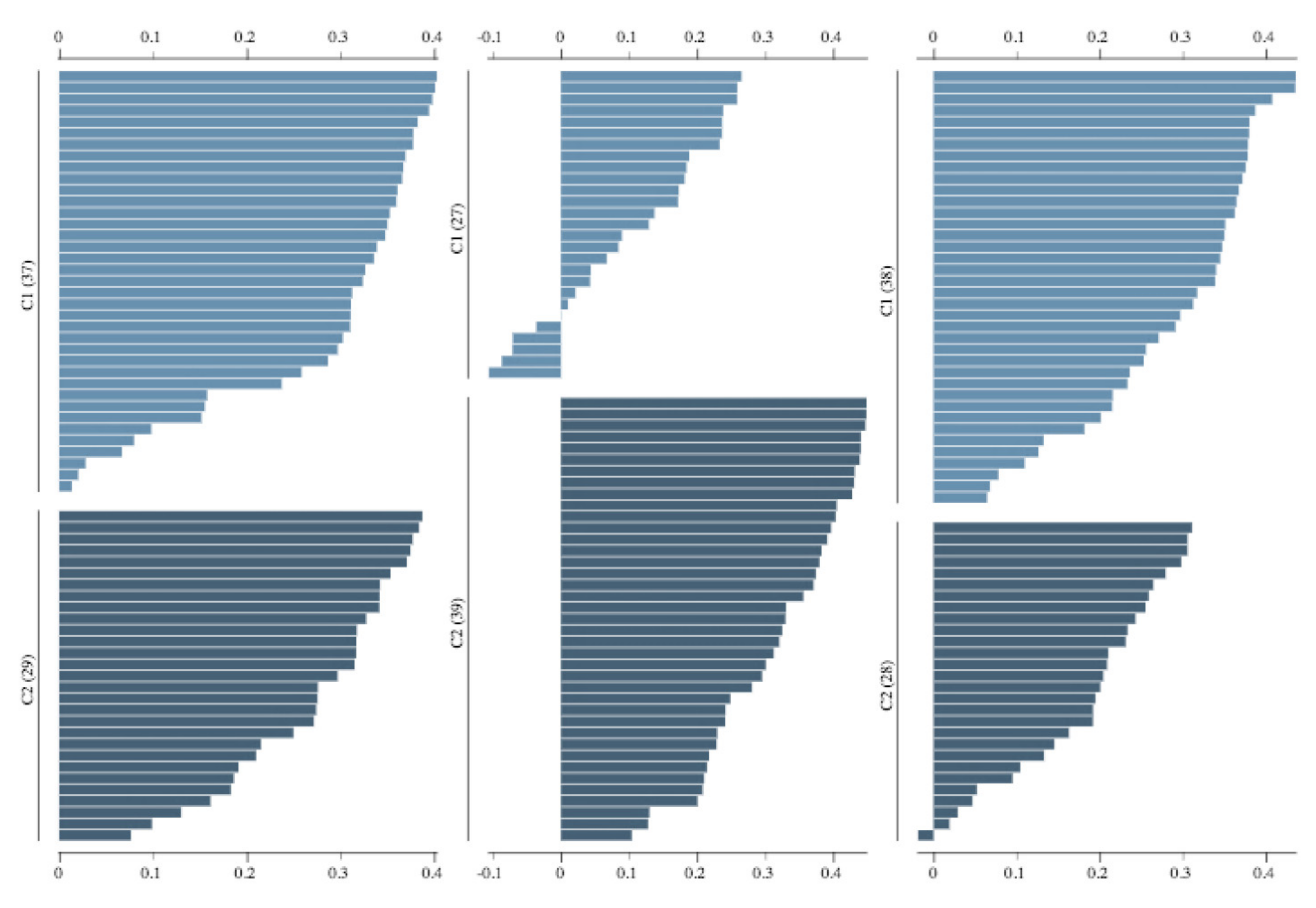
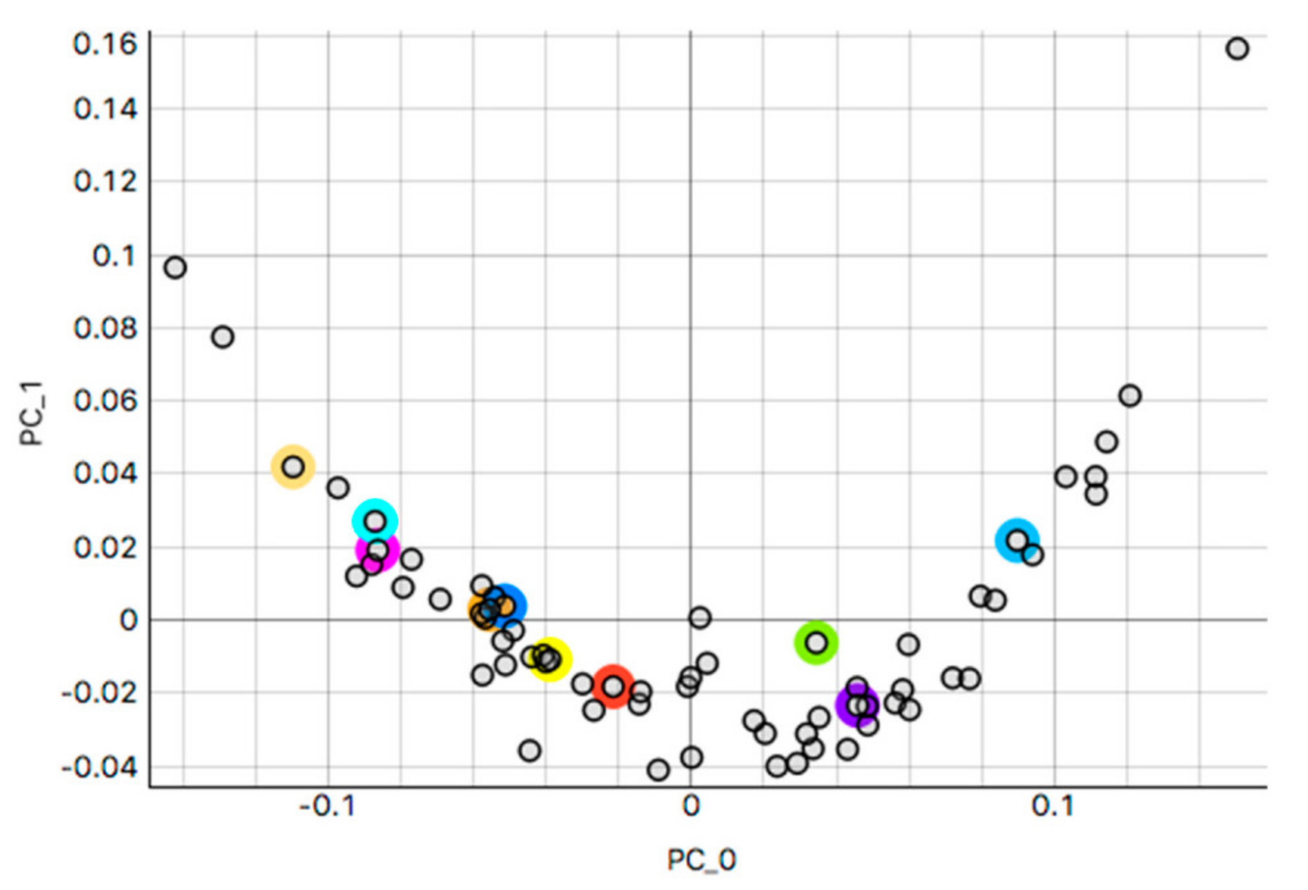
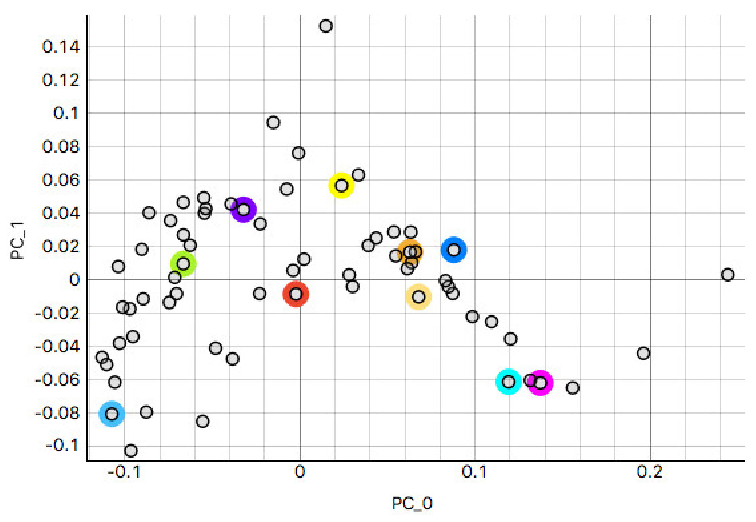
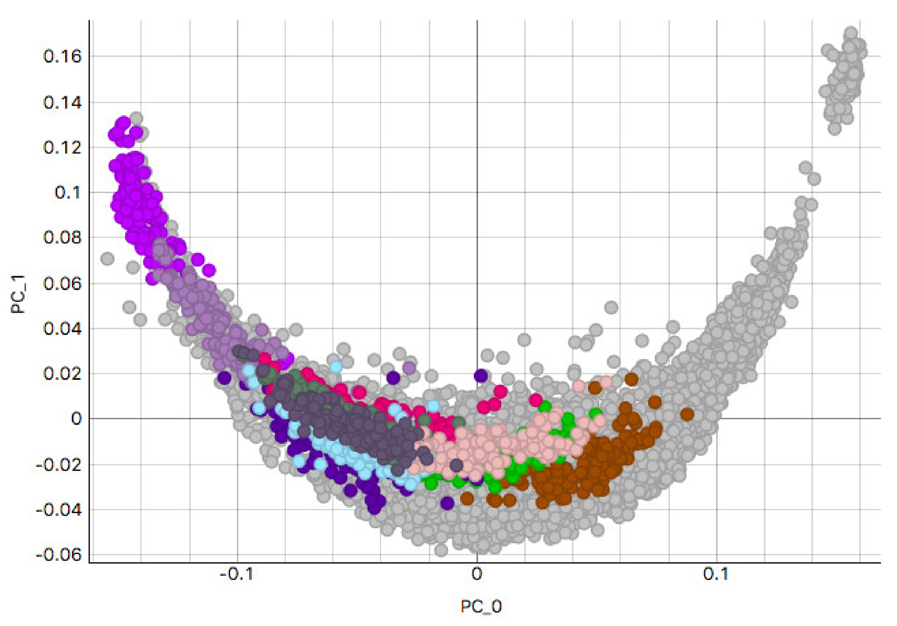
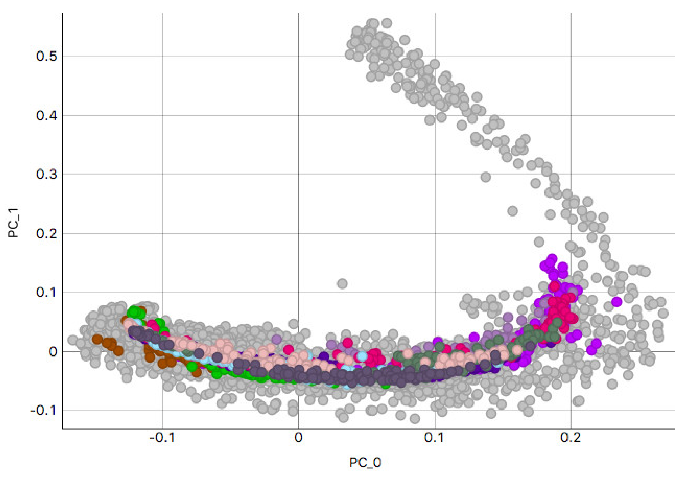
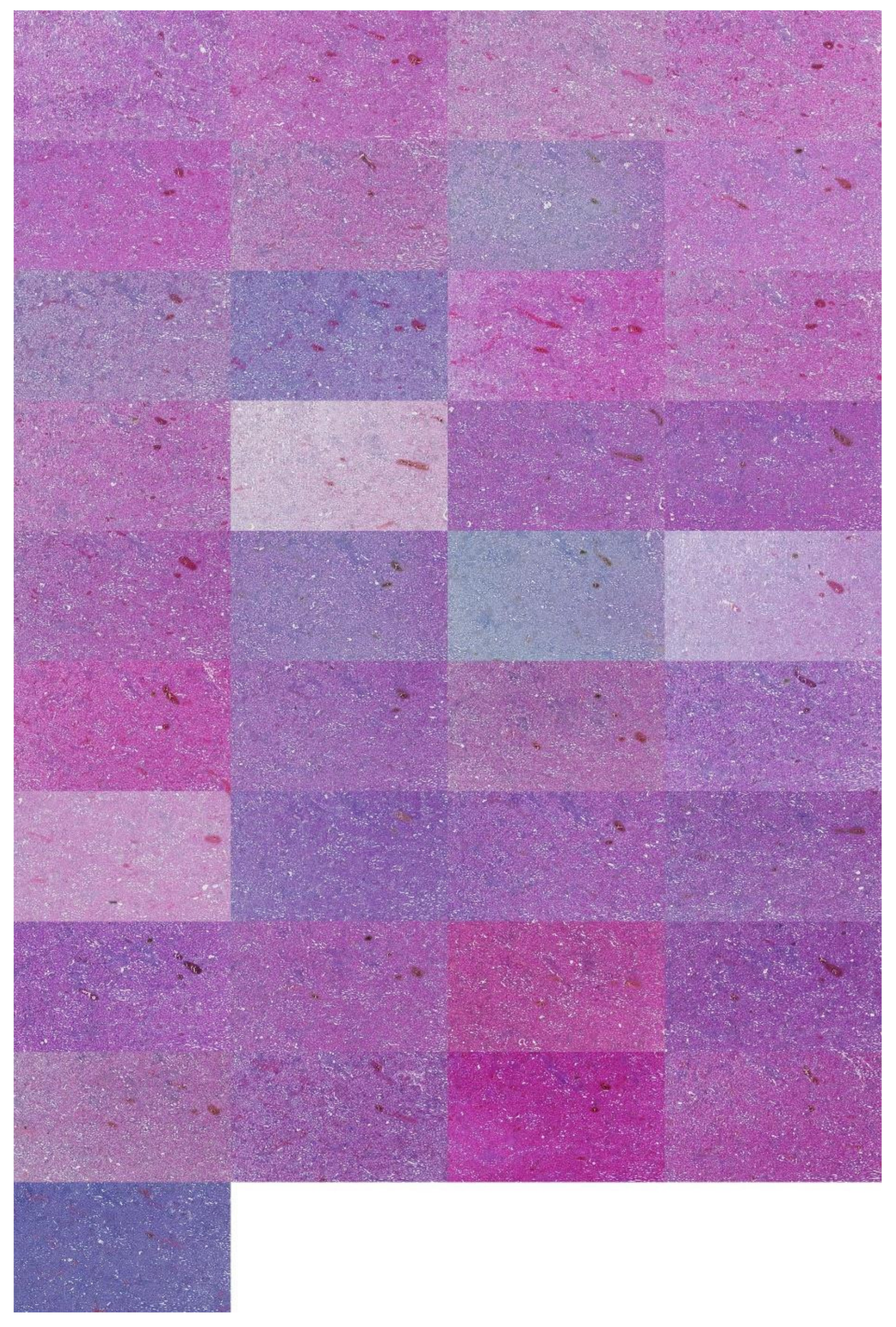
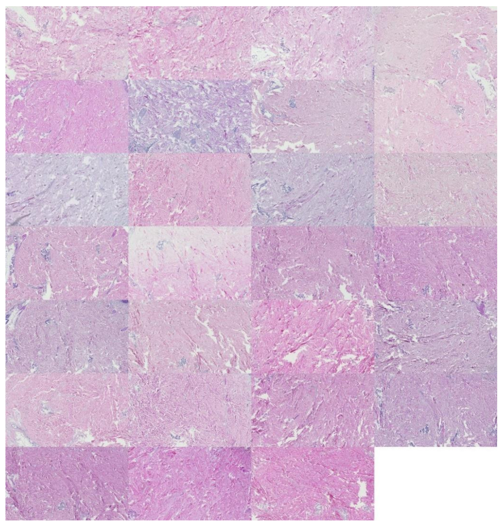
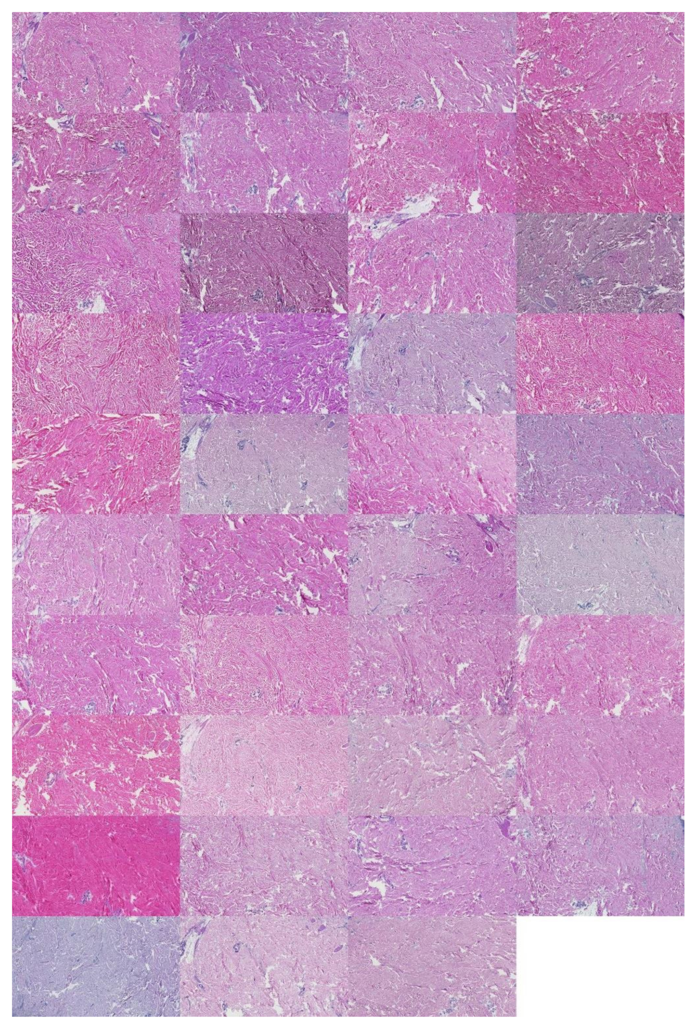
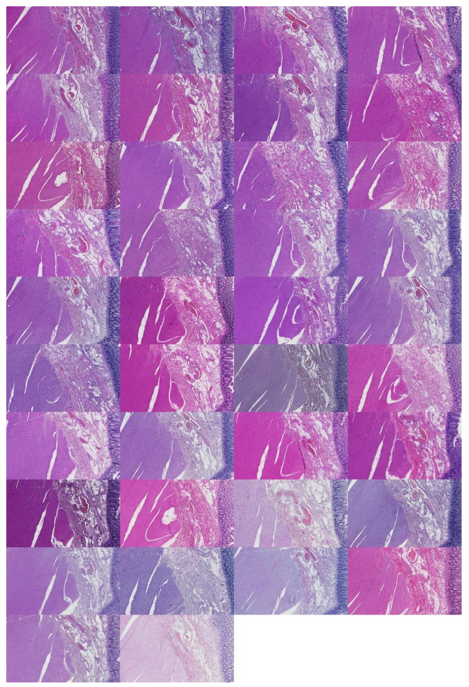
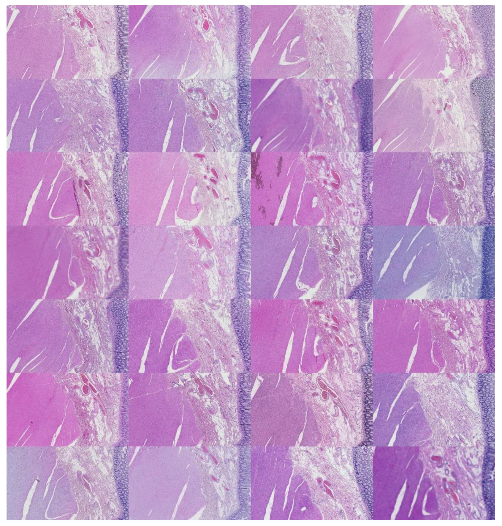
This study analyzed H&E staining results from skin, kidney, and liver tissues between 66 laboratories from 11 countries. The slides were distributed to the central Finland biobank via the Lab quality (Helsinki) company. After standard preprocessing, we used a principal-component-analysis-based RGB image representation; this image representation solely focused on color-related components and minimized the interference of morphological changes between the images. We used unsupervised machine learning to discover clusters of laboratory staining outcomes. The k-means algorithm was set to investigate groupings of stains up to 24 clusters. We furthered our investigation with supervised learning, designating laboratories as the ground truth. In the unsupervised approach, we used the rand index metric to compare cluster assignments between laboratories and tissue types. In the supervised approach we compared classification accuracy between tissue types. These approaches allowed us to infer a rough estimate of distinct outcomes from the set of laboratories and whether tissue type also affected the results.

2. Materials and Methods

2.1. Data Characterization

In the data collection phase, we obtained H&E-stained slides used in an external quality assessment (EQA) round organized by Labquality (Helsinki, Finland), a company providing external quality assessment schemes for clinical laboratories. The slides had a tissue microarray section consisting of three 6 mm punch biopsies. The punches were taken from normal human kidney, skin, and colon samples. The samples were anonymous formalin-fixed and paraffin-embedded routine histologic samples from a reference pathology laboratory. The EQA round was organized such that unstained 3 µm sections were sent to laboratories participating in the EQA scheme. The laboratories were asked to stain the slides by the H&E method they use in their daily practice. Altogether 66 laboratories from 11 countries returned the slides for the assessment. After that, the slides were digitalized with a NanoZoomer-XR (Hamamatsu Photonics) slide scanner with a 20× objective (scanning resolution 0.46 μm/pix); Figure 1 shows a random example of a stained slide.
The raw whole slide image (WSI) size was 44,214 by 44,214 pixels; the analysis was coordinated between the Central Finland Biobank, Nova Central Finland Hospital, and the Digital Health Intelligence Laboratory and Spectral Imaging Laboratory of the University of Jyväskylä, Finland. As part of the experiential pipeline, the WSIs were further processed as detailed in the proceeding sections.

2.2. Experiment Design

After data collection, our approach for obtaining the results of this study consisted of five stages: image preprocessing, feature extraction, feature engineering, data clustering, and supervised classification. Figure 2 summarizes these stages; we further elaborate on the exact steps undertaken for each stage.

2.3. Preprocessing, Feature Extraction, and Engineering (Unsupervised Learning)

2.3.1. Cropping Regions of Interest

The preprocessing stage began with 66 WSI scans; we digitally cropped one region of interest (ROI) of size 1440 × 904 pixels for each tissue type in each slide. This resulted in three sets of images of 66 ROIs each, one set for the kidney, one for the skin, and one for the colon tissue. Cropping was used to minimize the presence of the non-tissue-related background, such as dust, hair, fibers, and other artifacts from previous preprocessing steps. The selected region coordinates were approximately the same within each tissue type. Each ROI was localized to cover an approximately sufficient area in each tissue type. Figure 3 shows samples of such ROIs for each tissue type amongst nine randomly chosen laboratories (three laboratories per tissue type).
We extracted color histograms for each masked ROI’s red, green, and blue channels (RGB). An image is simply represented as a mixture of pixel values between the red, green, and blue channels in RGB space. This approach allowed us to summarize the color space information and discard morphological information that could interfere with the reliability of the clustering process. In addition, Figure 4 shows the distribution of laboratory samples for kidney along the first two principal components from the feature extraction. The remaining tissue group scatterplots are shown in Appendix A, Figure A1 and Figure A2. The remaining tissue type plots have the same laboratories highlighted by the same colors.

2.3.2. Background Thresholding

This approach aimed to discard non-tissue-related pixels. We masked non-tissue areas from the images by employing the Otsu thresholding method [23,24] and inverting the resulting mask. Otsu’s method aims to find an automatic thresholding value t that best separates a grayscale image’s foreground and background content. The separation is measured to maximize the weighted variance between background and foreground classes resulting from a given threshold value. The resulting mask can then be applied identically to each red, green, and blue (R, G, B) channel. Formally [16,17], an exhaustive search is performed to obtain the minimum weighted sum of variance of the foreground and background classes:
  σ w 2 t = w 0 t σ 0 2 t + w 1 t σ 1 2 t
where t is the intensity threshold value, σ 0 2 is the variance of the background class, σ 1 2 is the variance of the foreground class, and w 0 t and w 1 t are probabilities of separating the background and foreground given the threshold t value. Each class probability at a given threshold t is given by Equations (2) and (3), where L is the total count of bins in the grayscale histogram and p i is the probability, or quantity of grayscale pixels at intensity level i .
w 0 t = i = 0 t 1 p i
w 1 t = i = t L 1 p i

2.3.3. Image Intensity Normalization

This step aimed to achieve a consistent dynamic range between Otsu masked data samples. It is necessary since the scanning microscope will auto-adjust the intensity for each tissue sample creating a slight variation in the sample versus the background. We then scaled each R, G, and B channel for each masked image by the average pixel intensity found in each channel of the background (non-tissue regions). This approach extracted the average intensity from the regions that contained non-tissue pixels; these regions were related to the illuminance source of the used microscope and its auto-scaling features. For a given channel (e.g., Blue), we first obtain the average intensity value g as
g b l u e = i = 1 n b i n
where b i is the intensity value of pixel i in the blue channel that is masked for non-tissue, and n is the total number of pixels from that same channel. Finally, as seen in Equation (5), to obtain normalized blue channel vector b n e w , we scaled tissue-only masked blue channel vector b with the corresponding mean value of the non-tissue average intensity g b l u e , we repeated for each channel of every image individually.
b n e w = b g b l u e

2.3.4. Histogram Feature Vectors

When extracting red, blue, and green distributions, histograms quantize all pixel values between 256 bins representing the intensity spectrum for each color channel. We had to further account for the unequal number of pixels and normalized intensity ranges since in the previous step, we applied a mask and normalized by the average intensity (in the inverse of that mask) for each channel and per image. We thus extracted the minimum and maximum intensity found in each channel from all images. After masking and normalization, we used these two values to define the range of values for histogram extraction. The resulting minimum was 0, and the maximum was 1.4704298. After each histogram was extracted, each bin in each channel was normalized by the count of pixels (per image) not masked in that channel, meaning non-background pixels. Finally, we concatenated the resulting channels and thus obtained a sequentially concatenated dimensionality of 768; an illustration is shown in Figure 5.
We observed that specific bins were zeroed out and were thus further omitted before we proceeded to the next step. This is expected as not all bins may contain pixel counts. Ultimately, this amounted to omitting 125 bins from the kidney tissue set, 177 bins from the skin tissue set, and 164 bins from the colon tissue set. After these omissions, we obtained the following feature set dimensionalities: 643 for the kidney, 591 for the skin, and 604 for the colon.

2.3.5. Descriptive Analysis—PCA

Summarizing a given stain example in over 500 dimensions presents difficulties since not all features may be relevant to the problem and thus interject noise by increasing the dimensionality. We used principal component analysis (PCA) to decrease the original feature space size to reduce such potential noise while maintaining 95% of the variance. To this end, we first centered all RGB bins and used PCA. Centering was performed such that the mean value of each RGB bin vector was placed at 0, by subtracting the mean of the bin from each element of each bin, as seen in Equation (6):
z i μ z i
where z i is the i th bin and μ Z i the corresponding scalar mean value of the given bin z i .
PCA is an orthogonal linear data transformation approach that transforms the input data to a new coordinate system, such that a scalar projection of the data contains the largest variance in the first axis (first principal component). Subsequently, the variance decreases in the other orthogonal axis. PCA was calculated from the covariance matrix of the centralized data matrix using single-value decomposition (SVD). In our experiment, PCA produced a varying number of principal components for each tissue type; we retained 95% of the variance from each tissue type data. The number of PCs for each set was 41 for the kidney, 36 for the skin, and 34 for the colon. PCA reduced the dimensionality size by at least 93% in each tissue type compared to the initial dimensionality. Figure 6 shows the cumulative variance explained by the principal components found for each tissue type set.

2.3.6. Data Clustering and Validation

In this stage, we inserted each tissue’s PCs into the k-means clustering algorithm [25] as initialized by the k-means++ algorithm [26]. The k-means clustering algorithm is essentially a method of partitioning n observations into k clusters, where each observation exclusively belongs to one cluster that contains one centroid. The algorithm minimizes the within-cluster distance to the corresponding cluster centroid. Given a tissue set of r principal components and data points x 1 x 2 x 3 x i , for one tissue set, the k-means algorithm aims to partition these i observations into k i clusters; the k-means objective function [25] is defined as:
J = j = 1 k i = 1 w x i j C j 2
where k is the total cluster count, w is the total count of dataset points and C j is the centroid of the j -th cluster, where x i j is the i -th data point from cluster j . The k-means algorithm often converges to local minima, whose quality depends on the algorithm’s initialization [26]. The algorithm may fail to converge to an acceptable solution due to the initial parameter values. For this reason, the k-Means++ is an improvement over the random k-means initialization [26]. In Table 1, we can see the pseudo-code for the k-Means++ given any sample size.

2.3.7. Model Selection and Figure of Merit

We grid-searched up to 24 clusters iterating the k-means ++ algorithm 500 times per run. The figure of merit used for judging the quality of clusters and the selection criterion of the grid-search was the average silhouette coefficient using the Euclidian distance, defined as:
d x , q = v = 1 b x v q v 2
where x v , q v are two points in Euclidian space of b dimensions.
The silhouette coefficient [27] or score is often used to determine cluster quality. Formally [28,29], for a single data point x , the silhouette coefficient is calculated as:
S x = b x a   x max a x , b x
where a x is the average distance of data point x from the cluster C u to the remaining data points x u from the same cluster C u , referred to as intra-cluster distance and defined as:
a x = 1 n u 1 x u C u d x , x u
where n u is the total data points counted in cluster C u , and d is the distance metric. The other component in Equation (9), b x , refers to the minimum average distance of datapoint x to data points x y that belong to the cluster C y where y u ; this is referred to as intra-cluster distance and is expressed as:
b x = min y = 1 y u k 1 n y x C y d x , x y
where, similarly to Equation (10), n y is the total data point count in cluster C y and d the distance metric. The average silhouette coefficient for the cluster C u can then be expressed as:
S C u = 1 n u x C u S x
Finally, for clusters C = C 1 , C 2 , , C k , the average coefficient score is simply:
S I L C K = 1 k u = 1 k S C u
The resulting coefficient will vary between 1 and 1 . A value of 1 indicates members of a cluster are very similar within their cluster while further away from members of other clusters, and the reverse applies for negative coefficient values. When substantial cluster overlaps occur, the score decreases, although the relevance of the coefficient can vary between problem domains. The interpretation of the silhouette score can be sufficiently aided by domain expertise. Table 2 presents three simple rules from [30] for the generic interpretation of silhouette scores.

2.3.8. Clustering Comparison—Rand Index

The rand index [31] is a measure of similarity between two instances of data clustering results. We used it to measure the similarity between two sets of cluster labels assigned by the clustering algorithm. We solely calculated the index between different tissue type pairs. Simply formulated, the RI (Equation (14)) in terms of clustering predictions uses different prediction qualities (tutorial in [32]). When considering one set of labels (cluster assignment) given by the clustering algorithm as the ground truth and another such set of predicted labels,
R I = T P + T N T P + F P + T N + F N
where TP are true-positive predictions, TN are true-negative predictions, FP are false-positives, and FN false-negative predictions.

2.4. Preprocessing, Feature Extraction, and Engineering (Supervised Learning)

2.4.1. ROI Image Tiling

We cropped the original ROIs into 128 image tiles per ROI to conduct supervised learning. The image patches were non-overlapping and 113 × 90 pixels each in size. Consequently, this amounted to 8488 image patches distributed equally amongst 66 laboratories per tissue type. There were 25,462 tiles in total across all laboratories. The ground truth of each patch was the laboratory from which the original ROI was processed. This resulted in 66 ground truth classes, one for each laboratory containing 128 image patches. Examples are shown in Figure 7.

2.4.2. Feature Extraction

We extracted features identically as in the unsupervised learning set-up above. This approach produced 191 PCs for kidney, 133 for skin, and 151 for colon tiles. Figure 8 showcases skin image tiles after feature extraction along the first two principal components. The remaining tissue types are features in Appendix A and Figure A3 and Figure A4.

2.4.3. Classification Algorithm

We employed the k-nearest neighbors (KNN) [33] method for the classification experiment. This method operates under the assumption that k data points nearest a new data point x n e w are similar and can be used to determine the class of the new data point. K-NN can be defined for binary classification [34] as a piece-wise function assigning binary labels from the label set Y = 1 , 1 as:
f k n n x n e w = 1 ,       i N k x n e w y i 0 1 , i N k x n e w y i < 0
In Equation (15), N k x n e w is the set of k nearest data point indexes to the new data point x n e w . Consequently, the k nearest data points majority label is assigned to the new data point. The distance between data points can be accessed with a distance metric. In our case, we used the Euclidian distance metric and k = 5 .

2.4.4. Random Classifier Baseline

To compare classifier results against a baseline, we used the dummy classifier from the Scikit-Learn Python library [35]. The dummy classifier only produced random predictions uniformly amongst the 66 laboratory class labels.

2.4.5. Feature Selection

In addition to the original KNN, we used a wrapper feature selection method for a new classifier instance. We employed the mutual information [36] criterion, from which we selected the top 5% highest scoring features. The mutual information criterion (the term coined later [37]) is a non-negative score that measures the dependency between two variables. Formally, mutual information score I can be given for a pair of feature vectors v , g as:
I v   ; g = D K L P v , g P v   P g
where P v , g is the joint distribution,   is the tensor product, P g and P v are the marginal distributions, and D K L is the Kullback–Leibler [38] divergence.

2.4.6. Validation Approach

We employed the K-fold cross-validation (KFCV) [39] approach for classifier validation with K = 5. We tracked classification accuracy across the 5 KFCV iterations. KFCV is a data partition method developed for validating supervised models and reducing overfitting. In practice, the entire set of data is partitioned into K folds, one assigned as a testing set and the remaining folds combined into a training set. The method iterates K times, assigning different folds for training and testing each time. Figure 9 showcases the set-up for K = 3-fold cross-validation.

3. Results

3.1. k-Means Silhouette Scores

Figure 10 shows the results for the k-means cluster selection: kidney silhouette scores were maximal at K = 2 with a score of 0.277 ; the average score across all runs was μ k i d n e y = 0.11 ,   S D ± 0.05 , with minimum, m i n k i d n e y = 0.07 ; similar scores are found in skin tissue, with top silhouette score 0.233 at K = 2 and average score μ s k i n = 0.13 ,   S D ± 0.04 across all K, with minimum m i n s k i n = 0.11 . For colon tissues, the maximal silhouette score was 0.244 at K = 2 , where we observed the average of μ c o l o n = 0.14 ,   S D ± 0.03 across all K and minimum m i n c o l o n = 0.10 . Overall, we observed a clear descending trend for all tissue types as the number of searched clusters increased. According to Table 2, we saw that scores fall in the same category for skin and colon data < 0.25 , which highlighted scant evidence of cluster formation, while kidney data were > 0.25 , indicating some evidence of cluster formation.

3.2. H&E Clusters and Visualization

Figure 11 reports and visualizes individual sample allocations in the selected clusters. We observe that kidney cluster allocation divided the data samples approximately evenly at 56 %   (37 laboratories) in cluster 1 and 44 %   (29 laboratories) in cluster 2. In contrast, the skin cluster approximate allocation was 41 % (27 examples) for cluster 1 and 59 % (39 laboratories) for cluster 2, with negative scores for four members. Colon sample allocation was approximately 58 % in cluster 1 (38 laboratories) and 42 % in cluster 2 (28 samples). In Appendix A, we attached mosaic figures of each example per cluster and tissue type in the order of silhouette score.

3.2.1. Kidney Sample Clusters

Figure 12 shows individual silhouette scores per laboratory for kidney samples for the first found cluster (C1). The figure is sorted in descending order for the silhouette score. We can see that the first five laboratories with the highest score are 420, 34080, 34082, 1811, and 30,054 with respective scores of 0.403 , 0.401 , 0.398 , 0.394 , and 0.382 . The scores are similar, with the average score being 0.279 , a standard deviation of 0.120 , and a range of 0.390 , where the minimum score is 0.013 .
Figure 13 shows the individual instance scores for each laboratory in the kidney tissue group’s second found cluster (C2). As with the previous figure, we sorted in descending order for the silhouette coefficient. The first five laboratories in the ranks are 9191, 34073, 1199, 1126_A, and 1466, with corresponding scores of 0.3874 , 0.3839 , 0.3766 , 0.3743 , and 0.3705 . Compared to C1, all top-ranking members exhibited lower scores, including an average of 0.274 and a lower standard deviation of 0.089 . The total range of values was lower than C1 with 0.311 , with a minimum value of 0.077 . Table 3 shows each cluster’s maximum, median, and lowest scoring samples by the ROI used for clustering.

3.2.2. Skin Sample Clusters

Figure 14 shows silhouette scores per laboratory for the skin samples existing in the first found cluster (C1) sorted in descending order for the silhouette score. The first five laboratories with the highest score were 420, 97910, 1282, 1811, and 3431, where the corresponding scores were 0.265 ; 0.259 ; 0.259 , 0.238 , and 0.236 . We saw that a fraction of samples had a negative score, while the cluster average was 0.107 with a standard deviation of 0.119 and a range of 0.371 , where the minimum value was − 0.106 . This cluster had only 27 members, the least within and between all tissue types.
In Figure 15, we visualize the second cluster (C2) of the skin samples per laboratory with silhouette scores sorted in descending order. The top five scoring laboratories were 9191, 34073, 1466, 9056, and 9001, with the corresponding scores of 0.448 ,   0.448 ,   0.447 ,   0.440 ,   and   0.440 . These scores are almost twice as large as the corresponding scores in C1. The average score for this cluster was also larger than for C1, with 0.321 and a standard deviation of 0.101 ; the range was 0.345 , and the minimum score was 0.104 .
To better visualize sample allocation, we present in Table 4 the examples used in the clustering belonging to three ranking positions concerning silhouette score.

3.2.3. Colon Sample Clusters

Figure 16 shows each laboratory allocation in the first found cluster of the colon samples (C1) in descending order for silhouette scores. We found the following laboratories in the top five positions: 9001, 34073, 1126_A, 1642, and 7100, with corresponding scores of 0.436 ,   0.436 ,   0.408 ,   0.387 ,   and   0.38 . The average score was 0.288 with a standard deviation of 0.106 and a range of 0.372 , and the minimum value was 0.065 .
In Figure 17, we show the second cluster allocations of each laboratory across silhouetted scores, sorted in descending order. In the top five positions, we found the following laboratories: 30106, 34028, 3146, 97910, and 1659, with corresponding scores of 0.311 ,   0.306 ,   0.306 ,   0.298 ,   and   0.279 . The average score was 0.184 with a standard deviation of 0.095 and a range of 0.329 ; the minimum value was − 0.018 , and only the last sample had a negative score.
Table 5 showcases three examples from different rank positions concerning silhouette scores, which help us better visualize the clusters found.

3.2.4. Rand Index Results

Table 6 shows the rand index score (in pairs) that indicates the similarities between the clustering of laboratories across different tissue types. In descending order of more substantial similarity, we identified that the kidney and colon clustering had an RI of 0.6788 , followed by the skin and colon pair with 0.6434 and the kidney–skin pair with 0.6270 . All scores are relatively low, indicating unique cluster assignments between tissue types.

3.3. Classification Results (Supervised Learning)

In Table 7, we can see classification results for predicting the laboratory of origin from ROI tiles. The results are average classification accuracy across all five CV folds with the standard deviation in parenthesis. As can be seen, all accuracy values are substantially higher than the random baseline. Between classification results, accuracy values vary substantially between tissue types, indicating tissue type bias. The highest score is KNN, for which the mutual information had 70.6% accuracy in the kidney, followed by skin and colon. In contrast, without feature selection, the best result is skin tissue was 55.3% CV accuracy followed by kidney and colon.

4. Discussion

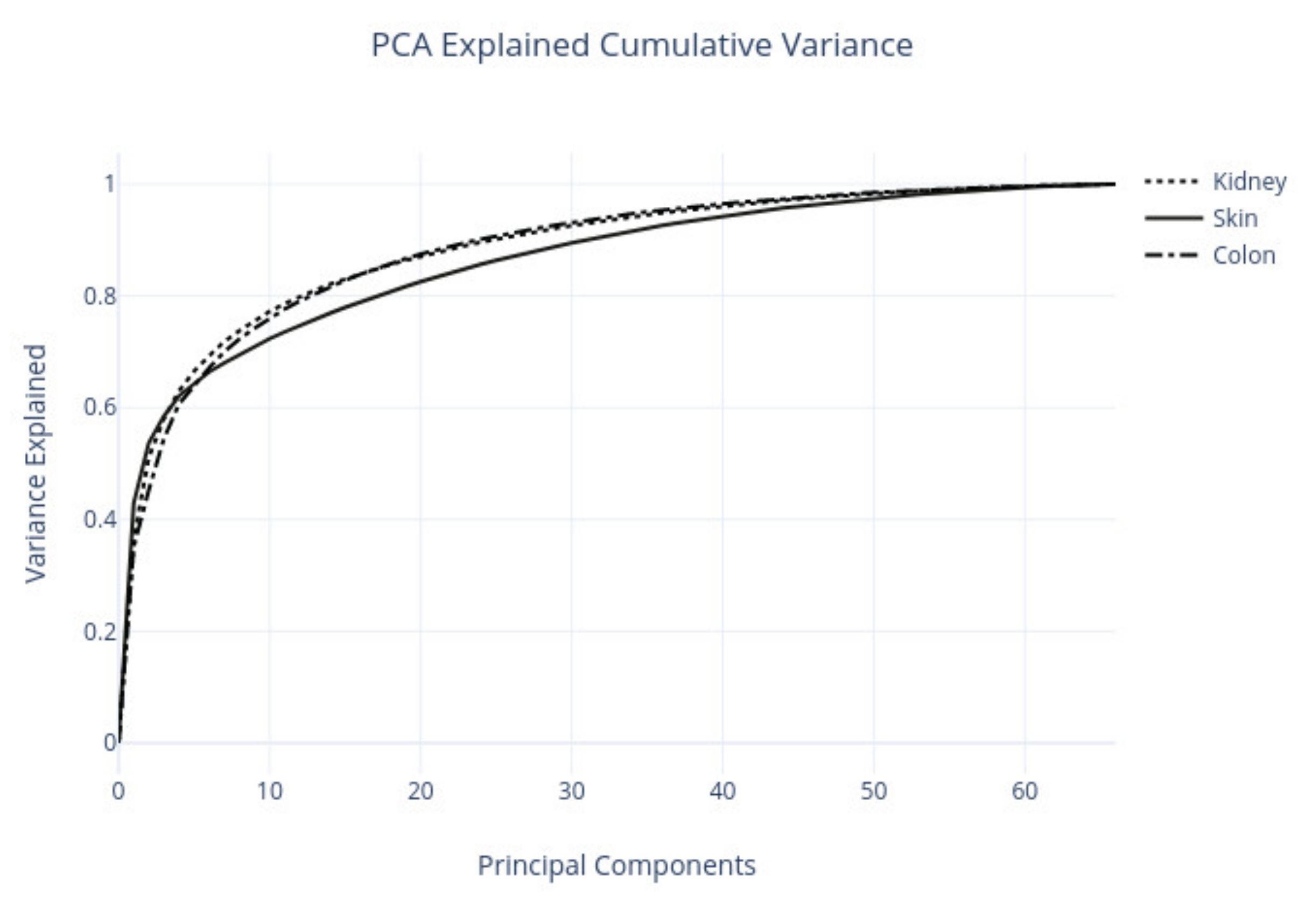
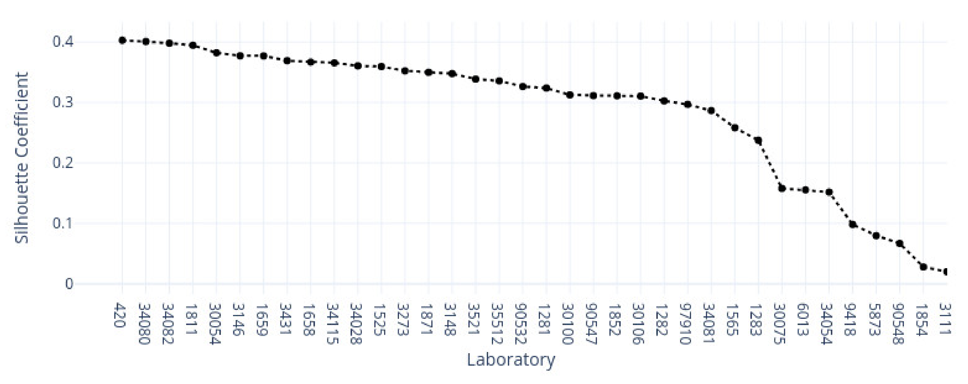
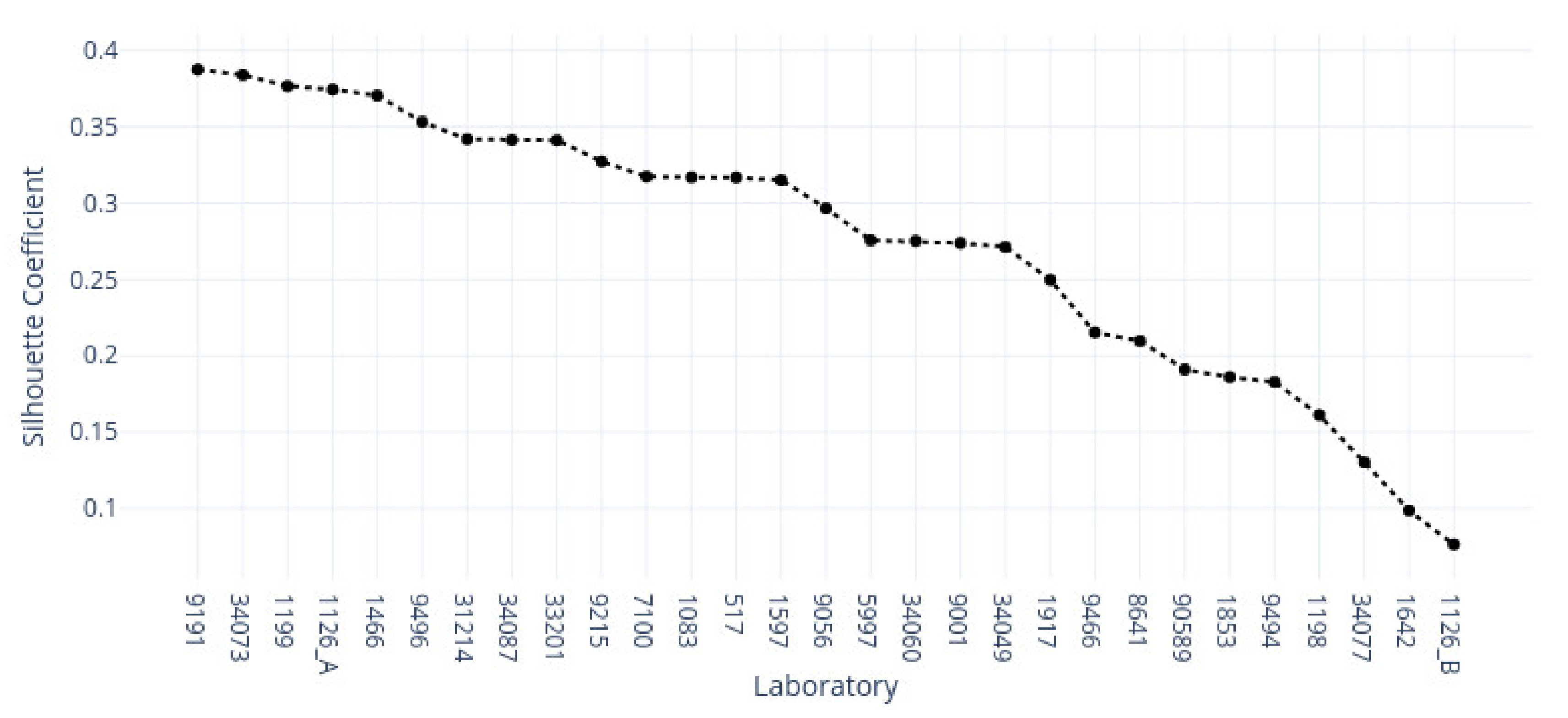
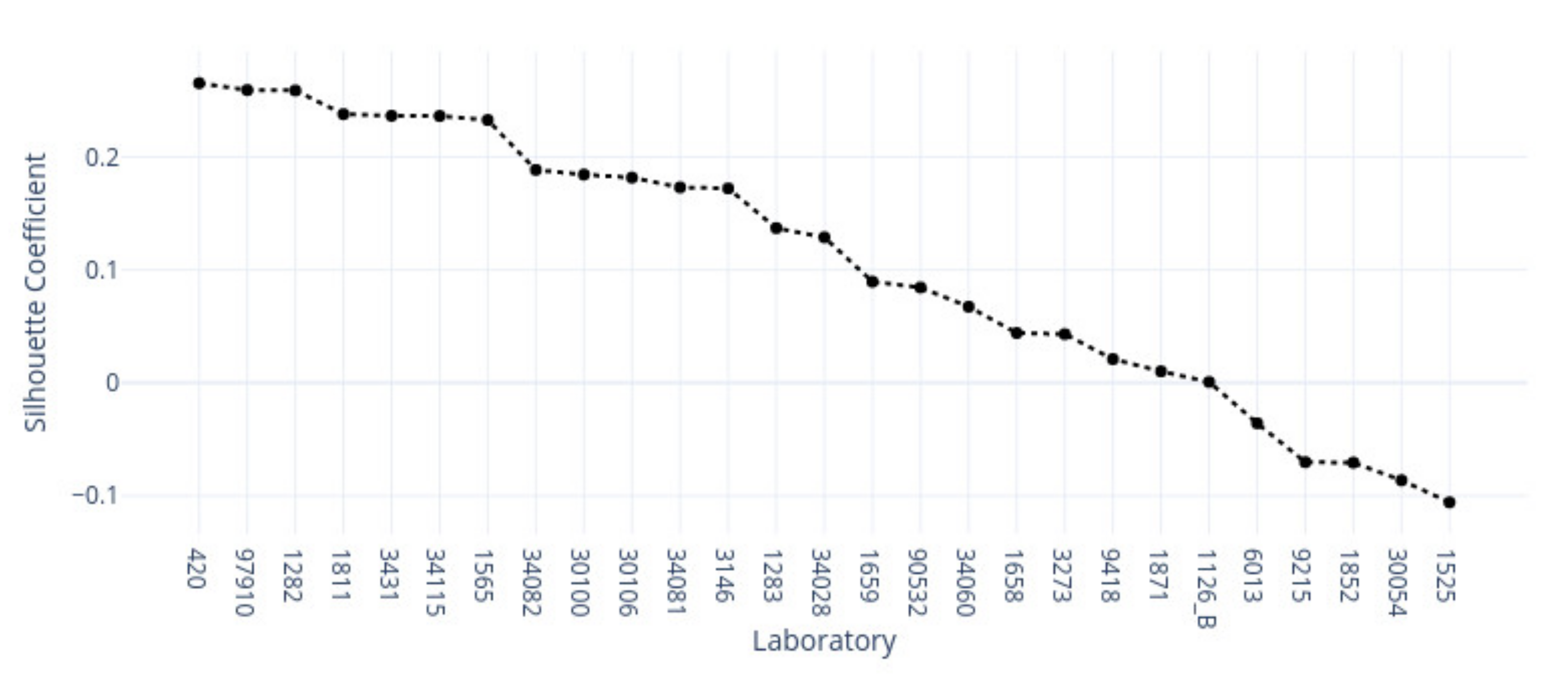
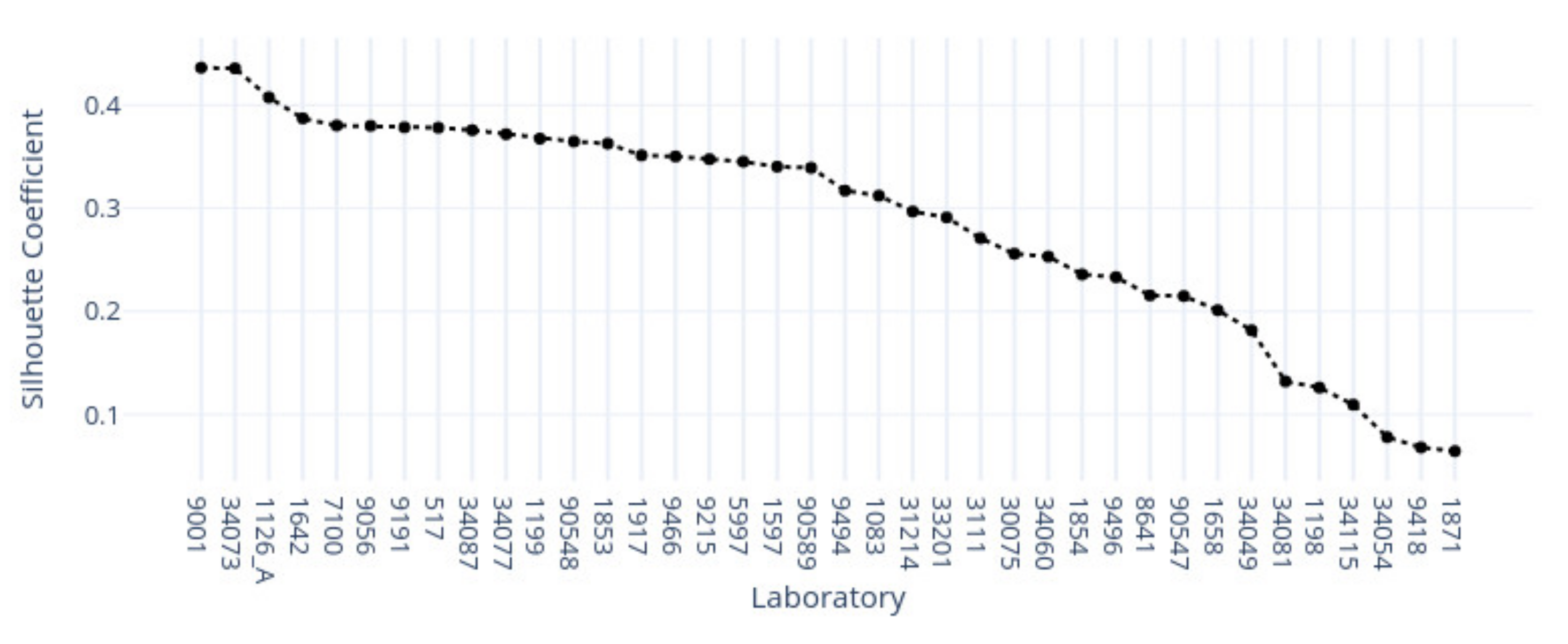
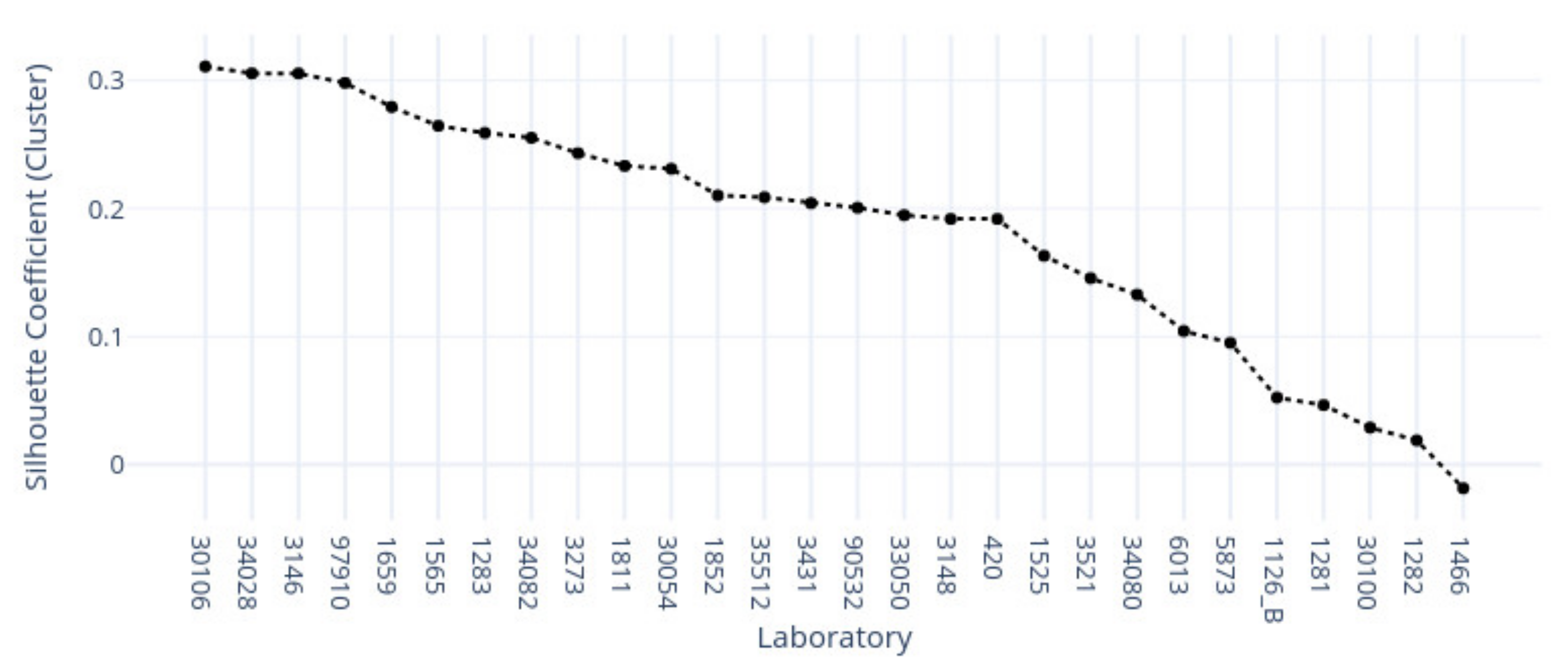
This study demonstrates the first results of the underlying structure between multiple laboratory stainings. The clustering section showcased that the stainings formed two primary clusters within different tissue types. The laboratories in these clusters maintain a similarity that steadily decreases as we approach each cluster’s edges. Although clusters did form according to the best silhouette scores, the clustering effects were not as strong as expected, with average silhouette scores below 0.3. It is important to note that we only had a single example per tissue type per laboratory. Such limitations can make it more challenging to analyze the staining variance, since more examples from each laboratory may be needed to characterize any given laboratory more accurately.
In contrast, the supervised approach showed good separability between laboratories. This result showed that laboratories have an effect, part of which can be predicted. We demonstrated that the tissue type affected the supervised results and cluster assignment. The large accuracy differences between tissue types were shown in the supervised approach. The same effect was shown in the unsupervised results where the rand index showed that laboratory assignment within clusters and between tissue types did not match, i.e., were slightly above the 50% chance level. It is important to note that we simultaneously analyzed the hematoxylin and eosin components in both machine learning approaches. Individual variation may exist in the two staining components whose impact and contribution to these results are yet undetermined. It therefore remains unclear if this effect would persist if the clustering and learning were to occur separately for hematoxylin and eosin.
This novel study was designed as a proof-of-concept approach and an initial investigation into inter-laboratory staining variation. Consequently, additional limitations include the limited resolution, a fixed zoom level, and one region of interest per input sample. If these parameters are updated in future studies, we might obtain an even more adequate margin of error and resolution for the numerical results. Additionally, we note that the features and preprocessing pipeline focused on color-related information, not morphological information. Such an approach has the benefit of highlighting non-structural features but does not consider tissue morphology. Another approach could use active learning such that clustering labels are used as ground truth to a supervised learning set-up; in this way, it might be possible to investigate which features play a more critical role in the clustering result by modeling the clustering result itself with a classification algorithm.
In conclusion, we investigated the impact and relationships of multi-laboratory H&E staining variance on different tissue types with machine learning methods. We hypothesized that individual laboratory stainings are consistent between tissue types and that different staining approaches form subgroups with similar features. Our results showed that multi-laboratory staining varies between tissue types. Multiple laboratories did not appear to form strong clusters within each tissue type but were relatively well separated in the supervised approach. From a clinical perspective, we showed that only some of the laboratories were identified. According to the result, not all laboratory samples were distinct and were confused with other laboratories. The results suggest value in considering tissue-specific normalization targets. This might require changing assumptions for the efficacy of a laboratory given incompatible tissue-type examples. Ultimately, tissue type appears to be an additional driver of the formed clusters and classification results. Thus, tissue type should also be considered when color-normalizing digital pathology slides between laboratories.

Author Contributions

Conceptualization, T.K., S.Ä. and F.P.; methodology, F.P., S.Ä. and I.P.; software, F.P.; validation, F.P., I.P. and S.Ä.; formal analysis, F.P., I.P., S.Ä., P.R. and T.K.; investigation, F.P., I.P. and S.Ä.; resources, T.K. and S.Ä.; data curation, F.P.; writing—original draft preparation, F.P. and T.K.; writing—review and editing, F.P., I.P., S.Ä., P.R. and T.K.; visualization, F.P.; supervision, I.P., S.Ä., P.R. and T.K.; project administration, S.Ä. and T.K.; funding acquisition, S.Ä. All authors have read and agreed to the published version of the manuscript.

Funding

The work is related to the AI Hub Central Finland project that has received funding from Council of Tampere Region (Decision number: A75000) and European Regional Development Fund React-EU (2014–2023) and Leverage from the EU 2014–2020. This project has been funded with support from the European Commission. This publication reflects the views only of the authors, and the Commission cannot be held responsible for any use which may be made of the information contained therein.

Data Availability Statement

The data presented in this study are available on request from the corresponding author. The data are not publicly available due to data protection policies of Central Finland Biobank.

Conflicts of Interest

The authors declare no conflict of interest.

Appendix A

Figure A1. Scatterplot of kidney examples along the first two principal components; the highlighted colors show the same random laboratories as in Figure 4, and names are not shown directly due to visual occlusion.
Applsci 12 07511 g0a1
Figure A2. Scatterplot of colon examples along the first two principal components; the highlighted colors show the same random laboratories as in Figure 4, and names are not shown directly due to visual occlusion.
Applsci 12 07511 g0a2
Figure A3. Kidney tissue tiles shown along the first two principal components. Colors represent random laboratory tiles. Due to the high number, only a small number of tiles can be shown without occlusion.
Applsci 12 07511 g0a3
Figure A4. Colon tissue tiles shown along the first two principal components. Colors represent random laboratory tiles. Due to the high number, only a small number of tiles can be shown without occlusion.
Applsci 12 07511 g0a4
Figure A5. Kidney examples visualized by descending silhouette score within the first cluster found (C1). Silhouette values descend in the left direction from the left-most example in the first row.
Applsci 12 07511 g0a5
Figure A6. Kidney examples visualized by descending silhouette score within the second cluster found (C2). Silhouette values descend in the left direction from the left-most example in the first row.
Applsci 12 07511 g0a6
Figure A7. Skin examples visualized by descending silhouette score within the first found cluster (C1). Silhouette values descend in the left direction from the left-most example in the first row.
Applsci 12 07511 g0a7
Figure A8. Skin examples visualized by descending silhouette score within the second cluster found (C2). Silhouette values descend in the left direction from the left-most example in the first row.
Applsci 12 07511 g0a8
Figure A9. Colon examples visualized by descending silhouette score within the first cluster found (C1). Silhouette values descend in the left direction from the left-most example in the first row.
Applsci 12 07511 g0a9
Figure A10. Colon examples visualized by descending silhouette score within the second found cluster (C2). Silhouette values descend in the left direction from the left-most example in the first row.
Applsci 12 07511 g0a10

References

  1. Glatz-Krieger, K.; Spornitz, U.; Spatz, A.; Mihatsch, M.J.; Glatz, D. Factors to keep in mind when introducing virtual microscopy. Virchows Arch. 2006, 448, 248–255. [Google Scholar] [CrossRef] [PubMed] [Green Version]
  2. Macenko, M.; Niethammer, M.; Marron, J.S.; Borland, D. A method for normalizing histology slides for quantitative analysis. In Proceedings of the 2009 IEEE International Symposium on Biomedical Imaging: From Nano to Macro, ISBI 2009, Boston, MA, USA, 28 June–1 July 2009; pp. 1107–1110. [Google Scholar]
  3. Ljungberg, A.; Johansson, O. Methodological aspects on immunohistochemistry in dermatology with special reference to neuronal markers. Histochem. J. 1993, 25, 735–745. [Google Scholar]
  4. Anghel, A.; Stanisavljevic, M.; Andani, S.; Papandreou, N.; Rüschoff, J.H.; Wild, P.; Gabrani, M.; Pozidis, H. A high-performance system for robust stain normalization of whole-slide images in histopathology. Front. Med. 2019, 6, 193. [Google Scholar] [CrossRef]
  5. Fischer, A.H.; Jacobson, K.A.; Rose, J.; Zeller, R. Hematoxylin and eosin staining of tissueand cell sections. Cold Spring Harb. Protoc. 2008, 3, pdb.prot4986. [Google Scholar] [CrossRef]
  6. Ciompi, F.; Geessink, O.; Bejnordi, B.E.; De Souza, G.S.; Baidoshvili, A.; Litjens, G.; Van Ginneken, B.; Nagtegaal, I.; Van Der Laak, J. The importance of stain normalization in colorectal tissue classification with convolutional networks. In Proceedings of the 2017 IEEE 14th International Symposium on Biomedical Imaging (ISBI 2017), Melbourne, Australia, 18–21 April 2017; pp. 160–163. [Google Scholar]
  7. Ismail, S.M.; Colclough, A.B.; Dinnen, J.S.; Eakins, D.; Evans, D.M.; Gradwell, E.; O’Sullivan, J.P.; Summerell, J.M.; Newcombe, R.G. Observer variation in histopathological diagnosis and grading of cervical intraepithelial neoplasia. BMJ 1989, 298, 707–710. [Google Scholar] [CrossRef] [Green Version]
  8. Tellez, D.; Litjens, G.; Bándi, P.; Bulten, W.; Bokhorst, J.-M.; Ciompi, F.; van der Laak, J. Quantifying the effects of data augmentation and stain color normalization in convolutional neural networks for computational pathology. Med. Image Anal. 2019, 58, 101544. [Google Scholar] [CrossRef] [PubMed] [Green Version]
  9. Tosta, T.A.A.; de Faria, P.R.; Neves, L.A.; Nascimento, M.Z.d. Computational normalization of H&E-stained histological images: Progress, challenges and future potential. Artif. Intell. Med. 2019, 95, 118–132. [Google Scholar]
  10. Piórkowski, A.; Gertych, A. Color normalization approach to adjust nuclei segmentation in images of hematoxylin and eosin stained tissue. In Advances in Intelligent Systems and Computing; Springer: Cham, Switzerland, 2019; Volume 762, pp. 393–406. [Google Scholar]
  11. Reinhard, E.; Adhikhmin, M.; Gooch, B.; Shirley, P. Color transfer between images. IEEE Comput. Graph. Appl. 2001, 21, 34–41. [Google Scholar] [CrossRef]
  12. Tosta, T.A.A.; de Faria, P.R.; Neves, L.A.; Nascimento, M.Z.D. Color normalization of faded H&E-stained histological images using spectral matching. Comput. Biol. Med. 2019, 111, 103344. [Google Scholar] [PubMed]
  13. Vijh, S.; Saraswat, M.; Kumar, S. A new complete color normalization method for H&E stained histopatholgical images. Appl. Intell. 2021, 51, 7735–7748. [Google Scholar]
  14. Zarella, M.D.; Yeoh, C.; Breen, D.E.; Garcia, F.U. An alternative reference space for H&E color normalization. PLoS ONE 2017, 12, e0174489. [Google Scholar]
  15. Salehi, P.; Chalechale, A. Pix2pix-based stain-to-stain translation: A solution for robust stain normalization in histopathology images analysis. In Proceedings of the 2020 International Conference on Machine Vision and Image Processing (MVIP), Qom, Iran, 18–20 February 2020; pp. 1–7. [Google Scholar]
  16. Khan, A.M.; Rajpoot, N.; Treanor, D.; Magee, D. A Nonlinear Mapping Approach to Stain Normalization in Digital Histopathology Images Using Image-Specific Color Deconvolution. IEEE Trans. Biomed. Eng. 2014, 61, 1729–1738. [Google Scholar] [CrossRef]
  17. Roy, S.; Jain, A.K.; Lal, S.; Kini, J. A study about color normalization methods for histopathology images. Micron 2018, 114, 42–61. [Google Scholar] [CrossRef] [PubMed]
  18. Vahadane, A.; Peng, T.; Sethi, A.; Albarqouni, S.; Wang, L.; Baust, M.; Steiger, K.; Schlitter, A.M.; Esposito, I.; Navab, N. Structure-Preserving Color Normalization and Sparse Stain Separation for Histological Images. IEEE Trans. Med Imaging 2016, 35, 1962–1971. [Google Scholar] [CrossRef] [PubMed]
  19. Clarke, E.L.; Treanor, D. Colour in digital pathology: A review. Histopathology 2017, 70, 153–163. [Google Scholar] [CrossRef]
  20. Boschman, J.; Farahani, H.; Darbandsari, A.; Ahmadvand, P.; Van Spankeren, A.; Farnell, D.; Levine, A.B.; Naso, J.R.; Churg, A.; Jones, S.J.; et al. The utility of color normalization for AI -based diagnosis of hematoxylin and eosin-stained pathology images. J. Pathol. 2022, 256, 15–24. [Google Scholar] [CrossRef] [PubMed]
  21. Bianconi, F.; Kather, J.N.; Reyes-Aldasoro, C.C. Experimental Assessment of Color Deconvolution and Color Normalization for Automated Classification of Histology Images Stained with Hematoxylin and Eosin. Cancers 2020, 12, 3337. [Google Scholar] [CrossRef]
  22. Gadermayr, M.; Cooper, S.S.; Klinkhammer, B.; Boor, P.; Merhof, D. A quantitative assessment of image normalization for classifying histopathological tissue of the kidney. In Proceedings of the German Conference on Pattern Recognition, Basel, Switzerland, 13–15 September 2017; pp. 3–13. [Google Scholar]
  23. Otsu, N. A threshold selection method from gray-level histograms. IEEE Trans. Syst. Man Cybern. 1979, 9, 62–66. [Google Scholar] [CrossRef] [Green Version]
  24. Liu, D.; Yu, J. Otsu method and K-means. In Proceedings of the 2009 9th International Conference on Hybrid Intelligent Systems, HIS 2009, Shenyang, China, 12–14 August 2009; Volume 1, pp. 344–349. [Google Scholar]
  25. Macqueen, J. On convergence of the k-means and partitions with minimum average variance. Ann. Math. Stat. 1965, 36, 1084. [Google Scholar]
  26. Arthur, D.; Vassilvitskii, S. K-means++: The advantages of careful seeding. In Proceedings of the Annual ACM-SIAM Symposium on Discrete Algorithms, New Orleans, LO, USA, 7–9 January 2007; pp. 1027–1035. [Google Scholar]
  27. Rousseeuw, P.J. Silhouettes: A graphical aid to the interpretation and validation of cluster analysis. J. Comput. Appl. Math. 1987, 20, 53–65. [Google Scholar] [CrossRef] [Green Version]
  28. Starczewski, A.; Krzyzak, A. Performance evaluation of the silhouette index. In Lecture Notes in Artificial Intelligence (Subseries of Lecture Notes in Computer Science); Springer: Cham, Switzerland, 2015; Volume 9120, pp. 49–58. [Google Scholar]
  29. Wang, F.; Franco-Penya, H.H.; Kelleher, J.D.; Pugh, J.; Ross, R. An analysis of the application of simplified silhouette to the evaluation of k-means clustering validity. In Lecture Notes in Computer Science (Including Subseries Lecture Notes in Artificial Intelligence and Lecture Notes in Bioinformatics); Springer: Cham, Switzerland, 2017; Volume 10358, pp. 291–305. [Google Scholar]
  30. Larose, D.T. Data Mining and Predictive Analytics; John Wiley & Sons: Hoboken, NJ, USA, 2015. [Google Scholar]
  31. Rand, W.M. Objective Criteria for the Evaluation of Clustering Methods. J. Am. Stat. Assoc. 1971, 66, 846–850. [Google Scholar] [CrossRef]
  32. Prezja, F. Developing and Testing Sub-Band Spectral Features in Music Genre and Music Mood Machine Learning. Master’s Thesis, University of Jyväskylä, Jyväskylä, Finland, 2018. [Google Scholar]
  33. Dudani, S.A. The Distance-Weighted k-Nearest-Neighbor Rule. IEEE Trans. Syst. Man Cybern. 1976, SMC–6, 325–327. [Google Scholar] [CrossRef]
  34. Kramer, O. K-nearest neighbors. In Dimensionality Reduction with Unsupervised Nearest Neighbors; Springer: Berlin/Heidelberg, Germany, 2013; pp. 13–23. [Google Scholar]
  35. Pedregosa, F.; Varoquaux, G.; Gramfort, A.; Michel, V.; Thirion, B.; Grisel, O.; Blondel, M.; Prettenhofer, P.; Weiss, R.; Dubourg, V.; et al. Scikit-learn: Machine Learning in {P}ython. J. Mach. Learn. Res. 2011, 12, 2825–2830. [Google Scholar]
  36. Shannon, C.E. A mathematical theory of communication. Bell Syst. Tech. J. 1948, 27, 379–423. [Google Scholar] [CrossRef] [Green Version]
  37. Kreer, J. A question of terminology. IRE Trans. Inf. Theory 1957, 3, 208. [Google Scholar] [CrossRef]
  38. Kullback, S.; Leibler, R.A. On Information and Sufficiency. Ann. Math. Stat. 1951, 22, 79–86. [Google Scholar] [CrossRef]
  39. Kohavi, R. A study of cross-validation and bootstrap for accuracy estimation and model selection. In Proceedings of the 14th International Joint Conference on Artificial Intelligence, Montreal, QC, Canada, 20–25 August 1995; Volume 2, pp. 1137–1143. [Google Scholar]
Figure 1. Randomly chosen WSI, label 1 for kidney, 2 for skin, and 3 for colon tissue.
Applsci 12 07511 g001
Figure 2. Experiment dataflow pipeline.
Applsci 12 07511 g002
Figure 3. For illustration purposes, three ROIs from three laboratories per tissue type (column-wise). The first column is skin, the second column is kidney, and the last column is colon.
Applsci 12 07511 g003
Figure 4. Scatterplot of skin examples along the first two principal components from the features explained below, the highlighted colors show random laboratories by code followed by tissue type code (‘_2’).
Applsci 12 07511 g004
Figure 5. Concatenated RGB space dimensionality.
Applsci 12 07511 g005
Figure 6. Explained cumulative variance by principal components.
Applsci 12 07511 g006
Figure 7. For illustration purposes, three tiled ROIs from three laboratories (per row). The first row is kidney, the second is skin, and the last is colon.
Applsci 12 07511 g007
Figure 8. Skin tissue tiles shown along the first two principal components. Colors represent random laboratory tiles. Due to the high number, only a small number of tiles can be shown without occlusion.
Applsci 12 07511 g008
Figure 9. Illustration K = 3 cross validation set-up.
Applsci 12 07511 g009
Figure 10. Silhouette scores for tissue types across searched K clusters.
Applsci 12 07511 g010
Figure 11. Sample allocation in found clusters C1 (light blue) and C2 (deep blue) per tissue type across silhouette scores (x-axis); the first plot is for kidney samples, the second for skin, and the third for colon samples.
Applsci 12 07511 g011
Figure 12. Silhouette scores for the first found cluster (C1) in kidney samples across laboratories.
Applsci 12 07511 g012
Figure 13. Silhouette scores and laboratories for the second found cluster (C2) in the kidney sample group.
Applsci 12 07511 g013
Figure 14. Silhouette scores for the first found cluster (C1) in skin samples across laboratories.
Applsci 12 07511 g014
Figure 15. Silhouette scores for the second found cluster (C2) in skin samples across laboratories.
Applsci 12 07511 g015
Figure 16. Silhouette scores for the second found cluster (C1) in colon samples across laboratories.
Applsci 12 07511 g016
Figure 17. Silhouette scores for the first cluster found (C2) in colon samples across laboratories.
Applsci 12 07511 g017
Table 1. k-means++ Pseudo-Algorithmic Steps.
  • Randomly select one data point x c from the available data points x 1 x 2 x 3 x i to serve as a centroid C .
  • Compute D x , the distance of each non-selected datapoint x to the nearest selected cluster centroid C .
  • Select a new C from the available data points x such that the new point has a probability of being chosen directly proportional to the distance D x 2 to the nearest, previously selected C .
  • Repeat Steps 2 and 3 until k centroids C k are sampled.
  • When Step 4 is complete, continue with the standard k-means algorithm.
Table 2. Silhouette score interpretation guidelines.
Silhouette Value RangeInterpretation
0.5 Good evidence for cluster existence in the data.
0.25 0.5 Some evidence for cluster existence in the data, domain-specific knowledge, can be brought to bear to support the presence of the clusters.
0.25 Scant evidence of cluster reality.
Table 3. Silhouette score rank-based visualization for both clusters in the kidney sample group.
Kidney Sample ScoresCluster 1 (C1)Cluster 2 (C2)
Maximum Silhouette Score Applsci 12 07511 i001 Applsci 12 07511 i002
Median Silhouette Score Applsci 12 07511 i003 Applsci 12 07511 i004
Minimum Silhouette Score Applsci 12 07511 i005 Applsci 12 07511 i006
Table 4. Visualized skin samples for both found clusters with rank positions from each cluster’s silhouette scores.
Kidney Sample ScoresCluster 1 (C1)Cluster 2 (C2)
Maximum Silhouette Score Applsci 12 07511 i007 Applsci 12 07511 i008
Median Silhouette Score Applsci 12 07511 i009 Applsci 12 07511 i010
Minimum Silhouette Score Applsci 12 07511 i011 Applsci 12 07511 i012
Table 5. Visualized ranks from silhouette score for the colon sample’s two found clusters (C1 and C2).
Kidney Sample ScoresCluster 1 (C1)Cluster 2 (C2)
Maximum Silhouette Score Applsci 12 07511 i013 Applsci 12 07511 i014
Median Silhouette Score Applsci 12 07511 i015 Applsci 12 07511 i016
Minimum Silhouette Score Applsci 12 07511 i017 Applsci 12 07511 i018
Table 6. Rand index results for all possible tissue type pairs.
Tissue Type PairRand Index Score
Kidney–Colon 0.6788
Skin–Colon 0.6434
Kidney–Skin 0.6270
Table 7. Cross-validation classification accuracy in predicting laboratory of origin of ROI tiles; standard deviation in parentheses.
Tissue TypeKNNKNN
(Feature Selected)
Random Classifier
Kidney0.395 (0.010)0.706 (0.009)0.014 (0.001)
Skin0.553 (0.007)0.617 (0.009)0.014 (0.003)
Colon 0.344 (0.007)0.513 (0.006)0.009 (0.002)
Publisher’s Note: MDPI stays neutral with regard to jurisdictional claims in published maps and institutional affiliations.

