The participants were undergraduate students. The recruitment message was disseminated through emails to students on campus. In addition to the requirements regarding age and language, a qualified participant needed to have normal or corrected-to-normal vision.
During recruitment, respondents were informed that their eye movements would be recorded during the experiment, although information about the specific purpose was not revealed until after the survey was completed, because knowing the purpose of the experiment could possibly induce bias.
Respondents were informed about the procedure of the experiment and the topics of the surveys and given general instructions regarding eye tracking. The eye tracker was calibrated using a nine-point calibration method ensuring that the mean difference between the measured gaze data and the target point was under or equal to 40 pixels (equaling a visual angle of about one degree viewed at 60 cm).
In total, 60 participants were recruited. Each participant scheduled a time slot of twenty minutes in the research lab for the eye tracking experiment and questionnaire survey, which would be described. Due to the inability of some subjects to be precisely calibrated, complete eye movement data were recorded for 39 of the subjects. The mean age of the users was 20, with 24 males and 15 females.
When participants arrived at the lab, they were seated in front of an external 12-inch monitor with a resolution of 1280 × 1024 pixels and were required to adjust their sitting position in order to guarantee the calibration of the eye tracker. The monitor was approximately 60 cm from the participant’s eyes. For optimal eye tracking, the distance from the participant’s eyes to the eye tracker should be approximately 60–65 cm (23–26") for most screen-based eye trackers from Tobii Pro. The survey was presented on a Tobii X2-30 video-based eye tracking screen with a collection rate of 30 Hz using the iMotions Attention Tool 5.2 software. The eye tracker desktop ran at 30 Hz. This allowed evaluating different types of stimuli such as graphic pieces, the usability of the web sites, and commercial and other applications. The computer used was a laptop Dell Latitude 3550 with a Core i3 processor at 1.7 GHz and 4 GB of DDR3 RAM.
Scenario Design
The stimuli consisted of two website home page layouts, as seen in
Figure 1 and
Figure 2. For the old website, the color scheme was strictly composed by the company colors: red, black, and white. As Gelasca et al. [
44] states, the color red has a high index of prominence, and this, together with the size/quantity, aims to capture the user’s attention. The placement of the text on the left side was in keeping with the Western trend of reading from left to right. The slogan and the advertising phrase tried to appeal to the cognitive spectrum of the human being to provoke the commitment with the brand. For the new website, the color scheme remained the same for the layout. The size/amount of the color red was replaced by the coffee cup image animation, which served as salience through motion appeal and a dynamic preview of a company branch location (
Figure 3). The animation of the coffee consisted of an elevation of the liquid to the left and then towards the brand name until they become one; finally, the liquid falls into the cup and explodes throughout the image.
Figure 4a–c are frames captured from the new website’s coffee animation happening in the same order as shown in this document.
Two homepage designs were evaluated. The participants could view each homepage for 2 min and surf through said page by scrolling up and down. In the case of the preview location element inside the new design, the user could click and drag the interactive image to visualize different points of view for said location of the company branch. Other homepage elements in both designs were not interactive; all buttons that redirect to any other page were disable, preventing from leaving the homepage for complete interaction with the design. This means that users could only interact within the presented homepage—old or new homepage design. In order to align the starting point of visual attention for both websites, respondents were asked to fixate on a fixation-cross, which was presented for two seconds before the start of each homepage. At the end of the interaction with the homepages, the users answered the survey using an ordinary computer mouse. Each experiment took about 15 min on average to complete. The data collected included the eye gaze data in specific areas of interest (AOIs) of the homepages and their responses in the post-survey. The eye gaze measures that were used in this paper were the number of fixations and the percentage of time spent on each AOI. Both of them are measures of attraction. The number of fixations indicates how easy something is noticed; in contrast, the percentage of time on an AOI shows how much interest an object received once it was seen [
45]. To calculate the percentage of time spent on an AOI, we divided the total dwell time on an AOI between the total dwell time on each homepage (2 min). A larger percentage fixation time within an AOI means that the participants spent more visual attention in that area. Along with the AOI metrics, a heat map of the gaze of the subjects was elicited to have a more visual representation of the attention intensity in the designs.
Table 4 shows the data collection process, from the user’s arrival until he takes the web page assessment surveys.
The resulting heat map of the off-stimulus (
Figure 5) indicates key fixation points in the design:
- 1.
Brand slogan in white font.
- 2.
Brand name in white font.
- 3.
Brand name in white font in company sign.
- 4.
Brand advertising phrase in black font.
- 5.
Menu button.
These hotspots were ordered by the ratio metric—count of users who fixed on that area over the total number of users—of the corresponding AOI in
Figure 2 to give an importance index based on user attention levels. Note that the Menu button was not an AOI set within the studio; however, it is a hotspot within the heat map, so to diminish its importance, it was decided to place it in the last position. For all other hotspots, the AOI description was listed for better reference. The most fixated item was the brand’s slogan in white font, which is placed on the left side of the design, which, considering that the users are from the Western Hemisphere, can be directly linked to the reading direction from left to right; another important factor to consider is the area covered by the slogan as it is the highest of the AOIs, which can directly influence the ratio. The next hotspot is the brand’s name in white font, which is placed right next to the brand’s slogan; these two hotspots are directly linked by the green path that connects them both, which could be interpreted as the proximity between them had an impact on the ratio. Following in the list is the brand’s name in white font in the company sign, which is placed in the top-right corner of the design, which is far from any other hotspot and does not apply in left–right reading implications. This makes the brand name on the company sign the dominant salience on the right side, which could be related to the fact that it is the most recognizable font in the image; it is a part of or the salience of the black color in the image with a distinctly red load or could be due to a familiarity factor. The fourth hotspot is the brand’s advertising phrase in black font, which is placed in the left side just right below the brand’s slogan, which is completely overlapped by the heat map colors, making it unreadable, which must indicate that it indeed is read by the subjects. Unlike the brand name located on the right side of the brand slogan, this hotspot does not have a clear connection with the former even though it has a larger area; this could be interpreted once again with the way of reading from top to bottom and from left to right. Lastly, the menu button found in the top middle of the layout—which has enough fixations to be considered a hotspot—could be interpreted as subjects’ familiarity with website layouts and user interfaces (UIs). An interesting thing about the menu button is its white color, which appears on most hotspots, which could indicate a prominence factor in this kind of red-loaded design. In general, the heat map is left-loaded and does not contain any significant hotspots in the lower right and upper left corners; this is related to the fact that no salience is found within those areas. This may be directly related to the type of reading from left to right and the fact that the left part is mostly covered in letters. Interestingly, the bottom right corner buttons have no fixations.
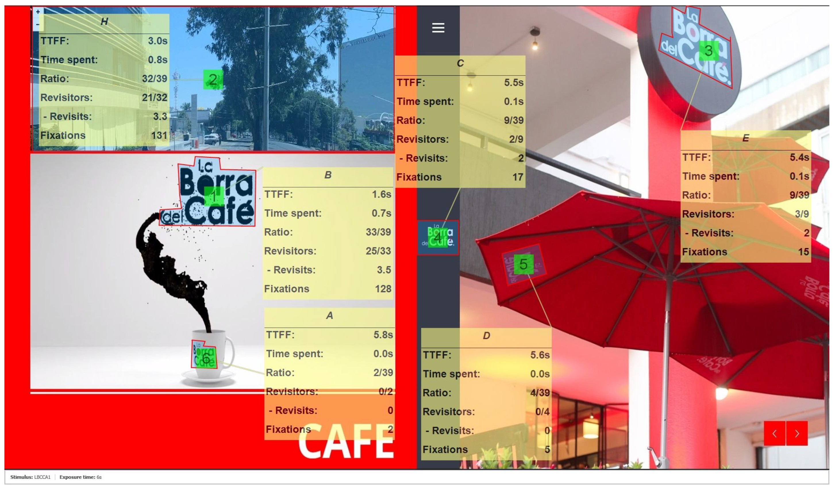
The resulting heat map of the on-stimulus (
Figure 6) indicates key fixation points in the design:
- 1.
Brand name in black font within animation.
- 2.
Company branch location preview.
- 3.
Brand name in white font in company sign.
- 4.
Brand name in white font.
- 5.
Brand name in black font in cup within animation.
- 6.
Liquid coffee within animation.
These hotspots were ordered in the same way as their off-stimulus analysis counterpart, but according to their own corresponding AOI in
Figure 1. Note that the liquid coffee within the animation was not an AOI set within the studio; however, it is a hotspot within the heat map, so to diminish its importance, it was decided to place it in the last position. For all other hotspots, the AOI description is listed for better reference. The most important hotspot, which is more than clear, is the brand name in black font within the animation in the left side of the design, which is due to the fact that it is almost completely covered by the only hotspot with a high intensity of attention. This indicates the salience of the animation and the whole design itself, in terms of attention, which could be interpreted as future familiarity with the brand. The reason behind this salience could be due to the fact that it is the most recognizable font within the animation. The second-most important hotspot is the company’s branch location preview, and it has a direct connection with the first one as it is right above it, and it can be seen in the shape of the main hotspot that has a yellowish tail on top. Even though the area of this AOI is larger than the previous one, it does not have a higher ratio since, along with the main hotspot, it only contains two other minor hotspots. The next hotspot is the brand name in white font in the company sign located in the upper right corner. This hotspot is the same as the one in
Figure 5, but in this case, the area covered by the hotspot is significantly less along with the attention intensity; this can be clearly interpreted as the salience of the AOI among the others became less effective, which is an expected result of the study since most of the attention should be either on the animation or the company branch location preview. As in the last one, the brand name in white font hotspot in the center became less salient, indicating that it also lost relevance compared to the other AOIs. In
Figure 5, there is a clear connection between the left side components and the centered brand name that was lost in this design, which may be due to the animation, as it focuses mainly on the center of the image and does not provide the same closeness. The loss of relevance for the centered brand name and brand name in sign hotspots, compared to
Figure 5, allowed us to assume that the salience of the left side of the design—animation and location preview—was made greater than any other component in the website design, just as expected. The last hotspot just reaffirmed our expectations for a higher intensity of attention towards the animated image as it completely covers the liquid coffee animation, and considering the animated image as an AOI, one can see that most of the hotspots are inside it; even more the highest attention intensity was in the same area. This shows that the animation of the liquid coffee did attract the attention of the users and places it as the most salient component between both designs.
The latest analysis is a more visual and intuitive approach that needs to be accompanied by quantitative analysis to provide hard facts.
Table A3 is sorted ascending by time to first fixation (TTFF), and as shown in
Figure 7, it is correlated by a −0.93 factor to ratio, as for a faster TTFF time, there is a higher ratio. As seen in the heat map analysis, the most visited AOI is the brand slogan in white font with a ratio of 31 users out of 39 total users, and it is also the most visited by 25 users out of 31 users who fixated. This particular AOI stands apart from the others by far, as shown in
Table 5, with at least double in all metrics, except revisits to the closest, indicating high attention dominance.
Table A4 is ordered as the counterpart analysis of the off-stimulus, and similar to its analysis in this case, there is a direct relation between the TTFF and ratio metrics with the same behavior—inversely proportional—but with a correlation factor of −0.97, as shown in
Figure 8, indicating a higher correlation than before. Analyzing the percentage difference between the first and second AOI in
Table 6, we can see that for the ratio, revisits, and fixations metrics, the change between the two is very low, which could indicate a good attention intensity result for both components. The domain of this pair of components seen in
Table 6 and
Table 7 is greater than that seen in the other design, except TTFF and revisits, which could be interpreted as a higher level of attention for both AOIs.
As stated before, the closeness between the components could result in more attention as seen for those components closest to the first AOI in both designs, yet there is still a higher percentage difference for the second AOI of the off-stimulus against the on-stimulus, which can be seen comparing
Table 5 and
Table 6. This can be interpreted as a higher prominence for the second AOI in the new design versus the second AOI in the first design. Now, if we compare the first AOI in the new design to the first AOI in the old design, as seen in
Table 8, the percentage difference for the metrics ratio, revisitors, and fixations is lower than 10%, which indicates minimum change, but when comparing the second AOI in the old design to the new design, the percentage difference comparing time spent and fixations passes 100%. Now, comparing the components that remained between designs for a percentage decrease in
Table 9, we can see for the AOI brand name in white font that there is a decrease in the metrics ratio, revisitors, and fixations, and for brand name in white font in company sign, there is a decrease in the metrics ratio, revisits, and fixations. This impact on the AOIs can be interpreted as a lack of prominence or user appeal, which is overshadowed by the high salience of the animation and location preview.
The latter is an analysis of the eye tracking results, but as mentioned, the study also used an FEA technique to recognize emotions that could be observed on the user’s face. Preliminary results indicated a mean increase in emotional time percent for the on-stimulus against off-stimulus state, as shown in
Figure 9, for all the emotions. This at first glance indicates an overall higher emotional reaction of the sample when being exposed to the dynamic website design against the static website design, which is a basis for a further analysis, but this is not enough to demonstrate that there is a significant difference between samples.
Figure 10 shows a comparison similar to the previous one, but instead of comparing the means, it uses the standard deviations of the samples—on-stimulus versus off-stimulus—this was performed with the intention of comparing whether the on-stimulus sample had a more similar behavior between subjects than the off-stimulus one. The result indicates an increment in the standard deviation for the on-stimulus state against the off-stimulus, which indicates a higher dispersion of the emotional time percentage between subjects of the same sample. This could indicate an increase in the number of outliers or the presence of outliers with values further from the mean; thus, an analysis in conjunction with the mean is needed, as the standard deviation analysis alone does not indicate if it is the first or the second case.
Diving deeper into the analysis and considering both the mean and standard deviation of the percentage of observable time for each emotion, we then compared the distribution of the samples to have a statistical approach of the situation.
Figure 11 shows for every and each emotion a higher skewness to the right—larger right tail—and a lower hill for the on-stimulus distribution compared to the off-stimulus, indicating a decrease in the case count for the mode—except for the neutral emotion—of 0% and a shift for most of the subjects to higher values of the percentage of emotional time for the on-stimulus sample. This can be interpreted as an increase in the percentage of observable time for the sample on-stimulus versus off-stimulus in all emotions. This could lead to a first conclusion based on statistical data that, in general, there is an increment in the percentage of observable time for each emotion being exposed to the dynamic web design.
Lastly, a Wilcoxon signed-rank test was applied to compare the samples—on-stimulus and off-stimulus— to statistically accept or reject the null hypothesis—that there is no difference between samples—and we established a significance level of 5%. The test returns a
p-value, which if higher than the established significance level would men the null hypothesis is accepted; on the contrary, if the
p-value lies lower than the significance level, the null hypothesis is rejected, and the alternate hypothesis is accepted. In this case, two alternate hypothesis were proposed as follows:
(
)—the off-stimulus sample is different for left and right tail from the on-stimulus sample—and
(
)—the off-stimulus sample mean is lower than the on-stimulus sample mean.
Table 10 and
Table 11 show the
p-values obtained through the Wilcoxon signed-rank test for the alternative hypotheses
and
, respectively.
Figure 12 shows the
p-value of the percentage of observable time for each emotion of each alternative hypothesis and the significance level to visually compare for which emotions we can reject the null hypothesis. Dots falling down the line can be interpreted as accepted, and those that lay above the line are rejected; thus, we can statistically accept the alternate hypothesis
for the following emotions: joy, anger, surprise, fear, and neutral. Based o the interpretation for alternate hypothesis
, we can statistically accept the following emotions: joy, anger, surprise, fear, disgust, and neutral.

 ,
, 


