Abstract
Color plays an essential role in the design of user interfaces and significantly impacts the user experience. To create aesthetically pleasing and user-friendly interfaces, the colors of the user interface should be consistent with the images. The latter can be challenging to achieve, as images often have different colors and are often changed by editors or authors who do not have sufficient design knowledge. To solve this problem, we have developed a model that automatically determines the color theme of the user interface based on a given image. The model first extracts the most prominent colors from the image and then considers both aesthetic (color harmony and compatibility with the image) and usability aspects (color contrast, color diversity, and color strength). All color calculations are performed in the perceptually uniform color space CAM02-UCS. In addition, the model can be adapted to the user’s needs and requirements. To test the model, we implemented it in a web-based application in which the colors were automatically selected based on the featured image. The resulting color themes were then evaluated by the users, who were mainly professional designers. According to the results, the model generates color themes that are consistent with the image, aesthetic, and user-friendly. An important observation was also that color harmony can be achieved simply by using the most prominent colors of the image (regardless of their hue), suggesting that color harmony is strongly influenced by the context of use. The presented model holds significant practical importance as it can be utilized in various applications and tools. For instance, it can automatically choose a color theme for a user interface based on a particular image, such as a company logo or a product image. Moreover, it can dynamically adjust the colors of elements in real time based on the image that is visible simultaneously with the elements.
1. Introduction
Color is one of the most essential elements in the design of user interfaces (UI) and has a major impact on the user experience (UX). From an aesthetic point of view, the UI color theme should be consistent with the images, especially with the featured image that accompanies and highlights the main content. When an image is placed next to elements of the user interface, there is a mutual effect on the color harmony and overall attractiveness. To ensure that the images match the UI color theme, the designer must either select images based on the predefined color theme, or an appropriate color theme based on the preselected images. This is achievable if the designer controls the images and the color theme. For example, when designing a promotional website for a product, the designer may choose the color theme based on the images and the visual identity of the company. However, conforming the color theme with the images becomes more challenging when the images have different colors or when the content of the user interface is dynamic. For example, in applications for music listening (Apple Music, Spotify etc.), the covers of the albums are dynamic and can change over time. A common solution is to use a color theme of achromatic or monochromatic colors. Unfortunately, this may reduce the attractiveness of the user interface and negatively impact the overall user experience.
Much research in recent years has focused on creating models and tools for generating color palettes or themes. Despite being recognized as highly useful and practical, these tools exhibit at least one of the following deficiencies:
- They do not consider the properties or characteristics of colors to achieve an optimal user experience (contrast, diversity, or prominence);
- They do not support dynamic, real-time computation of color themes;
- They do not support customization or settings to match user preferences;
- They do not consider images—the focus is solely on color harmony or preference.
To address these shortcomings, we have developed a new model that automatically determines the UI color theme based on a given image and user preferences. When determining the color theme, the model starts by identifying the most prominent colors in the image. It then considers both the aesthetic aspect, such as color harmony and compatibility with the image, and the usability aspect, such as contrast between colors, color diversity, color suitability, and color strength. Furthermore, the model can be customized through settings to ensure that the generated color theme matches the user’s requirements.
This article is divided into two parts. The first part explains the framework and structure of the model, while the second part describes its implementation in a web-based application and its evaluation based on user feedback.
2. Related Work
Much research in recent years has focused on creating models and tools for generating color themes or palettes. Gramazio et al. [1] have presented a tool for creating discriminable and aesthetically-preferred color palettes for information visualization. The tool uses an iterative, semi-random sampling procedure in the CIELAB color space to generate palettes of a given size and allows the user to customize the palette creation by changing the number of colors, defining which hues to sample from, and providing an existing palette to build upon. Even though the tool considers discriminability or color diversity, it does not consider other usability aspects, such as prominence and contrast.
Gijsenij et al. [2] presented a method for identifying key colors from the image or mood board using a clustering algorithm similar to k-means. However, in this method, the initial centroids are fixed based on a predefined pattern, and each iteration includes merging based on a predefined color difference threshold. Although the method focuses on finding diverse colors, it does not take into account other usability aspects and aesthetics of colors—color harmony or preference.
A lot of research has been concentrated on creating data-driven models utilizing machine learning techniques. O’Donovan et al. [3] used 327,381 human ratings of 22,376 color themes to train a model with the LASSO algorithm. The proposed model used more than 300 features to describe the color themes. Similarly, Lin et al. collected 1,600 color themes from 160 participants and extracted 70 theme features. O’Donovan’s model was recently extended by Kitta et al. [4] to support the creation of color themes with different numbers of colors. Yuan et al. [5] also developed an interactive tool for creating color palettes for infographics that use a recommendation engine based on deep learning to characterize color design practices from data.
Only a limited number of studies focus on the automatic generation of color themes for user interfaces. One of these studies, conducted by Gu et al. [6], introduced a framework for automatically coloring web pages. The framework implements probabilistic models based on data to ensure appropriate visual contrasts, compatibility of multiple colors, and semantic associations.
Table 1 compares the features of the models and methods mentioned in this section with the model presented in this article.
Table 1.
Features comparison table: feature is not supported  , feature is supported
  , feature is only partially supported
  .
.
, feature is supported , feature is only partially supported .
3. Background
3.1. Color and User Experience
Studies have shown that color can contribute to better visual hierarchy, consequently improving the parsing and interpretation of the content [7]. In addition, color is an exceptional tool for attracting attention and thus influencing the actions of the user [8]. Numerous experiments have established that color can also influence user performance and experience by improving visual search efficiency and decreasing cognitive effort [8,9]. Therefore, it is important to choose the appropriate color for an element and its background. For optimal user experience, it is recommended to use low-saturation colors for the background and high-contrast colors for the foreground [10,11].
In user interface design, color can be used to group elements, signal meaning or functionality, and increase aesthetic value [12]. One color is typically used as the dominant color, while another color is used as an accent. The dominant color is the most frequently used color in the user interface, and it is based on the visual identity of the company or product. It is important to remember that color can affect emotions or moods [13,14], and has symbolic meanings that can impact credibility and the trust of the users [15]. On the other hand, the accent color is used to highlight specific elements and draw attention to them. This is typically achieved by using highly contrasting or saturated colors [16]. For instance, the accent color is often applied to the call-to-action (CTA) button, which is designed to encourage users to take action.
3.2. Color Preference and Harmony
The aesthetics and attractiveness of a user interface depend largely on the chosen colors. While there are no universally attractive single colors, as a preference for colors depends on individuals, context, social influence, etc., research shows that certain colors are commonly less appealing to people [13,17,18,19,20]. Although there is no universal preference for individual colors, some color combinations are naturally more attractive (preferred color combinations) or work better together as a whole—harmonious colors. In recent years, scientists and researchers have conducted numerous studies on harmonious and preferred color combinations [13,17,19,20,21,22,23,24,25,26,27,28,29]. Despite often contradictory results, certain common denominators can be identified. Colors are considered harmonious if they have a similar or identical hue (analogous colors), a similar chroma value, or different lightness levels (monochromatic colors). On average, people prefer combinations of cool rather than warm color combinations. Both the preference and harmony increase with the similarity of hues, although preference depends more on individual color preferences and lightness contrast. At the same time, harmonious colors are more similar in hue, tend to be less saturated, and are lighter on average. Based on these findings, several models have been proposed to determine harmonious or preferred color combinations [1,3,4,19,30,31,32]. In practice, however, designers often still associate harmonious colors with their relationships in the color wheel, i.e., in terms of a hue circle, although only monochromatic and analogous colors can be considered harmonious based on the studies.
3.3. Extracting Colors from an Image
Several methods for extracting colors from images have been proposed in the past. Based on their working principle, color extraction methods can be divided into five main categories: histogram-based [33,34], cluster-based [35,36,37], segmentation-based [38,39], data-driven [40,41], and hierarchical methods [42,43]. Recently, interest in methods that mimic human perception has increased considerably. Such methods have a high practical value as they are generally better accepted by users [40,44,45,46].
4. Model Framework and Architecture
4.1. Model Overview
The presented model generates a UI color theme based on the initial colors and user preferences (settings). Although the number of initial colors is not mandatory, we recommend at least three for optimal results. In this study, the initial colors were determined using a model for extracting the most prominent colors from an image [40]. We chose this model to ensure that the initial colors match the feature image. Alternatively, the input colors can be set manually or derived using any other method for extracting colors from the image. Input colors only serve as a basis, since the model can adjust or replace them to improve the user experience and achieve better contrast or color harmony.
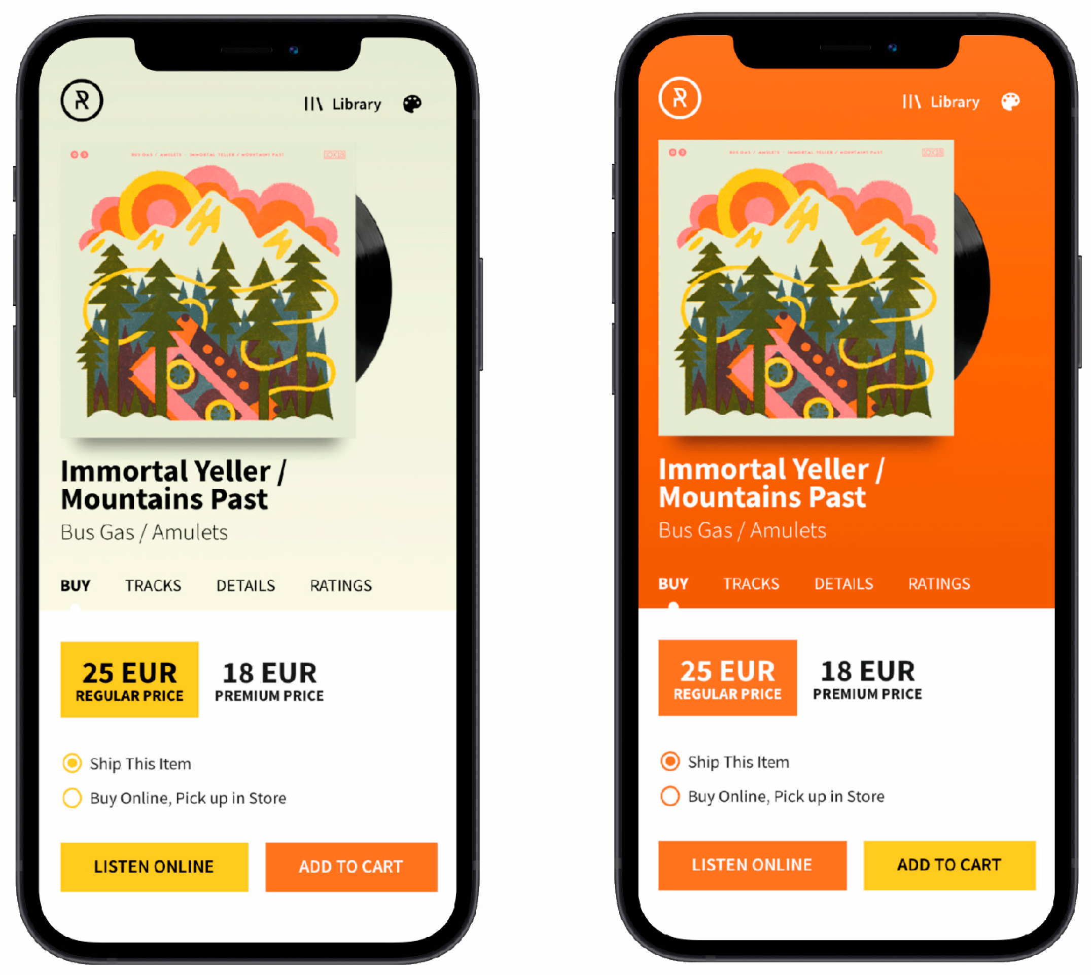
Figure 1 shows an example of the color theme generated by our model. The theme consists of five basic colors: primary color, secondary color, tertiary color, background color, and foreground color.

Figure 1.
The UI color theme consists of five basic colors and is generated based on initial colors and user settings.
The primary color takes up the largest part of the user interface and plays a decisive role in the interpretation and perception of the user interface. It is intended for the backgrounds of sections that need to be highlighted or differentiated from the main content. An example of such a section is the hero area, which occupies the area above the fold—an area of the user interface that is initially visible before scrolling. However, the primary color is unsuitable for interactive elements (e.g., buttons, text fields, links) or essential text, as the contrast is not considered in the calculation.
The main purpose of the secondary color is to attract attention. Therefore, it must have sufficient color strength—a high lightness and/or chroma value to stand out. Additionally, the secondary color helps differentiate elements, indicating various roles or states. Since the secondary color can also be used for interactive elements, it must be in high contrast with the background. An example of using the secondary color would be the CTA button, which prompts the user to take an action and should stand out from other elements.
Tertiary color is used primarily for interactive elements (buttons, radio buttons, checkboxes, etc.) and elements that require clear color differentiation (section headings, links, etc.). Since these elements are essential for the functionality of the user interface, they must be in high contrast with the background, especially in the lightness dimension, to ensure their visibility.
The combination of foreground and background colors is used for the main content of the user interface, where readability is the primary concern. To ensure readability, appropriate contrast between these two colors should be met. These colors are also used for displaying the content of the elements (text) when the primary, secondary, or tertiary color is used as the element background.
As shown in Figure 1, each of the five basic colors also has a corresponding darker or lighter variant that can be used for various purposes, such as displaying hover states, creating background gradients, or creating realistic shadows.
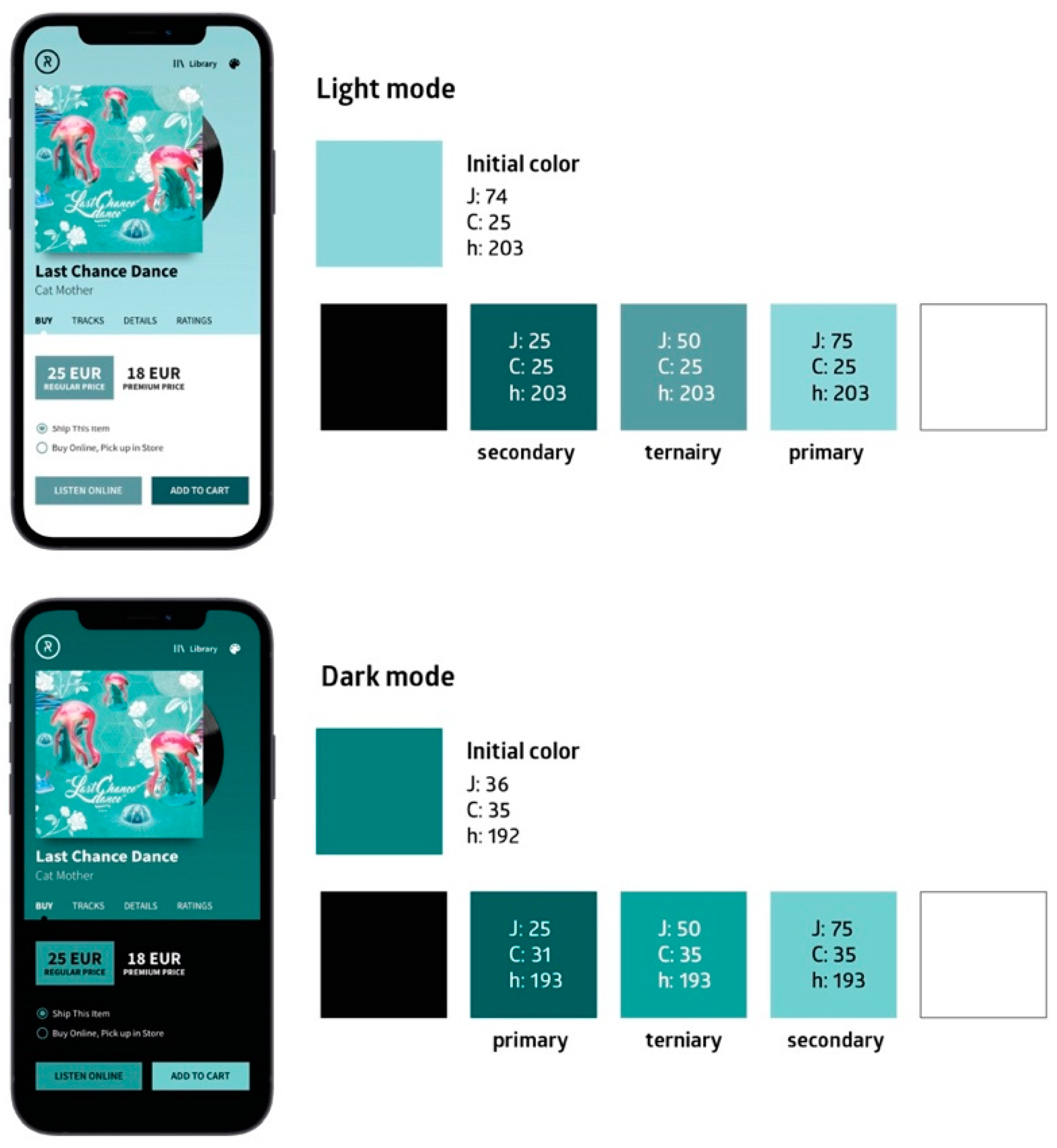
When generating the color theme, the model also considers the theme of the operating system or application—dark or light mode. In dark mode, the interface adopts a predominantly dark or black background with lighter text and elements. This mode is often favored for its reduced glare in low-light environments and its potential to extend battery life on laptops and mobile devices. In contrast, the light mode features a bright background with dark text, offering a classic look suitable for well-lit surroundings.
Furthermore, the model offers a range of settings that allow users to control the generation of color themes. For example, users can adjust parameters for selecting primary and secondary colors or choose between various modes or presets. In addition, they can enable or disable color harmony adjustments and set desired contrast levels. These settings allow users to create different color themes from the same input colors based on their own preferences.
The input and output colors of the model are defined in the sRGB color space, while the calculations are performed in the CAM02-UCS perceptual uniform color space [47]. To convert XYZ color values (these were obtained from RGB values based on sRGB color space) to the color appearance attributes of the CIECAM02 appearance model, on which the CIECAM02-UCS color space is based, we used the parameters recommended by Moroney [48]: LA = 4, reference white = D65, Yb = 20, and a dim environment (c = 0.69, Nc = 1, F = 1).
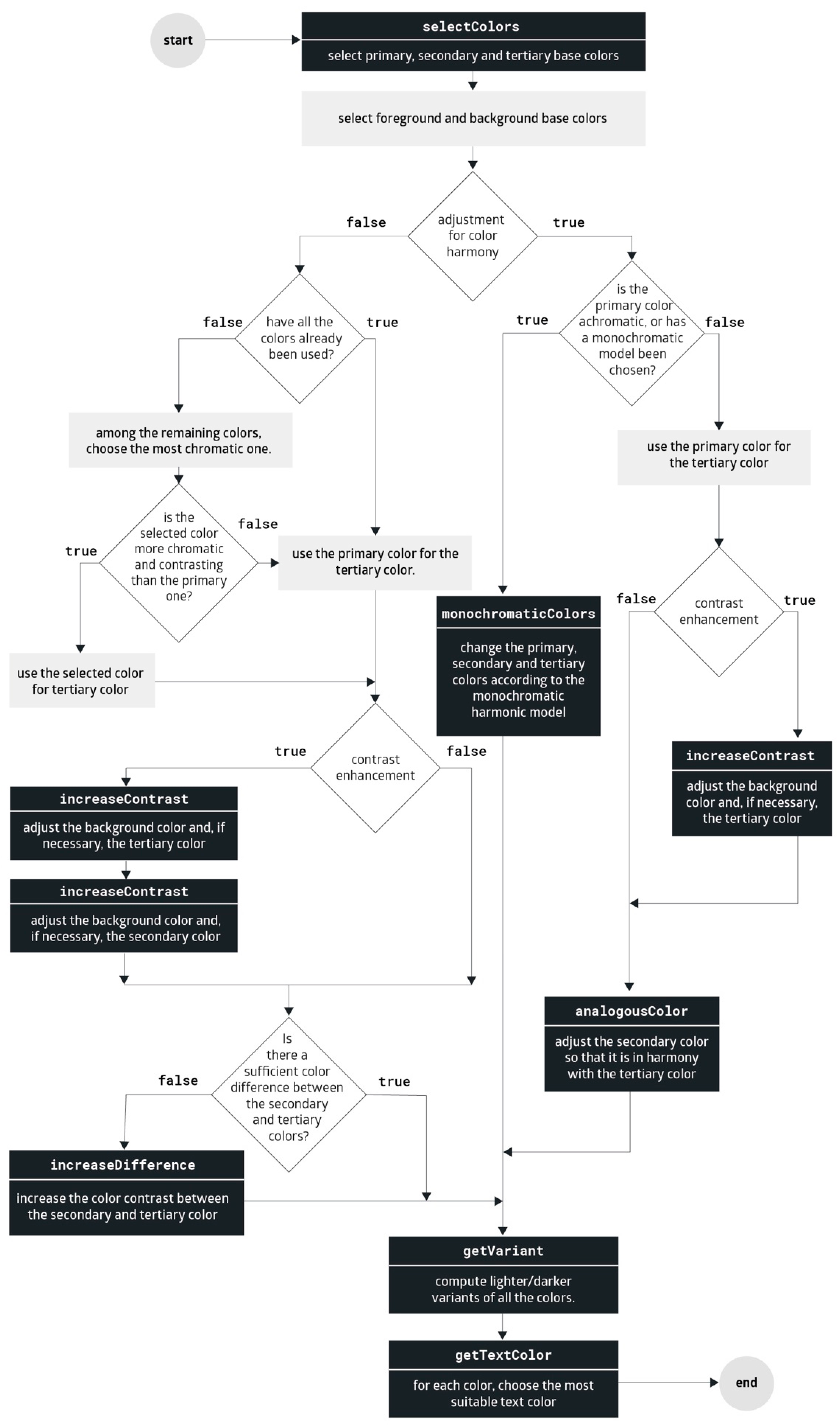
The algorithm used by the model is represented in Figure 2, while its main segments are explained in more detail in the following sections.
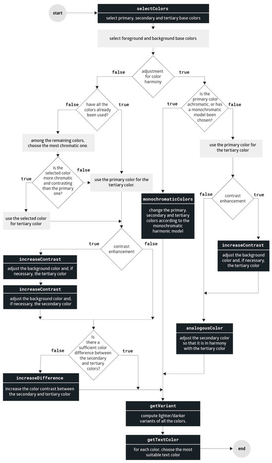
Figure 2.
The main algorithm for determining the color theme of a user interface.
4.2. Selecting Color Candidates
In the first step, the model determines the suitability of the input colors. First, it selects which input colors are best suited for primary and secondary colors. Then, it checks if any remaining colors can be used for the foreground or background color. If no suitable colors are found for the background or foreground, default colors are used. Algorithm 1 shows the pseudocode of the function for determining the suitability of colors, which is explained in more detail below.
| Algorithm 1. Selecting colors based on their suitability | ||||
| function selectColors | ||||
| ⊲ set of all pairs: [[c1, c2], [c2, c3] ... n] | ||||
| for all p ∈ P do | ||||
| if score > maxScore then | ||||
| end if | ||||
| end for | ||||
| for all do | ||||
| if then | ||||
| end if | ||||
| if then | ||||
| end if | ||||
| end for | ||||
| if then | ||||
| end if | ||||
| if then | ||||
| end if | ||||
| return | ||||
| end function | ||||
4.2.1. Selecting Primary and Secondary Color
Let be the set of initial colors based on which we want to create a color theme for a user interface. To determine the primary and secondary colors, first, a set of all pairs of the given colors is created: . A score is then calculated for each pair, with the first color being a candidate for the primary color and the second being a candidate for the secondary color. The pair of colors that receives the highest score is considered the best fit for the primary and secondary colors. The score is calculated as follows:
where is a candidate for the primary color and for the secondary color. and are scoring functions defined as:
where is the coverage of a color in the image, C is the color chroma value in CAM02-UCS color space, S is the strength of a color calculated as (J is the lightness of a color in CAM02-UCS), D is the contrast or absolute difference between lightness of a color (J) and lightness of the surround (Jb), A is the analogy or color similarity in lightness component with the surround (Jb), and is the Euclidian distance in CAM02-UCS. All values are relative, normalized between 0 and 1.
For the lightness of the surround, a minimum lightness value of the sRGB color gamut inside CAM02-UCS color space is used when the dark mode is set, and a maximum value when the light mode is set. The coverage of color in the image was determined by calculating the soft recoloring error. A detailed explanation of this metric can be found in our earlier work [40].
As you can see, the coverage of color in the image, chroma, strength, and contrast was considered in calculating scores for both the primary and secondary colors. However, when calculating the score for primary color () the model also considered analogy to prevent contrast color from being selected, since primary color can be used for the background of large areas. This is especially important when using a dark mode since bright backgrounds can be unpleasant for the user. In addition, the model takes into account the color difference between primary and secondary colors when calculating the score for the secondary color (), since the latter is mainly used for differentiating the elements and attracting attention of the users, and therefore there needs to be adequate differences.
The effect of each property can be modified by adjusting the weighting factors () on both functions. This means that the same property can play a different role in calculating the primary and secondary colors. Moreover, changing the weighting factors enables us to generate various color themes based on the same initial colors.
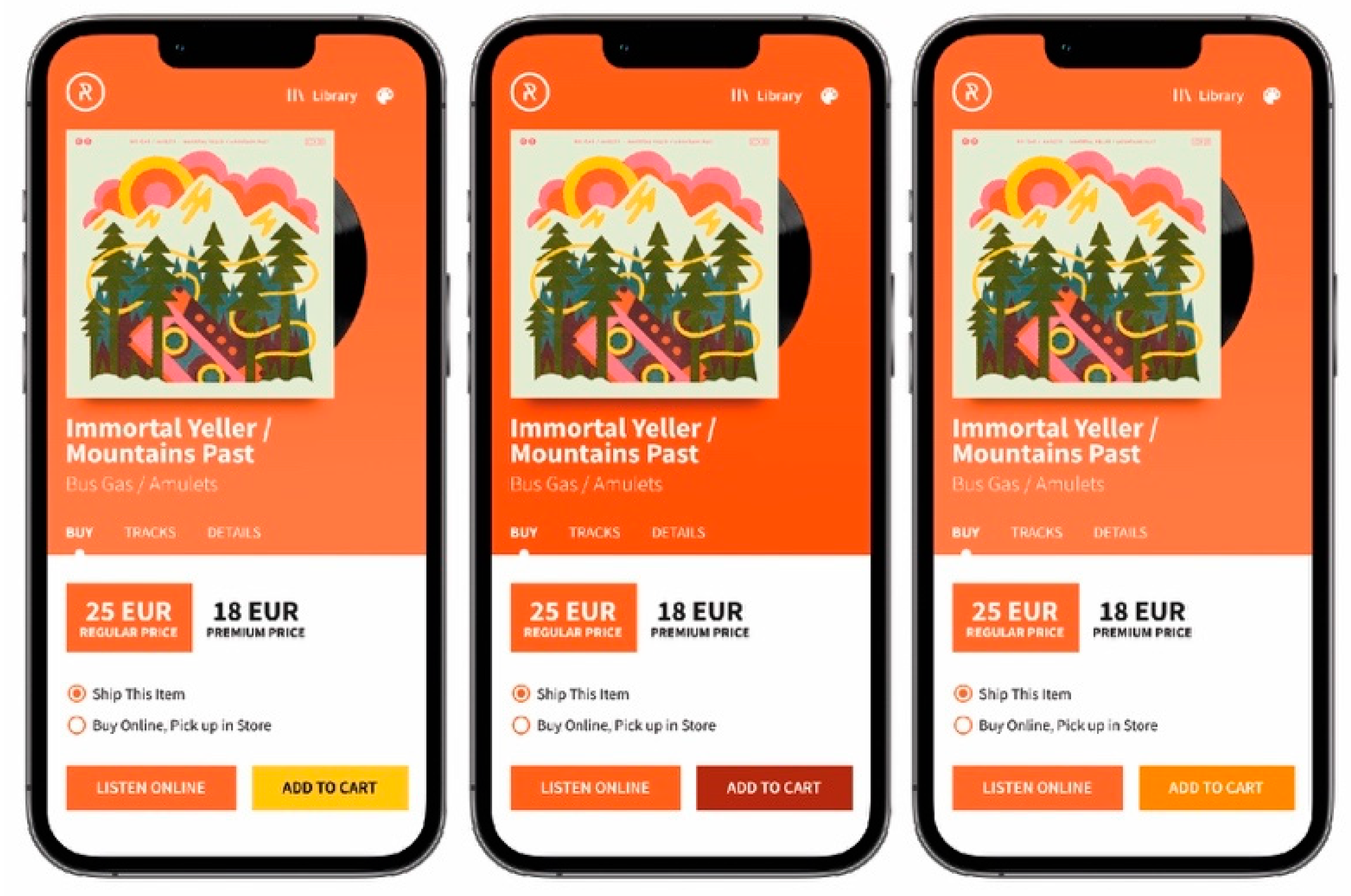
By testing different values of the weighting factors and visually evaluating the results, we defined two configurations or modes for selecting colors: authentic and colorful. The colorful mode favors colorfulness (chroma) when selecting the primary color, while the authentic mode emphasizes image coverage with color. Figure 3 shows an example of the color themes obtained with different color selection modes. The weighting factors of the two modes are listed in Table 2.
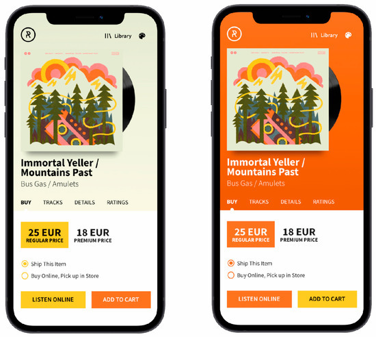
Figure 3.
Color themes created with different color selection modes: authentic (left) and colorful (right).
Table 2.
Weighting factors of two modes for selecting colors.
4.2.2. Selecting Foreground and Background Colors
To determine the foreground and background colors, the model first selects the lightest () and the darkest color () from the remaining colors. Then, it checks whether the selected colors have appropriate lightness and chroma values based on the specified thresholds (max. chroma), (max. lightness), and (min. lightness). The default thresholds are , , and , however the user can adjust these as needed. If the selected colors do not meet the specified conditions, the model uses default colors instead: and . The color values of the default colors can also be set in the model’s settings.
When the light mode is selected, the color is chosen for the foreground color and the color for the background color. In light mode, these roles are reversed so that the color is used for the foreground color and the color for the background color.
4.2.3. Selecting Tertiary Color
The model first checks if all colors have already been used. If not, the model selects the color with the highest chroma value from the remaining colors and calculates the contrast with the background color. If the contrast is higher than the contrast between the primary color and the background color, and the selected color has a higher chroma value than the primary color, the selected color is used as the tertiary color. Otherwise, the primary color is used as the tertiary color. The primary color is also used if all suggested colors have already been used. If the color harmony mode is set, the tertiary color is determined as described in the following chapter.
4.3. Color Harmony
The model can also consider color harmony when creating a UI color theme. Users can choose between a monochromatic and analogous color theme or turn off color harmony adjustment.
Monochromatic colors have the same hue, however, they can vary in chroma and lightness. To determine a monochromatic color theme within the CAM02-UCS color space, first, three colors are created that share the same hue and chroma as the previously defined primary color. These colors are evenly distributed between the predefined light color () and dark color (). If colors are outside the sRGB color gamut, linear interpolation is used to map them along the chroma path to the boundary of the color gamut (with lightness and hue remaining unchanged)—Algorithm 2. As can be seen from Figure 4, among the newly created colors, the color with intermediate lightness is used for the tertiary color, and the most contrasting color is used for the secondary color—in light mode, the darkest color, and in dark mode, the lightest. For the primary color, the most similar color (a lower color difference) to the initial primary color is chosen. However, if the dark mode is set, the darkest color is selected for the primary color to avoid glare. Algorithm 3 shows the pseudocode for determining a monochromatic color theme.
| Algorithm 2. Mapping color on the chroma path | |||
| function colorMapping(c) | |||
| if insideGamut(c) then | |||
| return c | |||
| end if | |||
| while do | |||
| if insideGamut(c) then | |||
| else | |||
| end if | |||
| end while | |||
| return | |||
| end function | |||
| Algorithm 3. Computing monochromatic colors | ||||
| function monochromaticColors | ||||
| for do | ||||
| end for | ||||
| if darkmode then | ||||
| else | ||||
| for all do | ||||
| if then | ||||
| end if | ||||
| end for | ||||
| end if | ||||
| return | ||||
| end function | ||||

Figure 4.
Monochromatic color theme in light and dark modes.
Analogous colors have similar hues, lying next to each other in hue dimension. When creating an analogous color theme, the primary color remains unchanged and is the starting point for calculating the secondary and tertiary colors. By default, the tertiary color is the same as the primary color, however, its lightness is adjusted in case of insufficient contrast with the background. The secondary color is determined as a color with the same lightness and chroma as the previously defined tertiary color, but with its hue shifted by 30 degrees in a clockwise direction (Algorithm 4). If the newly determined secondary color is outside of the sRGB color gamut, linear interpolation is used to map it along the chroma path to the boundary of the color gamut.
If the chroma of the primary color is less than specified chroma threshold (), the model, instead of analogous colors, computes monochromatic colors as described previously, ignoring the setting of the user.
| Algorithm 4. Computing analogous colors | |
| function analogousColors() | |
| return | |
| end function | |
A comparison of color themes with different color harmony settings is illustrated in Figure 5.
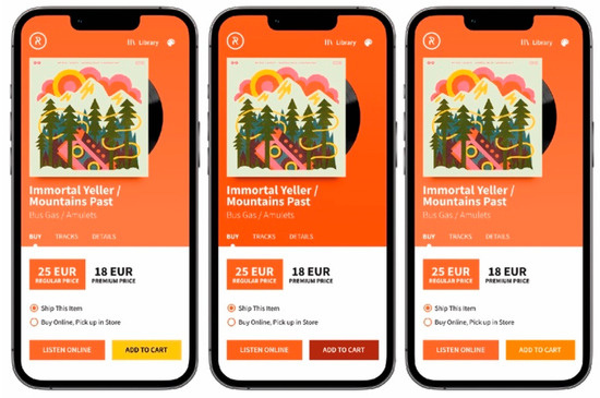
Figure 5.
Color themes computed with different options for color harmony adjustment: off (left), monochromatic (middle), and analogous (right).
4.4. Adjusting Colors for Better Contrast and Differentiation
As shown in Figure 2, the model includes adjusting the lightness values at several points to achieve sufficient contrast between a specific color and its background. To increase the contrast, the model first tries to modify the lightness of the background color—increasing it in a light mode and decreasing it in a dark mode—until the desired contrast is achieved or the background color reaches the boundary of the sRGB color gamut (Algorithm 5). If adjusting the lightness of the background color does not lead to the desired contrast, the lightness of the specified color is gradually adjusted. If changing a color’s lightness places them outside the sRGB color gamut, they are mapped to the boundary of the color space along the chroma path.
To calculate the contrast, we have used an equation outlined by the World Wide Web Consortium (W3C) within the Web Content Accessibility Guidelines (WCAG) 2.1 [49]:
where and are relative lightness values calculated as:
Values , , are calculated as:
where R, G, B are color values in the sRGB color space, normalized between 0 and 1.
The user can choose between two contrast levels defined by the WCAG (AA, AAA) or turn off contrast adjustments. For the more stringent AAA level, the contrast between the specified color and the background must be at least 7:1, while the AA level requires a contrast of 4.5:1.
| Algorithm 5. Contrast enhancement | ||||
| function increaseContrast | ||||
| while do | ||||
| if gamut then | ||||
| if then | ||||
| else | ||||
| end if | ||||
| if then | ||||
| else | ||||
| end if | ||||
| else | ||||
| if then | ||||
| else | ||||
| end if | ||||
| end if | ||||
| end while | ||||
| return | ||||
| end function | ||||
Since the secondary color is also used to differentiate interactive elements, it must be sufficiently different from the tertiary color. Therefore, the model utilizes a function to increase the difference between these two colors. As can be seen from Algorithm 6, the model initially attempts to increase the difference between the colors by gradually modifying the lightness of the most contrasting color according to the preferred mode. If this does not achieve the desired difference, it progressively adjusts the lightness of the less contrasting color. By default, the color difference between these colors should be at least 5 units, nevertheless, the user can modify this value in the model settings. If changing the brightness of color causes it to be outside of the sRGB color gamut, it is mapped to the boundary by reducing its chromaticity—moved along the chroma path.
| Algorithm 6. Differentiating the secondary color | ||||
| function increaseDifference() | ||||
| while do | ||||
| if then | ||||
| if darkmode then | ||||
| else | ||||
| end if | ||||
| if then | ||||
| else | ||||
| end if | ||||
| end if | ||||
| if then | ||||
| if darkmode then | ||||
| else | ||||
| end if | ||||
| if then | ||||
| else | ||||
| end if | ||||
| end if | ||||
| end while | ||||
| return | ||||
| end function | ||||
4.5. Defining Color Pairs and Color Variants
For each basic color (, , , , ), the model determines a color that can be effectively combined with it. The model chooses between the lightest color () and the darkest color () to maximize color contrast, as illustrated in Algorithm 7.
In addition, the model computes lighter or darker variants of each basic color to indicate various states of interactive elements (hover, active, focus) and for design needs, e.g., for generating color gradients.
As shown in Algorithm 8, the model initially attempts to create a darker version when the lightness of the color is less than or equal to 50, and a lighter version otherwise. The model takes the opposite approach if the lightness value of the newly computed color falls outside the range: [0, 100]. If the final color is outside the sRGB color gamut, it is mapped to the boundary of the color space by reducing its chroma value. By default, the color variants are either lighter or darker by 5 units, nevertheless, the user can adjust this value in the model settings.
| Algorithm 7. Selecting the most suitable color for text | ||
| function getCombination | ||
| if then | ||
| return | ||
| else | ||
| return | ||
| end if | ||
| end function | ||
| Algorithm 8. Computing color variant | ||
| function getVariant | ||
| if then | ||
| else | ||
| end if | ||
| if then | ||
| else | ||
| end if | ||
| return c | ||
| end function | ||
5. Integrating the Model into a Web-Based Application
To evaluate the performance of the model, we integrated it into a web application. The application uses the model for automatic and real-time adjustments of the UI colors based on the feature image. Our goal was to showcase the practical usage of the model. All the code is openly available on a Github public repository [50].
5.1. Concept and Design
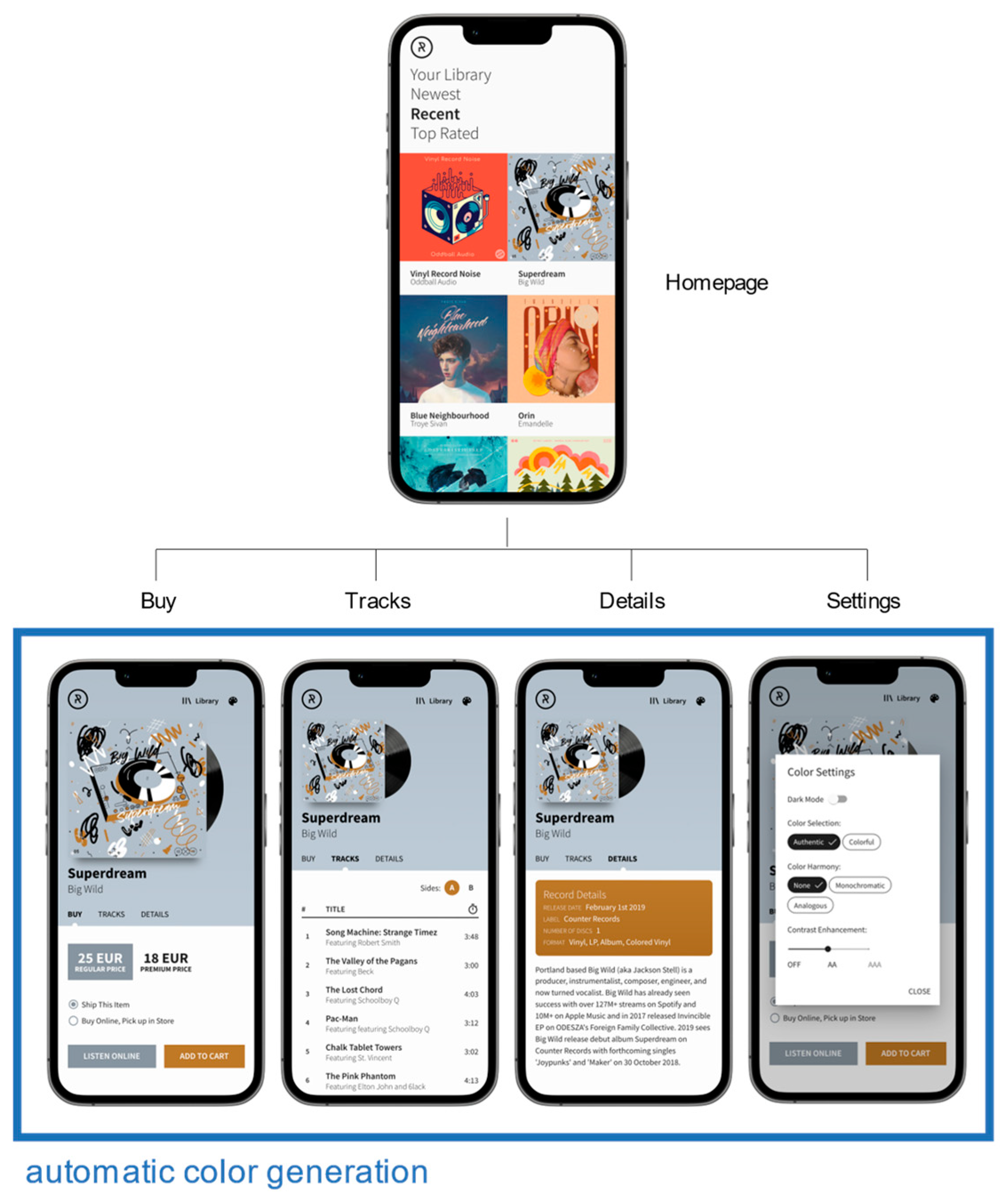
The web application, called “Records”, is used for browsing and purchasing music albums. Since the web application is primarily intended for demonstrating and testing the model, it contains limited data and certain functionalities still need to be implemented (e.g., listening to audio tracks and making purchases).
Figure 6 illustrates the landing page and subpages of the web application. Our model determines the UI colors in real-time on the subpages (while the user is browsing through the album) based on the featured image of the current album.
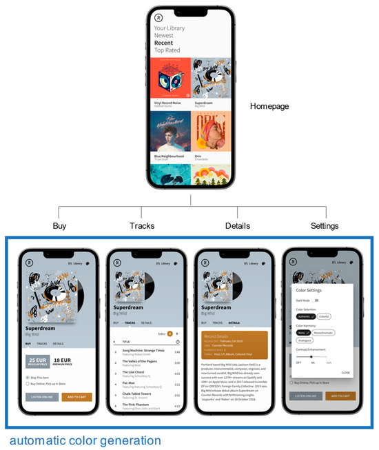
Figure 6.
Homepage and subpages of the web application. The colors are automatically determined on subpages based on the featured image.
As described in the previous section, our model generates a theme of five basic colors. Inside our application, the colors are used as follows:
- The primary color is used for the background of the hero area, where the feature image, title, and main menu are located;
- The secondary color is used for the CTA button “Add to Cart” and the information card;
- The tertiary color is used for all other interactive elements. The variant of tertiary color is used for indicating button states;
- The background and foreground colors are used in the central area where the main content is displayed and for the text color in other elements.
5.2. Development
The web application was developed as a single-page application (SPA) with client-side rendering (CSR). The logic, data retrieval, rendering, and routing are all implemented directly in the browser using JavaScript. This approach enables asynchronous content changes without page refreshes. To simplify the development process, the data are stored in a JSON file instead of a database.
The application is built using the React JavaScript library. The Reach Router library is used for routing between pages, and the Service Worker API is employed to enable offline functionality. User settings are stored in the browser’s local storage. For rapid development, we used Material UI design system.
5.3. Data and Image Collection
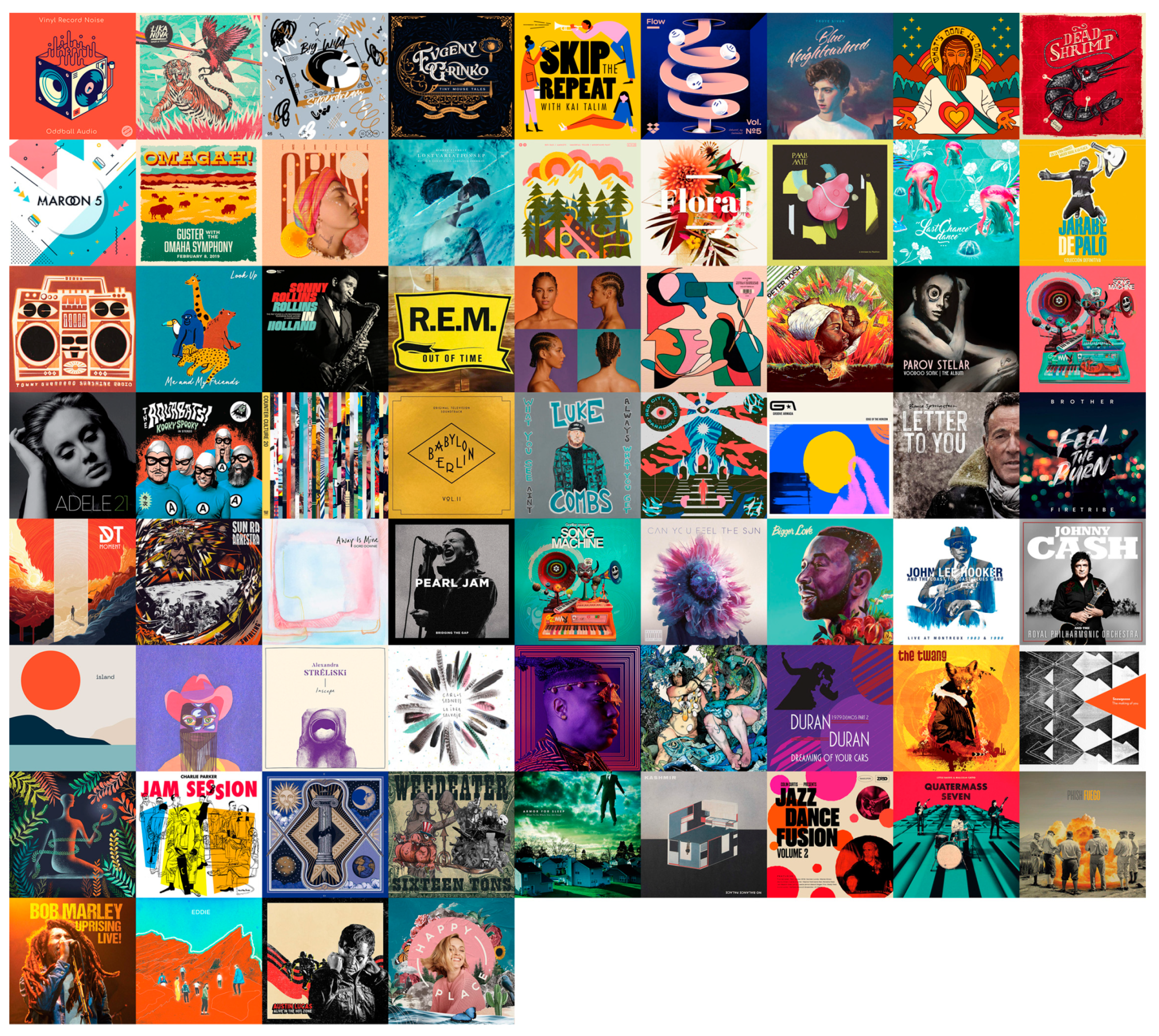
We have obtained data and images for 67 records from the web. The images are shown in Figure 7. Our aim was to select images that are highly diverse in terms of the span and distribution of colors (in both chroma and lightness dimensions), as well as the number of color categories. For images without an attached ICC profile, we assumed they were in the sRGB color space.
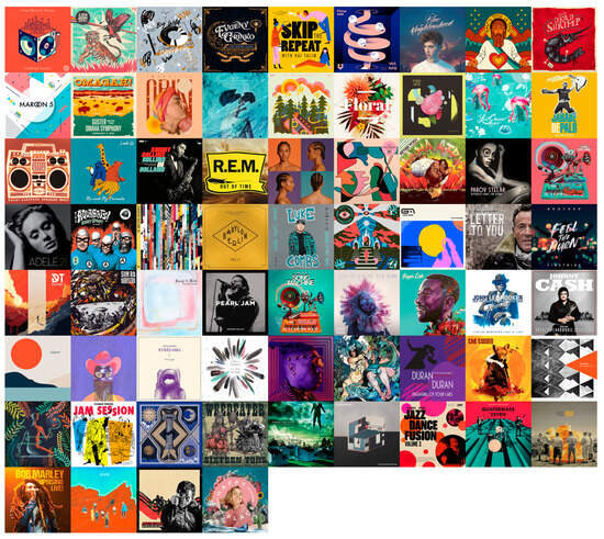
Figure 7.
Images of 67 records that were included in the application.
The model input colors were extracted from the images using a model for extracting the most prominent colors [40]. Since the model was developed in a Matlab/Python environment and cannot be directly utilized within the web application, the colors were pre-extracted for each image. These color values were stored in a JSON file and imported into the web application. For each image, we have extracted ten prominent colors.
5.4. Model Implementation
The model was implemented entirely in JavaScript, which makes it more flexible in web application development. The model can be used either on the client side (client-side rendering), as in our case, or on the server side (server-side rendering) inside the Node.js environment.
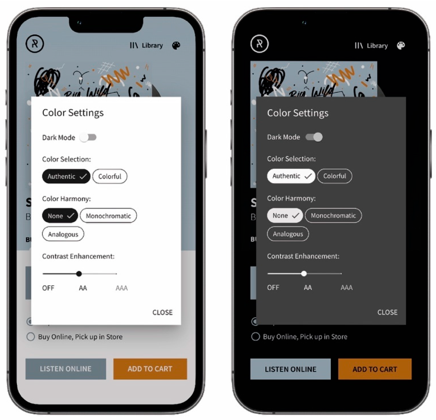
On the subpages where colors were dynamically determined, we have included a button that opens the modal window with all available settings (see Figure 8). The following settings are available:
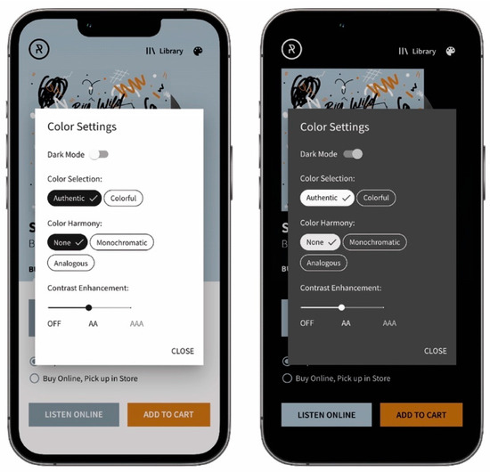
Figure 8.
The modal window with the settings in light (left) and dark mode (right).
- Dark mode: users can manually select their preferred mode. By default, the model uses a mode set by the operating system;
- Color selection: users can choose between two color selection modes supported by the model (see Section 4.2.1). The default mode is authentic;
- Color harmony: users can select between two color harmony models (see Section 4.3) or turn it off. By default, the adjustment for color harmony is turned off;
- Contrast enhancement: users can choose between two contrast levels (see Section 4.4) or turn off contrast enhancement. By default, the contrast is set to AA level.
6. Model Evaluation
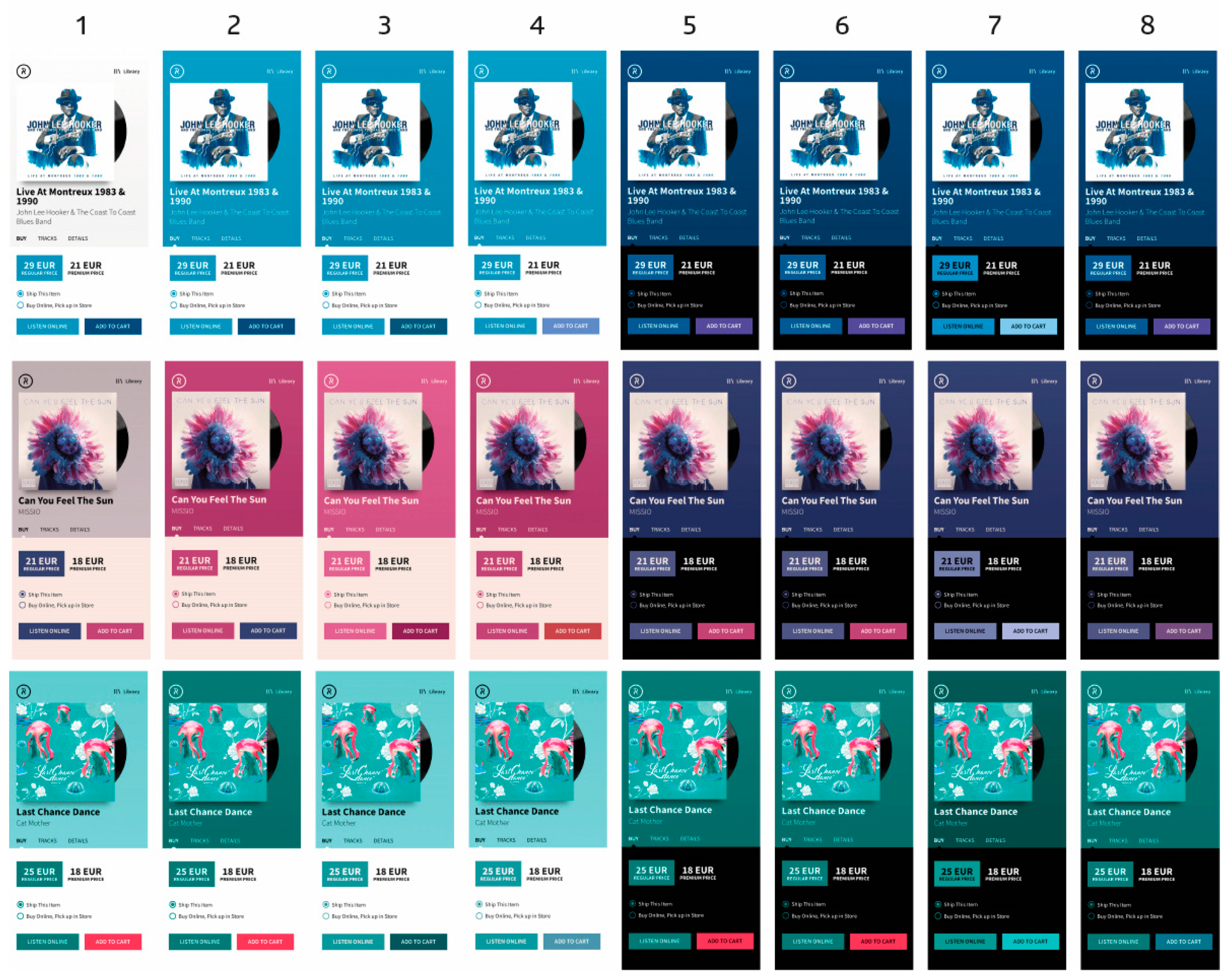
We took screenshots of the application using different settings to evaluate the model. The screenshots were then included in an online survey asking participants to rate the aesthetics and usability of colors.
Screenshots of three randomly selected albums and eight different settings were included in the survey. Screenshots are presented in Figure 9, while the settings are listed in Table 3. As can be seen, all settings use the same contrast level, while different options for dark mode, color selection, and color harmony were applied.
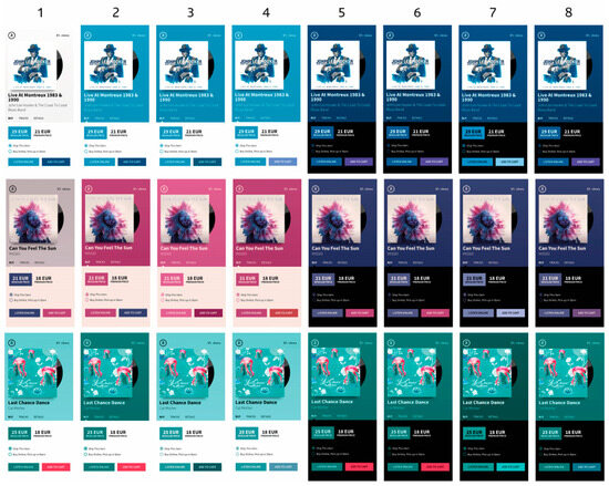
Figure 9.
Screenshots of the application used for model evaluation. The order of the screenshot corresponds to the applied settings listed in Table 3.
Table 3.
Settings used in the model evaluation.
In total, we created 24 screenshots that were randomly divided into six sets. Each participant rated the screenshots from one set.
6.1. Participants
A survey was conducted at the Faculty of Natural Sciences and Engineering, Department of Textiles, Graphic Arts, and Design, and shared in two Facebook groups—Slovenian Designers and UX Slovenia.
A total of 147 participants were included in the study (97 males and 50 females), aged between 19 and 62 years (average age 30.5 years). To test whether color vision was impaired, observers were presented with Ishihara test images (plates 1–16 and 22–25) at the end of the test. Data from subjects who failed the Ishihara test were excluded from the analysis.
6.2. Survey
Participants rated the color themes from an aesthetic and usability perspective. For each screenshot, they had to answer the following questions with “yes” or “no”:
- Question 1: Does the color theme match the featured image?
- Question 2: Do you prefer a color theme?
- Question 3: Are the user interface colors harmonious?
- Question 4: Are the colors of the buttons and other interactive elements clearly visible?
- Question 5: Does the “Add to Cart” button stand out more than other buttons?
- Question 6: Do any colors make the text difficult to read?
The survey was conducted using a custom website that guided participants through the entire process and collected data in a database.
7. Results and Discussion
We statistically analyzed the data collected from the online survey to assess whether responses differed significantly, and to identify potential performance variations among settings. We used Pearson’s Chi-square goodness-of-fit test to determine whether the differences between responses were statistically significant and the Chi-square test of independence to determine if responses statistically differ between different settings. In addition, we used binary logistic regression to determine the effect of each setting on usability and aesthetics of colors.
Figure 10 presents the percentage of affirmative responses for each question, while Figure 11 shows affirmative responses analyzed by individual setting.
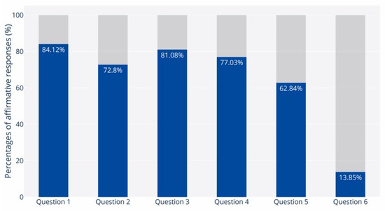
Figure 10.
Percentages of affirmative responses for each question.
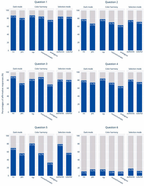
Figure 11.
Percentages of affirmative responses for different settings.
7.1. Compatibility with the Featured Image
In Question 1, participants were asked whether the color theme matched the featured image. The results revealed that more than 84% of the participants answered “yes” (χ2(1) = 275.7; p < 0.01), indicating that color themes generated by our model were consistent with the featured images.
The highest percentage of affirmative responses was observed when using Settings 3 (93.2%), while the lowest was recorded for Settings 8 (76.3%). Comparing the percentage of positive responses when different options for color harmony were used, reveals that the highest percentages were achieved when color harmony was turned off (87.8%), followed by the monochromatic (84.7%), and the analogous harmony option (76.4%). The differences are statistically significant (χ2(2) = 9.63; p = 0.008), suggesting that adjustments of colors for color harmony could impact their compatibility with a featured image. The results are in line with our expectations. When an adjustment for color harmony is set, the model could use colors other than those initially provided to establish color harmony. However, these colors may not be in the image, which results in lower compatibility.
A slightly lower percentage of affirmative responses was observed when using different options for dark mode and color selection. Although these differences are insignificant according to the Chi-square test of independence (χ2(1) = 3.86; p = 0.056, χ2(1) = 0.21; p = 0.88), the binary logistic regression confirmed the negative influence of the dark mode.
According to the coefficients obtained from the logistic model, it is 1.5 times more likely that the colors will not be consistent with the image when dark mode is used (p = 0.045) and up to 3 times more likely (p < 0.01) when the analogous option is set for color harmony adjustment—compared to the option when color harmony is turned off (χ2(4) = 15.91; p = 0.003, Nagelkerke R2 = 0.05).
7.2. Color Theme Preference
Question 2 inquired whether participants preferred the color theme. The high percentage of positive responses (72.80%) indicates that users, in general, prefer color themes that are generated by our model (χ2(1) = 123.14; p < 0.01). Among all the settings, the highest percentage of positive responses was recorded for Settings 1 (87.1%), while the lowest was observed for Settings 8 (60.5%).
The results of binary logistic regression analysis revealed that two individual settings, i.e., color harmony and dark mode, had a statistically significant impact (χ2(4) = 22.18; p < 0.01, Nagelkerke R2 = 0.05). When color harmony was disabled, 78.6% of responses were positive. However, only 70.7% were positive with the monochromatic option and 63.5% with the analogous option. Observed differences are statistically significant (χ2(2) = 11.73; p < 0.01). The impact of color harmony is further confirmed by the coefficients of the logistic regression, indicating that adjustment for color harmony reduces the likelihood of generating preferred color themes by 1.8 times with the monochromatic option (p = 0.03), and 2.5 times with the analogous option (p < 0.01).
As outlined in the previous section, when color harmony adjustment is disabled, all colors are derived from the image (if necessary, the model only adjusts the lightness of the colors to achieve sufficient contrast or differentiation). Therefore, it can be assumed that the preference for the color theme is influenced by how well the color theme matches the image. In order to test this assumption, we conducted a comparison of the responses received for Question 1 and Question 2. We observed that among the participants who agreed that the color theme was compatible with the image, 94.7% also expressed their preference for the color theme. Similarly, among those who assessed that the colors did not match the image, 75.5% also did not like the colors. The correlation between the compatibility with the image and preference for the color theme is statistically significant (χ2(1) = 131.85; p < 0.01) and moderate (φ = 0.47, Cohen’s V = 0.47; p < 0.01).
7.3. Color Harmony
Out of all the participants, 81.08% confirmed that the colors were in harmony (χ2(1) = 228.757; p < 0.01). The best result was achieved with Settings 3, where 98.6% of participants confirmed the harmony of colors, while the lowest percentage of affirmations was observed with Settings 8 (65.5%). Analysis of responses suggests that perceived color harmony is influenced by color harmony and dark mode settings but not color selection mode.
The results show that monochromatic color themes received the highest proportion of affirmative responses (88.0%) compared to the other color harmony options. When color harmony was turned off, the proportion slightly decreased to 83.3%. On the other hand, analogous color themes received the lowest proportion of affirmative responses (69.6%). These differences are statistically significant (χ2(2) = 18.383; p < 0.01) and confirmed by logistic regression (χ2(4) = 48.73; p < 0.01, Nagelkerke R2 = 0.13). According to coefficients, it is 2.6 times more likely that the analogous color theme will not be harmonious—compared to the themes where color harmony adjustment was turned off (p < 0.01). Therefore, when using analogous color themes, the chances of achieving color harmony are lower than when color harmony adjustment is turned off. This finding implies that, rather surprisingly, the compatibility with the image is more important than the relationships of colors in establishing color harmony. While using monochromatic colors gives the highest probability of achieving color harmony, the most crucial factor is using colors compatible with the image. This indicates that color harmony also depends on the context, confirming the findings in previous studies [51].
It is surprising to note that the percentage of positive responses is higher for the light mode (89.9%) than for the dark mode (72.7%). The difference between the two modes is statistically significant (χ2(1) = 28.633; p < 0.01) and has been confirmed through logistic regression analysis. Based on the obtained coefficients, it appears that colors are perceived 3.5 times less harmoniously in the dark mode than in the light mode. These findings align with previous studies, which found that harmonious color combinations tend to be lighter on average [23,24].
7.4. Usability of Color Themes
7.4.1. Visibility of Interactive Elements
In response to Question 4, participants answered affirmatively in 77% of all cases (χ2(1) = 172.97; p < 0.01), indicating that colors used for interactive elements such as buttons are sufficient in contrast. The highest and lowest affirmative responses were achieved with Settings 1 (92.9%) and Settings 4 (61.1%), respectively.
Analysis of responses while different settings were used revealed that the visibility of buttons did not statistically differ between light and dark mode (χ2(1) = 2.54; p = 0.11), neither with different selection modes (χ2(1) = 2.29; p = 0.13). In contrast, using different color harmony options led to statistically significant differences (χ2(2) = 20.731; p < 0.01). The highest percentage of affirmative responses was observed when color harmony was turned off (84.4%). When color harmony adjustment was turned on, affirmative responses were lower; 74% for monochromatic and 65.5% for analogous options. The impact of the color harmony option was also confirmed by binary logistic regression (χ2(4) = 24.76; p < 0.01; Nagelkerke R2 = 0.06). According to the logistic model coefficients, it is 2.3 times more likely that buttons will not be sufficiently visible when the monochromatic option is used and 3.5 times more likely when the analogous option is set.
It is surprising to note the effect of the color harmony setting on the visibility of buttons. When the analogous option is used, most buttons use the same tertiary color as when color harmony is turned off. The only difference is in the secondary color used for CTA buttons. Based on this, it can be inferred that due to the lower visibility of CTA buttons, some participants perceived the visibility of all buttons as insufficient. While button visibility could be improved by using more contrasting colors, doing so would likely compromise compatibility with the image.
7.4.2. CTA Button
Regarding Question 5, the results showed that 62.84% of participants answered positively (χ2(1) = 39.03; p < 0.01), indicating that our model effectively chooses suitable color for the CTA button. Among all the settings, Settings 2 had the highest affirmative response rate (88.9%), while Settings 8 had the lowest rate (32.9%).
Analysis of observed and expected frequencies using different settings indicates that all settings significantly influence the saliency of CTA button. However, the logistic regression analysis confirmed only the influence of dark/light mode and color harmony adjustment (χ2(4) = 116.56, p < 0.01, Nagelkerke R2 = 0.25).
There were 69.8% affirmative responses in the light mode, while in the dark mode, only 56.3% (χ2(1) = 11.61; p = 0.01). Based on the logistic regression coefficients, there seems to be a 2-fold higher chance of the CTA button being less visible when the dark display mode is in use (p < 0.01). Nevertheless, the reason for this phenomenon remains unexplained.
When color harmony adjustment was turned off, the percentage of affirmative responses increased to 81.0%. However, when the color harmony adjustment was turned on, the percentage of affirmative responses decreased significantly—56.7% with the monochromatic option and 33.1% with the analogous option. These differences are statistically significant (χ2(2) = 99.77; p < 0.01). The logistic regression analysis has confirmed that the color harmony setting significantly affects the saliency of the CTA button. It is estimated that enabling color harmony adjustment reduces the CTA button saliency by 3.7 times in the case of the monochromatic option (p < 0.01) and by an impressive 10 times with the analogous option (p < 0.01). This is to be expected, as the selection of the secondary color (color used for the CTA button) is limited to a specific hue, and its chroma is based on the primary color. On the other hand, when the color harmony adjustment is disabled, the model usually picks the most chromatic color in the image for the secondary color.
The percentage of affirmative responses was 79.6% when using the authentic option for color selection, compared to only 57.6% when using the colorful option (χ2(1) = 22.41; p < 0.01). This difference is not surprising, as the colorful mode favors chromatic colors in both primary and secondary color selection, while the authentic mode primarily considers chromaticity in the selection of the secondary color and, to a lesser extent, in the selection of the primary color.
7.4.3. Effect on Legibility
In response to Question 6, participants responded negatively in 86.15% of cases (χ2(1) = 309.43; p < 0.01). The highest percentage of negative responses was with Setting 3 (90.5%), while the lowest was with Setting 5 (75.0%).
There were no statistically significant differences between the observed and expected frequencies using different settings, as confirmed by the Chi-square test of independence and logistic regression. It is important to note that the contrast level was set to AA in all cases, ensuring adequate contrast between the text and its background.
8. Conclusions and Further Research
In this article, we have presented a model for generating UI color themes. First, the model enables the automatic generation of the UI color theme based on a given image. For example, if an editor or author changes the central image of a website (e.g., the logo or featured image), the model automatically determines a new color theme and thus changes the colors of all elements on the website. Secondly, the model enables the dynamic adjustment of the colors of the user interface based on the active featured image—the image displayed next to the elements. This feature proves particularly useful for websites where images play a central role and change dynamically, such as image galleries, product presentations, portfolios, etc. In such cases, the website no longer relies on a static/constant color theme, but the colors of the elements are dynamic and adapt to the current active image.
According to the results of the survey, our model generates colors that are (1) consistent with the image, (2) preferred by users, (3) harmonious, and (4) user-friendly (visible, discriminable, and high-contrast). An important finding is that color harmony can be achieved solely by using the prominent colors of the image without using color harmony adjustment, which implies that perceived color harmony is also context-dependent.
The survey results have also shown that the settings influence the model’s performance. For optimal performance, we recommend the following settings: light mode, authentic color selection, adjustment for color harmony turned off, and moderate contrast enhancement (AA).
While the survey results indicate relatively high performance, additional research is necessary before its implementation in a production environment. Therefore, our next step is to repeat the survey using the aforementioned optimal settings with more images, including brand logos and images of physical products. It would also be interesting to gather users’ opinions on other aspects of their experience, e.g., their emotions. Moreover, it is crucial to test the model’s performance with users who have partial or complete color blindness to ensure its wider usage. If necessary, adjustments should be made to make the model accessible to everyone. Additionally, the impact of various contrast enhancement levels needs to be determined, which was not covered in our research due to resource constraints.
The model we have developed has great practical value, especially when it comes to content management systems (CMS). These systems allow users to customize their websites through a simple interface. The model is even more valuable when used with modern block editors and website builders that allow users to add, combine, and customize individual blocks or components. In the near future, we plan to implement the model in one of the popular open-source CMSs. We would also like to develop a standalone tool/application to help UI designers and developers select color themes.
Funding
The authors acknowledge the financial support from the Slovenian Research Agency (research core funding No. P2-0450).
Data Availability Statement
The original contributions presented in the study are included in the article, further inquiries can be directed to the corresponding author.
Conflicts of Interest
The authors declare no conflict of interest.
References
- Gramazio, C.C.; Laidlaw, D.H.; Schloss, K.B. Colorgorical: Creating discriminable and preferable color palettes for information visualization. IEEE Trans. Vis. Comput. Graph. 2017, 23, 521–530. [Google Scholar] [CrossRef] [PubMed]
- Gijsenij, A.; Vazirian, M.; Spiers, P.; Westland, S.; Koeckhoven, P. Determining key colors from a design perspective using dE-means color clustering. Color Res. Appl. 2023, 48, 69–87. [Google Scholar] [CrossRef]
- O’Donovan, P.; Agarwala, A.; Hertzmann, A. Color compatibility from large datasets. ACM Trans. Graph. 2011, 30, 1–12. [Google Scholar] [CrossRef]
- Kita, N.; Miyata, K. Aesthetic Rating and Color Suggestion for Color Palettes. Comput. Graph. Forum 2016, 35, 127–136. [Google Scholar] [CrossRef]
- Yuan, L.P.; Zhou, Z.; Zhao, J.; Guo, Y.; Du, F.; Qu, H. InfoColorizer: Interactive Recommendation of Color Palettes for Infographics. IEEE Trans. Vis. Comput. Graph. 2022, 28, 4252–4266. [Google Scholar] [CrossRef]
- Gu, Z.Y.; Lou, J. Data driven webpage color design. Comput Aided Des. 2016, 77, 46–59. [Google Scholar] [CrossRef]
- Cao, Y.; Proctor, R.W.; Ding, Y.; Duffy, V.G.; Zhang, Y.; Zhang, X. Influences of Color Salience and Location of Website Links on User Performance and Affective Experience with a Mobile Web Directory. Int. J. Hum.–Comput. Interact. 2021, 37, 547–559. [Google Scholar] [CrossRef]
- Liu, W.; Cao, Y.; Proctor, R.W. How do app icon color and border shape influence visual search efficiency and user experience? Evidence from an eye-tracking study. Int. J. Ind. Ergon. 2021, 84, 103160. [Google Scholar] [CrossRef]
- Tian, S.J.; Luo, X.; Lu, D.; Chen, Y. Study on the Effect of Web Color Scheme on User Behavior. In Proceedings of the 2017 International Conference on Virtual Reality and Visualization (ICVRV 2017), Zhengzhou, China, 21–22 October 2017; pp. 408–410. [Google Scholar]
- Yamin, P.A.R.; Park, J.; Kim, H.K.; Hussain, M. Effects of button colour and background on augmented reality interfaces. Behav. Inf. Technol. 2023, 43, 663–676. [Google Scholar] [CrossRef]
- Deng, L.; Zhang, Z.R.; Zhou, F.Y.; Liu, R.Y. Effects of App Icon Border Form and Interface Background Color Saturation on User Visual Experience and Search Performance. Adv. Multimed. 2022, 2022, 1166656. [Google Scholar] [CrossRef]
- Lidwell, W.; Holden, K.; Butler, J.; Elam, K. Universal Principles of Design, Revised and Updated: 125 Ways to Enhance Usability, Influence Perception, Increase Appeal, Make Better Design Decisions, and Teach through Design; Rockport Publishers: Beverly, MA, USA, 2010. [Google Scholar]
- Ou, L.C.; Luo, M.R.; Woodcock, A.; Wright, A. A study of colour emotion and colour preference. Part I: Colour emotions for single colours. Color Res. Appl. 2004, 29, 232–240. [Google Scholar] [CrossRef]
- Gao, X.-P.; Xin, J.H. Investigation of human’s emotional responses on colors. Color Res. Appl. 2006, 31, 411–417. [Google Scholar] [CrossRef]
- Cyr, D.; Head, M.; Larios, H. Colour appeal in website design within and across cultures: A multi-method evaluation. Int. J. Hum.-Comput. Stud. 2010, 68, 1–21. [Google Scholar] [CrossRef]
- Kopacz, J. 13—Enhancing design using color A2—Best, Janet. In Colour Design; Woodhead Publishing: Sawston, UK, 2012; pp. 336–364. [Google Scholar]
- Palmer, S.E.; Schloss, K.B. An ecological valence theory of human color preference. Proc. Natl. Acad. Sci. USA 2010, 107, 8877. [Google Scholar] [CrossRef] [PubMed]
- Wright, A. 6—Predicting responses to colour A2—Best, Janet. In Colour Design; Woodhead Publishing: Sawston, UK, 2012; pp. 158–173. [Google Scholar]
- Ou, L.C.; Luo, M.R.; Woodcock, A.; Wright, A. A study of colour emotion and colour preference. Part III: Colour preference Modeling. Color Res. Appl. 2004, 29, 381–389. [Google Scholar] [CrossRef]
- Ou, L.C.; Luo, M.R.; Woodcock, A.; Wright, A. A study of colour emotion and colour preference. part II: Colour emotions for two-colour combinations. Color Res. Appl. 2004, 29, 292–298. [Google Scholar] [CrossRef]
- Westland, S.; Laycock, K.; Cheung, V.; Henry, P.; Mahyar, F. Colour Harmony. J. Int. Colour Assoc. 2007, 1, 1–15. [Google Scholar]
- Helson, H.; Lansford, T. The role of spectral energy of source and background color in the pleasantness of object colors. Appl. Opt. 1970, 9, 1513–1562. [Google Scholar] [CrossRef] [PubMed]
- Schloss, K.B.; Palmer, S.E. Aesthetic response to color combinations: Preference, harmony, and similarity. Atten. Percept. Psychophys. 2011, 73, 551–571. [Google Scholar] [CrossRef] [PubMed]
- Ou, L.C.; Luo, M.R. A colour harmony model for two-colour combinations. Color Res. Appl. 2006, 31, 191–204. [Google Scholar] [CrossRef]
- Chuang, M.-C.; Ou, L.-C. Influence of a holistic color interval on color harmony. Color Res. Appl. 2001, 26, 29–39. [Google Scholar] [CrossRef]
- Nemcsics, A. Experimental Determination of the Laws of Color Harmony. Part 4: Color Preference and the Color Harmony Content. Color Res. Appl. 2009, 34, 210–224. [Google Scholar] [CrossRef]
- Feisner, E.A. Colour: How to Use Colour in Art and Design; Laurence King: London, UK, 2006. [Google Scholar]
- Judd, D.B.; Wyszecki, G. Color in Business, Science and Industry, 3rd ed.; Wiley: Hoboken, NJ, USA, 1975. [Google Scholar]
- Burchett, K.E. Color harmony. Color Res. Appl. 2002, 27, 28–31. [Google Scholar] [CrossRef]
- Neumann, L.; Nemcsics, A.; Neumann, A. Computational color harmony based on coloroid system. In Proceedings of the Proceedings of the First Eurographics Conference on Computational Aesthetics in Graphics, Visualization and Imaging, Girona, Spain, 18–20 May 2005; pp. 231–240. [Google Scholar]
- Szabo, F.; Bodrogi, P.; Schanda, J. Experimental Modeling of Colour Harmony. Color Res. Appl. 2010, 35, 34–49. [Google Scholar] [CrossRef]
- Hsiao, S.W.; Chiu, F.Y.; Hsu, H.Y. A computer-assisted colour selection system based on aesthetic measure for colour harmony and fuzzy logic theory. Color Res. Appl. 2008, 33, 411–423. [Google Scholar] [CrossRef]
- Morse, B.S.; Thornton, D.; Xia, Q.; Uibel, J. Image-Based Color Schemes. In Proceedings of the 2007 IEEE International Conference on Image Processing, San Antonio, TX, USA, 16 September–19 October 2007; Volume III. pp. 497–500. [Google Scholar]
- Delon, J.; Desolneux, A.; Lisani, J.L.; Petro, A.B. Automatic color palette. Inverse Probl. Imaging 2007, 1, 265–287. [Google Scholar] [CrossRef]
- Zheng, X.; Lei, Q.; Yao, R.; Gong, Y.; Yin, Q. Image segmentation based on adaptive K-means algorithm. EURASIP J. Image Video Process. 2018, 2018, 68. [Google Scholar] [CrossRef]
- Rejeb, I.B.; Ouni, S.; Zagrouba, E. Image Retrieval Using Spatial Dominant Color Descriptor. In Proceedings of the 2017 IEEE/ACS 14th International Conference on Computer Systems and Applications (AICCSA), Hammamet, Tunisia, 30 October–3 November 2017; pp. 788–795. [Google Scholar]
- Huang, S.-C. An Efficient Palette Generation Method for Color Image Quantization. Appl. Sci. 2021, 11, 1043. [Google Scholar] [CrossRef]
- Li, A.; Bao, X. Extracting Image Dominant Color Features Based on Region Growing. In Proceedings of the 2010 International Conference on Web Information Systems and Mining, Sanya, China, 23–24 October 2010; pp. 120–123. [Google Scholar]
- Kiranyaz, S.; Uhlmann, S.; Ince, T.; Gabbouj, M. Perceptual Dominant Color Extraction by Multidimensional Particle Swarm Optimization. EURASIP J. Adv. Signal Process. 2010, 2009, 451638. [Google Scholar] [CrossRef]
- Weingerl, P.; Hladnik, A.; Javoršek, D. Development of a machine learning model for extracting image prominent colors. Color Res. Appl. 2020, 45, 409–426. [Google Scholar] [CrossRef]
- Wang, B.; Yu, Y.; Wong, T.-T.; Chen, C.; Xu, Y.-Q. Data-driven image color theme enhancement. ACM Trans. Graph. 2010, 29, 1–10. [Google Scholar] [CrossRef]
- Liu, S.; Luo, H. Hierarchical emotional color theme extraction. Color Res. Appl. 2016, 41, 513–522. [Google Scholar] [CrossRef]
- Karim, R.M.; Jeong, T.; Ha, H.; Ho, J.; Lee, K.; Shin, H.J. Improving user experience of color palette extraction by using interactive visualization based on hierarchical color model. Int. J. Hum.-Comput. Stud. 2023, 169, 102924. [Google Scholar] [CrossRef]
- Liu, S.; Jiang, Y.; Luo, H. Attention-aware color theme extraction for fabric images. Text. Res. J. 2018, 88, 552–565. [Google Scholar] [CrossRef]
- Feng, Z.; Yuan, W.; Fu, C.; Lei, J.; Song, M. Finding intrinsic color themes in images with human visual perception. Neurocomputing 2018, 273, 395–402. [Google Scholar] [CrossRef]
- Lin, S.; Hanrahan, P. Modeling how people extract color themes from images. In Proceedings of the SIGCHI Conference on Human Factors in Computing Systems, Paris, France, 27 April–2 May 2013; pp. 3101–3110. [Google Scholar]
- Luo, M.R.; Cui, G.; Li, C. Uniform colour spaces based on CIECAM02 colour appearance model. Color Res. Appl. 2006, 31, 320–330. [Google Scholar] [CrossRef]
- Moroney, N. Usage Guidelines for CIECAM97s. In Proceedings of the Society for Imaging Science and Technology: Image Processing, Image Quality, Image Capture, Systems Conference, Portland, OR, USA, March 2000; pp. 164–168. Available online: https://www.researchgate.net/publication/220865484_Usage_guidelines_for_CIECAM97s (accessed on 8 January 2024).
- Group, A.G.W. Web Content Accessibility Guidelines (WCAG) 2.1. Available online: https://www.w3.org/TR/WCAG21/ (accessed on 8 January 2024).
- Weingerl, P. Github—Automatic Color Theme Generation for User Interfaces Based on Featured Image. Available online: https://github.com/primozw/records-app-dev (accessed on 8 January 2024).
- Won, S.; Westland, S. Colour meaning and context. Color Res. Appl. 2016, 42, 450–459. [Google Scholar] [CrossRef]


Disclaimer/Publisher’s Note: The statements, opinions and data contained in all publications are solely those of the individual author(s) and contributor(s) and not of MDPI and/or the editor(s). MDPI and/or the editor(s) disclaim responsibility for any injury to people or property resulting from any ideas, methods, instructions or products referred to in the content. |
© 2024 by the author. Licensee MDPI, Basel, Switzerland. This article is an open access article distributed under the terms and conditions of the Creative Commons Attribution (CC BY) license (https://creativecommons.org/licenses/by/4.0/).