Abstract
Non-convex optimization problems often challenge gradient-based algorithms, such as Gradient Descent. Neural network training, a prominent application of gradient-based methods, heavily relies on their computational efficiency. However, the cost function in neural network training is typically non-convex, causing gradient-based algorithms to become trapped in local minima due to their limited exploration of the solution space. In contrast, global optimization algorithms, such as swarm-based methods, provide better exploration but introduce significant computational overhead. To address these challenges, we propose Multi-Agent Gradient Descent (MAGD), a novel algorithm that combines the efficiency of gradient-based methods with enhanced exploration capabilities. MAGD initializes multiple agents, each representing a candidate solution, and independently updates their positions using gradient-based techniques without inter-agent communication. The number of agents is dynamically adjusted by removing underperforming agents to minimize computational cost. MAGD offers a cost-effective solution for non-convex optimization problems, including but not limited to neural network training. We benchmark MAGD against traditional Gradient Descent (GD), Adam, and Swarm-Based Gradient Descent (SBGD), demonstrating that MAGD achieves superior solution quality without a significant increase in computational complexity. MAGD outperforms these methods on 20 benchmark mathematical optimization functions and 20 real-world classification and regression datasets for training shallow neural networks.
1. Introduction
Optimization is a fundamental process underlying the performance of numerous scientific and engineering problems [1]. The effectiveness of an optimization method directly determines the success of its applications, as these algorithms aim to identify the best solution to a problem, assessed by a criterion known as the fitness or cost function. The primary goal in optimization is to maximize or minimize this function [2] (pp. 1–2).
A major application of optimization today lies in training machine learning models, where algorithms optimize the weights of neural networks. Among the most widely used optimization techniques for neural networks are gradient-based algorithms, including Gradient Descent (GD) and its variants, such as Momentum, Adagrad, and Adam [3]. Despite their longstanding use, these algorithms remain robust and efficient, often outperforming many newer alternatives, particularly in high-dimensional applications such as machine and deep learning [4] (p. 2). Their enduring popularity stems from their computational efficiency and adaptability to diverse problems.
However, gradient-based algorithms typically assume a convex cost function with a single optimal solution [5]. This assumption often fails in real-world applications [6] (p. 33), where non-convex functions exhibit multiple local minima and maxima. While local optima may suffice in some cases, this limitation can significantly impact performance in others [7] (pp. 6–7). Additionally, algorithms like GD and Adam are sensitive to initial conditions [8], restricting their ability to explore the solution space thoroughly.
To overcome these limitations, researchers have explored multi-start methods, which initiate optimization from multiple starting points to increase the likelihood of finding better solutions. These approaches, however, often incur high computational costs and require careful resource allocation [9] (p. 13), and they still may not guarantee finding the global optimum [10] (p. 455).
Swarm-based algorithms, such as Particle Swarm Optimization (PSO) [11], have demonstrated strong global optimization capabilities. Nevertheless, these methods face challenges such as the curse of dimensionality [12] and high computational overhead [13] (p. 112), which limit their applicability in complex domains like deep learning [14] (pp. 14093–14094). Hybrid approaches that combine the global exploration of swarm algorithms with the local refinement of gradient-based methods, often termed swarm-based gradient methods [15] or gradient-based swarm algorithms [16], show promise but require further validation in high-dimensional settings [17] (p. 34).
In this paper, we present Multi-Agent Gradient Descent (MAGD), a novel multi-start algorithm designed to address the limitations of traditional gradient-based methods. MAGD provides an efficient multi-start framework with a simple implementation. By simultaneously updating multiple agents and dynamically removing underperforming ones, MAGD reduces computational costs while enhancing performance. Additionally, it integrates the Adam updating rule, accelerating convergence in complex landscapes.
1.1. Contributions of the Paper
The main contributions of this paper are as follows:
- A Streamlined and Efficient Multi-Start Algorithm: We propose the MAGD algorithm as a multi-start approach that simplifies optimization by accelerating agent termination and leveraging the Adam updating rule to enhance convergence.
- Performance Evaluation: We evaluate MAGD on 20 benchmark mathematical optimization functions and apply it to train shallow neural networks on 20 real-world classification and regression datasets, statistically demonstrating its superiority over traditional gradient-based and swarm-based gradient methods.
- Efficiency in Execution Time: We provide both theoretical and empirical evidence demonstrating that the algorithm introduces minimal time overhead, making it efficient and scalable for high-dimensional optimization tasks where the dimensionality or number of iterations greatly exceeds the number of agents.
1.2. Structure of the Paper
The remainder of this paper is organized as follows: Section 2 reviews related work on optimization algorithms, emphasizing the history of Gradient Descent (GD), its evolution, and the developments leading to modern variants. Section 3 presents the preliminaries, including the fundamentals of GD and the Adam optimization algorithm. Section 4 introduces the proposed MAGD algorithm in detail. Section 5 describes the experimental setup and results, comparing MAGD’s performance with GD, Adam, and Swarm-Based Gradient Descent (SBGD) on benchmark optimization problems and neural network training tasks. Finally, Section 6 concludes the paper by summarizing the theoretical and empirical findings, discussing research limitations, and providing recommendations for future work.
1.3. Abbreviations and Acronyms
- GD: Gradient Descent
- Adam: Adaptive Moment Estimation Gradient Descent
- MAGD: Multi-Agent Gradient Descent
- FMA: Fixed Multi-Agent Adam
- SBGD: Swarm-Based Gradient Descent
2. Literature Review
2.1. The Development of Gradient Descent: Early Roots and Its Resurgence Through Backpropagation
The earliest concept of iterative methods for optimization can be traced back to Isaac Newton, who laid the groundwork for both calculus and optimization techniques [18]. Following Newton, the notable mathematician Augustin-Louis Cauchy made significant contributions to numerical analysis, including methods for solving optimization problems. In 1847, Cauchy [19] developed the method of steepest descent, an early form of gradient descent. His work focused on finding the minimum of a function by iteratively moving in the direction of the negative gradient, which points towards the steepest descent. In 1908, Jacques Hadamard further explored the steepest descent method in the context of variational calculus [20]. In 1958, Rosenblatt [21] developed the perceptron, an early application of gradient descent in machine learning. The resurgence of interest in neural networks in the 1980s, particularly with the development of the backpropagation algorithm by Rumelhart et al. [22], marked a pivotal moment for gradient descent, as it became the foundation for backpropagation in neural network training.
2.2. Literature Work on Mitigating the Gradient Descent Local Optima Problem
The Gradient Descent algorithm assumes that the objective function is convex [5], meaning it has only one optimum (either a minimum or a maximum), which is the global optimum. However, in many cases, this assumption does not hold, and Gradient Descent can fall into local minima, limiting its capability to find better solutions. The problem of suboptimality that gradient descent suffers from has been extensively discussed, and considerable research has been dedicated to mitigating this issue.
Bottou and Léon [23] worked on Stochastic Gradient Descent (SGD) in 1991 and highlighted its ability to escape local minima by introducing noise into the gradient updates. In 2015, Dauphin et al. [24] proposed methods to identify and escape from saddle points, which can be even more problematic than local minima in high-dimensional spaces. Additionally, in 2014, Kingma et al. [25] improved stochastic gradient descent using adaptive learning rates that help escape local minima more effectively in deep learning models, coining the term Adam. In 2019, Chaudhari et al. [26] introduced Entropy-SGD, a novel approach that biases gradient descent towards flat minima, which are thought to generalize better and are less likely to be local minima.
2.3. Restart Gradient Descent Algorithms
Restart gradient-based algorithms attempt to escape local minima by restarting the search process from scratch, a method referred to as a cold restart, or partially, known as a warm restart [27] (p. 46). An earlier paper by Ros in 2009 [28] proposed a cold restart strategy for repeatedly applying the gradient descent algorithm from different initial positions based on specific criteria. This approach increases the ability to find better local or even global optima, albeit with a computational penalty.
Loshchilov et al. in 2016 [29] proposed a warm restart algorithm called Stochastic Gradient Descent with Restarts (SGDR). SGDR allows the learning rate to reset at specified time intervals, providing the model with opportunities to jump from one local minimum to another. Other restart methods involve adaptive techniques, where the decision to restart is based on specific criteria, such as the norm of the gradient or the progress made in reducing the cost function, as suggested by Fercoq et al. [30].
While restart strategies have shown promise, they can introduce additional computational costs due to the necessity for multiple restarts.
2.4. Multi-Start Gradient Descent Algorithms
A recently common method for mitigating the suboptimality problem in gradient-based algorithms is multi-start gradient-based optimization. This approach involves initiating different potential solutions from various positions in the cost function landscape and running the gradient-based search for all potential solutions simultaneously, rather than sequentially as seen in restart-based algorithms. This method helps escape local optima with less computational effort. However, running multiple instances of the algorithm simultaneously raises concerns about execution time penalties, which motivates research into improving the computational efficiency of multi-start algorithms. For instance, Peri et al. in 2012 [31] introduced the idea of replacing the computationally expensive cost function with a surrogate model. While this approach is innovative, it still requires the additional step of fitting the surrogate model. Another issue that increases the complexity of this algorithm is the use of de-clustering for the initialization of potential solutions, which itself represents an extra computational cost and complicates implementation. In 2021, Žilinskas et al. [10] developed an algorithm called METOD (Multi-start with Early Termination Of Descents), which is similar to sequential restart algorithms but incorporates memory, terminating any new point that belongs to an already explored region. However, the sequential updating of instances and the iterations needed for the local search of each instance can significantly increase execution time. Additionally, there are computational costs associated with checking whether each instance is located in an already explored region, alongside the extra hyperparameter tuning required to control this process.
2.5. Swarm-Based Optimization Algorithms and Their Application as Alternatives to Gradient Descent in Neural Network Training
Swarm-based algorithms are a subset of metaheuristic optimization techniques inspired by the collective behavior of decentralized, self-organized systems found in nature [32], such as flocks of birds, schools of fish, and colonies of ants. These algorithms have proven effective in solving complex optimization problems, particularly those that are difficult to address with traditional methods [33] (p. 1627).
One of the earliest swarm-based algorithms, the Ant Colony Optimization (ACO), was introduced by Dorigo et al. in 1996 [34], inspired by the foraging behavior of ants. Similarly, the Particle Swarm Optimization (PSO) algorithm was developed by Kennedy et al. in 1995 [11], drawing inspiration from the social behavior of bird flocks and fish schools. Karaboğa et al. [35] developed the Artificial Bee Colony (ABC) algorithm in 2005, which is inspired by the foraging behavior of honeybees. Another effective algorithm for global optimization problems is the Cuckoo Search (CS) algorithm, introduced by Yang et al. in 2009 [36]. This algorithm employs Lévy flights to enhance global search capabilities, thereby effectively avoiding local minima. The Grey Wolf Optimizer (GWO), introduced by Mirjalili et al. in 2014 [37], mimics the leadership hierarchy and encircling behavior of wolf packs to balance exploration and exploitation during the search for optimal solutions.
Numerous researchers have explored the application of swarm-based optimizers as alternatives to gradient descent algorithms for various local optimal problems. Yang et al. [36] tested the CS and PSO algorithms on multiple benchmark mathematical functions with multiple local minima, demonstrating their efficiency in finding better solutions. In 2010, Yang et al. [38] introduced the BAT algorithm, proving its effectiveness in identifying global optima. Similarly, Mirjalili et al. [37] validated the efficiency of the GWO algorithm for problems with multiple local optima.
In 2019, Khan et al. [39] developed a new algorithm called HACPSO, derived from APSO and CS algorithms, specifically for training artificial neural networks (ANNs). Their findings indicated that the proposed algorithms outperform the backpropagation (BP) algorithm, albeit with increased execution time. In 2020, Turkoglu et al. [40] employed the Artificial Algae Algorithm (AAA) [41] for training ANNs, concluding that while AAA outperformed BP in terms of accuracy, it was slower in terms of convergence speed. Eker et al. [42] further demonstrated that swarm-based algorithms can achieve superior results in training neural networks.
However, swarm-based algorithms often incur higher computational costs in high-dimensional problems. This increased cost, commonly referred to as the curse of dimensionality, arises from the exponential growth of the search space with increasing dimensions, compounded by the swarm’s stochastic nature and large swarm size [12]. To address this challenge, several studies have proposed hybrid swarm–gradient methods that combine the global exploration capabilities of swarm algorithms with the efficient convergence properties of gradient-based approaches.
2.6. Hybrid Swarm–Gradient Descent Algorithms
Noel et al. [16] introduced a gradient-based PSO algorithm in which the global best solution performs localized searches using gradient descent. This hybrid approach improves solution quality but significantly increases execution time due to the combined computational demands of random searching and gradient descent steps.
Lu et al. [15] proposed a swarm-based gradient descent algorithm for global optimization. The algorithm initializes a swarm of potential solutions, which communicate and update their positions through gradient descent. As iterations progress, less promising solutions are removed, and closely positioned solutions are merged, reducing computational costs. However, the algorithm remains computationally intensive due to the need for step-size optimization at every iteration, its complex implementation, and extensive hyperparameter tuning requirements.
He et al. [43] developed a compact cat swarm optimization algorithm based on a Small Sample Probability Model (SSPCCSO). This algorithm combines swarm and gradient-based methods by using a compact representation of the swarm, where only a single cat move is stored at each iteration according to gradient descent principles. New cats are sampled using a probability model that adjusts based on fitness evaluations. Despite its promise for computational efficiency, SSPCCSO has yet to be tested on real-world applications, such as neural network training.
From our narrative literature review, we can conclude the following:
- Gradient-based algorithms are among the most practical optimization methods for high-dimensional problems; however, they often fail to reach the global optimal solution.
- Adaptive learning rates and momentum in gradient-based algorithms have been employed to mitigate suboptimal solutions but still leave room for further enhancement.
- Restart-based gradient algorithms incur higher computational costs, particularly in the case of a cold restart, where optimization begins from a completely new initial point.
- Multi-start algorithms in the literature are often complex to implement due to additional sub-procedures, such as clustering, fitting surrogate models, and memory management.
- Swarm-based algorithms often struggle with the curse of dimensionality, making them impractical for high-dimensional problems like neural network training.
- Hybrid swarm–gradient algorithms in the literature may offer improved global optimization capabilities but often come with higher computational costs, greater implementation complexity, and numerous hyperparameters that are difficult to tune.
3. Preliminaries
3.1. Gradient Descent Algorithm Overview
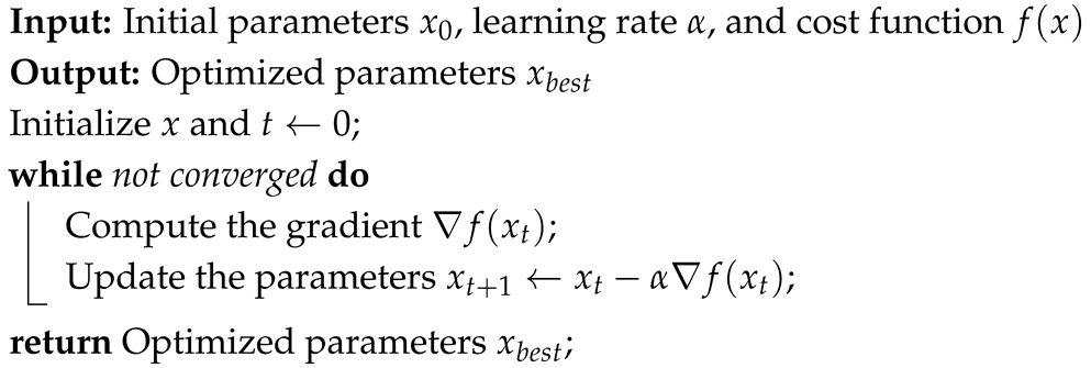
This section provides a brief overview of the traditional gradient descent algorithm. Gradient Descent (GD) is an iterative optimization algorithm designed for problems with differentiable cost functions. GD updates the solution by moving in the opposite direction of the cost function’s gradient with respect to each dimension. The update rule is expressed as:
where represents the parameters at iteration t, is the learning rate, and is the gradient of the cost function f with respect to x. The learning rate controls the step size. The full algorithm is outlined in Algorithm 1. By iteratively moving against the gradient, the variables aim to reach the minimum of the function.
However, GD faces challenges in flat regions or saddle points, where the gradient approaches zero, resulting in minimal updates and premature convergence. Researchers have continuously worked on improving GD to overcome these limitations.
| Algorithm 1: Gradient Descent Algorithm |
 |
3.2. Adam Algorithm Overview
The Adam algorithm [25] addresses the limitations of gradient descent and is widely used in neural network training. Adam improves upon GD by adaptively adjusting the learning rate based on the gradient’s history. This adjustment preserves the directionality of useful gradients while scaling step sizes using gradient variance to ensure stability.
Adam maintains two exponential moving averages: the first momentum term, m, tracks the gradient’s history, while the second term, v, tracks the variance. These moments are updated as follows:
where is the gradient, and control the decay rates of the moving averages. To correct the initial bias, the moments are scaled by and .
The momentum mechanism in Adam reduces the likelihood of getting stuck in local minima by maintaining directional consistency. However, Adam remains sensitive to initial conditions, and its effectiveness depends on hyperparameter tuning and the landscape of the cost function.
4. Proposed Solution
To address the challenge of local minima in gradient descent algorithms while minimizing computational penalties, we propose an elegant algorithm, the Multi-Agent Gradient Descent (MAGD), as a simplified variant of multi-start methods. The MAGD algorithm is inspired by Occam’s Razor [44], aiming to deliver a solution that is both simple and competitive.
MAGD initializes weight vectors for gradient descent, distributing them uniformly across the search space. Over time, the algorithm selects the most promising vector and removes less effective ones, thereby reducing the computational burden. This approach ensures that most search agents are eliminated within the initial iterations, allowing MAGD to transition smoothly into a standard gradient descent process, which serves as an efficient heuristic initialization method. This design achieves a balance between solution quality and computational simplicity.
4.1. Main Characteristics of the Multi-Agent Gradient Descent Algorithm (MAGD)
The Multi-Agent Gradient Descent (MAGD) algorithm incorporates the following key features:
- Multi-Agent Initialization: The algorithm begins by generating a set of uniformly distributed initial solutions in the search space, each termed an “agent”. The initialization is performed according to Equation (3):where denotes the uniform distribution, ensuring equal sampling probability across the search space. Since there is typically no prior information about regions more likely to contain the optima, a uniform distribution is preferred. However, if domain-specific knowledge is available, other distributions tailored to the problem may be used. Here, x represents the search space, and is the number of initial agents.
- Adam Updating Rule Integration: Building on the substantial improvements demonstrated by the Adam algorithm [25], MAGD incorporates its position-update rule (Equations (1) and (2)) for each agent. This integration enhances the exploratory power of individual agents, contributing to the overall efficiency of the algorithm.
- Adaptive Agent Pruning: Adaptive Agent Pruning is the most indispensable feature of MAGD for maintaining computational efficiency. This mechanism eliminates non-promising agents, significantly reducing execution time while preserving the exploration benefits of diverse initial positions. It employs two distinct strategies:
- (a)
- Convergence-Based Agent Reduction: As iterations progress, MAGD evaluates each agent’s convergence status. Converged agents with inferior performance are removed. Convergence is determined by a negligible change in cost over a specified period , expressed as:where and represent the agent’s cost at iterations t and , respectively. is a small threshold (e.g., ). It is important to recall that the removal of agents is performed with caution to ensure that the best agent is not lost. This principle aligns with the overarching goal of maintaining the quality of solutions during the pruning process.
- (b)
- Periodic Performance-Based Reduction: At fixed intervals (), agents with costs above the mean cost are pruned. This interval is a hyperparameter, typically set to a small fraction of the maximum iterations, such as . Periodic reduction accelerates computational efficiency. The pruning process is disabled once only one agent remains, thereby eliminating the additional computational complexity associated with this process, while the remaining agent continues to search for the global optimum, albeit without a guarantee of success.
Stopping Criteria: The stopping criteria can be tailored to the specific problem and may include reaching the maximum number of iterations, detecting convergence, or satisfying another user-defined condition. In our implementation, the algorithm terminates upon convergence of the best solution or reaching the maximum iteration count.
The pseudocode for MAGD is detailed in Algorithm 2. The inputs include the following:
| Algorithm 2: MAGD Algorithm |
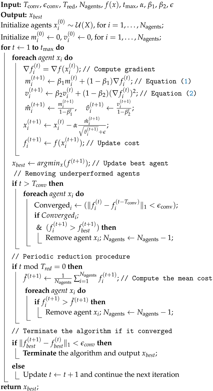 |
- x: Search space.
- : Cost function to minimize.
- : Learning rate (typically less than 0.3).
- : Exponential decay rates for Adam (default values: , ).
- : Small constant to prevent division by zero in Adam.
- : Maximum number of iterations.
- : Initial number of agents.
- : Iterations after which convergence is checked. A smaller value reduces computational cost but may compromise solution quality (default: between 1 and 10).
- : Threshold for agent convergence (default: ).
- : Interval for periodic agent reduction. This value should be significantly smaller than to facilitate faster pruning.
4.2. Time and Space Complexity Analysis of MAGD
4.2.1. Time Complexity
Gradient Computation and Update
The time complexity in each iteration arises from gradient computation and position updates. For each agent, computing the gradient and updating its position requires , where d is the dimensionality of the agent’s position. Given agents at iteration t, the per-iteration complexity is:
For a single agent over iterations, the total complexity is:
For a constant number of agents N across all iterations:
In MAGD, the number of agents at iteration t decreases exponentially as . Agents with costs worse than the mean are removed after every iterations (convergence-based reduction is omitted because it cannot be reliably expected.). Assuming a fixed reduction factor , representing the fraction of agents retained, the number of agents after each reduction step can be approximated as:
where corresponds to reduction steps.
For each interval , the number of agents remains constant. The total duration per interval is:
With intervals, the total time complexity is:
The summation is a geometric series:
Assuming , the series converges to:
For , where , this simplifies to:
Assuming the time complexity further simplifies to:
Because .
When , or , the time complexity becomes:
A comparison of (6) and (17) reveals that, as , or , the time complexity of MAGD converges to that of a single-agent algorithm.
4.2.2. Space Complexity
Each agent requires space to store its position, gradient, moments, and auxiliary variables. At iteration t, the total space complexity is:
For the maximum number of agents , the maximum space complexity is:
From Equation (8), as , . Therefore, the final space complexity can be expressed as:
Exponential Decay of Storage
While the space complexity of MAGD is , indicating no significant penalty for larger initial agent counts in terms of Big-O notation, a practical penalty exists. However, MAGD incorporates a mechanism that exponentially reduces storage requirements over time, as described by Equation (8). This ensures that storage remains manageable throughout the optimization process.
Fixed Multi-Agent Adam
To demonstrate the effectiveness of the adaptive agent reduction process, we implemented the standard Adam algorithm with the same number of agents as MAGD but without the reduction process. This implementation, referred to as Fixed Multi-Agent Adam (FMA), serves as a straightforward application of Adam to multiple agents and is used solely for comparison.
5. Experiments and Results
5.1. Experimental Setup and Implementation Details
In this section, we present the experiments conducted and discuss the results obtained from the implementation of our algorithm.
The experiments were performed on a Kaggle online server equipped with an Intel(R) Xeon(R) CPU @ 2.2 GHz (manufactured by Intel Corporation, Santa Clara, CA, USA), featuring 4 physical cores and 2 threads per core, providing a total of 8 logical cores. The server has 32 GB of RAM and does not utilize GPUs. All algorithms were implemented in Python.
The algorithm has been benchmarked against GD, Adam, and SBGD. These choices are deliberate and well-founded: GD represents the foundational approach for gradient-based optimization and is a natural baseline. Adam, in contrast, is currently the dominant algorithm in machine learning optimization. SBGD was included due to its shared characteristics with MAGD, as both are multi-agent-based and incorporate strategies for agent reduction. However, important differences exist between the two. SBGD is a swarm-based algorithm that relies on inter-agent communication, which introduces additional computational overhead and increases the number of hyperparameters requiring fine-tuning. These hyperparameters are often interdependent, complicating their adjustment and making the overall implementation of SBGD more challenging. By contrast, MAGD avoids inter-agent communication entirely, significantly reducing computational complexity, minimizing hyperparameter requirements, and enhancing implementation simplicity.
For MAGD, FMA, and SBGD, the agent updates in each iteration were executed sequentially (without explicit parallelization). However, simultaneous updates of agents were achieved by leveraging the vectorization capabilities of the NumPy library. This approach utilized SIMD (Single Instruction, Multiple Data) operations to optimize memory access and execution time per core, effectively avoiding the overhead associated with Python for loops.
The execution time for each algorithm was measured by recording the timestamp at the start and end of the execution using the Python time library. The complete implementation code is provided in the Supplementary Material.
5.2. Mathematical Functions Experiments and Results
The proposed MAGD algorithm was tested on 20 benchmark mathematical functions for optimization. These functions are summarized in Table 1. All functions were evaluated in two dimensions and are non-convex, meaning they have multiple local minima. MAGD was implemented to find the minimum values of these functions and was compared to GD, Adam, and Swarm-Based Gradient Descent (SBGD) [15].

Table 1.
Benchmark functions for optimization: formulas, ranges, and minimum values .
The hyperparameters used for all algorithms in these experiments are summarized in Table 2. The learning rate of SBGD is initially set to 3, as recommended by the authors in their research, to ensure it is sufficiently large [15] (p. 9), as the specified value reflects the initial learning rate rather than its adaptive adjustments during the iterations. Table 3 and Table 4 detail the hyperparameters specific to MAGD and SBGD, respectively.
Table 2.
Hyperparameters setting for All Algorithms in mathematical benchmark functions experiments.
Table 3.
Setting of the exclusive Hyperparameters for MAGD in mathematical benchmark functions experiments.
Table 4.
Setting of the exclusive Hyperparameters for SBGD in mathematical benchmark functions experiments.
The exclusive SBGD hyperparameters are described as follows:
- : This parameter determines the merging of agents that satisfy at each iteration, where and .
- : This threshold dictates the preservation of agents based on their . Agents with are removed. Here, is a term in SBGD proportional to the solution quality.
- : This parameter is equivalent to in MAGD and represents the convergence tolerance.
- and : These parameters control the learning rate updating procedure in SBGD. For further details, refer to [15].
5.2.1. Box Plot of Minimum Values of Benchmark Mathematical Functions Found by Different Algorithms Through 10 Different Seeds
Box plots, also known as box-and-whisker plots, are diagrams that visualize the statistical distribution of data [45] (p. 2). These diagrams represent compact and easily understandable statistical metrics of the data, such as the median, Interquartile Range (IQR), distribution fences, and outliers. This allows for comparing different algorithms across numerous experiments by summarizing them in a single diagram. Figure 1 provides a guide to help interpret the box plot diagram. Chart (A) shows the conventional box plot, while chart (B) displays a specialized version known as a violin plot, which includes additional information about the distribution density of the points. However, we have used the conventional box plot in our paper because it is clearer and more elegant.
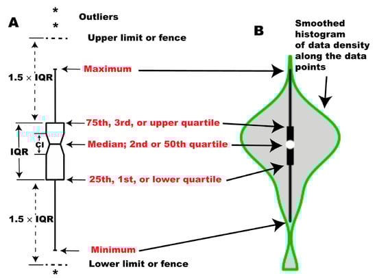
Figure 1.
Structure of box plots: (A) A box plot depicting the distribution using five statistical measures: minimum, first quartile (, 25th percentile), median (, 50th percentile), third quartile (, 75th percentile), and maximum. The whiskers extend to the smallest and largest data points within the lower and upper fences ( and ). Data points beyond these limits are considered outliers and are marked with asterisks (*). The notch around the median represents the 95% confidence interval for the median; (B) A violin plot, a variant of the box plot that provides additional insights into the data distribution. It visualizes the probability density distribution along the y-axis. The central box denotes the interquartile range (IQR), and the white dot marks the median. Note: Red-colored text highlights key statistical measures (minimum, maximum, quartiles, and median), adapted from [45] (p. 3).
The results of the experiments on mathematical benchmark functions are presented in Figure 2, Figure 3, Figure 4, Figure 5, Figure 6, Figure 7, Figure 8, Figure 9, Figure 10, Figure 11, Figure 12, Figure 13, Figure 14, Figure 15, Figure 16, Figure 17, Figure 18, Figure 19, Figure 20 and Figure 21. These figures display the box plot diagrams of the optimal minimum values (left axis) and execution durations (right axis) in seconds for the different algorithms across the 10 random generation seeds.
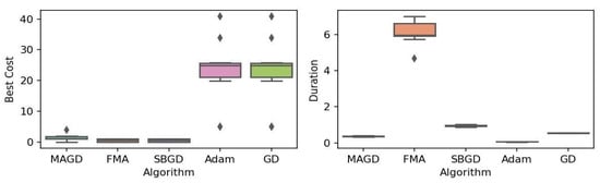
Figure 2.
Box plot of the minimum values and execution times obtained by various algorithms for the Rastrigin function. The left plot shows the best cost, while the right plot represents execution time. Different colors correspond to different algorithms, and diamond markers indicate outliers.

Figure 3.
Box plot of the minimum values and execution times obtained by various algorithms for the Ackley function. The left plot shows the best cost, while the right plot represents execution time. Different colors correspond to different algorithms, and diamond markers indicate outliers.

Figure 4.
Box plot of the minimum values and execution times obtained by various algorithms for the Goldstein–Price function. The left plot shows the best cost, while the right plot represents execution time. Different colors correspond to different algorithms, and diamond markers indicate outliers.
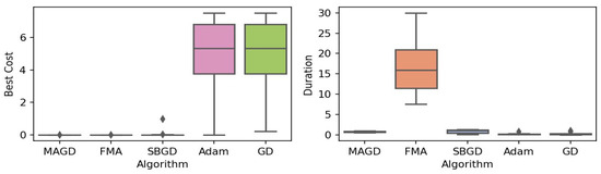
Figure 5.
Box plot of the minimum values and execution times obtained by various algorithms for the Levy–n13 function. The left plot shows the best cost, while the right plot represents execution time. Different colors correspond to different algorithms, and diamond markers indicate outliers.
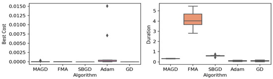
Figure 6.
Box plot of the minimum values and execution times obtained by various algorithms for the Himmelblau function. The left plot shows the best cost, while the right plot represents execution time. Different colors correspond to different algorithms, and diamond markers indicate outliers.
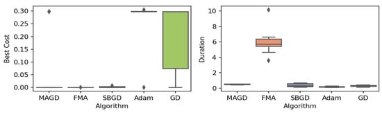
Figure 7.
Box plot of the minimum values and execution times obtained by various algorithms for the three-hump camel function. The left plot shows the best cost, while the right plot represents execution time. Different colors correspond to different algorithms, and diamond markers indicate outliers.
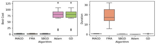
Figure 8.
Box plot of the minimum values and execution times obtained by various algorithms for the Griewank function. The left plot shows the best cost, while the right plot represents execution time. Different colors correspond to different algorithms, and diamond markers indicate outliers.
Figure 9.
Box plot of the minimum values and execution times obtained by various algorithms for the cross-in-tray function. The left plot shows the best cost, while the right plot represents execution time. Different colors correspond to different algorithms, and diamond markers indicate outliers.
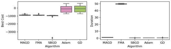
Figure 10.
Box plot of the minimum values and execution times obtained by various algorithms for the EggHolder function. The left plot shows the best cost, while the right plot represents execution time. Different colors correspond to different algorithms, and diamond markers indicate outliers.
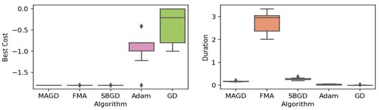
Figure 11.
Box plot of the minimum values and execution times obtained by various algorithms for the Michalewicz function. The left plot shows the best cost, while the right plot represents execution time. Different colors correspond to different algorithms, and diamond markers indicate outliers.
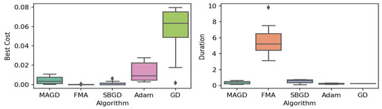
Figure 12.
Box plot of the minimum values and execution times obtained by various algorithms for the Alpine function. The left plot shows the best cost, while the right plot represents execution time. Different colors correspond to different algorithms, and diamond markers indicate outliers.

Figure 13.
Box plot of the minimum values and execution times obtained by various algorithms for the e Schaffer 2 function. The left plot shows the best cost, while the right plot represents execution time. Different colors correspond to different algorithms, and diamond markers indicate outliers.
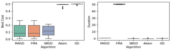
Figure 14.
Box plot of the minimum values and execution times obtained by various algorithms for the e Schaffer 4 function. The left plot shows the best cost, while the right plot represents execution time. Different colors correspond to different algorithms, and diamond markers indicate outliers.
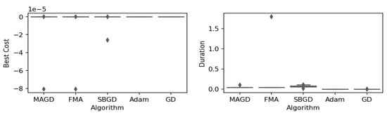
Figure 15.
Box plot of the minimum values and execution times obtained by various algorithms for the Easom function. The left plot shows the best cost, while the right plot represents execution time. Different colors correspond to different algorithms, and diamond markers indicate outliers.

Figure 16.
Box plot of the minimum values and execution times obtained by various algorithms for the Shubert function. The left plot shows the best cost, while the right plot represents execution time. Different colors correspond to different algorithms, and diamond markers indicate outliers.

Figure 17.
Box plot of the minimum values and execution times obtained by various algorithms for the Schwefel function. The left plot shows the best cost, while the right plot represents execution time. Different colors correspond to different algorithms, and diamond markers indicate outliers.
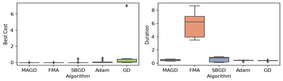
Figure 18.
Box plot of the minimum values and execution times obtained by various algorithms for the Zettl function. The left plot shows the best cost, while the right plot represents execution time. Different colors correspond to different algorithms, and diamond markers indicate outliers.
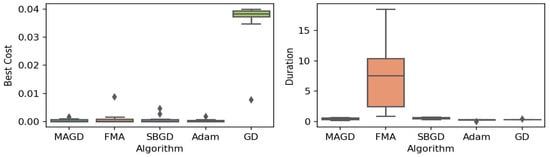
Figure 19.
Box plot of the minimum values and execution times obtained by various algorithms for the Leon function. The left plot shows the best cost, while the right plot represents execution time. Different colors correspond to different algorithms, and diamond markers indicate outliers.

Figure 20.
Box plot of the minimum values and execution times obtained by various algorithms for the Drop-Wave function. The left plot shows the best cost, while the right plot represents execution time. Different colors correspond to different algorithms, and diamond markers indicate outliers.

Figure 21.
Box plot of the minimum values and execution times obtained by various algorithms for the Langermann function. The left plot shows the best cost, while the right plot represents execution time. Different colors correspond to different algorithms, and diamond markers indicate outliers.
Mathematical Benchmarks Experiments: Box Plots Analysis
By observing the box plots in the left subplot, which visualize the minimum cost found by different algorithms, it is evident that MAGD, FMA, and SBGD achieve the most optimal values of the cost functions. They show nearly identical statistical distributions in most of the experiments, suggesting no significant difference between the three algorithms in terms of optimal solution finding. However, when we analyze the right subplot, which visualizes the execution time variability for each algorithm, we can clearly observe an additional advantage of MAGD, as it takes the shortest execution time among the three algorithms. Adam and GD significantly underperform compared to the multi-agent or swarm-based algorithms in terms of optimal value finding, as evident from the box plots of best costs. The entire distribution of the optimal costs is significantly higher than that of the superior algorithms. Adam exhibits superior capability in finding optimal solutions compared to GD in most benchmarks. However, the improvement in solution quality is considerably smaller than that achieved by multi-agent algorithms. Despite the shorter execution time of Adam and GD, they do not show a significant difference from MAGD, meaning that their short execution time cannot compensate for their significant underperformance in terms of optimal value finding.
Regarding MAGD and SBGD, although they exhibit similar optimality-finding capabilities, SBGD often requires longer execution times. This difference is not very apparent in the visualization due to the scale of the figures and the high bias of the FMA chart. The primary challenge with SBGD lies in tuning its numerous hyperparameters to strike a balance between exploration and time efficiency. In this study, the chosen parameter settings for SBGD resulted in no significant superiority over MAGD while incurring additional time overhead. This further highlights that MAGD provides an efficient and cost-effective solution.
5.2.2. Mathematical Benchmarks Experiments Numerical Results
To make the information clearer and easier to digest, in Table 5, we present the median of the absolute difference between the true global minima and the found minima from the 10 seeds for each benchmark. For simplicity, we refer to this difference as the ‘error’ of the algorithm as illustrated in Equation (21). We prefer the median over the mean because it is not affected by outliers.
where
Table 5.
Median of the absolute difference between the true global minima and the found minima across various optimization algorithms for standard mathematical benchmark functions over 10 different random seeds. Bold values indicate the best-performing algorithms.
- -
- : The median error for the algorithm a when applied to the function f, calculated over 10 different random seeds.
- -
- : The global minimum value for function f based on the true global minima (this is a fixed value for the function across all seeds and algorithms).
- -
- : The minimum value found by algorithm a when applied to function f using the i-th random seed ( where ).
5.2.3. Mathematical Benchmarks Experiments: Global Optimization Capability
To evaluate the new algorithm’s ability to locate global minima in the mathematical function experiments, we propose a measure called the hit rate. The hit rate counts the number of seeds where an algorithm successfully finds the global minimum, determined by whether the absolute difference between the true minimum and the minimum found by the algorithm is within a tolerance of . The equations defining this measure are provided in Equations (22) and (23).
Table 6 presents the hit rate of different algorithms across various benchmark mathematical functions.
Table 6.
Hit rate (in %) of various optimization algorithms across mathematical benchmark functions. The hit rate indicates the percentage of seeds for which each algorithm successfully located the global minimum. Bold values represent the best performance.
Table 6 demonstrates that MAGD, FMA, and SBGD outperform GD and Adam in hit-rate performance, with similar performance observed between MAGD, FMA, and SBGD (remember that FMA is not an actual algorithm but rather multiple simultaneous executions of Adam). To substantiate these observations, we conducted a t-test comparing the hit ratios of MAGD with those of other algorithms. The t-test, also known as Student’s t-test, is widely used to determine if there is a statistically significant difference between two data samples. This hypothesis test uses the t-distribution to compute the t-value, which is the ratio of the observed difference in means to the variability in the data, scaled by sample sizes. Using the t-distribution, the p-value is the probability distribution function (PDF) value corresponding to the computed t-value. A p-value less than 0.05 typically indicates a significant difference between two groups [46] (p. 64).
As shown in Table 7, The p-values indicate no significant difference between MAGD and FMA, or between MAGD and SBGD, in terms of global optimization capability. However, the difference between MAGD and Adam, as well as between MAGD and GD, is significant. It also shows a significant difference between MAGD and all other algorithms. Compared with GD and Adam, this difference indicates a relative drawback due to MAGD’s longer duration. However, the significantly shorter execution time of MAGD compared to SBGD suggests a clear advantage, especially considering its similar effectiveness in achieving optimal solutions.
Table 7.
p-values comparing MAGD hit rates with other algorithms for mathematical benchmark functions. Symbols (↑/↓) denote whether the difference signifies outperforming (↑) or underperforming (↓) of MAGD, while the absence of a symbol indicates no significant difference.
5.2.4. Mathematical Benchmarks Experiments: Execution Time
Table 8 presents the median execution time spent by different algorithms to find the optimal value for each mathematical function across 10 randomly generated seeds.
Table 8.
Median execution time (in seconds) across 10 random seeds for different algorithms on various mathematical benchmark functions. Bold values indicate the best performance.
Notably, FMA requires an excessively long time, which is not justified given its comparable performance to MAGD and SBGD. SBGD and MAGD require longer execution times than GD and Adam. Although the execution times of MAGD and SBGD exceed those of GD and Adam, both algorithms achieve significantly better results in finding optima. However, MAGD’s execution time remains lower than that of SBGD in most experiments, while offering comparable accuracy.
Since MAGD does not always consume less time than SBGD and the performance difference is not immediately apparent, statistical analysis is necessary to provide a broader perspective. To that end, we computed the mean, standard deviation (std), median, and 95% Highest Density Interval (HDI), which represents the Bayesian-estimated interval where 95% of the distribution values lie [47] (p. 15). The HDI interval of execution times offers a more reliable metric for judging which algorithm takes less time. Furthermore, we conducted a t-test to calculate the p-values for the execution time differences between MAGD and each of the other benchmarks. The statistical metrics were derived from 200 samples (20 functions and 10 seeds per function) to ensure more robust results. Table 9 presents a comparison between MAGD and SBGD in terms of various statistical attributes, while Table 10 presents the p-values (probability of equivalent means between two samples) for the execution time differences between MAGD and each other benchmark.
Table 9.
Statistical comparison of execution duration between algorithms for mathematical benchmark functions.
Table 10.
p-values comparing MAGD execution time with other algorithms for mathematical benchmark functions. Symbols (↑/↓) denote whether the difference signifies outperforming (↑) or underperforming (↓) of MAGD, while the absence of a symbol indicates no significant difference.
Table 9 and Table 10 show a significant difference between MAGD and all other algorithms. Compared to GD and Adam, this difference highlights a relative disadvantage due to MAGD’s longer duration. However, the significantly shorter execution time of MAGD compared to SBGD demonstrates a clear advantage, especially considering its similar effectiveness in achieving optimal solutions.
5.2.5. Mathematical Benchmarks Experiments: Convergence Curves
In this subsection, we present and discuss the convergence curves of selected mathematical test functions for multiple algorithms. Figure 22, Figure 23, Figure 24, Figure 25 and Figure 26 illustrate the convergence behaviors of these algorithms, providing insight into their performance.

Figure 22.
Convergence patterns of mathematical functions: Group 1.
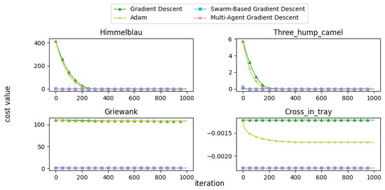
Figure 23.
Convergence patterns of mathematical functions: Group 2.
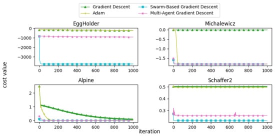
Figure 24.
Convergence patterns of mathematical functions: Group 3.
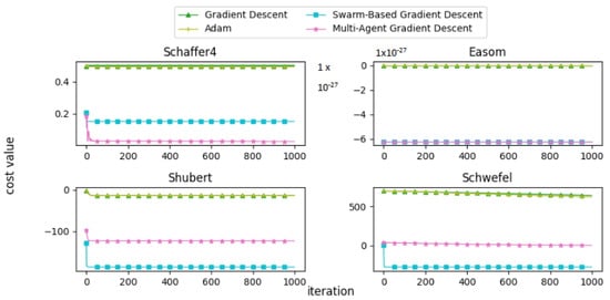
Figure 25.
Convergence patterns of mathematical functions: Group 4.

Figure 26.
Convergence patterns of mathematical functions: Group 5.
From the convergence curves, it is evident that MAGD demonstrates superior performance compared to Adam in many cases. While Adam requires more iterations to find the optimal value, MAGD often identifies it in the early stages due to its use of multiple searching agents. In contrast, GD is well known for its slow convergence rate compared to Adam. On the other hand, SBGD exhibits rapid convergence; however, its adaptive step size can sometimes lead to solutions that exceed the feasible range, a behavior that is typically undesirable in optimization tasks.
5.3. Neural Network Training
In this subsection, we present the results of applying our algorithm to a real-world problem: neural network training. We trained shallow neural networks and evaluated their performance on various benchmark datasets. The results of our algorithm were compared with those of FMA, SBGD, Adam and GD.
5.3.1. Experimental Design
The neural network consists of three layers: an input layer, a hidden layer, and an output layer. The input layer has weights shaped as . The hidden layer has a number of neurons equal to . The output layer contains one neuron for regression tasks and a variable number of neurons for classification tasks. The activation function is linear for regression and softmax for classification. Table 11 lists the datasets used in the experiments.
Table 11.
Experimental datasets.
The hyperparameters used for each algorithm during neural network training are presented in Table 12. Algorithm-specific parameters for MAGD and SBGD are detailed in Table 13 and Table 14, respectively.
Table 12.
Hyperparameters settings for neural network training across different algorithms. The symbol “-” indicates that the parameter is absent in the respective algorithm.
Table 13.
MAGD exclusive hyperparameters settings for neural network training.
Table 14.
SBGD exclusive hyperparameters settings for neural network training.
All algorithms were initialized with weights randomly generated within the range . For SBGD, FMA, and MAGD, the number of agents was set to 10, a reduced value due to resource constraints. Datasets were shuffled and split into 70% training and 30% testing sets. To ensure consistency, the random seed for weight initialization was set to 42 across all algorithms.
5.3.2. Results of Neural Network Training
In this section, we present the results of training neural networks using four algorithms and FMA, comparing their performance in terms of two aspects: training accuracy and execution time.
Training Performance and Accuracy
To compare the algorithms, we define the evaluation metrics used for this analysis, which are presented in Equations (24)–(26).
- Mean Squared Error (MSE): MSE measures the average of the squared differences between predicted and actual values. It quantifies the model’s prediction error, with lower values indicating a better fit.
- Accuracy Score: Accuracy score is the ratio that measures the probability that the model correctly predicts the target variable.
- Coefficient of Determination (): indicates the capability of the regression model to explain the variance in the dependent variable that is predictable from the independent variables (features). A value closer to 1 suggests a better fit. The value typically ranges from 0 to 1, but it can be less than 0 in some cases, indicating that the model poorly fits the data.
where
- n is the total number of data points.
- is the true label for the i-th data point.
- is the predicted label for the i-th data point.
- is an indicator function that equals 1 if (i.e., the prediction is correct) and 0 otherwise.
- is the mean of the true labels.
For the accuracy score metric, we will consider the models’ accuracy on the test datasets. However, for the MSE metric, we will compare algorithms using both training and testing datasets. While our primary focus is on developing an optimization algorithm for neural network training, where the MSE on the test data is more relevant, we also compare performance on the training data. This comparison highlights the algorithm’s potential for broader applications, demonstrating its general-purpose capabilities beyond just the specific task of neural network optimization.
Many researchers, such as Liu et al. [48] (p. 8), argue that minimizing the training error too aggressively can lead to overfitting. While this is true in some cases, it is not always the expected outcome. In general, achieving a smaller training error often leads to better accuracy on both the training and testing sets. However, when there is a significant gap between training and testing performance, it can be a sign of issues such as inefficient data splitting, insufficient data, or other factors like outliers in the training set or overly complex models. Our results support this hypothesis.
This risk can be mitigated using established techniques, including regularization, dropout, and data augmentation. In our experiments, we employed regularization, which reduces model complexity by modifying the training cost function to include a penalty on trainable weights. It is important to note that while this technique can help mitigate overfitting risks, it does not completely eliminate the problem. The formula for regularization is shown in Equation (27).
where
- is the regularization parameter (also known as the shrinkage or penalty term).
- p is the number of features or weights.
- represents the j-th weight in the model.
- is the sum of the squared weights, which penalizes large weights.
Thus, the task is to minimize the cost function shown in Equation (28).
Our findings indicate that in most cases, more optimal training errors lead to better generalization accuracy. We observe an increasing linear trend for testing error versus training error, as shown in Figure 27. Figure 27 has five axes, each representing the variance of testing error versus training error. For clearer visualization, the trend was fitted using Random Sample Consensus (RANSAC), a linear regression technique that is strengthened by features designed to protect the model from being affected by outliers [49,50] (p. 2). The red cross symbol represents outliers, defined as data points where the residual distance (predicted value − actual value) is greater than 1. We observe that larger testing errors for larger training errors are not typical, but rather exceptional. There are at most two outliers, if any, out of 20 experiments.
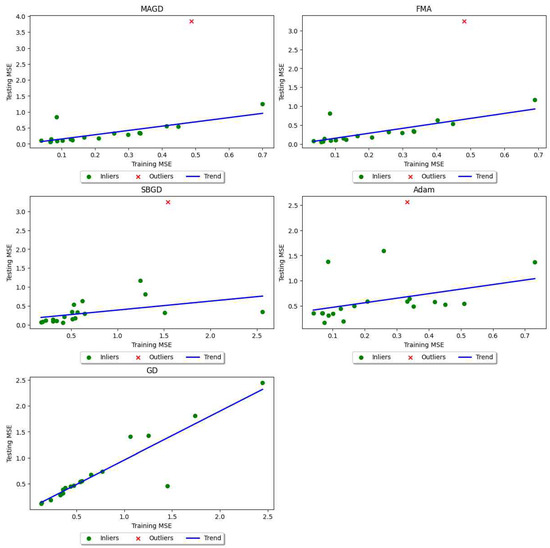
Figure 27.
Trend of testing error variance as a function of training error variance in neural network training tasks.
Table 15 and Table 16 compare the training costs achieved by the four algorithms in addition to FMA. The bold values indicate the least error among all algorithms. FMA achieves the least error in almost all datasets, but since we consider FMA as merely multiple executions of algorithms, it is not fair to judge its superiority here, as it consumes significantly longer time, as discussed in the next paragraph. Therefore, we will highlight the least error among the remaining algorithms (MAGD, SBGD, Adam, and GD) with * and use this to evaluate the superiority of these four algorithms. Looking at the training error values in Table 15, both MAGD and Adam demonstrate superior performance, with MAGD achieving slightly better solutions in most cases. Although this difference between Adam and MAGD is not statistically significant (a t-test is unnecessary for this comparison), practical applications may still value these small improvements. Minor increases in classification accuracy or in machine learning can have a significant practical impact, particularly in fields like medical diagnostics [51] (p. 4) and [52].
Table 15.
Training error values obtained by MAGD, FMA, SBGD, Adam, and GD for each dataset. Bolded values indicate the best result. ‘*’ denotes the best result among the algorithms excluding FMA, as FMA is not always the best.
Table 16.
Testing error values obtained by MAGD, FMA, SBGD, Adam, and GD for each dataset. Bolded values indicate the best result. ‘*’ denotes the best result among the algorithms excluding FMA, as FMA is not always the best.
GD and SBGD perform substantially worse in training cost optimization than Adam and MAGD, which raises the question of why SBGD, which performs well in low-dimensional mathematical function tests, falls short in neural network training. One possible explanation is that SBGD has not demonstrated superior performance in high-dimensional problems, as noted in its original study [15]; the mathematical functions tested here were limited to two dimensions, while neural network cost functions have a larger number of dimensions. Additionally, SBGD’s performance is sensitive to its numerous hyperparameters, which can cause premature convergence and limit solution quality. Our experiments also used a relatively small number of agents (10) for SBGD due to computational constraints, which could affect its efficacy.
In Table 16, we again omit FMA and refer to the best results among MAGD, SBGD, Adam, and GD with *. The results show consistent patterns between test error and training error. SBGD has the least error in only 1 dataset out of 20, GD in 2 datasets, while MAGD and Adam achieve the best values, with MAGD slightly underperforming Adam. However, this underperformance is not significant, as MAGD has the best values in 8 datasets out of 20, while Adam has the best values in 11 datasets out of 20. Nevertheless, since MAGD performs best in terms of training error, it still holds great promise for optimization problems where local minima arise. Additionally, a lower mean square error does not always correlate with worse classification or regression accuracy. These metrics are represented in Table 17 and Table 18. Table 17 compares the test accuracy of different algorithms on classification datasets, while Table 18 compares the scores for different algorithms on various regression datasets. The same configuration applies here as for the training and testing errors, where we omit FMA and refer to the best score among MAGD, SBGD, Adam, and GD with *. Note that the maximum value is the best, in contrast to MSE.
Table 17.
Accuracy scores of different algorithms across various classification datasets. Bold values highlight the highest accuracy achieved on each dataset. (*) indicates the maximum accuracy among all algorithms except FMA.
Table 18.
scores of different algorithms across various regression datasets. Bold values highlight the highest score achieved on each dataset. (*) indicates the maximum score among all algorithms except FMA.
The results demonstrate the superiority of MAGD, particularly in classification tasks, where it achieves the highest test scores across all classification datasets. In regression tasks, while FMA slightly outperforms MAGD, FMA is excluded from our comparison. In most cases, MAGD’s lower training error corresponds to superior generalization, with the exception of the “Forest Fires” dataset.
Classification Test Results Discussion: The tables reveal the underperformance of SBGD and GD. Since FMA is excluded from the comparison, the focus is on comparing MAGD and Adam. To formalize the comparison, the following symbol is introduced:
- : indicates that algorithm absolutely outperforms .
Using this notation, the superiority ratio of algorithm , denoted , , is defined in Equation (29). This metric quantifies the proportion of datasets where outperforms , adjusted for cases of underperformance. A negative value indicates underperformance, while denotes equivalence.
Here,
- and : the algorithms being compared.
- n: total number of datasets.
- : performance score of algorithm A on the i-th dataset.
Table 19 summarizes the superiority ratio of MAGD over Adam in classification tasks.
Table 19.
Comparison of MAGD and Adam in terms of the superiority ratio in classification tasks .
While MAGD achieves the highest accuracy across all datasets, its accuracy is comparable to Adam’s in 50% of the experiments. Thus, MAGD exhibits a 50% improvement ratio over Adam.
Regression Results Discussion: In regression tasks, MAGD achieves the maximum score in 50% of the datasets, with Adam also achieving the maximum in 50%. GD attains the highest score in two cases, whereas SBGD achieves none. To clarify MAGD’s absolute superiority, Table 20 reports the superiority ratio of MAGD compared to Adam and GD in regression tasks. MAGD provides improvement ratio over Adam, and over GD.
Table 20.
Comparison of MAGD, Adam, and GD in terms of the superiority ratio in regression tasks .
The results of neural network training indicate that even when testing error is higher, MAGD often outperforms SBGD, Adam, and GD, further validating its effectiveness.
Training Duration Evaluation
This paragraph evaluates the execution time of the proposed algorithm compared to other methods as shown in Table 21 that reports the mean number of convergence iterations for each algorithm to train the neural networks. One can observe that SBGD consumes the shortest time for neural network training compared to the other algorithms. This behavior contrasts with its performance on mathematical functions. The reason for SBGD’s faster training lies in its rapid convergence, as shown in Table 22. However, this rapid convergence results in lower performance scores and shorter execution times, primarily due to the numerous hyperparameters that require tuning to control the algorithm’s convergence behavior.
Table 21.
Performance comparison of execution time (in seconds) between MAGD and other methods for neural network training. The shortest execution time for each dataset is bolded.
Table 22.
Statistical comparison of iterations required for convergence for different algorithms in neural network training.
Among the algorithms, FMA requires the longest execution time. However, the extreme time overhead of FMA is not greatly correlated with its performance. MAGD consumes the longest time among the remaining algorithms (SBGD, Adam, and GD), but this extended execution time is correlated with its superior performance scores. Despite this observation, statistical inference suggests the differences in execution time between MAGD and GD or Adam algorithms are not statistically significant, as elaborated in the next analysis and discussion.
Statistical Analysis of Training Duration: To derive insights from the statistical results of the different algorithms, statistical features such as the mean, standard deviation (std), median, and the 90% Highest Density Interval (HDI) are presented in Table 23. We opted for the 90% HDI instead of the 95% HDI due to the presence of an outlier in the Adult dataset, where all algorithms exhibit large deviations from their distributions. This outlier impacts the accuracy of the highest density interval estimation when using a 95% interval.
Table 23.
Statistical comparison between the execution duration of different algorithms for neural network training.
Additionally, a t-test was conducted to evaluate the significance of differences between the algorithms (p-value). The t-test results, presented in Table 24.
Table 24.
p-values comparing MAGD execution time with other algorithms for neural network training before removing the outlier dataset. Symbols (↑/↓) denote whether the difference signifies outperforming (↑) or underperforming (↓) of MAGD, while the absence of a symbol indicates no significant difference.
Table 23 and Table 24 indicate that FMA’s mean duration is significantly longer than that of the other algorithms. Adam and GD exhibit approximately equivalent mean durations and standard deviations. SBGD has the shortest execution time, while MAGD takes slightly longer than Adam, with a somewhat broader range within which 90% of the execution times fall. Given that Adam is the most competitive algorithm to MAGD, determining the differences in execution time relative to Adam is of primary interest.
Table 23 initially suggests no statistically significant difference between the execution times of MAGD and the other algorithms. However, these values appear inconsistent with observations, as the differences in execution times are visually apparent. The unreliability of the initial t-test results stems from the presence of outliers, which can distort the findings. To address this, the outlier case (Adult dataset) was removed, and the t-test was repeated. The revised p-values, shown in Table 25, yield more interpretable results.
Table 25.
p-values comparing MAGD execution time with other algorithms for neural network training after removing the outlier dataset. Symbols (↑/↓) denote whether the difference signifies outperforming (↑) or underperforming (↓) of MAGD, while the absence of a symbol indicates no significant difference.
The updated results demonstrate that the difference in execution time between MAGD and Adam is not statistically significant. This aligns with our earlier conclusion in the time complexity Section 4.2.1, which asserts that as (a scenario that occurs frequently in our case), or (in our case, ), MAGD’s time cost approaches Adam’s execution time.
Adam with the Same Time Budget vs. MAGD
The Adam algorithm, one of the most widely used optimization methods in machine learning, warrants a comparative analysis to assess whether it can achieve similar performance to MAGD when allocated an equivalent execution time. Such an investigation is crucial for evaluating whether Adam, with extended iterations, can match MAGD’s performance, potentially making MAGD unnecessary in time-sensitive applications.
Initially, all algorithms were executed for a maximum of 500 iterations. To ensure a fair comparison between single-agent and multi-agent approaches, Adam’s maximum iterations were extended to 750 and 1000 in separate experiments. Table 26 displays the execution times for MAGD (with 500 iterations) and Adam across these three configurations. Additionally, Table 27 provides the mean number of convergence epochs (±standard deviation) and the mean execution time (±standard deviation) for MAGD and Adam under the respective experimental setups.
Table 26.
Execution time comparison among MAGD and Adam variants for neural network training across datasets. Bold values indicate the shortest time for each dataset.
Table 27.
Mean and standard deviation of execution times for MAGD and Adam with varying maximum iterations for neural network training.
From Table 27, we can see that Adam’s execution time is approximately the same as MAGD’s when Adam is run for 750 epochs.
Table 28 presents the accuracy scores of MAGD and Adam for 500, 750, and 1000 iterations, offering further insight into their relative performance. Additionally, Table 29 shows the scores for MAGD and Adam across multiple datasets with varying maximum iterations.
Table 28.
Accuracy scores of MAGD with 500 maximum iterations compared to Adam with 500, 750, and 1000 maximum iterations across various classification datasets. Bold values indicate the highest accuracy achieved for each dataset.
Table 29.
scores of MAGD with 500 maximum iterations compared to Adam with 500, 750, and 1000 maximum iterations across various regression datasets. Bold values indicate the highest score achieved for each dataset.
To evaluate the performance of MAGD compared to Adam with extended iterations, we examine their absolute superiority ratio that is computed according to Equation (29) in terms of accuracy score across classification datasets and score across regression datasets, in addition to introducing a second ratio called the average time penalty, , which quantifies the average of additional computational time incurred by one algorithm relative to another. It is calculated as:
where and are the execution times of and , respectively, and n is the number of observations. Thus, . A negative value indicates that is computationally faster than .
We computed both the and the corresponding for MAGD considering all datasets for each types of the tasks, means for fixed 500 maximum iterations and Adam for three different values of maximum iterations and the results are presented in Table 30 for classification tasks and in Table 31 for regression tasks.
Table 30.
Comparison of MAGD for fixed maximum iterations and Adam with varying maximum iterations using (average time penalty) and (performance superiority) in classification tasks.
Table 31.
Comparison of MAGD for fixed maximum iterations and Adam with varying maximum iterations using (average time penalty) and (performance superiority) in regression tasks.
Table 30 and Table 31 demonstrate that MAGD consistently maintains its superiority in classification tasks, even when Adam is allocated a longer time budget. Specifically, Table 30 shows that MAGD outperforms Adam in classification tasks, despite Adam receiving a longer execution time. Table 31 further reveals that when Adam is given 750 maximum iterations, resulting in a similar time consumption as MAGD with 500 iterations, MAGD still achieves a 10% improvement. Even when Adam is granted 1000 iterations and a longer execution time than MAGD, it performs only equivalently to MAGD, underscoring the role of multi-agent initialization in improving optimization results.
6. Conclusions
In this study, we introduced a novel multi-start optimization algorithm, Multi-Agent Gradient Descent (MAGD), motivated by the need to address challenges in machine learning where gradient-based algorithms often struggle with local optima. By adaptively pruning underperforming agents, MAGD achieves a balance between simplicity and computational efficiency.
Theoretical analysis demonstrated that MAGD maintains computational efficiency comparable to single-agent gradient-based algorithms in scenarios where the dimensionality of the problem or the number of iterations significantly exceeds the number of agents. This scalability highlights MAGD’s suitability for high-dimensional and extended optimization tasks.
We evaluated MAGD on mathematical non-convex problems (20 benchmark 2D mathematical functions) and neural network training (10 regression and 10 classification datasets). MAGD consistently outperformed GD and Adam, even when Adam was given equivalent or longer time budgets, and demonstrated optimization performance comparable to Swarm-Based Gradient Descent (SBGD) and Fixed Multi-Agent Adam (FMA). However, MAGD showed significant advantages in execution time over both SBGD and FMA, while requiring minimal hyperparameter tuning and being easier to implement compared to SBGD. These results highlight MAGD’s practicality and robustness.
In neural network training experiments, where the number of iterations greatly exceeded the number of agents, MAGD exhibited execution times statistically comparable to GD and Adam. In contrast, for mathematical function experiments involving a high number of agents and low-dimensional problems, MAGD achieved significantly slower execution times than single-agent methods. These findings align with our theoretical analysis.
Despite these promising results, MAGD has limitations. It does not guarantee finding the global minimum, and although we theoretically demonstrated its effectiveness in high-dimensional optimization problems, this claim was not empirically verified. Our experiments were restricted to 2D mathematical functions and shallow neural networks with low to medium-dimensional datasets.
In the future, we plan to test MAGD on high-dimensional mathematical problems and deep neural network training to validate its efficiency and scalability. Additionally, we aim to compare MAGD with a broader range of multi-start optimization variants to provide a more comprehensive evaluation. Further research should also focus on improving its global optimization capabilities and exploring its applicability to broader optimization tasks beyond machine learning.
We believe MAGD’s simplicity, reduced reliance on hyperparameters, and competitive performance make it a robust alternative to Adam in machine learning and deep learning applications. Often, well-designed, simple solutions prove to be the most effective or at least highly competitive.
Supplementary Materials
The Colab notebook for implementing the algorithms for both mathematical functions and neural network training tasks is provided at the link below. This notebook includes the core classes and functionalities of the proposed algorithms, along with demonstrations for mathematical functions and neural network training. While the notebook does not include the full code for generating all experiments and results presented in this study, it provides sufficient resources to reproduce the experiments using the basic classes and the hyperparameter settings described earlier in this paper. https://colab.research.google.com/drive/1IIcpEaA1hNaG-ns6oT1CKOTdmojLXVht?usp=sharing, accessed on 26 January 2025.
Author Contributions
Conceptualization, M.S. and M.R.B.; methodology, M.S. and M.R.B.; validation, M.S. and M.R.B.; investigation, M.S.; resources, M.S.; writing—original draft preparation, M.S. and M.R.B.; writing—review and editing, M.S. and M.R.B.; visualization, all authors; supervision, M.R.B.; project administration, M.R.B. All authors have read and agreed to the published version of the manuscript.
Funding
This research received no external funding.
Institutional Review Board Statement
Not applicable.
Informed Consent Statement
Not applicable.
Data Availability Statement
The original contributions presented in the study are included in the article, further inquiries can be directed to the corresponding author.
Acknowledgments
We would like to express our gratitude to Innopolis University for their financial support in conducting this research.
Conflicts of Interest
The authors declare no conflicts of interest.
References
- Boyd, S.; Vandenberghe, L. Convex Optimization; Cambridge University Press: Cambridge, UK, 2004. [Google Scholar]
- Sadollah, A.; Nasir, M.; Geem, Z.W. Sustainability and Optimization: From Conceptual Fundamentals to Applications. Sustainability 2020, 12, 2027. [Google Scholar] [CrossRef]
- Ruder, S. An overview of gradient descent optimization algorithms. arXiv 2017, arXiv:1609.04747. [Google Scholar] [CrossRef]
- Zhang, J. Gradient Descent based Optimization Algorithms for Deep Learning Models Training. arXiv 2019, arXiv:1903.03614. [Google Scholar] [CrossRef]
- Luo, Z.Q.; Tseng, P. On the Linear Convergence of Descent Methods for Convex Essentially Smooth Minimization. SIAM J. Control Optim. 1992, 30, 408–425. [Google Scholar] [CrossRef]
- Sun, R. Optimization for deep learning: Theory and algorithms. arXiv 2019, arXiv:1912.08957. [Google Scholar] [CrossRef]
- Numerical Optimization; Springer Series in Operations Research and Financial Engineering; Springer: New York, NY, USA, 2006. [CrossRef]
- Zhu, C.; Ni, R.; Xu, Z.; Kong, K.; Huang, W.R.; Goldstein, T. GradInit: Learning to Initialize Neural Networks for Stable and Efficient Training. In Proceedings of the Advances in Neural Information Processing Systems, Online, 6–14 December 2021; Curran Associates, Inc.: San Diego, CA, USA, 2021; Volume 34, pp. 16410–16422. [Google Scholar]
- Ragusa, E.; Cambria, E.; Zunino, R.; Gastaldo, P. A Survey on Deep Learning in Image Polarity Detection: Balancing Generalization Performances and Computational Costs. Electronics 2019, 8, 783. [Google Scholar] [CrossRef]
- Žilinskas, A.; Gillard, J.; Scammell, M.; Zhigljavsky, A. Multistart with early termination of descents. J. Glob. Optim. 2021, 79, 447–462. [Google Scholar] [CrossRef]
- Kennedy, J.; Eberhart, R. Particle swarm optimization. In Proceedings of the Proceedings of ICNN’95—International Conference on Neural Networks, Perth, WA, Australia, 27 November–1 December 1995; Volume 4, pp. 1942–1948. [Google Scholar] [CrossRef]
- Chen, S.; Montgomery, J.; Bolufé-Röhler, A. Measuring the curse of dimensionality and its effects on particle swarm optimization and differential evolution. Appl. Intell. 2015, 42, 514–526. [Google Scholar] [CrossRef]
- Neri, F.; Mininno, E.; Iacca, G. Compact Particle Swarm Optimization. Inf. Sci. 2013, 239, 96–121. [Google Scholar] [CrossRef]
- Abd Elaziz, M.; Dahou, A.; Abualigah, L.; Yu, L.; Alshinwan, M.; Khasawneh, A.M.; Lu, S. Advanced metaheuristic optimization techniques in applications of deep neural networks: A review. Neural Comput. Appl. 2021, 33, 14079–14099. [Google Scholar] [CrossRef]
- Lu, J.; Tadmor, E.; Zenginoglu, A. Swarm-Based Gradient Descent Method for Non-Convex Optimization. arXiv 2024, arXiv:2211.17157. [Google Scholar] [CrossRef]
- Noel, M.M. A new gradient based particle swarm optimization algorithm for accurate computation of global minimum. Appl. Soft Comput. 2012, 12, 353–359. [Google Scholar] [CrossRef]
- Tadmor, E.; Zenginoğlu, A. Swarm-Based Optimization with Random Descent. Acta Appl. Math. 2024, 190, 2. [Google Scholar] [CrossRef]
- Newton, I. Philosophiae Naturalis Principia Mathematica; Brookman, G., Ed.; Typis A. et J.M.: London, UK, 1833. [Google Scholar]
- Cauchy, A. Méthode générale pour la résolution des systemes d’équations simultanées. Comp. Rend. Sci. Paris 1847, 25, 536–538. [Google Scholar]
- Hadamard, J. Mémoire sur le Problème d’analyse Relatif a l’équilibre des Plaques élastiques Encastrèes; Imprimerie Nationale: Paris, France, 1908. [Google Scholar]
- Rosenblatt, F. The perceptron: A probabilistic model for information storage and organization in the brain. Psychol. Rev. 1958, 65, 386–408. [Google Scholar] [CrossRef] [PubMed]
- Rumelhart, D.E.; Hinton, G.E.; Williams, R.J. Learning representations by back-propagating errors. Nature 1986, 323, 533–536. [Google Scholar] [CrossRef]
- Bottou, L. Stochastic gradient learning in neural networks. Proc. Neuro-Nımes 1991, 91, 12. [Google Scholar]
- Dauphin, Y.N.; Pascanu, R.; Gulcehre, C.; Cho, K.; Ganguli, S.; Bengio, Y. Identifying and attacking the saddle point problem in high-dimensional non-convex optimization. In Proceedings of the Advances in Neural Information Processing Systems, Montreal, QC, Canada, 8–13 December 2014; Curran Associates, Inc.: San Diego, CA, USA, 2014; Volume 27, pp. 16410–16422. [Google Scholar]
- Kingma, D.P.; Ba, J. Adam: A Method for Stochastic Optimization. arXiv 2017, arXiv:1412.6980. [Google Scholar]
- Chaudhari, P.; Choromanska, A.; Soatto, S.; LeCun, Y.; Baldassi, C.; Borgs, C.; Chayes, J.; Sagun, L.; Zecchina, R. Entropy-SGD: Biasing gradient descent into wide valleys. J. Stat. Mech. Theory Exp. 2019, 2019, 124018. [Google Scholar] [CrossRef]
- Lu, J. Gradient Descent, Stochastic Optimization, and Other Tales. arXiv 2024, arXiv:2205.00832. [Google Scholar] [CrossRef]
- Ros, R. Benchmarking the BFGS algorithm on the BBOB-2009 function testbed. In Proceedings of the GECCO ’09—11th Annual Conference Companion on Genetic and Evolutionary Computation Conference: Late Breaking Papers, Montreal, QC, Canada, 8–12 July 2009; Association for Computing Machinery: New York, NY, USA, 2009; pp. 2409–2414. [Google Scholar] [CrossRef]
- Loshchilov, I.; Hutter, F. SGDR: Stochastic Gradient Descent with Warm Restarts. arXiv 2017, arXiv:1608.03983. [Google Scholar] [CrossRef]
- Fercoq, O.; Qu, Z. Adaptive restart of accelerated gradient methods under local quadratic growth condition. IMA J. Numer. Anal. 2019, 39, 2069–2095. [Google Scholar] [CrossRef]
- Peri, D.; Tinti, F. A multistart gradient-based algorithm with surrogate model for global optimization. Commun. Appl. Ind. Math. 2012, 3, 863. [Google Scholar] [CrossRef]
- Chakraborty, A.; Kar, A.K. Swarm Intelligence: A Review of Algorithms. In Nature-Inspired Computing and Optimization; Springer: Berlin/Heidelberg, Germany, 2017; pp. 475–494. [Google Scholar] [CrossRef]
- Tang, J.; Liu, G.; Pan, Q. A Review on Representative Swarm Intelligence Algorithms for Solving Optimization Problems: Applications and Trends. IEEE/CAA J. Autom. Sin. 2021, 8, 1627–1643. [Google Scholar] [CrossRef]
- Dorigo, M.; Maniezzo, V.; Colorni, A. Ant system: Optimization by a colony of cooperating agents. IEEE Trans. Syst. Man Cybern. Part B Cybern. 1996, 26, 29–41. [Google Scholar] [CrossRef] [PubMed]
- Karaboga, D. An Idea Based on Honey Bee Swarm for Numerical Optimization; Technical Report-tr06; Computer Engineering Department, Engineering Faculty, Erciyes University: Kayseri, Turkey, 2005. [Google Scholar]
- Yang, X.S.; Deb, S. Cuckoo search via Lévy flights. In Proceedings of the 2009 World Congress on Nature & Biologically Inspired Computing (NaBIC), Coimbatore, India, 9–11 December 2009; IEEE: New York, NY, USA, 2009; pp. 210–214. [Google Scholar]
- Mirjalili, S.; Mirjalili, S.M.; Lewis, A. Grey Wolf Optimizer. Adv. Eng. Softw. 2014, 69, 46–61. [Google Scholar] [CrossRef]
- Yang, X.S. A New Metaheuristic Bat-Inspired Algorithm. In Nature Inspired Cooperative Strategies for Optimization (NICSO 2010); González, J.R., Pelta, D.A., Cruz, C., Terrazas, G., Krasnogor, N., Eds.; Springer: Berlin/Heidelberg, Germany, 2010; pp. 65–74. [Google Scholar] [CrossRef]
- Khan, A.; Shah, R.; Imran, M.; Khan, A.; Bangash, J.I.; Shah, K. An alternative approach to neural network training based on hybrid bio meta-heuristic algorithm. J. Ambient Intell. Humaniz. Comput. 2019, 10, 3821–3830. [Google Scholar] [CrossRef]
- Turkoglu, B.; Kaya, E. Training multi-layer perceptron with artificial algae algorithm. Eng. Sci. Technol. Int. J. 2020, 23, 1342–1350. [Google Scholar] [CrossRef]
- Uymaz, S.A.; Tezel, G.; Yel, E. Artificial algae algorithm (AAA) for nonlinear global optimization. Appl. Soft Comput. 2015, 31, 153–171. [Google Scholar] [CrossRef]
- Eker, E.; Kayri, M.; Ekinci, S.; İzci, D. Comparison of Swarm-based Metaheuristic and Gradient Descent-based Algorithms in Artificial Neural Network Training. ADCAIJ 2023, 12, e29969. [Google Scholar] [CrossRef]
- He, Z.; Zhao, M.; Luo, T.; Yang, Y. A Compact Cat Swarm Optimization Algorithm Based on Small Sample Probability Model. Appl. Sci. 2022, 12, 8209. [Google Scholar] [CrossRef]
- Walsh, D. Occam’s Razor: A Principle of Intellectual Elegance. Am. Philos. Q. 1979, 16, 241–244. [Google Scholar]
- Hu, K. Become Competent within One Day in Generating Boxplots and Violin Plots for a Novice without Prior R Experience. Methods Protoc. 2020, 3, 64. [Google Scholar] [CrossRef] [PubMed]
- Livingston, E.H. Who was student and why do we care so much about his t-test?1. J. Surg. Res. 2004, 118, 58–65. [Google Scholar] [CrossRef] [PubMed]
- Siddique, T.; Mahmud, M.S.; Keesee, A.M.; Ngwira, C.M.; Connor, H. A Survey of Uncertainty Quantification in Machine Learning for Space Weather Prediction. Geosciences 2022, 12, 27. [Google Scholar] [CrossRef]
- Liu, S.; Papailiopoulos, D.; Achlioptas, D. Bad Global Minima Exist and SGD Can Reach Them. Mach. Learn. 2020, 33, 8543–8552. [Google Scholar]
- Gao, R.; Li, Y.; Liu, Z.; Zhang, S. Target Localization and Grasping of Parallel Robots with Multi-Vision Based on Improved RANSAC Algorithm. Appl. Sci. 2023, 13, 11302. [Google Scholar] [CrossRef]
- Zhao, G.; Li, Z.; Yang, M. Comparison of Twelve Machine Learning Regression Methods for Spatial Decomposition of Demographic Data Using Multisource Geospatial Data: An Experiment in Guangzhou City, China. Appl. Sci. 2021, 11, 9424. [Google Scholar] [CrossRef]
- Kohavi, R. Scaling up the accuracy of naive-bayes classifiers: A decision-tree hybrid. In Proceedings of the Knowledge Discovery and Data Mining, KDD, Portland, OR, USA, 2–4 August 1996; Volume 96, pp. 202–207. [Google Scholar]
- Demšar, J. On the appropriateness of statistical tests in machine learning. In Proceedings of the Workshop on Evaluation Methods for Machine Learning in Conjunction with ICML, Helsinki, Finland, 5–9 July 2008; p. 65. [Google Scholar]
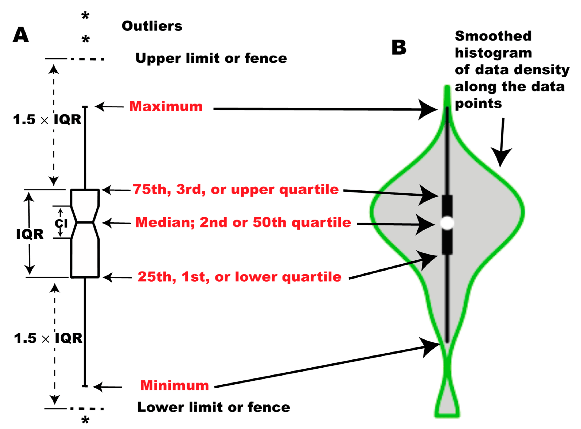
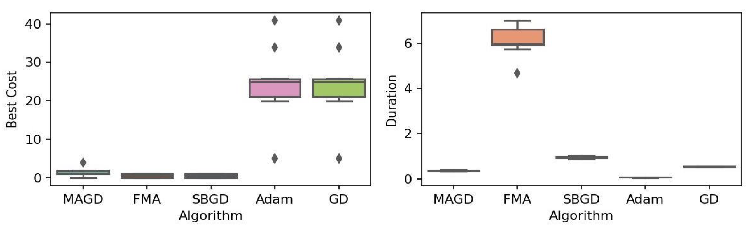
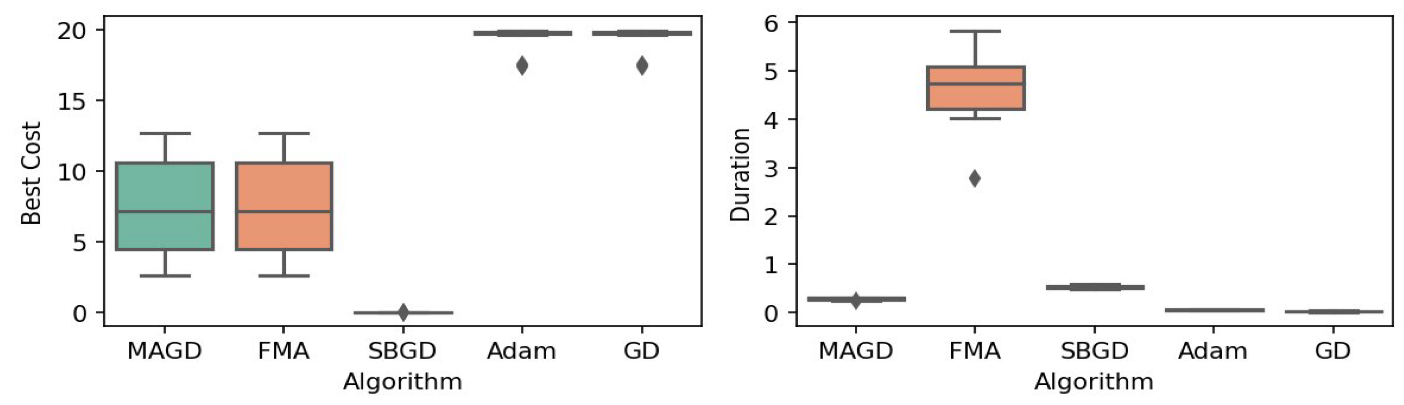
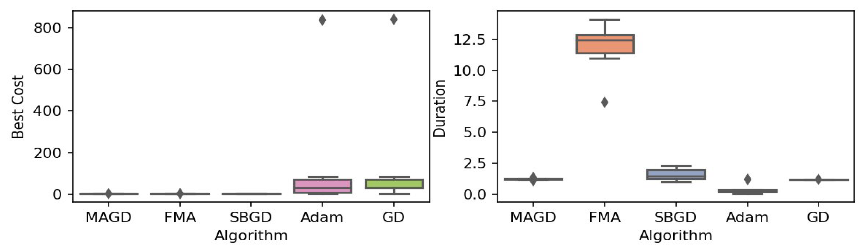


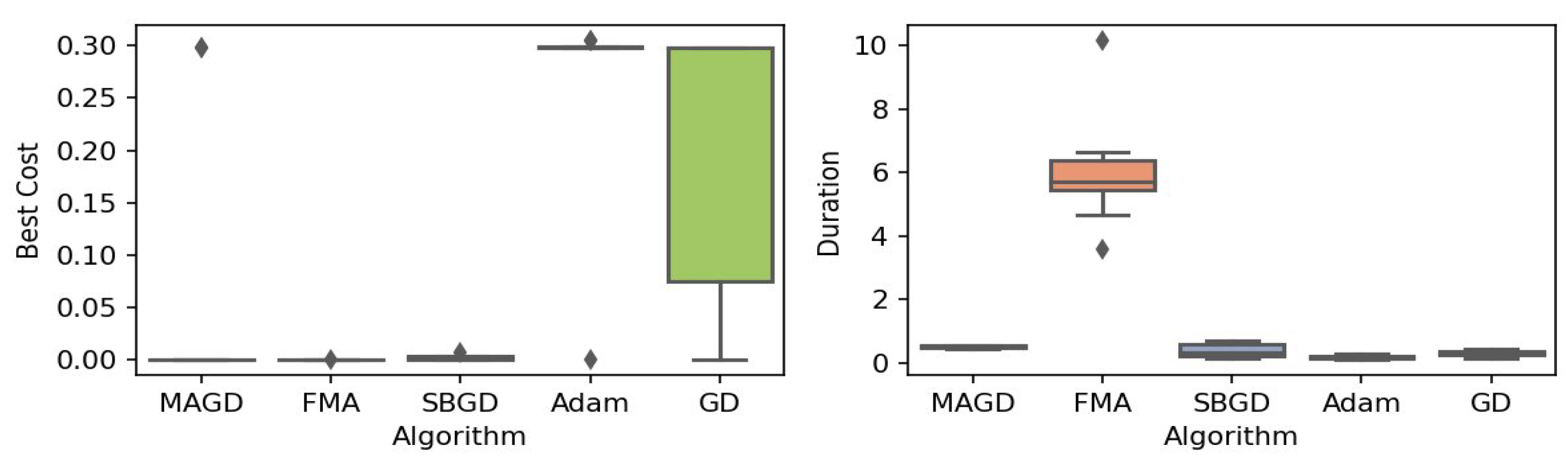

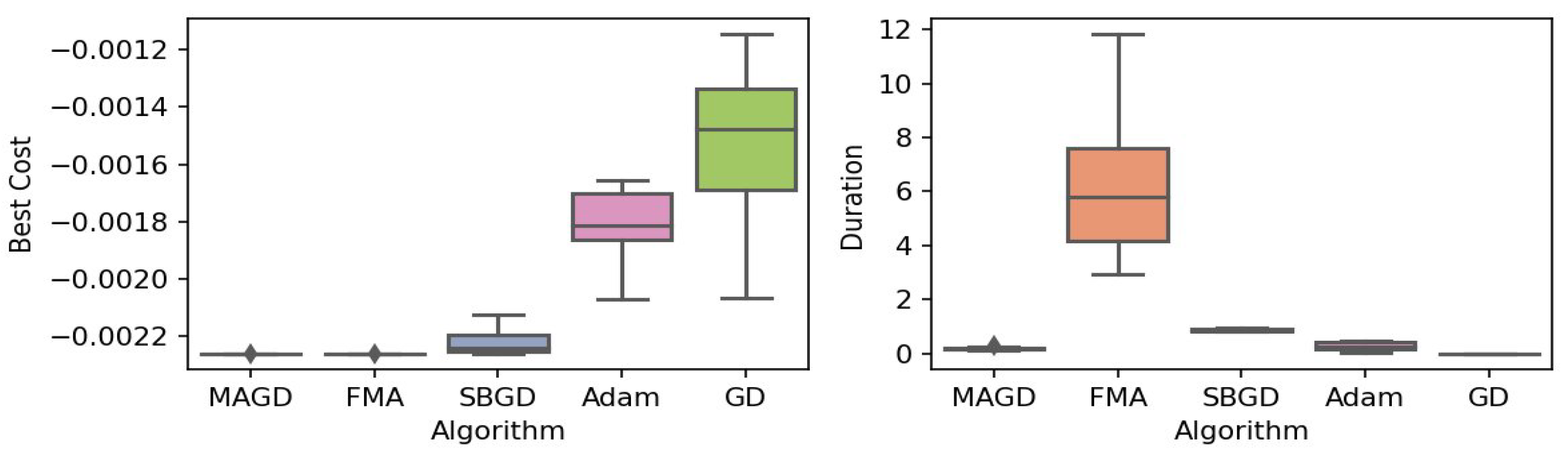
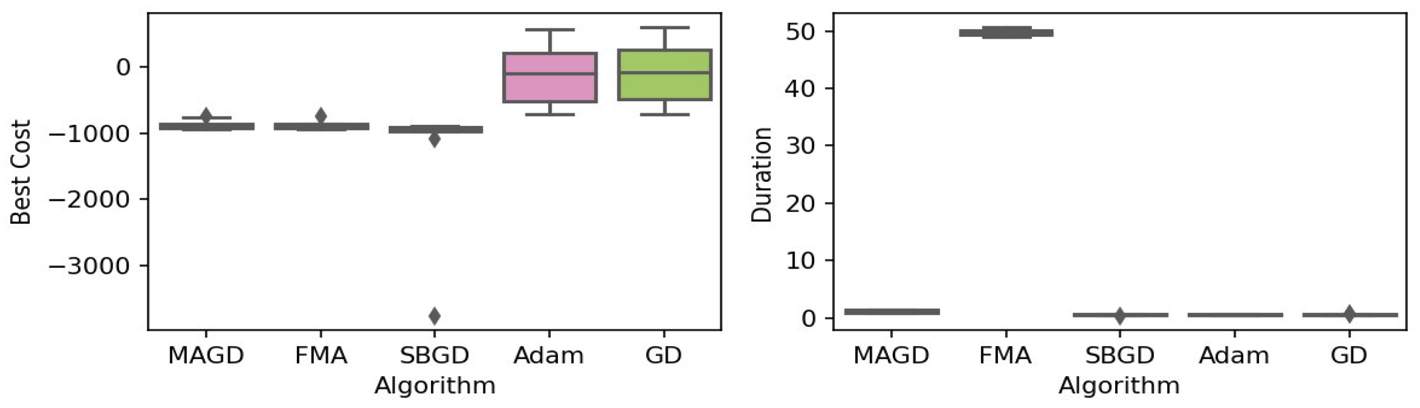
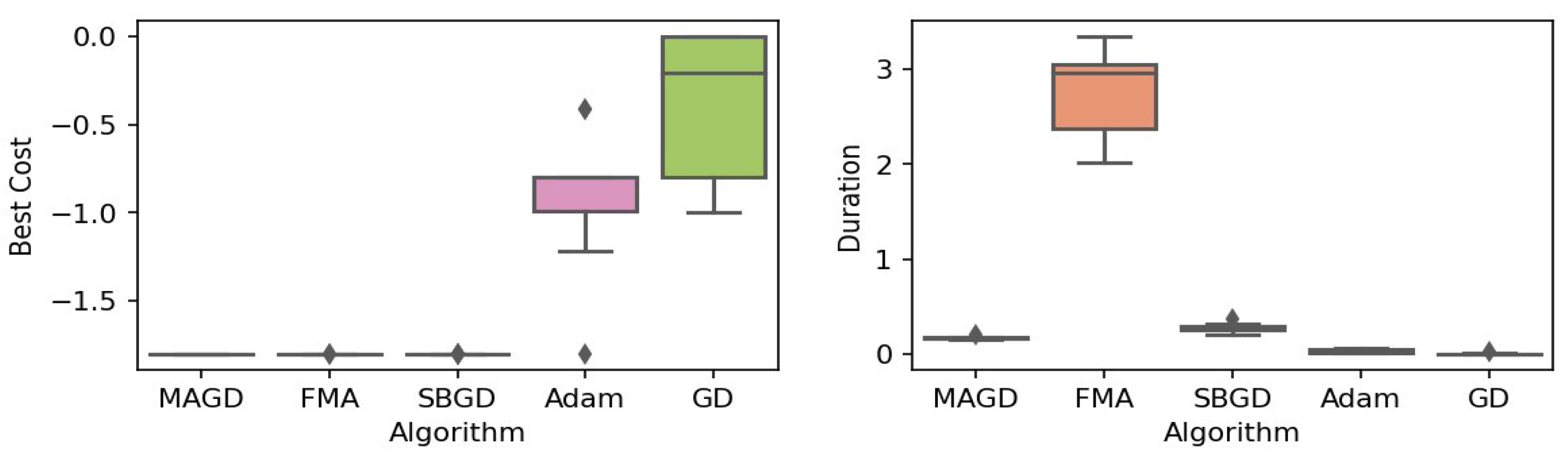

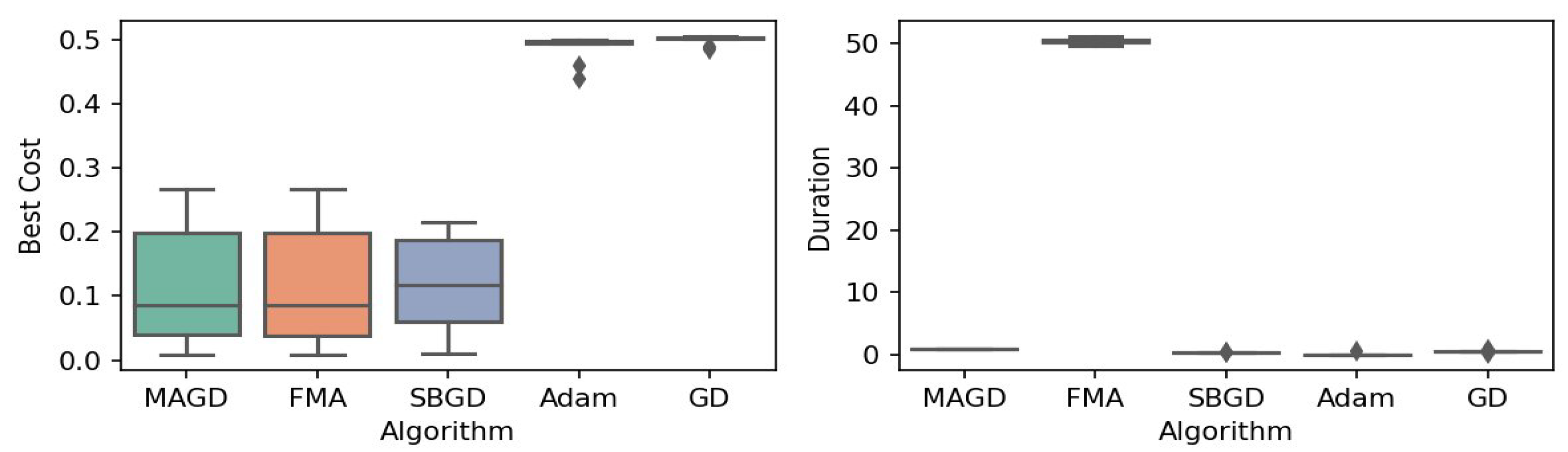
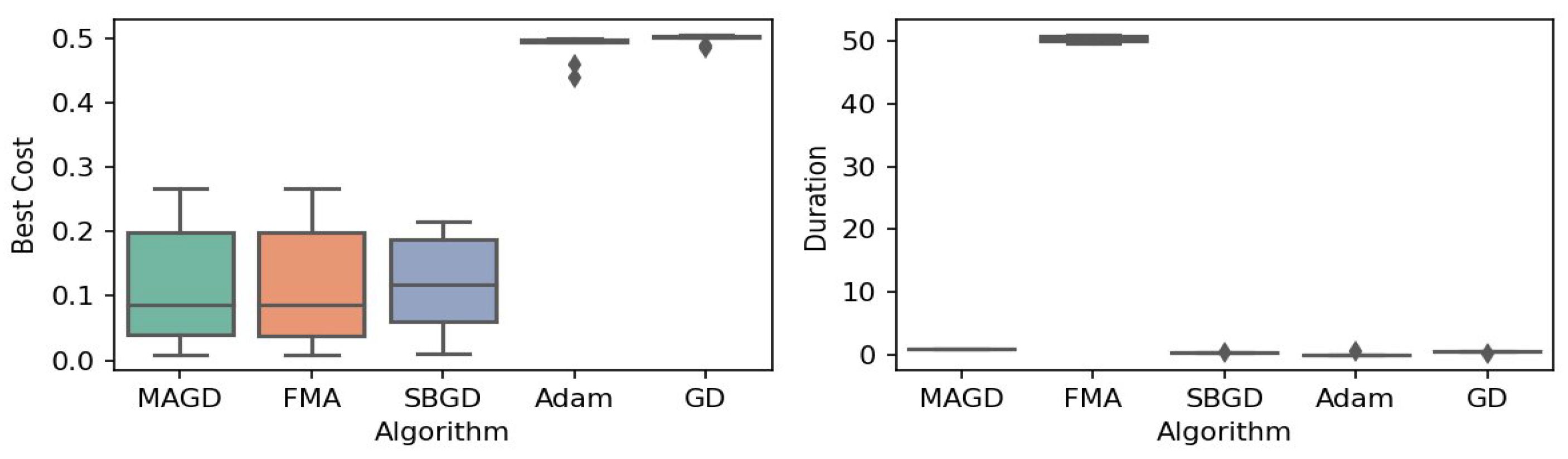

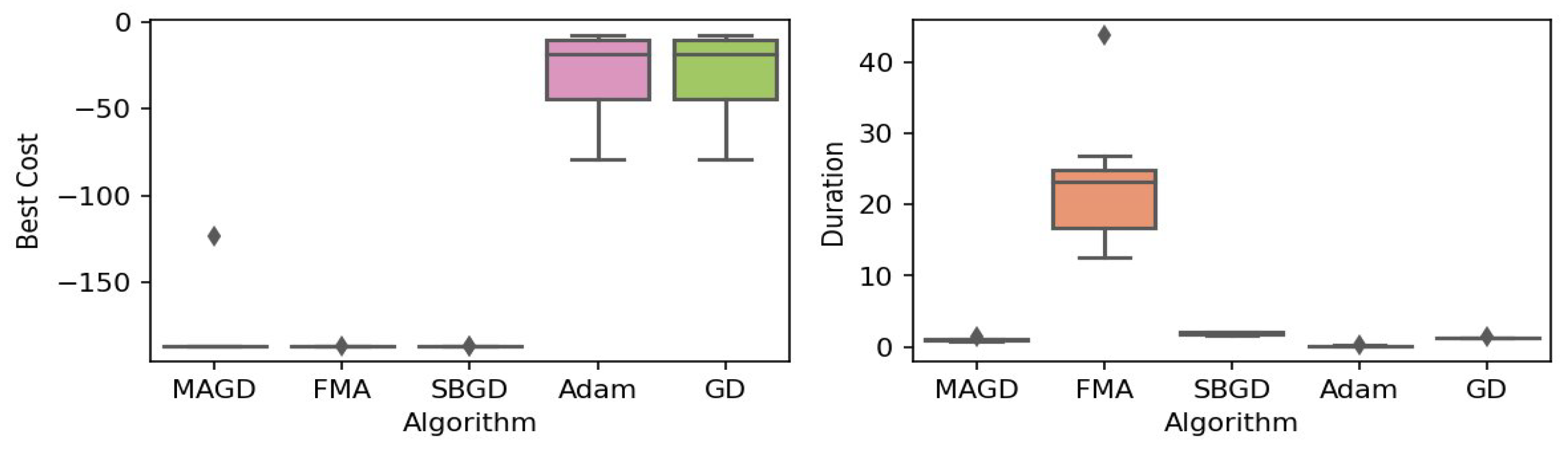
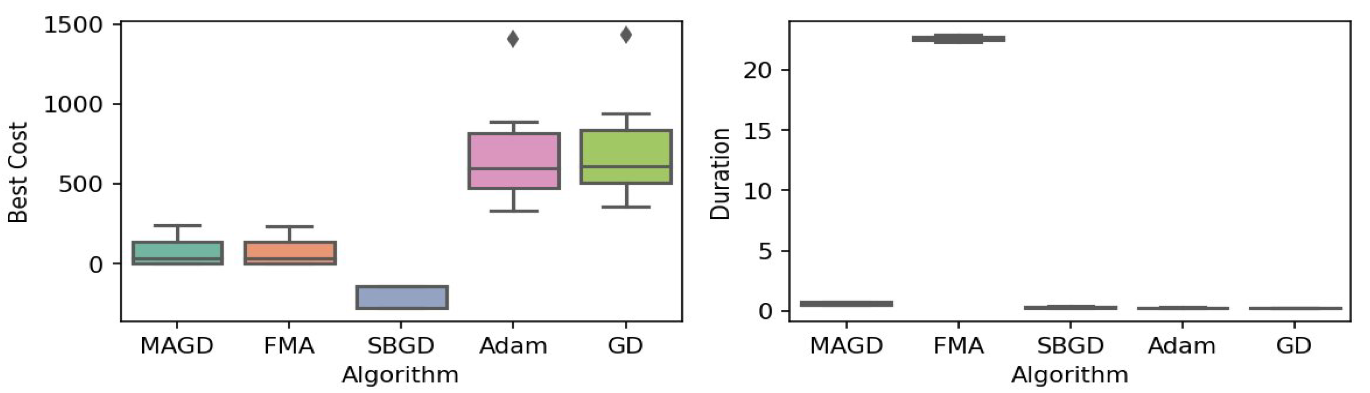

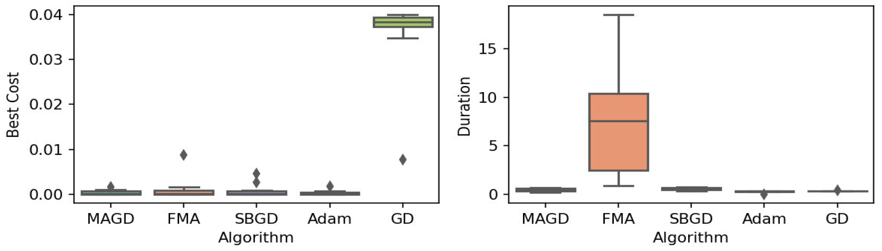
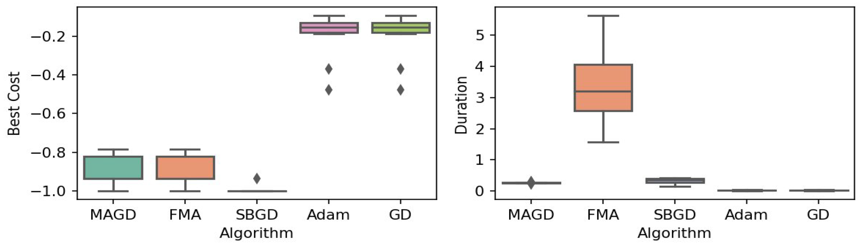
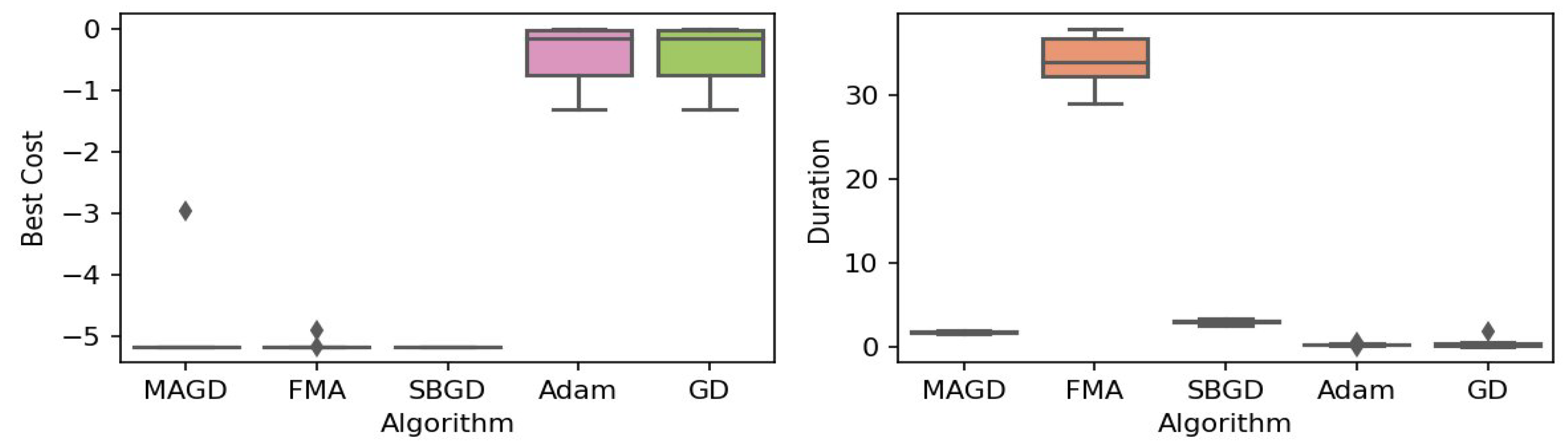
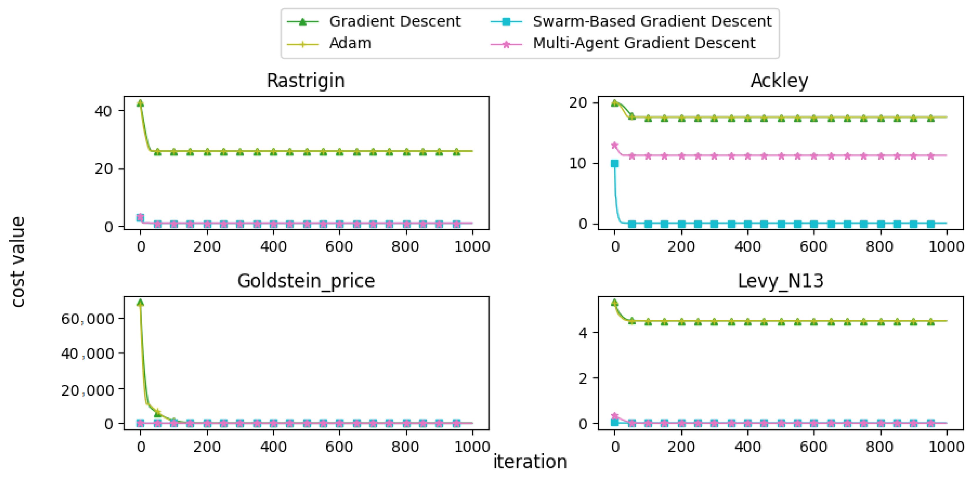
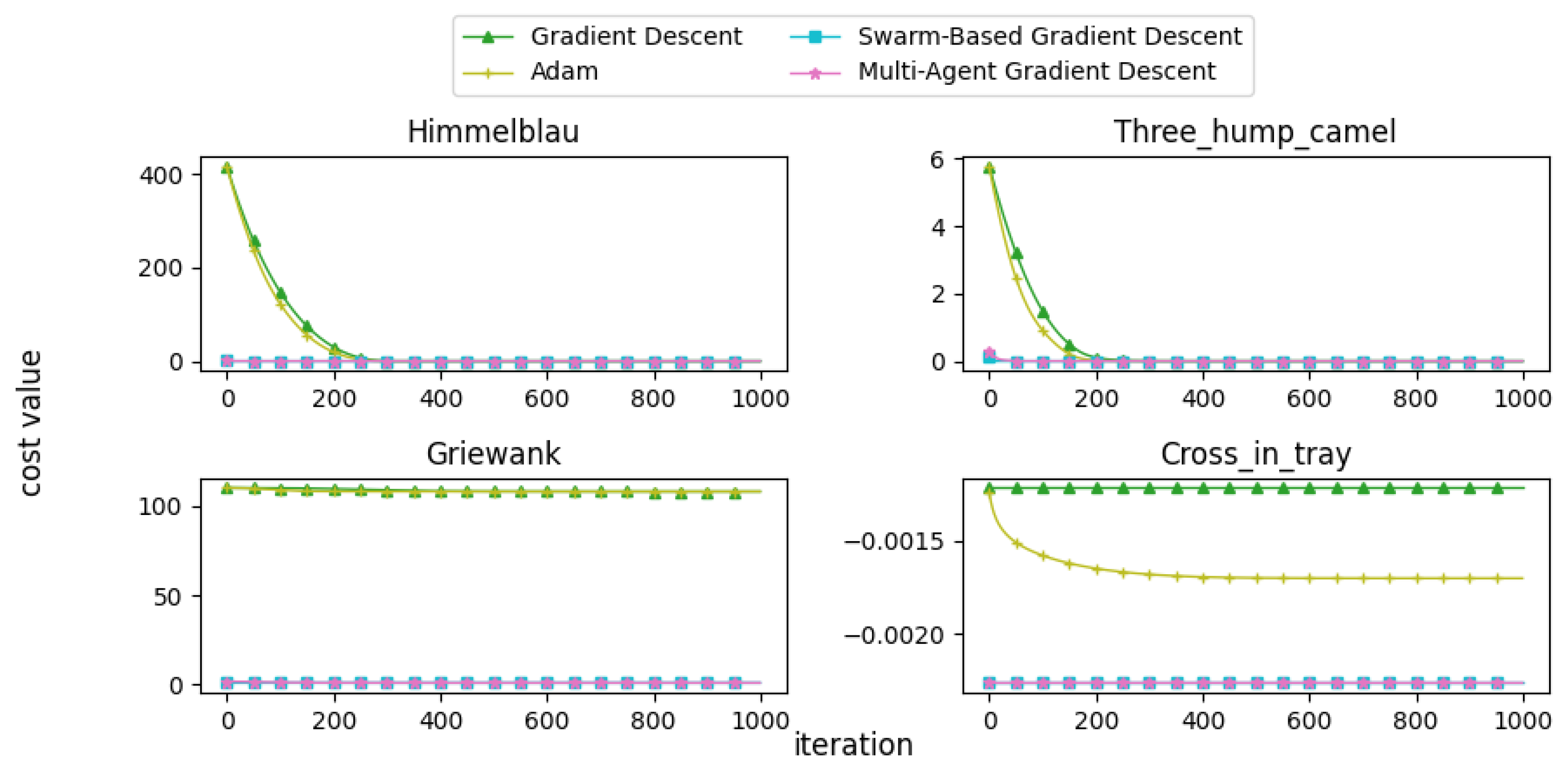
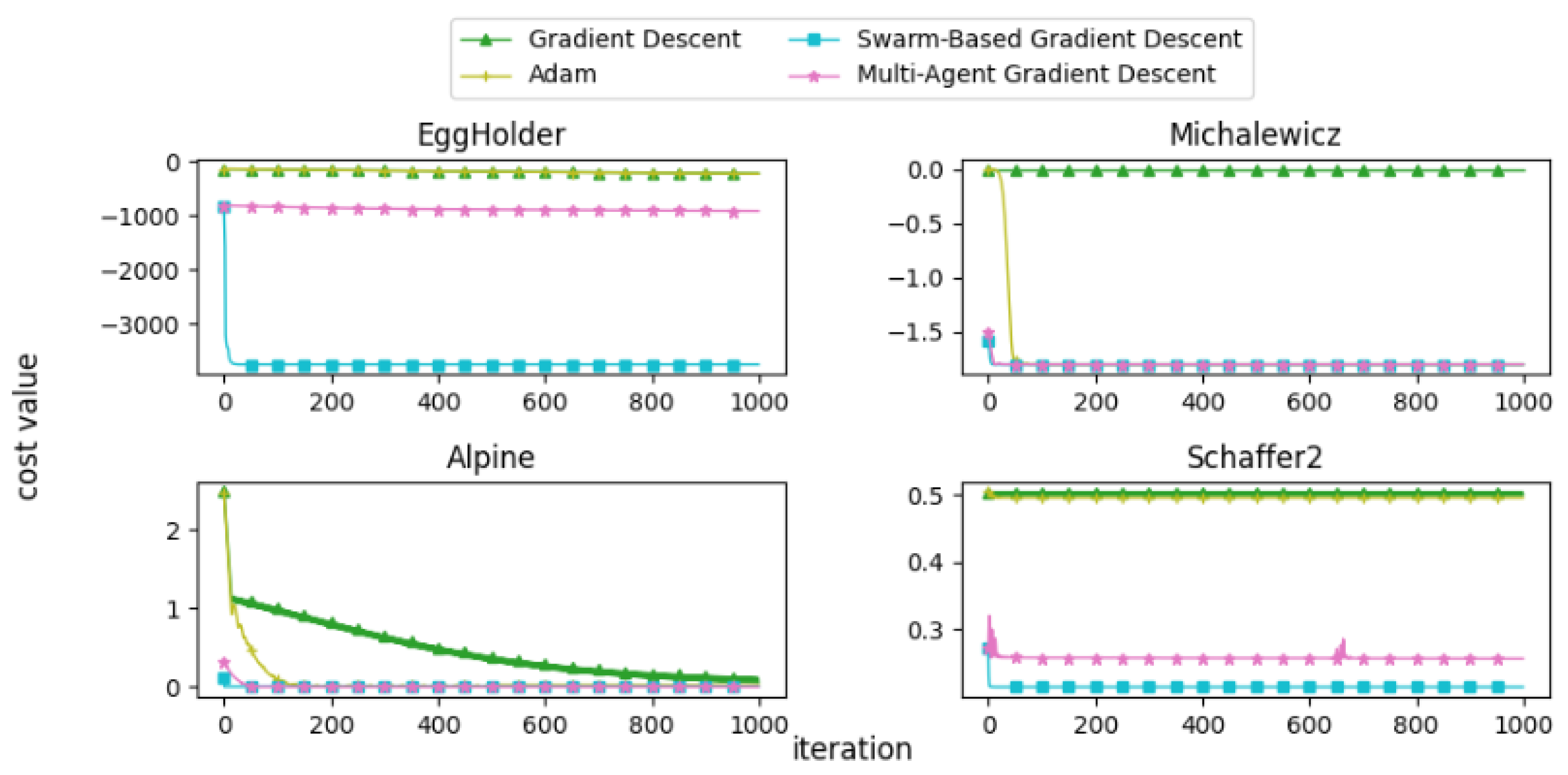
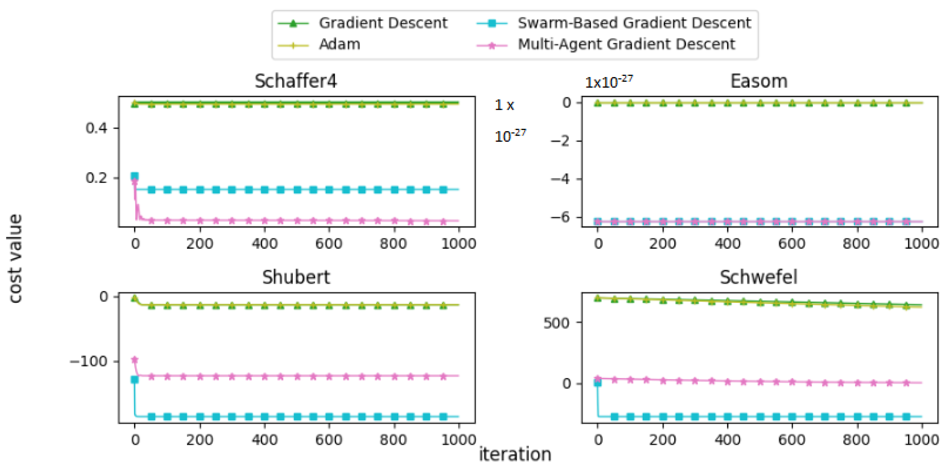
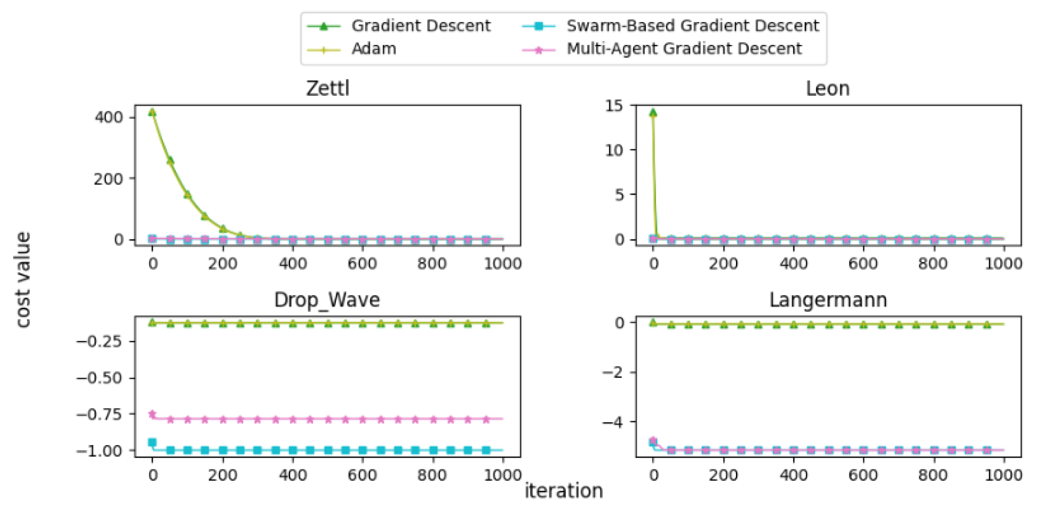
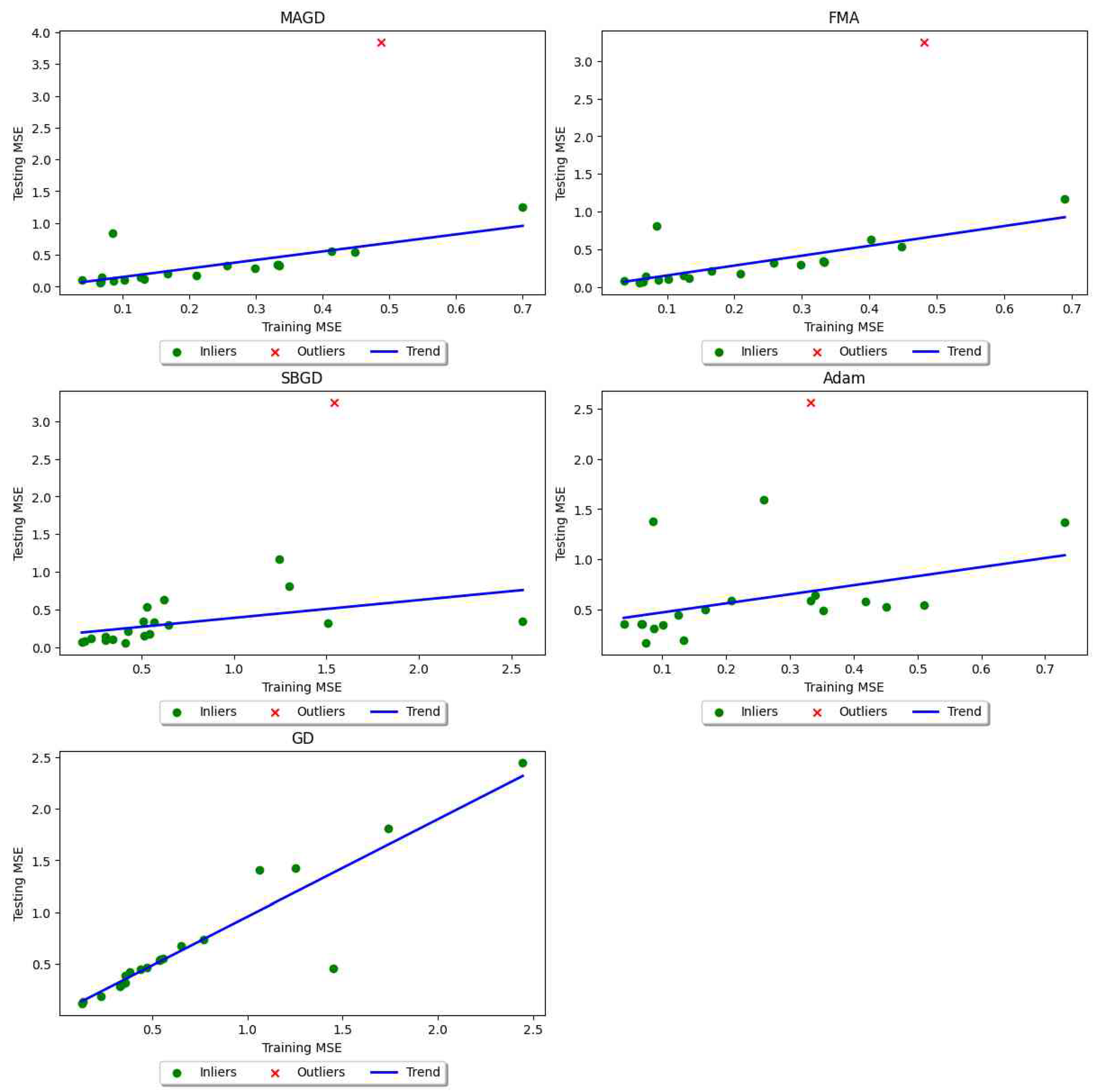
Disclaimer/Publisher’s Note: The statements, opinions and data contained in all publications are solely those of the individual author(s) and contributor(s) and not of MDPI and/or the editor(s). MDPI and/or the editor(s) disclaim responsibility for any injury to people or property resulting from any ideas, methods, instructions or products referred to in the content. |
© 2025 by the authors. Licensee MDPI, Basel, Switzerland. This article is an open access article distributed under the terms and conditions of the Creative Commons Attribution (CC BY) license (https://creativecommons.org/licenses/by/4.0/).