3.5. Exploratory Data Analysis—Feature Engineering and Transformations
Random forest regression models are scale invariant; however, the other methods used in this research are not [
20]. The “car” package in R [
24] facilitated a multivariate Box-Cox transformation for all modeled quantitative variables simultaneously after adjustment. Box-Cox transformations require that variables be strictly positive definite. With positive definite variables, the transformation seeks power transformations (powers of λ) that make the data multivariate normal enough for use in traditional linear models [
25]. This multivariate transformation is particularly useful for random effects models, models where the independent variables are assumed to be not fully observed or the result of random variable draws. The likelihood ratio test of the null (multivariate normal) vs. the alternative (not multivariate normal) after location transformation to make all variables positive definite resulted in a p-value of 1.0. The actual vector of transformations follows: λ = {−0.39, 0.31, 0.38, 0.24, 0.23, 0.34, 0.25, 0.14, 0.1, 0.21, 0.22, 0.48, 0.21, 0.71} for x = {number of claims, number of staffed beds, number of discharges, ER visits, total surgeries, acute days, net patient revenue, net income, cash, assets, liabilities, affiliated physicians, employees, percent Medicare/Medicaid}, respectively.
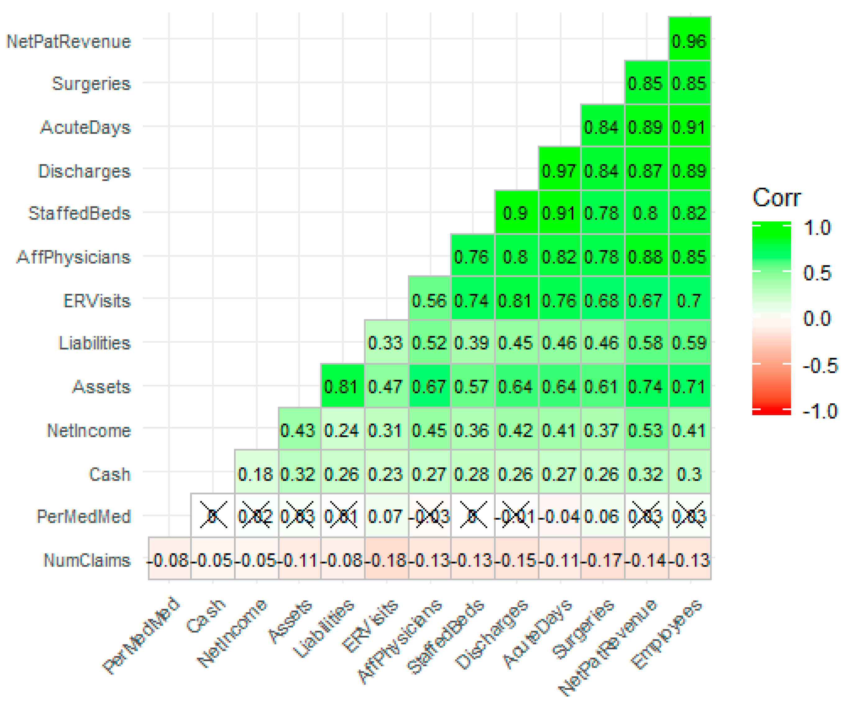
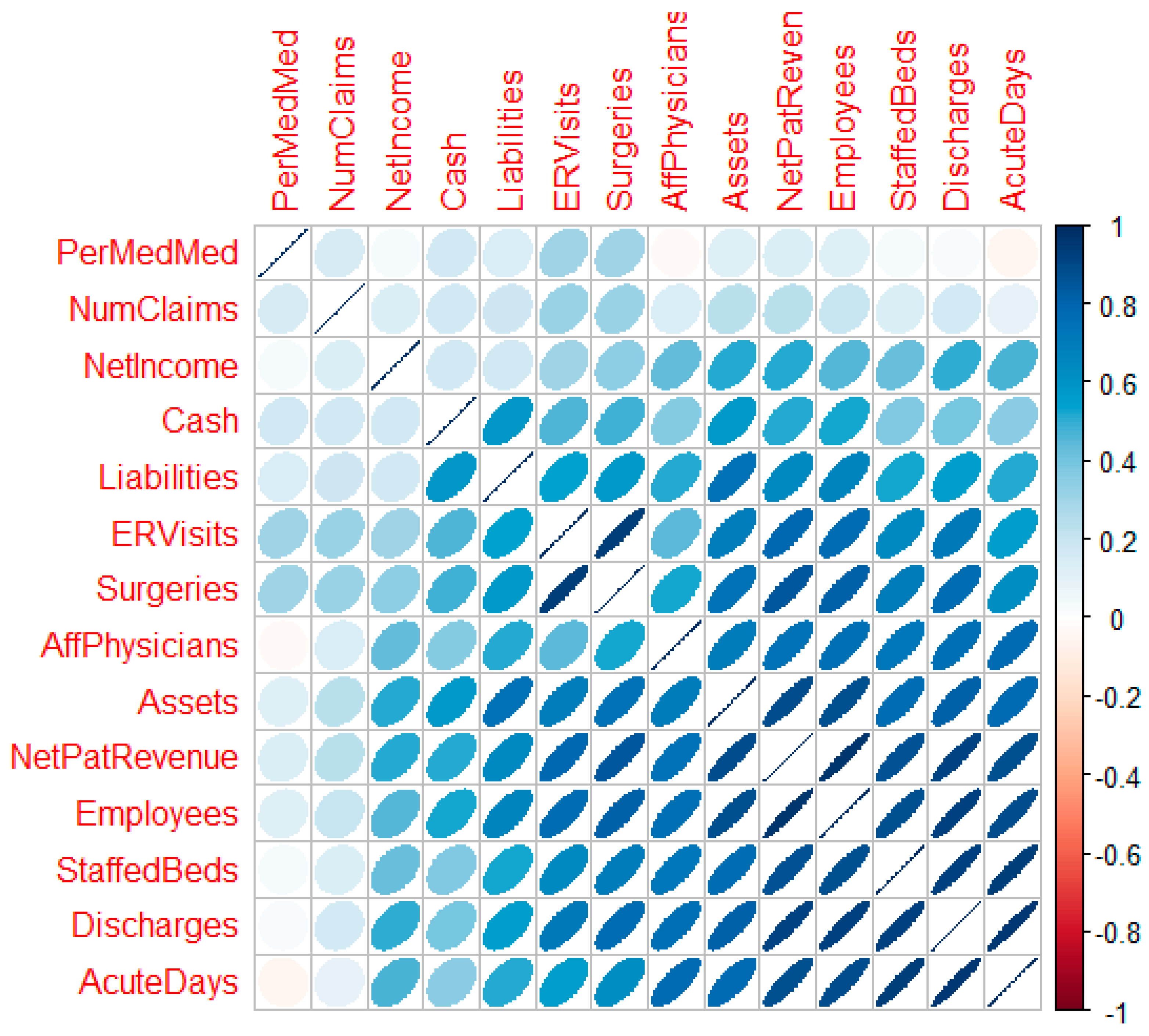
Figure 4 is a correlation plot [
26] post-transformation which reveals the strength, direction, and bivariate shape of the bivariate normal between variable pairs. With successful transformation, the forecasting using linear methods is likely to improve.
3.6. Geospatial Analysis Results—Zip Code Unit of Analysis
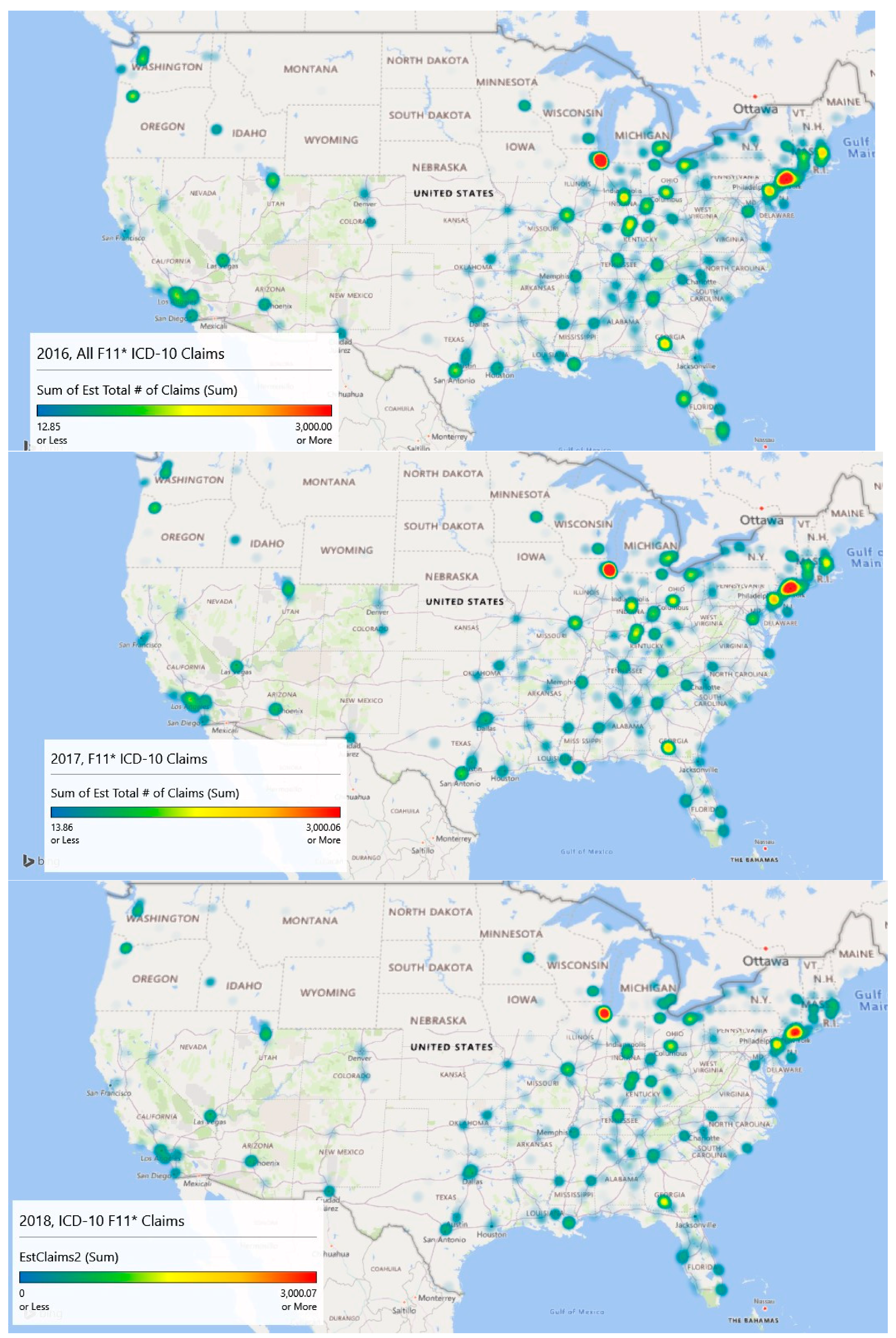
Geospatial heat map analysis of F11 claims by year and zip code is shown in the
Figure 5 panels. These maps were generated by a new feature of Microsoft Excel (3D Map), which links to its Bing mapping service. This study is concerned mostly with supporting resource allocation decision making, so counts of opioid admissions were considered more important than population rates of admissions, although both analyses are provided. With counts, it becomes possible to visualize a proxy for service demand.
The geospatial-temporal heat maps for counts were generated based on scaling to approximately the maximum number of claims experienced in any given year (3000). The meaning of the color ranges is shown in
Table 4. The inpatient met demand associated with the opioid epidemic becomes clear with geospatial analysis.
In 2016, the level of intensity for admissions is strongest around Chicago, Illinois and large swaths of New Jersey, where drug overdose is its leading cause of accidental death [
27]. The heat map depicts extreme intensity (dark red, near the 100th %) in Chicago. Areas above the median admission rate (yellow) appear to be Washington, DC; Atlanta, GA; and areas of Kentucky, Indiana, and Ohio.
By 2017, the area of intensity around New Jersey had grown, Atlanta saw more intensity, and Chicago remained the most intense. The usage in Los Angeles had expanded but remained sub-intense. Areas in Kentucky, Indiana, and Ohio remained problematic.
Data for 2018 were complete only through September, so they are excluded in the explanatory modeling. However, linear extrapolation produced the 2018 chart which indicates significant intensity in Chicago, New Jersey, and Atlanta. Montana, the Dakotas, Iowa, and Wyoming appear to be inoculated against the epidemic.
Year over year with 2018 extrapolated, there has been a decline in the number of claims. In 2016, the estimated number of claims was 112,816, and that value dropped to 103,436 in 2017. Using linear extrapolation, the estimated number of claims for 2018 is 71,414, although such an extrapolation likely does not reflect later reporting of previous claims and is thus an underestimate.
A Wilcoxon signed ranks test for complete opioid claims data (2016 and 2017) suggests differences between the years across zip codes with V = 405,660, p < 0.001. This result indicates that opioid-related claims from 2017 are statistically lower than 2016 when controlling for the zip code. The approximate 8.3% decrease in 2017 was statistically significant.
Overall, the maps are suggestive of areas where intervention efforts are needed most or are emerging. From a policy perspective, opioid prescriptions in the highest afflicted areas like Illinois and New Jersey might be screened more closely than those (say) in Montana, South Dakota, and North Dakota. Machine learning techniques might be used to identify outliers similar to Ekin et al. [
28]. Further, interdiction efforts might focus on Chicago as a major transportation hub along with the emerging problem city, Atlanta, for the same reason, and (of course) New Jersey.
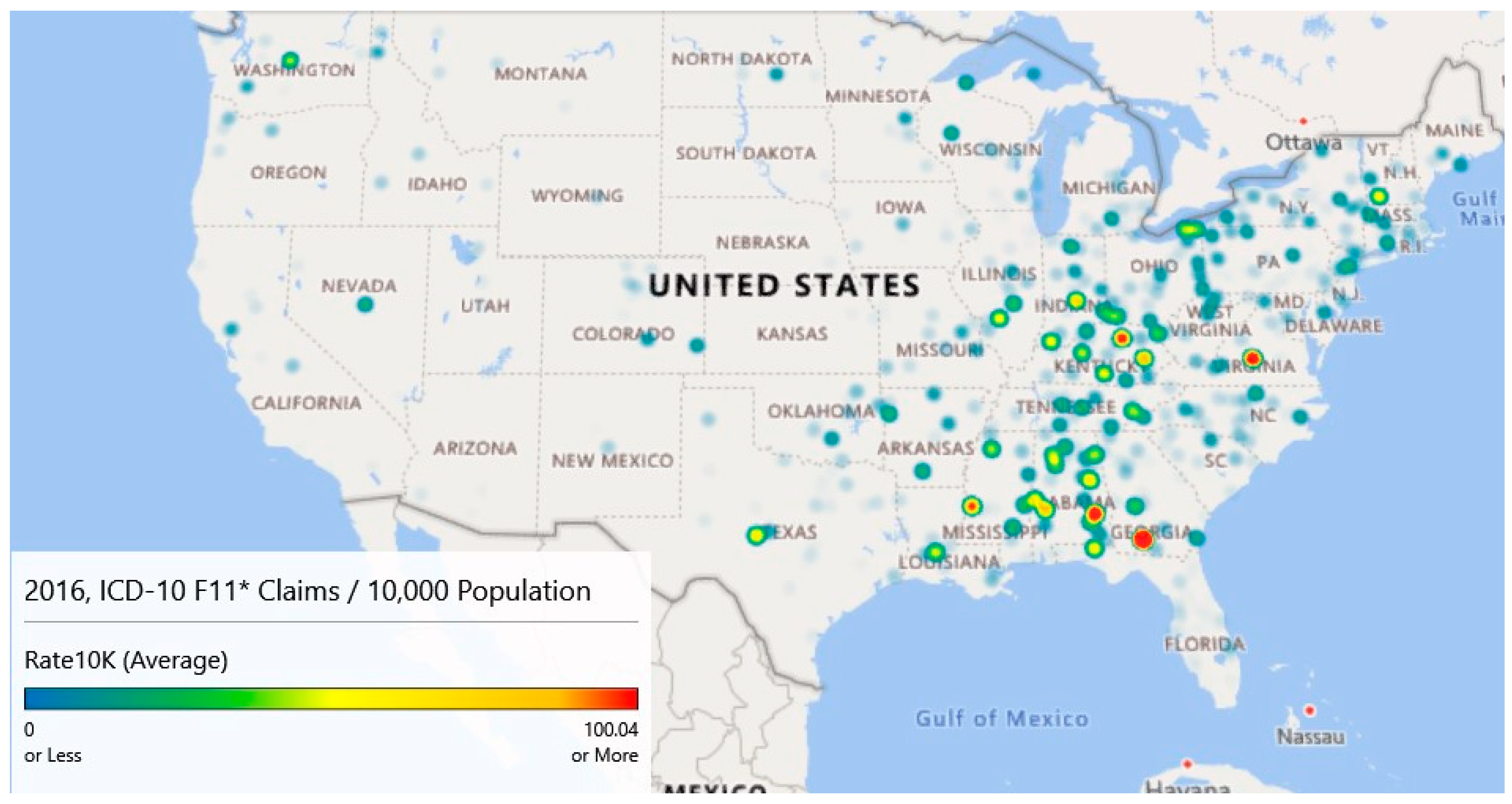
While the counts analyzed and graphed above show areas of interest, rates of claims per 10,000 provide a slightly different descriptive viewpoint. Using county-level population data from the Census Bureau [
14], heat maps were generated for 2016–2018. County-level data were used as several zip codes had sparse populations resulting in many outliers.
Figure 6 provides the maps for these years. These maps have gradients as specified in
Table 4 columns 1 and 2 and are scaled to a maximum of 100+ opioid claims per 10,000 cases for comparison purposes.
Map 1 of
Figure 6 (Year 2016) highlights five locations that have intensities of 100/10,000 population or more. The highest intensity claims rate (424.47) is associated with a small county, Colquitt, Georgia. In 2016, this county of 45,492 had an estimated 1,931 claims for a rate of 424.47 per 10,000 population. Norfolk City, Virginia; Bourbon, Kentucky; Bullock, Alabama; and Warren, Mississippi also had claim rates per 10,000 rates. Map 1 also highlights high claim rates in Appalachia.
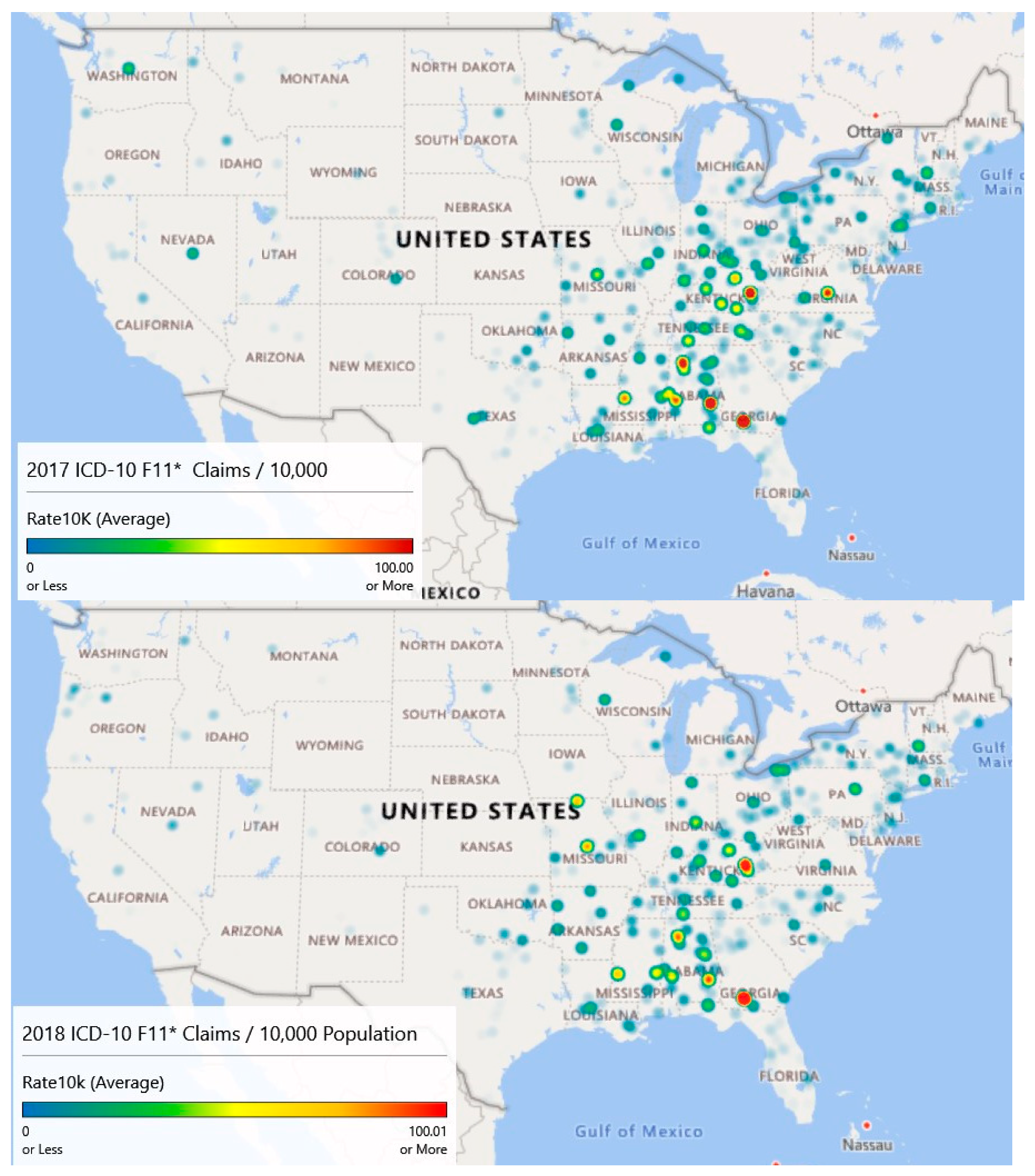
Map 2 of
Figure 6 (Year 2017) illustrates the diffusion or spread of the problem. While counts may have decreased since 2016, intensity appears to have increased, particularly in the Appalachian region and on the Northeastern seaboard. Diffusion is visible as evidenced by areas of intensity that have spread to Missouri.
Finally, map 3 of
Figure 6 (Year 2018) is based on extrapolated data, as information was only available through September. Still, the claim rates per 10,000 population for opioid admissions appear to be heaviest in the Appalachian Mountain regions.
Year over year, the average opioid admissions claim per 10,000 population has declined from 6.1 per 10,000 in 2016 to 5.8 per 10,000 in 2017. The estimate for 2018 is 4.5 per 10,000. While the average rates have declined, there has been noticeable diffusion based on an analysis of the heat maps.
A Wilcoxon signed ranks test for complete opioid claims rate data (2016 and 2017) suggests no differences between the years across counties with V = 109990, p < 0.097. This result indicates that opioid-related claims rates from 2017 are not statistically different from 2016 when controlling for the county.
Figure 5 and
Figure 6 illustrate different sides of the opioid epidemic problem.
Figure 5 provides resource allocation decision-making for treatment, as it illustrates the diffusion across geography.
Figure 6 provides decision support for enforcement and prevention, as it shows the higher concentrations of opioid-related admissions. From
Figure 5 and associated analysis, we noticed geographic diffusion in terms of counts and that there was a statistically significant difference in the number of claims between 2016 and 2017 after accounting for geography.
Figure 6 and its associated analysis shows high claims prevalence rates in Appalachia and that claims prevalence rates year to year remain relatively constant when accounting for geography. Both counts and rates may be useful in supporting resource allocation decision making.
3.7. Explanatory Modeling Results
The first explanatory model, stepwise regression, investigated the number of inpatient opioid claims as a function of the independent variables. Models were built on an 80% training set and applied to 20% blinded test set for analysis of performance. The final stepwise model, the one with the smallest Akaike Information Criterion, included (1) staffed beds, (2) discharges, (3) emergency room visits, (4) surgeries, (5) assets, (6) affiliated physicians, (7) percent Medicare/Medicaid, (8) medical school affiliation, (9) hospital type, (10) year, and (11) state. Unfortunately, this model was only able to account for 17.73% of the dependent variable’s variability. The root mean squared error (RMSE) of the forecast predictions was 1.76. The largest contributions to the model were from the ER visits (Sum of Squares (SS) = 1.49, 1 degree of freedom, df) and from the state (SS = 1.25, 51 df). All variables in the model were statistically significant largely, due to sample size. The overall effect size, however, is small.
Lasso, ridge, and elastic net regression models built using “glmnet” [
29] provided only slightly more variance capture with R
2 = {17.82%, 17.77%, 17.77%}, respectively. The RMSE’s were 1.75 for all three models. The elastic net selected a lasso model by assigning parameter α = 0. These models produced are essentially equivalent to the stepwise regression analysis.
Gradient-boosted random forests [
30] performed well on the unobserved test set and untransformed data, achieving an R
2 = 0.878 with hyperparameter tuning (depth of 6 trees, 500 rounds, learning rate of .1). To compare the results more fairly with the regression models, the same random forest configuration was run on the transformed data resulting in R
2 = 0.550 and an RMSE = 0.06.
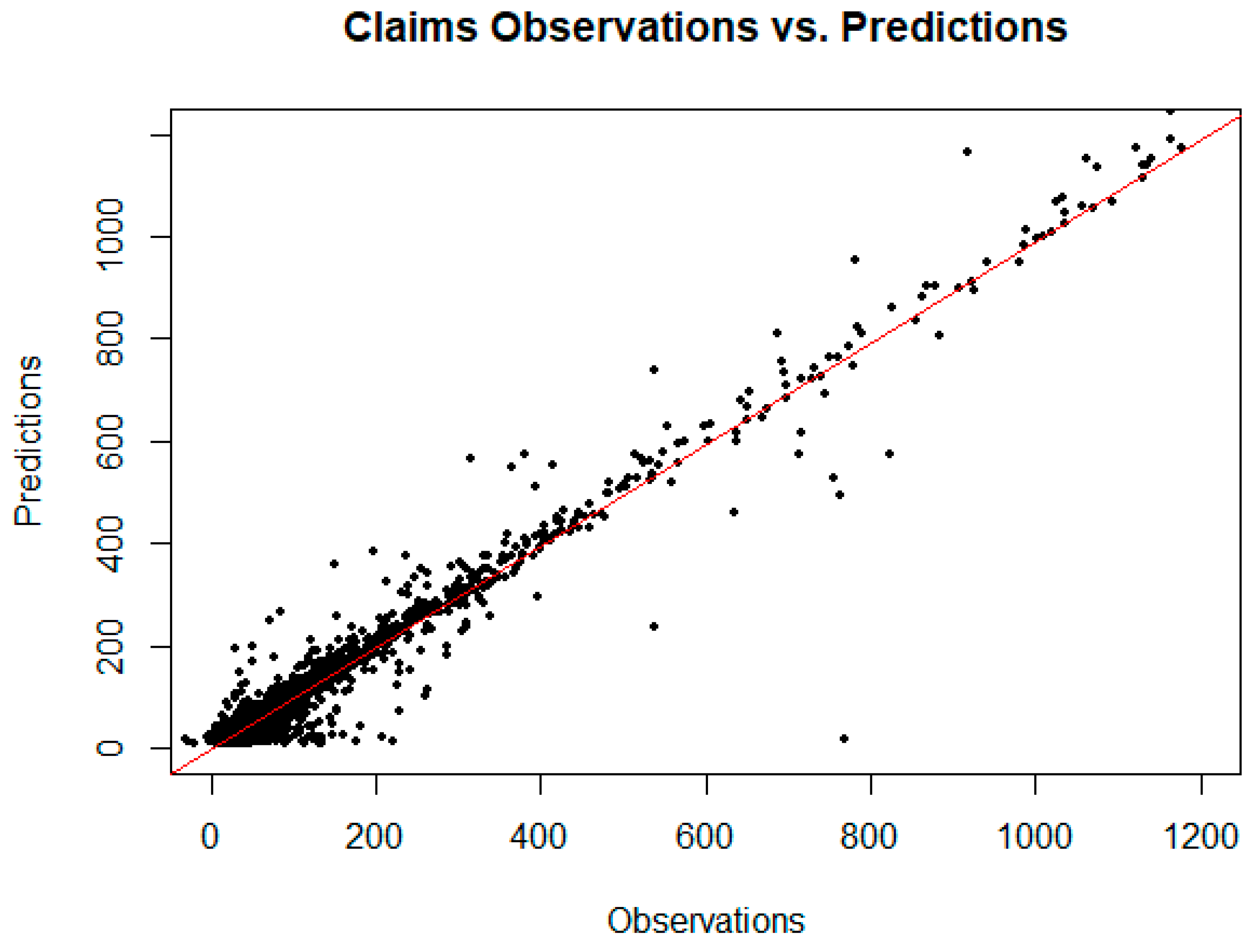
Figure 7 is a plot of the observed claims versus the random forest predicted claims for the training and unobserved test set data. From this plot, it appears reasonable to forecast demand for opioid inpatient services based on factors important to the random forest model. The implication for policymakers at the state and local level is that resource allocation to treat opioid abuse might reasonably be based on these models.
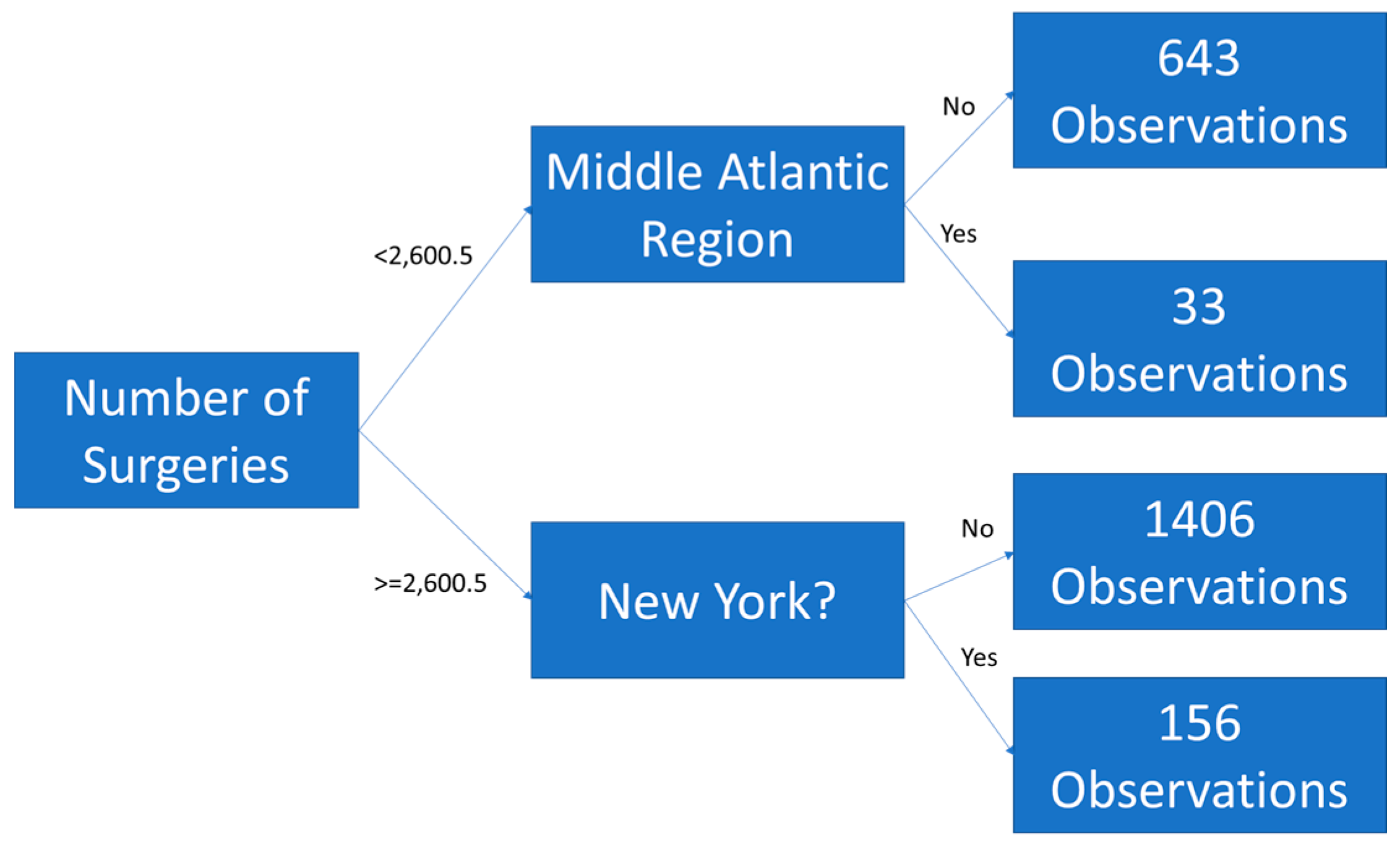
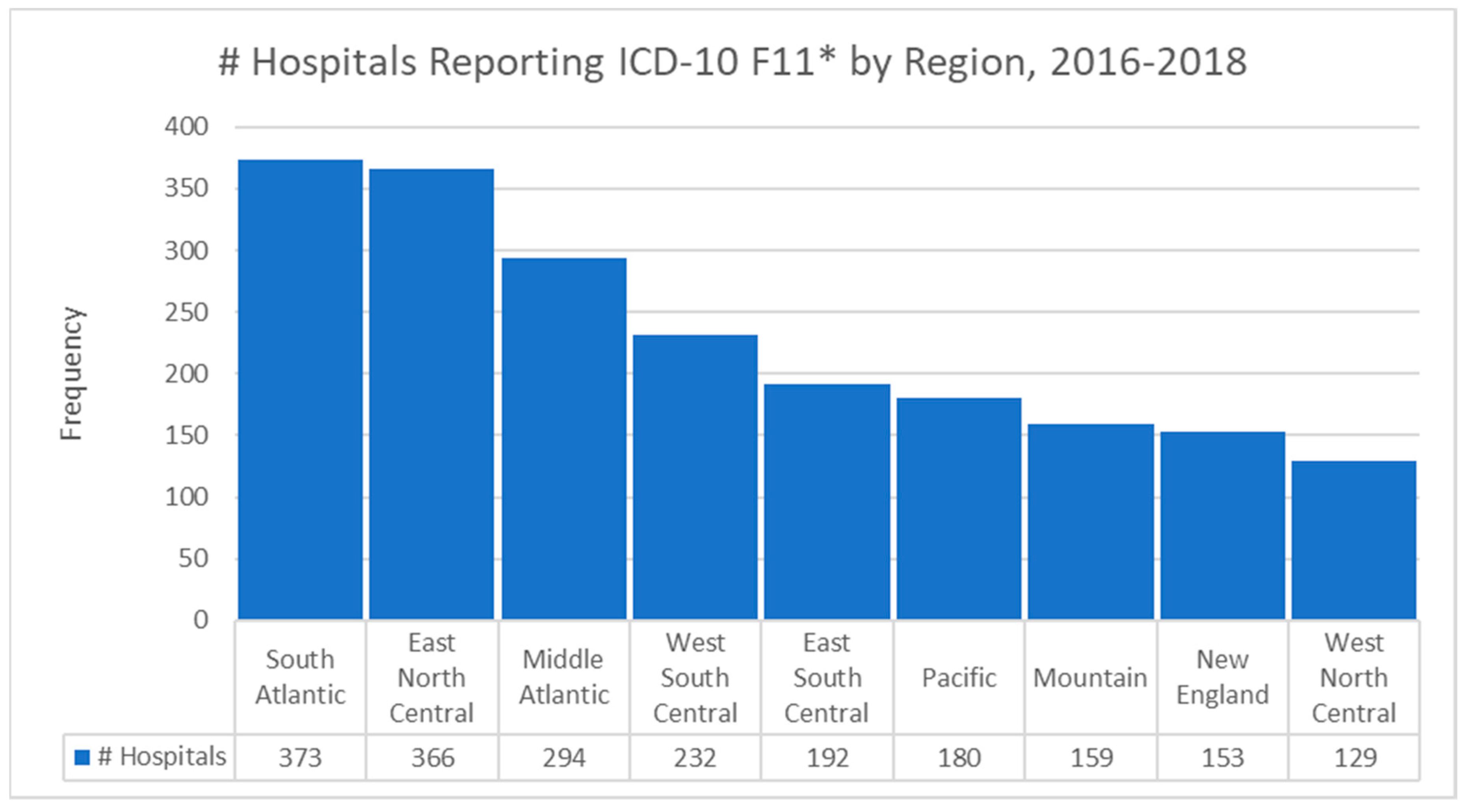
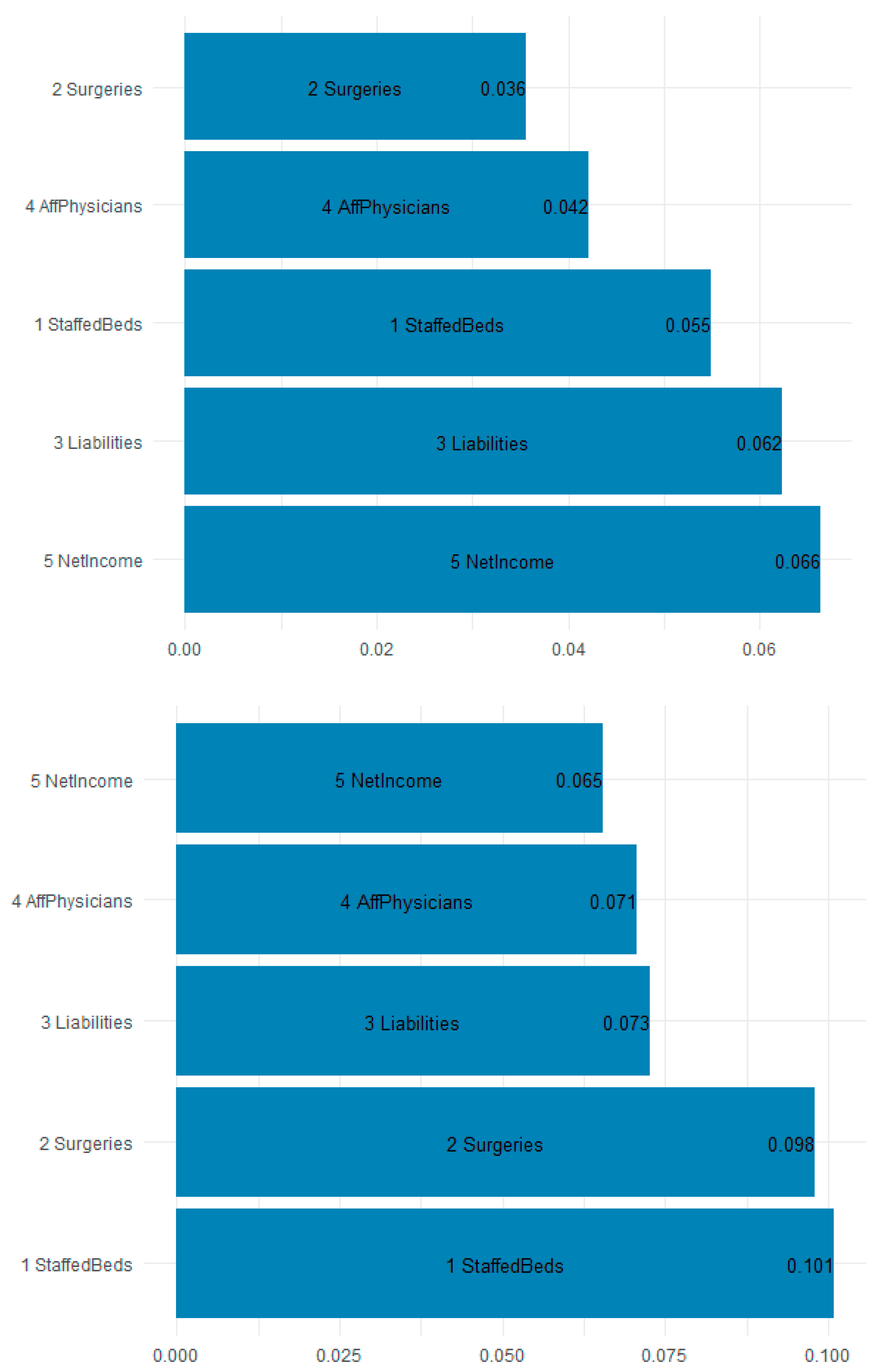
Figure 8 is a plot of the gain (improvement of an estimate when a feature is used in a tree) and cover (the average proportion of samples affected by splitting using this feature) for the top five items in the importance matrix. The most important features for predicting the F11 opioid claims appear to be the staffed beds (10.1% gain and 5.5% cover), surgeries (9.8% gain and 3.6% cover), and liabilities (7.3% gain and 6.2% cover). Most interesting is that workload and financial variables are the most explanatory.
Table 5 shows the top 10 most important features by gain. Because of their predictive accuracy, random forests may be used by policymakers to assign funds and resources to states and localities based on the estimated inpatient demand.
Random forests seek out estimates for each tree to help predict what the demand will be. The splits are not necessarily in the direction one might assume. The purpose of the explanatory models is to assess those workload, financial, technical, geographical-temporal variables that might be useful in estimating which facilities experience demand for ICD-10 opioid admissions. The presence of variables in the tree splits suggest importance only, not directionality. Given that the forest model predicts unseen data with 0.878% accuracy, it seems reasonable to assume that policymakers can rely on the forest for funding allocation determination. The initially explanatory models have outstanding predictive power.

 ,
, 


