

Observations in the Spanish Mediterranean Waters: A Review and Update of Results of 30-Year Monitoring

 , , , and
Abstract
1. Introduction
2. Materials and Methods
2.1. Observation Networks and Datasets
2.1.1. RADMED Project
2.1.2. Fuengirola Beach Temperature Time Series
2.1.3. The IEO Tide-Gauge Network
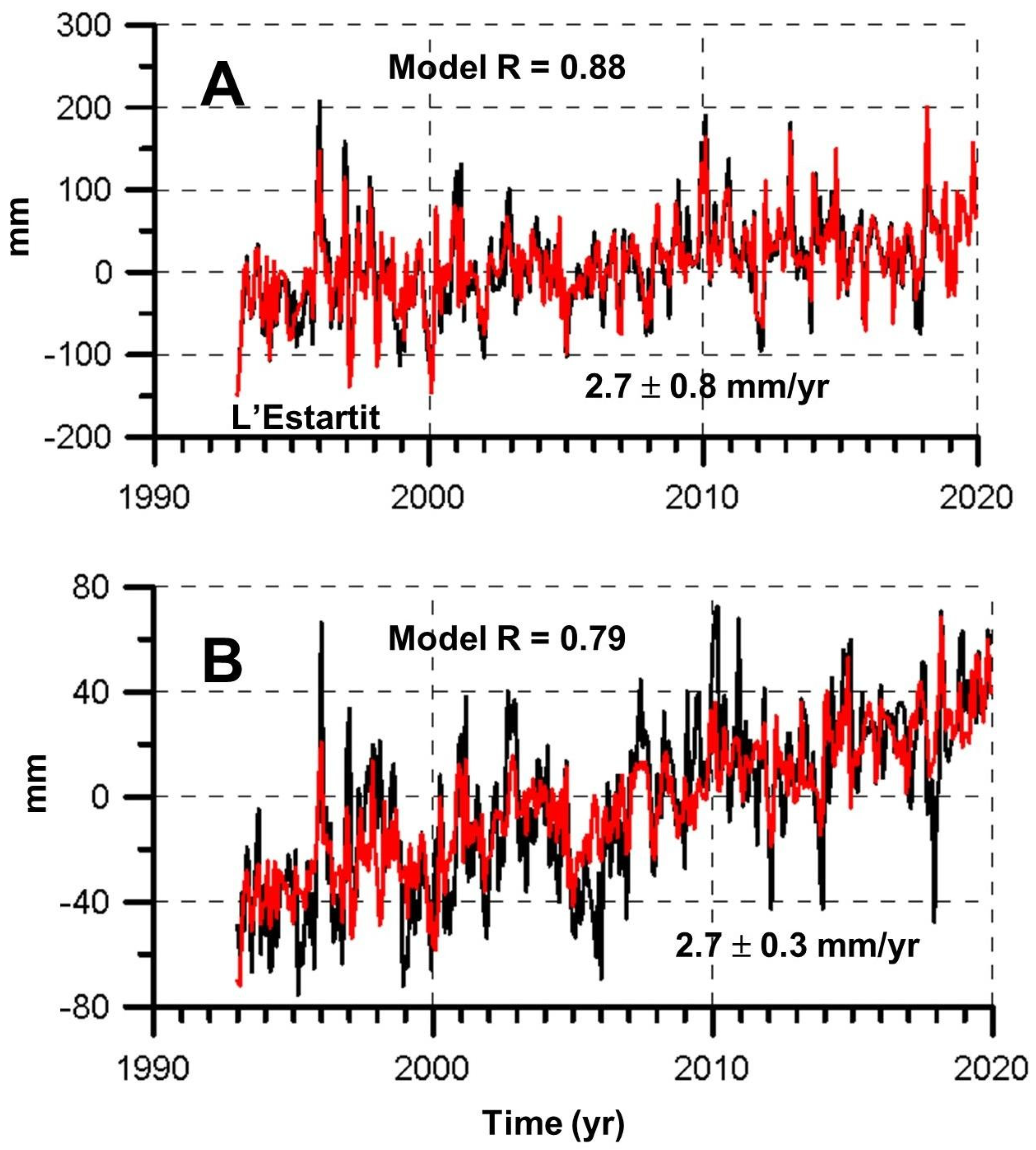
2.1.4. L’Estartit Oceanographic Station
2.1.5. The Balearic Island Coastal Observing and Forecasting System
2.1.6. Puertos del Estado
2.1.7. The Blanes Bay Microbiological Observatory
2.1.8. Other Datasets
2.2. Data Analysis Methods
2.2.1. Construction of Temperature and Salinity Time Series
2.2.2. Sources of Uncertainty
3. Results
3.1. Temperature, Salinity, Density, and Heat Content Trends
3.2. Surface Temperature Trends from Satellite Measurements, L’Estartit Oceanographic Station, and Fuengirola Time Series
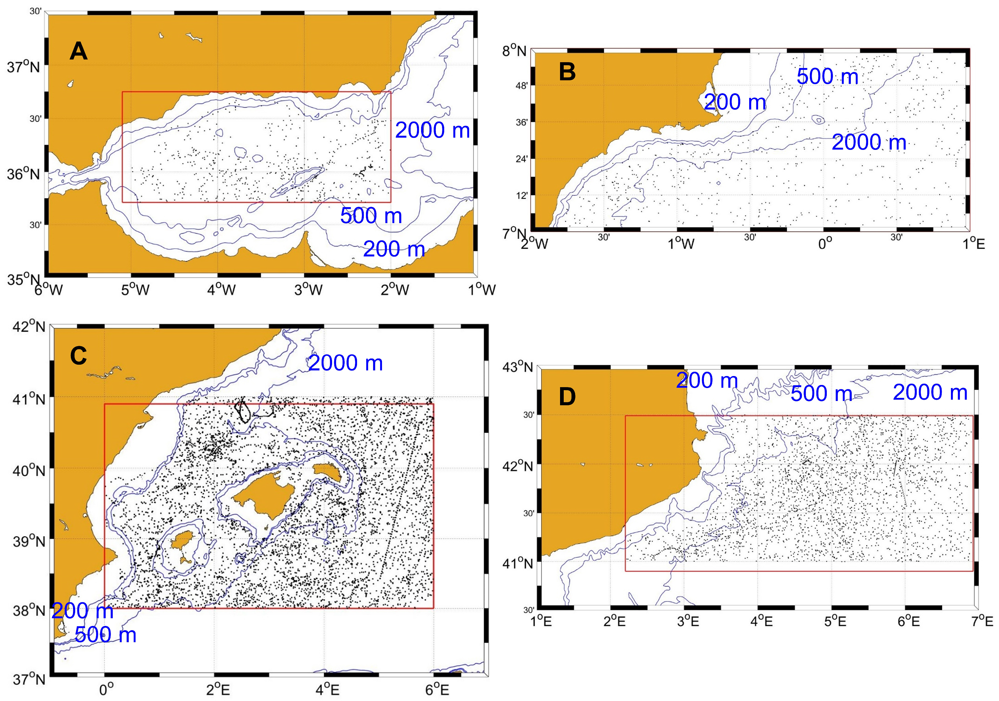
3.3. Marine Heat Waves
3.4. Mixed Layer Depth Trends
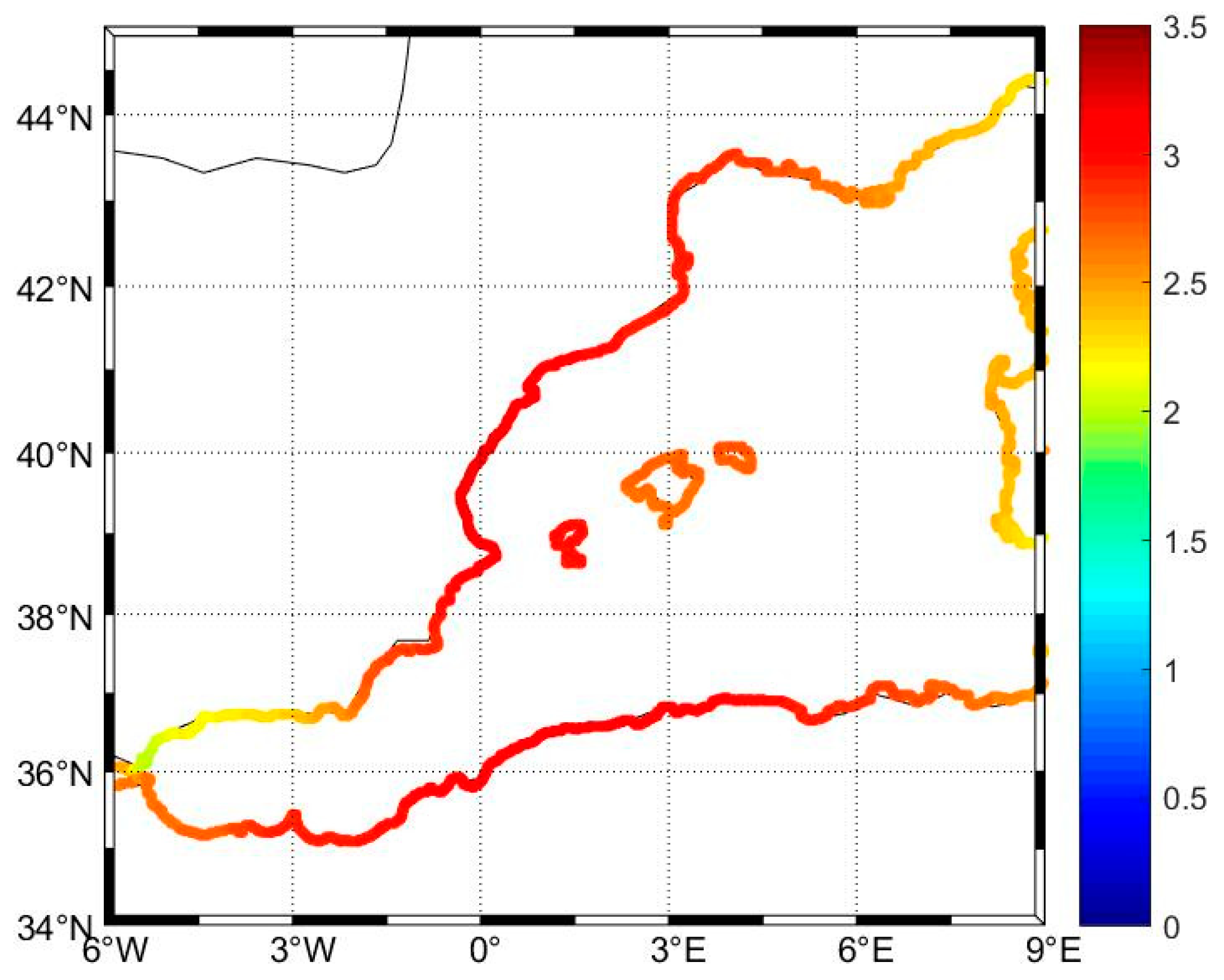
3.5. Sea Level Trends
3.6. Reliability of Climatological Seasonal Cycles and Trends
4. Discussion
5. Conclusions
Supplementary Materials
Author Contributions
Funding
Institutional Review Board Statement
Data Availability Statement
Acknowledgments
Conflicts of Interest
References
- Chiggiato, J.; Artale, V.; Durrieu de Madron, X.; Schroeder, K.; Taupier-Letage, I.; Velaoras, D.; Vargas-Yáñez, M. Recent Changes in the Mediterranean Sea, in Oceanography of the Mediterranean Sea: An Introductory Guide; Schroeder, K., Chiggiato, J., Eds.; Elsevier: Amsterdam, The Netherlands, 2023. [Google Scholar] [CrossRef]
- Vargas-Yáñez, M.; Juza, M.; García-Martínez, M.C.; Moya, F.; Balbín, R.; Ballesteros, E.; Muñoz, M.; Tel, E.; Pascual, J.; Vélez-Belchí, P.; et al. Long-Term Changes in theWater Mass Properties in the Balearic Channels Over the Period 1996–2019. Front. Mar. Sci. 2021, 8, 640535. [Google Scholar] [CrossRef]
- Vargas-Yáñez, M.; García-Martínez, M.; Moya, F.; Balbín, R.; López-Jurado, J.; Serra, M.; Zunino, P.; Pascual, J.; Salat, J. Temperature and Salinity Mean Valuesand Trends in the Western Mediterranean: The RADMED Project. Prog. Ocean. 2017, 157, 27–46. [Google Scholar] [CrossRef]
- Juza, M.; Tintoré, J. Multivariate Sub-Regional Ocean Indicators in the Mediterranean Sea:From Event Detection to Climate Change Estimations. Front. Mar. Sci. 2021, 8, 610589. [Google Scholar] [CrossRef]
- Juza, M.; Fernández-Mora, A.; Tintoré, J. JSub-Regional Marine Heat Waves in the Mediterranean Sea From Observations: Long-Term Surface Changes, Sub-Surface and Coastal Responses. Front. Mar. Sci. 2022, 9, 785771. [Google Scholar] [CrossRef]
- Marcos, M.; Wöppelmann, G.; Calafat, F.M.; Vacchi, M.; Amores, A. Mediterranean Sea Level, in the Mediterranean Sea, in Oceanography of the Mediterranean Sea: An Introductory Guide; Schroeder, K., Chiggiato, J., Eds.; Elsevier: Amsterdam, The Netherlands, 2023. [Google Scholar] [CrossRef]
- Ramos-Alcántara, J.; Gomis, D.; Jordà, G. Reconstruction of Mediterranean coastal sea level at different timescales based on tide gauge records. Ocean Sci. 2022, 18, 1781–1803. [Google Scholar] [CrossRef]
- Vargas-Yáñez, M.; Tel, E.; Moya, F.; Ballesteros, E.; García-Martínez, M.C. Long-Term Changes, Inter-Annual, and Monthly Variability of Sea Level at the Coasts of the Spanish Mediterranean and the Gulf of Cádiz. Geosciences 2021, 11, 350. [Google Scholar] [CrossRef]
- Parras-Berrocal, I.M.; Vazquez, R.; Cabos, W.; Sein, D.V.; Alvarez, O.; Bruno, M.; Izquierdo, A. Surface and intermediate water changes triggering the future collapse of deep water formation in the North Western Mediterranean. Geophys. Res. Lett. 2022, 49, e2021GL095404. [Google Scholar] [CrossRef]
- Soto-Navarro, J.; Jordá, G.; Amores, A.; Cabos, W.; Somot, S.; Sevault, F.; Macías, D.; Djurdjevic, V.; Sannino, G.; Li, L.; et al. Evolution of Mediterranean Sea water properties under climate change scenarios in the Med-CORDEX ensemble. Clim. Dyn. 2020, 54, 2135–2165. [Google Scholar] [CrossRef]
- Adloff, F.; Somot, S.; Sevault, F.; Jorda, G.; Aznar, R.; Déqué, M.; Herrmann, M.; Marcos, M.; Dubois, C.; Padorno, E.; et al. Mediterranean Sea response to climate change in an ensemble of twenty first century scenarios. Clim. Dyn. 2015, 45, 2775–2802. [Google Scholar] [CrossRef]
- Fox-Kemper, B.; Hewitt, H.; Xiao, C.; Aðalgeirsdóttir, G.; Drijfhout, S.; Edwards, T.; Golledge, N.; Hemer, M.; Kopp, R.; Krinner, G.; et al. Ocean, Cryosphere and Sea Level Change. In Climate Change 2021: The Physical Science Basis. Contribution of Working Group I to the Sixth Assessment Report of the Intergovernmental Panel on Climate Change; Masson-Delmotte, V., Zhai, P., Pirani, A., Connors, S., Péan, C., Berger, S., Caud, N., Chen, Y., Goldfarb, L., Gomis, M., et al., Eds.; Cambridge University Press: Cambridge, UK; New York, NY, USA, 2021; pp. 1211–1362. [Google Scholar]
- Wilson, W.S.; Fellows, J.L.; Kawamura, H.; Mitnik, L. A history of oceanography from space, in Remote Sensing of Environment, of the Manuel of Remote Sensing. Am. Soc. Photogramm. Remote Sens. 2006, 6. [Google Scholar]
- von Schuckmann, K.; Cheng, L.; Palmer, M.D.; Hansen, J.; Tassone, C.; Aich, V.; Adusumilli, S.; Beltrami, H.; Boyer, T.; Cuesta-Valero, F.J.; et al. Heat stored in the Earth system: Where does the energy go? Earth Syst. Sci. Data 2020, 12, 2013–2041. [Google Scholar] [CrossRef]
- Jordà, G.; Gomis, D. On the interpretation of the steric and mass components of sea level variability: The case of the Mediterranean basin. J. Geophys. Res. Ocean. 2013, 118, 953–963. [Google Scholar] [CrossRef]
- Jordà, G.; Gomis, D. Reliability of the steric and mass components of Mediterranean sea level as estimated from hydrographic gridded products. Geophys. Res. Lett. 2013, 40, 3655–3660. [Google Scholar] [CrossRef]
- Vargas-Yáñez, M.; Moya, F.; Balbìn, R.; Santiago, R.; Ballesteros, E.; Sánchez-Leal, R.F.; Romero, P.; García-Martínez, M.C. Seasonal and Long-Term Variability of the Mixed Layer Depth and its Influence on Ocean Productivity in the Spanish Gulf of Cádiz and Mediterranean Sea. Front. Mar. Sci. 2022, 9, 901893. [Google Scholar] [CrossRef]
- Zhou, Y.; Gong, H.; Zhou, F. Responses of horizontally expanding oceanic oxygen minimum zones to climate change based on observations. Geophys. Res. Lett. 2022, 49, e2022GL097724. [Google Scholar] [CrossRef]
- Bindoff, N.L.; Cheung, W.W.L.; Kairo, J.G.; Arístegui, J.; Guinder, V.A.; Hallberg, R.; Hilmi, N.; Jiao, N.; Karim, M.S.; Levin, L.; et al. Changing Ocean, Marine Ecosystems, and Dependent Communities. In IPCC Special Report on the Ocean and Cryosphere in a Changing Climate; Pörtner, H.-O., Roberts, D., Masson-Delmotte, V., Zhai, P., Tignor, M., Poloczanska, E., Mintenbeck, K., Alegrı, A., Nicolai, M., Okem, A., et al., Eds.; Cambridge University Press: Cambridge, UK; New York, NY, USA, 2019. [Google Scholar]
- Vargas-Yáñez, M.; García-Martínez, M.C.; Moya, F.; Balbín, R.; López-Jurado, J.L. The Oceanographic Context, in Alboran Sea—Ecosystems and Marine Resources; Baez, J.C., Ed.; Springer Nature Switzerland: Basel, Switzerland, 2021. [Google Scholar] [CrossRef]
- Vargas-Yáñez, M.; Plaza, F.; Garcıa-Lafuente, J.; Sarhan, T.; Vargas, J.M.; Vélez-Belchi, P. About the seasonal variability of the Alboran Se circulation. J. Mar. Syst. 2002, 35, 229–248. [Google Scholar] [CrossRef]
- Juza, M.; Escudier, R.; Pascual, A.; Pujol, M.-I.; Taburet, G.; Troupin, C.; Mourre, B.; Tintoré, J. Impacts of reprocessed altimetry on the surface circulation and variability of the Western Alboran Gyre. Adv. Space Res. 2016, 58, 277–288. [Google Scholar] [CrossRef]
- Tintore, J.; La Violette, P.E.; Blade, I.; Cruzado, A. A Study of an Intense Density Front in the Eastern Alboran Sea: The Almeria–Oran Front. J. Phys. Oceanogr. 1988, 18, 1384–1397. [Google Scholar] [CrossRef]
- Vargas-Yáñez, M.; Juza, M.; Balbín, R.; Velez-Belchí, P.; García-Martínez, M.C.; Moya, F.; Hernández-Guerra, A. Climatological temperature and salinity properties and associated water mass transports in the Balearic Channels using repeated observations from 1996 to 2019. Front. Mar. Sci. 2020, 7, 568602. [Google Scholar] [CrossRef]
- Heslop, E.E.; Ruiz, S.; Allen, J.; López-Jurado, J.L.; Renault, L.; Tintoré, J. Autonomous underwater gliders monitoring variability at “choke points” in our ocean system: A case study in the Western Mediterranean Sea. Geophys. Res. Lett. 2012, 39, L20604. [Google Scholar] [CrossRef]
- Barceló-Llull, B.; Pascual, A.; Ruiz, S.; Escudier, R.; Torner, M.; Tintoré, J. Temporal and Spatial Hydrodynamic Variability in the Mallorca Channel (Western Mediterranean Sea) From 8 Years of Underwater Glider Data. J. Geophys. Res. Oceans 2019, 124, 2769–2786. [Google Scholar] [CrossRef]
- Juza, M.; Escudier, R.; Vargas-Yáñez, M.; Mourre, B.; Heslop, E.; Allen, J.; Tintoré, J. Characterization of changes in Western Intermediate Water properties enabled by an innovative geometry-based detection approach. J. Mar. Syst. 2019, 191, 1–12. [Google Scholar] [CrossRef]
- Juza, M.; Renault, L.; Ruiz, S.; Tintoré, J. Origin and pathways of Winter Intermediate Water in the Northwestern Mediterranean Sea using observations and numerical simulation. J. Geophys. Res. Oceans 2013, 118, 6621–6633. [Google Scholar] [CrossRef]
- Vargas-Yáñez, M.; Zunino, P.; Schroeder, K.; López-Jurado, J.; Plaza, F.; Serra, M.; Castro, C.; García-Martínez, M.; Moya, F.; Salat, J. Extreme Western Intermediate Water formation in winter 2010. J. Mar. Syst. 2012, 105–108, 52–59. [Google Scholar] [CrossRef]
- López-Jurado, J.L.; Balbín, R.; Alemany, F.; Amengual, B.; Aparicio-González, A.; de Puelles, M.L.F.; García-Martínez, M.C.; Gazá, M.; Jansá, J.; Morillas-Kieffer, A.; et al. The RADMED monitoring programme as a tool for MSFD implementation: Towards an ecosystem-based approach. Ocean Sci. 2015, 11, 897–908. [Google Scholar] [CrossRef]
- Tel, E.; Balbin, R.; Cabanas, J.-M.; Garcia, M.-J.; Garcia-Martinez, M.C.; Gonzalez-Pola, C.; Lavin, A.; Lopez-Jurado, J.-L.; Rodriguez, C.; Ruiz-Villarreal, M.; et al. IEOOS: The Spanish Institute of Oceanography Observing System. Ocean Sci. 2016, 12, 345–353. [Google Scholar] [CrossRef]
- Marcos, M.; Puyol, B.; Gómez, B.P.; Fraile, M.A.; Talke, S.A. Historical tide-gauge sea level observations in Alicante and Santander (Spain) since the 19th century. Geosci. Data J. 2021, 8, 144–153. [Google Scholar] [CrossRef]
- Salat, J.; Pascual, J.; Flexas, M.; Chin, T.M.; Vazquez-Cuervo, J. Forty-five years of oceanographic and meteorological observations at a coastal station in the NW Mediterranean: A ground truth for satellite observations. Ocean Dyn. 2019, 69, 1067–1084. [Google Scholar] [CrossRef]
- Tintoré, J.; Vizoso, G.; Casas, B.; Heslop, E.; Pascual, A.; Orfila, A.; Ruiz, S.; Martínez-Ledesma, M.; Torner, M.; Cusí, S.; et al. SOCIB: The Balearic Islands Coastal Ocean Observing and Forecasting System Responding to Science, Technology and Society Needs. Mar. Technol. Soc. J. 2013, 47, 101–117. [Google Scholar] [CrossRef]
- Tintoré, J.; Pinardi, N.; Álvarez-Fanjul, E.; Aguiar, E.; Álvarez-Berastegui, D.; Bajo, M.; Balbin, R.; Bozzano, R.; Nardelli, B.B.; Cardin, V.; et al. Challenges for Sustained Observing and Forecasting Systems in the Mediterranean Sea. Front. Mar. Sci. 2019, 6, 568. [Google Scholar] [CrossRef]
- Lorente, P.; Aguiar, E.; Bendoni, M.; Berta, M.; Brandini, C.; Cáceres-Euse, A.; Capodici, F.; Cianelli, D.; Ciraolo, G.; Corgnati, L.; et al. Coastal high-frequency radars in the Mediterranean—Part 1: Status of operations and a framework for future development. Ocean. Sci. 2022, 18, 761–795. [Google Scholar] [CrossRef]
- Reyes, E.; Aguiar, E.; Bendoni, M.; Berta, M.; Brandini, C.; Cáceres-Euse, A.; Capodici, F.; Cardin, V.; Cianelli, D.; Ciraolo, G.; et al. Coastal high-frequency radars in the Mediterranean—Part 2: Applications in support of science priorities and societal needs. Ocean. Sci. 2022, 18, 797–837. [Google Scholar] [CrossRef]
- March, D.; Boehme, L.; Tintoré, J.; Vélez-Belchi, P.J.; Godley, B.J. Towards the integration of animal-borne instruments into global ocean observing systems. Glob. Change Biol. 2020, 26, 586–596. [Google Scholar] [CrossRef] [PubMed]
- Holte, J.; Talley, L.D.; Gilson, J.; Roemmich, D. An Argo mixed layer climatology and database, Geophys. Res. Lett. 2017. 44, 5618–5626. [CrossRef]
- Good, S.A.; Martin, M.J.; Rayner, N.A. Quality controlled ocean temperature and salinity profiles and monthly objective analyses with uncertainty estimates. J. Geophys. Res. Ocean. 2013, 118, 6704–6716. [Google Scholar] [CrossRef]
- Huang, B.; Liu, C.; Freeman, E.; Graham, G.; Smith, T.; Zhang, H.M. Assessment and intercomparison of NOAA daily optimum interpolation sea surface temperature (DOISST) version 2.1. J. Clim. 2021, 34, 7421–7441. [Google Scholar] [CrossRef]
- Nardelli, B.B.; Tronconi, C.; Pisano, A.; Santoleri, R. High and Ultra-High resolution processing of satellite Sea Surface Temperature data over Southern European Seas in the framework of MyOcean project. Remote Sens. Environ. 2013, 129, 1–16. [Google Scholar] [CrossRef]
- Pisano, A.; Nardelli, B.B.; Tronconi, C.; Santoleri, R. The new Mediterranean optimally interpolated pathfinder AVHRR SST Dataset (1982–2012). Remote Sens. Environ. 2016, 176, 107–116. [Google Scholar] [CrossRef]
- Gregory, J.M.; Banks, H.T.; Stott, P.A.; Lowe, J.A.; Palmer, M.D. Simulated and observed decadal variability in ocean heat content. Geophys. Res. Lett. 2004, 31, L15312. [Google Scholar] [CrossRef]
- Domingues, C.M.; Church, J.A.; White, N.J.; Gleckler, P.J.; Wijffels, S.E.; Barker, P.M.; Dunn, J.R. Improved estimates of upper-ocean warming and multi-decadal sea-level rise. Nature 2008, 453, 1090–1093. [Google Scholar] [CrossRef]
- Levitus, S.; Antonov, J.I.; Boyer, T.P.; Locarnini, R.A.; Garcia, H.E.; Mishonov, A.V. Global ocean heat content 1955-2008 in light of recently revealed instrumentation problems. Geophys. Res. Lett. 2009, 36, L07608. [Google Scholar] [CrossRef]
- Ishii, M.; Kimoto, M. Reevaluation of historical ocean heat content variations with time-varying XBT and MBT bias. J. Oceanogr. 2009, 65, 287–299. [Google Scholar] [CrossRef]
- Vargas-Yáñez, M.; Zunino, P.; Benali, A.; Delpy, M.; Pastre, F.; Moya, F.; García-Martínez, M.D.C.; Tel, E. How much is the western Mediterranean really warming and salting? J. Geophys. Res. Atmos. 2010, 115, C04001. [Google Scholar] [CrossRef]
- Chelton, D.B. Effects of sampling errors in statistical estimation. Deep. Sea Res. Part A. Oceanogr. Res. Pap. 1983, 30, 1083–1103. [Google Scholar] [CrossRef]
- Vargas-Yáñez, M. Trends and time variability in the northern continental shelf of the western Mediterranean. J. Geophys. Res. Atmos. 2005, 110, C10019. [Google Scholar] [CrossRef]
- Hobday, A.J.; Alexander, L.V.; Perkins, S.E.; Smale, D.A.; Straub, S.C.; Oliver, E.C.J.; Benthuysen, J.A.; Burrows, M.T.; Donat, M.G.; Feng, M.; et al. A hierarchical approach to defining marine heatwaves. Prog. Oceanogr. 2016, 141, 227–238. [Google Scholar] [CrossRef]
- Juza, M.; Tintoré, J. Sub-Regional Mediterranean Marine Heat Waves [Web App]. Balearic Islands Coastal Observing and Forecasting System, SOCIB. Available online: https:/apps.socib.es/subregmed-marine-heatwaves (accessed on 1 June 2023).
- Dayan, H.; McAdam, R.; Juza, M.; Masina, S.; Speich, S. Marine heat waves in the Mediterranean Sea: An assessment from the surface to the subsurface to meet national needs. Front. Mar. Sci. 2023, 10, 142. [Google Scholar] [CrossRef]
- Peltier, W.R. Global Glacial Isostacy and the surface of the ice-age earth: The ICE-5G (VM2) Model and GRACE. Annu. Rev. Earth Planet. Sci. 2004, 32, 111–149. [Google Scholar] [CrossRef]
- Llasses, J.; Jordà, G.; Gomis, D. Skills of different hydrographic networks in capturing changes in the Mediterranean Sea at climate scales. Clim. Res. 2015, 63, 1–18. [Google Scholar] [CrossRef]
- Oppenheimer, M.; Glavovic, B.; Hinkel, J.; van de Wal, R.; Magnan, A.; Abd-Elgawad, A.; Cai, R.; Cifuentes-Jara, M.; DeConto, R.; Ghosh, T.; et al. Sea Level Rise and Implications for Low-Lying Islands, Coasts and Communities. In IPCC Special Report on the Ocean and Cryosphere in a Changing Climate; Po, H.-O., Roberts, D., Masson-Delmotte, V., Zhai, P., Tignor, M., Poloczanska, E., Mintenbeck, K., Alegri, A., Nicolai, M., Okem, A., et al., Eds.; Cambridge University Press: Cambridge, UK; New York, NY, USA, 2019; pp. 321–445. [Google Scholar] [CrossRef]
- Liu, Y.; Kerkering, H.; Weisberg, R.H. (Eds.) Coastal Ocean Observing Systems; Elsevier: Amsterdam, The Netherlands; Academic Press: London, UK, 2015; 461p. [Google Scholar]


| Potential Temperature Trends (°C/100 Years) | ||||
|---|---|---|---|---|
| 1900–2020 | 1945–2020 | |||
| 0–150 | 0.34 | [−0.09, 0.76] | 0.50 | [−0.22, 1.22] |
| 150–600 | 0.08 | [0.00, 0.15] | 0.23 | [0.10, 0.36] |
| 600–bottom | 0.13 | [0.06, 0.19] | 0.25 | [0.16, 0.35] |
| Water column | 0.33 | [0.08, 0.58] | 0.12 | [−0.14, 0.39] |
| Salinity Trends (100 Years)−1 | ||||
|---|---|---|---|---|
| 1900–2020 | 1945–2020 | |||
| 0–150 | 0.11 | [0.06, 0.16] | 0.23 | [0.08, 0.39] |
| 150–600 | 0.03 | [0.01, 0.05] | 0.09 | [0.04, 0.14] |
| 600–bottom | 0.05 | [0.04, 0.07] | 0.11 | [0.09, 0.13] |
| Water column | 0.08 | [0.04, 0.12] | 0.19 | [0.10, 0.29] |
| Potential Density Trends (kg m−3/100 Years) | ||||
|---|---|---|---|---|
| 1900–2020 | 1945–2020 | |||
| 0–150 | −0.01 | [−0.13, 0.11] | 0.03 | [−0.17, 0.24] |
| 150–600 | 0.01 | [−0.02, 0.03] | −0.01 | [−0.08, 0.06] |
| 600–bottom | 0.01 | [0.01, 0.02] | 0.03 | [0.02, 0.04] |
| Water column | −0.08 | [−0.19, 0.02] | −0.02 | [−0.13, 0.09] |
| Absorbed Heat (W/m2) | ||||
|---|---|---|---|---|
| 1900–2020 | 1945–2020 | |||
| 0–150 | 0.03 | [−0.02, 0.08] | 0.05 | [−0.08, 0.17] |
| 150–600 | 0.03 | [0.00, 0.07] | 0.11 | [0.03, 0.18] |
| 600–bottom | 0.15 | [0.07, 0.22] | 0.34 | [0.22, 0.45] |
| Water column | 0.21 | [0.05, 0.37] | 0.46 | [0.20, 0.72] |
| Initial Year | Final Year | t-Threshold | d-Threshold | |
|---|---|---|---|---|
| Alboran Sea | 2006 | 2021 | 0.1 ± 0.9 | 0.1 ± 0.8 |
| Cape Palos | 2004 | 2021 | 0.1 ± 0.5 | 0.3 ± 0.5 |
| Balearic Islands | 2004 | 2021 | −4.5 ± 2.1 | −1.5 ± 1.1 |
| Northen Sector | 2003 | 2021 | −4.8 ± 5.4 | −4 ± 5 |
| Trend (mm/yr) | Tide-Gauge | Tide-Gauge | Altimetry | |
|---|---|---|---|---|
| Location | GIA | 1948–2019 | 1993–2019 | 1993–2019 |
| Tarifa | −0.2 | 1.4 ± 0.2 | 4.7 ± 0.7 | 2.5 ± 0.3 |
| Algeciras | −0.2 | 1.0 ± 0.1 | 2.3 ± 0.6 | 2.4 ± 0.4 |
| Ceuta | −0.2 | 0.9 ± 0.1 | 1.9 ± 0.6 | 2.4 ± 0.4 |
| Málaga | −0.2 | 1.4 ± 0.2 | 3.7 ± 0.7 | 4.1 ± 0.4 |
| Alicante | −0.2 | 0.8 ± 0.2 | 2.0 ± 0.8 | 3.0 ± 0.3 |
| L’Estartit | 0.1 | 2.7 ± 0.8 | 2.7 ± 0.3 | |
| Palma | 0.3 | 2.0 ± 1.1 * | 1.8 ± 0.5 * | |
Disclaimer/Publisher’s Note: The statements, opinions and data contained in all publications are solely those of the individual author(s) and contributor(s) and not of MDPI and/or the editor(s). MDPI and/or the editor(s) disclaim responsibility for any injury to people or property resulting from any ideas, methods, instructions or products referred to in the content. |
© 2023 by the authors. Licensee MDPI, Basel, Switzerland. This article is an open access article distributed under the terms and conditions of the Creative Commons Attribution (CC BY) license (https://creativecommons.org/licenses/by/4.0/).
Share and Cite
Vargas-Yáñez, M.; Moya, F.; Serra, M.; Juza, M.; Jordà, G.; Ballesteros, E.; Alonso, C.; Pascual, J.; Salat, J.; Moltó, V.; et al. Observations in the Spanish Mediterranean Waters: A Review and Update of Results of 30-Year Monitoring. J. Mar. Sci. Eng. 2023, 11, 1284. https://doi.org/10.3390/jmse11071284
Vargas-Yáñez M, Moya F, Serra M, Juza M, Jordà G, Ballesteros E, Alonso C, Pascual J, Salat J, Moltó V, et al. Observations in the Spanish Mediterranean Waters: A Review and Update of Results of 30-Year Monitoring. Journal of Marine Science and Engineering. 2023; 11(7):1284. https://doi.org/10.3390/jmse11071284
Chicago/Turabian StyleVargas-Yáñez, Manuel, Francina Moya, Mariano Serra, Mélanie Juza, Gabriel Jordà, Enrique Ballesteros, Cristina Alonso, Josep Pascual, Jordi Salat, Vicenç Moltó, and et al. 2023. "Observations in the Spanish Mediterranean Waters: A Review and Update of Results of 30-Year Monitoring" Journal of Marine Science and Engineering 11, no. 7: 1284. https://doi.org/10.3390/jmse11071284
APA StyleVargas-Yáñez, M., Moya, F., Serra, M., Juza, M., Jordà, G., Ballesteros, E., Alonso, C., Pascual, J., Salat, J., Moltó, V., Tel, E., Balbín, R., Santiago, R., Piñeiro, S., & García-Martínez, M. C. (2023). Observations in the Spanish Mediterranean Waters: A Review and Update of Results of 30-Year Monitoring. Journal of Marine Science and Engineering, 11(7), 1284. https://doi.org/10.3390/jmse11071284