1. Introduction
The user experience (UX) plays a critical role in the success of any e-commerce platform. UX is defined as “a person’s perceptions and responses that result from the use and/or anticipated use of a product, system or service” [
1]. It involves the user’s overall experience with the platform, including ease of use, aesthetics, functionality, and efficiency.
It is suggested to have different levels of aesthetics and usability in user interfaces because user preferences and needs can vary. Some users may prioritize an interface’s visual appearance and aesthetics, while others may value usability and functionality more. By offering different levels of aesthetics and usability, we can design interfaces that cater to a wide range of users’ preferences and needs [
2]. This helps improve the user experience and increases satisfaction and effectiveness in interacting with the system.
Usability is a crucial aspect of UX, as it determines how easily users can perform tasks and achieve their goals on the platform [
3]. It measures learning capacity, efficiency, memorization capacity, low error rate, and satisfaction. A platform that lacks usability is highly likely to result in negative impacts and user dissatisfaction [
4].
Aesthetics is another critical factor that impacts the overall UX. It involves the level of attraction, looks, and feel the user perceives in the interaction. For instance, research has shown a correlation between aesthetics and pleasure, with users often choosing attractiveness over functional aspects when interacting with commercial websites [
5].
However, combining these two factors is a significant challenge, as it requires designers to select many design features by following guidelines to achieve considerable levels of user experience. There are numerous design rules and guidelines to follow, such as those provided by [
6], which include guidelines about home page layout, navigation, graphics, text, multimedia, scrolling, and more. Designers must decide whether to include or exclude guidelines to meet the user’s needs and create a positive experience.
To tackle this challenge, this article introduces an experiment that enables designers to create user interfaces (UIs) by integrating design principles and quality factors, encompassing usability and aesthetics. First, the article outlines a method to design UIs using four e-commerce websites with varying levels of usability and aesthetics. The design process involves ten principles, such as system status visibility, user control and freedom, aesthetic and minimalist design, and others provided by [
7].
Second, once the designer has retrieved the UIs, the article conducts an experiment with 40 users to assess user perception of the design in each UI. The experiment shows a relation between what the designer intends to create and what the user perceives—the “
What
You
Design
Is
What
You
Get” (
WYDISWYG) principle. There has been a growing interest in incorporating the “
What
You
See
Is
What
You
Get” (
WYSIWYG) principle into UI design [
8]. This principle aims to enhance the efficiency and intuitiveness of the design process by giving designers a real-time preview of how their designs will appear in the final product.
However, the WYSIWYG approach has some limitations in the context of e-commerce, where the focus is not only on the visual appearance but also on the functionality and usability of the website. The WYSIWYG approach may result in designs that look great but are difficult to use, leading to a poor user experience and decreased user satisfaction [
9].
To address these limitations, we propose the “What You Design Is What You Get” (WYDISWYG) principle, which emphasizes the importance of designing for both aesthetics and functionality in e-commerce websites. The WYDISWYG approach combines the benefits of the WYSIWYG principle focusing on the overall user experience and usability.
Accordingly, the article’s scientific contributions are an experimental method that presents the strategies and steps to retrieve UIs based on quality factors (aesthetics, usability) and design principles, the validation of WYDISWYG by measuring user design perception, and the lessons learned.
The remainder of the paper is organized as follows:
Section 1 highlights the importance of user experience in e-commerce websites and the challenges of designing interfaces with a balance of aesthetics and usability.
Section 2 reviews previous research on the subject, including Nielsen’s design principles.
Section 3 describes the experimental design, which involved four e-commerce websites with varying levels of aesthetics and usability.
Section 4 presents the methodology used in the study.
Section 5 shows the results obtained in the study.
Section 6 emphasizes the importance of considering both aesthetics and usability in UI design. Finally,
Section 7 summarizes the study’s findings, limitations, and recommendations for further research.
2. Related Work
2.1. UX
The importance of UX and its impact on user behavior has been recognized in various fields [
10]. In e-commerce, numerous studies have been conducted to investigate the factors that affect user behavior and satisfaction. One such factor is website design. Previous research has shown that website design significantly impacts user behavior and satisfaction. For example, a study by Wang and Emurian [
11] found that the visual appeal of a website positively affects user satisfaction and willingness to use the website.
Another factor that has been studied extensively in e-commerce is usability. Usability refers to the ease with which users can accomplish tasks on a website. Research has shown that usability significantly impacts user behavior and satisfaction [
3,
7]. Previous research has also explored the relationship between website design and usability. For example, Tuch et al. [
2] investigated the relationship between aesthetics and usability in e-commerce websites and found that a balance between the two is important for user satisfaction.
In recent years, there has been a growing interest in using design principles and guidelines for improving UX in e-commerce. For example, a study by Nielsen and Molich [
7] proposed a set of heuristics for evaluating the usability of user interfaces, which has become a widely used standard in UX design. A study by Usability.gov [
6] provides a comprehensive set of guidelines for designing usable and attractive websites.
Despite the progress made in the field of UX design, there are still challenges in combining usability and aesthetics in e-commerce websites. One such challenge is the selection of design features that meet both usability and aesthetic goals while also achieving a high level of user satisfaction [
12]. In the present study, we address this challenge by proposing a method for designing e-commerce user interfaces that combine usability and aesthetics based on established design principles and validating the user perception of the interfaces.
2.2. WYSIWYG vs. WYDISWYG
The concept of “
What
You
See
Is
What
You
Get” (
WYSIWYG) has been a fundamental principle in user interface design for several decades [
13]. It refers to the idea that the final output of a design should accurately reflect what the user sees during the design process.
In e-commerce, WYSIWYG is essential for creating effective user interfaces that enhance the overall user experience. Research has shown that the visual design of e-commerce websites significantly impacts user behavior and satisfaction. For example, the study by Wang and Emurian [
11] found that the visual appeal of a website positively affects user satisfaction and willingness to use the website.
In recent years, there has been growing interest in the concept of “
What
You
Design
Is
What
You
Get” (
WYDISWYG), which expands upon the traditional WYSIWYG principle. WYDISWYG emphasizes the importance of designing user interfaces that accurately reflect the user’s goals, needs, and preferences. It also acknowledges the importance of creating interfaces that are both usable and aesthetically pleasing [
13].
In e-commerce, WYDISWYG is critical for creating user interfaces that meet the user’s expectations and enhance the overall user experience. Previous research has shown that the combination of usability and aesthetics is essential for achieving high levels of user satisfaction in e-commerce websites [
2].
Furthermore, [
14] evidences a set of heuristics for evaluating the usability of user interfaces. It has become well-known in UX design. Additionally, Usability.gov provides a comprehensive set of guidelines for designing usable and attractive websites in the e-commerce context [
6].
The WYDISWYG principle can help designers balance aesthetics and functionality to create e-commerce websites that are visually appealing and easy to use. Using design tools and techniques that allow designers to visualize the final product, the WYDISWYG approach can help ensure that the design meets both the aesthetic and functional goals. Moreover, the WYDISWYG principle can help save time and resources in the design process by allowing designers to see the impact of design decisions in real-time [
13]. This can lead to faster iterations and improvements in the design, resulting in a better user experience.
Despite the progress made in the field of UX design, there are still challenges in combining usability and aesthetics in e-commerce websites. The WYDISWYG principle offers a potential solution to these challenges by emphasizing the importance of designing user interfaces that accurately reflect the user’s goals, needs, and preferences. In the present study, we propose a method for designing e-commerce user interfaces that combine usability and aesthetics based on established design principles and by validating the user perception of the interfaces.
2.3. Design Principles
Several significant works related to the present article are discussed next.
In [
15], Olga de Troyer presents the Web Site Design Method (WSDM) as a user-centered method for the design of kiosk websites. WSDM solves website issues caused by a site that does not have an underlying design or when such a design is mostly data-driven. The method consists of the following phases: User Modeling, Conceptual Design, Implementation Design, and actual Implementation. The User Modeling phase comprises two sub-phases: User Classification and User Class Description. Moreover, the Conceptual Design phase consists of two sub-phases: Object Modeling and Navigational Design. Our exploratory analysis of WSDM evidences that this approach does not cover all design principles or a combination of aesthetics and usability. This approach covers two principles: user participation and general aspects of usability, such as navigation links. In addition, a formal evaluation of usability and maintenance and innovation are not provided.
Another interesting approach is the web semantics design method argued by [
16]. It is an improvement of the previous contribution as it is adapted to Semantic Web technology and supports the generation of semantically annotated websites and web applications. It also covers two more principles: iteration and real interaction in an audience-data-driven design. The target audience’s requirements are the first step of the modeling process. The different audience classes and their different requirements are underlined in the actual structure of the web system. Despite this, high/low aesthetics and usability levels are not defined explicitly. With this, the UI designer may develop a website without a balance of quality factors. Similarly, usability assessment in a real case was not found.
Issa also provides a study for applying usability and HCI principles in developing marketing websites [
17]. It evidences that the design methods focus on a limited set of principles rather than a complete guideline, such as [
7]. These key principles are (1) involving the users in the design from the beginning; (2) avoiding frustrations for the users (end-user and client-customer); (3) making the website more approachable, friendly, and interesting; and (4) winning the trust of the site visitors by meeting users’ requirements. These principles aim to design websites with high usability. However, levels of aesthetics and usability assessment are not mentioned.
Overall, there exist key contributions underlining design principles to create websites. Despite this, there is a lack of defining design principles across quality factors (usability, aesthetics) and also usability assessment of such created websites to validate whether the assumed users perceive quality design similarly.
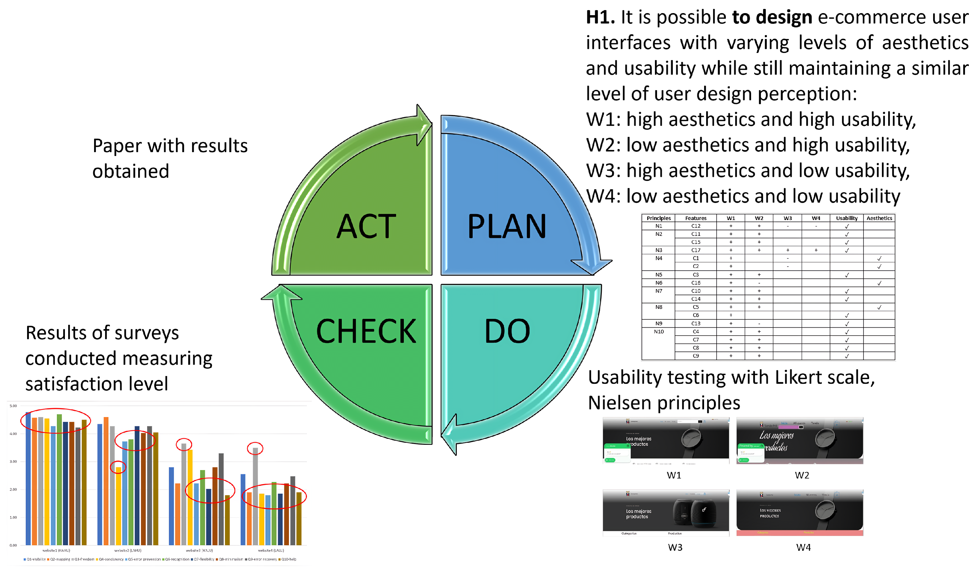
3. Method and Materials
We used a user-centered research method based on the Deming Cycle [
18]. It consists of four steps: Plan, Do, Check, and Act. First, the Plan step focuses on the construction of the research. We define the objectives to be achieved according to the research hypothesis question. In addition, researchers specify the research instruments, procedures, tasks, participants, data collection methods and/or survey design, measurement, data analysis methods, and research communication channels. The next step, Do, involves the experimental design and strategy for evaluating the research instruments. The Check step evaluates the experimental results. In this step, analysts check whether the research objectives have been achieved. This step is also known as Control [
18].
Finally, the Act step aims at a construction and decision process. In this step, scientific knowledge is generated to understand the results of the experiments and the limitations encountered. This step leads researchers to publish their results and define future work, if necessary. The following subsection will provide details of the application of the Deming Cycle and the experimental setup for our research case (see
Figure 1).
In a within-subjects design, users were asked to evaluate each of the four e-commerce websites using a questionnaire, measuring perceived usefulness using a Likert scale. The participating users were asked to evaluate the same e-commerce website through user interaction (task list). The web pages were developed based on two factors, usability and aesthetics: (W1) High usability, high aesthetics–high quality; (W2) High usability, low aesthetics–upper intermediate quality; (W3) Low usability, high aesthetics–lower intermediate quality; and (W4) Low usability low aesthetics–low quality. Hence, four interfaces were created for the same website (see
Figure 2). According to Tuch’s suggestion [
2], we attempted to separately modify the visual appeal and functionality of the website’s user interface to the greatest extent feasible.
4. Experimental Study
An experimentation phase was carried out with the designed web pages. We used WordPress as a content management platform to generate and deploy the selected features to implement [
19]. Access credentials were created to administer the web pages and user profiles for testing. On the web pages, users can access the resources of each online store with the features implemented for each one. WordPress helped us efficiently manage the online content presented in the online stores. The pages were published at epn.edu.ec, which facilitated online user interaction. More details about the experimental approach are described below.
4.1. Experimental Setup
The experimental setup consists of the first two stages of the method.
Section 4.1.1,
Section 4.1.2,
Section 4.1.3 and
Section 4.1.4 integrate the Plan stage (see
Figure 1).
Section 4.1.5 integrates the Do stage. The results obtained from our research are part of the Check stage but will be presented in the Analysis and Results Section. For the Act stage, we will present the research work and the web pages available to the public.
4.1.1. Goals and Hypothesis
The experiment analyzes how user experience (perceived value) in e-commerce websites differs as a function of usability and aesthetics. By combining UI design principles, It may be feasible to design e-commerce user interfaces with different levels of aesthetics and usability and still achieve comparable user design perception. It attempts to validate our proposed acronym: “What You Design Is What You Get” (WYDISWYG).
The experiment hypothesis is:
H1. It is possible to design
e-commerce user interfaces with varying levels of aesthetics and usability while maintaining a similar level of user design perception.
4.1.2. Research Instruments
The process of designing four web pages with different levels of usability and aesthetics involved five distinct steps. Firstly, we had to select the type of website we wanted to create. This step involved determining the website’s purpose, audience, and content. We considered different types of websites that would best serve our goals and objectives. Secondly, we obtained a domain appropriate for the website’s purpose and audience. For this project, we chose userexperience.epn.edu.ec. In particular, the Website1 step was to use Nielsen’s heuristics, which served as a framework for evaluating the usability of the web pages. We analyzed the design from the user’s perspective and ensured the web pages were intuitive and easy to use. Fourthly, we selected usability vs. aesthetics features that best serve the user’s needs. Finally, we generated four web pages with varying usability and aesthetic levels to evaluate these features for user satisfaction. The design process can be visualized in
Figure 3.
The design process involves the use of design guidelines. We selected Nielsen as one of the 10 Usability Principles to Improve UI Design [
7]. It proposes ten heuristics listed here: (N1) System status visibility; (N2) Coincidence between the system and the real world; (N3) User control and freedom; (N4) Consistency and standards; (N5) Error prevention; (N6) Recognition instead of memory; (N7) Flexibility and efficiency of use; (N8) Aesthetic and minimalist design; (N9) Help users recognize, diagnose, and recover from errors; and (N10) Help and documentation.
After a deep analysis of design principles [
7], the characteristics of the web pages taking into account the ten usability principles are the following: C1. Similar fonts and colors; C2. Margin inside objects (text and images); C3. Search engine with autocomplete; C4. Help with WhatsApp; C5. Minimalist style; C6. Scroll top; C7. Testimonials section; C8. Frequently asked questions section; C9. Contact form; C10. Language translation; C11. Location map; C12. Navigation route; C13. Validated fields; C14. Minimum fields required for purchase; C15. Correct hyperlinks; C16. Images to relate fields; and C17. Update items before buying. Each characteristic is mapped to each design principle, website, and UI quality (aesthetics, usability), as shown in
Table 1.
This table shows the design principles, features, and implementation across four websites (Website1, Website2, Website3, Website4). The design principles are categorized into Usability and Aesthetics, with their respective features represented by codes (N1 to N10 and C1 to C17). The plus (+) and minus (−) symbols under each website indicate the presence or absence of the corresponding feature. A checkmark (✓) indicates that the feature is present and implemented on the website.
For example, under the Usability category, N1 represents the design principle “Visibility of system status,” and it has the corresponding feature code C12. The plus (+) symbol under Website1 indicates that this feature is present and implemented on that website, while the minus (−) symbol under Website2 indicates that this feature is absent. The (+) under Website3 indicates that N3 (“User control and freedom”) is present and implemented on that website.
In the design of the four websites, various features and design principles were applied to showcase the advantages of the WYDISWYG approach. As shown in
Figure 4a, Website 1 was designed with similar font types and colors to provide a consistent look and feel, C1., and
Figure 4a shows the categories and feature products. This design approach resulted in high usability and aesthetics, reflecting a high-quality website.
On the other hand, Website 2 focused on usability by presenting minimal fields for purchase, which facilitates simplicity and ease of use for visitors, C14. (
Figure 4b). This approach highlights the principle of “do more with less,” as seen in
Figure 4b. Although this design approach resulted in high usability, the website’s aesthetics were low, resulting in an upper-intermediate quality website.
Website 3 was designed to conform to content limits, both in terms of text and images, which provides an aesthetically pleasing website in comparison to its variant, Website 4 (
Figure 4c). However, this design approach resulted in low usability, resulting in a lower-intermediate quality website with high aesthetics, as shown in
Figure 4c.
In contrast, Website 4 lacked many features found in its previous versions, such as a search feature to facilitate the search for specific items, as per the principle of C3 (
Figure 4d). This approach is showcased in
Figure 4d, highlighting the importance of incorporating design principles to provide a well-balanced website that satisfies both usability and aesthetic requirements. Unfortunately, this design approach resulted in low usability and aesthetics and a low-quality website.
Overall, the four websites illustrate how the WYDISWYG approach can be used to design e-commerce user interfaces with varying levels of aesthetics and usability.
4.1.3. Procedure and Tasks
A total of 40 Spanish-speaking participants (23 women and 17 men) with experience and knowledge in usability were recruited to evaluate the user interfaces of four e-commerce sites: Website1, Website2, Website3, and Website4 (
Figure 2). Each site was briefly introduced, including its domain, web pages, and key features.
Participants were randomly assigned to interact with the e-commerce sites in different orders in a within-subject approach, with each site assigned a task list to complete. The tasks included exploring the website, exploring the home page, browsing categories, exploring the store, logging in to a store account, and purchasing an item.
The time allotted for each task varied (almost 30 min of interaction for each website), with browsing categories and exploring the store given less time than purchasing an item. Participants were given clear instructions and examples for each task to ensure consistency across participants.
After completing each task, participants were asked to rate their user experience by an online survey. The collected data will be analyzed to evaluate the effectiveness of the WYDISWYG approach in designing e-commerce user interfaces to match UI design vs. user perception.
4.1.4. Survey Design
An online survey was created to assess user design perception with the help of the Likert scale containing the following ten questions related to each of the Nielsen principles: (Q1.) The website allows you to visualize the navigation path within the category section?; (Q2.) The categories take you to the corresponding products?; (Q3.) Allows you to update (change number or delete items) before finalizing the purchase?; (Q4.) The web page maintains similar fonts and colors?; (Q5.) The search engine maintains user support?; (Q6.) The web page allows you to associate each category as the available buttons?; (Q7.) The web page allows the change of language?; (Q8.) The web page allows you to display necessary information?;(Q9.) The fields are validated and show you the error?; and (Q10.) The web page allows you to search for help and testimonials?
4.1.5. Data Collection
To achieve (H1), 40 participants evaluated the websites through a designed online survey. Each participant tested the four web pages against the list of six tasks provided. This evaluation took about 30 min (5 min for each task). As a result, each user provided one assessment for each web page, which equals 160 evaluations. Therefore, 160 (evaluations) × 10 (questions) = 1660 items collected. The results of this evaluation are discussed in the following section.
5. Results
To achieve (H1), 160 surveys with ten questions were computed to distinguish whether users against the predesigned websites determine the same UI quality. For each website, the results of the questions were summed per user (scores). Then, the percentage per user was calculated. The average of all users was obtained. First,
Figure 5 (averages scores) evidences that the best and the worst websites in terms of UI quality (Design process) are also perceived by users (evaluation process) in a similar manner (red marks).
In particular, Website1, with the highest UI quality (HAHU), has the highest score of Nielsen design perceived by users with almost 0.91 percent. In this case, it is identified as having the highest UI quality based on the design process. This means that Website1 has successfully incorporated high aesthetics (HA) and high usability (HU) in its design. Consequently, users perceive the high UI quality of Website1, as indicated by the correlation value. Users will likely have positive experiences with Website1 due to its visually appealing design and user-friendly features, leading to a high user perception score.
Conversely, with the lowest UI quality, Website4 (LALU) has the lowest score with 0.38 percent. Website4 is described as having the lowest UI quality. This implies that this website exhibits low aesthetics (LA) and low usability (LU). Consequently, users perceive the low UI quality of the website, meaning that users may encounter difficulties navigating the website or find it visually unappealing, resulting in a lower user perception score.
Both websites with a combination of aesthetics and usability are also found with different values, with 0.79 and 0.51 for Website2 (LAHU) and Website3 (HALU), respectively. These websites are mentioned as having combinations of aesthetics and usability but with different correlation values. Website2, characterized by low aesthetics (LA) and high usability (HU), receives a correlation value of 0.79 percent. This indicates that users positively perceive the combination of low aesthetics and high usability. On the other hand, Website3, with high aesthetics (HA) and low usability (LU), receives a correlation value of 0.51 percent. This suggests that users perceive the combination of high aesthetics and low usability less favorably than Website2. It is important to note that while both combinations have differing user perception scores, they are still lower than Website1, which had the highest UI quality.
Overall, the observations in these scenarios indicate consistency between the perceived UI quality evaluated through the design process and the user perception scores. Websites with a higher UI quality, incorporating both high aesthetics and usability, are perceived more positively by users. Conversely, websites with a lower UI quality and low aesthetics and usability receive lower user perception scores. Additionally, the specific combinations of aesthetics and usability can influence user perception, with some combinations being more positively received than others. These findings demonstrate the relationship between design quality, user perception, and the impact of aesthetics and usability on user experience.
Second,
Figure 6 further clarifies that there are key points in Nielsen principles (Survey design) that match up the UI quality factor and user perception for each website. For each website, the results of the users were summed per question. Next, the percentage per question was calculated. The average of all questions was obtained per website.
First, Website1 (HAHU) has the highest values for all questions (red mark, top-left) with values over 4 points. Conversely, Website4 (LALU) concentrates the lowest values between 1 and 2. Interestingly, it reaches a peak in user control and freedom with almost 4 (red mark, top-right). This figure also uncovers the user perception of the combination of aesthetics and usability.
Website2 (LAHU) shows the lowest point for consistency (red mark, less than 2), which is precisely the principle (N4,
Table 1) in aesthetics not considered (low aesthetics) in the design process. Principles 6 (recognition) and 8 (minimalism) for low aesthetics are also found in the second group of lower values perceived by users. Similarly, other values are the highest ones that correspond to the given quality: high usability in visibility, mapping, freedom, error prevention, and help.
Website3 (HALU) evidences more variation underlying the fact that a website with high aesthetics but with low usability is found to be fuzzy by users (red mark), with values in the range of [1,2], a second middle group in [2,3.5], and finally a top value for user control and freedom with almost 4 points.
Based on the evaluation results of the surveys, our hypothesis (H1) has been validated. Our study demonstrates that it is possible to design e-commerce user interfaces with varying levels of aesthetics and usability while maintaining a similar level of user design perception. We achieved this by designing four different websites using various design principles. Our findings show that users were able to retrieve scores similar to the predefined UI quality for each website: Website1 (HAHU, 0.91), Website2 (LAHU, 0.79), Website3 (HALU, 0.50), and Website4 (LALU, 0.38), as shown in
Figure 5. Furthermore, our study uncovered the design distinctions in Nielsen principles that were perceived by users, as demonstrated in
Figure 6. These findings reinforce our proposition of WYDISWYG (What You Design Is What You Get), indicating that designers may effectively control the user interface’s perception by incorporating design principles. Thus, our study provides insights for designers to create well-balanced e-commerce websites that satisfy both usability and aesthetic requirements while maintaining a similar level of user design perception.
While our experiment yielded valuable results, it is important to note some limitations. Firstly, the experiment was limited to only four interfaces that combined the factors of usability and aesthetics. This may limit the generalizability of the results to other interfaces or domains. Secondly, more support or training for design principles may be needed to overcome this issue. Further experiments could explore other design aspects, such as how different design elements match Nielsen principles. For example, users may have varying preferences between radio buttons and checkboxes in selection lists, or certain colors may significantly impact aesthetics and usability. Overall, while the results of this experiment provide valuable insights into the relationship between usability, aesthetics, and user design perception, more research is needed to fully explore the complexity of design principles and their impact on user experience in e-commerce.
6. Discussion
The results obtained in this study revealed a significant relationship between the levels of aesthetics and usability of user interfaces and user perception. It was found that, overall, UIs with high levels of usability were perceived as better by users, regardless of their aesthetics. In contrast, UIs with low usability were perceived as worse, even if they had attractive aesthetics.
A possible explanation for these results may be related to the functionality and efficiency of interface design. UIs with high usability tend to be more intuitive and easy to use, enabling users to perform tasks efficiently and without obstacles. These interfaces prioritize smooth navigation, clear information organization, and responsiveness, resulting in a more satisfying user experience.
Upon analyzing the data in detail, specific design elements that may have influenced user perception were identified. It was found that consistency in design, such as the consistent application of colors, fonts, and styles, contributed to higher perceived usability. Consistency provides users with a sense of familiarity and facilitates their understanding of the interface.
Furthermore, providing user control and freedom also enhanced the user experience. Allowing users to customize or adapt the interface to their individual preferences gives them a sense of empowerment. It enables them to interact with the UI more personally and comfortably. This can be especially relevant in educational and healthcare contexts where users have specific needs and individual preferences.
These findings have significant implications for UI design in different contexts. For example, in the case of educational websites, it is crucial to prioritize usability to facilitate the navigation and interaction of students with the content. A consistent and user-friendly design can improve the learning experience and access to information.
Similarly, in healthcare websites, usability becomes paramount for users to find the information they need and access services efficiently and quickly. An intuitive and accessible design can be especially crucial when a quick response is required, such as searching for medical information or scheduling appointments.
The current study aimed to test the hypothesis that it is possible to design e-commerce user interfaces with varying levels of aesthetics and usability while maintaining a similar level of user design perception. The study’s results support this hypothesis, as users perceived the designed websites with different levels of aesthetics and usability similarly. Moreover, the user perception of each website aligns with the UI quality factor, as the obtained scores by users were similar to the predefined UI quality. This finding reinforces the idea that what designers design is what users get, as stated in the proposed “What You Design Is What You Get” (WYDISWYG) principle.
Furthermore, the results suggest that usability is more critical than aesthetics in determining user perception. This finding aligns with previous research emphasizing the importance of usability over aesthetics in enhancing user experience. Websites with high usability, regardless of aesthetics, were perceived as better by users, while websites with low usability were perceived as worse, even if they had high aesthetics. This highlights the need for designers to prioritize usability during the design process to improve user experience.
Despite these promising results, the study has some limitations that must be considered. Firstly, the experiment was limited to only four interfaces, which could limit the generalizability of the findings. However, additional experiments with a larger sample size and more support or training for design principles may help overcome these issues. Secondly, this study focused solely on e-commerce websites, and future studies should consider other types of websites and clarify which design elements match up with Nielsen principles. For example, users may have different preferences for design elements, such as radio or check buttons in a selection list or different colors, that could affect aesthetics and usability differently. Overall, this study provides valuable insights into the importance of usability in designing e-commerce user interfaces, but further research is necessary to generalize the findings to other contexts.
In terms of uncertainty analysis, it involves considering potential sources of uncertainty in the collected data. Measurement errors, such as variations in participants’ interpretations of the Likert scale questions or mistakes in recording responses, can contribute to uncertainty. Additionally, there may be variability in participant responses due to individual differences and subjective perceptions. The sample size of 40 participants introduces sampling error, and generalizing the findings to the broader population incurs uncertainty. Confidence intervals can be calculated to quantify uncertainty, providing a range of values within which the proper population parameter is likely to fall. Statistical analysis techniques, such as hypothesis testing and ANOVA, can be used to assess the significance of differences between websites and evaluate the effectiveness of the WYDISWYG approach. Replication and validation studies can further validate the results and reduce uncertainty. By addressing these factors, the calculation of uncertainty analysis and causes of uncertainty in performance parameters may be better specified in the study as future work.
7. Conclusions
First, our study contributes to the ongoing discussion of future trends and challenges in human–computer interaction by proposing an experimental method for designing e-commerce user interfaces with varying levels of aesthetics and usability while maintaining a similar level of user design perception. This study proposed an experimental method based on the Deming Cycle, which outlines the strategies and steps to retrieve user interfaces based on quality factors, such as aesthetics and usability, and design principles according to Nielsen’s framework. Four e-commerce websites were designed with a combination of low/high levels of aesthetics and usability and Nielsen principles, namely Website1 (HAHU), Website2 (LAHU), Website3 (HALU), and Website4 (LALU). Based on 160 surveys, the experimental results demonstrated that it is possible to design user interfaces with varying levels of aesthetics and usability while maintaining a similar level of user design perception.
Second, our findings suggest that usability is more crucial than aesthetics in enhancing user experience, which aligns with previous studies. The results indicate that users perceived websites with high usability scores, regardless of aesthetics, as better. In contrast, websites with low usability scores, even with high aesthetics, were perceived as worse.
Third, this research could be utilized by e-commerce companies and web designers to enhance the user experience of their websites. The study suggests that it is possible to create user interfaces with varying levels of aesthetics and usability while maintaining a comparable level of user design perception. This means that designers can explore different combinations of aesthetics and usability factors, allowing them to experiment with innovative and visually appealing designs without compromising user satisfaction or usability. By implementing the proposed experimental method, companies can conduct systematic tests and evaluations to identify the optimal balance between aesthetics and usability for their target audience. This approach empowers designers to make informed decisions and fine-tunes their e-commerce interfaces, enhancing user engagement, increasing conversion rates, and improving customer satisfaction.
Furthermore, we can assert that the method proposed in this study can be adapted to improve the user interface of other websites, such as educational and healthcare websites. When designing educational websites, relevant design principles and quality factors can be applied to deliver an effective and engaging user experience. Similarly, healthcare websites can benefit from considering specific design principles and quality factors in this domain to provide users with an intuitive and useful interface.
Fourth, while this study has some limitations, such as the subjective selection of features and the focus on e-commerce websites only, it provides a foundation for future research to improve the selection of design principles, consider other website domains, and clarify users’ perception of user interface elements to match up with Nielsen’s principles.
Overall, our contribution defines an initial spotlight on the importance of considering both aesthetics and usability in UI design and emphasizes the importance of our proposition, “What You Design Is What You Get” (WYDISWYG), as a future trend.

 ,
, 


