Abstract
In this paper, we propose a new approach to analyze financial contagion using a causality-based complex network and value-at-risk (VaR). We innovatively combine the use of VaR and an expected shortfall (ES)-based causality network with impulse response analysis to discover features of financial contagion. We improve the current research methods by building a Granger causality network on VaR and ES and using conclusions drawn from network analysis as a foundational step before impulse response analysis. First of all, we select 30 stock indices that are very well-known globally and collect their trading data. After calculating the risk indicators of VaR and ES, we perform the Granger causality test on them and then build networks based on their respective Granger causality square matrix. Next, we examine the networks’ topological features to discover different degrees of risk transmission among all stock indices in the system. Lastly, we identify the most and the least active stock indices in the risk transmission network and conduct impulse response analysis on them. We discover that BSESN (India S&P BSE SENSEX) is the most risk-sensitive stock index as its VaR significantly increases by 0.03–0.04% and its ES jumps even more, by 0.07–0.08%, in response to an impulse from a few key stock indices. We also find that either PSI20 or XU100 is the most risk-proof stock index, depending on whether we choose VaR or ES as a risk indicator.
1. Introduction
Compared to traditional financial econometric research methodologies, complex network theory, which originates from graph theory, gives us more insights on the key entities and their connections in a financial system. This is why complex network theory has been extensively applied to the study of financial risk contagion. In this paper, we will innovatively combine Granger causality network with impulse response analysis to discover transmission paths and the degree of risk-sensitivity of key stock indices in a system. We aim to reveal the direct influence of any given stock index in a system and the degree of their response to other stock indices, as well as the change in response over time. The susceptible-infectious-recovered (SIR) model from epidemiology has been widely applied to the decomposition of financial risk in a system. In comparison, our method is more straightforward and direct but equally incisive. The applications of the results of this paper are as follows. 1. We have established a method to study the financial contagion among a group of stock indices. Combining Granger causality test and value-at-risk (VaR) and expected shortfall (ES) with network theory, researchers can identify comparatively risk-proof and risk-sensitive entities in a financial network. 2. Researchers can also identify the risk transmission path and analyze relations between two entities using our method. 3. Based on hierarchical cluster, structure partition, core-peripheral analysis, correlation analysis and QAP analysis, researchers can have an in-depth understanding of the structure of the target financial network. 4. Impulse analysis allows us to quantify the magnitude of risk transmission between two financial entities.
First of all, let us examine important research papers in this field. F. Allen and D. Gale (2000) published one of the most highly cited papers in the early stage of the study of financial contagion network. They found that a small liquidity preference shock in one part of the world financial system can be transmitted throughout the economy. Fully connected financial network structures are proven to be more robust than sparsely connected structures [1]. L. Eisenberg and T. H. Noe (2001) developed the foundational framework for the clearing of interbank obligations and produced qualitative comparative statics which show that even unsystematic and non-dissipative financial risk shocks can damage the total value of the system, as well as individual firms in the system [2]. M. Boss et al. (2004) conducted a famous empirical analysis of the network structure of the Austrian interbank market and found that the banking network has the classical structural characteristics found in several other complex real-world networks [3]. H. Rahmandad et al. (2008) studied several models of contagion in public health, including agent-based models (AB) and differential equation models (DE), and studied the effects of individual heterogeneity and different network topologies, including fully connected, stochastic, Watts-Strogatz small-world, scale-free and lattice networks, and explored the possibility of applying infectious disease models to financial crisis forecasting [4]. M. Billio et al. (2012) proposed several new econometric measures based on principal component analysis and Granger causal networks to measure the correlation between the monthly returns of hedge funds, banks, securities firms and insurance companies, and found that all four sectors were highly correlated, with banks playing a much more important role in transmitting shocks than other financial institutions [5]. J.D. F. Caccioli et al. (2014) introduced a model of financial risk contagion due to fire sales and overlapping portfolios and demonstrated that their model and methods of analysis can be calibrated to real-world financial data and can be applied to macroprudential stress testing [6]. G. Cimini et al. (2015) addressed the limitedness of the information available by designing an innovative method to rebuild the structure of privacy-protected systems based on intrinsic node-specific features and connection properties of a limited subgroup of nodes. They tested their method on synthetic and empirical examples and demonstrated that their method shows remarkable robustness [7]. M. Bardoscia et al. (2017) showed that market integration and diversification can in fact drive the market towards instability because they may help to amplify financial distress that ultimately leads to a more severe financial crisis [8]. K. Anand et al. (2018) performed an extensive comparison of reconstruction methodologies on numerous empirical financial networks [9]. P. Barucca et al. (2020) developed a model for the balance sheet consistent valuation of interbank claims and applied their model to the evaluation of systemic risk, particularly for stress testing [10]. Bardoscia et al. (2021) published a review article to explore the deep connection between statistical physics, network science and economics [11]. W.K. Härdle et al. (2016) used conditional VaR (CVaR) to measure systemic risk of the networked financial system conditional on institutions being under distress [12]. F Betz et al. (2016) proposed a framework for calculating time-varying systemic risk contributions to a high-dimensional and interconnected financial network. Based on a penalized two-stage fixed-effects quantile approach, tail risk dependencies and systemic risk contributions were calculated. They found that network dependencies in extreme risks are more relevant than simple (mean) correlations [13]. T. Ando et al. (2022) applied quantile regression to estimate vector autoregressions with a common factor error structure. They applied their new technique to study credit risk spillovers among a group of 17 sovereigns and show that idiosyncratic credit risk shocks propagate much more strongly in both tails than at the conditional mean or median [14]. L. Fang et al. (2018) constructed a tail risk network to analyze overall systemic risk of Chinese financial institutions based on the macroeconomic and market externalities. Specifically, they applied the Least Absolute Shrinkage and Selection Operator (LASSO) method of high-dimensional models and showed that idiosyncratic risk can be impacted by its links with other institutions [15]. J. Li et al. (2019) innovatively proposed a network-based framework to analyze two types of contagion among numerous institutions. Applying the framework to the publicly listed Chinese financial entities, they found out the main drivers of contagion during three financial crises, thus improving the understanding of Chinese financial market [16].
2. Methodology
2.1. Conceptual Model
We illustrate our research methodology in Figure 1. We defined 30 stock indices as our input. Our first step was to calculate daily lognormal return of stock indices and analyze their descriptive statistics. We then computed historical risk indicators, including VaR and ES, through which we obtained Granger causality test results. We then proceeded to derive networks from Granger causality square matrices from the previous step. The core step of our research was to calculate and analyze topological measures of the networks to gain deep insights into the networks’ properties. In the second half of our research, we screened out a group of risk-sensitive and risk-insensitive/risk-proof stock indices for further analysis: impulse response analysis. Our goal was to uncover the dynamics and interactions between stock indices with different levels of risk-sensitivity. To be more specific, we aimed to reveal the rate of response and the span of response time for the selected targets, thereby revealing some features of risk transmission in the stock index network.
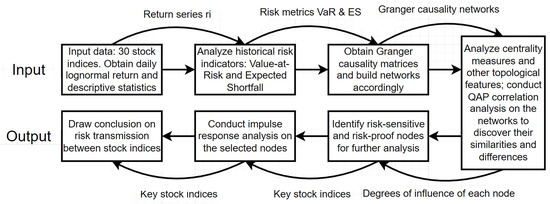
Figure 1.
Flow Chart of Our Research Methodology.
2.2. Value-at-Risk and Expected Shortfall
VaR quantifies the losses on a portfolio of financial assets that occur with a chosen probability. Computing VaR is equal to finding the value of a single or a portfolio of financial assets such that there is a given probability that the investment will be worth at least the computed result over a specified horizon; how to pick the horizon and probability will depend on how VaR will be applied in practice, and a derived and often preferable measure is tail VaR, which is the expected loss should the VaR level be surpassed [17].
Suppose we want to compute VaR over the horizon h of a single stock. If the distribution of the stock price after h periods is lognormal, we have:
When we choose a stock price , then the probability that the stock price will be less than is:
The complementary calculation is to compute the corresponding to the probability c. By the definition of , we have:
We can solve for by using the inverse cumulative probability distribution, :
Solving for gives:
where takes the place of a standard normal random variable [17].
A weakness of VaR is that it assumes the minimum loss that will occur with a hypothetical likelihood, but in the real world we are often more interested to know the exact magnitude of the loss when the bottom line is broken; this is called the tail VaR, ES, conditional VaR (CVaR) or expected tail loss [17]. For a single stock, we were able to assess the severity of the loss by computing the average loss conditional upon the stock price being less than , whereas VaR specifies the level, , that will be breached with probability c, tail VaR measures the average severity of the breach:
We could use this definition of ES to compute it [17]. Code for calculating VaR and ES can be found at https://github.com/VickykciV/Stock-Market-Network (accessed on 10 April 2023).
2.3. Granger Causality Testing
In the study of modern financial systems, we often need to determine the bidirectional causal relations between two financial assets. British economist Clive W. J. Granger proposed a test method, of which the principal idea is: if financial asset x is the cause of financial asset y, but y is not the cause of x, then the past values of x can predict the future values of y, but the opposite is not true. In other words:
where the lag order P can be determined according to the “information criterion” or the “sequential t rule from large to small” [18]. Null hypothesis assumes that “”, that is, the past value of x does not help to predict future values of y. If the null hypothesis is rejected, then x is called a Granger cause of y; if the positions of y and x in the regression model are reversed, it can be tested whether y is the Granger factor of x. It should be emphasized that Granger causality is not an intrinsic causal relation, but an observed dynamic causal relation between two variables, emphasizing the predictive ability of one variable to another.
2.4. Complex Network
Empirical studies have found that financial networks have numerous typical structure characteristics of complex network structure, such as scale-free, small-world and other characteristics. Scale-free means that the degree distribution of the network obeys a power-law distribution; small-world refers to networks characteristics such as smaller average shortest distance and higher clustering coefficient; other important features include clustering structure, high network density, high heterogeneity, etc.
A network is usually denoted by (N, E), where N = {1, 2…, n} is a set of nodes, which represents a set of entities in the network, and E = {(i,j)}, ∀ i, j ∈ N is a set of directed or undirected edges connecting nodes, which represents relations between entities. A graph of the network can be denoted as a N × N adjacency matrix A = {}, where if the node i has directed link with node j, and otherwise [19].
Topological Measurements
Analysis of centrality measurements is the most crucial part of an analysis of a complex network, because the ultimate goal is to identify and evaluate the most influential and the most vulnerable nodes in the network. Based on past studies, when analyzing financial networks, centrality measurements perform well overall in identifying systemically risky financial institutions. Centrality depicts the relative importance of the vertex in the network and determines whether it is core or peripheral. There are many ways to characterize the centrality of nodes in a graph: degree centrality, clustering coefficient, closeness centrality, eigenvector centrality, etc. Network measures show important implications in capturing interconnectedness and measuring contagion risk [19].
Centrality measurements: Centrality is an important indicator of the structural location of a financial entity. It is often used to evaluate the importance of an institution and to measure its special attributes and international influence. Centrality is divided into 3 types: degree centrality, closeness centrality and betweenness centrality [20]. When measuring centrality, we often need to convert absolute values into standard values. In a directional graph, degree centrality is further divided into out-degree centrality and in-degree centrality. Out-degree centrality is the sum of the number of external relations admitted by a node, and its formula is: ; its standardized formula is: , where = 0 or 1, depending on whether node i and node j have directed connections, and g represents the number of nodes in the system. In-degree centrality is the sum of connections that a node has with other nodes in the network, and its formula is: ; its standardized formula is: , where = 0 or 1, depending on whether node j and node i have directed connections, and g represents the number of nodes in the network [20].
Closeness centrality is a measurement of the centrality of a node based on distance. The closer the distance between a node and other nodes, the higher the centrality, and vice versa. The formula is: , where represents distance between 2 nodes. In other words, is the reciprocal of the sum of the distances from node to other nodes. The smaller the value, the greater the distance between node and other nodes [20].
A third commonly used primary centrality is betweenness centrality. Betweenness centrality measures the ability of a node to act as an intermediary. When a node’s betweenness centrality is higher, the node has more connections with other nodes. When the network has a major division and several separate components are formed, if there is a node that forms a link in the component, the node is called a cutting point, or “bridge” [20]. The formula for betweenness centrality is: ; standardized formula for un-directed betweenness centrality is: ; standardized formula for directed betweenness centrality is: . In the above formulas, is the number of shortcuts from node j to node k, is the number of shortcuts for node j to reach node k and g is the total number of nodes in the network; similarly, for the overall structure of the network, group betweenness centrality has a similar meaning to individual betweenness centrality, and the formula is: [20].
Subgroup and clique: Density is one of the most fundamental and widely used measurement in clique analysis of network structure. It is also the most basic building block supporting calculations and analysis of network structure. Nodes in a network are either closely connected or distantly connected, and density can be a very indicative measure of this characteristic of nodes. The formula for the density of un-directed graphs is: , where L represents the number of edges, g represents the number of nodes; formula for the density of directed graphs is: .
For subgroups and cliques, we can carried out the partitioning process in 2 ways: one is based on the degree of nodes, and the other is based on distance between nodes. For the former, K-plex and K-core are the two most important partitioning standards. K-plex refers to a network containing nodes, where means the number of nodes, each node is connected to nodes in the network, where also refers to the number of nodes; K-core method means for ∈ , when the number of connected nodes is k, then the sub-graph is considered as K-core, which means that when there are nodes in a subgroup, each node maintains at least k links with other nodes in the subgroup [20].
Roles and structures: We generally used two methods: one is the Euclidean distance method and the other is called the Concor method. The Concor method is developed on the basis of correlation. The correlation between two nodes is the main concern of the Concor method:
where i , j . In the formula above, is the average number of edges pointing to node i, and is the number of edges connecting to node k minus . In the same manner, indicates the average number of edges pointing toward node i. Denotations in the second part of the numerator is interpreted in the same way as the first part; note that the direction is reversed [20].
3. Data
We collected, observed and analyze 30 global major stock indices dating from 1 January 2012 to 1 June 2022. We listed their names and corresponding abbreviations in Table 1. Among the 30 stock indices we have picked, 12 were from European markets, 8 from Asia, 5 from North America, 2 from Middle East, 2 from Africa and 1 from South America. These stock indices represent the most well-known stock markets in the world. We calculated moving averages with a 5-day window to fill missing data. We also removed outliers in trading data. After we finished the pre-processing procedure, we finally obtained a sample of 2690 days of trading data on 30 stock indices.

Table 1.
A Selection of Global Major Stock Indices.
We then calculated daily lognormal returns of 30 time series based on the formula: . Plots are shown in Figure 2. It is obvious that several stock markets fluctuated most drastically in March 2020, when the COVID-19 pandemic first broke out. Return series have been experiencing more fluctuations since then, with remarkably greater volatilities in December 2021 and March 2022 in some markets. Global stock markets dropped significantly at the beginning of December 2021, but mostly recovered by the end of the year. The spread of Omicron could be the major cause of the dramatic drop in the market indices in December 2021, but as investors soon gained confidence in managing the spread of this new variant of COVID-19 virus, markets rebounded quickly. The Russo-Ukrainian War might be the root of the high volatilities in global stock markets in March 2022; its impacts on the global stock markets persisted for at least 3 more months afterwards, as we can see from Figure 1 that fluctuations have been wider since the outbreak of the war. The late-stage pandemic-era bond-purchasing program by the Federal Reserve System of the United States, as well as decades high inflation rates in G7 countries, could also be contributing factors to the abnormally high volatilities in global markets during these periods.
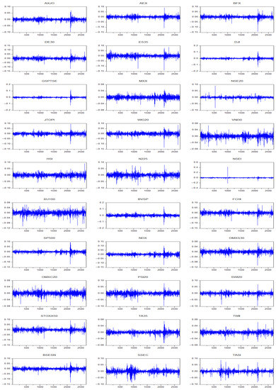
Figure 2.
Daily Lognormal Returns of 30 Stock Indices, 1 January 2012–1 June 2022 (%).
We plotted descriptive statistics of our 30 series of , where represents the daily lognormal returns of the chosen stock indices and i represents the individual stock index we have picked. The number of observations was 2690. We focused on indicators including mean, median, maximum, minimum, standard deviation, skewness, kurtosis and Jarque-Bera. In terms of mean, and had the highest mean of 0.07%, beating and by 0.01%. Out of the 30 stock indices, 20 had means that fell in the range between 0.02% and 0.05%. The average of , and series, which were close to 0.01%, were significantly smaller compared to other series. The only return series that had a negative mean was . In terms of standard deviation, all of the 30 series were around 1%, with the biggest value at 1.53% and the smallest 0.68%. All except had negative skewness. The skewness of was 8.5624, which was apparently an outlier in the sample. The most negative values of skewness were −1.1880 (), −1.0688 () and −1.0079 (). The skewness of the rest of the return series all fell between −1 and 0. In terms of kurtosis, also had the highest value of kurtosis, 358.7456. The second highest value of kurtosis was 47.3537 (), which was also an outlier to some degree, compared to other results. The other values of kurtosis fell between 6.1941 () and 28.2639 (). Lastly, the magnitudes of Jarque-Bera were in the same order as kurtosis. We present these results in Table S1.
4. Empirical Study
We are now able to conduct an empirical study of financial risk contagion based on complex network theory. We have presented a preliminary analysis of the sample data in Section 3, and now we focus on calculating risk indicators, constructing networks, analyzing the networks and performing impulse response analysis.
4.1. Value-at-Risk and Expected Shortfall
We computed historical lognormal return, VaR and ES on a daily basis for the 30 stock indices dating from 1 January 2012 to 1 June 2022. We used the normal distribution method to calculate VaR and the back-testing method to assess the established model. Back-testing captures the accuracy of the risk measurement calculations. Losses on a financial asset are forecasted and are compared to the actual historical losses at the end of the next day. In this paper, we decided the length of the test window should be 250 trading days. The estimation window started from 1 January 2012 and ran through the entirety of 2690 trading days. The significance level was set to be 97.5%, which meant that the loss incurred would not exceed the output number (VaR) at more than a 2.5% probability. To calculate ES, we also used the normal distribution method and back-testing. We display the plots of return, VaR and ES in Figure 3. For almost all 30 stock indices, the curves of VaR and of ES plummeted dramatically at around 9 March 2020 and stayed relatively unchanged for a year until around 3 March 2021. Before 9 March 2020, there were no universal patterns in the graphs of VaR and ES; after VaR and ES bounced back after 3 March 2021, there were also no common features. Therefore, we focused exclusively on the graphs during the period between 9 March 2020 and 3 March 2021. For the whole year, BVSP had the highest absolute value of ES which was as high as 10.508%. GSPTSE (8.259%), DJI (7.763%), S&P500 (7.149%) and BSESN (7.094%) also had significantly high ES. On the other hand, SSEC (3.159%), TWII (2.819%), HSI (3.922%) and NSE20 (3.555%) were the 4 with the smallest ES. In terms of VaR, in all 30 cases the magnitudes of ES were notably greater than VaR. Stock indices with greater values of ES generally had greater values of VaR. BVSP had VaR of 5.450%, the highest value of VaR among all stock indices. MXX (2.644%), NSE20 (2.692%), OMXC20 (2.763%), SWI20 (2.918%), TWII (2.819%), HSI (2.815%), N225 (2.844%), SSEC (2.752%) and TASI (2.983%) had VaR values of less than 3%. Based on Figure 3, it is clear that the losses in all 30 markets far exceeded the values of VaR and ES in March 2020 when the COVID-19 pandemic broke out. Additionally, when the volatility of return series was high, the loss almost always fell into the “dangerous zone”.
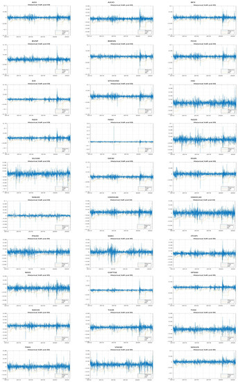
Figure 3.
Lognormal Return, VaR and ES of 30 Stock Indices, 1 January 2012–1 June 2022 (%).
4.2. Network Construction
We built a standard vector autoregression model (VAR model) on 30 return series . Based on the VAR model, according to final prediction error and Akaike information criterion, the lag length for Granger causality test was set to be 2. Next, we conducted pair-wise Granger causality test in software Eviews to obtain F statistics for each pair of and , where i and j each denotes a stock index from our sample. Granger causality test results are shown in Table S2. Then we were able to build a Granger causality square matrix . In Table S2, the first column is a list of and the first row is a list of ; numbers in Table S2 represent the F statistics results of the pair-wise Granger causality test under the null hypothesis that did not Granger cause . Higher F statistics indicated smaller p value of the test, which led to stronger Granger causality relation between and .
In Panel A of Table S2, vertically, 17 stock indices have fairly large values of F statistics relating to AXJO, HSI, N225 and TWII, showing that AXJO, HSI, N225 and TWII were strongly Granger caused by these 17 stock indices; 21 stock indices, including AEX, BFX, BVSP, DE30, DJI, ES35, FCHI, GSPTSE, JTOPI, MXX, NDX, OMXS30, OMXC20, PSI20, S&P500, STOXX50, SWI20, TA35, TASI, WIG20 and XU100, had notably small values of F statistics, indicating that the daily lognormal returns of these 21 stock indices were not significantly Granger caused by returns in other markets. We will use “influence” and “impact” interchangeably with “Granger cause” in the following study. It should be noted that these deduced “influence” and “impact” reflect Granger causality relations and do not necessarily prove causal relations per se. The majority values of F statistics were small, indicating that there were no significant causal relations among these stock indices. Next, we analyzed Panel A horizontally. DJI, GSPTSE, NDX and S&P500 had notably large values of F statistics relating to at least 10 stock indices, implying that DJI, GSPTSE, NDX and S&P500 probably had strong influence on the daily returns in a significant number of global markets; 13 stock indices, including AXJO, HSI, JTOPI, N225, NSE20, NSEI, OMXC20, OMXS30, SSEC, TWII, VNI30, WIG20 and XU100, had significantly small values of F statistics associated with other indices, implying that their daily returns cannot greatly impact returns in other markets.
Next, we repeated the above procedures to obtain Granger causality square matrices and for VaR series and ES series and show the results in Panel B and Panel C of Table S2, respectively. With regards to in panel B, vertically, BSESN and NSEI had significantly large values of F statistics relating to other stock indices, implying that daily returns of these 2 indices were probably strongly influenced by other markets. It is worth noting that the large values of F statistics were clearly smaller than the large values of F statistics of . Out of 30 stock indices, 18, including AEX, AXJO, BVSP, DJI, HSI, JTOPI, NDX, OMXC20, OMXS30, PSI20, S&P500, SSEC, SWI20, TA35, TASI, VNI30, WIG20 and XU100, had relatively small values for F statistics. In many cases the numbers were less than 1, indicating that there were essentially no causal relations between them. In regard to , F statistics notably had the smallest values. In Panel C, vertically, AXJO and BSESN are 2 indices that had relatively large F statistics associating with other indices.
Lastly, we inputted matrices and into software Ucinet to obtain 3 networks , and . Results are shown in Figure 4.
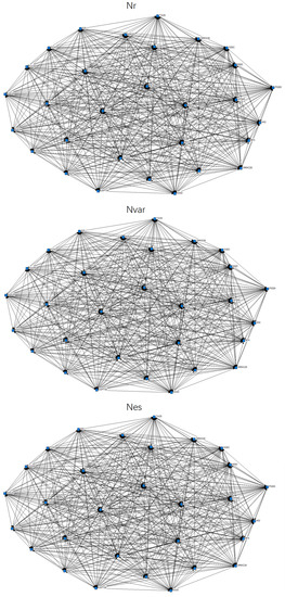
Figure 4.
Illustration of Constructed Networks. Note: Top left is an illustration of network ; top right is network ; bottom is network .
4.3. Network Analysis
(1) Centrality Analysis
We illustrate 6 major network measures of , and in Figure 5. Specifically, we are interested in analyzing out-degree and in-degree of each index, because out-degree, out-to-local-degree and out-beta centrality give us the same order of nodes, and it is the same for the 3 types of in degrees.
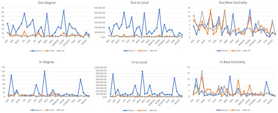
Figure 5.
Centrality Measures for Networks , and .
In regard to network , firstly we analyzed out-degree. S&P 500 was placed at the top of the ranking of out-degree with a value of 64.31. The top 2–5 stock indices were DJI (57.242), NDX (56.25), GSPTSE (42.445) and AEX (33.14). Several European stock indices also have above average out-degrees: STOXX50 (33.04), DE30 (32.92), FCHI (30.943), BFX (28.152) and OMXS30 (25.094). The stock index that has the smallest out-degree is VNI (0.974), which implies that the Vietnamese stock market has less than 1 edge associated with other nodes in the network. Other nodes with notable small out-degrees were NSE20 (2.605), TWII (2.887), N225 (2.912), AXJO (3.624), HSI (3.934), NSEI (5.142) and XU100 (6.568), most of which are Asian markets. It is worth noting that OMXC20 had an out-degree of 12.283, which was considerably less than the average out-degree of the network and was in sharp contrast to OMXS30 (25.094). In terms of in-degree, the top ones in the ranking were Asian markets: N225 (120.666), AXJO (102.665), TWII (83.148), HSI (56.492), NSEI (32.089) and BSESN (30.696). Markets with smaller in-degrees were mostly from emerging markets such as MXX (2.272), BVSP (3.402), XU100(3.873), ES35(4.932), TA35(5.682) and TASI (5.724). European markets generally had below average or average level in-degrees. Based on these observations, we can conclude that regarding stock index return, the three major indices in the United States have the most powerful contagion capabilities on other stock markets in the world, and western European markets also have considerable influence around the globe. In contrast, Asian markets generally have the least influence on world markets but are the most easily influenced by other nodes in the network.
Nodes in network with higher out-degrees were DJI (13.944), JTOPI (13.037), S&P500 (11.004), AEX (10.988) and WIG20 (7.736), while nodes with smaller out-degrees were VNI30 (1.204), ES35 (1.224), DE30 (1.51), N225 (1.391) and OMXS30 (1.824). European markets mostly had out-degrees of 2–4. In contrast to the Dow Jones Industrial Average and Standard & Poor 500 that have high out-degrees, NASDAQ had a less than average out-degree of 3.962. On the other hand, BSESN (20.954) and NSEI (18.195) had the largest in-degrees, followed by DE30 (9.552), GSPTSE (8.938), MXX (7.63) and BFX (7.509). The top 5 stock indices with the smallest in-degrees were PSI20 (0.383), HIS (0.506), TASI (1.082), NDX (1.356) and AEX (1.809), followed closely by XU100 (1.841). These results were distinctly different from results drawn from network . We cannot simply classify our stock indices based on geographical regions or traditional reputations. Dow Jones Industrial Average and Standard & Poor still have the greatest impact on other stocks and have more levels of resistance to being affected by others; meanwhile, out-degree and in-degree of NASDAQ do not align with them, and this contradicts the previous results.
In regard to network , BSESN had high values in all 6 network measures. AEX, JTOPI, SWI20 and WIG20 had large out-degrees, out-to-local degrees and out-beta centrality measures. AXJO is the only index that had significantly large values of in-degree. In comparison, XU100 was the opposite of BSESN and had small numbers across all 6 measures. Other stock indices that were significantly small in centrality measures are HSI, MXX, N225, NDX, NSE20, NSEI, OMXC20, OMXS30, SSEC, TA35, TASI, TWII and VNI30, among which HSI, MXX, N225, NSE20, NSEI, OMXS30, SSEC, TA35, TWII and VNI30 had significantly small out-degrees, out-to-local degrees and out-beta centrality measures, while NDX, OMXC20 and TASI had significantly small in-degrees, in-to-local degrees and in beta centrality measures.
(2) Hierarchical Clustering
For all 3 networks we found that the number of hierarchical clusters was 29. Tree diagrams are presented in Figure 6 and measures of cluster adequacy are presented in Figure 7. The measures of cluster adequacies capture the goodness of fit of the partitions. The routine takes a proximity matrix and a partition matrix where the clusters are defined in the matrix columns. There were 4 measures that we took particular interest in: ETA, Newman and Girvan’s modularity Q, Q-Prime and Krackhardt and Stern’s E-I. In terms of ETA, at first the curves for all 3 networks gradually dropped to −0.2 from 0. After the first 20 stock indices, 3 curves of ETA dropped to −0.3 through very different routes. Since ETA denotes the correlation between the input matrix and an ideal structure matrix, it seems that all nodes were within 30% deviation from their “perfect” position or structure. In terms of indicator Q, the curve of started from −0.017 and dropped to −0.088 at some point, but eventually bounced back to −0.039; the curve of started from −0.03 and went through a similar passage as , lowered to −0.058 but eventually adjusted back to −0.024; the curve of started from −0.04, the most negative value of all, and ended up at −0.15. Since Q represents the percentage of edges that fell within the partition less than the expected fraction when the edges were randomly distributed, we may conclude that for all 3 networks, based on Q, at least 2/3 of nodes extended edges just as “expected”. Q-Prime, a normalized version of Q, led us to the same conclusion as before, except that in the graph of Q-Prime, did not have any bounce-backs and plunged directly to −0.3. Lastly, E-I index is the difference between external and internal edges, divided by the total number of edges. In terms of E-I, , and , all started from 1 and stayed close to 1 for the first half of nodes, but later quickly dived to 0.502, −0.258 and 0.367, respectively.
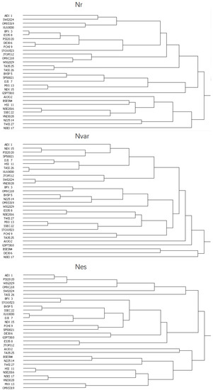
Figure 6.
Tree Diagrams of Hierarchical Clusters for Networks , and .
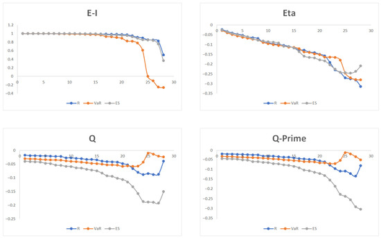
Figure 7.
Measures of Cluster Adequacies for Networks , and .
(3) Roles and Structures
We base our analysis of roles and structures on the Concor method. Regarding network , we discovered that the maximum depth of splits (not blocks) was 7, convergence criteria was set to be 0.2 and maximum iteration was set to be 25. The resulting structure had a R2 of 0.961. We called the top governing layer that encompasses all 30 nodes layer#1, and the most basic layer of units layer#7. On layer#2, we had 4 large groups: the first group consisted of AEX, SWI20, BFX, FCHI, STOXX50, DE30, ES35, PSI20, TA35, MXX, BVSP, DJI, S&P500, NDX, GSPTSE and TASI, almost all of which were from Europe and North America; the second consisted of JTOPI, OMXC20, OMXS30, XU100 and WIG20; the third consisted of N225, AXJO, TWII, HIS, SSEC and VNI30, all of which were from Asia; lastly, the group that had the smallest number of nodes included NSEI, BSESN and NSE20. Regarding network , we found that the maximum depth of splits was 6. Convergence criteria and maximum iteration were set to be 0.2 and 25, respectively. For , layer#2 had 4 groups: the first group was composed of AEX, SWI20, PSI20, DJI, AXJO, XU100, BVSP, NSE20, JTOPI, WIG20 and TA35; the second group included HSI, SSEC, NDX, TASI and OMXC20; the third group consisted of BFX, MXX, GSPTSE, BSESN, NSEI and VNI30; and the last group had DE30, OMXS30, ES35, FCHI, STOXX50, TWII and N225. Geographical and economical groups and allies were seemingly irrelevant in the structure partitioning for , nor were other political characteristics of these stock markets. Lastly, for network , the maximum depth of splits was 7 and other parameters were set the same as and . As a result, R2 = 0.721. We still had 4 groups in layer#2 of . The first group had the greatest number of nodes: AEX, SWI20, PSI20, BVSP, JTOPI, GSPTSE, WIG20, S&P500, DJI, NDX, BFX, STOXX50, FCHI and TA35; the second group consisted of OMXC20, TASI, SSEC and XU100; the third group consisted of AXJO, BSESN, MXX, NSE20, TWII, HIS, VNI30 and the last group consisted of OMXS30, DE30, ES35, NSEI and N225. In this case, we can see that geographical factors influenced structure partitioning in the most basic layers, especially layer#6 and layer#7, such as the following units: S&P500 and DJI, STOXX50 and FCHI, TWII and HSI, and OMXS30 and DE30. We conducted structure analysis again but using the Euclidean method as a comparison to results based on the Concor method. Evidently, results based on Euclidean method had many irrelevant and inaccurate details, because using correlation to partition the stock indices is more adequate practice compared to using distance to partition. Results are shown in Figure 8.
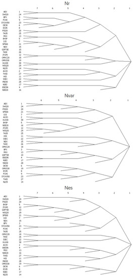
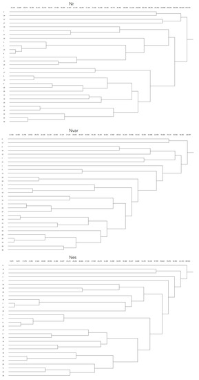
Figure 8.
Roles and Structures Analysis. Note: Structure partitioning results based on Concor method are shown on the top; results based on Euclidean method are shown on the bottom.
(4) Core and Periphery
When conducting core and peripheral analysis, number of iterations was set to be 50 and population size was set to be 100. For each network, nodes were divided into core class and peripheral. Blocked adjacency matrices were calculated and the resulting density matrices are shown in Table 2. Final fitness values for matrices , , were 0.438, 0.435 and 0.557, respectively. In theory, when the value of density is higher, the class is “heavier” or “meatier”. Core-to-core density of was 56.627, the highest among all results. Core-to-core densities of and were 12.794 and 20.498, respectively, indicating that the core class of was moderately dense while the core class of can be considered sparse. Peripheral-to-peripheral density of was 8.094, which was not too much smaller than the core-to-core density of . The peripheral blocks in both and were remarkably sparse, since their peripheral-to-peripheral density values were 2.964 and 2.657, respectively. In terms of connections between core and peripheral classes, had comparatively connected core class and peripheral class, in that the peripheral-to-core and core-to-peripheral densities were 29.120 and 15.683 each. The obvious difference in values of peripheral-to-core and core-to-peripheral densities implies that nodes in peripheral class had more directed connections to core class than core class to peripheral class. This pattern was also true for and , since peripheral-to-core densities for these matrices were 4.862 and 7.498, while core-to-peripheral densities were 3.128 and 4.288.
Table 2.
Core-Peripheral Analysis Results: Density Matrix.
(5) Correlation Analysis
We present the correlation matrix of network centrality measures in Figure 9. Out-degree and in-degree of nodes in are denoted as and . Similarly, , and represent out-degree and in-degree of nodes in and , respectively. We conducted correlation analysis on 3 networks. Correlation between and was 0.49, the largest among all indicators. The second largest correlation was between and —0.44. Correlations between and , and , and and were 0.25, 0.17 and 0.15, respectively, which also indicated some perceptible correlations. Correlations less than 0.1 were considered too small in our study. The most negative correlation was −0.31, which was between and . The second most negative correlation was −0.16, which was between and .
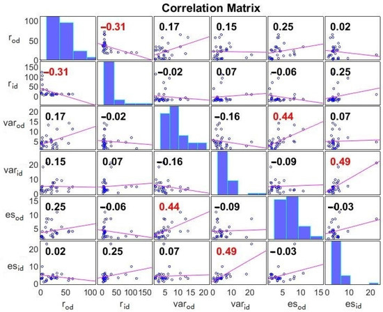
Figure 9.
Correlation Matrix of return, VaR and ES.
(6) QAP Correlation Analysis
We conducted Quadratic Assignment Procedure (QAP) correlation analysis in this section. We used QAP correlation to further analyze similarities and differences among matrices , and . We carried out the calculation process in Ucinet to evaluate whether we can predict the structure of one matrix based on the other matrix. Results are shown in Table 3. The QAP correlation analysis showed a significant correlation between and (r = 0.597, p = 0.000), which was certainly expected because VaR and ES are inherently correlated; correlation between and is also worth highlighting (r = 0.151, p = 0.047); correlation between and had the smallest r value and largest p value (r = 0.105, p = 0.107), which could be considered an insignificant result because the p value was greater than 10%. Our results seem to suggest that, based on a Pearson correlation value of nearly 0.6 and a p value of 0, there was a significant intercorrelation between the VaR Granger causality network and ES Granger causality network for the selected 30 stock indices during the last decade. The correlation between the return Granger causality network and ES Granger causality network was statistically significant since p value was less than 5%, but r value was only 0.151 and not relatively high. The statistical significance was even smaller for the VaR Granger causality network since the p value exceeded 10%.
Table 3.
QAP Correlation Analysis Results.
4.4. Impulse Response Analysis
Next, we will examine more in-depth financial risk contagion patterns among key players in the network. Based on centrality measurements of , we found that PSI20 had the lowest in-degree, in-to-local degree and in-beta (0.383, 1648.713, 0.29, respectively) and BSESN had the highest in-measures (20.954, 78,923.57, 16.652, respectively). Examining Granger causality matrix we detected that JTOPI, GSPTSE, DJI and AXJO had the strongest Granger causal relations with BSESN; on the other hand, DE30, ES35, TASI and WIG20 had zero Granger causal relations with PSI20. Based on these observations, we performed impulse response analysis on them because they were the most likely to give us deeper insights into risk transmission patterns between highly risk-sensitive stock indices, as well as highly risk-proof stock indices. To perform the analysis, we built VAR models on the variables first, lag length was found to be 2, and then calculated response standard error using the Monte Carlo method, with repetitions set as 100. We based our impulse response function on Cholesky decomposition. Results are shown in Figure 10.
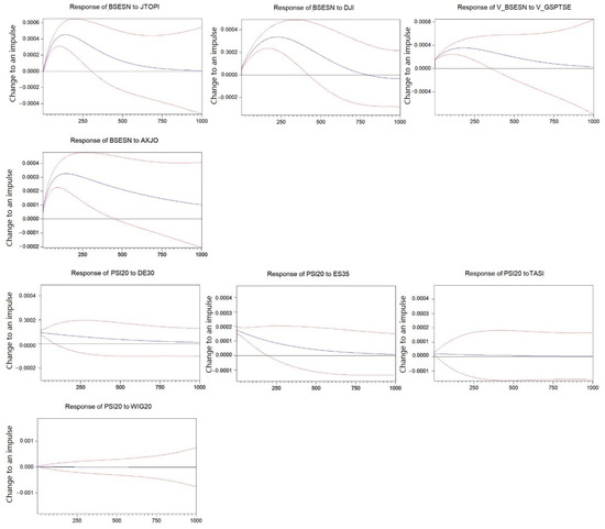
Figure 10.
Impulse Response of and to selected stock indices. Note: Blue lines represent the predicted results; red lines represent one positive/negative standard deviation from the predicted results.
First, we observed the responses of VaR of BSESN and PSI20 for a period of 1000 trading days. We denote VaR of stock indices as and trading day as . It is clear that the response of to exceeded 0.04% at around and continued to grow till around , and then steadily declined to around 0.03% on . The impulse response curve eventually touched 0.00% at about , indicating a fairly long-lasting effect of the initial shock. The response of to was developed in a similar manner, except that after the initial impulse the curve instantly elevated to about 0.015% and then peaked at around 0.03% at about before falling to almost 0.00% at the end of the observation period. Response curves of to and to both started from about 0.005% and exceeded well above 0.03%, but the former decreased to 0.00% at around , whereas the latter steadily lowered down but never touched 0.00% by the end of the observation period. Although responses varied, we can still summarize that 1 unit of impulse from the selected 4 stock indices typically led to a 0.03–0.04% increase at peak level in . The elevation in was non-negligible and long-lasting, validating research result from network analysis.
As a comparison, we conducted impulse response analysis on . We generated impulses from , , and in turn and demonstrate results in the lower half of Figure 10. It is evident that did not respond almost at all to and . The response of to was the strongest as the curve instantly jumped to 0.02% after the initial shock, and then steadily descended to 0.00%. The response of to was a little bit less than 0.01% originally, before almost uniformly declining to 0.00% by the end of the period. So far, we have detected the striking differences between a highly risk-sensitive stock index (BSESN) and a highly risk-insensitive or risk-proof one (PSI20). For the former, the shock curve gradually ascended to 0.03–0.04% before smoothly returning to 0.00%, but for the latter, either the curve started and peaked at around 0.01% and then fell through a linear route to 0.00%, or the curve showed little to no response to the original trigger. We have also discovered that even if Granger causality test indicates that there is no causal relation between 2 variables, such as and or and , VaR modelling and impulse response analysis reveal that there could still be some response in the target stock index, though the response was considerably mild.
We carried out impulse response analysis on selected ES series. Based on centrality measurements of , we found that XU100 had the lowest in-degree, in-to-local degree and in-beta (0.601, 1932.666, 0.307, respectively) and BSESN had the highest in-measures (22.714, 69,889.42, 21.769, respectively). Examining Granger causality matrix we detected that JTOPI, GSPTSE, BVSP and WIG20 had the strongest Granger causal relations with BSESN; on the other hand, DJI, GSPTSE and NDX had zero Granger causal relations with PSI20, and AEX, FCHI and BFX had F statistics of 0.01. Based on these observations, we performed impulse response analysis on them in a similar way as before and present the results in Figure 11.
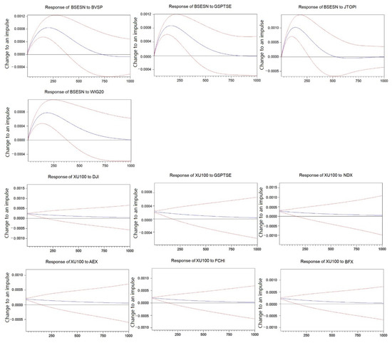
Figure 11.
Impulse Response of and to selected stock indices. Note: Blue lines represent the predicted results; red lines represent one positive/negative standard deviation from the predicted results.
First, we observed the responses of and for a period of 1000 trading days. It is clear that the response of to and that of to were comparatively similar; both overpassed 0.08% at around and both fell back to 0.00% at around , except that the former went beyond 0.00%. The response of to rose to as high as 0.1% just before , before sliding back to 0.00% at around . The curve dipped in the negative realm, but eventually adjusted back to zero. The smallest peak value was about 0.07% and was from to . The curve slowly fell back to 0.00% by the end of the period.
Responses of to 6 chosen stock indices were developed in almost identical style. After the initial instigation of 1 unit of impulse, was instantly lifted by 0.022–0.025%, and then retreated to 0.00% steadily in an almost linear passage. Moreover, both bounds of standard deviation in 6 subplots had nearly identical shapes. The distance between upper and lower bounds became wider consistently.
We arrived at the same conclusion regarding the difference in curve patterns of highly risk-sensitive stock index and highly risk-proof index. Moreover, compared to Figure 10, response rates shown in Figure 11 were markedly higher: 0.07–0.08% compared to 0.03–0.04%, and 0.022–0.025% compared to 0.01–0.02%. This finding also confirms our core-peripheral analysis that showed that overall was much more densely formed, indicating that connections between nodes in were stronger. Furthermore, we have demonstrated that when we base our calculation on different risk indicators, we can still arrive at the same conclusion about which index can cause the greatest response in another index, such as the impact of JTOPI on BSESN. However, when we want to follow the ranking and select a few more influential stock indices, we may find that the picks are different according to different risk indicators.
5. Discussion
Our entire study is fundamentally based on one important statistical hypothesis test, the Granger causality test. We should emphasize again that Granger causality test results do not reveal or prove causal relation per se. Granger causal relation should be understood as an observed dynamic causal relation between two variables, highlighting the predictive ability of one variable to another. That is, in the empirical study section of our paper, although we use “influence”, “impact” and “connect to” broadly to describe relations between nodes, we are essentially evaluating their observed dynamic causal relations but not their intrinsic relations. Nonetheless, observed causal relations still offer great insights and information for researchers to analyze and forecast dynamics and interactions between different stock indices.
First, let us discuss the basic risk measurements we have relied on in this study: VaR and ES. VaR and ES estimate potential losses in an asset or a portfolio of assets and the probability that the loss will occur. To put it simply, the higher the absolute value of VaR and ES is, the worse the situation is. ES is often considered an improvement on VaR since it measures the expected loss should the bottom line defined by VaR be breached. Movements in VaR and ES curves in 30 markets can offer clear observations on the severity of financial downturns that occurred in the last decade. Just as we have analyzed previously, based on ES, daily losses of BVSP, GSPTSE, DJI and S&P500 could potentially be greater than 10.508%, 8.259%, 7.763% and 7.149%, respectively, during the pandemic crisis, an alarming phenomenon that does not happen every day in the stock market.
Observing individual entities is not enough to uncover all features of riskiness in stock markets. In the main part of this paper, we have combined Granger causality test with complex network theory to dig through dynamics of global major stock markets. Building Granger causality matrix (and its corresponding network ) is the first step in discovering interactions between different stock indices. We should emphasize that the analysis of only reflects information on stock return but not on risk transmission. The study on and should be considered an improvement or an advancement from the “basic” analysis on , because the risk indicators that these two matrices are built on are based on stock return. In regard to , we have observed that the matrix itself is already highly informative. By analyzing F statistics in matrix , we reach similar conclusions as the centrality analysis for network : F statistics and centrality measurements cross validate each other. Based on matrix , we can infer that DJI, GSPTSE, NDX and S&P500 are the markets that are able to radiate strong influence on other stock indices, and at the same time they have significantly great resistance to exterior influence coming from other stock indices. This feature may cement their “superior” position because they are the most influential and definitive indicators on stock returns worldwide, while at the same time are able to withstand impacts from other markets. In sharp contrast, AXJO, HSI, N225 and TWII are the markets that are the most susceptible to influence from other indices but also perpetuate very weak influence on other markets. These four Asian stocks are the complete opposite of North American stocks above, but this observation does not necessarily indicate that these four Asian stock indices are inherently bad investment targets. There are five indices that neither have great impacts on other indices nor are susceptible to exterior fluences: JTOPI, OMXC20, OMXS30, WIG20 and XU100. They are relatively marginalized markets and thus are insular to some extent. Now, when we look at centrality measures of network , we may reach similar conclusions. S&P500, DJI, NDX and GSPTSE have the highest out-degrees, indicating that they have the strongest directed links to other nodes. Several European indices are on the next tier of influence. Asian indices, including TWII, N225, AXJO, HSI and NSEI, exhibit high in-degree and low out-degree, consistent with the observation that they are remarkably influenced by other indices, but their own influence is low.
As we have stated before, we cannot find clear geographical patterns in results from and (or their corresponding networks and ). Analyzing matrix leads to the conclusion that two Indian indices, BSESN and NSEI, are very easily influenced by other indices. In general, F statistics are small in value, indicating that there are not strong connections among indices compared to . Similar conclusions can be drawn from analyzing centrality measurements of network . BSESN and NSEI are the highest in in-degree, supporting the conclusion that they are eminent receivers of world risks. American results are again worth noting. DJI and S&P500 both extend strong influence on other nodes, while NDX is prominent in resisting risk transmission. On another note, based on values of F statistics from matrix , two Asian stock indices AXJO and BSESN have strong observed causal relations with other indices. They also both have relatively large out-degrees in network , and AXJO also has high in-degree, indicating that AXJO are both influential in risk transmitting and in being affected by risks in other indices. In contrast to AXJO, NDX, OMXC20 and TASI are small in both out-degree and in-degree, indicating that they are especially isolated from exterior risks. Comparing results from and , we can see that although ES is technically derived from VaR, observations from networks are not necessarily comparable. Only BSESN and NDX display similar features in both networks. Additionally, dynamics and observed causal relations are clear and strong among indices returns, but not so much in risk measurements.
Hierarchical clustering and structure partitioning results are already clearly shown in Figure 6, Figure 7 and Figure 8. We have also sorted out positions and layers of network structures for all three networks and discovered that the Concor method should be the best for our study as it gives a six/seven-layer structure instead of the 29-layer structure given by Eucliean method or the 29-layer structure based on hierarchical clustering.
Core-peripheral analysis has shown some interesting results. In terms of density matrix analysis, we can reach a similar conclusion as previously with F-statistics analysis and centrality measurement analysis: the majority of nodes in have stronger connections with each other, compared to nodes in and . Stronger connections are also reflected in higher values in density results. It should be emphasized that even the peripheral-to-core density of is higher than core-to-core densities of and . In other words, nodes are more “densely linked” in network . In terms of members in core classes, AEX, AXJO, BFX, GSPTSE are the indices that are in core classes across all 3 networks. DE30, DJI and S&P500 are in core classes of both and , while BSESN is a core member of both and . These results are somewhat reminiscent of results from the previous paragraphs, proving again that core-peripheral analysis is intrinsically related to F-statistics from the Granger causality test and centrality measurements of networks. In core-peripheral analysis, edges of both directions need to be taken into consideration, and this is the reason why nodes with outstanding out-degree but insignificant in-degree can be partitioned in peripheral class, whereas nodes with moderate to strong out-degree and in-degree, such as AEX and BFX, belong to core class.
Correlation analysis and QAP analysis reflect relations among networks , and . We have compared differences in their node-level topological features; in addition, studies in part (5) and (6) of Section 4.3 focus on network-to-network dynamics. Again, correlation results do not indicate causal relations. They reflect connections among variables, but do not offer underlying reasons for these connections. We have described correlation results in part (5) of Section 4.3. Correlations are high between and , and (0.49 and 0.44, respectively). Correlation between and is the most negative among all (−0.31), implying that for network , nodes with high out-degree tend to have relatively low in-degree. This result may be partly determined by North American stock indices and Asian stock indices with distinctive out-degrees and in-degrees, as analyzed before. Ultimately, QAP analysis gives us some fundamental insights on relations between three networks. The QAP correlation analysis shows a significant Pearson correlation between and , whose r value is almost 0.6 and p value 0.000. Pearson correlations between and , and are not negligible, whose r values are 0.105 and 0.151 and p values 0.107 and 0.047, implying that relations among return on world stock indices also determine, to some degree, relations among their risk measurements. In other words, a very rough estimation of the “resemblance” between return and risk indicators is about 10–15%.
Having thoroughly investigated network features, we then study more closely the power of key markets in the transmission of world financial risk. Specifically, we carry out impulse response analysis on a few major time series of VaR and ES. Based on VaR, we select BSESN as the most risk-sensitive index and PSI20 as the most risk-proof index; based on ES we still define BSESN as the most risk-sensitive but XU100 as the most risk-proof. Network analysis and impulse response analysis lead to the same judgement in some respects, but impulse response analysis reveals more details about specific stock indices. We can now deconstruct the impact of world financial risk into impacts generating from individual stock index and allocate proportions of response to specific roots. We can also see the whole process of change in rate of response through time. This study lays ground for future research on a more insightful breakdown of financial risk contagion in stock index market.
6. Conclusions
In this paper, we have analyzed financial return and risk indicators based on the Granger causality test and complex network theory. We selected 30 conventionally influential stock indices and collect their trading data from 1 January 2012 to 1 June 2022. After calculating risk indicators such as historical VaR and ES, we performed Granger causality test on return and risk series, and then built networks according to their respective Granger square matrix. Next, we have extensively examined their topological features including centrality measure, hierarchical cluster, structure partition, core and peripheral partition, network indicators correlation and QAP correlation analysis. Our study has revealed different degrees of risk transmission among all players in the system. We have found that in terms of contagion between return series, four North American stock indices that are commonly believed to be benchmarks in the finance field indeed have tremendous influence on other stock indices, whereas some Asian stock indices that are also very well established do not have significant influence on others, but they can be sensitive to influence from other stock indices. In terms of risk indicators VaR and ES, connections between nodes are considerably weaker, although American stock indices and Indian stock indices still stand out in influence measurements. According to our role and structure analysis, all three networks can be partitioned into four subgroups, which can be further divided multiple times. On the bottom of the structure are several basic units consisting of two stock indices, which are usually geographically close to each other. Core-peripheral analysis has also shown that nodes in network are more strongly connected with each other, whether they are in core class or peripheral class. Analysis on correlations between network indicators, as well as QAP correlation analysis, are also revealing. Through inter-network analysis, we have demonstrated that the observed causal relations among stock index return have about 10–15% Pearson correlation to the observed causal relations among stock risk indicators. Most importantly, we have successfully identified the most and the least active stock indices in the risk transmission network and conducted impulse response analysis on them. We have discovered that BSESN is the most risk-sensitive stock index whose VaR jumps 0.03–0.04% and ES jumps 0.07–0.08% in response to an impulse from the world’s most influential stock indices; we have also found that either PSI20 or XU100 is the most risk-proof stock index, depending on whether we choose VaR or ES as a risk indicator.
Supplementary Materials
The following supporting information can be downloaded at: https://www.mdpi.com/article/10.3390/electronics12081846/s1, Table S1. Descriptive Statistics of Lognormal Returns of 30 Stock Indices, 1 January 2012–1 June 2022. Table S2. Granger Causality Test Results (F-Statistics) for Matrices G_r, G_var and G_es.
Author Contributions
Methodology, Y.D. and Z.D.; Formal analysis, Y.D.; Data curation, Y.D.; Writing—original draft, Y.D.; Writing—review & editing, Z.D. All authors have read and agreed to the published version of the manuscript.
Funding
This research received no specific grant from any funding agency in the public, commercial, or not-for-profit sectors.
Institutional Review Board Statement
Not applicable.
Informed Consent Statement
Not applicable.
Data Availability Statement
The authors confirm that the data supporting the findings of this study are available on the website http://www.investing.com (accessed on 1 August 2022).
Conflicts of Interest
The authors declare no conflict of interest.
References
- Allen, F.; Gale, D. Financial contagion. J. Polit. Econ. 2000, 108, 1–33. [Google Scholar] [CrossRef]
- Eisenberg, L.; Noe, T.H. Systemic Risk in Financial Systems. Manag. Sci. 2001, 47, 236–249. [Google Scholar] [CrossRef]
- Boss, M.; Elsinger, H.; Summer, M.; Thurner, S. Network topology of the interbank market. Quant. Finance 2004, 4, 677–684. [Google Scholar] [CrossRef]
- Hazhir, R.; Sterman, J.D. Heterogeneity and Network Structure in the Dynamics of Diffusion: Comparing Agent-Based and Differential Equation Models. Manag. Sci. 2008, 54, 998–1014. [Google Scholar] [CrossRef]
- Billio, M.; Getmansky, M.; Lo, A.W.; Pelizzon, L. Econometric measures of connectedness and systemic risk in the finance and insurance sectors. J. Financ. Econ. 2012, 104, 535–559. [Google Scholar] [CrossRef]
- Caccioli, F.; Shrestha, M.; Moore, C.; Farmer, J.D. Stability analysis of financial contagion due to overlapping portfolios. J. Bank. Finance 2014, 46, 233–245. [Google Scholar] [CrossRef]
- Cimini, G.; Squartini, T.; Garlaschelli, D.; Gabrielli, A. Systemic Risk Analysis on Reconstructed Economic and Financial Networks. Sci. Rep. 2015, 5, 15758. [Google Scholar] [CrossRef] [PubMed]
- Bardoscia, M.; Battiston, S.; Caccioli, F.; Caldarelli, G. Pathways towards instability in financial networks. Nat. Commun. 2017, 8, 14416. [Google Scholar] [CrossRef] [PubMed]
- Anand, K.; van Lelyveld, I.; Banai, Á.; Friedrich, S.; Garratt, R.; Hałaj, G.; Fique, J.; Hansen, I.; Jaramillo, S.M.; Lee, H.; et al. The missing links: A global study on uncovering financial network structures from partial data. J. Financ. Stab. 2018, 35, 107–119. [Google Scholar] [CrossRef]
- Barucca, P.; Bardoscia, M.; Caccioli, F.; D’Errico, M.; Visentin, G.; Caldarelli, G.; Battiston, S. Network valuation in financial systems. Math. Finance 2020, 30, 1181–1204. [Google Scholar] [CrossRef]
- Bardoscia, M.; Barucca, P.; Battiston, S.; Caccioli, F.; Cimini, G.; Garlaschelli, D.; Saracco, F.; Squartini, T.; Caldarelli, G. The physics of financial networks. Nat. Rev. Phys. 2021, 3, 490–507. [Google Scholar] [CrossRef]
- Härdle, W.K.; Wang, W.; Yu, L. TENET: Tail-Event driven NETwork risk. J. Econom. 2016, 192, 499–513. [Google Scholar] [CrossRef]
- Betz, F.; Hautsch, N.; Peltonen, T.A.; Schienle, M. Systemic risk spillovers in the European banking and sovereign network. J. Financ. Stab. 2016, 25, 206–224. [Google Scholar] [CrossRef]
- Ando, T.; Greenwood-Nimmo, M.; Shin, Y. Quantile Connectedness: Modeling Tail Behavior in the Topology of Financial Networks. Manag. Sci. 2022, 68, 2401–2431. [Google Scholar] [CrossRef]
- Fang, L.; Sun, B.; Li, H.; Yu, H. Systemic risk network of Chinese financial institutions. Emerg. Mark. Rev. 2018, 35, 190–206. [Google Scholar] [CrossRef]
- Li, J.; Yao, Y.; Li, J.; Zhu, X. Network-based estimation of systematic and idiosyncratic contagion: The case of Chinese financial institutions. Emerg. Mark. Rev. 2019, 40, 100624. [Google Scholar] [CrossRef]
- McDonald, R.L. Derivatives Markets, 3rd ed.; Pearson Custom Publishing: Boston, MA, USA, 2012. [Google Scholar]
- Qiang, C. Advanced Econometrics and Stata Applications, 2nd ed.; Higher Education Press: Beijing, China, 2014. [Google Scholar]
- Gong, X.-L.; Liu, X.-H.; Xiong, X.; Zhang, W. Financial systemic risk measurement based on causal network connectedness analysis. Int. Rev. Econ. Financ. 2019, 64, 290–307. [Google Scholar] [CrossRef]
- Jiade, L. Social Network Analysis Handout, 3rd ed.; Social Science Literature Press: Beijing, China, 2020. [Google Scholar]


Disclaimer/Publisher’s Note: The statements, opinions and data contained in all publications are solely those of the individual author(s) and contributor(s) and not of MDPI and/or the editor(s). MDPI and/or the editor(s) disclaim responsibility for any injury to people or property resulting from any ideas, methods, instructions or products referred to in the content. |
© 2023 by the authors. Licensee MDPI, Basel, Switzerland. This article is an open access article distributed under the terms and conditions of the Creative Commons Attribution (CC BY) license (https://creativecommons.org/licenses/by/4.0/).