1. Introduction
Thematic maps of point distributions appear in research studies to assist in visualizing micro-level analysis, in media releases and in online mapping platforms to provide information to the public. At the same time, the number of scientific publications that contain maps of confidential information has recently increased [
1]. The same can be expected in public platforms, because geographical information technology is an effective tool to provide detailed information for community purposes. Confidential or sensitive types of location information appear usually in an obfuscated form to protect individual privacy. The obfuscation process results in visualizations with spatial error compared to the original data. The aim of this paper is to calculate the amount of spatial error that can be introduced to the obfuscated visualization without altering the essential information that the actual data portray.
The necessity of calculating the error of obfuscated visualizations is due to the fact that confidential, sensitive and private information is constantly being visualized via point maps by three main sources: (1) newspapers’ releases; (2) scientific publications; and (3) crime mapping websites.
1.1. Examples of Obfuscated Point Maps for Privacy Protection
In some cases, geographical masking techniques are used to protect the visualized confidential topic. Geographical masks are a group of location protection methodologies that were first introduced by Armstrong
et al. [
2] as approaches to mask specific confidential locations of individuals. So far, they have been used in a variety of scientific publications to protect the locations of health-, crime- or privacy-related information [
1]. Location protection methods are not limited to geographical masks only [
3,
4], but these type of methods seem to be preferred for the protection of discrete point data. In the field of epidemiology, Wheeler [
5] randomly shifted cases of childhood leukemia from their true locations to preserve data confidentiality. Almanza
et al. [
6] used a similar approach to map a child’s level of physical activity in different locations. Furthermore, Vieira
et al. [
7] employed a random displacement within 1.2 km
2 to present locations of residencies of breast cancer in Cape Cod, Massachusetts. The audience of these publications may be primarily the scientific community (experts of the topic) and, at a later stage, the public.
Furthermore, certain organizations responsible for disseminating information to the public publish protected data. An example of this practice is the Police.uk website that publishes crime data at a national level in the U.K. To protect the identity and privacy of individual victims, all crime data are masked using a specific “location anonymization” technique [
8]. The “location anonymization” technique seems to be in line with the guidelines that have been proposed in the code of practice report from the non-departmental public body “Information Commissioner’s Office” [
9] and the report by the U.S. Department of Justice about the publication of spatial crime data [
10]. Furthermore, policing initiatives, such as crime mapping, improve people’s perceptions of their neighborhood and of the local police and are perceived as informative and trustworthy [
11]. On the other hand, Chainey and Tompson [
12] argue that the quality and cartographic visualization of the published information needs to be improved, and social media should get involved to enable a dialogue on crime issues. Regarding the risk of privacy violation from re-identification, the participants of a survey that was conducted in London, U.K., expressed a preference for a medium-risk protection method (from eight to 20 addresses) that indicates the need for street-level protected resolutions, such as geographical masks [
13].
1.2. Examples of Point Maps Where a Confidential Theme is not Obfuscated
A considerable amount of publications presented confidential locations unmasked (real locations in point maps). A striking example is an interactive map pinpointing the locations of gun owners in two suburban counties in New York that was published in December 2012, by “The Journal News” [
14,
15]. Residents objected to their information being published and claimed that the map would prompt burglaries, because burglars are now aware of where weapons might be found [
16]. Former burglar Walter T. Shaw confirmed that such information would be highly useful to burglars and to either avoid such residencies or to locate available weapons [
17]. Another example is a map depicting the exact locations of deaths caused by Hurricane Katrina that was published in a local newspaper in Baton Rouge, LA, USA [
18]. Last, Kounadi and Leitner [
1] found 41 scientific articles that displayed actual confidential, sensitive or private information on maps.
The risk of re-identification when confidential residential information is disclosed and unmasked may be unknown to the public, but scholars have tried to raise awareness of it. The process of obtaining further information about individuals from maps that present exact confidential locations has been described as the “transgressor’s scenario” by Kounadi
et al. [
19]. Furthermore, Leitner, Mills and Curtis [
20] examined the accuracy of the reverse engineering process that is the process of extracting geographic coordinates from a point distribution on a digital map. From the perspective of location trajectories (e.g., GPS data), Krumm [
21] showed how individuals’ names and phone numbers can be retrieved from such data. The examples of unmasked releases of confidential data and the findings from the studies of re-identification indicate the necessity of employing geographical masks for visualization.
1.3. Calculating the Error of Obfuscated Locations
The disadvantage of geographical masks is that by altering the original locations, the masked locations will be somehow different from the original ones. Even more, custodians of masked data do not evaluate and report the spatial error of their visualizations. Failure to analyze and assess this error may lead to inaccurate visualizations and misconceptions about the specificity of the original patterns.
Of course, scholars who published on geographical masks have examined the spatial information loss of masked data using different metrics and approaches. Armstrong
et al. [
2] examined whether several geographical masks preserve the spatial characteristics of the original pattern (
i.e., pair-wise relations, event-geography relations, trends, anisotropies, clusters’ existence, clusters’ actual locations and clusters’ relative locations). While this approach is useful to understand the effects that the application of different geographical masks will have on the original point pattern, it does not allow quantifying this effect. For instance, the “random perturbation” mask (
i.e., introducing a random error in both the distance and direction of an original point) preserves approximately the clusters’ actual locations; however, one cannot answer the question: How much does a geographic mask preserve its original locations? On the other hand, Kwan
et al. [
22] quantified the geomasking effects on the original spatial pattern by performing point pattern analysis methods to both original and masked datasets and then compared the results. The methods that they used included visualization of point patterns, visualization of 2D and 3D density surfaces, examination of maps of density differences and cross K function analysis. Additionally, other scholars used spatial statistics to quantify the effects and, in particular, cluster indices, such as the clusters’ sensitivity, specificity, detection rate, accuracy and the most significant cluster [
23,
24,
25,
26].
Most of the effects’ detection techniques compared the performance of different masks to the same dataset in order to identify the mask that yields the least spatial error for the masked dataset. The study by Kounadi and Leitner [
27] had the same objective and employed two “divergence indices”. “Divergence” describes the distortion or difference of a masked point pattern with an original point pattern using spatial statistics. In addition, the results of the divergence indices can be used to compare errors to other masked datasets or visualizations. The divergence indices consist of two composite indicators. These are: (1) the “Global Divergence Index” (GDi) that calculates the divergence of the masked points’ centrographic analytical results from the original points’ centrographic analytical results; and (2) the Local Divergence Index (LDi) that calculates the divergence of the masked points’ hotspots analytical results from the original points’ hotspots analytical results. Hotspots are areas or points of high density of incidents. To this extent, hotspots are statistically significant areas resulting from spatial clustering methods that measure the local characteristics of a point pattern. For the examined masks and their parameters, the masked data altered notably the local characteristics of the original data. On the other hand, the masks introduced trivial errors to the global characteristics of the original data.
Finally, Leitner and Curtis [
28] added an important factor to their method for examining the masks’ spatial error, namely the map viewer. The authors wanted to find out what the visual impact of the masks was on the point pattern distribution and hot spots identification as compared to the original distribution and hot spots. More specifically, they employed a survey where participants made visual observations and ranked the similarities of masked and original point patterns. Furthermore, participants drew hot spots into the original or masked point pattern, which allowed the authors to visually compare the differences of the hot spots’ drawings. This is an important approach, because people (experts or non-experts) are those who will be ultimately exposed to masked maps. Consequently, when confidential location information is published, the perceptual spatial error should be taken into consideration, as well.
1.4. The Study’s Objective
Two recent studies examined the error of masked datasets for certain spatial analyses. The first study by Heydrich, Burgert and Emch [
29] examined the offset of locations from Demographic and Health Survey (DHS) clusters (clusters are locations) that are displaced using a specific random perturbation mask. The masked clusters are provided by the organization to researchers for spatial analysis. The second study by Tompson
et al. [
30] examined the spatial resolution that is adequate for analysis if masked crime data that are available from the Police.uk website were to be used for research. Both studies provided guidelines on the appropriate usage of these masked datasets with the perspective of further research. The guidelines are specific to these masked datasets and cannot be applied for other datasets or geographical masks.
On the other hand, the visualization error of masked data has yet to be addressed, even though pure visualization and information dissemination seems to be the main usage of masked datasets. What is missing in the current literature is a generally applicable approach that not only calculates the spatial information loss of masked data, but also sets a threshold value up to which the spatial error cannot alter in a meaningful way the characteristics of the original pattern in the final visualized form. Hence, there is a need to define a maximum acceptable level of spatial error below which the spatial error cannot be visually observed. The study’s objective is to propose a method for potential “maskers” to quantify the spatial error and, based on this error, to evaluate the quality of their confidential masked visualizations. To address this issue, we assume that visual observations are strongly related to statistical results. In other words, the public’s perceived similarity of point patterns can be associated with the statistical similarity between the same point patterns. This is the main hypothesis of this research. This means that the higher the spatial error is that masked data have compared to original data, the less likely it will be that people would perceive the masked point pattern as being similar to the original one. If this hypothesis is confirmed, then the perceived similarity of future visualizations could be estimated by calculating the spatial error of masked data.
2. Analytical Strategy
To define a threshold value for the maximum spatial error of masked data, we employed a strategy that involves three phases. In the first phase, a perceptual survey was conducted. In the second phase, a spatial statistical analysis was performed. The last phase involved the comparison of statistical and perceptual results using logistic regression analysis.
As part of the first phase, we had to recruit participants that belong to either of the two groups: (1) experts,
i.e., people who are customarily working with spatial data; and (2) non-experts in handling spatial data. Because spatial data experts are a very small subgroup of the population, we employed the snowball method to obtain a large enough sample. Snowball sampling is a non-probability sampling technique where participants recruit more participants from among their acquaintances [
31]. It is used to identify potential subjects in studies where subjects are difficult to sample by using common random sampling methods. In our study, online questionnaires were distributed through e-mail lists among friends, colleagues, as well as in posts in Facebook groups related to GIS or GIS University Departments. Then, the approached participants could re-distribute the survey’s link to other people. The redistribution was allowed without restrictions, because both “experts” and “non-experts” were required. The participants’ task was to rank the similarity of pairs of maps. For each pair, there was one map showing the original distribution of the points and one map showing the masked distribution. The participants ranked the similarity of the maps by choosing one of the following ordered responses: “very similar”, “similar”, “slightly similar”, “different”, and “very different”. The level of similarity was designed as a Likert-type scale format [
32]. These ordinal categories were decided upon testing the survey’s design with some of our colleagues. It was emphasized to the participants that there were no correct or wrong answers about the individual’s perception of similarity. Last, to ensure that the respondents will focus on the comparison of the point patterns only and that no other factors will influence their judgements, all maps had the same symbology and cartographic design. In addition to that, no information about the area and the theme of the distribution was given.
For each map pair, the spatial error of the masked distribution was calculated using the “spatial information divergence” approach by Kounadi and Leitner [
27]. According to the authors, some of the advantages of this approach are that it shows the magnitude of distortion of the original value of a spatial statistic to the masked value and it allows comparisons to be made about the distortions between different areas and datasets. For reasons mentioned in the Introduction, only the “local divergence index (LDi)” was applied, that is the divergence of the masked hotspots (hotspots of the masked points) to the original ones (hotspots of the original points), and it can be calculated using the following formula:
where
A = area of original hotspots and
B = area of masked hotspots.
The local divergence index ranges from zero to 100. The maximum divergence is equal to 100 when original and masked hot spots are completely disjoint. On the other hand, the divergence is equal to zero when the masked and original hotspots are identical. In total, we calculated three local divergence indices: (1) Nnh.di, the index of the hotspot areas’ divergence using the nearest-neighbor hierarchical spatial clustering; (2) Gi*.di, the index of the hotspot areas’ divergence using the Getis-Ord Gi* statistic; and (3) Ans.di, the index of the hotspot areas’ divergence using the Anselin Local Moran’s I statistic [
33,
34,
35]. Hence, for one map of each pair of maps, the local divergence index was calculated three times using one clustering method per time.
In the last phase, we tested our hypothesis using logistic regression analysis, which is considered an important and useful model for categorical response data [
36]. We defined the hotspot divergence to be the independent variable that can predict the perceived similarity, as this was the dependent variable. However, variations in the predictability of each clustering method (nearest-neighbor hierarchical spatial clustering, Getis-Ord Gi*, Anselin Local Moran’s I), as well as in the responses between the two sample groups (“experts” and “non-experts”) may exist. Hence, the following nine combinations were tested: (1) the similarity responses of “experts” with the results of one of the three clustering methods (three combinations); (2) the similarity responses of “non-experts” with the results of one of the three clustering methods (three combinations); and (3) the similarity responses of all participants with the results of one of the three clustering methods (three combinations).
Preparation of Original and Masked Maps
The location data that are used in this study are vehicle thefts in Vienna, Austria, from January 2007, until June 2007. The data were provided by the Criminal Intelligence Service Austria. The dataset is appropriate for this study for two reasons. Vehicle thefts tend to be spatially clustered similarly to other confidential data (e.g., patients’ locations for a particular disease) or sensitive data (e.g., locations of residential burglaries). On the other hand, vehicle thefts are neither confidential nor sensitive, because the majority of their locations cannot be associated with individuals’ addresses. Exceptions involve thefts where the vehicle is stolen from the garage or the parking lot associated with a single family home. Nevertheless, this type of incident is not distinguished from the others in the dataset. Furthermore, the data are already seven years old, so the information is not really relevant anymore and of little use to somebody trying to inverse address-match the locations to re-identify people living at that address. Thus, such maps can be safely disseminated for the purposes of the study without disclosing private information.
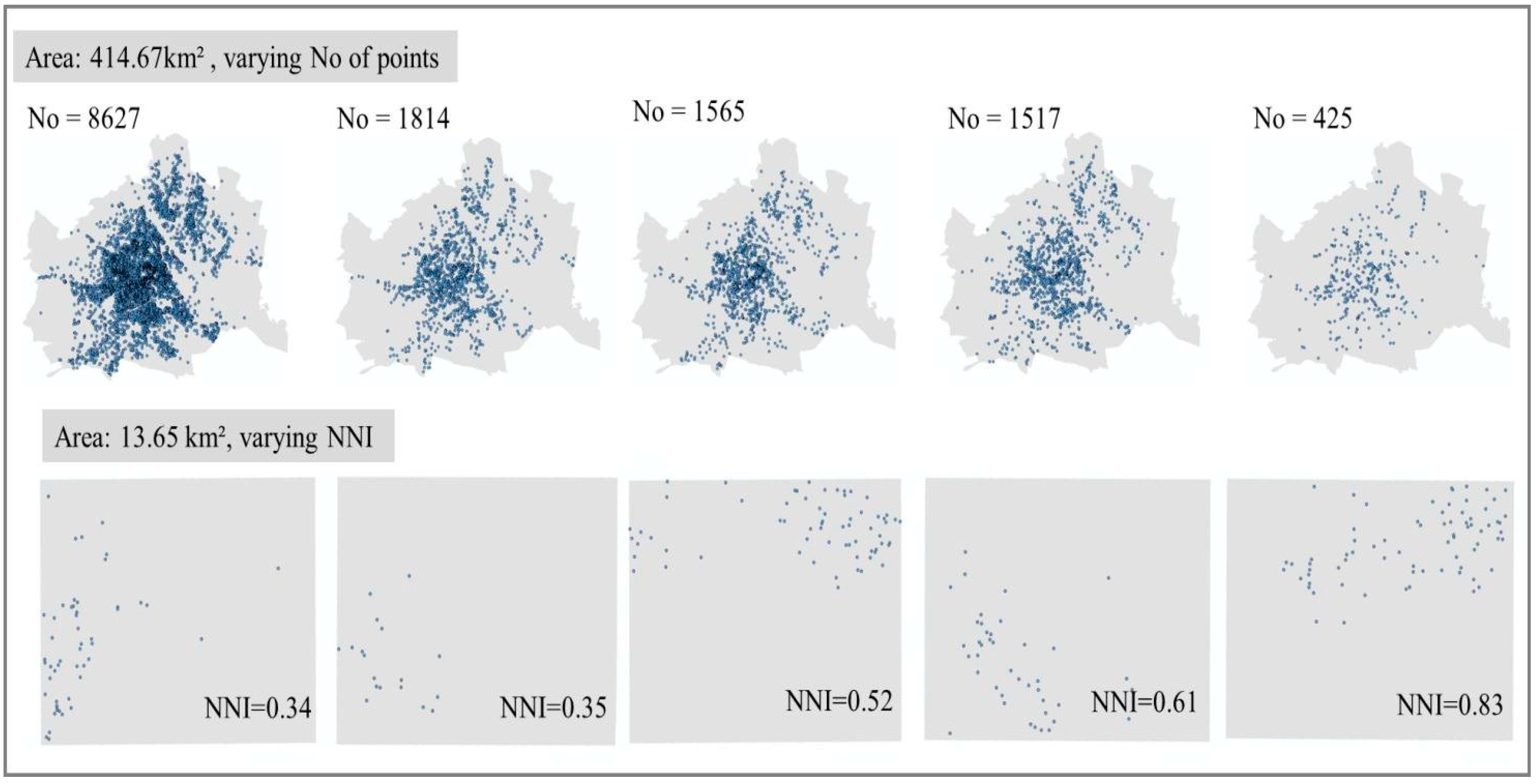
For the maps’ creation, we aimed at a variety of maps that represent different scenarios of point patterns that a viewer may come across. First, we extracted from the original dataset the following subsets: one set per month (six in total), one set per week (24 in total) and one set for the entire period. Furthermore, we overlaid a 7 × 7 grid over the study area (city of Vienna) and extracted the cells that contained 50 or more thefts (22 cells/ subsets). From the collection of 52 subsets, we selected ten subsets that vary in three spatial characteristics: (1) locations’ density; (2) locations’ clustering degree; and (3) the trend of the distribution. The final ten sets vary in the following ways: (1) the points’ density ranges from 50 incidents to 8627 incidents; (2) the clustering degree calculated by the nearest neighbor index (NNI) ranges from 0.34 to 0.83; and (3) the point patterns have six different trends (five grid areas and the city of Vienna). From the ten sets, we created ten original maps that will be compared against their masked maps. The final ten original maps are presented in
Figure 1.
Figure 1.
Original maps. The five maps at the top cover the entire city of Vienna (414.67 km2) and vary in terms of the density of the points. The five maps at the bottom are squared areas in Vienna, each 13.65 km2 large, and varying in terms of the distribution of the points and the clustering degree (NNI, nearest neighbor index).
The “circular mask” was employed to create the masked sets [
22]. This geographical masking method displaces the original points at a fixed predefined distance (radius) and at a random direction (0° to 360°) on a circle’s circumference. The method was selected due to its simple implementation; however, any other method could have been used instead. The parameter of the geographical masks that determines the magnitude of the spatial error that is introduced to the data is called the “masking degree”. For the “circular mask”, the masking degree is the size of the radius. Previous findings showed that by increasing the masking degree, the masked point pattern tends to be more spatially different from the original point pattern [
22,
23,
37]. Because the original maps have two different scales (five maps depicting the entire city of Vienna with an area of 414.67 km
2 and five maps at a larger scale, depicting a portion of Vienna with an area of 13.65 km
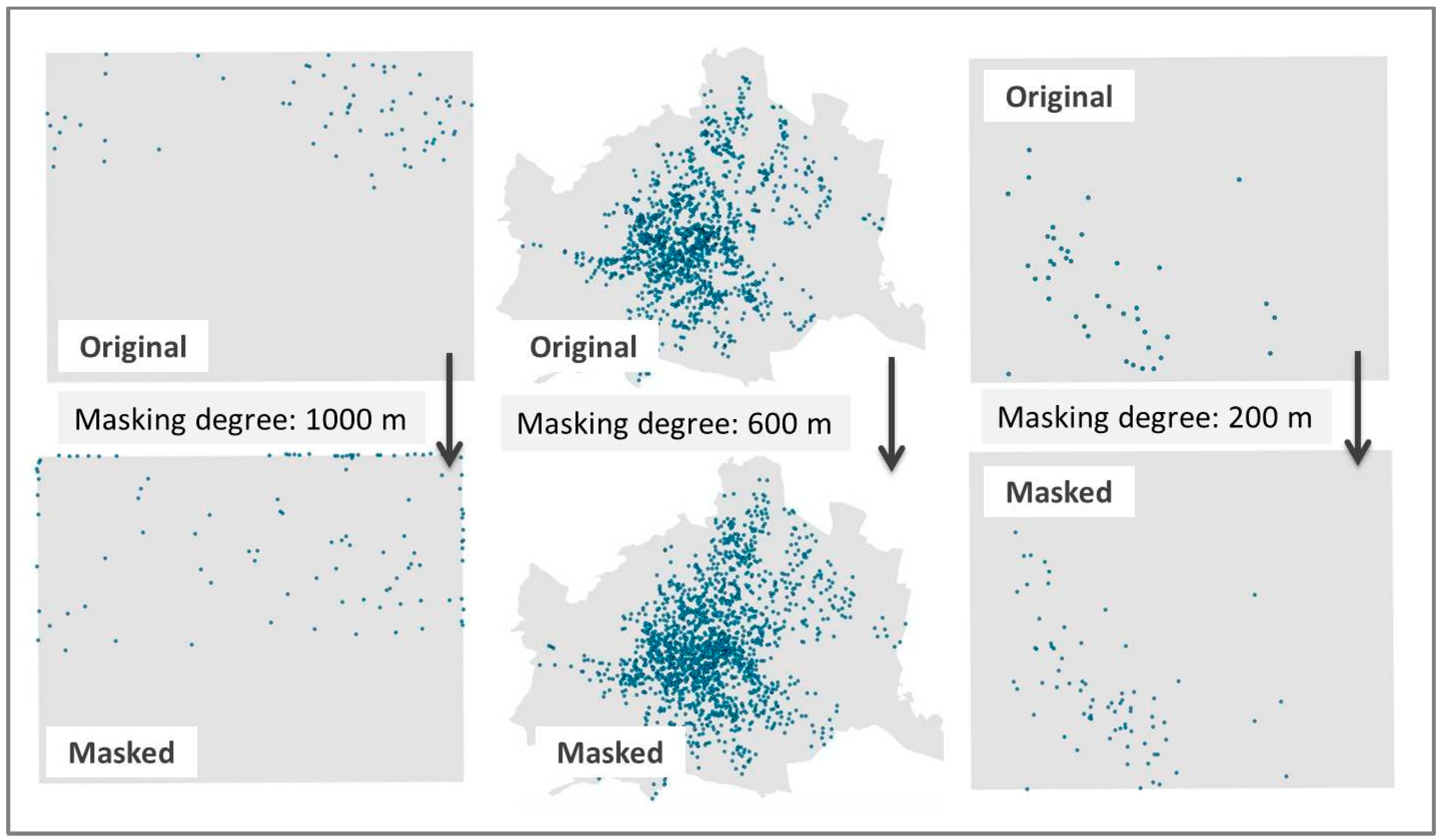
2), the same masking degree would affect the larger scale maps more than the smaller scale maps. Furthermore, the application of the mask should yield a wide range of “local divergence” results (0–100). In other words, a mixture of masked maps with a small error that could be perceived as similar from the participants’ point of view, as well as masked maps with a large error that may be perceived as different. To ensure a variety of results, we masked the original datasets using three radii.
Figure 2.
Three pairs of original versus masked maps of different masking degrees.
Figure 2.
Three pairs of original versus masked maps of different masking degrees.
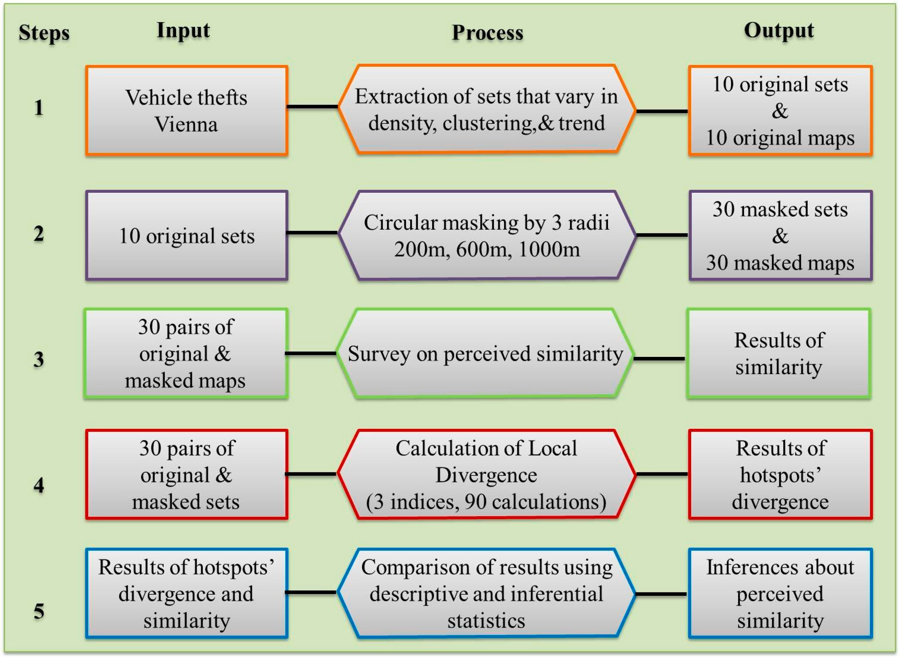
Figure 3.
The analytical strategy of the study.
Figure 3.
The analytical strategy of the study.
To select appropriate sizes for the radii, we consulted estimations of the spatial errors of different masking degrees that were proposed in previous studies [
7,
22,
37,
38]. Based on these studies, we selected one radius that is assumed to have a small effect on the masked point pattern (200 meters), one that is assumed to have a large effect (1000 meters) and one in the middle (600 meters).The masking procedure resulted in 30 masked maps that are compared against the 10 original maps.
Figure 2 above shows three out of the 30 pairs that were used in the analysis. Lastly,
Figure 3 demonstrates a summary of the analytical strategy in five steps. Each step describes the input, output and processes that were involved.
3. Results
This section is organized into three parts. First, we analyze the survey’s results with respect to the participants. Second, we compare the statistical (LDi) with the perceptual results (survey’s responses of perceived similarity) in order to identify the clustering method that can best estimate the perceived similarity. Finally, using the optimal clustering method, we develop models to predict the perceived similarity.
3.1. Survey Results and Participants
The survey was conducted in two weeks from 14 through 26 July 2014. In total, 398 questionnaire responses were collected. The design of the questionnaire was initially tested by a selected group of the authors’ colleagues. It was suggested that the number of pairs of maps should be restricted to 15 per questionnaire in order to facilitate the tedious task of repetitively ranking the similarity of pairs of images that have a similar format. Hence, the 30 pairs of maps that formed 30 questions were divided into two online questionnaires of 15 questions each. The pairs of maps were randomly selected and reordered within the questionnaires. In addition to the main questions (ranking of similarity), four more questions were asked regarding the characteristics of the participants. These were: gender, age, nationality and profession. The profession question was formulated as follows: Do you work in academia, industry or a public sector related to geodesy, geomatics, geoinformatics, geography, urban planning or environment (Yes/No)? The aim of these questions was firstly to separate the “experts” from the “non-experts” group and, secondly, to explore variations of responses with regard to the demographic aspects of our sample.
The characteristics of the survey’s sample are summarized in
Table 1. The profession group is represented with 210 participants related to spatial science (“experts”) and 148 participants not related to spatial science. Furthermore, the majority of the participants were between 20 and 39 years old (76.1%), and their nationality was Greek, Austrian, German or Croatian (59.5%; altogether, 42 nationalities were represented). Furthermore, 40 out of 398 participants did not respond to the “profession”, “sex” and “age group” questions, and 57 out of 398 participants did not respond to the “nationality” question.
Additionally, statistical tests were conducted with the categories of the groups to examine statistically significant variations in perceived similarities. The tests that were employed were the Wilcoxon matched-pair test for groups of two categories and Friedman’s test for groups of three categories [
39,
40]. Each category is considered as a paired sample and was examined to detect if the categories’ ratings are consistent with each other (e.g., do women rank similarity differently than men?). For age and nationality groups, we examined the categories for which we had more than 30 participants. For each category and pair of maps, we calculated the mode perceived similarity, which was coded as follows: 1 = very similar, 2 = similar, 3 = slightly similar, 4 = different, 5 = very different.
Table 2 shows the mean of all pairs of map modes and the tests’ statistical significance by category. Apart from nationality, all other groups gave statistically different responses among their categories. The perceived similarity of participants who belong to the categories “experts”, male and the age group “21–29” is statistically lower than those who belong to the categories “non-experts”, female and the age groups “30–39” and “40–49”. The highest difference is observed in the profession group, thus justifying the logic of creating separate models.
Table 1.
Characteristics of participants (No = 398). a Nationalities in the U.K. are aggregated to “British” citizenship, since participants used different wording to describe their nationality; b nationalities with less than 10 participants per nationality (in total, 36 nationalities).
Table 1.
Characteristics of participants (No = 398). a Nationalities in the U.K. are aggregated to “British” citizenship, since participants used different wording to describe their nationality; b nationalities with less than 10 participants per nationality (in total, 36 nationalities).
| Group | No | % |
|---|
| Profession | | |
| non-spatial science | 148 | 37.2% |
| spatial science | 210 | 52.8% |
| No response | 40 | 10.0% |
| Sex | | |
| female | 163 | 41.0% |
| male | 195 | 49.0% |
| No responses | 40 | 10.0% |
| Age group | | |
| <17 | 1 | 0.3% |
| 18–20 | 8 | 2.0% |
| 21–29 | 170 | 42.7% |
| 30–39 | 133 | 33.4% |
| 40–49 | 32 | 8.0% |
| 50–59 | 10 | 2.5% |
| >60 | 4 | 1.0% |
| Non-response | 40 | 10.1% |
| Nationality | | |
| Greek | 104 | 26.1% |
| Austrian | 58 | 14.6% |
| German | 51 | 12.8% |
| Croat | 24 | 6.0% |
| British a | 16 | 4.0% |
| American | 11 | 2.8% |
| Other b | 77 | 19.4% |
| No response | 57 | 14.3% |
Table 2.
Significance of differences in similarity perception between the categories of each group. a The groups’ categories are statistically different at the 0.05 significance level.
Table 2.
Significance of differences in similarity perception between the categories of each group. a The groups’ categories are statistically different at the 0.05 significance level.
| Group | Categories | Mean | Test | Score | p-Value |
|---|
| Profession a | spatial science | 2.83 | Wilcoxon
matched-pair test | W = 78 | 0.001 |
| non-spatial science | 3.23 |
| Sex a | female | 3.20 | Wilcoxon
matched-pair test | W = 60 | 0.007 |
| male | 2.90 |
| Age group a | 21–29 | 2.90 | Friedman’s test | X2 = 2.81 | 0.046 |
| 30–39 | 3.17 |
| 40–49 | 3.17 |
| Nationality | Austrian | 3.00 | Friedman’s test | X2 = 1.86 | 0.183 |
| German | 3.23 |
| Greek | 2.97 |
3.2. Comparing Perceived with Statistical Similarity
Summarized results of perceived similarity and local divergence indices by area size and masking degree are shown in
Table 3. The divergence results show the mean value for each clustering method, and the similarity results show the mode perceived similarity. To calculate the clusters of each method, we used the following parameters: (1) for the nearest-neighbor hierarchical spatial clustering: two standard deviational ellipses to outline the clusters, a minimum of five points per cluster, only first-order clusters and a search radius based on the random nearest neighbor distance; and (2) for the Getis-Ord Gi* and the Anselin Local Moran’s I statistics: Extracting cells where z > 1.65 (
p-value < 0.1) of a 150-meter grid square. All original sets are characterized by point patterns that are more clustered than dispersed (NNIs range from 0.34 to 0.83). The parameters were selected so that all sets would return statistically-significant spatial clusters. More conservative parameters (
i.e., minimum of 20 points per cluster for nearest-neighbor hierarchical spatial clustering) would deter sets of low numbers of points and higher NNI values from creating significant clusters, even though they are statistically clustered. Other parameters could have been used, as well. However, these parameters allow the replicability of this study to areas ranging from small neighborhoods to city levels.
In the previous section, it was explained how the masking degree and the scale affect the magnitude of the spatial error in the masked dataset. The results of
Table 3 are in line with this explanation for both local divergences and perceived similarities. For all clustering methods, the divergence is higher for bigger masking degrees of the same area and lower for larger area sizes of the same masking degree. Furthermore, on average, a smaller area has higher divergences (area size: 13.65 km
2; divergence range: 65.56–83.29) than a larger area (area size: 414.67 km
2; divergence range: 52.21–71.75). Similar observations can be made for the perceived similarity. The only exception is that by decreasing the masking degree from 1000 meters to 600 meters of the same area, the perception of similarity does not change towards a more “similar” opinion.
Table 3.
Perceived similarity and local divergences by area size and masking degree. The perception of similarity is compared with the results obtained from three spatial clustering methods. Nnh.di is the index of the hotspot areas’ divergence using the nearest-neighbor hierarchical spatial clustering. Gi*.di is the index of the hotspot areas’ divergence using the Getis-Ord Gi* statistic. Finally, Ans.di is the index of the hotspot areas’ divergence using the Anselin Local Moran’s I statistic. The greater the divergence, the higher is the dissimilarity between original and masked hot spots.
| | Similarity | Nnh.di | Gi.di | Ans.di |
|---|
| Area: 13.65 km2, 1,000-meter masking degree | different | 95.78 | 81.16 | 91.19 |
| Area: 13.65 km2, 600-meter masking degree | different | 87.07 | 71.14 | 89.12 |
| Area: 13.65 km2, 200-meter masking degree | slightly similar | 57.32 | 44.39 | 69.57 |
| Area: 414.67km2, 1,000-meter masking degree | slightly similar | 68.95 | 60.85 | 77.09 |
| Area: 414.67km2, 600-meter masking degree | slightly similar | 59.83 | 57.40 | 74.48 |
| Area: 414.67km2, 200-meter masking degree | similar | 43.04 | 38.39 | 63.69 |
| Area: 13.65 km2 | different | 80.06 | 65.56 | 83.29 |
| Area: 414.67 km2 | slightly similar | 57.27 | 52.21 | 71.75 |
The findings thus far indicate that the perceived similarity of an original
versus a masked map is somehow relevant to the hotspots’ distortion (LDi) of the masked maps. That is, the more error is introduced into the data, the less similar the masked map will be perceived compared to the original one. To statistically examine the association of the ordered variable “perceived similarity” with the local divergence indices, we performed Kendall’s tau b and Spearman’s rho tests [
41,
42]. To apply these nonparametric methods when one variable is ordinal and the other is ratio scale, the latter variable needs to be in the ordinal scale, as well. This means that the local divergence information has to be reduced to its ordinal scale of measurement. Consequently, the local divergence variable was ordered as: 1 = 0–25, 2 = 26–50, 3 = 51–75, 4 = 76–100. For every pair of maps, the mode perceived similarity and the ordered category of the local divergence was calculated. From the results of
Table 4, we reject the null hypotheses of mutual independence between the variables for all of the tests. In addition, for all groups in
Table 4 (all participants, non-experts and experts), Nnh.di has the highest correlation followed by the Gi*.di. Ans.di has the lowest correlation of all three divergence indices and among all groups.
Table 4.
Correlation between perceived similarity and local divergence indices. a Correlation is significant at the 0.05 level (2-tailed). All other correlations are significant at the 0.01 level (2-tailed).
Table 4.
Correlation between perceived similarity and local divergence indices. a Correlation is significant at the 0.05 level (2-tailed). All other correlations are significant at the 0.01 level (2-tailed).
| Correlation Test | All Participants | Non-Experts | Experts |
|---|
| Nnh.di | Ans.di | Gi*.di | Nnh.di | Ans.di | Gi*.di | Nnh.di | Ans.di | Gi*.di |
|---|
| Kendall’s tau b | 0.765 | 0.467 | 0.614 | 0.710 | 0.397 a | 0.492 | 0.703 | 0.451 | 0.583 |
| Spearman’s rho | 0.805 | 0.499 | 0.643 | 0.766 | 0.423 a | 0.523 | 0.755 | 0.494 | 0.631 |
3.3. Estimation Models of Perceived Similarity
Given that the analyses presented above suggest that the local divergence indices could possibly estimate the perceived similarity, we use ordinal logistic regression models to examine their predictability. We created one model for each group (all participants, experts, non-experts). Rather than analyzing the results for all independent variables (local divergence indices), we analyze the Nnh.di, which has the strongest correlation with the examined dependent variable (perceived similarity). Similar to before, for every pair of maps, the mode perceived similarity was calculated. The nnh.di as an explanatory variable created significant prediction models for the following categories: 1 = very similar or similar, 2 = slightly similar and 3 = different or very different. The first category “very similar or similar” defines the upper boundary of the Nnh.di results and a range of optimal or acceptable results. The second category “slightly similar” indicates a range of Nnh.di results, which may not be acceptable for visualization; however, they do not indicate a differently perceived visualization as those of the last category “different or very different”. The results of diagnostic tests and coefficients of the ordinal logistic regression analysis are presented in
Table 5.
Table 5.
Diagnostics and coefficient results for each ordinal logistic regression model.
Table 5.
Diagnostics and coefficient results for each ordinal logistic regression model.
| Model | P-Value of Diagnostics |
|---|
| Model Fit (X2) | Goodness of Fit (Pearson) | Nagelkerke | Test of Parallel Lines |
|---|
| All Participants | <0.01 | 0.962 | 0.744 | 0.838 |
| Non-experts | <0.01 | 0.902 | 0.679 | 0.116 |
| Experts | <0.01 | 0.930 | 0.673 | 0.683 |
| | Nnh.di Coefficient |
| | Estimate | SE | Wald | p-Value |
| All Participants | 0.157 | 0.041 | 14.876 | <0.01 |
| Non-experts | 0.133 | 0.035 | 14.109 | <0.01 |
| Experts | 0.135 | 0.036 | 13.962 | <0.01 |
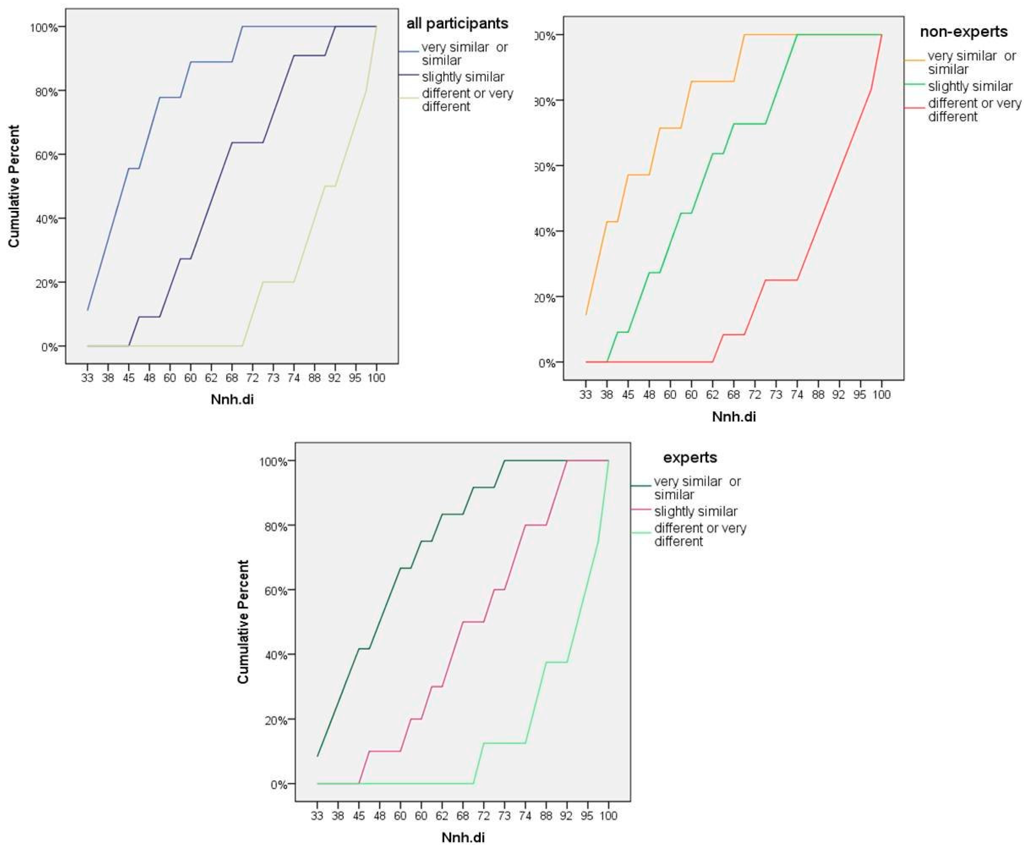
Figure 4.
Cumulative percentages of Nnh.di by category of perceived similarity (very similar/similar, slightly similar and different/very different) for each group (all participants, non-experts, experts).
Figure 4.
Cumulative percentages of Nnh.di by category of perceived similarity (very similar/similar, slightly similar and different/very different) for each group (all participants, non-experts, experts).
Generally, the models show that the Nnh.di is a significant predictor of the perceived similarity of masked and original point maps. First, the chi-square tests show that by including the independent variable, the models are significantly improved (
p < 0.01). Second, Pearson’s chi-square statistics of the models are insignificant, which means that the observed data are consistent with the fitted model and that the data and the model predictions are similar. The Nagelkerke values (pseudo R-squared) indicate that all three models do a good job at predicting the response variable, given that a perfect model fit for this statistic returns a value of one. The “all participants” model includes all responses from the “experts”, the “non-experts”, as well as the participants who did not respond to the respective question (in total, n = 398). Finally, the tests of parallel lines, which assume that the variable is proportional across the ordinal categories, are insignificant. This means that the ordinal type of regression model is a better fit for the dependent variable than a general one.
Figure 4 shows the cumulative percentages of Nnh.di by category of perceived similarity. In accordance with the tests of parallel lines results, the similarity categories are not only well separated within the different ranges of Nnh.di values, but they also seem to be equally spaced from each other. However, in the non-experts graph of
Figure 4, the “slightly similar” category is closer to the “very similar or similar” category than the “different or very different” category. This explains why this group has the lowest insignificant value for the test of parallel lines compared to the other two (0.116). Still, the ordinal logistic regression model is statistically the most appropriate for our data.
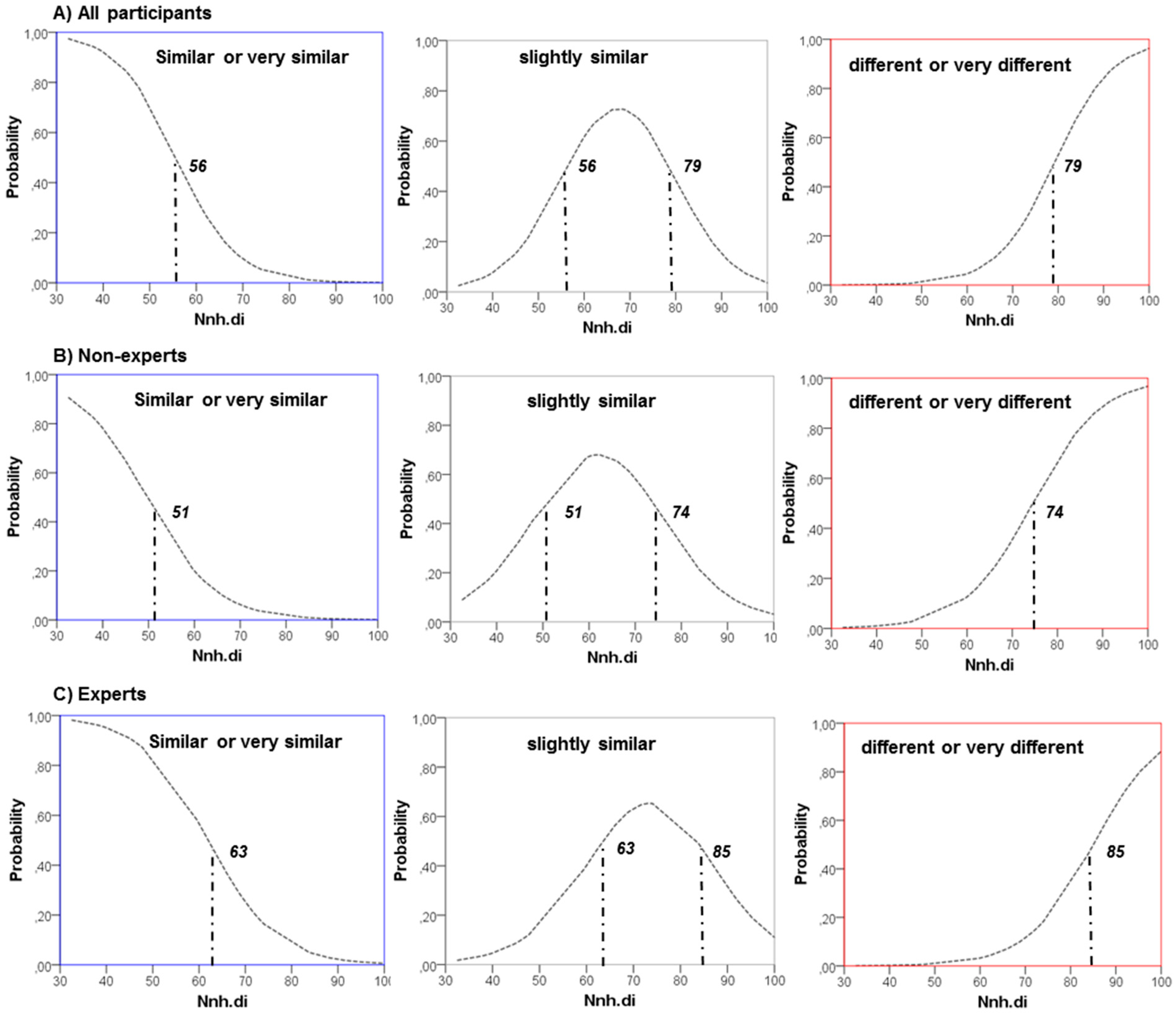
Figure 5.
Nnh.di results and estimated probability of perceived similarity in three ordered categories (very similar/similar, slightly similar and different/very different) for each group ((A) all participants; (B) non-experts; (C) experts).
Figure 5.
Nnh.di results and estimated probability of perceived similarity in three ordered categories (very similar/similar, slightly similar and different/very different) for each group ((A) all participants; (B) non-experts; (C) experts).
The lower part of
Table 5 shows the estimates of the Nnh.di coefficient. All of them are statistically significant at a 99% confidence interval and positively related to the perceived similarity. In other words, the higher the Nnh.di value, the more probable it is for the perceived similarity to be in a higher category (1 = very similar or similar, 2 = slightly similar and 3 = different or very different).
Figure 5 shows the estimated probability of perceived similarity for different values of Nnh.di results by each model. The trend is the same for all models. The probability of “very similar or similar” responses is decreasing as the Nnh.di is increasing. On the contrary, the probability of “different or very different” responses is increasing as the Nnh.di is increasing. The “slightly similar” responses are more probable for middle values in the range of Nnh.di results. However, the Nnh.di limits for which the probability between classes is higher vary among the models. The critical value below which a masked map is more likely to be perceived as “very similar or similar” is 51 for the “non-experts” model, 63 for the “experts” model and 56 for the “all participants” model. The results are consistent with the Wilcoxon matched-pair test results that show that participants related to spatial sciences have a more “lenient” judgement on the point patterns’ similarity than the remaining participants.
4. Discussion
To determine a threshold value for the spatial error of masked data, we employed a perceptual study with the use of an online questionnaire and compared its qualitative results with the quantitative results of spatial statistical analysis. Our findings show that the amount of error in locations of masked hotspots is highly correlated with people perceiving a distribution to be similar to an original one. Consequently, the perceived similarity of a masked versus an original map can be estimated by calculating the divergence of the masked hotspots to the original ones (LDi). This allows us to set an upper boundary to the amount of error that ensures that the final obfuscated map will not be perceived differently from the original map. “Upper boundary” is a critical value of the LDi below which a masked map is more likely to be perceived as “very similar or similar” to the original map. Three upper boundaries are identified with three prediction models. The first prediction model includes the responses of experts—people who are customarily working with spatial data—and the critical LDi value for this model is 63. The second prediction model includes the responses of non-experts in handling spatial data, and the critical LDi value for this model is 51. The third prediction model includes all responses, and the critical LDi value for this model is 56.
The online questionnaire about the perception of point pattern similarity received a lot of attention, and we collected 398 responses from participants of 42 nationalities. Because the perception of spatial similarity is yet an unexplored topic, in addition to the objective of this study, we had the opportunity to analyze the results by groups of respondents. The categories of age, sex and profession groups gave statistically different responses. For example, young people (21–29 years old) gave significantly more similar responses than older people (40–49 years old). The mean of ranks for all age groups ranges from 2.90 to 3.17, which corresponds to the same response “slightly similar”. Hence, the differences are statistically significant, but vary only slightly. That means that even though there are variations in the responses, there is still high correlation between all responses and the LDi results. The latter is proven by the diagnostics of the “all participants” prediction model (
Table 5) that indicate that the model is a good fit of the response variable (perceptual similarity).
The results of this study can be used in most scenarios where a masking procedure is required. However, consideration should be given to four aspects of the masking process: (1) K-anonymity of confidential dataset; (2) geographical masking method; (3) calculation of the LDi; and (4) interpretation of perceived similarity graphs.
This paper does not discuss a disclosure threshold value for privacy protection (K-anonymity). K-anonymity is the number of cases among which a specific case cannot be reversely re-identified [
23]. K-anonymity can refer to households, people or even addresses and may vary depending on the regulations about a particular type of location dataset. The “masker” has to take into consideration the regulations regarding the type of information that is about to be masked and employ a geographical masking method with the error that is required to ensure that it is properly protected.
The selection of the geographical masking method is important for re-using the model’s results. Any geographical iso-masks apart from affine transformations [
2] or flipping [
28] can be used. That is because the LDi is not invariant to rotation, scaling or translation. For example, the LDi of masked locations from a circular mask may be the same as the LDi of masked locations from affine rotation (rotating each point by a fixed angle from a pivot point), but the pattern will appear different. Nevertheless, there are plenty of random perturbation and point aggregation techniques in the literature that can be used. Furthermore, rotation, scaling, translation and flipping are not preferred by scientists or organizations. According to the findings by Kounadi and Leitner [
1] and the anonymization method employed by the Police.uk website [
8], point aggregation and random perturbation are mostly in use.
Furthermore, the calculation of the LDi should necessarily adopt the parameters that were used in this study (
Results Section). More explicitly, to evaluate the spatial error of the masked data, one should calculate the local divergence index using the nearest-neighbor hierarchical spatial clustering with the parameters that we used here. Altering the parameters of the method would alter the interpretation of the perceived similarity in an unpredicted way. For example, by increasing the number of points from five to 10 per cluster, the local divergence index would increase, as well, because this means somehow requesting more conservative clusters. Consulting the results of our model (
Figure 5) in this case may result in estimating the perceived similarity as “different”, though if the original parameters were used, the perceived similarity could have been estimated as “similar”. Furthermore, this approach is best applicable for areas of a similar size to the ones of this study (from 414.67 km
2 to 13.65 km
2). This is an approximate representation of regions that range from a city to a neighborhood level. Although it is common to visualize a distribution of crime incidents at these scales, smaller or larger scales may be used, as well. For example, the interactive map of the Police.uk website reaches a resolution at the street level. Therefore, further research is needed to accurately evaluate spatial errors at these resolutions.
Finally, the graphs of
Figure 5 pinpoint the critical values of the LDi results for the evaluation of the error. The graph of experts shows that people who work with spatial data tend to see pairs of spatial point patterns as slightly more similar compared to the general public. This indicates that the threshold value of spatial error could be adjusted according to the intended audience. For example, for masked visualizations in scientific publications or conferences, a maximum LDi value of 63 can be an acceptable error. On the other hand, when masked visualizations are in public view, the lowest critical value (51) of the non-experts graph should be considered as the maximum acceptable error.


