
Functional Data Visualization and Outlier Detection on the Anomaly of El Niño Southern Oscillation


1
Department of Mathematical Sciences, Faculty of Science, Universiti Teknologi Malaysia, Johor Bahru 81310, Malaysia
2
UTM Centre for Industrial and Applied Mathematics (UTM-CIAM), Ibnu Sina Institute for Scientific and Industrial Research, Universiti Teknologi Malaysia, Johor Bahru 81310, Malaysia
Climate 2021, 9(7), 118; https://doi.org/10.3390/cli9070118
Submission received: 8 June 2021
/
Revised: 30 June 2021
/
Accepted: 8 July 2021
/
Published: 15 July 2021
(This article belongs to the Special Issue Climate Change Dynamics and Modeling: Future Perspectives)
Abstract
:The El Niño Southern Oscillation (ENSO) is a well-known cause of year-to-year climatic variations on Earth. Floods, droughts, and other natural disasters have been linked to the ENSO in various parts of the world. Hence, modeling the ENSO’s effects and the anomaly of the ENSO phenomenon has become a main research interest. Statistical methods, including linear and nonlinear models, have intensively been used in modeling the ENSO index. However, these models are unable to capture sufficient information on ENSO index variability, particularly on its temporal aspects. Hence, this study adopted functional data analysis theory by representing a multivariate ENSO index (MEI) as functional data in climate applications. This study included the functional principal component, which is purposefully designed to find new functions that reveal the most important type of variation in the MEI curve. Simultaneously, graphical methods were also used to visualize functional data and capture outliers that may not have been apparent from the original data plot. The findings suggest that the outliers obtained from the functional plot are then related to the El Niño and La Niña phenomena. In conclusion, the functional framework was found to be more flexible in representing the climate phenomenon as a whole.
1. Introduction
The El Niño Southern Oscillation (ENSO) is an erratic climate phenomenon caused by coupled atmospheric–ocean interactions in the tropical Pacific Ocean. The El Niño phenomenon refers to the prolonged heating of surface temperatures over the eastern and central Pacific Ocean for a half-year period of two to seven years. Different heating positions in the tropical Pacific Ocean have resulted in a wide range of consequences and climate anomalies all across the world. La Niña, on the other hand, is the polar opposite of El Niño and happens when ocean surface temperatures in the central and eastern Pacific Oceans fall below average. It brings in heavy rainfall in some locations, while others experience dry spells. During El Niño, rain tends to decrease throughout the Asian continent and western Pacific regions such as Indonesia, Malaysia, and Australia, which causes long dry spells. In contrast, rainfall increases over the central and eastern tropical Pacific Ocean [1]. However, during La Niña, rain reduces over the central and eastern tropical Pacific Oceans, whereas rainfall increases over the western Pacific.
The World Meteorological Organization (WMO) recently observed in 2020 that the tropical Pacific had been ENSO neutral since July 2019. However, sea surface temperature (SST) values have decreased marginally below the average since May 2020. Therefore, the WMO predicts that the chance of La Niña in September to November 2020 is about 60 percent, while for ENSO-neutral conditions, it remains at 40 percent. For El Niño, it is close to zero.
It is known that there is a connection between ENSO and climatic and hydrological phenomena across the world. Extreme drought and related food shortages, floods, rainfall, and temperature rises due to ENSO are causing a wide range of health problems, including outbreaks of disease, malnutrition, heat stress, and respiratory diseases. The Malaysian climate is influenced by ENSO, with drier-than-normal conditions during El Niño and wetter-than-normal conditions during La Niña. During the strongest El Niño years, 1997–1998, Malaysia and other Southeast Asian regions such as Thailand, Vietnam, Indonesia, and Singapore experienced dry conditions [2]. These El Niño episodes brought severe drought conditions, such as prolonged dry spells that negatively impacted Malaysia’s human health and economic activities. Susilo et al. [3] concluded that El Niño events had a stronger effect on rainfall than La Niña events in Central Kalimantan, Indonesia. They found that the El Niño events were associated with an increase in the number of days with less than 1 mm of rainfall during the dry season. Stanley Raj and Chendhoor [4] studied the influence of ENSO on the rainfall characteristics of coastal Karnataka, India. Their findings indicated that La Niña brought more rainfall than El Niño to the area.
A different scenario has been observed for other continents. El Niño years have been seen to bring excessive rainfall to South Florida, notably around Lake Okeechobee. The La Niña years, on the other hand, were marked by severe drought. During the 1997 El Niño event, it was difficult to maintain a safe water level in Lake Okeechobee due to limited discharge capacity [5]. In Peru, the 1997 El Niño event had the most significant impact, especially in the northern coastal region, which experienced heavy rain and severe flooding [6]. The heavy rains and flooding caused considerable damage to houses, schools, and health institutions. Additionally, increased cases of malaria, diarrhea, and acute respiratory infections were also reported. These effects of the ENSO and the ENSO phenomenon’s abnormality have led many researchers to become interested in its modeling.
Statistical modeling represents a major tool in developing the understanding of the ENSO phenomenon. Several authors have investigated different approaches to model the ENSO. Previous studies have focused on the conventional multivariate statistical techniques using linear and nonlinear time series models. Models such as a nonlinear univariate time series model [7], parametric seasonal autoregressive integrated moving average (SARIMA) model [8,9], and a nonparametric kernel predictor [10,11,12] have been widely used in modeling and forecasting of the data series. The rapid development of new technology such as artificial intelligence (AI), machine learning, and deep learning also provides alternative ways to forecast the ENSO phenomenon [13,14,15,16].
The Southern Oscillation Index (SOI) is the oldest indicator used to describe the ENSO phenomenon. The SOI is an indicator of the advancement and intensity of El Niño and La Niña in the Pacific Ocean. It serves as a regulated index dependent on the variations in ocean pressure levels between the Eastern Pacific (Tahiti) and the Indian Ocean (Darwin). During El Niño, the pressure drops below average in Tahiti and rises above normal in Darwin, resulting in negative SOI values, whereas during La Niña, the pressure behaves in the opposite manner, resulting in a positive index. Katz [17] reviewed the history of the SOI’s statistical modeling, while Fedorov et al. [18] studied the ENSO’s physical predictability. Both concluded that the ENSO might not be predictable by deterministic physical models. They preferred probabilistic forecasts based on ensemble forecasts. Anh and Kim [7] found that a nonlinear stochastic model was better than a linear stochastic model for modeling the SOI series. They concluded that the autoregressive moving average (ARMA) model was not appropriate for the SOI series because there is no linearity in the time series. Therefore, they suggested using a nonlinear approach, an autoregressive conditional heteroscedasticity model, for the SOI series. Gallo et al. [19] proposed a different modeling method, namely the Markov approach, to forecast the ENSO pattern. A Markov autoregressive switching model was developed to describe the SOI using two autoregressive processes. Each was associated with a particular ENSO phase: La Niña or El Niño. They then extended the model by adding sinusoidal functions to forecast future SOI values.
Other than the SOI, sea surface temperature (SST) indices including Niño-1+2, Niño-3, Niño-4, and Niño-3.4 have also been used to describe the ENSO phenomenon. Ham et al. [13] employed a deep-learning approach to forecast the ENSO for lead times of up to one and a half years. They trained a convolutional neural network (CNN) and found that the model was also effective at predicting the detailed zonal distribution of sea surface temperatures. In addition, He et al. [14] introduced a deep-learning ENSO forecasting model (DLENSO), which is a sequence-to-sequence model consisting of multilayered convolutional long short-term memory (ConvLSTM), to predict ENSO events by predicting the regional SST of Niño-3.4. Hanley et al. [20] compared several ENSO indices to determine the best index for defining ENSO events. They observed that Niño-4 has a weak relationship with El Niño but a strong response to La Niña, while Niño-1+2 shows the opposite characteristics. Their findings suggested that the choice of index depends on the phase of the corresponding ENSO. Their study concluded that SOI, Niño-3.4, and Niño-4 indices are equally sensitive to El Niño events, but are more sensitive than Niño-1+2 and Niño-3 indices. However, Mazarella et al. [21,22] commented that those indices could not represent the coupled ocean–atmosphere phenomena. Hence, they suggested using the multivariate ENSO index (MEI) since it is the most comprehensive index to describe the ENSO.
Nowadays, climate data or earth data are always thought of as continuous data even though they are computed at discrete time intervals such as daily, monthly, or annually. Functional data analysis (FDA) is a new modern statistical method that can express discrete observations arising from time series as functional data representing the entire measured function and a continuum interval, which can be regarded as a single entity, curve, or image. With recent technological advances, the idea of functional data analysis has become more prevalent. The development of FDA in statistical theory provides an alternative approach to the current conventional statistical methods, since it provides additional information on their smoothing curves or functions. Normally, conventional statistical techniques could not possibly generate further details on the data. The FDA can usually provide information on the functions and their derivatives based on the smoothing curves. Statistical frameworks using FDA techniques have been successfully applied in various fields. For example, in hydrology and meteorology studies, researchers such as Alaya et al. [23], Bonner et al. [24], Chebana et al. [25], Hael [26], Suhaila and Yusop [27], and Suhaila et al. [28] have successfully employed several FDA tools in their analyses. The detailed applications of the FDA and its tools have been well reviewed by Wang et al. [29] and Ullah and Finch [30].
Functional data visualization and outlier identification have recently become one of the most important statistical approaches used with these new advanced technologies. Therefore, this study investigated the potential of functional data for visualizing the changes in the MEI, which is used to characterize the intensity of ENSO events. The MEI is considered to be the most comprehensive ENSO monitoring index because it incorporates the analysis of various meteorological and oceanographic components into a single index. Here, we applied a modern statistical method to examine the pattern, variation, and shape of the functional MEI and relate it to the El Niño and La Niña events. The concept of functional data allowed us to provide more effective and efficient estimates of the ENSO phenomenon’s risk.
2. Materials and Methods
The multivariate ENSO index is measured as the first principal component of six main variables observed over the tropical Pacific, including sea level pressure, zonal and meridional components of the surface wind, sea surface temperature, surface air temperature, and sky cloudiness. It was developed at the National Oceanic Atmospheric Administration (NOAA) Climatic Diagnostic Center [31,32]. A new version of MEI named MEI.v2 was computed using five variables: sea level pressure, sea surface temperature, zonal and meridional components of the surface wind, and outgoing longwave radiation. All variables were interpolated to a standard 2.5° latitude–longitude grid, and standardized anomalies were determined with respect to the 1980–2018 reference period.
MEI.v2 is the leading main principal component time series of the empirical orthogonal function (EOF) standardized anomalies of the above five combined variables over the tropical Pacific during the 1980–2018 period. EOFs were estimated for 12 overlapping bimonthly “seasons” (Dec–Jan, Jan–Feb, Feb–Mar, …, Nov–Dec) to consider ENSO’s seasonality and reduce the impact of high-frequency intraseasonal variability. The detail of the methods is described on the website https://psl.noaa.gov/enso/mei/ (accessed on 25 June 2020). The data consisting of the monthly values of MEI were taken from this website. The highest MEI values represent the warm ENSO phase (El Niño), while the lowest values represent the cold ENSO phase (La Niña). The MEI values from 1980 to 2019 were considered in this study.
2.1. Functional Data Smoothing
Suppose we have a data set such as where T = 12 months, n is the number of years, and is the MEI measured at the month tj of the i-th year. These discrete observations are transformed into smoothing curves xi(t) as temporal functions with a base period of T = 12 months and a k basis function. Since the MEI data of the entire series had some seasonal variability and periodicity over the annual cycle, Fourier bases were preferred. The value of k can be chosen to capture the variation.
A common statistical approach for smoothing is to use the basis expansion, which is given as
where refers to the basis coefficient, is the known basis function, and K is the size of the maximum basis required. The type and relevance of a dataset are factors in determining the basis. According to Ramsay and Silverman [33], the properties of the smooth curve play a significant role in making the best decision. There was a clear periodic structure in this situation and the best-known basis function for a periodic set of data is the Fourier series, which can be written as
defined by the basis with The constant is related to the period T by the relation of The coefficients of the basis function are solved by minimizing the least-squares criterion, which can be written as
The amount of smoothing is determined by the number of basis functions used. A large number of basis functions usually results in a lower bias than a small number of basis functions; however, the former is often less smooth [34]. As a result, when creating a smooth curve from discrete data, the roughness penalty approach is suggested. Roughness, as defined by the integrated square of the second derivatives, is penalized. Putting them together will create a penalized residual sum of squares, which is given as
2.2. Summary Statistics of Functional Data
In classical statistics, measures of central tendency such as mean, median, and mode are often used to characterize the middle of the dataset. Dispersion measures such as variance and standard deviation, on the other hand, are used to show the dataset’s variability. Both measurements were used to explain the shape of the curves in this analysis. The mean curve, which is based on the sample curves, can be defined as
The mean curve is often used to evaluate the centrality of a sample curve; however, if there is a chance of outliers, the mean curve should be scrutinized. The functional framework’s location curves may also be the median and mode, which are based on the statistical notion of a depth function. Fraiman and Muniz [35] and Febrero et al. [36] extended the notion of depth to functional data. To obtain a robust location estimator for the distribution centre, they introduced the functional trimmed mean. The trimmed mean is defined as the mean of the most central curves, where α is given such that . The proposed method of depth defined by Fraiman and Muniz [35] is given in the form
where represents the univariate depth of and refers to the empirical distribution of the sample Suppose we define the functional depth as
and each curve corresponds to its functional depth given in Equation (7). The curves are ranked according to the values . The functional median is referred to as the deepest function in the sample, which attains the maximum values of functional depth. Another central measure is the modal curve, which represents the densest curve surrounded by the rest of the curves. The functional mode is given in terms of kernel estimator, as defined by Febrero et al. [36].
On the other hand, scale parameters are used to measure the dispersion of a distribution or a sample. The variability of function samples can be measured using the sample variance functions, which can be defined as
while the covariance function, which is used to summarize the dependence structure between curve values and at times s and t, respectively, can be written as
The surface of covariance and the contour map are used to plot the variability of the function sample. Another functional method that can also be used to capture the variability of the function samples is through functional principal component analysis (FPCA).
2.3. Functional Principal Component Analysis (FPCA)
Principal component analysis (PCA) is a multivariate statistical method that reduces the number of correlated variables to a smaller number of uncorrelated variables called principal components. After subtracting the mean from each observation, the method is typically used to find the principal modes of variation in the results. To achieve a satisfactory approximation to the original data, the numbers of these principal modes of variations are needed.
The key concept behind the extension of multivariate PCA to functional PCA is the substitution of functions for vectors, matrices for compact linear operators, covariance matrices for covariance operators, and scalar products in vector space for scalar products in L2 space [37]. In statistical reviews, there are at least two ways to perform smoothed FPCA. The first approach is to smooth the functional data before applying FPCA. The second method smooths principal components using a roughness penalty term in the sample covariance and optimizes it to ensure that the approximate principal components are sufficiently smooth. FPCA can identify new functions that show the most important type of variation in the curve data after transforming the data into functions. Under orthonormal constraints, the FPCA approach maximizes the sample variance of the scores. The following is a brief description of the FPCA method.
- Let be the functional observations obtained by smoothing the discrete observations
- Let be the centred functional observations where is the mean function. A FPCA is then applied to , creating a small set of functions, called harmonics, that reveal the most important variations in the data.
- The first principal component describes a weight function for the that exists over the same range and accounts for the maximum variation. The first principal component yields the maximum variation in the functional principal component scoressubject to the normalization constraint
- The next principal components are obtained by maximizing the variance of the corresponding scoresunder the constraints
In a functional context, the interpretation of FPCA is quite complicated, and the best way to consider the plots of the overall mean function and perturbations around the mean is based on zk. A method known as varimax rotation can be used to enhance interpretability. The details are given in Ramsay and Silverman [33].
2.4. Visualization and Outlier Detection Using a Functional Concept
In this study, three graphical methods were used to explore, visualize, and analyze unique features of MEI curves, such as outliers, that cannot be captured using summary statistics. These methods were first suggested by Hyndman and Shang [38]. A rainbow plot was used to visualize functional data, while outliers were identified using a functional bagplot and a functional high-density region (HDR) boxplot.
2.4.1. Rainbow Plot
A rainbow plot is a simple plot of all the data with the addition of a colour palette depending on the data’s ordering. Orders were focused on bivariate depth or bivariate kernel density in the functional context. The bivariate scores of the first two principal components were used in both methods. Let and be the first two vector scores and be the bivariate score points. The first way of ordering the functional observations was based on Tukey’s half-space location depth of the bivariate principal component scores given by
where is the half-space depth function introduced by Tukey [39]. It is defined as the smallest number of data points included in close half space containing on its boundary. The observations are decreasingly ordered according to their depth values OTi. The first ordered curve is considered to represent the median curve, while the last curve is considered the outermost curve.
The second method of ordering was based on the bivariate kernel density estimate, which was also computed using the bivariate robust principal component scores given as
where is the kernel function and is the bandwidth for the jth bivariate score points. The functional curves were ordered based on the value of ODi. The modal curve was the first curve with the highest density, while the most peculiar curve was the last curve with the lowest density. The rainbow colours reflect the order of the curves. The outlying curves with the lowest depth or density are shown in violet, while the curves with the maximum density or depth are shown in red. After that, the plotting curves are sorted by depth and density.
2.4.2. Functional Bagplot
Rousseeuw et al. [40] introduced the bivariate bagplot based on Tukey’s half-space depth function. The values obtained from the first two principal component scores determine the bivariate bagplot in functional models. The functional bagplot maps the functional curves to the bagplot of the first two robust principal component scores. The median curve and the inner and outer regions are shown in the functional bagplot. The area bounded by all curves corresponding to the points in the bivariate bag, which covers 50% of the curves, is referred to as the inner region. The outer region, on the other hand, is characterized as the area enclosed by all curves that correspond to points in the bivariate fence regions. Outliers are points that are outside of the field. According to Hyndman and Shang [38], when outliers are far from the median, a functional bagplot is a good outlier-detection tool.
2.4.3. Functional High-Density Region (HDR) Boxplot
The third method, the functional HDR boxplot, was based on the bivariate HDR boxplot, which was constructed using a bivariate kernel density estimate [41]. This outlier detection was again based on the first two principal component scores. The functional HDR boxplot displays the modal curve and the inner and outer regions. The inner region is defined as the region bounded by all curves corresponding to points inside the 50% bivariate HDR and usually the 99% outer highest-density region. The outer region is similarly defined as the region bounded by all curves corresponding to the points within the outer bivariate HDR. A detailed review of these three methods can be found in [38].
3. Results and Discussion
3.1. Reconstructing Multivariate El Niño Southern Oscillation Index Using a Basis Function
This study looked at how the MEI changes are correlated with El Niño and La Niña. The number of months was specified as T = 12. The Fourier basis was used in this study because the data from the entire MEI series indicated some seasonal variability and periodicity over the annual cycle. This study ran its analysis using the R package called “fda.usc”. The optimum number of basis functions that characterized the MEI pattern was nine bases with a 0.1 smoothing parameter. The choice of the basis functions was made based on the quality of smoothing and the percentage of variance explained by PCA. Figure 1a,b shows the smoothing curves of the MEI for the strong El Niño and La Niña events, respectively. There were five strong El Niño episodes in 40 years—1982–1983, 1987–1988, 1991–1992, 1997–1998, and 2015–2016—while strong La Niña years were observed in 1988–1989, 1999–2000, 2007–2008, and 2010–2011. The years with the strongest ENSO episodes are highlighted in the figure.
Figure 2a,b shows the discrete observed monthly MEI values over the selected La Niña years of 1988–1989 and 2010–2011, and their resulting smooth curves based on the number of basis functions. As shown in Figure 2a, a positive MEI value was observed in the early year of 1988, but the index decreased to negative values beginning in May and continued to show a negative value until September to October 1989. The lower panel of Figure 2a displays the corresponding rate of change in the MEI depending on the first derivative value. A larger change in MEI values can be seen in 1988 compared to 1989 due to shifts from positive MEI values to negative MEI values. These variations in MEI values over time could only be measured using FDA techniques.
Figure 2b displays the MEI pattern for the years 2010 and 2011. The MEI values ranged from −2.5 to −1.0 throughout the years 2010 and 2011. The MEI values began to drop rapidly between May and the end of the year. The pattern continued in the year 2011, where negative MEI values were recorded throughout the year. The MEI curve for 2010–2011 represents the strongest episode of occurrence of the La Niña event on record. The bottom panel of Figure 2b reflects the rate of change in the MEI values, but minor changes were observed over the year compared to the La Niña episodes of 1988–1989, since the MEI values throughout 2010–2011 showed negative values.
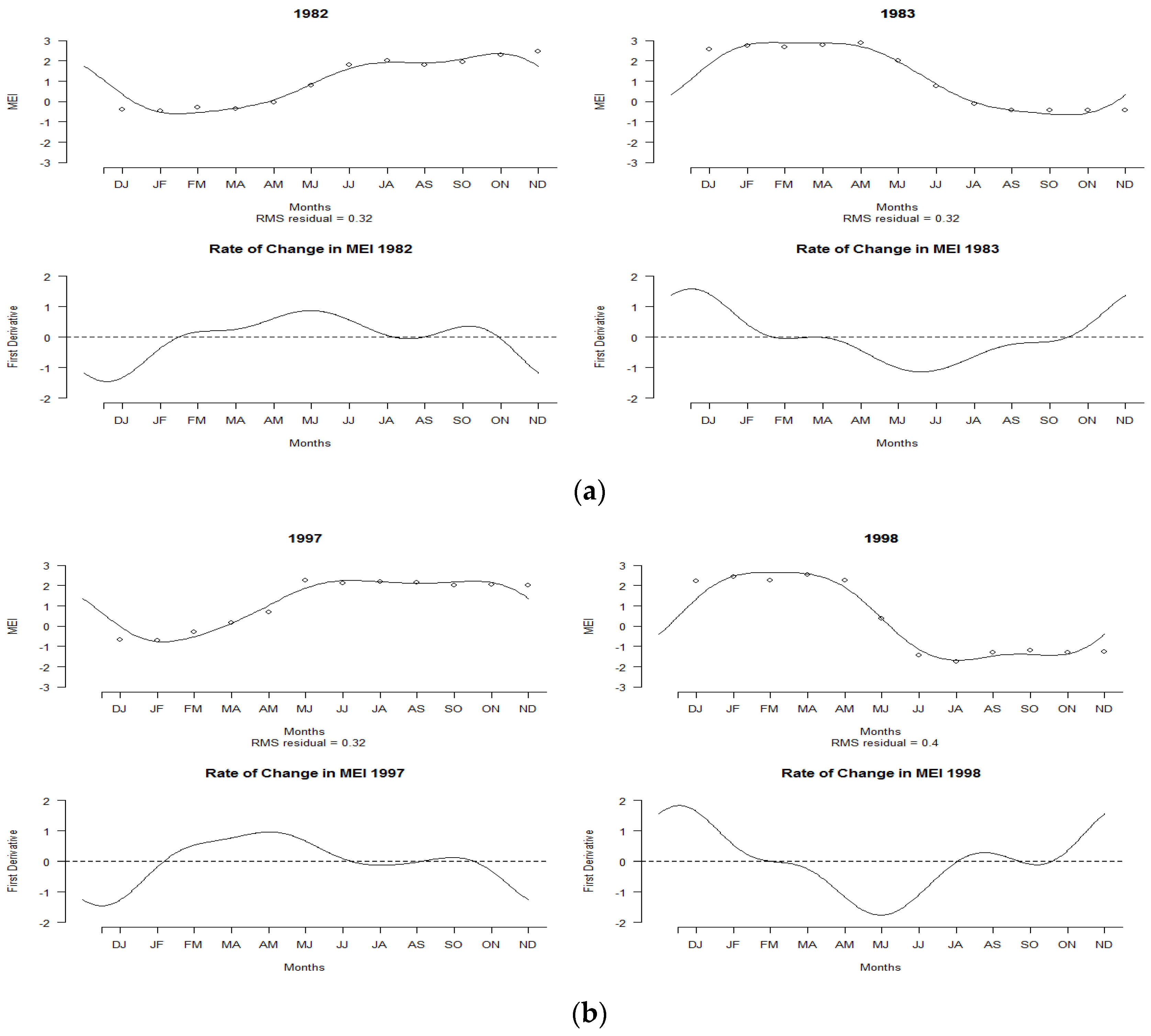
Figure 3a indicates the MEI curve for the years 1982 and 1983. A positive MEI was observed at the beginning of January 1982, but the index continued to decrease with negative values until May. It then increased again until the highest positive MEI was observed in November. These trends persisted until the middle of 1983. A high rate of MEI changes was observed in 1983, as shown in the lower panel of Figure 3a. Similar patterns were observed for 1997–1998, as shown in Figure 3b. Positive MEI values were observed in the middle of 1997, and the pattern continued until May 1998. This condition led to the El Niño phenomenon, which was categorized as a strong El Niño. The lower panel of Figure 3b indicates the same kind of MEI pattern.
The findings indicate that FDA could effectively describe changes in the MEI curve based on their derivatives, which can be calculated from their function. It was shown that positive and negative changes have occurred in the MEI curves over the years. The relationships between curves can also be determined on the basis of these changes.
3.2. Summary Statistics of Functional Data
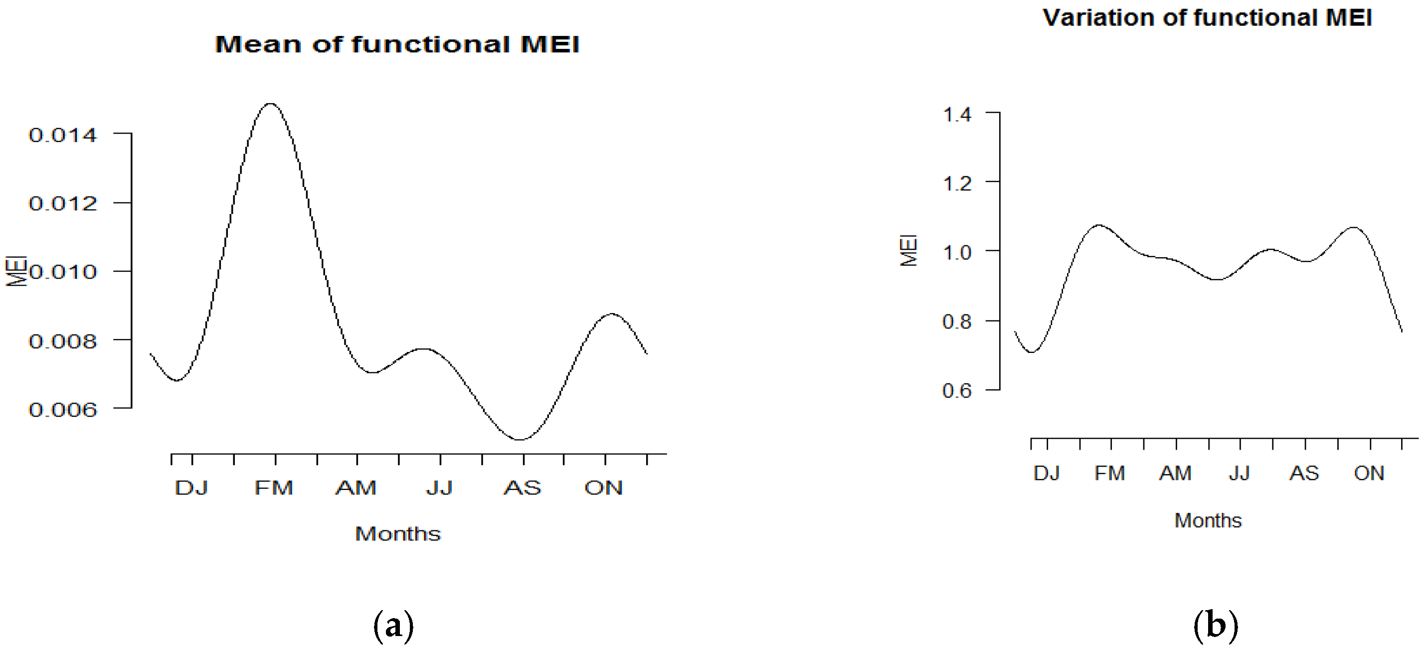
Figure 4 displays the summary statistics of the functional data in terms of mean and standard deviation for all years from 1980 to 2019. The highest mean was observed during the bimonthly duration of February to March, while the lowest mean was found from August to September. On the other hand, the largest variation in MEI was observed in February–March and October–November due to shifts in positive and negative MEI values across the year. Similar patterns are shown in Figure 5.
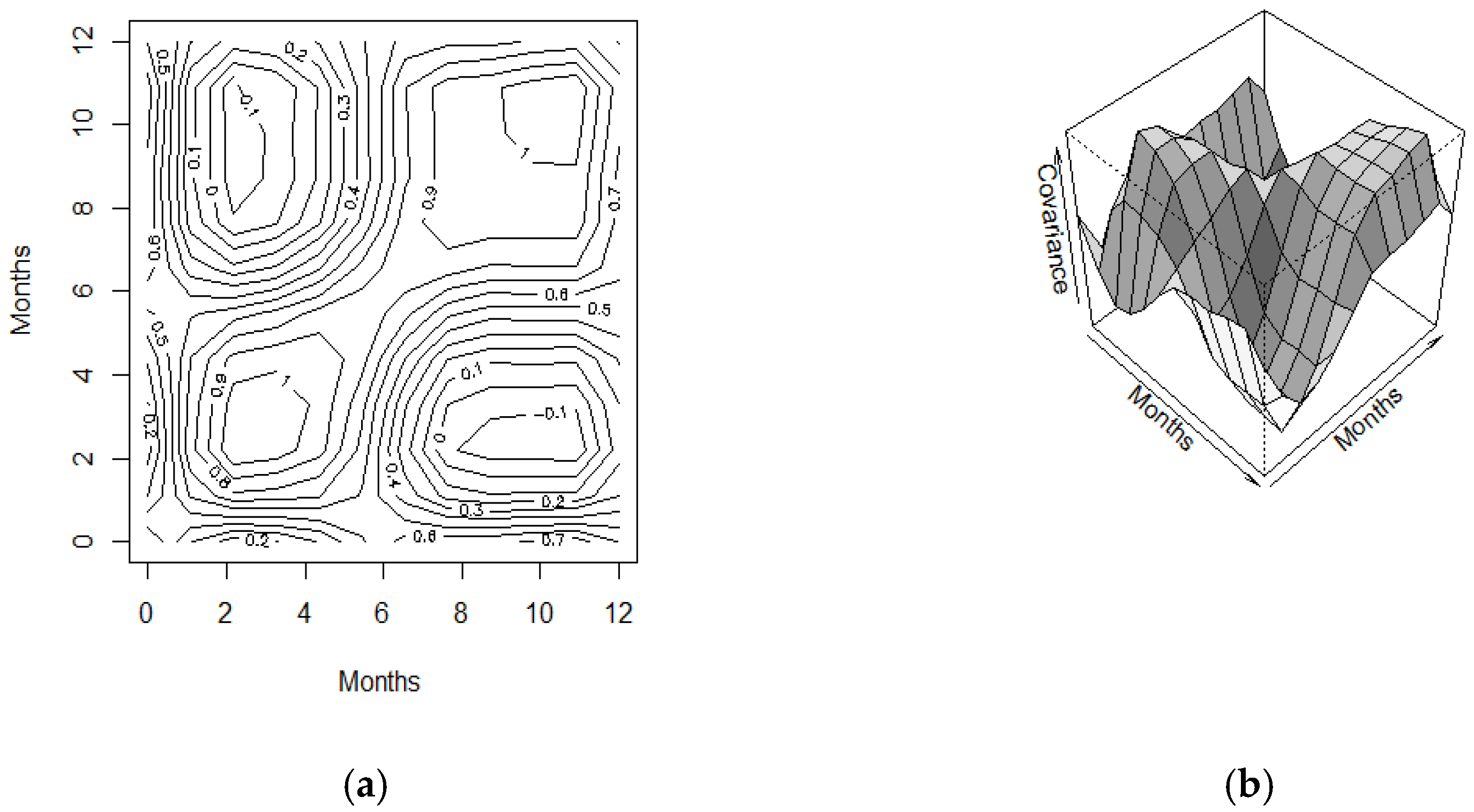
The bivariate (temporal) variance–covariance surface and the corresponding contour map displayed the highest variability between bimonthly February–March. A high variation was also observed in October–November. The concept of a bivariate (temporal) variance–covariance surface and the corresponding contour in this functional analysis offers new approaches to gather information, more so than a single value or matrix obtained via the conventional univariate and multivariate statistical methods. Generally, it could be said that the temporal variation of MEI can be depicted and visualized easily using the functional concept rather than any real values presented in vectors or matrices.
3.3. Results of FPCA
Functional principal component analysis was carried out to identify the primary sources of variation for the multivariate ENSO index. The centered principal components are presented in Figure 6a, while the perturbation about the mean is presented in Figure 6b,c. The first two principal components’ variance rates were 53.8% and 42.6%, respectively, and are shown in Figure 6b,c. These two components accounted for 96.4% of the total variation of the MEI. The first principal component showed negative and positive effects of MEI values, with the largest positive variation in October–November. In contrast, the second principal component showed that MEI was the most variable in February–March. This finding is found to be consistent with the bivariate variance-covariance surface, as shown in Figure 5. Based on Figure 6b, the first principal component could be said to represent the contrast condition between El Niño and La Niña events. Strong El Niño event is observed after May, and the pattern continues until the end of the year. On the other hand, as shown in Figure 6c, the second principal component is more likely to represent El Niño events starting from the early year until July.
Table 1 lists the corresponding scores of the first two principal components. Based on the first principal component scores, the largest positive score was achieved in 1997, followed by 2015 and 1982, while the negative scores were observed for 1988 and the largest in 2010. These years are plotted in Figure 7a,b, respectively.
Figure 7a shows high positive MEI values for the curves of 1982, 1997, and 2015 after April, and the values continued to rise until December. These curves correspond to El Niño years. In contrast to Figure 7a, the negative scores computed in the years 1988 and 2010 show the La Niña events in which strong negative MEI values were detected starting after April and continuing until the end of the year, as shown in Figure 7b. However, the second principal component scores in Figure 8 show that 1983 and 1998 were the years that represented high positive MEI values, with peaks in February–March. Thus, the MEI curves for 1983 and 1998 show that those years experienced strong El Niño events.
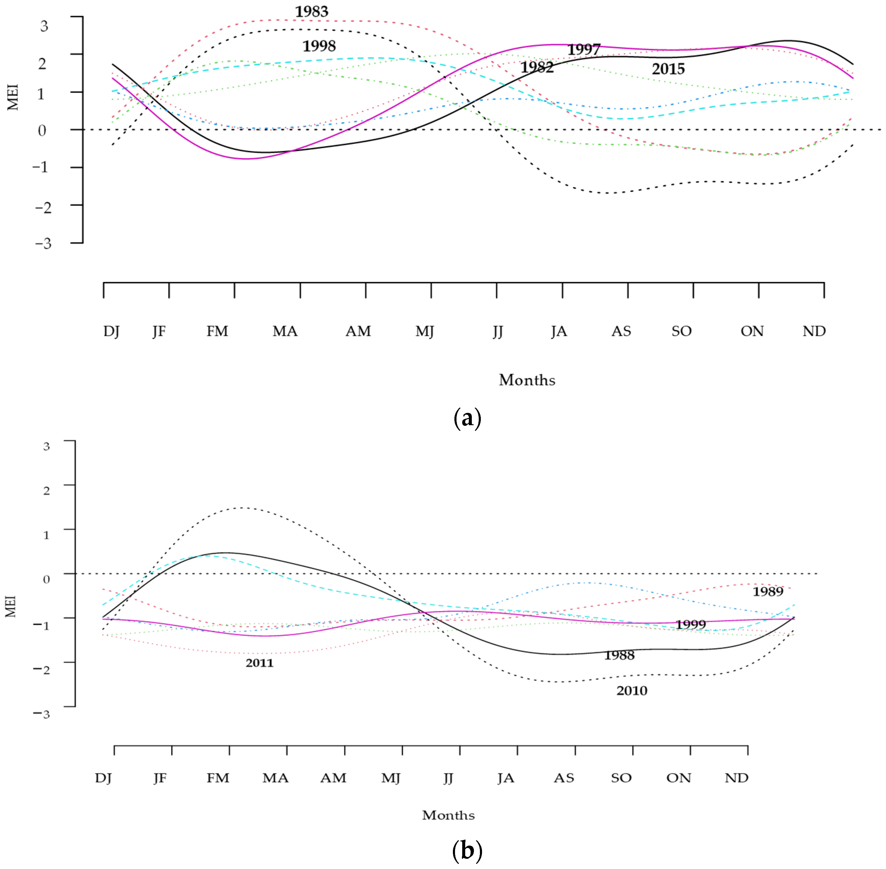
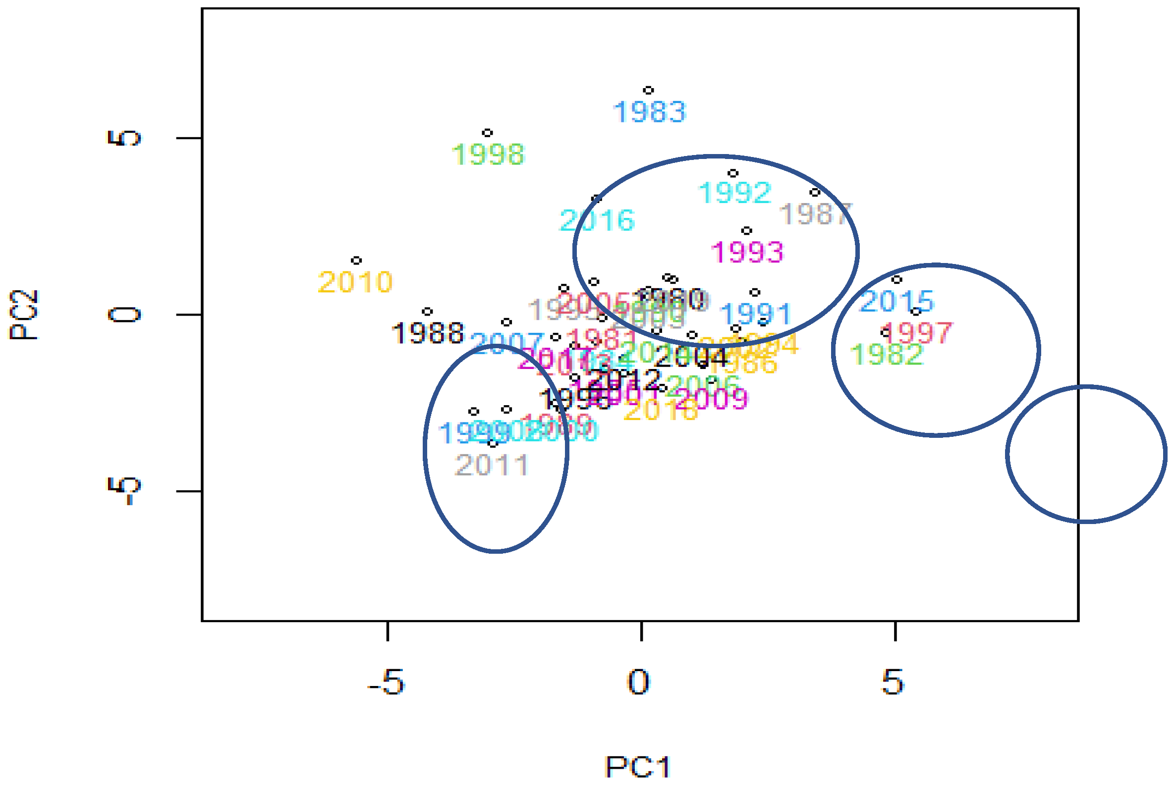
The scores of the first two principal components were then mapped onto Figure 9. The figure shows some exact groupings that reveal the most important type of variation in the MEI curve. The MEI curves can be classified into several clusters. The MEI curves for 1983, 1998, and 2016 may be considered to have their special cluster. Other MEI curves including 1992, 1993, and 1987 may be classified as one cluster, while the curves for 2015, 1997, and 1982 may be considered another cluster. These years may be linked to El Niño events.
Those curves with negative scores computed for FPC1 and FPC2 were considered La Niña years, including 2010, 2011, 1988, 1989,1999, 2007, 2008, and some other curves in Figure 9. In contrast, other MEI curves with positive scores of FPC1 and FPC2 could be said to represent the El Niño years. Based on the mapping scores of FPC1 and FPC2, it is suspected that the MEI curves for 1983 and 1998 could be considered outliers.
3.4. Functional Outliers
Outlier detection methods were applied to justify the unusual years noted above. The rainbow plots of the MEI series, ordered by half-space location depth and the highest density region, are shown in Figure 10a,b. The colors represent the ordering, which follows the order of the rainbow. Figure 10a,b illustrates the order of the curves based on depth and density. The curves closest to the center are shown in red. The outlying curves with lower depth are shown in violet. The results showed that both methods of orderings led to a similar order. In both figures, the red curve corresponds to 2014, while the most outlying curve was 1983.
In order to check the above unusual outliers, outlier detection, functional bagplot, and functional HDR boxplot were employed. The bivariate bagplot and functional bagplot, together with HDR and the associated functional HDR boxplots of the smooth MEI curves, are shown in Figure 11a,b. On the right panels of Figure 11a,b, the dark grey regions show the ‘bag’ and the light grey region displays the ‘fence’. These convex hulls correspond directly to the regions of similar shading in the functional bagplot on the left. All points outside the fence regions were identified as outliers. The different colors for these outliers enabled the individual functional curves on the left to be matched to the bivariate robust principal component scores on the right. In the left panel of Figure 11a, the black lines is the median curve. The blue dotted lines represent 95% pointwise confidence intervals. The curves outside the fence regions are shown as outliers of different colors. The red asterisk on the right panel marks the Tukey median of the bivariate principal scores.
Based on a 95% coverage probability, the detected outliers in the multivariate episode index were 1982, 1983, 1988, 1997, 1998, 2010, and 2015, as shown in Figure 11a. The MEI curves for 1983 and 1998 were outside the fence starting from the early part of the year and continuing until May. For years 1982, 1997, and 2015, the curves were out of the range from July until the end of the year. On the other hand, the MEI curves for 1988, 1998, and 2010 were out of the fence from June until November, with the largest magnitude in 2010. All these curves correspond to El Niño and La Niña years. Strong El Niño episodes were observed in the years 1982–1983 and 1997–1998. During the years 2010–2011, the La Niña phenomenon began to occur in early June 2010. The NOAA reported that the ocean and atmosphere conditions across the Pacific were favorable for the development of a La Niña episode [42].
In contrast to the results shown in Figure 11a, the functional highest-density region (HDR) boxplot showed quite a different result, as shown in Figure 11b. With a 95% coverage probability, the outliers identified were 1983 and 1998. Again, these results corresponded to NOAA in that the recorded years 1982–1983 and 1997–1998 experienced the strongest El Niño phenomenon since 1900 [43]. Referring to Hyndman and Shang [38], the functional HDR boxplot based on the density approach is much better than the depth-based method functional bagplot. The latter may fail to detect those outliers not far from the median.
4. Conclusions
This study discussed the application of a new modern statistical method known as functional data analysis in analyzing climate phenomena. The multivariate ENSO index from 1980 to 2019 was analyzed in terms of smoothing functions, rates of changes, descriptive statistics, percentage of variations, and outliers using functional data analysis tools. The functional results obtained in this study can provide more insight and additional information for people involved in climate systems and represent an alternative way to describe the MEI. However, the present study is limited to profiling and exploration of the multivariate ENSO index.
As a future research direction, we recommend applying a functional framework to examine the functional relationship between MEI and climate variables such as rainfall, temperature, and other related climate variables. Some inferential aspectssuch as parameter estimations and modeling prediction should be applied in future analyses to investigate the impact of MEI on other climate variables.
Funding
This study was funded by the Ministry of Higher Education (MOHE) for the funding given under the Fundamental Research Grant Scheme (FRGS/1/2020/STG06/UTM/02/3) under vote 5F311 and Research University Grant (Q.J130000.3854.19J58) under Universiti Teknologi Malaysia.
Institutional Review Board Statement
Not applicable.
Informed Consent Statement
Not applicable.
Data Availability Statement
Not applicable.
Acknowledgments
The authors would like to express their gratitude to the Ministry of Higher Education (MOHE) for the funding given under the Fundamental Research Grant Scheme (FRGS/1/2020/STG06/UTM/02/3) under vote 5F311. We are also grateful to Universiti Teknologi Malaysia for supporting this project with Research University Grant (QJ130000.3854.19J58).
Conflicts of Interest
The authors declare no conflict of interest.
References
- L’Heureux, M. What Is the El Niño–Southern Oscillation (ENSO) in a Nutshell? Available online: https://www.climate.gov/news-features/blogs/enso/whatni%C3%B1o%E2%80%93southern-oscillation-enso-nutshell (accessed on 28 June 2021).
- Juneng, L.; Tangang, F.T. Evolution of ENSO-related rainfall anomalies in Southeast Asia region and its relationship with atmosphere-ocean variations in Indo-Pacific sector. Clim. Dyn. 2005, 25, 337–350. [Google Scholar] [CrossRef]
- Susilo, G.E.; Yamamoto, K.; Imai, T.; Ishii, Y.; Fukami, H.; Sekine, M. The effect of ENSO on rainfall characteristics in the tropical peatland areas of Central Kalimantan, Indonesia. Hydrol. Sci. J. 2013, 58, 539–548. [Google Scholar] [CrossRef] [Green Version]
- Stanley Raj, A.; Chendhoor, B. Impact of Climate Extremes of El Nina and La Nina in Patterns of Seasonal Rainfall over Coastal Karnataka, India. In India: Climate Change Impacts, Mitigation and Adaptation in Developing Countries; Springer Climate; Islam, M.N., van Amstel, A., Eds.; Springer: Cham, Switzerland, 2021; pp. 227–242. [Google Scholar] [CrossRef]
- Abtew, W.; Trimble, P. El Niño–Southern Oscillation Link to South Florida Hydrology and Water Management Applications. Water. Resour. Manage. 2010, 24, 4255–4271. [Google Scholar] [CrossRef]
- Bayer, A.M.; Danysh, H.E.; Garvich, M.; Gonzálvez, G.; Checkley, W.; Alvarez, M.; Gilman, R.H. The 1997–1998 El Niño as an unforgettable phenomenon in northern Peru: A qualitative study. Disasters 2014, 38, 351–374. [Google Scholar] [CrossRef] [PubMed] [Green Version]
- Ahn, J.H.; Kim, H.S. Nonlinear modelling of El Nino Southern Oscillation Index. J. Hydrol. Eng. 2005, 10, 8–15. [Google Scholar] [CrossRef]
- Brockwell, P.; Davis, A. Time Series: Theory and Methods; Springer: New York, NY, USA, 1987. [Google Scholar]
- Box, G.; Jenkins, G. Time Series Analysis; Holden Day: New York, NY, USA, 1996. [Google Scholar]
- Bosq, D. Non-parametric statistics for stochastic processes, estimation and prediction. In Lecture Notes in Statistics; Springer: New York, NY, USA, 1996; Volume 110. [Google Scholar]
- Collomb, G. From non-parametric regression to non-parametric prediction: Survey on the mean square error and original results on the predictogram. In Lecture Notes in Statistics; Springer: Berlin, Heidelberg; New York, NY, USA, 1983; Volume 16, pp. 182–204. [Google Scholar]
- Gyorfi, L.; Hardle, W.; Sarda, P.; Vieu, P. Non-Parametric Curve Estimation from Time Series; Springer: New York, NY, USA, 1989. [Google Scholar]
- Ham, Y.-G.; Kim, J.-H.; Luo, J.-J. Deep learning for multi-year ENSO forecasts. Nature 2019, 573, 568–572. [Google Scholar] [CrossRef] [PubMed]
- He, D.; Lin, P.; Liu, H.; Ding, L.; Jiang, J. DLENSO: A Deep Learning ENSO Forecasting Model. In Trends in Artificial Intelligence, Lecture Notes in Computer Science; Nayak, A., Sharma, A., Eds.; Springer: Cham, Switzerland, 2019; Volume 11671. [Google Scholar] [CrossRef]
- Huang, A.; Vega-Westhoff, B.; Sriver, R.L. Analyzing El Niño-Southern Oscillation predictability using long-short-term-memory models. Earth Space Sci. 2019, 6, 212–221. [Google Scholar] [CrossRef]
- Pal, M.; Maity, R.; Ratnam, J.V.; Nonaka, M.; Behera, S.K. Long-lead prediction of ENSO Modoki Index using Machine Learning Algorithms. Sci. Rep. 2020, 10, 365. [Google Scholar] [CrossRef]
- Katz, R.W. Sir Gilbert Walker and a connection between El Nino and statistics. Stat. Sci. 2002, 17, 97–112. [Google Scholar] [CrossRef]
- Fedorov, A.V.; Harper, S.L.; Philander, S.G.; Winter, B.; Witternberg, A. How predictable is El Nino. Bull. Am. Meteorol. Soc. 2003, 84, 911–919. [Google Scholar] [CrossRef] [Green Version]
- Gallo, I.C.; Akhavan-Tabatabaei, R.; Sa’nchez-Silva, M.; Bastidas-Arteaga, E. A Markov regime-switching framework to forecast El Nino Southern Oscillation patterns. Nat. Hazards 2015, 81, 829–843. [Google Scholar] [CrossRef] [Green Version]
- Hanley, D.; Bourassa, M.; O’Brien, J.; Smith, S.; Spade, E. A quantitative evaluation of ENSO indices. J. Clim. 2003, 16, 1249–1258. [Google Scholar] [CrossRef]
- Mazzarella, A.; Giuliacci, A.; Scafetta, N. Quantifying the Multivariate ENSO Index (MEI) coupling to CO2 concentration and to the length of day variations. Theor. Appl. Climatol. 2013, 111, 601–607. [Google Scholar] [CrossRef] [Green Version]
- Mazzarella, A.; Giuliacci, A.; Liritzis, I. On the 60-month cycle of multivariate ENSO index. Theor. Appl. Climatol. 2010, 100, 23–27. [Google Scholar] [CrossRef]
- Alaya, M.A.B.; Ternynck, C.; Dabo-Niang, S.; Chebana, F.; Ouarda, T.B.M.J. Change point detection of flood events using a functional data framework. Adv. Water Resour. 2020, 137, 103522. [Google Scholar] [CrossRef]
- Bonner, S.J.; Newlands, N.K.; Heckman, N.E. Modelling regional impacts of climate teleconnections using functional data analysis. Environ. Ecol. Stat. 2014, 21, 1–26. [Google Scholar] [CrossRef]
- Chebana, F.; Dabo-Niang, S.; Ouarda, T.B.M.J. Exploratory functional flood frequency analysis and outlier detection. Water Resour. Res. 2012, 48. [Google Scholar] [CrossRef] [Green Version]
- Hael, M.A. Modeling of rainfall variability using functional principal component method: A case study of Taiz region, Yemen. Model. Earth Syst. Environ. 2020. [Google Scholar] [CrossRef]
- Suhaila, J.; Yusop, Z. Spatial and temporal variability of rainfall data using functional data analysis. Theor. Appl. Climatol. 2017, 129, 229–242. [Google Scholar] [CrossRef]
- Suhaila, J.; Jemain, A.A.; Hamdan, M.F.; Zin, W.W.Z. Comparing rainfall patterns between regions in Peninsular Malaysia via functional data analysis techniques. J. Hydrol. 2011, 411, 197–206. [Google Scholar] [CrossRef]
- Wang, J.L.; Chiou, J.M.; Muller, H.G. Review of functional data analysis. Annu. Rev. Stat. 2015, 3, 257–295. [Google Scholar] [CrossRef] [Green Version]
- Ullah, S.; Finch, C.F. Applications of functional data analysis: A systematic review. BMC Med. Res. Methodol. 2013, 13, 43. [Google Scholar] [CrossRef] [PubMed] [Green Version]
- Wolter, K.; Timlin, M.S. Monitoring ENSO in COADS with a seasonally adjusted principal component index. In Proceedings of the 17th Climate Diagnostics Workshop, Norman, OK, USA, 18–23 October 1992; Volume 52, pp. 52–57. [Google Scholar]
- Wolter, K.; Timlin, M.S. El Niño/Southern Oscillation behaviour since 1871 as diagnosed in an extended multivariate ENSO index (MEI.ext). Int. J. Climatol. 2011, 31, 1074–1087. [Google Scholar] [CrossRef]
- Ramsay, J.O.; Silverman, B. Functional Data Analysis; Springer: New York, NY, USA, 2005. [Google Scholar]
- Levitin, D.J.; Nuzzo, R.L.; Vines, B.W.; Ramsay, J.O. Introduction to functional data analysis. Can. Psychol. 2007, 48, 135–155. [Google Scholar] [CrossRef] [Green Version]
- Fraiman, R.; Muniz, G. Trimmed means for functional data. Test 2001, 10, 419–440. [Google Scholar] [CrossRef]
- Febrero, M.; Galeano, P.; Gonzalez-Manteiga, W. Outlier detection in functional data by depth measures, with application to identify abnormal NOx levels. Environmetrics 2008, 19, 331–345. [Google Scholar] [CrossRef]
- Shang, H.L. A survey of functional principal component analysis. AStA Adv. Stat. Anal. 2014, 98, 121–142. [Google Scholar] [CrossRef] [Green Version]
- Hyndman, R.J.; Shang, H.L. Rainbow Plots, Bagplots, and Boxplots for Functional Data. J. Comput. Graph. Stat. 2010, 19, 29–45. [Google Scholar] [CrossRef] [Green Version]
- Tukey, J.W. Mathematics and the picturing of data. In Proceedings of the International Congress of Mathematicians 1974 Vancouver, 21–29 August 1974; Canadian Mathematical Society Ottawa: Ottawa, CA, Canada, 1975; Volume 2, pp. 523–531. [Google Scholar]
- Rousseeuw, P.J.; Ruts, I.; Tukey, J.W. The bagplot: A bivariate boxplot. Am. Stat. 1999, 53, 382–387. [Google Scholar]
- Hyndman, R.J. Computing and Graphing Highest Density Regions. Am. Stat. 1996, 50, 120–126. [Google Scholar]
- Lindsey, R. La Niña Continuing in the New Year. Available online: https://www.climate.gov/news-features/event-tracker/2010-la-ni%C3%B1a-continuing-new-year (accessed on 28 June 2021).
- What Is El Niño? Available online: https://www.pmel.noaa.gov/elnino/what-is-el-nino (accessed on 28 June 2021).
Figure 1.
Smoothing curve of multivariate ENSO indices during the (a) strong El Niño years and (b) strong La Niña years.
Figure 1.
Smoothing curve of multivariate ENSO indices during the (a) strong El Niño years and (b) strong La Niña years.

Figure 2.
Smoothing MEI curves of La Niña years and their corresponding rates of change: (a) 1988–1989, (b) 2010–2011.
Figure 2.
Smoothing MEI curves of La Niña years and their corresponding rates of change: (a) 1988–1989, (b) 2010–2011.
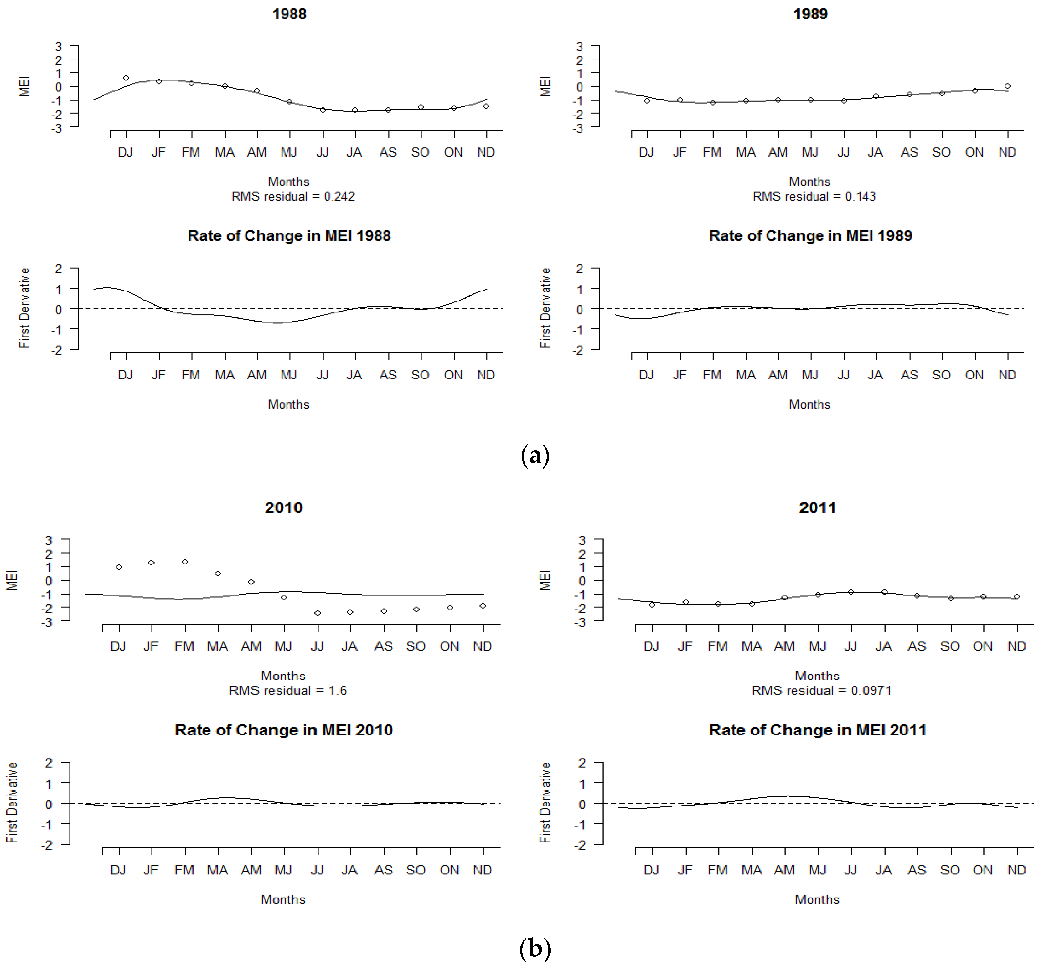
Figure 3.
Smoothing MEI curves of El Niño years and their corresponding rates of change: (a) 1982–1983, (b) 1997–1998.
Figure 3.
Smoothing MEI curves of El Niño years and their corresponding rates of change: (a) 1982–1983, (b) 1997–1998.

Figure 4.
Plot of (a) functional means and (b) functional variance of MEI.

Figure 5.
(a) Estimated variance surface of multivariate ENSO from 1980 to 2019 and (b) the corresponding contour maps.
Figure 5.
(a) Estimated variance surface of multivariate ENSO from 1980 to 2019 and (b) the corresponding contour maps.

Figure 6.
(a) The centered harmonic function of FPCs; plot of the first two principal components (b) FPC1 and (c) FPC2 with the negative and positive perturbations.
Figure 6.
(a) The centered harmonic function of FPCs; plot of the first two principal components (b) FPC1 and (c) FPC2 with the negative and positive perturbations.
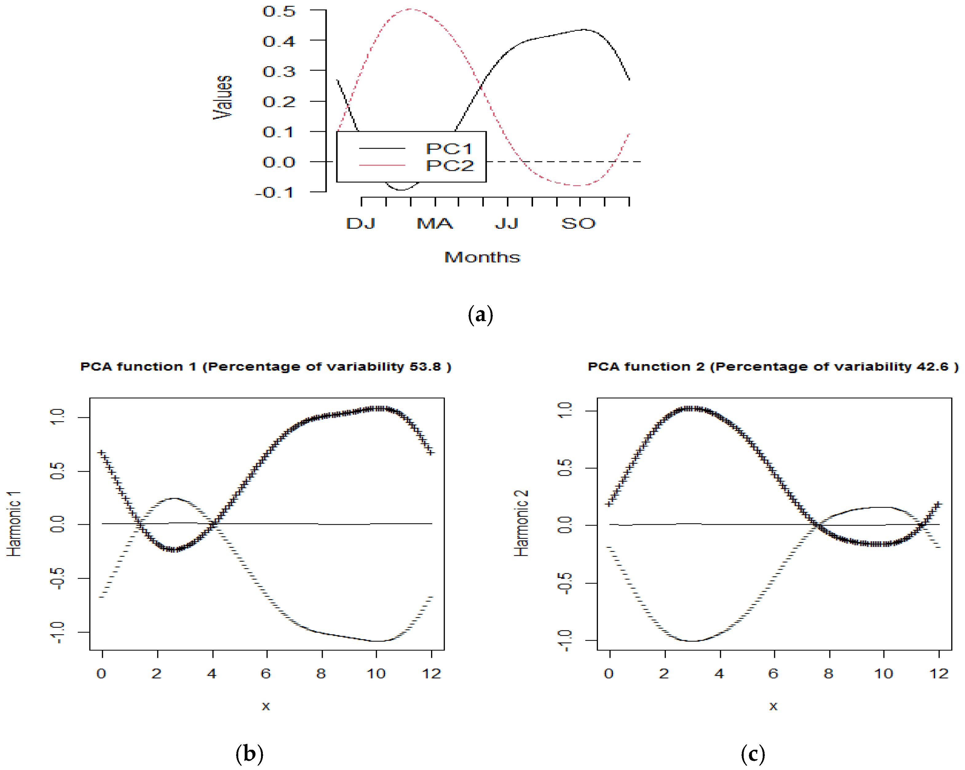
Figure 7.
The functional MEI for the first principal component: (a) positive and (b) negative scores of the corresponding years.
Figure 7.
The functional MEI for the first principal component: (a) positive and (b) negative scores of the corresponding years.
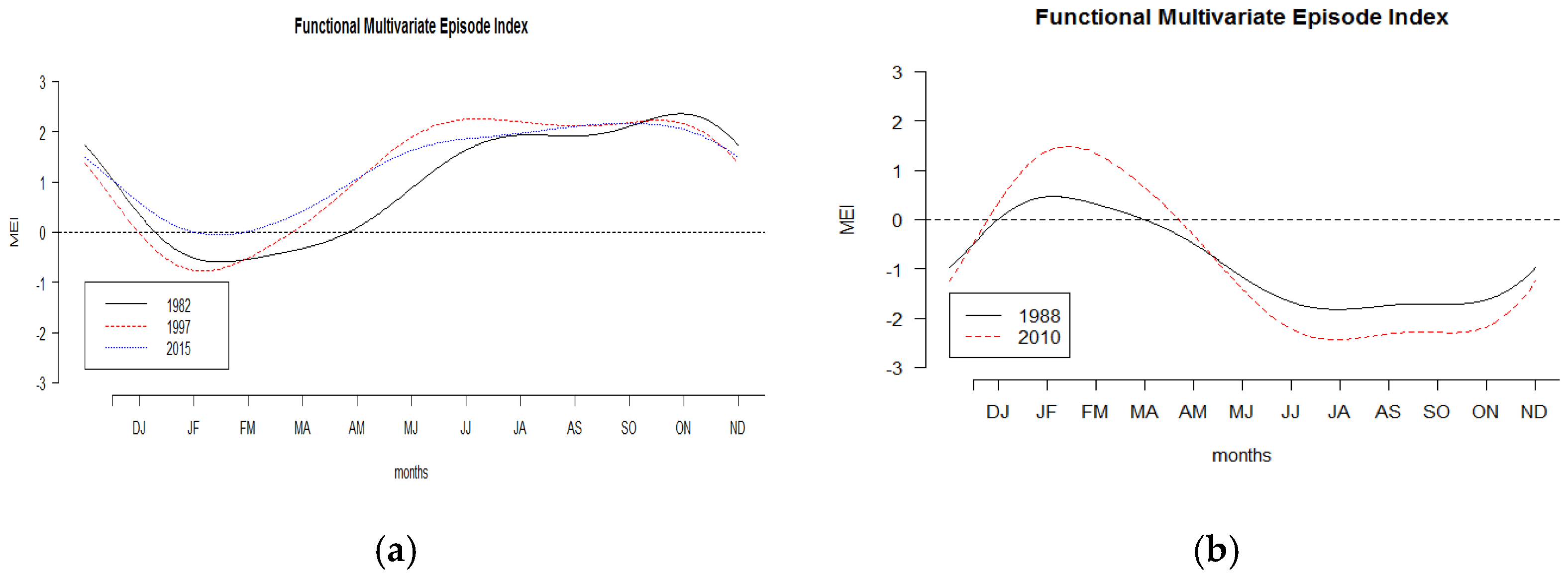
Figure 8.
The functional MEI for the second principal component with positive scores of the corresponding years.
Figure 8.
The functional MEI for the second principal component with positive scores of the corresponding years.

Figure 9.
Scores of the first and second functional principal component analyses.

Figure 10.
(a) Rainbow plot of multivariate ENSO index with depth ordering. (b) Rainbow plot of multivariate ENSO index with density ordering.
Figure 10.
(a) Rainbow plot of multivariate ENSO index with depth ordering. (b) Rainbow plot of multivariate ENSO index with density ordering.

Figure 11.
(a) Functional bagplot and bivariate bagplot. (b) Functional HDR and bivariate HDR. The points outside the fence regions are the outliers of different colors.
Figure 11.
(a) Functional bagplot and bivariate bagplot. (b) Functional HDR and bivariate HDR. The points outside the fence regions are the outliers of different colors.


Table 1.
The scores of the first and second principal component FPCs.
| YEAR | FPC1 | FPC2 |
|---|---|---|
| 1980 | 0.5634 | 1.0129 |
| 1981 | −0.7354 | −0.1321 |
| 1982 | 4.8422 | −0.5380 |
| 1983 | 0.1909 | 6.2850 |
| 1984 | −0.8539 | −0.7648 |
| 1985 | −0.6886 | −1.5971 |
| 1986 | 1.9950 | −0.8023 |
| 1987 | 3.4397 | 3.4135 |
| 1988 | −4.1807 | 0.0654 |
| 1989 | −1.6430 | −2.5272 |
| 1990 | 0.1904 | 0.6399 |
| 1991 | 2.2735 | 0.6008 |
| 1992 | 1.8214 | 3.9927 |
| 1993 | 2.0924 | 2.3116 |
| 1994 | 2.4518 | −0.2431 |
| 1995 | −1.4697 | 0.6950 |
| 1996 | −1.2976 | −1.8288 |
| 1997 | 5.4765 | 0.0473 |
| 1998 | −3.0029 | 5.0775 |
| 1999 | −3.2550 | −2.7936 |
| 2000 | −1.5200 | −2.7340 |
| 2001 | −0.3334 | −1.6938 |
| 2002 | 1.8934 | −0.4078 |
| 2003 | 0.1893 | 0.4581 |
| 2004 | 1.0644 | −0.5939 |
| 2005 | −0.8842 | 0.8795 |
| 2006 | 1.2594 | −1.4574 |
| 2007 | −2.6395 | −0.2433 |
| 2008 | −2.5981 | −2.7190 |
| 2009 | 1.4150 | −1.8415 |
| 2010 | −5.5991 | 1.4806 |
| 2011 | −2.8756 | −3.6729 |
| 2012 | −0.3109 | −1.2757 |
| 2013 | −1.2971 | −0.8870 |
| 2014 | 0.3250 | −0.5038 |
| 2015 | 5.0918 | 0.9263 |
| 2016 | −0.8640 | 3.2373 |
| 2017 | −1.6409 | −0.6941 |
| 2018 | 0.4335 | −2.1305 |
| 2019 | 0.6808 | 0.9584 |
The bold values correspond to the largest and the smallest values.
Publisher’s Note: MDPI stays neutral with regard to jurisdictional claims in published maps and institutional affiliations. |
© 2021 by the author. Licensee MDPI, Basel, Switzerland. This article is an open access article distributed under the terms and conditions of the Creative Commons Attribution (CC BY) license (https://creativecommons.org/licenses/by/4.0/).
Share and Cite
MDPI and ACS Style
Suhaila, J. Functional Data Visualization and Outlier Detection on the Anomaly of El Niño Southern Oscillation. Climate 2021, 9, 118. https://doi.org/10.3390/cli9070118
AMA Style
Suhaila J. Functional Data Visualization and Outlier Detection on the Anomaly of El Niño Southern Oscillation. Climate. 2021; 9(7):118. https://doi.org/10.3390/cli9070118
Chicago/Turabian StyleSuhaila, Jamaludin. 2021. "Functional Data Visualization and Outlier Detection on the Anomaly of El Niño Southern Oscillation" Climate 9, no. 7: 118. https://doi.org/10.3390/cli9070118
Note that from the first issue of 2016, this journal uses article numbers instead of page numbers. See further details here.