Abstract
Usability is a principal aspect of the system development process to improve and augment system facilities and meet users’ needs and necessities in all domains. It is no exception for cultural heritage. Usability problems of the interactive technology practice in cultural heritage museums should be recognized thoroughly from the viewpoints of experts and users. This paper reports on a two-phase empirical study to identify the usability problems in audio guides and websites of cultural heritage museums in Vietnam, as a developing country, and Australia, as a developed country. In phase one, five-user experience experts identified usability problems using the set of usability heuristics, and proposed suggestions to mitigate these issues. Ten usability heuristics identified a total of 176 problems for audio guides and websites. In phase two, we conducted field usability surveys to collect the real users’ opinions to detect the usability issues and examine the negative-ranked usability. The outstanding issues for audio guides and websites were pointed out. Identification of relevant usability issues and users’ and experts’ suggestions for these technologies should be given immediate attention to helping organizations and interactive service providers improve technologies’ adoptions. The paper’s findings are reliable inputs for our future study about the preeminent UX framework for interactive technology in the CH domain.
1. Introduction
Visitor experience in cultural heritage (CH) sites has undergone positive changes, including enhanced audience engagement and improved learning experiences influenced by the evolution of interactive technologies in the domain [1,2]. The affordance of interactive technology is recognized by cultural organizations to encourage creative interaction with spaces and artefacts, provide inventive ways of engagement, and extract new kinds of meaning from previously inaccessible archives [3]. It is no doubt that the recent increase in interactive applications in the cultural spaces allows the visitors to experience the artefacts, visits, and exhibitions in more effective and attractive ways. CH interactive applications consist of smartphone apps and games, location-aware audio guides, VR/AR (virtual/augmented reality) technologies, online virtual worlds, multi-touch screens, and different types of interfaces that transcend CH content to users [4].
CH spaces have a long history of adapting mobile technologies, including audio guides. Together with using the app physically at museums, websites are also an important means to offer museum services to visitors/users. However, like other areas, the objectives of CH spaces to enhance the visitors’ experiences cannot be achieved if the critical usability issues that pertain to both interactive applications and websites are not adequately resolved. To meet the high user expectations, designers have applied user center design methodology by bringing users into the design process on creating products or services to interpret and effectively satisfy users’ needs. It is no exception in the field of CH. Usability and user experience (UX) have always been the predominant concern of software products. Usability and UX are indicators for successful interaction designs.
From the existing work, the interactive technologies’ situation in CH spaces in developing countries have been partly shown. VR/AR has been deployed to preserve and enhance the CH in some developing countries such as Indonesia (Banten E-heritage) [5], Africa (The tales of the Tokoloshe) [6]. However, there are remarkable gaps in CH budget distribution and management in developed and developing countries. For example, the limited financial allocation at the Indian national museums makes them uninspiring, hardly drawing any visitors [7]. Donatella and Bertacchini [8] showed the vicious circle in the developing nations, in which the low level of development obstructs culture promotion. In contrast, the unsuccessful exploitation of domestic heritage impedes the chances of culture-based development strategies. To analyze the challenges and opportunities of CH management in developing countries, Altschul showed that frameworks maintaining a balance between cultural heritage and economic development in those nations do not exist or are ineffectual [9]. In general, the situations of how the interactive technologies are applied in national CH museums in the developing country and their usability issues have not been mentioned officially in existing work. However, via those papers, we can somehow understand the financial circumstance in deploying the technology in CH spaces in developing countries.
Vietnam’s culture is a colorful picture of “unity in diversity”, the essence and convergence of unique cultural values of 54 ethnic groups. Therefore, like other CH of other countries, they should be preserved and promoted because of their high values and uniqueness. Vietnamese museums nowadays are keen on presenting their objects in the most appealing and exciting way in order to magnetize visitors. Some national Vietnamese CH museums, including the VNMH, the Museum of Vietnamese Ethnic Culture, and the archaeological museum, have piloted interactive technologies such as touch displays, audio guides, and 3D content. Such interactive technology infrastructures capture visitors’ attention and motivate them to learn and engage in exhibits, resulting in a memorable and immersive learning experience [10]. However, this statement is based on the general observation; there had no statistic number from an interview or survey. Vietnamese CH institutions lack necessary interactions with visitors. Besides the appealing display of museum artifacts, ways to make museums are competitive with other forms of entertainment are Vietnamese museums’ concerns [11]. There is still minimal and intermittent interactive technology implementation in the Vietnamese CH domain [12]. Therefore, the Vietnamese government has introduced policies to enhance usability and visitors’ experience by adopting more interactive technologies in the museums displays and exhibitions [13].
In a developed country, Australian museums have a long-standing framework that other nations should benefit from the current system [14]. Lehman [15] highlighted a strong demand for immersive technologies, such as storytelling, audio guide, and VR expressed in the strategic or master plans of museums, such as New South Wales museums and galleries [16], and Australian museums [17]. Australian museums have successfully deployed modern technologies that other countries can learn, with no exception for Vietnam [14]. In the context of developing countries, an ICT evolution in CH organizations is critical. Additionally, to propose a preeminent UX framework for interactive museum technologies, especially during and after COVID-19 pandemic. The interactive technologies and their shortcomings should be understood and evaluated. Therefore, usability problems that the UX experts and actual users have experienced for developing and developed countries are essential and necessary to recognize.
The term “interactive technologies” used in this study refers to audio guides and museum websites/virtual museums. Although the audio guide is quite dated technology that has been utilized in CH venues, it is one of the primary devices conveying the message from the artefacts and exhibitions to the Vietnamese CH national museums’ visitors. Besides physical visits, online visits via websites are the common way to connect the community to museums. Therefore, audio guides and websites were chosen as interactive technologies to conduct the surveys.
Our research was carried out in two independent phases with the primary aim to examine the interactive technologies’ usability issues (phase 1) and what usability was ranked negatively (phase 2) from national museums in developing and developed countries. In phase 1, we conducted a HE with five UX experts examining the CH audio guides and websites/virtual museums to identify their usability problems and collect suggestions to improve these interactive technologies at CH locations. For phase 2, we conducted two usability surveys with 205 visitors visiting the museums physically. The purpose of the surveys is to examine the opposing ranks (including strongly disagree and disagree rank from the five-point Likert scale) of interactive apps and websites in Vietnam (as a developing country) and Australia (as a developed country).
This paper presents the results from the two phases and concludes with the usability issues of these technologies from the viewpoint of UX experts and real users. Additionally, the overview considerations for the interactive technology deployment in CH museums are presented. The reasons to conduct the two-phase study are the combination of the two techniques helping identify more usability problems of the systems [18]. Our method meets more attributes of positive cultural UX, including usefulness, ease of use, efficiency, accessibility, and identification [19,20], and increases the reliability of the data collected [21].
In phase 1, we used the checklist, mainly from Nielsen [22] with heuristic explanations [23] to conduct the HE. It involves the insight of five UX experts to assess the usability of museums’ audio guides and websites based on a set of predefined heuristics.
In phase 2, we developed the questionnaires based on the comprehensive questionnaires for multimedia guide experience from Othman [24], which were constructed on the variety of studies and professional organizations from the UK, and the criteria for evaluating the usability of the interactive device [25]. The synthetic questionnaires were used for another research on designing good UX for CH interactive technologies in developed and developing countries. These usability surveys are parts of that research.
Commonly, large national museums frequently have some supplies or funds for employing professionals to design their online museum effectively, while small museums face difficulties in developing and maintaining their official websites [26]. Vietnamese and Australian museums also have faced the same situations. The government’s investment in museums is uneven. It is widely noticed that the small local museums are not receiving the necessary financial support from the national government [26]. Therefore, the reasons these museums were chosen as the spaces to conduct the research are easy to interpret. Three national museums were chosen to examine their interactive technologies, including two national museums in Vietnam, namely the Vietnamese National Museum of History (VNMH) and the Hanoi Temple of Literature (TL), and one in Australia, the National Museum of Australia (NMA). Those three museums were selected as they share similar traits suitable for our study: government-owned museums; and provide an interactive application(s) and virtual exhibition(s) via the website.
2. Literature Review
The existing papers have shown how the usability and usability evaluations of CH products/apps are essential; and how these evaluations were conducted in the CH context.
2.1. Usability, User Experience and Heuristic Evaluation
Usability is part of the broader term UX and refers to the ease of access and or use of a product or website. Usability has been a principal aspect of the system development process to improve and augment system facilities and meet users’ needs and necessities. According to Nielsen, usability frequently means how well users can utilize the system’s functionality [27]. Unusable user interfaces are probably the single most prominent reasons for combining of interactive systems—computers and people, fail in actual use [28]. Usability is defined as the degree to which specified users can achieve specified goals in a particular environment, with effectiveness, efficiency, and satisfaction and in an acceptable way [29].
UX is related to the users’ emotions and perceptions leading to the use or the anticipated use of the product [30]. UX has also gone beyond traditional usability engineering, including users’ feelings, motivations and values, which are given more emphasis in addition to the efficiency, effectiveness and basic satisfaction, considered as the traditional meaning of usability [31].
In the relationship with usability, UX is tightly coupled with usability. According to Nigel Bevan [32], there is no elemental difference between usability and UX; however, there are some differences regarding task performance and pleasure in the development phase. UX has also gone beyond traditional usability engineering, including users’ feelings, motivations and values, which are given more emphasis in addition to efficiency, effectiveness and basic satisfaction. These aspects have been defined as the traditional meaning of usability [31]. Usability and UX, nowadays, have been the success ingredients of the software products, and indicators for successful interaction designs.
A usability assessment is defined as evaluating the user interface to identify usability issues in a design [33]. The usability evaluation’s objective is to identify as much as possible potential issue that the users could have with an application ([34] as cited in [35]). UX research, however, may include usability metrics from the viewpoint of visitors, such as effectiveness, efficiency and satisfaction.
The data collection to measure different usability metrics can ultimately contribute to better software development decision-makers, whether they are software developers, team managers, or usability developers [28].
Heuristic evaluation (HE) is critical for finding usability defects. Heuristic evaluations are prevalent, quick, and inexpensive techniques used for analyzing usability. HE is defined as an informal approach of usability analysis where several evaluators are presented with an interface design and inquired about commenting on it [21]. The evaluation has been performed in computer games, e-learning, mobile map applications, health social networking websites, gestural interaction, and heuristics with cultural aspects, to name but a few [36,37,38]. HE is one of the most actively used and researched usability techniques from numerous related studies. Among the related theories, interaction refers to an abstract model by which humans interact with the computing device for performing a given task. Nielsen [22] proposed a guideline for conducting HE. A minimum of three to five individuals are selected to lead the HE that can identify an average of 74% to 87% of the problems.
The methodologies of usability heuristics vary, including literature reviews, usability problems; mixing processes; guidelines, principles, or design recommendations, interviews, and theories [39]. The authors also illustrated that many researchers and practitioners have successfully used Nielsen’s heuristics; however, some researchers found it necessary to modify them in some ways. Likewise, Silva et al. [40] also showed that Nielsen’s heuristics are still the most preferred by the many previous researchers. Additionally, although being developed some new criteria, the new heuristics from TMD Heuristics [41] or SMASH heuristics were evaluated to be essentially like Nielsen’s [42].
In general, the heuristics of Nielsen could be applied in multiple contexts and audiences. In the next section, we will present an overview of the research about usability and its evaluations in the CH domain. Most studies about usability evaluations are HE.
2.2. Heuristic Evaluation in Cultural Heritage
Several researchers have proposed sets of heuristics based on Nielsen’s usability heuristics for websites in the CH environment. For example, Tehrani et al. [43] and Pallas and Economides [26] conducted research on virtual museum, and art museum websites. Additionally, heuristics for interactive applications in CH have also been addressed by many studies. For example, Gómez et al. [23] and Inostroza et al. [41] researched on usability heuristics of mobile devices, standard technologies in CH. The following two sub-sections provide closer views about how usability heuristics have been conducted in applications and websites of the CH domain.
2.2.1. Heuristic Evaluation for Interactive Applications
There are various techniques and methods which can be employed in the usability assessment of software, including mobile guide, AR, or VR. Gómez et al. [23] proposed a compilation of HE checklists taken from the existing bibliography but readapted to new mobile interfaces. Selecting and rearranging these heuristic guidelines provides a useful tool for both evaluation and a best-practices checklist. This experiment shows that the proposed checklist is very useful to avoid usability gaps even with non-trained developers. The resulting framework includes 13 sub-heuristics for mobile (adapted from 10 Nielsen usability heuristics and three new ones). The three new sub-heuristics are skills, pleasurable and respectful interaction, and privacy (See Figure 1). Inostroza et al. [41] proposed the 12-item usability heuristic set, which was also based on Nielsen’s heuristics and modified a new attribute, physical interaction and ergonomics. According to these researchers, traditional methods for usability measuring do not fit the nature of interactive devices. Both above studies used the same approach: usability heuristics developed using a mixing process involving the existing heuristics (Nielsen’s heuristics) in the mobile context.
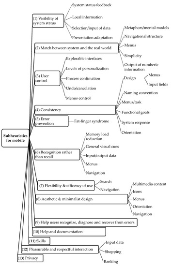
Figure 1.
13 sub-heuristics for mobile devices adapted from Gómez [23].
Unlike ordinary software applications, in the case of AR, numerous devices can be employed, such as handheld, head-mounted, large screens with projecting devices and sound devices and interfaces that the user interacts with, using movements or gestures. The usability evaluation of AR interfaces becomes an essential procedure that should be part of their development process, as in the case of common software. Likewise, Murtza et al. [44] introduced new sets of heuristics that can be used to carry out usability inspections of VR systems via the HE method.
In conclusion, there are almost no research studies investigating usability evaluations about interactive technologies in national CH museums of both developing and developed countries. Ten usability factors of Nielsen can be modified and adjusted to suit the new generation of products. For audio guide’s usability evaluation in this study, ten usability heuristics of Nielsen [22] with the detailed explanations from Gómez’s et al. [23] should be considered as the best new sets of heuristics to form a checklist to measure the usability of interactive applications and websites in CH environment.
2.2.2. Heuristic Evaluation for Websites
The CH of a nation symbolizes an invaluable inheritance for both citizens to understand and explain the origin of customs and traditions and for the tourism sector to attract foreign visitors. Internet and technologies have enabled CH institutions to provide access to their collections in multiple ways, both on-site and online, and attract even more audiences. Fotakis and Economides [45] showed that museums have used the Internet to make their presence known, exhibit their artefacts virtually, and communicate widely with the community during recent years. Thus, many museums have focused on improving their virtual presences and services. To make CH websites more effective, researchers have measured the effectiveness of users’ interaction and websites’ attraction. In this context, user needs in the CH domain also vary. Usability evaluation assesses the ease of using a website’s functions and how well they enable users to perform their tasks efficiently [46]. Besides, CH has been a challenging domain of application in the information and communication technologies area. The use of modern technologies was recognized to be one of the principal methods to approach the mass audience and therefore to effectively promote and show the CH of nations. It is proved that technology-supported natural HCI is a critical factor in enabling access to CH assets. Advances in ICT provide the best conditions for visitors to access collections online and better experience CH on-site. Designing effective interfaces for CH websites is the destination that the organizations desire to achieve. Various institutions provide access to their collections both on-site and online, aiming to attract more comprehensive users than those that visit the physical sites. The most effective methods which can be deployed to make successful CH displays consist in attracting the visitors’ attention and improving their engagement. Lazarinis et al. [47] evaluated the technical capability of tourism and cultural websites to recognize the available options provided to users. Lazarinis et al.’s conclusions that besides the rich multimedia content, websites need to support users more efficiently by providing more services or customizing e-services.
To assess the Augmented Representation of Cultural Objects system of the virtual museum exhibition, Karoulis et al. [48] used the combination of empirical and expert-based methods. The questionnaire for museum curators and cognitive walkthrough for visitors were conducted. Karoulis et al. [48] stated that the combination of an expert-based method with the real user-based method, which is less resource consuming and more reliable is promising to valuate interfaces of a complex cultural heritage virtual interfaces.
From another point of view, the audiences’ websites are from across regional, languages, and boundaries, and they require the websites designed influentially by their local cultural perspectives. Meanwhile, cross-cultural usability is making a website an effective “bridge” between the global web owner and the local user. Consideration about the (H2) Nielsen’s heuristics, “match between system and the real world” and the intercultural usability heuristics, Díaz et al. [49] confirmed that the independent of the objective culture, the website should “speak” the language of its users with words, phrases, and concepts familiar to them. This viewpoint makes the possible actions easy to comprehend, rather than using concepts related to the system or jargons. Therefore, the measure of cross-cultural usability has become contentious in the area of HCI [39].
Harms and Schweibenz [50] conducted a study to evaluate the usability of Saarland’s museum website. Their first aim was to assess some evaluation methods, and the second was to improve the usability of the Saarland Museum website. They adopted a combination of HE and user testing as suggested in their research literature. The HE detected numerous usability problems in comparison with the laboratory test.
An expert review checkpoint, essential for enhancing the usability of the platform, was developed by Travis [51]. While developing functional systems requires much more than simply applying guidelines, by encouraging continuity and good practice, guidelines can also make a significant contribution to usability. The overview of the results is clearly displayed by expert review checkpoints that use the spider web according to the specified criteria.
For virtual museums, Tehrani et al. [43] stated that this kind of museum could present UX in visualizing the real museum. The usability problems for the Virtual Museum Negara prototype and calculate the experts’ results via the Content Validity Index in improving the interface design were identified via some factual statements of 10 usability heuristics of Nielsen.
Ten usability heuristics of Nielsen are the foundation for HE because they apply to multiple contexts and audiences. However, due to the innovative traits of new applications, new sets of usability heuristics, modifying Nielsen’s heuristics and or adding new heuristics to evaluate interactive applications and websites in the domain of CH are needed. Although the nature of these two environments of interactive applications and websites are different, to measure the usability of interactive technologies in general, the same synthesized checklist with the most common characteristics about them should be used to make the evaluation process more convenient.
3. Study Design
Using these mixed methods of HE and user surveys satisfies a pragmatic category with five attributes, including usefulness, reliability, ease of use, efficiency, and accessibility [19,20]. Nielsen [24] concluded that usability specialists evaluate much better than those without usability expertise at finding usability problems. Therefore, based on these reasons, collecting the results from both expert-based evaluation (phase 1) and user-based survey (phase 2) is a good and reliable approach to detect usability errors of CH interactive technologies.
3.1. Heuristic Evaluation in Phase 1
In phase 1, the HE was carried out to identify the usability issues about the designs of the interactive applications and websites. After careful analysis, some issues were raised by the evaluators regarding the usability aspects. The problems identified by the evaluators through the HE were listed together with their suggestions.
Nielsen proposed a four-point-rating scale to evaluate the severity of a problem: 1 = a ‘cosmetic problem’, the user will be mildly frustrated, and it would be nice to fix; 2 = a ‘minor problem’, users will be frustrated/have difficulty continuing to their goal, could be fixed; 3 = a ‘major problem’, users will be very frustrated/having difficulty continuing to their goal, should be fixe; and 4 = a ‘catastrophic problem’, users will not be able to continue to their goal, must be fixed [33]. The results will be presented in Section 4.1.
3.1.1. Method
Our heuristic study for audio guide and website evaluations applied a customized checklist to identify usability issues from the three national museums. We recognized that the last three heuristics from Gómez’s et al. [23] are not suitable for our evaluation, such as personal data (privacy); and data entry (pleasurable and respectful interaction), and input devices, or novice and expert users (skills). Moreover, the physical interaction and ergonomics from Inostroza [41], which shows the characteristic of the interactive app (such as physical buttons, audio guides’ size), need to be considered in the evaluation. Therefore, our checklist added this sub-heuristic, SH35-Physical interface/buttons, for only audio guides and placed it under (H8) Aesthetic and minimalist design. The physical interface and button designs were likely thought related to H8, H3 (User control/Freedom), or H7 (Flexibility and Efficiency of use). We agreed to place this sub-heuristic, Physical interface/buttons, under H8 (see Table 1). This study consented that the essential criterion is detecting the usability issues of the system rather than paying attention to the position of this sub-heuristic.

Table 1.
Checklist for Heuristic Evaluation.
In summary, the checklist is available for UX experts, which can be considered a comprehensive checklist mainly adapted from the 10 usability heuristics from Nielsen, with detailed explanations from Gómes et al. [23].
3.1.2. Participants
In this phase, the evaluation was carried out by five evaluators who had UX knowledge. They evaluated the usability aspects of the interactive applications and websites using the customized heuristics checklist. We invited these five participants via the professional network of our group members and the UX Design Group Meetups in Melbourne. The evaluators are Vietnamese and Australian, who are working at a private companies and universities in the area of UX. UX experts all confirmed that they are interaction designers (AR/VR), UX engineers, or UI designers. All UX experts are familiar with Nielsen’s heuristics. The evaluated information is in English, including the videos about audio guides’ operations and websites. The information about their years’ experience in UX has not been sufficiently collected.
3.1.3. Procedures
Five UX experts conducted the heuristic evaluations, for both museum website and interactive application evaluations. The checklist was sent to the UX experts to evaluate for both audio guides and museums websites.
For audio guides, in each museum, videos about its operation (all in English) were filmed and sent to the evaluators. The length of each video is 3 min maximum and were recorded by the camera with at least 7.2 megapixel (the general rule for high-quality sharp prints is 300 pixels per inch) to guarantee the effective visualizations. We had three videos with 3:00, 2:05, and 2:15 min length for VNMH, TL, and NMA, respectively. To evaluate the usability of audio guides and websites, in this research, we consented that the quality of a video would not be paid much attention; instead, we focused on the performance of these applications (Figure 2). Expert-based evaluations were conducted via video of visitors’ interactions that contributed to data collection. Therefore, the experts did not need to attend the museum directly. However, evaluations via videos have their drawbacks, as discussed in the last part of Section 5.
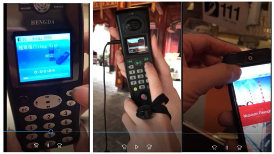
Figure 2.
The video snapshots from the videos about audio guides’ operation from VNMH (left), TL, NMA (right).
For website evaluations, the links of websites (including virtual museums) were also sent to these UX experts (Figure 3). The followings are the websites’ URLs.
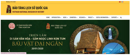
Figure 3.
Screenshot of homepage’s websites of VNMH.
- Vietnam National Museum of History: http://baotanglichsu.vn/en (accessed on 29 October 2021). Its virtual museums: http://disanvanhoaphatgiao.egal.vn/ (accessed: 29 October 2021) and http://denco.egal.vn/ (accessed on 29 October 2021).
- Hanoi Temple of Literature: http://vanmieu.gov.vn/en (accessed on 29 October 2021).
- National Museum of Australia: https://www.nma.gov.au/ (accessed on 29 October 2021).
3.1.4. The Heuristic Checklist
As mentioned in phase 2′s method (Section 3.2.1), a heuristic document was prepared with a set of 10 heuristics and 38 sub-heuristics and a brief explanation of each sub-heuristic. Table 1 provides the list of heuristics.
In terms of the task list for audio guides, evaluators watched and evaluated one video per museum about the audio guide’s operation. Regarding the tasks for the websites, the evaluators assessed the museum’s homepages and the first children.
3.1.5. Conducting a Heuristic Evaluation
The evaluators were introduced to the evaluation process with a brief introduction provided by email. Before starting the usability test, evaluators were briefed on purpose, and the relevance of the testing, and concerns or questions were cleared. All necessary information to evaluate audio guides and websites is available in English. The Nielsen heuristics list was sent to them together with the consent form, the evaluation checklist, and the description of our project before the evaluation. The evaluators were asked to familiarize themselves with the HE checklist. While evaluating, they were asked to assign the rating and propose suggestions for the problems based on the heuristics provided. For each evaluator, a total of six checklists were expected to be returned (three museums and one report for app and one report for website). It took an evaluator approximately 2 to 3 h to evaluate both audio guides and websites independently. All documents were collected and filed.
3.2. Usability Survey in Phase 2
In this phase, we conducted field-usability surveys at three national museums for museum audio guides and websites via two questionnaires distributed to the visitors after they experienced using audio guides and museums’ websites. The surveyed museums include two national museums in Vietnam (VNMH and TL) and one national museum in Australia (NMA). The survey was chosen because this method is simple and stimulating, used prevalently in CH field to collect both quantitative and qualitative, and goes well with the usefulness attribute [20].
3.2.1. Procedures
When visitors entered the museums, they were approached and asked whether they would like to participate (two survey languages were Vietnamese or English). If they were willing to join, and did not borrow the audio guide, it was delivered to visitors. The consent forms and two questionnaires were handed over to the visitors. After experiencing the exhibition(s) freely with audio guides and museums’ websites, the visitors came back to our survey area and answered the questionnaires, which took approximately 25 min to complete. One laptop with an internet connection was available to participants to search or verify information from the museum’s website. During the survey, the researcher encouraged participants to discuss if there were some things unclear or vague. After completing the survey, two questionnaires were collected on the spot.
3.2.2. Measures
The questionnaire for audio guides we based on the combination of the scales (measuring the usability of using multimedia guide [52], constructed on the variety of prestigious studies and professional organizations from the UK; and the criteria for evaluating the effectiveness and the usability of the interactive device [25]). The questionnaire for CH websites was designed to collect participants’ comments about information presentation, layout, navigation, and interface. Both questionnaires used five-point Likert scale, ranging from 1 (“strongly disagree”) to 5 (“strongly agree”). The results will be presented in Section 4.2.
3.2.3. Participants
There were 205 visitors, including 117 females and 88 males, participating in the study in both countries (110 for Vietnam and 95 for Australia). The respondents came from an array of demographic backgrounds (different countries, educations, or work backgrounds). A significant proportion of participants was in the age group 25–39 (41.46%). The dominant age group in Vietnamese museums was in18–24 (46.36%), while the major age group in the Australian museum was 25–39 (45.53%). At Vietnamese museums, 80.9% Vietnamese answered our survey. In contrast, at the Australian museum, the number of participants who were native English speakers was 52.63%, near-native speakers were 13.68%, good English speakers were 20%, and average English speakers were 13.68%.
4. Results
Our usability evaluations presented in this section are obtained from phase 1, the HE, and phase 2, the usability survey. Our findings from HE will be presented in Section 4.1, and the usability survey will be presented in Section 4.2.
4.1. Heuristic Evaluations from UX Experts
In this session, the heuristic evaluation results and some comparisons between the analyzed data are presented.
The outputs of the HE were two schemes on measurement of severity levels and the agreement among evaluators for audio guides (Section 4.1.1) and websites (Section 4.1.2). These schemes are presented by the heat maps, the visual representations showing the comparative views of measurement of severity levels for audio guides and websites, and agreements of 5 evaluators on the severity levels of the three national museums.
The measurement of severity levels is a weighted scheme where levels are taken into account. We calculate the weighted values by multiplying value of the severity level by its level and then add them together. For example, for VNMH’s SH01, three evaluators ranked its severity at 1, 2, 3 levels. Thus, the overall calculation would be: (1 × 1) + (1 × 2) + (1 × 3) = 6.
Regarding the color scheme of the measurement of severity levels, the dark red represents the highest value data points (the most severe error), and the green represents the lowest value data points (no error). Regarding the color scheme of the agreement of five evaluators on the severity scale, the dark red represents the lowest agreement, and the green represents the highest agreement.
The agreement among evaluators is computed by the sum of five severity levels (with level 0 is no error) divided by the count of those five severity levels provided by all evaluators.
In other words, the sub-heuristics with the highest measurement of severity level and the minor agreement of evaluators are highlighted in red. (See Table 2 and Table 3).
Table 2.
Measurement of severity levels for audio guides (left heat map with red is the highest and green is the lowest values); and the agreement of five evaluators on severity scales (right heat map with red is the lowest and green is the highest values).
Table 3.
Measurement of severity levels for websites (left heat map with red is the highest and green is the lowest values); and the agreement of five evaluators on severity scales (right heat map with red is the lowest and green is the highest values).
A total of 163 usability issues were identified across five levels of severity. Out of the total, 72 and 91 issues were identified from the audio guides, and websites respectively.
4.1.1. Evaluator Ratings of Three CH’s Audio Guides
Out of 72 usability issues identified by 5 UX experts, Help menu and Physical interface/buttons were evaluated as having more issues. In detail, at the Physical interface/buttons, VNMH and TL were recorded with three and four issues each. For the Help menu, NMA audio guides had 1 error, while TL and VNMH’s audio guides had three errors. Audio guide’ heuristic Undo/cancellation, menu control, Accidental activation and Help menu of VNMH; Undo/cancellation, Accidental activation, Navigation of information, and Sequences of instructions of TL were classified as catastrophic issues and needed immediate action. Twenty-seven issues were categorized as major issues and needed to be rectified, including five issues from MNA (Navigational structure, Menus—H2, Design consistency: menus/input fields—H4, Navigation—H6), four issues from TL (System status feedback—H1, Menus—H2, Help menu, Documentation—H10), and 18 issues from VNMH (mostly at H1, H2, H3, and H10).
Via the left heat map, we can see the green color dominated the measurement of severity levels, in which five evaluators marked these data points as errorless (values = 0). The bigger values were recorded for the red, orange, and yellow colors (from 10 down to 3, especially at VNMH. In particular, accidental activation (lack of back button) and help menu were recorded as the most severe issues for the audio guide at this museum with 10 scores.
The more green color in the NMA shows that the Australian museum’s audio guide has more preeminent functions than Vietnamese museum ones. In detail, there are 29/38 (76%) sub-heuristics of Australian museums’ audio guide recorded no error, while this number is 41/76 (54%) for Vietnamese museums’ audio guides. For the right side of the heat map, the highest agreement among evaluators was seen at H4 and H7; and at NMA (see the Table 2).
Among 72 usability issues, major problems make up 37.5% of the issues (27 issues), cosmetic and minor problems make up nearly 25% of the issues (18 and 19 issues respectively), and the percentage of catastrophic problems is the smallest amount making up 11.11% of the issues (8 issues).
Figure 4 shows the total number of audio guides’ issues of the three national museums regardless of the severity rating scales. VNMH’s audio guides are recorded having more problems at SH01-System status feedback, SH09-Simplicity, SH22-Fat finger syndrome + Accidental activation, SH35-Physical interface/buttons, and SH37-Help menu. The total numbers of audio guides’ issues of VNMH, TL, and NMA are 41, 19 and, 12, respectively. Of the data gathered, Vietnamese audio guides noted more usability problems than Australia with the ratios of 3.4:1 (VNMH and NMA), and 1.6:1 (TL and NMA). The Vietnamese audio guides’ usability problems were mainly recorded as the outdated model, only text appears on the screen, lacking the related image(s) to the background and illustration or videos (VNMH), and bulky and old-styled device (TL).
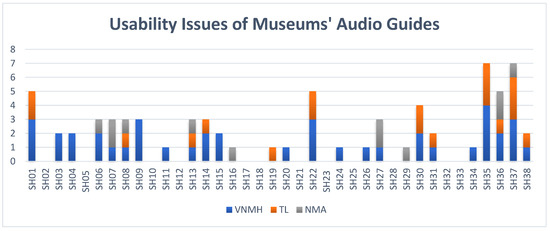
Figure 4.
Usability issues of audio guides of 3 museums surveyed.
4.1.2. Evaluator Ratings of 3 CH’s Websites
Among the 91 usability issues identified by five UX experts, Search was evaluated as having more issues with seven errors each, in which TL and VNMH have recorded three and four issues, respectively. System status feedback and Navigation were noted at six errors, with two issues at VNMH, two issues at TL, and one issue at NMA (in bold). Six teen websites’ heuristics were classified as catastrophic issues and needed immediate action. They are System status feedback, Metaphors, Simplicity, Undo/cancellation, and Search of VNMH; Local information, Simplicity, Explorable interface, Search, Navigation, Icons, Menus, Orientation, Navigation, and Documentation of TL; and Multimedia content of NMA. Twenty-four issues were categorized as major issues and needed to be rectified. They are the issues from VNMH (System status feedback, Navigational structure, Menu control, Accidental activation, General visual cues, Menus, Search, Navigation, Error(s), and Help menu); issues from TL (System status feedback, Response time, Navigational structure, Menu control, Navigation, Search, Navigation, Help menu, Documentation); and issue from MNA (Navigational structure).
In terms of measurement of severity levels, the weighted scheme shows that the system status feedback (H1) and Search (H7) of VNMH; and Response time (H1) of TL were scored highest. More green in the NMA websites indicates that the Australian museum website is also better than those in Vietnamese museums. In particular, Australian museums’ website has 29/38 (76%) sub-heuristics with no errors, but Vietnamese museums’ websites have 34/76 (45%) sub-heuristics with no errors.
Regarding the agreement on evaluation, H4 and H6 had the highest unanimity (Table 3).
Among 91 usability issues, minor problems make up 35.16% of the issues (32 issues), percentage of major problems is 26.37% (24 issues), cosmetic problems and catastrophic problems are relatively small with 20.88% (19 issues) and 17.58% of the issues (16 issues) respectively. Figure 5 shows the total number of websites’ issues of the three national museums regardless of the severity rating scales. The number of websites’ issues of VNMH, TL, and NMA are 46, 32, and 13, respectively. The ratios of usability problems detected for Vietnamese and Australian museum websites are 3.5:1 (VNMH and NMA) and 2.5:1 (TL and NMA). Vietnamese museums’ websites’ usability errors mainly are about response time (slow when displaying the details of images from the gallery), aesthetic and minimalist design (the broken site layouts causing all of the issues of menus and orientation), and search (inactive advanced search). The Vietnamese museums’ websites’ usability errors are recorded at navigation (main navigation arrows don’t follow convention) and menu (many menu controls are not intuitive).
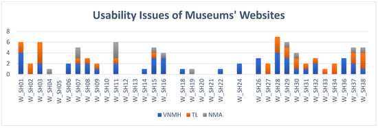
Figure 5.
Usability issues of websites of 3 museums surveyed.
4.2. Usability Survey
Usability issues of museums’ audio guides and websites are categorized primarily based on Nielsen heuristics, explanations from Gómez [14], and one sub-heuristic from Inostroza et al. [17]. As stated in the introduction, this usability survey is a part of a more extensive study about how to design good UX for interactive technologies in developed and developing countries.
4.2.1. Usability Evaluation for Audio Guides
We used 15 close-ended questions and two open-ended questions to measure the usability of audio guides (see Table A1-English and Table A2-Vietnamese-Appendix A). To analyze the data, we pay attention to the number of participants who ranked strongly disagree and disagree to see how visitors ranked statements negatively. The results are presented in Table 4.
Table 4.
Usability evaluation of audio guides (bold values represent the highest number of Strongly Disagree or Disagree in each museum.).
The number of people who either strongly disagreed or disagreed with these statements is presented in Table 4. The most significant number of the VNMH was “delay between my actions and expected outcomes” (62.07%), TL was “easy to read the text on the screen” (21.15%), and AM was also “easy to read the text on the screen” (15.79%). VNMH’s audio guide was recorded as the device with the most significant number in negative ranking. Most of the museum audio guide’s metrics had a negative rank. Only the statement “The information given by the audio guide is reasonable and understandable” was not ranked negatively at two museums (TL and AM). Values of audio guide factors that have the highest negative ranking are highlighted in Table 4.
The thematic analysis from participants showed more issues from the audio guides via the question about the worst aspect(s) of using the device and what the visitors would change about the worst aspect(s). Firstly, visitors of Vietnamese museums commented that the biggest limitation of the automatic VNMH audio guide was the delay or miss-presentation between the content and the physical relics, resulting in the visitors hearing the wrong audio (33% of VNMH responses), which links to H2 (Match between system and the real world). Comments such as “hard to use” (14% of VNMH responses), “inflexibleness” (H7, flexibility, and efficiency of use), “hard to concentrate”, and “less interaction” were recorded. Besides, the content of audio guides should be concise and rich, which was expected to be presented in more languages rather than Vietnamese and English (H4, Consistency). No option for choosing the language in the device (museum installed the language when visitors borrowed this device at the reception desk) was the worst function of TL audio guide (12% of TL responses) (H2, Match between system and the real world). A location-aware audio guide was expected. Otherwise, a map about the exhibits’ stops should be included in the app (10% of TL responses) (H6, Recognition rather than recall). Due to the redundancy of buttons (buttons have no function), VNMH’s audio guide looks cumbersome. The overall size of the TL audio guide needs to decrease, while the screen/button size should be larger. Besides, the content was relatively short with a slow reading speed, and adding pictures would make the content dissemination more effective (H4, Consistency).
Regarding the issues of the NMA audio guide, the limited languages (only English) and too long audios/lots of reading on a small screen are the biggest negative sides of the app (10% of NMA responses) (H2, Match between system and the real world). Challenging to plan where to go/app need to know where the visitor is in the museum/unclear what path to follow is the audio guide’s drawbacks also related to the function of location awareness (H6, Recognition rather than recall).
The visitors’ suggestions are simple and easy to make, such as the suggestions for the issue “not a 2-way interaction” is “add visual technologies” or “need a 2-way interaction”. Some of them are valuable, for example, “the map should be included in the app”, “speed of audio guide should be faster” for TL audio guide; “instead of typing the section you are in, the app should use GPS then automatically start to display the art”, “The app could ask about general interests and then plan a visit for you.”, “The app could ask about general interests and then plan a visit for you.”, and “I would add foreign languages” for NMA’s audio guide.
To sum up, we can see the negative rankings on these 15 statements with the usability survey. The most significant numbers were almost seen at VNMH (214 times for strongly disagree and disagree), followed by AM (89 times for strongly disagree and disagree). On the other hand, the details of errors and user suggestions/solutions were presented via open-ended questions.
4.2.2. Usability Evaluation for Websites
We used 13 open-ended questions, and two open-ended questions to examine the usability of museums’ websites (see Table A3-English and Table A4-Vietnamese, Appendix B). The number of participants who ranked strongly disagree and disagree was analyzed. Table 5 presents the results.
Table 5.
Usability evaluation of websites (bold values represent the highest number of Strongly Disagree or Disagree in each museum).
Approximately 53.68% of people strongly disagreed or disagreed with the statement “I find it convenient to choose the languages displayed” was the largest number at AM. “The ambiguity of link label” was recorded as the statement with the most significant negative rankings at TL (53.85%) and VNMH (32.76%). The values in bold show the website factors that have the highest negative ranking in each museum.
Thematic analysis was conducted following Braun and Clark [53] by Nvivo 12. The first author read through the response and created codes by counting the number of occurrences to identify major themes. The codes were reviewed by the second author to finalize. The thematic analysis of open-ended questions recorded the answers for the worst aspects of using Vietnamese museum websites. Too much information on one page (H8—Aesthetic and minimalist design) was the most significant limitation of Vietnamese museums’ websites, mainly TL (13% of TL responses). While VNMH virtual museums received lots of positive feedback from visitors on the audio and visual aspects, their content needs to be updated and richer (H8). At TL, more clips, pictures, animations, virtual exhibitions, eye-catching layout, and good interaction need to build to enhance the visitors’ attractiveness (H8). Vietnamese and English are not enough for visitors, and visitors need more languages such as German, Japanese (H2—Match between system and the real world). There is some Vietnamese content in the English version as the inconsistent error in presentation (H4, Consistency).
Like the significant defect of Vietnamese museums websites, information (H8) overwhelmed was commented most by NMA’s participants (11% of NMA responses). The second drawback of the NMA website is language (H2) (no Italian language, more language expectation, certain words written in American rather than English, could not find text in other languages, using jargon). Content limitation (H8), all exhibitions look the same (H6), and not much visual display (H8) are other error detections. Long roll and cannot see the whole screen were noticed as the aesthetic and minimalist design drawbacks. Lastly, the menu button had a problem (slightly unresponsive and moved a lot).
Visitors proposed suggestions/solutions, such as “should have more languages rather than just Vietnamese, English”, and “should mark the places with numbers and have the guide to use” for VNMH’s websites. They also suggested “Improve the quality of content, and sound” for TL’s website; and “support more languages, even if it is only simple how to get or how to park in different languages”, and “more interactive, more videos such as virtual museums” for NMA’s website.
In closing, via user survey, we see the most negative rankings at the “ambiguity of link labels” and “convenient to choose the languages displayed”. Those biggest numbers were almost seen at AM (114 times for strongly disagree and disagree) followed by TL (77 times for strongly disagree and disagree). The open-ended questions showed the details of errors and user suggestions/solutions for the errors.
4.2.3. Comparisons of Usability Evaluations for Audio Guides and Websites
To compare the data of usability evaluations for museums’ audio guides and websites of developing and developed countries, we grouped the 2 Vietnamese national museums’ mean scores. They are both national CH museums in the Vietnamese capital city. We use Kruskal-Wallis H Test to determine statistically significant differences between CH museums in two developing and developed countries.
As stated in Section 4.2.1, we used 15 close-ended questions (and 2 open-ended questions) to measure the usability of audio guides (see Appendix A). All p-values of the Shapiro Wilk Test are smaller than 0.05. We do not assume these normal distributions. Hence, the overall level of visitor experience was investigated for audio guides by conducting an analysis of the Kruskal–Wallis test to check the significant differences in the audio guide usability factors. The results are presented in Table 6.
Table 6.
Usability evaluation of audio guides: Mean, SD, and p-value.
Many of the p values (Asymp. Sig.) of the samples from Vietnamese and Australian museums were less than 0.05, showing that the differences in weight gain are statistically significant. However, for the two statements US11 (Provide clear feedback—H1) and US12 (Consistent experience in the virtual and real world—H2), their p-values were 0.495 and 0.324, respectively, hence the differences in the two of them are not statistically significant. Most of the mean scores of Australian museums are significantly larger than that of Vietnamese museums. The largest Kruskal-Wallis H is 44.844 at US01 (Reasonable and understandable information—H4), indicating the most significant difference between groups we are comparing.
To compare the usability evaluations of museums’ websites, we used the 13 open-ended questions and two open-ended questions were used to examine the usability of museums’ websites (see Appendix B). Because the data distributions are not normal, we used Kruskal–Wallis test to check the significant differences in website usability factors. Table 7 presents the results.
Table 7.
Usability evaluation of websites: Mean, SD, and p-value.
The differences in WUS03, WUS04, WUS06, WUS07, and WUS10 to WUS13 are statistically significant as their p-values are less than 0.05, while the other website’ usability are not. The greatest Kruskal–Wallis H is recorded at WUS06 (Convenient in language choosing, H3) at 76.982, showing the largest difference between Vietnamese and Australian national museum websites.
4.3. Suggestions to Fix the Usability Problems from UX Experts
The detailed problems and their suggestions are presented in Appendix C, Appendix D and Appendix E. Here, we emphasize two main aspects (1) the sub-heuristic receiving more suggestions from five experts and (2) suggestions for the catastrophic problems (severity level = 4) needing immediate actions. Interestingly, there was no fault marked as a catastrophic problem for NMA’s audio guide and website. Therefore, the following suggestions are for Vietnamese museums: VNMH and TL.
4.3.1. Suggestions for Audio Guides
The UX experts’ suggestions for three museums’ audio guides are presented in Appendix C (Table A5, VNMH), Appendix D (Table A7, TL), and Appendix E (Table A9, NMA).
- (1)
- Four out of five UX experts gave suggestions for sub-heuristic SH35, physical buttons of VNMH’s and TL’s audio guides, in which mainly the useless buttons should be removed. Sub-heuristics of VNMH’s audio guide, including system status feedback; simplicity; accidental activation; and help menu, are received three suggestions from five UX experts. Help menu from TL’s audio guide also had three suggestions from the experts.
- (2)
- Regarding VNMH’s audio guide, Metaphors need to be updated immediately because the current metaphors are somewhat dated and obsolete. The VNMH’s audio guide’s screen size needs to be redesigned urgently (analog screen supports well for only audio, not for pictures). In this vein, for Undo/cancellation (SH14) and Accidental activation (SH22), undo and redo buttons were expected to fix soon. Menu control needs signifiers for menu control, for example, pressing and holding the “L” button to change the language. For TL’s audio guide, a delete/backspace button was needed urgently to solve SH14 and SH22. See Appendix C (Table A5) and Appendix D (Table A7) for the details.
4.3.2. Suggestions for Websites
The UX experts’ suggestions for three museums’ websites are presented in Appendix C (Table A6, VNMH), Appendix D (Table A8, TL), and Appendix E (Table A10, NMA).
- (1)
- Four out of five UX experts detected the issues and gave suggestions for VNMH’s websites on System status feedback, and Search; for TL’s website on Response time, and Multimedia control. Those sub-heuristics, including Design consistency: menus/input fields, Navigation, and Error(s); Expression of error messages at VNMH; and Search at TL received 3 suggestions for each.
- (2)
- For VNMH’s website, System status feedback, Metaphors, Simplicity, and Search needed improvement immediately, while Simplicity from TL needed urgent actions. See Appendix C (Table A6) and Appendix D (Table A8) for the details.
5. Discussion
There are many ways to identify usability problems [20,43,48,52]. The combination of HE and usability survey (the open-ended questions) can help detect the usability problems of the systems, and they may be appropriate for identifying some specific issues [18]. In this vein, HE or usability inspection identified many issues and proposed suggestions to fix those [37].
Regarding the research method, both techniques, including HE and usability surveys, help our findings meet five out of eight attributes, including usefulness, ease of use, efficiency, accessibility, and identification [19,20]. To investigate the agreement of real users of a system with the problems identified by HE, HE should be conducted first, and then a real users’ survey [18] to verify the result. In phase 1, the checklist used for HE was experimentally evaluated as a tool for design, relevant to the tested product in the CH domain, and overcome the irrelevant problems mentioned in Mazlan et al. [54]. We used the Nielsen’s severity four-levels, including ‘cosmetic problem’, ‘minor problem’, ‘major problem’, and ‘catastrophic problem’ to pay attention to all the issues, which is different from using the two final levels only of Khajouei et al. [18].
In this study, the usability surveys, a part of the bigger UX surveys, support and consolidate for HE results which was mentioned in Section 1, Introduction. Similar to our study’s purpose, Karoulis et al. [48] conducted the usability evaluations of the museum’s system, in which the evaluators’ opinions (from two groups: usability experts and museums’ curators) were concluded differently.
We find that HE is sensitive to identify. Usability surveys contribute the users’ opinions to support for experts’ evaluations through their rankings or replies to the open-ended questions. For example, in the audio guide’s H1—Visibility of system status, experts found the problems at SH01 (at VNMH and TL), SH03 (at VNMH), and SH04 (at VNMH). Real users also ranked negatively on US02, US11, and US13 at the three museums (see Table 4). Another example from H8—Aesthetic and minimalist design, UX experts detected the issues on SH30, SH31. Usability surveys showed the strongly disagree and disagree rankings on SH08, SH09, and US15. Mainly, usability issues on the new SH35 (Physical interface/buttons) were found by the UX experts to be modified by the users’ replies from the open-ended questions, in which both buttons’ size (at TL) and redundancy button (at VNMH) inhibit the user’s use. In terms of the usability errors from the website’s H7—Flexibility and efficiency of use, experts showed the issues on W_SH28 (Search), and W_SH29 (Navigation), the real visitors complemented via the negative rankings on WUS04 (perform the tasks without getting any error) and WUS07 (easy to navigate the website) (see Table 5). In general, Vietnamese museum audio guides and websites were recorded as having more usability problems than Australian’s. Vietnamese CH museums’ audio guides are outdated and cumbersome with analog screens, low resolution, and ten useless number buttons (VNMH’s). Vietnamese museums’ website problems relate to information presentation, bandwidth limit especially for virtual museums, and language (in the English version).
Some data need to have more explanations and discussions. For Vietnamese museums’ audio guides, the delay or miss-presentation between the content in the device and physical relics was the greatest weakness of the VNMH automatic audio guide, causing visitors to hear the wrong audio. The error in locational tracking may be due to the smaller than prescribed distance of the arrangement of objects (3 m < 5 m).
Audio guides in the museums have essential limitations, including small screen size, limited input capability, different input methods, bandwidth or network access, different display resolutions, and minimal or different processing capacities. Hence, the capability to attract visitors’ attention was limited [55]. According to Bredin [56], the good audio guide’s ingredients are free of charge, good content (specialist knowledge), multilingual support, and support for disabilities (for example, visually impaired). Similarly, undersized screen, low resolution, bulky appearance, and cost of use are the drawbacks of VNMH and TL’s audio guides. NMA’s audio guide, on the other hand, does not support multilingualism. Regarding CH websites, good examples are good interaction, flexible accessibility, and intuitive navigation [57]. The three museums’ website limitations are too much information on one page. The navigation and accessibility errors are not recorded. The VNMH and TL’s website participants still encounter dead link(s), less interaction, and unattractive interfaces. The NMA’s website users dissatisfy with the excessive scrolling, unresponsive menu button, and not much interaction.
The agreements of users and the experts were at a medium level in Khajouei et al. [18]; however, usability surveys strengthen the HE results in this research.
Much of the studies illustrate very little agreement on a usability problem and how severe it is [48,58], and this study found the similarities. The agreement is mostly seen at the “no error” data points. Catastrophic problems for both audio guides and websites were recorded at the smallest amount at 12.5% and 16.67%, respectively. However, the number of cosmetic problems is not the highest compared to minor, major and catastrophic problems as shown in Karat et al.’ findings [59].
Having confirmed the disparity of the evaluators, the next point of discussion is conducting the HE via videos has certain drawbacks because some issues might only be detected by physically visiting the museums to experience the device. Some outstanding examples are “the delay between the actions and expected outcomes” or “cannot match the content of physical object/place” which are not recognized by experts via video examination. However, Karoulis et al. [48] showed that usability experts are closer to the goal (even than the museum curators) because they understand thoroughly what and how has to be examined. That may explain why experts (4 out of five) detected those useless buttons on VNMH and LT’s audio guides, while the visitors could not state the issue clearly than experts.
More usability issues were detected and examined by 5 UX experts, and the usability surveys strengthened the HE results from the real visitors’ viewpoints.
The issues identified by UX experts are allocated in 10 heuristics and usability surveys to help the museums’ curators, and interactive designers thoroughly understand their products. One of the suggestions from our UX experts for VNMH’s website is the recommendation for Multimedia content (SH30), in which Flash used for virtual museums cannot be browsed in some videos. Therefore, VNMH should use another platform replacing Flash [23,60].
From this 2-phase study, to have good “ingredients” for interactive app/website, some technical considerations should be paid attention to:
- Help menu and documentation should be provided effectively to users.
- Multilingual support is required due to exposure to international visitors.
- The two-way interaction, flexible accessibility and trouble-free navigation are needed.
- The quality of the device should be sufficient. For example, the quality of audio guides’ screens and screens for web browsing are crucial.
- Considering technology for information presentation for accessibility and cross-platform compatibility should be paid attention; for example, Flash is replaced with HTML5 or WebGL.
Other design recommendations need to be considered, such as the interactive app/website should be free of charge, and the content should be concise, rich, and current.
6. Conclusions
The paper shows the usability issues of museums’ interactive apps and websites from different angles, experiences, and approaches. Because of these differences, the number of UX experts’ suggestions is more than that of real visitors (77 and 91 suggestions from UX experts, and 10 and 12 suggestions from visitors for audio guides and for websites, respectively). In common with the experts, real visitors pointed out some similar usability issues; however, there are some different viewpoints on showing the issues that they experienced. HE is more sensitive to detect problems for both audio guides and websites in all usability heuristics, especially at H10.
In contrast, usability surveys quickly detected the issues relating to language-changing options. Additionally, HE ranks the severity scales of the problems so that the museum curators can respond appropriately. Having said that, conducting the HE brings to light more significant results and usability surveys complementing HE. Besides, there are some valuable suggestions from real visitors that the UX experts were unable to detect. The examples are the evaluations of the audio guide via videos, such as the suggestion “the presentation of content of audio guide should be synchronized with the location of the visitors” to solve the issue “cannot match the content of physical object/place with the audio guide”.
In the context of Vietnamese and Australian museums, this paper is likely to be the first usability review to better understand the strengths and weaknesses of interactive technologies in CH areas, especially for developing countries such as Vietnam. The findings are expected to help the museum director and the museum’s prospective interactive service providers by reflecting on the usability of websites and on-site interaction installations. The HE complements the reliability of usability surveys. Additionally, experts’ suggestions can help CH organizations and interactive service providers improve their adoptions of these technologies to better satisfy user needs. The limitations of this study are that two Vietnamese national museums and one Australian national museum used for the survey are a small sample of national museums; hence the number of audio guides and websites surveyed is small.
Further, UX experts were recruited via emails at different periods, so there was no discussion among the evaluators about the issues and the severity levels. Finally, Nielsen’s 10 heuristics interpretation is subjective; therefore, there is likely a different classification of opportunity for sub-heuristics of usability surveys. The findings are the audio guides and websites’ usability issues detected and suggestions proposed by UX experts and visitors. Australian museum interactive technologies have fewer usability errors than those in Vietnam. What Vietnamese national museums should do to mitigate the limitations and improve the user experience, especially during and after the COVID-19 pandemic, will be presented in future work.
Author Contributions
Conceptualization, D.L. and A.S.; methodology, D.L., T.H. and A.S.; validation, D.L. and T.H.; formal analysis, D.L.; investigation, D.L.; resources, D.L., T.H. and A.S.; data curation, D.L.; writing—original draft preparation, D.L.; writing—review and editing, D.L., T.H. and A.S.; supervision, A.S. and T.H.; funding acquisition, T.H., A.S. and D.L. All authors have read and agreed to the published version of the manuscript.
Funding
The UserX 2019 pilot project funding from School of Communication & Creative Arts, Faculty of Arts & Education, Deakin University, which was used to conduct the surveys and heuristic evaluations. Dr Thuong Hoang is the recipient of an Australian Research Council Discovery Early Career Researcher Award (DE200100898) funded by the Australian Government.
Institutional Review Board Statement
The research project (procedures, questionnaires) was reviewed by Deakin University human ethics advisory group for compliance with the National Statement on Ethical Conduct in Human Research 2007 (Updated 2018). After obtaining the ethics approval from Deakin University, we started to survey at Vietnamese and Australian museums.
Informed Consent Statement
Informed consent was obtained from all subjects involved in the study.
Data Availability Statement
Not applicable.
Acknowledgments
We thank all the participants and staff at VNMH, TL and NMA who were involved in answering our questionnaires and interviews.
Conflicts of Interest
The authors declare no conflict of interest.
Appendix A. Questionnaires for Audio Guides
Table A1.
Questionnaires for Audio Guide (English version).
Table A1.
Questionnaires for Audio Guide (English version).
| Questions | Strongly Disagree | Disagree | Neutral | Agree | Strongly Agree | |
|---|---|---|---|---|---|---|
| US01 | The information given by audio guide is reasonable and understandable | |||||
| US02 | It is easy to determine where I am in the visit with the audio guide | |||||
| US03 | Learning to operate the audio guide is easy | |||||
| US04 | I am clear with all instructions of audio guide | |||||
| US05 | Using the audio guide does not require much training | |||||
| US06 | It is difficult to choose the option I want with the audio guide | |||||
| US07 | I feel that I am in control of audio guide | |||||
| US08 | I find it easy to read the text on the screen of audio guide | |||||
| US09 | I find it easy to hear the material on audio guide | |||||
| US10 | The audio guide presents information in an understandable manner | |||||
| US11 | The audio guide clearly provides feedback about my actions | |||||
| US12 | My experience in the virtual environment is consistent with my real-world experience | |||||
| US13 | I am able to anticipate what would happen next in response to the actions that I perform | |||||
| US14 | I experience the delay between my actions and expected outcomes | |||||
| US15 | The visual display quality interferes or distracts me from performing required activities |
16. What is the best aspect of using the audio guide?
17. What is the worst aspect of using the audio guide?
- Your Gender:
- Your Age:
- Your Occupation:
- Your Native Language:
English Other: (please specify)
If you are not a native speaker of English, how would you rate your knowledge of English?
Good Average Near native
Table A2.
Bảng hỏi dành cho Hướng dẫn tự động (Vietnamese version).
Table A2.
Bảng hỏi dành cho Hướng dẫn tự động (Vietnamese version).
| Câu hỏi | Rất không đồng ý | Không đồng ý | Không có ý kiến | Đồng ý | Rất đồng ý | |
|---|---|---|---|---|---|---|
| US01 | Thông tin được trình bày trên hướng dẫn âm thanh là hợp lý và dễ hiểu | |||||
| US02 | Thật dễ dàng để xác định tôi đang ở đâu khi sử dụng hướng dẫn âm thanh | |||||
| US03 | Học cách vận hành hướng dẫn âm thanh thật dễ dàng | |||||
| US04 | Tất cả các hướng dẫn của hướng dẫn âm thanh thì rõ ràng đối với tôi | |||||
| US05 | Không cần đào tạo nhiều để sử dụng hướng dẫn âm thanh | |||||
| US06 | Thật khó để chọn tùy chọn tôi muốn với hướng dẫn âm thanh | |||||
| US07 | Tôi cảm thấy rằng tôi đang kiểm soát ứng dụng này | |||||
| US08 | Tôi thấy thật dễ dàng để đọc văn bản trên màn hình của ứng dụng | |||||
| US09 | Tôi thấy thật dễ dàng để nghe tài liệu trên hướng dẫn âm thanh | |||||
| US10 | Hướng dẫn âm thanh trình bày thông tin một cách dễ hiểu | |||||
| US11 | Hướng dẫn âm thanh cung cấp phản hồi về hành động của tôi một cách rõ rang | |||||
| US12 | Trải nghiệm của tôi trong môi trường ảo phù hợp với trải nghiệm thực tế của tôi | |||||
| US13 | Tôi có thể dự đoán những gì sẽ xảy ra tiếp theo để phản ứng với những hành động mà tôi thực hiện | |||||
| US14 | Tôi thấy sự đáp ứng chậm của ứng dụng khi tôi thao tác | |||||
| US15 | Chất lượng hiển thị hình ảnh cản trở/làm tôi mất tập trung khi thực hiện các hoạt động cần thiết |
16. Điều tốt nhất của việc sử dụng hướng dẫn âm thanh là gì?
17. Điều tệ nhất của việc sử dụng hướng dẫn âm thanh là gì?
- Giới tính của Anh/Chị:
- Tuổi của Anh/Chị:
- Nghề nghiệp của Anh/Chị:
- Ngôn ngữ chính của Anh/Chị: (Vietnamese)
Appendix B. Questionnaires for Websites
Table A3.
Questionnaires for Website (English version).
Table A3.
Questionnaires for Website (English version).
| Question | Strongly Disagree | Disagree | Neutral | Agree | Strongly Agree | |
|---|---|---|---|---|---|---|
| WUS01 | I find that there is reasonable number of words on each website page | |||||
| WUS02 | The contents of the website are useful to me | |||||
| WUS03 | The information about the museum exhibits on the website is clear | |||||
| WUS04 | I often perform the tasks without getting any error | |||||
| WUS05 | I find that there is terminology jargon on the website | |||||
| WUS06 | I find it convenient to choose the languages displayed | |||||
| WUS07 | I find it is easy to navigate the website | |||||
| WUS08 | I am able to discover/learn individually about the objects/exhibits from the website | |||||
| WUS09 | I am able to perform the tasks easily with the help of the website | |||||
| WUS10 | I find there is ambiguity of link labels | |||||
| WUS11 | I enjoy the layout of the website | |||||
| WUS12 | I find that the page layout is consistent throughout the website | |||||
| WUS13 | I find the graphics on the website are attractive |
14. What is the best aspect of using the website?
15. What is the worst aspect of using the website?
Table A4.
Bảng hỏi cho Trang web (Vietnamese version).
Table A4.
Bảng hỏi cho Trang web (Vietnamese version).
| Câu hỏi | Rất không đồng ý | Không đồng ý | Không có ý kiến | Đồng ý | Rất đồng ý | |
|---|---|---|---|---|---|---|
| WUS01 | Tôi thấy rằng số lượng từ trên mỗi trang web là hợp lý | |||||
| WUS02 | Nội dung của trang web rất hữu ích với tôi | |||||
| WUS03 | Thông tin về các triển lãm của bảo tàng trên trang web là rõ ràng | |||||
| WUS04 | Tôi thường thực hiện các thao tác với ứng dụng mà không gặp bất kỳ lỗi nào | |||||
| WUS05 | Tôi thấy rằng trang web có dùng thuật ngữ chuyên ngành | |||||
| WUS06 | Tôi thấy thuận tiện khi chọn ngôn ngữ hiển thị | |||||
| WUS07 | Tôi thấy điều hướng trang web thật dễ dàng | |||||
| WUS08 | Tôi có thể tự khám phá/tìm hiểu về các hiện vật/triển lãm từ trang web | |||||
| WUS09 | Tôi có thể thực hiện các nhiệm vụ dễ dàng với sự trợ giúp của trang web | |||||
| WUS10 | Tôi thấy có sự mơ hồ của các nhãn liên kết | |||||
| WUS11 | Tôi thích cách bố trí của trang web | |||||
| WUS12 | Tôi thấy rằng bố cục trang web nhất quán | |||||
| WUS13 | Tôi thấy đồ họa trên trang web rất hấp dẫn |
14. Điểm tốt nhất của việc sử dụng trang web là gì?
15. Điểm dở nhất của việc sử dụng trang web là gì?
Appendix C. UX Experts’ Suggestions for the VNMH
Table A5.
UX Experts’ Suggestions for the VNMH’s Audio Guide.
Table A5.
UX Experts’ Suggestions for the VNMH’s Audio Guide.
| Sub-Heuristics Code | Sub-Heuristic | Severity Level | Suggestion(s) |
|---|---|---|---|
| (H1) SH01 | System status feedback | 1 2 3 | Feedback is delayed. A software or hardware improvement should be made. |
| (H1) SH03 | Response time | 1 2 | Response time is delayed because of the equipment is an old model Response time is slow and can be improved by using better devices |
| (H2) SH06 | Metaphors | 3 4 | The equipment employs the old cell phone design and structure in hope of familiarising the users. However, this metaphors is rather dated and obsolete. Furthermore, the screen is too small leading to a very small font size which can hinder the reading. Equipment models that are designed like smartphones or tablets should be used so that there’s a bigger screen with large enough font size Icons are not easy to comprehend on the device. They should be changed by more familiar icons |
| (H1) SH04 | Selection/input of data | 3 2 3 | Use of L button for language toggle isn’t intuitive. Neither are the volume up and volume down icons. Use more meaningful iconography. May be using QR code instead? Because the device catches the signal automatically to play the corresponding audio, user may expect delay or wrong audio played |
| (H2) SH07 | Navigational structure | 3 | Figuring out what the device can do can be frustrating because the navigational structure is not clear enough |
| (H2) SH09 | Simplicity | 1 3, 3 | In users’ minds, the number pad on the equipment acts as a signifier for some affordances of the equipment. However, in reality, as mentioned in the video, the number pad has no function, which will confuse the users and overwhelm their cognitive load. Since the numbers serve no purpose, they should be eliminated so that users won’t be distracted by them when performing tasks |
| (H3) SH14 | Undo/cancellation | 3 4 | For an irreversible function like “Stop”, a message like “Are you sure you want to stop the recording?” should pop up in case of accidents It’s almost impossible to undo or cancel any action apart from pausing audio so undo and redo buttons should be provided |
| (H3) SH15 | Menu control | 2 4 | Menu control provide necessary functions but lacks signifiers. For example. To change the language, according to the video, you have to press and hold the “L” button. If there were no previous instructions, there is no way one could realise that and would not be able to change the language. Setting up the language is tricky as you have to press and hold the button. It should just be pressing the button the change the language. |
| (H4) SH20 | System response consistency | 1 | The response for setting up the language is different from other functions. |
| (H5) SH22 | Accidental activation (lack of back button); | 2 4 4 | There should be an undo button for the equipment in case user press ‘Stop” by accident and a “Return” button since currently, there is no way to go back to where they were previously listening to or reading before the accident There’s no way to get back to the previous point so undo and redo buttons should be provided. There should be a back button or scroll bar to listen again or pause instead of the automatic features |
| (H8) SH30 | Multimedia content | 2 3 | Only texts appear on the screen. It would be nice to add a related image to the background. The only sound is not lively, not to attract viewers, need more illustrations or videos to provide more interaction. Analog screen limitation. |
| (H8) SH31 | Icons | 1 | Icons can be improved for better aesthetics |
| (H8) SH32 | Menus | 2 | |
| (H8) SH34 | Navigation | 2 | Implement “Back to top” function for easy access. |
| (H8) SH35 | Physical buttons | 1 1 2, 2 | The handset has number buttons akin to a telephone keypad but they don’t appear to be needed. This is confusing. Remove them. The buttons look easy to use; however, the labels of the buttons are likely to come off with time, thus posing a potential problem in the future. The device is outdated, making the younger generation have a harder time getting used to the device. At the same time, elements’ sizes are too small for older generation. If buttons have no purpose then they should be eliminated. |
| (H9) SH36 | Error(s); Expression of error messages | 2 3 | There should be a guideline message in case the users press the wrong buttons Error or help messages should be provided in case users get confused or accidentally make a mistake. |
| (H10) SH37 | Help menu | 3 4 3 | There should be a helpful guide present around the museum to aid with the equipment in case there is no human guide available. Additionally, some contact information should be present on the equipment in case the equipment breaks down or lost during the visit. There is no help button available and it should be provided. Required for user convenience |
Table A6.
UX Experts’ Suggestions for the VNMH’s Website.
Table A6.
UX Experts’ Suggestions for the VNMH’s Website.
| Sub-Heuristics Code | Sub-Heuristic | Severity Level | Suggestion(s) |
|---|---|---|---|
| (H1) W_SH01 | System status feedback | 1 2, 4 3 | There’s some forms of system feedback (colour change,…) but they need to be emphasized with greater contrast. The cursor changes shape when hovering the side menu, but only text is clickable, not the whole button. It can confuse users sometimes. Although there is a button for tickets online, this function is not working. Change the behaviour of the side menu button. Implement ticket online function or remove this option. Add feedback form for the website. |
| (H1) W_SH03 | Response time | 1 | Virtual museum: Response time is slow. Increase the bandwidth for the webserver. |
| (H1) W_SH06 | Metaphors | 2, 4 | There’s the presence of metaphors on the website (folder model). However, the same metaphor needs to be consistent throughout every page and links. Virtual museum: many icons are not easy to understand and do not match cultural conventions. All icons under “Tra cứu thông tin” menu should either be replaced or changed. |
| (H2) W_SH07 | Navigational structure | 3 3 | Very crowded and overwhelming. It should reduce the amount of trivial information and only showcase important ones. Website: Information is not well-organized and is overabundance. “Domestic news” and “International news” should be merged into one section. A lot of sections in “Research” can be merged into one. |
| (H2) W_SH08 | Menus | 2 1 | The “Project” menu item is redundant. There is no content in this menu. Consider updating the content or removing this menu item. Website: item names are not familiar and simple enough for users to understand quickly. “Thông tin hữu ích”/“Useful Information” should be replaced with “Tham quan”/“Visit us”, “Dự án BTLSQG” should just be “Dự án” |
| (H2) W_SH09 | Simplicity | 4 | Virtual Museum: Help section is not really helpful. The rectangle box should be darker so text can be easily readable. Language should be clearer (e.g., “Vị trí kế tiếp”/“Next position” should be “Điểm tham quan tiếp theo”/“Next artwork”, “Auto guild” should be “Hướng dẫn viên”/“Audio”). |
| (H2) W_SH11 | Explorable interface | 2 2 | Home page tiles aren’t clickable. Add links to featured pages. Flash-based, so not accessible and not available on mobile devices. |
| (H3) W_SH14 | Undo/cancellation | 4 | Virtual museum: “Auto guild” (the documentary) should not automatically start and turning it off should be more obvious (the volume button can be highlighted when the sound is on so users can spot it instantly to turn it off). “Auto guild” and “Sound” basically have the same function so one of them should be eliminated. |
| (H3) W_SH15 | Menu control | 2 4 3 | The control should be more prominent and a welcome guide should appear when they enter the virtual museum to show them how the control works rather than leave users to figure it out by themselves. (Virtual museums) Virtual Museum: there should be a homepage before the virtual page to inform users that they will be entering the virtual museum. As virtual museum is not familiar to most users, proper instructions should be provided instead of letting users figure out how to use the website themselves. Change the status menu when making a selection—like changing colours. |
| (H4) W_SH16 | Design consistency: menus/input fields | 1 1 2 | Navigation menus in several pages should be consistent. Website: icons are not consistent in terms of design (their sizes, strokes, and amount of details should be more similar). Sightseeing registration form, not safe because it does not use captcha code to protect the site. |
| (H4) W_SH18 | Menus/task consistency | 1 | Virtual museum: users can be confused when choosing between “Exhibition”, “Collection”, and “Library”. They should just be one or their content should be improved. |
| (H5) W_SH22 | Accidental activation (lack of back button); | 3 | Should have link/button back when the wrong link or link does not exist. |
| (H6) W_SH24 | General visual cues | 2 3 | Some pages (such as/Articles/3181/19339/10-famous-architectures-of-saigon.html) would benefit from headings, subheadings, bulleted lists, etc. There are a number of blank pages (such as Articles/3191/general-information. Some pages would benefit from joining up to avoid multiple clicks (for instance the useful info section). Website: items on the homepage should be re-organized and more whitespace can be added so users can tell the differences between each item to another. |
| (H6) W_SH26 | Menus | 2 2 3 | Some menu labels, e.g., ‘project’ and ‘supports’, aren’t intuitive. There’s also some duplication of terms such as ‘exhibition’ as both a primary nav item and tertiary nav item elsewhere. Use mutually exclusive and understandable labels throughout. Many menu controls are not intuitive—for example, auto-rotation, invisible hotspot, light on/off. And also top controls—location information/location collection items/auto tour guide. The iconography needs to be revisited. Change the status menu when making a selection—like changing colours |
| (H7) W_SH28 | Search | 2 4 1 4 | Advanced search function should clarify what it will do Advanced search does not work. There is no system feedback when choosing the advanced search checkbox. Implement advanced search function or remove this option. Website: would be nice if the search box showed suggestions. The search box needs a bigger design |
| (H7) W_SH29 | Navigation | 1 1 3 | Main navigation arrows don’t follow convention. They should point right by default, and then down when sub-menus are activated. There are four different navigation systems spread all over the screen. All actions are, therefore, very arduous. Navigation should be consolidated. Important booking function is only accessible from the home page. The button is also small and has no distinction feature with other buttons. There should be a separate menu/sections for the booking function that can be accessed on any page. |
| (H8) W_SH30 | Multimedia content | 1 | Virtual Museum: text fonts should be more consistent and suitable to the theme. Update to new technology instead of using Flash (no longer supported by the web browser) |
| (H8) W_SH31 | Icons | 2 | Both website and virtual: icons’ designs and their positions should be re-considered and more visually pleasant. |
| (H8) W_SH32 | Menus | 1 2 | Too many main menu items. Suggest categorizing main menu item based on the customers’ needs instead of showing everything on the menu. Website: the menu panel of the left should be removed or can be replaced by a filter function. http://baotanglichsu.vn/en/Articles/4259/Permanent-Exhibitions (accessed on 20 June 2020) |
| (H9) W_SH36 | Error(s); Expression of error messages | 3 2 3 | The search function should be more tolerant towards errors. It could use text suggestion and provide a better microcopy for the “no result found” page. Website: Search function should be more helpful by displaying suggested searches. Update to new technology instead of Flash (no longer supported by the web browser) |
| (H10) W_SH37 | Help menu | 1 3 | There should be a “Help” section Virtual museum: help menu should be clearer |
| (H10) W_SH38 | Documentation | 1 | There should be a Frequently Asked Questions section |
Appendix D. UX Experts’ Suggestions for the TL
Table A7.
UX Experts’ Suggestions for the TL’s Audio Guide.
Table A7.
UX Experts’ Suggestions for the TL’s Audio Guide.
| Sub-Heuristics Code | Sub Heuristic | Severity Level | Suggestion(s) |
|---|---|---|---|
| (H1) SH01 | System status feedback | 1 3 | More status feedback can be provided so users can know if they are doing it right. Add the feedback form for the application. |
| (H2) SH06 | Metaphors | 1 | The device should make the cancel button more obvious (like adding the symbol “x” on red background). |
| (H2) SH07 | Navigational structure | 1 3 | Instead of having the device and the map separately, the device can offer a list of destinations/works on it and users can choose to listen to them directly without having to look up on the map. Add Navigation form for the application. |
| (H2) SH08 | Menus | 3 | Add navigation bar menu. |
| (H3) SH13 | Process confirmation | 1 2 | The device should have a confirmation window popup after users put in the number as a confirmation for the content to be played. For example, “You are going to hear about the ‘….’ “ so that users may realise if they put in the wrong number, which leads to undesired content. There should be confirmation message telling users what they are going to listen about. |
| (H3) SH14 | Undo/cancellation | 4 | Backspace should be added so users can undo what they have mistyped. |
| (H4) SH19 | Functional goal consistency | 2 | Minor concern: what happens if users input invalid number to the device. |
| (H5) SH22 | Accidental activation (lack of back button); | 1 4 | There should be a delete button or “backspace” like in the computer keyboard so that users can delete a single number without having to cancel everything in case they put in the wrong number. The device should provide undo/backspace button in case of users mistyping. The name of the place/work should be displayed before playing the audio so users can be confirmed that they are listening to what they want. |
| (H6) SH27 | Navigation | 1 1 | There should be a list of places on the devices itself so that even if the users lost the paper guide, they can still know which number to put in to hear the respective content. The device should have a list of places/works in it so users can navigate to it without relying on the map. |
| (H7) SH29 | Navigation | 3 | Users must search for a physical map to know the correct number to input. Provide a map option on the device if possible. |
| (H8) SH30 | Multimedia content | 1 2 | The background image serves no purpose and should be removed so the design can stay minimal. The un-live sound does not attract viewers, add more illustrations or videos. |
| (H8) SH31 | Icons | 2 | Elements on screen are too small to be seen easily, especially for people with poor eyesight. |
| (H8) SH35 | Physical buttons | 2 1 2 2 | The device is too big and not comfortable to be used by one hand. The cancel button should be placed next to the play button. The device’s shape looks similar to a remote control, thus, making it a little bit difficult to put in the pocket/bag during the visit. A wristband attached to the back of the device could be used so that users may attach it to their hands so they are hand-free. The device is bulky and old-fashioned, making it hard for the younger generation to get used to it. The screen should get larger for better accessibility. |
| (H9) SH36 | Error(s); Expression of error messages | 1 | If the number entered is invalid, there should be a message informing users that they have entered the wrong number or perhaps suggest them other numbers. |
| (H10) SH37 | Help menu | 1 1 3 | There should be a microcopy that prompt user to put in the number that correlate with the place whose content they want to hear. It could be helpful if the device offers a help button in case the user gets confused. Required for user convenience. |
| (H10) SH38 | Documentation | 3 | Required for user convenience. |
Table A8.
UX Experts’ Suggestions for the TL’s Website.
Table A8.
UX Experts’ Suggestions for the TL’s Website.
| Sub-Heuristics Code | Sub Heuristic | Severity Level | Suggestion(s) |
|---|---|---|---|
| (H1) W_SH01 | System status feedback | 1 3 | The feedback should have more contrast. Add the feedback form for the website. |
| (H1) W_SH02 | Local information | 2 4 | The content is not updated and is still using Lorem Ipsum Information in About Us and Education Programs is still Lorem Ipsum. Information in Relics hasn’t been translated to English completely. Some links are broken. |
| (H1) W_SH03 | Response time | 3 1 1 2 | Slow when displaying detail images from the gallery. Very slow when navigating between scenes in the 360 tour. Consider lower the image resolution. Especially for VR viewers, increase the smoothness between scenes transition is very important to avoid feelings of motion sickness. It’s a little too long because of the dated effects. Effects when hover are slow, which may make users think those buttons are not clickable. Should increase the bandwidth for the web-server. |
| (H2) W_SH07 | Navigational structure | 3 | Add search engines on the websites. |
| (H2) W_SH08 | Menus | 1 | There should be a hover sub-menu so that users don’t have to load one page to get to another. |
| (H2) W_SH09 | Simplicity | 4 | Heavily inconsistent in displaying the language. Some texts are English, some texts are Vietnamese, some texts are of unknown language (About us section). Must have translation test before publishing the website. |
| (H3) W_SH11 | Explorable interface | 4 | Map function is not working. The events section is also not working/not updated. Implement those functions or remove the entire sections. |
| (H3) W_SH15 | Menu control | 3 | A control menu is required to allow users to return to the previous menu. |
| (H6) W_SH27 | Navigation | 1 3 | The page should highlight which sub-menu users are on so users can acknowledge where they are better and therefore, navigate around better. Add the navigation bar to the website, help users know their position on the page and do not have to spend a lot of time to return to the previous page. |
| (H7) W_SH28 | Search | 4 2 3 | The site appeared broken; it doesn’t seem to be loading stylesheets properly. There are massive pictures, text-only navigation and extreme scrolling required. It is incredibly difficult to understand. There should be a search bar so that users would find information faster. Add search engine on the websites. |
| (H7) W_SH29 | Navigation | 4, 3 | Add navigation bar to the website. |
| (H8) W_SH30 | Multimedia content | 4, 1 1 2 | The banner on home page keeps changing images without the option to manually view the images. Add arrows to the left/right edge to navigate between images. Pictures should have higher quality as they are all pixelated and inconsistent in size. Text about the relics should be edited to be shorter and more appealing to website visitors. Images are in low quality. Words per line should be reduced for better reading. The number of typefaces used should be reduced and they should express the theme well. |
| (H8) W_SH31 | Icons | 4 | The comment on the Temple of Literature applies to all items I’ve marked as catastrophic. The site layout was broken, causing all of the issues. |
| (H8) W_SH32 | Menus | 4 | |
| (H8) W_SH33 | Orientation | 4 | |
| (H8) W_SH34 | Navigation | 4 3 | No “Back to top” function on some content-heavy pages. Implement “Back to top” function for easy access. |
| (H10) W_SH37 | Help menu | 2 3 | There is FAQ section but without any content. Update the content or remove this section. Adding help, FAQs and materials to exploit the services will be convenient for users. |
| (H10) W_SH38 | Documentation | 2 3 | Even though there is an FAQ section, there is no content available. Some links are broken as well There is no content in FAQs section. |
Appendix E. UX Experts’ Suggestions for the NMA
Table A9.
UX Experts’ Suggestions for the NMA’s Audio Guide.
Table A9.
UX Experts’ Suggestions for the NMA’s Audio Guide.
| Sub-Heuristics Code | Sub Heuristic | Severity Level | Suggestion(s) |
|---|---|---|---|
| (H2) SH06 | Metaphors | 1 | Navigation of the museum’s map on the app is not obvious enough. It might help if it was added on the menus (or the app should provide an icon of the map on home page) |
| (H2) SH08 | Menus | 3 | Two main parts of content: museum favourites and defining moments. When user enters one category, only one from them. Allow the search result to include all stops. |
| (H4) SH16 | Design consistency: menus/input fields | 3 | Swipe between collections (defining moments in Australian History and Museum favourites) isn’t obvious. Improve visual cues by reducing the size of the tiles so the second tile is partly visible at all times to encourage a swipe. |
| (H6) SH27 | Navigation | 2 3 | Findability on Mandarin language menu option is low. It is hidden under a label in English. Promote language toggle to primary position The numpad function requires users to recall from memory rather than using some form of recognition. A “Call-to-action” should be use for this action rather than an icon on the top right. |
| (H7) SH29 | Navigation | 3 | It may be just the video isn’t comprehensive and I’ve misunderstood, but it wasn’t obvious that the keypad was needed to type in the exhibit number. Change the interface design, and/or add a visual cue to the label on the exhibit. Sensor/beacon technology could be used to serve the information based on proximity (like they do at MONA in Hobart). |
| (H8) SH35 | Physical buttons | 2 | Touchscreen’s sensitivity should be improved. (It should be more sensitive) |
| (H9) SH36 | Error(s); Expression of error messages | 2 1 | There is no further indication or suggestion if users input invalid stop number. The back button should be used instead of a clear all button when users are typing in the number of the loop in case they make a mistake for a single number. |
| (H10) SH37 | Help menu | 2 | There is a “Using this app” section to help users, but with very few instructions. Suggest adding more visual instructions (images, animations, instruction video clips, etc.) |
Table A10.
UX Experts’ Suggestions for the NMA’s Website.
Table A10.
UX Experts’ Suggestions for the NMA’s Website.
| Sub-Heuristics Code | Sub Heuristic | Severity Level | Suggestion(s) |
|---|---|---|---|
| (H1) W_SH04 | Selection/input of data | 2 | Lack of online form. All interaction is done via email system (feedback, booking, membership registration etc.) At least provide some online form. It saves time for users. |
| (H2) W_SH07 | Navigational structure | 2 | Main navigation has some ambiguity in terms—‘whats on’, ‘visit’, ‘explore’, ‘learn’, ‘about’ are somewhat synonymous. Content is therefore difficult to locate. It isn’t clear which are online resources, which are exhibitions, what the differences are. Also, the language selector is hidden under an English navigation item and should be promoted. Add navigation components so that users know where they are and can return to the page. |
| (H3) W_SH11 | Explorable interface | 1 1 2 | There’s some slightly annoying chunking of information. For instance …/whats-on/building-architecture-tour information adds little to the landing page information and is a wasted extra click. There’s an opportunity to eliminate this by grouping the information. The microcopy could be more detailed, for example, instead of just the name of the page, it should be “Go back to…” to act as a signifier so that users know that they can go back to the previous page. As the website offers a large amount of information, it should point out which section the user is visiting by highlighting the section (e.g., “EXPLORE”) on the navigation bar. |
| (H3) W_SH15 | Menu control | 2 1 | There is no breadcrumb system so after a while browsing the site, users may get lost track. Implement a breadcrumb system or at least allow users to go back to the previous page. Would be nice if the website has a way for users to acknowledge where they are and go back (e.g., show “explore- > defining moments- > gold rushes” on https://www.nma.gov.au/defining-moments/resources/gold-rushes (accessed on 20 June 2020). |
| (H4) W_SH16 | Design consistency: menus/input fields | 2 | There’s a lack of clarity between headings and navigation—e.g., the contrast button is in the same style as opening times and ticket price but they aren’t buttons. ‘Members special’ is not clear as a button. Also here: https://www.nma.gov.au/whats-on/tours-and-experiences (accessed on 20 June 2020) where book tickets is a button and other items in the same style aren’t. |
| (H4) W_SH19 | Functional goal consistency | 2 | There is a “Back to top” button at most of the pages. However, there is no “back to top” button on the lengthy story explorer page. Add the “back to top” button. |
| (H7) W_SH29 | Navigation | 2 | On the homepage, a rollover is needed to activate sidewise scroll to access some content. This isn’t intuitive. Should all be displayed, use a ‘show more’ call to action, or shrink content panels to allow display of the edge of the next panel to hint at further content. |
References
- Othman, M.K.; Sulaiman, M.N.S.; Aman, S. Heuristic evaluation: Comparing generic and specific usability heuristics for identification of usability problems in a living museum mobile guide app. Adv. Hum.-Comput. Interact. 2018, 2018, 1518682. [Google Scholar] [CrossRef]
- Pallud, J. Impact of interactive technologies on stimulating learning experiences in a museum. Inf. Manag. 2017, 54, 465–478. [Google Scholar] [CrossRef]
- Arrigoni, G.; Schofield, T.; Trujillo Pisanty, D. Framing collaborative processes of digital transformation in cultural organisations: From literary archives to augmented reality. Mus. Manag. Curatorship 2020, 35, 424–445. [Google Scholar] [CrossRef] [Green Version]
- Nikolakopoulou, V.; Koutsabasis, P. Methods and Practices for Assessing the User Experience of Interactive Systems for Cultural Heritage. In Applying Innovative Technologies in Heritage Science; IGI Global: Hershey, PA, USA, 2020; pp. 171–208. [Google Scholar]
- Subali, M.; Andriansyah, M.; Saptono, D.; Purwanto, I.; Antonius, I.S.; Rahmadi, H.; Sudjono, L.A.L. Development of Banten E-Heritage using Virtual Reality Technology on Mobile Device. In Proceedings of the 2018 Third International Conference on Informatics and Computing (ICIC), Palembang, Indonesia, 17–18 October 2018; IEEE: New York, NY, USA, 2018. [Google Scholar]
- Skovfoged, M.M.; Viktor, M.; Sokolov, M.K.; Hansen, A.; Nielsen, H.H.; Rodil, K. The tales of the Tokoloshe: Safeguarding intangible cultural heritage using virtual reality. In Proceedings of the Second African Conference for Human Computer Interaction: Thriving Communities, New York, NY, USA, 3 December 2018. [Google Scholar]
- Thomas, M. A Fading Taj and Shabby Museums: India Spends Less Than 1% of Its Annual Budget on Culture and It Shows. Available online: https://qz.com/india/897228/a-fading-taj-and-shabby-museums-india-spends-less-than-1-of-its-annual-budget-on-culture-and-it-shows/ (accessed on 2 March 2021).
- Saccone, D.; Bertacchini, E. Culture, Heritage and Economic Development-Empowering Developing Countries; University of Turin: Turin, Italy, 2011. [Google Scholar]
- Altschul, J.H. Cultural heritage management in developing countries: Challenges and opportunities. In Relevance and Application of Heritage in Contemporary Society; Routledge: London, UK, 2018; pp. 125–134. [Google Scholar]
- Vu, D. ICT and Museum Displays. 2008. Available online: http://dch.gov.vn/pages/news/preview.aspx?n=380&c=64 (accessed on 20 February 2019).
- Tran, H. Museum Interactive and Experience in 4.0 Age. 2018. Available online: http://baovanhoa.vn/van-hoa/artmid/428/articleid/13150/tuong-tac-trai-nghiem-o-bao-tang-thoi-40 (accessed on 2 February 2019).
- Le, L.; Nguyen, H. Build a New Museum and the Best Practices. 2011. Available online: http://baotangtonducthang.vn/xay-dung-bao-tang-moi-va-nhung-bat-cap-tu-thuc-tien-can-thay-doi.html (accessed on 7 May 2020).
- Linh, G. Renovation and Improvement the Quality and Efficiency of Museum Activities Associated with Tourism Development. 2019. Available online: https://bvhttdl.gov.vn/gan-hoat-dong-bao-tang-voi-phat-trien-du-lich-20190103113425089.htm (accessed on 1 April 2019).
- Pham, T. Discussion about Interactive Experience from Museums (Part 1). 2018. Available online: http://baotanglichsu.vn/vi/Articles/3099/69198/djoi-djieu-ve-tuong-tac-trai-nghiem-tu-trung-bay-bao-tang-phan-1.html (accessed on 7 September 2019).
- Lehman, K. Australian museums and the modern public: A marketing context. J. Arts Manag. Law Soc. 2009, 39, 87–100. [Google Scholar] [CrossRef]
- Museums & Galleries of NSW. Strategic Planning for Museums and Galleries. 2019. Available online: https://mgnsw.org.au/sector/resources/online-resources/new-facilities/strategic-planning/ (accessed on 7 July 2019).
- Museum, A. David Attenborough’s Virtual Reality Experiences Come to Australian Museum from 8 April. 2016. Available online: https://australianmuseum.net.au/about/organisation/media-centre/david-attenboroughs-virtual-reality-experiences-come-to-australian-museum-from-8-april/ (accessed on 2 February 2019).
- Khajouei, R.; Ameri, A.; Jahani, Y. Evaluating the agreement of users with usability problems identified by heuristic evaluation. Int. J. Med. Inform. 2018, 117, 13–18. [Google Scholar] [CrossRef] [PubMed]
- Konstantakis, M.; Caridakis, G. Adding Culture to UX: UX Research Methodologies and Applications in Cultural Heritage. J. Comput. Cult. Herit. (JOCCH) 2020, 13, 1–17. [Google Scholar] [CrossRef] [Green Version]
- Konstantakis, M.; Michalakis, K.; Aliprantis, J.; Kalatha, E.; Caridakis, G. Formalising and evaluating cultural user experience. In Proceedings of the 2017 12th International Workshop on Semantic and Social Media Adaptation and Personalization (SMAP), Bratislava, Slovakia, 9–10 July 2017; IEEE: New York, NY, USA, 2017. [Google Scholar]
- Nielsen, J.; Molich, R. Heuristic evaluation of user interfaces. In Proceedings of the SIGCHI Conference on Human Factors in Computing Systems, New York, NY, USA, 1 March 1990. [Google Scholar]
- Nielsen, J. 10 Usability Heuristics for User Interface Design; Nielsen Norman Group: Fremont, CA, USA, 1995; p. 1. [Google Scholar]
- Yáñez Gómez, R.; Cascado Caballero, D.; Sevillano, J.-L. Heuristic evaluation on mobile interfaces: A new checklist. Sci. World J. 2014, 2014, 434326. [Google Scholar] [CrossRef] [PubMed] [Green Version]
- Othman, M.K. Measuring Visitors’ Experiences with Mobile Guide Technology in Cultural Spaces; University of York: York, UK, 2012. [Google Scholar]
- Battisti, F.; Di Stefano, C. Virtual Reality meets Degas: An immersive framework for art exploration and learning. In Proceedings of 2018 7th European Workshop on Visual Information Processing (EUVIP), Tampere, Finland, 26–28 November 2018; IEEE: New York, NY, USA, 2018. [Google Scholar]
- Pallas, J.; Economides, A.A. Evaluation of art museums’ web sites worldwide. Inf. Serv. Use 2008, 28, 45–57. [Google Scholar] [CrossRef] [Green Version]
- Nielsen, J. Finding usability problems through heuristic evaluation. In Proceedings of the SIGCHI Conference on Human Factors in Computing Systems, New York, NY, USA, 1 June 1992. [Google Scholar]
- Seffah, A.; Donyaee, M.; Kline, R.B.; Padda, H.K. Usability measurement and metrics: A consolidated model. Softw. Qual. J. 2006, 14, 159–178. [Google Scholar] [CrossRef]
- ISO. Ergonomics of Human-System Interaction—Part 11: Usability: Definitions and Concepts. 2018. Available online: https://www.iso.org/obp/ui/#iso:std:iso:9241:-11:en (accessed on 2 March 2019).
- Kim, G.J. Human-Computer Interaction: Fundamentals and Practice; CRC Press: Boca Raton, FL, USA, 2015. [Google Scholar]
- Saffer, D. Designing for Interaction: Creating Innovative Applications and Devices; New Riders: Berkeley, CA, USA, 2010. [Google Scholar]
- Bevan, N. What is the difference between the purpose of usability and user experience evaluation methods. In Proceedings of the Workshop UXEM, Uppsala, Sweden, 24–28 August 2009. [Google Scholar]
- Nielsen, J. Usability Engineering; Morgan Kaufmann: San Francisco, CA, USA, 1994. [Google Scholar]
- Jeffries, R. Usability problem reports: Helping evaluators communicate effectively with developers. In Usability Inspection Methods; John Wiley & Sons, Inc.: New York, NY, USA, 1994; pp. 273–294. [Google Scholar]
- Mariage, C.; Vanderdonckt, J.; Pribeanu, C. State of the Art of Web Usability Guidelines. In Handbook of Human Factors in Web Design; Proctor, R.W., Vu, K.-P.L., Eds.; Lawrence Erlbaum Associates: Mahwah, NJ, USA, 2005; pp. 688–700. [Google Scholar]
- Mohamed, H.; Jaafar, A. AHP_HeGES: Tools to evaluate usability of educational computer game (UsaECG). In Proceedings of 2011 International Conference on User Science and Engineering (i-USEr), Kuala Lumpur, Malaysia, 12–14 November 2011; IEEE: New York, NY, USA, 2011. [Google Scholar]
- Khajouei, R.; Gohari, S.H.; Mirzaee, M. Comparison of two heuristic evaluation methods for evaluating the usability of health information systems. J. Biomed. Inform. 2018, 80, 37–42. [Google Scholar] [CrossRef] [PubMed]
- Fink, N.; Pak, R.; Battisto, D. Developing a usability evaluation tool to assess the patient room bathroom. HERD Health Environ. Res. Des. J. 2010, 3, 22–41. [Google Scholar] [CrossRef] [PubMed]
- Quiñones, D.; Rusu, C. How to develop usability heuristics: A systematic literature review. Comput. Stand. Interfaces 2017, 53, 89–122. [Google Scholar] [CrossRef]
- Silva, P.A.; Jordan, P.; Holden, K. Something old, something new, something borrowed: Gathering experts’ feedback while performing heuristic evaluation with a list of heuristics targeted at older adults. In Proceedings of the 2014 Workshops on Advances in Computer Entertainment Conference, New York, NY, USA, 11 November 2014. [Google Scholar]
- Inostroza, R.; Rusu, C.; Roncagliolo, S.; Rusu, V. Usability heuristics for touchscreen-based mobile devices: Update. In Proceedings of the 2013 Chilean Conference on Human-Computer Interaction, New York, NY, USA, 11 November 2013. [Google Scholar]
- Joyce, G.; Lilley, M. Towards the development of usability heuristics for native smartphone mobile applications. In International Conference of Design, User Experience, and Usability; Springer: Berlin/Heidelberg, Germany, 2014. [Google Scholar]
- Tehrani, S.E.M.; Zainuddin, N.M.M.; Takavar, T. Heuristic evaluation for Virtual Museum on smartphone. In Proceedings of the 2014 3rd International Conference on User Science and Engineering (i-USEr), Shah Alam, Malaysia, 2–5 September 2014; IEEE: New York, NY, USA, 2014. [Google Scholar]
- Murtza, R.; Monroe, S.; Youmans, R.J. Heuristic evaluation for virtual reality systems. In Proceedings of the Human Factors and Ergonomics Society Annual Meeting, Austin, TX, USA, 9–13 October 2017. [Google Scholar]
- Fotakis, T.; Economides, A.A. Art, science/technology and history museums on the web. Int. J. Digit. Cult. Electron. Tour. 2008, 1, 37–63. [Google Scholar] [CrossRef] [Green Version]
- Wang, J.; Senecal, S. Measuring perceived website usability. J. Internet Commer. 2007, 6, 97–112. [Google Scholar] [CrossRef]
- Lazarinis, F.; Kanellopoulos, D.; Lalos, P. Heuristically evaluating Greek e-tourism and e-museum websites. Electron. J. Inf. Syst. Eval. 2008, 11. [Google Scholar]
- Karoulis, A.; Sylaiou, S.; White, M. Usability evaluation of a virtual museum interface. Informatica 2006, 17, 363–380. [Google Scholar] [CrossRef]
- Díaz, J.; Rusu, C.; Pow-Sang, J.A.; Roncagliolo, S. A cultural-oriented usability heuristics proposal. In Proceedings of the 2013 Chilean Conference on Human-Computer Interaction, New York, NY, USA, 11 November 2013. [Google Scholar]
- Harms, I.; Schweibenz, W. Evaluating the Usability of a Museum Web Site. 2001. Available online: https://eric.ed.gov/?id=ED482074 (accessed on 20 March 2020).
- Travis, D. 247 Web Usability Guidelines. Available online: https://www.userfocus.co.uk/resources/guidelines.html (accessed on 1 September 2020).
- Othman, M.K.; Petrie, H.; Power, C. Engaging visitors in museums with technology: Scales for the measurement of visitor and multimedia guide experience. In IFIP Conference on Human-Computer Interaction; Springer: Berlin/Heidelberg, Germany, 2011; pp. 92–99. [Google Scholar]
- Braun, V.; Clarke, V. Using thematic analysis in psychology. Qual. Res. Psychol. 2006, 3, 77–101. [Google Scholar] [CrossRef] [Green Version]
- Mazlan, M.F.B.; Sivaji, A.; Tzuaan, S.S.; Lokman, A.M. Enhancing the heuristic evaluation (HE) by development and validation of a collaborative design measurement system (CDMS): Collaborative design and measurement system for designers and testers. In Proceedings of 2012 IEEE Colloquium on Humanities, Science and Engineering (CHUSER), Kota Kinabalu, Malaysia, 3–4 December 2012; IEEE: New York, NY, USA, 2012. [Google Scholar]
- Kumar, B.A.; Goundar, M.S.; Chand, S.S. A framework for heuristic evaluation of mobile learning applications. Educ. Inf. Technol. 2020, 25, 3189–3204. [Google Scholar] [CrossRef]
- Bredin, H. Guiding Principles: What Are the Ingredients of a Good Audio Guide? Available online: https://www.spectator.co.uk/article/guiding-principles (accessed on 7 December 2020).
- Lin, A.C.; Fernandez, W.D.; Gregor, S. Understanding web enjoyment experiences and informal learning: A study in a museum context. Decis. Support Syst. 2012, 53, 846–858. [Google Scholar] [CrossRef]
- Albert, W.; Tullis, T. Measuring the User Experience: Collecting, Analyzing, and Presenting Usability Metrics; Newnes: Oxford, UK, 2013. [Google Scholar]
- Karat, C.-M.; Campbell, R.; Fiegel, T. Comparison of empirical testing and walkthrough methods in user interface evaluation. In Proceedings of the SIGCHI Conference on Human Factors in Computing Systems, New York, NY, USA, 1 June 1992. [Google Scholar]
- Budiu, R.; Nielsen, J. Usability of Ipad Apps and Websites; Nielsen Norman Group: Fremont, CA, USA, 2011; Volume 30, p. 34. [Google Scholar]


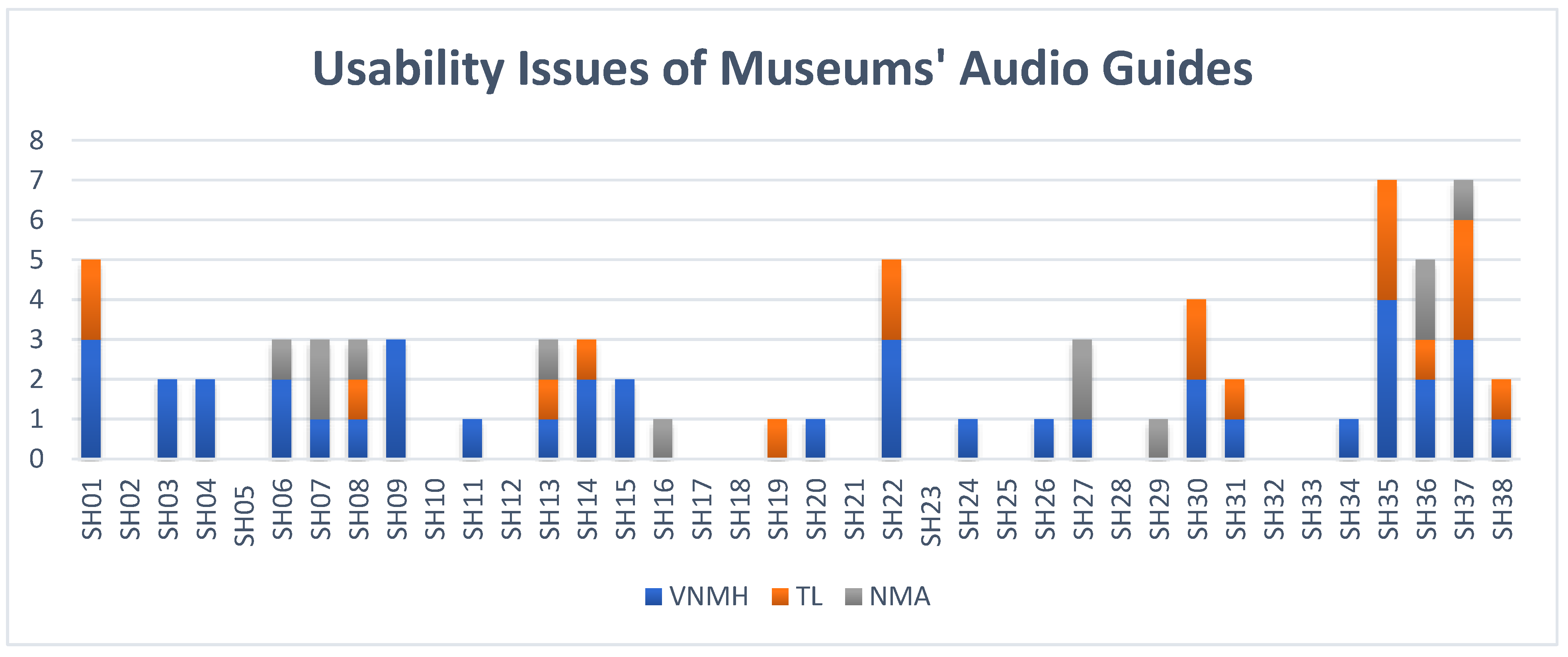
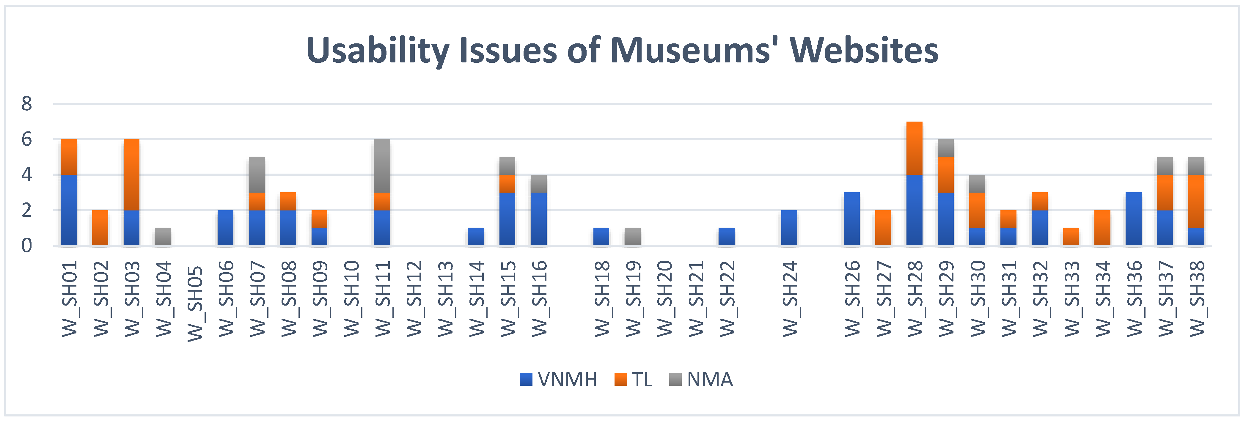
Publisher’s Note: MDPI stays neutral with regard to jurisdictional claims in published maps and institutional affiliations. |
© 2021 by the authors. Licensee MDPI, Basel, Switzerland. This article is an open access article distributed under the terms and conditions of the Creative Commons Attribution (CC BY) license (https://creativecommons.org/licenses/by/4.0/).