1. Introduction
Sustainable development has long been articulated as having three overlapping concerns of the environment, community and economics. The overlap is important as it implies that any one of these concerns should not dominate any of the others. Thus, economic growth should not take place to the detriment of the environment and/or society as a whole, and indeed some have argued that economic growth is not necessary or indeed desirable in sustainable development [
1]. While the relationship between economic growth and sustainable development has been hotly debated, it is certainly the case that economic growth is sought after by a large percentage of the population of any one country, not least the UK, and this has been especially apparent since the downturn in the economy as of 2008.
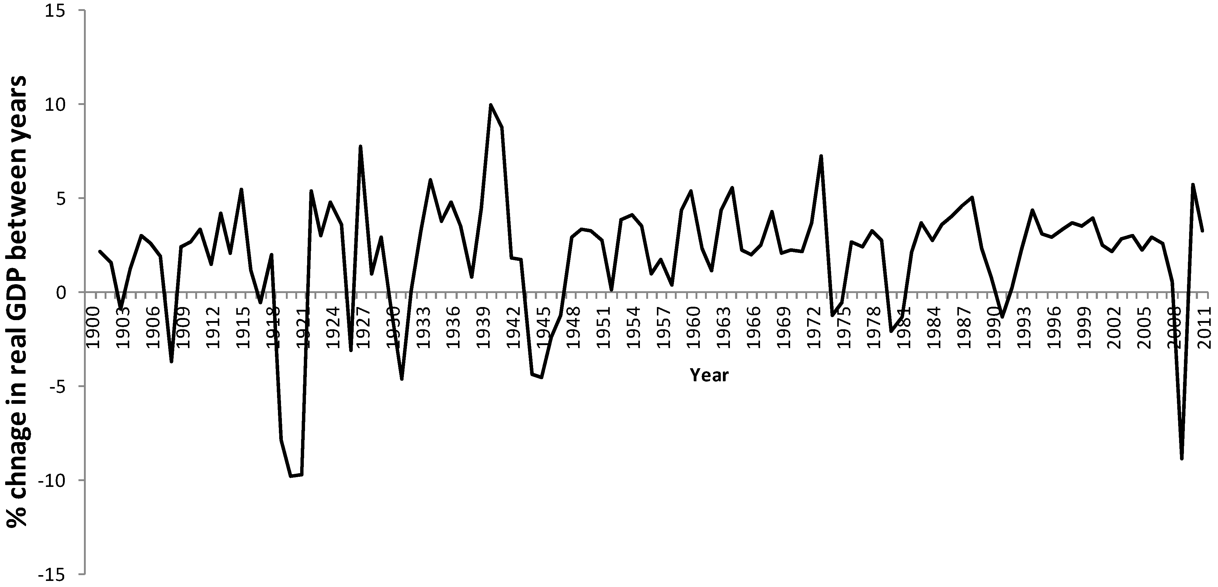
Figure 1 shows the real GDP figures (chained to 2005) for the UK up until 2011, and the downturn for 2008 was marked even in comparison to the downturns of two World Wars and the slump in the 1930s. The use of ‘real’ GDP where the value of the currency is pegged to a specific year (in this case 2005) removes the effect of inflation. Thus, the temptation for politicians may be to get the economy moving almost at any cost, even if it means a negative impact on the environment or indeed parts of society.
Figure 1.
Percentage change in Gross Domestic Product (GDP for the UK economy between 1900 and 2011. GDP has been “chained” to 2005.
Figure 1.
Percentage change in Gross Domestic Product (GDP for the UK economy between 1900 and 2011. GDP has been “chained” to 2005.
This “trade off” between the components of SD is not new, and is being played out on a daily basis across all countries of the globe. While various “national scale” measures exist for economic growth, and one of them (GDP) has been used for
Figure 1, measuring impact on the environment and society at the same scale is not so straightforward. One important issue is that such impacts can be very different across spaces within a single country and indeed within communities living in the same place.
This paper will explore some of the relationships that exist between regions of the same country in terms of some of the key considerations within SD; most notably consumption and social deprivation. The use of resource consumption by a population has certain advantages in that it can accommodate impacts that are not necessarily local to that consumption; for example the import of goods from foreign countries. There are well-established tools such as the Ecological Footprint (EF) which allow for such assessment. The EF is primarily an index of consumption and attempts to present that dimension of human behavior in terms of the land area (or more accurately—equivalent bioproductive land area) required to support it [
2,
3,
4,
5,
6,
7,
8]. The EF can be calculated for any size of population from an individual through to the global population and to adjust for such differences the EF is typically expressed on a per capita basis. The assumption is that the greater the EF per capita then the higher is the consumption and the worse is the negative impact on the planet, and the use of bioproductive land areas (global hectares; gha) as the unit to express such consumption means that people can readily appreciate the impact that they are having. Larger values for the EF can be associated with a sense of “greed” [
9] and the mantra of keeping one’s footprint as low as possible is something that can be readily articulated. Thus, the EF becomes a proxy assessment of environmental impact arising from human beings, although as will be seen later in the paper this is not a straightforward assumption. The extent of social deprivation can be thought of as a community impact that goes beyond a focus solely on income per household.
The notion of envisioning consumption in terms of land area has been promoted by various groups who calculate their own version of the EF. The “Footprint for Nations” version of the EF is published by Global Footprint Network [
10] and appears as one of two key indices in the World Wildlife Funds “Living Planet Reports” [
11]. The “Living Plant Reports” which contain values of the EF for nation-states have been published every two years since 2000; the two reports published before 2000 did not have the EF. The linkage between national EF, as determined by bodies such as the Global Footprint Network, and “quality of life”, as embodied by the Human Development Index (HDI) of the UNDP, have been explored in the literature [
12]. The HDI was initially developed as a means of measuring the extent of “human development” at the scale of the nation state. The HDI comprises three elements, namely income/capita, education and life expectancy, and ranges between 0 and 1; with higher values equating to “more” development. For many years the HDI was a simple arithmetic average of these three components, and higher values of the HDI (up to a maximum of 1) equate to “better” human development (or less deprivation). Lower values of the HDI equate to less human development, or, put another way, increasing deprivation. However, this is seeing human development (or deprivation as the mirror image) in very limited terms as comprising just three components. The decision to include a small number of components was purposely made by the UNDP as they wished to keep it as simple and as transparent as possible [
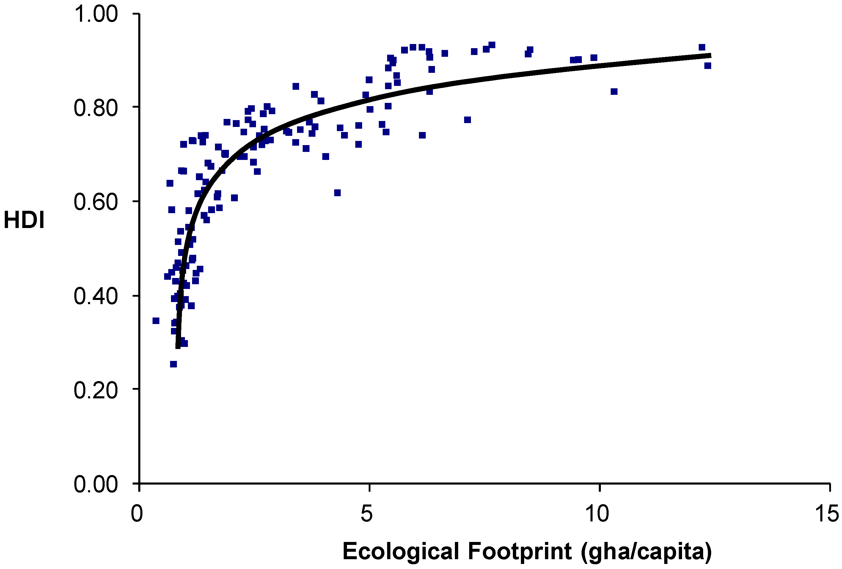
12]. Strictly speaking, the HDI was not intended to be a measure of “quality of life” but is often reported in the media using such terms. A number of studies have shown that the relationship is linear over the lower range of EF and HDI, but HDI begins to level off at higher values of the EF [
12]. A graphical example of the relationship between EF and the HDI for countries is presented as
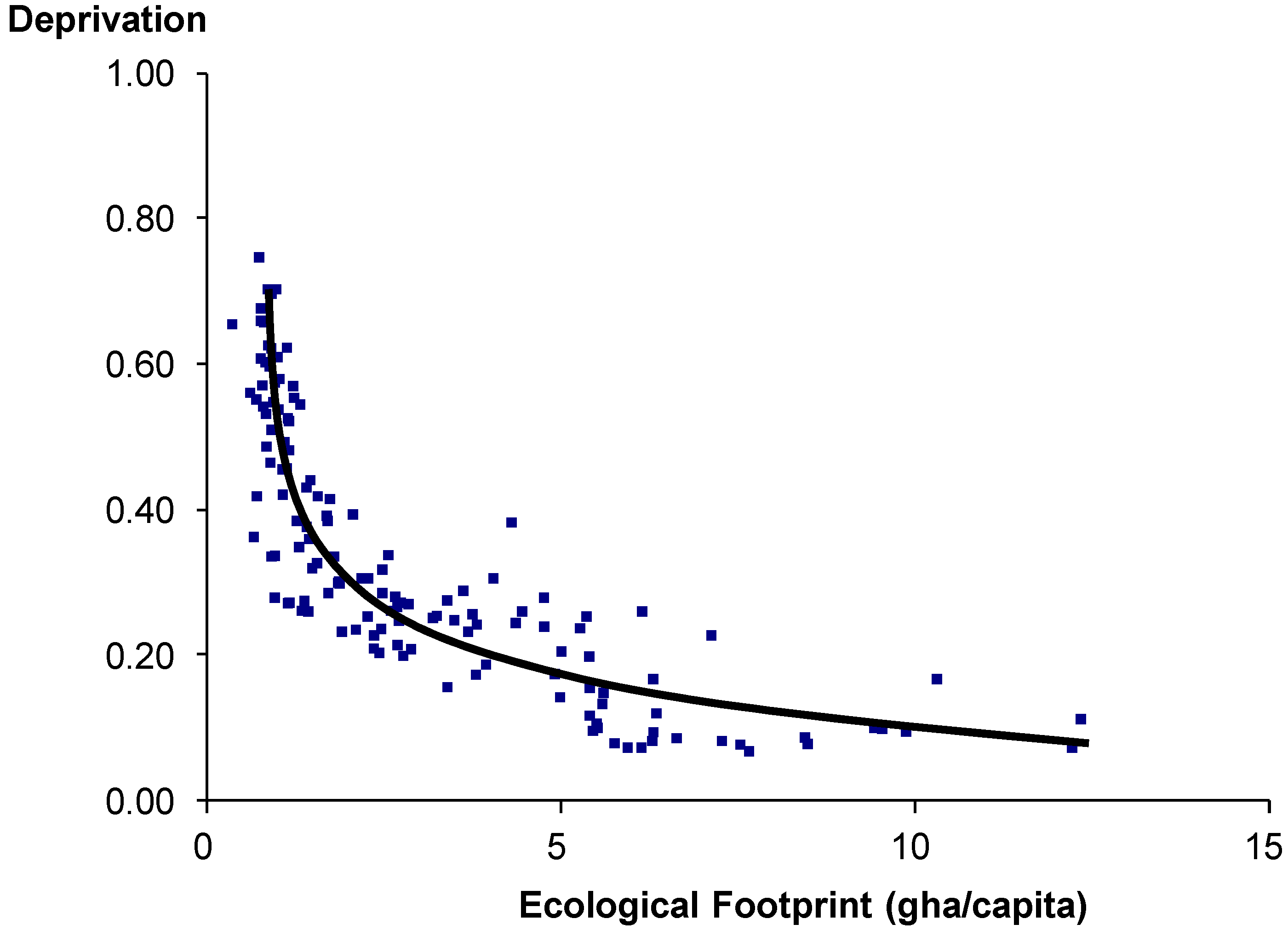
Figure 2. This can, of course, also be articulated in terms of deprivation rather than “quality of life” (development), where the former is seen as the inverse of the latter. In
Figure 3 this has simply been achieved by subtracting the HDI from 1 (higher values equate to greater deprivation). Thus, in effect, more EF (seen in terms of consumption) does not necessarily generate more development/less deprivation; there is a diminishing return. In effect the relationship between EF and deprivation begins with a sharp decline in deprivation as EF increases, but this becomes shallower and eventually levels off completely.
Figure 2.
Relationship between Ecological Footprint (EF; Global Footprint Network) and Human Development Index (HDI). Each point in the graph is for a single country.
Figure 2.
Relationship between Ecological Footprint (EF; Global Footprint Network) and Human Development Index (HDI). Each point in the graph is for a single country.
Figure 3.
Relationship between Ecological Footprint (EF; Global Footprint Network) and deprivation (measured as 1-HDI). Each point in the graph is for a single country.
Figure 3.
Relationship between Ecological Footprint (EF; Global Footprint Network) and deprivation (measured as 1-HDI). Each point in the graph is for a single country.
However, the cause-effect relationship seen in
Figure 2 and
Figure 3 is not straightforward for a number of reasons. Firstly, it has to be reiterated that the HDI is a rather simple index having just three components, even if they are important, and thus is inevitably limited in its ability to capture the complexity of “human development”. Much the same can be said of the EF, of course, and indeed this measure is also not without its critics. Secondly, EF can be a function of development rather than development being a function of EF (as implied in
Figure 2 and
Figure 3). Thirdly the dataset for
Figure 2 and
Figure 3 span a very wide range of EF and HDI values although it should be noted that the HDI is adjusted in such a way as to avoid a dominance of the income/capita component given that this has such a wide disparity between countries. The other two components of the HDI (education and life expectancy) have nothing like the extent of difference seen with the income/capita component largely because they have natural ceilings; the education component cannot be greater than 100% of children in school and maximum human life expectancy currently tends to be a decade or so after 100. Thus, given that the components of the HDI are effectively “capped” (either naturally or by the use of a mathematical device) then some of the leveling seen in
Figure 2 could be an artifact; a point that has not been made in previous studies of the relationship between these two variables.
Perhaps surprisingly there have been far fewer explorations to see whether the diminishing return relationship of
Figure 2 and
Figure 3 exist within a single country. This is partly because relatively few countries have regional EF and deprivation data, and those countries that do have such data tend to be found in the more affluent developed world. The EF, in particular, is a measure having many methodologies [
4] and while there are many examples of cities and regions estimating their own EF it is less common to have a uniform methodology applied to different regions within a country. While there is, of course, much deprivation in the developed world one may perhaps expect a greater degree of homogeneity in terms of deprivation and EF within such countries as the extremes one sees on the global stage are less likely. Thus, in theory, one may expect to see a relationship between EF and quality of life (or deprivation) that covers the part of the relationship towards the right-hand side of the curves seen in
Figure 2 and
Figure 3—the shallow declining line—but is that the case? The objective of this paper is to answer this question by drawing upon EF and deprivation data from England.
The United Kingdom, comprising four countries (England, Northern Ireland, Scotland and Wales), is an example of a nation which does have regional data for EF as well as detailed and extensive data which allows for assessment of the level of deprivation at fine spatial scales. England, the largest of the four countries in the UK in terms population and economy, comprises a number of regions, including Greater London. The other three countries are much smaller in terms of population. The level of deprivation at quite fine spatial scales (equating roughly to parishes) can readily be discerned for England using census data, and these can be aggregated to the scale of regions. Mitchell and Norman [
13] explored the link between deprivation and a number of indicators of environmental quality between 1960 and 2007 in England and made a convincing case that the relationship is not as straightforward as may be imagined. Indeed they argue that the greatest decline in environmental quality was often in the most affluent areas. However, as noted above the EF is based on consumption and the impact on the environment is assumed to flow from it and go beyond just the immediate local scale. Thus, EF embodies environmental impacts that can be local, national and international. The Stockholm Environment Institute (SEI) has also estimated values of the EF for local authorities across England. Thus, England provides a context within which the above assumptions regarding the relationship between EF and deprivation can be tested.
3. Methodology
The EF data for local authorities in England were obtained from the SEI website [
24]. The precise terminology of “local authority” in England can be confusing as some are boroughs (e.g., in London and other cities), districts or unitary authorities, but here the units employed by SEI were used and these are referred to as “districts”. The “local authorities” are grouped into geographical regions that do not necessarily have a governance role. Thus, the East Midlands region comprises 40 local authorities but there is no elected governance structure at the regional scale. London is the exception as the 33 boroughs (or districts) sit within a governance structure composed of an elected assembly and a mayor. While the regions, with the exception of London, are not administrative units they do broadly provide a basis for exploring geographical variation across the country.
Of the original EF components used by the SEI for their EF only 5 were employed in the analysis, namely housing, transport, food, consumer items and private services. The values for public services, capital investment and “other” were constant for all of the local authorities (0.59, 0.12 and 0.01 gha/capita respectively) and thus omitted from the analysis. These data were used to calculate an average EF and standard deviation for each of the regions in England; East, East Midlands, London, North East, North West, South East, South West, West Midlands and York and Humber. The EF data for the 5 components were used to calculate a 1st and 2nd Principal component.
The TID values for English local authorities were calculated from the 2001 census; the census that equates most closely with the time period for the EF data (2004 but published in 2008). Census data for that year were collected at parish scales in the UK (a local authority is comprised of a number of parishes) and the parish data were aggregated to produce a value for the local authorities that match those employed by SEI for the EF. Given that the four components of the TID have different units it was necessary to standardize them before taking the mean:
A number of methods were employed for data analysis, but primarily these were principal component analysis (PCA) and least squares linear regression employed to relate TID with EF. PCA is a way of accounting for the variation in a dataset using a number of “principal components”. The first PCA accounts for as much of the variability in the data as possible, and this is followed by the second, third etc. which in turn account for as much of the remaining variation as they can. In the results reported here only the first two principal components were included in the analysis.
In some cases comparisons were made using the Kruskal Wallis non-parametric test. This test checks whether two or more independent samples come from identical populations, and is thus a nonparametric alternative to a one-way ANOVA. The KW test is performed on ranks of the original data rather than the data themselves. Hence the smallest value gets a rank of 1, the next smallest gets a rank of 2 and so on for the entire dataset (procedures are in place to accommodate tied ranks—usually by averaging). The test then compares the mean ranking of the categories (not the medians of the raw data in the categories) and calculates a statistic referred to as “H”.
4. Results
The averages and standard deviations of the 5 components of the EF for the 9 English regions are shown in
Table 2. The results of a Kruskal Wallis non-parametric test on the EF components are also shown in
Table 2. For the housing and transport components the highest footprints are for the South East region and in the case of housing it is lowest for the East Midlands. The transport footprint is also high for the East and South West. In the case of the food footprint the highest footprint is for London, but high values are also found for the South East and East. Lowest “food footprints” are found for the North East, West Midlands and York and Humber. The South East again comes top for the “consumer items” footprint while the lowest values are for the North East and North West. Finally, the “private services” footprint is highest for the South east and London. The overall pattern is indicative of higher footprints (greater impact from consumption/capita) towards the south and east of England and lower footprints towards the north.
Table 3 gives the average (and standard deviation in parentheses) of the TID for the 9 English regions. The values are the averages across the 4 standardized components of the TID and that is why some are negative. Higher values equate to higher deprivation. London is the region with the highest level of deprivation at the time the data were collected (2001 census). This might be surprising to the reader but to this day parts of London continue to have some of the highest deprivation in the whole of the UK. However, it should be noted that the components of the TID could potentially distort the picture for London given that it has a good public transport system and property prices tend to be higher than the rest of the country. Hence even households that are relatively wealthy may not need to own a car and may rent rather than own their accommodation.
Table 2.
Averages and standard deviations (parentheses) of the five components of the Stockholm Environment Institute’s Ecological Footprint (EF) across the 9 English regions (gha/capita). The average EFs are based upon the sum of the 5 components and do not include public services, capital investment and “other” as these were identical for all regions. The table also shows the results of a Kruskal Wallis non-parametric test (*** = p < 0.001).
| Region | Number of districts | Housing | Transport | Food | Consumer | Private | EF |
|---|
| East | 48 | 1.30 (0.07) | 1.08 (0.08) | 1.37 (0.08) | 0.75 (0.04) | 0.31 (0.02) | 4.81 (0.26) |
| East Midlands | 39 | 1.27 (0.05) | 0.97 (0.08) | 1.34 (0.07) | 0.72 (0.04) | 0.28 (0.01) | 4.58 (0.24) |
| London | 33 | 1.32 (0.08) | 0.94 (0.15) | 1.44 (0.18) | 0.74 (0.09) | 0.36 (0.05) | 4.80 (0.53) |
| North East | 23 | 1.29 (0.09) | 0.76 (0.06) | 1.28 (0.08) | 0.62 (0.04) | 0.25 (0.01) | 4.20 (0.26) |
| North West | 40 | 1.30 (0.07) | 0.91 (0.08) | 1.36 (0.1) | 0.70 (0.05) | 0.29 (0.02) | 4.55 (0.30) |
| South East | 67 | 1.35 (0.1) | 1.07 (0.09) | 1.38 (0.1) | 0.80 (0.05) | 0.33 (0.02) | 4.93 (0.34) |
| South West | 45 | 1.32 (0.08) | 1.03 (0.05) | 1.32 (0.05) | 0.75 (0.03) | 0.30 (0.01) | 4.73 (0.19) |
| West Midlands | 34 | 1.29 (0.07) | 0.92 (0.09) | 1.28 (0.09) | 0.69 (0.05) | 0.28 (0.02) | 4.46 (0.30) |
| York and Humber | 23 | 1.34 (0.09) | 0.93 (0.08) | 1.28 (0.08) | 0.69 (0.04) | 0.28 (0.02) | 4.52 (0.29) |
| H and significance | | 37.81 *** | 170.35 *** | 59.17 *** | 173.24 *** | 240.46 *** | 102.38 *** |
It can be seen from
Table 3 that the lowest levels of deprivation at the time of the census were in the South East, the South West and the East regions. It is also interesting to note the variation within each region. This was, again, highest for London, but the North East and York and Humber were not far behind. These are aggregated values for each region and it is instructive to look at how the mean TID was related to the standard deviation (SD) within each region. Plots of the mean TID against the SD for each region are shown in
Figure 4. As perhaps would be expected, and for most regions, the SD increases as the mean increases, and this probably reflects a skewing within the data used to calculate the TID. This is not uncommon with data of this type, and suggests that at higher means of deprivation in an area there is also a greater degree of variation. However, it is interesting to note that the fitted regression lines for all regions have similar slopes, the exception perhaps being London (2.38) and at the other extreme the South West (0.45). The distribution of points around the “best fit” regression lines is also worth of note, especially for London. Greater London is very diverse in terms of its distribution of wealth, with affluent areas existing in close proximity to those with high deprivation.
Table 3.
Mean and standard deviations for the Townsend Index of Deprivation (TID) of the 9 English regions. The table also shows the results of a Kruskal Wallis non-parametric test (*** = p < 0.001).
Table 3.
Mean and standard deviations for the Townsend Index of Deprivation (TID) of the 9 English regions. The table also shows the results of a Kruskal Wallis non-parametric test (*** = p < 0.001).
| Region | Number of districts | Mean (SD) |
|---|
| East | 48 | −0.38 (0.4) |
| East Midlands | 39 | −0.29 (0.43) |
| London | 33 | 0.88 (0.64) |
| North East | 23 | 0.18 (0.63) |
| North West | 40 | −0.06 (0.65) |
| South East | 67 | −0.45 (0.42) |
| South West | 45 | −0.40 (0.36) |
| West Midlands | 34 | −0.25 (0.53) |
| York and Humber | 23 | −0.05 (0.63) |
| H and significance | | 111.2 *** |
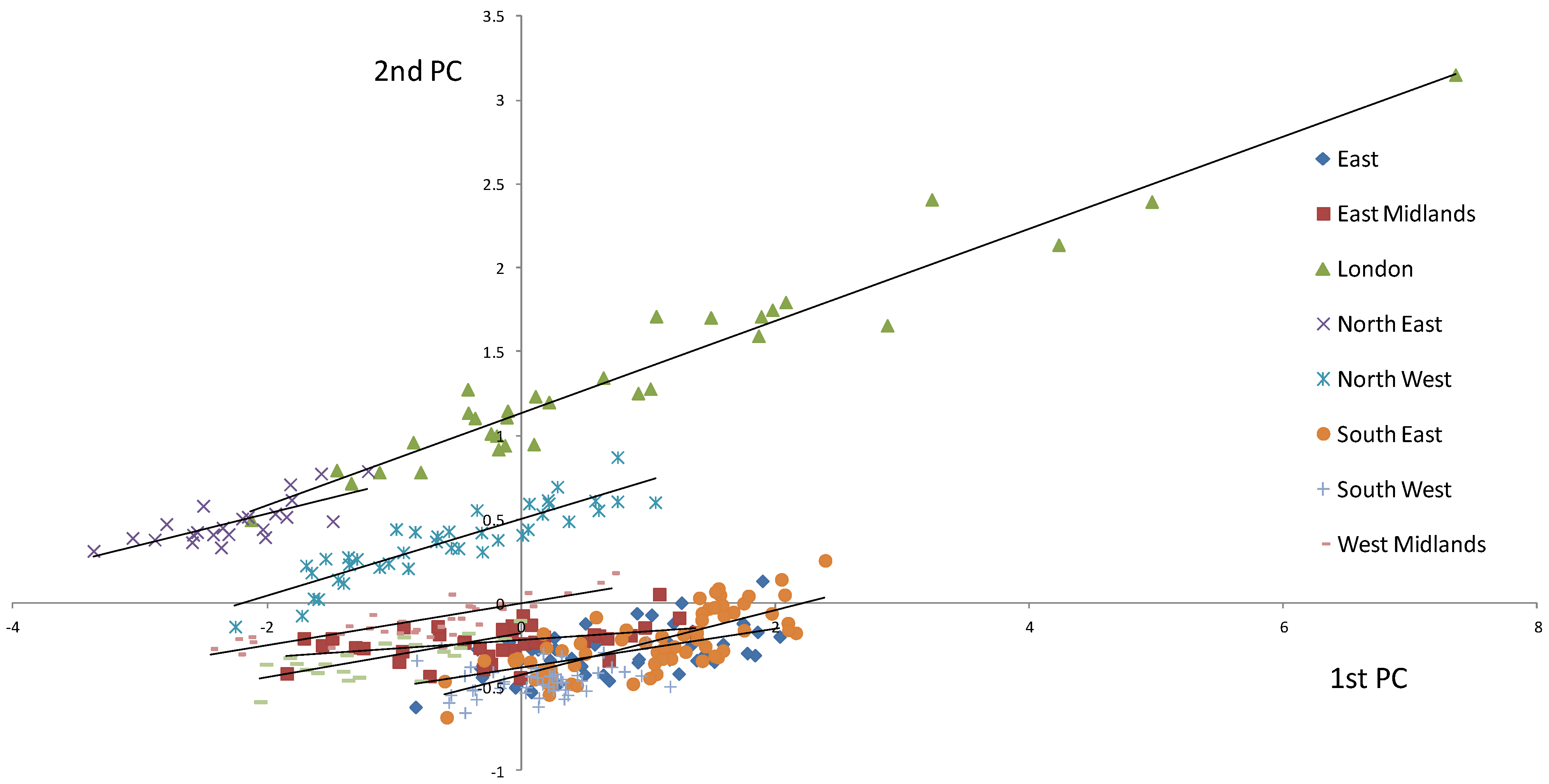
Figure 5 is a plot of the 1st principal component of the EF against the 2nd Principal component. While the analysis was conducted on all of the EF data combined the regions have been separated out and best fit regression lines applied to each. Most of the regions are grouped within a relatively small space within the graph (suggesting a degree of homogeneity within the EF space defined by the 1st and 2nd PCs), but London in particular stands out as having a large spread in data points.
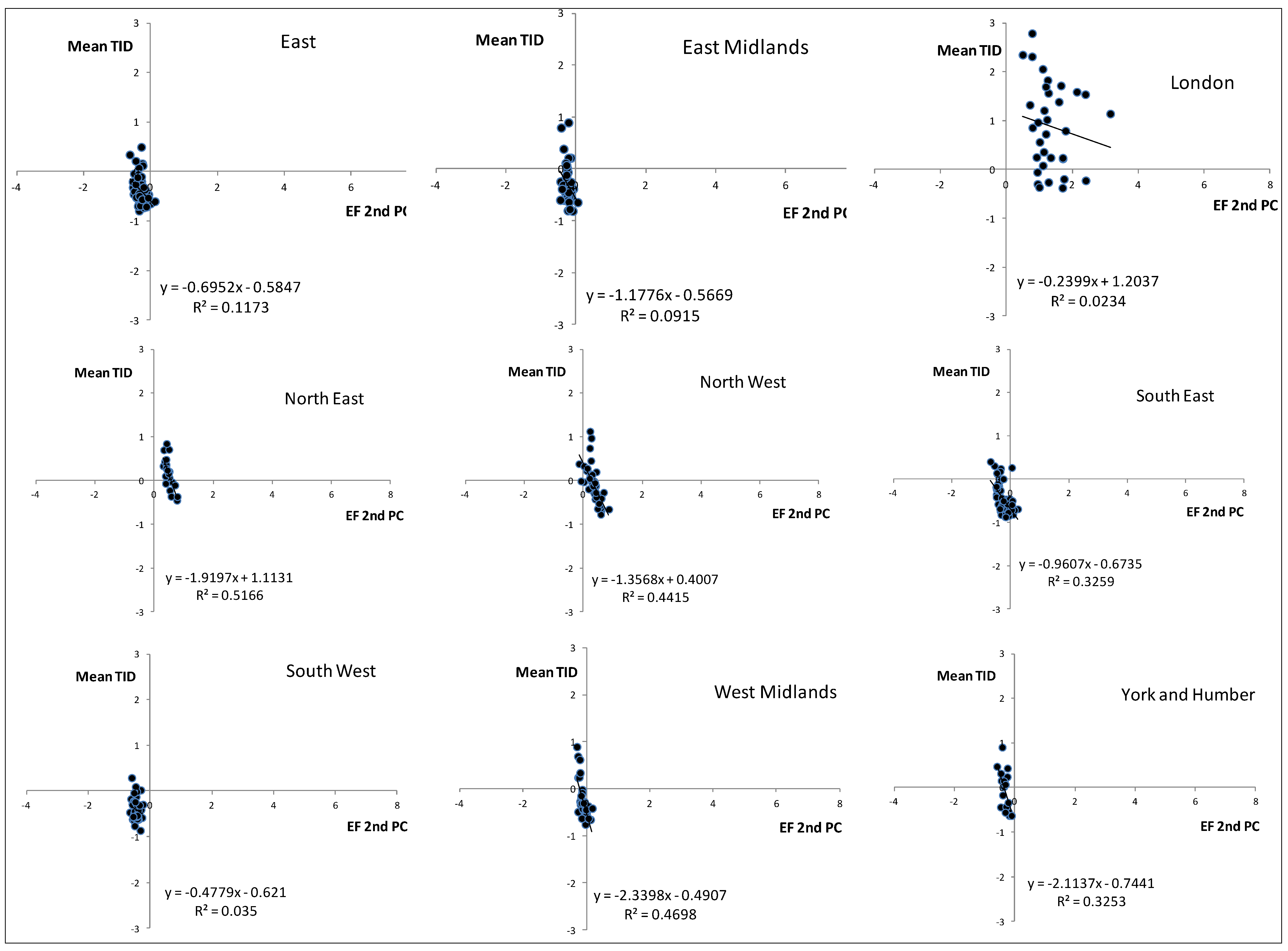
The separation is mostly in terms of the 2nd PC as seen in
Figure 6 where the 1st and 2nd PCs are plotted against the EFs obtained by summing the 5 components. Please note that these EFs are not the ones published by the SEI as three components have not been included. The 1st PC from all the regions allow for a single best fit regression line, while for the 2nd PC the groupings emerge. It seems as if the 1st PC captures a commonality amongst all the regions, while the second PC captures regional differences in footprint. In both cases higher values of the PC equate to higher EFs, and the greater spread in EF within London is especially apparent.
Figure 4.
Plots of mean TID against the standard deviation (SD) of the TID within each of the 9 English regions.
Figure 4.
Plots of mean TID against the standard deviation (SD) of the TID within each of the 9 English regions.
Figure 5.
1st Principal component plotted against the 2nd Principal Component of the EF data. The regions emerge as groupings within the graph and best-fit regression lines are shown for each of these.
Figure 5.
1st Principal component plotted against the 2nd Principal Component of the EF data. The regions emerge as groupings within the graph and best-fit regression lines are shown for each of these.
Figure 6.
1st and 2nd PCs plotted against the EF obtained by a simple summation of the EF components for all districts in the English regions.
Figure 6.
1st and 2nd PCs plotted against the EF obtained by a simple summation of the EF components for all districts in the English regions.
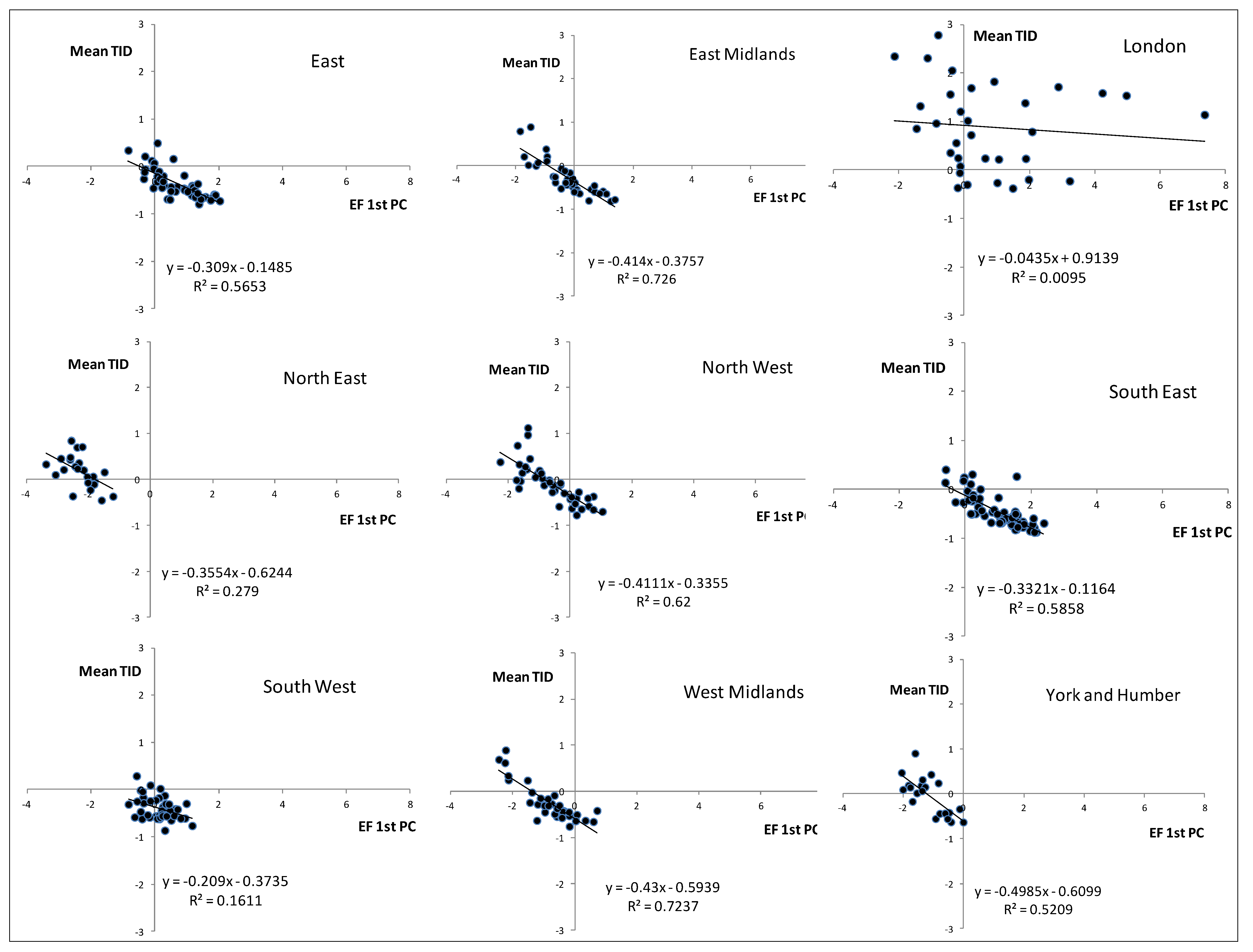
In terms of the relationship between the EF and the TID,
Figure 7 and
Figure 8 are plots of the 1st and 2nd PC respectively against the TID for the districts within each region. In
Figure 7 there is a clear linear relationship between the two such that the EF increases as the level of deprivation declines. The pattern is the same across all regions, albeit with slightly different spreads and locations within the axes. The data for London are more spread than for the other regions. The data are remarkably consistent in terms of the location within the graphs and the slope of the fitted lines. London stands out as being quite different from the other regions and so indeed, but to a lesser extent, does the North East. The difference between London and the other regions is also noticeable in
Figure 8 (2nd PC). With all the other regions the 2nd PC against TID generates small clusters of points in the graphs and these, again, are remarkably similar in terms of the size of the cluster and their placement within the two dimensional space. The difference seen with London in
Figure 8 seems to stem from the large variation in TID between the London boroughs; this is much higher than the variation in EF for those boroughs.
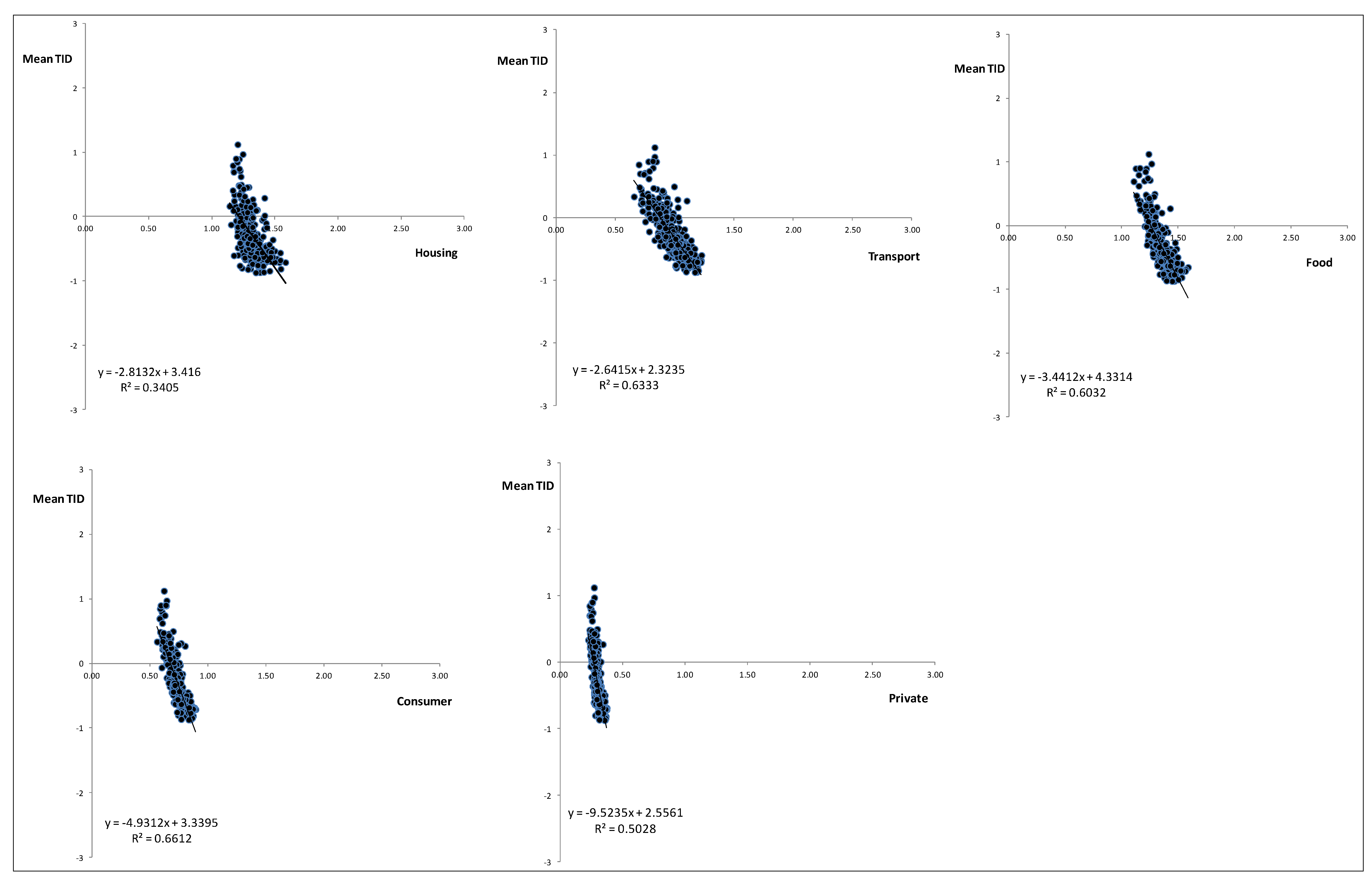
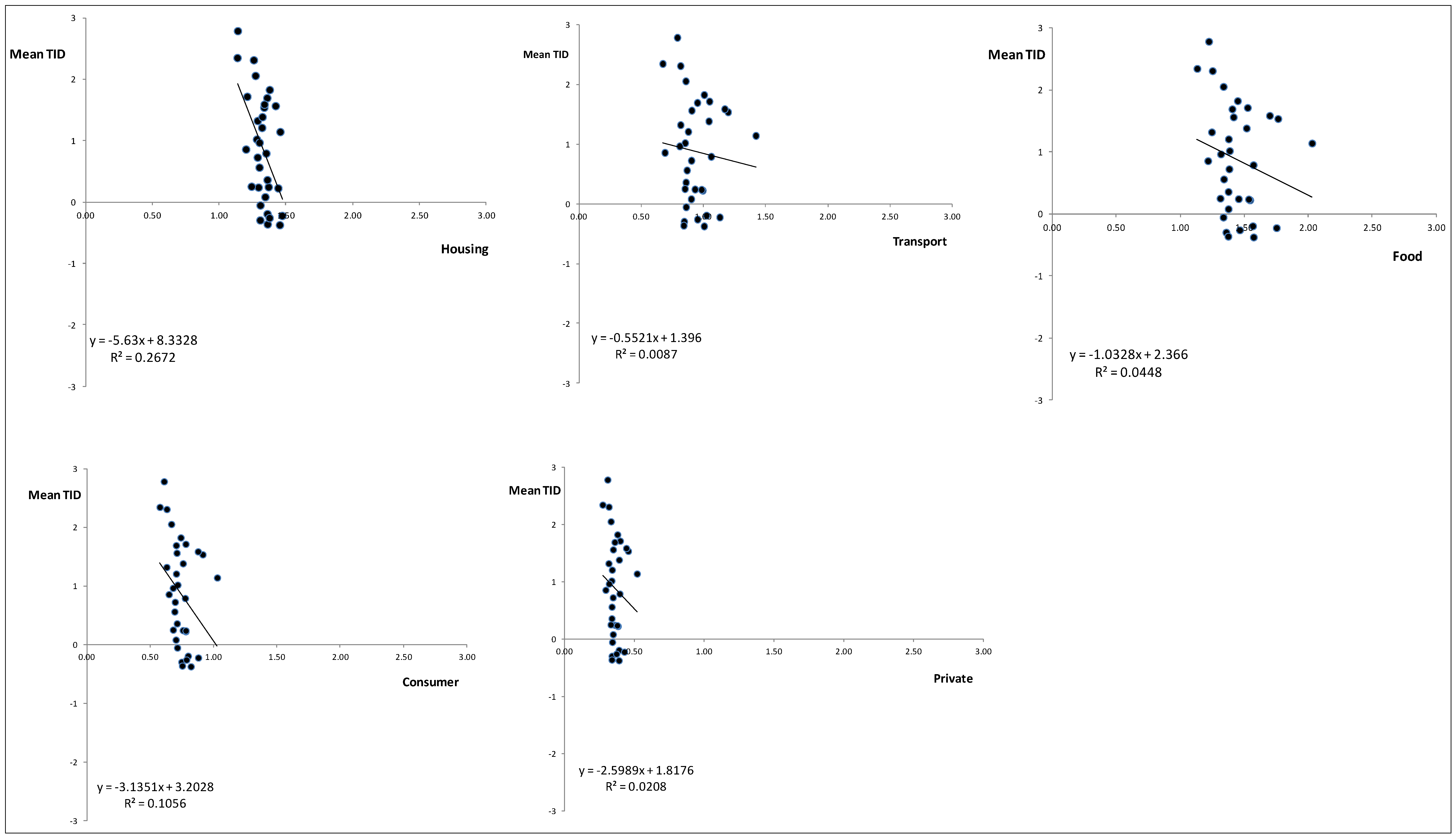
The differences between London and the rest of the country are also apparent in
Figure 9 and
Figure 10. Both
Figure 9 and
Figure 10 show the breakdown of the five components of the EF (their 1st PC) against the mean TID. In the case of
Figure 9 the data are for all regions with the exception of London while
Figure 10 presents the data just for London. In
Figure 9 the clustering is very apparent, although it is interesting that while each of EF components has a similar relationship with TID the location of the cluster along the EF axis is different. For each of the components there is evidence of a linkage between EF and TID; as the TID increases then the EF declines. In
Figure 10, where the data points are only for London, the locations of the clusters are similar to those in
Figure 9 but the scattering of the points is very apparent, and is largely driven by the TID but also the spread of the EF component data, especially the food and transport components. The variation in the transport component could in part be a reflection of the extensive public transport system in London as an alternative to car use.
Figure 7.
Plots of mean TID against the 1st PC of the EF. Data are for districts within the English regions.
Figure 7.
Plots of mean TID against the 1st PC of the EF. Data are for districts within the English regions.
Figure 8.
Plots of mean TID against the 2nd PC of the EF. Data are for districts within the English regions
Figure 8.
Plots of mean TID against the 2nd PC of the EF. Data are for districts within the English regions
Figure 9.
Mean TID as a function of the 1st PC of the components of the EF. Data are for all English regions except London and each dot represents a district.
Figure 9.
Mean TID as a function of the 1st PC of the components of the EF. Data are for all English regions except London and each dot represents a district.
Figure 10.
Mean TID as a function of the 1st PC of the components of the EF. Data are only for Greater London and each dot represents a borough (district).
Figure 10.
Mean TID as a function of the 1st PC of the components of the EF. Data are only for Greater London and each dot represents a borough (district).
5. Discussion
This study is one of few using fine scale data to address the relationship between EF and TID at a national level. There are relatively few examples of such studies at the intra-country scale, probably due to a scarcity of good quality data. The results are in agreement with the Mitchell and Norman [
13] and corroborate the relationship between affluence and EF in England. However, there is no diminishing return at the country level between TID and EF since most of the relationships in England and within the various geographical areas are markedly linear (with the exception of London). This contrasts with the plots between variables such as the HDI and EF which tend to show a leveling off at higher levels of the EF, although it is also worth noting that some of the leveling in the HDI-EF relationship could be due to a capping effect employed by UNDP in some of the HDI components. Such capping has not been employed here with the TID. The study has also demonstrated some key issues which have to be taken into consideration in similar type of analysis. On the one hand one would expect that EF would increase as a function of affluence. As households earn more, and this is proxied by the components of the TID even if income is not included as a component, then they are likely to purchase more of the items shown in
Table 1. These are generalizations, of course, and no doubt much of the error seen in the various plots of TID and EF emerge from households that affluent but do not have a high EF to match and vice versa. However, despite the fact that various studies have demonstrated that affluence is directly related to their EF, this is not always straight forward, particularly when working at the household level. For example a study from Finland [
31] working with low-income households came to the conclusion that although they had lower EFs than those of the average Finn their consumption levels were still not sustainable (
i.e., deprivation coupled with overconsumption). The results of Wu and Xu [
32] for the Heihe river basin, China, highlight a strong rural-urban dichotomy with regard to resource consumption, with urban areas having a greater degree of resource consumption. However, in the results presented here London does not seem to have an EF much greater than other regions and even within the city there is high variation.
So what is it about London that creates such a difference when compared with other regions of England? Why is it that the TID seems to be delinked from the EF? The variation in TID between the London boroughs is certainly much greater than seen for any of the districts within the other regions of England, but it is interesting to note that compared with non-London districts the level of deprivation for every London borough tended to be relatively high. While the boroughs are often seen as being quite different in terms of their wealth, with boroughs in the South West and West of the city seen as more affluent than those in the East and South East, but even within affluent boroughs there are areas of deprivation and the reverse is true for boroughs seen as less affluent. Hence one can readily imagine that the range of the TID for the London boroughs would be higher than for other regions. Why some of the EF components should also be so variable compared with other regions is less apparent. One explanation may rest with the structure of the TID and the inclusion of components focused on car and home ownership. Even relatively wealthy households in London may not see the need for a car given the good transport infrastructure and high property prices tend to mean that many households rent rather than own their accommodation. However, even with the larger ranges in the TID and EF for the hypothesis to be true one would expect to see a curved relationship yet this is not apparent in the data.
An important issue is that the components within the TID and EF operate at various scales with different sensitivity across administrative scales. Tzanopoulos
et al. [
33] showed that direct drivers demonstrate higher sensitivity across administrative levels compared to indirect drivers, as they operate in a non-linear way. This is also the case with many of the components of the EF compared to those of the TID. Furthermore, policies and policy instruments influencing these components are elaborated over multiple administrative levels, which do not match the scales of measurement or reporting. The TID values have been calculated using the parish and then aggregated to districts and regions, while the EF data have been estimated at the district scale.
Future work should be able to identify tipping points
i.e., pairs of values on the curve (x
i,y
i) where the relationship between TID and EF is not sustainable for a given geographical area in the long run. Although the difficulties of the concept and its application in ecological systems have been discussed [
34], conceptually there are certain analogies which could be taken into consideration in this study. These include the linear response of EF to TID, the multiple interactions between TID components and the fact that driver and response variables may operate at different time scales. There is also scope to look at other measures of deprivation, such as the Indices of Multiple Deprivation (IMD) which exist for England and see how they are linked to consumption. The IMD is far more complex than the TID and covers a number of dimensions rather than just the four in the TID. For example, the IMD developed for England and published in 2000 has 6 “domains” of deprivation and a total of 32 indicators. However the IMD needs more data than those available from the census and this does limit the spatial scales at which it is available. Nonetheless, the IMD is more favored by the UK government in terms of policy and this helps to offset some of its disadvantages as a research tool.
Finally it should be mentioned that this paper touches upon one of the most important elements of sustainable development—the decoupling of wealth and environment impact as expressed through models such as the Environmental Kuznets Curve. The relationships in all of the graphs presented in this paper between EF and TID do not show that such a decoupling has been reached, but a key assumption rests with the relationship between EF and negative environmental impact and as Fiala [
22] has pointed out it is possible that innovation will come to the rescue and allow a decoupling between consumption and impact. In policy terms it is challenging to limit consumption, especially as people develop expectations for the sort of goods embodied in the TID. Is it possible to identify an optimal value for the TID in terms of what people can expect and balance that against an EF that the planet can sustain? To date there is no evidence which suggests it is possible to use the analysis shown in this paper to “manage” a society in this way even if it was thought to be desirable.


