
Where Maps Lie: Visualization of Perceptual Fallacy in Choropleth Maps at Different Levels of Aggregation


Abstract
:1. Introduction
- (a)
- Where there are deviations from expected relative (class/rank) values, and;
- (b)
- How much perception of spatial distribution is distorted due to these deviations.
2. Materials and Methods
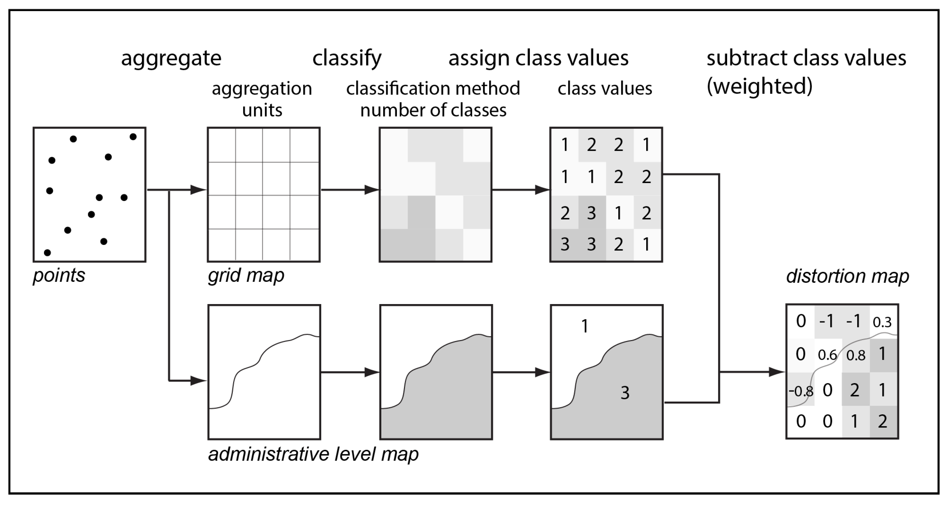
- The benchmark dataset (point data aggregated into small spatial units sufficient to adequate representation of the visualized phenomenon);
- The dataset of the larger aggregation units;
- The number of classes;
- Break values that depend on the chosen method of classification for both datasets.
- Point data are aggregated into a benchmark grid and into larger aggregation units;
- Both datasets are classified using the chosen method with the chosen number of classes;
- The benchmark grid is intersected with larger aggregation units;
- Class values of the larger aggregation units are compared to the benchmark grid cells. For the benchmark grid cells that intersect several larger aggregation units, class is calculated as weighted average and rounded to integer value;
- The difference between larger aggregation units class value and benchmark grid class value is calculated:
- The size and shape of a cell. The method works in the same way for cells of any shape, administrative units, or other polygons. The optimal size and shape of the cells depend on the nature of data. Any cartographic projection can be used as long as the maps used for comparison and the map of distortions are in the same projection;
- The number of classes. While interpreting maps, people operate not the values, but the categories, such as ‘average’, ‘low’, ‘high’, or ‘normal’. The results of some pilot tests conducted as a part of the preparation for this research allow for the assertion that most users do well at perceiving and memorizing just three classes: ‘average’, ‘low’, and ‘high’ [23]. As stated in a study on visual perception of choropleth maps by Schiewe [24], ‘the number of classes should be kept as small as possible, […]. Defining a universal upper limit (e.g., 5 or 6 classes) is of course rather difficult […].’ According to previous interviews and experiments with memorizing, seven classes appeared to be too many even for geography students. Five classes allow for representing the data with higher precision than just three, but further studies are needed to find out whether people really distinguish between the two ‘low’ and two ‘high’ categories. The method described can be applied for any number of classes;
- The method of classification. Any method of classification can be used. The method operates with semantic class values. These values remain comparable across choropleth maps that use different number of classes ad different classification methods. Thus, different methods of classification may be applied for benchmark and for the aggregated dataset. An appropriate classification method must be selected depending on the nature of represented data;
- The color scheme. Both diverging and gradual color scales can be used. If they are applied correctly from the viewpoint of cartography and special users’ needs are considered, they would have no major impact on perception of the general spatial pattern.
3. Case Study
3.1. Rationale for the Case Study
3.2. Experiment Design
- The eldership level map (encompassing all elderships). Elderships are the smallest administrative divisions of Lithuania with an area from 0.7 to 594.8 km2; average 116.2 km2;
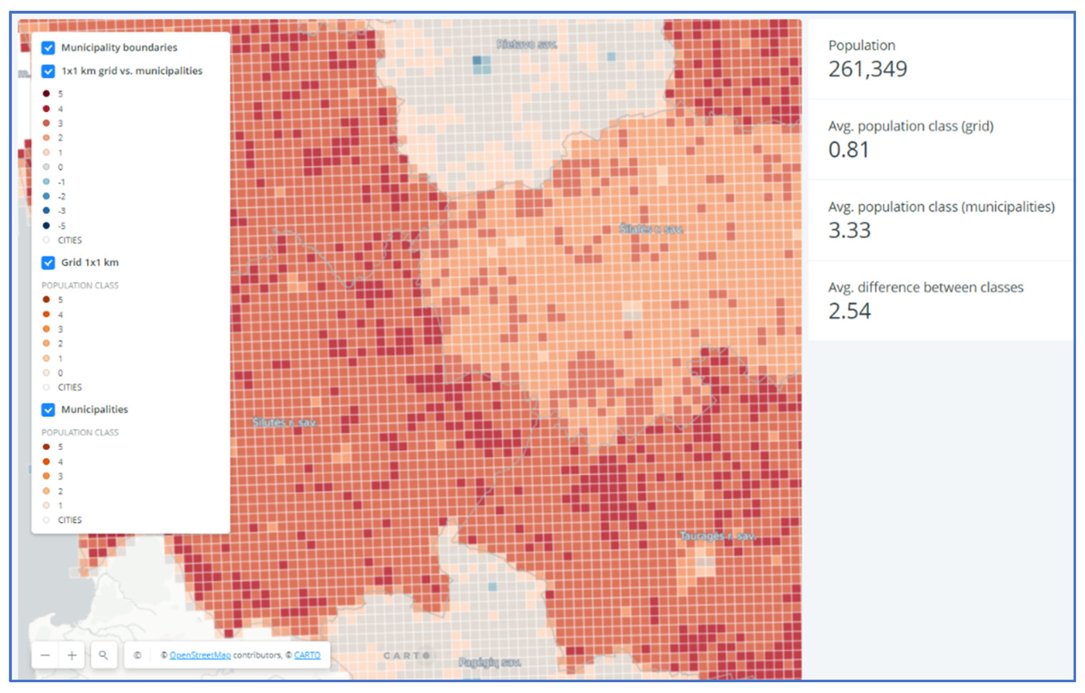
- The municipality level map (rural municipalities with an area from 40.0 to 2213.9 km2; average 1080.1 km2). For this map, urban areas with extreme density values (the seven largest cities) were removed as outliers to the issues at hand (Figure 5). Inclusion of cities would only mean higher levels of distortion. On the other hand, people commonly understand that towns are by their nature populated many times more densely than rural areas (in Lithuania, correspondingly averaging 984 and 31 inhabitants per km2, respectively). In the discourse of depopulation, urban areas need to be analyzed and discussed as a separate issue.
3.3. Outcomes
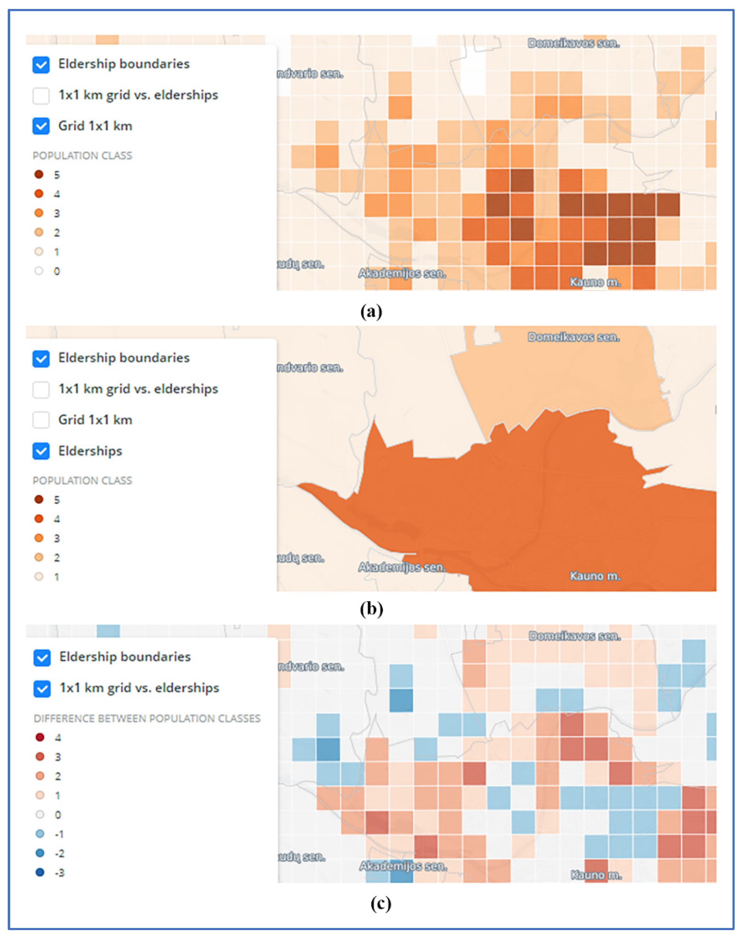
- (a)
- Eldership level (https://vucarto.carto.com/builder/e86912d2-c776-449d-8a27-4423b718ef55/embed, accessed on 28 November 2021); and
- (b)
- Municipality level (https://vucarto.carto.com/builder/6f48cac4-5770-482f-aaf2-1b41561553d0/embed, accessed on 28 November 2021) choropleth map layers and statistics of class values for visible area (Figure 6).
- (a)
- The areas surrounding the five largest cities (Vilnius, Kaunas, Klaipėda, Šiauliai and Panevėžys, Lithuania) and, surprisingly, several municipalities which have several times smaller population and no bigger towns. It means that although there is a trend of higher positive deviations to be observed near cities and towns, this trend is far from universal. The deviations were determined more by the configuration of administrative districts and by a specific mosaic of land use in each district;
- (b)
- Central and Western Lithuania with prevailing deviations of +3 and +4 over the entire area. These distortions are responsible for the wrong assumption repeatedly used (and even explained by higher fertility of land) by Lithuanian researchers who contend that rural population density is relatively much higher in middle Lithuania.
4. Discussion
5. Conclusions
Author Contributions
Funding
Institutional Review Board Statement
Informed Consent Statement
Data Availability Statement
Acknowledgments
Conflicts of Interest
References
- Monmonier, M. How to Lie with Maps, 2nd ed.; University of Chicago Press: Chicago, IL, USA, 2014. [Google Scholar]
- Jovanovic, J.; Zivkovic, D. Cartographic Modeling of the Population Density in the Function of Research of Spatial-demographical Relations. Geogr. Inst. Jovan Cvijin SASA Collect. Pap. 2005, 54, 115–127. [Google Scholar] [CrossRef]
- Robinson, W.S. Ecological Correlations and the Behavior of Individuals. Am. Sociol. Rev. 1950, 15, 351–357. [Google Scholar] [CrossRef]
- Openshaw, S. The Modifiable Areal Unit Problem; Geo Books: Norwich, UK, 1984. [Google Scholar]
- Root, E.D. Moving Neighborhoods and Health Research Forward: Using Geographic Methods to Examine the Role of Spatial Scale in Neighborhood Effects on Health. Ann. Am. Assoc. Geogr. 2012, 102, 986–995. [Google Scholar] [CrossRef] [PubMed] [Green Version]
- Manley, D. Scale, Aggregation, and the Modifiable Areal Unit Problem. In Handbook of Regional Science; Springer: Berlin, Germany, 2014; pp. 1157–1171. [Google Scholar]
- Xu, P.; Huang, H.; Dong, N.; Abdel-Aty, M. Sensitivity analysis in the context of regional safety modeling: Identifying and assessing the modifiable areal unit problem. Accid. Anal. Prev. 2014, 70, 110–120. [Google Scholar] [CrossRef] [PubMed]
- Karsznia, I.; Gołębiowska, I.M.; Korycka-Skorupa, J.; Nowacki, T. Searching for an Optimal Hexagonal Shaped Enumeration Unit Size for Effective Spatial Pattern Recognition in Choropleth Maps. ISPRS Int. J. Geo-Inf. 2021, 10, 576. [Google Scholar] [CrossRef]
- Luo, L.; McLafferty, S.; Wang, F. Analyzing Spatial Aggregation Error in Statistical Models of Late-stage Cancer Risk: A Monte Carlo Simulation Approach. Int. J. Health Geogr. 2010, 9, 51. [Google Scholar] [CrossRef] [Green Version]
- Shi, X.; Miller, S.; Mwenda, K.; Onda, A.; Rees, J.; Onega, T.; Gui, J.; Karagas, M.; Demidenko, E.; Moeschler, J. Mapping Disease at an Approximated Individual Level Using Aggregate Data: A Case Study of Mapping New Hampshire Birth Defects. Int. J. Environ. Res. Public Health 2013, 10, 4161–4174. [Google Scholar] [CrossRef] [Green Version]
- Shi, X. Evaluating the Uncertainty Caused by P.O. Box Addresses in Environmental Health Studies: A restricted Monte Carlo Approach. Int. J. Geogr. Inf. Sci. 2007, 21, 325–340. [Google Scholar] [CrossRef]
- Shi, X. A GeoComputation Process for Characterizing the Spatial Pattern of Lung Cancer Incidence in New Hampshire. Ann. Am. Assoc. Geographers. 2009, 99, 521–533. [Google Scholar] [CrossRef]
- Griffith, D.A. Uncertainty and Context in Geography and GIScience: Reflections on Spatial Autocorrelation, Spatial Sampling, and Health Data. Ann. Am. Assoc. Geogr. 2018, 6, 1499–1505. [Google Scholar] [CrossRef]
- Jacquez, G.M.; Waller, L.A. The Effect of Uncertain Locations on Disease Cluster Statistics. In Quantifying Spatial Uncertainty in Natural Resources: Theory and Applications for GIS and Remote Sensing; Mowrer, H.T., Congalton, R.G., Chelsea, M.I., Eds.; Sleeping Bear Press: Chelsea, MI, USA, 1999; pp. 53–64. [Google Scholar]
- Andresen, M.A.; Malleson, N. Spatial Heterogeneity in Crime Analysis. In Crime Modeling and Mapping Using Geospatial Technologies; Leitner, M., Ed.; Springer: Dordrecht, The Netherlands, 2013; pp. 3–23. [Google Scholar]
- Boessen, A.; Hipp, J.R. Close-ups and the Scale of Ecology: Land Uses and the Geography of Social Context and Crime. Criminology 2015, 53, 399–426. [Google Scholar] [CrossRef] [Green Version]
- Gerell, M. Smallest is better? The Spatial Distribution of Arson and the Modifiable Areal Unit Problem. J. Quant. Criminol. 2017, 33, 293–318. [Google Scholar] [CrossRef]
- Petrov, A. One Hundred Years of Dasymetric Mapping: Back to the Origin. Cartogr. J. 2012, 49, 256–264. [Google Scholar] [CrossRef]
- Brewer, C.A.; Eicher, C.L. Dasymetric Mapping and Areal Interpolation: Implementation and Evaluation. Cartogr. Geogr. Inf. Sci. 2013, 28, 125–138. [Google Scholar] [CrossRef]
- Zandbergen, P.A.; Ignizio, D.A. Comparison of Dasymetric Mapping Techniques for Small-Area Population Estimates. Cartogr. Geogr. Inf. Sci. 2013, 37, 199–214. [Google Scholar] [CrossRef]
- Ricker, B.; Kraak, M.-J.; Roth, R. The Promise of Dasymetric Maps for Monitoring Progress towards the United Nations Sustainable Development Goals. Abstracts of the International Cartographic Association. In Proceedings of the 30th International Cartographic Conference, Florence, Italy, 14–18 December 2021. [Google Scholar] [CrossRef]
- Nelson, J.K.; Brewer, C.A. Evaluating Data Stability in Aggregation Structures across Spatial Scales: Revisiting the Modifiable Areal Unit Problem. Cartogr. Geogr. Inf. Sci. 2017, 44, 35–50. [Google Scholar] [CrossRef]
- Šturaitė, A. Lietuvos Gyventojų Tankumo Kartografavimo Metodų Lyginamoji Analizė. Master’s Thesis, Vilnius University, Vilnius, Lithuania, 2016. (Unpublished work). [Google Scholar]
- Schiewe, J. Empirical Studies on the Visual Perception of Spatial Patterns in Choropleth Maps. K J. Cartogr. Geogr. Inf. 2019, 69, 217–228. [Google Scholar] [CrossRef] [Green Version]
- Andrienko, G.; Andrienko, N.; Demšar, U.; Dransch, D.; Dykes, J.; Fabrikant, S.; Jern, M.; Kraak, M.-J.; Schumann, H.; Tominski, C. Space, Time and Visual Analytics. Int. J. Geogr. Inf. Sci. 2010, 24, 1577–1600. [Google Scholar] [CrossRef] [Green Version]
- Berzins, A.; Zvidrins, P. Depopulation in the Baltic states. Lith. J. Stat. 2011, 50, 39–48. [Google Scholar] [CrossRef] [Green Version]
- Vaitiekūnas, S. Lietuvos gyventojų tankumas ir koncentracija. Tiltai 2004, 4, 21–39. [Google Scholar]
- Stanaitis, S. Social, Economic and Demographic Changes of Rural Areas in Lithuania. In Changing Functions of Rural Areas in the Baltic Sea Region; Polish Academy of Science: Warsaw, Poland, 2004; pp. 45–58. [Google Scholar] [CrossRef]
- Vaitiekūnas, S. Lietuvos Gyventojai per du Tūkstantmečius; Mokslo ir Enciklopedijų Leidybos Institutas: Vilnius, Lithuania, 2006. [Google Scholar]
- Daugirdas, V.; Baubinas, R. Retai apgyventos teritorijos Lietuvoje. 1. Teritorinės sklaidos aspektai. Ann. Geogr. 2008, 40, 28–37. [Google Scholar]
- Stanaitis, S.; Stanaitis, A. Lietuvos miestų ir jų gyventojų skaičiaus bei struktūros kaita nepriklausomybės metais. Tiltai 2013, 3, 69–82. [Google Scholar]
- Daugirdas, V.; Burneika, D.; Kriaučiūnas, E.; Ribokas, G.; Stanaitis, S.; Ubarevičienė, R. Lietuvos Retai Apgyventos Teritorijos; Lietuvos Socialinių Tyrimų Centras: Vilnius, Lithuania, 2014. [Google Scholar]
- Eismontaite, A.; Beconytė, G. Prognosis of Crime Rate Growth in Lithuania, Based on its Spatial Distribution and Relationship with Registered Unemployment Rates. Filos. Sociol. 2011, 22, 236–245. [Google Scholar]
- Vasiliauskas, D.; Beconytė, G. Cartography of Crime: Portrait of Metropolitan Vilnius. J. Maps 2016, 12, 1236–1241. [Google Scholar] [CrossRef]
- Levasseur, M.; Cohen, A.A.; Dubois, M.F.; Généreux, M. Environmental Factors Associated With Social Participation of Older Adults Living in Metropolitan, Urban, and Rural Areas: The NuAge Study. Am. J. Public Health 2015, 105, 1718–1725. [Google Scholar] [CrossRef] [PubMed]
- Interaktyvus Atlasas. Oficialiosios Statistikos Portalas. 2017. Available online: https://osp.stat.gov.lt/interaktyvus-atlasas (accessed on 29 November 2021).


| Methods | Descriptive Statistics | Evaluation of Data Stability in Aggregation Structures [19] | VPF Method |
|---|---|---|---|
| Approach | Statistical (standard deviation or dispersion index for an aggregation unit) | Statistical–visual (local indicators of spatial association) | Direct comparison of class values assigned to mapped units |
| Cartographic visualization of fallacies | No | Yes (requires additional interpretation) | Yes (direct) |
| Takes map perception into account | No | No | Yes |
| Precision | Precise values | Similarity values | Relative ordinal values |
| Usability of results | Requires interpretation | Requires additional analysis and interpretation | Usable without specialized knowledge |
| Main disadvantages | Does not represent spatial distribution of fallacies | Complexity | Shows generalized picture (may depend on the method of classification) |
| Evaluates possible impact of fallacy on data analysis, but not on perception | |||
| Main advantages | Precise and commonly used | Educates users | Yields immediately usable maps of fallacies |
Publisher’s Note: MDPI stays neutral with regard to jurisdictional claims in published maps and institutional affiliations. |
© 2022 by the authors. Licensee MDPI, Basel, Switzerland. This article is an open access article distributed under the terms and conditions of the Creative Commons Attribution (CC BY) license (https://creativecommons.org/licenses/by/4.0/).
Share and Cite
Beconytė, G.; Balčiūnas, A.; Šturaitė, A.; Viliuvienė, R. Where Maps Lie: Visualization of Perceptual Fallacy in Choropleth Maps at Different Levels of Aggregation. ISPRS Int. J. Geo-Inf. 2022, 11, 64. https://doi.org/10.3390/ijgi11010064
Beconytė G, Balčiūnas A, Šturaitė A, Viliuvienė R. Where Maps Lie: Visualization of Perceptual Fallacy in Choropleth Maps at Different Levels of Aggregation. ISPRS International Journal of Geo-Information. 2022; 11(1):64. https://doi.org/10.3390/ijgi11010064
Chicago/Turabian StyleBeconytė, Giedrė, Andrius Balčiūnas, Aurelija Šturaitė, and Rita Viliuvienė. 2022. "Where Maps Lie: Visualization of Perceptual Fallacy in Choropleth Maps at Different Levels of Aggregation" ISPRS International Journal of Geo-Information 11, no. 1: 64. https://doi.org/10.3390/ijgi11010064