
TOPCAT: Desktop Exploration of Tabular Data for Astronomy and Beyond


H. H. Wills Physics Laboratory, University of Bristol, Tyndall Avenue, Bristol BS8 1TL, UK
Informatics 2017, 4(3), 18; https://doi.org/10.3390/informatics4030018
Submission received: 27 May 2017
/
Revised: 20 June 2017
/
Accepted: 24 June 2017
/
Published: 27 June 2017
(This article belongs to the Special Issue Scalable Interactive Visualization)
Abstract
:TOPCAT, the Tool for OPerations on Catalogues And Tables, is an interactive desktop application for retrieval, analysis and manipulation of tabular data, offering a powerful and flexible range of interactive visualization options amongst other features. Its visualization capabilities focus on enabling interactive exploration of large static local tables—millions of rows and hundreds of columns can easily be handled on a standard desktop or laptop machine, and various options are provided for meaningful graphical representation of such large datasets. TOPCAT has been developed in the context of astronomy, but many of its features are equally applicable to other domains. The software, which is free and open source, is written in Java, and the underlying high-performance visualisation library is suitable for re-use in other applications.

1. Introduction
1.1. Source Catalogues
Astronomy is a discipline with a long history of collecting, storing and analysing data. This comes in various forms, including images, spectra and time series, but one of the most important is the source catalogue, a list of observed astronomical objects such as stars or galaxies, each with a fixed set of features. These features are mostly numeric and typically include quantities such as central sky coordinates, brightness in one or several wavebands, apparent size, ellipticity parameters and so on.
A catalogue is thus naturally represented as a table with a certain number of rows (one for each observed object) and columns (one for each feature). An early example is the Catalog of Nebulae and Star Clusters published by Charles Messier in 1781 [1], containing data in six columns for 103 celestial objects, each observed individually by eye. More recent examples are often, though not always, considerably larger; the features for modern catalogues are extracted automatically from image data obtained by highly sophisticated telescope instrumentation, and for the largest sky surveys can run to hundreds of columns such as the Sloan Digital Sky Survey [2], and/or the order of a billion rows such as the Gaia mission [3]. These numbers, of course, are expected to rise in the future, for instance in upcoming experiments such as ESA’s Euclid satellite (http://sci.esa.int/euclid/) and the Large Synoptic Survey Telescope (https://lsst.org/). Many other catalogues however may contain only a few tens or thousands of objects identified as a particular astronomical type or of interest for a particular study. In some cases catalogues can be represented by a single table, in others as complex relational databases.
A number of technologies exist for accessing such data, including bulk download of full or partial tables in domain-specific (VOTable [4], FITS [5]) or generic (Comma-Separated Value) file formats, and remote access to relational databases using SQL-like query languages. A family of “Virtual Observatory” standards (see e.g., [6,7,8]), developed since 2002 by a group of interested parties known as the International Virtual Observatory Alliance (IVOA) (http://www.ivoa.net/), enables standardised access to many thousands of such catalogues, which are mostly available without usage restrictions, hosted by a large network of data servers around the world.
1.2. TOPCAT Application
TOPCAT (http://www.starlink.ac.uk/topcat/), the Tool for OPerations on Catalogues And Tables [9], is a desktop Java GUI application for retrieval, analysis, and manipulation of tables. It has been developed in the context of astronomy and the Virtual Observatory, with the aim of providing a toolkit for astronomers to perform all the mechanical operations they routinely require on catalogues, so they can focus on extracting scientific meaning from this hard-won data.
It has been under more or less continuous development since 2003, and is in 2017 a mature application with an active user base in the thousands, spread over six continents, including undergraduates, amateur astronomers, and research scientists. A number of factors have contributed to its popularity in the astronomy community, including astronomy-specific capabilities such as celestial coordinate system handling, table joins using sky positions, and Virtual Observatory data access, as well as more generic items such as its powerful expression language and support for large datasets, alongside a responsive development model, high-quality support, ease of installation and a relatively shallow initial learning curve.
This paper however describes just one aspect of TOPCAT’s operation, its capabilities for exploratory visualisation, especially as applicable to generic (not necessarily astronomical) tabular data. Its distinctive combination of features compared to other visualisation applications includes:
- the ability to work with large datasets, without any special preparation of the data or prior assumptions about the visualisations required
- provision of many options to explore high-dimensional data, that can be adjusted interactively with rapid visual feedback
- meaningful representation of both high and low density regions of very large point clouds
The rest of the paper discusses these capabilities and outlines some of the underlying implementation. Section 2 describes TOPCAT’s relatively unsophisticated approach to data access which can nevertheless, by using robust technologies such as file mapping, deliver high performance results, as well as providing a platform that is easy to deploy and install. Section 3 and Section 4 explore the visualisation capabilities offered, principally representation of point clouds in one, two and three dimensions, including the optionally weighted “hybrid density map/scatter plot” which provides a unified view of high and low density regions in very crowded plots; the use of linked views for exploring high-dimensional data is also discussed. Section 5 and Section 6 examine the difficult issue of providing a comprehensible user interface to control the highly configurable plots on offer, including mention of the command-line interface STILTS. Section 7 goes into some detail about the implementation of certain performance-critical parts of the code and Section 8 gives a few examples of its, currently minority, use in fields other than astronomy. Section 9 and Section 10 conclude with information about availability of the software.
The visualisation framework described here corresponds to that introduced in version 4 of the application, released in 2013.
2. Application Overview
2.1. Data Access
TOPCAT uses a traditional model of data access for visualisation, in which the user identifies and retrieves to local storage one or more static tables, and then works with them. This makes it unsuitable for direct visualisation of extremely large datasets, but it turns out in most cases to be possible for users working with very large astronomical catalogues to preselect and download a subset of interest, by restricting for instance to a given sky region or class of astronomical object; TOPCAT provides a wide range of astronomy-specific options for selective acquisition of such data. In many other cases, users will be concerned with much smaller catalogues where data volume is not an issue.
Given this approach, it is important to be able to access large data files on local disk efficiently. TOPCAT’s preferred input format is the FITS binary table [5]. This binary format lays out columns and rows in a predictable pattern on disk, so that files can be mapped into memory for sequential or random access, giving effectively instant load time and without encroaching on Java’s limited heap space; for more explanation of this technique and its benefits in this context see [10]. However, other formats such as the more common Comma-Separated Values (CSV) are also supported. In this case direct file mapping is not useful, but for large CSV tables the data is copied on load into a temporary binary file which can itself be mapped, allowing similar access but with a significant load time. Another option is to use TOPCAT to convert from CSV to FITS format before use.
We note that more sophisticated data access models are in use by other visualisation applications, for instance running the computation on a remote data-hosting server and transmitting only the resulting images to be displayed in a browser or other desktop application (e.g., the Gaia archive visualisation service [11]), or retrieving and caching relevant data subsets on demand for local rendering as required by user navigation actions (e.g., Aladin-Lite [12]) or moving the user to the data using centralised high-performance visualisation facilities which may include large-scale display hardware alongside High Performance Computing capability (e.g., [13]). Such techniques can avoid wholesale transfer of an impractically large dataset without requiring the user to identify any particular subset of interest, and can deliver excellent interactive experiences. They also however suffer from some limitations. Visualisations which are intrinsically data intensive will have large resource requirements, consuming centralised resources while in progress which may be expensive and scale poorly to large numbers of users. In some cases, efficient server-side visualisation makes use of pre-computed data structures such as indexes or hierarchical multi-resolution maps, which may be expensive to compute but once in place can support rapid navigation and interaction. This can work well, but it generally requires prior information (or assumptions) about what visualisations are going to be required. In the case that there are many columns, and a user may want to plot not just any pair of columns against each other, but arbitrary functions based on available columns, it is typically not possible to ensure that the appropriate pre-calculated data structures are in place. As a general rule, coordinating client and server software adds a layer of complexity which can make software development slower and harder, and often impacts reliability. These techniques are also not suitable in the absence of network connectivity. TOPCAT’s low-tech approach on the other hand has the benefits of reliability, network independence and above all flexibility in terms of the visualisation options available.
2.2. Usage Model
As well as its traditional approach to data access, TOPCAT supports a straightforward usage model: it is a standalone application running CPU-based code, and suitable for use on low-end desktop or laptop computers. The visualisation is multi-threaded to maintain GUI responsiveness, but does not currently distribute the bulk of its computation across multiple cores for efficiency (though it may do so in future). If GPUs are present they are not used except for normal graphical operations.
This generally low-tech approach can nevertheless deliver performant interactive visualisation for quite large datasets, and has the benefit that barriers to use are low.
2.3. Expression Language
One of the features of TOPCAT not directly related to visualisation is its provision of a powerful expression language which allows evaluation of simple or complex expressions involving column names. In general, wherever a coordinate is supplied for plotting, either a column name or an expression can be used, making it very easy to plot arbitrary functions or combinations of columns. The expression language can also be used to define row selections algebraically.
The implementation of this feature is based on JEL, the Java Expressions Language, available from https://www.gnu.org/software/jel/.
3. Visualising Point Clouds
A source catalogue may contain tens or hundreds of columns, and interesting relationships may be lurking between pairs or higher-order tuples of these features. Often, an interesting result is to identify a subset of rows occupying a particular region in some multidimensional parameter space whose axes may be table columns, or linear or non-linear combinations of columns. Physically, this corresponds to identifying a sub-population of observed astronomical objects sharing some physical characteristics, for instance a group of stars formed from the same primordial dust cloud. TOPCAT does not attempt to provide automated support for discovering such relationships, for instance by implementing data mining algorithms. Instead, it aims to provide the user with a flexible toolkit of options to display different aspects of the data, in order to pick out trends, associations or interesting outliers by eye.
Many, though not all, of these options are variations on the theme of a scatter plot in two or three dimensions of some point cloud in multi-dimensional space. A scatter plot can be an excellent tool for presenting a relationship between known variables, but it presents two main problems. First, if the dimensionality of an association is greater than that of the plot, the association may be masked. Second, if the number of points is large compared to the area on which they are plotted, data can be obscured. These issues can to some extent be addressed by providing a range of plotting and interaction options, and are discussed in the following subsections.
3.1. High-Dimensional Plots
To represent a relationship between two variables by plotting points on a two-dimensional plotting surface is straightforward. This can be extended to three dimensions by using various techniques for representing points in a 3-d space, though visual interpretation tends to be harder in this case. TOPCAT supports both options, though the 3-d representation is at present restricted to a 2-d projection whose 3-d nature only becomes apparent from user interaction with the mouse (rotation, zooming, navigation).
To visualise a higher-dimensional relationship however, spatial positioning is not enough, so TOPCAT provides various ways to modify the representation of each point according to additional features. Distinct sub-populations can be identified using markers of different colours, sizes or shapes, individual points can be labelled with per-object text labels, and additional numeric features can be encoded using:
- colour from a selected colour map
- marker size
- X/Y marker extent
- error bars aligned with the axes
- vector with magnitude and orientation
- ellipse primary/secondary radius and orientation
The user can combine these options freely; some examples are shown in in Figure 1.
In principle quite a large number of features can be encoded in this way, for instance one could represent seven dimensions on a 2-d scatter plot by marking coloured ellipses with text labels. In practice however, especially if the number of points is large, there are limits to what is visually comprehensible.
3.2. Subset Selection and Linked Views
An alternative approach to understanding high-dimensional data is to extract sub-populations for further examination. A common workflow is to make a scatter plot in one parameter space, identify by eye a subset of points falling within a sub-region of that space and then replot the subset in a second parameter space to reveal some relationship evident in the subset but not the full dataset. This sequence may often be iterated to narrow down a sub-population of interest. This can be seen as a somewhat crude way to identify clusters that would be evident in a much higher dimensional space by combining multiple 2-dimensional views, but it is a powerful technique, and falls into the category of linked views [15,16].
TOPCAT allows the user to define subsets in various graphical and non-graphical ways, one of the most powerful being to drag out with the mouse an arbitrary shape over a region of a plot. Such subsets, once defined, can be plotted separately in any other plot of the same table, and also distinguished for other processing operations. An example is given in Figure 2.
3.3. Row Highlighting and Linked Views
Another aspect of linked plots in TOPCAT is that when the user highlights a plotted point by clicking on it, any point in other visible plots representing the same row is automatically highlighted. At the same time, if the underlying data is displayed in an table browser window, the corresponding row is highlighted so that the data values in all columns can easily be seen. The same operation works in reverse, so clicking a row in the table browser window will highlight any corresponding points in currently visible plots.
The application can also be configured so that some Activation Action takes place when a row is selected by user action in either of these ways. A typical activation action might be to display an image associated with the table row in question, for instance the original photograph that supplied the data, e.g., available from a URL column in the table. TOPCAT can perform basic image display internally, or communicate with external specialised display applications in order to achieve this kind of thing. This coordinated row-highlighting behaviour can be especially useful for investigating outliers.
The communication with external display applications mentioned above, if required, can be done by invoking methods of Java classes supplied at runtime, or invoking system commands, or using the messaging protocol SAMP [19] implemented by a number of astronomy tools, including Aladin [18], SAOImage DS9 [20], Astropy [21] and others. This latter option in fact provides for inter-process exchange of both single rows and row subsets, allowing linked views between cooperating applications, as well as just within TOPCAT.
For an example of all this in action, see Figure 3.
3.4. High-Density Plots
TOPCAT aims to be able to explore tables containing many rows. The answer to the question, “how many?”, is of course constrained by available resources of computation and user time, but in general the target is: as many as possible. The larger the dataset that can be explored interactively, the fewer decisions the user will need to take in pre-selecting data, and the more relationships are potentially available for discovery.
There are two main aspects to consider when attempting to satisfy this requirement. The more obvious concerns resource usage: will the computation require more memory than is available, and will it be fast enough to provide a fluid experience? These questions are discussed in Section 7. But there is also a question of what constitutes a visually faithful and comprehensible representation of a very large number of points. In particular, how can one represent a scatter plot when the number of points to plot exceeds the number of pixels available?
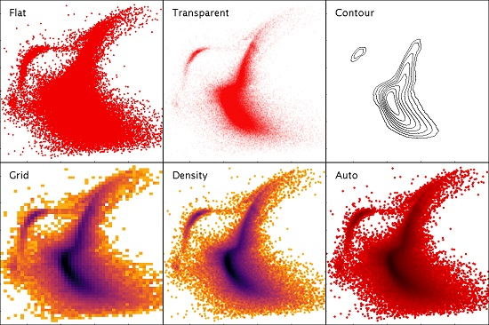
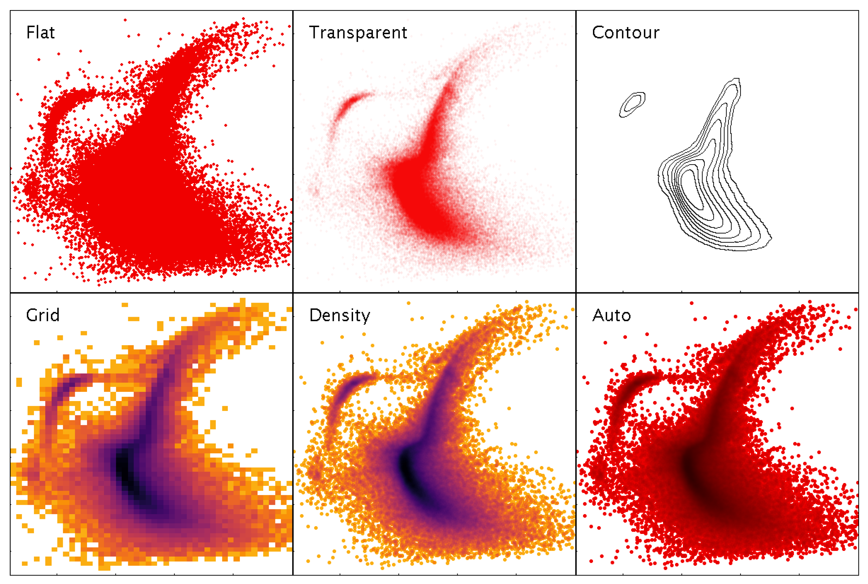
Simply plotting the points as opaque markers loses information where there are many points per pixel, since it is not possible to see how many points are overplotted. A number of options exist to address this, such as painting partially transparent markers, drawing contours, or binning data to generate colour-coded two-dimensional histograms (also known as density maps). Very often for source catalogues however, the outliers are just as important as the statistical trends, so both the low and high density regions of the plot must be represented faithfully. Contour plots and density maps do not work well for low-density regions, while transparent points are suitable for small variations in density but lose information at one or both ends of the density spectrum if there is a large density range. Use of a density map or contour plot also inhibits the row highlighting behaviour described in Section 3.3, since single points are not represented. To address this issue, a hybrid density map/scatter plot has been introduced, which is a convolution of a single-pixel density map with a shaped marker, and represents both high and low density regions of the plot well in the same display, resembling a smoothed density map at high density and a normal scatter plot at low density. This hybrid representation, which is the default plotting mode, also works particularly well when navigating a large point cloud: zooming in turns a high-density into a low-density region, so the plot transitions smoothly from a density map to a normal scatter plot. It is described in more detail in [23]. TOPCAT provides all these options and others for plotting large and small point clouds in two or three dimensions. Some examples are shown in Figure 4.
Colour-coding points to express extra dimensions as discussed in Section 3.1 presents additional issues in high-density regions, since multiple colours may be overplotted in the same pixel. To address this problem, TOPCAT offers a weighted generalisation of the hybrid density map/scatter plot, as illustrated in Figure 5.
3.5. Navigation
It is impossible to understand all the information in a point cloud consisting of millions of points from a static image, particularly if it is presented on a grid of, say, 100,000 pixels. But it is often possible to identify what might be a region of interest from a plot that represents the density structure and outliers appropriately, and zoom in on such a region for closer inspection, down to the features of individual objects. Interactive navigation of plots is therefore a crucial feature for exploratory visualisation.
The basic user interface for navigating 2-dimensional plots is fairly straightforward, namely that dragging a mouse around the screen will drag the plot with it, while rolling a mouse scroll wheel will zoom in or out around the current mouse position. Plots in TOPCAT in many cases have no natural aspect ratio, so various options are provided for anisotropic zooming: dragging the middle button will drag out a “window” rectangle with any required aspect ratio to become the new field of view, while dragging the right button stretches or shrinks the field of view in the X and Y directions independently according to the drag position. It is also possible to control the X or Y fields of view separately by performing the windowing or stretching gestures near the relevant axis. Keyboard modifiers are available for mice lacking all three buttons or a scroll wheel. The isotropic drag/zoom navigation gestures are generally intuitive for users of other GUI applications. The anisotropic zooming capabilities offer very flexible 2-d navigation, but they are less intuitive and advertising them well is difficult, so many users may not be aware of their proper use.
Allowing navigation through a 3-d scatter plot is a more difficult user interface problem. In this case, TOPCAT uses the default-button drag to rotate the visualised cube, and the mouse wheel to zoom in or out around the cube center. These gestures are intuitive. Translating the volume within the cube however is harder to do. Some mouse gestures are assigned to drag and stretch along the cube plane most nearly parallel to the screen projection plane, but it is difficult to use these to zoom in on a region of interest. More useful is the right-click; this takes the point under the current cursor position and translates it to the center of the cube, so that subsequent zoom actions will zoom in and out around it. However, since in 3-d the cursor position represents a line of sight rather than a unique point, this presents a problem: which of the positions under the cursor should be the new plot center? To break this degeneracy, the point chosen is the center of mass (mean depth) of all the points plotted along the line of sight. The effect is that when clicking on a single point, the point position is used, while when clicking on a dense region, the center of the region is used. This re-centering navigation works very well in practice for navigating to regions of interest in 3-d point clouds, though again the UI may not be obvious to all users.
Visual feedback is given as quickly as possible in all these cases. Typically the screen is updated at better than 10 frames per second up to a million or so rows for one of the standard scatter plots; for larger datasets or more complex plots the response may be more sluggish. To improve user experience, an adaptive “sketch” mode is in effect by default. If refreshing a frame takes more than a certain threshold time (0.25 s), fast intermediate plots based on a subsample of the data are drawn while a navigation action is in progress, the subsampling fraction being chosen depending on how long the full plot appears to take. When the user has stopped dragging/zooming and enough time has elapsed for the full plot to be drawn, the display is refreshed from the full dataset. In most cases this gives a good compromise between responsive and accurate behaviour, though for certain plot types the intermediate sketched frames can prove confusingly different from the final, correct, frame.
4. Other Plot Types
Although the main focus of the visualisation in TOPCAT is representing point clouds of various sorts, it has other visualisation capabilities too. One important category is depicting weighted or unweighted frequency data, which is a kind of point cloud in one dimension. The most common visualisation for this kind of data is a histogram, but a number of variations are available including smoothed representations with choices of fixed-width or adaptive smoothing kernels with various functional forms, a range of normalisation types, cumulative binning, control over bin width and phase, etc. Some of the options are illustrated in Figure 6.
A number of other more specialised plot types are also offered, for instance analytic function plotting, line plots to trace samples against an independent variable, axes annotated with time coordinates, spectrograms, and some fairly basic data fitting algorithms.
There are also comprehensive facilities for plotting data with positions specified by latitude and longitude on the celestial sphere, including a range of sky projections, sky coordinate system grid annotations, and binning schemes suitable for spherical geometry. These sky plotting capabilities may also be used for data situated on other spheres, such as (an approximation to) the surface of the Earth.
5. Configuration User Interface
TOPCAT currently provides around thirty different plot layer types (fixed shape marker, variable size marker, error ellipse, histogram, ...) with seven different shading modes (flat, auto, transparent, weighted, ...), on half a dozen different plot geometries (2-d and 3-d Cartesian, spherical polar, celestial sphere, ...). Each of these options has typically 5–10 associated configuration variables. All of these options have been introduced to support anticipated, and in many cases actual, requirements for making sense of real user data.
This offers a great deal of flexibility for specifying a visualisation, but equally presents a serious problem of complexity: how does the user, especially the non-expert user, navigate all these options to look at some data? Packaging this flexibility in a comprehensible and usable GUI is perhaps the single most difficult problem in developing an application of this kind.
Addressing this from the user perspective, the application is designed on the principle that the user should always see some kind of reasonable plot with minimal effort.
In practice, this means that if the user hits one of the top-level Plot buttons in the application’s main window, a reasonable plot is shown, if at all possible. If the user hits the Plane Plot button, a scatter plot is displayed of the two first numeric columns of the currently-selected table; an example is shown in Figure 7. The bounds of the plot region are automatically adjusted to display all the points in the selected dataset. The shading mode (Auto from Figure 4) is one which works well for both small and large datasets. This default plot is unlikely to be the one the user wants to see, but it is easier to take an existing GUI and modify its default settings, with instant visual feedback at every step, than to be presented with a lot of blank fields to fill in before any result is shown. The controls visible in the same plot window make it obvious how to choose a different table or different columns for the plot. It is somewhat less obvious how to modify the plot by changing marker characteristics, overplotting other datasets, adding error bars or contours, changing axis scaling or annotation etc, but by exploring the various tabs and list items the user can explore and adjust the various options in as much detail as they require. In this way each user can benefit from as much configuration effort as they are willing to expend, rather than being scared off by an initial need to understand the tool in detail. Comprehensive documentation is provided for each feature, accessible from a help button at the top of the window, though it is more of a pleasant surprise than a general expectation that confused users will seek and read this material.
This approach provides a GUI that is usable by novices to produce basic plots, but which can also be exploited by experts for very detailed control. However, the question of providing a usable interface for configuring complex plots is not a solved problem in TOPCAT; it also becomes more acute as additional plot types and options are added. While many users do manage to use the various combined features to perform sophisticated visualisations it is probably the case that only a minority understand the full range of available capabilities.
6. Alternative Interfaces
This paper mainly discusses the GUI application TOPCAT. However, it is possible to access the visualisation functionality in a number of ways from outside of that application, and many of the same remarks apply.
Alongside TOPCAT is a suite of command-line tools by the name of STILTS (STIL Tool Set) [24], which provides scriptable access to most of the functionality available from TOPCAT. Both are based on the table access library STIL (Starlink Tables Infrastructure Library), and all of these items are developed and maintained, with some other partially related software, in a single group of packages collectively known as Starjava. These packages are available at the from the URLs http://www.starlink.ac.uk/stilts/ and http://www.starlink.ac.uk/stil/.
STILTS provides commands that can generate all the visualisations available from TOPCAT’s GUI, and in fact most of the figures in this paper were generated using STILTS, since its scriptable nature makes it more suitable for careful preparation of published figures than TOPCAT’s point and click operation.
The output of STILTS, like that of TOPCAT, can be to various bitmapped or vector graphics file formats (including PNG, GIF, PDF and PostScript) or to an interactive window on screen that allows the same mouse-controlled navigation actions as TOPCAT.
The classes used for visualisation in both cases form a library known informally by the name plot2. These classes have not so far been formally packaged as a separate product, but are contained within the STILTS jar file and can be used independently of either the TOPCAT or STILTS applications, to provide high performance static or interactive visualisation within third party Java applications. Depending on what functionality is required, the code required for this is licensed under the LGPL or GPL. Some more background on this possibility is described in [25].
As explained in Section 7.1, plotting from STILTS is actually more scalable than that from TOPCAT. While there is no fixed limit on the size of tables loaded into TOPCAT, it is not really intended for use with tables more than a few tens of millions of rows; interactive use is generally sluggish on such data, and in some cases memory usage can be high. STILTS visualisation on the other hand is in most cases able to stream data within a fixed (and quite small) memory footprint, so it is possible to generate static plots of arbitrarily large data sets quite easily. Figure 8 shows an all-sky density plot generated from a 2 billion row table in about 30 min.
7. Implementation Notes
The user experience-driven requirements of usability with large datasets, fast navigation, flexible configurability and instant visual feedback place considerable constraints on the implementation. In this section we outline some of the strategies in place to deliver these features.
7.1. Scalability
The first requirement, built into the whole of the TOPCAT application and its underlying libraries, is to be able to process tables with large row counts in fixed memory if at all possible. This means that generating a plot must not, unlike many off-the-shelf Java plotting libraries, allocate an object or other storage for each input row or plotted point. Instead, where possible, the plotting system uses data structures that scale with the number of pixels rather than the number of rows. This rule is violated in some cases, for instance if the number of rows can be determined to be small, or in a few cases where it is unavoidable such as z-stacking points for 3-d plots, but most of the common plot types obey it.
To support this model, the various plot layer implementations work with an abstraction of the data that simply iterates over each row, returning typed values (typically double precision scalars, though in some cases boolean, string or array values) for the required coordinates at each step. For each iteration they can then either paint directly to the graphics system or populate some limited-size data structure that will be used for graphics operations later in the rendering process.
The harnessing code can then decide how to deliver the iteration over the data values from the original table. The TOPCAT application reads the relevant values into in-memory primitive arrays once it is known what coordinates are required, ensuring maximal subsequent access speed, since actually extracting these values from the underlying loaded tables may be somewhat time-consuming. This does entail some -scale memory usage, though usually at an acceptable level, e.g., only 16 bytes per row for a 2-d scatter plot. However the STILTS application writing to a static image file simply iterates over the rows of the underlying table without intermediate caching, thus requiring little additional storage. These different strategies have different benefits: TOPCAT, having prepared the data for a given visualisation at the expense of some memory usage can plot subsequent frames using the same data (e.g., the results of user navigation) as quickly as possible. STILTS (in its default configuration) may take longer for each frame of an animation sequence but can process arbitrarily large tables in a small memory footprint. In the common case where STILTS is painting to a single static frame, the benefits for subsequent replots would not be useful.
7.2. Responsive User Interface
As discussed in Section 5, the visualisation user interface contains many controls, each of which may change the appearance of some or all parts of the plot; the axes or one or more of the data layers contributing to a particular visualisation. A responsive user interface requires that whenever one of these controls is adjusted, the display is updated accordingly. However, regenerating the whole plot from scratch may be expensive for a large or complex plot, so this should be avoided where possible. In some cases (e.g., changing the plot colour of a currently hidden dataset) perhaps no replot is required at all. In other cases (e.g., axis annotations only are changed) some parts of the plot must be redrawn but the results of previous computations could be re-used. Or perhaps (e.g., coordinate data is replaced by a different table column) the whole thing needs to be redrawn. In general various parts of the plotting computations can be cached, and a great deal of effort goes into working out, whenever the controls are adjusted, which computations from the previous plot can be re-used.
The way this works is that every time a user control is adjusted, it triggers a replot action. This calculates a set of label objects for each of several plot characteristics such as the currently visible region of parameter space, the set of table data required for each plot layer, the per-layer configuration style options etc. Together, this set of labels completely characterises the plot. These label objects are small and cheap to produce, so multiple replot actions per second (for instance, as a user drags a slider) are in themselves easy to service, and this step can be done on Swing’s Event Dispatch Thread (EDT) without impairing the responsiveness of the overall application GUI. If this is the first plot to be produced in a given window, these labels are stored for later reference, and then fed back to the plot components that generated them, providing instructions to draw the plot which is then calculated and displayed. However, on subsequent plots in the same window, the plotting system performs various comparisons of the labels for the new frame with those that specified the previous frame. Specifically, Java’s Object.equals method is used for label comparison, so these label objects must be written with carefully implemented equality semantics. If the set is exactly equivalent to that for the previous frame, no replot needs to be done. In general, some recalculation or redrawing will be needed, but less than would be required for regenerating the whole plot from scratch. This computation prepares a new plot bitmap on a worker thread, which it passes on completion back to the EDT for display in the plot window. A queue of replot requests is maintained, and if a new one comes in while another is waiting to be performed, the older one is discarded. Whether requests in progress are aborted depends on some logic to decide whether the new request looks like a minor (navigation) or major (plot new data) configuration update.
The details of the selective caching that underlies this are quite complicated, but an example may be illustrative. A plot layer performs its plotting in two stages: in the planning stage it is given the opportunity to produce a plan object that may represent the results of expensive computations, and in the painting stage it is given back the same plan to use in order to perform actual graphical output. Management, including optional caching, of the plan objects is done by the plotting application and not the layer itself. If the layer can determine that a plan equivalent to the one it needs to produce for the currently requested plot is already available, because the management level has cached it from an earlier invocation, it can skip the planning stage and use the previously calculated plan for the painting stage instead. Hence: a density map layer might generate a plan containing a grid of bins populated by the expensive work of iterating over the table rows, and then in the painting stage simply transfer this grid to a bitmap using some configuration-determined colour map. If a subsequent invocation uses the same grid data but a different colour map, because the user has adjusted the colour map controls but not moved the grid, it can repaint the image (cheap) without requiring a rescan of the table data (expensive). The result is that the user can adjust colour map parameters with instant visual feedback even for a large dataset.
7.3. Configuration Option Management
As discussed above, many configuration options are available to control the data layers that combine to form a given visualisation, along with the details of the axis representation and annotation, legend display, plot dimensions, font selection etc.
In order to reduce the implementation complexity associated with these hundreds of options, each one is represented by a standard object known internally as a ConfigKey. Each of these keys can supply user-directed metadata (name, description), value type (which may just be a number or some more complex type like a colour map or marker shape), a sensible default value, a GUI component for specifying values, and methods for mapping between typed values and string representations. It is important that the default values of all keys taken together to specify a given plot will combine to give some reasonable default plot as discussed in Section 5.
Different components of the plotting system make use of these keys to build the user interface and gather configuration information without hard-coded knowledge of each plot and layer type. A harnessing application needs to establish which plot type and layers are in use, interrogate them for their ConfigKeys, and then acquire values for each key that can be fed back to the plot components to generate the plot. In TOPCAT’s case it sets up plot window controls by stacking the relevant GUI components ready for adjustment by the user, while STILTS interrogates the list of name-value pairs supplied on the command line. Other front ends based on name-value pairs have also been implemented, including a cgi-bin interface for HTTP operation and a Jython front-end to STILTS; both are available and documented within the STILTS distribution itself, as the STILTS server task and the JyStilts application respectively.
The user documentation for each plot type can also be generated programmatically at documentation build time by interrogating each key for its user metadata; around 130 of the 400 pages in the PDF version of the STILTS user document are auto-generated from ConfigKey objects in this way.
The result of organising the configuration options in this uniform way is that new configuration options can be introduced easily by making only localised changes to plot type or layer type code; no corresponding updates to the UI code or hand-written documentation are required.
8. Use Beyond Astronomy
TOPCAT has been developed for astronomers, with the support of funding agencies whose responsibility is to the astronomy community. The large majority of its use to date has been within astronomy, mostly for use with source catalogues. It is also applied to other types of astronomical table such as time series and event lists, and within some related but distinct fields such as planetary and solar system science.
However, though it has much functionality that is specific to astronomy (understanding of sky coordinate systems, data access using astronomy file formats and Virtual Observatory protocols, table join techniques appropriate for the celestial sphere) many of its capabilities are suitable for any kind of tabular data, and some adventurous groups in other disciplines are also making enthusiastic use of it.
One example is the group of P. Pognonec from Université Nice, who use it for work investigating cellular events such as proliferation, mitosis and cell death. They report TOPCAT as their preferred option for visualising with dotplots and histograms the large tables (ten million cells with 50–100 parameters) of data produced by image analysis of high throughput microscopy acquisitions. An example is shown in Figure 9. Another is operational and laboratory work by H. Rydberg in the company Sustainable Waste and Water, City of Gothenburg in Sweden, where it is used especially for interactive analysis of long time series data concerning water quality; see Figure 10. In this case the capability to ingest large raw datasets without prior aggregation and navigate interactively makes it possible to clean data and identify trends over a wide range of timescales. The author has also had other informal reports of TOPCAT’s sporadic use in bioinformatics, finance, urban transport planning and flight testing.
While the current funding arrangements do not prioritise support outside of astronomy, the author is very interested to hear of potential or actual uses in other domains, and willing to supply modest support, for either casual use or adapting the application or underlying libraries to other requirements. One missing feature that should be noted when considering applying the software more widely is its weak support for categorical data, which is not very common in TOPCAT’s core use cases. However, enhancements in this area are possible in the future.
9. Software Availability
TOPCAT is written in pure Java, and distributed as a single jar file depending only on the Java Standard Edition (Java SE), currently version 6 or later. The wide availability and excellent portability and backward compatibility characteristics of the Java platform mean that it can therefore be installed and run very easily on all widely used desktop and laptop computers. The jar file, as well as a MacOS DMG file, can be downloaded from the project web site http://www.starlink.ac.uk/topcat/. Other information including comprehensive tutorial and reference documentation, full version history, pointers to mailing lists etc can be found in the same place. The package has also recently been made available as part of the Debian Astro suite [27].
The software is available free of charge under the GNU Public Licence, and the source code is currently hosted on github (https://github.com/Starlink/starjava/).
10. Conclusions
TOPCAT is a GUI application for manipulating tables, that amongst other capabilities provides sophisticated visualisation capabilities for tabular data. It is a traditional desktop application, requiring neither exotic hardware nor server support. It has been developed within the context of astronomy and is widely used in that field, but is suitable, along with its command-line counterpart STILTS and underlying Java libraries, for visualising many other kinds of tabular data. The focus is on highly configurable interactive plots of both small and large (multi-million-row) tables, offering many variations on the representation of point clouds in one, two or three dimensions, with the aim of revealing expected and unexpected relationships at multiple scales in large and high-dimensional datasets.
Acknowledgments
Development of TOPCAT’s current visualisation capabilities has been supported by a number of grants from the UK’s Science and Technology Facilities Council. The features described here have benefitted greatly from advice, comments and feedback from its active user community. Special thanks to Henrik Rydberg and Philippe Pognonec for their input on use in non-astronomical contexts. The author also thanks the anonymous referees whose constructive comments have improved the paper.
Conflicts of Interest
The author declares no conflict of interest. The funding sponsors had no role in the design of the study; in the collection, analyses, or interpretation of data; in the writing of the manuscript, and in the decision to publish the results.
References
- Messier, C. Catalogue des Nébuleuses & des amas d’Étoiles (Catalog of Nebulae and Star Clusters); Technical Report; Memoirs of the Royal Academy of Sciences for 1771: Paris, France, 1781. (In French) [Google Scholar]
- Stoughton, C.; Lupton, R.H.; Bernardi, M.; Blanton, M.R.; Burles, S.; Castander, F.J.; Connolly, A.J.; Eisenstein, D.J.; Frieman, J.A.; Hennessy, G.S.; et al. Sloan Digital Sky Survey: Early Data Release. Astron. J. 2002, 123, 485–548. [Google Scholar] [CrossRef]
- Brown, A.G.A.; Vallenari, A.; Prusti, T.; de Bruijne, J.H.J.; Mignard, F.; Drimmel, R.; Babusiaux, C.; Bailer-Jones, C.A.L.; Bastian, U.; Elteren, A.K.; et al. Gaia Data Release 1. Summary of the astrometric, photometric, and survey properties. Astron. Astrophys. 2016, 595, A2. [Google Scholar]
- Ochsenbein, F.; Taylor, M.; Williams, R.; Davenhall, C.; Demleitner, M.; Durand, D.; Fernique, P.; Giaretta, D.; Hanisch, R.; McGlynn, T.; et al. VOTable Format Definition Version 1.3. IVOA Recommendation 20 September 2013. arXiv, 2013; arXiv:1110.0524. [Google Scholar]
- Hanisch, R.J.; Farris, A.; Greisen, E.W.; Pence, W.D.; Schlesinger, B.M.; Teuben, P.J.; Thompson, R.W.; Warnock, A., III. Definition of the Flexible Image Transport System (FITS). Astron. Astrophys. 2001, 376, 359–380. [Google Scholar] [CrossRef]
- Arviset, C.; Gaudet, S.; IVOA Technical Coordination Group. IVOA Architecture Version 1.0. IVOA Note 23 November 2010. arXiv, 2011; arXiv:1106.0291. [Google Scholar]
- Dowler, P.; Rixon, G.; Tody, D. Table Access Protocol Version 1.0. IVOA Recommendation 27 March 2010. arXiv, 2010; arXiv:astro-ph.IM/1110.0497. [Google Scholar]
- Plante, R.; Williams, R.; Hanisch, R.; Szalay, A. Simple Cone Search Version 1.03. IVOA Recommendation 22 February 2008. arXiv, 2008; arXiv:astro-ph.IM/1110.0498. [Google Scholar]
- Taylor, M.B. TOPCAT & STIL: Starlink Table/VOTable Processing Software. In Astronomical Society of the Pacific Conference Series, Proceedings of the Astronomical Data Analysis Software and Systems XIV, Pasadena, CA, USA, 24–27 October 2004; Shopbell, P., Britton, M., Ebert, R., Eds.; Astronomical Society of the Pacific: San Francisco, CA, USA, 2005; Volume 347, p. 29. [Google Scholar]
- Taylor, M.B.; Page, C.G. Column-Oriented Table Access Using STIL: Fast Analysis of Very Large Tables. In Astronomical Society of the Pacific Conference Series, Proceedings of the Astronomical Data Analysis Software and Systems XVII, London, UK, 23–26 September 2007; Argyle, R.W., Bunclark, P.S., Lewis, J.R., Eds.; Astronomical Society of the Pacific: San Francisco, CA, USA, 2008; Volume 394, p. 422. [Google Scholar]
- Moitinho, A.; Krone-Martins, A.; Savietto, H.; Barros, M.; Barata, C.; Falcão, A.J.; Fernandes, T.; Alves, J.; Gomes, M.; Bakker, J.; et al. Gaia Data Release 1: The archive visualisation service. Astron. Astrophys. 2017, in press. [Google Scholar]
- Boch, T.; Fernique, P. Aladin Lite: Embed your Sky in the Browser. In Astronomical Society of the Pacific Conference Series, Proceedings of the Astronomical Data Analysis Software and Systems XXIII, Waikoloa Beach Marriott, HI, USA, 29 September–3 October 2013; Manset, N., Forshay, P., Eds.; Astronomical Society of the Pacific: San Francisco, CA, USA, 2014; Volume 485, p. 277. [Google Scholar]
- Carbon, D.F.; Henze, C.; Nelson, B.C. Exploring the SDSS Data Set with Linked Scatter Plots. I. EMP, CEMP, and CV Stars. Astrophys. J. Suppl. 2017, 228, 19. [Google Scholar] [CrossRef]
- Springel, V.; White, S.D.M.; Jenkins, A.; Frenk, C.S.; Yoshida, N.; Gao, L.; Navarro, J.; Thacker, R.; Croton, D.; Helly, J.; et al. Simulations of the formation, evolution and clustering of galaxies and quasars. Nature 2005, 435, 629–636. [Google Scholar] [CrossRef] [PubMed]
- Tukey, J.W. Exploratory Data Analysis; Addison-Wesley: Boston, MA, USA, 1977. [Google Scholar]
- Goodman, A.A. Principles of high-dimensional data visualization in astronomy. Astron. Nachr. 2012, 333, 505–514. [Google Scholar] [CrossRef]
- Altmann, M.; Roeser, S.; Demleitner, M.; Bastian, U.; Schilbach, E. Hot Stuff for One Year (HSOY). A 583 million star proper motion catalogue derived from Gaia DR1 and PPMXL. Astron. Astrophys. 2017, 600, L4. [Google Scholar] [CrossRef]
- Bonnarel, F.; Fernique, P.; Bienaymé, O.; Egret, D.; Genova, F.; Louys, M.; Ochsenbein, F.; Wenger, M.; Bartlett, J.G. The ALADIN interactive sky atlas. A reference tool for identification of astronomical sources. Astron. Astrophys. Suppl. 2000, 143, 33–40. [Google Scholar] [CrossRef]
- Taylor, M.B.; Boch, T.; Taylor, J. SAMP, the Simple Application Messaging Protocol: Letting applications talk to each other. Astron. Comput. 2015, 11, 81–90. [Google Scholar] [CrossRef]
- Joye, W.A.; Mandel, E. New Features of SAOImage DS9. In Astronomical Society of the Pacific Conference Series, Proceedings of the Astronomical Data Analysis Software and Systems XII, Baltimore, MD, USA, 13–16 October 2002; Payne, H.E., Jedrzejewski, R.I., Hook, R.N., Eds.; Astronomical Society of the Pacific: San Francisco, CA, USA, 2003; Volume 295, p. 489. [Google Scholar]
- Robitaille, T.P.; Tollerud, E.J.; Greenfield, P.; Droettboom, M.; Bray, E.; Aldcroft, T.; Davis, M.; Ginsburg, A.; Price-Whelan, A.M.; Kerzendorf, W.E.; et al. Astropy: A community Python package for Astronomy. Astron. Astrophys. 2013, 558, A33. [Google Scholar]
- Bellini, A.; Piotto, G.; Bedin, L.R.; Anderson, J.; Platais, I.; Momany, Y.; Moretti, A.; Milone, A.P.; Ortolani, S. Ground-based CCD astrometry with wide field imagers. III. [email protected] proper-motion catalog of the globular cluster ω Centauri. Astron. Astrophys. 2009, 493, 959–978. [Google Scholar] [CrossRef]
- Taylor, M.B. Visualizing Large Datasets in TOPCAT v4. In Astronomical Society of the Pacific Conference Series, Proceedings of the Astronomical Data Analysis Software and Systems XXIII, Waikoloa Beach Marriott, HI, USA, 29 September–3 October 2013; Manset, N., Forshay, P., Eds.; Astronomical Society of the Pacific: San Francisco, CA, USA, 2014; Volume 485, p. 257. [Google Scholar]
- Taylor, M.B. STILTS—A Package for Command-Line Processing of Tabular Data. In Astronomical Society of the Pacific Conference Series, Proceedings of the Astronomical Data Analysis Software and Systems XV, San Lorenzo de El Escorial, Spain, 2–5 October 2005; Gabriel, C., Arviset, C., Ponz, D., Enrique, S., Eds.; Astronomical Society of the Pacific: San Francisco, CA, USA, 2006; Volume 351, p. 666. [Google Scholar]
- Taylor, M.B. External Use of TOPCAT’s Plotting Library. In Astronomical Society of the Pacific Conference Series, Proceedings of the Astronomical Data Analysis Software an Systems XXIV (ADASS XXIV), Calgary, AB, Canada, 5–9 October 2014; Taylor, A.R., Rosolowsky, E., Eds.; Astronomical Society of the Pacific: San Francisco, CA, USA, 2015; Volume 495, p. 177. [Google Scholar]
- Robin, A.C.; Luri, X.; Reylé, C.; Isasi, Y.; Grux, E.; Blanco-Cuaresma, S.; Arenou, F.; Babusiaux, C.; Belcheva, M.; Drimmel, R.; et al. Gaia Universe model snapshot. A statistical analysis of the expected contents of the Gaia catalogue. Astron. Astrophys. 2012, 543, A100. [Google Scholar] [CrossRef]
- Streicher, O. Debian Astro: An open computing platform for astronomy. arXiv, 2016; arXiv:astro-ph.IM/1611.07203. [Google Scholar]
Figure 1.
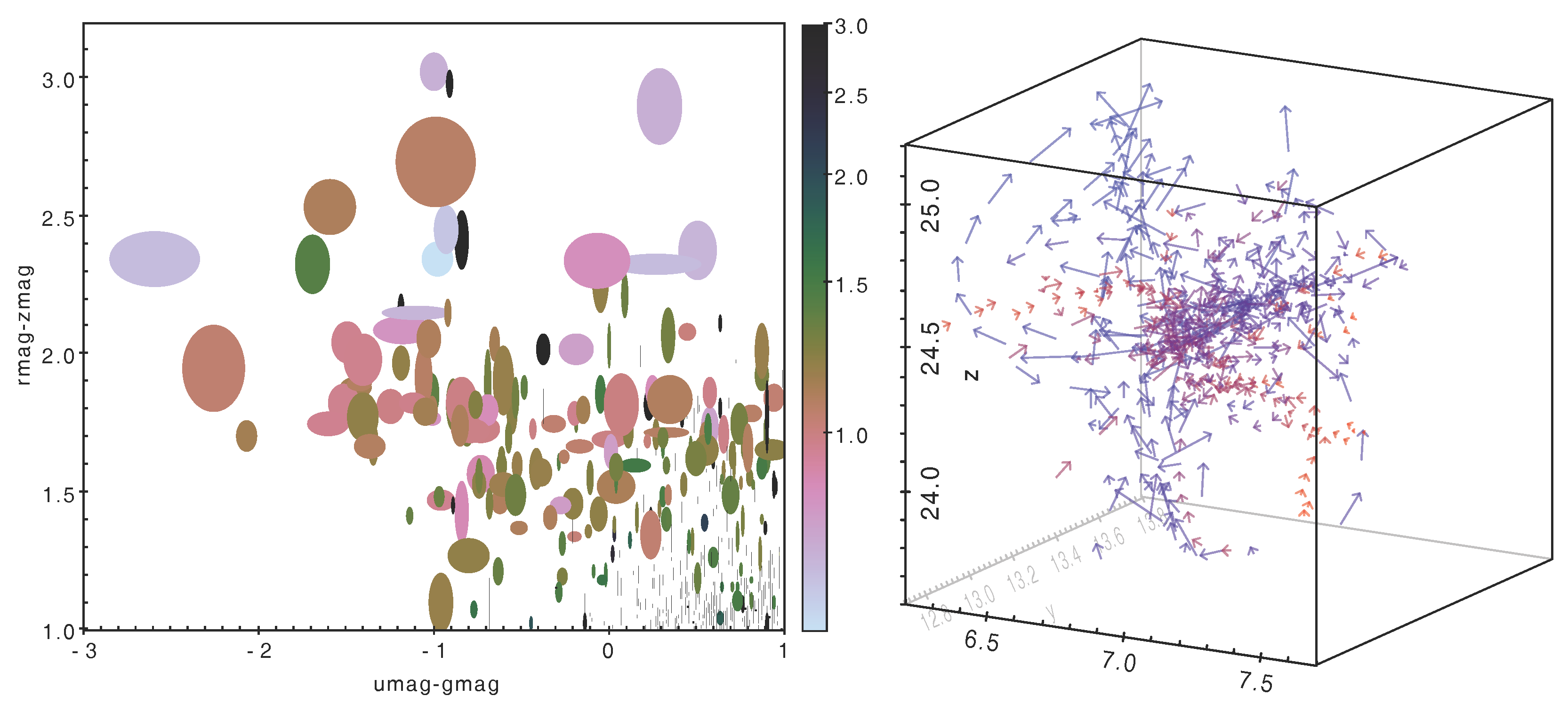
Options for high-dimensional visualisation. The left hand figure uses marker colour and shape to indicate three non-positional numeric features. The right hand figure uses arrows to represent points in six-dimensional phase space, the positions and velocities of simulated galaxies [14]; redshift is additionally shown by colour-coding.
Figure 1.
Options for high-dimensional visualisation. The left hand figure uses marker colour and shape to indicate three non-positional numeric features. The right hand figure uses arrows to represent points in six-dimensional phase space, the positions and velocities of simulated galaxies [14]; redshift is additionally shown by colour-coding.

Figure 2.
Linked views for row subsets. The user has identified the region in plot (a) by dragging the mouse, and the same subset of rows shows up in an interesting subregion of the different plot in (b). In this case each point represents a star in the region of the Pleiades open cluster [17]; (a) shows apparent velocity across the sky, while (b) characterises stellar classification. Those stars with similar motion, identified as the “Cluster” subset in (a), were formed in the same environment and therefore have similar physical characteristics, hence trace out a distinct path in (b).
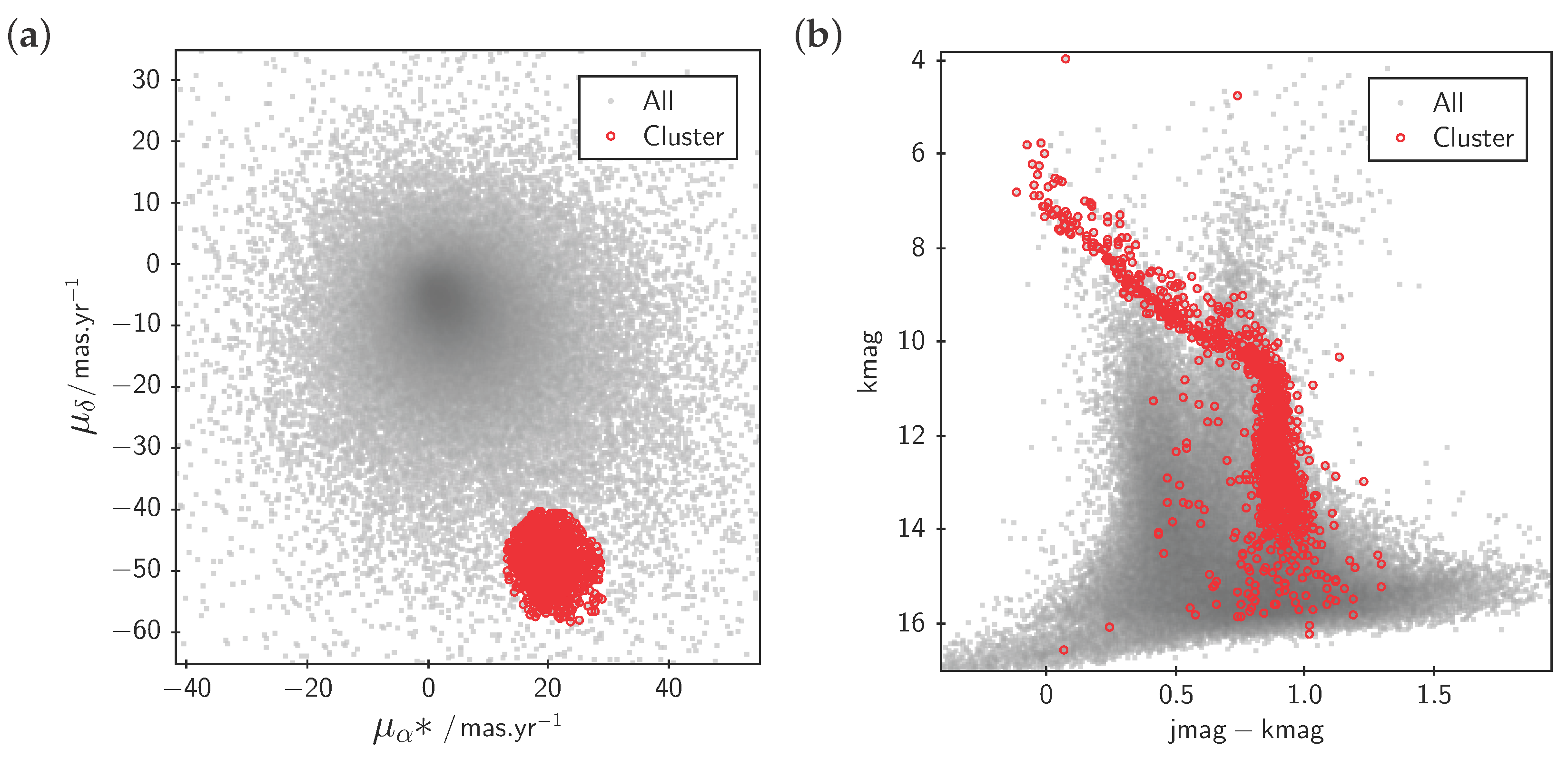
Figure 3.
Linked highlighting of table rows. A user has clicked on an outlier in the 2-d plot (center), highlighting it with a “target” cursor. This automatically causes the same row to be highlighted in other ways: the target cursor marks the relevant point on the 3-d plot (right) and the row is flagged in the table data browser (bottom). In this case TOPCAT has also been configured to communicate with the external image display application Aladin [18] (left), which is caused to display a sky image corresponding to the highlighted row. This interaction makes it easy to see here that the relevant star is very close to another one; it is likely that this contamination of sources has led to a spurious brightness value, resulting in its anomalous position in the 2-d plot. Data show a Gaia-Hipparcos colour magnitude diagram and 2MASS colour image.
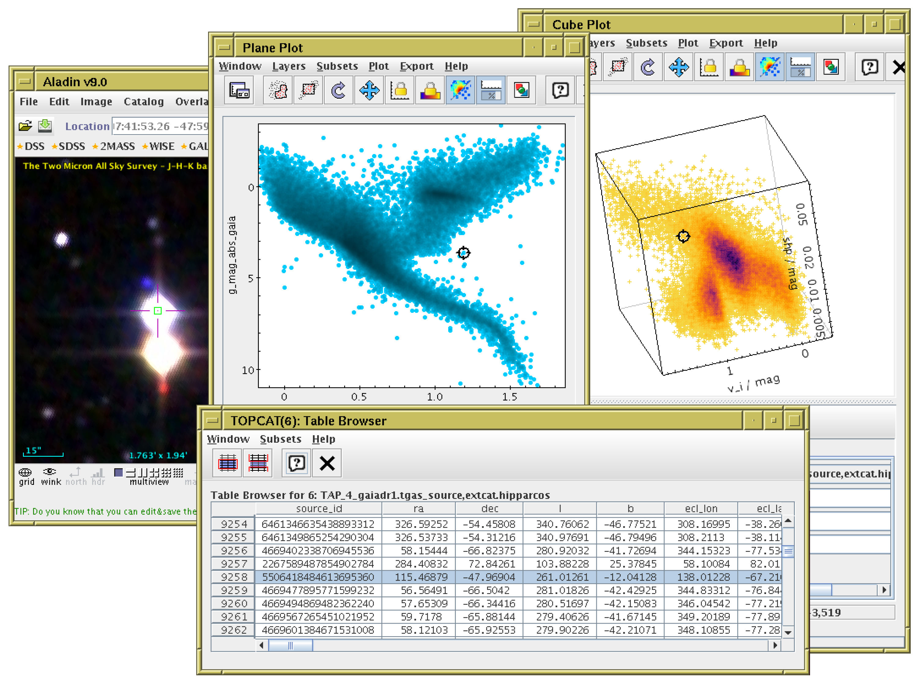
Figure 4.
Various representations of a 2-dimensional point cloud available within TOPCAT. Flat simply plots markers at each point, obscuring the density structure. Transparent plots partially transparent markers, giving some indication of overdense regions, however regions over a certain density threshold are saturated. Contour is a somewhat smoothed contour plot. Grid is a 2-d histogram on a grid of fixed size rectangular bins; various options are available for combination within bins including mean, median, min, max etc. Density structure is clear, but resolution is lost and outliers are poorly represented. Density is a hybrid density map/scatter plot with a configurable colour map, showing both high-density structure and individual outliers. Auto is a standard profile of the hybrid map used by default, with a fixed colour map scaling that fades from a dataset’s chosen colour to black; multiple overplotted datasets can be distinguished by using different base colours. Data represent a V vs. B-V colour-magnitude diagram of 139,000 stars from the globular cluster Centauri [22].

Figure 5.
Various representations of a 2-dimensional point cloud with a third dimension indicated by colour. Aux paints opaque coloured markers, which works for low-density regions, but at high density the appearance is noisy and depends on row sequence, since points painted later obscure earlier ones. Grid is a 2-d histogram weighted by the third coordinate; points in the same bin are averaged, but some spatial resolution is lost. Weighted is a hybrid density map/scatter plot but with pixel bins weighted by the third coordinate, providing clarity in both low and high density regions. The weighting combination method in the latter two cases is configurable; in this case the median has been used. Data are as for Figure 4 with the third coordinate indicating probability of cluster membership.
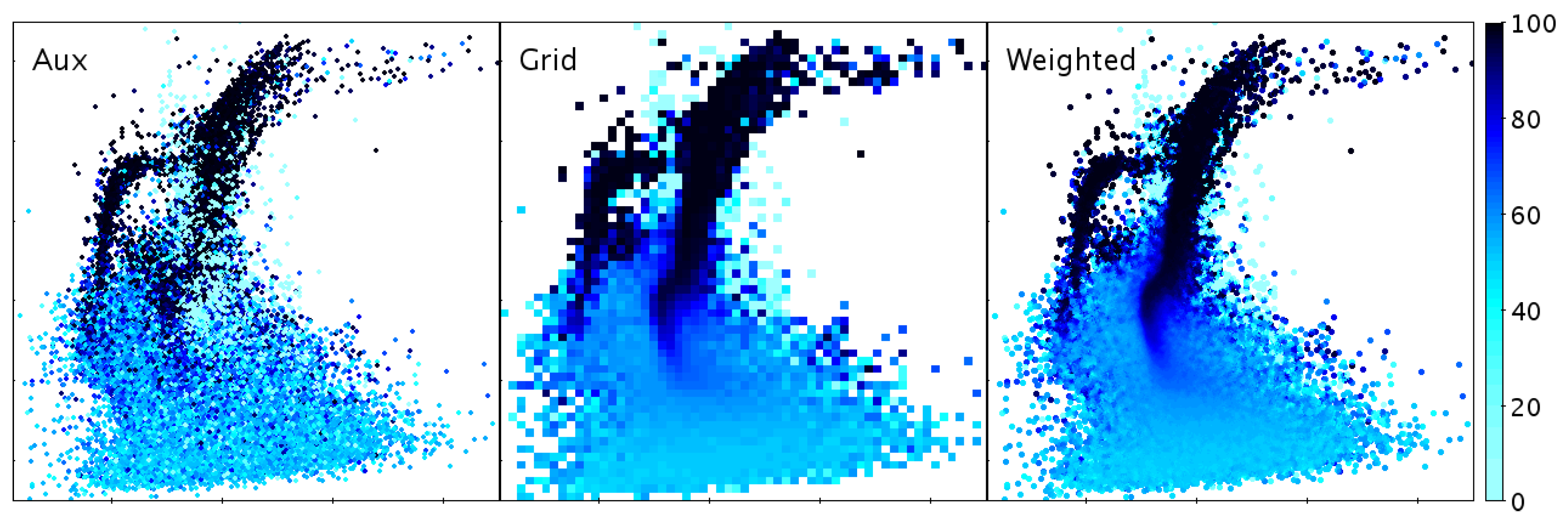
Figure 6.
Some histogram-like plots. Shown here are three different representations of the same one-dimensional dataset: a traditional histogram, a Kernel Density Estimate which uses a smoothing kernel to avoid the quantisation implied by histogram binning, and a “densogram” that represents point density using a colour bar.
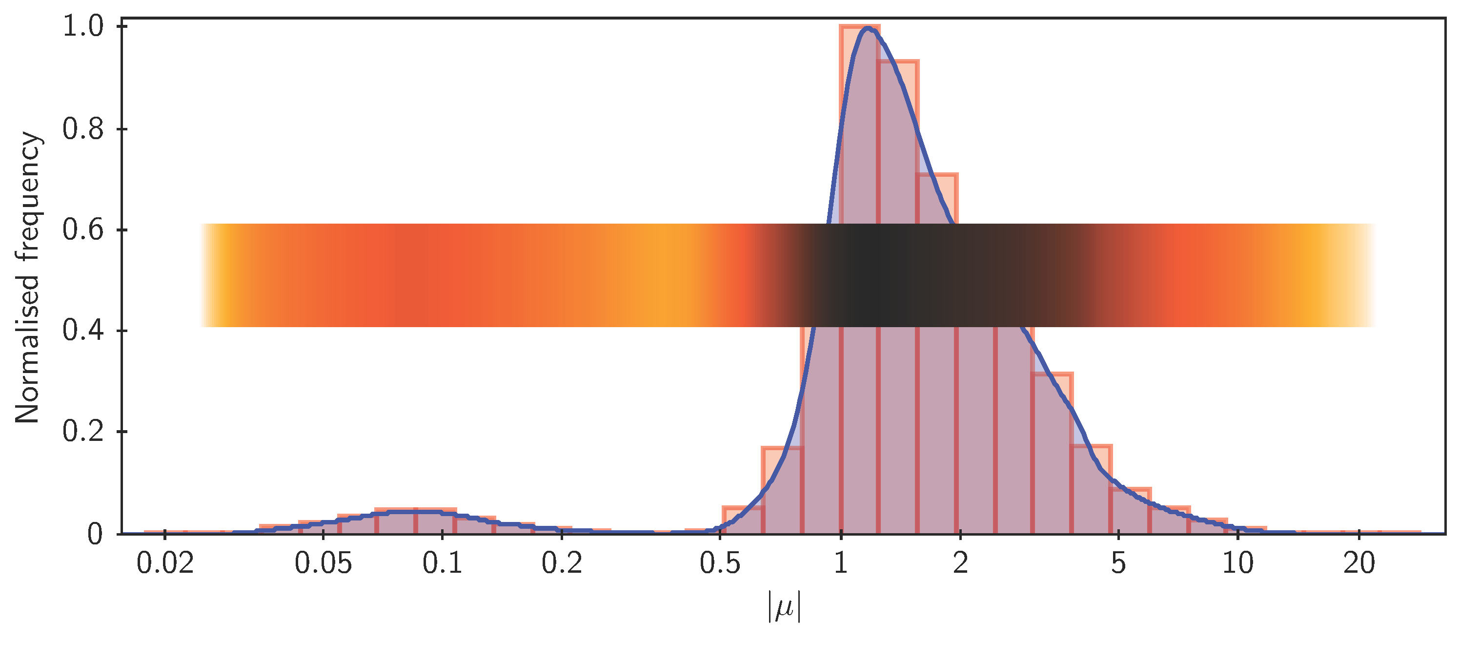
Figure 7.
TOPCAT’s Plane Plot window. The left hand panel is what appears as soon as the user opens the window; some default plot is displayed. It is easy to see how to change the data to be plotted. The right hand panel shows the control panel from the bottom of the plot window (here it has been expanded and floated out into its own window), as configured for controlling a much more complicated plot. Each of the controls towards the right can be adjusted interactively with instant effects on the displayed plot. The various tabs and list items provide more configuration options for other aspects of the plot.
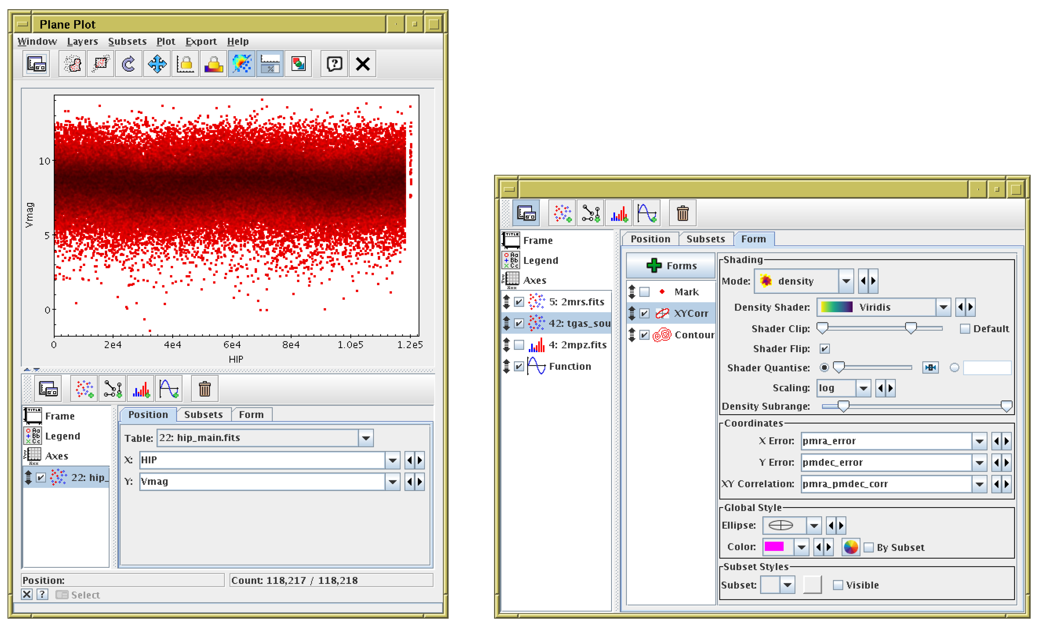
Figure 8.
Plot of a large table: A map representing simulated density on the sky of stars in the Milky Way [26]. This figure (originally from [25]) was generated from a 2 billion row table in about 30 min on a normal desktop computer.
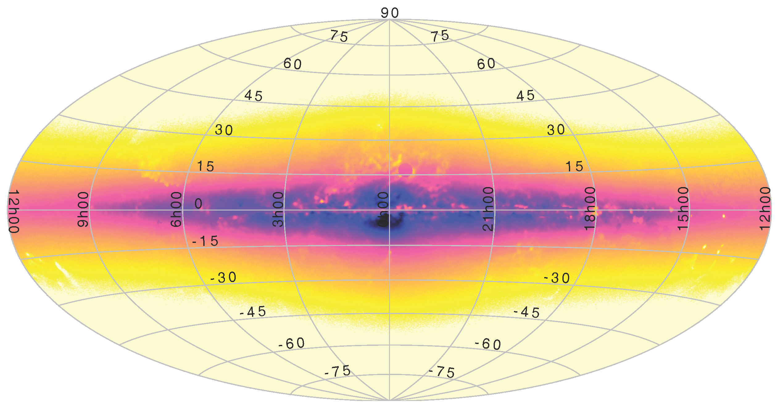
Figure 9.
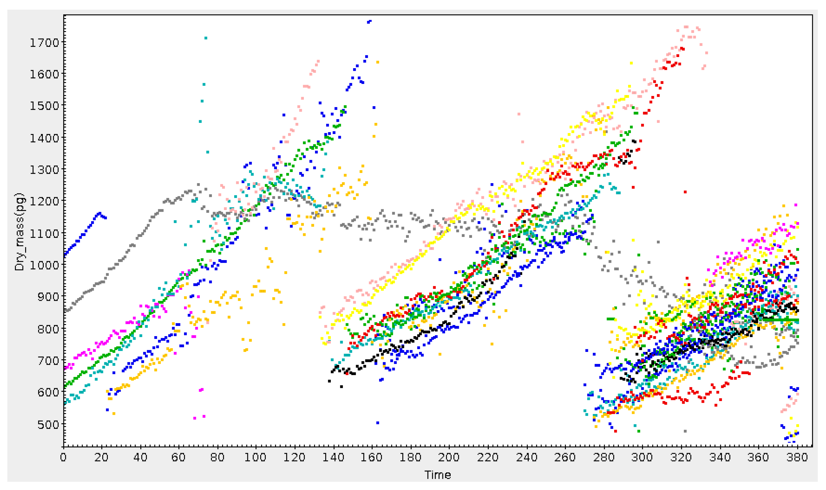
Growth and division of cells over time. Cell mass, represented by one colour for each distinct cell, increases until mitosis, when it is replaced by two daughter cells. In this plot the grey cell has become “blocked”, losing mass slowly instead of dividing. Credit: P. Pognonec, Université Nice.
Figure 9.
Growth and division of cells over time. Cell mass, represented by one colour for each distinct cell, increases until mitosis, when it is replaced by two daughter cells. In this plot the grey cell has become “blocked”, losing mass slowly instead of dividing. Credit: P. Pognonec, Université Nice.

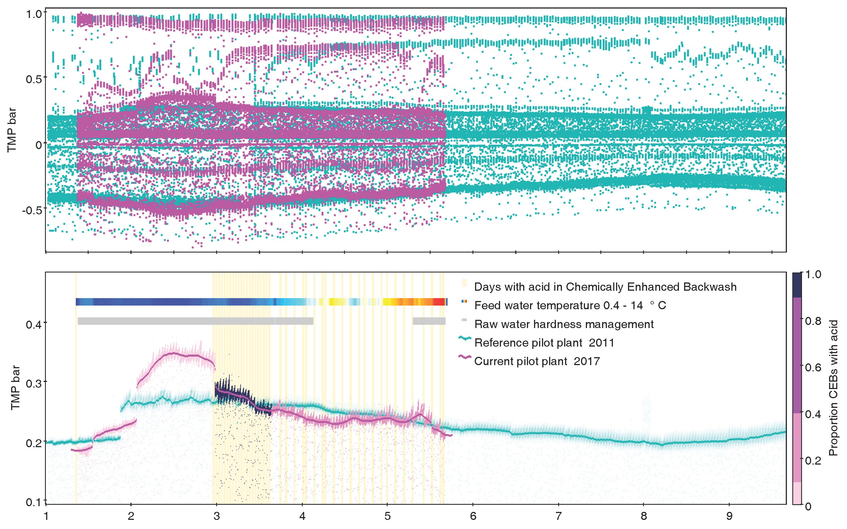
Figure 10.
Time series (decimal month January–September) of Trans Membrane Pressure over two different ultrafiltration pilot plants in Gothenburg Sweden (7.7M rows). (Top) Two series of correct but noisy raw data, obviously not suitable for mean aggregations; (Bottom) Exactly the same data as top display, clarified by use of subsets, transparency, quantile smoothers, marking by auxiliary Y axis, histogram by time as event marking, and densograms for additional quantitative variable as well as operational information. Credit: H. Rydberg, Sustainable Waste and Water, City of Gothenburg.

© 2017 by the author. Licensee MDPI, Basel, Switzerland. This article is an open access article distributed under the terms and conditions of the Creative Commons Attribution (CC BY) license (http://creativecommons.org/licenses/by/4.0/).
Share and Cite
MDPI and ACS Style
Taylor, M. TOPCAT: Desktop Exploration of Tabular Data for Astronomy and Beyond. Informatics 2017, 4, 18. https://doi.org/10.3390/informatics4030018
AMA Style
Taylor M. TOPCAT: Desktop Exploration of Tabular Data for Astronomy and Beyond. Informatics. 2017; 4(3):18. https://doi.org/10.3390/informatics4030018
Chicago/Turabian StyleTaylor, Mark. 2017. "TOPCAT: Desktop Exploration of Tabular Data for Astronomy and Beyond" Informatics 4, no. 3: 18. https://doi.org/10.3390/informatics4030018
Note that from the first issue of 2016, this journal uses article numbers instead of page numbers. See further details here.