
Transport Accessibility of Urban Districts in Megapolis: Insights from Moscow


Faculty of Physics, Lomonosov Moscow State University, Moscow 119991, Russia
*
Author to whom correspondence should be addressed.
Urban Sci. 2024, 8(2), 36; https://doi.org/10.3390/urbansci8020036
Submission received: 16 January 2024
/
Revised: 24 March 2024
/
Accepted: 1 April 2024
/
Published: 18 April 2024
Abstract
:(1) Background: As global urbanization accelerates, effective mobility in metropolitan areas becomes crucial. City transportation systems, often congested, have diverse transit modes and numerous access points. Our study focuses on the transportation accessibility of the various districts within Moscow, a city with a population of over 12 million and covering approximately 900 square kilometers. (2) Methods: The city was divided into 2 km-by-2 km squares, and we used both personal and public transportation data. This allowed us to analyze spatiotemporal mobility patterns, calculating travel times and distances between these defined centroids. Our assessment not only considered transportation to key hubs, such as major train stations, airports, and the city center, but also weighed the integral interconnectedness of individual districts. Various time frames, including morning and evening peak hours and quieter weekend periods, were used. (3) Results: The study pinpointed the most and least convenient districts for various transit options across the city. Our findings underscore the intricacies of daily commuting patterns in Moscow, highlighting bottlenecks and areas for potential infrastructure enhancement. (4) Conclusions: Using Moscow’s case, we demonstrated the methodology to better understand and improve strategic urban planning and intelligent mobility solutions, aiming to bolster transportation accessibility.
1. Introduction
In today’s rapidly urbanizing world, the transportation sector is essential in driving economic growth and facilitating social interactions. Robust and efficient transportation infrastructure is critical for the economic prosperity of cities, as well as larger regions and countries. At the same time, with the global urban population expanding, ensuring effective mobility in large metropolitan areas is increasingly challenging. City transportation networks are intricate, featuring diverse transit modes and numerous access points, and often suffering from high congestion levels. These networks, while providing socio-economic benefits, also pose challenges, including bottlenecks, operational inefficiencies, and adverse impacts on environmental and safety standards. Therefore, managing these networks effectively is a crucial aspect of urban planning and policy-making, necessitating advanced evaluative tools that address the unique complexities of major urban settings. Various metrics have been established as vital tools for analyzing and enhancing accessibility. These metrics facilitate an understanding of how inhabitants navigate the urban matrix and are critical for strategic urban planning and the development of intelligent mobility solutions.
1.1. Accessibility and Key Accessibility Metrics
Recent studies underscore the critical role of accessibility in urban planning, expanding its definition beyond mere physical ease of travel. Hu et al.’s research [1] accentuates accessibility as essential for facilitating interactions and influencing choices regarding residential and business locations within urban environments. Additionally, the study by Ismael and Duleba [2] on the quality of public transportation services during the COVID-19 pandemic highlights the profound impact of accessibility on user satisfaction and changing expectations. These findings emphasize the necessity for adaptable urban planning strategies that prioritize accessibility, showcasing its pivotal role in improving urban life and the effectiveness of transportation systems.
Building on these insights, our study defines “accessibility” as the capacity for efficient and effective travel between various points within an urban setting, specifically focusing on the ease of movement between districts within Moscow through both personal and public modes of transport. This entails a comprehensive examination of travel times, distances, and the overall efficacy of the city’s transportation infrastructure. By highlighting the quality and efficiency of connections that these modes of transportation offer to key urban destinations, our research aims to contribute to the evolving discourse on urban mobility and planning, ensuring a nuanced understanding of accessibility in the context of Moscow’s urban landscape.
Travel Time Metrics are foundational to accessibility analysis. Studies often employ travel time matrices, which encapsulate the time necessary for traversing from various origins to destinations within a cityscape, thereby enabling the estimation of accessibility indicators and indices [3,4,5], which describe an integrated model that assesses the impact of new infrastructures on travel time savings and accessibility. Isochronic maps, which depict areas reachable within certain travel time thresholds from a given point, further enrich this analysis by providing a visual representation of accessibility [6].
Infrastructure and Service Metrics are critical for assessing the physical components of transportation networks. These include the density of pedestrian pathways, cycling lanes, roadways, and the proliferation of transit routes and stations. Additionally, the frequency, velocity, and interconnectivity of different transport modalities, such as walking, cycling, public transit, and ridesharing services, are imperative for evaluating the overall efficiency of urban mobility [7].
The Accessibility of Key Services, such as employment opportunities, healthcare facilities, educational institutions, and grocery stores, is also a crucial metric. The proximity and availability of these services are significant determinants of a region’s livability and the quality of life of its residents [3,5]
Composite Indices offer a more holistic view by amalgamating infrastructure, travel times, and service accessibility into overall indices. These indices provide a macroscopic measure of accessibility at different spatial scales from neighborhoods to the entire city [5]. Khan and Habib [8] developed a complementary microsimulation modeling approach to estimate fine-grained accessibility metrics by simulating the movements and constraints of individual travelers. Their model assigns travelers to modes and routes based on detailed individual-level activity patterns and social interactions. This facilitates a more behavioral analysis of accessibility compared to traditional travel demand models working at an aggregate level.
Equity Metrics are employed to discern disparities in accessibility. These metrics are instrumental in comparing access among different demographic groups and geographic locales, thereby pinpointing and addressing transport equity issues [3,7].
The choice of these metrics is customized to align with the distinctive needs of the study, including the scope (from local neighborhoods to metropolitan regions), the goals (ranging from urban planning to assessing transportation equity), and the specific transport modes and activities being examined. Essentially, these metrics aim to measure the ease with which critical destinations can be accessed through the urban transportation network, reflecting the network’s effectiveness and its capacity to serve all users equitably. For research, a particular set of metrics is often selected to serve these ends.
Mościcka et al. [9] developed a detailed Transport Accessibility framework for analyzing transportation in Warsaw. This framework, utilizing metrics like average travel speed and time and data from Google and the Database of Topographical Objects, offers an in-depth view of accessibility across 601 city cells, each 1 km in size, providing invaluable insights for urban planning and policy-making. Similarly, Goch et al. [10] concentrated on Warsaw using public transport data and GIS tools for an intricate analysis based on travel time and population density. Their method identified key areas frequented by residents integral to Warsaw’s urban structure for employment, commerce, education, leisure, and social interaction. Bárta [11] performed a comprehensive study of public transport accessibility in 18 districts of Krakow, using seven primary and five secondary indicators, including metrics such as the average number of transport units at stops and the specifics of tram transport.
The work by Benenson et al. [12] stands out for introducing Urban. Access, a GIS-based tool designed for high-precision measurement of transport accessibility. The tool is versatile and adaptable across diverse urban settings, offering key indicators like the Access Zone and the Service Zone for nuanced comparative analyses. Antwi et al. [13] performed a meticulous comparative analysis of spatial accessibility and travel time in the Oforikrom District, Ghana. The study employed GIS and GPS technology for an elaborate examination of travel costs and time, culminating in a map that vividly outlines levels of transport accessibility.
The study conducted by the European Commission in 2015 [14] presents a nuanced methodology for analyzing the accessibility of public transportation across various European cities. By harnessing high-resolution data on population distribution within distinct city segments, along with information on public transport stops and routes, the methodology facilitates a comparative analysis of transport accessibility among cities of similar sizes. The outcomes of this methodology are visually represented through graphs showcasing transport accessibility for populations across different cities and maps delineating the distribution of transport accessibility across various cities.
The study of urban transport accessibility continues to evolve with contributions from various domains and geographies addressing multiple facets, from job accessibility to urban planning. Wu et al. [15] underscore the need for a universal metric in evaluating transport and land-use systems across various global cities, emphasizing the need for international comparability in urban access. Expanding on the concept of urban access, a GIS-based model was presented by Caselli et al. [16] to assess pedestrian accessibility contextualized within the “15-min city” framework. The issue of perceived accessibility in public transport has been explored by Olsson et al. [17], who focus on how various factors may negatively influence public transport’s perceived accessibility, a crucial factor in building sustainable and inclusive urban environments. Iamtrakul et al. [18] take a closer look at Bangkok, characterizing its transport accessibility in the context of its unique urban development patterns.
There are also Global Traffic Indices for describing urban mobility and traffic. The TomTom Traffic Index and the INRIX Global Traffic Scorecard offer broad datasets that capture global urban mobility dynamics [19,20]. These indices use continuous monitoring to offer insights on congestion, costs, and emissions. The TomTom Index, covering 416 cities globally, tracks traffic flow constantly, offering a detailed annual snapshot of congestion. A 53% congestion level, for example, means a 30 min trip would take 53% longer than in free-flowing conditions. Similarly, the INRIX Scorecard analyzes road conditions in major cities, combining several key metrics to illustrate the time spent in traffic and the speed of final-mile travel, offering a comprehensive view of urban transport patterns.
1.2. Case Study: Moscow
Moscow serves as a significant case study for exploring transport accessibility and transportation planning. As Russia’s capital, it is home to over 12 million people and spans roughly 900 square kilometers within the Moscow Ring Road (MKAD). This vast urban area relies on a multifaceted transportation system, including roads, subways, buses, and trams. Given Moscow’s size, population density, and intricate commuting patterns, it is imperative to thoroughly assess the accessibility of transportation across its various districts. Transportation accessibility in Moscow has been studied from different perspectives in the literature. Grebennikov et al. [21] examined types of transport accessibility in Moscow, such as territorial, temporal, economic, informational, and barrier-free access. They argue Moscow’s development has led to unequal accessibility levels across the city. Sapanov et al. [22] analyzed public transport accessibility in Moscow’s administrative districts using a two-step floating catchment area method. They found the city center and southwest have the highest public transport accessibility, while the southeast and Moscow Ring Road have lower levels. Factors like metro station proximity strongly predicted accessibility. Lukina et al. [23] studied perceived accessibility across Moscow neighborhoods using a survey of 2275 residents. They measured satisfaction with transit services, travel obstacles, and accessibility to activities like jobs, healthcare, and recreation. The results show that perceived accessibility varies greatly across the city and identified districts with good and poor ratings. A study by Mkhitaryan et al. [24] offers a nuanced methodology for assessing transport accessibility in megacities, with a specific focus on Moscow. The paper introduces a framework based on weighted normalized private indicators for assessing the accessibility of three housing estates in the city. Utilizing GIS databases and multivariate analyses, the study provides a comparative and dynamic evaluation of these estates, contributing to the broader discourse on urban transportation planning in megacities.
Overall, the literature utilizes both perceived accessibility surveys of residents as well as GIS-based models integrating land use, transport infrastructure, and travel behavior to understand accessibility differences across Moscow. Key factors influencing accessibility include public transit proximity and quality, metro expansion projects, the spatial distribution of opportunities like jobs, and demographics.
1.3. Research Gaps
The existing literature on urban transport accessibility has extensively focused on the accessibility of key services such as employment opportunities, healthcare facilities, educational institutions, and grocery stores [9,10,11]. These factors are crucial in determining the livability of a region and the quality of life of its residents [14]. Studies have highlighted the importance of the proximity and availability of these services in urban areas [12]. However, a significant gap exists in the literature regarding the practicality and feasibility of obtaining detailed data for such analyses in large metropolises. This challenge is particularly pronounced in densely populated and geographically expansive cities like Moscow.
In many instances, the sheer size and complexity of mega-cities impede the collection of granular data necessary for assessing the accessibility of specific services [16]. The intricate nature of urban landscapes, coupled with the diverse and dynamic nature of city life, makes it difficult to accurately capture and analyze data that reflects the true accessibility landscape of these sprawling urban areas [17].
To address this gap, our study adopts an approach by utilizing a square grid methodology proposed by Mościcka et al. [9] to understand the city’s structure. We enrich the methodology by adding the travel patterns from each district to every other district. This method, while differing from the traditional focus on key service accessibility, offers a comprehensive view of the city’s mobility network. By analyzing travel times and distances within this grid, our study provides a macroscopic view of Moscow’s transportation accessibility.
Furthermore, this research aims to evaluate the connectedness of Moscow’s road network by examining the ease of travel between each district. This approach provides insights into the efficiency of the city’s transportation infrastructure, identifying potential bottlenecks and areas for infrastructure enhancement. The study’s methodology enables us to overcome the limitations of data availability in large cities, offering an innovative way to assess urban mobility and transport accessibility.
By focusing on the interconnectedness of the city’s districts and the overall efficiency of the transportation network, this study fills a critical gap in urban transport research. It shifts the focus from the accessibility of specific services to the broader question of how well a city’s transportation infrastructure facilitates movement across its entirety. This perspective is crucial for strategic urban planning and developing intelligent mobility solutions that cater to the needs of a densely populated and rapidly evolving urban landscape like Moscow.
2. Materials and Methods
The primary goal of this research is to thoroughly analyze transportation accessibility between districts in Moscow, all within the boundaries of the Moscow Ring Road (MKAD). In this study, we used both public and private modes of transportation to extensively examine various travel factors, such as road connectivity, travel times, distances (measured in actual routes and straight lines), and speeds. Our investigation covered different urban areas of attraction, including major train stations, airports, and the city center, and examined various times of the day, including peak hours in the morning and evening and off-peak weekend periods. Additionally, this study aims to evaluate the connectedness of Moscow’s road network by examining how easily one can travel between each district in the city. Our methodology involves dividing Moscow into 2 km-by-2 km squares and calculating the travel times and distances between the centers of these squares.
2.1. Data Sources
For this study, a wide range of data from various public and private sources was collected to form a detailed view of Moscow’s transportation ecosystem, as shown in Figure 1.
OpenStreetMap was utilized to map the spatial arrangement of the city, including its administrative districts and regions. The Google Cloud Platform provided in-depth data on travel times and routes, focusing on both cars and public transportation. Details regarding the time period of data collection from the Google Cloud Platform and the spatial methodology are provided in the section below. The Federal State Statistics Service contributed up-to-date demographic data as of Spring 2021 (considering the results of the All-Russian population census of 2021) [25]. These data contain information on the population size for each district of Moscow as of 1 January 2021. The Railway Media [26] provided statistics on passenger volumes at key railway stations (the total number of passengers for each Moscow railway station for the year 2020). The Moscow Traffic Organization Center (TSODD), a government agency, offered a correspondence matrix showing movement patterns across the city using both private and public transportation (averaged data for April 2021 on the number of movements between districts reflects urban resident mobility patterns). They also provided airport passenger data (the total number of passengers for each Moscow airport for the year 2020). This combination of data from diverse sources allowed a comprehensive analysis of how people travel between different districts in Moscow.
2.2. Spatial Analysis Framework
Moscow has a population of over 12 million and features a radial–circular urban structure. It covers an area of approximately 900 square kilometers within the boundaries of the Moscow Ring Road (MKAD). The city comprises 107 districts within the MKAD, which are organized into 9 administrative regions (Figure 2a). The distribution of the population across Moscow’s districts as of 1 January 2021 is illustrated in Figure 2b.
For the purposes of the current study, the territory within the MKAD has been subdivided into 222 square cells, each measuring 2 km × 2 km (Figure 2c).
For each cell center, travel metrics were obtained for all other cell centers using both private and public modes of transport. Key destinations, such as the city center hub, main railway stations, and airports, were analyzed separately.
2.3. Temporal Analysis Framework
The study was conducted using data from Spring 2021 (April 2021). To create an accurate representation of transport accessibility in Moscow, we analyzed travel data at specific times: during the morning rush hour at 8:00 and the evening rush hour at 19:00 on a typical weekday (Thursday) (the 4 Thursdays of April 2021) and at 14:00 on weekends (Sunday) (the 4 Saturdays of April 2021).
2.4. District Weighting Scheme
In order to reflect the varied transport patterns across Moscow’s districts, we implemented a weighting scheme. This scheme was based on the number of trips starting from each district, as shown in the correspondence matrix. The Moscow Traffic Organization Center (TSODD) kindly provided the correspondence matrix for this research. The matrix was organized to show data for each 2 km-by-2 km grid area covered in this study. It included information on the number of trips that started and ended within each square. These trips were categorized into different types: car journeys, subway trips, bus journeys, and multimodal public transport rides. The last category, multimodal public transport rides, refers to trips involving a change between different types of transportation. Figure 3 displays how public transport and private transport trips are spread throughout Moscow, covering both weekdays and holidays.
To determine the total count of public transport trips, we summed the numbers of subway trips, bus journeys, and multimodal public transport rides originating from each grid square. When calculating the totals for each district, we added together the figures for all grid cells that have their center in that particular district. The approach for this calculation involved a specific formula:
where
is the total number of public transport trips for a specific district;
is the total number of personal transport trips;
n the number of grid cells whose centers are located within the district;
, , , and are the numbers of metro trips, bus journeys, multimodal public transport rides, and car trips, respectively, originating from the j-th grid cell.
This formula aggregates the count of various types of public transport trips across all grid cells that are part of a district, providing a comprehensive measure of public transport usage in that area.
2.5. Overrun Coefficient
We introduce an indicator for evaluating the efficacy of the city’s road network known as the “overrun coefficient”. This coefficient is calculated by dividing the actual car travel distance from one district to another by the direct straight-line distance between them.
where
is the “overrun coefficient”;
is the actual car travel distance between two districts, following the road network;
is the direct straight-line distance between the same two districts.
In this case, indicates perfect road network efficiency, where the actual travel route is as direct as a straight line. Any value of greater than 1 signifies a deviation from this ideal, indicating a less efficient or more circuitous road network.
2.6. Structure of the Study
In this study, we comprehensively analyze urban transport accessibility in Moscow, focusing on the intricacies of travel across the city’s districts. The research is methodically divided into distinct sections, each addressing a specific aspect of urban mobility. Table 1 presents a structured overview of these sections. This systematic approach enables us to delve into the nuances of travel times, speed metrics, and accessibility, both by private and public transportation modes. Table 1 serves as a guide to understanding the scope and focus of each section.
3. Results
3.1. Road System Connectivity
To ascertain the connectivity of Moscow’s road network for private transport travel, two principal metrics were employed, as depicted in Figure 4. Figure 4a displays the distribution of the total actual travel distance by car from each district to all other districts in Moscow, expressed in kilometers. Figure 4b presents the “overrun coefficient”.
Figure 4a illustrates the typical car travel distances from one district to all others in Moscow. Districts situated in the center of Moscow tend to have shorter cumulative travel distances, reflecting more efficient connectivity. On the other hand, peripheral districts, particularly those to the north and south, often register longer travel distances.
A key indicator for evaluating the efficacy of the city’s road network is the “overrun coefficient”, as depicted in Figure 4b. In Moscow, the average and median overrun coefficients stand at 1.5, indicating that central districts usually boast superior road connectivity, as evidenced by their lower overrun coefficients. Conversely, the districts on the city’s periphery exhibit higher overrun coefficients, highlighting less efficient road networks.
3.2. Accessibility of the City Center
3.2.1. Trips from Districts to the City Center
Travel Time
Journeys to the city center play a vital role in everyday urban mobility, especially during peak traffic hours. The most critical period is the morning rush hour, when a considerable part of Moscow’s population commutes from residential areas to their jobs, many of which are located in the city center. For this study, Red Square has been chosen as the representative point of the city center. The analysis concentrates on comparing the travel times to this central point using both public transport and private transport. These travel times are illustrated in Figure 5, showing the length of time it takes to reach the city center from various districts throughout Moscow. This comparison highlights the efficiency and accessibility of different modes of transportation at various times of the day.
While the average travel time to the city center by public transport is slightly longer than by car, it shows considerably more consistency, with less variation depending on the time and day of the week. On average in Moscow, the travel time to the city center is around 44 min, regardless of whether it is during peak rush hours or on weekends.
Average Speed
In urban environments, cars do not typically move in straight lines, which results in the actual speed often being higher than the nominal speed. We examined both the average nominal speed and the average actual speed of travel to the city center. The average nominal speed, also referred to as the “Formal Speed”, is calculated based on the straight-line distance. In contrast, the average actual speed takes into account the actual car travel routes within the city’s urban layout, as shown in Figure 6. A higher actual speed can enhance the user experience, providing a more efficient journey even when the average travel times are relatively high.
The analysis reveals that in Moscow, high average travel speeds to the city center are typically found in the south-western and north-western parts of the city, whereas the north-eastern part generally experiences lower speeds, as indicated in Figure 6.
3.2.2. Trips from the City Center to the Districts
Travel Time
An analysis of trips from the city center to various districts in Moscow, especially during the evening rush hour, uncovers notable trends in urban mobility (see Figure 7). The emphasis on evening rush hour is due to the predominant flow of traffic from the city center toward residential areas.
The data reveal a consistent pattern in which travel times on public transport exhibit less variation depending on the day of the week compared to private transport. This consistency in public transport travel times provides valuable insights into the dynamics of commuting from the city center to residential districts, enhancing our understanding of traffic flow and transport efficiency during peak hours.
Average Speed
In assessing vehicular travel from the city center, this study replicates the methodology used for analyzing inbound trips by focusing on two distinct speed metrics (see Section 3.2.1). This thorough examination of car travel speeds from the city center, carried out over various time periods, reveals significant patterns in the city’s traffic flow (refer to Figure 8).
It was observed that districts with higher average speeds predominantly lie in two specific areas: the Western Administrative Region and the North-Western Administrative Region. This notable trend in travel speeds is systematically illustrated in Figure 8, offering a clear visualization of the spatial distribution of vehicular speeds in these parts of Moscow.
3.3. Accessibility of the Airports and Railway Stations
3.3.1. Trips to the Airports
In 2021, despite the pandemic leading to a notable decrease in passenger traffic, Moscow’s airports still handled a total of 48 million passengers. This underscores Moscow’s role as a crucial transportation hub in the country and highlights the importance of airport accessibility for city residents.
Travel Time
This section of the study addresses the question, “What is the average time it takes to reach the airport?” An airport’s demand was assessed based on its total passenger traffic in March 2021. The airports Domodedovo, Sheremetyevo, and Vnukovo were analyzed (see Figure 9).
Owing to the geographical locations of Moscow’s airports, all situated beyond the MKAD, the transportation accessibility from various city districts varies significantly (see Figure 9). A key factor affecting travel time to airports is the alignment with the Aeroexpress schedule [27]. The Aeroexpress is a dedicated rail service connecting the city center with the airports, but its fixed schedule and limited stops can result in longer overall travel times on public transport. This is particularly evident when compared to travel by car, where flexibility and direct routes often shorten travel times significantly despite potential traffic jams. As a result, for trips to airports located outside the MKAD, travel times on public transport, primarily dependent on the Aeroexpress timetable, can be considerably longer—sometimes nearly twice as long—as travel by car.
3.3.2. Trips to the Railway Stations
Travel Time
This section of the study addresses the question, “What is the average time required to reach the railway station?” A station’s demand was assessed based on its total passenger traffic for 2020, which includes both suburban and long-distance travel. The stations under consideration, marked with black dots in the figures, include Leningradsky/Yaroslavsky/Kazansky; Kursky; Paveletsky; Kievsky; Belorussky; and Rizhsky (refer to Figure 10).
The main city railway stations are strategically situated within the Third Transport Ring (TTK), significantly enhancing transport accessibility for districts located within this ring. This strategic placement makes these inner TTK districts the most convenient in terms of access to the railway stations. Notably, for these districts, the average travel time by car to any of the stations does not exceed 25 min, as illustrated in Figure 10. Furthermore, as expected, the travel time to the stations increases with the distance from the city center, varying even among districts of relatively equal distance.
For public transport, the central districts again predictably have the shortest travel times. From the “peripheral” districts, the time to reach the stations is longer, with public transport showing a significant time advantage during the morning rush hour.
3.4. Trips across All Districts of Moscow
3.4.1. Trip from a Fixed District to All Other Districts
Travel Time
This section analyzes the average travel time from a selected district to all other districts in Moscow, reflecting the city’s overall transport accessibility from the perspective of the selected district (see Figure 11). It evaluates travel times using both private and public transport, taking into account the weights of the districts from the correspondence matrix.
In exploring travel patterns using both public and private transport, it is observed that while the top-performing districts vary, the general trend is consistent: districts situated nearer to the city center tend to show a better performance.
Average Speed
This study reveals a fascinating aspect when we look at how departure districts are distributed based on their average travel speeds across the city’s actual routes (refer to Figure 12).
Although districts closer to the center were previously noted for their shorter travel times, an interesting shift is observed when considering travel speeds. In this regard, some districts near the MKAD also emerged as frontrunners. However, the districts located on the periphery consistently recorded the slowest speeds.
3.4.2. Trip to a Fixed District from All Other Districts
Travel Time
This section evaluates how long it takes, on average, to travel to a selected Moscow district from any other district, offering a detailed insight into the selected district’s accessibility. This measure is particularly important, for instance, during the evening rush hour when people are returning home from work. Since not everyone works in the center, this metric complements the “travel time from the city center” analysis. Figure 13 illustrates the distribution of travel times to various districts at different times of the day using both private and public transportation.
It is shown that the North-Eastern Administrative Region ranks notably low in terms of travel efficiency. In terms of public transport, districts with higher transport accessibility are found closer to the city’s central area.
Average Speed
When the study delves into the analysis of actual travel speeds directed toward various districts, as depicted in Figure 14, the findings pertaining to the leading districts present an unexpected trend.
Contrary to expectations, the highest travel speeds are observed for trips to districts that are typically known for being the most congested.
4. Discussion
The research conducted offers a comprehensive evaluation of transport accessibility across Moscow’s districts, shedding light on the intricate commuting patterns and the interconnectedness of the city’s transportation network. This study’s findings align with and extend the work of Cervero and Kockelman [28], who emphasized the importance of accessibility in urban planning and the role of public transport in enhancing city mobility. Similar to their conclusions, our analysis underscores the efficiency of Moscow’s central districts in terms of road network and public transportation, highlighting a crucial urban planning consideration: the balance between density and accessibility.
Our investigation into Moscow’s road system connectivity reveals a nuanced landscape where central districts benefit from higher road network efficiency compared to peripheral ones. This dichotomy in connectivity, as highlighted through the “overrun coefficient,”, mirrors findings from Litman [7], who argued that urban sprawl significantly affects transport efficiency and accessibility. The efforts by Moscow’s authorities to improve transport accessibility in outer districts, particularly through the expansion of the metro network, resonate with Litman’s advocacy for integrated, multimodal transport systems to combat the challenges posed by urban expansion.
Moreover, our findings on the reliability of public transport versus the variability of private transport travel times contribute to the discourse on urban transport efficiency. The consistency in public transport travel times, even during peak hours, echoes the observations made by Duranton and Turner [29] regarding the resilience of public transport systems amidst varying urban demands. This study, therefore, not only highlights the current state of Moscow’s transport accessibility but also emphasizes the importance of ongoing strategic urban planning and the adoption of intelligent mobility solutions.
The significant differences in efficiency between central and peripheral districts of Moscow found in this study have broader implications for global urban transport systems. These findings underscore the need for cities to invest in transport infrastructure in remote areas, aiming to mitigate accessibility inequalities, as suggested by Glaeser and Kahn [30]. Such investments can contribute to more equitable urban environments and provide a model for cities seeking to reduce dependence on private vehicles, thereby addressing traffic congestion effectively.
From 2011 to 2023, the Moscow metro network nearly doubled in the number of stations [31]. Acknowledging the complexities of urban sprawl and historical planning, the focus of city planners on improving peripheral connectivity is evident and ongoing. Our findings, while highlighting current contrasts, also reflect the dynamic nature of urban development and the responsive strategies being implemented. Continuing on this trajectory of targeted improvements promises to progressively diminish the connectivity gap and foster a more integrated urban transport network across Moscow.
The analysis of district accessibility by examining travel speeds and times to and from the city center, airports, railway stations, and other districts also shows a more advantageous position for centrally located districts. Moreover, the comparison between public transport and private transport has revealed a crucial dynamic: public transport demonstrates notable consistency in travel times, while private transport journeys show greater variability, significantly influenced by the time of day and traffic conditions. This consistency in public transport suggests a resilient system capable of maintaining steady service levels despite the fluctuating demands of peak and off-peak hours.
Our findings highlight that travel times to airports are significantly longer during evening rush hours compared to morning hours. This is consistent with global urban trends where end-of-day traffic volumes surge due to simultaneous exit flows. The Eastern Administrative Region reported the longest travel times, which may reflect infrastructural and logistical constraints. A key factor affecting travel time to airports is the alignment with the Aeroexpress schedule. The Aeroexpress is a dedicated rail service connecting the city center with the airports, but its fixed schedule and limited stops can result in longer overall travel times on public transport. This is particularly evident when compared to travel by car, where flexibility and direct routes often shorten travel times significantly despite potential traffic jams. It is also important to note that significant work is being undertaken in Moscow to address this issue. In September 2023, the Vnukovo metro station was opened directly at Vnukovo Airport, becoming the first metro station in Russia at an airport [32].
Additionally, it is important to note that when traveling by private transport, we only considered the actual travel time to the destination, not accounting for the time spent searching for a parking spot. Therefore, travel by car would effectively take longer. Meanwhile, when considering public transport, taxis were not included in the analysis. Taxis can use designated bus lanes, and the average waiting time for a taxi in Moscow is five to seven minutes [33]. Therefore, augmenting public transport with taxis could significantly improve the transport accessibility indicators of peripheral districts.
The North-Eastern Administrative Region is highlighted as having the longest travel times, which could be symptomatic of broader connectivity issues within the city’s road network. In contrast, the Western Administrative Region and the South-West Administrative Region showed the quickest travel times, which may reflect well-integrated road systems or less traffic congestion.
The findings of this study contribute to the ongoing discourse on urban transport efficiency and provide a foundation for future research, particularly in the optimization of Moscow’s transport network. Further studies could explore the impact of recent infrastructural developments and delve into the socio-economic factors influencing district-level transport dynamics. The advancement of smart traffic management systems and the integration of multimodal transport options also present promising avenues for enhancing urban mobility.
5. Conclusions
Our research, covering transportation to key assessment modes, such as train stations, airports, and the city center, as well as the interconnectivity of individual districts, reveals significant differences in the efficiency of the road network between central and peripheral districts of Moscow. The study also highlights the remarkable reliability of public transport, in contrast to the more variable travel times experienced by private transport, especially during peak times. These findings highlight the importance of ongoing urban strategic planning and the implementation of multimodal transport solutions that contribute to the continuous improvement of Moscow’s urban transport network.
This study’s findings have several implications for urban transport systems around the world. First, they highlight the need for cities to invest in developing and expanding transport infrastructure in remote areas. These investments could mitigate accessibility inequalities and help create more equitable urban environments. Second, the reliability of public transport, even during peak hours, provides a model for other cities seeking to reduce dependence on private vehicles and solve traffic congestion.
Moreover, lessons learned from Moscow’s efforts to improve transportation, such as expanding the metro network and integrating airports into the public transport system, serve as a valuable example for cities facing similar problems. Adopting Moscow’s methodologies, including the use of overrun coefficients and comparative analysis of different transport modes, could help other cities evaluate and improve their own transport systems.
This study contributes to the field of urban transportation planning by providing a replicable framework for assessing transportation accessibility in metropolitan areas. The methodology and results not only provide a clearer understanding of Moscow’s transport situation but also offer a lens through which other major cities can view and improve their transport and accessibility strategies.
Author Contributions
Conceptualization, T.P. and A.G.; methodology, T.P. and A.G.; data analysis, visualization, and validation, T.P.; writing—original draft preparation, T.P.; writing—review and editing, T.P. and A.G. All authors have read and agreed to the published version of the manuscript.
Funding
This research received no external funding.
Data Availability Statement
Derived data supporting the findings of this study are available from the corresponding author on request.
Acknowledgments
The authors thank the Moscow Traffic Organization Center (TSODD) for providing the correspondence matrix that was of significance to the study.
Conflicts of Interest
The authors declare no conflicts of interest.
References
- Hu, L.; Cao, J.; Yang, J. Planning for accessibility. Transp. Res. Part D Transp. Environ. 2020, 88, 102575. [Google Scholar] [CrossRef]
- Ismael, K.; Duleba, S. Investigation of the Relationship between the Perceived Public Transport Service Quality and Satisfaction: A PLS-SEM Technique. Sustainability 2021, 13, 13018. [Google Scholar] [CrossRef]
- Verduzco Torres, J.R.; McArthur, D.P. Public transport accessibility indicators to urban and regional services in Great Britain. Sci. Data 2024, 11, 53. [Google Scholar] [CrossRef] [PubMed]
- Wang, Y.; Jin, Y.; Mishra, S.; Wu, B.; Zou, Y. Integrated Travel Demand and Accessibility Model to Examine the Impact of New Infrastructures Using Travel Behavior Responses. J. Transp. Eng. Part A Syst. 2021, 148, 05021009. [Google Scholar] [CrossRef]
- Mitropoulos, L.; Karolemeas, C.; Tsigdinos, S.; Vassi, A.; Bakogiannis, E. A composite index for assessing accessibility in urban areas: A case study in Central Athens, Greece. J. Transp. Geogr. 2023, 108, 103566. [Google Scholar] [CrossRef]
- Biazzo, I.; Monechi, B.; Loreto, V. General scores for accessibility and inequality measures in urban areas 2019 General scores for accessibility and inequality measures in urban areas. R. Soc. Open Sci. 2019, 6, 190979. [Google Scholar] [CrossRef] [PubMed]
- Litman, T. Evaluating Accessibility for Transport Planning. Measuring People’s Ability to Reach Desired Services and Activities Victoria Transport Policy Institute. 2024. Available online: https://www.vtpi.org/access.pdf (accessed on 25 February 2024).
- Khan, N.; Habib, M. Microsimulation of mobility assignment within an activity-based travel demand forecasting model. Transp. A Transp. Sci. 2023, 19, 1983664. [Google Scholar] [CrossRef]
- Mościcka, A.; Pokonieczny, K.; Wilbik, A.; Wabiński, J. Transport Accessibility of Warsaw: A Case Study. Sustainability 2019, 11, 5536. [Google Scholar] [CrossRef]
- Goch, K.; Ochota, S.; Piotrkowska, M.; Kunert, Z. Measuring dynamic public transit accessibility to local centres in Warsaw. Urban Dev. Issues 2018, 58, 29–40. [Google Scholar] [CrossRef]
- Bárta, M. Comparative analysis of the accessibility and connectivity of public transport in the city districts of Krakow. Transp. Geogr. Pap. Polish Geogr. Soc. 2020, 23, 7–14. [Google Scholar] [CrossRef]
- Benenson, I.; Martens, K.; Rofé, Y. Measuring the Gap between Car and Transit Accessibility: Estimating access using a High-Resolution Transit Network Geographic Information System. Transp. Res. Rec. 2010, 2144, 28–35. [Google Scholar] [CrossRef]
- Antwi, T.; Quaye-Ballard, J.A.; Arko-Adjei, A.; Osei-wusu, W.; Quaye-Ballard, N.L. Comparing Spatial Accessibility and Travel Time Prediction to Commercial Centres by Private and Public Transport: A Case Study of Oforikrom District. J. Adv. Transp. 2020, 2020, 8319089. [Google Scholar] [CrossRef]
- European Commission. Measuring Access to Public Transport in European Cities. 2015. Available online: https://ec.europa.eu/regional_policy/en/information/publications/working-papers/2015/measuring-access-to-public-transport-in-european-cities (accessed on 25 February 2024).
- Wu, H.; Avner, P.; Boisjoly, G.; Braga, C.K.; El-Geneidy, A.; Huang, J.; Kerzhner, T.; Murphy, B.; Niedzielski, M.A.; Pereira, R.H.; et al. Urban Access across the Globe: An International Comparison of Different Transport Modes. NPJ Urban Sustain. 2021, 1, 16. [Google Scholar] [CrossRef]
- Caselli, B.; Carra, M.; Rossetti, S.; Zazzi, M. From urban planning techniques to 15-minute neighbourhoods. A theoretical framework and GIS-based analysis of pedestrian accessibility to public services. Eur. Transp. 2021, 85, 10. [Google Scholar] [CrossRef]
- Olsson, L.E.; Friman, M.; Lättman, K. Accessibility Barriers and Perceived Accessibility: Implications for Public Transport. Urban Sci. 2021, 5, 63. [Google Scholar] [CrossRef]
- Iamtrakul, P.; Padon, A.; Klaylee, J. Measuring Spatializing Inequalities of Transport Accessibility and Urban Development Patterns: Focus on Megacity Urbanization, Thailand. J. Reg. City Plan. 2023, 33, 345–366. [Google Scholar] [CrossRef]
- TomTom Traffic Index. Available online: https://www.tomtom.com/traffic-index/ranking/ (accessed on 25 February 2024).
- INRIX Global Traffic Scorecard. Available online: https://inrix.com/scorecard (accessed on 25 February 2024).
- Grebennikov, V.; Munin, D.; Levashev, A.; Mihajlov, A. Types of Transport Accessibility. Institution News. Investments. Building Construction. Real Estate 2012, 1, 56–60. [Google Scholar]
- Sapanov, P.M. The modern transport availability of regions of Moscow and approaches to its evaluation. Geod. Cartogr. = Geod. Kartogr. 2015, 12, 15–21. (In Russian) [Google Scholar] [CrossRef]
- Lukina, A.V.; Sidorchuk, R.R.; Mkhitaryan, S.V.; Stukalova, A.A.; Skorobogatykh, I.I. Study of Perceived Accessibility in Daily Travel within the Metropolis. Emerg. Sci. J. 2021, 5, 868–883. [Google Scholar] [CrossRef]
- Mkhitaryan, S.V.; Musatova, Z.B.; Murtuzalieva, T.V.; Timokhina, G.S.; Shirochenskaya, I.P. Methodology for Assessing the Transport Accessibility of Capital Objects in a Megacity Based on Geoinformation Data. MIR (Mod. Innov. Res.) 2021, 12, 400–415. (In Russian) [Google Scholar] [CrossRef]
- The Federal State Statistics Service. Available online: https://77.rosstat.gov.ru/folder/64634?ysclid=lt4j7s4oco922173800 (accessed on 25 February 2024).
- The Railway Media. Statistics. Available online: https://www.zd-media.ru/stat/ (accessed on 25 February 2024).
- «Aeroexpress». Comfortable Trains to Vnukovo, Domodedovo and Sheremetyevo Airports. 2023. Available online: https://aeroexpress.ru/en/aero.html (accessed on 25 February 2024).
- Cervero, R.; Kockelman, K. Travel Demand and the 3Ds: Density, Diversity, and Design. Transp. Res. Part D Transp. Environ. 1997, 2, 199–219. [Google Scholar] [CrossRef]
- Duranton, G.; Turner, M.A. Urban Growth and Transportation. Rev. Econ. Stud. 2012, 79, 1407–1440. [Google Scholar] [CrossRef]
- Glaeser, E.L.; Kahn, M.E. Sprawl and Urban Growth. In Handbook of Regional and Urban Economics; Elsevier: Amsterdam, The Netherlands, 2004; Volume 4, pp. 2481–2527. [Google Scholar] [CrossRef]
- Modern Underground City: Transformation of Moscow Metro. Available online: https://www.mos.ru/en/news/item/123820073/?ysclid=lqpmqfaizm700622484 (accessed on 25 February 2024).
- Vnukovo International Airport Has Become the First One in Russia, Enabling Reached by Metro. Available online: https://www.vnukovo.ru/en/about/press-office/news/2023-09-06-vnukovo-international-airport-has-become-the-first-one-in-russia-enabling-reached-by-metro/?ysclid=lqpmolzosx646430838 (accessed on 25 February 2024).
- Changes in Moscow Taxi Service over 111 Years. Available online: https://www.mos.ru/en/news/item/46233073/?ysclid=lqpmrwf3ye116310598 (accessed on 25 February 2024).
Figure 1.
The schematic representation of the data sources.

Figure 2.
Moscow map. (a) Moscow administrative districts and regions; (b) The distribution of the population across Moscow’s administrative districts as of 1 January 2021, in which the number of people are represented in a heat map format where cooler colors (blue) indicate lower population density, while warmer colors (red) signify higher population density; (c) Division of Moscow area inside the Moscow Ring Road into 2 × 2 km square cells.

Figure 3.
Number of trips across city districts–total number of trips originating in each district (in units), as per the correspondence matrix. This figure displays the distribution of travel in Moscow by transportation mode and day type, with color coding indicating trip volumes. Lighter shades denote fewer trips, and darker shades denote more trips. (a) Public transport usage on a typical weekday has areas with fewer than 100,000 trips in light blue and areas with more than 500,000 trips in dark red. (b) Private vehicle usage on a typical weekday shows areas with fewer than 10,000 trips in light blue and areas with more than 70,000 trips in dark red. (c) Public transport usage on a weekend depicts fewer than 50,000 trips in light blue and more than 300,000 trips in dark red. (d) Private vehicle usage on a weekend illustrates fewer than 5000 trips in light blue and more than 35,000 trips in dark red. The maps provide a clear visual representation of mobility patterns across the city, contrasting public and private transportation usage during weekdays and weekends.

Figure 4.
Evaluation of Moscow road system connectivity. (a) The distribution of the total actual travel distance by private vehicle from each district to all other districts, measured in kilometers. The color scale indicates the cumulative distance with darker shades representing longer travel distances; dark blue corresponds to areas with the highest cumulative travel distance exceeding 7000 km, while dark red represents areas with the lowest, less than 4000 km. (b) The “overrun coefficient” (the ratio between the actual and straight-line travel distances for each district) for each district. The color scale reflects the overrun coefficient, with dark blue indicating the highest ratio, greater than 1.70, implying significant deviation from the straight-line path, and dark red showing the lowest ratio, close to 1.40, suggesting a path closer to the direct route.

Figure 5.
Average travel time to the city center in minutes. The color gradient across the heatmaps indicates the average travel time from each district to the city center, with the color gradient indicating duration: dark blue represents the longest travel times, and dark red represents the shortest. (a) Public transport at 8:00 on a weekday: travel times range from over 70 min (dark blue) to under 10 min (dark red). (b) Private transport at 8:00 on a weekday: travel times range from over 70 min (dark blue) to under 10 min (dark red). (c) Public transport at 19:00 on a weekday: travel times range from over 80 min (dark blue) to under 10 min (dark red). (d) Private transport at 19:00 on a weekday: travel times range from over 60 min (dark blue) to under 10 min (dark red). (e) Public transport at 14:00 on a holiday: travel times range from over 60 min (dark blue) to under 5 min (dark red). (f) Private transport at 14:00 on a holiday: travel times range from over 45 min (dark blue) to under 5 min (dark red). Each map provides a visual representation of travel times reflecting typical traffic patterns for the respective times and transport modes.

Figure 6.
Average speed to the city center in km/h. The color gradient represents the average speed of travel, with dark blue indicating higher speeds and dark red indicating lower speeds. (a) At 8:00 on a weekday (average nominal speed), with speeds from over 27.5 km/h (dark blue) to below 10 km/h (dark red). (b) At 8:00 on a weekday using private transport (average actual speed), with speeds exceeding 32.5 km/h (dark blue) to under 15 km/h (dark red). (c) At 19:00 on a weekday using public transport (average nominal speed), ranging from above 25 km/h (dark blue) to below 5 km/h (dark red). (d) At 19:00 on a weekday using private transport (average actual speed), with speeds over 30 km/h (dark blue) to under 15 km/h (dark red). (e) At 14:00 on a weekend day using public transport (average nominal speed), speeds are above 27.5 km/h (dark blue) to under 10 km/h (dark red). (f) At 14:00 on a weekend day using private transport (average actual speed), with speeds exceeding 40 km/h (dark blue) to below 15 km/h (dark red). This visualization provides insight into traffic flow efficiency and potential congestion areas within the city.


Figure 7.
Average travel time from the city center to the districts in minutes. The color gradient on the heatmaps indicates travel times, with the color gradient indicating duration: dark blue represents the longest travel times, and dark red represents the shortest. (a) Public transport at 8:00 on a weekday, where the darkest blue areas reflect travel times of over 70 min, transitioning to dark red areas with times as low as 10 min. (b) Private transport at 8:00 on a weekday, with the darkest blue showing over 50 min and dark red areas indicating less than 10 min. (c) Public transport at 19:00 on a weekday, with the darkest blue indicating travel times above 80 min, and dark red areas under 20 min. (d) Private transport at 19:00 on a weekday, where the darkest blue depicts times over 50 min, and dark red shows below 10 min. (e) Public transport at 14:00 on a weekend day, with the darkest blue indicating over 70 min, and dark red showing under 10 min. (f) Private transport at 14:00 on a weekend day, with the darkest blue showing times above 60 min, and dark red showing times as low as 10 min. These visualizations offer insights into the efficiency of the transportation network at different times and days, providing valuable data for urban planning and traffic management.

Figure 8.
Average speed from the city center to the districts in km/h. The color gradient represents the average speed of vehicles, with dark blue indicating the highest speeds and dark red the lowest. (a) At 8:00 on a weekday, average nominal speed, with dark blue areas reflecting speeds above 40 km/h, transitioning to dark red areas with speeds below 5 km/h. (b) At 8:00 on a weekday, average actual speed using private transport, with dark blue indicating speeds over 50 km/h and dark red indicating speeds under 10 km/h. (c) At 19:00 on a weekday, average nominal speed using public transport, dark blue areas show speeds greater than 30 km/h, and dark red areas show speeds less than 5 km/h. (d) At 19:00 on a weekday, average actual speed using private transport, with dark blue reflecting speeds above 35 km/h and dark red showing speeds below 10 km/h. (e) At 14:00 on a weekend day, average nominal speed using public transport, with dark blue indicating speeds over 40 km/h and dark red indicating speeds under 5 km/h. (f) At 14:00 on a weekend day using private transport, average actual speed, with dark blue showing speeds greater than 50 km/h and dark red indicating speeds less than 10 km/h. These maps provide a visual analysis of the velocity of traffic flow toward various districts from the city center at different times and days, which can be essential for urban mobility planning.

Figure 9.
Average travel time to the Moscow airports in minutes. The color gradients on the heatmaps indicate the average travel time, with the color gradient indicating duration: dark blue represents the longest travel times, and dark red represents the shortest. (a) At 8:00 on a weekday using public transport, the scale goes from over 130 min (dark blue) to under 80 min (dark red). (b) At 8:00 on a weekday using private transport, the scale goes from over 85 min (dark blue) to under 45 min (dark red). (c) At 19:00 on a weekday using public transport, the scale goes from over 135 min (dark blue) to under 95 min (dark red). (d) At 19:00 on a weekday using private transport, the scale goes from over 95 min (dark blue) to under 60 min (dark red). (e) At 14:00 on a weekend day using public transport, the scale goes from over 130 min (dark blue) to under 90 min (dark red). (f) At 14:00 on a weekend day using private transport, the scale goes from over 70 min (dark blue) to under 50 min (dark red). These maps illustrate the variability in travel times to airports depending on the mode of transport and time of day, which is crucial for planning and managing airport accessibility.


Figure 10.
Average travel time to the railway stations in minutes. The heatmaps depict the average travel time, with the color gradient indicating duration: dark blue represents the longest travel times, and dark red represents the shortest. (a) At 8:00 on a weekday using public transport, the scale ranges from over 65 min (dark blue) to under 25 min (dark red). (b) At 8:00 on a weekday using private transport, travel times range from over 70 min (dark blue) to under 20 min (dark red). (c) At 19:00 on a weekday using public transport, the scale ranges from over 65 min (dark blue) to under 40 min (dark red). (d) At 19:00 on a weekday using private transport, travel times range from over 60 min (dark blue) to under 20 min (dark red). (e) At 14:00 on a weekend day using public transport, the scale ranges from over 65 min (dark blue) to under 45 min (dark red). (f) At 14:00 on a weekend day using private transport, travel times range from over 50 min (dark blue) to under 15 min (dark red). These maps provide an overview of travel times to key railway stations, which is essential for transportation planning and for travelers scheduling their journeys to and from these hubs.

Figure 11.
Average travel time from a fixed district to all other districts in minutes. The heatmaps show the average travel time, with the color gradient indicating duration: dark blue represents the longest travel times, and dark red represents the shortest. (a) At 8:00 on a weekday using public transport, dark blue represents travel times over 90 min, while dark red shows times under 50 min. (b) At 8:00 on a weekday using private (car) transport, dark blue denotes times over 65 min, and dark red represents times under 30 min. (c) At 19:00 on a weekday using public transport, dark blue indicates times above 90 min, and dark red indicates times below 50 min. (d) At 19:00 on a weekday using private transport, dark blue signifies times over 64 min, and dark red signifies times under 30 min. (e) At 14:00 on a weekend day using public transport, dark blue indicates times over 85 min, while dark red shows times under 50 min. (f) At 14:00 on a weekend day using private transport, dark blue represents times over 47.5 min, and dark red shows times under 30 min. These maps offer a comparative view of transit times at different times of the day and week, highlighting the variability in congestion and travel efficiency across the city.

Figure 12.
Actual speed of travel by car from a fixed district to all other districts, km/h. The color gradient in the heatmaps corresponds to the actual speed of car travel, with the color gradient indicating travel speed: dark blue represents the fastest speed, and dark red represents the slowest speed. (a) At 8:00 on a weekday, dark red represents the slowest speeds below 24 km/h, and dark blue indicates the fastest speeds above 36 km/h. (b) At 19:00 on a weekday using public transport, dark red indicates speeds under 17 km/h, and dark blue represents speeds over 35 km/h. (c) At 14:00 on a weekend day using public transport, dark red shows speeds less than 30 km/h, and dark blue illustrates speeds exceeding 46 km/h. These visualizations provide insights into the variability of car travel speeds across different times and days, which can inform traffic management and urban planning initiatives.

Figure 13.
Average travel time to a fixed district from all other districts in minutes. The heatmaps display travel time gradients, with the color gradient indicating duration: dark blue represents the longest travel times, and dark red represents the shortest. (a) At 8:00 on a weekday using public transport, dark blue signifies the longest travel times exceeding 90 min, transitioning to dark red for the shortest travel times under 50 min. (b) At 8:00 on a weekday using private transport, dark blue represents travel times over 60 min, with dark red indicating times under 30 min. (c) At 19:00 on a weekday using public transport, dark blue shows travel times greater than 90 min, with dark red showing times less than 70 min. (d) At 19:00 on a weekday using private transport, dark blue denotes travel times above 80 min, and dark red denotes times below 55 min. (e) At 14:00 on a weekend day using public transport, dark blue indicates travel times over 85 min, with dark red indicating times under 75 min. (f) At 14:00 on a weekend day using private transport, dark blue suggests travel times over 50 min, and dark red suggests times less than 30 min. These visualizations provide a comprehensive view of the variability in travel times at different times of the day and week, which can be used to inform traffic management and urban transit planning.


Figure 14.
Actual speed of travel by car to a fixed district from all other districts in km/h. The heatmaps visualize the actual car travel speeds, with the color gradient indicating the travel speed: dark blue represents the fastest travel speeds, and dark red represents the slowest travel speeds. (a) At 8:00 on a weekday, dark red indicates the slowest speeds under 25 km/h, transitioning to dark blue for the fastest speeds above 42.5 km/h. (b) At 19:00 on a weekday using public transport, dark red shows speeds below 18 km/h, and dark blue indicates speeds above 30 km/h. (c) At 14:00 on a weekend day using public transport, dark red represents speeds under 28 km/h, while dark blue indicates speeds over 44 km/h. These maps are instrumental for understanding the fluctuations in traffic flow and can aid in optimizing travel schedules and routes for better efficiency.


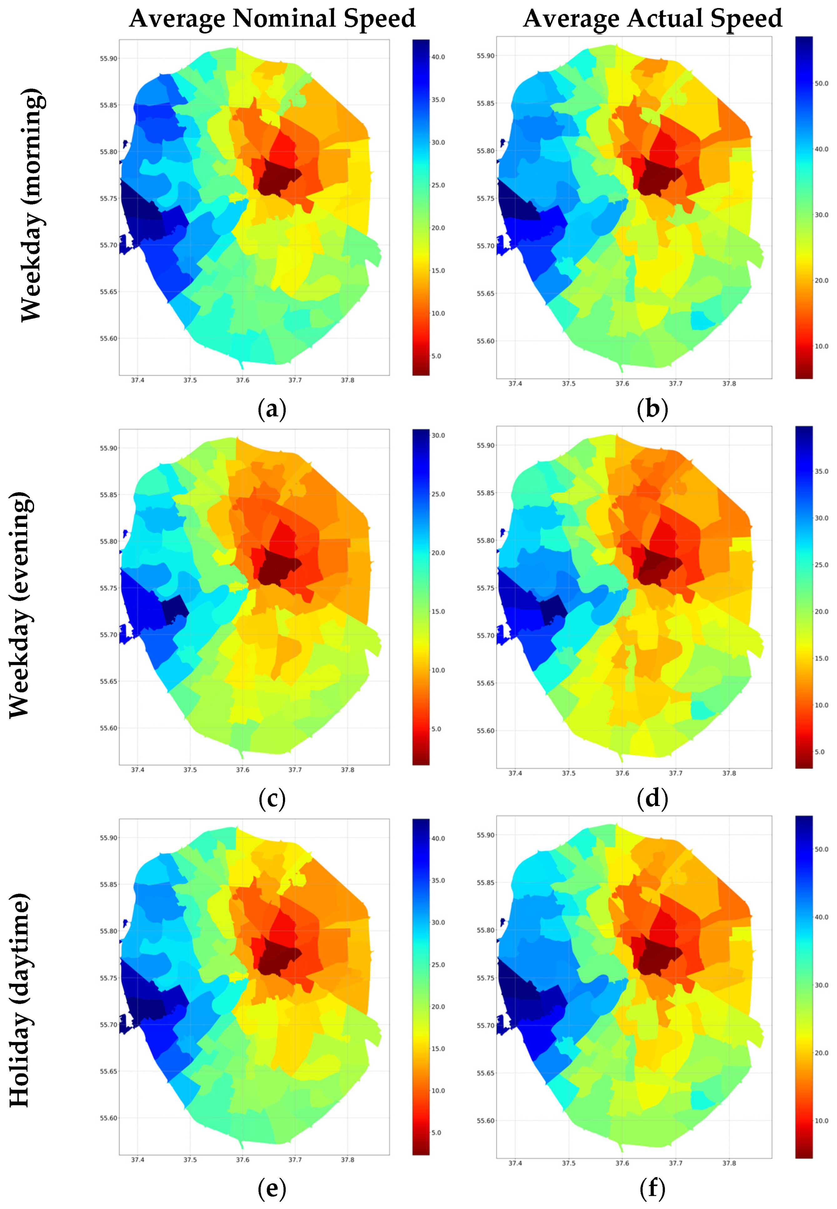
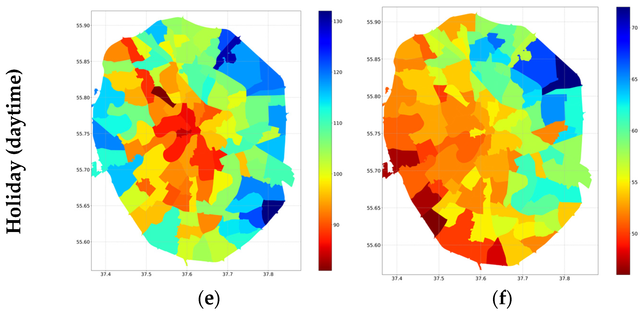
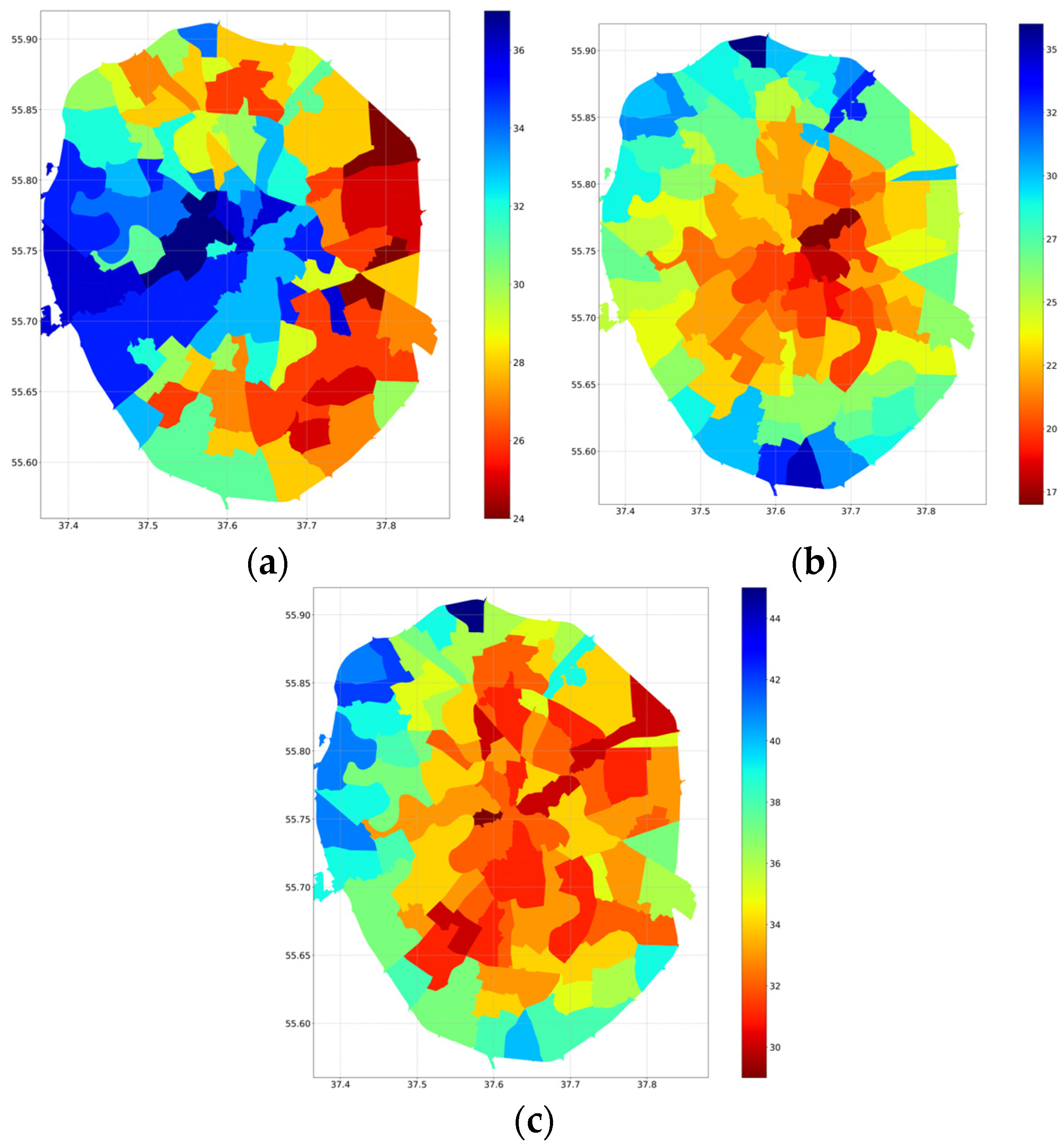
Table 1.
Overview of the study’s structure on transport accessibility of urban districts in Moscow.
| Section | Description | Research Question | Key Metrics |
|---|---|---|---|
| Section 3.1: Road System Connectivity | Compares the total actual travel distance by car from each district to all other districts and introduces the “overrun coefficient” as a measure of road network efficiency. | What are the typical travel distances by car within Moscow? How does the ratio of the actual travel distance to the direct straight-line distance (the “overrun coefficient”) vary across Moscow’s districts? | Total actual travel distance by private transport from each district to all other districts in Moscow and “Overrun coefficient” for private transport (the ratio between the actual travel distance and the direct straight-line distance). |
| Section 3.2: Accessibility of the City Center | Compares travel from a district to the city center and back using both private and public transport. | On average, how much time does it take for a resident of a district to reach the city center and return? | Travel time by private and public transport and speed metrics (average nominal speed and average actual speed) for private transport. |
| Section 3.3: Accessibility of the Airports and Railway Stations | Compares travel from a district to any of the airports or railway stations using private and public transport. | On average, how much time does it take for a resident of a district to reach any of the three main Moscow airports or major Moscow railway stations? | Travel time by private and public transport. |
| Section 3.4: Trips Across All Districts of Moscow | Compares travel on private and public transport from a fixed district to each of the other districts within the MKAD and vice versa. | On average, how much time does it take for a resident to travel from their district to any other district in Moscow within the MKAD and vice versa? | Travel time by private and public transport, and speed metrics (average nominal speed and average actual speed) for private transport. |
Disclaimer/Publisher’s Note: The statements, opinions and data contained in all publications are solely those of the individual author(s) and contributor(s) and not of MDPI and/or the editor(s). MDPI and/or the editor(s) disclaim responsibility for any injury to people or property resulting from any ideas, methods, instructions or products referred to in the content. |
© 2024 by the authors. Licensee MDPI, Basel, Switzerland. This article is an open access article distributed under the terms and conditions of the Creative Commons Attribution (CC BY) license (https://creativecommons.org/licenses/by/4.0/).
Share and Cite
MDPI and ACS Style
Petrova, T.; Grunin, A. Transport Accessibility of Urban Districts in Megapolis: Insights from Moscow. Urban Sci. 2024, 8, 36. https://doi.org/10.3390/urbansci8020036
AMA Style
Petrova T, Grunin A. Transport Accessibility of Urban Districts in Megapolis: Insights from Moscow. Urban Science. 2024; 8(2):36. https://doi.org/10.3390/urbansci8020036
Chicago/Turabian StylePetrova, Tatiana, and Andrey Grunin. 2024. "Transport Accessibility of Urban Districts in Megapolis: Insights from Moscow" Urban Science 8, no. 2: 36. https://doi.org/10.3390/urbansci8020036