Abstract
The Water–Energy–Food (WEF) Nexus framework for holistic sustainable development has spawned independent and academic communities around the globe that utilize the framework in research, implementation, policy development, and technological advancement. These communities, however, are geographically and topically segmented and lack large-scale databasing that clearly catalogs and classifies their work. Recognizing this need, the WEF Nexus Strategic Initiative program at The Pennsylvania State University has developed the WEF Nexus Discovery Map utilizing the Arc Geographic Information Systems’ (GIS) Online Dashboard creation toolkit. In real time, users are able to select from 5040 different combinations of filters with the ease of a few button pushes and see projects pop up or disappear from the map located on the dashboard. Projects can then be clicked on to view their specific information, such as the institution that produced the work, local collaborators, relevant web page, and point of contact. The WEF Nexus Discovery Map demonstrates the early new-age of data resource management with the intersection of visuals, advanced search with built-in filters, and community-driven data collection to provide users with exact needs and connections to better facilitate and deploy the holistic sustainability framework of the WEF Nexus.
Keywords:
water–energy–food nexus; GIS; technology; database; collaboration; visualization; repository 1. Introduction
Complexity in the global challenge to reduce and reverse the impacts of human environmental interference has spawned a myriad of outlooks and means of modeling complex systems that quantify the combined impacts of technology, culture, economics, and government. Additionally, human population growth, climate change, and high-density urbanization have drawn attention to the challenges of providing basic resources for survival [1]. The Water–Energy–Food (WEF) Nexus model proposes a prioritization on the interconnections in its three forenamed aspects as a means to model and deploy sustainable development with equitable discretion [2]. The WEF Nexus model drives equity by encouragement of interdisciplinary collaboration, minimization of disruptions to resource security, acknowledgement of often-disregarded stakeholders, and the large-scale mapping of system interactions. The WEF Nexus framework has been utilized to quantify linkages of resources around the globe, from emphasizing targets for sustainable intervention in South Africa, to mitigating the urban–rural resource conflict in India, to promoting synergy in wastewater management and energy production in Germany [3,4,5]. Thus, the WEF Nexus model has grown in popularity in academia, Non-Governmental Organizations (NGOs), and industry [6].
However, the networks and initiatives established by the users of the WEF Nexus model are often contained within themselves. Commonly, user groups digitally host in-depth and curated resources, models, infographics, media, and invitations for collaborations. Currently, a large aggregator for WEF related material is done by Deutsche Gesellschaft für Internationale Zusammenarbeit (GIZ), a firm specialized in international corporate collaboration, that maintains a data repository called the “Knowledge Hub”, which hosts resources, training, videos, and projects from initiatives around the globe all filterable by category, topic, region, language, and year [7]. While this repository accomplishes many user needs of accessibility and material depth, it only allows filtering of resources broadly by geographical region and lacks the ability to view country-specific projects, which may be a beneficial feature to improve searchability, especially for large continental regions. Since WEF modeling is commonly done with geographic specificity, a map-based visualization would provide an enhanced user experience. The WEF Nexus Discovery Map was conceptualized by the WEF Nexus Strategic Initiative program at The Pennsylvania State University to bring together a data repository with geographical visualization in an easily accessible web tool that encourages community contribution. Developed and hosted on ArcGIS Online, the interface welcomes users from academia, government, and industry to a geographically visualized database of WEF-based policy guides, research, emerging technologies, and implementation projects. In addition to the visualization of projects, a set of customizable filters enable viewing of projects by their category, relation to WEF aspects, region, and land class which assist the user in searching for their desired resource and help facilitate connections with other relevant members of the WEF community. This paper provides background on the goals and creation of the WEF Nexus Discovery Map as well as insights into its limitations and potential for future work.
2. Materials and Methods
2.1. Dashboard Development
One criterion at the forefront for development of the WEF Nexus Discovery Map was ease of creation, as the development team sought creation tools that did not require extensive knowledge of HTML, Python, or JavaScript programming. The inspiration to utilize the ArcGIS Online dashboard creation toolkit came from viewing John Hopkins’ COVID-19 Dashboard produced by their Center for Systems Science and Engineering (CSSE), in which they created a successful display of large-scale data equipped with easy-to-use clickable filters to focus visualized data [8]. Other examples of dashboards highlighted by ArcGIS showcase the range of possible uses of displays from active building permits in Utah to active fires around the world [9,10]. One example dashboard that shares similarities with the goals of this project is that produced by the NGO The Nature Conservancy on sustainable production and conservation initiatives [11]. That dashboard’s core traits of displaying a repository of projects on a map represented by custom icons, and the use of clickable filters that work in real time to sort projects, solidified our selection of the ArcGIS Online dashboard creation toolkit for this work.
The ArcGIS cloud-based online platform allows users to create and host map content ranging from simple data point maps to website-like StoryMaps. Similar to ArcGIS, data entry onto a map is commonly done through the use of comma separated (.CSV) files. ArcGIS Online additionally makes many of the map making processes easy by taking user input from its commonly used desktop software. The input includes sets of readily available base maps, libraries of shapefiles for countries or counties, and presets of labels. Development of a customized dashboard follows the nature of ArcGIS Online’s map creation in that the capabilities of a dashboard are pre-prepared elements. Elements such as “text box”, “image”, “filter”, “map”, and “counter” are simply added and placed into their desired position in the dashboard workspace. Inserting these elements into the dashboard is generally formulaic, in that the designer choses a map, and then selects fields to either filter or quantify the data. Thus, while no new lines of code were required by our team in the creation of the WEF Nexus Discovery Map, concepts such as data management and debugging were necessary as we developed the webtool.
2.2. Input Data Generation
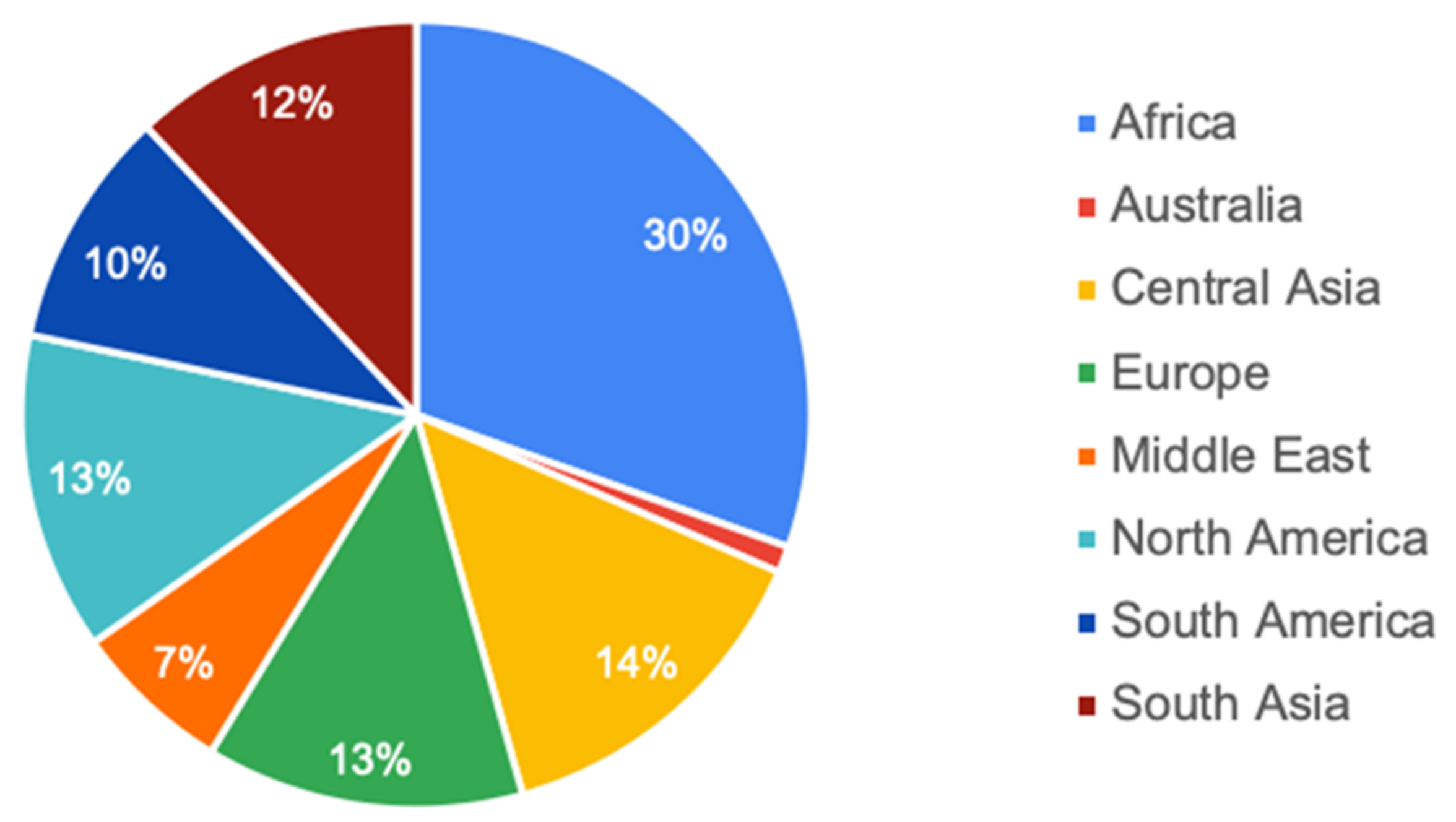
For the purpose of developing the WEF Nexus Discovery Map and showcasing its features to encourage community contribution, 100 sample projects from a variety of geographic locations were collected and added to the dashboard for its initial launch (Figure 1). These projects were collected from WEF Nexus databases hosted by WEF-focused groups, the WEF “Knowledge Hub”, and university faculty projects. However, not all selected projects were previously explicitly categorized as WEF nexus related: projects that were determined to be WEF in the nature of their framework and analysis were also added to the database. For example, works that captured key elements of WEF such as detailing and managing interconnections of resource sectors, equitable access to resources, and stakeholder inclusion were regarded as works that embody the WEF framework and thus were added as projects.

Figure 1.
Percent distribution of curated projects in the WEF Nexus Discovery Map by global region as of this publication.
To maintain the accuracy and reliability in the inner workings of the WEF Nexus Discovery Map, the development of filters and refinement of data entry were concurrently considered during the collection of the 100 sample projects curated for the Discovery Map’s initial launch. During this process, it was established that projects would fall into the filterable categories of policy guide, implementation, research, and emerging technology. Additional metadata on projects include their relation and interconnections in water–energy–food, point of contact, institution(s), local collaborator(s), keyword tags, year of publication or years active, land class of the project’s geography, likely user-groups, and coordinates of the project location. To meet the criterion of providing accurate geographical visualization, project locations were logged utilizing a spherical coordinate system. Projects specific to a city or town were recorded with their respective coordinates, however, projects regarding a country or region were recorded with their centroid for best representation. These centroid location data were often taken from Google’s Developers published dataset [12]. A single file of comma-separated values (CSV) was created using the metadata from all projects and subsequently uploaded onto ArcGIS Online.
The CSV file was used to create the ArcGIS Online map that exists on the dashboard. This was achieved by selecting the location metadata and specifying the field information used for icon generation. Icons for projects serve to inform the user of both the project’s category and combination of WEF traits; thus, custom icons were developed to represent the iconography of the category, and the colors blue, yellow, and green were utilized to represent water, energy, and food, respectively. The created map was then transferred to the dashboard creator in ArcGIS Online.
2.3. Dashboard Features
As previously described, the dashboard creation toolkit offers a variety of features that can be added to the interface by adding “elements” and simply dragging them to a section of the dashboard. The elements utilized in creation of the WEF Nexus Discovery Map included maps generated outside the dashboard, programmable filters usable on the metadata of each project, embeddable text and images, programmable counters, and a map element list. Embeddable content was used to host images for the map legend and to incorporate the “WEF Nexus Dashboard Guide” as a portable document format (pdf) file, which aids in the user experience. To foster the community aspect of the map, the “indicator” element was utilized to display the available projects in large font when logging onto the dashboard, which changes in real time as filters are applied. Users also have access to a directly linked Google Form where they can submit their own project(s) to be added to the WEF Nexus Discovery Map. The Google Form asks the user to provide the categorical metadata of their project (Figure 2). Additional categorization of the project may be facilitated by the WEF Nexus Strategic Initiative program as needed to uphold consistency and accuracy in categorization of projects.
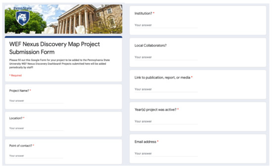
Figure 2.
Google Form for community project submission.
3. Results and Discussion
3.1. WEF Nexus Discovery Map Visualization
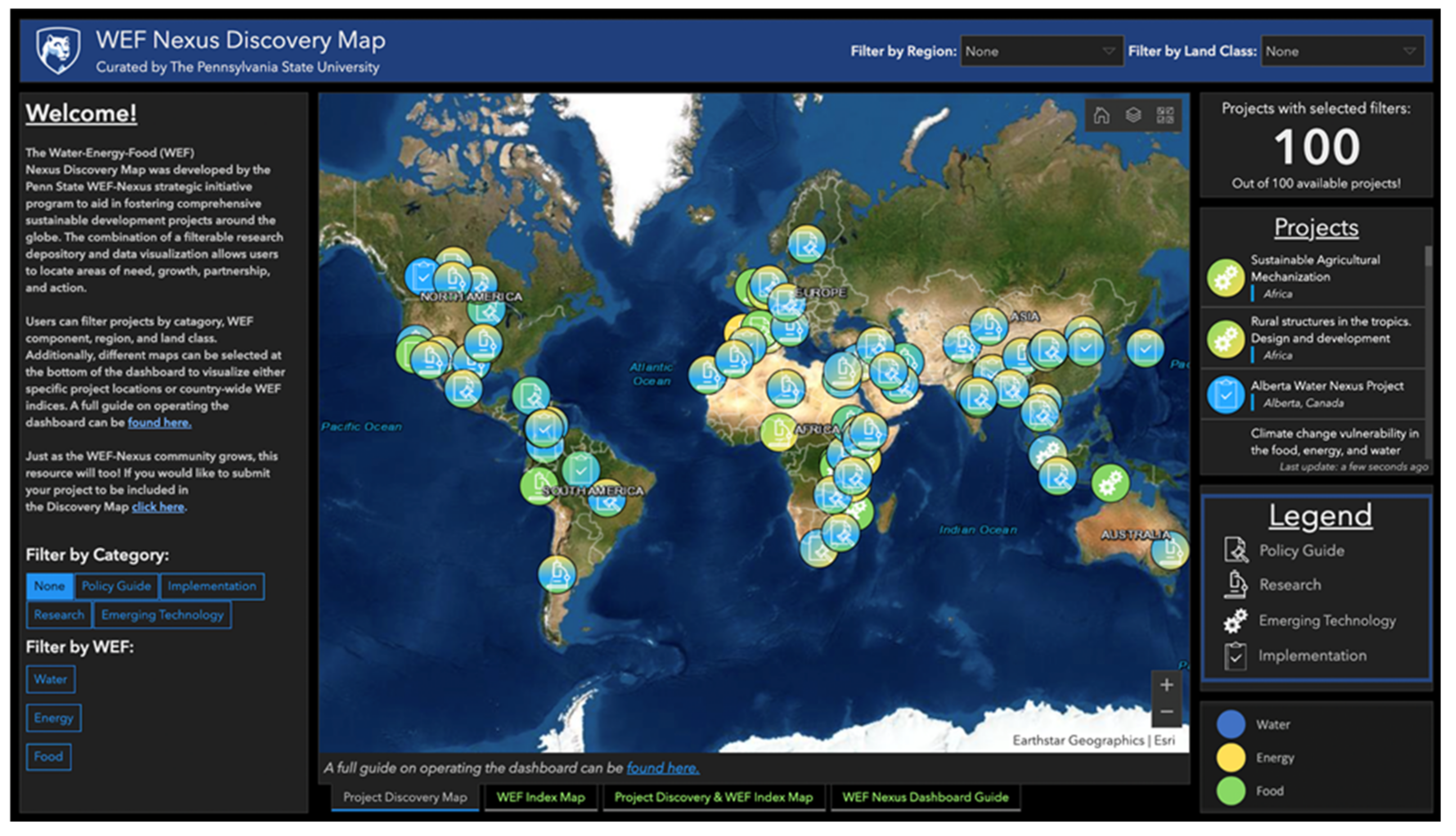
The WEF Nexus Discovery Map represents a new intersection in databasing that incorporates visualization as not only a means for accessibility, but also to enhance both searching effectiveness and the resulting analytics provided to the user. As of this publication, the WEF Nexus Discovery Map dashboard hosts 100 selected projects with 31 filters to facilitate 5040 different filter combinations. Upon opening the dashboard, users see a world map in the middle of the screen and assorted information on the side panels, including a guide to operate the dashboard, a legend, a list of projects, a description about the selected project, an option to submit their own project, and an assortment of filters (Figure 3). These filters allow users to filter for a project’s category, alignment with WEF, region, and land class. As users click these filters, projects on the map simultaneously disappear and reappear to match those of the filters chosen. Additionally, on the right side of the screen, a scrollable list of projects with their title, location, and WEF alignment changes with filters as well.

Figure 3.
Welcome screen of the WEF Nexus Discovery Map.
Projects on the map are displayed with circular icons, each containing a symbol that represents its category, either: policy guide, research, emerging technology, or implementation. The WEF aspects of the project are visualized by the color of the symbol background, with either a gradient or a solid fill of blue, yellow, or green representing water, energy, food, respectively. For example, a project showcasing the interconnection between water and energy has a gradient background of blue and yellow. Similarly, a project on just food has a solid green background. Thus, users can visually see core aspects of a project by visual inspection and receive validation that the filters they have selected are working properly.
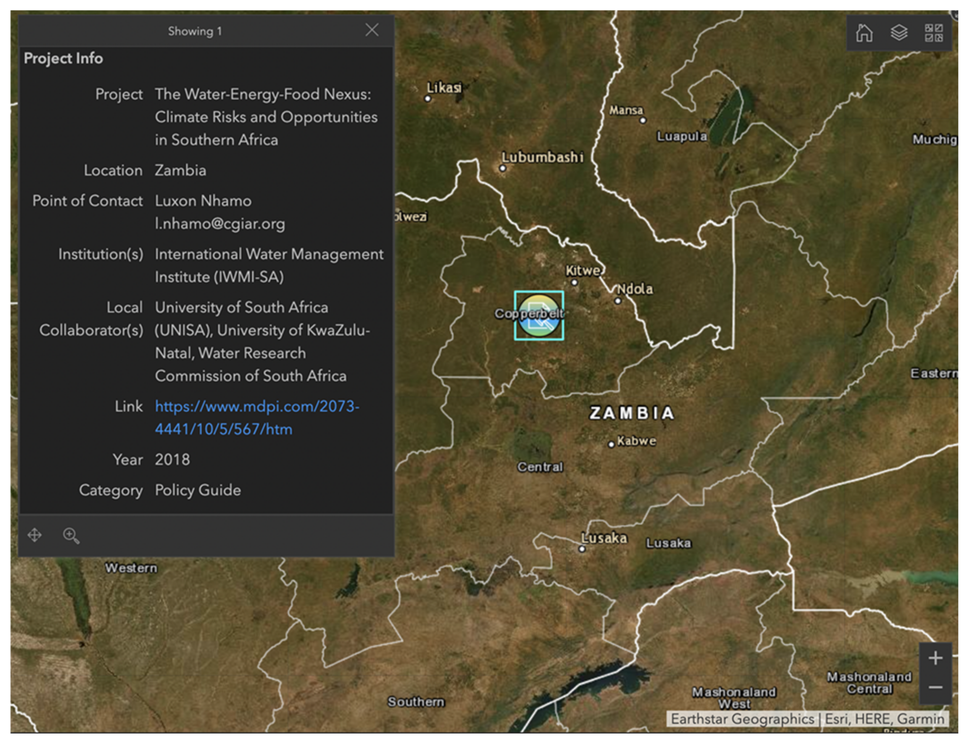
Once a project is clicked on in the map or project list, a small “project info” window pops up in the center map displaying a project’s details. This includes the project’s name, location, point of contact, institution, local collaborators, link to website or publication, year published or years active, and category (Figure 4). Once another project is clicked, the previous project’s information window disappears and is replaced with the newly clicked project. This enables users to quickly click on a project, find its information, then move onto another project from either the map area or the project list. Accessibility was deliberately chosen to be at the forefront of this work to attract a variety of stakeholders who impact investment and policy actions related to sustainability. These stakeholders now have access to concisely categorized work in which results can be extracted to best fit their needs. For example, if a stakeholder is unable to find research on integration of sustainable water management in the Gobi desert plains of China, the stakeholder can utilize the WEF Nexus Discovery Map to filter projects related to water and deserts to find pieces of work highly related to their project, thus increasing the potential to bring greater awareness of existing resources that can be used to advance the field and improve the likelihood of successful implementation.

Figure 4.
Sample of project information displayed on the WEF Nexus Discovery Map dashboard.
3.2. The WEF Index Map
A second map incorporated into the dashboard is the “WEF Index Map” developed with a dataset on WEF country indexing conducted by the European Commission Joint Research Centre Competence Centre on Composite Indicators and Scoreboards [13]. This dataset utilizes a total of 21 indicators to index a country’s performance in water, energy, and food, in addition to an aggregate “nexus score”. The “WEF Index Map” on the dashboard utilizes this data by creating a map with the layers of index scores represented by colored gradients, giving the user an idea of how countries in the world are performing in each facet of WEF and where they stand in the security of their nexus of resources. For example, activating the “Water Index” layer will color countries on the map with a blue gradient, with darker blues corresponding to an index score closer to 100 and the lighter blues having a score closer to 0. Countries can then be clicked on individually, similar to clicking a project on the “Project Discovery” map, for a pop-up to appear detailing the country name and the score of the active index layer.
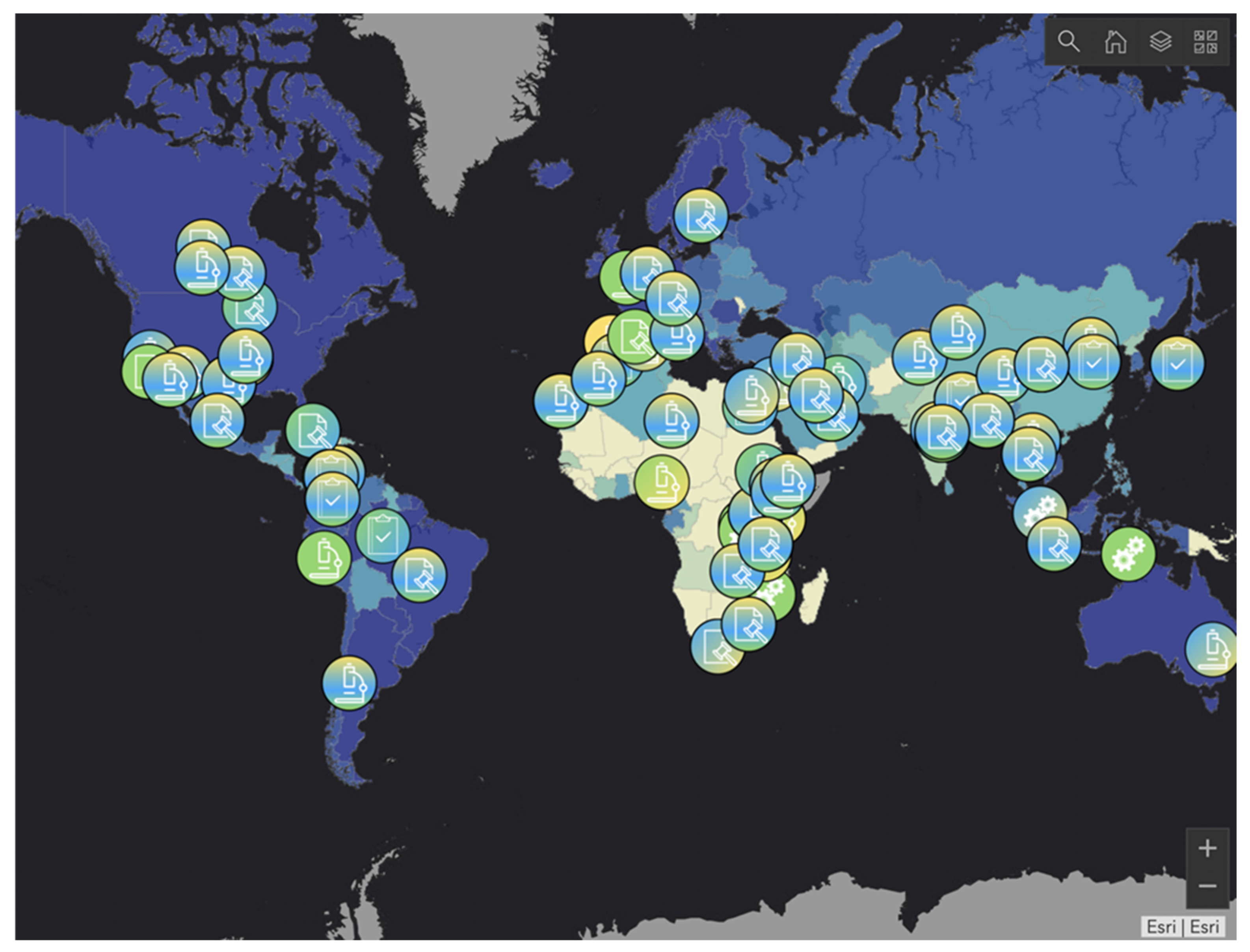
A third map, “Project Discovery and WEF Index Map”, is also available on the dashboard and is a combination of the information included in the “Project Discovery” and “WEF Index” maps, with both the country gradient indices and project icons available to be clicked and filtered (Figure 5). This enhances the user experience, as by visual inspection, one can see which areas of the world lack projects in WEF sectors and their current status in WEF category or nexus.

Figure 5.
Project Discovery and the WEF Index Map illustrating the combination of a nexus index gradient (in this case, for “water”) and icons showing available projects.
Given the extent of project classifications combined with the WEF Index data, there is potential to conduct meta-analysis on the repository to provide an evaluation of geographically-based trends and thereby better identify places of opportunity for application of the WEF Nexus framework. This meta-analysis could be utilized in instances in which a geographic location is identified for a WEF project, and similar geographic locations can be data mined and projects filtered to provide further insight into local project development. Clearly, the capability to do this would be best served by data that are entirely open source, so an effort has been made to link projects to open source data where possible.
3.3. Limitations and Future Scope
There are a few in-built limitations of the ArcGIS dashboard creation toolkit that required workarounds to enhance the functionality of the WEF Nexus Discovery Map. One of the most pertinent limitations is the inability for a “reset filters” button to be programmed into the dashboard. Such a feature would greatly increase usability and prevent users from having to refresh the page to reset filters, potentially losing their zoomed-in spot. Another limitation of the ArcGIS dashboard creation toolkit is that its search feature is highly sensitive in that words must be searched explicitly in the search bar for them to be retrieved. For example, a user searching for “ocean”-related content would likely pull no results even if projects have been tagged as “off-shore wind power” or “seaweed management.” For this reason, even though projects are currently tagged with keywords, the ArcGIS open search function has been taken out of the WEF Nexus dashboard to remove user confusion. Similarly, projects in the dashboard are not filterable by multiple strings of words that describe a project. The most apparent limitation of this is the inability to simply filter projects by “water, energy, and food” as the dashboard does not have a function to filter by the condition of a string of text in the metadata. To work around this, each aspect of WEF has been given an independent binary category in the comma separated file that is imported into ArcGIS Online. Three separate filters are then created on the dashboard to create three “string conditional” filters available to users. It is understandable that the ArcGIS dashboard cannot accommodate all the needs of a database search tool, as it is not ordinarily made for this use, but rather serves as the best means to create the tool for a basic level of web design capability. Thus, there is opportunity for a web-tool to be built from the ground up to better meet the needs of a geographical-visualized repository.
4. Conclusions
The forward-thinking and holistic structure of the WEF Nexus framework brings the opportunity to revitalize the nature of a data repository into an interactive user experience. The WEF Nexus Discovery Map captures the traditional data repository features of filtering classified and categorized resources, and also reflects the characteristics of a new-age data repository with the introduction of visual impact from the icons of the projects, real-time filtering, surface-level identifiable trends, and a customized user-oriented experience. Users from academia, industry, and nonprofit sectors can access data in an aesthetically pleasing manner by visualizing the number of projects subdividing as filters are applied. Additionally, the project icons on the map and the counter displayed on the dashboard provide interactive images to entice users to submit their own projects to grow the repository, expose their work to wider audiences, and find potential collaborators. The future for the WEF Nexus Discovery Map is a community-building tool for academics, non-governmental organizations, and industry to accelerate research and implementation utilizing the WEF Nexus framework. By welcoming community submission of additional projects, the WEF Nexus Strategic Initiative program at The Pennsylvania State University additionally hopes to grow an evolving global database of experts who are engaged and at the forefront within the WEF Nexus space.
While the WEF Nexus Discovery Map being hosted on the ArcGIS platform may not facilitate an exhaustive suite of search and filter capabilities, the tool is relatively seamless for web development that does not require programming. The resulting web-tool is user-friendly while presenting vast amounts of data with in-depth metadata available for filtering and viewing. At the time of this publication, the dashboard features an initial set of 100 projects from around the world viewable through 31 filters, culminating in 5040 total combinations for filtering by project category, WEF, region, and land class that work in real time to add or remove viewable projects. Users can click on projects for additional information, such as the institution that produced the work, local collaborator(s), relevant web page, and point of contact. Additionally, users can utilize the WEF Index data imported onto the dashboard to see geographical trends for places of opportunity for implementation of the WEF framework. The new WEF Nexus Discovery Map manages its data repository through an intersection of visuals, advanced search tools with built-in filters, and community-driven data collection to provide users with resources and connections to facilitate advancement of the WEF Nexus for holistic, sustainable development.
Author Contributions
Conceptualization, M.A., P.V.F. and R.A.B.; methodology, M.A., P.V.F. and R.A.B.; software development, M.A.; formal analysis, M.A., P.V.F. and R.A.B.; data curation, M.A. and P.V.F.; writing—original draft preparation, M.A.; writing—review and editing, M.A., P.V.F. and R.A.B.; supervision, R.A.B.; project administration, R.A.B.; funding acquisition, R.A.B. All authors have read and agreed to the published version of the manuscript.
Funding
The support of the Penn State University Strategic Initiative Seed Grant program is gratefully acknowledged.
Institutional Review Board Statement
Not applicable.
Informed Consent Statement
Not applicable.
Data Availability Statement
The website of the WEF Nexus Discovery Map and associated data archive generated in this work is publicly available here: https://pennstate.maps.arcgis.com/apps/opsdashboard/index.html#/a80f41228a4c477293d4ff48850d91e9 (accessed on 30 March 2021).
Acknowledgments
The authors would like to thank Mónica Vázquez and Lily Umbel from Penn State EnvironMentors for their support in gathering data for the sample of curated projects.
Conflicts of Interest
The authors declare no conflict of interest.
References
- Zhang, C.; Chen, X.; Li, Y.; Ding, W.; Fu, G. Water-energy-food nexus: Concepts, questions and methodologies. J. Clean. Prod. 2018, 195, 625–639. [Google Scholar] [CrossRef]
- Garcia, D.J.; You, F. The water-energy-food nexus and process systems engineering: A new focus. Comput. Chem. Eng. 2016, 91, 49–67. [Google Scholar] [CrossRef]
- Nhamo, L.; Mabhaudhi, T.; Mpandeli, S.; Dickens, C.; Nhemachena, C.; Senzanje, A.; Naidoo, D.; Liphadzi, S.; Modi, A.T. An integrative analytical model for the water-energy-food nexus: South Africa case study. Environ. Sci. Policy 2020, 109, 15–24. [Google Scholar] [CrossRef]
- Sukhwani, V.; Shaw, R. A Water-Energy-Food Nexus based Conceptual Approach for Developing Smart Urban-Rural Linkages in Nagpur Metropolitan Area, India. J. Integr. Disaster Risk Manag. 2020, 10, 1–22. [Google Scholar] [CrossRef]
- Gondhalekar, D.; Ramsauer, T. Nexus City: Operationalizing the urban Water-Energy-Food Nexus for climate change adaptation in Munich, Germany. Urban Clim. 2017, 19, 28–40. [Google Scholar] [CrossRef]
- Leck, H.; Conway, D.; Bradshaw, M.; Rees, J.A. Tracing the Water–Energy–Food Nexus: Description, Theory and Practice. Geogr. Compass 2015, 9, 445–460. [Google Scholar] [CrossRef]
- Water-Energy-Food.org. Available online: https://www.water-energy-food.org/knowledge-hub (accessed on 30 March 2021).
- Dong, E.; Du, H.; Gardner, L. An interactive web-based dashboard to track COVID-19 in real time. Lancet Infect. Dis. 2020, 20, 533–534. [Google Scholar] [CrossRef]
- Fire Information for Resource Management System (FIRMS). Available online: https://firms.modaps.eosdis.nasa.gov/map/ (accessed on 31 March 2021).
- Parcel and Zoning Viewer-Cache County, Utah. Available online: https://gis.cachecounty.org/Websites/Parcel%20and%20Zoning%20Viewer/ (accessed on 31 March 2021).
- ArcGIS.com. Available online: https://www.arcgis.com/apps/opsdashboard/index.html#/02f1d1ffc666465aaa45ff4554569e4a (accessed on 30 March 2021).
- Dataset Publishing Language. Available online: https://developers.google.com/public-data/docs/canonical/countries_csv (accessed on 30 March 2021).
- The Water-Energy-Food Nexus Index. Available online: https://wefnexusindex.org (accessed on 30 March 2021).
Publisher’s Note: MDPI stays neutral with regard to jurisdictional claims in published maps and institutional affiliations. |
© 2021 by the authors. Licensee MDPI, Basel, Switzerland. This article is an open access article distributed under the terms and conditions of the Creative Commons Attribution (CC BY) license (https://creativecommons.org/licenses/by/4.0/).

