Abstract
The exponential growth of user-contributed data provides a comprehensive basis for assessing collective perceptions of landscape change. A variety of possible public data sources exist, such as geospatial data from social media or volunteered geographic information (VGI). Key challenges with such “opportunistic” data sampling are variability in platform popularity and bias due to changing user groups and contribution rules. In this study, we use five case studies to demonstrate how intra- and inter-dataset comparisons can help to assess the temporality of landscape scenic resources, such as identifying seasonal characteristics for a given area or testing hypotheses about shifting popularity trends observed in the field. By focusing on the consistency and reproducibility of temporal patterns for selected scenic resources and comparisons across different dimensions of data, we aim to contribute to the development of systematic methods for disentangling the perceived impact of events and trends from other technological and social phenomena included in the data. The proposed techniques may help to draw attention to overlooked or underestimated patterns of landscape change, fill in missing data between periodic surveys, or corroborate and support field observations. Despite limitations, the results provide a comprehensive basis for developing indicators with a high degree of timeliness for monitoring perceived landscape change over time.
1. Introduction
It is common to think of landscape as a specific arrangement of objects in space. These objects can then be measured, inventoried, and mapped for purposes of environmental planning and natural resource management. To shift the perspective to a process-oriented view, anthropologist Tim Ingold [1] coined the term landscape temporality in 1993. According to Ingold, this concept encompasses both the human viewer component and the physical manifestation of objects in space and time. Landscape temporality can therefore refer to both human and environmental change. This is similar to concepts in landscape and urban planning, where “experiential” approaches aim to describe how people perceive and interact with the landscape [2]. It is generally accepted that both human and environmental change can significantly influence human–environment interactions and the perceived meaning and value of landscapes [3]. However, the human viewer component in particular complicates the assessment of landscape scenic resources. Landscape and environmental planners need to assess not only physical changes (including ephemeral features) but also how people respond to these changes, which in turn affect landscapes. This includes temporal characteristics, trends, and collective perceptions of landscape change. Consequently, both the human viewer and the landscape are important issues in the assessment of scenic resources. In recent years, however, search and ranking algorithms and the global spread of information increasingly influence the behavior of large groups of people [4]. This affects collective engagement and interaction with the landscape and its scenic resources. For this reason, social media and the dissemination of information have become a new component that planners need to consider.
To systematize these three components (the environment, the human viewer, and information technology) for landscape change assessment, we propose the application of the social–ecological–technological system (SETS) framework [5] to temporal geosocial media analysis. To demonstrate and discuss a variety of situations, we examine temporal patterns from five platforms (Reddit, Flickr, Twitter, Instagram, and iNaturalist) and for five case studies. In particular, we interpret the results from a human-centered perspective, with the aim of disentangling the human viewer component from several other superimposed patterns in the data, such as algorithmic bias, platform dynamics, or shifting perceptual preferences. The results can help to corroborate or complement traditional scenic resource assessments. The presented approach can also extend the means to include newer phenomena resulting from changing communication patterns in a globally connected world.
2. Literature Review
In an attempt to improve the empirical assessment of ephemeral landscape features, Hull and McCarthy [6] proposed a concept they called “change in the landscape”. While the authors give a specific focus to wildlife, they describe a wide range of processes associated with change: “[…] day changes to night, autumn to winter and flowers to fruit; there is plant succession, bird migration, wind, rain, fire and flood […]” (ibid., p. 266). These changes are characterized by nine types, such as slow changes (gentrification of neighborhoods, growth of vegetation), sudden changes (weather fluctuations), regular changes (seasonal in plants, animal migration, sunrises), frequent (presence of wildlife, wind, sounds), infrequent (fire, floods), long duration (buildings, roads, consequences of natural disasters), medium duration (harvesting of trees, seasons), ephemeral–irregular, occasional, and periodic (wildlife, weather, hiking, evidence of other hikers). In their conclusion, the authors warn that ignoring these conditions leads to biased assessments of landscape quality. In practice, however, common temporal assessments continue to focus on physical manifestations of change, such as those observed in biotopes [7], which are often assessed using remote sensing technologies [8].
A number of approaches investigate people’s perceptions, attitudes, and responses to environmental change and how people engage with the landscape over time [9]. With the emergence of large collections of user-generated content shared on the Internet, several studies have attempted to assess temporal aspects. Juhász and Hochmair [10] compared temporal activity patterns between geolocated posts shared on Snapchat, Twitter, and Flickr and found that the different active groups on these platforms are responsible for significant differences in the observed spatial patterns. A better understanding of the source and nature of these differences has become a central focus of research around volunteered geographic information (VGI). Paldino et al. [11] studied the temporal distribution of activity by domestic tourists, foreigners, and residents in New York City, analyzing daily, weekly, and monthly activity patterns and differences between these groups. Mancini et al. [12] compared time series collected from social media and survey data. They concluded that day trips have the greatest impact on the differences between survey and social media data. Tenkanen et al. [13] showed how Instagram, Flickr, and Twitter can be used to monitor visitation to protected areas in Finland and South Africa. Their findings suggested that the amount and quality of data vary considerably across the three platforms.
In a relatively new direction, ecologists are increasingly relying on unstructured VGI for biodiversity monitoring [14]. Rapacciuolo et al. [15] demonstrated a workflow to separate measures of actual ecosystem change from observer-related biases such as changes in online communities, user location or species preferences, or platform dynamics. In particular, they found that trends in biodiversity change are difficult to separate from changes in online communities. In a recent study, Dunkel et al. [16] examined reactions to sunset and sunrise expressed in the textual metadata of 500 million photographs from Instagram and Flickr. Despite significant differences in data sampling, both datasets revealed a strong consistency in spatial preference patterns for global views of these two events. Platform biases were observed in locations where user groups differed significantly, such as the Burning Man festival in Nevada. The festival location ranked second globally for sunrise viewing on Instagram, while Flickr users shared very few photos, a pattern that is explained by the different user compositions of these platforms.
As becomes obvious with the above review, a key task in analyzing user-generated content is to reduce bias in the data to increase representativeness. Bias can include factors such as uneven data sampling affected by population density, or highly active individual users skewing patterns through mass uploads, as well as changes in platform incentives that affect how and what content is shared [12]. There are a number of methods that can help compensate for these effects. However, these methods can also introduce bias and further reduce the amount of data available, making interpretation more difficult. For this reason, ref. [15] divide approaches into two broad categories that are not mutually exclusive but tend to have opposite effects: filtering and aggregation. Filtering increases precision, which helps to derive more reliable and useful inferences but also tends to reduce the available variance, richness, and representativeness of the data. Aggregation, on the other hand, minimizes bias in the overall data by, for example, increasing quantity through sampling from a larger, more representative number of observers and by integrating data from different platforms. This comes at the expense of precision. Aggregation and filtering approaches can be combined [17].
A gap in the current literature is how to systematize the application of filtering and aggregation approaches for new studies. The number of possible biases in data is large (e.g., [14]), and it is not possible to know a priori which biases affect the data. There is a lack of a categorization scheme to help understand the phenomena that affect sampling at specific times and places. A first step in this direction is the consideration of any user-generated data as “opportunistic” sampling and the contributing users as “observers”. Both terms are increasingly used in biodiversity monitoring [14,18]. Opportunistic in this case refers to the degree to which data are sampled without predefined systematic contribution rules or objectives. The classification is not abrupt, and a continuum of platforms exists between fully standardized and rigorous survey protocols at one end (e.g., the United Kingdom Butterfly Monitoring Scheme [19]) to semi-structured data (iNaturalist or eBird as VGI that is aimed at collecting data for a specific purpose), to fully crowdsourced data (Flickr, Twitter, Reddit, Instagram as geosocial media) [20]. The ranking of platforms along this continuum can be judged by the homogeneity of contributing user groups and contribution rules. In summary, the above research suggests that opportunistic data tend to be better for inferring users’ subjective values, including individual preferences for activities and observational behavior, making them suitable for assessing landscape perception and scenic resources.
This openness typically results in larger volumes of observations than are typically available from more systematized field surveys but also leads to more biases that can negatively affect the reliability and validity of the data. Proposed solutions to reduce bias in species monitoring are (1) reverse engineering the “survey structure”, (2) finding the lowest common denominator for comparison, (3) modeling the observation process, and (4) comparing to standardized data sources [15]. Applying these solutions to landscape perception, however, requires a broader set of considerations for disentangling results. While ecological changes are critical for landscape and urban planners, changes in the observer and the observation process itself are equally relevant. The latter covers effects introduced by the use of global social media and information spread. Examples include mass invasions [4] and algorithmic bias [21], which can have negative effects on landscapes and how they are perceived.
This study presents five case studies. We discuss three main areas in which change can occur: ecological, social, and technological. The domains are taken from the SETS framework. They are used to systematize biases in the case studies and to assess perceived landscape change from different perspectives. Rather than looking at a single dataset in detail, the cross-section allows us to test the system under different parameters. In the literature cited above, the effects of technology are often subsumed under distributional measures of the social domain or treated as one of many different biases affecting data collection. Explicitly considering technology as an independent component helps us systematize the analysis process and better distinguish important levers for biases found in the data. We show how the framework can help analysts disentangle the three domains when interpreting and making sense of temporal patterns in community-contributed opportunistic data sources.
3. Materials and Methods
3.1. Framework for Analysis
The SETS framework is a system consisting of three poles, the social (S), ecological (E), and technological (T) [22]. So-called couplings exist between these poles. Couplings can be thought of as a “lens” for understanding the dynamics between different parts of complex ecosystems. Perceptions of landscape change are part of such a system. To date, research on landscape perception has mainly focused on two of these poles: the physical landscape and the perceiving human (see [23]). The third technological pole of the SETS framework has usually been subsumed under physical landscape assessment, which may include changes such as infrastructure. However, Rakova and Dobbe [24] emphasized that algorithms have become a critical part of the technological pole. Algorithms increasingly affect the interactions between society and ecosystems on a global scale. From this perspective, it makes sense to consider technology as a separate third component. Using geosocial media or VGI as an interface for data collection means that technological couplings can be identified as imprints in data (shown on the right side of Figure 1). Conversely, people communicating on these platforms use their senses and social context (the social dimension, S) to choose what to share and when to share it. Lastly, scenic resources and the environment (the ecological dimension, E) provide incentives that affect people’s agency and their ability to perceive and respond in a particular way.
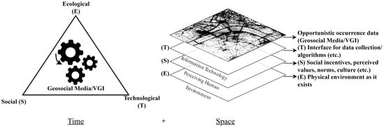
Figure 1.
SETS framework for separating three types of couplings influencing opportunistic data collection through geosocial media and VGI over time (left) and space (right).
At the same time, more complex feedback loops exist between these poles that require special attention. In particular, technological phenomena such as algorithms influence individual social–ecological interactions [25]. People gather information from all sources when making travel arrangements, for example. Their choices may be influenced by the physical characteristics of the landscape, such as scenic quality, as an ecological coupling (hereafter referred to as E), or by reports, reviews, and recommendations from other travelers, which can be seen as an example of a social coupling (S). Such a spatial discourse has effects over time on perceived values, norms, or the ways cultures perceive scenic beauty [2]. Finally, algorithms that promote some information while downgrading others can be described as a technological coupling (T). Especially in the latter case and for geosocial media, many algorithms and platform incentives have known and unknown effects on user behavior [26,27]. The sum of these experiences defines how information about the environment is perceived and communicated. Geosocial media and VGI, therefore, can have a profound influence on long-term dynamics. Through repetition and reinforcement, algorithmic couplings increasingly manifest as actual changes in the social or ecological domain. Van Dijck [25] already argued that networks such as Flickr “actively construct connections between perspectives, experiences, and memories” but also warned that “the culture of connectivity […] leads to specific ways of ‘seeing the world’” (p. 402). For example, by rewarding particularly stunning landscape photographs with “user reach” on social media, some landmarks are already under unusual visitation pressure [4].
Figure 1 illustrates geosocial media and VGI as a core component and as indistinct from SETS. This concept helps to consider these algorithms together with their social (including institutional) and ecological couplings that define the broader ecosystem in which they operate [24,28]. To draw useful conclusions and derive actionable knowledge, planners need to assess all three poles. However, approaches to disentangling the effects of these poles vary widely depending on the data source and analysis context. To explore these different analytical contexts and data characteristics for assessing perceived landscape change, we use data from five platforms in five small case studies. The case studies illustrate a variety of tasks, challenges, and pitfalls in early exploratory parts of analyses. We discuss these case studies from a SETS perspective. The discussion is sorted based on the complexity of identified data couplings, from less complex to more complex.
3.2. Data Collection and Preprocessing
Table 1 lists platforms and number of observations collected for each study. Data collection for these studies was performed using the official application programming interfaces (APIs) provided by the platforms. APIs are challenging to work with. They often change on a weekly or monthly basis, are difficult to fully sample, and are often incompletely documented. For example, the Instagram, Reddit, and Twitter APIs have changed in ways that would make it very difficult or impossible to retrieve the data that were collected for this study again and in the same form. Therefore, transparency, reproducibility, and reusability are critical issues in this area of research. We follow a workflow outlined in [29] that allows us to share the data collected from the APIs without compromising user privacy. Based on this workflow, the data have been transformed into a privacy-friendly format that allows quantitative analysis without the need to store raw data. As a result of this data abstraction process, all measures reported in this paper are estimates, with guaranteed error bounds of ±2.30%. Only publicly shared content was retrieved. With the exception of the Reddit data, we only selected content that was either geotagged or contained some other form of explicit reference to a location or coordinate. To reduce the effort of cross-platform analysis, we mapped the different data structures and attributes of all platforms to a common structure for comparison1. To assess temporal patterns, we used either photo timestamps (Flickr), time of observation (iNaturalist), or post-publication date as a proxy (Twitter, Instagram, Reddit). Below, we keep the discussion of data collection and processing steps to a necessary minimum and refer readers to Supplementary Materials S1–S10 for commented code, data collection, processing, and visualization.

Table 1.
Overview of case studies and collected data.
The first study focuses on data from Instagram, as a single data source, and a specific phenomenon related to landscape change that is observed at 13 selected vantage points across Europe (see S1). The study captured metadata from 998,800 photographs from 40 Instagram places between 2007 and 2019. Because multiple Instagram places can refer to the same vantage point, we applied manual disambiguation to assign Instagram places to vantage points. In the second study, we looked at Reddit, a discussion platform that does not support explicit georeferencing. However, spatial information can be inferred, for example, from subreddits that refer to different spatial regions. We manually matched 46 subreddits related to US national parks and collected comments and posts from 2010 to 2022 (S2–S5). This dataset contains 53,491 posts and 292,404 comments. Due to significant differences in data availability, we limit our analysis to the 20 national parks that receive the most communication exposure. The third study focuses on a single ecological phenomenon (cherry blossoming) and examines seasonal and long-term variation across two platforms (S6). The data collected include metadata for 100,700 photos from Flickr and 1.6 million tweets from Twitter. The fourth study illustrates cross-platform analysis by sampling and aggregating data from Instagram, Flickr, Twitter, and iNaturalist for 30 biodiversity hotspots in Germany. The total number of photos and observations is 2,289,722. In this case study, we do not apply any filtering techniques, and the results show the absolute frequencies of photos, tweets, and animal and plant observations, respectively (S7). In the last case study, we look at global observations of the Red Kite (Milvus milvus) and use a variety of filtering techniques to examine temporal patterns (S8–S10).
3.3. Signed Chi Equation
Specifically for the last case study, we apply the signed chi normalization to temporal data. This equation was originally developed by Visvalingam [30] to visualize overrepresentation and underrepresentation in spatial data.
Applying this normalization allows analysts to distinguish properties of filtered subsets of data from phenomena or biases found in the entire data set [30]. The two components can also be described as a generic query (expected) and a specific query (observed). A specific query might be the frequency of photographs related to a particular topic or theme (e.g., all photographs of the Red Kite). A generic query, on the other hand, ideally requires a random sample of data. Observed and expected values are usually evaluated for individual “bins”, which can be spatial grid cells or temporally delimited time periods or intervals. Based on the global average ratio of frequencies between observed ( and expected (, individual bins are normalized (norm). Positive chi values indicate overrepresentation and negative values indicate underrepresentation of observations in a given area or time interval (). The randomness of the generic query is typically difficult to achieve due to the opaque nature of APIs. For example, it is not always clear how data have been pre-filtered by algorithms before being served to the user [16]. The easiest way to ensure randomness is to sample all data from a platform. For Flickr and iNaturalist, this was possible, and all geotagged photos and observations were queried for the period from 2007 to 2022. The resulting dataset we use for “expected” frequencies consists of metadata of 9 million iNaturalist observations. Observed frequencies are based on 22,075 Flickr photos and 20,561 iNaturalist observations. All data and code used to generate the graphs are made available in a separate data repository [31].
4. Results and Discussion
4.1. Mass Invasions (Instagram)
For the first case study, we looked for a phenomenon called “mass invasions” by Oian et al. [4], which refers to landscape changes triggered by technology and the use of geosocial media. We expected that such a phenomenon would be easier to identify in the data collected from geosocial media and VGI, since the phenomenon under observation and the interface for data collection are closely related. We focused on a selected list of 13 scenic places in Europe that were known to be affected. This analytical context is part of a master’s thesis by Tautenhahn [32]. The term is used to describe a sudden increase in visitors that cannot be explained without taking into account geosocial media and the global spread of information. Here, the effect of people crowding certain places can be described as primarily belonging to the social (S) domain. Crowding existed before social media (see [33]). Likewise, without the existence of scenery and beauty at these locations, mass invasions might not have occurred in the first place. Thus, the ecological (E) and social (S) domains can be seen as a necessary backdrop for this coupling. However, platforms, algorithms, and the Internet as technology (T) seem to reinforce and incentivize certain behaviors that produce a particular outcome in these places.
Data collection and analysis for this study presented relatively few challenges. Claudia Tautenhahn contributed a list of potentially affected places, based on a priori knowledge that she gained from literature and field observations. Because Instagram enables place-based communication through a named gazetteer of user-contributed places, these places could be used to directly query and filter data. For the 13 given locations and 40 assigned Instagram places provided by Tautenhahn, we retrieved all posts, starting in 2019 and going backward in time. To emphasize, the data collection was performed by the authors of this article, and the visuals presented here were generated independently of the master’s thesis. Tautenhahn’s thesis is based on the same data and includes additional qualitative surveys and interpretations, which we cite accordingly. Figure 2 shows time series visualizations for a subset of four of these places. The graphs were generated based on the total monthly Instagram post volume. In addition, the single month with the highest frequency of posts and the 12-month moving average are shown.
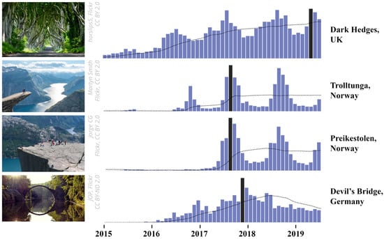
Figure 2.
Time series visualization (Instagram) for selected vantage points in Europe that are known to have shown “Mass invasions”. Months with the highest number of visits are highlighted in black. The 12-month moving average is shown as a dotted line. See Appendix A, Figure A1 for visualizations of all 13 assessed vantage points.
To begin exploring questions of why and how, a common first step in interpreting such graphs is to formulate hypotheses [34]. Comparing relative differences is an important key task, as absolute post volume is not a robust and reliable measure [35]. We accounted for this fact by scaling the y-axes between the minimum and maximum values in Figure 2 and by omitting absolute values. Based on visual comparison, the relative differences between the four graphs can be grouped into three categories. Dark Hedges, a famous avenue of old beech trees in the UK made famous by the TV series “Game of Thrones”, shows a continuously increasing trend that also starts relatively early compared to the other locations. In contrast, the two viewpoints Trolltunga and Preikestolen in Norway both show a strong seasonal trend, peaking in the summer months. For these two sites, the first significant peak in Instagram post volume also appeared relatively late in 2016–2017. As an outlier, the Devil’s Bridge in Germany, known for its distinctive water reflection that forms a full circle, shows an increasing trend in Instagram posts that peaks in the fall of 2017 and then suddenly declines. In contrast to the other three locations, the Devil’s Bridge graph shows no noticeable seasonal patterns.
The formulation of useful hypotheses typically requires the consideration of additional data. For Devil’s Bridge, a review of infrastructure changes reveals that the bridge was undergoing renovations from 2018 to 2021 [32] (p. 55), a finding that can explain the declining trend in Instagram photos. In other words, the opportunity to take stunning photos of the bridge and generate “reach” on geosocial media was severely limited during this time period. This simple and obvious relationship can be described as a coupling from the SETS framework. The construction, as a (1) technological phenomenon, affects the (2) social dimension of visitors’ agency to take photos of a given scene. The motivation to take these photos (3) is perhaps related to the platform, which incentivizes the reproduction of idealized photos that generate as many comments, likes, or reshares online as possible [36]. A similar social–technological incentive could also be at work at Dark Hedges, further fueled by the global spread of information through geosocial media, as an algorithmic–technological coupling that reinforces these trends. Such hypotheses would need further confirmation through, e.g., questionnaires. In an interview by Tautenhahn [32] at Dark Hedges, a couple confirmed the relationship between the TV series and their motivation to visit the avenue (transcript, p. 201):
I: So what were your motives to come here? Your reasons?P 1: Ahm…P 2: Of course the movie.[…]I: (Laughs) And what did you expect when you came here?P 1: Ahm, basically something like that. [Okay] A little bit overcrowded. [Yeah. Okay] Yeah. But beautiful landscape of course.
Options for confirmatory analysis also include internal consistency checks, such as regression analysis or comparing the consistency of individual ratios. For example, for Dark Hedges, Tautenhahn [32] examined the proportion of posts containing hashtags related to the TV series (#gameofthrones, #GoT, #kingsroad) over time. Her results show that the ratio of posts containing at least one of these hashtags increased continuously up to 55% in April 2015 and remained relatively stable thereafter, a finding that can be used to support hypotheses and gain confidence in the data. Similarly, the small peak for Devil’s Bridge in December 2016 can be linked to Lorenz Holder winning the Red Bull award with a photo of the bridge and its reflection (ibid., p. 54), an event that may have originally triggered reactions on geosocial media.
4.2. National Parks (Reddit)
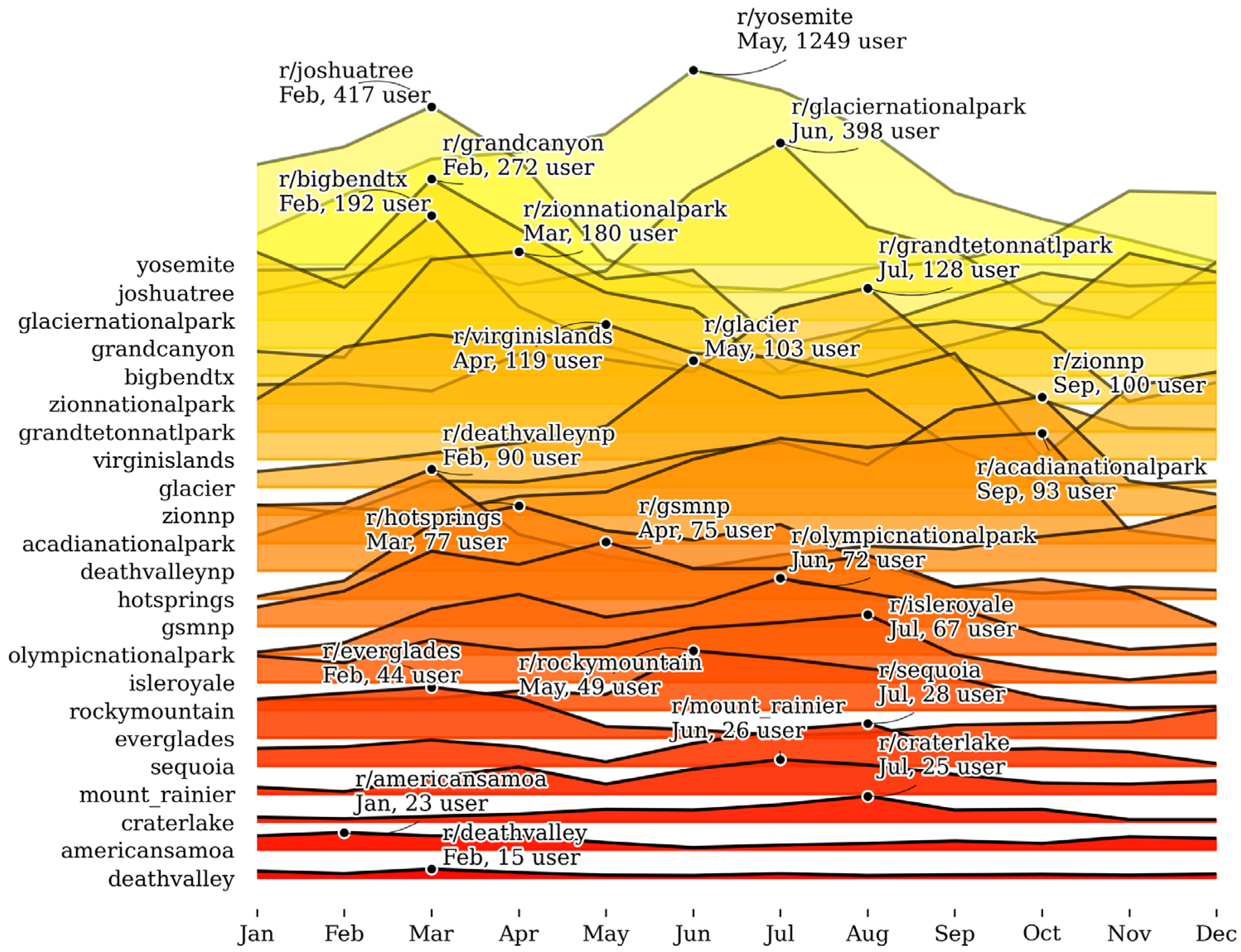
Clearly delineated contexts with a single phenomenon and pole as a common denominator, as in the first example, are unfortunately rare in landscape change assessment. Many contexts require the study of landscapes at smaller scales, often covering large regions with many phenomena and a variety of perceiving user groups. This not only requires more effort to query, filter, and map data but also reduces the specificity of hypotheses that can be identified from exploring patterns. To illustrate such a context, we selected a list of 20 Reddit subreddits related to US national parks for the second example. The list of subreddits is comparable to the list of Instagram locations in the first example. Both gazetteers allow analysts to examine a set of locations or regions (E) from the perspective of a selected group (S) of users on a particular platform (T). Figure 3 shows the average monthly post and comment volume for the Reddit data for each park. The graphs are stacked into a single visualization. This type of visualization, also known as a Joyplot, is particularly useful for comparative analysis of changes in distributions over time [37]. The Joyplot sorts the graphs for the national parks in descending order of importance based on the average volume of data per month. To avoid obscuring parks with less communication, parks with the most comments are shown in the background.
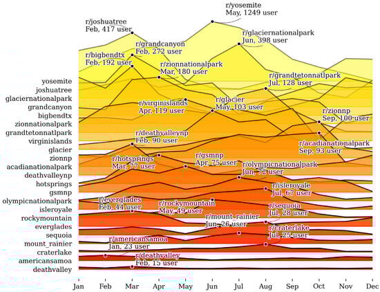
Figure 3.
A Joyplot visualizing seasonal communication trends for selected national parks based on unique user counts from community-led subreddits. “Mountain peaks” are used as a metaphor for the volume of monthly patterns that deviate from the norm (the average monthly communication frequency for each park). See Appendix A, Figure A2 for individual visualizations of posts and comment volume per subreddit.
Contrary to what one might expect, the ranking of Reddit parks (the order of ridges in Figure 3) does not match the rankings reported by official visitation statistics. For example, Great Smoky Mountains National Park is ranked #1 in official visitation statistics, while it is ranked #14 based on the volume of posts and comments on Reddit. However, when this overall bias is ignored, the monthly post volume for individual parks actually confirms our expectation that seasonal preferences and limitations for viewing scenic resources are reflected in communication trends. For example, Yosemite, Glacier, and Grand Teton national parks are difficult to visit in the winter due to harsh weather conditions. This is also evident in Reddit’s communication trends. Similarly, Joshua Tree, Zion, Grand Canyon, Big Bend, and Death Valley national parks are popular during the winter season when temperatures are more moderate.
However, just because people communicate and share photographs online does not necessarily mean (1) that they visited a national park, (2) that they perceived scenic resources, or (3) that the quality of their experience was positive or negative. The strength of the coupling between visual perception and collected data varies based on the interface that is used for data collection [36]. This also applies to data collected from different social media platforms. Flickr’s metadata, for example, often contains relatively direct links to the visually perceived environment, through photo timestamps or GPS coordinates [27]. In contrast, posts on X (formerly Twitter) are frequently published retrospectively and do not necessarily refer to the referenced geolocation [38]. From the perspective of visual resource assessment, these biases can be seen as a detrimental effect. It can also be seen as an opportunity to investigate different forms of environmental perception. Reddit, for instance, incentivizes a particular form of communication that regularly produces extensive discussion on a specific topic [39]. This is evident when looking at a small subset of four Reddit post titles for Yosemite selected from Supplementary Materials (S2):
- What equipment do I need for Vernal Fall in April?
- Does group size of 1 help half dome lottery chances?
- Yosemite Valley with little kids—in the snow—Trip Report
- Mirror Lake today before the snow
One might wonder what “equipment” (1) has to do with appreciating the beauty of Vernal Falls. Or how and why the “Half Dome Lottery” (2) affects the visitor experience, or the effect of traveling with or without small children on the perception of the valley (3). These questions may be only indirectly related to actual visual changes observed in the landscape, but they can be critical for exploring dynamic relationships and making sense of preference factors. Particularly, these discussions can be used by visual resource specialists to examine three independent forms of landscape perception: (1) pre-visit expectations, (2) on-site, in situ perceptions and experiences, and (3) post-visit retrospective reports and abstracted memories of scenes.
Here, considering Reddit as a separate technological factor or lens can help draw attention to the strengths and weaknesses of different platforms. Individual platform features and algorithms result in a specific set of written and unwritten contribution rules, restrictions, and incentives that affect the opportunistic contribution of data [10]. These circumstances create a self-selection bias for contributing users. Hargittai [39] identifies several of these for Reddit, including gender bias (more men than women), education bias (more middle to higher education), and a bias toward users from urban areas. Biases generally limit representativity. They may also explain why certain parks receive more (e.g., Yosemite, Yoshua Tree) or less (e.g., Death Valley, Everglades) attention on Reddit than is observed in field surveys. Many biases are difficult to assess systematically as they are a consequence of complex couplings between the social and technological domains. Depending on the context of the analysis, these factors limit the ability to draw valid and accurate conclusions, such as for comparing different park uses. Conversely, correlations between the seasonality of platform use and the ecological characteristics of individual parks indicate an easier-to-identify coupling. This may offer options for developing indicators for monitoring perceived landscape change for individual parks.
4.3. Cherry Blossoms (Flickr, Twitter)
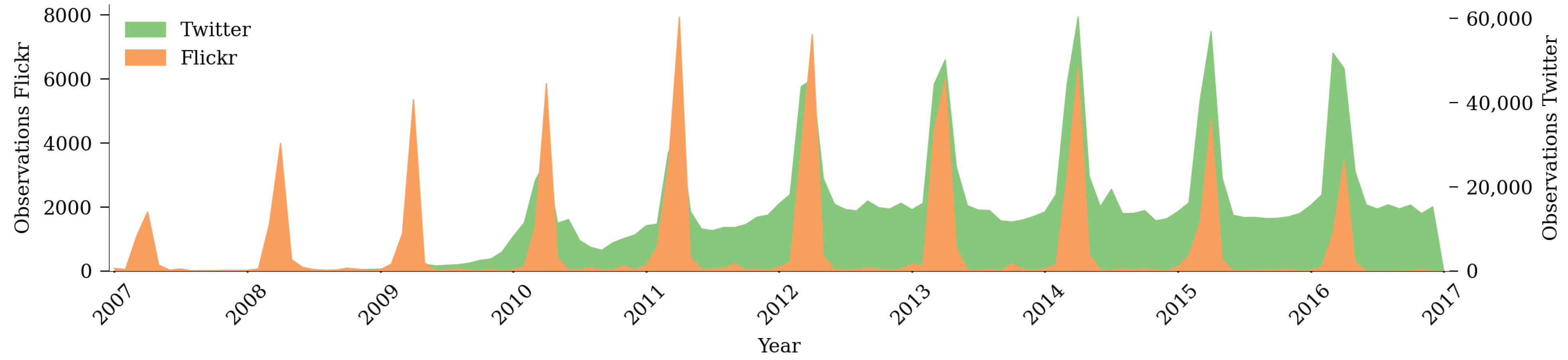
The first two case studies show a mix of ecological, technological, and social dynamics in data patterns. Is this always the case? To illustrate the impact of a single phenomenon across multiple platforms, we considered observations of cherry blossoms (E) shared on Twitter and Flickr. Our hypothesis is that, under certain circumstances, global communication should be closely linked to actual ecological change. Cherry blossoms can be seen as one of the many phenomena that Hull and McCarthy [6] categorized under landscape change (see Literature review). Our expectation was that the regularity and seasonal appearance of cherry blossoms each spring should allow us to better observe changes in patterns related to the other two SETS dimensions. For example, cultural changes (S) could lead to a steady increase in perceived importance that is visible online (T); or unexpected fluctuations in the regularity of reactions could draw attention to trends and events not captured so far. Figure 4 illustrates the global volume of tweets and Flickr photographs that contain references to cherry blossoming from 2007 to 2018. For both Flickr and Twitter, we used the same query to semantically filter content:
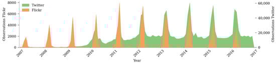
Figure 4.
Global Flickr and Twitter cherry blossom-related online communication.
We explicitly limited our query to English terms and the Japanese word sakura, accepting a possible language bias. Furthermore, while we restricted the Flickr query to geotagged content, we left the Twitter query unrestricted due to the limited availability of only 1% of geotagged tweets.
Three key observations can be made. Firstly, the regularity and strong delineation of peaks each spring can be observed for both Twitter and Flickr. This underpins the overarching ecological bias of the phenomenon. Blossoms are visually sensed. The possibility to physically observe cherry blossoms is further limited to a brief period each year. Confirmation of this aspect in the graph (Figure 4) can be seen as a consistency check for the data collection process. In other words, both Twitter and Flickr capture at least some of the experiential dynamics of perceiving cherry blossoms as a visible change in the landscape. Secondly, and perhaps more interestingly, Twitter and Flickr patterns differ (T). While Flickr’s photograph volume is mainly limited to the short periods when blossoms are actually visible (February through April), the data from Twitter feature a more continuous volume of tweets throughout the year. A possible explanation could be the unequal platform impact on the data collection process. Photographs can be considered as shared digital artifacts of landscape perception [40]. Taking a photograph typically requires active observation and presence [41]. We likely further substantiated this coupling by limiting our Flickr query to geotagged content only. This is not the case for users of X (formerly Twitter), who also use non-geotagged and text-only tweets that only metaphorically refer to cherry blossoms. A look at a small subset of the collected data can support this assumption and reveal other differences between the two platforms.
Twitter:
- wondering why the cherry blossom tourists have to take the Metro during rush hour
- Ugh cherry blossom fest traffic hell. Avoid the downtown mall
- The Sakura flowers are expected to be on its full bloom tomorrow, can’t wait to just sit under the Cherry Trees
- LED Cherry Blossom Tree—National Deal, Special 1
Flickr:
- This looked so nice in the sunlight. A whole tree filled with big clumps of cherry blossom and this little clump was leaning out into the sunlight.
- This is our Cherry tree in full bloom a couple of months ago, before the wind blew the blossom away. You can’t tell from this how overgrown the garden is. Can’t comment at moment.
Interestingly, while the two selected Flickr photo descriptions are positive, half of the shown tweets also refer to negatively perceived events related to the cherry blossoms. Technology (T) and the way communication works on X seem to motivate users (S) to report on negative experiences as well. Based on our limited observation, the same cannot be said for Flickr, where users rarely share negatively perceived content. Furthermore, a tweet referencing the “LED Cherry Blossom Tree” (a corporate advertisement) illustrates a strong bias toward the intertwining of cherry blossoms in culture and technology. This observation of occurrence is almost decoupled from its ecological origin (E) and would be considered noise that must be excluded for any analysis of actual landscape change. These observations may mean that analysts need better filtering procedures to consider Twitter as a valid data source for studying visual perception or to exclude the platform’s data altogether. Empirical testing could confirm and support these subjective observations, which was not performed in this paper. Finally, the regularity of the cherry blossoms and the global data collection also allow us to observe underlying platform trends [42]. Flickr’s overall popularity increased until 2012–2013, with a downward trend in users since then (Figure 4). The rise of Twitter, on the other hand, appears to be slightly offset, with a noticeable peak in 2014, according to our data. These technological artifacts distort interpretation over longer periods and must be accounted for, which we demonstrate in the last case study (Section 4.5).
4.4. Biodiversity Hotspots (Flickr, Twitter, iNaturalist, Instagram)
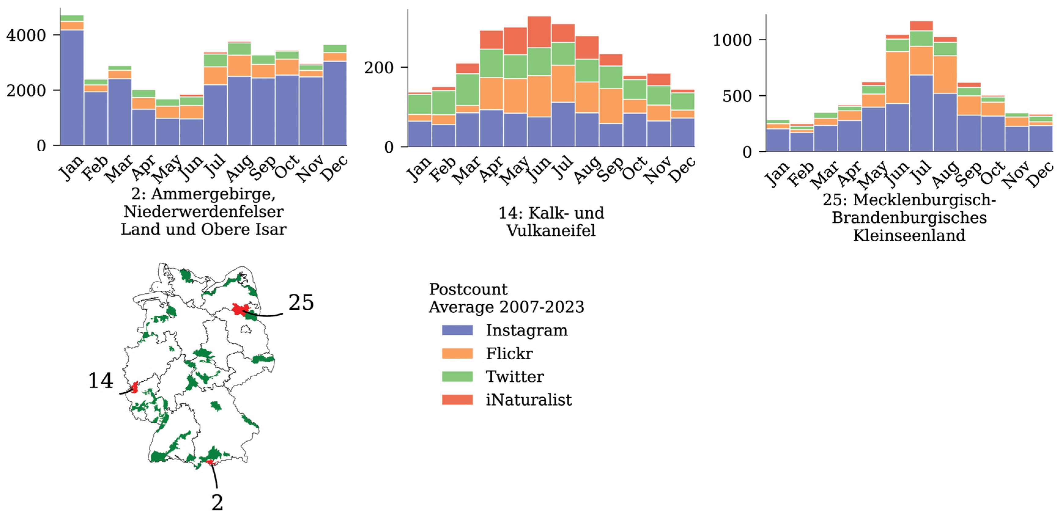
As becomes obvious, comparing data from multiple platforms is particularly useful for identifying and separating technological (T) impacts from ecological (E) and social (S) phenomena. To illustrate this utility, our next case study explicitly aimed to collect data from many platforms and for a variety of regions of scenic interest. Using data from Flickr, Twitter, iNaturalist, and Instagram, we examined the variance in seasonal user frequency for five platforms and for 30 biodiversity hotspots in Germany (see Appendix A, Figure A3). Figure 5 shows a subset of three hotspots as stacked frequency bar plots. All hotspots show divergent patterns, with user frequency varying significantly over the year and across platforms. For example, the “Ammergebirge, Niederwerdenfelser Land und Obere Isar” (Hotspot 2) appears to be a popular holiday destination at the turn of the year and for Instagram (e.g., winter sports tourism). At the same time, this region shows a relatively constant flow of visitors across all platforms in all seasons. In contrast, the “Limestone and Volcanic Eifel” (Hotspot 14), a region known for its attractiveness for nature lovers and hikers, seems to attract a disproportionately high number of animal and plant observers, especially in summer (iNaturalist), according to our data. Other regions, such as “Mecklenburg-Brandenburgisches Kleinseenland” (Hotspot 25), are primarily characterized by summer tourism. Many of the remaining hotspots, available in Appendix A, Figure A3, can also be assigned to these three categories. In our data, Twitter and Instagram tend to show the least variation in frequency throughout the year. In comparison, iNaturalist and Flickr users seem to share more data, relatively speaking, during the summer months.
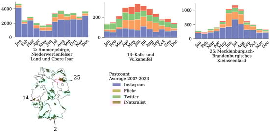
Figure 5.
Average monthly number of communication frequency for three of 30 biodiversity hotspots in Germany, measured by intersecting georeferenced posts from four platforms (2007–2022) with hotspot shapes. See Appendix A, Figure A3 for the complete set of visualizations.
Looking at these graphs, it is clear that different platforms (T) promote different user groups (S) with different interests. These interests influence how and when data are shared. For example, for hotspot 25, characteristic lakes provide a number of ecosystem services (E) for well-being that attract families and young people during the summer months. On the other hand, rare species are difficult to observe with children playing nearby, which may explain the underrepresentation of iNaturalist and the overrepresentation of Flickr observations in this region. Similar couplings between ecology (E) and social preferences (S) can be identified for the other hotspots. It would be natural to assume that older people and species and plant observers, seeking quiet recreation during the summer months, are more likely to avoid the busy family tourism in hotspot 25. Instead, hotspot 14 may offer a set of features that better correlate with the interests of these groups, resulting in an overrepresentation of iNaturalist data in this region. Finally, hotspot 2 is located in a region bordering the Alps, which is popular for group travel. This characteristic overlaps well with group activities such as skiing or snowboarding. New Year’s Eve is a singular event of particular importance for this group, which is shown as a significant peak for January in our data. These patterns can be used to understand environmental justice and socio-spatial inequality in decision-making [24]. The regularity and persistence of these seasonal trends can further support monitoring changes over time. In these cases, cross-platform sampling can reduce bias and increase the trustworthiness of the data. Unfortunately, rigid spatial delineation of hotspots requires coordinates of sufficient accuracy, which are only available from a limited number of platforms.
4.5. Red Kites (iNaturalist)
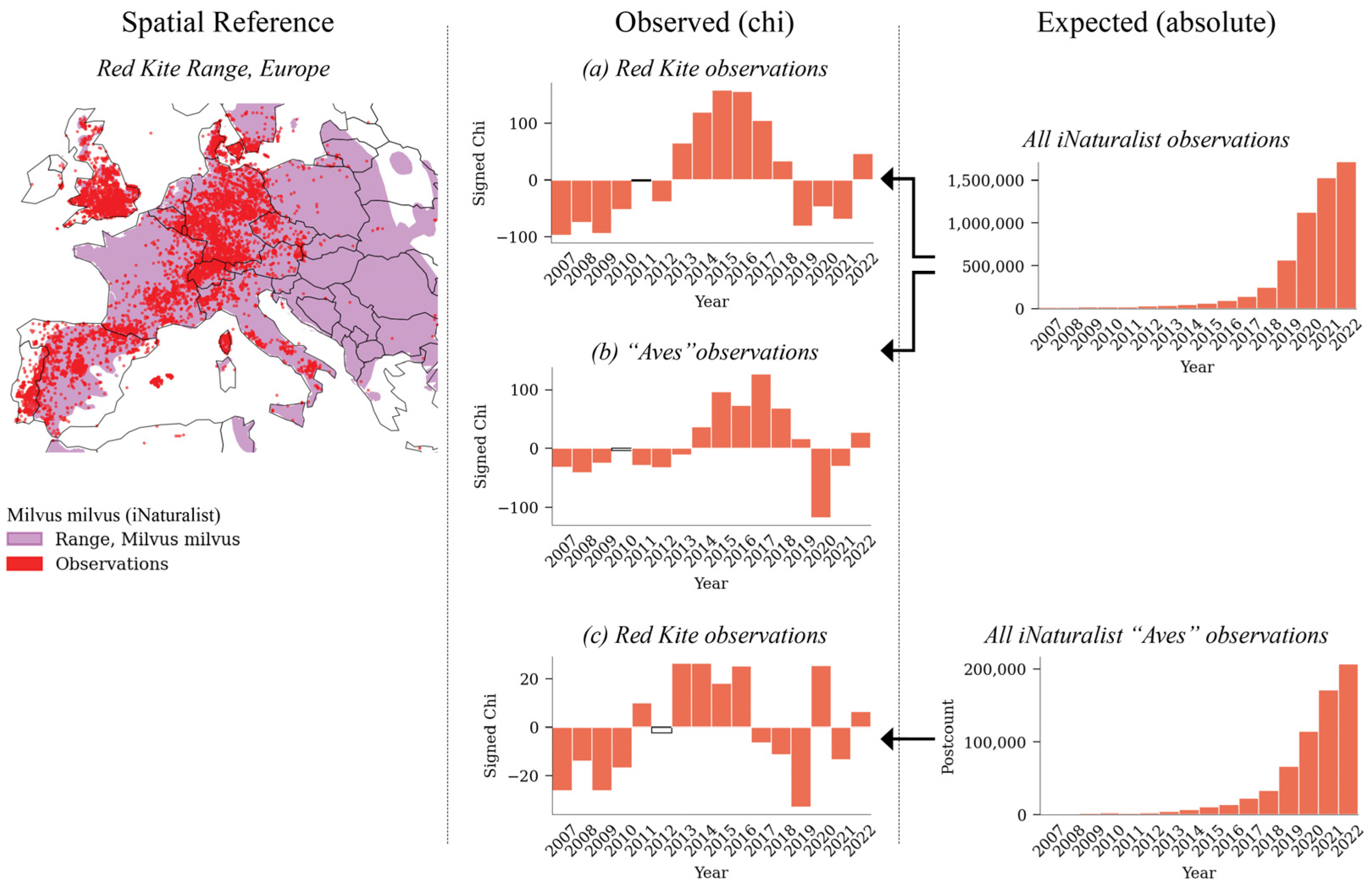
Finally, in addition to seasonal patterns, we wanted to explore whether we could identify long-term temporal trends for a selected landscape resource. In this last case study, we filtered for observations of the Red Kite, a relatively common bird of prey in Europe, as an ecological theme (E). After excluding Flickr due to low volume and noisy data, we selected the iNaturalist platform for data collection. Unlike the other data sources explored so far, iNaturalist can be considered as explicit Volunteered Geographic Information (VGI). Explicit VGI directs user behavior toward a common goal for data collection, such as to “Explore and share […] observations from the natural world”.2 The platform is specifically tailored for nature and plant observers, allowing (for example) sharing and filtering by taxonomic species name. From a data collection perspective, this type of sampling is less error-prone and does not require significant data cleaning (see [43]). The map in Figure 6 visualizes all locations from which users sighted and reported Red Kites in Europe between 2007 and 2022. Shown in the background is the shape of the Red Kite range, which is an additional dataset maintained by iNaturalist. The area is derived from user activity and illustrates the possible presence range of the Red Kite.

Figure 6.
Using umbrella communities, such as all “bird photographers” (Aves), to compensate for within-community variation: (a) signed chi for “Red Kite” calculated without compensation, based on all iNaturalist observations, (b) test for “Aves” vs. all iNaturalist observations, producing a similar distribution as (a), and (c) “Red Kite” vs. “Aves” observations to compensate for within-community variation.
Disentangling social (S), ecological (E), and technological (T) couplings in the temporal patterns of these data proves difficult for two reasons. First, the popularity of iNaturalist increased significantly over the observation period (Figure 6). This means that the number of Red Kite sightings must be adjusted to account for the overall increase in observers on the platform. This requires downloading the complete iNaturalist data for all species observations. We used the chi-square equation to account for this effect (see Materials and Methods). Second, due to the concrete filtering, akin to a needle in a haystack, any noise, co-occurring event, or underlying data problem can produce effects that make the results difficult to interpret. The resulting graph (Figure 6a) shows an overrepresentation of Red Kite observations in the years 2013 to 2017. Is this overrepresentation associated with an actual increase in abundance (an ecological coupling) for this particular species? In fact, structured survey data [44] suggest a continuous increase in Red Kite abundance over the last decade.
We questioned this initial assumption. Given that the platform has grown significantly, a bias introduced by certain subgroups, such as birdwatchers, overly joining in some years could also explain fluctuations in Red Kite observations. To test the data based on this hypothesis, the expected frequencies (all iNaturalist observations) can be compared to all observations of the Aves (birds) “umbrella class”. The resulting graph (Figure 6b) produces a similar overrepresentation as is visible in Figure 6a, which supports our earlier expectation. Bird photographers joining comparatively early may have led to an overrepresentation of Aves observations shared on the platform during these years. Later, as iNaturalist grew in popularity, the platform also perhaps attracted more species observers from other interest groups, such as plant photographers.
Based on these assumptions, we adjusted for the overrepresentation of Aves photographers by selecting all observations of the class Aves as expected frequencies and calculating chi for the observed frequencies of the Red Kite (Figure 6c). In other words, we examine the overrepresentation of selected subgroups by comparing behavioral similarities to a broader “umbrella” group. While the resulting graph (Figure 6b) still shows an overall increase in relative Red Kite sightings, it is less pronounced than without compensation (Figure 6a). A significant outlier of under-represented Red Kite observations compared to all Aves observations is visible in 2019 (Figure 6c), corresponding to a decrease in general bird photography in the following year of 2020 (Figure 6b). Further investigation of the contributions of the Aves community compared to other subsamples would be necessary to explain this outlier. At the same time, increased filtering also reduces reliability and representativeness. For iNaturalist, representativity is already severely limited because of the required expertise in a selected, specific topic (species monitoring). This may prevent further zooming in on particular regions of interest and limit analysis to small-scale or regional contexts where sufficient data are available.
5. Conclusions
Many of the relationships between visual perception, photo-based communication, and collective social behavior have been known since Urry wrote about “the tourist gaze” [33]. Since then, geosocial media and online communication have radically altered their technological counterparts. Geosocial media and algorithms now influence, distort, and modify the way people perceive their environment. This has given rise to new phenomena, such as mass invasions or cyber cascades, which cannot be explained without considering the global spread of information. Trends such as fake news [45], social bubbles [46], and GenAI are creating an “era of artificial illusions” [47], in which the senses are increasingly challenged to distinguish between the real and the imagined. On the other hand, masses of data on how people perceive their environment are readily available online as what we call opportunistic occurrence data. Assessing perceived landscape change from this data requires disentangling multiple superimposed patterns in the data. For biodiversity and species monitoring, ref. [15] refer to this process as “reverse engineering survey structure” (p. 1226). While their goal is to identify changes in the physical world (species trends) based on data collected online, landscape perception analysis requires equal consideration of the human observer and the physical landscape. Both poles are important subjects of analysis. In this paper, we introduce technology as a third pole. Based on the SETS framework, we distinguish three main domains in which change can occur: the ecological (E), social (S), and technological (T) domains. We discuss the application of the SETS framework in five case studies and show how couplings between these domains can be used to disentangle relationships. Three main findings can be summarized: first, the importance of integrating data from multiple data sources, which refers to the category of aggregation approaches proposed in ref. [15]; second, the consideration of platform biases when filtering user-generated content collected online for specific purposes; third, the existence of biases introduced by the use of technology as a data collection interface. These distortions lead to specific analytical challenges in assessing original landscape experiences and affect planners’ agency in decision-making.
In terms of scenic resource assessment, the five case studies can be grouped based on how they address two common tasks: (1) identifying temporal characteristics for a given area or region (national parks 4.2, biodiversity hotspots 4.4), and (2) characterizing and identifying temporal trends for selected scenic resources or phenomena (mass invasions 4.1, cherry blossoms 4.3, red kites 4.5). Generic queries and the integration of multiple data sources can reduce bias and increase representativeness, which helps to gain confidence in the data. In particular, comparisons between data from different platforms help to better understand tourist flows for different user groups. However, only unspecific and broad interpretations are possible, such as identifying and confirming common, recurring seasonal visitation patterns for selected areas and regions. Our results show this for two case studies of US national parks and for 30 biodiversity hotspots in Germany. On the other hand, it proved difficult to identify trends for selected themes or scenic resources. Our observations indicate that overall platform changes (e.g., popularity) or changes in subcommunities (e.g., bird photographers or the group of “red kite photographers” on Flickr and iNaturalist) have a stronger influence on the observed patterns than phenomenal changes, such as the actual growth of the red kite population. A solution for landscape change monitoring could be to first consider observations from umbrella communities, such as all “bird photographers” on iNaturalist (Section 4.5), as the expected value in the signed chi equation. This generic query can then be used to compensate for within-community variation to visualize corrected trends for specific observations (e.g., to normalize observations of specific bird species). As an exception, observations of cherry blossom, as a globally perceived ecological event, are found to be very stable and seem to be less affected by changes in communities or technology. One possible interpretation is that the phenomenon is valued equally across many cultures and communities. Such events may therefore be useful as “benchmark events” to compensate for within-community variation in the study of more localized aspects of landscape change.
Our results show that platform biases exist toward individual poles that affect their suitability for assessing some contexts of landscape change better than others. iNaturalist or Flickr, for example, features metadata that appears more directly linked to the actual perceived environment. This makes these platforms better suited for filtering data related to actual ecological change (E), such as the timing of events like flowers, fruits, and leaf color change. Other aspects related to broader societal behavior, human preferences, and collective spatiotemporal travel footprints (S) may require consideration of a broader set of platforms, including (e.g.) Instagram or Twitter. Due to the rules and incentives on these platforms, not all aspects are captured equally. In our study, we observed that charged discussions with positive and negative reaction sentiments, associations, metaphors, and political couplings are primarily found on X (formerly Twitter) and Reddit. The influence of technology and algorithms also varies, as shown in our case studies and confirmed by other authors [36]. Capturing these different perspectives and conditions of opportunistic data contribution helps planners gain a more holistic understanding of the dynamics influencing visual perception and behavior observed in the field. Cross-platform comparisons, such as in Section 4.4, are found to be particularly useful in reducing bias and providing actionable knowledge for decision-making. The results can be used, for example, to increase environmental justice or reduce socio-spatial inequality [24]. It can also help develop techniques to counteract phenomena associated with the technological domain, such as crowd bias toward certain visual stimuli and amplifying imitative photo behavior.
When evaluating scenic resources through the “lens” of user-generated content from geosocial media, we recommend that planners consider the following three analytical challenges. First (1), some ecological features (E) may be valuable even if they are not perceived by someone. This applies to ecological phenomena that are rare, take a long time to occur, or cannot be recreated or replaced once lost. Such features may be difficult to detect in user-generated content and with quantitative analysis due to the selective focus and bias of crowd perception [28]. Second (2), some content may be shared online for social purposes (S) even if the original experience was not perceived as scenic or valuable. We observed this effect for places affected by “mass invasions” (Section 4.1). Here, users appear to selectively share photos that show few people in solitary scenes from what are actually crowded vantage points. Tautenhahn explains this phenomenon as “self-staging” in the landscape [32] (p. 9). Finally (3), even in those cases where people do share their original experiences with, e.g., photographs of crowded scenes, geosocial media ranking algorithms (T) may prevent these experiences from ever gaining a wider user “reach” by, e.g., downgrading unaesthetic or negatively perceived content. These algorithmic effects can make it difficult for planners to interrupt feedback loops, such as mass invasions, with negative consequences for infrastructure, ecology, and human well-being (see [4]). In the fields of landscape and urban planning, the shown analyses over time can help to better understand these unique transient characteristics of places, areas, and landscapes, to protect and develop specific ephemeral scenic values, or to propose actions to change negative influences.
Supplementary Materials
The following supporting information can be downloaded at https://www.mdpi.com/article/10.3390/land13071091/s1, S1 (HTML File): 01_mass_invasion.html, S2 (HTML File): 02_reddit_api.html, S3 (HTML File): 03_reddit_pmaw.html, S4 (HTML File): 04_reddit_privacy.html, S5 (HTML File): 05_reddit_vis.html, S6 (HTML File): 06_cherry_blossoms.html, S7 (HTML File): 07_hotspots.html, S8 (HTML File): 08_milvus_conversion.html, S9 (HTML File): 09_milvus_maps.html, S10 (HTML File): 10_milvus_chi.html. Note: Only HTML conversions are attached to this paper. The notebook files (ipynb format) and data are made available in a separate data repository [31].
Author Contributions
Conceptualization, A.D. and D.B.; methodology, A.D. and D.B.; software (visualization), A.D.; validation, A.D. and D.B.; formal analysis, A.D.; investigation, A.D.; resources, D.B.; data curation, A.D.; writing—original draft preparation, A.D. and D.B.; writing—review and editing, D.B.; visualization, A.D.; supervision, D.B.; project administration, D.B.; funding acquisition, D.B. and A.D. All authors have read and agreed to the published version of the manuscript.
Funding
This work was supported by the German Research Foundation as part of the priority program “Volunteered Geographic Information: Interpretation, Visualisation and Social Computing” (VGIscience, priority program 1894).
Data Availability Statement
All data used to produce figures and results in this work (see code Supporting information S1–S10) are made available in a public data repository https://doi.org/10.25532/OPARA-572.
Acknowledgments
The authors gratefully acknowledge the support of the Gemeinsame Wissenschaftskonferenz (GWK) by providing computing time through the Center for Information Services and HPC (ZIH) at TU Dresden.
Conflicts of Interest
The authors declare no conflicts of interest.
Appendix A
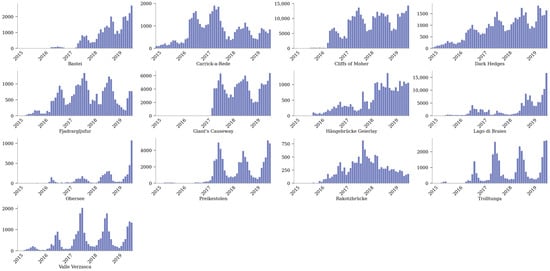
Figure A1.
Time series visualization of communication volume (Instagram) for all 13 assessed vantage points in Europe that are known to have shown “Mass invasions”.
Figure A1.
Time series visualization of communication volume (Instagram) for all 13 assessed vantage points in Europe that are known to have shown “Mass invasions”.
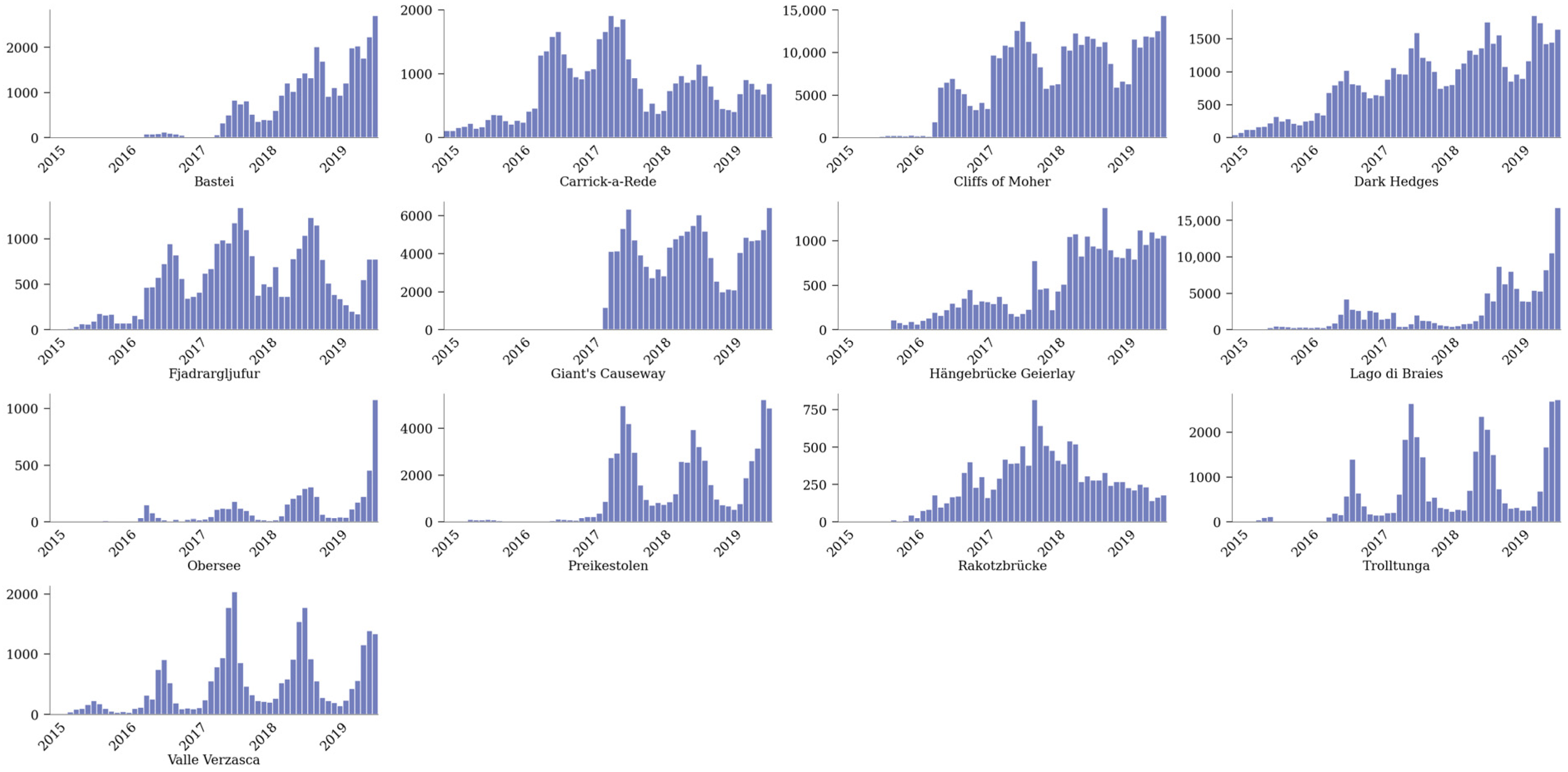
Figure A2.
Barplot visualization showing seasonal communication volume for all assessed national parks based on comment (red) and post (blue) count from subreddits.
Figure A2.
Barplot visualization showing seasonal communication volume for all assessed national parks based on comment (red) and post (blue) count from subreddits.
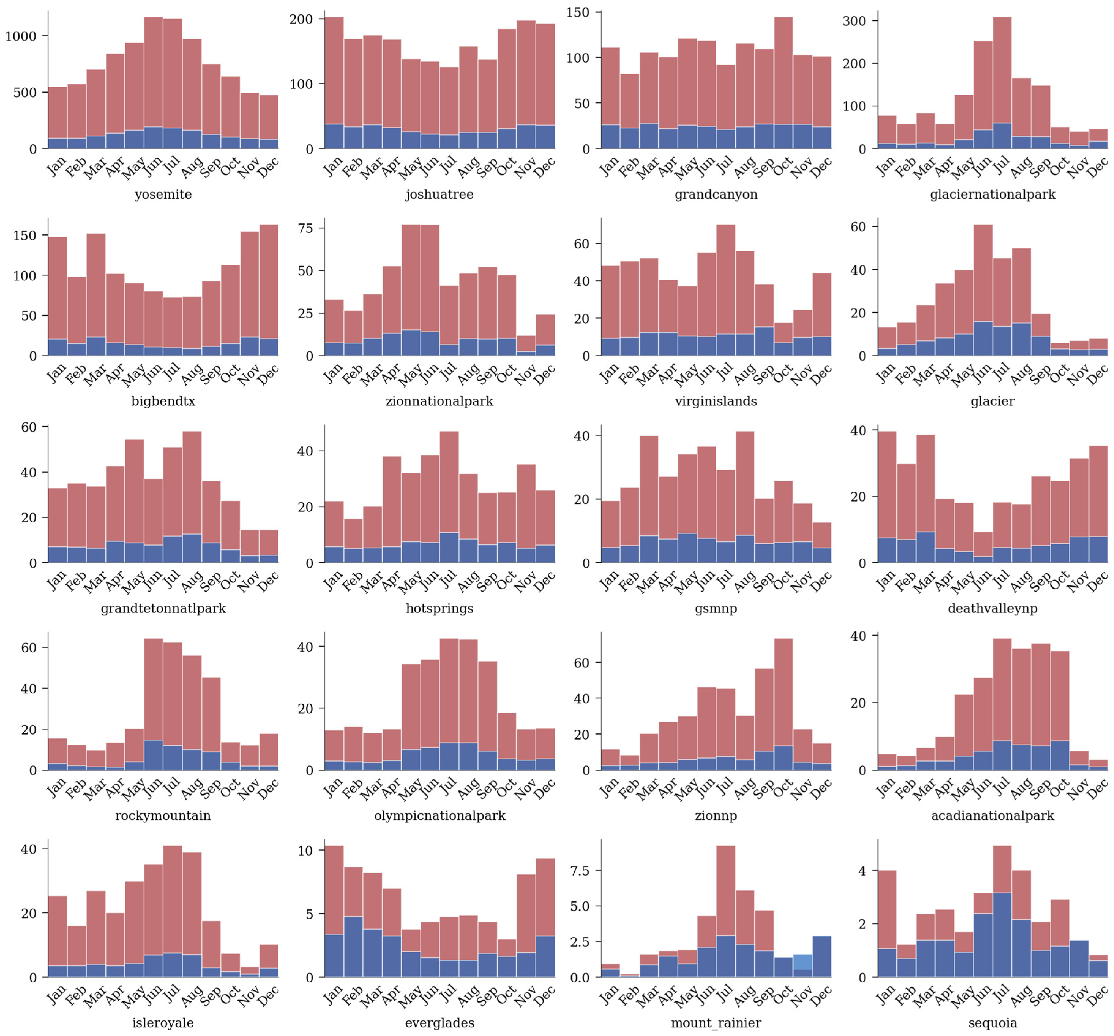
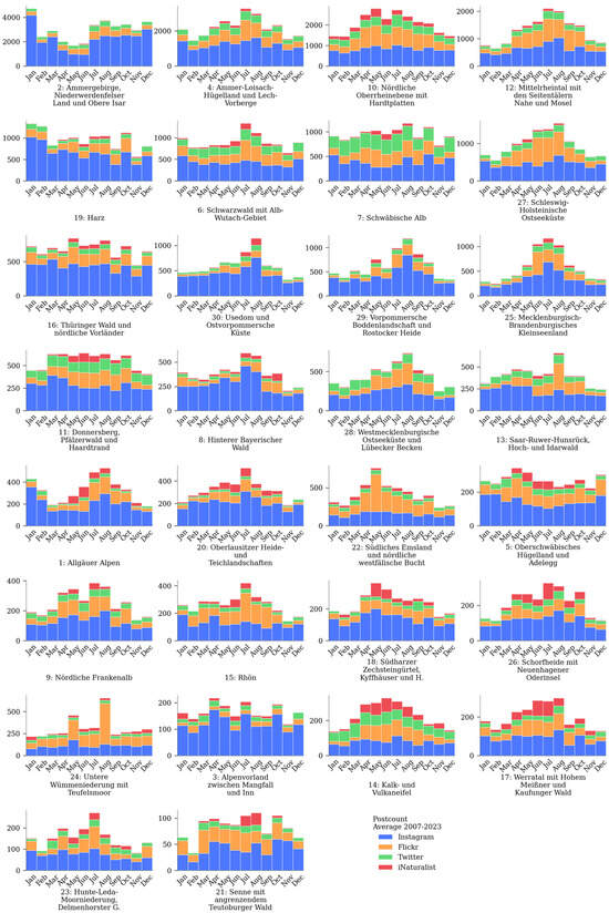
Figure A3.
Average monthly number of communication frequency for 4 social media platforms and for all 30 biodiversity hotspots assessed in Germany.
Figure A3.
Average monthly number of communication frequency for 4 social media platforms and for all 30 biodiversity hotspots assessed in Germany.
Notes
| 1 | Available online: https://lbsn.vgiscience.org/ (accessed on 18 July 2024). |
| 2 | Available online: https://www.inaturalist.org/ (accessed on 18 July 2024). |
References
- Ingold, T. The Temporality of the Landscape. World Archaeol. 1993, 25, 152–174. [Google Scholar] [CrossRef]
- Dakin, S. There’s More to Landscape than Meets the Eye: Towards Inclusive Landscape Assessment in Resource and Environmental Management. Can. Geogr. 2003, 47, 185–200. [Google Scholar] [CrossRef]
- Bell, S. Landscape: Pattern, Perception and Process, 2nd ed.; Routledge: Abingdon, UK, 2012. [Google Scholar]
- Øian, H.; Fredman, P.; Sandell, K.; Sæþórsdóttir, A.D.; Tyrväinen, L.; Søndergaard Jensen, F. Tourism, Nature and Sustainability; TemaNord; Nordic Council of Ministers: Copenhagen, Denmark, 2018. [Google Scholar] [CrossRef]
- McPhearson, T.; Cook, E.M.; Berbés-Blázquez, M.; Cheng, C.; Grimm, N.B.; Andersson, E.; Barbosa, O.; Chandler, D.G.; Chang, H.; Chester, M.V.; et al. A Social-Ecological-Technological Systems Framework for Urban Ecosystem Services. One Earth 2022, 5, 505–518. [Google Scholar] [CrossRef]
- Hull, R.B.; McCarthy, M.M. Change in the Landscape. Landsc. Urban Plan. 1988, 15, 265–278. [Google Scholar] [CrossRef]
- Käyhkö, N.; Skånes, H. Change Trajectories and Key Biotopes—Assessing Landscape Dynamics and Sustainability. Landsc. Urban Plan. 2006, 75, 300–321. [Google Scholar] [CrossRef]
- Fichera, C.R.; Modica, G.; Pollino, M. Land Cover Classification and Change-Detection Analysis Using Multi-Temporal Remote Sensed Imagery and Landscape Metrics. Eur. J. Remote Sens. 2012, 45, 1–18. [Google Scholar] [CrossRef]
- Daniel, T.C. Whither Scenic Beauty? Visual Landscape Quality Assessment in the 21st Century. Landsc. Urban Plan. 2001, 54, 267–281. [Google Scholar] [CrossRef]
- Juhász, L.; Hochmair, H. Comparing the Spatial and Temporal Activity Patterns between Snapchat, Twitter and Flickr in Florida. GI_Forum 2019, 7, 134–147. [Google Scholar] [CrossRef]
- Paldino, S.; Kondor, D.; Bojic, I.; Sobolevsky, S.; González, M.C.; Ratti, C. Uncovering Urban Temporal Patterns from Geo-Tagged Photography. PLoS ONE 2016, 11, e0165753. [Google Scholar] [CrossRef]
- Mancini, F.; Coghill, G.M.; Lusseau, D. Using Social Media to Quantify Spatial and Temporal Dynamics of Nature-Based Recreational Activities. PLoS ONE 2018, 13, e0200565. [Google Scholar] [CrossRef]
- Tenkanen, H.; Di Minin, E.; Heikinheimo, V.; Hausmann, A.; Herbst, M.; Kajala, L.; Toivonen, T. Instagram, Flickr, or Twitter: Assessing the Usability of Social Media Data for Visitor Monitoring in Protected Areas. Sci. Rep. 2017, 7, 17615. [Google Scholar] [CrossRef] [PubMed]
- Bowler, D.E.; Callaghan, C.T.; Bhandari, N.; Henle, K.; Benjamin Barth, M.; Koppitz, C.; Klenke, R.; Winter, M.; Jansen, F.; Bruelheide, H.; et al. Temporal Trends in the Spatial Bias of Species Occurrence Records. Ecography 2022, 2022, e06219. [Google Scholar] [CrossRef]
- Rapacciuolo, G.; Young, A.; Johnson, R. Deriving Indicators of Biodiversity Change from Unstructured Community-contributed Data. Oikos 2021, 130, 1225–1239. [Google Scholar] [CrossRef]
- Dunkel, A.; Hartmann, M.C.; Hauthal, E.; Burghardt, D.; Purves, R.S. From Sunrise to Sunset: Exploring Landscape Preference through Global Reactions to Ephemeral Events Captured in Georeferenced Social Media. PLoS ONE 2023, 18, e0280423. [Google Scholar] [CrossRef] [PubMed]
- Senaratne, H.; Mobasheri, A.; Ali, A.L.; Capineri, C.; Haklay, M. A Review of Volunteered Geographic Information Quality Assessment Methods. Int. J. Geogr. Inf. Sci. 2017, 8816, 139–167. [Google Scholar] [CrossRef]
- Lobo, J.M.; Mingarro, M.; Godefroid, M.; García-Roselló, E. Taking Advantage of Opportunistically Collected Historical Occurrence Data to Detect Responses to Climate Change: The Case of Temperature and Iberian Dung Beetles. Ecol. Evol. 2023, 13, e10674. [Google Scholar] [CrossRef] [PubMed]
- Kelling, S.; Johnston, A.; Bonn, A.; Fink, D.; Ruiz-Gutierrez, V.; Bonney, R.; Fernandez, M.; Hochachka, W.M.; Julliard, R.; Kraemer, R.; et al. Using Semistructured Surveys to Improve Citizen Science Data for Monitoring Biodiversity. BioScience 2019, 69, 170–179. [Google Scholar] [CrossRef] [PubMed]
- Grabow, M.; Louvrier, J.L.P.; Planillo, A.; Kiefer, S.; Drenske, S.; Börner, K.; Stillfried, M.; Hagen, R.; Kimmig, S.; Straka, T.M.; et al. Data-Integration of Opportunistic Species Observations into Hierarchical Modeling Frameworks Improves Spatial Predictions for Urban Red Squirrels. Front. Ecol. Evol. 2022, 10, 881247. [Google Scholar] [CrossRef]
- Mashhadi, A.; Winder, S.G.; Lia, E.H.; Wood, S.A. No Walk in the Park: The Viability and Fairness of Social Media Analysis for Parks and Recreational Policy Making. In Proceedings of the International AAAI Conference on Web and Social Media, Palo Alto, CA, USA, 7–10 June 2021; pp. 409–420. [Google Scholar]
- Bixler, R.P.; Lieberknecht, K.; Leite, F.; Felkner, J.; Oden, M.; Richter, S.M.; Atshan, S.; Zilveti, A.; Thomas, R. An Observatory Framework for Metropolitan Change: Understanding Urban Social–Ecological–Technical Systems in Texas and Beyond. Sustainability 2019, 11, 3611. [Google Scholar] [CrossRef]
- Tress, B.; Tress, G. Capitalising on Multiplicity: A Transdisciplinary Systems Approach to Landscape Research. Landsc. Urban Plan. 2001, 57, 143–157. [Google Scholar] [CrossRef]
- Rakova, B.; Dobbe, R. Algorithms as Social-Ecological-Technological Systems: An Environmental Justice Lens on Algorithmic Audits. In 2023 ACM Conference on Fairness, Accountability, and Transparency; ACM: Chicago, IL, USA, 2023; p. 491. [Google Scholar] [CrossRef]
- van Dijck, J. Flickr and the Culture of Connectivity: Sharing Views, Experiences, Memories. Mem. Stud. 2011, 4, 401–415. [Google Scholar] [CrossRef]
- Metcalf, J.; Crawford, K. Where Are Human Subjects in Big Data Research? The Emerging Ethics Divide. Big Data Soc. 2016, 3, 205395171665021. [Google Scholar] [CrossRef]
- Antoniou, V.; Morley, J.; Haklay, M. Web 2.0 Geotagged Photos: Assessing the Spatial Dimension of the Phenomenon. Geomatica 2010, 64, 99–110. [Google Scholar]
- Sunstein, C.R. #Republic: Divided Democracy in the Age of Social Media; Princeton University Press: Princeton, NJ, USA, 2017. [Google Scholar]
- Dunkel, A.; Löchner, M.; Burghardt, D. Privacy-Aware Visualization of Volunteered Geographic Information (VGI) to Analyze Spatial Activity: A Benchmark Implementation. IJGI 2020, 9, 607. [Google Scholar] [CrossRef]
- Visvalingam, M. The Signed Chi-Square Measure for Mapping. Cartogr. J. 1978, 15, 93–98. [Google Scholar] [CrossRef]
- Dunkel, A.; Burghardt, D. Supplementary Materials for the Publication “Assessing Perceived Landscape Change from Opportunistic Spatio-Temporal Occurrence Data”. 2024. Available online: https://opara.zih.tu-dresden.de/items/14b6d22e-f705-4260-972c-9c4a8d0e551e (accessed on 18 July 2024).
- Tautenhahn, C. Das Phänomen der Masse: Landschaftliche Wirkungen Sozialer Medien. Master’s Thesis, Department of Landscape Architecture and Environmental Planning, Berkeley, CA, USA, 2020. [Google Scholar]
- Urry, J. The Tourist Gaze: Leisure and Travel in Contemporany Societies; Sage: Chicago, IL, USA, 1990. [Google Scholar]
- Anselin, L.; Sridharan, S.; Gholston, S. Using Exploratory Spatial Data Analysis to Leverage Social Indicator Databases: The Discovery of Interesting Patterns. Soc. Indic. Res. 2007, 82, 287–309. [Google Scholar] [CrossRef]
- Dunkel, A.; Andrienko, G.; Andrienko, N.; Burghardt, D.; Hauthal, E.; Purves, R. A Conceptual Framework for Studying Collective Reactions to Events in Location-Based Social Media. Int. J. Geogr. Inf. Sci. 2019, 33, 780–804. [Google Scholar] [CrossRef]
- Bubalo, M.; van Zanten, B.T.; Verburg, P.H. Crowdsourcing Geo-Information on Landscape Perceptions and Preferences: A Review. Landsc. Urban Plan. 2019, 184, 101–111. [Google Scholar] [CrossRef]
- White, T.M. Cartographic Pleasures: Maps Inspired by Joy Division’s Unknown Pleasures Album Art. Cartogr. Perspect. 2019, 92, 65–78. [Google Scholar] [CrossRef]
- Hahmann, S.; Purves, R.; Burghardt, D. Twitter Location (Sometimes) Matters: Exploring the Relationship between Georeferenced Tweet Content and Nearby Feature Classes. JOSIS 2014, 9, 1–36. [Google Scholar] [CrossRef]
- Hargittai, E. Potential Biases in Big Data: Omitted Voices on Social Media. Soc. Sci. Comput. Rev. 2020, 38, 10–24. [Google Scholar] [CrossRef]
- Steels, L. Collaborative tagging as distributed cognition. In Cognition Distributed: How Cognitive Technology Extends Our Minds; Cognitive Pragmatism; Harnad, S., Dror, I.E., Eds.; John Benjamins Publishing Company: Amsterdam, The Netherlands, 2008; pp. 93–98. [Google Scholar]
- Sontag, S. On Photography; Farrar, Straus and Giroux: New York, NY, USA, 1977. [Google Scholar]
- Teles da Mota, V.; Pickering, C. Assessing the Popularity of Urban Beaches Using Metadata from Social Media Images as a Rapid Tool for Coastal Management. Ocean Coast. Manag. 2021, 203, 105519. [Google Scholar] [CrossRef]
- Hartmann, M.C.; Koblet, O.; Baer, M.F.; Purves, R.S. Automated Motif Identification: Analysing Flickr Images to Identify Popular Viewpoints in Europe’s Protected Areas. J. Outdoor Recreat. Tour. 2022, 37, 100479. [Google Scholar] [CrossRef]
- Stevens, M.; Murn, C.; Hennessey, R. Population Change of Red Kites Milvus Milvus in Central Southern England between 2011 and 2016 Derived from Line Transect Surveys and Multiple Covariate Distance Sampling. Acta Ornithol. 2020, 54, 243–254. [Google Scholar] [CrossRef]
- Elmas, T.; Overdorf, R.; Özkalay, A.F.; Aberer, K. Ephemeral Astroturfing Attacks: The Case of Fake Twitter Trends. In 2021 IEEE European Symposium on Security and Privacy (EuroS&P); IEEE: New York, NY, USA, 2021; pp. 403–422. [Google Scholar] [CrossRef]
- Terren, L.; Borge-Bravo, R. Echo Chambers on Social Media: A Systematic Review of the Literature. Rev. Commun. Res. 2021, 9, 99–118. [Google Scholar] [CrossRef]
- Casu, M.; Guarnera, L.; Caponnetto, P.; Battiato, S. GenAI Mirage: The Impostor Bias and the Deepfake Detection Challenge in the Era of Artificial Illusions. Forensic Sci. Int. Digit. Investig. 2024, 50, 301795. [Google Scholar] [CrossRef]


Disclaimer/Publisher’s Note: The statements, opinions and data contained in all publications are solely those of the individual author(s) and contributor(s) and not of MDPI and/or the editor(s). MDPI and/or the editor(s) disclaim responsibility for any injury to people or property resulting from any ideas, methods, instructions or products referred to in the content. |
© 2024 by the authors. Licensee MDPI, Basel, Switzerland. This article is an open access article distributed under the terms and conditions of the Creative Commons Attribution (CC BY) license (https://creativecommons.org/licenses/by/4.0/).