Abstract
Pandemic curves, such as COVID-19, often show multiple and unpredictable contamination peaks, often called second, third and fourth waves, which are separated by wide plateaus. Here, by considering the statistical inhomogeneity of age groups, we show a quantitative understanding of the different behaviour rules to flatten a pandemic COVID-19 curve and concomitant multi-peak recurrence. The simulations are based on the Verhulst model with analytical generalized logistic equations for the limited growth. From the log–lin plot, we observe an early exponential growth proportional to . The first peak is often τgrow ≅ 5 d. The exponential growth is followed by a recovery phase with an exponential decay proportional to . For the characteristic time holds: . Even with isolation, outbreaks due to returning travellers can result in a recurrence of multi-peaks visible on log–lin scales. The exponential growth for the first wave is faster than for the succeeding waves, with characteristic times, τ of about 10 d. Our analysis ascertains that isolation is an efficient method in preventing contamination and enables an improved strategy for scientists, governments and the general public to timely balance between medical burdens, mental health, socio-economic and educational interests.
1. Introduction
The current COVID-19 pandemic curves are routinely used to investigate and inform governments, healthcare professionals and society on, essentially, the dynamics of contaminations and deaths in a nation. Pandemic curves are presented for several countries on a semi-logarithmic scale and normalized per 105 inhabitants, either on the number of infections or on the number of deaths per day, d [1]. Limited growth models are mathematical tools employed to describe growth in pandemic scenarios, among others. One reliable and widely verified model of limited growth is the generalized logistic equation proposed by Verhulst [2]. In the Verhulst model, N(t) represents the cumulative number of infected people over a time t. The epidemic curve, , is in the run up proportional to with , a typical characteristic time, and it shows a maximum at time, . The inflection point is the value that holds:
The depends on the sensitivity of the subgroup to get infected and the transmission speed of infection for this group. After , N(t) increases less rapidly and levels at the value M. The epidemic curve is proportional to . As often observed, the cumulative number, N, and the epidemic curve, are averaged over a week to reduce the noise in the data. Here, we simulate N and . The simple substitution N1/n = T, which is a function of time like N, in [3], shows that the generalized logistic equation, which is denoted as Vn, is a recast of the Verhulst model denoted as Vn1 (logistic equation).
In this work, we chose the flexible analytical phenomenological model Vn2 instead of discrete-time mechanistic models with 10 coupled equations with one-hour step size and a substantial number of unknown parameters and online-available models [4,5]. The refined discrete SEIR model considers: S, susceptible individuals, E, infected individuals not being infectious yet, and I infected individuals, the latter subdivided into six classes, D(t) number of deaths and R(t) the recovered individuals. All this at the expense of too many unknown parameters and a set of 10 equations with less insight. To overcome this, in this work, heterogeneity in the population is simplified. Statistical inhomogeneity for COVID-19 stems mainly from the age difference in risk to get infected and for deaths. The difference in transmission rate is also different between age groups. In the refined models, as mentioned in [5], ten age groups are considered (0–10; 10–20; … 90–more) with different parameters. The isolation between the fast group characterized by a low τ and a slow group with high τ is most efficient. Intermingling is the worst condition.
2. Materials and Methods
Real data on COVID-19 presented in log–lin scales is retrieved from Financial Times and Our World in Data [1]. The shape of curves in the logarithmic representation is indicative of the tangent lines in the run up to exponential growth and exponential decay in the recovery phase.
The data were analysed manually by the tangent line method described in [6]. The shape of curves in the logarithmic representation is indicative for growth and decay rate and an added value in analysing epidemic curves. The simulations were performed by means of KaleidaGraph Synergy Software [7].
3. Results and Discussion
The aim of our analysis and simulations of pandemic curves is to quantitatively understand the effect of isolation between subgroups against the spreading of COVID-19. Isolation and vaccination are among the most crucial influencers in the dynamics of pandemic curves. Even with isolation rules, ‘spontaneous’ outbreaks caused by returning travellers from abroad can result in a spatiotemporal dynamic that provokes plateaus or recurrence of multi-small peaks visible on log–lin scales in the overall picture. From the model follows that plateaus are a succession of small outbreaks with small intervals of about t/τ = 3 to 5 and τ is about 10 d. Hence, several peaks in the log–lin plots from different countries [1] are analysed. For simplicity, we choose arbitrarily five countries in a semi-logarithmic presentation: two small neighbouring countries (Belgium, the Netherlands) with different confinement rules; a large country (USA) to show the advantage of using semi-logarithmic plots, and a typical country with a very low population density (Finland) to show the problem of low noisy number (between 1 and 0) and Portugal, interfacing only one country.
Websites such as Financial Times and Our World in Data present confirmed cases and deaths of COVID-19 in cumulative numbers and in epidemic curves (per day, d) in logarithmic–linear (log–lin) scales from several countries [1]. Cumulative numbers and epidemic curves are issued daily at and in integers as, and in discrete curves. For large numbers and for τ > 1 d, in the run up holds:
and the curves are analysed and simulated as continuous functions. For convenience, an exponential growth of, e.g., τgrow = 10 d, is equivalent with a reproduction number R = 1.1 because [3]:
or more precisely:
which is equivalent to a doubling time, , expressed as [3]:
The R-value is also applicable for non-exponential growth and decay and must not be translated into a τ-value, which is only applicable for an exponential dependence.
The typical monotonic increasing cumulative curves presented in the log–lin are convenient to visualize the situation in one plot for large and small countries and go asymptotically to the limiting value of M. The exponential growth is in log–lin, a straight line as shown by the tangent lines in Figure 1 for USA, Portugal, Belgium, the Netherlands and Finland. The slope analysis of the tangent line in Figure 1 follows the characteristic time, τgrow, with the time difference, , expressed in days, d, and ln as the natural logarithm [6]. For confirmed cases of COVID-19, in most countries, it holds that for the run up to the first peak: . The surprising result is verified, among others, for Ireland, United Kingdom, Italy and Germany, not shown in Figure 1 for clarity. The small difference, e.g., τgrow = 5.68 d for Italy and τgrow = 4.73 d for the Netherlands, can point to better handling by the Italian authorities [3]. The tangent line for the USA indicates a steeper exponential growth with .
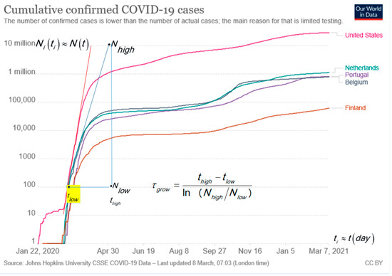
Figure 1.
Cumulative number of confirmed COVID-19 cases in absolute numbers [1]. The advantage of a log–lin plot is that small and large numbers are visible. The typical S-shape of the curve in the lin–lin plot is lost in the log–lin presentation. The blue tangent line is for Portugal, Netherland and Belgium. The analysis gives [6]: .
The epidemic curves in Figure 2 for new confirmed cases per day, d, in log–lin for Belgium and the Netherlands [1] show an exponential growth in the run up. In less than one year, the Belgium and the Netherlands curves show four to five peaks. Figure 2 shows that the growth rate (1/τ) in the first peak (steeper slope) is faster than for the second peak (slower slope), e.g., for Belgium and the Netherlands: first peak is and second peak is .
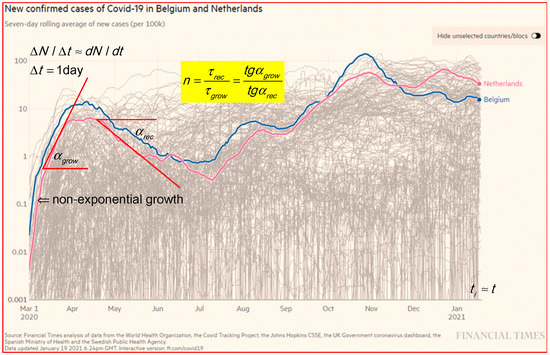
Figure 2.
The epidemic curve in log–lin for new confirmed cases in Belgium and the Netherlands [1]. Results are taken over 7 days, d to smooth out the fluctuations and normalized on 105 to better compare countries with different populations. The two tangent lines and slope angles are an indication for the analysis in a ratio of τ-values. Some peaks in the log–lin presentation at a level on a factor of 30 below the main peaks are hardly visible in a linear presentation.
In general, in the growth phase is smaller than in the recovery, and the decay phase is sometimes hidden by a plateau. Clear plateaus between maxima are visible in, e.g., Finland at a low level from the beginning of October to the middle of November (2020), and USA (not shown) at a high level from June to the end of November (2020). Plateau levels are explained by overlapping outbreaks in the proposed model and simulations in Section 3.3. In Figure 2, are the angles of the tangent lines. To be specific, the new cases in Belgium show a ratio n = 4.76; 1.6 and 4 for the first, second and third peaks, respectively.
The relation between τ, the scale factors on the axis, and the tg of the angle of the slope of the tangent line in a plot is given by:
where the scale factor for the x-axis is Sx in mm/d and for the y-axis is Sy, which is the distance in mm for a factor of 10 along the log scale y-axis. In the same plot, where the ratio sy/sx is constant, and the ratio of tg for the slopes between the first peak and the second peak are equal to the ratio of the τ-values of the second peak over the first peak.
Figure 3 shows the curves for deaths per day, d, attributed to COVID-19 in a log–lin plot for a few countries in absolute numbers taken from Our World in Data [1]. We expect a delay between the curve for deaths and confirmed cases per day, d. The comparison between the curves for new cases in Figure 2 and new deaths in Figure 3 shows a variable lag-time of about 2, 9 and 13 d between the corresponding peaks of cases and deaths for the first, second and third peak in Belgium. The increase in τgrow from 5 d for the first peak to 12 d for the second peak and the increase in lag-time delay for the first peak to the succeeding peaks may be explained by the faster transmission of infection for the age group with a higher risk (1/τ) in the first peak compared to the (younger) age group with smaller risk in the second having slower transmission. The last peak can be the typical lowest transmission after imposing the strongest behaviour rules for the group in the third ‘wave.’ The reduction of risks can be a consequence of imposing behaviour rules in the meantime between the first and second peak or lower risk for the younger age group than in the first peak. Summarizing for new cases and deaths per day, d, holds:
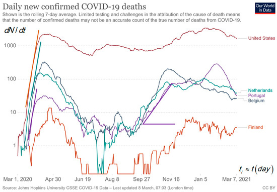
Figure 3.
The log–lin epidemic curve for new deaths in USA, Portugal, Belgium, the Netherlands and Finland [1]. The low numbers for Finland are noisier, and zero cannot be shown on a logarithmic scale. The peaks in the middle are not observable in a lin–lin plot because it is about a factor of 30 lower than the highest peak. The slopes are indications for the analysis in .
All epidemic plots in log–lin show a typical steep non-exponential dependence that is ignored to calculate τ and is simulated and explained in Figure 4a. The low numbers for Finland result in a jumping curve with less reliability, and jumps between 1 and zero cannot be presented on a log scale.
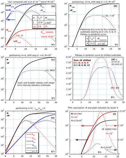
Figure 4.
Partitioning in isolated groups without parameter change during the outbreak and its effect on . (a) A large number of equal islands all starting at t = 0 results in a sum with high initial values (blue arrow) for N, and one peak in at t/τ = 5.8. In (b,c), four isolated outbreaks are modelled at equidistant time lags. The outbreak intervals in (b) are t/τ = 3 and in (c) are t/τ = 4, and the result in a plateau, and (d) is the epidemic curves in a lin–lin plot as simulated in (b,c) by four patchy outbreaks at fixed time intervals. (e) A fast group isolated from a slow with equal size but with characteristic time τ and 2τ results in a first and second peak. (f) Special case of partitioning (m = 1) for comparing 0% with 75% of vaccination.
Statistical heterogeneity was also used to explain deviations from a pure exponential decay in cancer survival curves [6]. Our approach can explain bumpy pandemic curves with a broad plateau, a steep start and even with n > 2, which means that we can explain deviations from Vn2 because the recovery of the fast group is hidden by the recovery of a slower group.
3.1. How Behaviour Rules Can Lower the Risk 1/τ and M
The two crucial parameters in the Verhulst model and in our analysis are: 1/τ, the risk for infection or hospitalization or death per day, d, and M, a dimensionless number, which represents the number of non-vaccinated people in a group or subgroup. The characteristic time, τ, is an effective value and depends on the intrinsic effectiveness of the virus transmission, the risk to become ill and its incubation time. In addition, τ depends on extrinsic factors, such as contact frequency, exposure time, distancing, quality of ventilation and contact tracing [3], intermingling [4], differences in culture (handshaking and kissing or polite greeting), the health care system (stocks of basic protective gear, face protection and testing kits), sanitation, food habits and immune status (BMI-range) [8]. Increasing contact time and frequency will increase the risk, 1/τ, and reduce the τ-value. The τ-value is intrinsically lower for some virus variants, and it has an outspoken effect if the risk by the external conditions is already kept low. The physical background of social distancing, mouth–nose masks, face shields and ventilation is the Brownian motion of water droplets, diffusion and the trapping model, as explained in [3].
In the absence of vaccination, the risk reduction during the epidemic is achieved by imposing behaviour rules, such as: e.g., increasing social distancing, hand washing, mouth–nose mask, face shield and good ventilation with moderate airflow. Ultimately, the limiting value M represents the number of non-vaccinated in a group. Vaccination is the most effective way to lower the peak height of the pandemic curve. In the absence of vaccines, M can be lowered by, e.g., making people’s bubbles smaller. Other behavioural epidemiology rules to increase τ and decrease M span from imposing a curfew, testing, home isolation, reducing contact frequency, controlling the size of contact bubbles and tracing ‘super spreaders.’ The trends between the parameter values: M, τ and rules are clear, but the precise values connected to rules are not so clear. That makes predictions uncertain. A weakening or lifting of behaviour rules increases risk and can trigger a second wave in a pandemic.
Behaviour rules may be classified, e.g., in different stages of increasing ‘survival mode’: stage I: social distancing, no fun shopping, or only within a time limit, only click and collect to reduce contact time, imposing teleworking where possible; stage II: in addition to stage I, avoiding social gathering, shutting down universities, secondary schools and sport, culture and religious accommodation; stage III: stage II and closure of all other schools, reducing contact bubble size, closing non-crucial shops and services and closure of airports; stage IV: like stage III, with travel stop and installing a curfew. Unfortunately, it is difficult to quantize the effect of an imposed stage in a precise value for the reduction in M. A change in the pallet of rules for decreasing M will henceforth be denoted as ‘imposing rules’ or (after vaccination) ‘lifting rules.’ Yet, subdividing the population into a fast subgroup, with a high-risk group and a more robust low-risk subgroup, explains the observed pandemic curves better.
3.2. Analytical Expressions for Limited Growth Based on the Verhulst Model
If the relative growth rate is constant in time for a statistical homogeneous group, the risk 1/τ is constant, and the number of infections grows exponential:
The Verhulst model is applied with a risk decreasing in time as:
and M is, at most, the population number under investigation minus the number of vaccinated people and those living completely isolated. The equations are summarized in Table 1.

Table 1.
Verhulst-type model: ; ; independent of N0.
The aim of the simulation is to enlighten some main ideas in a broad-brush picture. Therefore, the above flexible analytical phenomenological model Vn2 (logistic with n = 2) is chosen [4,5]. The refined discrete models are at the expense of too many unknown parameters and a complex set of equations with less insight. Models based on deep learning and artificial intelligence use a huge amount of data and uncertain parameters, are less intuitive and are not considered here. The aim of the simulation is to use a simple and intuitive model that takes into account the statistical inhomogeneity of age groups and explains better the following crucial effects:
- The possibility of multiple peaks in the epidemic curve without changing rules;
- That partitioning in subgroups with strong isolation is an efficient approach;
- That isolation of high-risk elderly people from normal risk younger people is the best procedure in retirement houses if vaccination is not available;
- That a high plateau value after a peak is caused by ‘spontaneous’ outbreaks at random places and at a random time by a lack of rules or a lack of local compliance with the rules;
- That health care pressure asks to lower the risk of contamination by imposing efficient rules, especially II) and III) and by a population complying with the rules;
- That the presentation on a semi-logarithmic format has an advantage over a linear one: exponential growth is visible as a straight line, large and small countries fit in the same plot, and noisy data is better represented (except, e.g., for numbers switching between 1 and 0) and the apparent ‘lag time’ in linear formats for exponential growth is not discernable in a semi-logarithmic plot;
- The rule of thumb: A perfect vaccine applied to non-vaccinated people, e.g., reduces the number of non-vaccinated by a factor of four (from 100% to 25% or from 80% to 20%), and results in a reduction by a factor four in hospitalization (the parameter, M, in the model).
An example of a more complicated model is given in by Abrams et al. [9]. The handling of noisy data in models (transfer functions) with noisy parameters is proposed by Ren et al. [10]. There is a long history of deterministic epidemic models starting with fast exponential growth and, in the recovery phase, showing a slower exponential decay [11]. More recent references to the Verhulst model exist [12,13].
In [12], the work investigates not only the time-dependent risk as in Equation (10) for Vn but, e.g., also the risk proportional to and time lag. Reference [13] is in support of the fact that the limiting value M/m for m equal subgroups, as applied in Section 3.3, is an overestimation. The parameter M/m should be reduced by taking into account the population density (surface concentration) in the subgroups.
Here, the statistical inhomogeneous population is considered with not too many details, equations and unknown parameters. In all models, there is uncertainty about parameter values. For simplicity, the uncertain lag time between the curves for contamination, hospitalization and deaths and between the moment of imposing new behaviour rules and its effect is not taken into account.
Explicit expression for , the inflection time , as calculated from where shows its maximum denoted as , as shown in Table 1 for Vn1, Vn and Vn2. Reducing the risk, 1/τ, by imposing rules always results in a delay and lowering of the peak because and results in less medical burden.
The first row in Table 1 shows the logistic model [2] with the rate equation, , its solution and initial condition . The second row shows the results, code Vn, as in the first row but for the time-dependent risk on contamination as:
which is only a recast of Vn1 [3], after the substitution , which is a function of time similar to N. Lowering risk, 1/τ, delays and lowers the peak because tinf depends on n, τ and the ratio M/N0. The peak height, , depends on M, τ and n but not N0. Imposing behaviour rules (on top of existing ones) is a qualitative way to flatten the curve by lowering M. The most effective and quantitative way to reduce M and the peak height is by vaccination. The third row shows the Vn2 case with n = 2 used in the simulations. The rationale for the power n > 1 is not always clear, but it is inspired by the real data that shows that τrecov/τgrow is larger than 1, which means that n, in the Vn model, is given by n = τrecov/τgrow and must be larger than one. The correct value for n should not concern us, only the fact that it is larger than 1. The choice for n = 2 is inspired by the pandemic curves with n ≥ 1 often. The risk is reduced by the increase in the average distance, a, between uninfected people and freshly infected. Hence, and the distance, a, between the ‘items’ is inversely proportional as:
where S [km−2] represents the surface concentration of the not-yet-infected people and still active spreaders of the COVID-19. Crowded streets result in a high local value of S and a smaller distance. That may make the factor: plausible in Vn2.
The rows in Table 1 show the coordinates of the maximum in the epidemic curve, , and the value . In the models, Vn1, Vn and Vn2, the peak height of the epidemic curve, , and is independent of N0. The peak position, , slightly (logarithmically) shifts to a later time for lower No values.
3.3. Statistical Inhomogeneity
The parameters used in the simulations are inspired by real data from five different countries in Figure 1, Figure 2 and Figure 3, and M is arbitrary. Therefore, we use a relative time scale t/τ. Our simulations consider a statistical inhomogeneous population and entail that characteristics of subgroups are essential for a better understanding of the pandemic curve dynamics. Hence, Figure 4a–f presents the simulations of the partitioning scenario, where a population is divided into m equal isolated (no travelling) subgroups, either starting with the outbreaks at the same time or more realistically with outbreaks shifted in time. The proposed scenario is partitioning in equal subgroups to compare with a city situation. The effect on the epidemic curve of four outbreaks at different times and of vaccination is also shown in Figure 4a–f.
The aim of the partitioning simulation is to compare the sum of m isolated subgroups (all equal) with a city situation. Well-isolated subgroups are crucial to fight against the epidemic. Partitioning in m equal groups is the simplest scenario. The isolated subgroups are supposed to live on m ‘islands’ or in m isolated areas. All subgroups have equal τ- and limiting value M/m adapted to their size and the start of outbreaks at with . M is the limiting value for the total group supposed to live in close contact in a city. Already from this simple simulation, we learn that the behaviour of all islands together shows an earlier peak in the epidemic curve. The equations for N in an island, N1/m, and the sum and tinf are:
The full lines in the simulations represent cumulative numbers, . The dotted lines represent the new cases per day, d (), multiplied by the characteristic time, τ, versus the relative time scale, t/τ. This makes results more general. If τ = 10 d, then the absolute time scale is found by multiplying the x-axis values by 10 and dividing normalized epidemic curve values by 10. The simulation in Figure 4a–d have an arbitrarily chosen value M = 105. This means that for N0 = 1, M/N0 = 105 and tinf/τ = 12.86. If the reference τ of the slow group is 10 d, and the epidemic curve is about new hospitalizations per day, then a value of τN′ = 500 should be read as 500/10 or 50 patients per day, d. In addition, if people stay in the hospital for 10 d on average, then we need a capacity of 500 beds for the newcomers. A stationary state holds: ‘population size’ is equal to the ‘birth rate’ multiplied by the ‘average lifetime.’
The simulations in Figure 4a–f are without a parameter change during the outbreak. In Figure 4a, the sum of 103 islands is compared with the city situation (m = 1). We assume that all outbreaks start at the same time. This is much earlier than for the city situation with the peak at t/τ = 12.9. The maximum for one island, τN′max(1/m), is 103 lower than the sum and comes earlier than in the city situation. The tinf/τ and τN′max(1/m) for m = 1 and 103 are indicated in the inserted table. The blue arrow indicates that the sum of all subgroups starts at a higher N and τ × N′ at low t/τ compared with the city situation. Real data often show such a steep increase at the beginning of the pandemic curve because , as shown in Equation (12). The start of the infection at random times is more realistic. Therefore, in Figure 4b,c, we simulate the effect of four isolated outbreaks with time intervals of t/τ = 3 and 4, respectively. Patchy outbreaks result in a plateau for the epidemic curve of the sum of the four subgroups. The plateau is broader and lower if the intervals are slightly larger. Figure 4d summarizes the epidemic curves in (b) and (c) in a lin–lin plot.
Figure 4e shows the slow and fast subgroup at t = 0, with limiting value M/2 = 5 × 10⁴. The epidemic curve shows two maxima. The purpose of Figure 4a–e is to compare the sum of subgroups in confinement with a city scenario, as mentioned in Figure 4a. If an ideal vaccine (100% efficient) is used to prevent illness and transmission of the disease, then a 75% vaccination reduces M and the peak height by factor 4, as shown in Figure 4f (25% not vaccinated compared to 100% is a reduction in M by a factor 4).
3.4. Isolate Fast from Slow Is Better Than Mingle: Adding and Mixing
The simulations in Figure 5a–h compares the effect of isolation between a fast and slow group. The two groups with different τ and sizes are considered, either living rather isolated (no travelling) or mixed (no isolation). The total effect of the fast group with higher risk isolated from the slow group is compared with the intermingling. The two scenarios are denoted by ‘adding’ and for not isolated by ‘mixing.’
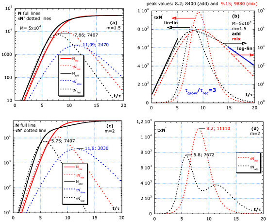
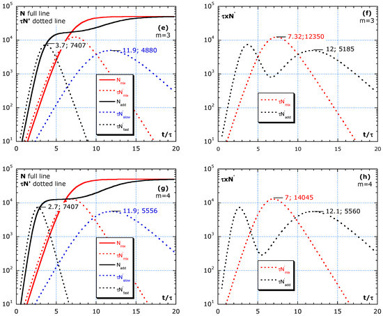
Figure 5.
Difference between adding and mixing without a change in parameters: τ and M during the outbreak. (a,b) Shows almost homogeneous, with m = 3/2. (c,d) Simulations with m = 2, representing subgroups equal in number. (e,f) Simulation with m = 3 and (g,h) simulation with m = 4. The fast group gives an earlier, sharper and higher peak than the slow group. Mixing always results in a higher and sharper peak than adding. Improving isolation by, e.g., avoiding social gatherings, specifically, between fast and slow groups, is more efficient than by strengthening general rules.
The statistical inhomogeneity stems from subgroups with different risks, 1/τ on infection, with τ the characteristic time. The elderly people with lower immunity and confined in a retirement house show a higher risk for COVID-19 and have a lower τ. The peak of the epidemic curve is proportional to the growth limit, M.
In Figure 5a–h, the ‘adding’ of a fast with an isolated slow group is compared with strong ‘mixing.’ In this simulation, only a fast and slow group are involved mostly unequal in number, τ and M. By ‘adding,’ we assume that the ‘fast’ group is well isolated from the ‘slow’ group with . The risk for the fast group is a factor m > 1 higher than for the slow group, and their limit value is M/m a fraction m of the total M, given by:
and the population in the groups are proportional, e.g., . The slow group is defined as:
The parameter choice considers that: ‘the larger the deviation in τ the rarer.’ This inversely proportional dependence agrees with a large number of statistics, as in Zipf’s power law [14,15]. The consequence of the chosen dependence of τfast and Mfast on the factor m >1 makes m independent. The consequence of the chosen dependence on the factor m >1 for τfast = τ/m and Mfast = M/m is that for the fast group is m-independent.
Mixing is the worst-case scenario. The fast and slow group become a ‘homogeneous group’ with harmonic averaged τ. In the scenario for intermingling, we propose the harmonic average τ-value for the mixed group. The general average, , is defined as:
For a = 1, 2 and −1; is the well-known arithmetic mean, root mean square (rms) mean and harmonic average, respectively [16]. The harmonic average is used because the average risk is used for the mixing group, and 1/τ represents the risks. For the intermingling average, holds:
Table A1 shows the relations and numerical values used in the simulations of Figure 5a–h to show the differences between mixing and adding. The total result of adding and mixing are denoted by the subscript ‘add’ and ‘mix.’ The 9th row in Table A1 shows the characteristics: and for mixing towards a ‘homogeneous’ group by a strong interaction. The 12th and 14th row shows and for the ‘fast’ and ‘slow’ group that are well isolated from each other. The factor m > 1 is a measure for the statistical inhomogeneity (m = 3/2 is almost homogeneous).
One scenario per row in Figure 5a–h shows the difference between adding and mixing. The red lines are for mixing. N is for ‘mixing’ (full red line) and the sum of N of fast and slow or ‘adding’ (full black line). The three dotted lines are for : slow group in blue, fast in black line and red dotted for ‘mixing.’ The independent contributions to the epidemic curve are denoted as ; in Figure 5a,c. Figure 5 simulates scenarios with the limit value M = 5 × 10⁴ and four m-values. No change is assumed in risks during the interval . The area under the lin–lin curves in Figure 5b,d,f,h is the total number of cases and remains constant because a constant value of M is chosen in the simulation. The dynamics and height of maxima can be quite different. Figure 5b,d,f,h shows the addition of for fast and slow to compare with mixing in lin–lin scales and in log–lin scales. Isolation between fast and slow (adding) always results in lower peaks in epidemic curves compared to mixing of fast and slow groups (red dotted lines).
Figure 5a,b shows almost homogeneous, with m = 3/2, and describes a scenario of a slightly faster subgroup, 2/3 of the population with a 1.5 higher risk than in the slow group. Because m is low, only one peak is visible. Figure 5b compares the same epidemic curve in lin–lin with log–lin for mixing and adding. The ratio inferred from the analysis of the blue and black tangent lines gives: . Such high n-values are also found in real data, as presented in Figure 2 and Figure 3. Figure 5c,d, with m = 2, represents subgroups equal in number. Yet, the fast group has a twice lower τ-value than the slow group. In Figure 5d, the two peaks in are visible. Figure 5e,f, with m = 3, shows the simulation of a minority (1/3 of the population) fast group, with a 3 times lower τ-value than the slow main (2/3 of the population) group. Figure 5g,h, simulates with m = 4, which represents a subgroup of 25% weak elderly people with strong interaction between their caretakers, nurses all together having a four times higher risk than the rather well-isolated large (75%) slow group outside in the nursing home.
In this model, all peaks of the fast group have the same height independent of m. For an almost statistical homogeneous group with 1 < m < 2, the two peaks in the adding scenario melt together and result in . A stronger heterogeneity in the population with m ≥ 3 results in two distinct peaks in the epidemic curve in the case of adding (isolation between the high- and low-risk group).
Figure 6 shows the effect of imposing rules at different times, tr in the exponential growth phase and the strong effect of a 75% vaccination degree. At time tr, rules are imposed lowering M and increasing τ. We ignore the dead time due to the relatively long incubation time for COVID-19, and we assume a homogeneous population and use Vn2 with but the value on N at tr. The relative times: tinf/τ, tr/τ, the N0-value and the improve factor f for τ and M are shown in Figure 6a for three scenarios to compare with ‘not imposing rules change’ (red line):
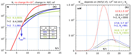
Figure 6.
The effect of imposing stronger rules (or a very effective 66.6% vaccination degree) at different times during the process assuming: are compared to no change in red lines. Time lag is not considered. (a) The cumulative number, N, at the introduction of the rules, the values: trule/τ;N0. (b) The flattening of the epidemic curve (multiplied by τ) of the scenarios in (a) with the normalized time at the maxima, tmax/τ, its normalized value , the f-value and N0.
- (i)
- The blue line represents an early and moderated change at trule/τ = 7.1, at about 55% of the inflection time, tinf, as indicated in the table of Figure 6a. We assume that the imposed rules increase the original τ by the factor, f = 2, and reduce the original M-value by the same factor, f = 2;
- (ii)
- The black line represents a moderate change with the factor, f = 2, but later at 65% of tinf. Case (ii) and (iii) show a limit value of 105/2 and the same slope, roughly half the slope of the red curve as expected for f = 2;
- (iii)
- The strong change with f = 3 is represented by the green line and starts at 70% of tinf time. It may be the situation where 2/3 of the population is vaccinated, and hence a factor f = 3 reduction in M.
Figure 6b shows the effect of three scenarios on the epidemic curves (multiplied by the initial τ) in lin–lin scales. After imposing rules, the peak height in the epidemic curve is given by:
4. Conclusions
The surprising result from the analysis of log–lin epidemic curves is that most countries show an exponential growth characterized by τgrow of about 5 d, followed by a slower recovery phase in exponential decay with τrecov and . The τgrow for the succeeding peak(s) is larger than for the first peak. The lag-time between the peak for contamination and peak for death increases from the first, second to the third ‘wave.’
The simple partitioning scenario explains the already steep slope at the start in log–lin epidemic curves and how plateaus are the result of patchy ‘spontaneous’ outbreaks at random times in different locations, which may be caused by contaminated travellers returning. The peak in the epidemic curve can come earlier for the sum of isolated subgroups of equal size compared with all living together in a city situation.
Reducing the risk, 1/τ, and the limiting number, M, by imposing rules, results in a delay, lowering and broadening of the peak in the epidemic curve. A high-vaccination degree flattens the epidemic curve more effectively than behaviour rules.
A second wave can be a consequence of adding two statistical inhomogeneous groups. A second wave is not always the result of lifting or not complying with the rules. If the population consists of a large group with a lower risk to be infected compared to a slow (higher risk) subgroup but well isolated, then two peaks could occur in the first ‘wave’. In contrast, if the mixing scenario holds between the fast and slow group, then the new ‘homogeneous’ group results in an epidemic curve with one peak, an effective τmix higher than τfast of the sensitive and lower than τslow and always the highest peak (in red). Therefore, mixing is the worst-case scenario. The peak for ‘mixing’ is at least twice and more precisely 2 × (m − ½)/(m − 1) as high as the fast peak in ‘adding.’ Mixing should be avoided by observing the correct isolation rules.
Flattening the curve without vaccine asks for more isolation between fast and slow subgroups. Imposing strong isolation between the high-risk people in nursing homes from its staff of care keepers, nursing, administration, volunteers and visitors is more effective than a general curfew. Considering statistical inhomogeneity improves the understanding of multiple wave dynamics and helps to understand the imposed safety rules provided by the World Health Organization. The analysis of results by partitioning in subareas like in a corporative way (contact in a class but not between classes) asks for improved local rules.
Author Contributions
L.K.J.V. and P.R.F.R. wrote the manuscript text. All authors have read and agreed to the published version of the manuscript.
Funding
This project has received funding from the European Research Council (ERC) under the European Union’s Horizon 2020 research and innovation programme (grant agreement No. 947897).
Institutional Review Board Statement
Not applicable.
Informed Consent Statement
Not applicable.
Data Availability Statement
The data presented in this study are available on request from the corresponding author.
Conflicts of Interest
The authors declare no conflict of interest.
Appendix A
Table A1.
The values for the parameters for m = 3/2, 2, 3 and 4 in Figure 5.
Table A1.
The values for the parameters for m = 3/2, 2, 3 and 4 in Figure 5.
| Nº | From Almost Homogeneous to Strong Inhomogeneity | ||||
|---|---|---|---|---|---|
| 1 | τslow/τfast = m ≥1 | 3/2 | 2 | 3 | 4 |
| 2 | Figure 5 Row number | (a), (b) 1st | (c), (d) 2nd | (e), (f) 3rd | (g), (h) 4th |
| 3 | τfast = τ/m | 2/3τ | 1/2τ | 1/3τ | 1/4τ |
| 4 | Mfast = M/m | 2/3M | 1/2M | 1/3M | 1/4M |
| 5 | τslow ≡ τ | τ | τ | τ | τ |
| 6 | Mslow = M(m − 1)/m | 1/3M | 1/2M | 2/3M | 3/4M |
| 7 | M = Mfast + Mslow | Mfast > Mslow | Mfast = Mslow | Mfast < Mslow | Mfast << Mslow |
| 8 | τmix = τ × m/(2m − 1) < τ | 3/4τ | 2/3τ | 3/5τ | 4/7τ |
| 9 | Mixing:and | ||||
| 10 | Mixing: tinfl/τ | 9.15 | 8.13 | 7.32 | 6.97 |
| 11 | Mixing: τ × N′max | 9880 | 11,111 | 12,350 | 12,960 |
| 12 | Fast: and ; m independent | ||||
| 13 | Fast: tinfl/τ τN′max | 7.86 7407 | 5.75 7407 | 3.697 7407 | 2.7 7407 |
| 14 | Slow: and | ||||
| 15 | Slow: tinfl/τ τ × N′max | 11.09 2470 | 11.50 3704 | 11.79 4938 | 11.91 5556 |
References
- Financial Times, Coronavirus Pandemic Tracked: FT Visual & Data Journalism Team. Available online: https://ig.ft.com/coronavirus-rt/?areas=usa&areas=gbr&areasRegional=usny&areasRegional=usnj&areasRegional=usia&areasRegional=usca&areasRegional=usnd&areasRegional=ussd&cumulative=0&logScale=1&per100K=1&startDate=2020-09-01&values=deaths (accessed on 20 March 2021).
- Verhulst, P.-F. Notice sur la loi que la population suit dans son accroissement. Corr. Math. Phys. 1838, 10, 113–121. [Google Scholar]
- Vandamme, L.K.J.; de Hingh, I.H.J.T.; Fonseca, J.; Rocha, P.R.F. Similarities between pandemics and cancer in growth and risk models. Sci. Rep. 2021, 11, 349. [Google Scholar] [CrossRef] [PubMed]
- Baldea, I. Suppression of Groups Intermingling as an Appealing Option for Flattening and Delaying the Epidemiological Curve While Allowing Economic and Social Life at a Bearable Level during the COVID-19 Pandemic. Adv. Theory Simul. 2020, 3. [Google Scholar] [CrossRef] [PubMed]
- Molenberghs, G.; Buyse, M.; Abrams, S.; Hens, N.; Beutels, P.; Faes, C.; Verbeke, G.; van Damme, P.; Goossens, H.; Neyens, T.; et al. Infectious diseases epidemiology, quantitative methodology, and clinical research in the midst of the COVID-19 pandemic: Perspective from a European country. Contemp. Clin. Trials 2020, 99. [Google Scholar] [CrossRef] [PubMed]
- Vandamme, L.K.J.; Wouters, P.A.A.F.; Slooter, G.D.; de Hingh, I.H.J.T. Cancer survival data representation for improved parametric and dynamic lifetime analysis. Healthcare 2019, 7, 123. [Google Scholar] [CrossRef] [PubMed]
- Synergy Software. Available online: www.synergy.com (accessed on 27 May 2019).
- Tashiro, A.; Shaw, R. COVID-19 Pandemic Response in Japan: What Is behind the Initial Flattening of the Curve? Sustainability 2020, 12, 5250. [Google Scholar] [CrossRef]
- Abrams, S.; Wambua, J.; Santermans, E.; Willem, L.; Kuylen, E.; Coletti, P.; Libin, P.; Faes, C.; Petrof, O.; Herzog, S.A.; et al. Modeling the early phase of the Belgian COVID-19 epidemic using a stochastic compartmental model and studying its implied future trajectories. Epidemics 2021, 35, 1755–4365. [Google Scholar] [CrossRef] [PubMed]
- Ren, M.F.; Zhang, Q.C.; Zhang, J.H. An introductory survey of probability density function control. Syst. Sci. Control Eng. 2019, 7, 158–170. [Google Scholar] [CrossRef]
- Turner, M.E.; Pruitt, K.M.A. Common basis for survival, growth, and autocatalysis. Math. Biosci. 1978, 39, 113–123. [Google Scholar] [CrossRef]
- Peleg, M.; Corradini, M.G.; Normand, M.D. The logistic (Verhulst) model for sigmoid microbial growth curves revisited. Food Res. Int. 2007, 40, 808–818. [Google Scholar] [CrossRef]
- Arditi, R.; Bersier, L.F.; Rohr, R.P. The perfect mixing paradox and the logistic equation: Verhulst vs. Lotka. Ecosphere 2016, 7. [Google Scholar] [CrossRef]
- Bak, P. How Nature Works Copernicus; Springer: New York, NY, USA, 1999. [Google Scholar]
- Ectors, W.; Kochan, B.; Janssens, D.; Bellemans, T.; Wets, G. Zipf’s power law in activity schedules and the effect of aggregation. Future Gener. Comput. Syst. Int. J. Escience 2020, 107, 1014–1025. [Google Scholar] [CrossRef]
- Squire, P.T. Which mean? Am. J. Phys. 1977, 45, 1094–1096. [Google Scholar] [CrossRef]


Publisher’s Note: MDPI stays neutral with regard to jurisdictional claims in published maps and institutional affiliations. |
© 2021 by the authors. Licensee MDPI, Basel, Switzerland. This article is an open access article distributed under the terms and conditions of the Creative Commons Attribution (CC BY) license (https://creativecommons.org/licenses/by/4.0/).