Abstract
The intermarket analysis, in particular the lead–lag relationship, plays an important role within financial markets. Therefore, a mathematical approach to be able to find interrelations between the price development of two different financial instruments is developed in this paper. Computing the differences of the relative positions of relevant local extrema of two charts, i.e., the local phase shifts of these price developments, gives us an empirical distribution on the unit circle. With the aid of directional statistics, such angular distributions are studied for many pairs of markets. It is shown that there are several very strongly correlated financial instruments in the field of foreign exchange, commodities and indexes. In some cases, one of the two markets is significantly ahead with respect to the relevant local extrema, i.e., there is a phase shift unequal to zero between them.
1. Introduction
It is well-known that financial markets can be strongly correlated in such a way that their market values show a similar behavior. Knowing the exact connection between two markets would be very helpful for risk-averse investment strategies. In the case that two markets are perfectly correlated, it would make no difference to invest in either one of them or both together, in the sense that we simply cannot diversify the risk on both markets. In case it is known that one market leads the other, one is able to use the leading market as an indicator to predict the price development of the other market. Knowing this connection between the two markets can be useful for improving the investment strategy. Therefore, a method for quantizing the interrelation of two markets is developed from a different point of view: We want to be able to identify a possible phase shift between two markets if they are correlated.
This subject has been approached in a variety of articles. One approach is to decompose the time series of two markets on a scale-by-scale basis into components with different frequencies using wavelets. The lead–lag relationship is studied by comparing the components of one selected level of the wavelet transformation for two markets, see e.g., [1,2,3,4,5]. More on wavelet methods in finance can be found in the book of Gençay, Selçuk and Whitcher [6].
Other methods working with correlation, auto-correlation and similar quantities can be found e.g., in [7,8,9,10,11,12,13,14,15,16,17]. There are also some studies focusing on financial crisis, where, e.g., the comovements during the 2007–2008 crisis [17,18] and the 1997 Asian crisis, 1994 Mexican devaluation, and 1987 U.S. market crash [19] are discussed. A different but related topic is the lead–lag relationship between news, e.g., on Twitter, and stock prices (see e.g., [20,21]). For a detailed literature overview, we refer to Fiedor [16].
For the intermarket analysis from a point of view of the technical analysis, see e.g., Murphy [22] and Ruggiero [23].
However, to the best of the author’s knowledge, the approaches found in the literature do not follow a geometric approach, e.g., they do not take local extreme values of the time series into account. Decomposing the time series using wavelets permits writing the time series as the sum of wavelike components with different frequency spectrums. Using these components for comparison of different markets will therefore compare only parts of the original time series. The problem is that these components can be hidden in the original time series such that a possible lag observed between the components of the same level does not necessarily mean that this lag can be observed in the time series itself, e.g., by comparing reversal points. Therefore, it is not clear how to interpret the results with regards to an application.
Since we want to be able to receive results giving us an observable lead–lag relationship of two time series, a geometrical approach is preferred. For this reason, we need significant points to be able to uniquely identify a lead or lag if any. Very important situations are reversal points, and therefore also the points in time of relevant local extreme values that represents the moment of reversal. A possible lead or lag can then directly be seen by comparing the local extrema of both charts. Such an ansatz could be used for trading these financial products and offers a deep insight into the lead–lag relationship between two markets because an empirical distribution over all local phase shifts can be identified. Additionally, the results are not hidden in just one single value like cross-correlation.
The paper is organized as follows: the search for the relevant local extreme values is far from being unique. Therefore, the approach to find these extreme values for a given pair of markets, which we want to compare, is discussed in Section 2. Using these values, local phase shifts can be computed for both markets, which gives a corresponding empirical distribution. To analyze the results, the directional statistics is introduced in Section 3. Now, we can apply our approach to historical data, e.g., for foreign exchange, commodities and indexes, which is done in Section 4. In Section 5, some conclusions are given.
Before we continue with the presentation of our lead–lag method, some general remarks are in order. Since our method is based only on empirical observations of real market data, its applicability is absolutely free of the validity of any hypotheses. By observing reversal points and recognizing them purely with quantitative reproducible methods, we invented a possibility of a geometric visualization of the correlation of two related markets at selected points. In particular, at this point, it is not clear whether or not our method can anyhow be related to the hypothesis of efficient markets (see Section 5 for more details).
2. Method for Intermarket Analysis
Suppose we want to compare two financial instruments, namely market A and market B, for lead and lag. First, we take one chart for each market with the same bar size, e.g., a 60 chart, depending on our interest. Then, we want to decide whether these two charts are correlated and show lead or lag. Of course, if both financial instruments are fully uncorrelated, we do not expect a reasonable relation and thus it makes no sense to compare them. Therefore, let us assume that there is a connection between these two charts.
Since a geometrical ansatz is preferred, the points in time of relevant local extreme values are needed. If each maximum occurs for both charts at the exact same time and the same holds true for the minimal values, it can be said that both price developments run perfectly synchronous. If the maximum of chart B occurs shortly after the maximum of chart A, then a lag of market B compared to market A is observed.
Such a comparison could easily be done by hand in a very intuitive way. Assume two markets have a lead–lag relationship, e.g., market A leads B, then a direct benefit would result because right after a reversal point in market A, there most likely would occur a reversal point in market B. This can be very useful for several strategies (for position entries and also for exits).
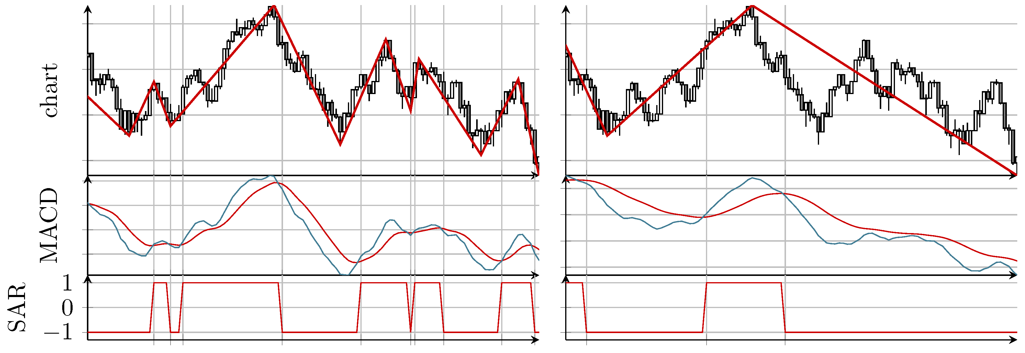
Of course, doing an extensive study by hand would be very time consuming and not objective. For an automatic approach, an appropriate method to identify local extrema for both time series is needed first. The MinMax algorithm introduced by Maier-Paape [24] is a method which yields such a series of alternating relevant local extrema (called MinMax process) and will therefore be used in the following. This method uses a so called SAR (stop and reverse) process as input. This is an indicator that only has two values, “up” and “down”, to identify up and down movements in the price chart. Simply speaking, if an up movement is detected by the SAR process, the MinMax algorithm searches for a maximum and fixes this local maximal value once the movement phase, indicated by the SAR process, reverses to a down movement. Analogously, minimal values are searched during down movement phases. The exact algorithm, however, is much more involved because of so called “exceptional situations” (see (Definition 2.9 [24])). In any case, the SAR process controls the frequency of the by the MinMax process detected local extreme values.
The underlying SAR process can e.g., be derived from the well known MACD (moving average convergence/divergence) indicator of [25]. The MACD indicator consists of two lines, the “MACD line” and the “signal line”. Whereas the MACD line is the difference of a fast exponential moving average (EMA; standard setting is 12 periods) and a slow EMA (standard is 26 periods), the signal line is the EMA (standard is nine periods) of the MACD line. To construct the related SAR process, we use the MACD indicator not with default parameters, but scale all three values (12,26,9) by a common factor, called “timescale”. Since the MACD line is “faster” than the signal line, the SAR process is defined as value “up” (value 1), if the MACD line is above the signal line, and as value “down” (value ) in the opposite case. See [24] for the details and Figure 1 for an example.

Figure 1.
Two examples showing for the MinMax series and the underlying SAR (stop and reverse) process derived from the MACD (moving average convergence/divergence) indicator for two different choices of “timescale”: parameter (12,26,9), i.e., (left) and parameter (30,65,22.5), i.e., (right). Both examples show the exact same time frame of the S&P 500.
In this paper, we will always use the MACD indicator induced SAR process, although there would be other reasonable choices possible. Increasing the timescale leads to less detected extreme values while decreasing the timescale leads to more extreme values, i.e., a finer resolution.
Note that the MACD series can oscillate quickly around the signal line which leads to many small and insignificant local extreme values. To avoid this problem, we require a change of the direction of the SAR process such that the distance of the MACD line and its signal line needs to exceed some minimal threshold of , where ATR means the average true range of the price chart (see (Subsection 2.1 [24]) for the details), i.e., at time point of the ith candle of the chart, it is
In the following, this MinMax algorithm is used because this is a very flexible tool to identify local extreme values in price charts. As far as we know, this method is the only one that identifies local extreme values exactly and is continuously adjustable. Since a financial time series always has some noise, there is no unique objective choice for relevant local extrema of a financial time series. Therefore, this process needs to be parameter dependent to adjust the resolution of the minima and maxima.
One question is how to choose the “right” parameter. This will be discussed at the end of this section. For the moment, let us assume that “good” parameters for market A are known. The MinMax process then yields consecutive minima and maxima denoted by with points in time and consecutive price values . To be able to compare these points, the time in seconds since 1st January 1970 is measured. For this wavelike time series, the mean wavelength can be computed by
Note that λ depends on the parameters used in the MinMax algorithm since the minima and maxima depend on the used parameters.
Choosing these parameters for the second market gives us the extreme values with mean wavelength . In general, will hold. In the following, the parameters of the MinMax process for market B are adjusted, so that holds true, in order to obtain two series of extreme values that hopefully oscillate similarly not only globally but also locally. With this at hand, we have a unique selection criterion for the parameters for market B. Clearly, there are different possibilities, but this question is left open for future research.
Remark 1.
Note that, in general, the wavelength is not expected to be constant, but to be time dependent and able to vary a lot. To see this, Figure 2 shows the averages of wavelengths over a window containing 49 half periods of the MinMax process, i.e., for . Therefore, matching the mean wavelength for both markets means just matching the level of refinement and not the position of the extreme values themselves.
Figure 2.
Moving average of wavelengths over half periods for S&P 500 on a 60 chart, where the y-axis shows the mean number of candles between two maxima (and also between two minima).
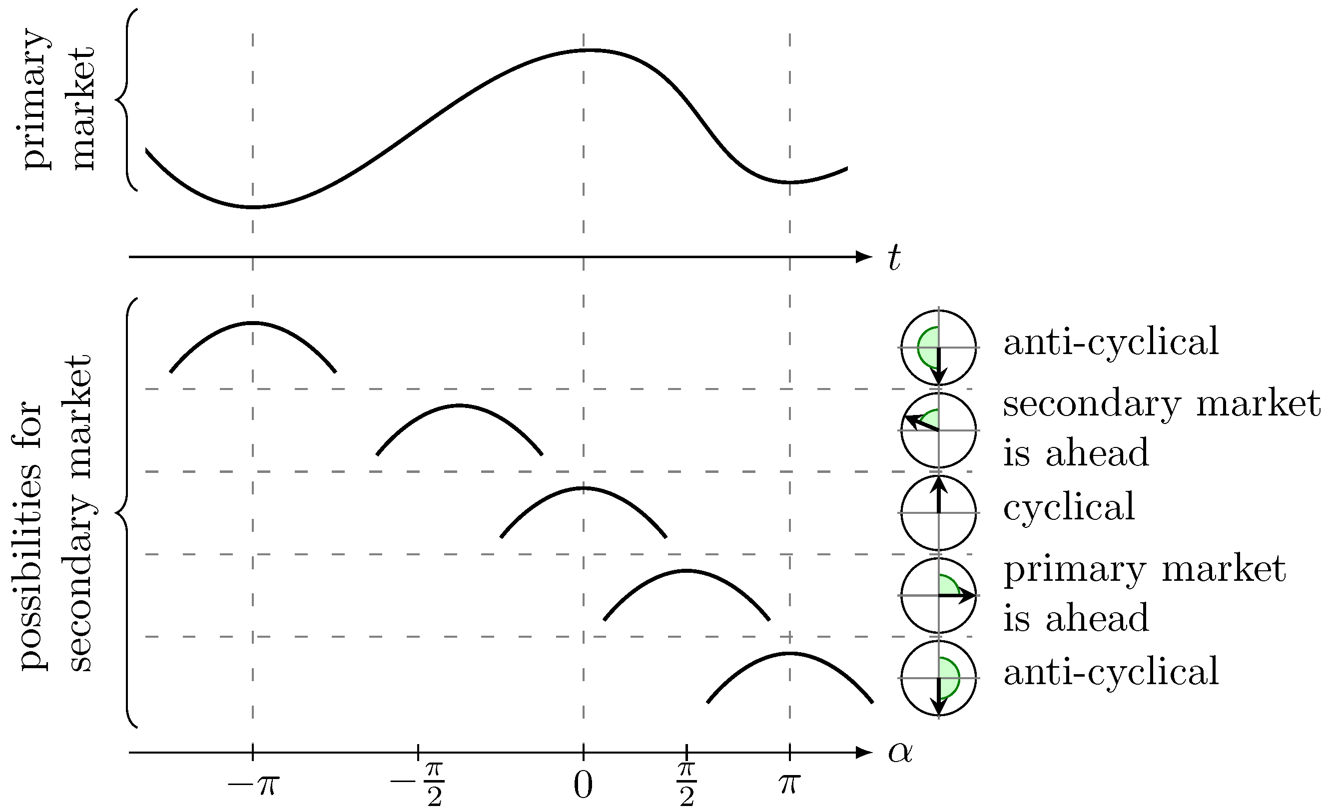
Since we are interested in the lead–lag relationship between market A and B, we only need to find the relationship of points in time of the extrema by finding the relative positions of within . In this case, market A is called the primary market and market B the secondary market. The overall procedure is as follows:
- Fix the desired mean wavelength .
- Find all local extreme values and for the primary and the secondary market, respectively, such that the mean wavelengths (1) for both markets on the full data base matches , i.e., such that .
- Find such that and .For each , do the following:
- (a)
- Find such that .
- (b)
- Define the phase shift of extreme value regarding the extreme values and . Here, the linear relative distance between the corresponding extrema values, measured as an angle, is used. We setwhereFigure 3 shows some examples for the position of a maximum of the secondary market relative to some extreme values of the primary market.
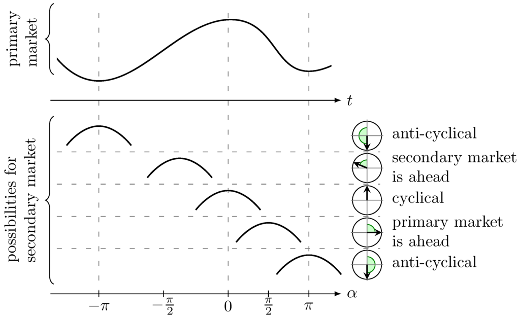 Figure 3. Computation of α in (2): The upper chart shows an idealized price movement of the primary market with two minima and one maximum; the lower part shows five different possibilities for the position of a maximum of the second market, where measures their positions relative to the extreme values of the primary market.
- We end up with the empirical circular distribution depending on the mean wavelength .
Negative α resemble a front-running (lead) of the secondary market, positive α resemble a time lag of the secondary market. The result can be interpreted on the unit sphere and gives us all observations of local phase shifts between two markets.
Remark 2.
This approach is independent of the openings of the stock exchange for market A and market B. Since the points in time and are measured in seconds since 1st January 1970, we just put these values into (2), and the machinery continues working unchanged.
Note that the different timezones for the price data need to be considered because some stock exchanges are in the United States while others are in Europe. To avoid any problems regarding the timezones and also daylight saving times, the Greenwich Mean Time (GMT) is used.
Remark 3.
The above method has only one parameter, namely the mean wavelength (see step 1). Therefore, different distributions for different wavelengths can be computed. It turns out that the results in most cases do not depend on the wavelength. Therefore, we compute for many values of the mean wavelength λ. For each λ, a histogram or rather a bar plot can be generated, and, at the end, the average of all bars including standard deviation can be computed.
Remark 4.
Note that the extreme values cannot be determined in real time. There is always at least a small time lag. Therefore, such an empirical distribution can also be identified, if we use the point in time when the extreme value is confirmed by the MinMax algorithm instead of the point in time of the extreme value itself.
3. Directional Statistics
Since we work with circular distributions, the mean and variance must be computed in an appropriate way (see e.g., [26,27]). This can be used to identify a possible phase shift. We introduce the basic statistical quantities in Subsection 3.1. For a deeper analysis, some interesting statistical tests are listed in Subsection 3.2 and an approximation of the lead or lag is given in Subsection 3.3.
3.1. Basic Quantities
Now, we will discuss how to calculate estimators, e.g. for the mean angular direction. Details on computations for a general distribution with a periodic probability density function f can be found in (Section 3.2 [26]).
The first step is to identify the angles by vectors on the unit sphere . Let be the outcomes of a discrete distribution for the phase shift of two markets of interest. We can identify each angle with a point on the unit sphere
for . In this two-dimensional space, the mean resultant vector can be computed by
Note that because it is a convex combination of vectors in . If , choose the mean angular direction such that
Of course, could be zero and thus no unique mean angular direction would exist. This is the case, e.g., if the angles are uniformly distributed all around . If this is the case for the phase shifts between two markets, then there is no connection between them and the analysis of the results would already be finished. Since we are interested in at least slightly correlated markets, we do not expect this behavior.
Nevertheless, even in the case where , the length of could be small. This happens if the outcomes of the distribution have a large variance. In contrast, a length of near 1 indicates a small variance and a high concentration of the outcomes close to its mean angular direction. Therefore, we need to consider the circular variance (cf. Section 2.3.1, Equation (2.11) [26]) which can be defined by
To be able to also measure the skewness and the peakedness, we define the circular skewness by
and the circular kurtosis by
The circular standard error can be defined by
and for more information, see (Section 4.4.4, Equation (4.21) [26]).
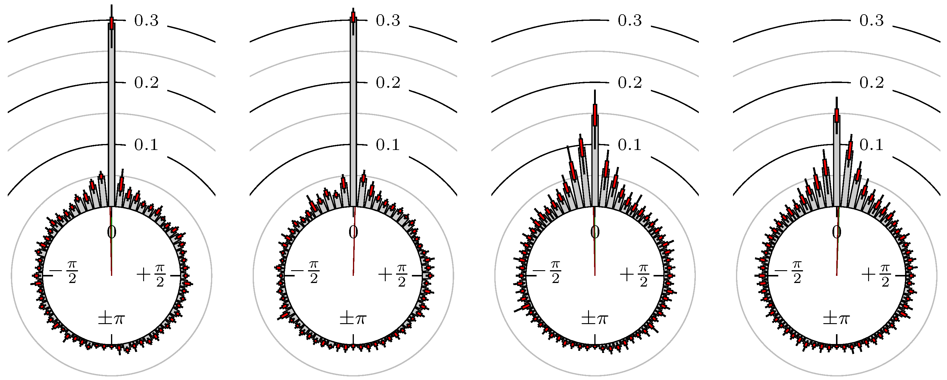
Since we are interested in the possible lead or lag between two markets, we want to reduce the influence of outliers that are far away from the mean angular direction. For this reason, a hat function on is used to weight the empirical distribution with the hat near the position of the highest peak of the distribution. Then, all reasonable data near the peak get high weights and thus more influence in our statistics, while less important data, i.e., the outliers, obtain small weights. We expect that the peaks of the distributions are near zero up to some lead or lag, i.e., the two markets are positive correlated. Therefore, we use the hat function which has its hat (maximum) at zero and is zero (minimum) at . The first two plots of Figure 4 show an example for an observed distribution and its weighted counterpart, respectively. From the weighted distribution, the weighted mean angular direction can be computed as in (4).
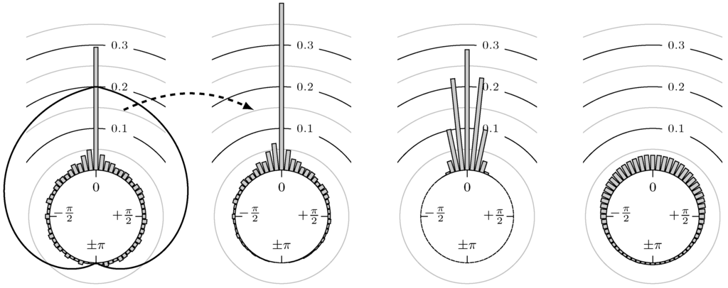
Figure 4.
(first): example of a possible distribution of phase shifts and a hat function on ; (second): corresponding weighted version of the example distribution from first plot; (third): plot of the probability density functions of von Mises distributions mean location parameter and concentration parameters ; (fourth): same as third but with .
3.2. Statistical Tests
Most of the statistical tests require an underlying von Mises distribution (see e.g., (Section 3.3.6 [26])), which is often used as an analogon to normal distribution on the unit sphere. The distribution we get for our application is not exactly a von Mises distribution but has a similar shape (see Figure 4). In this figure, the distribution of phase shifts has a similar shape to two superposed von Mises distributions, one with a large and one with a small concentration parameter κ. Thus, it is possible that the phase shifts correspond to a von Mises distribution plus noise, e.g., white noise. Nevertheless, we use the following statistical tests in order to be able to classify the results even if they are designed for von Mises distributions.
Since we do not know the underlying distribution for the phase shifts, we only get some realizations. Computing the quantities in Section 3.1 using the formulas by putting in our observations will give us the estimators that will be denoted by , , , and , respectively.
Next, we want to verify the quality of our mean angular direction. Therefore, the %-confidence intervals for the population mean is computed, such that and are the lower and upper confidence limits of the mean angular direction, respectively (see (Section 26.7 [28])). For the weighted mean , the confidence interval is denoted by . We always use %.
To test for zero mean, which would imply that there is no lead or lag relationship, the one sample test for mean angle can be performed, which is similar to the one sample t-test on a linear scale. Let be the mean angular direction for which we want to test and the mean angular direction of the underlying (unknown) distribution. We test for
by checking whether using our estimator and its 95% confidence interval (see (Section 27.1 (c) [28])). In our case, we will set . The result of this test is then given by
As noted in Remark 3, empirical distributions for different mean wavelengths will be generated, with, say, different values. To compare all these distributions for the same pair of markets, the one-factor ANOVA or Watson–Williams test (multi-sample test) can be used. It assesses the question whether the mean directions of two or more groups are identical or not, i.e., it tests for
(see (Section 27.4 (b) [28])). The output of this test is a p-value, i.e., the probability of getting results which are at least as extreme as our observation assuming the null hypothesis is true. Thus, a large p-value indicates that the null hypothesis holds true. We denote this value by .
3.3. Lead or Lag
Using the mean angular direction and its confidence interval, we can roughly approximate the lead or lag. Assume the mean wavelength on a 10 chart is 600 candles. The mean wavelength would then be approximately . This value equates . Thus the mean of the lead or lag ℓ can be approximated by
and the corresponding confidence interval is approximated by , where
Analogously, we can compute the lead or lag using the weighted mean angular direction that is denoted by and , respectively, i.e. and . Note that a positive value for ℓ and means that the primary market leads the secondary and vice versa for a negative value.
To answer the question of which market is ahead, if any, we make the following definition:
Definition 1.
For positive correlated markets, i.e., , we say one market leads the other if is significantly different from zero, i.e.
4. Empirical Study
Now, we study different markets from commodities to foreign exchanges. In Subsection 4.1, we explain the setting and give some details on the choice of parameters. The angular histograms and the statistical results are then shown in Subsection 4.2.
4.1. Settings
In this paper, we focus on the 10 chart. The wavelengths used to adjust the MinMax process for the primary market (see Remark 3) are of sizes
i.e., between 1000 and 30000 . For the Watson–Williams test (see Section 3.2), this leads to groups. For each , , we then perform steps 1 to 4 from Section 2.
Remark 5.
Note that we do not measure the wavelength in number of candles or number of candles multiplied by its time span. We always use the differences in seconds from our timestamps measured in the universal GMT. Therefore, we always consider the time when the stock exchange is closed.
For most computations of the directional statistics, the MATLAB library CircStat [29] has been used and all angles are measured in radian.
The markets that are examined including the period of time for the available candle data are listed in Table 1. Note that the start date is not the same for all markets. For a combination of markets with different initial dates, the smaller period of time is used for both markets.

Table 1.
Examined markets and the period of time of the used candle data of the 10 chart (whereas the initial date depends on the financial instrument, the terminal date is always 31 December 2015). The Forex data are from HistData.com while the rest of the historical data are from TaiPan RT from Lenz und Partner AG (Dortmund, Germany).
4.2. Results
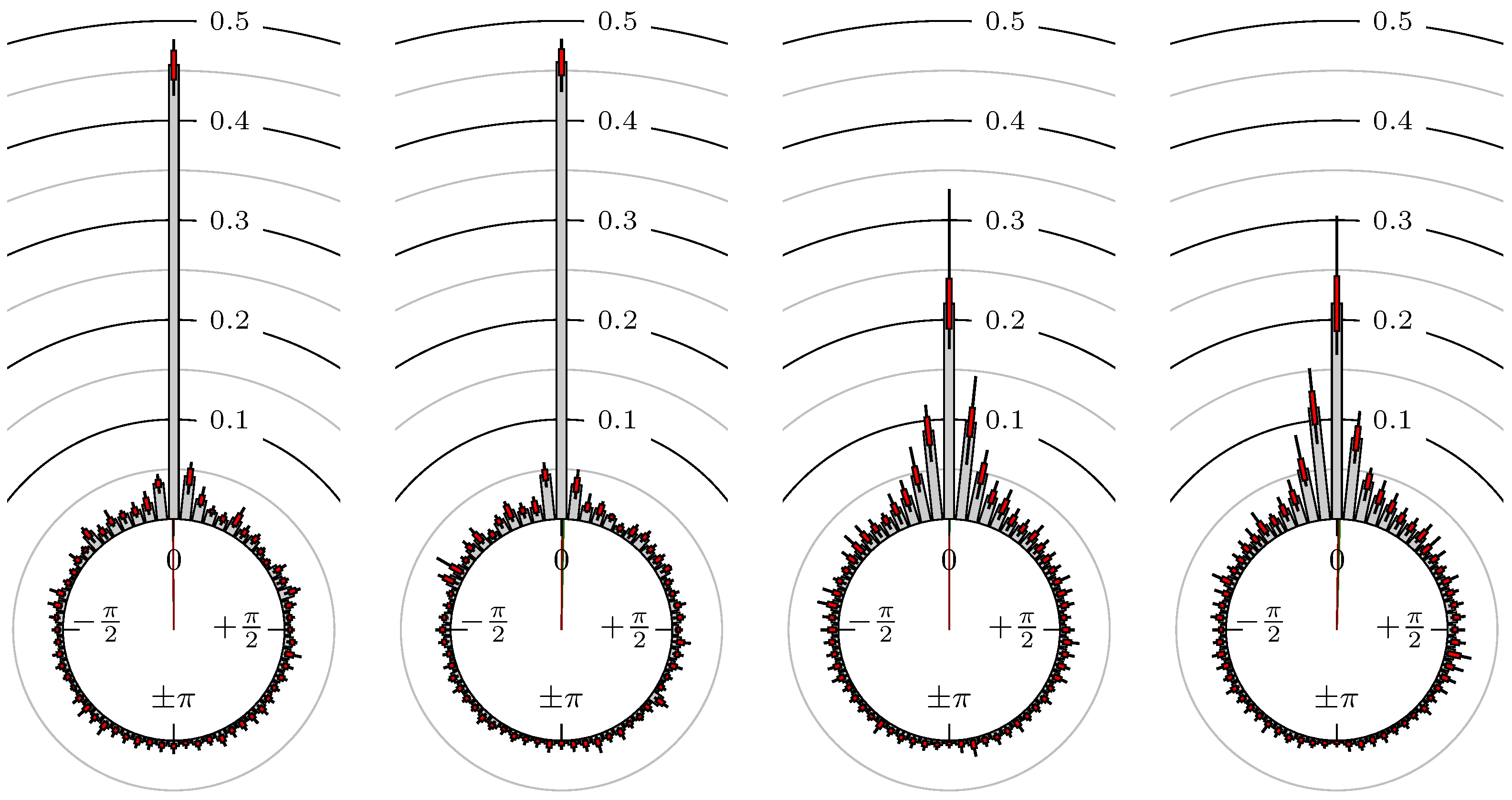
Now, we look at the results for several futures, indexes and foreign exchanges. The statistical quantities for the phase shift of the extreme values are shown in Table 2 and for the points in time of the confirmation of the extreme values in Table 3. The corresponding empirical distributions are given, according to the following remark, by Figure 5, Figure 6, Figure 7, Figure 8, Figure 9, Figure 10, Figure 11, Figure 12, Figure 13, Figure 14, Figure 15, Figure 16, Figure 17, Figure 18, Figure 19, Figure 20, Figure 21 and Figure 22.
Table 2.
Results on 10 min chart (time of extrema). This market leads the other one.
Table 3.
Results on 10 min chart (time of extrema confirmed). This market leads the other one.
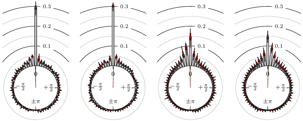
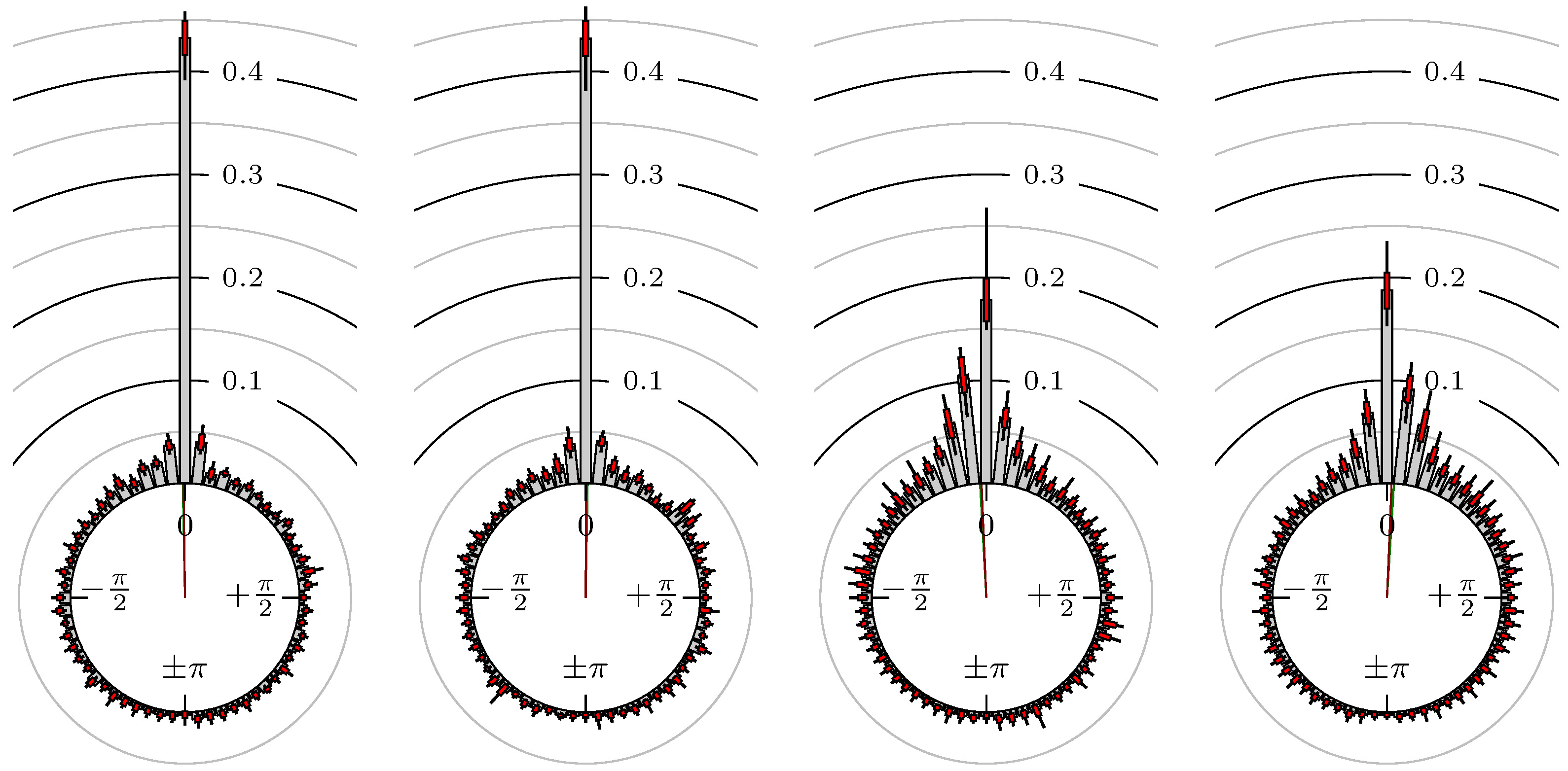
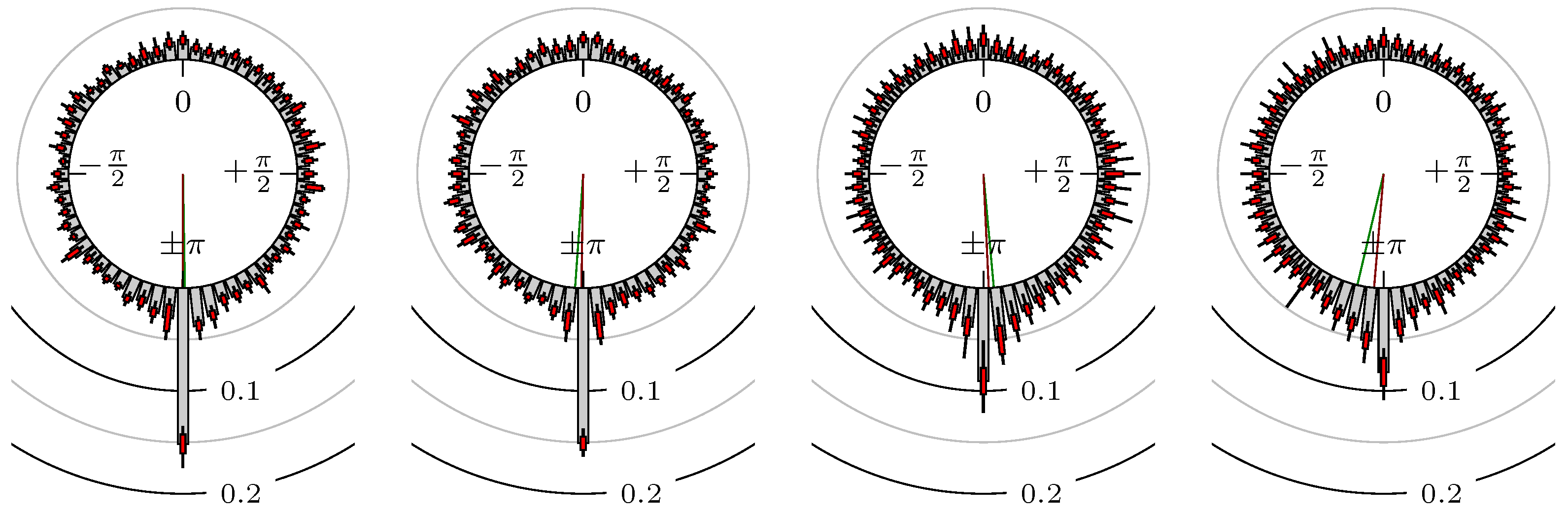
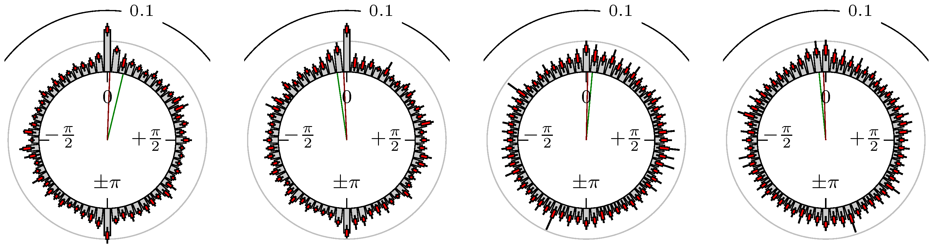
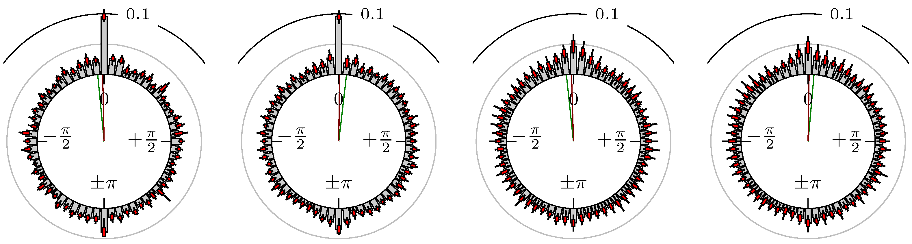
Figure 5.
S&P 500 versus DAX.
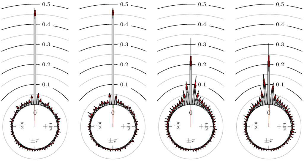
Figure 6.
S&P 500 versus NASDAQ 100.
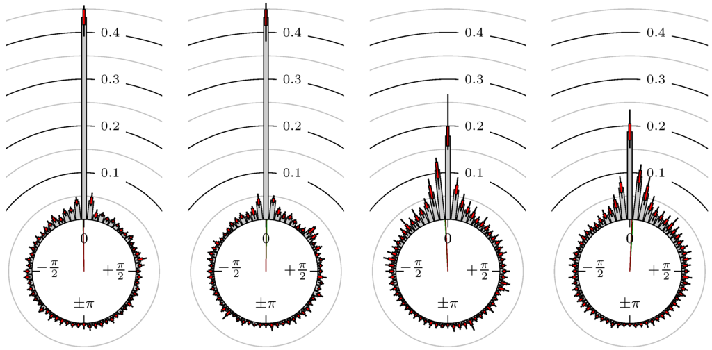
Figure 7.
S&P 500 versus Russell 2000.
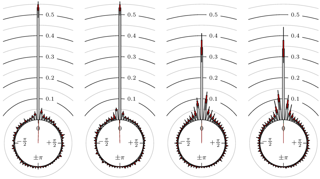
Figure 8.
DAX versus EuroSTOXX 50.

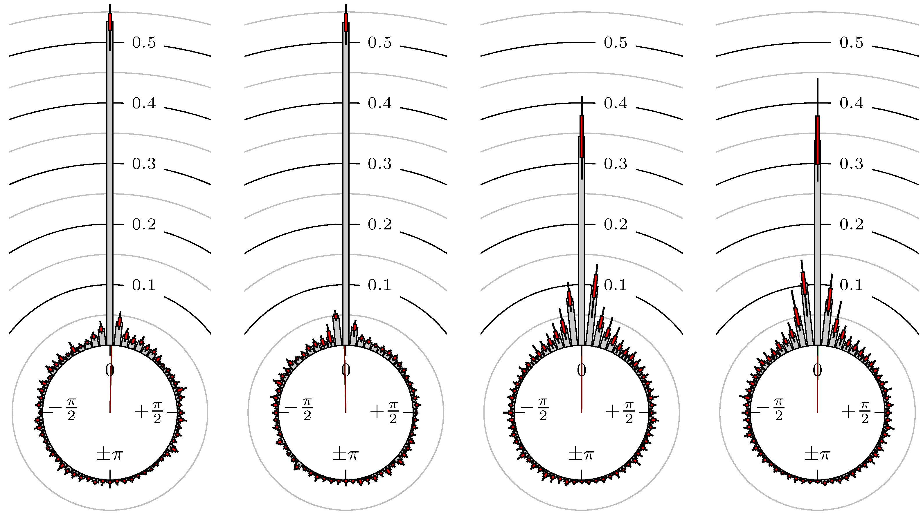
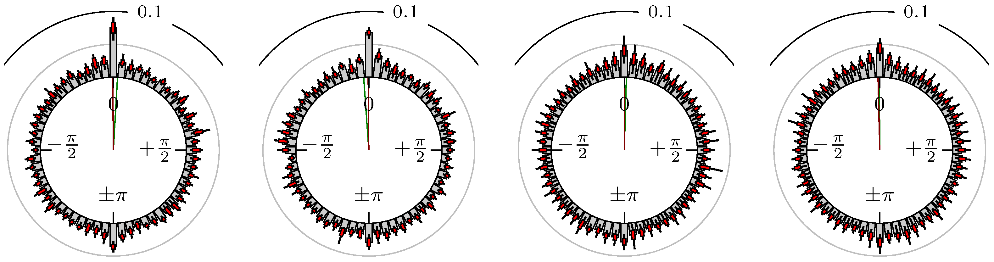
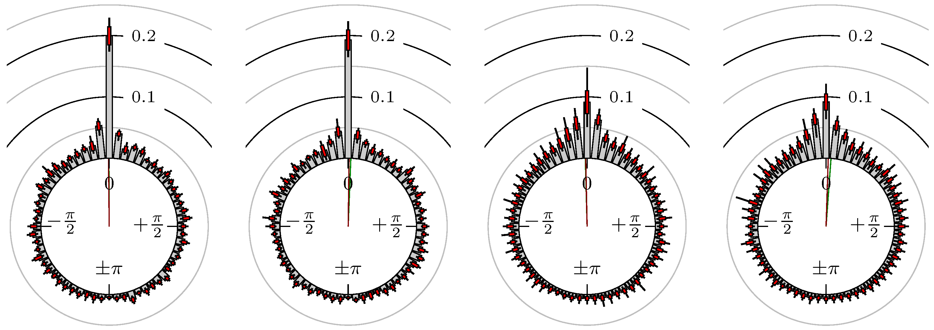
Figure 9.
BUND versus 30y T-Bonds.
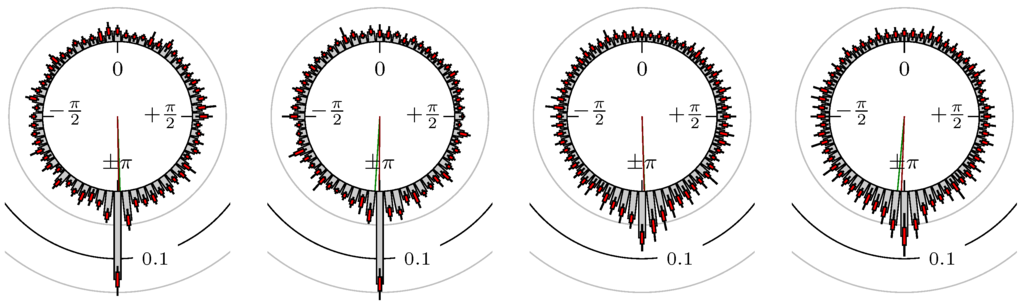
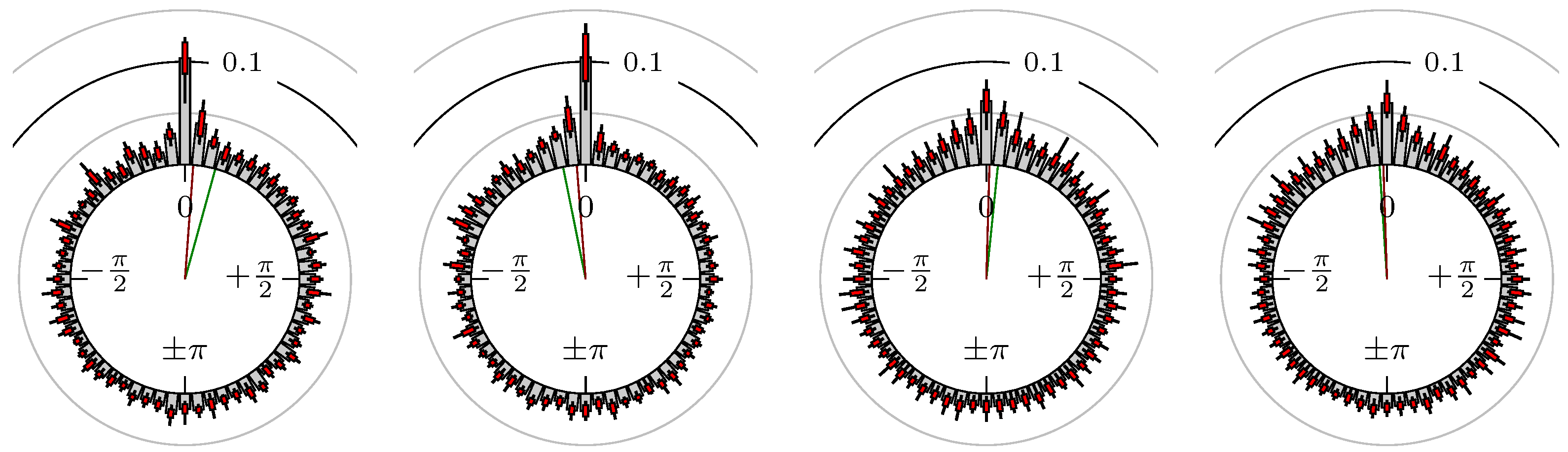
Figure 10.
S&P 500 versus 30y T-Bonds.
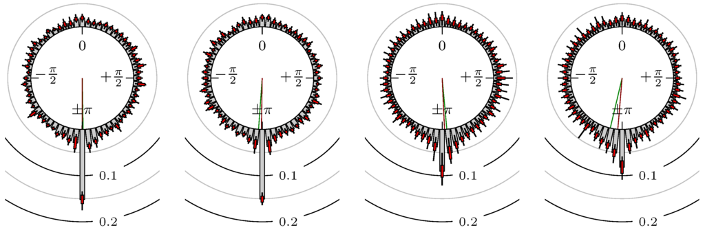
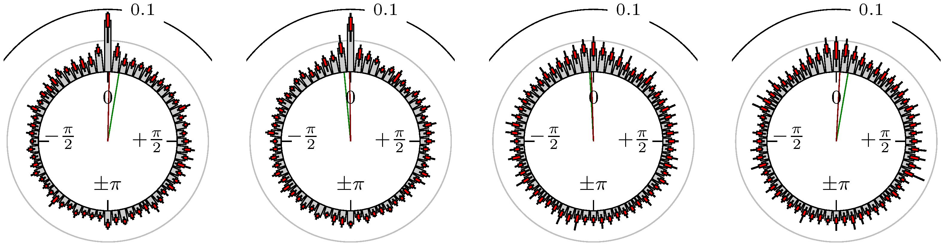
Figure 11.
DAX versus BUND.
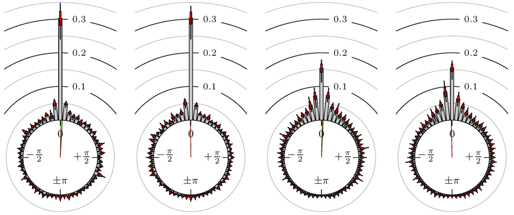
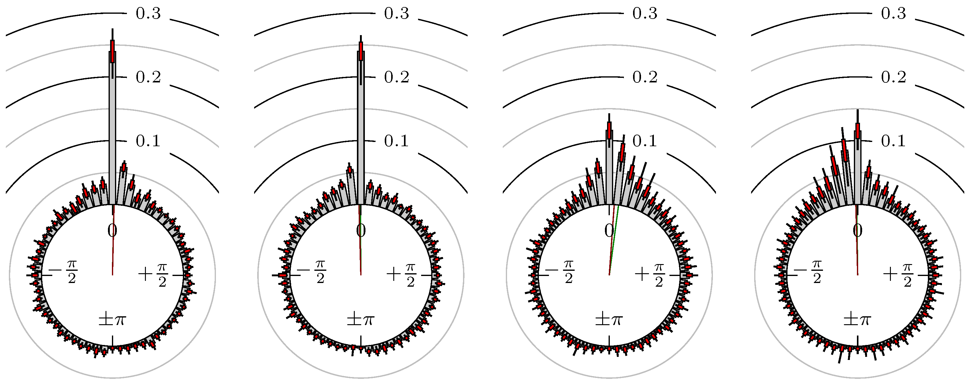
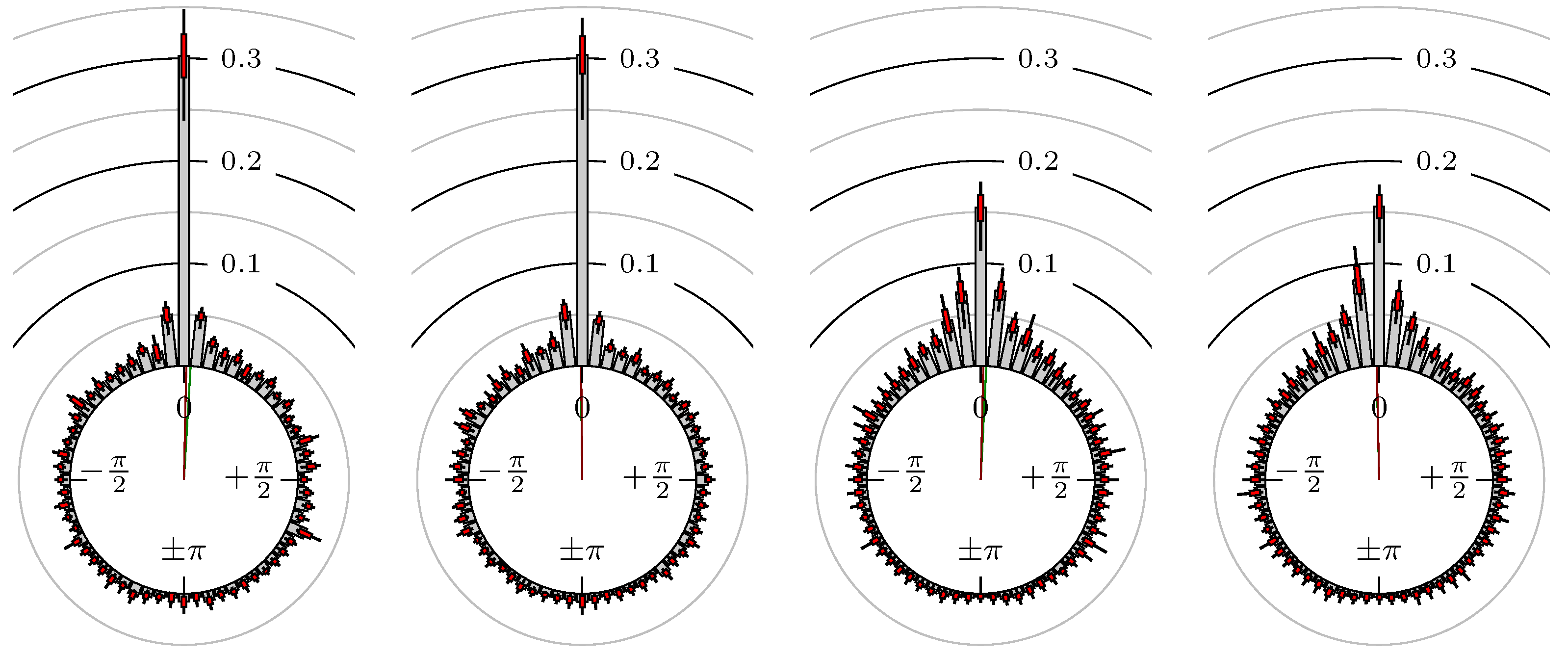
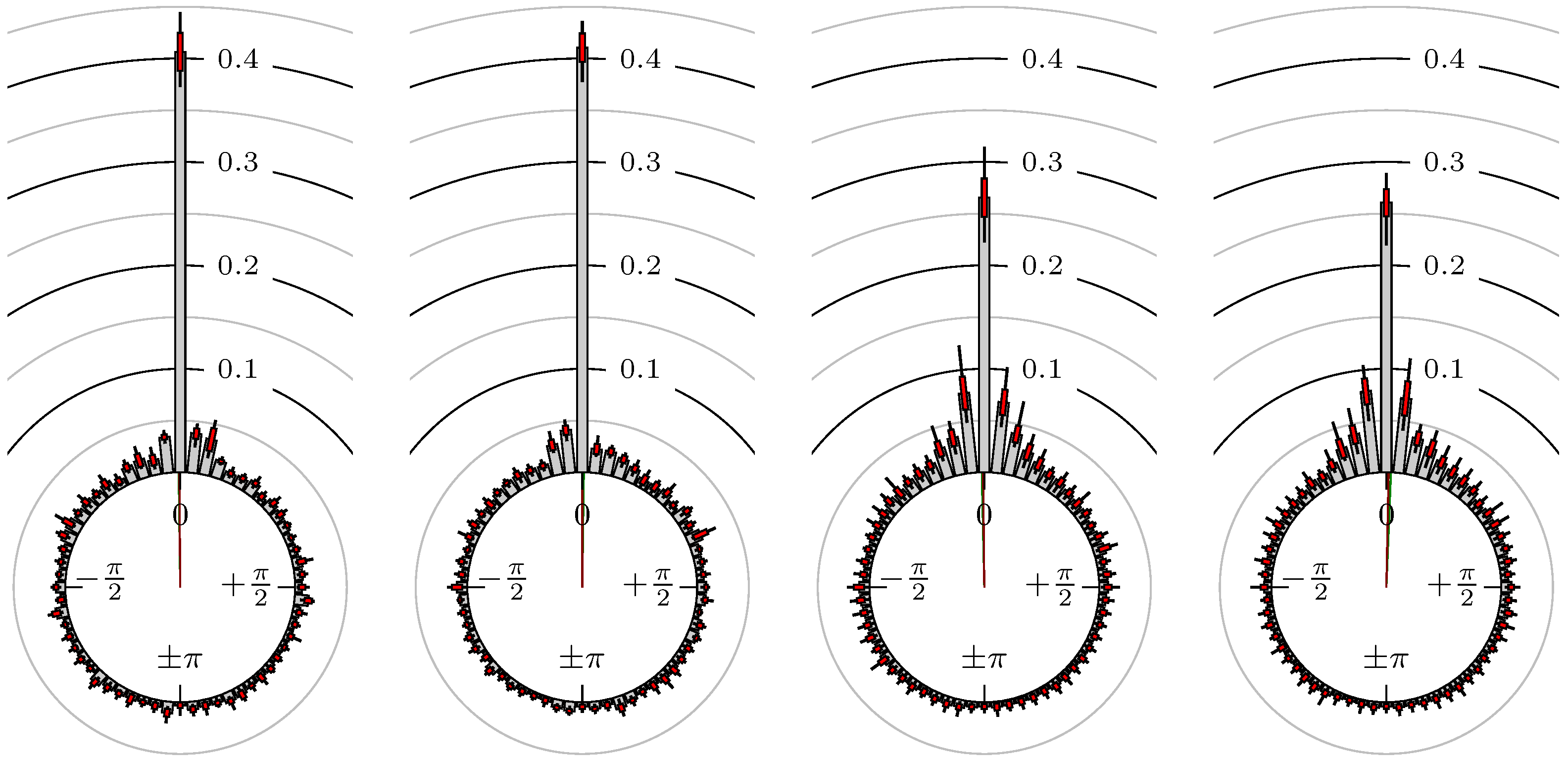
Figure 12.
Gold versus Silver.
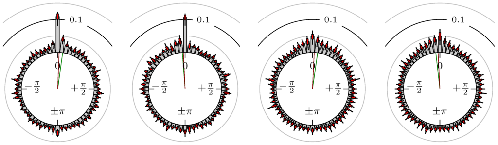
Figure 13.
Gold versus Oil (WTI).
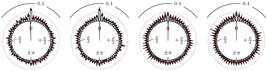
Figure 14.
Oil (WTI) versus Natural Gas.
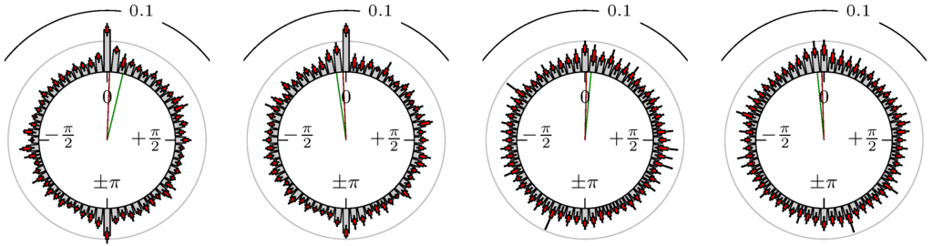
Figure 15.
Gold versus S&P 500.
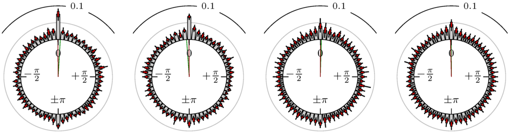
Figure 16.
Gold versus DAX.
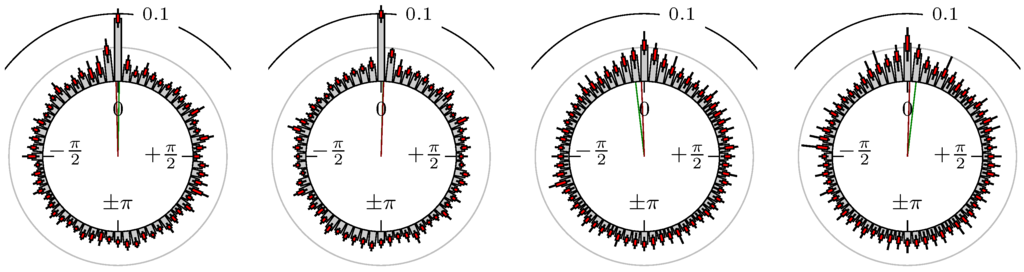
Figure 17.
Oil (WTI) versus DAX.
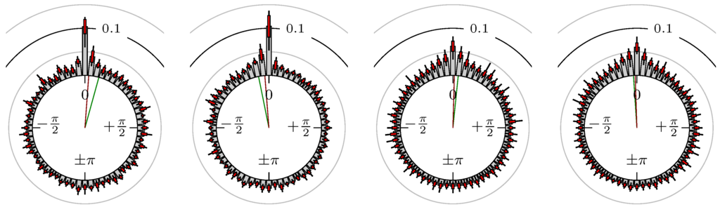
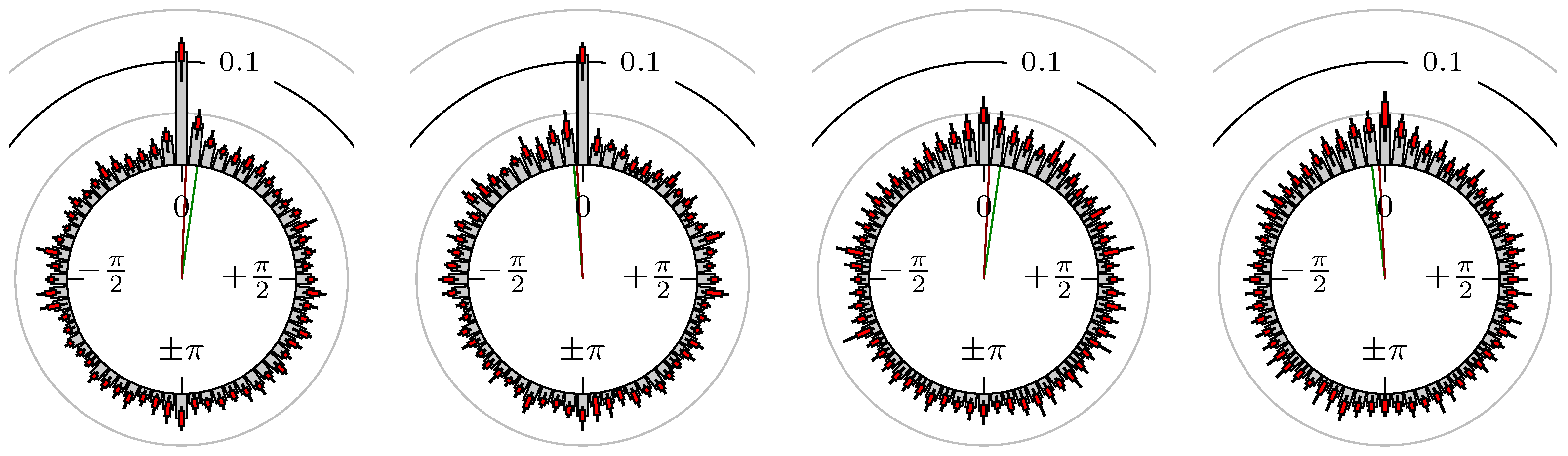
Figure 18.
Gold versus EUR-USD.

Figure 19.
Oil (WTI) versus EUR-USD.
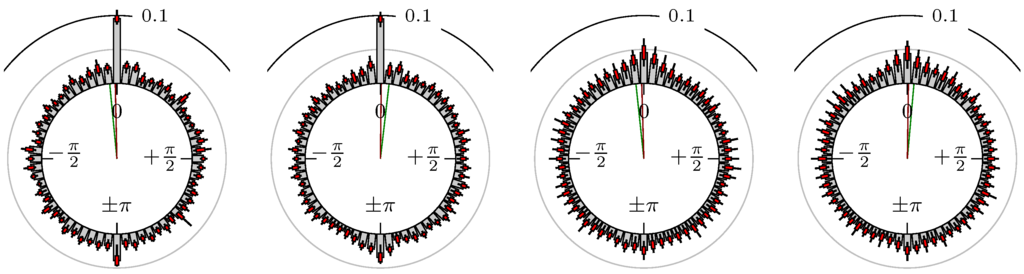
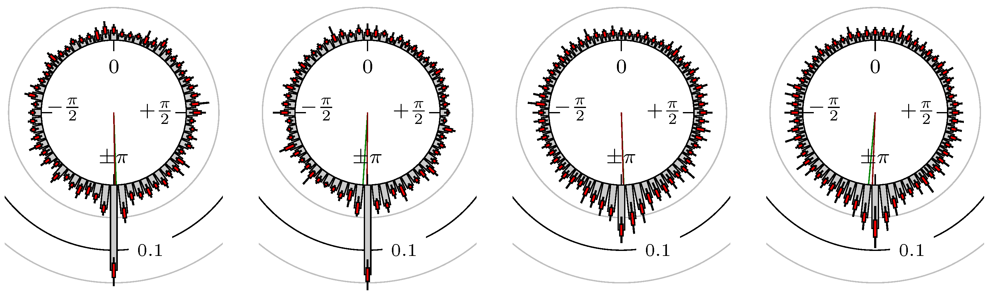
Figure 20.
EUR-USD versus JPY-USD.
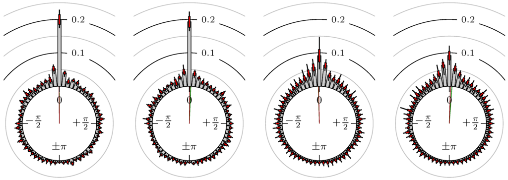
Figure 21.
EUR-USD versus GBP-USD.
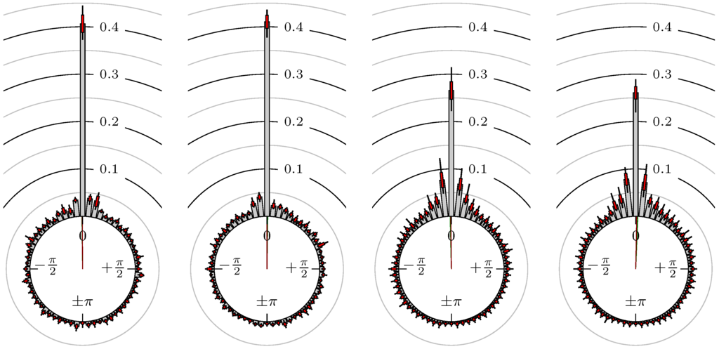
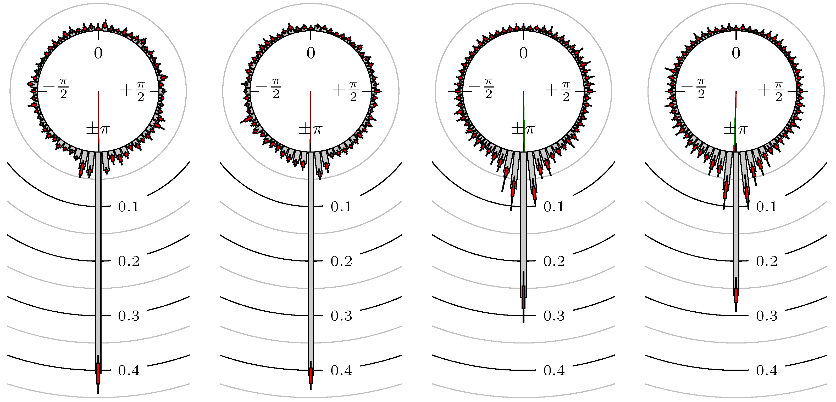
Figure 22.
EUR-USD versus CHF-USD.
Remark 6.
(Notes on figures)
The label of each of the following figures states “A versus B” and each figure shows the following four distributions (in same order):
- Time of extrema: A as primary and B as secondary market.
- Time of extrema: B as primary and A as secondary market.
- Time of extrema confirmed (see Remark 4): A as primary and B as secondary market.
- Time of extrema confirmed (see Remark 4): B as primary and A as secondary market.
All plots also contain the mean angular direction and the mean angular direction of the weighted distribution (weighted with the hat function, see Figure 4). These directions are the green and red lines inside the circle, respectively.
Additionally, each bin of the histograms contains information of the single distributions for each wavelength: it shows that the largest value of this bin occurred within the 59 single distributions, the smallest value and the bin value of the combined distribution plus and minus the standard deviation.
Now, we discuss the results for the time of extrema and afterwards the results for the confirmation time of the extrema.
Time of Extrema
First, we note that the results are mostly independent of the mean wavelength, which we can see from the additional information of each bin, i.e., the minimal and maximal value for this bin and the standard deviation. Next, we see a very weak correlation between combinations of commodities with itself, except Gold vs. Silver, commodities vs. stock markets, commodities vs. foreign exchanges and EUR-USD vs. JPY-USD, i.e., Figure 13 to Figure 20. The pairs of markets also have a relatively large standard deviation and small concentration around its mean indicated by the small kurtosis .
In addition, the combination between stock markets and bond futures (see Figure 10 and Figure 11) have only a small correlation. However, there is a notable peak at that indicates a negative correlation.
All other combinations of markets illustrated in Table 2 and Figure 5 to Figure 9 and Figure 12, Figure 21 and Figure 22 show a large peak near the mean angular direction between 20% up to 53%. This means that the probability is significantly high that extreme values for both markets are shaped in almost the exact time. Of course, this leads to smaller standard deviations and higher kurtosis.
Confirmation Time of Extrema
Since the point in time of confirming an extreme value by the MinMax process is more sensitive to the price development than the very fixed point in time of the extreme value itself, we already expect scattered observations. However, even here, we can see a peak in the mean angular direction of about half of the size of the peak for the time of extrema of the strongly correlated pairs of markets. The values in Table 3 are approximately of the same order as in Table 2.
All Together
We see strong correlations for extrema and confirmed extrema between combinations of DAX, BUND, EuroSTOXX 50, S&P 500, 30y T-Bonds, NASDAQ 100, Russell 2000 and between the foreign exchanges, except EUR-USD versus JPY-USD. Additionally, Gold and Silver have a strong correlation, whereas all other combinations with at least one market from commodities seem to be weakly correlated or even nearly uncorrelated. Thus, from the point of view of local extreme values, the commodities are separated from other markets.
The lead–lag (see Section 3.3) is between 5 and 10 for the point in time of the extrema for the indexes and foreign exchanges, and also for Gold versus Silver. Note that this is just at most the duration of one single period of the 10 chart. Even the points in time of the extrema are just the time stamp of a candle and not the exact time of the extreme value itself, i.e., these points in time have an uncertainty of . Therefore, we cannot view the value as an absolute value but more as a tendency of the lead or lag for the candles in which the extreme values occur.
Remark 7.
In most of the cases, our investigations of the correlation of two markets yields one market leading and one market following, e.g., DAX Futures leads S&P 500 E-mini Futures, no matter which one is considered the primary or secondary market. Note, however, that, in some cases, our calculation cannot decide which market is leading.
Remark 8.
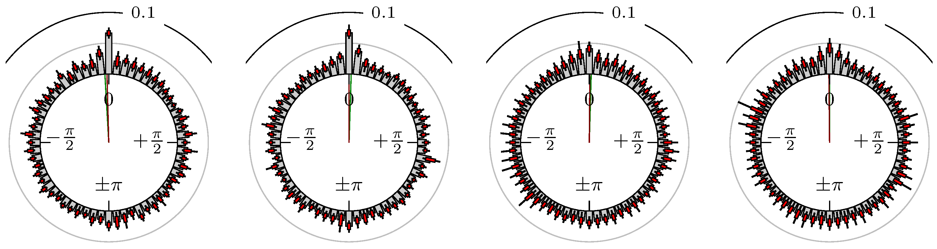
For the Swiss franc currency, it is more common to analyze USD-CHF instead of CHF-USD, as we do in the above discussion. The reason we focus on CHF-USD is to see the positive correlation to EUR-USD and thus to have a more natural interpretation for lead and lag as in Definition 1.
However, it is also possible to compare (strongly) negative correlated markets as EUR-USD versus USD-CHF. In Figure 23, we see the results for this combination. The results are expected to be the same as for the combination EUR-USD versus CHF-USD but shifted by π. A comparison of Figure 22 and Figure 23 shows this connection perfectly. This is also the case for the Japanese yen.
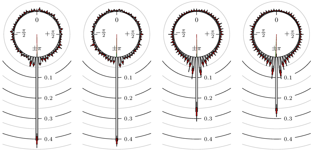
Figure 23.
EUR-USD versus USD-CHF (cf. Figure 22).
5. Conclusions
We introduced the notion of lead–lag relationship from a market technical point of view. Using the local extreme values of the markets, we get an empirical distribution of their phase shifts on the unit sphere. The directional statistics help us to illustrate and quantify the results.
Many strongly correlated pairs of markets are observed with respect to their extreme values, while, of course, there are combinations with a very weak connection. Combinations of indices show the highest correlation and also a measurable lead or lag. Since we use a geometrical approach based on the actual local extreme values of the chart, i.e., on some kind of reversal points, the results can directly be used for trading strategies. For instance, the period where the reversal points are recognized could be used as entry or exit signal of such a trading strategy.
This, however, was not the theme of this paper. Nevertheless, having designed such trading signals, it could be an interesting research approach to test the efficient market hypothesis (EMH) with such kind of signals. Clearly, this would be way beyond the tasks of this paper. Note that, although the EMH basically implies that one cannot make profits with ideas of technical analysis or quantitative methods in the long run, newer interpretations like the adaptive market hypothesis of Lo [30] concede the existence of pattern-like trends in real markets. With the observed lead–lag pattern here, this could be similar.
Further interesting research effort could be the localization using this method to shorter time intervals so that we obtain even more meaningful results for live/real time data.
Author Contributions
Stanislaus Maier-Paape and Andreas Platen contributed equally to this work.
Conflicts of Interest
The authors declare no conflict of interest.
References
- S. Dajčman. “Interdependence Between Some Major European Stock Markets–A Wavelet Lead/Lag Analysis.” Prague Econ. Pap. 22 (2013): 28–49. [Google Scholar] [CrossRef]
- F. In, and S. Kim. “The Hedge Ratio and the Empirical Relationship between the Stock and Futures Markets: A New Approach Using Wavelet Analysis.” J. Bus. 79 (2006): 799–820. [Google Scholar] [CrossRef]
- S. Kim, and F. In. “The relationship between stock returns and inflation: New evidence from wavelet analysis.” J. Empir. Financ. 12 (2005): 435–444. [Google Scholar] [CrossRef]
- J.B. Ramsey, and C. Lampart. “The Decomposition of Economic Relationships by Time Scale Using Wavelets: Expenditure and Income.” Stud. Nonlinear Dyn. Econ. 3 (1998): 23–42. [Google Scholar] [CrossRef]
- J.B. Ramsey, and C. Lampart. “Decomposition of Economic Relationships by Timescale using Wavelets.” Macroecon. Dyn. 2 (1998): 49–71. [Google Scholar]
- R. Gençay, F. Selçuk, and B. Whitcher. An Introduction to Wavelets and Other Filtering Methods in Finance and Economics. New York, NY, USA: Academic Press, 2001. [Google Scholar]
- K. Chan. “Imperfect Information and Cross-Autocorrelation Among Stock Prices.” J. Financ. 48 (1993): 1211–1230. [Google Scholar] [CrossRef]
- F. de Jong, and M.W.M. Donders. “Intraday Lead-Lag Relationships Between the Futures-, Options and Stock Market.” Rev. Financ. 1 (1998): 337–359. [Google Scholar] [CrossRef]
- F. de Jong, and T. Nijman. “High frequency analysis of lead–lag relationships between financial markets.” J. Empir. Financ. 4 (1997): 259–277. [Google Scholar] [CrossRef]
- B. Égert, and E. Kočenda. “Time-varying synchronization of European stock markets.” Empir. Econ. 40 (2011): 393–407. [Google Scholar] [CrossRef]
- R. Garcia, and G. Tsafack. “Dependence structure and extreme comovements in international equity and bond markets.” J. Bank. Financ. 35 (2011): 1954–1970. [Google Scholar] [CrossRef]
- T. Iwaisako. “Stock Index Autocorrelation and Cross-autocorrelations of Size-sorted Portfolios in the Japanese Market.” Hitotsubashi J. Econ. 48 (2007): 95–112. [Google Scholar]
- H.R. Stoll, and R.E. Whaley. “The Dynamics of Stock Index and Stock Index Futures Returns.” J. Financ. Quant. Anal. 25 (1990): 441–468. [Google Scholar] [CrossRef]
- D.Y. Kenett, T. Preis, G. Gur-Gershgoren, and E. Ben-Jacob. “Quantifying meta-correlations in financial markets.” EPL (Europhys. Lett.) 99 (2012): 38001. [Google Scholar] [CrossRef]
- B. Podobnik, and H.E. Stanley. “Detrended Cross-Correlation Analysis: A New Method for Analyzing Two Nonstationary Time Series.” Phys. Rev. Lett. 100 (2008): 084102. [Google Scholar] [CrossRef] [PubMed]
- P. Fiedor. “Information-theoretic approach to lead–lag effect on financial markets.” Eur. Phys. J. B 87 (2014): 168. [Google Scholar] [CrossRef]
- T. Aste, W. Shaw, and T. Di Matteo. “Correlation structure and dynamics in volatile markets.” New J. Phys. 12 (2010): 085009. [Google Scholar] [CrossRef]
- T. Didier, I. Love, and M.D.M. Pería. “What explains comovement in stock market returns during the 2007–2008 crisis? ” Int. J. Financ. & Econ. 17 (2012): 182–202. [Google Scholar]
- K.J. Forbes, and R. Rigobon. “No Contagion, Only Interdependence: Measuring Stock Market Comovements.” J. Financ. 57 (2002): 2223–2261. [Google Scholar] [CrossRef]
- J. Bollen, H. Mao, and X. Zeng. “Twitter mood predicts the stock market.” J. Comput. Sci. 2 (2011): 1–8. [Google Scholar] [CrossRef]
- H. Mao, S. Counts, and J. Bollen. “Predicting Financial Markets: Comparing Survey, News, Twitter and Search Engine Data.” Available online: http://arxiv.org/abs/1112.1051 (accessed on 5 December 2011).
- J.J. Murphy. Intermarket Analysis: Profiting from Global Market Relationships. Hoboken, NJ, USA: John Wiley & Sons, 2004. [Google Scholar]
- M.A. Ruggiero. Cybernetic Trading Strategies. Hoboken, NJ, USA: John Wiley & Sons, 1997. [Google Scholar]
- S. Maier-Paape. “Automatic One Two Three.” Quant. Financ. 15 (2015): 247–260. [Google Scholar] [CrossRef]
- G. Appel. Technical Analysis: Power Tools for Active Investors. Upper Saddle River, NJ, USA: Financial Times Prentice Hall, 2005. [Google Scholar]
- N.I. Fisher. Statistical Analysis of Circular Data. Cambridge, UK: Cambridge University Press, 1996. [Google Scholar]
- K.V. Mardia, and P.E. Jupp. Directional Statistics. Wiley Series in Probability and Statistics; Hoboken, NJ, USA: Wiley, 1999. [Google Scholar]
- J.H. Zar. Biostatistical Analysis, 5th ed. Upper Saddle River, NJ, USA: Pearson, 2010. [Google Scholar]
- P. Berens. “CircStat: A MATLAB Toolbox for Circular Statistics.” J. Stat. Softw. 31 (2009): 1–21. [Google Scholar] [CrossRef]
- A.W. Lo. “The Adaptive Markets Hypothesis.” J. Portf. Manag. 30 (2004): 15–29. [Google Scholar] [CrossRef]


© 2016 by the authors; licensee MDPI, Basel, Switzerland. This article is an open access article distributed under the terms and conditions of the Creative Commons Attribution (CC-BY) license (http://creativecommons.org/licenses/by/4.0/).