Article

Visual Analytics in Explaining Neural Networks with Neuron Clustering

Department of Computer Science, Rowan University, Glassboro, NJ 08028, USA
*
Author to whom correspondence should be addressed.
AI 2024, 5(2), 465-481; https://doi.org/10.3390/ai5020023
Submission received: 15 February 2024 / Revised: 28 March 2024 / Accepted: 1 April 2024 / Published: 5 April 2024
(This article belongs to the Special Issue Machine Learning for HCI: Cases, Trends and Challenges)

Abstract

:
Deep learning (DL) models have achieved state-of-the-art performance in many domains. The interpretation of their working mechanisms and decision-making process is essential because of their complex structure and black-box nature, especially for sensitive domains such as healthcare. Visual analytics (VA) combined with DL methods have been widely used to discover data insights, but they often encounter visual clutter (VC) issues. This study presents a compact neural network (NN) view design to reduce the visual clutter in explaining the DL model components for domain experts and end users. We utilized clustering algorithms to group hidden neurons based on their activation similarities. This design supports the overall and detailed view of the neuron clusters. We used a tabular healthcare dataset as a case study. The design for clustered results reduced visual clutter among neuron representations by 54% and connections by 88.7% and helped to observe similar neuron activations learned during the training process.

1. Introduction

With the advances in computational resources and technology, deep learning models have reached remarkable performance in various domains, such as image recognition [1], object detection [2], and natural language processing [3]. Deep learning applications such as automated diagnosis systems and autonomous vehicles reduce human efforts and errors in daily and sensitive tasks. However, neural networks (NNs), a popularly used DL method, are considered black-box models because of their complex architecture and topology. The black-box model refers to a system whose internal functioning or logic is uninterpretable [4]. Therefore, explanations of how black-box models work are essential for the understanding of the model. These explanations help domain experts, primarily those who work in sensitive domains such as medicine, and end-users to trust the model’s decisions.
An interactive visualization platform has been used by machine learning (ML) scientists to enhance the interpretation of the inner working mechanisms of NNs and reduce human efforts by visualizing training dynamics [5,6] and architecture [7,8] interactively [9]. Modern DL models have millions of parameters, including dozens of hidden layers and hundreds or even more neurons. Therefore, visualizing real-time training dynamics and architecture with layers and neurons leads to scalability issues and visual clutter [8,10]. Under limited human cognition, users may not follow the connections among data, nodes, and layers of a cluttered neural network. These scalability and visual clutter issues obstruct the interpretation and reasoning behind the working mechanism of the large-scale networks. Various approaches such as filtering, sampling, clustering, and edge bundling [11] were introduced to reduce visual clutter. However, clutter is often unavoidable when analyzing large-scale datasets when encountering the number of components and overlaps of edges and nodes on deep neural networks (DNNs).
This study presents a new visual platform (Figure 1) to explain DNN by reducing visual clutter using clustering algorithms. Clustering algorithms group hidden neurons based on their similarity using an averaged activation matrix. The new visual design interprets the data transmission from the input layer to the model prediction and highlights the clustered neurons. A tabular healthcare dataset is used as a case study to conduct the experiments. The main contributions of this study are as follows:
  • a clustering approach to resolve visual clutter problems in neural network architecture.
  • a new visual platform to interpret data flow in DNN.
Figure 1. The proposed visual analytics to explain deep neural networks with neuron clustering. (a) A color-coded input feature layer along with feature descriptions. (b) Network level view: Represents a deep neural network to observe feature contribution to the predictions. (c) Feature level view: A detailed view of activation-based clustered neurons with a circular design and feature and neuron weights as a vertically stacked bar chart.
Ai 05 00023 g001

2. Related Work

Visual analytics has served as a powerful tool to understand the behavior of deep learning models [12]. Visualizations can be used for architecture understanding by visualizing network components such as neurons and layers, feature analysis by highlighting feature contributions to the predictions, and performance comparison by using evaluation metrics. However, when dealing with high-dimensional data and DNNs with large numbers of hyperparameters, visual analytics systems suffer from visual scalability and cause visual clutter [13]. The clutter decreases the visual perception and information received by the visuals because of occlusion and messiness [14].
Many studies have been conducted to reduce visual clutter to reveal a more precise view of visualizing deep neural networks. We group these studies based on their decluttering approaches as follows: filtering, reduction operations, edge bundling, and clustering in Table 1. Studies have often adopted filtering [15,16,17,18] to address visual clutter challenges, as seen in Table 1. For example, Deepvix [15] filters the weight values based on a threshold value on connections between long short-term memory (LSTM) layers. Similarly, Summit [16] and ReVACNN [17] filter edges to reduce visual clutter caused by the number of channels/connections between layers. GNNVis [18] uses reduction operations to speed up the rendering of the graph neural networks by filtering out less relevant nodes, thus enhancing focus. Filtering is a process of displaying or emphasizing certain aspects of the data while suppressing other components. However, it can lead to a biased analysis depending on the filtering criteria selected by users or designers. Users/designers may cause a bias by selecting certain aspects of the data and ignoring others. Moreover, filtering weights/layers/neurons may exclude outliers from the VA and users may miss the opportunity to identify unusual network behaviors. To address the challenges of bias and overlooking outliers, dimensionality reduction (DR) operations, such as t-distributed stochastic neighbor embedding (t-SNE) [19], have been adopted. For example, Rauber et al. [20] used dimensionality reduction techniques to project activations of all hidden layers. DeepVID [21] uses t-SNE to project image data as a scatterplot so users can use lasso selection to access data and investigate the decision made by an NN. Similarly, ActiVis [7] has used t-SNE to group instance subsets based on their activation similarities. In ActiVis [7], users can select a certain group of instances on projection view to examine them in detail. However, dimensionality reduction techniques have also had a limitation in terms of the number of points to visualize, especially for large numbers of activations for deep NNs [13]. Dimensionality reduction operations can still cause occlusions and overlaps on points and can be visually distracting for users. To overcome the disadvantages of DR techniques, Rauber et al. [20] utilized a bundling algorithm [22] to support the activations projection view by obtaining bundled images. Similarly, Cantareira et al. [23] used a similar but modified bundling algorithm used by Rauber et al. [20] to group similar trajectories. Since edge bundling still hinders the relationships in the bundle and makes it impossible to distinguish multiple merged edges, Cantareira et al. [23] add control points to the algorithm to follow the directions of activations over the training time. Recently, clustering algorithms have become popular in visualizing dense networks to reduce screen space constraints and reveal patterns on large networks. For example, Cakmak et al. [24] applied a hierarchical density-based spatial clustering algorithm [25] to reduce VC in visualizing long sequences of dynamic graphs. The clustering algorithm grouped and arranged similar features in pixel-based visualizations to reveal the temporal patterns. Wu et al. [26] and Liu et al. [9] utilized k-means [27] to remove occlusion in visualizing neuron activations. Similarly, Wongsuphasawat et al. [28] presented a clustered graph by grouping nodes based on their hierarchical structures and utilized an edge bundling algorithm to support it. Liu et al. [5] proposed a visual analytics tool called CNNVis that adopts both clustering and edge bundling algorithms to present an uncluttered view of the training dynamics of convolutional neural networks (CNNs) formulated as directed acyclic graphs. Clustering algorithms can better preserve data points/neurons/layers based on their similarities than filtering and sampling [29]. Since many clustering algorithms are robust to noise and outliers in the data, users will be able to identify unusual cases without losing any information. Moreover, clustering will help in interpreting data and understanding the underlying patterns.
Aside from common decluttering techniques, there are other customized decluttering approaches. For example, Bellgardt et al. [30] used immersive virtual reality (VR) to reduce visual clutter by adding a third dimension and showing only the edges connected to the selected node by a user in visualizing NNs as a node-link diagram. Ji et al. [31] developed a tool, USEVis, for attention-based networks and used weight thresholds to eliminate clutter and highlight the most important attention. Shen et al. [29] also created customized sampling stripes to reduce visual clutter in visualizing the classification results of DNNs.
Table 1. A comprehensive comparison between visual analytics tools.
StudiesVisual ClutterInteractionsPurpose of Explanation
FilteringReduction OperationsBundlingClusteringOthers
Deepvix [15]X F, H, DMAA, PA
Summit [16]X C, HAA
ReVACNN [17]X F, DMAA, PA
Rauber et al. [20] XX C, FFA
CNNVis [8] XX DMAA, FA
Wu et al. [26] X X DMPA, FA
Activis [7] X DMAA, FA
TensorFlow PlayGround [32] A, DMFA, PA
TensorBoard [33]X Node Expansion CAA, PA
Bellgardt et al. [30]X 3D in VRCAA, PA
DeepVID [21] X CFA
USEVis [31]X ThresholdsC, F, DMFA
Shen et al. [29] X C, FFA
Chae et al. [12] Stripes designCFA, PA
Our VA tool XCircular designC, HAA, FA
Interactions: H: Highlight, F: Filter, C: Controls, DM: Direct Manipulation, A: Animation. Explanation Type: AA: Architecture Analysis/Understanding, PA: Performance Analysis, FA: Feature Analysis/Selection.
Previous VA work mainly focused on reducing visual clutter in CNNs [7,8,12,16,18,21,26] and recurrent neural networks (RNNs) [15,29] due to their popularity in computer vision and large language model tasks and their intuitively interpretable structure. CNNs are structured hierarchically and can capture spatial relationships in images or videos. Similarly, RNNs have recurrent connections and are specialized, particularly for sequence data such as audio or natural language processing tasks. Although most real-world datasets are tabular, their dedicated DL model, deep neural networks, are often neglected in interpretation and visualizations due to their complexity and depth in terms of the number of hidden layers and neurons. Moreover, the interpretation of DNNs is harder in terms of how each layer captures and transmits the information since the structure of DNNs lacks spatial or temporal structure. To close the research gap, TensorBoard [33], developed by Google researchers, helps users inspect the structure of large NNs using zoom-in/-out and node expansion options. The system focuses on a conceptual graph of users’ model design [33] rather than displaying the inner dynamics (i.e., weights, bias, etc.) of the network. Therefore, TensorBoard does not use a clustering algorithm to group neurons/layers to reduce visual clutter. Similarly, TensorFlow PlayGround [32], a well-known platform, is developed for users to explore the behavior of NNs and modify the hyperparameters (such as the number of layers and neurons) of NNs. The platform has a limitation in terms of the maximum number of hidden layers and neurons. It is designed for educational purposes and is suitable for two abstract real-valued features [32]. However, the platform ignores decluttering for possible cluttering and overlapping happens when users increase the number of hidden layers and neurons. Unlike other studies, we aim to close the research gap by focusing on understanding deep neural networks, known as fully connected neural networks, using visualization for their inner dynamics. Considering the disadvantages of filtering, such as biased analysis and overlooking outliers/unusual events, and the disadvantages of DR techniques, such as the limitation of usability in terms of the number of points to be visualized [13], we chose clustering algorithms to reduce visual clutter in visualizing intermediate layers and their components. Unlike TensorFlow PlayGround [32], our proposed tool does not have any limitations in terms of the number of hidden layers and neurons since we adopt clustering to reduce clutter. Moreover, we included inner dynamics such as weights and activations. Users can analyze any NN architecture with the proposed tool without facing the limitation of the number of layers and neurons. While TensorFlow PlayGround [32] is designed for two abstract real-valued features, our tool can also support any high-dimensional tabular data. Further, we support decluttering with a unique circular design for neuron representation grouped by clustering algorithm based on their activation similarities. Activation-based clustered neurons will help users to follow the information flow from the input layer to the other layers and increase the interpretation of how NNs transmit data and make predictions. Additionally, we propose a compact view to provide detailed information on inner dynamics. Thus, the cognitive load of users and inspecting time can also be reduced; therefore, they may gain a better understanding of NN.
With the increase in concerns about black-box models, the usage of explainable artificial intelligence (XAI) models has increased [21,34,35,36]. For example, DeepVID [21] uses the Local Interpretable Model-Agnostic Explanations LIME [37] method, one of the most popular XAI techniques, to obtain feature contributions and reflects these values over the image by highlighting pixels based on these contribution scores to explain NNs locally. Similarly, Wu et al. [26] also incorporated the LIME method in their VA to support instance-based explanations. XAI techniques are commonly used for instance-based explanations [21,34,36]. Most of the studies focus on feature importance [21,34] by highlighting the most important pixels on images using popular XAI methods such as Saliency maps [38], Grad-CAM [39], and rule-based explanations [40,41,42] by generating logical expressions using rule extraction techniques. XAI methods focus on analyzing the behavior and decision-making process of DNNs rather than understanding the model architecture itself [43]. While XAI methods offer valuable insights into specific aspects of black-box models, unlike our proposed tool, they will not provide a complete visualization of NNs with their layers, neurons, and model parameters. Our tool provides a visualization of the architecture itself with averaged activations using a customized design and weights between layers. With global (network-level view) and local (feature-level view) views in our design, we support our users in investigating and analyzing the behavior of NNs.

3. The Proposed Tool

This section covers the design challenges often encountered by ML researchers and design goals to resolve these challenges through our proposed tool.

3.1. Design Challenges

To properly design an interactive visual analytics tool for explaining neural networks, we focused on the following design challenges (DCs) based on the related literature [7,16,43,44,45].
DC 1: Complex model architecture. Recent DNNs contain dozens of layers and hundreds of neurons. Because of the black-box nature of NNs, their internal functioning, computational operations among layers, and decision-making mechanisms are opaque. To open the black box, visualizing many components of NNs from general structure (e.g., layers, neurons) to individual units (e.g., activations), particularly on how data features contribute to classification results, is required, especially for end-users and domain experts who may be inexperienced in ML.
DC 2: Visual clutter and scalability. Visually explaining modern NNs leads to visual clutter and scalability issues because of the massive number of elements in DNNs. Visualizing high-volume layers, connections between them, and other computational units such as weights in a limited screen space cause clutter and obstruct the perception. The challenge in providing scalable visualization is the trade-off between preserving meaningful information while reducing visual clutter.
DC 3: Underrepresented data domains. While VA tools often adopt image and text data in explaining DNNs [1,6,7,8], the tabular data domain is underrepresented, covering most real-world data. In addition, dealing with tabular data in explaining NNs brings other challenges: representations of learned features, different feature formats, and missing/sparse values.

3.2. Design Goals

Based on the design challenges, we summarized our design goals (DGs) as follows:
DG 1: Presenting a compact architecture view by reducing the clutter. Presenting information in a compact view will reduce the overwhelming for users. Since DNNs have many layers and neurons (DC 1), we aim to provide a new compact view by displaying neurons and layers, where a clustering algorithm is used to reduce the visual clutter (DC 2) among neurons.
DG 2: Interpret tabular data features in NN decision. Explaining tabular data is relatively challenging compared to other domains, e.g., image data, since they are readily interpretable. We aim to use tabular data in our design as a case study (DC 3). We will focus on illustrating how data features contribute to the generation of each neuron along with classification results using various visual interactions.

4. Methodology

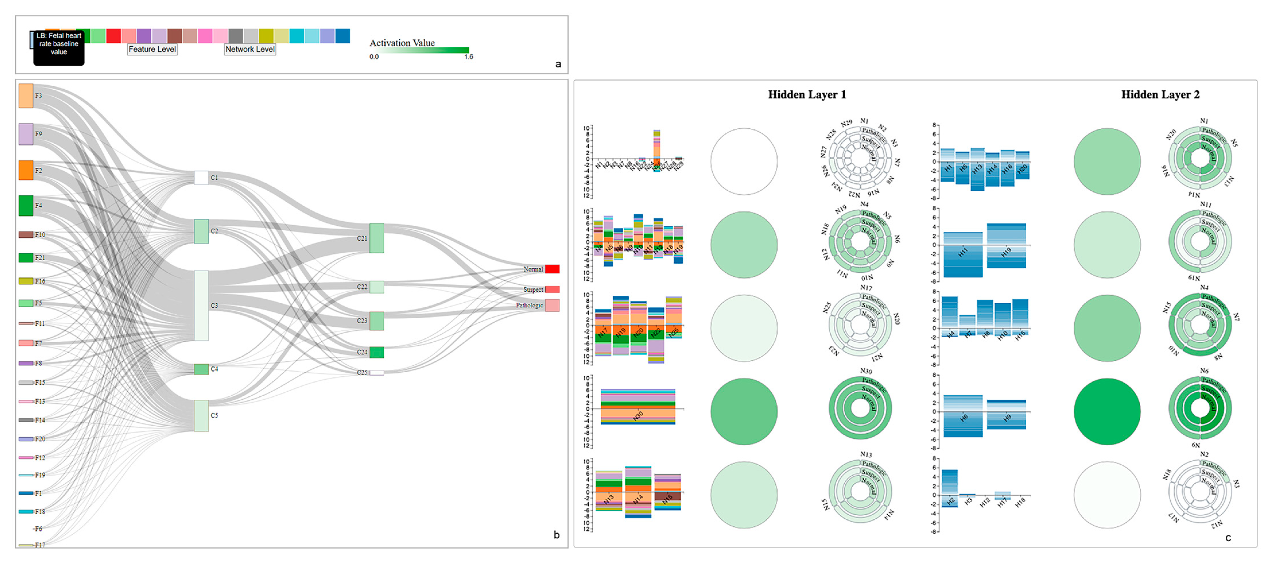
4.1. Use Case: CTG Dataset

In the experiments, we used the Cardiotocography (CTG) dataset retrieved from the UCI Machine Learning repository [46]. Cardiotocography is used to evaluate the health of fetal by recording the fetal heart rate (FHR) of the baby and uterine contractions of the mother during pregnancy [47]. The dataset is generated using the SisPorto system [48] that conveys digital signals from a fetal monitor. CTGs are evaluated by obstetricians using FHR patterns. Accurate diagnosis and distinguishing normal and abnormal patterns are critical to prevent diseases such as cerebral palsy and neurodevelopmental disability [49]. To reduce human effort and error in the interpretation of CTGs, machine learning approaches have often been utilized to assist in diagnosis.
The dataset contains 2126 fetal CTG records and 21 features that were processed from cardiotocographic signals. The CTGs are also classified by three expert obstetricians and a consensus classification label is assigned to each of them. The experiments can be conducted using both 10-classes morphologic patterns or 3-classes fetal state. The data has 1655 instances for the normal class, 295 instances for the suspect class, and 176 instances for the pathologic class.

4.2. Model Selection

The dataset went through cleaning, training-testing, and cross-validation process. With grid search, the ReLu activation function and Adam optimizer are selected. The learning rate is set to adaptive. K-fold cross-validation, in which k is 10, is utilized to remove the randomness by dividing the dataset randomly into 80% for training and 20% for testing. After the experiments and grid search, we selected a 4-layered NN architecture based on the accuracy score. The selected NN architecture has 30 and 20 neurons in the hidden layers. The best accuracy score is 0.88. All experiments are conducted using Python and all visualizations are created using D3 [50], a JavaScript library.

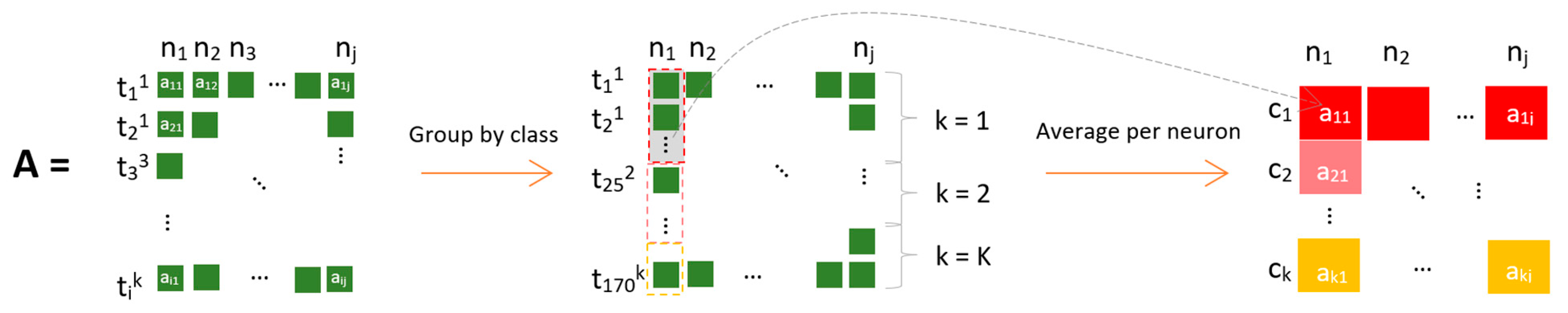
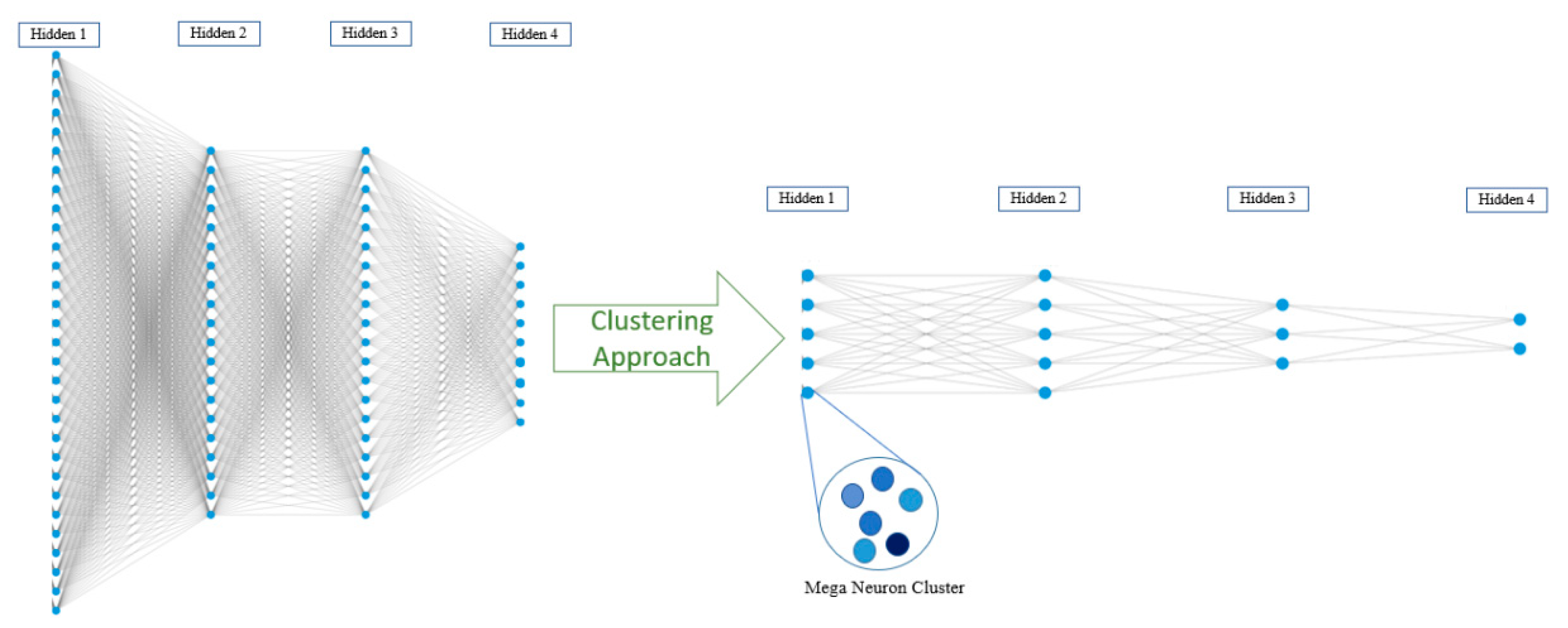
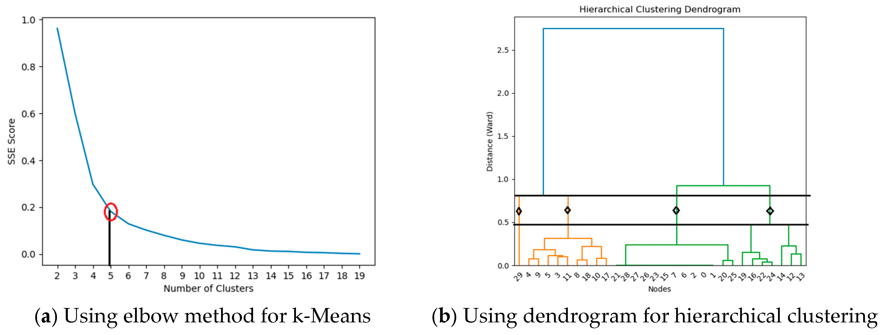
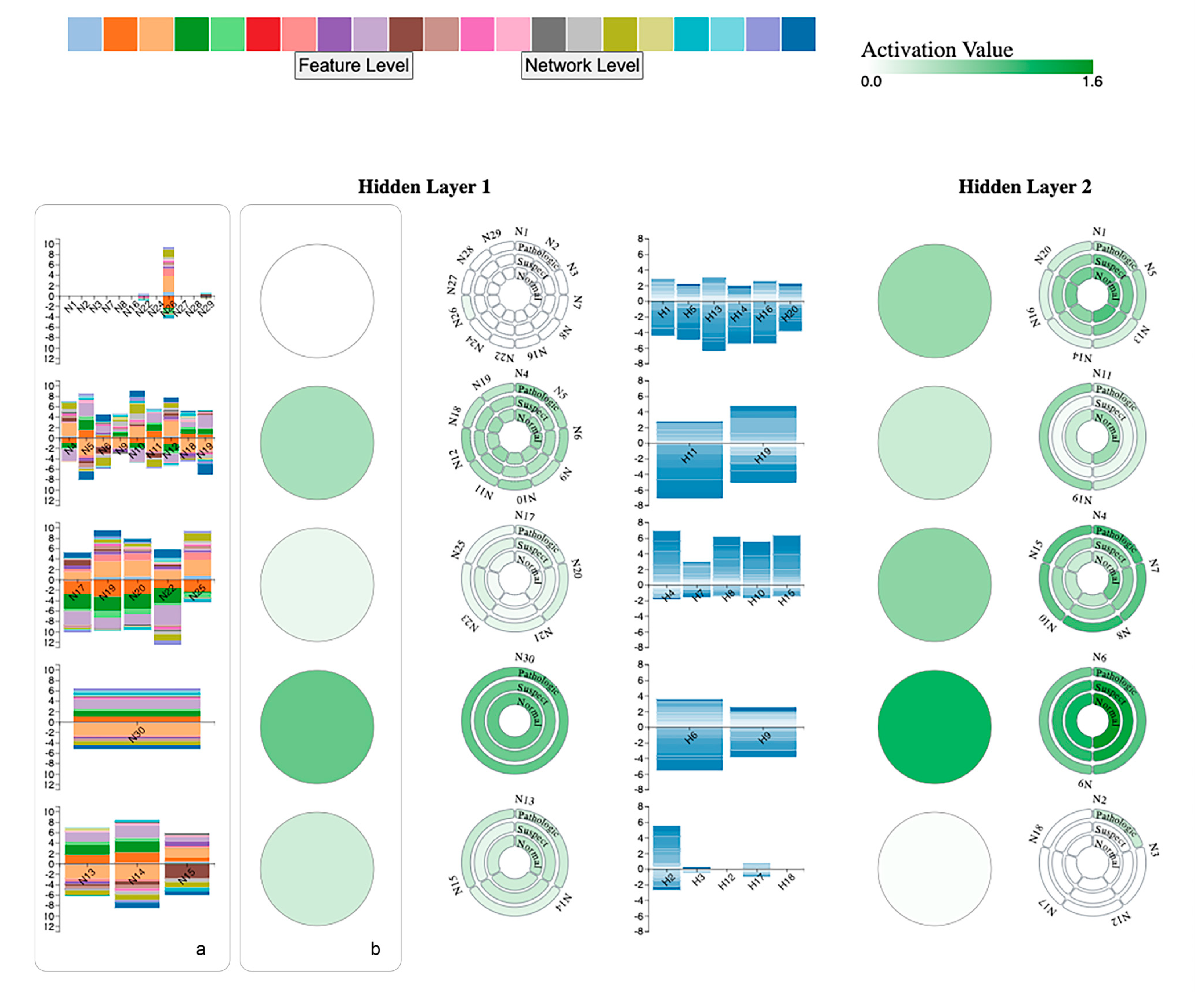
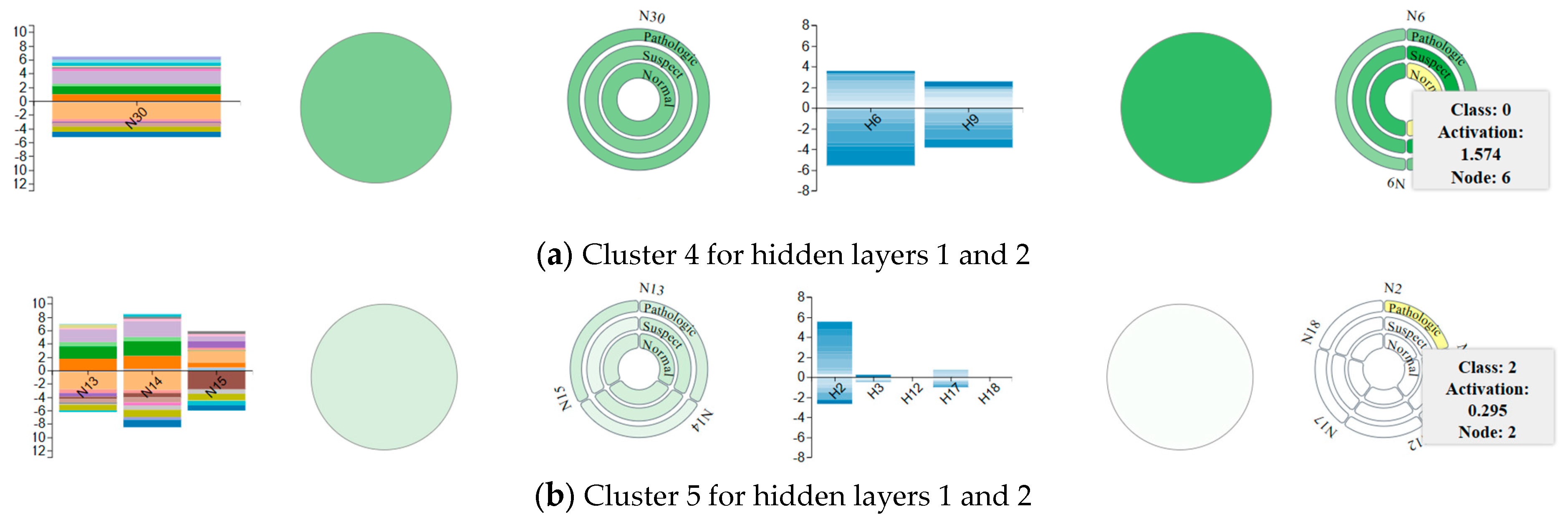
4.3. Neuron Clustering Approach and Results

In the process of explaining how an NN makes predictions, the focus is often on understanding the changes in activation values across neurons during training. Activation functions transmit information through layers, and higher activation values generally indicate greater neural activity. In this context, we propose a method to extract and store the activation values for each neuron. Given that the number of neurons and activations can be substantial, reaching hundreds or more, we suggest calculating the average activation values per neuron for each class to address the challenge of high dimensionality.
Suppose we have an activation matrix (A), as shown in Figure 2, where nj (columns) indicates the jth neuron at the hidden layer, tik (rows) indicates the number of training instances in class k (ck), and aij is the activation value of ith training instance of jth neuron. Initially, we have an activation matrix A with dimensions I·J activation matrix where I indicate the number of training instances and J indicates the number of hidden neurons at the hidden layers. To reduce the dimension of the activation matrix, we create a subset Tk of training instances belonging to ck. For a specific class ck, Tk represents a set of indices of training instances that belong to class ck. For example, T1 = {i | instance i belongs to class ck} = {t11, t21, t31, …, tI1}. After this, we calculate the average value of each activation group per class to obtain one averaged activation value using the following equation:
Averaged   Activation   Value kj   = 1 T k Σ i T k A i j ˙
Thus, we obtain a new averaged activation matrix to be used in clustering experiments with a size of Ak·j where k is the number of classes in a dataset. The averaged activation matrix allows us to obtain a summarized representation of activation by reducing the dimensionality from the original I·J to K·J. By applying the neuron clustering approach, we aim to reduce visual clutter among neurons and link representations by gathering clustered neurons into mega neurons.
Figure 3 illustrates an example of reducing clutter in both neurons and connection levels by creating mega clusters for 4-layered NN. The mega neurons concept will contribute to reducing visual clutter along with grouping similarly activated neurons. End-users will observe and analyze mega neurons to understand a group of activations of neurons such as highly activated neurons vs. dead neurons.
We utilized various clustering algorithms to cluster neurons using an averaged activation matrix based on their similarities. These algorithms include k-means [27], mean shift [51], and hierarchical clustering [52]. The mean shift algorithm does not require a pre-defined number of clusters. The number of clusters for k-means and hierarchical clustering are chosen with experiments. We calculated the number of clusters for k-means based on the sum of the squared distance between the centroid and each cluster member, defined as the sum of squares error (SSE). Figure 4a depicts the selection of number of clusters for the first hidden layer using the elbow method. The elbow method helps us select the best cluster number based on the angle form on the line among SSE scores. We used a dendrogram with ward distance metric [53] to select the number of clusters for hierarchical clustering. Figure 4b displays a dendrogram for the first hidden layer along with ward distance and clusters. The height of the dendrogram indicates the distance between clusters. The number of clusters is determined as four for the first hidden layer for hierarchical clustering. We selected the number of clusters as five in k-means based on SSE score for the first hidden layer.
Since the knowledge of the ground truth clusters is unknown for neurons, we used the Silhouette, Davies Bouldin (DB), and Calinski Harabasz (CH) performance evaluation metrics [54]. The clustering results, the number of clusters for the second hidden layer, and performance metrics are shown in Table 2.
The best scores are shown in bold in the table. Table 2 shows that mean shift and k-means algorithms performed better than hierarchical clustering algorithms in neuron clustering for both hidden layers. Hierarchical clustering has lower scores for silhouette and CH performance evaluation metrics that require higher values, while k-means has the highest scores on these metrics for both hidden layers. Similarly, the mean shift has the best DB scores that require one to have a minimum value, while hierarchical clustering has the worst score on the DB metric. Even though mean shift has better performance on DB score than k-means and hierarchical clustering, the detailed investigation of the mean shift clustering results indicates that most neurons agglomerate into one cluster. The variability of activation values on the clusters indicates that similarly acted neurons are not represented well with the mean shift algorithm. Therefore, we eliminated the use of mean shift in our visual design. Likewise, the hierarchical clustering method has poor performance because it has the worst performance scores on DB and CH metrics. Therefore, we adopted k-means in our visual design based on performance metrics since it performed well with at least two performance metrics for each hidden layer neuron clustering. According to the elbow method, we have selected five clusters (mega neurons) for k-means at each hidden layer.

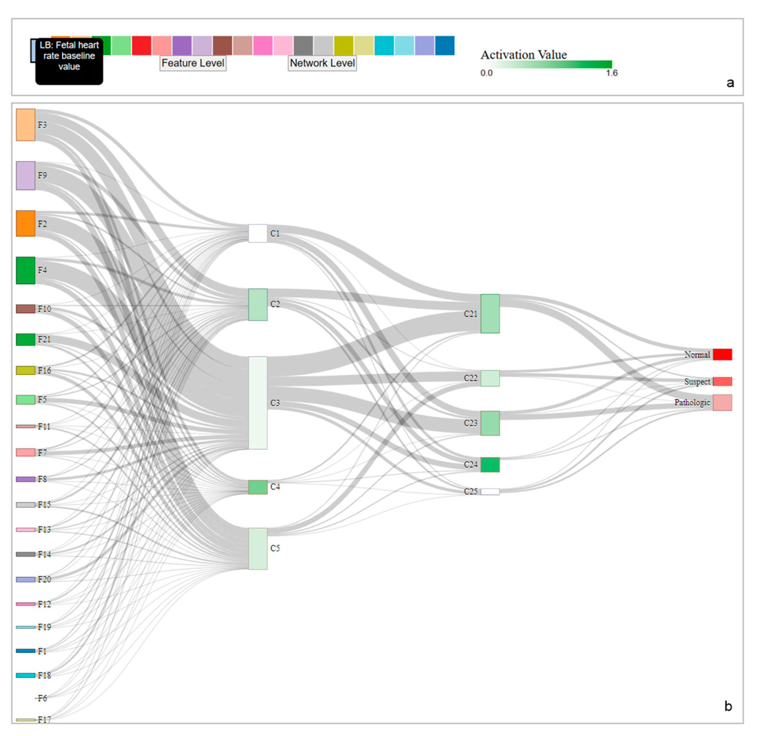
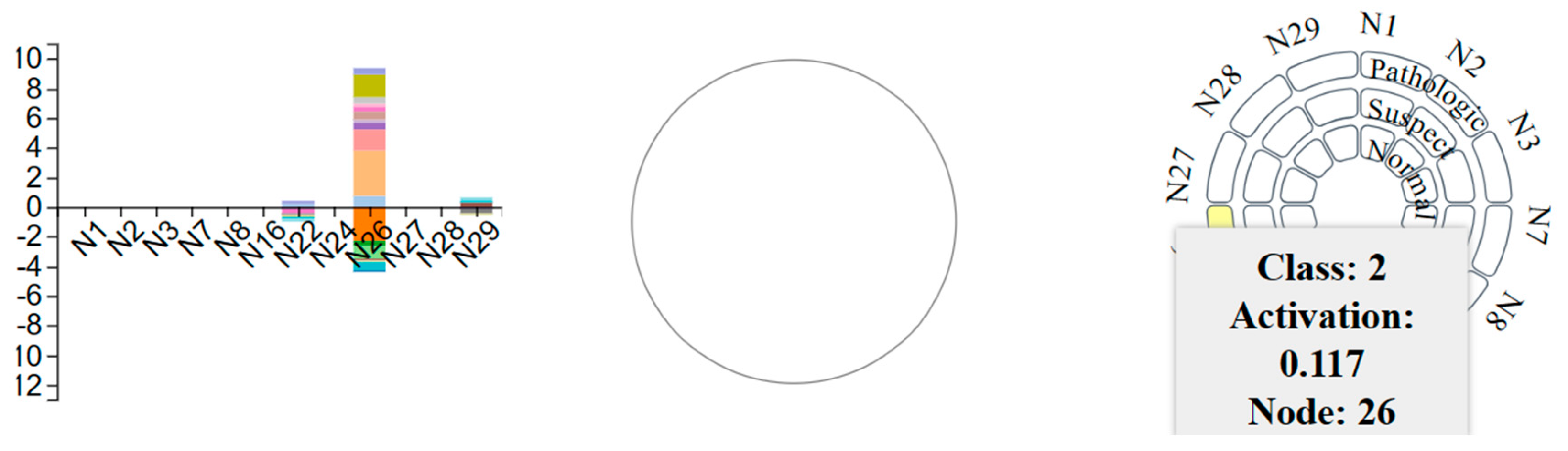
4.4. Visualization Overview and Usage Scenario

We have designed a visualization that has feature and network level views to support detailed and overall analysis. The network level includes a Sankey diagram (Figure 5a) that represents a whole NN architecture with clustered neurons. Connections between the Sankey diagram’s nodes represent model weights between layers. The width of links corresponds to the magnitude of weight between nodes. Sankey diagram helps users to identify the magnitude of weights among neurons as well as analyze the dynamics of the network, such as the distribution of weights from the input layer to the output layer.
Each feature in the dataset is encoded as F#, where # indicates the number of the feature in the CTG dataset. Detailed explanations of the feature set can be found in the UCI ML repository [46]. Since the width indicates the magnitude of weights, for example, feature 6 in the input layer, F6—severe decelerations per second—have the lightest connections with hidden layer 1, showing that F6 has less contribution to the model predictions. On the other hand, F2, accelerations per second, F3, fetal movements per second, F4, uterine contractions per second, and F9, the mean value of short-term variability has a thicker connection with hidden layer 1. These features have contributed more to the model predictions, as stated in [55]. Uterine contractions (F4) are especially important during pregnancy to monitor the fetus’ and mother’s wellbeing. Similar findings are stated in the literature [55].
The Sankey diagram is created using the breadth-first search method. We allow dragging of the nodes of Sankey diagrams so domain experts and end-users can modify the order of the input layer to group them based on their weights (Figure 6). Since the tool was designed for tabular data, we incorporated data features (input layer) as colored bars with definitions in a tooltip (Figure 5b). The input layer has categorical colors, each representing an individual data feature, as seen in the first layer of the Sankey diagram (Figure 5a). The color density on each mega neuron, represented as rectangles in the Sankey diagram, indicates neural activity within the cluster. The color legend of activation color scales from white to green based on their magnitude; white represents the lowest activation value, and green represents the highest amount of activation (Figure 5a). The color density on the output layer corresponds to the size of each class. For example, the normal class has 1655 instances and is represented with bold red, and the pathologic class has 176 instances and is represented with the lightest red. Along with seeing the architecture itself, users can also have insight into the dataset in terms of feature weights by highlighting the connections between layers and the size of the output class.
Users can access the feature level view by clicking the ‘feature level’ button at the input layer legend. Feature level view (Figure 7) provides a detailed view of feature weights for each neuron per cluster. We visualized feature weights as a stacked vertical bar chart (Figure 7a) with feature colors for each cluster. The vertical axis indicates the weight values of each feature per neuron, and the horizontal axis shows the corresponding neurons within each mega neuron. The height of each box indicates the weight value, positive and negative, based on the position on the vertical axis. The second stacked vertical bar chart shows the weights between hidden layers. The color indicates the magnitude of the weights.
Based on k-means clustering results, we have five clusters at each hidden layer. Users can access the detailed view of mega neurons, as seen in Figure 7b, by clicking on any mega cluster to view a custom circular design. The feature level view displays the training dynamics (weights and activations) and the representation of the intermediate layer.
Figure 8 shows the detailed view of cluster 1 at the first hidden layer. The detailed view includes a custom design created to show each individual neuron in a cluster. The layered circles indicate the total number of classes. Since the CTG dataset has three classes, the clustered neuron design consists of 3-layered circles (Figure 8), normal, suspect, and pathologic classes. The color indicates the range of activation values. While the mega neuron has a white color, which indicates near zero activations, when we click it, we can see a detailed view and analyze each individual neuron by selecting and viewing detailed information on the tooltip. Supported by feature weights, we can observe that highlighted neuron 26 has a 0.117 activation value for the pathologic class, and other neurons have zero activations, which indicates they will not pass the information to the next layers and do not contribute to the learning process.
Figure 9 compares mega neurons (cluster) 4 and 5 for both hidden layers. As seen in Figure 9a, cluster 4 at the first hidden layer includes only one neuron (neuron 30), and at the second hidden layer, it has two neurons (neurons 9 and 6). For both layers, it has highly activated neurons, as seen in normal class neuron 6, which has a 1.574 activation value. We can say that N30 can pass the information to the next layers with high activation values and contribution to make predictions. As seen in a stacked bar chart, F2, F3, F4, and F4 (based on color legend) have higher weights compared to other features. Cluster 5 (Figure 9b) has three and five neurons at hidden layer 1 and 2, respectively. Cluster 5 has slightly fewer activations compared to Cluster 4, and the amount of activation reduces at the second hidden layer. For example, the activation value of neuron 2 at the pathologic class is 0.295. We observe that similar color density grouped together, which means the clustering algorithm performed well to present similar activations. We provide highlighting, zoom-in, and zoom-out features to add user interaction to the design. Thus, users can perform zoom-in or -out features to see the overall view or access the detailed view.

5. Discussion

We presented a visualization tool that adopts a clustering algorithm, i.e., k-means, and a unique circular design to support reducing visual clutter. After a grid search for NN hyperparameters and experiments to decide the number of hidden layers and neurons, we chose the best-performing architecture, which has input layer with 21 features (nodes), two hidden layers with 30 and 20 neurons, and an output layer with 3 classes (nodes). The total number of nodes on the selected architecture is 74, and there are 1290 edges between layers. With the usage of k-means, we reduced the number of hidden neurons from 30 and 20 to 5 mega neurons. The total number of nodes is reduced from 74 to 34 with a decrease of 54%, and, indirectly the total number of edges within layers is reduced from 1290 to 145, with a decrease of 88.7%. Even though we present mega neurons, we also allow users to access detailed views of each neuron with a unique design that reduces the clutter. We also eliminate the disadvantages of other cluttering approaches, such as information loss, by keeping the actual hidden neurons with their actual activation values. The detailed and global view will help users to understand the behavior of NNs by observing the information flow with weights. Color-coded mega neurons will also ease the process of understanding active and dead neurons that contribute to the decision-making process of networks. Based on the idea of dead neurons, machine learning practitioners may redesign their models, reducing the number of neurons. We summarized the discussion in three parts as follows: scalability and clutter, efficacy of the proposed tool, and the limitations.
Scalability and clutter: This study focuses on reducing the visual clutter among neuron representations in neural network visualization. To explain neural networks visually, we worked on a common issue in the visual analytics field: visual clutter. We utilized clustering algorithms to group neurons based on the similarity of their activation values. We used a tabular healthcare dataset to train the deep neural network and evaluate its components with a use-case scenario. We extracted activations after the training process and created an averaged activation matrix by calculating average activation values per class. The averaged matrix can help eliminate the disadvantages of high-dimensional data by obtaining class-level activations. We evaluated the three commonly used clustering algorithms, k-means, mean-shift, and hierarchical clustering, to adopt in our tool. We used three performance metrics: Silhouette score, Davies Bouldin, and Calinski Harabasz score. According to the performance evaluation, the hierarchical clustering method fails to provide good results and k-means outperformed other clustering algorithms in at least two performance metrics. Using the elbow method, we chose the number of clusters for each hidden layer, which was five. The results indicated that k-means clustered neurons well by grouping them based on their activation similarities. We represented clusters as mega neurons that contain each neuron in the cluster. Mega neuron representation has reduced the clutter at each hidden layer. Diminishing the number of neurons in smaller mega neurons also reduces edge clutter among layers. We allow users to access details of mega neurons with interactions. Our unique clustered neuron design delivers all information in a compact view without overwhelming the end-users. The color density allows users to follow highly activated neurons and dead neurons that do not contribute to the learning process. We also represent input features as colored bars by providing their definitions in a tooltip.
Efficacy: This study uses a tabular healthcare dataset to conduct a use-case scenario. We aim to visualize activation values on the learning process that shows how the information is transmitted from layer to layer. After the training process, we obtained weights and other computational units (e.g., activations). This design shows the variation of activation values among neurons. Users can observe activated and deactivated neurons at each layer by color density. We observed that the first hidden layer contains more deactivated neurons than the second. Also, cluster 4 in the second hidden layer has higher activation values. This finding justifies that each layer learns and identifies more complex features to predict the output. Therefore, the contribution of neurons in the second layer to the output layer is higher. This design provides insights into the activation of neural networks. This system follows the organizing principle of visualization design as follows: overview first, zoom and filter, and detail-on-demand views. The use-case scenario shows the efficacy of the system by analyzing components of the neural network for tabular data. We overview the entire architecture first. Then, using interactions, we access detail-on-demand views that display individual activations and feature weights. This design will reduce visual clutter with a clustering algorithm and unique circular design and help open the black-box models. In a feature-level view, we also provided feature weights as a color-coded vertical stacked bar chart between input layer and first hidden layer, and weights between first and second hidden layer, as well. Even at first glance, users will be able to identify the most contributed features to the prediction by using bar chart heights. These findings are also justified with the other related work [40], in terms of the healthcare data domain.
Limitations: The proposed design is developed for domain experts and end-users to understand the behavior of neural networks with network-level and feature-level views. This design supports the visualization of the inner dynamics, i.e., activation values and weights, of the network. However, other computational units, such as gradients and parameters, can be integrated to understand the behavior of neural networks, especially for data scientists and machine learning experts. While reducing clutter among neurons and edges (indirectly) with clustering algorithms is the main contribution, adopting an edge bundling algorithm will eliminate the limitation of overlapping edges. Another limitation is that the proposed visualization tool is evaluated solely based on a use-case scenario within the healthcare domain. To mitigate this limitation, future work will focus on designing users’ studies to increase the validation of our tool. With user studies, we will obtain feedback in terms of the usability of the tool, demonstrate the efficiency in terms of learned insights, and improve the design based on user requirements and evaluations. The current use-case scenario contains a small number of features that are easily visualized as input layers. When the dimensionality of datasets increases, there is no limitation on the volume of data, providing each feature may cause clutter. Therefore, users may want to visualize the most important features. This limitation can be resolved in future work by adding feature selection/feature importance techniques in the current design. Increasing the interactions, such as allowing direct manipulation, will also eliminate another limitation which is real-time parameter modification.

6. Conclusions

We introduced a visual design to support the interpretation of neural networks through their computational units. We utilized clustering algorithms to group hidden neurons based on their activation similarities to reduce visual clutter, a common issue in the visualization of NN. We defined mega neurons representing clustered neurons based on the best-performing clustering method, i.e., k-means. Visualizing neural network architecture with mega neurons as a compact view has reduced the visual clutter. To access the detailed activation values of each neuron, we provided interactions for users. This system allows us to interpret the neurons based on their activation status: activated or deactivated. We also observed that later layers contribute to the prediction higher since they learn more complex features gradually. With color-coded feature weight visualization, we identified features that have higher importance. These results were justified by the related work.
Future work should focus on mitigating the limitations of this study to improve the design and present more components of the neural network. We will focus on including other components, i.e., gradients and feature importance. Future work will also aim to increase interactions and allow direct manipulations so users will be able to change parameters and observe the changes in predictions. Direct manipulation will also support identifying the most contributed features. Users may remove features one by one until the prediction for one class changes. The proposed visualization tool will be tested using high-dimensional tabular datasets and deep neural networks to examine its scalability. In future work, we also aim to conduct user studies with machine learning scientists and domain experts to improve the design and its functions and receive feedback about the usability of the tool. In addition, future work will focus on utilizing comprehensive artificial intelligence techniques in the VA system to explain black-box models mathematically and visually.

Author Contributions

Conceptualization, B.S. and G.A.; Data curation, B.S.; Formal analysis, B.S. and G.A.; Funding acquisition, B.S.; Investigation, B.S. and G.A.; Methodology, G.A. and B.S.; Project administration, B.S.; Resources: B.S., Software, G.A.; Supervision, B.S., Validation, B.S. and G.A.; Visualization, G.A. and B.S.; Writing—original draft preparation, G.A.; Writing—review and editing, B.S. and G.A.; All authors have read and agreed to the published version of the manuscript.

Funding

This research received no external funding.

Institutional Review Board Statement

Not applicable.

Informed Consent Statement

Not applicable.

Data Availability Statement

CTG dataset is retrieved from: UC Irvine Machine Learning Repository. Available online: https://archive.ics.uci.edu/dataset/193/cardiotocography (accessed on 13 January 2024).

Conflicts of Interest

The authors declare no conflicts of interest.

References

  1. He, K.; Zhang, X.; Ren, S.; Sun, J. Deep residual learning for image recognition. In Proceedings of the 2016 IEEE Conference on Computer Vision and Pattern Recognition (CVPR), Las Vegas, NV, USA, 12 December 2016; pp. 770–778. [Google Scholar] [CrossRef]
  2. Pathak, A.R.; Pandey, M.; Rautaray, S. Application of Deep Learning for Object Detection. Procedia Comput. Sci. 2018, 132, 1706–1717. [Google Scholar] [CrossRef]
  3. Collobert, R.; Weston, J. A unified architecture for natural language processing. In Proceedings of the 25th International Conference on Machine Learning, New York, NY, USA, 5–9 July 2008; pp. 160–167. [Google Scholar] [CrossRef]
  4. Das, A.; Rad, P. Opportunities and Challenges in Explainable Artificial Intelligence (XAI): A Survey. arXiv 2020. [Google Scholar] [CrossRef]
  5. Liu, M.; Shi, J.; Cao, K.; Zhu, J.; Liu, S. Analyzing the Training Processes of Deep Generative Models. IEEE Trans. Vis. Comput. Graph. 2018, 24, 77–87. [Google Scholar] [CrossRef] [PubMed]
  6. Liu, D.; Cui, W.; Jin, K.; Guo, Y.; Qu, H. DeepTracker: Visualizing the training process of convolutional neural networks. ACM Trans. Intell. Syst. Technol. 2018, 10, 6. [Google Scholar] [CrossRef]
  7. Kahng, M.; Andrews, P.Y.; Kalro, A.; Chau, D.H.P. ActiVis: Visual Exploration of Industry-Scale Deep Neural Network Models. IEEE Trans. Vis. Comput. Graph. 2018, 24, 88–97. [Google Scholar] [CrossRef] [PubMed]
  8. Liu, M.; Shi, J.; Li, Z.; Li, C.; Zhu, J.; Liu, S. Towards Better Analysis of Deep Convolutional Neural Networks. IEEE Trans. Vis. Comput. Graph. 2017, 23, 91–100. [Google Scholar] [CrossRef] [PubMed]
  9. Sun, B. Use of Visual Analytics (VA) in Explainable Artificial Intelligence (XAI): A Framework of Information Granules; Springer International Publishing: Berlin/Heidelberg, Germany, 2021. [Google Scholar]
  10. Krause, J.; Dasgupta, A.; Swartz, J.; Aphinyanaphongs, Y.; Bertini, E. A Workflow for Visual Diagnostics of Binary Classifiers using Instance-Level Explanations. In Proceedings of the 2017 IEEE Conference on Visual Analytics Science and Technology (VAST), Phoenix, AZ, USA, 3–6 October 2017; pp. 162–172. [Google Scholar] [CrossRef]
  11. Zhou, H.; Xu, P.; Yuan, X.; Qu, H. Edge bundling in information visualization. Tsinghua Sci. Technol. 2013, 18, 145–156. [Google Scholar] [CrossRef]
  12. Mohamed, E.; Sirlantzis, K.; Howells, G. A review of visualisation-as-explanation techniques for convolutional neural networks and their evaluation. Displays 2022, 73, 102239. [Google Scholar] [CrossRef]
  13. Hohman, F.; Kahng, M.; Pienta, R.S.; Chau, D. Visual Analytics in Deep Learning: An Interrogative Survey for the Next Frontiers. IEEE Trans. Vis. Comput. Graph. 2018, 25, 2674–2693. [Google Scholar] [CrossRef] [PubMed]
  14. Rosenholtz, R.; Li, Y.; Nakano, L. Measuring visual clutter. J. Vis. 2007, 7, 17. [Google Scholar] [CrossRef] [PubMed]
  15. Dang, T.; Van, H.; Nguyen, H.; Pham, V.; Hewett, R. DeepVix: Explaining Long Short-Term Memory Network with High Dimensional Time Series Data. In Proceedings of the 11th International Conference on Advances in Information Technology, Bangkok, Thailand, 1–3 July 2020. [Google Scholar] [CrossRef]
  16. Hohman, F.; Park, H.; Robinson, C.; Polo Chau, D.H. Summit: Scaling Deep Learning Interpretability by Visualizing Activation and Attribution Summarizations. IEEE Trans. Vis. Comput. Graph. 2020, 26, 1096–1106. [Google Scholar] [CrossRef] [PubMed]
  17. Chung, S.; Suh, S.; Park, C.; Kang, K.; Choo, J.; Kwon, B.C. ReVACNN: Real-Time Visual Analytics for Convolutional Neural Network. In Proceedings of the ACM SIGKDD Workshop on Interactive Data Exploration and Analytics, San Francisco, CA, USA, 14 August 2016; pp. 30–36. Available online: http://www.image-net.org/challenges/LSVRC/ (accessed on 3 February 2022).
  18. Jin, Z.; Wang, Y.; Wang, Q.; Ming, Y.; Ma, T.; Qu, H. GNNVis: A Visual Analytics Approach for Prediction Error Diagnosis of Graph Neural Networks. arXiv 2020. [Google Scholar] [CrossRef]
  19. Maaten, L.V.D.; Hinton, G. Visualizing data using t-SNE. J. Mach. Learn. Res. 2008, 9, 2579–2605. [Google Scholar]
  20. Rauber, P.E.; Fadel, S.G.; Falcão, A.X.; Telea, A.C. Visualizing the Hidden Activity of Artificial Neural Networks. IEEE Trans. Vis. Comput. Graph. 2017, 23, 101–110. [Google Scholar] [CrossRef] [PubMed]
  21. Wang, J.; Gou, L.; Zhang, W.; Yang, H.; Shen, H. Deepvid: Deep visual interpre- tation and diagnosis for image classifiers via knowledge distillation. IEEE Trans. Vis. Comput. Graph. 2019, 25, 2168–2180. [Google Scholar] [CrossRef] [PubMed]
  22. Van Der Zwan, M.; Codreanu, V.; Telea, A. CUBu: Universal Real-Time Bundling for Large Graphs. IEEE Trans. Vis. Comput. Graph. 2016, 22, 2550–2563. [Google Scholar] [CrossRef] [PubMed]
  23. Cantareira, G.D.; Etemad, E.; Paulovich, F.V. Exploring neural network hidden layer activity using vector fields. Information 2020, 11, 426. [Google Scholar] [CrossRef]
  24. Chen, C.; Wang, Z.; Wang, X.; Guo, L.; Li, Y.; Liu, S. Interactive Graph Construction for Graph-Based Semi-Supervised Learning. IEEE Trans. Vis. Comput. Graph. 2021, 27, 3701–3716. [Google Scholar] [CrossRef] [PubMed]
  25. Cakmak, E.; Jackle, D.; Schreck, T.; Keim, D. Dg2pix: Pixel-Based Visual Analysis of Dynamic Graphs. In Proceedings of the 2020 IEEE Visualization in Data Science (VDS), Salt Lake City, UT, USA, 26 October 2020; pp. 32–41. [Google Scholar]
  26. Wu, C.; Qian, A.; Dong, X.; Zhang, Y. Feature-oriented Design of Visual Analytics System for Interpretable Deep Learning based Intrusion Detection. In Proceedings of the 2020 International Symposium on Theoretical Aspects of Software Engineering (TASE), Hangzhou, China, 11–13 December 2020; pp. 73–80. [Google Scholar] [CrossRef]
  27. Bishop, C.M. Pattern Recognition and Machine Learning; Springer: Berlin/Heidelberg, Germany, 2006. [Google Scholar]
  28. Wongsuphasawat, K.; Smilkov, D.; Wexler, J.; Wilson, J.; Mane, D.; Fritz, D.; Krishnan, D.; Viegas, F.B.; Wattenberg, M. Visualizing Dataflow Graphs of Deep Learning Models in TensorFlow. IEEE Trans. Vis. Comput. Graph. 2018, 24, 1–12. [Google Scholar] [CrossRef]
  29. Shen, Q.; Wu, Y.; Jiang, Y.; Zeng, W.; Lau, A.K.H.; Vianova, A.; Qu, H. Visual Interpretation of Recurrent Neural Network on Multi-dimensional Time-series Forecast. In Proceedings of the 2020 IEEE Pacific Visualization Symposium (PacificVis), Tianjin, China, 3–5 June 2020; pp. 61–70. [Google Scholar] [CrossRef]
  30. Bellgardt, M.; Scheiderer, C.; Kuhlen, T.W. An Immersive Node-Link Visualization of Artificial Neural Networks for Machine Learning Experts. In Proceedings of the 2020 IEEE International Conference on Artificial Intelligence and Virtual Reality (AIVR), Utrecht, The Netherlands, 14–18 December 2020; pp. 33–36. [Google Scholar] [CrossRef]
  31. Ji, X.; Tu, Y.; He, W.; Wang, J.; Shen, H.; Yen, P. USEVis: Visual analytics of attention-based neural embedding in information retrieval. Vis. Inform. 2021, 5, 1–12. [Google Scholar] [CrossRef]
  32. TensorFlow PlayGround. Available online: https://playground.tensorflow.org/ (accessed on 16 December 2023).
  33. TensorBoard. Available online: https://www.tensorflow.org/tensorboard/graphs (accessed on 16 December 2023).
  34. Chan, G.Y.; Yuan, J.; Overton, K.; Barr, B.; Rees, K.; Nonato, L.; Bertini, E.; Silva, C.T. SUBPLEX: Towards a better understanding of black box model explanations at the subpopulation level. IEEE Comput. Graph. Appl. 2022, 42, 24–36. [Google Scholar] [CrossRef]
  35. Yuan, J.; Barr, B.; Overton, K.; Bertini, E. Visual Exploration of Machine Learning Model Behavior With Hierarchical Surrogate Rule Sets. IEEE Trans. Vis. Comput. Graph. 2022, 30, 1470–1488. [Google Scholar] [CrossRef] [PubMed]
  36. Spinner, T.; Schlegel, U.; Schäfer, H.; El-Assady, M. ExplAIner: A visual analytics framework for interactive and explainable machine learning. IEEE Trans. Vis. Comput. Graph. 2020, 26, 1064–1074. [Google Scholar] [CrossRef] [PubMed]
  37. Ribeiro, M.T.; Singh, S.; Guestrin, C. ‘Why should i trust you?’ Explaining the predictions of any classifier. In Proceedings of the 22nd ACM SIGKDD International Conference on Knowledge Discovery and Data Mining, San Francisco, CA, USA, 13–17 August 2016; pp. 1135–1144. [Google Scholar] [CrossRef]
  38. Simonyan, K.; Vedaldi, A.; Zisserma, A. Deep inside convolutional networks: Visualising image classification models and saliency maps. In Proceedings of the 2nd International Conference on Learning Representations, Banff, AB, Canada, 14–16 April 2014; pp. 1–8. [Google Scholar] [CrossRef]
  39. Selvaraju, R.R.; Das, A.; Vedantam, R.; Cogswell, M.; Parikh, D.; Batra, D. Grad-CAM: Visual explanations from deep networks via gradient-based localization. Int. J. Comput. Vis. 2020, 128, 336–359. [Google Scholar] [CrossRef]
  40. Letham, B.; Rudin, C.; McCormick, T.; Madigan, D. Interpretable classifiers using rules and bayesian analysis: Building a better stroke prediction model. Ann. Appl. Stat. 2015, 9, 1350–1371. [Google Scholar] [CrossRef]
  41. Angelov, P.; Soares, E. Towards explainable deep neural networks (xDNN). Neural Netw. 2020, 130, 185–194. [Google Scholar] [CrossRef] [PubMed]
  42. Schlegel, U.; Cakmak, E.; Keim, D.A. ModelSpeX: Model specification using explainable artificial intelligence methods. In Proceedings of the International Workshop on Machine Learning in Visualization for Big Data, Norrköping, Sweden, 25–29 May 2020; Volume 1, pp. 2–6. [Google Scholar] [CrossRef]
  43. Alicioglu, G.; Sun, B. A survey of visual analytics for Explainable Artificial Intelligence methods. Comput. Graph. 2021, 102, 502–520. [Google Scholar] [CrossRef]
  44. Alicioglu, G.; Sun, B. ViewClassifier: Visual Analytics on Performance Analysis for Imbalanced Fatal Accident Data. In Intelligent Systems and Applications. IntelliSys 2021; Arai, K., Ed.; Lecture Notes in Networks and Systems; Springer: Cham, Switzerland, 2021; p. 296. [Google Scholar]
  45. Wang, Z.J.; Turko, R.; Shaikh, O.; Park, H.; Das, N.; Hohman, F.; Kahng, M.; Chau, D. CNN Explainer: Learning Convolutional Neural Networks with Interactive Visualization. IEEE Trans. Vis. Comput. Graph. 2020, 27, 1396–1406. [Google Scholar] [CrossRef] [PubMed]
  46. Kelly, M.; Longjohn, R.; Nottingham, K. UCI Machine Learning Repository; University of California, School of Information and Computer Science: Irvine, CA, USA, 2019; Available online: http://archive.ics.uci.edu/ml (accessed on 1 March 2024).
  47. Ravindran, S.; Jambek, A.B.; Muthusamy, H.; Neoh, S.C. A novel clinical decision support system using improved adaptive genetic algorithm for the assessment of fetal well-being. Comput. Math. Methods Med. 2015, 2015, 283532. [Google Scholar] [CrossRef]
  48. Ayres-de-Campos, D.; Bernardes, J.; Garrido, A.; Marques-de-sá, J.; Pereira-leite, L. SisPorto 2.0: A Program for Automated Analysis of Cardiotocograms. J. Matern. Fetal Med. 2000, 9, 311–318. [Google Scholar] [CrossRef] [PubMed]
  49. Tamer, J.A. Abnormal Foetuses Classification Based on Cardiotocography Recordings Using Machine Learning and Deep Learning Algorithms. Master’s Thesis, National College of Ireland, Dublin, Ireland, 2020. [Google Scholar]
  50. Bostock, M.; Ogievetsky, V.; Heer, J. D3: Data-driven documents. IEEE Trans. Vis. Comput. Graph. 2011, 17, 2301–2309. [Google Scholar] [CrossRef] [PubMed]
  51. Comaniciu, D.; Meer, P. Mean Shift: A Robust Approach Toward Feature Space Analysis. IEEE Trans. Pattern Anal. Mach. Intell. 2002, 24, 603–619. [Google Scholar] [CrossRef]
  52. Nielsen, F. Hierarchical Clustering. In Introduction to HPC with MPI for Data Science; Undergraduate Topics in Computer Science; Springer: Cham, Switzerland, 2016. [Google Scholar]
  53. Murtagh, F.; Legendre, P. Ward’s Hierarchical Agglomerative Clustering Method: Which Algorithms Implement Ward’s Criterion? J. Classif. 2014, 31, 274–295. [Google Scholar] [CrossRef]
  54. Sci-Kit Learn. Available online: https://scikit-learn.org/stable/modules/clustering.html (accessed on 16 December 2023).
  55. Amin, B.; Salama, A.A.; Gamal, M.; El-Henawy, I.M.; Mahfouz, K. Classifying Cardiotocography Data based on Rough Neural Network. Int. J. Adv. Comput. Sci. Appl. 2019, 10, 352–356. [Google Scholar] [CrossRef]
Figure 2. Obtaining the average activation values per neuron at each class. The activation matrix (A) is grouped by class per neuron (nj) and each class (ck) has an averaged activation value (aij).
Ai 05 00023 g002
Figure 3. An illustration of the neuron clustering approach to an NN architecture. The clustering algorithm will convert a group of clustered neurons into a mega cluster that represents similarly activated neurons.
Ai 05 00023 g003
Figure 4. The selection of a number of clusters for k-means (a) and hierarchical clustering (b).
Ai 05 00023 g004
Figure 5. A compact view of neural networks with clustered mega neurons. (a) represents the legend of input layer along with feature definitions and a color legend for activations. (b) Sankey diagram represents network level visualization.
Ai 05 00023 g005
Figure 6. An example of an input layer grouped based on their contributions to the prediction with a drag and drop option. F3, F9, F2 and F4 have the highest weights as supported in literature [55].
Ai 05 00023 g006
Figure 7. A feature level view of the proposed visualization tool. Feature level shows a stacked bar chart to represent weights, circular mega neurons, and a circular custom design to show each neuron within clusters with activation values. (a) Vertical stacked bar chart for feature weights. Colors indicate individual features, as seen in legend. (b) Mega neurons that represent clustered neurons based on averaged activations. Mega neurons are colored based on their average activation value as shown in legend.
Ai 05 00023 g007
Figure 8. Mega neuron 1 at the first hidden layer, along with feature weights. The color legend indicates that most of the neurons at cluster 1 are not activated (dead).
Ai 05 00023 g008
Figure 9. Clusters 4 and 5 for both hidden layers, along with the weights. Cluster 4 has highly activated neurons while cluster 5 at the second hidden layer is almost zero.
Ai 05 00023 g009
Table 2. The comparison of neuron clustering results is based on evaluation metrics.
Clustering AlgorithmsThe Number of ClustersSilhouette Score (Max)DB Score (Min)CH Score (Max)
1st Hidden LayerK-means50.6320.49159.44
Mean Shift60.600.40143.28
Hierarchical Clustering40.6300.46131.76
2nd Hidden LayerK-means50.590.5341.60
Mean Shift40.580.4736.03
Hierarchical Clustering40.560.6028.50
Disclaimer/Publisher’s Note: The statements, opinions and data contained in all publications are solely those of the individual author(s) and contributor(s) and not of MDPI and/or the editor(s). MDPI and/or the editor(s) disclaim responsibility for any injury to people or property resulting from any ideas, methods, instructions or products referred to in the content.

