Article

An Interactive Dashboard for Statistical Analysis of Intensive Care Unit COVID-19 Data

1
ISEL, Instituto Superior de Engenharia de Lisboa, Instituto Politécnico de Lisboa, 1959-007 Lisboa, Portugal
2
Instituto de Telecomunicações, 1049-001 Lisboa, Portugal
3
Center for Mathematics and Applications (NOVA Math), NOVA SST, 2829-516 Caparica, Portugal
4
Centro de Estatística e Aplicações (CEAUL), Universidade de Lisboa, 1749-016 Lisboa, Portugal
5
Department of Intensive Care Medicine (Unidade de Urgência Médica), São José Hospital, Central Lisbon University Hospital, 1150-199 Lisboa, Portugal
6
NOVA Medical School, Universidade Nova de Lisboa, 2829-516 Lisboa, Portugal
*
Author to whom correspondence should be addressed.
BioMedInformatics 2024, 4(1), 454-476; https://doi.org/10.3390/biomedinformatics4010026
Submission received: 22 October 2023 / Revised: 22 January 2024 / Accepted: 5 February 2024 / Published: 7 February 2024
(This article belongs to the Section Applied Biomedical Data Science)

Abstract

:
Background: COVID-19 caused a pandemic, due to its ease of transmission and high number of infections. The evolution of the pandemic and its consequences for the mortality and morbidity of populations, especially the elderly, generated several scientific studies and many research projects. Among them, we have the Predictive Models of COVID-19 Outcomes for Higher Risk Patients Towards a Precision Medicine (PREMO) research project. For such a project with many data records, it is necessary to provide a smooth graphical analysis to extract value from it. Methods: In this paper, we present the development of a full-stack Web application for the PREMO project, consisting of a dashboard providing statistical analysis, data visualization, data import, and data export. The main aspects of the application are described, as well as the diverse types of graphical representations and the possibility to use filters to extract relevant information for clinical practice. Results: The application, accessible through a browser, provides an interactive visualization of data from patients admitted to the intensive care unit (ICU), throughout the six waves of COVID-19 in two hospitals in Lisbon, Portugal. The analysis can be isolated per wave or can be seen in an aggregated view, allowing clinicians to create many views of the data and to study the behavior and consequences of different waves. For instance, the experimental results show clearly the effect of vaccination as well as the changes on the most relevant clinical parameters on each wave. Conclusions: The dashboard allows clinicians to analyze many variables of each of the six waves as well as aggregated data for all the waves. The application allows the user to extract information and scientific knowledge about COVID-19’s evolution, yielding insights for this pandemic and for future pandemics.

1. Introduction

COVID-19 is caused by the SARS-CoV-2 coronavirus identified for the first time in humans in the city of Wuhan, China, in November 2019. This led to a pandemic, due to its high number of cases and ease of transmission. This disease causes respiratory infections, flulike symptoms, and may evolve to more serious conditions, such as pneumonia causing death.
The evolution of this pandemic and its consequences were reflected in the mortality and morbidity of populations, leading to the development of several scientific studies and research projects all over the world [1,2,3,4,5,6,7,8,9,10,11]. For instance, the study carried out by Florensa et al. [1] was carried out in Lleida, Spain, and compared the Alpha variant, first detected in the United Kingdom, and the Delta variant, first detected in India. It concluded that the Alpha variant was more aggressive, with a wider range of symptoms when compared to the Delta variant, mostly due to the lack of vaccination, as the existing one was aimed at the Delta variant [1]. The work of Amin et al. [2] compared the first five waves of COVID-19 in Tehran, Iran. It showed that the aggressiveness of the virus, and consequently the probability of death, worsened from the first to the third wave, in which the most serious cases were identified. In the fourth and fifth waves, the gravity of the pandemic gradually decreased.
The work reported in this paper was carried out within the scope of the Predictive Models of COVID-19 Outcomes for Higher Risk Patients Towards a Precision Medicine (PREMO) research project, approved by the Institutional Ethics Committee of the Centro Hospitalar Universitário de Lisboa Central (1043/2021, on 20 May 2020). PREMO aims to develop predictive models for COVID-19 data, to promote faster and more accurate medical decisions, to reduce serious events, faster recoveries, and a significant reduction in fatalities. Previously, in the context of the PREMO project, Rekowski performed a study with data from the first three waves of COVID-19 [12]. This study encompassed demographic, clinical, and laboratory data of 337 patients with COVID-19 admitted to the intensive care unit (ICU) of Centro Hospitalar Universitário Lisboa Central, in Lisbon, Portugal, from March 2020 to March 2021. It aimed to identify biomarkers related with the most severe events, such as death in the ICU and the need for invasive mechanical ventilation (IMV).

Goals and Structure of This Paper

In this paper, we describe the development and functionalities of a full-stack Web application, with visualization panels (dashboard) and statistical analysis of different clinical data parameters, from patients admitted to the ICU of Lisbon hospitals, during the first six waves of COVID-19 in Portugal.
The remainder of this paper is organized as follows. A description of the related work, the state of the art and conceptual models regarding the extraction of information and knowledge from data are provided in Section 2. Section 3 describes the requirements and functionalities of the developed Web application and its architecture, explaining the key decisions taken. Section 4 presents the development of the application, the languages and tools used for that purpose as well as the deployment of the application. The experimental results obtained with the platform, in the form of graphical representations, diagrams, and statistical analysis are reported in Section 5. Finally, Section 6 presents conclusions and provides directions for future work.

2. Related Work

In Section 2.1, we provide a description of the preliminary work carried out in the context of the PREMO project. We address the first steps regarding the ICU COVID-19 data gathering from dispersed files to the construction of a database and its relational model. Section 2.2 approaches a conceptual model that moves from data to information and knowledge and its mapping to the current work. We also briefly describe examples of dashboards for the study of COVID-19 with some resemblance to our proposal.

2.1. Preliminary Work on the PREMO Project—The Starting Point

The work reported in this paper arises within the scope of the PREMO project, following the study carried out by Rekowski [12] aimed to identify predictive biomarkers for severe outcomes in the context of COVID-19, namely, death, in critically ill patients admitted to the ICU. To this end, clinical, demographic, and laboratory data collected along the patients’ stay in the ICU were analyzed. It is important to distinguish two different types of data: longitudinal data (LD) and cross-sectional data (CD). In CD, there is one set of measurements with multiple observations on the relevant variables, taken at approximately the same point in time. In LD, records for the same entities are obtained over multiple moments in time, making it possible to obtain information about the trajectory of variables over time, as described by Molenberghs and Verbeke [13].
To infer the evolution of the patients’ clinical condition in the first week of ICU hospitalization, a comparative analysis was carried out between data from the second and seventh day. The statistical distribution for the laboratory parameters of interest were compared between the group of deceased patients and the group of patients who were discharged. Survival analysis studies were also carried out, through the estimation of Kaplan–Meier survival curves [14,15]. To compare survival curves for patients characterized by distinct risk patterns, according to biomarker cutoffs, for example, the cut-off point that separates the normal and non-normal reference values of a biomarker, the log-rank (Mantel–Cox) [16,17], Breslow (generalized Wilcoxon) [18,19], and Tarone–Ware tests were carried out [20]. The analysis of associations between biomarkers and death was tested using univariate models suitable for LD, acquired throughout the stay of patients in the ICU. It was concluded that the patients who died were considerably older, had a larger number of comorbidities, required more often the use of IMV support, and spent less time in the hospital, as compared to patients who were discharged. This analysis was carried out with standard software tools, and there was no programming involved.
As a first programming approach to support the study by Rekowski [12], the work of Ribeiro [21] used data from the first three waves of COVID-19, from one hospital in Lisbon, Portugal with the following objectives:
  • To devise a relational database with the LD of the patients admitted to the ICU, using scripts written in Python. The database was set up dynamically allowing rapid adaptation depending on the number of biomarkers that may arise.
  • To perform the necessary data transformations before being stored in the database, without providing any dashboard nor visualization capabilities.
The data were initially stored in Excel files, with one file per patient, with each row representing a biomarker measurement within the collection from the patient. The contents of these Excel files were transposed to the database, after some data preprocessing steps. All files were scanned, extracting the data, excluding columns with meaningless or erroneous values. The devised relational database had the following tables:
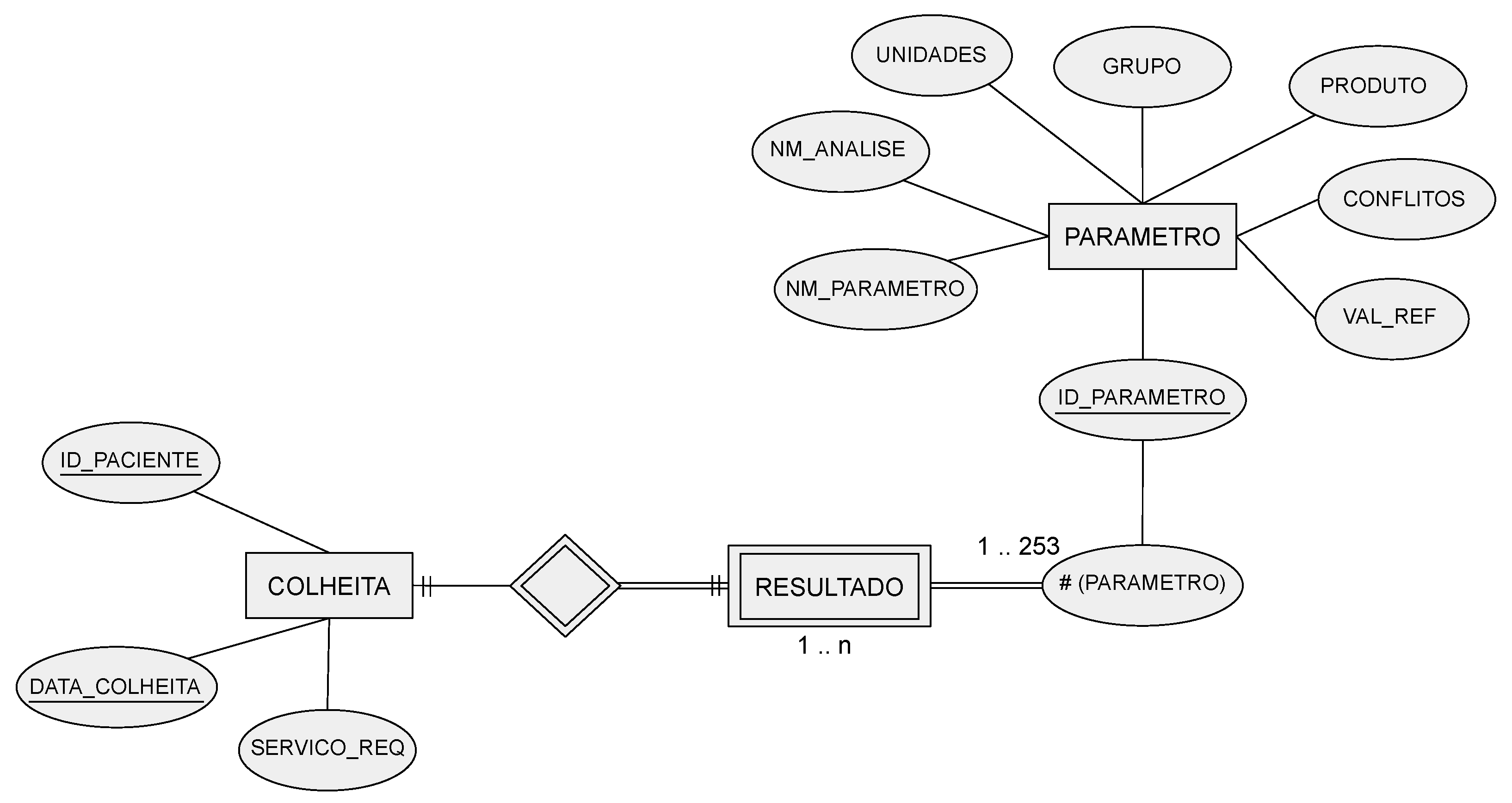
  • COLLECTION—identifies the patient, a collection date, and the service that requested the collection.
  • PARAMETER—stores different variables (parameters), such as the name of the laboratory, the parameter name, and reference values, among others.
  • RESULT—the patient’s analysis results for each parameter.
The corresponding entity relationship (ER) model is depicted in Figure 1. Regarding the COLLECTION attributes, the ID-PACIENTE attribute is a sequential number that identifies a patient but hides their identity, under the General Data Protection Regulation (GDPR) guidelines. Only the authorized hospital personnel can access the mapping between this database’s ID-PACIENTE and the real patient identification.

2.2. Dashboards for COVID-19 and Clinical Data

A dashboard refers to the representation of useful information to the user. As stated by Wexler et al. [22] “A dashboard is a visual display of data used to monitor and/or facilitate understanding”. A dashboard is typically composed of graphs, diagrams, and numbers providing adequate data visualization and interpretation. The proper use of a dashboard on the data allows the extraction of information and knowledge about the disease and the pandemic, according to the data, information, knowledge, and wisdom (DIKW) model [23,24,25].
Some COVID-19-related projects also address the development of dashboards. Some of them report the largest number of infections, number of recoveries, number of vaccinations, number of deaths, among other indicators, to monitor the spread of the SARS-CoV-2 virus and its variants. An example of this type of dashboard is the one developed by the Johns Hopkins University Center for Systems Science and Engineering [26]. Another example is the COVID-19 Watcher dashboard to monitor the disease spread in the United States [27]. The dashboard developed by Ibrahim et al. [28], depicted in Figure 2, concerns the management of infected and noninfected patients. The dashboard identifies the hospitalized patients’ location and their status through a color scheme. It allows users to monitor patients in multiple wards and intervene when clinically necessary or to relocate patients, yielding better resource management.

3. Proposed Solution—Web Application with a Dashboard

Regarding the evolution of COVID-19 in Portugal, we were not able to find any publicly available dashboards nor a systematic analysis of the behavior on the six waves of the disease. Thus, we decided to develop a dashboard for that purpose, since the interactive visualization of data, wave comparison, and wave aggregation are valuable tools to study the pandemic. Moreover, we decided to develop a full-stack Web application that allows this analysis to be carried out through a browser, without the need to install additional software, accessible anywhere in the world (with controlled access and anonymous data). Section 3.1 describes the application functional and nonfunctional requirements. We also depict the application’s key entities and the flow of information between them as well as a brief description of the application architecture. The data preprocessing steps are described in Section 3.2 with the necessary extract, transform, and load operations. Finally, Section 3.3 describes the available data visualization graphs and diagrams as well as the details and formats about the data importation and exportation operations.

3.1. Application’s Functional and Nonfunctional Requirements and Key Entities

The developed application has the following functional requirements:
  • Aggregate data from all the COVID-19 waves.
  • Data import and export, using text files and graphic files.
  • Data visualization through various types of statistical graphs, such as line, bar, pie, scatter plots, box plots, and survival curves.
  • Download of graphics presented in various formats.
  • Filling in forms to select the data to be displayed.
  • Filter data by COVID-19 waves.
  • Generate reports with statistical analysis.
  • Users may have different roles for user management, such as adding, removing, and editing (available to users with the administrator role).
The nonfunctional requirements are as follows:
  • Authentication system, with proper storage of passwords.
  • Data processing, according to their type—cross-sectional or longitudinal.
  • Provision of the solution through a web browser.
The proposed solution’s key entities are depicted in Figure 3. The solution is composed of a web server that provides the interaction with the user and an application server that enables the logic and communication between the user and the relational database, following a three-tier architecture [29,30]. We also used a nonrelational database to process data to check on the status of data job processing tasks.
For the development of the application, we followed a three-tier architecture [29,30,31], composed of the following layers:
  • Presentation tier: concerns the dashboard, provided by the Web server, which in turn provides the user interface.
  • Logic tier: corresponds to the application server. This is in the intermediate layer, which has the business logic and the processing of user inputs. This also constitutes the connection between the two other layers.
  • Data tier: uses a relational database server, in which the application’s persistent data are stored.

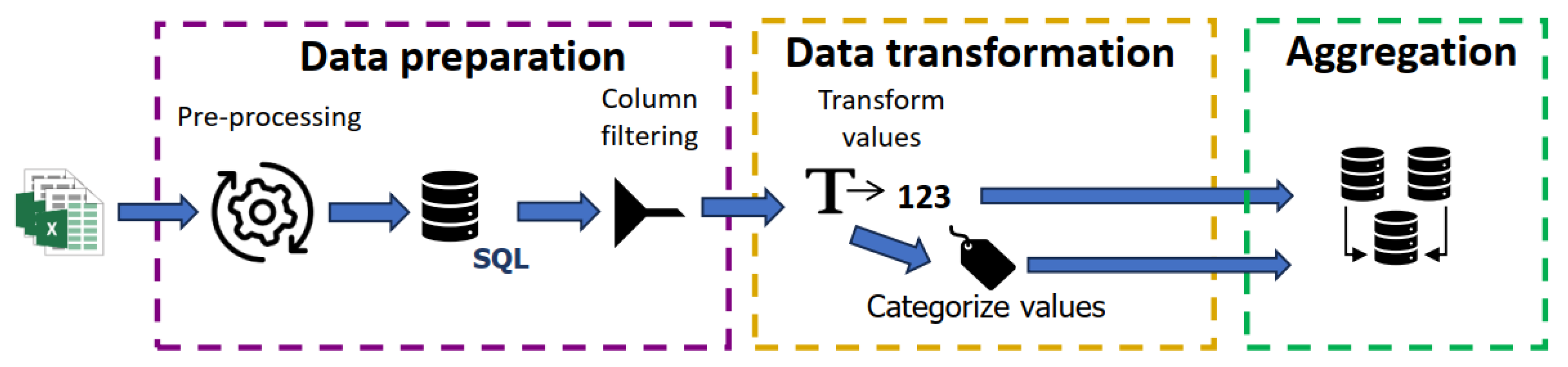
3.2. Data Processing Phases and Storage in the Database

In the initial stage of this work, we found that data from two hospitals were spread across different databases and Excel files. To gather all the data, we devised an extract, transform, and load (ETL) process [32,33] composed of three phases as depicted in Figure 4. The ETL process populates the relational database with data from the Excel files.
The first ETL phase imports the data from several sources into a single database and removes duplicates and out of range values. The second phase is composed of data transformation and labeling. Finally, the third phase involves the aggregation and description of patient data. We devised these phases for our specific problem, but the implementation was carried out in a modular way, such that it can easily be adapted to data from other hospitals/countries.
Regarding the ETL process, it consists of a procedure to establish communication between the application server and the ETL in an asynchronous way, through a message queue, as this process may take hours depending on the quantity of data. In order to make the data received on the application server available in ETL, a nonrelational database (NoSQL) was used. The relational database, using the structured query language (SQL), stores the application permanent data. The nonrelational database is mainly used to send files from the application server to the ETL service and to inquire about the status of jobs in processing.

3.3. Data Visualization Graphs and Diagrams, Importation, and Exportation

The application provides data visualization through graphs and diagrams by filling out forms that allow data filtering. The available graphs and diagrams are:
  • Bar and circular graphs, to analyze the absolute and relative frequency for the categories of nominal variables.
  • Box plot graphs, to visualize the distribution of quantitative variables. In addition, parallel box plots allow a data comparison between groups of patients. In both cases, a summary of descriptive statistics is provided.
  • Line graphs, to analyze the evolution of a parameter across the ICU admission. It can be performed over a restricted group of patients.
  • Scatter plots, to assess the correlation between two quantitative variables.
  • Survival curves, to visualize the estimated survival probability of an individual living longer than a certain time.
All of these graphs and diagrams, with the exception of line graphs, when it comes to a special group of patients, allow the visualization to be isolated per COVID-19 wave. In addition to presenting graphs and diagrams, the solution allows the user to export patient data in a compressed comma-separated values (CSV) file, using filters such as patient identifiers or a collection of dates. Importing new data while the application is running is also available.

4. Development of the Three Tiers of the Proposed Solution

In this section, we describe the key aspects and choices taken for the development of our solution. Section 4.1 discusses the details of the choices taken for programming languages and libraries, from a myriad of available possible choices, for each one of the three application layers. We address the technical choices and legacy issues that arise from previous work. The Web server implementation, the page navigation strategies, and the way the user inputs/outputs data and requests are described in Section 4.2. The application programming interface (API) is described in Section 4.3, in which we detail all the modules that constitute the API and how communication flows between them. Finally, a discussion on the deployment of the solution is the topic of Section 4.4, in which we address several options for deployment as well as the reasons for our choice for this task.

4.1. Choice of Programming Languages and Libraries for Each Tier

This section discusses the choices of languages and libraries. For the presentation tier, to develop the dashboard user interface, a Web application was considered, since it does not require to install software, as it runs in a browser, being accessible anywhere. Since it is a Web application, we chose the JavaScript language (version ECMAScript 2020), which is interpreted, prototype-based, single-threaded, dynamic, and multiparadigm [34]. Additionally, it is one of the most used languages for Web development [35,36]. Since JavaScript was adopted, we also decided to incorporate TypeScript (version 5.0), which is an open-source language built on top of JavaScript. The TypeScript language has the concept of type, unlike JavaScript, which is advantageous when dealing with large applications to manage their complexity.
Regarding the libraries used to build user interfaces, React was the chosen library [37], which is free, open source, and uses JavaScript. In this library, there is a great emphasis on code reuse using components. In order to use components with some style, the React Bootstrap library was also used. Based on the types of graphics and diagrams that the dashboard exhibits, we searched for the most suitable libraries with free-access code. From this search, some libraries were identified, namely D3 [38], Victory [39], C3 [40], Chart.js [41], Recharts [42], and Plotly [43]. Out of these libraries, “Plotly” was chosen since it provides a high level of flexibility in constructing graphics without a steep learning curve. The React plotly-js library contains the React components for the Plotly library.
As for the logic tier, since it already has a component written in Python, that same language was chosen. Therefore, it was necessary to choose a Python library to assist in developing an application server. A search was performed for these libraries [44,45,46,47]. Out of the libraries found, the following stood out: Flask [48], Django [49], FastAPI [50], and Pyramid [51]. From these, FastAPI was chosen, as it has suitable documentation, and it is simple to use.
Finally, the data tier is supported by MariaDB (relational database), as it was already established from the previous work by Ribeiro [21]. Regarding the choice of the NoSQL database, we found some solutions, such as CouchDB, MongoDB, Redis, and Cassandra. Among these, MongoDB was chosen because it is a well-documented JavaScript Object Notation (JSON)-based database, allowing the storage of files of any size (limited by the computer file system).
Regarding the message queue implementation, we also considered several alternatives, choosing RabbitMQ, due to its suitable documentation. The import functionality will not be used very often, and as such a very specific queuing service is not necessary, as long as its correct operation is guaranteed.

4.2. Web Server Implementation’s Key Aspects and User Navigation

The dashboard is provided by the Web server. This consists of an application that runs in a Web browser following a single-page application (SPA) implementation. The SPA concept implies that only one Web document is loaded and Hypertext Transfer Protocol (HTTP) requests are made to change the content of the page to be displayed.
Figure 5 shows an example of a form to visualize the temporal evolution for a quantitative variable. We observe a form component (marked in red) that contains several field components (marked in green). The user inputs the fields marked in green, including the patient ID. This ID corresponds to sequential numbers in the database and only the hospital personnel can access the mapping to the real patient identification, under medical secrecy and the GDPR guidelines. There is no possibility to identify the patients from the data stored in the database and visible on the dashboard. Currently, the application supports multiple IDs entered as semicolon-separated values, e.g., to select patients 10 and 15 to 20, one simply writes “10; 15–20” in the corresponding field.
These form components use field components with the following contents:
  • An error code, used by all field components to display an error message.
  • A handler invoked when there is a change in the field.
  • A list of selected options and values, for drop-down lists.
To provide drop-down lists, the React Select library [52] was used with a wrapper allowing one to specify the maximum number of selected values.
Regarding the checking of field completion by the user, it is carried out each time the user changes the content of the form, with the exception of dates, in order to display an error message if something is not filled out correctly. Before making the request to the API, all fields are checked again. In this way, the possibility of the user being able to change the types of data in the HyperText Markup Language (HTML) document is taken into account. If everything is filled out correctly, the respective request to the API is carried out. This, in turn, also performs checks and, in the event of an error, it sends a response stating the fields that are in error, thus generating error messages in the user interface.
Each graphic corresponds to a component that contains its design and a set of inputs, named controllers, to check some aspects of the graphic representation, such as choosing a specific COVID-19 wave or representing several individual graphics, one per wave. Each chart component is made up of two components:
  • MyPlot, composed by ModalDownload and Plot.
  • Controller, where each graphic has a specific field to control the data. All available graphics, except one, have one field that allows the user to choose a specific COVID-19 wave and another to separate the graph into many others where each one corresponds to a specific wave.
The ModalDownload component allows the user to download a graphic by presenting a form with a text box to enter a name, and a list to choose the desired format of the image to be downloaded in one of the formats available in Plotly: SVG, PNG, JPEG, and WebP. To achieve this download, the MyPlot component adds a new button to the config object, which is inputted into the Plot action. By clicking this button, the ModalDownload modal is activated, which in turn displays the corresponding form.
The second component used by MyPlot is Plot (from the React Plotly library), which is used to draw graphics with the provided data. This Plot component inputs three parameters:
  • Data, which refers to a list of objects, with the graphics to be drawn. These objects indicate the values on the XX-axis and on the YY-axis, type of graphics, content of legends, colors, and others.
  • Layout, an object that holds information about the layout of the “page” in which the graphics are drawn, such as the dimension, title, name of the axes, borders, annotations (strings that can be placed together with the graphics), shapes (such as straight lines, that can be added to graphics) as well as other fields.
  • Config, an object that allows one to define properties such as buttons in the menu and also interactivity with the graphics, such as scrolling to zoom in and out or add or remove buttons in the button menu, among other actions.
There are several components that use the MyPlot component, which are responsible for processing the data in such a way that MyPlot can exhibit the desired graph. There is one of these components for each type of chart available in the developed solution.

4.3. API Implementation and Module Organization

The application server, written in Python, is composed of several modules with organization, scalability, code reuse, and dependency injection. These modules are:
  • Endpoints, with the application’s routes and handlers.
  • Services, holding the contracts and specific implementations of the services that handle the application logic.
  • Data access layer (DAL), with contracts and their specific implementations, to deal with the database access logic.
  • Data transformation objects (DTO), having objects used to pass information between layers, between the business layer and the data access layer, or between servers.
  • Exceptions, the exceptions that may be raised by running the application.
  • Utils, which contains utility functions for the entire application.
In Figure 6, we have the structure diagram of the application server. The user makes requests to the application using the HTTP protocol, available in the endpoints module. This module forwards this request to services which perform checks on input parameters and business rules then communicates with the DAL module to obtain information from the database.

4.4. Solution Deployment—Making the Solution Available

The implementation phase of a computer solution constitutes one of the final steps of the application development and testing. Without deployment, there is no solution available to users.
After the development of an application, it is necessary to perform its deployment making it available to users. Application deployment is the process of installation and updating, which allows the availability of one or more applications for use, through, for example, a URL on a server [53].
The application is intended to be accessed privately, being available on an internal network by medical doctors who have the expertise to analyze the results generated by the dashboard. However, by using a virtual private network (VPN) access with a given set of credentials, one can access the application from anywhere. The main application contains the different applications developed in the project, such as the API (written in Python) or the graphical part of the dashboard (written in JavaScript).
There are several tools and services that allow applications to be made available, and a search was carried out on the following ones. The tools considered in this search were:
  • Serve [54], a module written in JavaScript that allows applications to be made available in React.
  • Nginx [55], in addition to serving applications, can also function as a load balancer and reverse proxy.
  • Tomcat [56], which is an Apache project that acts as a Java Web server.
  • Docker [57,58], used to create, deploy, run, update, and manage containers, isolated from various applications, through virtualization.
  • Heroku [59], used to build, run, and operate applications in the cloud.
  • Google App Engine [60], which is a cloud service to develop applications.
Among this set of tools, Docker was chosen, as it allows one to decouple the different applications and run them separately. It also creates an image to facilitate the creation of a new application process. Docker containers consist of a package of everything necessary to run an application, such as the source code, libraries, dependencies, or configuration files. Containers run in isolated processes, created and managed by Docker, which in turn is an application running on an operating system. Figure 7 depicts the container diagram devised for the developed solution. On the container diagram, we have Traefik, which provides the Hypertext Transfer Protocol Secure (HTTPS) implementation. Traefik is an open-source reverse-proxy HTTP, load balancer that allows the creation and renewal of Transport Layer Security (TLS) certificates [61].
Figure 8 shows a screenshot of the application running with the Portuguese interface, after authentication with the VPN of the Polytechnic of Lisbon. The PREMO project has ongoing research and development until 31 December 2024. Upon the project conclusion, the application will be deployed and hosted at a proper location.

5. Data Visualization Graphics, Diagrams, and Statistical Analysis

This section shows the dashboard interface, functionalities, output graphics, diagrams, and statistical analysis provided by the application. Section 5.1 shows the landing page of the application after user authentication. It also shows how the user inputs a request to retrieve and visualize cross-sectional data and to generate the corresponding graphics. The visualization of a patient’s cross-sectional data with different graphics is provided in Section 5.2, with several examples of graphics. In Section 5.3, we display some examples of survival curves and line plots, in different test scenarios, corresponding to longitudinal data. Finally, Section 5.4 provides a discussion on the use of the reported graphics and on how they can aid in dealing with the disease.

5.1. Dashboard Landing Page and Request Input Page

The dashboard contains several pages for the different features available. In Figure 9, the application’s home page is shown with the number of patients and number of collections for the six COVID-19 waves. The horizontal navigation bar is also displayed, containing the application title and a button to end the session, as well as the left-side vertical navigation bar to switch between different pages, after authentication. It shows the view of a user with an administrator role. This type of authentication also allows user management.
In Figure 10, the page containing the form to be filled out is shown to present the graphical representations for cross-sectional data, such as circular/bar graphics, box diagrams, and scatter plots. On the left-hand-side graphic controls, the user inputs the patient ID, interval dates, and other parameters to request the data. Depending on the type of parameters selected on the drop-down list located above the Visualize button, the corresponding type of graphic is displayed in the white area in the middle and on the right-hand side of the window.

5.2. Graphical Representations for Cross-Sectional Data

Graphics from cross-sectional data report statistical information related to a given moment in time, for quantitative or qualitative variables. The dashboard provides three types of graphs with cross-sectional data, namely, pie charts and bar charts, scatter plots, and box plots. For each graphic representation, it is possible to visualize the data by COVID-19 wave, by choosing the corresponding selector on the dashboard form.

5.2.1. Pie Charts and Bar Charts—Observing Absolute and Relative Frequencies

The pie charts and the bar charts allow the user to observe the absolute and relative frequency of each category for nominal variables. In Figure 11, we have a pie chart with the percentage of male and female patients, per wave. The same data are shown in Figure 12 using a bar plot.

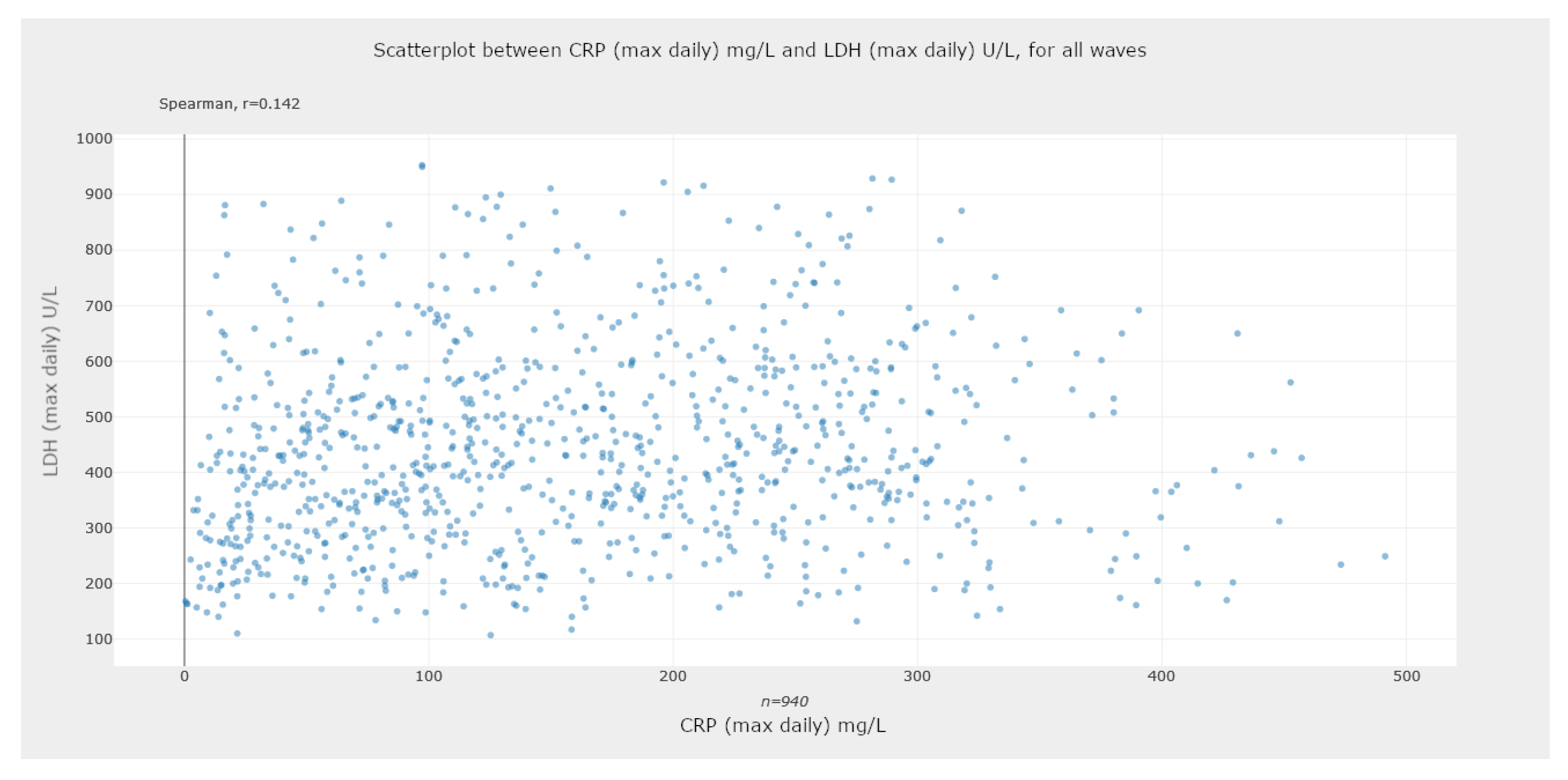
5.2.2. Scatter Plots—Assessing Statistical Correlations

Scatter plots are constructed from two quantitative variables and allow the user to visualize the distribution of the point cloud corresponding to the joint observations of the bivariate sample, according to the user’s selection. Scatter diagrams are useful to visually check for the existence of correlation between two quantitative variables. An example of such a graph can be seen in Figure 13, showing the correlation between the C-reactive protein (CRP) and lactate dehydrogenase (LDH). We also display the Spearman correlation coefficient values. In Figure 14, we can observe this analysis isolated per wave. It is interesting to notice the changes in the correlation coefficients across the several waves. This tool also allows the graphical representation of ratios calculated based on some parameters of interest. For example, the neutrophil-to-lymphocyte ratio (NLR), which has been found to be predictive of outcome in COVID-19, as stated by Prozan et al. [62].
These graphs are processed identically to circular graphs. To avoid the graph generation being too cumbersome due to the possible high number of points to be generated, we resorted to the Plotly WebGL engine.

5.2.3. Box-Plot Diagrams—Comparing Groups of Patients

Another available functionality is the observation of individual or groups of box-plot diagrams. The representation of several box plots allows a comparison between different groups, as can be seen in the example of Figure 15, in which the distribution of the CRP level by gender is observed, including the p-values from the statistical hypothesis test to compare the CRP distribution values by gender. It is also possible to visualize these data, isolated by waves, as depicted in Figure 16. In this case, we also observe a distinction in the p-values across all waves.

5.3. Graphical Representations for Longitudinal Data

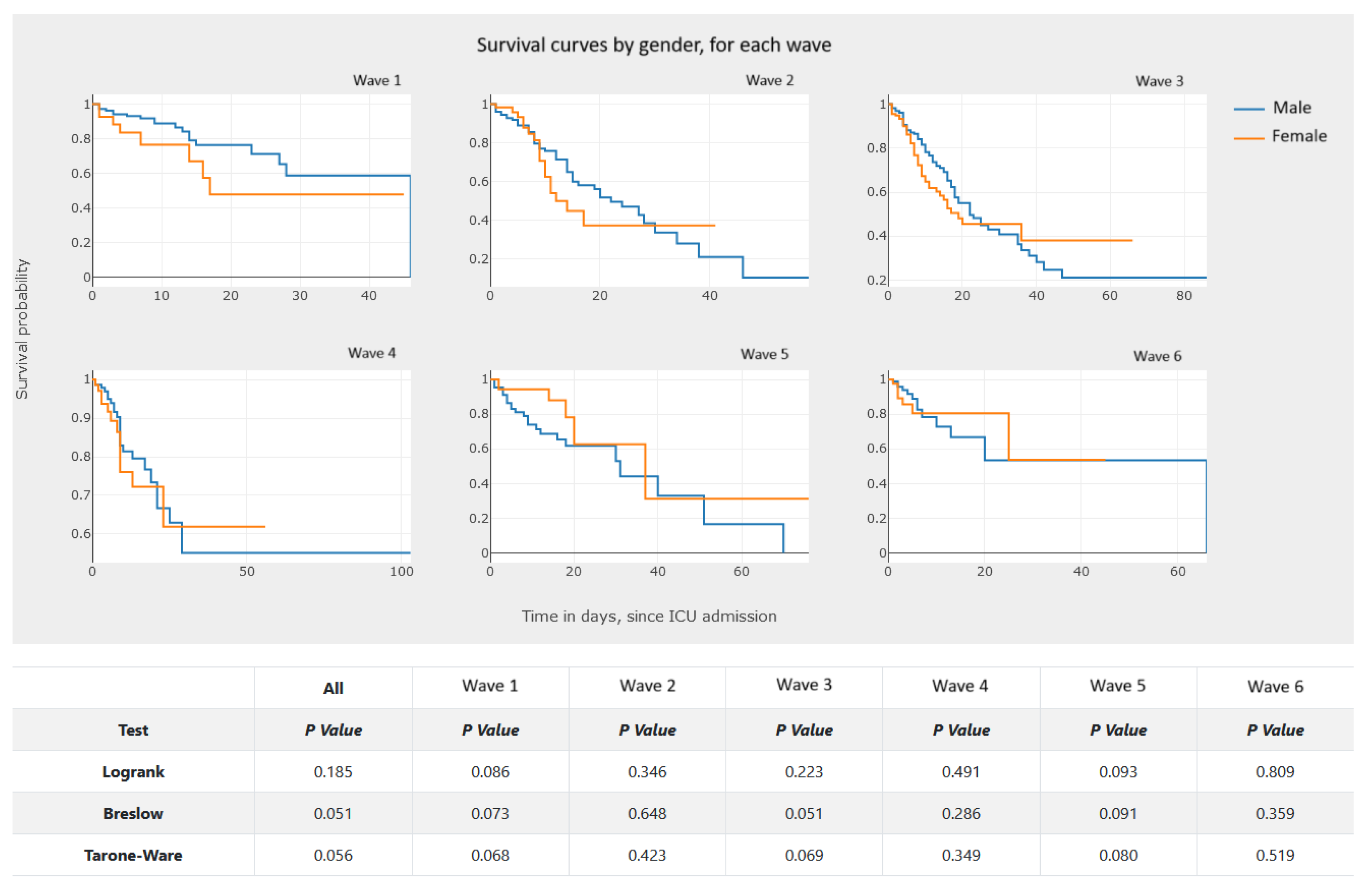
5.3.1. Kaplan–Meier Survival Curves—Estimating Survival Probability

Survival curves are graphical representations of the estimated survival functions. These functions, in turn, estimate the probability of an individual surviving longer than a certain time. In our analysis, we have patients admitted to the ICU, and the time is measured in days spent in the ICU. The survival curves used in this application are based on the Kaplan–Meier survival estimator [14].
Figure 17 presents survival curves for groups of patients that correspond to the two classes of a nominal variable, which in this case is the gender. We also report the results of the Breslow test [18,19]. A functionality of great interest for clinical practice which is also available in this application is the joint visualization of survival curves for groups of patients associated with risk patterns. These risk standards are defined by cutoffs applied to quantitative variables, as shown in the example presented in Figure 18. In our analysis, the cutoff values were provided by the clinical experts of the hospital laboratory. Thus, these values were defined externally by a medical decision; the cutoff value can easily be entered and configured in the application.
Figure 19 shows four survival curves, each one corresponding to a group of patients. In this example, the groups are defined by categories of two variables, the gender with two categories and the categorical variable myoglobin associated to a clinically relevant cutoff point. The categorical variable myoglobin was obtained by encoding the quantitative variable myoglobin, using the cutoff point of interest. We can also isolate the curves by waves, as shown in Figure 20, which represents the curves, by gender, per wave.
We found no libraries available for generating these survival curves in JavaScript like those available for Python. Thus, they are generated in the API and not in the user interface. The groups of patients are defined by the categories of the nominal variables and/or the cutoff points used to categorize quantitative variables, referring to information on the first day of admission to the ICU. The tests to compare the different curves are also generated in the API. Once the points of the curves are found in the user interface, a line graph is generated.

5.3.2. Line Graphics—Analysis and Comparison of Parameter Evolution

Line graphics use line segments to connect different points. These graphs show the evolution of some variable (ordinate axis) depending on the value on the abscissa axis. We use these graphs to represent the evolution of a given parameter for different patients, throughout the period of stay in the hospital ICU. We provide two variants for these graphs:
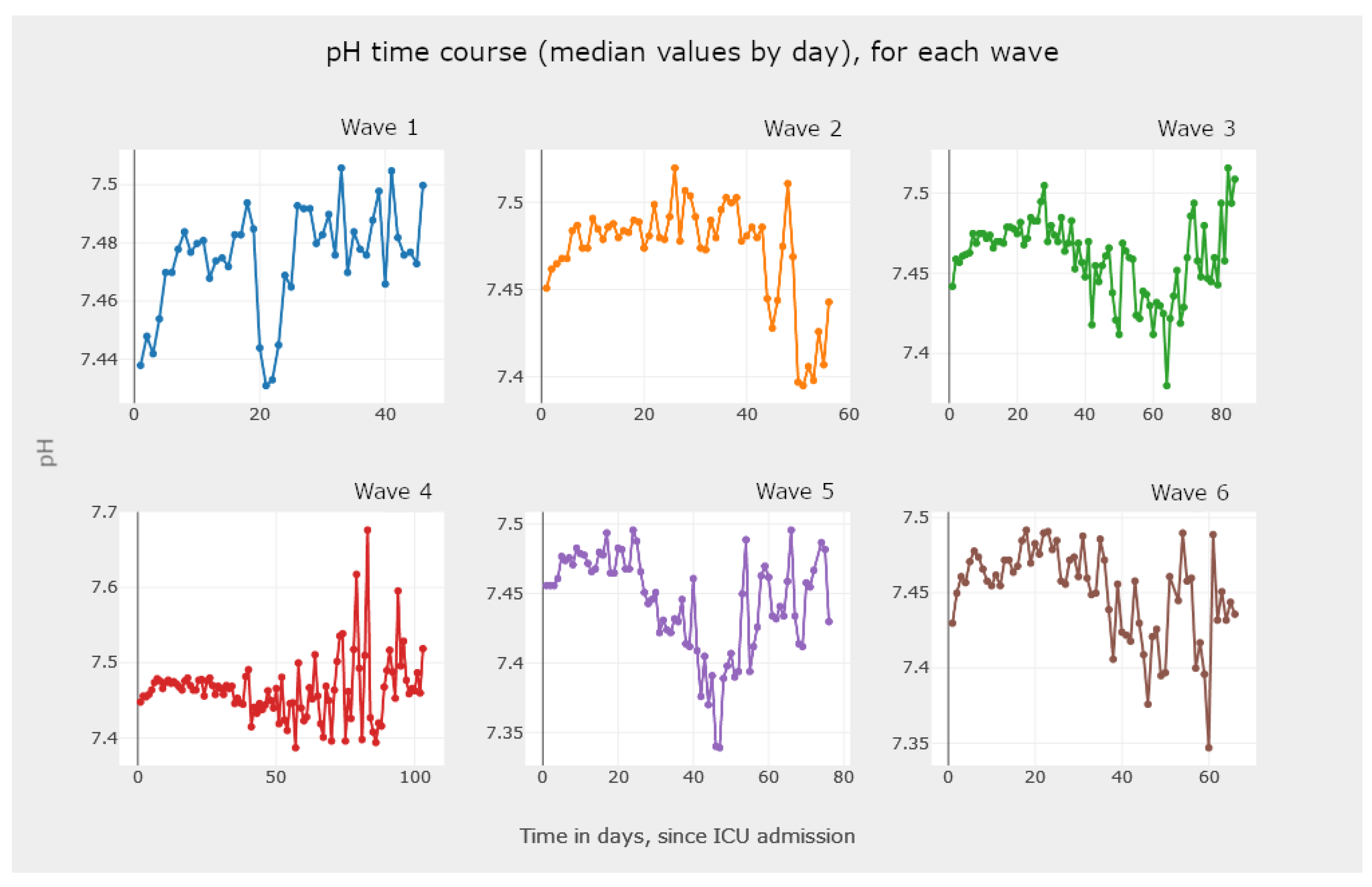
  • One to analyze the evolution of a parameter for different patients, as shown in Figure 21.
  • The other one analyzes all aggregates, shown in Figure 22 and Figure 23, isolated by waves.
The generation of these graphics demands a high level of processing, given that to each patient must be assigned a single value per day in the ICU. If a single daily value is available, it is used; otherwise, the median of the daily values is used.

5.4. Discussion on the Use of Reported Graphics

We now provide some insights on how the use of the application and the graphic analysis is helpful to acquire information, knowledge, and wisdom from the disease. First, as described in Section 5.1, we designed the interface of the application in such a way that it is intuitive for the intended users, the medical doctors. We chose fonts and colors that are easily readable in any platform and operating system. The user inputs requests on the left-hand side and the output is in the middle or on the right-hand side. The representation of cross-sectional data, reported in Section 5.2, allows for different analysis scenarios, such as:
  • Observe the frequency and percentage of the admission of patients to the ICU, among the COVID-19 waves. For instance, Figure 12 shows that the third wave was the one with more ICU admissions. On one hand, throughout the third wave, the Alpha variant was related with a larger rate of deaths in the ICU, when compared to the Delta variant, which probably led to a greater number of admissions to the ICU and more severe conditions of the disease, affecting the older population still not vaccinated. On the other hand, the number of ICU admissions in the fifth and sixth waves decreased significantly. This fact must be related to the appearance of other variants and the availability of vaccines to most of the Portuguese population [1].
  • Check for correlations between parameters of the medical tests conducted on ICU patients. From the literature on COVID-19, we know that there exists a correlation between some parameters. By analyzing graphs such as the ones reported in Figure 13 and Figure 14, we can confirm existing known correlations or discover new ones. Additionally, we highlight that this tool allows users to calculate ratios between parameters, allowing them to explore their association with more severe events, in the context of COVID-19 patients. Available examples in our tool with a recognized clinical interest are neutrophil-to-lymphocyte and platelet-to-lymphocyte ratios, found to be markers of inflammation and prognosis for more severe states of COVID-19 [64]. Moreover, with the ability to separate the data by wave, we can also look for correlations between parameters and their changes in different waves.
  • Check for statistical significance between relevant data comparisons. This is a key feature of the developed application, since it provides a strong notion about the recorded analysis numbers and whether they are statistically significant or not. For instance, the box plots in Figure 15 and Figure 16 are examples of this case.
The representation of longitudinal data, reported in Section 5.3, can be an added value in research and clinical decision-making as follows:
  • Perform an analysis of the survival data. The analysis of the graphics in Figure 17 and Figure 18 allows one to observe and compare the survival probability of patients in both groups, along the ICU stay. For example, the clinician can visually compare the median survival time, by group, or understand which of the two groups of patients experiences a larger number of events in the first week of ICU admission.
  • In Figure 19, we illustrate the possibility of visualizing and comparing survival curves that correspond to a stratification of the sample into groups defined by criteria of clinical interest, such as normality/non-normality values of certain biomarkers.
  • Analyzing Figure 20, we gain a clear notion of how the survival probability drops with the increase in the number of days in the ICU, per gender and per wave. This may lead to a treatment adjustment and better resource management in the ICU. In addition, this graphic highlights the different characteristics of survival data per wave of COVID-19.
  • The visualization of Figure 21, Figure 22 and Figure 23 allows the clinician to obtain information on the clinical practice biomarkers’ trajectory. Many studies address the importance of analyzing the association between death and certain biomarkers’ trajectory patterns. For example, Chen et al. [65] modeled the longitudinal trajectories of laboratory biomarkers and made dynamical predictions on individual prognoses.

6. Conclusions

COVID-19 caused a period of pandemic, due to its ease of transmission and large number of infection cases. This disease had severe consequences on the mortality and morbidity of populations, especially the elderly. The disease affected populations in waves, and the consequences of each wave exhibited some differences. To understand the disease and its behavior, it is important to analyze the data collected during the pandemic period in patients admitted to the ICU. One adequate way to analyze the data is by using graphics, filtering the data by waves or by aggregating all the waves.
In this paper, we described the development of a full-stack Web application for the purpose of visualization of different aspects of the COVID-19 data from patients admitted to the ICU. Our solution consists of a dashboard accessible by a browser, without the need to install additional software. The dashboard generates different types of graphics and provides functionalities for data importation and exportation. We used the React library, where the various graphics created with the Plotly library in JavaScript are available. This interface communicates with an API written in Python and built on the FastAPI framework to extract the necessary data from the database. These three entities follow a three-tier architecture. A reverse proxy is used to redirect requests to the Web server and the API. The different parts that compose the application are available through Docker containers and the application is already available on our virtual private network.
The application supports importing new data while running. For that purpose, we resorted to an asynchronous communication mechanism between the API and the ETL process, with the RabbitMQ message queue coupled with a nonrelational database. We devised an extensive ETL process, for each type of data, by removing unnecessary columns, duplicate observations, or meaningless values.
The application allows clinicians to visualize graphics and diagrams promoting faster and more accurate medical decisions, to reduce serious events, faster recoveries, and a reduction in fatalities. Since we worked with data from patients admitted to the ICU on the first six waves of COVID-19 in Portugal, the use of the platform provides a large degree of information and knowledge about COVID-19.

Future Work

The solution herein reported will have improvements to existing functionalities as well as new ones. In fact, this is the first release of the application with the key functionalities. The PREMO project is ongoing until 31 December 2024, and the research team of PREMO expects to continue to develop and to improve the application functionalities.
After the PREMO project concludes, we will move (host) the application to a new permanent address. Hopefully, at the end of the project, we will have a version of the application that requires only a few maintenance tasks, since the main focus will be on inserting/updating the data. We believe that it will be possible for the hospital IT team to keep the application running.
Regarding new functionalities, we plan on editing configuration files from the dashboard with the list of parameters to analyze, changing the parameter transformation rules, and defining the categorization parameters. It would also be interesting to insert data relating to therapy into the database, with patient identification, the medications administered to the patient, and their start date and end date. We can also consider adding predictive models with existing data, already transformed by the ETL process, to provide suggestions to users.

Author Contributions

Conceptualization, I.P., C.G., C.V.R. and L.B.; methodology, I.P., C.G. and L.B.; software, R.D.; validation, A.F., I.P., C.V.R. and L.B.; writing—original draft preparation, R.D. and A.F.; writing—review and editing, A.F., I.P. and C.V.R. All authors have read and agreed to the published version of the manuscript.

Funding

This research was partially funded by the Predictive Models of COVID-19 Outcomes for Higher Risk Patients Towards a Precision Medicine (PREMO) project, by Fundação para a Ciência e Tecnologia (FCT), grant DSAIPA/DS/0117/2020.

Institutional Review Board Statement

The work reported in this paper was approved by the Institutional Ethics Committee of the Centro Hospitalar Universitário de Lisboa Central, Lisbon, Portugal, number 1043/2021, on 20 May 2020.

Informed Consent Statement

Not applicable.

Data Availability Statement

The code and data are publicly available at https://github.com/RubenDays/premo-dashboard-public, accessed on 22 January 2024.

Conflicts of Interest

The authors declare no conflicts of interest.

References

  1. Florensa, D.; Mateo, J.; Spaimoc, R.; Miret, C.; Godoy, S.; Solsona, F.; Godoy, P. Severity of COVID-19 cases in the months of predominance of the Alpha and Delta variants. Sci. Rep. 2022, 12, 15456. [Google Scholar] [CrossRef] [PubMed]
  2. Amin, R.; Sohrabi, M.R.; Hannani, K. Five consecutive epidemiological waves of COVID-19: A population-based cross-sectional study on characteristics, policies, and health outcome. BMC Infect. Dis. 2023, 22, 906. [Google Scholar] [CrossRef] [PubMed]
  3. Abati, E.; Stellio, L.; Manini, A.; Moroni, F.; Azzalini, L.; Vilca, L. A cross-sectional survey study of the impact of COVID-19 pandemic on the training and quality of life of Italian medical residents in the Lombardy region. Ann. Med. 2022, 54, 2326–2339. [Google Scholar] [CrossRef]
  4. Collis, A.; Garimella, K.; Moehring, A.; Rahimian, M.A.; Babalola, S.; Gobat, N.H.; Shattuck, D.; Stolow, J.; Aral, S.; Eckles, D. Global survey on COVID-19 beliefs, behaviors and norms. Nat. Hum. Behav. 2022, 6, 1310–1317. [Google Scholar] [CrossRef]
  5. Novais, F.; Cordeiro, C.; Câmara Pestana, P.; Côrte-Real, B.; Reynolds Sousa, T.; Delerue Matos, A.; Telles-Correia, D. The Impact of COVID-19 in Older People in Portugal: Results from the Survey of Health, Ageing and Retirement (SHARE). Acta Médica Port. 2021, 34, 761–766. [Google Scholar] [CrossRef]
  6. Hart, W.; Miller, E.; Andrews, N.; Waight, P.; Maini, P.; Funk, S.; Thompson, R. Generation time of the alpha and delta SARS-CoV-2 variants: An epidemiological analysis. Lancet—Infect. Dis. 2022, 22, 603–610. [Google Scholar] [CrossRef] [PubMed]
  7. Bahl, A.; Mielke, N.; Johnson, S.; Desai, A.; Qu, L. Severe COVID-19 outcomes in pediatrics: An observational cohort analysis comparing Alpha, Delta, and Omicron variants. Lancet Reg. Health—Am. 2023, 18, 100405. [Google Scholar] [CrossRef]
  8. Uemura, K.; Kanata, T.; Ono, S.; Michihata, N.; Yasunaga, H. The disease severity of COVID-19 caused by Omicron variants: A brief review. Ann. Clin. Epidemiol. 2023, 5, 31–36. [Google Scholar] [CrossRef]
  9. Petrone, D.; Mateo-Urdiales, A.; Sacco, C.; Riccardo, F.; Bella, A.; Ambrosio, L.; Presti, A.L.; Martino, A.D.; Ceccarelli, E.; Manso, M.D.; et al. Reduction of the risk of severe COVID-19 due to Omicron compared to Delta variant in Italy (November 2021–February 2022). Int. J. Infect. Dis. 2023, 129, 135–141. [Google Scholar] [CrossRef]
  10. Mondal, M.; Bharati, S.; Podder, P.; Kamruzzaman, J. Deep Learning and Federated Learning for Screening COVID-19: A Review. BioMedInformatics 2023, 3, 691–713. [Google Scholar] [CrossRef]
  11. Rocchi, E.; Peluso, S.; Sisti, D.; Carletti, M. A New Epidemic Model for the COVID-19 Pandemic: The θ-SI(R)D Model. BioMedInformatics 2022, 2, 398–404. [Google Scholar] [CrossRef]
  12. Rekowski, C. Development of Predictive Models for COVID-19 Prognosis Based on Patients’ Demographic and Clinical Data. Master’s Thesis, Instituto Superior de Engenharia de Lisboa, Lisboa, Portugal, 2022. [Google Scholar]
  13. Molenberghs, V.; Verbeke, V. Linear Mixed Models for Longitudinal Data, 3rd ed.; Springer: New York, NY, USA, 2009. [Google Scholar] [CrossRef]
  14. Kaplan, E.; Meier, P. Nonparametric estimation from incomplete observations. J. Am. Stat. Assoc. 1958, 53, 457–481. [Google Scholar] [CrossRef]
  15. Collett, D. Modelling Survival Data in Medical Research, 3rd ed.; Chapman and Hall/CRC: Boca Raton, FL, USA, 2014. [Google Scholar] [CrossRef]
  16. Mantel, N. Evaluation of survival data and two new rank order statistics arising in its consideration. Cancer Chemother. Rep. 1966, 50, 163–170. [Google Scholar]
  17. Cox, D. Regression Models and Life-tables (with discussion). J. R. Stat. Soc. 1972, 34, 187–220. [Google Scholar]
  18. Gehan, E. A Generalized Wilcoxon Test for Comparing Arbitrarily Singly-Censored Samples. Biometrika 1965, 52, 203–223. [Google Scholar] [CrossRef]
  19. Breslow, N. A generalized Kruskal-Wallis test for comparing K samples subject to unequal patterns of censorship. Biometrika 1970, 57, 579–594. [Google Scholar] [CrossRef]
  20. Daniel, W.; Cross, C. Biostatistics: A Foundation for Analysis in the Health Sciences, 10th ed.; John Wiley & Sons: Hoboken, NJ, USA, 2013. [Google Scholar]
  21. Ribeiro, D. Project Report—PREMO. Technical Report, Instituto Superior de Engenharia de Lisboa. 2022. Available online: www.isel.pt (accessed on 21 October 2023).
  22. Wexler, S.; Shaffer, J.; Cotgreave, A. The Big Book of Dashboards: Visualizing Your Data Using Real-World Business Scenarios; John Wiley & Sons: Hoboken, NJ, USA, 2017. [Google Scholar]
  23. Intezari, A.; Pauleen, D.J.; Taskin, N. The DIKW hierarchy and management decision-making. In Proceedings of the Hawaii International Conference on System Sciences (HICSS), Koloa, HI, USA, 5–8 January 2016; pp. 4193–4201. [Google Scholar]
  24. Rowley, J. The wisdom hierarchy: Representations of the DIKW hierarchy. J. Inf. Commun. Sci. 2007, 33, 163–180. [Google Scholar] [CrossRef]
  25. Zins, C. Conceptual approaches for defining data, information, and knowledge. J. Am. Soc. Inf. Sci. Technol. 2007, 58, 479–493. [Google Scholar] [CrossRef]
  26. Dong, E.; Ratcliff, J.; Goyea, T.D.; Katz, A.; Lau, R.; Ng, T.K.; Garcia, B.; Bolt, E.; Prata, S.; Zhang, D.; et al. The Johns Hopkins University Center for Systems Science and Engineering COVID-19 Dashboard: Data collection process, challenges faced, and lessons learned. Lancet Infect. Dis. 2022, 22, e370–e376. [Google Scholar] [CrossRef]
  27. Wissel, B.D.; Van Camp, P.; Kouril, M.; Weis, C.; Glauser, T.A.; White, P.S.; Kohane, I.S.; Dexheimer, J.W. An interactive online dashboard for tracking COVID-19 in US counties, cities, and states in real time. J. Am. Med. Inform. Assoc. 2020, 27, 1121–1125. [Google Scholar] [CrossRef] [PubMed]
  28. Ibrahim, H.; Sorrell, S.; Nair, S.C.; Al Romaithi, A.; Al Mazrouei, S.; Kamour, A. Rapid development and utilization of a clinical intelligence dashboard for frontline clinicians to optimize critical resources during COVID-19. Acta Inform. Medica 2020, 28, 209. [Google Scholar] [CrossRef] [PubMed]
  29. Wijegunaratne, I.; Fernandez, G. The Three-Tier Application Architecture. In Distributed Applications Engineering: Building New Applications and Managing Legacy Applications with Distributed Technologies; Springer: London, UK, 1998; pp. 41–78. [Google Scholar] [CrossRef]
  30. IBM. What Is Three-Tier Architecture? Available online: https://www.ibm.com/topics/three-tier-architecture (accessed on 22 January 2024).
  31. AWS. Three-Tier Architecture Overview. Available online: https://docs.aws.amazon.com/whitepapers/latest/serverless-multi-tier-architectures-api-gateway-lambda/three-tier-architecture-overview.html (accessed on 22 January 2024).
  32. Witten, I.; Frank, E.; Hall, M.; Pal, C. Data Mining: Practical Machine Learning Tools and Techniques, 4th ed.; Morgan Kauffmann: Burlington, MA, USA, 2016. [Google Scholar]
  33. Denney, M. Validating the extract, transform, load process used to populate a large clinical research database. Int. J. Med. Inform. 2016, 94, 271–274. [Google Scholar] [CrossRef] [PubMed]
  34. Mozilla. JavaScript|MDN. Available online: https://developer.mozilla.org/en-US/docs/Web/JavaScript (accessed on 22 January 2024).
  35. Veeraraghavan, S. 20 Most Popular Programming Languages to Learn in 2023. Available online: https://www.simplilearn.com/best-programming-languages-start-learning-today-article (accessed on 22 January 2024).
  36. Yang, D. The 9 Best Programming Languages to Learn in 2023. Available online: https://www.fullstackacademy.com/blog/nine-best-programming-languages-to-learn (accessed on 22 January 2024).
  37. React—A JavaScript Library for Building User Interfaces. Available online: https://reactjs.org (accessed on 22 January 2024).
  38. D3—Data-Driven Documents. Available online: https://d3js.org (accessed on 22 January 2024).
  39. Victory—React.js Components for Modular Charting and Data Visualization. Available online: https://formidable.com/open-source/victory (accessed on 22 January 2024).
  40. C3.js D3-Based Reusable Chart Library. Available online: https://c3js.org (accessed on 22 January 2024).
  41. Chart.js—Simple Yet Flexible JavaScript Charting Library for the Modern Web. Available online: https://www.chartjs.org (accessed on 22 January 2024).
  42. Recharts. Recharts—A Composable Charting Library Built on React Components. Available online: https://recharts.org/en-US (accessed on 22 January 2024).
  43. Plotly—Javascript. Available online: https://plotly.com/javascript (accessed on 22 January 2024).
  44. Purkayastha, S. Top 15 Python REST API Frameworks in 2022. Available online: https://rapidapi.com/blog/best-python-api-frameworks (accessed on 22 January 2024).
  45. Kaur, P. Top 5 Python REST API Framework. Available online: https://www.moesif.com/blog/api-product-management/api-analytics/Top-5-Python-REST-API-Frameworks (accessed on 22 January 2024).
  46. Nicholas, S. Best Python REST API Framework Solutions for 2023. Available online: https://hevodata.com/learn/python-rest-api-framework (accessed on 22 January 2024).
  47. Manzi, M. How to Build APIs in Python: 8 Popular Frameworks. Available online: https://www.techrepublic.com/article/build-apis-python (accessed on 22 January 2024).
  48. Flask—Web Development, One Drop at a Time. Available online: https://flask.palletsprojects.com/en/2.2.x (accessed on 22 January 2024).
  49. Django—The Web Framework for Perfectionists with Deadlines. Available online: https://www.djangoproject.com (accessed on 22 January 2024).
  50. FastAPI—FastAPI Framework, High Performance, Easy to Learn, Fast to Code, Ready for Production. Available online: https://fastapi.tiangolo.com (accessed on 22 January 2024).
  51. Pyramid—The Start Small, Finish Big Stay Finished Framework. Available online: https://trypyramid.com (accessed on 22 January 2024).
  52. React Select. Available online: https://react-select.com/home (accessed on 22 January 2024).
  53. What Is Application Deployment. Available online: https://www.vmware.com/topics/glossary/content/application-deployment.html (accessed on 22 January 2024).
  54. Serve-npm. Available online: https://www.npmjs.com/package/serve (accessed on 22 January 2024).
  55. Nginx. Available online: https://www.nginx.com (accessed on 22 January 2024).
  56. Apache Tomcat. Available online: https://tomcat.apache.org (accessed on 22 January 2024).
  57. Docker. Available online: https://www.docker.com (accessed on 22 January 2024).
  58. IBM. What Is Docker. Available online: https://www.ibm.com/topics/docker (accessed on 22 January 2024).
  59. Heroku. Available online: https://www.heroku.com (accessed on 22 January 2024).
  60. Google. App Engine Application Platform. Available online: https://cloud.google.com/appengine (accessed on 22 January 2024).
  61. Traefik. Traefik Labs: Say Goodbye to Connectivity Chaos. Available online: https://traefik.io (accessed on 22 January 2024).
  62. Prozan, L.; Shusterman, E.; Ablin, J.; Mitelpunkt, A.; Weiss-Meilik, A.; Adler, A.; Choshen, G.; Kehat, O. Prognostic value of neutrophil-to-lymphocyte ratio in COVID-19 compared with Influenza and respiratory syncytial virus infection. Sci. Rep. 2021, 11, 21519. [Google Scholar] [CrossRef] [PubMed]
  63. Mann, H.; Whitney, D. On a Test of Whether one of Two Random Variables is Stochastically Larger than the Other. Ann. Math. Stat. 1947, 18, 50–60. [Google Scholar] [CrossRef]
  64. Chan, A.S.; Rout, A. Use of Neutrophil-to-Lymphocyte and Platelet-to-Lymphocyte Ratios in COVID-19. J. Clin. Med. Res. 2020, 12, 448–453. Available online: https://www.jocmr.org/index.php/JOCMR/article/view/4240. (accessed on 27 November 2023). [CrossRef]
  65. Chen, X.; Gao, W.; Li, J.; You, D.; Yu, Z.; Zhang, M.; Shao, F.; Wei, Y.; Zhang, R.; Lange, T.; et al. A predictive paradigm for COVID-19 prognosis based on the longitudinal measure of biomarkers. Briefings Bioinform. 2021, 22, bbab206. [Google Scholar] [CrossRef]
Figure 1. The original entity relationship (ER) model developed in the preliminary work on the technical report of Ribeiro [21], with entities named in Portuguese (COLHEITA translates to COLLECTION, PARAMETRO translates to PARAMETER, and RESULTADO translates to RESULT).
Biomedinformatics 04 00026 g001
Figure 2. Dashboard visualization for resource and patient management [28].
Biomedinformatics 04 00026 g002
Figure 3. The key entities of the diagram for the proposed solution.
Biomedinformatics 04 00026 g003
Figure 4. Extract, transform, and load (ETL) process with three phases [32,33].
Biomedinformatics 04 00026 g004
Figure 5. Form to generate a line graph to analyze the evolution of a parameter, selected from a drop-down list.
Biomedinformatics 04 00026 g005
Figure 6. The application server structure diagram and its most important modules.
Biomedinformatics 04 00026 g006
Figure 7. Container diagram for the developed solution.
Biomedinformatics 04 00026 g007
Figure 8. The developed solution running at our institution, with the Portuguese interface, upon VPN authentication.
Biomedinformatics 04 00026 g008
Figure 9. Overview of the application interface on its landing page. By default, it displays the global indicators of the six waves, with the total number of patients and collections.
Biomedinformatics 04 00026 g009
Figure 10. Page to display graphics from cross-sectional data. The users input the request for data on the form located on the left-hand side and the corresponding graphic is generated in the middle and on the right-hand side of the window.
Biomedinformatics 04 00026 g010
Figure 11. Pie chart with the percentage of patients per gender, per wave.
Biomedinformatics 04 00026 g011
Figure 12. Bar chart with the count and percentage of patients per gender, per wave.
Biomedinformatics 04 00026 g012
Figure 13. Scatter plot for the correlation analysis between CRP and LDH, for all waves. We display the Spearman correlation coefficient value.
Biomedinformatics 04 00026 g013
Figure 14. Scatter plots for the correlation analysis between CRP and LDH, per wave. We display the Spearman correlation coefficient value for each wave.
Biomedinformatics 04 00026 g014
Figure 15. Box-plot diagram for the comparison of the distribution of CRP levels by gender with a p-value obtained through the Wilcoxon–Mann–Whitney test [63].
Biomedinformatics 04 00026 g015
Figure 16. Box-plot diagrams for the comparison of the distribution of CRP levels by gender, for each wave.
Biomedinformatics 04 00026 g016
Figure 17. Kaplan–Meier survival curves, by gender, with Breslow test results [18,19].
Biomedinformatics 04 00026 g017
Figure 18. Kaplan–Meier survival curves, by groups defined by the myoglobin cutoff, with Breslow test results [18,19]. The cutoff value was externally established by the medical team from the hospital.
Biomedinformatics 04 00026 g018
Figure 19. Kaplan–Meier survival curves, by groups defined by gender and myoglobin cutoff, with Breslow test results [18,19]. The cutoff value was externally established by the medical team from the hospital.
Biomedinformatics 04 00026 g019
Figure 20. Kaplan–Meier survival curves, by gender, per wave, with log-rank (Mantel–Cox) [16,17], Breslow (generalized Wilcoxon) [18,19], and Tarone–Ware tests [20].
Biomedinformatics 04 00026 g020
Figure 21. Line graph with pH time course (daily maximum), for two patients.
Biomedinformatics 04 00026 g021
Figure 22. Line graph with pH time course (median of daily values), for all patients.
Biomedinformatics 04 00026 g022
Figure 23. Line graph for pH time course (median of daily values), for all patients, per wave.
Biomedinformatics 04 00026 g023
Disclaimer/Publisher’s Note: The statements, opinions and data contained in all publications are solely those of the individual author(s) and contributor(s) and not of MDPI and/or the editor(s). MDPI and/or the editor(s) disclaim responsibility for any injury to people or property resulting from any ideas, methods, instructions or products referred to in the content.

