
Experimental Study on the Universal Design of Signage Size and Brightness Contrast for Low Vision Individuals

 , ,
, ,
Abstract
1. Introduction
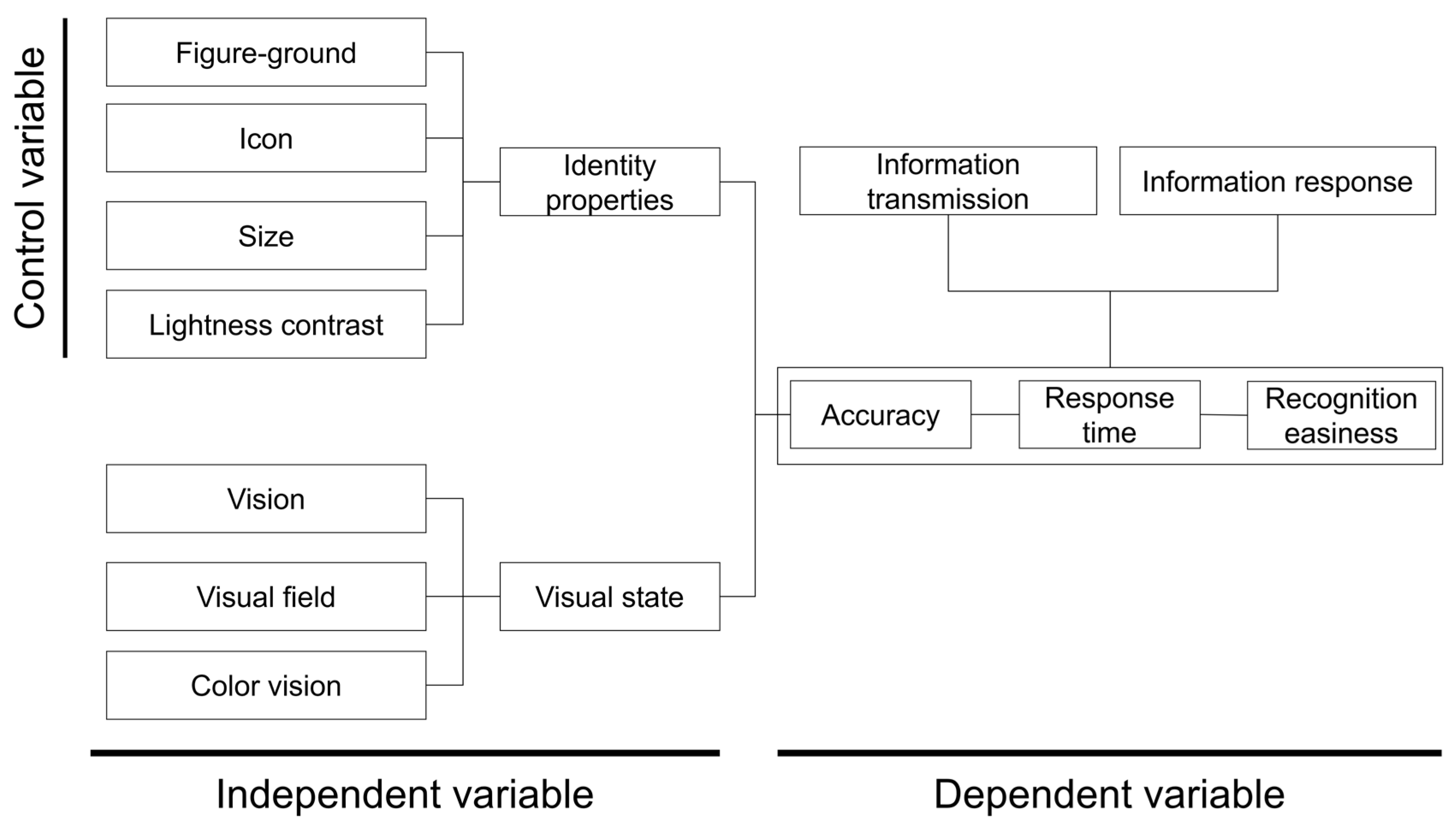
2. Experimental Design
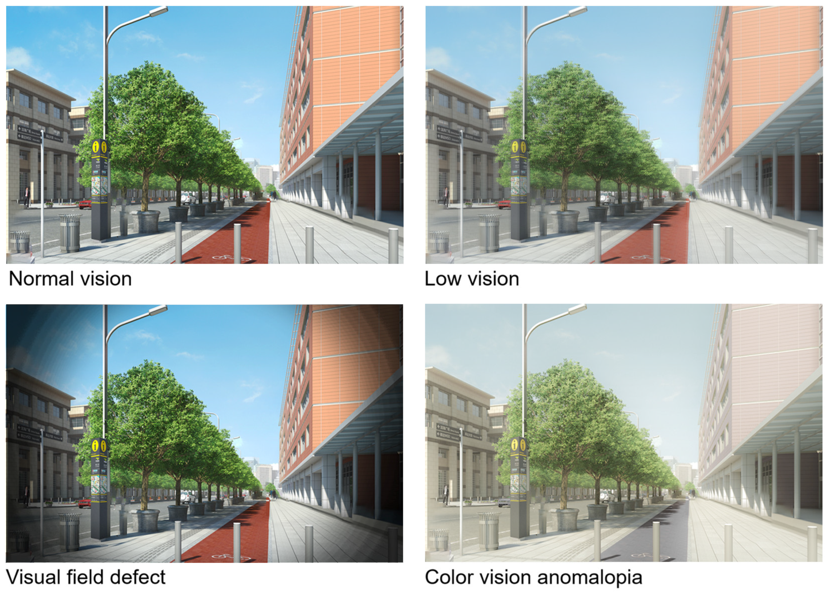
2.1. Enrollment and Determination of Visual Status
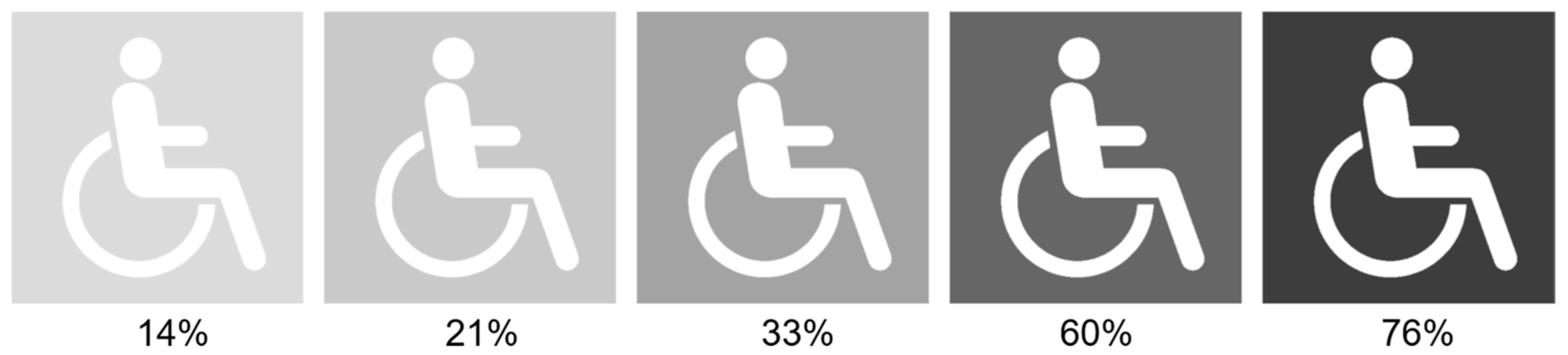
2.2. Experiment Setup
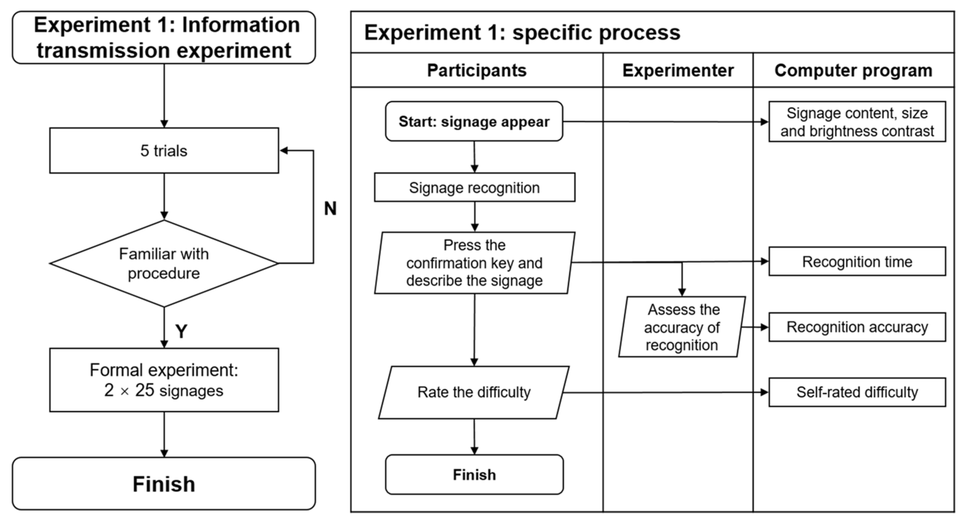
2.3. Procedure
3. Experimental Results
3.1. Descriptive Statistics
3.1.1. Experiment 1
- Accuracy
- 2.
- Response time
- 3.
- Difficulty level
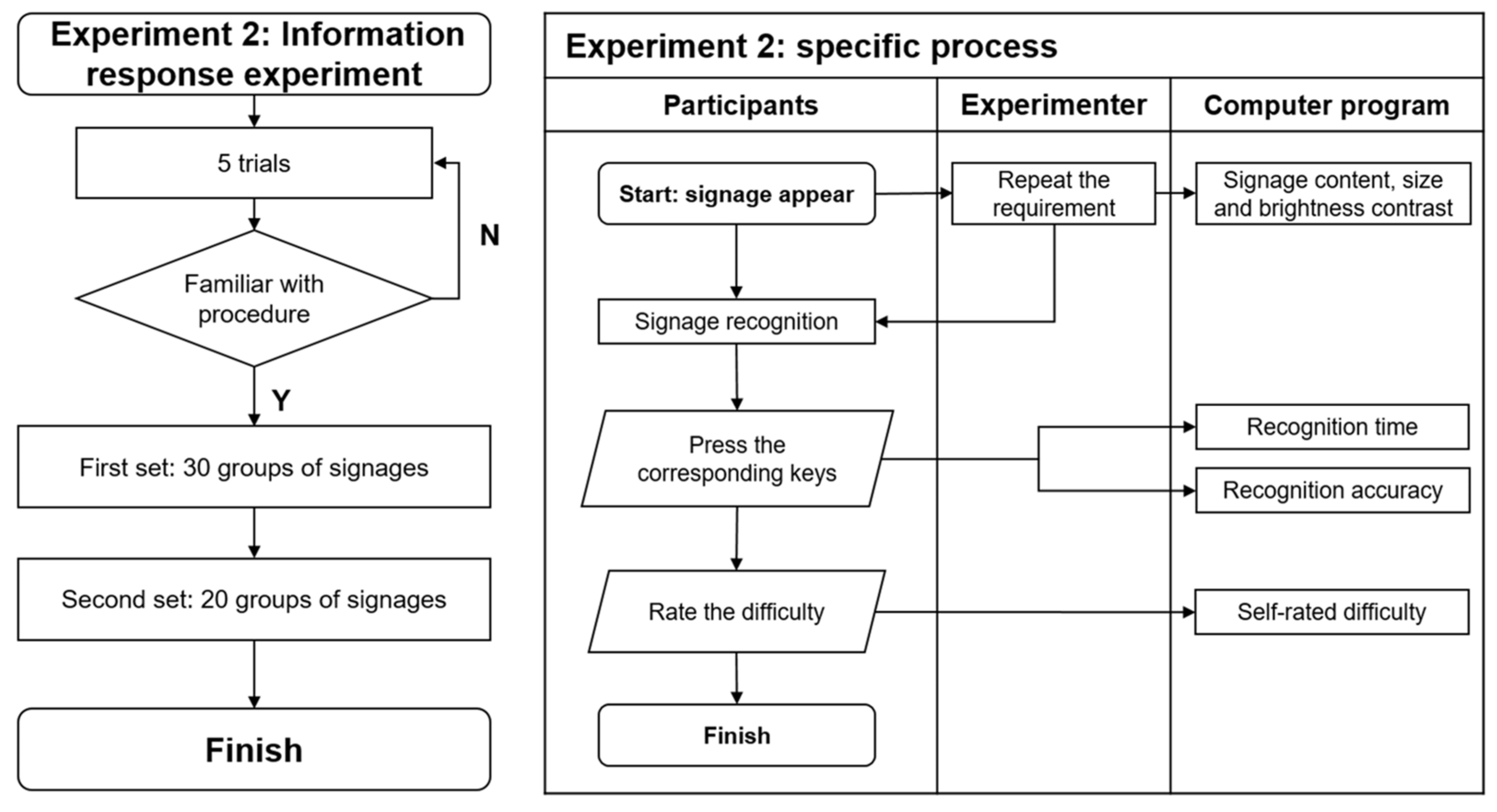
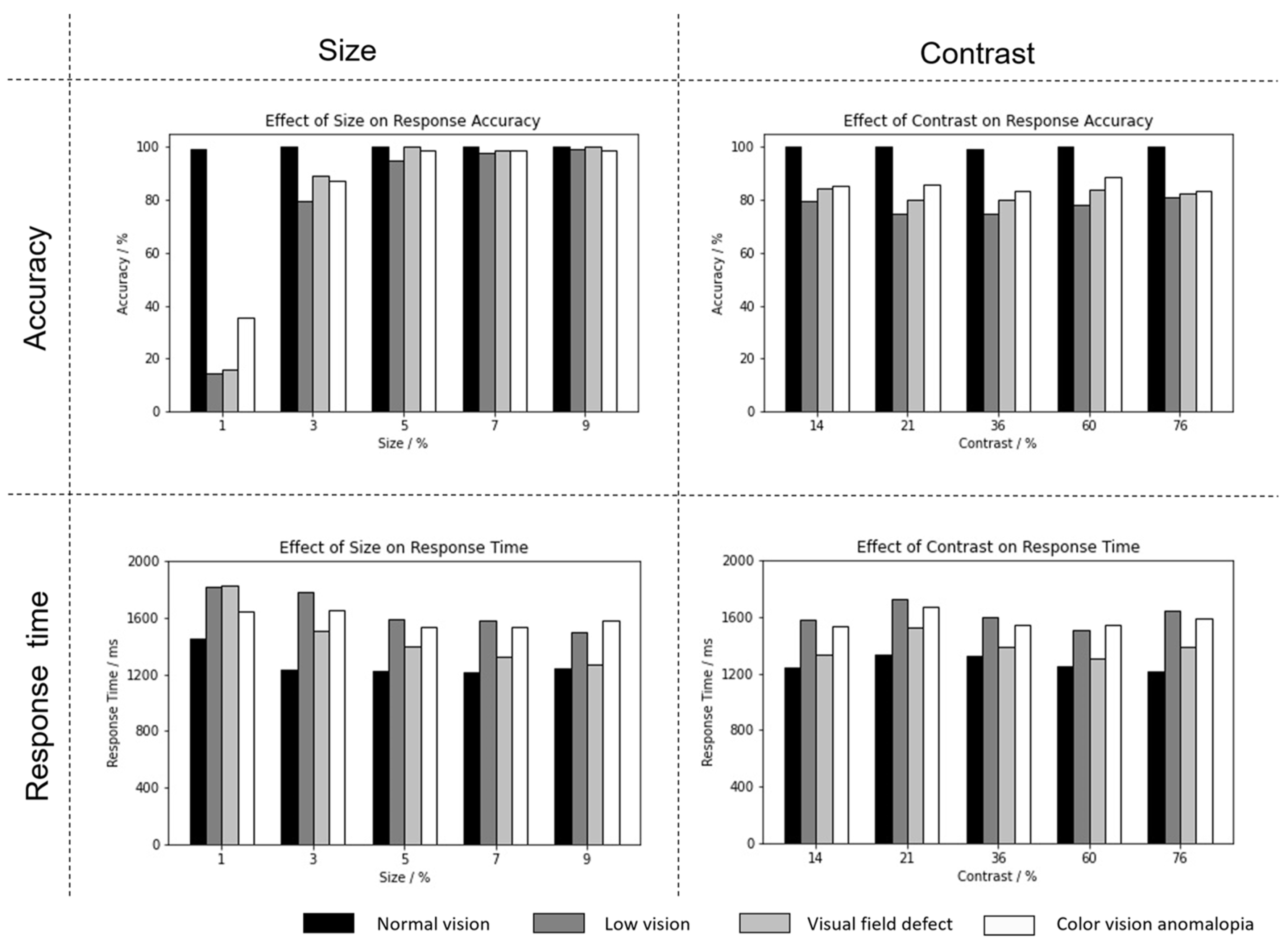
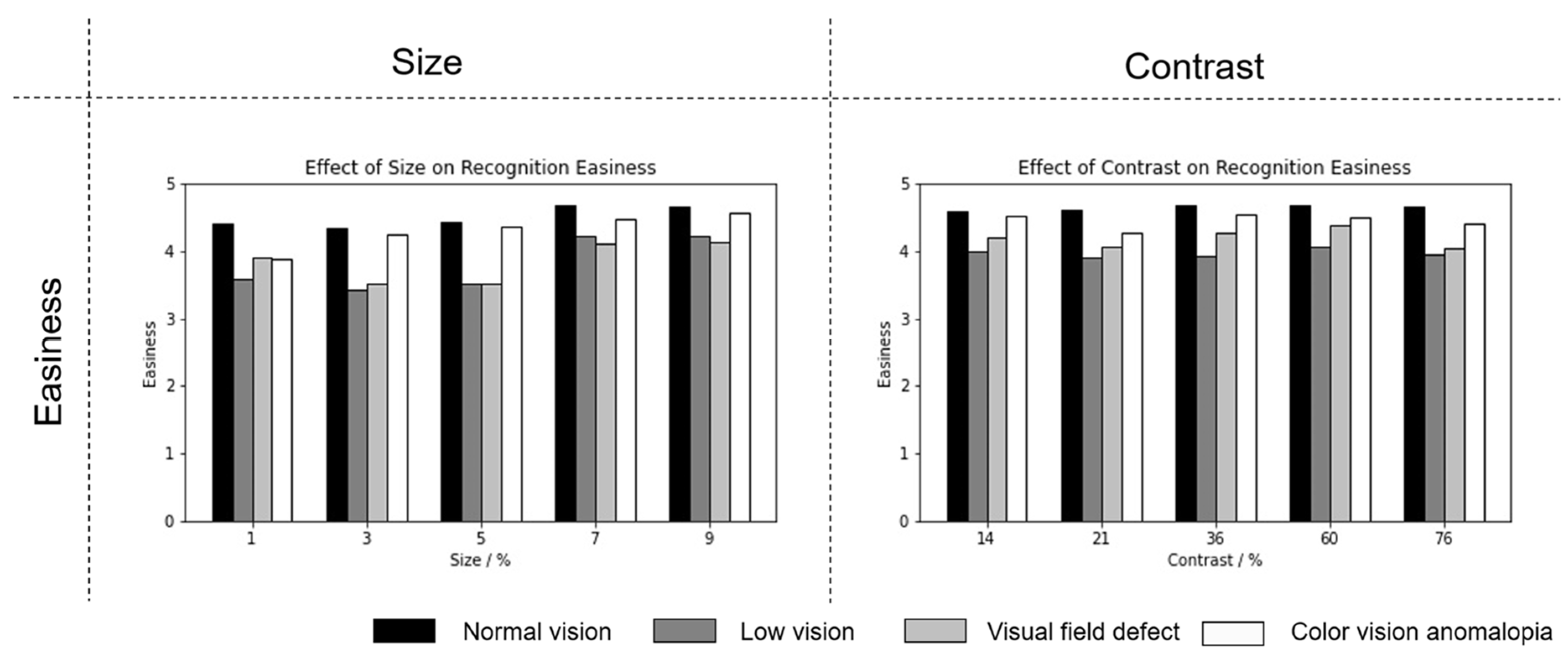
3.1.2. Experiment 2
- (1)
- Accuracy
- (2)
- Response time
- (3)
- Difficulty level
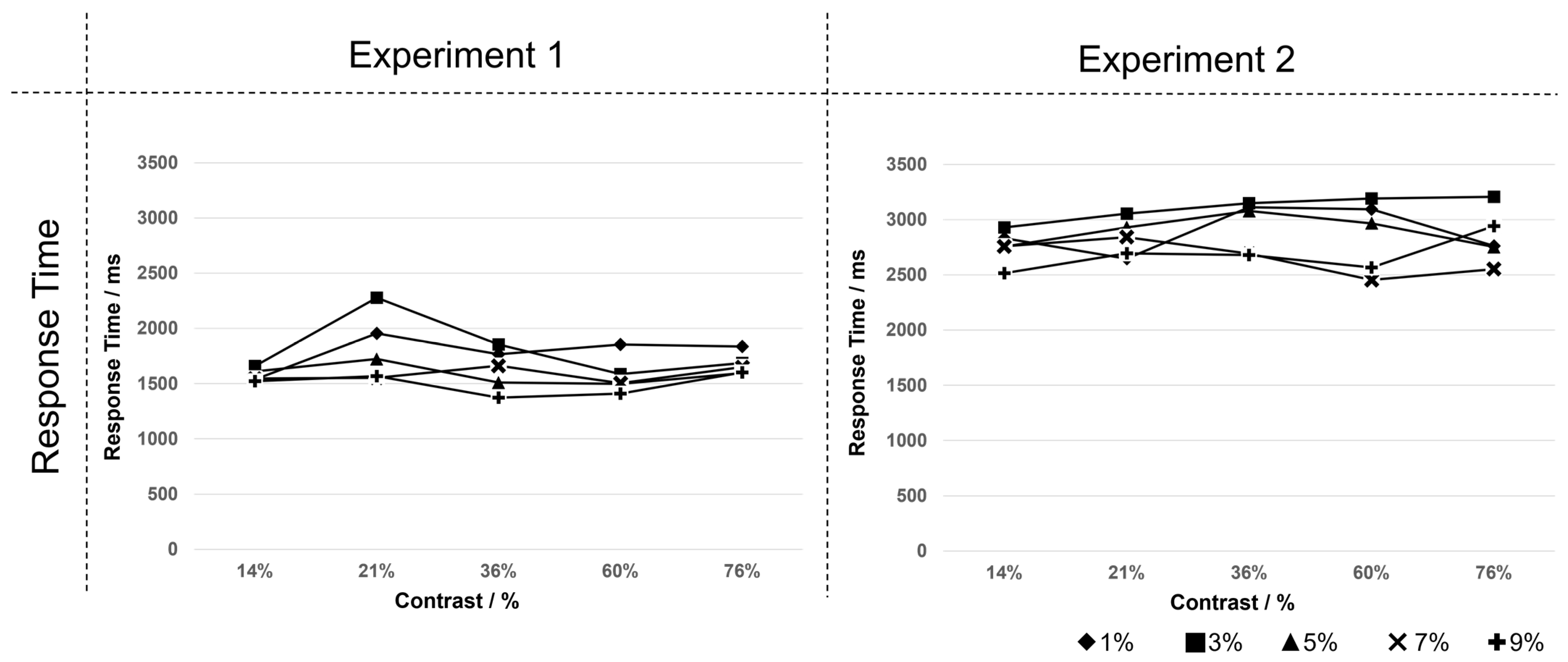
3.1.3. Correlation between Experiments 1 and 2
- (1)
- Accuracy
- (2)
- Response time
3.2. Path Analysis
3.2.1. Experiment 1
- (1)
- When the dependent variable is accuracy, visual acuity (r = 0.272, z = 18.210, p = 0.000 < 0.01) and signage size (r = 0.517, z = 35.424, p = 0.000 < 0.01) are significantly positively correlated with accuracy.
- (2)
- After excluding experimental data with erroneous response results in Experiment 1, analysis with correct response time as the dependent variable found that vision (z = −12.438, p = 0.000 < 0.01) and signage size (z = −6.885, p = 0.000 < 0.01) are significantly negatively correlated with response time. Color vision (z = −2.432, p = 0.015 < 0.05) is negatively correlated with response time. Moreover, the visual field (z = 5.575, p = 0.000 < 0.01) is significantly positively correlated with response time.
- (3)
- When the dependent variable is self-rated difficulty, vision (z = 26.468, p = 0.000 < 0.01) and signage size (z = −3.369, p = 0.001 < 0.01) are significantly positively correlated with self-rated difficulty. Color vision (z = 44.096, p = 0.000 < 0.01) is negatively correlated with difficulty.
3.2.2. Experiment 2
- (1)
- When the dependent variable is accuracy, vision (z = 6.787, p = 0.000 < 0.01) and signage size (z = 12.904, p = 0.000 < 0.01) are significantly positively correlated with accuracy.
- (2)
- After excluding experimental data from Experiment 1 with incorrect response results, analysis of correct response time as the dependent variable revealed that vision (z = −5.513, p = 0.000 < 0.01), visual field (z = −4.038, p = 0.000 < 0.01), and signage size (z = 12.904, p = 0.000 < 0.01) are significantly positively correlated with response time.
- (3)
- When the dependent variable is self-rated difficulty, vision (z = 18.150, p = 0.000 < 0.01) and signage size (z = 19.523, p = 0.000 < 0.01) are significantly positively correlated with self-rated difficulty. Color vision (z = −3.092, p = 0.002 < 0.01) is significantly negatively correlated with self-rated difficulty.
4. Discussion
5. Conclusions
Author Contributions
Funding
Institutional Review Board Statement
Informed Consent Statement
Data Availability Statement
Conflicts of Interest
Correction Statement
References
- Arthur, P.; Passini, R. Wayfinding: People, Signs, and Architecture; McGraw-Hill Book Company: New York, NY, USA, 1992. [Google Scholar]
- Calabrese, A.; Cheong, A.M.Y.; Cheung, S.H.; He, Y.; Kwon, M.; Mansfield, J.S.; Subramanian, A.; Yu, D.; Legge, G.E. Baseline MNREAD measures for normally sighted subjects from childhood to old age. Investig. Ophthalmol. Vis. Sci. 2016, 57, 3836–3843. [Google Scholar] [CrossRef] [PubMed]
- Calder, L.; Woo, G.C. Clinical low vision. Optom. Vis. Sci. 1985, 62, 228–229. [Google Scholar]
- Feinbloom, W. Report on the science information program. Optom. Vis. Sci. 1966, 43, 112–115. [Google Scholar] [CrossRef]
- Hellinger, G. Vision rehabilitation for aged blind persons. J. Vis. Impair. Blind. 1969, 63, 175–177. [Google Scholar] [CrossRef]
- Adeyemo, O.; Jeter, P.E.; Rozanski, C.; Arnold, E.; Dalvin, L.A.; Swenor, B.; Dagnelie, G. Living with ultra-low vision: An inventory of self-reported visually guided activities by individuals with profound visual impairment. Transl. Vis. Sci. Technol. 2017, 6, 10. [Google Scholar] [CrossRef] [PubMed]
- Davies, T.; Beasley, K. Accessible Design for Hospitality: Ada Guidelines for Planning Accessible Hotels, Motels and Other Recreational Facilities; McGraw-Hill: New York, NY, USA, 1994. [Google Scholar]
- Weisman, J. Evaluating architectural legibility: Way-finding in the built environment. Environ. Behav. 1981, 13, 189–204. [Google Scholar] [CrossRef]
- Rubin, G.S.; Legge, G.E. Psychophysics of reading. VI—The role of contrast in low vision. Vis. Res. 1989, 29, 79–91. [Google Scholar] [CrossRef] [PubMed]
- American National Standards Institute. Accessible and Usable Buildings and Facilities; Council of American Building Officials: Falls Church, VA, USA, 1992.
- Schambureck, E.M.; Parkinson, S.F. Design for Sight: A Typology System for Low–Vision Design Factors. J. Int. Des. 2018, 43, 33–54. [Google Scholar] [CrossRef]
- Giudice, N.A.; Legge, G.E. Blind navigation and the role of technology. In The Engineering Handbook of Smart Technology for Aging, Disability, and Independence; Helal, A., Mokhtari, M., Abdulrazak, B., Eds.; John Wiley & Sons: New York, NY, USA, 2008; pp. 479–500. [Google Scholar]
- Walker, B.N.; Lindsay, J. Development and evaluation of a system for wearable audio navigation. Proc. Hum. Factors Ergon. Soc. Annu. Meet. 2005, 49, 1607–1610. [Google Scholar] [CrossRef]
- Wilson, J.; Walker, B.N.; Lindsay, J.; Cambias, C.; Dellaert, F. SWAN: System for Wearable Audio Navigation. In Proceedings of the 2007 11th IEEE International Symposium on Wearable Computers, Boston, MA, USA, 11–13 October 2007; pp. 91–98. [Google Scholar]
- Legge, G.E.; Beckmann, P.J.; Tjan, B.S.; Havey, G.; Kramer, K.; Rolkosky, D.; Gage, R.; Chen, M.; Puchakayala, S.; Rangarajan, A. Indoor navigation by people with visual impairment using a digital sign system. PLoS ONE 2013, 8, e76783. [Google Scholar] [CrossRef]
- Zhang, E.; Yang, Z.; Zhao, W.; Mei, Z.; Xia, Y.; Chen, F. Unlocking Brilliance: A Smart Approach to Icon Colour Design Inspired by Universal Design Principles. Buildings 2024, 14, 1522. [Google Scholar] [CrossRef]
- Arditi, A. Improving the design of the letter contrast sensitivity test. Investig. Ophthalmol. Vis. Sci. 2005, 46, 2225–2229. [Google Scholar] [CrossRef] [PubMed]
- Regan, D.; Neima, D. Low-contrast letter charts as a test of visual function. Ophthalmology 1983, 90, 1192–1200. [Google Scholar] [CrossRef] [PubMed]
- Scheiman, M.; Scheiman, M.; Whittaker, S. Low Vision Rehabilitation: A Practical Guide for Occupational Therapists; Slack Incorporated: West Deptford, NJ, USA, 2007. [Google Scholar]
- Zhao, W.; Zhang, E.; Zhang, M. Interior design considerations for individuals with impaired vision. Inter. Des. Constr. 2021, 12, 126–128. [Google Scholar]
- Arditi, A. Rethinking ADA signage standards for low-vision accessibility. J. Vis. 2017, 17, 8. [Google Scholar] [CrossRef] [PubMed]
- ANEC. New Standard for the Visual Accessibility of Signs and Signage for People with Low Vision; Acute Necrotizing Encephalopathy of Childhood: Brussels, Belgium, 2010.
- Lerner, N.; Singer, J.; Robinson, E.; Huey, R.; Jenness, J. Driver Use of Enroute Real-Time Travel Time Information; Federal Highway Administration: Washington, DC, USA, 2009.
- NIBS. Design Guidelines for the Visual Environment: Version 6; National Institute of Building Sciences: Washington, DC, USA, 2015. [Google Scholar]
- RTIG Inform. Bus Passenger Information Technology. Available online: https://theaccessofficer.n-somerset.gov.uk/2016/02/12/bus-passenger-information-technology/ (accessed on 21 May 2024).
- Zimring, C.M.; Bostrom, J.; Wineman, J. Multidisciplinary Assessment of the State of the Art of Signage for Blind and Low Vision Persons: Final Report; Architectural and Transportation Barriers Compliance Board: Washington, DC, USA, 1985.
- Hayanouchi, S. Investigation of Color and Discriminability of Tactile Pavements for the Visually Impaired; Japan Road Technical Association: Tokyo, Japan, 1974. [Google Scholar]
- Yoshida, M.; Clara, A.; Shoko, S. The use of films to simulate age-related declines in yellow vision. J. Occup. Rehabil. 1996, 6, 119–134. [Google Scholar] [CrossRef]
- Lomperski, T.J. Enhancing interior building sign readability for older adults: Lighting color and sign color contrast. J. Int. Des. 1997, 23, 17–27. [Google Scholar] [CrossRef]
- Bright, K.; Cook, G.; Harris, J. Colour, Contrast & Perception: A Design Guidance for Internal Built Environments; University of Reading: London, UK, 2004. [Google Scholar]
- Bullough, J. Factors affecting sign visibility, conspicuity, and legibility: Review and annotated bibliography. Interdiscip. J. Signage Wayfinding 2017, 1, 2–25. [Google Scholar] [CrossRef]
- Yang, P.; Zhao, K. Ophthalmology; People’s Medical Publishing House: Beijing, China, 2000. [Google Scholar]
- Arthur, P. Broadening Our Comprehension of the Principles of Environmental Communications in Public Buildings; National Research Council Canada: Ottawa, ON, Canada, 1984. [Google Scholar]
- GBT 15566.1-2007; Guidance System for Public Information—Setting Principles and Requirements—Part 1: General Principles. China Planning Publishing House: Beijing, China, 2007.
- GBT 10001.1-2012; Public Information Graphic Symbols—Part 1: General Symbols. China Planning Publishing House: Beijing, China, 2012.
- ISO 21542:2011; Building Construction—Accessibility and Usability of the Built Environment. International Organization for Standardization: Geneva, Switzerland, 2011.
- Peters, G.; Adams, B. Three criteria for readable panel markings. Prod. Eng. 1959, 30, 123–131. [Google Scholar]
- Smith, S.L. Letter size and legibility. Hum. Factors 1979, 21, 661–670. [Google Scholar] [CrossRef]
- Loomis, J.M. A model of character recognition and legibility. J. Exp. Psychol. Hum. Percept. Perform. 1990, 16, 106–120. [Google Scholar] [CrossRef] [PubMed]
- Holmes-Siedle, J.; Goldsmith, S. Accessible Design; Dalian University of Technology Press: Dalian, China, 2002. [Google Scholar]
- BSI. Design of Buildings and Their Approaches to Meet the Needs of Disabled People: Code of Practice; British Standards Institution: London, UK, 2018; p. 58. [Google Scholar]
- Architectural Institute Of Japan. A Concise Collection of Accessible Building Design Information; China Architecture & Building Press: Beijing, China, 2006. [Google Scholar]
- Civil Rights Division of U.S. Department of Justice. ADA Standards for Accessible Design; U.S. Department of Justice: Washington, DC, USA, 2010.
- Sun, B.; Hu, A. Clinical Low Vision; People’s Medical Publishing House: Beijing, China, 2013. [Google Scholar]
- Ding, X.; Zhu, R.; Li, J. A criterion of image quality assessment based on property of HVS. J. Image Graph. 2004, 9, 190–194. [Google Scholar]
- Cook, G.; Webber, G.; Gillham, S.; Le Scouiller, S.; Moseley, E. The legibility and conspicuity of emergency escape route signage for people with visual impairments. Int. Congr. Ser. 2005, 1282, 1016–1020. [Google Scholar] [CrossRef]
- Den Brinker, B.; Wijk, M.; Smeets, J. In public environments character height of textual information should be at least 5 percent of critical reading distance. In Proceedings of the 9th International Conference on Low Vision, Montreal, QC, Canada, 7–11 July 2008. [Google Scholar]


| Standard | The Requirements for Brightness Contrast |
|---|---|
| Germany | Appropriate combinations are characterized by one or more of the following: high brightness contrast, achromatic components, and combinations of complementary colors. Among them, <0.16 is low contrast, <0.64 is medium, and ≥0.64 is high contrast; for the visually impaired, the contrast should be more than 0.83. |
| Spain | A minimum of 60% brightness contrast between shapes and backgrounds for the low vision individual. |
| The Netherlands | For normal groups, the difference in reflectance of signage and background of signage and background must be ≥0.30, and the reflectance values of white and black are 0.85 and 0.04, respectively. However, the rationale for the values is not provided. |
| Sweden | Due to weathering and discoloration, the brightness contrast diminishes overtime. Therefore, for normal groups, some institutions believe that a brightness contrast of 60% is not recommended and should be set it to 70%. |
| UK | For low vision individuals, the brightness contrast between the wall and the signboard should be 70%. However, no quantitative experimental data are provided. |
| USA | The brightness contrast should be more than 70%. |
| Canada | A recommendation of 70% brightness contrast between the foreground and background (NCS color system) is provided without any further information. |
| China | The background color of the pedestrian directional signages and the brightness contrast between brightness and dark of the layout elements should not be less than 30%. |
| ISO 21542 [36] | The proposed brightness contrast for signage is 60%. |
| Standards | Recommended Letter Scale | Recommended Character Scale | Size and Reading Distance | Remark |
|---|---|---|---|---|
| Belgium | — | 1.8–3.5% | 2–4% | Depending on the importance of information displayed Text information should be supplemented by symbols for understanding |
| The Netherlands | — | 5% of critical reading distance | 5% | Contrasting letters must have a minimum ratio of 1:3 to the background |
| Luxemburg | — | — | 3.75% | |
| Ireland | — | At least 15 × 15 cm | 6% | Absolute minimum of 1.5–2.5 cm Emergency signs should be sized larger, as they may need to be followed in smoky conditions and/or without good lighting |
| United Kingdom | Minimum Size (1.5–2.5 cm) | The overall height of the symbol should be at least 10 cm, if space permits | Average of 5% | Symbols are generally better than words |
| Medium (5–10 cm) | ||||
| Long distance (>15 cm) | ||||
| Spain | — | — | 2.75% (minimum 1.4%) | — |
| Sweden | The character size cannot be increased indefinitely because the text is no longer readable when low vision individuals get too close to the signage | — | 2% (minimum 1.5%) | — |
| X | → | Y | z (CR Value) | p |
|---|---|---|---|---|
| Vision | → | Accuracy | 18.210 | 0.000 ** |
| Visual field | → | Accuracy | −1.567 | 0.117 |
| Color vision | → | Accuracy | 0.651 | 0.515 |
| Signage size | → | Accuracy | 35.424 | 0.000 ** |
| Brightness contrast | → | Accuracy | 1.143 | 0.253 |
| Vision | → | Response time | −12.438 | 0.000 ** |
| Visual field | → | Response time | 5.575 | 0.000 ** |
| Color vision | → | Response time | −2.432 | 0.015 * |
| Signage size | → | Response time | −6.885 | 0.000 ** |
| Brightness contrast | → | Response time | −0.932 | 0.351 |
| Vision | → | Difficulty | 26.468 | 0.000 ** |
| Visual field | → | Difficulty | −1.397 | 0.162 |
| Color vision | → | Difficulty | −3.369 | 0.001 ** |
| Signage size | → | Difficulty | 44.096 | 0.000 ** |
| Brightness contrast | → | Difficulty | 1.271 | 0.204 |
| X | → | Y | z (CR Value) | p |
|---|---|---|---|---|
| Vision | → | Accuracy | 6.787 | 0.000 ** |
| Visual field | → | Accuracy | −0.752 | 0.452 |
| Color vision | → | Accuracy | 0.419 | 0.675 |
| Signage size | → | Accuracy | 12.904 | 0.000 ** |
| Brightness contrast | → | Accuracy | 0.006 | 0.995 |
| Vision | → | Response time | −5.513 | 0.000 ** |
| Visual field | → | Response time | −4.038 | 0.000 ** |
| Color vision | → | Response time | 0.149 | 0.881 |
| Signage size | → | Response time | −5.646 | 0.000 ** |
| Brightness contrast | → | Response time | −0.119 | 0.906 |
| Vision | → | Difficulty | 18.150 | 0.000 ** |
| Visual field | → | Difficulty | 0.599 | 0.549 |
| Color vision | → | Difficulty | −3.092 | 0.002 ** |
| Signage size | → | Difficulty | 19.523 | 0.000 ** |
| Brightness contrast | → | Difficulty | 1.342 | 0.180 |
Disclaimer/Publisher’s Note: The statements, opinions and data contained in all publications are solely those of the individual author(s) and contributor(s) and not of MDPI and/or the editor(s). MDPI and/or the editor(s) disclaim responsibility for any injury to people or property resulting from any ideas, methods, instructions or products referred to in the content. |
© 2024 by the authors. Licensee MDPI, Basel, Switzerland. This article is an open access article distributed under the terms and conditions of the Creative Commons Attribution (CC BY) license (https://creativecommons.org/licenses/by/4.0/).
Share and Cite
Zhang, E.; Zhao, W.; Mei, Z.; Yang, Z.; Chen, F.; Xia, Y.; Wang, Y. Experimental Study on the Universal Design of Signage Size and Brightness Contrast for Low Vision Individuals. Buildings 2024, 14, 2063. https://doi.org/10.3390/buildings14072063
Zhang E, Zhao W, Mei Z, Yang Z, Chen F, Xia Y, Wang Y. Experimental Study on the Universal Design of Signage Size and Brightness Contrast for Low Vision Individuals. Buildings. 2024; 14(7):2063. https://doi.org/10.3390/buildings14072063
Chicago/Turabian StyleZhang, Erke, Wei Zhao, Zihan Mei, Zhexi Yang, Fei Chen, Yuanyuan Xia, and Yihan Wang. 2024. "Experimental Study on the Universal Design of Signage Size and Brightness Contrast for Low Vision Individuals" Buildings 14, no. 7: 2063. https://doi.org/10.3390/buildings14072063
APA StyleZhang, E., Zhao, W., Mei, Z., Yang, Z., Chen, F., Xia, Y., & Wang, Y. (2024). Experimental Study on the Universal Design of Signage Size and Brightness Contrast for Low Vision Individuals. Buildings, 14(7), 2063. https://doi.org/10.3390/buildings14072063