Abstract
Environmental data visualization tools are used for data validation, maintenance, and assessment of status and trends of environmental variables. However, currently available visualization tools do not meet all the requirements needed for efficient data management. In this paper, we propose a new approach and present a web-based implementation of a visualization tool that focuses on efficient visualization and seamless integration of maps and graphs. Our approach emphasizes the spatio-temporal relationship of environmental data stored in a relational database. Several new advantages emerge with this approach. Through a case study of two oceanographic datasets—the HarmoNIA project database and the Croatian national monitoring database—we show how this approach enables intuitive status and trend assessments, simplifies data validation, enables the updating of corrections, and is suitable for a web-based implementation that works efficiently even with large datasets.
1. Introduction
The visualization of environmental data is important for the assessment of processes taking place in the environment [1]. Visualization of collected data includes plotting charts or drawing maps with values of the variables collected by monitoring system or predicted by modelling software. There are many tools used by environmental scientists developed for the purpose of data visualization. However, they all lack an intuitive interface for assessment of state, trends and outliers in the presented dataset. In this paper we present a new, web based tool with an intuitive interface capable of the seamless examination of environmental data both in spatial and temporal dimensions. We designed an operative visualization tool by having in mind all layers of the web application: data storage and exchange formats, optimized client server communication patterns and designed web user interface. The main goals that we want to achieve are:
- Intuitively assess the state of the environment based on the values of the presented variables;
- Intuitively asses the trends of the environment state based on the processes taking place in the environment;
- Intuitively recognize the error or outlier in presented measurement data.
1.1. Motivation
Environmental science with oceanography is important for understanding the environment and addressing climate change. Measurements, including fieldwork and cruises, are very expensive, which brings with it a great responsibility for data management so that these measurements can provide new knowledge and understanding of natural processes. In the more than 20 years we have been working with oceanographic data, we have concluded that data management is very often inadequate, leaving data unchecked or incomplete. Much of the blame in such cases lies with inappropriate tools for organising, storing, reviewing and analysing data.
1.2. Related Work
Spatio-temporal web data visualization often involves the use of the web GIS and various graphical representations of data with combined views of space and time [2]. Oceanographic data management relies on visualization for insight of both state and trends of the environment [3]. Visualization in a web environment also includes an interface (human-computer interaction), transfer of data to the client side, and user interactions [4]. Of additional importance for a successful web application is the time needed to collect the data and draw the scene (it should be short enough for smooth use) [5]. Relational databases are standard today as a source of data for general types of websites (content management systems). They are used for spatio-temporal visualization for the same reason: easy and fast query and extraction of subsets of data based on user queries [6].
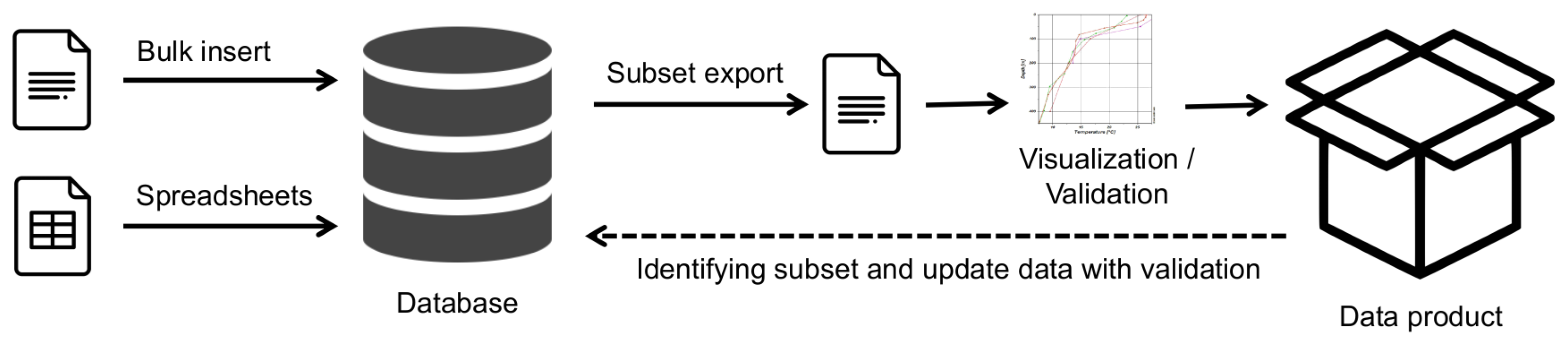
Traditionally, spatio-temporal (environmental) data are collected, validated, and stored in a file system using specialized software. Oceanographic data validation additionally involves setting the “validation factor” that describes the quality of the data. This flag should be set as a result of data visualisation by a local expert, and this information states that this value corresponds to the expected value range for a given parameter, location and time [7]. The increasing prevalence of relational databases has led to their use for managing environmental data as well [8]. Special client programs are used to access the database and visualize and validate the data. The user creates a data product from a subset of data and produces some images with maps and graphs. A schematic representation of this process can be found in Figure 1. The data product is a validated and visualized dataset tailored to the specific purpose. The result is a “one-dimensional” view of the dataset used. In the end, the result can be published as a web page or text document. Errors identified and corrected in this process are in most cases not returned to the database or data source, and for another data product, the analyses and validation of the data must be performed again.
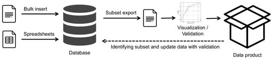
Figure 1.
Schematic view of traditional “one direction” data flow.
In the next section we will present the currently used tools for environmental spatio-temporal data visualization and outline their shortcomings.
1.2.1. General Purpose Software (Spreadsheet, etc.)
Environmental data management has traditionally involved the use of some general-purpose software tools. For example, spreadsheets (mostly MS Excel) are used for data visualization and some time as data storage. Various statistical tools (such as Statistica or R Statistics) are used for statistical analysis and some advanced data visualization. General purpose spatial data software (such as QGIS [9] or ESRI ArcView) is used to draw maps of the stations. The above programs have a wide range of applications and meet some data management requirements, but also have some major drawbacks:
- Processing a subset of data is time-consuming. Example: If the user has a large Excel spreadsheet with data from all stations, it is time consuming to extract just one station or data from a group of stations;
- Returning the analysis results to the main dataset is time consuming or non-existent. Example: the analysis of data from one station shows some errors in the values. It is time consuming to find the exact rows in the original dataset containing all stations and update the values;
- Visualization of data only (chart) or map only (stations). One tool is used to draw charts (usually Excel) and another is used for maps (e.g., QGIS). In the end, the user has to extract both and put them together in a word processor;
- Poor efficiency of the whole process. The process described is repetitive and time consuming.
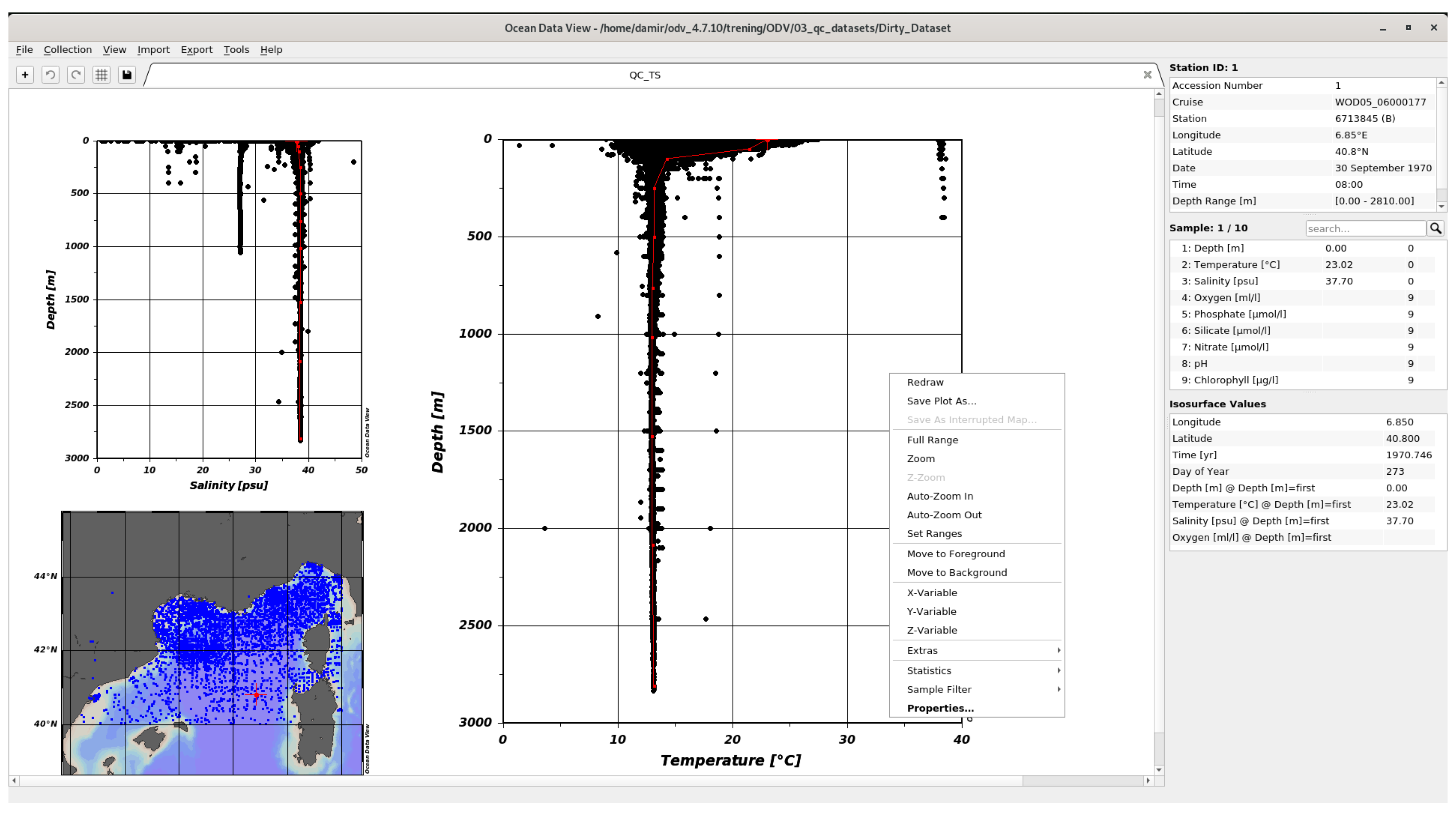
1.2.2. Ocean Data View
Ocean data view (ODV) [10] is the most powerful software tool for the visualization of oceanographic data. It provides various graphical visualizations, stations maps and spatial interpolation. The interface shown in Figure 2 is based on context menus and requires some learning for new users due to the many options implemented.
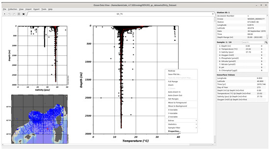
Figure 2.
ODV desktop application.
Despite its very good visualization capabilities, ODV is only a tool for visualizing a subset of data. The biggest disadvantages are:
- Limited data filtering;
- Desktop tool with no collaboration possibilities;
- Changes and validations made in ODV can be exported to file, not committed to the database;
- Separate and detached visualizations of status and trend.
Recently, Ocean Data View has also become available as a web version [11,12]. The web interface is implemented using a websocket (QtWebSockets) to run web applications, or a combination of WebSocket and HTML5 Canvas. These types of solutions are graphical versions of the terminal approach to the server. Each client has its own isolated process on the server side and performs various operations over WebSocket. The main disadvantage of this approach is that we need some processing power on the server side for each client, and content caching on the browser side is not really used. The interface is the same as for the desktop version. With WebODV it is only possible to visualize prepared datasets available online. It is not possible to make any changes.
1.2.3. WISE Marine
The European Environment Agency has its own services for visualization and presentation of data. One of these services is the Water Information System for Europe (WISE) Marine [13]. The purpose of this website is to present the state of the environment, as the agency explains on its website: “The marine environment assessments are typically informed by indicators which draw from monitoring data in a structured manner for each assessment topic. The indicators can cover all aspects of the DPSIR framework [14], but are generally more focused on pressures, state and impacts. The indicator assessments provide detailed information including the matrices, metrics and methods used, as well as the results. In the present section, a list of indicators is provided either used in the context of the Regional Sea Conventions work, or published by the European Environment Agency with a pan-European coverage”.
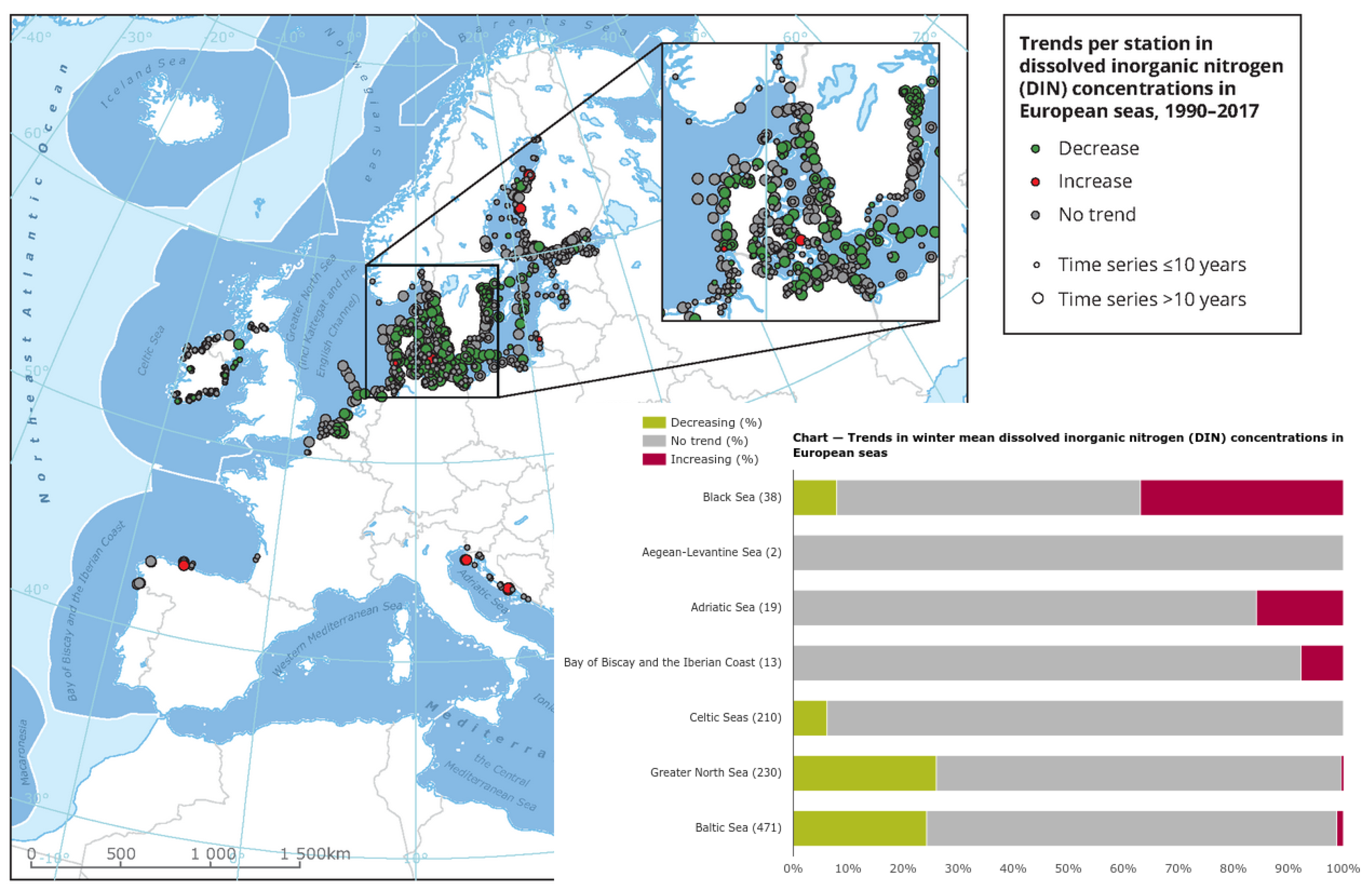
In many different visualizations, such as in Figure 3 [15], status and trends are shown. The map is presented as a static image showing only the trend without specific values. The chart shows only the percentage of trends within areas. The map and chart are not linked and the map is not interactive. In addition to the static elements, data visualizations often do not provide basic information about the dataset: what are the ranges of values, where are the hotspots, and what are the trends for specific locations and hotspots. Trend is often calculated as a statistically significant increase or decrease in value over time, without considering the value itself. Using this approach, a location with a measured value for a particular parameter may have an average value of 100 in one year and an average value of 80 in another year, indicating a statistically significant decline. Another location may have a value of 5 for the same parameter in one year and a value of 6 in another year. In the data visualization, the first site has a better status than the second (decrease vs. increase), regardless of the fact that the status with respect to this particular parameter is much better at the second site than at the first.

Figure 3.
Example of data visualizations from WISE Marine [15].
1.2.4. Comparison of Related Software and Targeted Properties
The software described is used in real-world applications to manage and present oceanographic data. There are many web pages that contain oceanographic data. WISE Marine site was chosen because it is intended to present the status and trend of certain oceanographic parameters and because this site has a serious background (European Environment Agency). Table 1 shows a summary of the main characteristics of the listed solutions.
Table 1.
Main properties of related solutions.
As can be seen in Table 1, the big problem with the listed solutions is that the data cannot be easily inserted and updated. Considering that 20–30% of oceanographic data are lost worldwide; this is even more important. Extracting knowledge from data is another important issue. Identifying status, trends, and hot spots is important to experts and is becoming increasingly important to the general public. In this work we are trying to fill this gap with a database-based online solution that allows easy input and updating with coupled spatio-temporal visualization.
1.3. Research Goals and Proposed Solution
Having in mind shortcomings of traditionally used tools for data visualization and need for efficient data management, our research is aimed towards definition, design and implementation of an efficient new tool. The requirements for such a tool are:
- Web based interface with good response time in order to ensure high availability to all users accessing from different platforms;
- Efficient data exchange between client and server and balancing of load for data processing;
- Bidirectional seamlessly switching between spatial and temporal dimension in visualization;
- Sharing knowledge possibilities in terms of data validation and expertise updates;
- Integration of data from various sources.
From the aspect of functionalities the goals to be achieved are:
- The solution must provide a simple and intuitive user interface. Users must be able to use the application without any special help or learning effort;
- The solution must provide quick and easy insight into spatio-temporal data so that users can extract knowledge from the displayed datasets (state of the environment, trends, special events). At the same time, the user can easily validate the dataset by identifying and marking bad values;
- The solution must be able to be implemented as a real web application and for real use cases.
To achieve these goals, we need to analyse the process of data management and the visualization of spatio-temporal environmental data. Tools and processes used by environmental experts in their work to manage data, as well as their efforts and problems. At the end, we can propose a methodology and its implementation to find a solution.
The rest of the paper is organized as follows: in the next section we describe materials and methods used in this study—describe the oceanographic environmental spatio-temporal data, discuss the elements of interface for the proposed solution and design the means of verification. The following section describes the case study implementation. In the results section we describe the demonstration of our visualization solution on two different datasets and discuss the performance and capabilities. In the conclusion we outlined the advantages of the proposed solution and discuss the future work that is enabled by the approach we offered.
2. Materials and Methods
To optimize the workflow, we first need to introduce a two-way data flow with a web browser as the central tool for querying and submitting changes to environmental data. A schematic representation of the two-way data flow can be found in Figure 4.
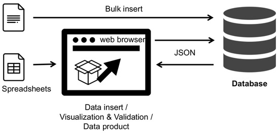
Figure 4.
Schematic view of changed “two way” data flow.
Using the application server and data visualization in the web browser shifts the entire process from specialized and custom desktop software to dynamic web pages. Data visualization is still performed on the client side, but the only software used is the web browser. Data can be collected from various sources and validations and data corrections are simply returned to the database.
2.1. Description of Data
Increasing human use of marine and coastal areas can affect marine ecosystems through various types of physical, chemical, and biological disturbances and contamination by hazardous substances. In particular, in the Adriatic and Ionian Seas, the general increase in maritime traffic, the growing urbanization of coastal areas, and the likely increase in offshore oil and gas production pose a serious risk of pollution by hazardous substances for several coastal countries [16].
The HarmoNIA [17] project datasets on hazardous substances in sediment, biota and water column were produced with the help of the EU EMODnet initiative for the management and provision of fragmented marine data and within the framework of the HarmoNIA project. The datasets cover the Adriatic and Ionian Seas and span the period 1980–2017. These data come from 10 different institutions. The data were collected at 2149 stations, which were sampled over 4282 times. Sampling was performed by research ships in the frame of various projects and national monitoring programs. This results in a final number of 95,231 data values related to 510 different parameters in 22 groups. Parameters include Metals and metalloids (in biota, sediment and water), Pesticides and biocides (in biota, sediment and water), PAHs (in biota, sediment and water), Antifoulants (in biota and water), Polychlorinated biphenyls (in biota and water) and Halophenols, Hydrocarbons and Radionuclides in water. All data are quality tagged using a common approach. The datasets contain some restricted access data (by negotiation or academic—6010 out of 95,231). These data are not displayed as individual values, but are used for statistical calculations.
The dataset was extracted from EMODnet in the form of the files and then bulk inserted into the relational database for the purpose of data visualizations. EMODnet uses SeaDataCloud infrastructure [18] containing a central metadata database and distributed data sources. It was beyond this case study to modify SeaDataCloud infrastructure, but as data are fetched in JSON format, the same code with minor modifications can be used to fetch data from many different sources using JSONP. Environmental data are generally dispersed in space and time. Monitoring stations are, in theory, places where measurements are made regularly as part of a monitoring program. However, there may also be locations where only one-time measurements are made and cannot be used to detect a trend. A set of stations measured at approximately the same time or averaged over a period of time can be used for spatial interpolation of a particular parameter. A set of environmental measurements for a given parameter should provide this information:
- Where are the hot-spots or locations with increased values;
- What is the trend for each location, especially for hot-spots;
- Are the values, and which ones are over some thresholds or maximum values;
- What is the category (excellent, good, poor, etc.) of each value if categories are defined for this parameter (and area).
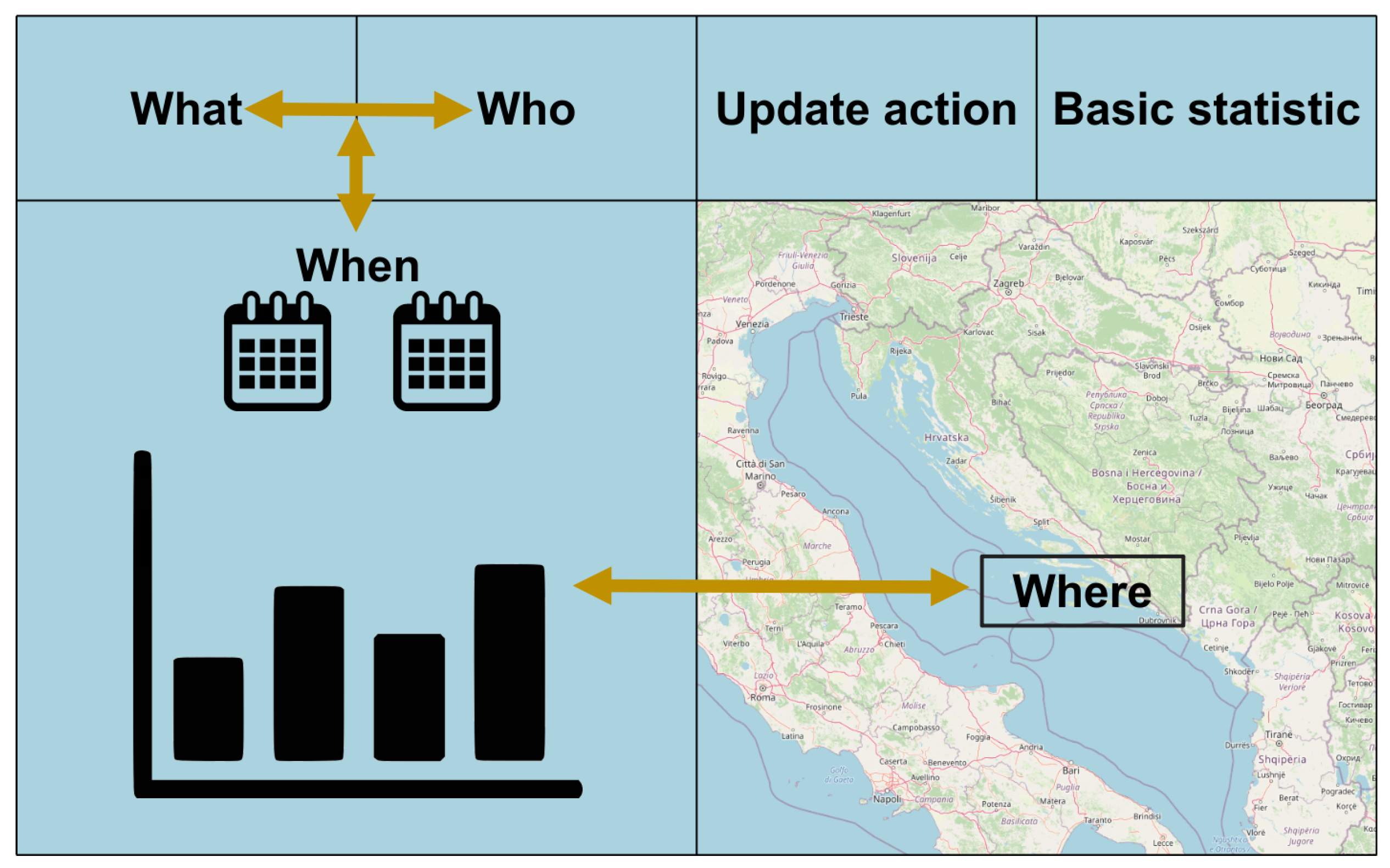
The easiest and most intuitive way to obtain these answers is through good data visualization. The type of data determines the type of graph [19] used, and we use line, column, and stacked category charts. Simple statistical processing is not good enough. Values should be associated with locations, and the importance of elevated or incidental values or pollution is associated with location preferences. Areas with greater socioeconomic values or protected natural areas have greater importance. Besides the pure value, metadata should also be displayed. We can explain the necessary metadata with the term 4W, which stands for Where, When, What, and Who. These aspects of metadata are considered as minimum metadata to achieve good data management. The meaning of the four aforementioned aspects are: Where—the spatial dimension of the data value, the geographical location expressed in a selected coordinate system, and the coverage area, which depends on the spatial variability of the measured parameter; When: the temporal dimension of the data, the date, time, and validity period of the data, which also depends on the temporal variability of the parameter; What—which parameter the value represents, what the unit of measurement is, what the measurement method was; Who—the institution performing the measurement may be the subject of data quality. Considering these four aspects of metadata, we propose a user interface for visualizing data that establishes a bidirectional relationship between the two main dimensions—spatial and temporal.
2.2. Visualization Method
First we should list some assumptions for good status-trend environmental data visualization:
- User should choose some subset of data for analyzing and/or validating;
- Both graph and map should be simultaneously presented;
- Graph elements and location markers should be connected;
- Connection should be bidirectional: from graph to map and from map to graph;
- Trend should be easily acquired for each location.
2.2.1. Interface Elements Locations
The process of data analysis/validation starts with choosing a subset of data to analyze. After that, data should be retrieved from the storage and visualized in graphical form and at the end, after all the data are acquired, data should also be input into the space on some map. Taking into account order of actions and the findings about how people view web pages [20], the organisation of a web user interface is proposed. The location of elements is shown in Figure 5. The obligatory presence of charts and maps prescribes a two-column main division with some subdivisions in the header.
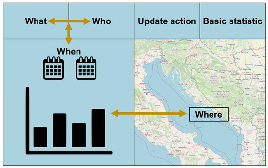
Figure 5.
Web interface elements locations diagram.
After defining the elements and their position on the page, the first implementation of the web application was created. Figure 6 shows this first version. While using the application, it became clear that the space on the user’s screen needed to be better used. Additionally, the interface was not properly aligned and looked a bit messy. To improve the user interface, we decided to use some extended design principles: “Size, Color, Contrast, Alignment, Repetition, Proximity, Whitespace, Texture and style” [21]. These principles led us to a better interface with more efficient use of space and better design. These elements will be discussed in the following sections.
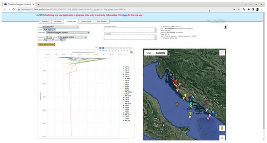
Figure 6.
Screen shoot of the first version of web application.
2.2.2. Visualization Graph—Map
Connection of graph element and location can be achieved by color matching graph element and location markers. For the web presentation and human perception the number of colors that can be used is limited. The number of measurements and locations can be bigger than the number of used colors (some colors must be reused). In that case, we should have a formula to connect each color with a particular location. Usually each location has some unique numerical identifier (primary key) in the database. We will use that number to calculate position of color from array of colors [22] with formula:
where i is the id/unique number of locations, n is the number of different colors in the array of colors and mod is the modulo operation.
2.2.3. Interaction
The most intuitive way for connecting two elements on a web page is to use the hover event on some element. Then the hover event will somehow mark the current element (where the mouse pointer is) and all other connected elements and this action we can call “Visual Feedback”. Except for the hover event we also can use the onClick event. This event is used for switching from status to trend view or for marking value in the process of validation.
Visual Feedback should provide user visual information of connection between elements in the way that this element should be somehow “Marked” on the web page. Possible ways of marking elements are:
- To change element size;
- To change element color;
- To change element position.
Changing element position is not convenient neither for markers on the map (position on the map holds important information), neither for graph elements (hard to follow and understand graph.
Changing element size is a good way to highlight station markers. Since markers are color matched, changing size is better than changing color.
For highlighting graph element different approaches are needed for different types of graphs:
- Line graph can be highlighted by using a thicker line.
- For column graph it is better to change color since size of column is connected to value with column representation.
- For categorized graphs both size (value) and color (category) holds information, highlighting can be made by changing background color of the stacked (categorized) column.
2.2.4. Adoptive Data Filters
Loading a subset of data for analyzing is in response to specific user requests. The user selects the data subset using adoptive data filters provided on the page. Adoptive data filters are filters that retrieve values for each category in the background according to all already defined category (e.g., if the user selects a specific year, the next field for selecting the month will be filled with moths for which we actually have data for specific parameters). With adoptive data filters situations wren user choose some value for filters only to find out that for this combination there is not data at all, will be avoided.
2.2.5. Workflow
After data are fetched and visualized user dynamically with explained interactions obtains insight into the data and gains the “additional value” of this dataset.
Planned workflow in dataset analysis should be:
- Choosing dataset to analyze using data filters;
- Achieving a graphic representation of the data (graph) and map of station locations;
- Inspecting data by finding suspicious values or hot-spots;
- Obtaining knowledge about dataset and/or submitting validations and/or writing comment/expertise about dataset.
The methods described above, although they seem self-explanatory and simple, have emerged from a study of the ways and efficiencies of different users (environmental experts) in managing and validating data. They are balanced between minimum effort (number of operations by the user) and maximum gain in visual insight and accumulated knowledge from the analyzed dataset.
2.3. Means of Verification
The first test of the proposed methodology will be the real implementation in a web environment. It is a challenge to develop a relatively complex web application with smooth execution and acceptable response times (less than one second). The developed application will then be presented to real users for usability testing.
International project HarmoNIA [23] (Harmonization and Networking for contaminant assessment in the Ionian and Adriatic Seas) with Specific objective “Enhance the capacity in transnationally tackling environmental vulnerability, fragmentation, and the safeguarding of ecosystem services in the Adriatic-Ionian area” was an opportunity for the verification of the proposed solution. The partners involved in HarmoNIA (10 institutions from Italy, Croatia, Greece, Slovenia, Montenegro and Albania) combine long-standing expertise and experience in collecting, processing, quality controlling and managing marine chemistry data and in implementing data visualization products, together with expertise in distributed data infrastructure development and operation. One of the work packages and tasks of project is: “A viewing service will be implemented to allow user-friendly visualization of sampling site positions and of the distribution of data on selected parameter groups (e.g., heavy metals, hydrocarbons, …). Due to the heterogeneous and complex nature of data on contaminants, an inventory of data visualization products commonly used for the assessment of contaminants in the Adriatic—Ionian seas will be carried out to define best practices of synthetic and scientifically meaningful ways to analyse and represent data, and to define a set of data outputs specifically relevant for Marine Strategy Framework Directive. The gathered datasets will be used, in agreement with data providers and according to access conditions defined within the project, to create, in selected key areas, examples of common data outputs useful for management of contamination at transnational scale.” The implementation of the proposed methods as the official data visualization of the project data is good means of verification. For the solution testing, experts from the mentioned ten institutions from six countries were involved.
Another means of verification is the use of implemented methods in the process of data management and verification for the national monitoring database in Croatia. The database is used as a mandatory storage and verification tool for the entire Croatian national marine monitoring program.
3. Case Study
To implement our methods, we need some basic elements. The first is the relational database containing the environmental data. Second, an http server for serving web content and some kind of application server for creating dynamic web pages. Finally, there are some JavaScripts APIs and custom libraries for client-side data visualization in the web browser.
3.1. Used Technologies
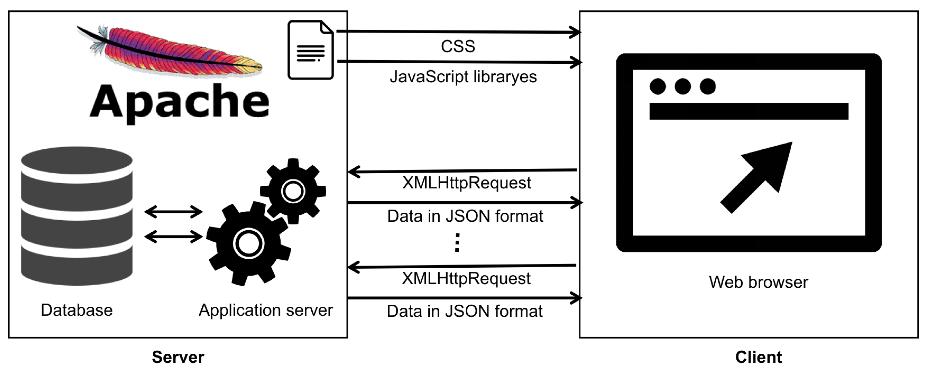
The relational database used for the concrete implementation is the ORACLE 19 database [24], standard edition 2. The database was installed on the Linux Enterprise operating system (CentOs 7). Apache http server and Tomcat 9 application server were installed on the same server. Under the Tomcat Application Server, the Oracle REST Data Service (ORDS) was launched to create dynamic web pages from database procedures. On the client side Highcharts 8 was used, a software library written in pure JavaScript for chart creation. For the map, the Google Maps API v3 JavaScript library was used. Some general JavaScript libraries such as jQuery and Backgrid were also used. JSON [25] was used as the data transfer format between server and client.
In our approach, we used JavaScript libraries both for drawing maps and displaying spatial data and for visualizing data. On the web interface, there is a dynamic data filter to select a data subset for visualization. The data were retrieved via an asynchronous XMLHttpRequest or a newer Fetch API. Only alphanumeric data in JSON format were transferred between server and client.
We can identify two main components in loading the data of a web page:
- Loading CSS elements and JavaScript libraries as static content from the web server. The web browser cache can be used to further reduce the amount of data transferred;
- Loading a subset of data for visualization in response to specific user requests. The user selects the subset of data using adoptive data filters provided on the page.
See Figure 7 for a schematic representation of the page loading process.

Figure 7.
Simplified schema of server—client interactions and web application loading process.
Asynchronous XMLHttpRequest or Fetch API was used to load data in the background. Synchronous data loading was disabled in some browsers. Appropriate event handling is required when loading data asynchronously. Only when the current process of fetching and drawing data is complete, can the user select another dataset or parameter and start a new cycle. The JSON format was used for data transfer. Although the JavaScript method is called “XMLHttpRequest”, the JSON format was used and not XML. The JSON format allows arrays and complex structures and is more compressed than XML.
3.2. Implemented Methods
There is more than one implementation of methods and some are listed in Section 2.3. The HarmoNIA project implementation of data visualization is available to the public, and this is because this implementation is suitable as an example implementation. The HarmoNIA data visualization can be found at: https://vrtlac.izor.hr/ords/harmonia/ (accessed on 22 May 2022).
3.2.1. Database and Web Application Optimizations
For optimal user experience, web applications have to be quick in their responses to user actions and demands. There are several ways of improving responses from a database, and in general for the web application.
- Database optimizations include the usage of indexes and query optimization. Coordinates are stored as proper spatial fields for easy integration with spatial services and web GIS;
- Balanced server-client processing. Querying of data subsets is performed ad server side because of better efficiency and a lower transfer rate of data. Visualization, statistical processing and average calculations for multi-depth data are performed client side;
- Usage of automatic or manual (depending on database features) table partition for huge datasets;
- Asynchronous data loading (in the background with proper events handling).
3.2.2. Implementation of Adoptive Filters
A user can easily obtain a data visualization of the whole dataset for a particular parameter, but sometimes some additional filters have to be applied. For this purpose query filters are implemented.
Data filter is organized with this sections (options for selections):
- Year;
- Project / Monitoring;
- Institution;
- Cruise;
- Parameter group;
- Parameter.
In the first version, all fields were populated with all unique values from the entire dataset (all years, all institutions, etc.). In practice, users often selected combinations for which no data were available at all (e.g., some institutions did not submit data for a particular year). For this reason, adoptive filters were implemented. At each onChange event of each of the listed fields, a database query was executed and each field was populated with possible combinations.
To improve efficiency, the last used filter values (combinations) were stored as a cookie in the browser. On the next query, the user can start with the previous combination of filters, which saves some time (the user does not have to set all fields from the beginning). If for some reason the user wants to start with a new “empty” filter, there is a “Reset filters” button for this purpose.
In addition to the main query filter, a filter for various validation factors or access restrictions was implemented. By default, validated or non-validated data were displayed in the chart. The user can also include suspicious or bad values by clicking the appropriate checkbox. The numbers within each checkbox for each validation factor indicate how many values were included in each category.
3.2.3. Bidirectional Connection
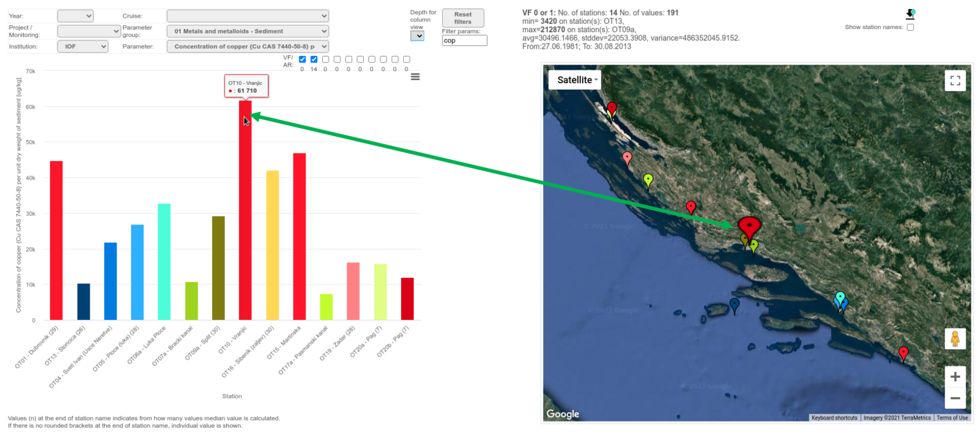
All measurements were displayed chronologically sorted in the graph. In the case that there is more than one measurement per one station, all values were marked onto the graph when the user makes the hover to station position on the map. In case there is more than one measurement (for a given location and time range), one of the group functions is used to calculate a single value (median value in concrete example). The number of values used for aggregation is shown in brackets next to the station name. By clicking on the graph (specific column or line), the time series graph view is shown with all particular values sorted chronologically. Graph element and station marker were color matched and visual feedback was provided on hovering on either of these elements. An example is shown in Figure 8.

Figure 8.
Example of bidirectional connection from web application.
3.2.4. Statistics
Basic statistics are provided for the entire visualized data subset. Statistics include the number of stations and values, the minimum and maximum values and the stations where these values are present, the average, standard deviation, variance, and the time range of the data.
If appropriate, the user can choose a different type of graph by selecting only one level of data as the average (in case we have more than one depth or height value at the same location).
3.3. Status to Trend
For each aggregated value on the output status graph, it is possible to obtain a trend graph for a particular station and parameter with just one click. You can find an example in Figure 9.
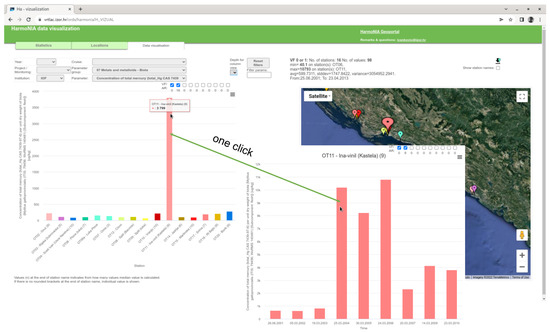
Figure 9.
Illustration of one click status to trend example.
3.4. Average or Particular Depth View
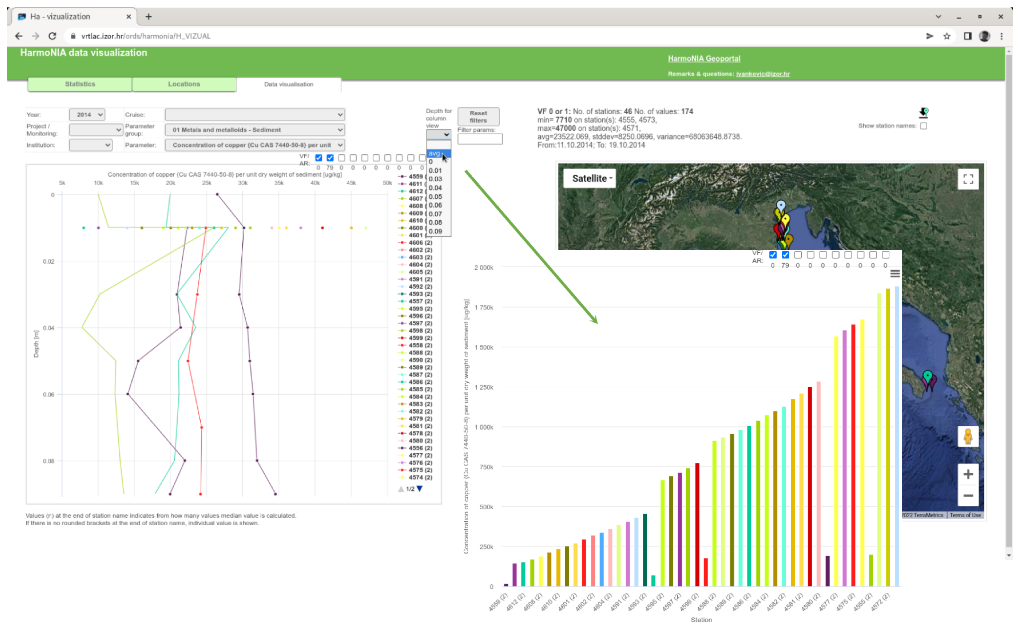
Oceanographic data often have more than one depth for a given measurement (similarly, meteorological measurements have different heights). In this case, a line plot is created. Since different stations may have different depths and some stations may have only one depth, conversion to a column chart is possible. The user can select the average of all depths or a specific available depth to produce only one value per station in the bar chart. This type of chart is easier to understand in some cases. An example can be found in Figure 10. A transformation of this view change is performed on the client side since all data needed are already loaded and there is no need for an additional database query.
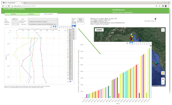
Figure 10.
Usage of “many to one depth” tool from web application.
3.5. Custom Base Map
Except for standard map and satellite images as a base layer on a locations map, any custom map from the tile server can be used. This is important because the user can have insight into the relation of the station location to some other important spatial properties. For example in Figure 11, the base layer is a map of the vulnerability index calculated in the frame of the HARmoNia project. At first sight, it is obvious that almost all monitoring stations are located inside vulnerable areas.
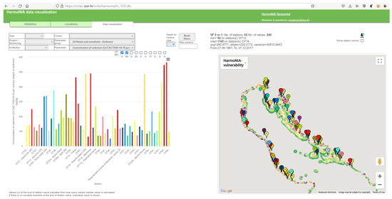
Figure 11.
Custom base layer example.
4. Results
Programming a dynamic website consists of two main parts: the programming and optimization of database queries and structure and programming in JavaScript within the web page. Loading time is one of the most critical characteristics of a web page. Loading an “empty” page (data filter only with no data subset) takes about two seconds (measured on an ADSL connection or a 4G mobile connection). Loading the categories of adoptive filters takes a little more than one second, and loading and visualizing the data subset takes another two seconds. Loading the full page with all components (when user settings are stored in the cookie) takes about four seconds. Although the loading time is longer than one second, which is kind of a standard nowadays, the achieved performance is acceptable for a web page with so many elements and data. Scripting (the execution of JavaScript on the client side) takes about three seconds for this average of four seconds. Loading time and performance of the web page are in the same range as the mentioned Ocean Data View desktop application.
To test how dataset size affects load time, we measured performance on three datasets: small, medium, and large. The test was performed over an average ADSL connection to the Internet (maximum speed 15 MB/s) using a desktop computer with AMD® Ryzen 5 3500u processor. As we can see from Table 2, the main component of the total loading time is scripting. The loading time for a large dataset is even shorter than for a small dataset, which we can explain by network speed variations. The rendering time is also not significant and is not related to the size of the dataset. As we expected, the main difference in loading time is due to scripting. Since we mainly use JavaScript for data processing and rendering of charts and maps, in all three cases, the loading time is short enough for a good user experience and efficient workflow.
Table 2.
Performance of web page.
4.1. HarmoNIA Project Implementation
The HarmoNIA project’s implementation of data visualization helped analyze the project dataset. There were 7294 duplicates found in the dataset, which means that another 7% duplicates were found in the already validated and checked dataset. Trend visualization also helped in finding “quasi-duplicates”, usually pairs of the same values for the same parameter, time, and station, but reported twice with different measurement devices. The data visualization tool was used to produce the official project outputs and results. According to a part of the scientific project report, “The standard approach and the harmonized data management system allows us to easily compare concentrations of contaminants measured by different countries. The visualization system is interactive and easily allows us to filter and visualize desired information to compare the spatial and/or temporal variability of a specific contaminant concentration among different monitoring stations”.
After the HarmoNIA project ended, all participating institutions joined the “HarmoNIA Network” to further promote the project results and to continue the development of the project tools. One of these tools is the data visualization tool, and the development of this tool continues. As the project results had a good impact on the scientific community and EU funding agencies, a new project is now being planned as an ancestor to HarmoNIA.
4.2. Croatian National Monitoring Database
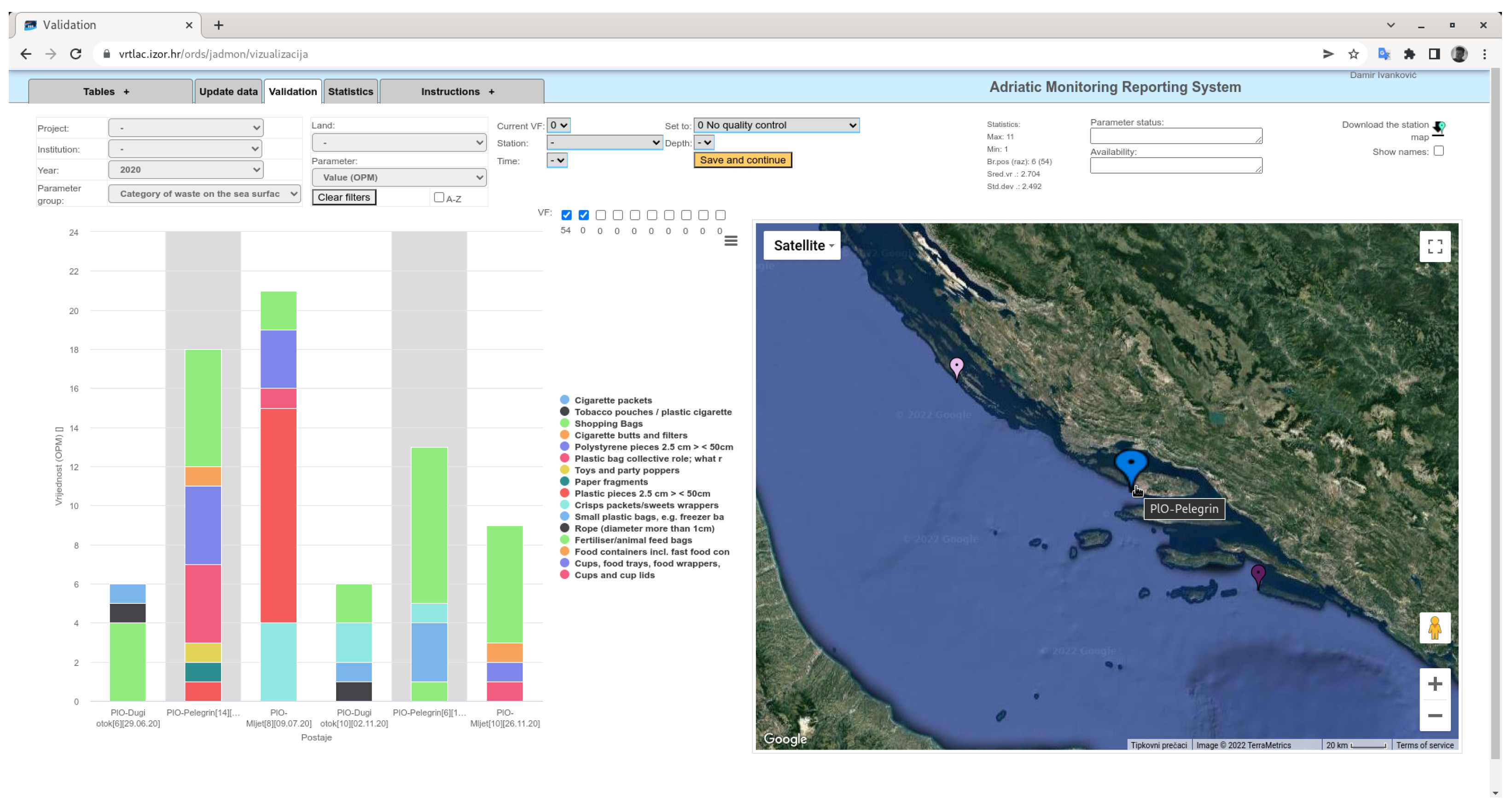
Within the framework of the Croatian Marine Reference Center of the Ministry of Economy and Sustainable Development of the Republic of Croatia, a national monitoring database and web application has been developed. The main purpose of the database is to provide an efficient tool for experts from many institutions involved in marine monitoring to enter and validate oceanographic measurements. This application is based on the same principles and code as the HarmoNIA data visualization. The difference is that the HarmoNIA application is for data visualization and is publicly available, while this application is for data validation (setting validation factor and expert comment) and is under authorization. The application has been in use for two years and good progress has been made in improving data quality. For some parameters such as sea litter, data have been visualized and validated for the first time, categorized by station and with a spatial component (Figure 12). The application is well received by users and is used without prior user training.
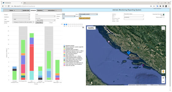
Figure 12.
Example of marine litter categories visualization.
At the top centre of the window shown in the Figure 12 is the orange “Save and continue” button for updating validations and parameter knowledge (parameter status). With this button, users can easily update their actions for the visualised dataset to database.
5. Conclusions
The goal of this work is to improve data management and visualization, especially for various environmental parameters with spatial and temporal components. Although some of these principles are well-known and self-explanatory, they have not been implemented into practical everyday use. Despite tremendous improvements in informatics and measurement techniques, environmental data are still not fully utilized. That is why, in this paper we identified gaps of common data visualization and management tools and proposed the solutions. Let us summarize the main advantages of our approach:
- Web application as a universal and easy to use tool for data validation and analysis;
- Same tool for visualization and submission of validation and other results in a one-step process;
- Alignment of our system to INSPIRE directive and easy integration with web GIS and spatial services;
- Intuitive way of data presentation used without any training by experts and non expert persons, providing them quick and easy insight into an environmental dataset.
From data feeds and validation to so-called information for decision makers, large amounts of environmental data are lost or not properly used. Collecting data can be very expensive, but an even higher price is paid when poor decisions are made to protect the environment due to a lack of knowledge and understanding. The use of relational databases and interactive, bidirectionally linked charts and maps can improve the quality and accessibility of data. The visualization of environmental data on the Internet is also important because it can make data more accessible to the general public. Public interest in environmental data is increasing, and many organizations outside of environmental science institutions are looking for reliable and easy-to-understand information.
The amount of information available today is huge, and to distinguish high quality data from “information noise” we need good presentation and visualization of data. There are many initiatives to improve data discovery and reuse, but there are few initiatives to improve data presentation. We are trying to contribute to a clear and consistent presentation of environmental data.
The proposed approach is demonstrated on two case study datasets—the HarmoNIA project dataset and the Croatian national monitoring dataset. In the future, we will continue to work on the usability of the user interface by integrating other information via web GIS with WMS and WFS services, especially, instead of Google Map API for the cartographic part. This will improve spatial analysis and the real challenge will be integrating with graphics and identifying the various spatial elements that are interactive with user actions.
Committing changes to the database and improving upload quality is another area for future improvement. By fusing the results of multiple user data validation we will be able to make both data and validation quality assessments. Using similar principles for visualising raster data, such as the results of numerical models with regular spatial grid and time intervals and comparing model results with real measurements, will also be a next challenge.
Author Contributions
Conceptualization, D.I.; methodology, Lj.Š.; software, D.I.; validation, D.I.; writing—original draft preparation, D.I.; writing—review and editing, Lj.Š., V.D. and A.I. All authors have read and agreed to the published version of the manuscript.
Funding
This research was supported by the project “The European Marine Observation and Data Network (EMODnet) Chemistry” funded by EU Blue Growth strategy, Marine Knowledge 2020.
Institutional Review Board Statement
Not applicable.
Informed Consent Statement
Not applicable.
Data Availability Statement
Data used for HarmoNIA visualisations can be found and downloaded at: http://harmonia.maris2.nl/search (accessed on 22 May 2022). Only 6% of data have some restrictions as is noticed in section “Description of data”.
Acknowledgments
This research was supported by the project CAAT (Coastal Auto-purification Assessment Technology) which is funded by the European Union from European Structural and Investment Funds 2014–2020, Contract Number: KK.01.1.1.04.0064. and the project HarmoNIA which is funded by the European Union from the ADRION programme Priority Axis 2: Sustainable Region and by Croatian Referral Centre for Sea. The authors would like to thank Dalibor Jelavić and Anđela Jelinčić who helped with concrete implementations of web applications.
Conflicts of Interest
The authors declare no conflict of interest.
Abbreviations
The following abbreviations are used in this manuscript:
| GIS | Geographic information system |
| 3D | Three-dimensional space |
| MS | Microsoft corporation |
| HTML5 | Hyper Text Markup Language fifth major version |
| WISE | Water Information System for Europe |
| ESRI | Environmental Systems Research Institute |
| ODV | Ocean Data View |
| DPSIR | Drivers, Pressures, State, Impact and Response model of intervention |
| EMODnet | European Marine Observation and Data Network |
| JSON | JavaScript Object Notation |
| API | Application Programming Interface |
| REST | Representational state transfer |
| CSS | Cascading Style Sheets |
| XML | Extensible Markup Language |
| ADSL | Asymmetric Digital Subscriber Line |
| 4G | fourth generation of broadband cellular network technology |
| INSPIRE | INfrastructure for SPatial Information |
| WMS | Web Map Service |
| WFS | Web Feature Service |
References
- Šerić, L.; Iv, A.; Bugarić, M.; Braović, M. Semantic Conceptual Framework for Environmental Monitoring and Surveillance—A Case Study on Forest Fire Video Monitoring and Surveillance. Electronics 2022, 11, 275. [Google Scholar] [CrossRef]
- Harbola, S.; Coors, V. Geo-visualization and Visual Analytics for Smart Cities: A Survey. The International Archives of the Photogrammetry, Remote Sensing and Spatial Information Sciences, Volume XLII-4/W11. In Proceedings of the 3rd International Conference on Smart Data and Smart Cities, Delft, The Netherlands, 4–5 October 2018. [Google Scholar]
- Rosenblum, L.J. Visualizing oceanographic data. IEEE Comput. Graph. Appl. 1989, 9, 14–19. [Google Scholar] [CrossRef]
- Fox, P.; Hendler, J. Changing the equation on scientific data visualization. Science 2011, 331, 705–708. [Google Scholar] [CrossRef] [PubMed]
- Hibbard, B. The top five problems that motivated my work [data visualization]. IEEE Comput. Graph. Appl. 2004, 24, 9–13. [Google Scholar] [CrossRef] [PubMed] [Green Version]
- Bechini, A.; Vetrano, A. Management and storage of in situ oceanographic data: An ECM-based approach. Inf. Syst. 2013, 38, 351–368. [Google Scholar] [CrossRef]
- Intergovernmental Oceanographic Commission. Manual of Quality Control Procedures for Validation of Oceanographic Data; UNESCO: Paris, France, 1993. [Google Scholar]
- Stefanov, A.Y.; Racheva, E.R. Black Sea Monitoring Oceanographic Data Base-Structured And Unstructured Approach. Comput. Sci. Technol. 2014, 1, 101. [Google Scholar]
- Welcome to the QGIS Project! Available online: https://qgis.org/en/site/ (accessed on 1 April 2022).
- Schlitzer, R. Interactive analysis and visualization of geoscience data with Ocean Data View. Comput. Geosci. 2002, 28, 1211–1218. [Google Scholar] [CrossRef] [Green Version]
- Mieruch, S.; Schlitzer, R. webODV–operational and ready for the community. Boll. Geofis. 2021, 12, 119. [Google Scholar]
- Welcome to webODV. Available online: https://webodv.awi.de/home (accessed on 1 December 2021).
- Biliouris, D.; Van Orshoven, J. WISE: Water Information System for Europe, issues and challenges for Member states. In European Conference of the Czech Presidency of the Council of the EU TOWARDS eENVIRONMENT Opportunities of SEIS and SISE: Integrating Environmental Knowledge in Europe; Masaryk University: Brno, Czech Republic, 2009. [Google Scholar]
- Maxim, L.; Joachim, H. Spangenberg, and Martin O’Connor. An analysis of risks for biodiversity under the DPSIR framework. Ecol. Econ. 2009, 69, 12–23. [Google Scholar] [CrossRef]
- Nutrients in Transitional, Coastal and Marine Waters. Available online: https://www.eea.europa.eu/data-and-maps/indicators/nutrients-in-transitional-coastal-and-4/assessment (accessed on 24 March 2022).
- Molina Jack, M.E.; Bakiu, R.; Castelli, A.; Čermelj, B.; Fafanđel, M.; Georgopoulou, C.; Giorgi, G.; Iona, A.; Ivankovic, D.; Kralj, M.; et al. Heavy Metals in the Adriatic-Ionian Seas: A Case Study to Illustrate the Challenges in Data Management When Dealing With Regional Datasets. Front. Mar. Sci. 2020, 7, 571365. [Google Scholar] [CrossRef]
- Harmonization and Networking for Contaminant Assessment in the Ionian and Adriatic Seas—HarmoNIA. Available online: https://harmonia.adrioninterreg.eu/ (accessed on 8 February 2022).
- Fichaut, M. From SeaDataNet II to SeaDataCloud. In Proceedings of the IMDIS 2016, Gdansk, Pologne, 11–13 October 2016; Volume 47. [Google Scholar]
- Few, S. Selecting the Right Graph for your Message. Intell. Percept. Edge 2004, 7, 35. [Google Scholar]
- 10 Useful Findings about How People View Websites. Available online: https://cxl.com/blog/10-useful-findings-about-how-people-view-websites/ (accessed on 10 March 2022).
- Alexander, G.; Jakob, E. Improving the User Experience in Data Visualization Web Applications. 2021. Available online: https://www.diva-portal.org/smash/get/diva2:1570143/FULLTEXT02.pdf (accessed on 10 March 2022).
- Help:Distinguishable Colors—Wikipedia. Available online: https://en.wikipedia.org/wiki/Help:Distinguishable_colors (accessed on 10 March 2022).
- Project-Deliverables—Harmonization and Networking for Contaminant Assessment in the Ionian and Adriatic Seas—HarmoNIA. Available online: https://harmonia.adrioninterreg.eu/library/project-deliverables (accessed on 8 February 2022).
- Oracle Database 19c—Get Started. Available online: https://docs.oracle.com/en/database/oracle/oracle-database/19/index.html (accessed on 10 March 2022).
- Garret, J.J. Ajax: A New Approach to Web Applications; Adaptive Path: San Francisco, CA, USA, 18 February 2005. [Google Scholar]


Publisher’s Note: MDPI stays neutral with regard to jurisdictional claims in published maps and institutional affiliations. |
© 2022 by the authors. Licensee MDPI, Basel, Switzerland. This article is an open access article distributed under the terms and conditions of the Creative Commons Attribution (CC BY) license (https://creativecommons.org/licenses/by/4.0/).