Abstract
Air quality is relevant to society because it poses environmental risks to humans and nature. We use explainable machine learning in air quality research by analyzing model predictions in relation to the underlying training data. The data originate from worldwide ozone observations, paired with geospatial data. We use two different architectures: a neural network and a random forest trained on various geospatial data to predict multi-year averages of the air pollutant ozone. To understand how both models function, we explain how they represent the training data and derive their predictions. By focusing on inaccurate predictions and explaining why these predictions fail, we can (i) identify underrepresented samples, (ii) flag unexpected inaccurate predictions, and (iii) point to training samples irrelevant for predictions on the test set. Based on the underrepresented samples, we suggest where to build new measurement stations. We also show which training samples do not substantially contribute to the model performance. This study demonstrates the application of explainable machine learning beyond simply explaining the trained model.
1. Introduction
Air pollution poses a significant environmental risk to human health, leading to 4.2 million premature deaths every year []. Therefore, air quality monitoring networks are established in many countries to warn the public, monitor compliance to regulations concerning air pollutant emissions, and analyze observations to assist with the development of new regulations [,]. Tropospheric ozone is a toxic air pollutant. In contrast to stratospheric ozone, which protects humans and plants from harmful ultraviolet radiation, tropospheric, near-surface ozone harms humans and plants. It is also a greenhouse gas []. Uncovering the spatial variability of air pollutants such as ozone is crucial for controlling air pollution and assessing human exposure.
Machine learning is a complementary approach to established physics-based chemistry-transport modeling [,,]. Data-driven techniques and machine learning are increasingly explored for air quality modeling [,,,,] because many observations are available on the one hand. On the other hand, these methods were proven to capture complex relationships while being easy to implement [].
The downside of these easy-to-implement methods is the problem of opaque models. For atmospheric scientists, it is essential to understand the internal functioning of their models. Investigating machine learning approaches to predict ozone values based on environmental data can help pinpoint influential factors for ozone values or predict the spatial variability of ozone. In addition, for decision-making, trustworthy and reliable models are required. Understanding the models’ capabilities and limitations is a way to increase trust in a model. Explaining how a trained machine learning model arrives at its predictions gives us insights into its core functioning.
As stated in the beginning, air pollution monitoring is essential to design policies to protect the public and for research to understand air pollution chemistry. Inspired by the increasing application of data-driven techniques to air quality research, Betancourt et al. [] combine environmental data with air quality observations for the challenge to model air pollutant tropospheric ozone. An impression of the AQ-Bench dataset is given in Figure 1. Figure 1a shows the locations of ozone observation stations distributed around the globe and their ozone values, while Figure 1b gives a histogram of the target data distribution. In AQ-Bench, the authors model the target ozone metrics derived from air quality measurement stations based on various geospatial datasets using different machine learning algorithms []. Betancourt et al. [] show differing scores for the coefficient of determination for a random forest and a two-layer shallow neural network. They compare the coefficient of determination of the three data-driven approaches and found that the nonlinear methods had a higher score than linear regression. They conclude a similar performance of the shallow neural network and the random forest. What is rarely done, to our knowledge, is to explain the differences between various machine learning architectures applied to the same task.
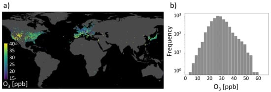
Figure 1.
Geospatial air quality benchmark dataset (AQ-Bench). (a) Measurements of the target on a map projection. It is the average ozone from 2010 to 2014 of the AQ-Bench dataset and is given in ppb (parts per billion). (b) Histogram of the average ozone values in the AQ-Bench dataset [].
In this study, we explain the similarity of a shallow neural network and a random forest, which are two different algorithms trained on the same dataset by showing similar behavior in the models’ representation space. Thus, the contribution of this study is two-fold. On the one hand, we uncover the core functionality of two different machine learning approaches trained on the same benchmark dataset AQ-Bench. On the other hand, we use the models’ explanations to gain a deeper understanding of the underlying dataset. The explanations reveal the representation of AQ-Bench in the machine learning models. With our analysis, we flag untrustworthy data samples, identify training data samples irrelevant for prediction, and recommend where to build new near-surface ozone measurement stations based on underrepresented test samples. The uniqueness of our approach is that we use machine learning explanations based on analysis of the models’ representation space to derive understanding and make recommendations in the geographical space.
2. Related Work
Earth system science research faces challenges when applying machine learning methods to environmental data. Tuia et al. [] point out the challenges that arise from the basic machine learning chain to derive input-output relations from Earth system data. The input data are complex and, at the same time, limited. The black box behavior of the models has to be overcome, and the output results should be turned to an explainable, reliable, and scientifically consistent outcome. A full review is beyond the scope of this study, but in the following sections, we (i) emphasize data-driven ways to model air pollution (Section 2.1); (ii) show examples of overcoming the black box behavior in atmospheric science (Section 2.2); and (iii) highlight studies turning their results into scientific outcomes (Section 2.3). We focus on studies within the Earth system science domain to meet the goal of this study, which aims to use machine learning explanations for further use in ozone research.
2.1. Data-Driven Air Pollution Modeling
Different machine learning approaches have been used in air pollution research in recent years. Algorithms capable of learning nonlinear relationships in the input data are needed to process complex air pollution data. Tree-based algorithms, such as random forest and sophisticated neural networks, are commonly applied to model different air pollutants such as fine particulate matter (PM2.5, PM10) and gases such as near-surface ozone.
Brokamp et al. [] use a random forest for land-use regression and assessment of several particulate pollutant species. They conclude to use random forests in land-use models for more accurate exposure assessment in the future. Similarly, Mallet [] states that the best performing model in their study is the random forest, which can model 59% of the variance in PM10. They use a range of meteorological, environmental, and temporal variables as predictors. Althuwaynee et al. [] judge the random forest to provide clear insights about the PM10 pollution distribution. They implement a random forest and extreme-gradient boosting to map the PM10 susceptibility index onto probability and classification index maps. Tian et al. [] find that their random forest outperforms other models, suggesting that the relationship between air quality and spatial configurations of the urban elements such as the urban infrastructure is most likely nonlinear. They use a random forest and a neural network to combine meteorological factors with urban elements to explore intra-urban PM2.5 concentrations. Lu et al. [] conclude that deviations of hourly ozone prediction by their numerical chemistry transport model can be significantly reduced by machine learning postprocessing. Their postprocessing involves Lasso regression, random forest, and a long short-term memory recurrent neural network. Alimissis et al. [] compare the application of neural networks and multiple linear regression to spatial interpolation of the urban air pollutants nitrogen oxides, ozone, carbon monoxide, and sulfur dioxide. They conclude that neural networks are significantly superior in most cases. Cabaneros et al. [] review 139 papers using neural networks for air pollution modeling between January 2001 and February 2019. Wen et al. [] propose using convolutional long short-term memory to predict PM2.5. Their results show that their machine learning model achieves a better performance than current state-of-the-art models for monitoring stations in China. Based on meteorological and air quality data, convolutional neural networks are applied to forecast ozone at several hundred measurement locations [,].
2.2. Explainable Machine Learning in Earth Science
Mcgovern et al. [] state that the ultimate goal of Earth scientists is to deepen their understanding of the Earth system. Therefore, incorporating machine learning into a cycle of knowledge discovery is a means to get closer to this goal. To integrate machine learning into the cycle of knowledge discovery, explainable AI and interpretation techniques are required to understand the core functioning of the machine learning models. Review articles list explainable AI methods [,]; here, we highlight Earth science studies that explain their machine learning models.
Mcgovern et al. [] use interpretation techniques such as saliency maps [], backward optimization [], and neuron ranking by their discrimination ability to examine their tornado predictions. Gu et al. [] note that different models favor different predictor variables and result in different interpretation abilities by interpreting their data-driven air quality models using SHAP value-based explanations. Yan et al. [] develop an interpretable deep learning model to retrieve surface fine particle air pollution from satellite data. They can extract spatio-temporal features from their model, which agrees with their physics-based numerical model. Bennett et al. [] analyze their neural network for simulating latent and sensible heat fluxes using layer-wise relevance propagation [], and they show that even simple neural networks can extract physically plausible relationships. They suggest that explainable AI methods offer ways to learn from trained neural networks instead of just making predictions. However, to reach the ultimate goal, as stated by Mcgovern et al. [], explaining a model is not the end, and scientific insights need to be generated from the results.
2.3. Scientific Insights through Explainable AI
In their abstract, Roscher et al. [] write: “An exciting and relatively recent development is the uptake of machine learning in the natural sciences, where the major goal is to obtain novel scientific insights and discoveries from observational or simulated data”. According to Roscher et al. [], an essential component is domain knowledge, which is needed to increase models’ and results’ explainability and enhance scientific consistency. Their article reviews various explainable machine learning approaches and highlights how they are used in combination with domain knowledge from different disciplines. Some studies go a step further than simply determining the explanation of used machine learning models; they leverage the achieved explanations to gain a deeper understanding of the Earth system. Stirnberg et al. [], for example, use explanations based on SHAP values [] to reveal meteorological factors driving fine particulate air pollution variability. With their SHAP value analysis, they gain process understanding at individual air pollution measurement sites. Toms et al. [] apply an explainable neural network as a tool to identify patterns of Earth system predictability. Their neural network is trained to predict decadal oceanic variability and explained it by applying layer-wise relevance propagation []. They conclude that explainable neural networks are useful in determining patterns of predictability. Schramowski et al. [] introduce a method called explanatory interactive learning for deep convolutional neural networks with the task of plant phenotyping. They use explanations by saliency maps to uncover correctly classified samples affected by the Clever-Hans effect [] and correct these predictions to arrive at an explainable and trustworthy model. In perspective, Tuia et al. [] argue that learning causal relationships is crucial for understanding the Earth system. The link between explainability and actual causal relationships is strong since relationships determined by machine learning can be paired with domain knowledge to formulate hypotheses that can help to uncover novel cause-and-effect relationships.
3. AQ-Bench Dataset
AQ-Bench is a machine learning benchmark dataset designed to empirically relate ozone statistics observed at air quality measurement stations to geospatial data. It contains aggregated ozone statistics from over 5500 measurement stations of the years 2010–2014. These stations are distributed globally, although not evenly (see Figure 1). The primary source of the ozone statistics is the Tropospheric Ozone Assessment report database []. Most of the stations are in Europe, North America, and East Asia. Although AQ-Bench contains different ozone statistics, this study only focuses on the average ozone as a target variable.
The geospatial features in AQ-Bench characterize the measurement site. Although there are no functional relationships available as prior knowledge for machine learning in the dataset, these geospatial features were selected because they serve as proxies for ozone formation, destruction, and transport processes. Features such as ‘population density’ in different radii around the station indicate human activity and, therefore, ozone precursor emissions. In addition, features such as ‘altitude’/’relative altitude’ are used as proxies for local flow patterns and ozone sinks. A complete description of the features in AQ-Bench and their relation to ozone processes can be found in [].
4. Methods
We combine the following methods to gain novel scientific insights about the AQ-Bench dataset. First, we use the methods to understand how the trained models work. Second, we use our knowledge about the models’ functioning to explain inaccurate predictions. We train our models on a dataset that consists of input feature vectors and target values . Both machine learning models predict based on the input feature vector:
To gain novel insights, we uncover the models’ functioning by calculating SHAP global importance for both models; see Section 4.1 and visualizing prediction patterns. Since we use a random forest and a neural network, we implement visualization methods tailored to the specific architectures. Section 4.2 presents the neural network visualization method and Section 4.3 presents the random forest visualization method. These visualizations help us to explain individual predictions. Nevertheless, interpreting individual predictions does not yield a global understanding of the trained models. Therefore, we move from single predictions to studying prediction patterns. For this, we use k-nearest neighbors on both models for explaining inaccurate predictions; see Section 4.4.
4.1. SHAP
As Lundberg et al. [] proposed, we use SHapley Additive exPlanations (SHAP) to explain local and global predictions []. SHAP values are derived by a model-agnostic post hoc explainable machine learning method and therefore are suitable for comparison of our two different machine learning algorithms. The SHAP values quantify the contribution of each feature to the model prediction. Contribution refers to the deviation from the base rate, which is the expected value of the training dataset, where features with high absolute contributions are considered more important. For example, a feature with a negative SHAP value causes the model to predict a value lower than the expected value of the training set. Since features with large SHAP absolute values are considered important for a single prediction, averaging absolute SHAP values per feature across data results in an estimate for global importance based on SHAP.
4.2. Neural Network Activation
For the neural network, Equation (1) takes the form:
where and represent the neural network’s parameters []. Our trained, shallow neural network can be easily visualized by representing the node structure and expressing the values of weights and biases as colors (Figure 2, left). During inference, the trained neural networks parameters are combined with the input feature vector and the activation function in each layer:
where and the weights and biases of layer l []. Therefore, we can also visualize the trained neural network during inference by plotting the activation . The neural network signals are obtained by visualizing Equations (3) and (4); see Figure 2 (right).
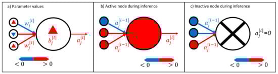
Figure 2.
Visualization method for neural networks. It is possible to visualize the trained neural network weights and biases , as shown in (a). During inference, active neurons (activation ) transport a signal, as shown in (b), whereas it is also possible to have inactive neurons that do not transport any signal; see (c). Note that we use lowercase letters to indicate the components of the vectors and matrices.
4.3. Random Forest Activation
A random forest consists of decision trees , where are independent and identically distributed random vectors. The random forest prediction is the average over all K decision tree predictions. Thus, Equation (1) takes the form:
given the input []. Typically, a random forest consists of hundreds of decision trees []. Therefore, visualization of the individual decision trees is possible, but hardly useful due to their sheer number and complexity.
Since we can represent our data in the geographical space, we use a more intuitive way of visualizing the basis set of influential training samples that the random forest used for its prediction. By visualizing the location of the basis set used for prediction on a global map, we display the random forests’ functioning. We name this type of visualization leaf activation to emphasize the similarity to an activated neural network during prediction. The steps to create this kind of visualization are illustrated in Figure 3 and listed in the following:
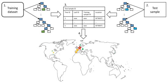
Figure 3.
Leaf activation visualization pipeline as described in the text as enumerated bullet points. We match the training samples contributing to a specific test sample prediction and determine the influence each training sample has on the prediction. The basis set of training samples, the relative influence of a training sample, and the target test sample are visualized as a scatter plot on the map.
- Propagate all training samples through the trained random forest. Keep track of the tree IDs, leaf node IDs, and corresponding training sample IDs.
- Propagate a single test sample through the random forest. Track the corresponding responsible tree IDs and leaf node IDs for the prediction.
- To identify training samples that are most relevant for a given prediction, keep track of the relative frequency of the training samples contributing to the leaf node predictions responsible for a given test sample prediction.
- Since each training sample has geographical information; influential training samples can be visualized on a map. The marker size indicates the frequency of a specific training sample contributing to the leaf nodes responsible for a particular prediction.
As decision trees split the data according to their features, these groups of training samples should have similar features as the target test sample. These training samples took the same decision path through the decision trees and ended up in the same leaf node as the test sample.
4.4. Explaining Inaccurate Predictions with k-Nearest Neighbors
Figure 4 shows how to use k-nearest neighbors to explain inaccurate model predictions as proposed by Bilgin and Gunestas [], who explain their deep learning models through post hoc analysis of k-nearest neighbors. For an inaccurately predicted test sample, they extract the k-nearest neighbors in the training dataset and feed them into the trained model. By comparing the prediction based on the nearest neighbors in the training set and the inaccurate prediction of the test sample, they derive an interpretation of the model’s response and identify different cases. Bilgin and Gunestas [] apply their method to two standard machine learning benchmark datasets: IRIS and CIFAR10. They originally tested their method on supervised classification tasks, and we adapted and applied it to our supervised regression task.
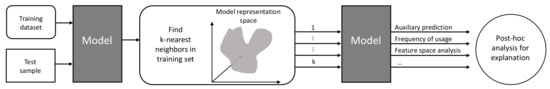
Figure 4.
Explaining inaccurate predictions by k-nearest neighbors pipeline (adapted and extended from []). After identifying the k-nearest neighbors in the model representation space, we analyze the auxiliary predictions based on the nearest neighbors regarding the accuracy, relevance, and distance to the test sample in the feature space.
Since our goal is to explain the functioning of our two machine learning models, we search the k-nearest neighbors in their respective representation spaces. For the random forest, we defined the nearest neighbors as samples in the same leaf nodes (Section 4.3). For the neural network, we defined the nearest neighbors as samples leading to similar activation patterns (Section 4.2), i.e., a group of neurons activated. To search the neural network activation pattern space, we use the Euclidean distance
where and are a pair of neighboring activation patterns in the n-dimensional neural network activation space.
We define the following prediction scenarios for inaccurate predictions; see Figure 5:
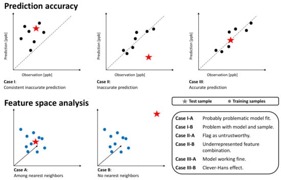
Figure 5.
Schematic overview of possible cases. The upper columns show the predictions on k-nearest neighbors training samples and the target test sample with respect to the prediction error. The lower columns depict the k-nearest neighbor analysis in the feature space. Dots represent training samples, while stars depict the test sample.
- Case-I-A: A sample of k-nearest neighbors leads to consistent, inaccurate predictions. The k-nearest neighbors and the test station are located next to each other in the feature space. The inaccurate prediction of the test sample is not unexpected. In this case, the model might not be fitted well.
- Case-I-B: A sample of k-nearest neighbors leads to consistent, inaccurate predictions. The k-nearest neighbors and the test station are not located next to each other in the feature space. The inaccurate prediction of the test sample is not unexpected. In this case, the model might not be fitted well, and the test sample is not well represented– too many problems.
- Case-II-A: The model accurately predicts a sample of k-nearest neighbors, while it inaccurately predicts the test sample. The k-nearest neighbors and the test station are located next to each other in the feature space. Therefore, the inaccurate prediction of the test sample is unexpected. This could point to either an erroneous test sample or a model limitation. In any case, this prediction is untrustworthy.
- Case-II-B: A sample of k-nearest neighbors leads to accurate prediction, while the test sample is inaccurately predicted. The k-nearest neighbors and the test station are not located next to each other in the feature space. Thus, the inaccurate prediction of the test sample is not unexpected. This points to an underrepresented test sample.
- Case-III-A: A sample of k-nearest neighbors leads to scattered accurate predictions. The test sample is accurately predicted. In the feature space, the accurately predicted test sample has nearest neighbors. The models are predicting a correct value. This is the usual case for a healthy prediction.
- Case-III-B: A sample of k-nearest neighbors leads to scattered predictions; both accurate and inaccurate predictions are possible. The test sample is accurately predicted but due to the wrong reasons. The accurately predicted test sample has no nearest neighbors in the feature space. The models are predicting a correct value but due to the wrong reason. We can flag this case as the Clever-Hans effect [].
For the search of the k-nearest neighbors, we prepared the feature space by (i) using scaled features such that all features have a comparable range of values and (ii) weighting the features with the respective SHAP importance value. The weighting of the feature space follows the method by Meyer and Pebesma [], which calculates the distances’ multidimensional feature space, with features being weighted by their respective importance in the model. Then, a Euclidean distance in this scaled and weighted feature represents the distance relevant to the model prediction.
5. Experimental Setup
This Section gives an overview of the experimental setups of model training and the application of explainable machine learning methods to our models. We describe the model training in Section 5.1 and the evaluation in Section 5.2. We compare the feature importance of both models with SHAP, as described in Section 5.3. To gain an insight into the representation of AQ-Bench in the trained machine learning models, we visualize single predictions, as described in Section 5.4. By investigating the predictions made on the test set in relation to the training samples that this prediction is based upon, we gain an understanding of prediction accuracy. We present in Section 5.5 how we use k-nearest neighbors for explaining inaccurate predictions.
5.1. Model Training
We train a shallow neural network and a random forest to solve the task posed by Betancourt et al. []: given geospatial data describing the environmental features, infer the ozone metrics. In this study, we focus on predicting one ozone metric, the average ozone. We want to solve the task of predicting average ozone values by training two machine learning models on a subset of AQ-Bench features. AQ-Bench originally contains over 100 features. Following the feature selection method by Meyer et al., here, we only use 31 of them (features listed in Appendix A, Table A1), because fewer features decrease model complexity and enable more comprehensible explanations. Ref. [] showed that forward feature selection applied on AQ-Bench leads to 31 features. The data split is kept as in AQ-Bench with 60% training (approximately 3300 samples) and 20% validation and test samples (roughly 1110 samples, respectively).
We trained a two-layer shallow neural network and a random forest to predict the average ozone value based on this subset of geospatial data. The hyperparameters of both machine learning models are summarized in Table A2 in Appendix B.
5.2. Evaluation Metrics
To evaluate the performance of our models, we use common evaluation metrics in the field of machine learning. We calculate the Root Mean Square Error (RMSE) and the coefficient of determination () based on the following formulas:
Moreover, we consider deviations between the prediction and the reference value as residuals. Residual is calculated by subtracting the prediction from the observed ozone value y:
Therefore, negative residuals point to an overestimation by the prediction, while positive residuals depict underestimation.
5.3. SHAP Values
We aim to compare machine learning models based on different algorithms. Gu et al. [] propose to treat SHAP (Section 4.1) as a unifying framework for the comparison of different machine learning models. Thus, we use SHAP feature importance to rank features of both trained random forest and neural network according to their relevance. SHAP values for the random forest are are calculated analytically, whereas the SHAP values for the neural network area are approximations. Details about the calculation of the SHAP values and the software we used can be found in [].
We expect that both models use similar features to predict average ozone, i.e., a subset of features that are among the most important for both models.
5.4. Visualization of Individual Predictions
By visualizing the predictions patterns of an accurate prediction and an inaccurate prediction, we aim to show that the underlying patterns leading to an accurate prediction can be differentiated from the patterns leading to an inaccurate prediction. Here, we choose two example test samples for visualization where the models had to predict high ozone values. The one example shows accurate predictions by both models, while the second example displays an inaccurate prediction with a positive residual, which is also called underestimation by the models. We chose test samples to be geographically close to each other; both are located in southern Europe. An overview of the selected test sample stations, observed average ozone value, predicted values, and residuals is given in Table 1.

Table 1.
Example stations with the station IDs to identify them in the Tropospheric Ozone Assessment Report database. Station 6952 is located in Spain, while Station 8756 is situated in Greece. The subscripts point to the corresponding model abbreviation, for the neural network and for the random forest.
5.5. Identify k-Nearest Neighbors and Classify Predictions
We aim to test our hypothesis that certain feature combinations lead to activation patterns in both models related to prediction accuracy. Moreover, we increase our understanding of how the models function and identify different reasons for inaccurate predictions. To do so, we use auxiliary predictions on the k-nearest neighbors, as described in Section 4.4. We identify the k-nearest neighbors for the auxiliary predictions in the models’ representations spaces and compare if these k-nearest neighbors are also the test sample’s k-nearest neighbors in the feature space. To automatically classify our test samples to the different cases (Figure 5), we determine 11 nearest neighbors in the training set of a given test sample. Then, we calculate the average residual of the training samples and compare it to the test sample’s residual. In addition, we calculate the average distance between the group of k-nearest neighbor training samples in the feature space and compare it to the average distance between the test sample and its k-nearest neighbors. Based on these values, we can classify our samples into different cases.
We expect both models to lead to similar classifications of the test stations to the cases.
5.6. Train on a Reduced Dataset
We hypothesize that removing non-influential training samples will not affect the performance of machine learning models. To test the hypothesis, we re-train our models on a reduced dataset. We identify the 10% training samples that are not influential for the predictions on the test samples. To identify which samples are non-influential, we used the identified 100 nearest neighbors for each test sample and ranked the whole training dataset according to the proximity to the test samples. We eliminated the 10% of data with the lowest proximity to the test samples in the models’ representation spaces from the training dataset. This leads to a training dataset of the size 3000 training samples. For evaluation, we use the evaluation metrics introduced in Section 5.2. The hyperparameters of both models are kept unchanged.
We do not expect significant performance losses of both models. The random forest is less sensitive to changes in the training dataset than the neural network, such that we expect a slightly higher performance loss of the neural network than the random forest.
6. Results
6.1. SHAP Global Importance
Table 2 gives an overview of the global feature importance for the trained random forest and neural network. In both models, the absolute value of the latitude is the most influential feature, with global feature importance of 23.96% (RF)/20.50% (NN). For the subsequential most important features, the models differ. The trained random forest heavily relies on features related to topography, i.e., altitude, and then uses environmental characteristics connected to an anthropologically influenced environment. The topography-related features are also of relevance to the neural network. Both models attribute some importance to the forest in the surrounding 25 km area, while for the neural network, this feature is two times as important as it is for the random forest. There are several features with low importance attributed by both models. These are mainly tropical, boreal, and polar climatic zones, which are not well represented in the AQ-Bench dataset. The differing feature importance of both models leads to differently weighted features spaces when searching the k-nearest neighbors.
Table 2.
Global feature importance derived by SHAP for our trained random forest (RF) and neural network (NN). The first column lists short descriptions of the AQ-Bench features; we kept the order from the most important to the least important in the test set of our random forest. Percentage values for the random forest are shown in the second column, and corresponding values of the neural network are shown in the third column. The largest importance values of both models were underlined, the second largest are shown in bold, and the third largest are shown in italic font. For a table with the AQ-Bench feature names, see Appendix A Table A1.
6.2. Comparison of Neural Network and Random Forest Performance and Residuals
The coefficients of determination for the neural network and random forest for the training set, validation set, and test set can be found in Table 3. We calculated all performance metrics using the observed values (ground truth) and Equations (7) and (8). The coefficient of determination is over 95% for the training set for the random forest, while it is 64.21% for the neural network. The difference between the and RMSE on the test set is smaller than the difference on the training set. The random forest has a slightly higher with 53.03% than to the neural network with 49.46%. The difference between the RMSE of both models is smaller, with 4.46 ppb for the random forest and 4.59 ppb for the neural network. From these two scores, the models perform comparably well on the test set, while it is apparent that the random forest performance is slightly better.
Table 3.
Coefficient of determination and RMSE for the training and validation test set.
The focus of this study lies on the test set; therefore, we take a closer look at the residuals of both models. The residual is defined in Section 5.2, Equation (9). Figure 6 shows the residuals of the random forest together with the residuals of the neural network. Both models mainly predict the average ozone on the test set with a residual error below 5 ppb. We consider predictions with residuals below 5 ppb as accurate, considering the conservative measurement error estimation of 5 ppb []. From 1110 test samples, the random forest accurately predicted 867 samples, and the neural network accurately predicted 842 samples. The correlation between the residuals of the random forest and the neural network is shown in Figure 6. The correlation is high, so apparently, some test samples are difficult to predict for both models. The following Sections focus on these 268 (neural network) and 243 (random forest) inaccurately predicted samples.
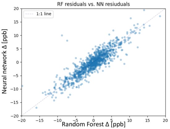
Figure 6.
Scatter plot of the residuals of the random forest on the x-axis and neural network on the y-axis for the test set.
6.3. Visualization of Individual Predictions
In this section, we take a closer look at the visualization of single prediction patterns by both machine learning models. As described in Section 4.3, it is possible to show in geographical space upon which samples the random forest bases its prediction. Table 2 gives the coordinates, and the stations are displayed in Figure 7. Both test samples are located in the Mediterranean area, in Spain (a,b) and Greece (c,d). Figure 3a,b show the accurate prediction, where the random forest bases its prediction on stations with similar features and similar average ozone values. The most influential training samples are located next to the target test station in the geographical space. The predicted value is 41.99 ppb compared to the observed value of 42.44 ppb. In contrast, Figure 7c,d shows an inaccurate prediction with a residual of 12.72 ppb, while the target average ozone was 40.17 ppb, which is indicated by the bright yellow star in Figure 7d. In this case, the influential training samples have much lower average ozone values. Moreover, there are hardly any influential stations with larger contribution but many with small markers, even in South Korea and Japan. The accurate prediction for station 6952 is based upon 63 training stations, while the inaccurate prediction of station 8756 is based upon 122 training stations.
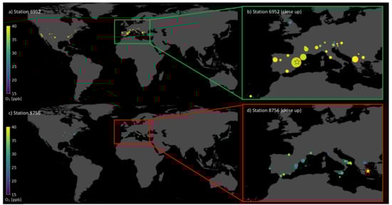
Figure 7.
Map with training stations (dots) upon which the trained random forest bases its predictions to predict the test station (star). The colors of the dots indicate the observed ozone value at the respective training and test station. Plot (a) and (b) depict an accurate prediction with a small residual. Plot (c) and (d) show an inaccurate prediction with a large residual. Plots (b) and (d) are close-ups over Europe.
In Section 4.2, we introduced a way of visualizing shallow neural networks. We visualize the neural network while it infers the average ozone values for the same two example test stations presented in Table 2. Figure 8a shows the activation pattern caused by the accurate prediction for the station in Spain, while b shows the activation pattern for the inaccurately predicted station in Greece. The residual error for the accurate prediction is comparable to that of the random forest, 0.43ppb, while the inaccurate prediction misses the target value by 10.56 ppb. As a reference, we also show the weights and biases of the network in Appendix C, Figure A1. Left of the input nodes, we noted down the feature names, also found in Appendix A, Table A1. Red nodes indicate active input features important for the respective prediction. In both cases (a) and (b), most input nodes are light blue, indicating slightly negative values. While in (a), there are many connections activating and deactivating nodes in the first hidden layer, the inaccurate prediction (b) has a first hidden layer with mainly slightly activated nodes. The signals to the second hidden layer are visible in (a), while again, in (b), there is hardly any departure from the mean state. In the second hidden layer, the first node from the top can reduce the value of the output node, while the other four nodes increase the output (see also Appendix C, Figure A1). In (a), this node is correctly deactivated, leading to a high and accurate prediction. In (b), this node is activated such that the second hidden layer increases and decreases the output value, leading to a prediction near the average.
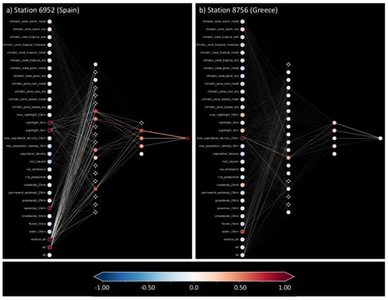
Figure 8.
Trained shallow neural network while making predictions for two test samples. Plot (a) depicts an accurate prediction with a small residual. Plot (b) shows an inaccurate prediction with a large residual.
6.4. Explaining Inaccurate Predictions
To get a general impression of how our trained models work, we look at the 11 nearest neighbors of the entire test set. As described in Section 4.4, the whole test set is needed to classify all test samples into the three cases using the k-nearest neighbor algorithm to identify the nearest neighbors. After classifying all test samples, we mainly focus on inaccurate predictions with a residual larger than 5 ppb, which can only appear in case-I and case-II. Figure 9 show inaccurately predicted test stations ordered according to their predicted average ozone value. Each vertical sequence of dots represents one test sample. Each dot is one nearest neighbor of the test sample. The nearest neighbors were identified in the respective models’ representation. Afterward, we also checked the Euclidean distance of these nearest neighbors in the weighted feature space. In the vertical, nearest neighbors are ordered according to the weighted Euclidean distance in the feature space, meaning the further away from zero the dot is placed, the more different the features of the neighbor and the target test sample. The colors represent negative (red) and positive residuals (blue). The dot size indicates proximity/importance in the models’ representation spaces. Figure 9a shows the random forest results, and Figure 9b shows the neural network results.
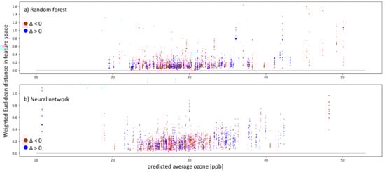
Figure 9.
Plots showing inaccurate predictions (absolute values of ppb) on the test set by the random forest (a) and neural network (b). The weighted Euclidean distance in the respective feature space is on the y-axis. On the x-axis, the predicted average ozone is shown. The colors indicate the residual: red points mean negative residuals and model overestimation, while blue points show positive residuals and model underestimation. The size of the single dots points to the distance between the test sample and the training sample in the representation space. A larger dot means that the test sample and respective training sample lead to similar activation patterns in the model.
Inaccurate predictions can be found in both models over the average ozone distribution. We have far more test samples between 25 and 30 ppb than outside of this range. Below 21 ppb and above 35 ppb, both models have trouble finding nearest neighbors in the weighted feature space. This is visible through the vertical sequence of dots being farther away from the zero line in black. Moreover, in the well-represented range between 25 and 30 ppb, some samples have nearest neighbors in the weighted feature space, but still, they fail to produce accurate predictions. We further analyze the nature of the failed prediction using the cases presented in Section 4.4 in Figure 10.
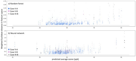
Figure 10.
Similar to Figure 9, but the colors indicate the type of inaccurate prediction (navy blue and plum dots). Moreover, additionally to inaccurate predictions, we also show instances of Clever-Hans, where the residual error ppb, but there are no nearest neighbors in the models’ representation space (gray dots).
Figure 10 shows all inaccurately predicted test samples and accurately predicted samples that do not have nearest neighbors in the weighted feature space. The colors denote the case describing the reason for the inaccurate prediction. Blue dots represent case II-A (untrustworthy sample and/or prediction), plum-colored dots represents case II-B (underrepresented feature combination), and gray dots refer to case III-B (Clever-Hans effect). Figure 10a shows the analysis for the random forest, and Figure 10b shows the analysis for the shallow neural network. The prediction error on the test samples is mainly close to ≈0 ppb, never leading to case-I for both models. Thus, all inaccurate predictions belong to case-II for AQ-Bench. The Random Forest incorrectly predicted 243 test samples, of which 238 belong to case II-A, while five belong to case II-B. There are a total of 268 inaccurate predictions for the neural network: 246 categorized as case II-A and 22 categorized as case II-B. We also checked the nearest neighbors in the weighted feature space for all accurately predicted test samples and found six samples belonging to case-III-B for the random forest and 52 for the neural network.
We can pick the inaccurately predicted samples and plot their geospatial locations based on this classification. Figure 11 illustrates untrustworthy predictions, underrepresented test stations, and training stations that were non-influential (Section 6.5) for all predictions on the test set. We derive areas where new data acquisition would improve our data-driven models for the underrepresented samples. Given our current test station features, we searched the global feature space to identify locations where we recommend additional observations. Figure 11 shows the areas in blue, red, and violet (overlap blue and red) on the globe where we recommend building new ozone monitoring stations. For example, both models recommend building stations around the underrepresented stations in Greenland and Chile. Thus, these new training data samples would improve our machine learning models given the current test set.
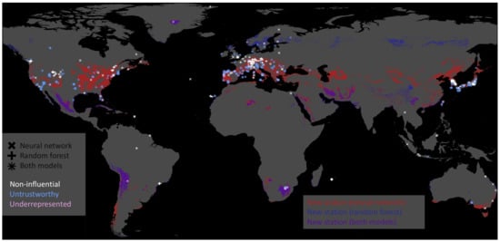
Figure 11.
Map showing non-influential training stations in white, untrustworthy predictions on the test set in blue, and underrepresented test stations in plum. The marker indicates the model on which these stations were derived. The neural network’s marker is ×, the random forest’s marker is +, and where those two symbols overlap, we get something like an asterisk ∗. Moreover, we indicate regions where the models recommend building new stations in red, blue, and violet. The neural network recommends building new stations in red-colored areas; the random forest recommends building new stations in the blue-colored areas. Violet represents the intersection of regions recommended by both models.
6.5. Training without Irrelevant Training Samples
We noticed that many training stations are not nearest neighbors to any of the stations within the test set during our analysis of the test set predictions. The random forest does not base any prediction upon them, and for the neural network, these training stations cause different activation patterns, leading them to not be even amongst the 100 nearest neighbors of any test sample. Given the assumption that we only want to predict the average ozone on our test set, we can argue that these might be irrelevant training samples. An overview of the location of these non-influential stations is given in Figure 11. We trained both machine learning models on a reduced training dataset from scratch to test if we could get a comparable performance by leaving out these training samples. Table 4 shows the RMSE and coefficient of determination of the models trained on the reduced training dataset.
Table 4.
Scores on the test set for the reduced training set excluding 10% of the non-influential training data samples.
Leaving out the non-influential training stations leads to slight decreases in the coefficient of determination on the test set. For the random forest, the value decreases by 1%, while the loss in accuracy is slightly higher for the neural network, around 2%. The RMSE values of both models increase by 0.03 ppb for the random forest and 0.13 ppb for the neural network.
7. Discussion
The following discussion is based on several assumptions. First, we assume that the SHAP values, which indicate the impact a feature has on the prediction, are related to the global importance of a feature when taking the entire set of SHAP values into account. Moreover, to use the Euclidean distance as a measure for similarity, we assume that the weighted feature space and the representation space are smooth. On top of this, we suppose that the Euclidean distance in the weighted feature space and representation space reflects similar samples and similar prediction patterns. We also assume that the weights in the neural network and the structure of the decision trees within the random forest have meaning. Finally, we assume that the k-nearest neighbors in the representations space are the influential training samples for the prediction. This assumption is weak for the random forest since we identified the training samples sharing leaf nodes with the predicted test sample. It is a somewhat stronger assumption for the neural network, where we cannot verify if the training stations we identified as k-nearest neighbors in the representation space are the stations on which the prediction on the test sample is based.
The random forest achieves a higher score and a lower RMSE than the neural network on the training data set. However, both models achieve similar scores differing by 3.5% on the test set (Section 6.2). The comparison of the residuals of the neural network and random forest shows that both models have difficulties of accurately predicting a subset of the test samples, which points to shortcomings of the AQ-Bench dataset rather than poorly fitted models.
To understand the difference between an accurate prediction and an inaccurate prediction in the models’ representation space, we visualize the signal activation of the neural network and the leaf activation of the random forest (Section 6.3). In both cases, the patterns within the models’ activation differ between an accurate and an inaccurate prediction(Figure 7 and Figure 8). These prediction patterns, which are representations of AQ-Bench samples in the model representation space, can be used to classify inaccurate predictions by the reason the prediction failed. Section 4.4 defines cases based upon the distance to the nearest neighbors in the model representation space and the weighted feature space. The numerals in the names of the cases point to the model’s representation of the data. Case-I points to consistent inaccurate predictions, case-II points to inaccurate predictions, and case-III points to accurate predictions. On top of the model representation, we analyze the weighted feature space where we defined cases. In case-A, the test sample is among its nearest neighbors of the training set, while in case-B, it is far away from the training samples classified as nearest neighbors in the model representation space. In the following, we first discuss case-I and case-III because case-II gives more insights to AQ-Bench.
The first conclusion we draw from the analysis in Section 6.4 is that samples are assigned to any case except case-I-A and case-I-B, which means that both models are well fitted. Furthermore, case-III represents all accurate predictions. Over 93% of the predictions can be assigned to case-III-A for both models, which shows that most of these samples are not affected by the Clever-Hans effect (case-III-B). Although there is a difference between the neural network and the random forest, the neural network detected nearly nine times more often Clever-Hans predictions than the random forest.
In contrast to case-I and case-III, the discussion of case-II is diverse. Test predictions assigned to case-II are unexpected and inaccurate, while the k-nearest neighbor predictions are accurately predicted. Based on the examination of the weighted feature space, it is possible to identify underrepresented samples and untrustworthy predictions. The explanations lead to further insights about the AQ-Bech dataset and both models’ predictions, as discussed in the following.
Overall, we found 0.5% underrepresented test samples for the random forest and 2% for the neural network. We suppose the data split causes the low rates of underrepresented test samples because Betancourt et al. [] follow good practices of a dataset design, taking into account spatial correlations, data distribution, and representation ability.
Nevertheless, there is an overlap between the test samples identified as underrepresented in the training dataset, leading to areas where we recommend building new ozone observation stations based on both models (violet areas, see Figure 11). We chose machine learning as an alternative method to propose new station locations, which is a task that is also tackled by using an atmospheric chemistry model []. Although we show that the number of underrepresented test samples is not a significant issue for the prediction on the test dataset, underrepresented locations become problematic in the case of applying the models to areas outside the AQ-Bench dataset, e.g., in (global) mapping studies [,,].
We also identified training samples that are non-influential when making predictions on the test set shown in Section 5.6. Those samples were either rarely or not included in the set of the 100 nearest neighbors and never used as auxiliary predictions. Neural network and random forest show slight differences regarding which subset of training samples are non-influential, but both agree on a set of roughly 5%. The non-influential stations are either located in data-dense regions or data-sparse regions. We interpret non-influential stations appearing in a data-dense region as redundancy in the training dataset. In contrast, non-influential stations in data-sparse areas are attributed to rare feature combinations not present in the test dataset and therefore are not needed to make accurate predictions on the test set. We further observe training samples in areas with sparse observations that are non-influential for one model but influential for the other one (Figure 11). One model recommends adding more stations in these areas while the other model flagged the available station as non-influential, highlighting the differences in the models’ representations. This is underlined by the SHAP importance (Table 2) that shows that the models primarily base their predictions on different features. The spatial distribution of the new building locations in Figure 11 shows the strong influence of the feature absolute latitude. Areas, where we recommend building new stations based on the model’s results, are distributed across zonal bands and are characterized by relevant feature combinations.
The majority of the inaccurately predicted test samples of approximately 22% for both models belong to the case-II-A of an unexpected inaccurate prediction (Section 6.4). Here, the auxiliary predictions of the 11 nearest neighbors are accurate, and these training samples are also nearest neighbors in the weighted features space. We flag these predictions as untrustworthy because we do not trust the decision process they follow, as detailed in the following. There are two possible reasons for an inaccurate test sample prediction while the nearest neighbor predictions are accurate. The first reason is that the test sample’s ozone value is erroneous, which might be due to an error in the observation. The AQ-Bench is a reliable benchmark dataset originating from a trustworthy data source. Errors in ozone values could occur in single cases, but it is doubtful that 22% of the data are erroneous. The second reason is the relationship between the features and their importance and the target average ozone deviates for these samples. The features in AQ-Bench are a variety of characteristics describing the environment around the measurement station and are proxies for precursors and atmospheric variables. There is no direct chemical relationship between environmental characteristics and average ozone. As a result, possible relevant features are missing, and the relation between features and target cannot be represented sufficiently because the system is underdetermined. Therefore, we attribute the untrustworthy samples to unique relationship between features and targets not reflected in the learned models.
8. Conclusions
In this study, we present various ways of using explainable machine learning to understand the core functionality of different machine learning models to support our understanding of the underlying dataset. Although AQ-Bench consists of proxies for chemical processes, we can gain new scientific insights and understand how different machine learning architectures use the input data to derive their predictions. By analyzing inaccurate predictions within the representation space of the machine learning models and assessing their k-nearest neighbors of the inaccurate predictions in the feature space, we draw conclusions about data representation and flag untrustworthy predictions. Moreover, our analysis also shows that given our current test dataset, irrelevant training samples exist, which we can drop without significant deterioration of model performance. Our experiments conclude that our machine learning models trained on geospatial air quality data do not represent the chemical relationships but rather found patterns in comparable training samples. Based on these learned patterns, both models construct the predictions with slightly different feature importance. Therefore, both models need enough representative and variable training samples to correctly reproduce prediction patterns required for the full range of predictions.
Author Contributions
Conceptualization, S.S. and C.B.; methodology, S.S. and C.B.; software, C.B.; validation, R.R.; formal analysis, S.S.; investigation, S.S. and C.B.; data curation, C.B.;writing—original draft preparation, S.S.; writing—review and editing, S.S., C.B. and R.R.; visualization, S.S. and C.B.; supervision, R.R.; project administration, S.S. All authors have read and agreed to the submitted version of the manuscript.
Funding
S.S. and C.B. acknowledge funding from ERC-2017-ADG#787576 (IntelliAQ). S.S also acknowledges funding by the German Federal Ministry of Education and Research 67KI2043 (KI:STE). R.R. acknowledges funding by the German Federal Ministry of Education and Research (BMBF) in the framework of the international future AI lab “AI4EO—Artificial Intelligence for Earth Observation: Reasoning, Uncertainties, Ethics and Beyond” (Grant number: 01DD20001).
Data Availability Statement
The data presented in this study are openly available. The AQ-Bench dataset [] is available under the DOI http://doi.org/10.23728/b2share.30d42b5a87344e82855a486bf2123e9f. The gridded data of the AQ-Bench variables are available under the DOI http://doi.org/10.23728/b2share.9e88bc269c4f4dbc95b3c3b7f3e8512c.
Acknowledgments
First of all, we acknowledge the unlimited trust by Martin Schultz and the freedom he gave us to experiment, explore, and apply explainable machine learning for air quality research. We also acknowledge the fruitful discussions with Hanna Meyer and Marvin Ludwig. We want to thank our colleagues Vincent Gramlich, Lukas H. Leufen, Felix Kleinert, and Ankit Patnala for their feedback on our challenges. We are grateful for the technical support by Timo Stomberg and Ann-Kathrin Edrich. We also want to thank our supportive family and friends..
Conflicts of Interest
The authors declare no conflict of interest.
Appendix A. SHAP Importance with Feature Variable Names
Table A1.
Feature importance derived by SHAP. The first column lists the names of the AQ-Bench features; we kept the order from the most important to the least important in the test set of our random forest. Percentage values for the random forest are shown in the second column; corresponding values of the neural network are shown in the third column.
| Feature | Importance RF [%] | Importance NN [%] |
|---|---|---|
| lat | 23.96 | 20.5 |
| relative_alt | 16.21 | 11.93 |
| alt | 10.44 | 8.16 |
| nightlight_5km | 9.73 | 4.35 |
| forest_25km | 5.37 | 13.54 |
| population_density | 4.41 | 1.8 |
| nightlight_1km | 4.12 | 8.77 |
| water_25km | 4.11 | 7.5 |
| max_population_density_25km | 3.54 | 0.32 |
| no2_column | 3.51 | 6.31 |
| max_population_density_5km | 3.04 | 1.21 |
| savannas_25km | 2.68 | 0.84 |
| croplands_25km | 1.73 | 1.74 |
| grasslands_25km | 1.68 | 0.77 |
| nox_emissions | 1.62 | 0.84 |
| climatic_zone_warm_dry | 1.18 | 5.27 |
| shrublands_25km | 0.65 | 1.67 |
| max_nightlight_25km | 0.35 | 0.39 |
| climatic_zone_warm_moist | 0.33 | 2.49 |
| climatic_zone_cool_moist | 0.32 | 0.14 |
| rice_production | 0.3 | 0.58 |
| permanent_wetlands_25km | 0.27 | 0.15 |
| climatic_zone_cool_dry | 0.25 | 0.13 |
| climatic_zone_tropical_dry | 0.14 | 0.13 |
| climatic_zone_tropical_wet | 0.03 | 0.11 |
| climatic_zone_tropical_moist | 0.02 | 0.09 |
| climatic_zone_boreal_moist | 0.0 | 0.11 |
| climatic_zone_polar_moist | 0.0 | 0.07 |
| climatic_zone_boreal_dry | 0.0 | 0.1 |
| climatic_zone_polar_dry | 0.0 | 0.0 |
| climatic_zone_tropical_montane | 0.0 | 0.0 |
Appendix B. Hyperparameters
Table A2.
Hyperparameters of the random forest and the neural network.
Table A2.
Hyperparameters of the random forest and the neural network.
| Random Forest | |
|---|---|
| Number of trees | 100 |
| Criterion | RMSE |
| Depth | Unlimited |
| Bootstrapping | Training samples |
| Neural Network | |
| Learning rate | |
| L2 lambda | |
| Batch size | No mini batches |
| Number of epochs | 15,000 |
Appendix C. Trained Neural Network Visualization
Figure A1 shows the trained neural network’s weights and biases. The strength between the connections of input features and the first layer is consistent with the global importance given by SHAP. Moreover, we can note nodes with certain roles in the second hidden layer: A node activated to reduce the final predicted value (blue connection to output node) and three nodes (red/orange connections) that can be activated to increase the final prediction.
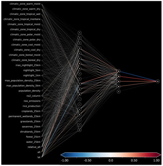
Figure A1.
Weight and biases for our trained shallow neural network.
References
- 4.2 Million Deaths Every Year Occur as a Result of Exposure to Ambient (Outdoor) Air Pollution. Available online: https://www.who.int/health-topics/air-pollution#tab=tab_1 (accessed on 12 December 2021).
- Schultz, M.G.; Akimoto, H.; Bottenheim, J.; Buchmann, B.; Galbally, I.E.; Gilge, S.; Helmig, D.; Koide, H.; Lewis, A.C.; Novelli, P.C.; et al. The Global Atmosphere Watch reactive gases measurement network. Elem. Sci. Anth. 2015, 3. [Google Scholar] [CrossRef] [Green Version]
- Schultz, M.G.; Schröder, S.; Lyapina, O.; Cooper, O.; Galbally, I.; Petropavlovskikh, I.; Von Schneidemesser, E.; Tanimoto, H.; Elshorbany, Y.; Naja, M.; et al. Tropospheric Ozone Assessment Report: Database and Metrics Data of Global Surface Ozone Observations. Elem. Sci. Anth. 2017, 5, 58. [Google Scholar] [CrossRef] [Green Version]
- Gaudel, A.; Cooper, O.R.; Ancellet, G.; Barret, B.; Boynard, A.; Burrows, J.P.; Clerbaux, C.; Coheur, P.F.; Cuesta, J.; Cuevas, E.; et al. Tropospheric Ozone Assessment Report: Present-day distribution and trends of tropospheric ozone relevant to climate and global atmospheric chemistry model evaluation. Elem. Sci. Anth. 2018, 6, 39. [Google Scholar] [CrossRef]
- Rao, S.T.; Galmarini, S.; Puckett, K. Air Quality Model Evaluation International Initiative (AQMEII) advancing the state of the science in regional photochemical modeling and its applications. Bull. Am. Meteorol. Soc. 2011, 92, 23–30. [Google Scholar] [CrossRef] [Green Version]
- Schultz, M.G.; Stadtler, S.; Schröder, S.; Taraborrelli, D.; Franco, B.; Krefting, J.; Henrot, A.; Ferrachat, S.; Lohmann, U.; Neubauer, D.; et al. The chemistry–climate model ECHAM6.3-HAM2.3-MOZ1.0. Geosci. Model Dev. 2018, 11, 1695–1723. [Google Scholar] [CrossRef] [Green Version]
- Wagner, A.; Bennouna, Y.; Blechschmidt, A.M.; Brasseur, G.; Chabrillat, S.; Christophe, Y.; Errera, Q.; Eskes, H.; Flemming, J.; Hansen, K.; et al. Comprehensive evaluation of the Copernicus Atmosphere Monitoring Service (CAMS) reanalysis against independent observations: Reactive gases. Elem. Sci. Anth. 2021, 9, 00171. [Google Scholar] [CrossRef]
- Cabaneros, S.M.; Calautit, J.K.; Hughes, B.R. A review of artificial neural network models for ambient air pollution prediction. Environ. Model. Softw. 2019, 119, 285–304. [Google Scholar] [CrossRef]
- Kleinert, F.; Leufen, L.H.; Schultz, M.G. IntelliO3-ts v1.0: A neural network approach to predict near-surface ozone concentrations in Germany. Geosci. Model Dev. 2021, 14, 1–25. [Google Scholar] [CrossRef]
- Stirnberg, R.; Cermak, J.; Kotthaus, S.; Haeffelin, M.; Andersen, H.; Fuchs, J.; Kim, M.; Petit, J.E.; Favez, O. Meteorology-driven variability of air pollution (PM1) revealed with explainable machine learning. Atmos. Chem. Phys. Discuss. 2020, 2020, 1–35. [Google Scholar] [CrossRef]
- Betancourt, C.; Stomberg, T.; Roscher, R.; Schultz, M.G.; Stadtler, S. AQ-Bench: A benchmark dataset for machine learning on global air quality metrics. Earth Syst. Sci. Data 2021, 13, 3013–3033. [Google Scholar] [CrossRef]
- Gu, J.; Yang, B.; Brauer, M.; Zhang, K.M. Enhancing the Evaluation and Interpretability of Data-Driven Air Quality Models. Atmos. Environ. 2021, 246, 118125. [Google Scholar] [CrossRef]
- Betancourt, C.; Stomberg, T.T.; Edrich, A.-K.; Patnala, A.; Schultz, M.G.; Roscher, R.; Kowalski, J.; Stadtler, S. Global, high-resolution mapping of tropospheric ozone—Explainable machine learning and impact of uncertainties. Geosci. Model Dev. Discuss. 2022. (in preparation). [Google Scholar]
- Tuia, D.; Roscher, R.; Wegner, J.D.; Jacobs, N.; Zhu, X.; Camps-Valls, G. Toward a Collective Agenda on AI for Earth Science Data Analysis. IEEE Geosci. Remote Sens. Mag. 2021, 9, 88–104. [Google Scholar] [CrossRef]
- Brokamp, C.; Jandarov, R.; Rao, M.; LeMasters, G.; Ryan, P. Exposure assessment models for elemental components of particulate matter in an urban environment: A comparison of regression and random forest approaches. Atmos. Environ. 2017, 151, 1–11. [Google Scholar] [CrossRef] [Green Version]
- Mallet, M.D. Meteorological normalisation of PM10 using machine learning reveals distinct increases of nearby source emissions in the Australian mining town of Moranbah. Atmos. Pollut. Res. 2021, 12, 23–35. [Google Scholar] [CrossRef]
- AlThuwaynee, O.F.; Kim, S.W.; Najemaden, M.A.; Aydda, A.; Balogun, A.L.; Fayyadh, M.M.; Park, H.J. Demystifying uncertainty in PM10 susceptibility mapping using variable drop-off in extreme-gradient boosting (XGB) and random forest (RF) algorithms. Environ. Sci. Pollut. Res. 2021, 28, 1–23. [Google Scholar] [CrossRef]
- Tian, Y.; Yao, X.A.; Mu, L.; Fan, Q.; Liu, Y. Integrating meteorological factors for better understanding of the urban form-air quality relationship. Landsc. Ecol. 2020, 35, 2357–2373. [Google Scholar] [CrossRef]
- Lu, H.; Xie, M.; Liu, X.; Liu, B.; Jiang, M.; Gao, Y.; Zhao, X. Adjusting prediction of ozone concentration based on CMAQ model and machine learning methods in Sichuan-Chongqing region, China. Atmos. Pollut. Res. 2021, 12, 101066. [Google Scholar] [CrossRef]
- Alimissis, A.; Philippopoulos, K.; Tzanis, C.; Deligiorgi, D. Spatial estimation of urban air pollution with the use of artificial neural network models. Atmos. Environ. 2018, 191, 205–213. [Google Scholar] [CrossRef]
- Wen, C.; Liu, S.; Yao, X.; Peng, L.; Li, X.; Hu, Y.; Chi, T. A novel spatiotemporal convolutional long short-term neural network for air pollution prediction. Sci. Total Environ. 2019, 654, 1091–1099. [Google Scholar] [CrossRef]
- Sayeed, A.; Choi, Y.; Eslami, E.; Jung, J.; Lops, Y.; Salman, A.K.; Lee, J.B.; Park, H.J.; Choi, M.H. A novel CMAQ-CNN hybrid model to forecast hourly surface-ozone concentrations 14 days in advance. Sci. Rep. 2021, 11, 10891. [Google Scholar] [CrossRef] [PubMed]
- McGovern, A.; Lagerquist, R.; Gagne, D. Using machine learning and model interpretation and visualization techniques to gain physical insights in atmospheric science. In Proceedings of the ICLR AI for Earth Sciences Workshop, Online, 29 April 2020. [Google Scholar]
- Adadi, A.; Berrada, M. Peeking inside the black-box: A survey on explainable artificial intelligence (XAI). IEEE Access 2018, 6, 52138–52160. [Google Scholar] [CrossRef]
- Arrieta, A.B.; Díaz-Rodríguez, N.; Del Ser, J.; Bennetot, A.; Tabik, S.; Barbado, A.; García, S.; Gil-López, S.; Molina, D.; Benjamins, R.; et al. Explainable Artificial Intelligence (XAI): Concepts, taxonomies, opportunities and challenges toward responsible AI. Inf. Fusion 2020, 58, 82–115. [Google Scholar]
- Simonyan, K.; Vedaldi, A.; Zisserman, A. Deep inside convolutional networks: Visualising image classification models and saliency maps. In Workshop at International Conference on Learning Representations; Citeseer: Princeton, NJ, USA, 2014. [Google Scholar]
- Erhan, D.; Bengio, Y.; Courville, A.; Vincent, P. Visualizing higher-layer features of a deep network. Univ. Montr. 2009, 1341, 1. [Google Scholar]
- Yan, X.; Zang, Z.; Luo, N.; Jiang, Y.; Li, Z. New interpretable deep learning model to monitor real-time PM2. 5 concentrations from satellite data. Environ. Int. 2020, 144, 106060. [Google Scholar] [CrossRef]
- Bennett, A.; Nijssen, B. Explainable AI Uncovers How Neural Networks Learn to Regionalize in Simulations of Turbulent Heat Fluxes at FluxNet Sites; Earth and Space Science Open Archive ESSOAr: Washington, DC, USA, 2021. [Google Scholar]
- Bach, S.; Binder, A.; Montavon, G.; Klauschen, F.; Müller, K.R.; Samek, W. On pixel-wise explanations for non-linear classifier decisions by layer-wise relevance propagation. PLoS ONE 2015, 10, e0130140. [Google Scholar] [CrossRef] [Green Version]
- Roscher, R.; Bohn, B.; Duarte, M.F.; Garcke, J. Explainable machine learning for scientific insights and discoveries. IEEE Access 2020, 8, 42200–42216. [Google Scholar] [CrossRef]
- Lundberg, S.M.; Lee, S.I. A Unified Approach to Interpreting Model Predictions. In Advances in Neural Information Processing Systems 30 (NeurIPS 2017 Proceedings); Guyon, I., Luxburg, U.V., Bengio, S., Wallach, H., Fergus, R., Vishwanathan, S., Garnett, R., Eds.; NeurIPS: Long Beach, CA, USA, 2017; pp. 4765–4774. [Google Scholar]
- Toms, B.A.; Barnes, E.A.; Hurrell, J.W. Assessing Decadal Predictability in an Earth-System Model Using Explainable Neural Networks. Geophys. Res. Lett. 2021, e2021GL093842. [Google Scholar] [CrossRef]
- Schramowski, P.; Stammer, W.; Teso, S.; Brugger, A.; Herbert, F.; Shao, X.; Luigs, H.G.; Mahlein, A.K.; Kersting, K. Making deep neural networks right for the right scientific reasons by interacting with their explanations. Nat. Mach. Intell. 2020, 2, 476–486. [Google Scholar] [CrossRef]
- Lapuschkin, S.; Wäldchen, S.; Binder, A.; Montavon, G.; Samek, W.; Müller, K.R. Unmasking Clever Hans predictors and assessing what machines really learn. Nat. Commun. 2019, 10, 1096. [Google Scholar] [CrossRef] [Green Version]
- Lundberg, S.M.; Erion, G.; Chen, H.; DeGrave, A.; Prutkin, J.M.; Nair, B.; Katz, R.; Himmelfarb, J.; Bansal, N.; Lee, S.I. From local explanations to global understanding with explainable AI for trees. Nat. Mach. Intell. 2020, 2, 56–67. [Google Scholar] [CrossRef] [PubMed]
- Goodfellow, I.; Bengio, Y.; Courville, A.; Bengio, Y. Deep Learning, 1st ed.; MIT Press Cambridge: Cambridge, UK, 2016. [Google Scholar]
- Breiman, L. Random forests. Mach. Learn. 2001, 45, 5–32. [Google Scholar] [CrossRef] [Green Version]
- Probst, P.; Wright, M.N.; Boulesteix, A.L. Hyperparameters and tuning strategies for random forest. Wiley Interdiscip. Rev. Data Min. Knowl. Discov. 2019, 9, e1301. [Google Scholar] [CrossRef] [Green Version]
- Bilgin, Z.; Gunestas, M. Explaining Inaccurate Predictions of Models through k-Nearest Neighbors. In Proceedings of the International Conference on Agents and Artificial Intelligence, Online, 4–6 February 2021; pp. 228–236. [Google Scholar]
- Meyer, H.; Pebesma, E. Predicting into unknown space? Estimating the area of applicability of spatial prediction models. Methods Ecol. Evol. 2021, 12, 1620–1633. [Google Scholar] [CrossRef]
- Sofen, E.; Bowdalo, D.; Evans, M. How to most effectively expand the global surface ozone observing network. Atmos. Chem. Phys. 2016, 16, 1445–1457. [Google Scholar] [CrossRef] [Green Version]
- Petermann, E.; Meyer, H.; Nussbaum, M.; Bossew, P. Mapping the geogenic radon potential for Germany by machine learning. Sci. Total Environ. 2021, 754, 142291. [Google Scholar] [CrossRef]
Publisher’s Note: MDPI stays neutral with regard to jurisdictional claims in published maps and institutional affiliations. |
© 2022 by the authors. Licensee MDPI, Basel, Switzerland. This article is an open access article distributed under the terms and conditions of the Creative Commons Attribution (CC BY) license (https://creativecommons.org/licenses/by/4.0/).